Best WPML Websites of 2026 (20 Real-World Examples)
Multilingual WordPress references, with practical lessons for language navigation, publishing ownership and a complete translated journey.
A multilingual website succeeds when people can finish the same useful task in their chosen language—not merely when a language switcher appears in the header.
The examples range from corporate publishing and architecture to hospitality, transport and local services. Their language needs differ: a corporate newsroom, a booking introduction and a professional-services archive each require a different translation workflow. Study the page structure and the information being offered before choosing how much content to translate.
The November 13 public checks found WPML component references on each exact page below. That does not verify every translation, prove which translation method was used or establish the platform behind a separate booking application. Some retained screenshots show the browser’s existing translation state; those are labelled in the review rather than presented as proof of the site’s own localized copy.
Before the examples
What makes good WPML website development in 2026?
Translate the task as well as the headline
Map the full journey from discovery through service detail, enquiry, confirmation and support. Identify third-party handoffs and documents. A translated hero followed by an untranslated form can leave the most important decision unsupported.
Give each language an editorial owner
Define source-language changes, translation review and the handling of missing content. WPML’s documentation covers multilingual WordPress workflows; it cannot decide who in your organization checks a changed fee, service restriction or opening time.
A language preference does not always identify the visitor’s country or relevant office. Name regional service differences explicitly. Do not silently change the selected branch when a visitor switches language, or imply that translated information makes every offer available everywhere.
The collection · 20 examples
20 WPML website examples worth studying
Compare the opening corporate references with smaller specialist and service sites. Look for a visible language route, equivalent information hierarchy and a practical next step. The source evidence supports a WPML reference, not a completed translation-quality assessment.
We start with five recognizable brands or organizations: Tencent, Rackspace Technology, BNP Paribas Personal Finance, REWE International AG, SOM. Each attribution applies to the named website property, not every product or website belonging to its organization. This is a curated reading sequence, not a measured ranking.
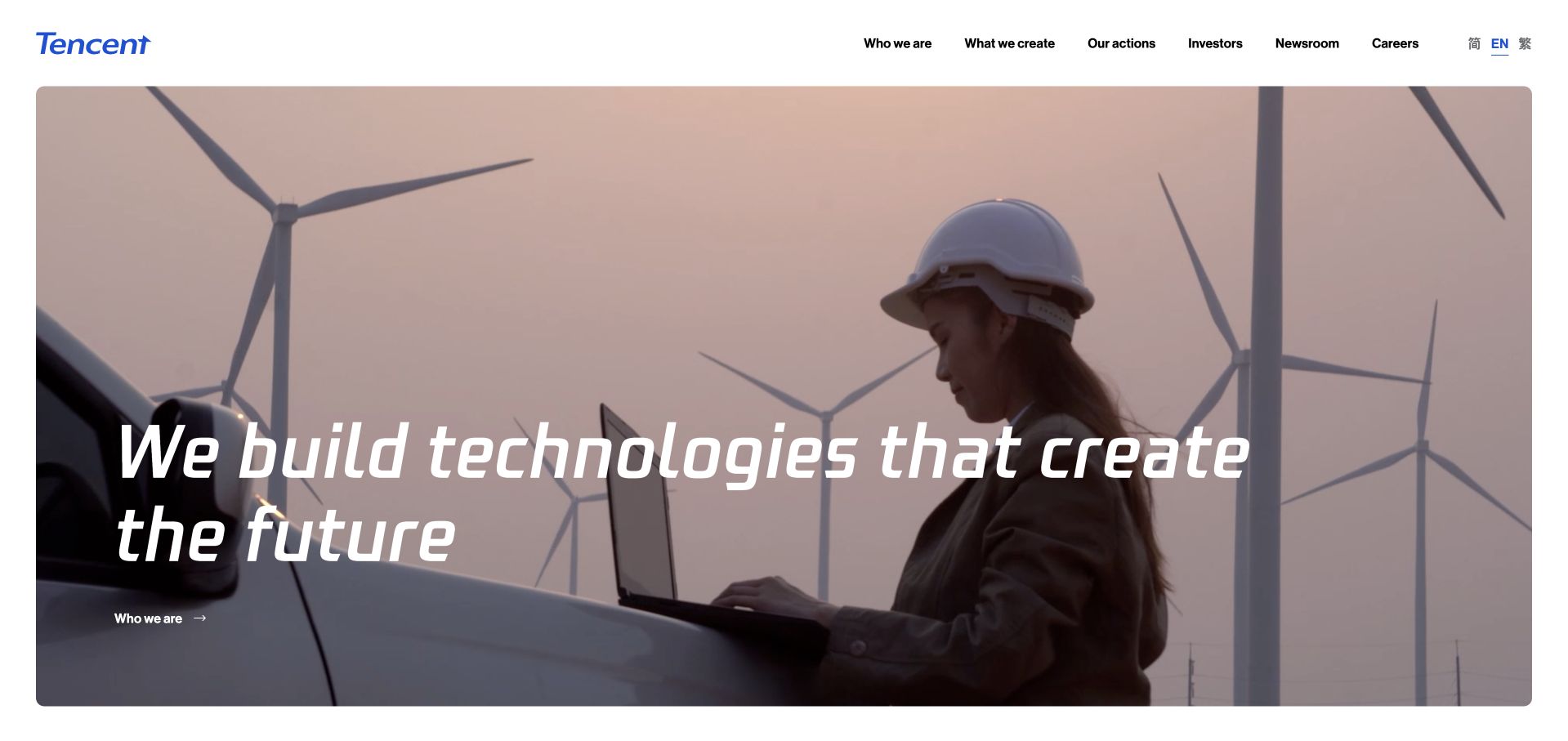
Tencent’s corporate opening uses a photograph of wind turbines and a worker, with an italic white statement laid across the image. The slim white header contains company, work, investment and newsroom routes, leaving the photograph to carry most of the first impression. The scene connects a broad technology message with a recognizable physical setting rather than an abstract stock illustration. This is a corporate storytelling property, not a catalog of every Tencent product. The photograph and statement should therefore be studied as communication choices, without treating them as proof of a specific environmental outcome, operational program or the technology delivering the pictured public page.
What you can learn
Pair a broad corporate message with a scene that gives it understandable context. Keep essential company information in stable navigation and provide supporting stories beyond the visual opening. Overlay text must remain legible when the image changes, is cropped on mobile or cannot be loaded at all.
Pros
A concise verbal layer allows the photographic setting to establish context.
Corporate utility routes remain available in a restrained header.
Cons & considerations
An expansive statement needs specific evidence and examples farther down.
Image-dependent contrast and autoplay behavior require accessible alternatives.
Platform source: WordPress.org Showcase. Linked script matches WPML. Exact public source-page sample: https://www.tencent.com/. This identifies a public WPML reference or response association, not private configuration, complete architecture, measured performance or successful data collection. Platform evidence is separate from the direct website screenshot and is not a complete current infrastructure audit.
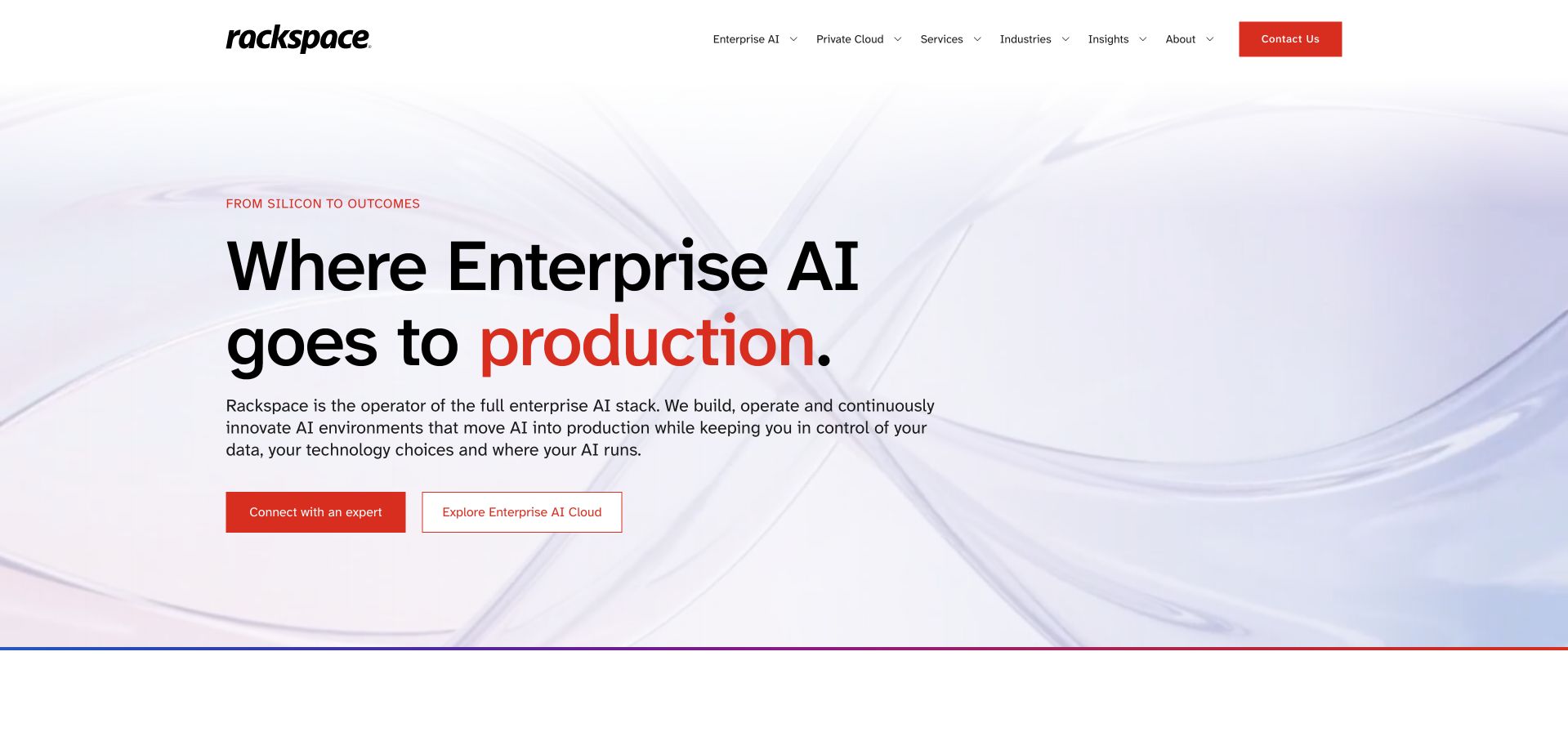
Rackspace’s homepage uses a pale abstract background, a large black headline and a red emphasis word to introduce its enterprise-AI positioning. Supporting text explains an operating role, and two actions separate speaking to an expert from exploring the offering. The design does not depend on a dashboard collage to establish technical credibility; hierarchy and explanatory copy do most of the work. This makes the opening easier to scan than a dense capability matrix. The proposition remains broad, so infrastructure, data and operational responsibilities need detailed supporting pages. The public WPML reference applies to this property, not every product or customer platform associated with the company.
What you can learn
A technical service can be introduced through responsibility rather than feature count. State what the provider operates, what the customer retains control over and where the detailed evaluation begins, then let the visual treatment support that distinction.
Pros
A restrained background gives the headline and explanation strong visual separation.
Two distinct actions support both exploratory and sales-ready visitors.
Cons & considerations
A broad full-stack claim requires concrete scope and exclusions in supporting content.
A large headline should not push the practical service explanation below the fold on mobile.
Platform source: WordPress.org Showcase. Linked stylesheet matches WPML. Exact public source-page sample: https://www.rackspace.com/. This identifies a public WPML reference or response association, not private configuration, complete architecture, measured performance or successful data collection. Platform evidence is separate from the direct website screenshot and is not a complete current infrastructure audit.
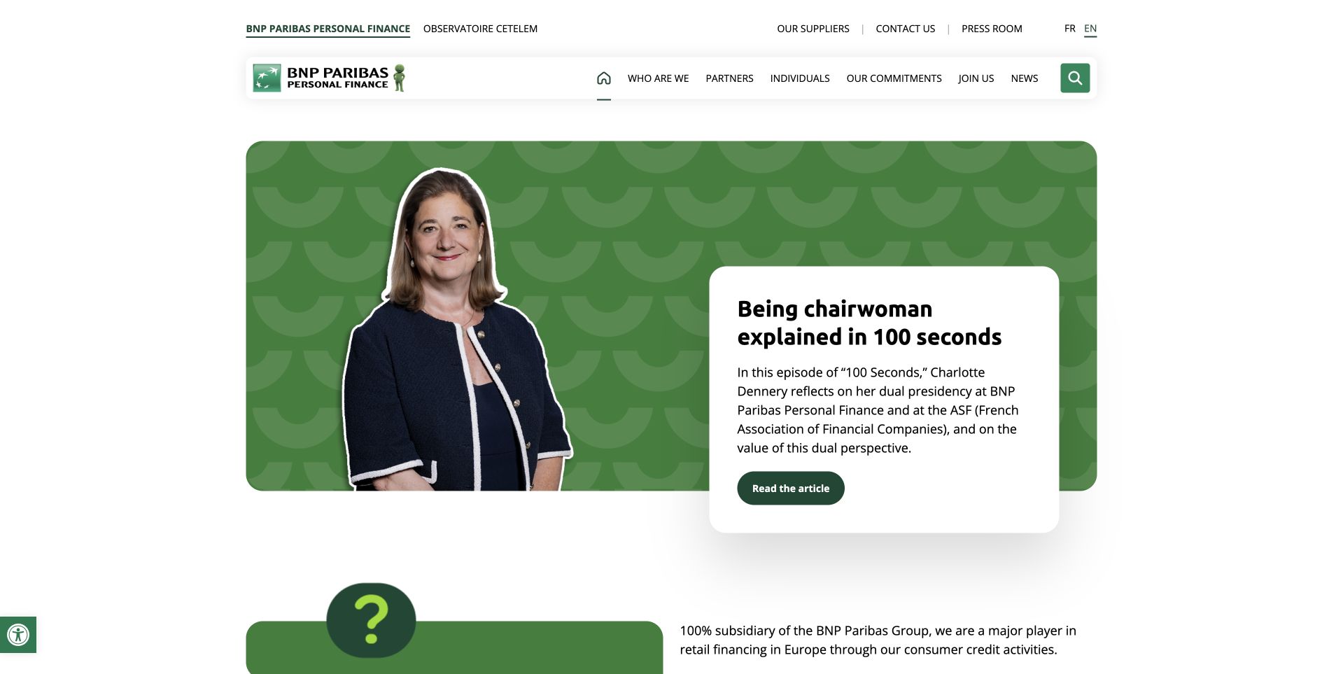
BNP Paribas Personal Finance uses a green patterned feature with a portrait on the left and an offset white article card on the right. The card explains a leadership feature, while compact navigation separates company, partners, individuals, commitments, careers and news. The composition gives a person and an editorial story a defined place within a division-specific corporate site. It is useful for studying how a recognizable group identity can support more specific organizational context. The English source path and public WPML references do not establish the completeness of other language editions or the systems behind financial applications.
What you can learn
Keep the legal and organizational entity clear when presenting a recognizable group brand. Give editorial stories readable summaries and destinations, and preserve the exact division and function scope of technical evidence instead of extending it to the whole organization.
Pros
The portrait and white article card create a clear editorial feature structure.
Navigation distinguishes corporate, partner, individual, and career audiences.
Cons & considerations
Overlapping story cards need a sensible mobile reading sequence.
A shared group identity requires consistent division-specific context throughout the journey.
Platform source: WordPress.org Showcase. Linked stylesheet matches WPML. Exact public source-page sample: https://personal-finance.bnpparibas/en/. This identifies a public WPML reference or response association, not private configuration, complete architecture, measured performance or successful data collection. Platform evidence is separate from the direct website screenshot and is not a complete current infrastructure audit.
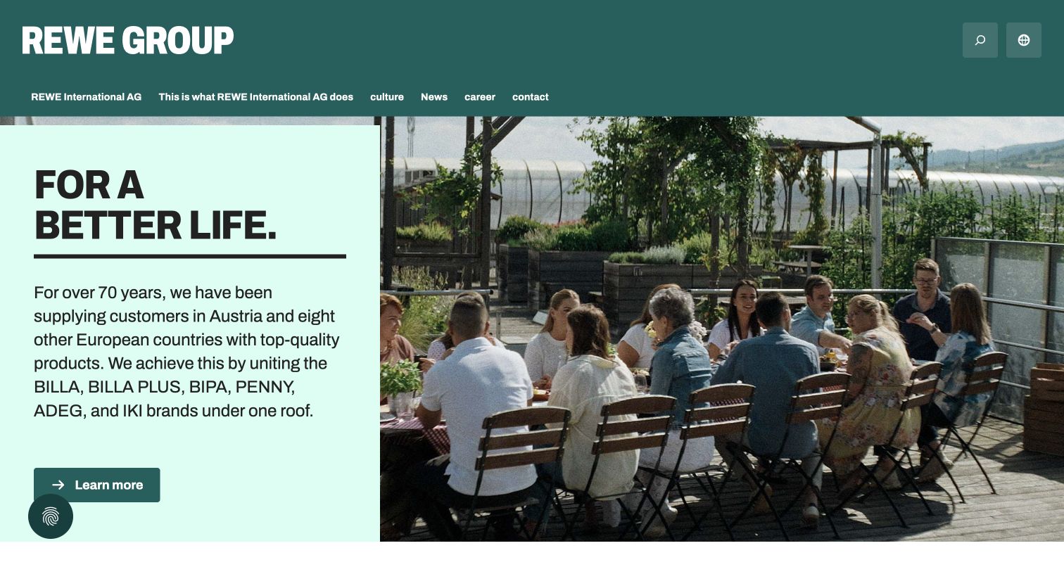
REWE International AG’s Austrian corporate site balances a large group identity with an everyday human image. The opening combines a dark green masthead, a pale green text panel and a photograph of colleagues on a terrace. A short purpose statement introduces regional retail brands, followed by a single learn-more action. Company information, careers and news have distinct routes rather than being treated as one audience. This is the Austrian corporate property, not every REWE store or booking service. The retained capture shows the browser’s existing English translation; that state is not proof of the website’s own translated edition. The composition demonstrates a calm editorial approach to a complex regional organization.
What you can learn
Separate long-lived company information from dated news, while preserving a recognizable visual system. Keep brand, regional entity and language context explicit so that a translated introduction does not imply that every business unit offers the same information or services.
Pros
People-focused photography makes an institutional introduction approachable.
The visible paths distinguish company information from careers and news.
Cons & considerations
Several regional brand names compete for attention in the introductory paragraph.
Language changes need to preserve the selected corporate and regional context.
Platform source: WordPress.org Showcase. Linked script matches WPML. Exact public source-page sample: https://rewe-group.at/de/. This identifies a public WPML reference or response association, not private configuration, complete architecture, measured performance or successful data collection. Platform evidence is separate from the direct website screenshot and is not a complete current infrastructure audit.
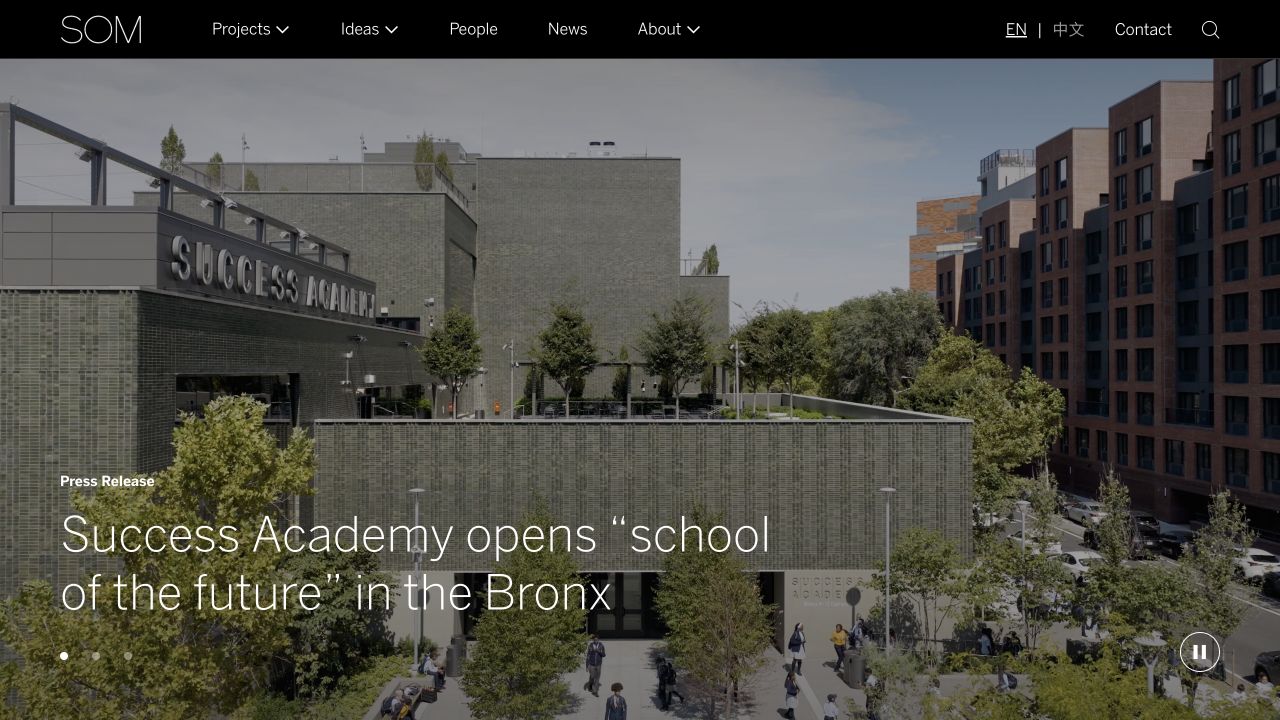
SOM places a project or news photograph beneath a slim dark navigation bar. Projects, ideas, people, news and company information are plainly named rather than hidden in an expressive interface. The wider archive supports more targeted exploration beyond the image-led feature. Public WPML component references identify a multilingual publishing association on the reviewed page, not proof that every project record or office workflow is translated.
What you can learn
Plan relationships among people, project records, topics, and editorial pieces before adding more page templates. An editor should be able to promote a story while retaining the same project reference underneath. Test that relationship in a safe copy with realistic archive depth. Include media replacement, redirects, and restoration of structured content in handover, because recovering a visually correct landing page is not enough if the linked archive has lost its meaning.
Pros
The navigation gives both visual work and intellectual material durable destinations.
A restrained shell leaves room for changing project photography.
Cons & considerations
A substantial archive requires maintained taxonomy rather than navigation labels alone.
A large practice archive needs useful project facts and filter labels beyond the featured photograph.
Platform source: WordPress.org Showcase. Linked script matches WPML. Exact public source-page sample: https://www.som.com/. This identifies a public WPML reference or response association, not private configuration, complete architecture, measured performance or successful data collection. Platform evidence is separate from the direct website screenshot and is not a complete current infrastructure audit.
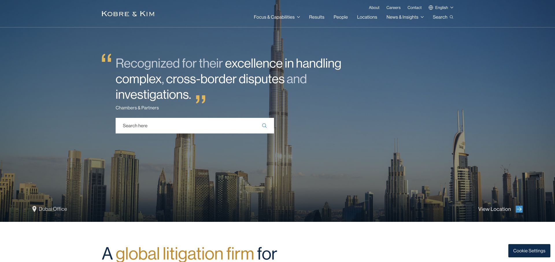
Kobre & Kim layers a large search field and an attributed quotation over a darkened city panorama. A location label and action connect the photograph to an actual office rather than anonymous decoration. Capabilities, results, people, and locations form a restrained upper navigation, with language and contact in a separate utility position. The layout recognizes several research tasks: finding a person, examining work, or searching a known term. Gold quotation marks supply an identifying accent without another illustration. The quotation is a confidence device, though anonymous client attribution is less specific than a named case study.
What you can learn
If search is a central route, make its purpose explicit and pair it with browsable capabilities. Give location photography a destination and caption so it contributes to wayfinding rather than merely filling space.
Pros
Search is treated as a useful primary task, not a tiny header icon.
The city image is linked to a visible location destination.
Cons & considerations
Visitors without legal vocabulary may still need guided practice navigation.
An anonymous quotation offers less inspectable context than a named example.
Platform source: WordPress.org Showcase. Linked script matches WPML. Exact public source-page sample: https://kobrekim.com/. This identifies a public WPML reference or response association, not private configuration, complete architecture, measured performance or successful data collection. Platform evidence is separate from the direct website screenshot and is not a complete current infrastructure audit.
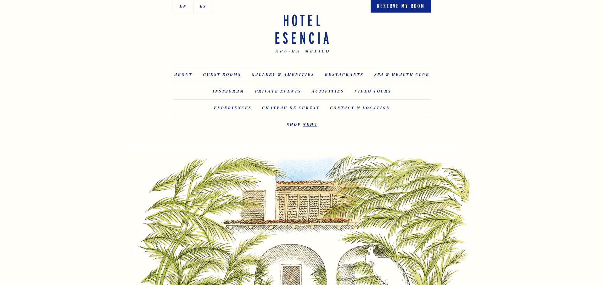
Hotel Esencia uses a narrow centered column, generous cream whitespace, and blue typography that recalls printed stationery. A stacked wordmark sits above three ruled navigation rows, while room reservation and language choices remain at the top. Below, a hand-drawn architectural illustration and palms introduce the property instead of a conventional full-screen photograph. The composition is unusually typographic for a resort homepage, with guest rooms, amenities, dining, activities, and location all directly named.
What you can learn
An independent resort can stand apart through original illustration and disciplined typography, not just larger beach imagery. Preserve a visible room-reservation action and ensure the broad navigation leads to concrete photographs and practical details for each experience, rather than making the editorial identity the only way to understand the property.
Pros
The named navigation categories give guests direct access to rooms, amenities, dining, and location.
The original illustration creates a distinctive identity without needing a full-viewport video.
Cons & considerations
Several rows of small italic navigation can be slower to scan than a shorter primary menu.
The illustration is evocative but cannot substitute for current room and facility photographs.
Platform source: WordPress.org Showcase. Linked stylesheet matches WPML. Exact public source-page sample: https://hotelesencia.com/. This identifies a public WPML reference or response association, not private configuration, complete architecture, measured performance or successful data collection. Platform evidence is separate from the direct website screenshot and is not a complete current infrastructure audit.
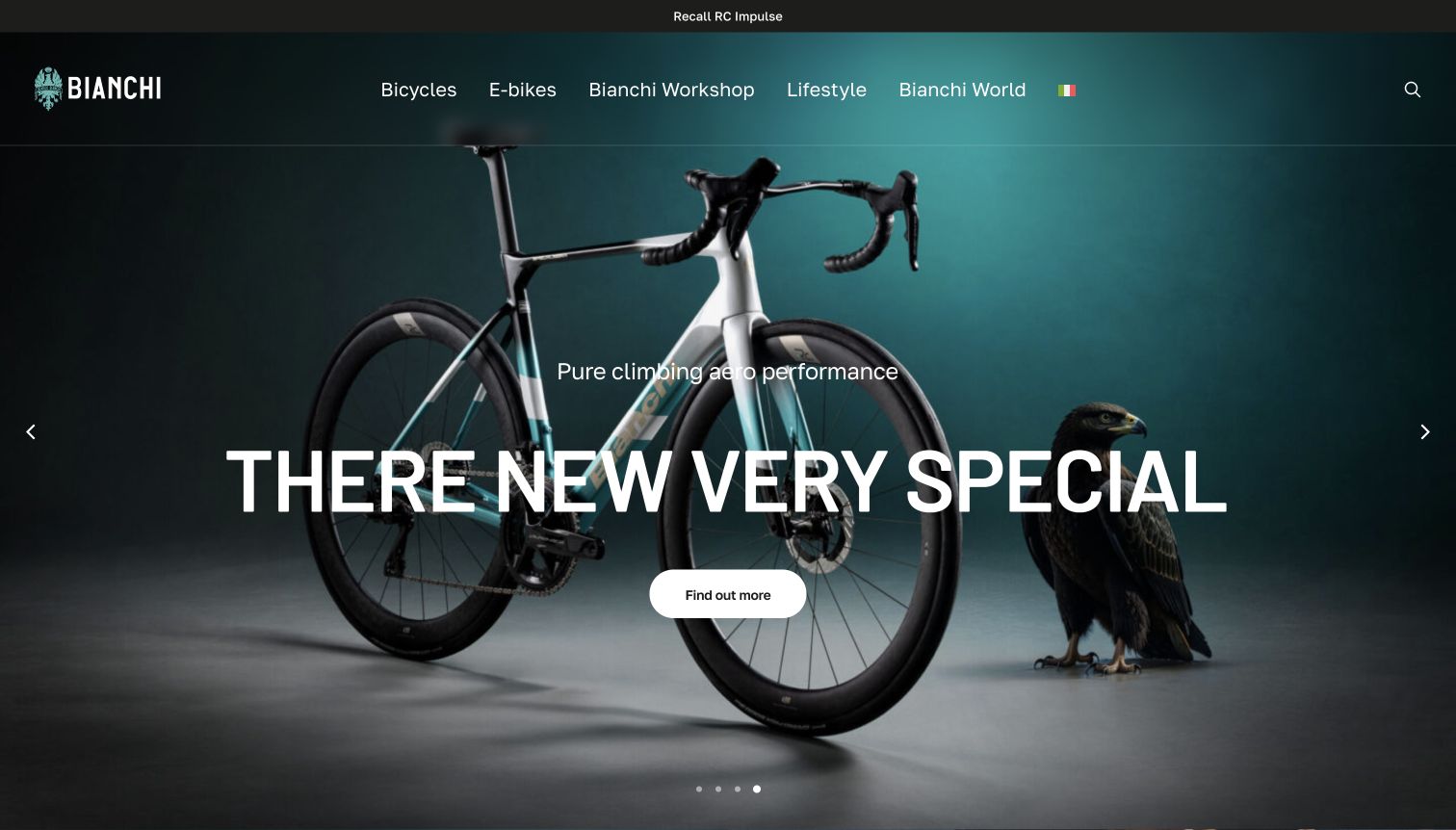
Bianchi’s captured hero places a complete road bicycle and an eagle against a dark teal studio background. The main heading, short performance-oriented line and rounded action sit over the product image, while the top navigation distinguishes bicycles, electric models, workshop, lifestyle and brand stories. A separate recall link occupies the narrow strip above the header. The source page uses Italian navigation in its DOM, while the browser visibly translated parts of the page into English, including an awkwardly rendered product heading. The capture preserves that real presentation rather than silently correcting its text.
What you can learn
Use studio imagery when the bicycle’s complete silhouette should be clear, but keep the model identity accurate across languages. Product names need protection from automatic translation. Service notices also deserve a stable, visible position so that a visually polished campaign does not conceal practical ownership information.
Pros
The studio composition shows the whole bicycle rather than only a component crop.
A recall route remains visible above the promotional content.
Cons & considerations
The observed translation distorts the main product heading.
Large overlaid text covers part of the bicycle’s frame and cockpit.
Platform source: WordPress.org Showcase. Linked stylesheet matches WPML. Exact public source-page sample: https://www.bianchi.com/. This identifies a public WPML reference or response association, not private configuration, complete architecture, measured performance or successful data collection. Platform evidence is separate from the direct website screenshot and is not a complete current infrastructure audit.
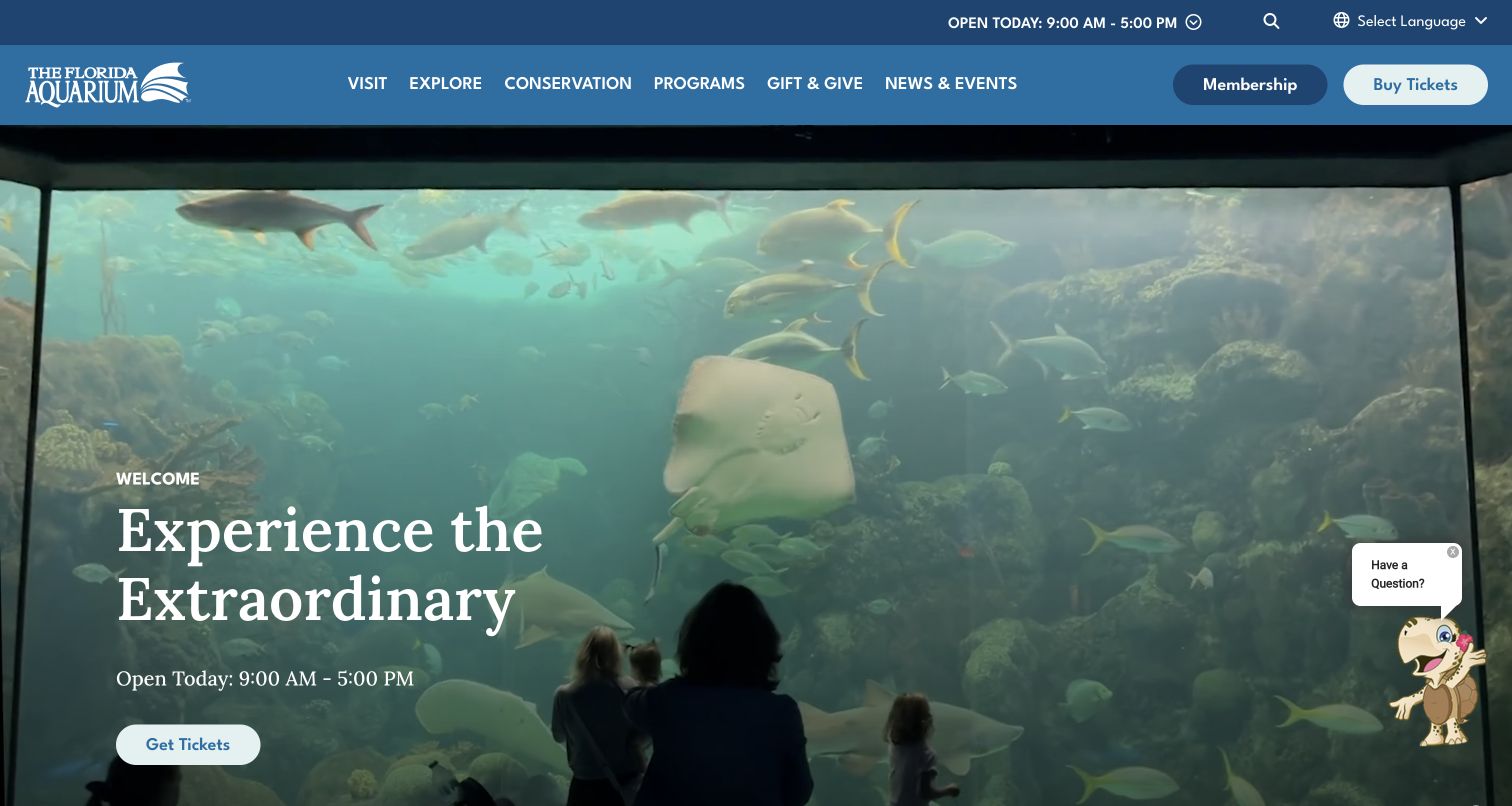
The Florida Aquarium pairs a large viewing-window image with the Experience the Extraordinary headline and a prominent Get Tickets action. Current hours appear both in the upper utility area and beside the hero invitation, making timing difficult to miss. The blue header separates visiting, exploring, conservation, programmes and giving, with membership and ticket purchase set apart. A small chat control remains in the lower corner. The composition lets the animal-viewing scene establish appeal while the practical next step is clearly repeated.
What you can learn
Repeat a critical fact only when both placements draw from the same maintained source. Clear hours near the admission action are helpful, but duplicate text should not become contradictory after seasonal changes; support widgets should remain small enough to leave those controls accessible.
Pros
Hours are visible next to the main invitation as well as in the utility header.
The photograph shows the visitor’s relationship to the habitat rather than presenting an isolated animal cutout.
Cons & considerations
A floating chat control can compete with lower-page actions on smaller screens.
The broad hero promise needs supporting detail about exhibits, inclusions and entry conditions on planning pages.
Platform source: WordPress.org Showcase. Linked script matches WPML. Exact public source-page sample: https://www.flaquarium.org/. This identifies a public WPML reference or response association, not private configuration, complete architecture, measured performance or successful data collection. Platform evidence is separate from the direct website screenshot and is not a complete current infrastructure audit.
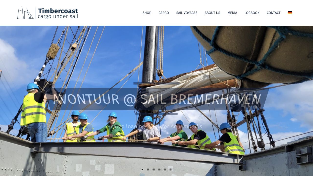
Timbercoast opens with a working-vessel photograph and a campaign caption. A compact header separates Shop, Cargo, Sail Voyages, company information, media and the logbook. People and equipment appear in context rather than an abstract shipping graphic, and pagination dots reveal a sequence of campaign panels. This English-language page is a useful example of several business and editorial journeys sharing one recognizable setting. The source check found WPML references, but did not verify translation coverage, the commerce system or environmental performance. The retained screenshot records the actual campaign frame and its translucent caption rather than a reconstructed promotional image.
What you can learn
Use documentary images to explain a specialist activity, then make the distinct commercial and editorial routes easy to recognize. Captions need enough contrast and context to remain useful as slides change; the navigation should still work for someone who bypasses the campaign entirely.
Pros
Cargo, voyages, and shopping are separate navigation choices.
The working scene makes the organization’s subject tangible.
Cons & considerations
The translucent campaign caption has weak contrast in this captured frame.
Unlabeled carousel dots provide little information about the other panels.
Platform source: WordPress.org Showcase. Linked stylesheet matches WPML. Exact public source-page sample: https://timbercoast.com/en/. This identifies a public WPML reference or response association, not private configuration, complete architecture, measured performance or successful data collection. Platform evidence is separate from the direct website screenshot and is not a complete current infrastructure audit.
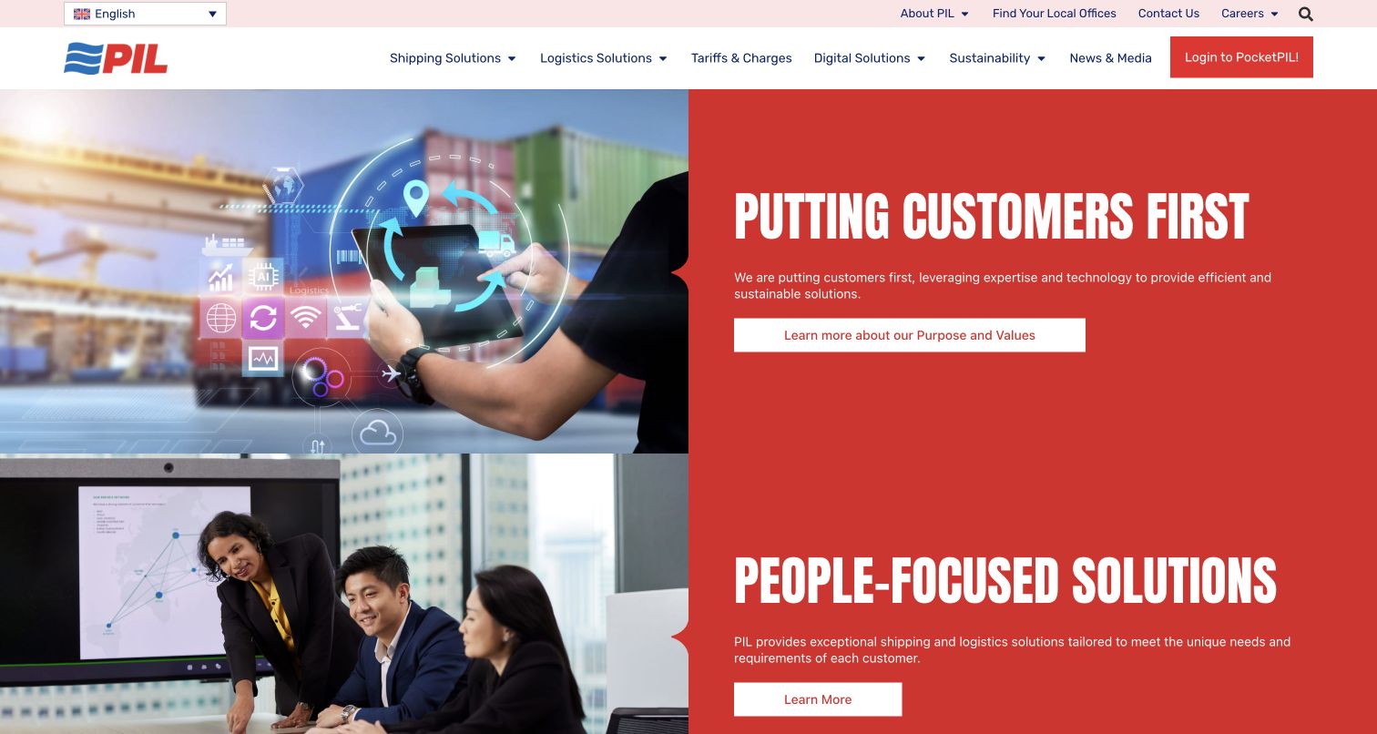
Pacific International Lines uses two substantial red-and-white feature panels to introduce its customer and people themes. Each pairs a photograph on the left with a concise heading, supporting statement, and Learn More action on the right. The navigation does more practical work than the broad campaign copy: Shipping Solutions, Logistics, Tariffs and Charges, and Digital sit together, while local offices, contact information, and the PocketPIL login remain visible above or beside them. This gives the page a relationship-oriented tone while preserving routes to commercial and operational information.
What you can learn
Use people and service stories to explain the company's approach, then counterbalance them with specific navigation for charges, contacts, and digital tasks. Repeated broad campaign buttons should not become the only route through the first screen.
Pros
Tariffs and Charges is named plainly in the main navigation rather than hidden under a general information label.
The paired image-and-copy panels make each campaign segment visually easy to distinguish.
Cons & considerations
The two large panels devote considerable space to general values before showing detailed shipping tools.
Repeated Learn More buttons communicate less destination detail than the specific service labels in the header.
Platform source: WordPress.org Showcase. Linked stylesheet matches WPML. Exact public source-page sample: https://www.pilship.com/. This identifies a public WPML reference or response association, not private configuration, complete architecture, measured performance or successful data collection. Platform evidence is separate from the direct website screenshot and is not a complete current infrastructure audit.
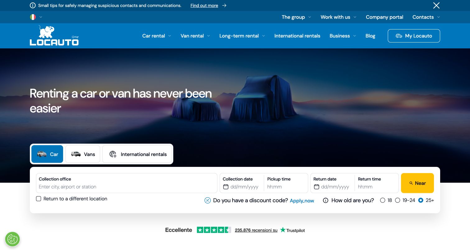
Locauto uses a blue header above a dark campaign image showing covered vehicles. Car, van and international-rental choices sit directly above a wide white booking panel that overlaps the lower edge of the hero. Pickup office receives the widest input, with collection and return dates and times continuing across the row. Different return location, discounts and age bands appear beneath. The header gives long-term rental and business services their own categories, while a narrow information strip sits above it. This layout is useful for comparing a broad service portfolio with a still-focused short-term booking tool. The hero remains atmospheric, but the white panel provides the practical structure needed to begin a reservation.
What you can learn
Attach vehicle-category choices to the reservation tool they affect. Separate business and longer-term rental routes, and keep translated date, location and age labels clear when the overlapping panel reflows on mobile.
Pros
The category choices are adjacent to the reservation form rather than buried in navigation.
A wide location field accommodates city, airport or station entry.
Cons & considerations
Two navigation layers and an information strip add substantial header density.
The compact secondary row needs clear labels when translated or enlarged.
Platform source: WordPress.org Showcase. Linked stylesheet matches WPML. Exact public source-page sample: https://www.locautorent.com/it/. This identifies a public WPML reference or response association, not private configuration, complete architecture, measured performance or successful data collection. Platform evidence is separate from the direct website screenshot and is not a complete current infrastructure audit.
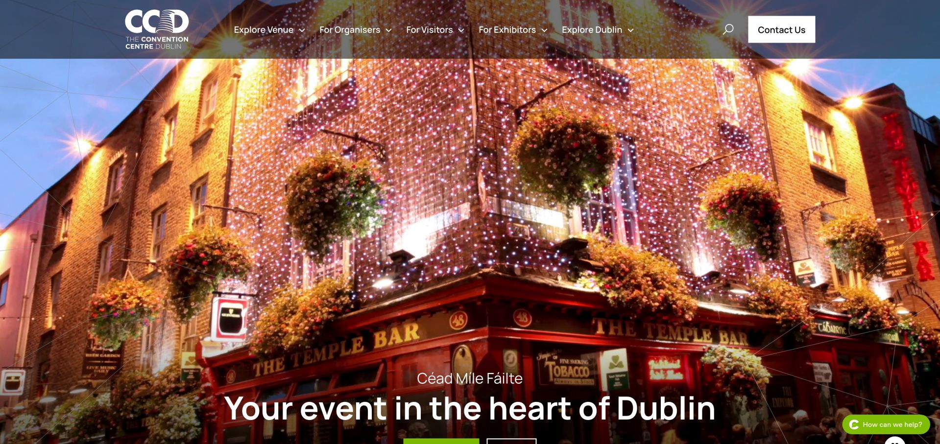
The CCD combines Dublin destination imagery with separate routes for organisers, visitors and exhibitors. A room finder, capacity chart and floor plans turn the visual introduction into practical planning material, while travel, hotels and local dining support attendance. The broad opening image makes the city memorable, but the actionable details sit farther down. Animated statistics initially read as zero in the inspected page, so essential facts should not depend on a counter animation.
What you can learn
Separate people choosing a venue from those arriving for an event. Give capacities, plans and practical travel information durable, clearly named destinations. Keep essential facts readable without animated counters, and check their equivalent language versions directly. A translated campaign headline is not a substitute for consistent venue specifications, rate documents and arrival instructions throughout the planning journey.
Pros
Distinct organiser, visitor and exhibitor journeys
Room finder and planning documents support comparison
Cons & considerations
Large visual opening delays detailed planning content
Platform source: WordPress.org Showcase. Linked stylesheet matches WPML. Exact public source-page sample: https://www.theccd.ie/. This identifies a public WPML reference or response association, not private configuration, complete architecture, measured performance or successful data collection. Platform evidence is separate from the direct website screenshot and is not a complete current infrastructure audit.
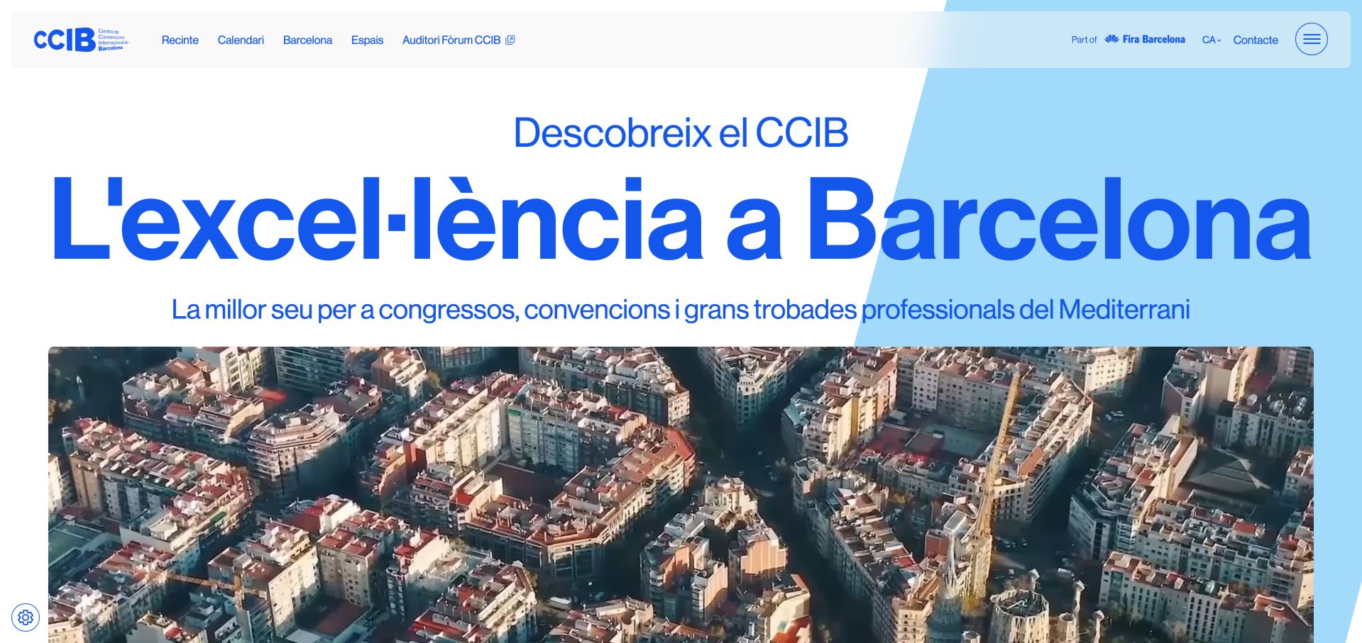
CCIB uses oversized blue typography and Barcelona imagery to connect the building with its setting. The navigation leads into spaces, the calendar and city information, while production, audiovisual, IT, furniture and signage services receive their own treatment. That breadth helps a planner understand what must be coordinated beyond the room. The inspected English entry redirected to Catalan, so international language routing deserves as much care as the visual identity.
What you can learn
Show production responsibilities as clearly as room choices. For an international venue, test the actual language destinations instead of assuming a language label guarantees equivalent content. Translate the practical planning journey, including capacities, audiovisual requirements and contact expectations. Keep source-page redirects and regional context visible so a visitor understands which version they have reached.
Pros
Production and supporting services are clearly differentiated
Venue, events and destination information share a coherent structure
Cons & considerations
Requested English route redirected to Catalan during inspection
Large imagery and typography postpone detailed specifications
Platform source: WordPress.org Showcase. Linked script matches WPML. Exact public source-page sample: https://ccib.es/. This identifies a public WPML reference or response association, not private configuration, complete architecture, measured performance or successful data collection. Platform evidence is separate from the direct website screenshot and is not a complete current infrastructure audit.
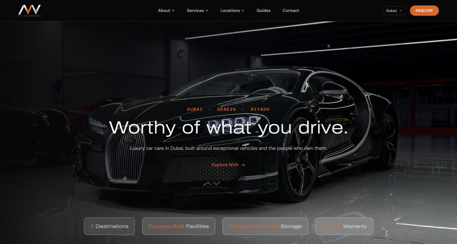
NVN Motorworks' Dubai page uses dark workshop imagery and restrained orange accents to introduce a premium vehicle-care setting. The city selector and Dubai label establish which location the visitor is exploring, while service and enquiry routes remain visible. The broader offer includes tint alongside paint protection, detailing, and other specialist work. Rather than making a technical film comparison in the opening, the page builds confidence in the studio environment and lets visitors move toward a consultation. That presentation can support a high-consideration enquiry, but the connection to a particular tint package needs another step. The retained November 6 capture documents the Dubai property specifically.
What you can learn
Keep location context attached to an international brand's service journey. Pair the studio's visual identity with precise treatment information so a customer can distinguish the atmosphere of the business from the specifications of the film being considered.
Pros
The Dubai location context is visible within the broader international brand structure.
Workshop imagery and a restrained action hierarchy create a coherent premium presentation.
Cons & considerations
The opening brand message supplies less immediate detail about window-film choices.
Several related services compete for attention before a tint customer reaches a specific enquiry.
Platform source: WordPress.org Showcase. Linked script matches WPML. Exact public source-page sample: https://nvnmotorworks.com/dubai/. This identifies a public WPML reference or response association, not private configuration, complete architecture, measured performance or successful data collection. Platform evidence is separate from the direct website screenshot and is not a complete current infrastructure audit.
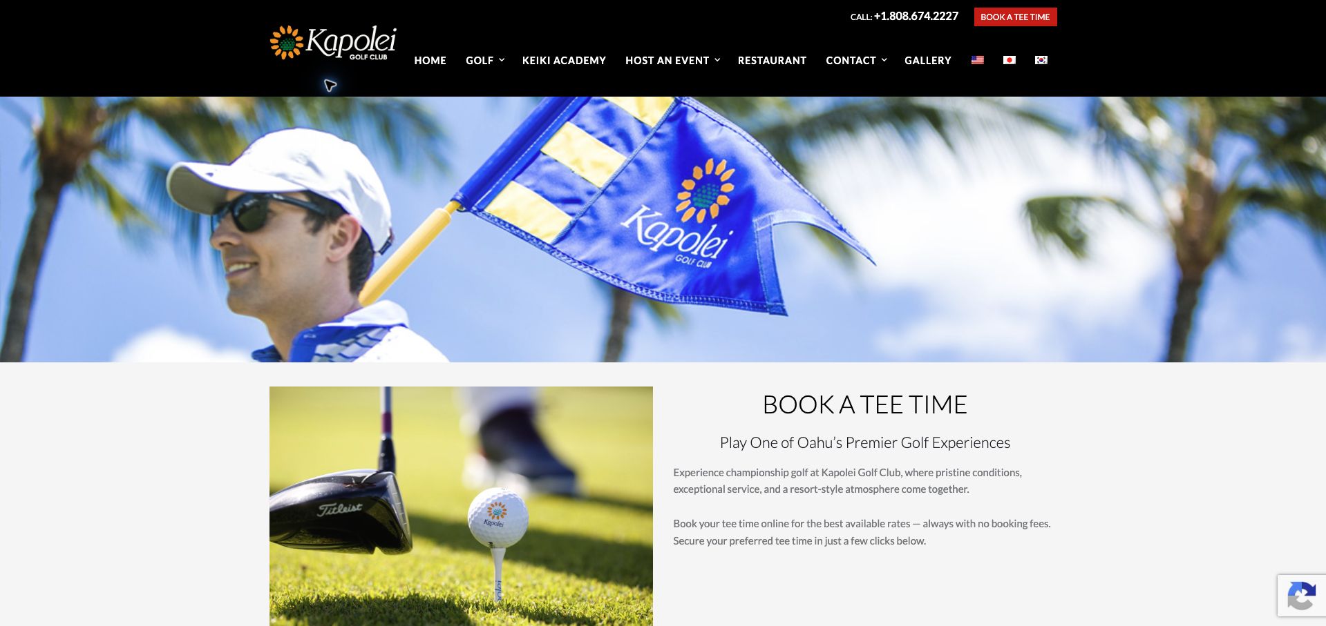
Kapolei Golf Club’s booking page uses a wide course-branded photograph above a balanced two-column introduction. A golf equipment image sits on the left, while Book a Tee Time, a short positioning line, and explanatory copy occupy the right. The shared black header retains telephone access, a red booking shortcut, and navigation for golf, the academy, events, dining, and contact. The dated public audit found WPBakery’s js_composer stylesheet on this page. This association applies to the public introduction; it does not verify the separate booking interface, current rates, or the no-fee claim displayed in the copy.
What you can learn
Make a transaction landing page state its purpose before adding promotional detail. Keep the supporting image subordinate to practical instructions, and identify where live availability begins so visitors can distinguish descriptive content from the system that confirms a time and price.
Pros
The page heading names the intended booking task directly.
Telephone and booking shortcuts remain available in the shared header.
Cons & considerations
The large banner and introductory row delay live booking information.
Several promotional claims need confirmation in the actual reservation terms.
Platform source: WordPress.org Showcase. Linked stylesheet matches WPML. Exact public source-page sample: https://kapoleigolf.com/book-a-tee-time/. This identifies a public WPML reference or response association, not private configuration, complete architecture, measured performance or successful data collection. Platform evidence is separate from the direct website screenshot and is not a complete current infrastructure audit.
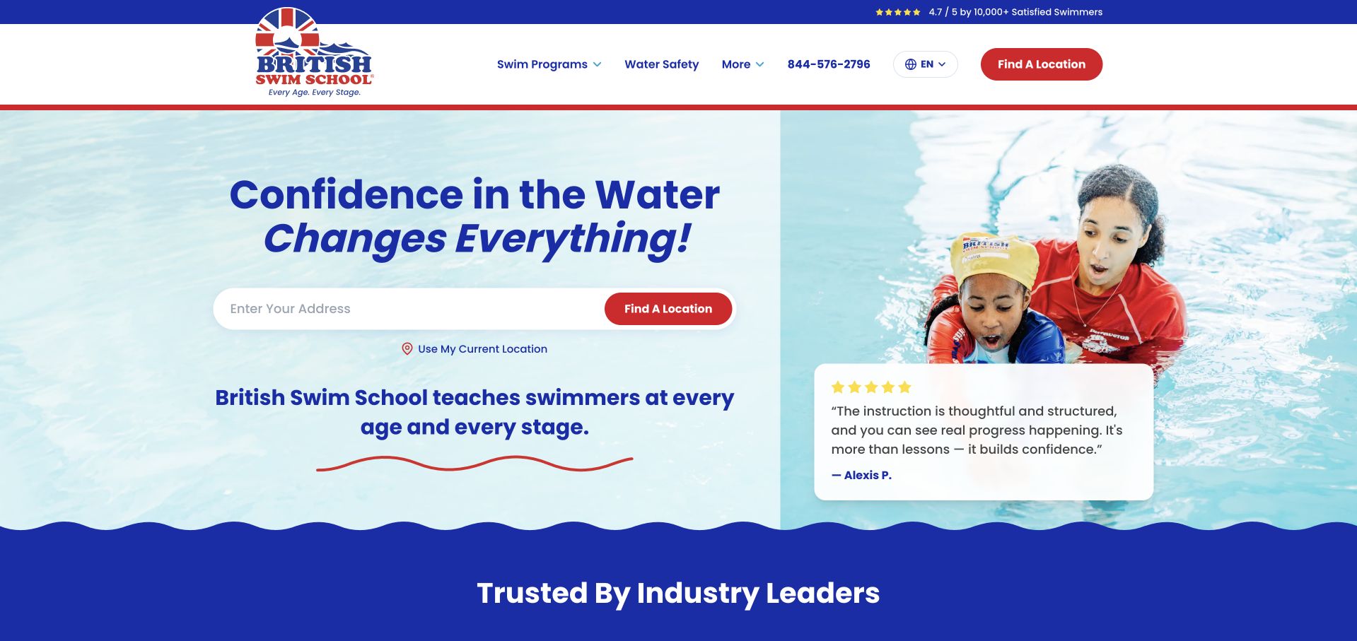
British Swim School places an address-based location finder beside instructor imagery and a parent testimonial. Red actions and navy type create a clear visual hierarchy against a pale background. The useful distinction comes below: water acclimation, survival skills, and stroke development are described before the page introduces its named classes. An assessment route then offers help choosing by age and experience, and program tabs include teens, adults, and adaptive lessons. The opening still emphasizes a broad confidence promise rather than class logistics. Prices and schedules require further exploration, while testimonials describe individual experiences rather than establishing general teaching outcomes.
What you can learn
Translate internal level names into plain-language learning goals before presenting the full curriculum. Support both geographic browsing and placement help, and keep age, parent participation, and experience requirements attached to individual classes.
Pros
Three learning stages explain the curriculum in ordinary language.
Adult and adaptive programs have visible category routes.
Cons & considerations
The opening does not show lesson price or duration.
Prominent testimonials offer less practical guidance than class requirements.
Platform source: WordPress.org Showcase. Linked stylesheet matches WPML. Exact public source-page sample: https://britishswimschool.com/. This identifies a public WPML reference or response association, not private configuration, complete architecture, measured performance or successful data collection. Platform evidence is separate from the direct website screenshot and is not a complete current infrastructure audit.
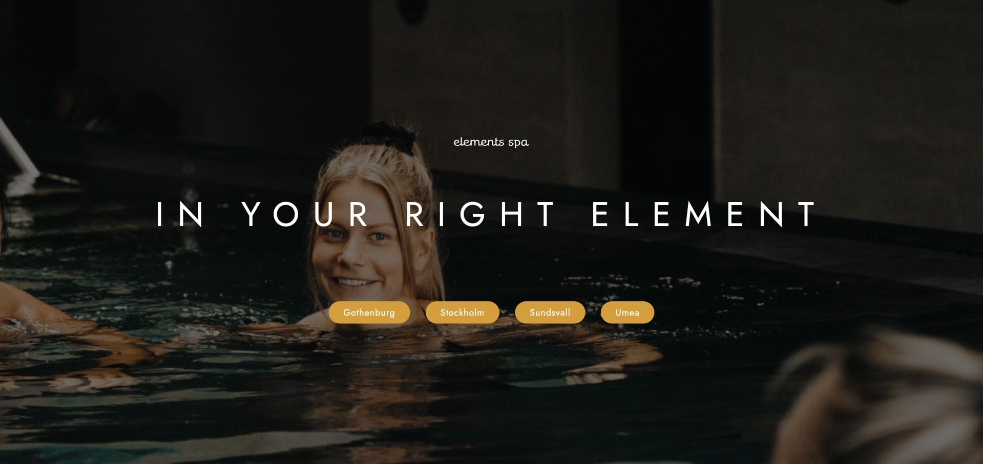
Elements Spa’s reviewed entry page uses a dark pool photograph, a short centered headline and four city buttons. It is a location gateway rather than a complete treatment homepage. The sparse composition makes the required next step clear without asking visitors to interpret a large shared service catalog. Its limitation is equally clear: the page itself provides little written explanation of treatment availability, prices or visit rules. Those details must be supplied reliably by the chosen destination rather than assumed to be identical across the group.
What you can learn
A city gateway can be deliberately short when geography is the first necessary decision. Preserve the selected city through the next page and booking route, and do not imply that every location has the same offer.
Pros
Four city choices make the geographic decision explicit.
The minimal layout avoids an undifferentiated group-wide treatment menu.
Cons & considerations
The gateway provides little direct service or price information.
Visitors must continue to establish each property’s appointment and access rules.
Platform source: WordPress.org Showcase. Linked script matches WPML. Exact public source-page sample: https://elementsspa.co/. This identifies a public WPML reference or response association, not private configuration, complete architecture, measured performance or successful data collection. Platform evidence is separate from the direct website screenshot and is not a complete current infrastructure audit.
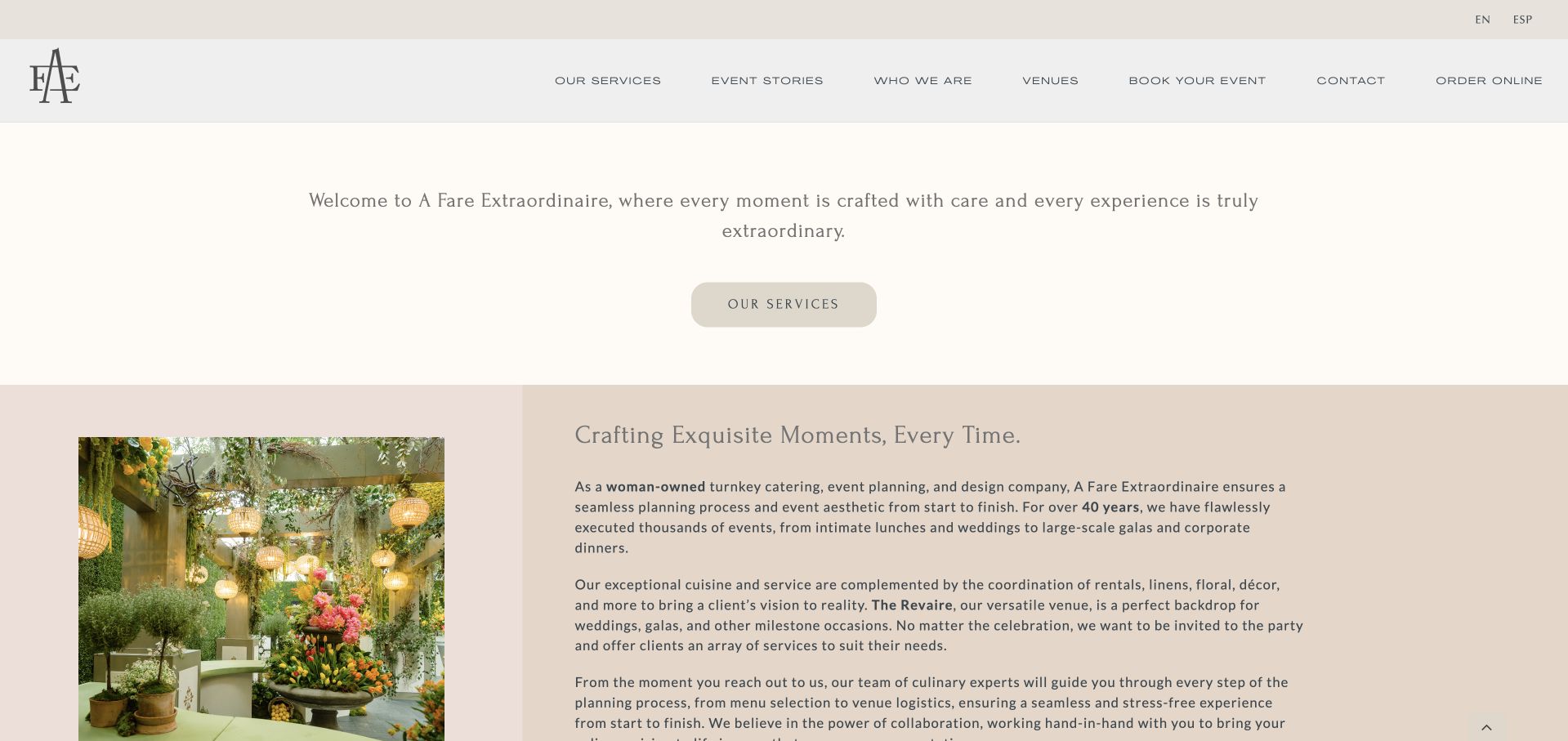
A Fare Extraordinaire provides English and Spanish navigation and names services, event stories, venues, booking, contact and online ordering in its menu. Its introduction explains catering, planning, design, rentals, linens and floral coordination as a connected offer. A restrained cream-and-taupe presentation gives the hospitality imagery room without turning every service into a separate campaign. The Houston address and direct contact details provide a practical anchor. The design is useful for studying how a bilingual service business can explain a combined planning responsibility before a visitor chooses between an enquiry and a more transactional ordering route.
What you can learn
Explain what turnkey actually includes instead of leaving visitors to interpret the phrase. Support an image-led brand with a short, concrete account of the event elements the team can coordinate. Keep the Spanish journey equivalent through service explanations and the ordering handoff, particularly when catering, rentals and floral coordination are presented as one combined planning offer.
Pros
The service explanation names concrete event elements.
English and Spanish routes are visible.
Cons & considerations
The opening transition can delay useful content.
Several different booking and ordering destinations need clear expectations.
Platform source: WordPress.org Showcase. Linked stylesheet matches WPML. Exact public source-page sample: https://afehouston.com/. This identifies a public WPML reference or response association, not private configuration, complete architecture, measured performance or successful data collection. Platform evidence is separate from the direct website screenshot and is not a complete current infrastructure audit.
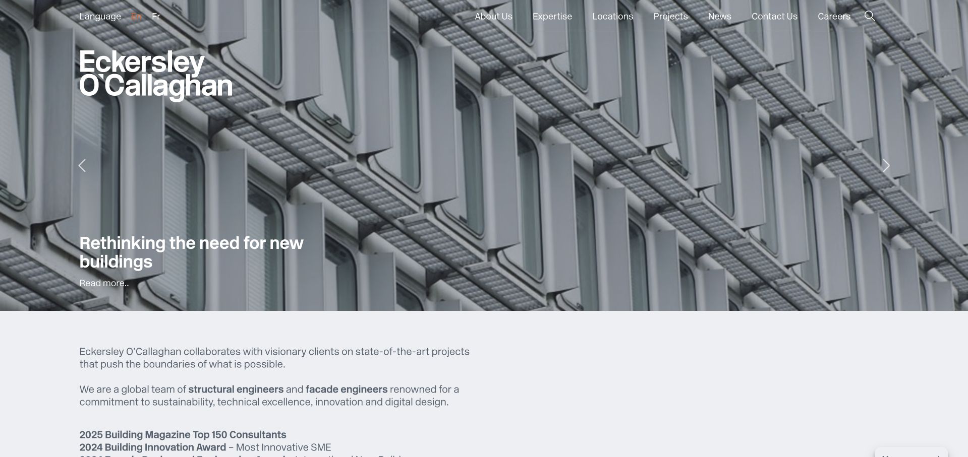
Eckersley O’Callaghan pairs large project imagery with an explicit written introduction beneath the hero. White typography overlays a detailed building photograph, while expertise, projects, locations and news remain distinct header destinations. For professional audiences, the work can inspire while discipline and location help qualify an enquiry. Linked structural and façade terminology bridges the photograph and the service catalogue. The changing feature can alter what a new visitor learns first, so individual project context and responsibility still need to be explained beyond awards or dramatic imagery.
What you can learn
Let the hero tell one project story and use the next section to name the actual engineering disciplines. Connect those discipline terms directly to service pages, and keep credits explicit when a project involves many designers and consultants.
Pros
Expertise, project and location navigation supports different professional research journeys without requiring a generic contact first.
The introductory text links architectural imagery back to identifiable structural and façade services.
Cons & considerations
A rotating feature can make the first message inconsistent between visits and harder to reference.
Prominent awards or project claims still require supporting context about dates, roles and the specific work recognised.
Platform source: WordPress.org Showcase. Linked script matches WPML. Exact public source-page sample: https://www.eocengineers.com/. This identifies a public WPML reference or response association, not private configuration, complete architecture, measured performance or successful data collection. Platform evidence is separate from the direct website screenshot and is not a complete current infrastructure audit.
Kegan has 15+ years of experience working with small businesses, Fortune 500 companies, and everything in between. No development job is too big or too small: he brings the same hands-on attention to a focused improvement, a complete website, or a custom application.
For WPML projects, he can help with multilingual WordPress structure, language navigation, translation-review workflows, form and content completeness, migration planning, and editor-friendly handover. He works directly with clients on scope, design, implementation, testing, and handover, with an emphasis on clear communication and a system that remains practical to maintain after launch.
Show 3 other WPML developersHide other WPML developers
Choose a translation workflow the team can actually maintain
A curated set of complete language journeys
Start with the pages needed to make a meaningful decision, then complete those routes. An intentionally limited language edition is easier to explain than a large directory with translated labels and missing detail pages.
Machine assistance with named human review
If automatic translation is used, define which material needs specialist checking and what may publish only after approval. Product names, addresses, financial terms and accessibility information deserve specific handling rather than a generic “translated” status.
Separate regional editions when the offer genuinely differs
Keep shared brand material connected while allowing verified regional pricing, contacts and service constraints. Document which fields are shared, translated or locally overridden so that an update does not overwrite a legitimate difference.
From references to requirements
Plan multilingual content before multiplying templates
Inventory more than pages
Include navigation, forms, error messages, emails, PDFs, image text and external booking destinations. Mark every item with an owner and a completeness state. Test a language with longer labels so the layout is not dependent on unusually short English copy.
Design missing and outdated states
Explain what happens when an equivalent page does not exist. Preserve context when returning to the main edition. Changes to practical information need a visible review queue; a translated page should not silently retain a superseded date or service promise.
Validate discoverability and handoff
Review canonical and language-alternate implementation with the developer, then test actual public destinations. Keep a redirect record when language paths change. Ask editors to publish and revise one representative item in each supported workflow before accepting the handover.
A useful handover demonstration
Ask the actual team to carry out its routine job: publish a realistic update, correct a mistake, preview a narrow screen, and identify who owns an integration failure. For a library or frontend framework, also ask who maintains the content source and deployment. A polished screenshot does not answer those operational questions.
Beyond the screenshot
Multilingual WordPress launch checklist
Name the supported languages and relevant regional scope.
Assign a source editor, translator and approver.
Map complete service, enquiry and confirmation journeys.
Check navigation, validation messages, documents and email templates.
Test long labels, right-to-left needs and text enlargement where relevant.
Protect names, addresses, units and specialist terminology.
Review public language URLs, alternates and redirects.
Rehearse a source change and its translation-review process.
Test with real content, a keyboard, a small screen, slow or failed requests, and the people who will maintain the system. These are planning checks, not an accessibility, security, performance, or search-ranking certification.
Sources & editorial method
How this WPML collection was reviewed
Every example has a genuine direct source capture and a dated WPML reference from the reviewed public page. Reused captures keep their original dates, views and translation caveats. Component references do not prove current translation coverage, editorial quality, licensing, every plugin or the technology of related applications.
Every image is an unmodified capture from the actual website, with its source and capture date. Some captures are reused from our shared catalog; their dates remain the original capture dates. None comes from a vendor gallery or a generated reconstruction. Moving imagery and live content can change.
Technology attribution uses public page assets or metadata, official platform documentation, or a cited first-party project case study. Documentary and framework-relationship evidence is identified where used; it is not a complete current backend inventory. A CMS image CDN alone does not establish a full CMS deployment. A library’s presence does not prove which individual controls use it, and a platform label does not establish AI authorship.
The composition notes, lessons, pros and tradeoffs are original editorial observations. We have not measured conversion, traffic, security, performance or accessibility conformance. Website owners retain their brands and imagery; these examples are not our client portfolio. Written, Edited and Curated are independent records, not dates advanced by a build. See our editorial standards or suggest a correction.
Questions worth asking
WPML website development FAQs
Does a WPML reference prove the whole site is translated?
No. It identifies a public component association. Coverage, accuracy and downstream forms require separate review.
Is a browser-translated screenshot evidence of WPML output?
No. Browser translation and the website’s own language editions are different mechanisms. The reviews preserve that distinction.
Should every page exist in every language?
Decide the useful scope with the people maintaining it. Visitors need honest coverage and complete relevant journeys, not a promise the team cannot sustain.
Does adding WPML guarantee international search visibility?
No. Content relevance, accessible language routes, technical implementation and ongoing maintenance still require work; no ranking outcome is promised.