Akamai website examples and mPulse measurement planning (20 Real-World Examples)
Twenty public properties with exact mPulse loader references, genuine screenshots and practical lessons for measuring useful visitor journeys.
A monitoring snippet is an association, not a performance result. These examples connect visible website tasks with precisely scoped Akamai mPulse evidence while keeping private configuration and delivery architecture unknown.
Akamai’s mPulse documentation explains that it uses the Boomerang library to collect browser performance information. Its documented resource domains include s.go-mpulse.net, which appears in the sampled public loader code for this collection. That gives a specific product association rather than a guess based on a brand name in a policy document.
The examples begin with Nike, Mazda, Walgreens, Mailchimp’s marketing site and Nationwide, then cover industrial, editorial and public-service properties. Each review starts from a genuine captured design and asks what a comparable project should distinguish in its measurement plan. No result is claimed for the named organization, and no private dashboard was accessed.
Before the examples
What makes good Akamai website development in 2026?
Name the observed product, not the whole architecture
Akamai documents mPulse installation even when Akamai does not deliver a site’s traffic. An mPulse loader therefore cannot establish CDN delivery, origin hosting or the configuration of every branded service. Keep the monitoring association separate from infrastructure claims in both technical inventories and public case studies.
Define what a visitor came to do before deciding how to group observations. Shopping, support, billing and editorial browsing can share a homepage while needing different performance expectations. Use the examples as prompts for your own journey map rather than copying an assumed conversion funnel from their visual appearance.
Akamai documents that browser privacy features and extensions may block mPulse resources or beacons. Missing telemetry is not evidence that a visitor had no problem, and blocked monitoring should not prevent ordinary navigation. Test the public experience with optional measurement unavailable instead of trying to defeat the visitor’s choice.
All twenty associations are explicit mPulse/Boomerang loader references in previously observed public source. The collection does not mix those signals with generic Akamai keywords, CSP allowances or unverified hosting claims.
We start with five recognizable brands or organizations: Nike storefront, Mazda USA, Walgreens, Intuit Mailchimp marketing website, Nationwide. Each attribution applies to the named website property, not every product or website belonging to its organization. This is a curated reading sequence, not a measured ranking.
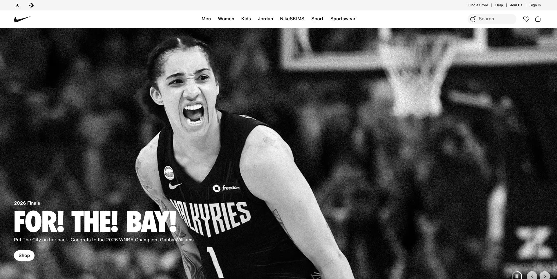
Nike places a monochrome sports campaign below a dense but predictable commerce header. The small shopping pill sits beside condensed white copy, while search and bag remain in the stable upper frame. This makes the page useful for separating campaign presentation from recurring retail tasks when planning browser measurement.
What you can learn
For a comparable storefront, define separate measurement groups for campaign browsing, category navigation and cart entry. Compare those paths on representative devices rather than assuming a striking first image predicts the shopping experience. The public mPulse loader identifies a monitoring association; it does not show what Nike measures, which visitors are sampled or whether Akamai delivers the storefront.
Pros
The solid header protects important commerce controls from photographic contrast changes.
The shopping action is placed directly beside the campaign explanation.
Cons & considerations
A full-height campaign delays specific products until the next section.
An autoplay carousel needs understandable pause controls and a practical nonmoving alternative.
Platform source: Public mPulse loader source. Public page source observed 2026-11-03 contains a script loader for https://s.go-mpulse.net/boomerang/, documented by Akamai as an mPulse/Boomerang resource. This establishes the monitoring-snippet association, not execution for every visitor, monitoring settings or Akamai CDN delivery. Platform evidence is separate from the direct website screenshot and is not a complete current infrastructure audit.
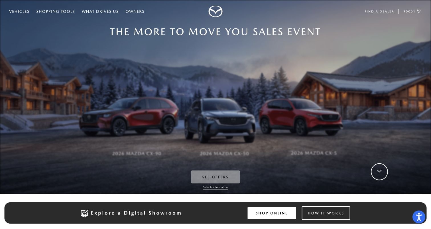
Mazda combines a mountain setting and several vehicles with a seasonal sales headline. A dark digital-showroom strip follows the campaign, while shopping and ownership routes remain above it. The design distinguishes exploration from a practical buying journey, which is more useful for measurement planning than treating every homepage interaction as one conversion.
What you can learn
A useful vehicle-site brief would distinguish showroom exploration from model detail and owner support. Decide which transitions matter before comparing load observations across the whole site. Keep the seasonal campaign replaceable without obscuring durable model routes. The observed mPulse snippet does not establish the configuration of a dealer handoff or prove that every vehicle tool uses the same infrastructure.
Pros
The large image communicates vehicle context without a lengthy introductory paragraph.
Shopping and owner destinations remain identifiable above the changing campaign content.
Cons & considerations
Small white navigation can compete with lighter areas of an active photographic background.
The seasonal message gives limited immediate detail for someone comparing individual models.
Platform source: Public mPulse loader source. Public page source observed 2026-11-03 contains a script loader for https://s.go-mpulse.net/boomerang/, documented by Akamai as an mPulse/Boomerang resource. This establishes the monitoring-snippet association, not execution for every visitor, monitoring settings or Akamai CDN delivery. Platform evidence is separate from the direct website screenshot and is not a complete current infrastructure audit.
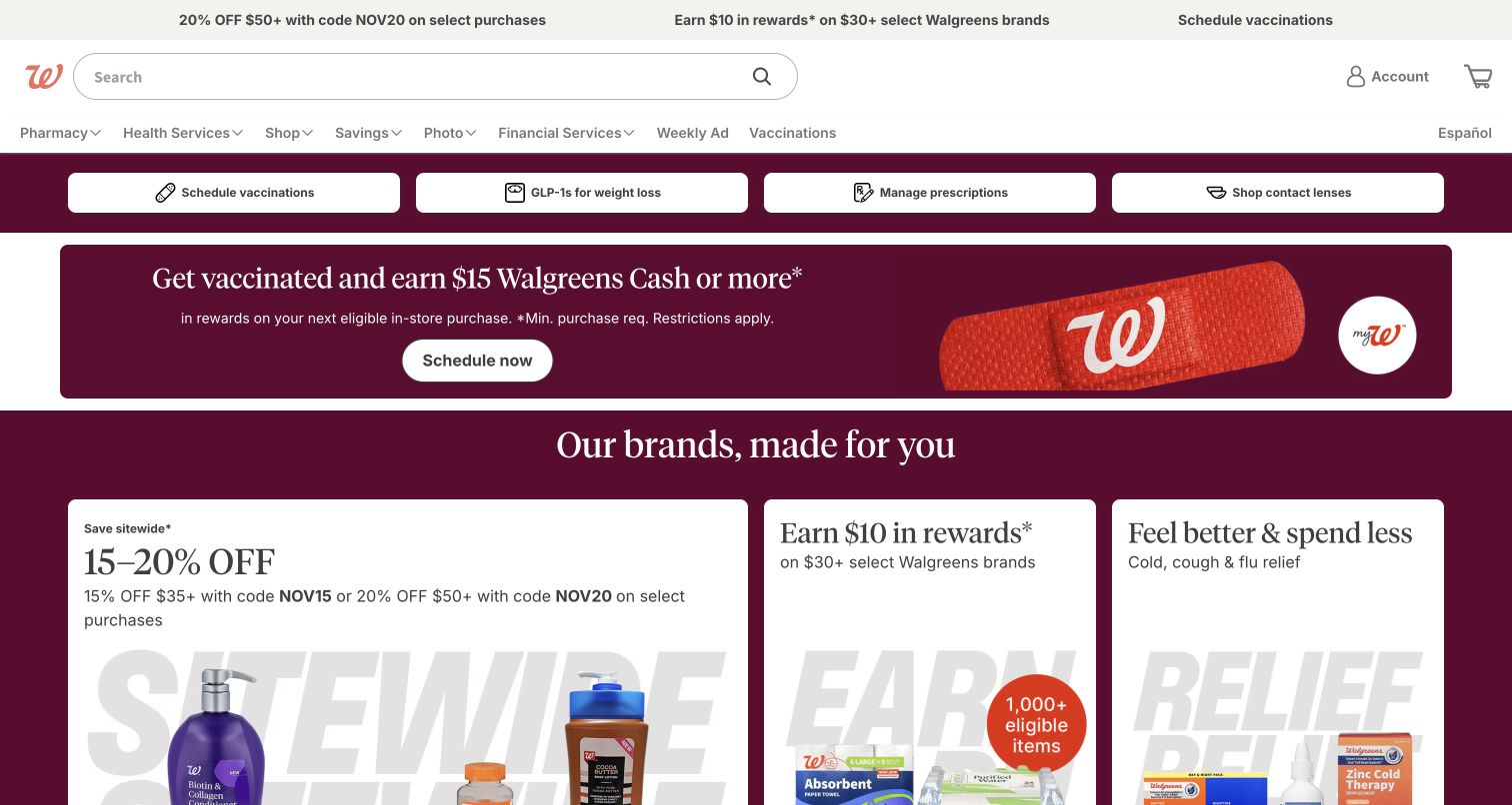
Walgreens gives search substantial width above a dense combination of pharmacy shortcuts and retail promotions. Large burgundy campaign panels sit below practical task buttons for prescriptions and appointments. The captured interface illustrates several visitor intentions sharing one page, making a single aggregated performance impression an inadequate description of the whole experience.
What you can learn
Treat recurring service shortcuts separately from promotional shopping in your own measurement plan. Preserve ordinary navigation if an optional monitoring resource is blocked, and avoid collecting prescription or appointment details into generic event labels. The source evidence establishes a public mPulse loader, not access to pharmacy systems, private customer information or the service’s actual monitoring reports.
Pros
The wide search input remains easy to locate above a busy promotional area.
Practical task buttons provide alternatives for visitors who already know the service they need.
Cons & considerations
Several service and retail intentions compete within one dense header and opening viewport.
Campaign prominence can push everyday product discovery farther down the page on shorter screens.
Platform source: Public mPulse loader source. Public page source observed 2026-11-03 contains a script loader for https://s.go-mpulse.net/boomerang/, documented by Akamai as an mPulse/Boomerang resource. This establishes the monitoring-snippet association, not execution for every visitor, monitoring settings or Akamai CDN delivery. Platform evidence is separate from the direct website screenshot and is not a complete current infrastructure audit.
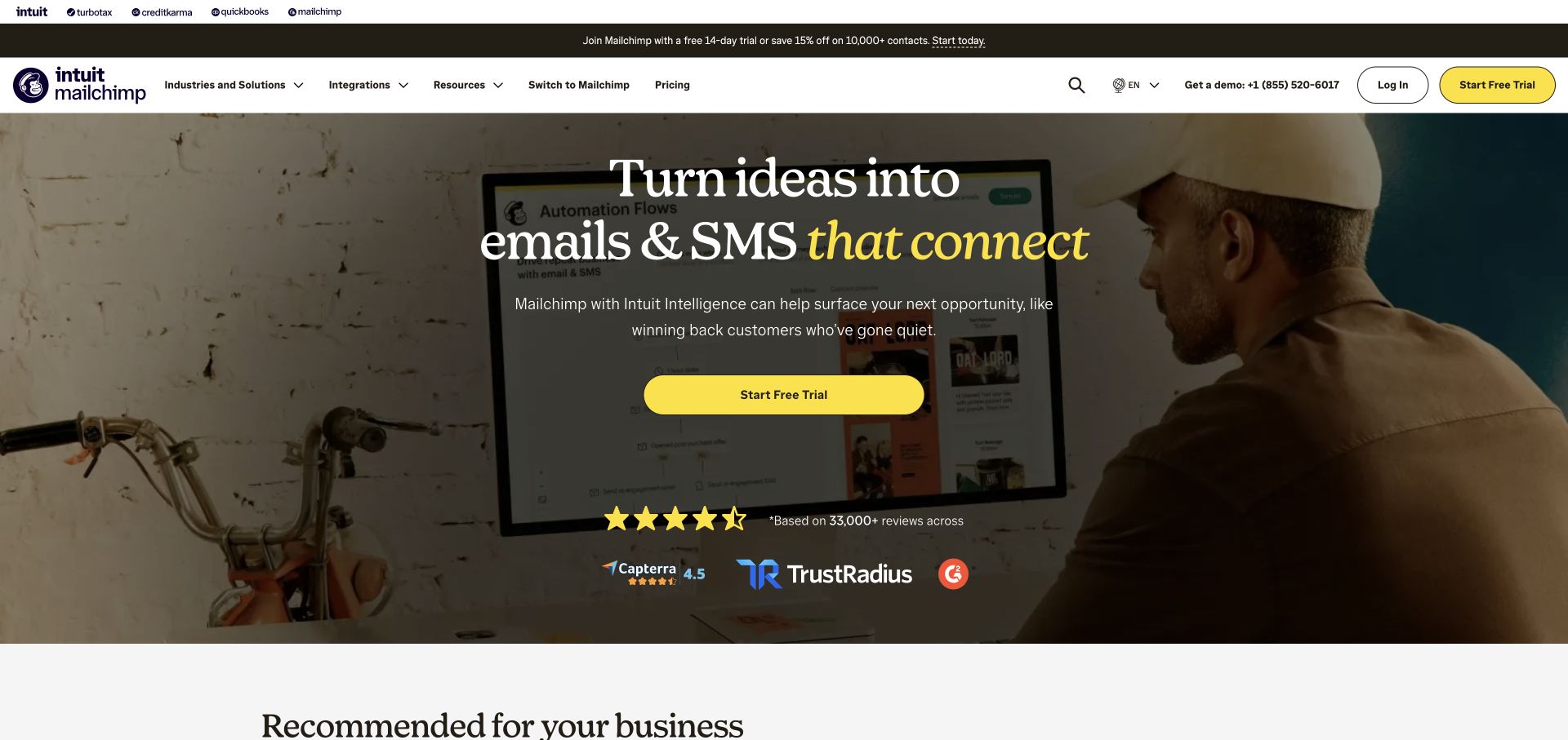
Mailchimp pairs a photographic marketing scene with a large email-and-SMS proposition and a conspicuous yellow trial button. Navigation includes broader product and business routes above the campaign. The page gives a clear acquisition path, but the trial invitation, pricing research and educational browsing remain different tasks with different expectations.
What you can learn
Segment a comparable software journey into trial discovery, pricing evaluation and learning rather than measuring only the yellow button. Keep marketing claims and rating content separately maintained so a campaign refresh does not invalidate the page’s informational purpose. The public loader cannot reveal Mailchimp’s conversion definitions, sampling choices or authenticated product performance, and those should not be inferred from the visible design.
Pros
The yellow trial button has a clear visual priority within a detailed photographic opening.
Integration and switching routes acknowledge visitors who already have a specific buying question.
Cons & considerations
Several header layers take substantial space before the introductory message.
Ratings and promotional terms need current source and review metadata, not permanent copy embedded in artwork.
Platform source: Public mPulse loader source. Public page source observed 2026-11-03 contains a script loader for https://s.go-mpulse.net/boomerang/, documented by Akamai as an mPulse/Boomerang resource. This establishes the monitoring-snippet association, not execution for every visitor, monitoring settings or Akamai CDN delivery. Platform evidence is separate from the direct website screenshot and is not a complete current infrastructure audit.
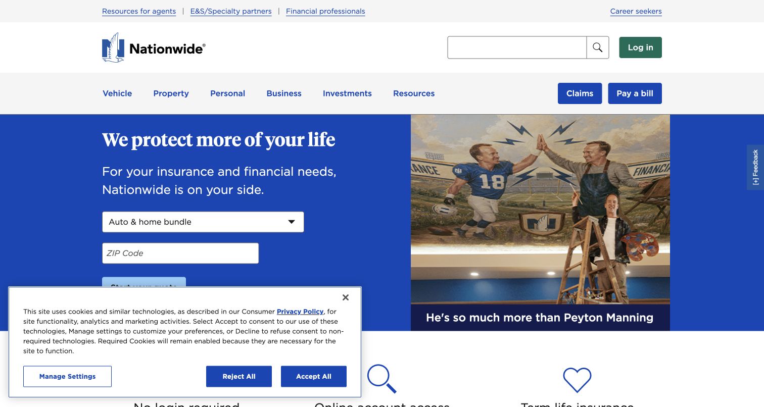
Nationwide places a quote-oriented panel beside a campaign photograph, with product-family navigation and account utilities above. A visible consent panel occupies part of the lower opening. Returning account users and prospective policy shoppers therefore share the same frame without necessarily sharing the same task or tolerance for promotional interruption.
What you can learn
Keep quotation research, claims navigation and returning-account access distinct in a comparable insurance project. Consent states also deserve an explicit test case because they affect both screen space and optional measurement. Use generic journey labels instead of recording entered personal details. Nothing in the public mPulse reference establishes the insurer’s privacy configuration or the operation of its private account systems.
Pros
The no-login label helps users understand the boundary of the quick-task menu.
Insurance, financial products and professional audiences are identified through separate navigation routes.
Cons & considerations
A dropdown hides alternatives until it is opened, making visible labeling particularly important.
The broad insurance-and-investments offering requires careful explanation so visitors do not confuse different product categories.
Platform source: Public mPulse loader source. Public page source observed 2026-11-03 contains a script loader for https://s.go-mpulse.net/boomerang/, documented by Akamai as an mPulse/Boomerang resource. This establishes the monitoring-snippet association, not execution for every visitor, monitoring settings or Akamai CDN delivery. Platform evidence is separate from the direct website screenshot and is not a complete current infrastructure audit.
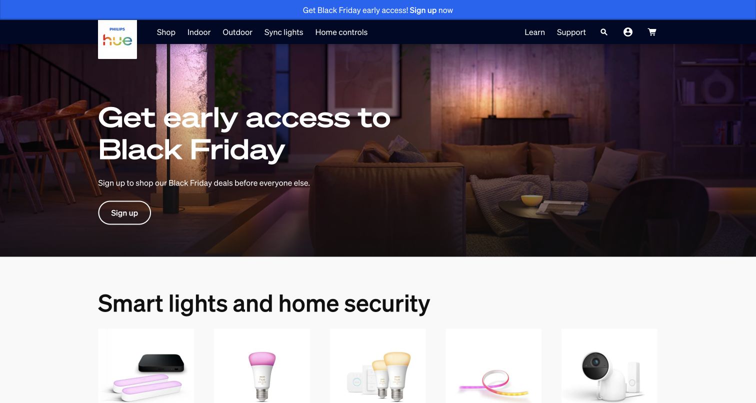
Philips Hue uses a dark, atmospheric room scene for a seasonal signup campaign, followed by recognizable lighting-product categories. A blue announcement strip adds another promotional layer above the navigation. The visual story explains a connected-home experience, while the categories provide a more direct route for people who already know what they need.
What you can learn
The seasonal signup and ordinary product categories need different success criteria in a comparable store. Check that a blocked optional monitor does not interfere with category browsing or the signup destination. Evaluate the photographic crop and text contrast independently of telemetry. The loader is evidence of an Akamai mPulse integration reference, not proof of device-control infrastructure or connected-product reliability.
Pros
The room image explains the experience of the products before asking visitors to compare individual items.
Persistent category navigation offers a route around the seasonal campaign for shoppers with a known need.
Cons & considerations
Promotional announcements and the hero can compete for attention at the top of the page.
Text placed over atmospheric photography needs crop-specific contrast checks, especially on narrow screens.
Platform source: Public mPulse loader source. Public page source observed 2026-11-03 contains a script loader for https://s.go-mpulse.net/boomerang/, documented by Akamai as an mPulse/Boomerang resource. This establishes the monitoring-snippet association, not execution for every visitor, monitoring settings or Akamai CDN delivery. Platform evidence is separate from the direct website screenshot and is not a complete current infrastructure audit.
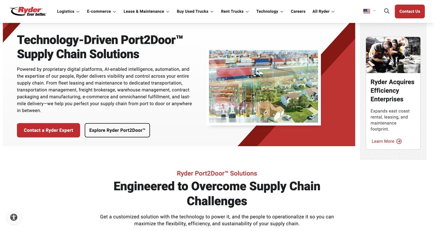
Ryder pairs a supply-chain proposition with port imagery, two distinct actions and a separate corporate-news card. The broad navigation spans logistics, commerce and vehicle-related services. Its dense but structured opening suggests several business journeys that should remain distinguishable when measuring a large corporate marketing property.
What you can learn
Plan separate reporting groups for supply-chain exploration, direct contact and vehicle-service research. A corporate news card can attract attention without indicating commercial intent, so avoid interpreting every click as progress toward one funnel. The public source shows a mPulse snippet but does not disclose whether these distinctions exist in Ryder’s dashboards or how its operational platforms are hosted.
Pros
Port imagery provides an immediate physical reference for the broad supply-chain proposition.
Separate actions distinguish a direct commercial conversation from further exploration of the offering.
Cons & considerations
The news rail, large headline and navigation create several competing points of attention.
The expansive introductory claim requires deeper pages to clarify service scope and geographic coverage.
Platform source: Public mPulse loader source. Public page source observed 2026-11-03 contains a script loader for https://s.go-mpulse.net/boomerang/, documented by Akamai as an mPulse/Boomerang resource. This establishes the monitoring-snippet association, not execution for every visitor, monitoring settings or Akamai CDN delivery. Platform evidence is separate from the direct website screenshot and is not a complete current infrastructure audit.
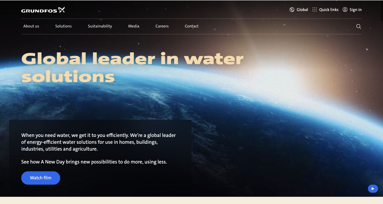
Grundfos opens with a cinematic view of Earth, a broad water-solutions headline and a compact explanatory panel. A watch-film action offers deeper storytelling while corporate and solution routes remain in the header. The page is an effective reminder that a brand narrative and a specific product inquiry are not equivalent journeys.
What you can learn
For an industrial site, separate visitors watching the corporate film from those trying to locate a pump or solution category. An unavailable media asset should not remove the practical product route. Measure the tasks that matter in your own implementation, then retain readable static content. The observed monitor does not identify private engineering tools or demonstrate that the cinematic introduction performs well.
Pros
The headline and supporting panel explain the company’s broad role without requiring technical product knowledge.
Corporate and solution destinations remain available above the large visual statement.
Cons & considerations
The cinematic opening postpones specific product selection until visitors use navigation or continue down the page.
Background media adds states that need deliberate fallbacks and contrast review rather than only a polished poster.
Platform source: Public mPulse loader source. Public page source observed 2026-11-03 contains a script loader for https://s.go-mpulse.net/boomerang/, documented by Akamai as an mPulse/Boomerang resource. This establishes the monitoring-snippet association, not execution for every visitor, monitoring settings or Akamai CDN delivery. Platform evidence is separate from the direct website screenshot and is not a complete current infrastructure audit.
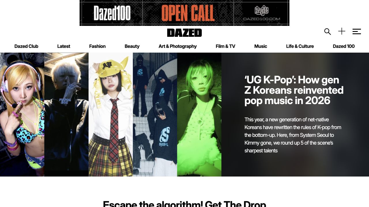
Dazed combines a prominent cultural feature with several portraits and a substantial text panel. Category navigation and an open-call banner occupy the space above the editorial image. The resulting magazine-like composition makes story discovery immediate, while recurring editorial subjects offer paths beyond whichever feature currently dominates the homepage.
What you can learn
Compare direct article arrivals with homepage browsing before making decisions about the large feature panel. Long headlines and different portrait crops deserve their own layout checks, especially when editorial campaigns change quickly. Monitoring should complement that editorial review rather than replace it, including the way a feature is presented in the archive. The public loader supplies no access to Dazed’s audience segments, subscriber data or actual story-engagement results.
Pros
The feature combines photography with enough copy to explain the story.
Recurring subjects provide a stable structure around changing cultural material.
Cons & considerations
Oversized feature art makes a few editorial choices dominate the opening.
Long headlines and complex image crops require deliberate small-screen treatments.
Platform source: Public mPulse loader source. Public page source observed 2026-11-03 contains a script loader for https://s.go-mpulse.net/boomerang/, documented by Akamai as an mPulse/Boomerang resource. This establishes the monitoring-snippet association, not execution for every visitor, monitoring settings or Akamai CDN delivery. Platform evidence is separate from the direct website screenshot and is not a complete current infrastructure audit.
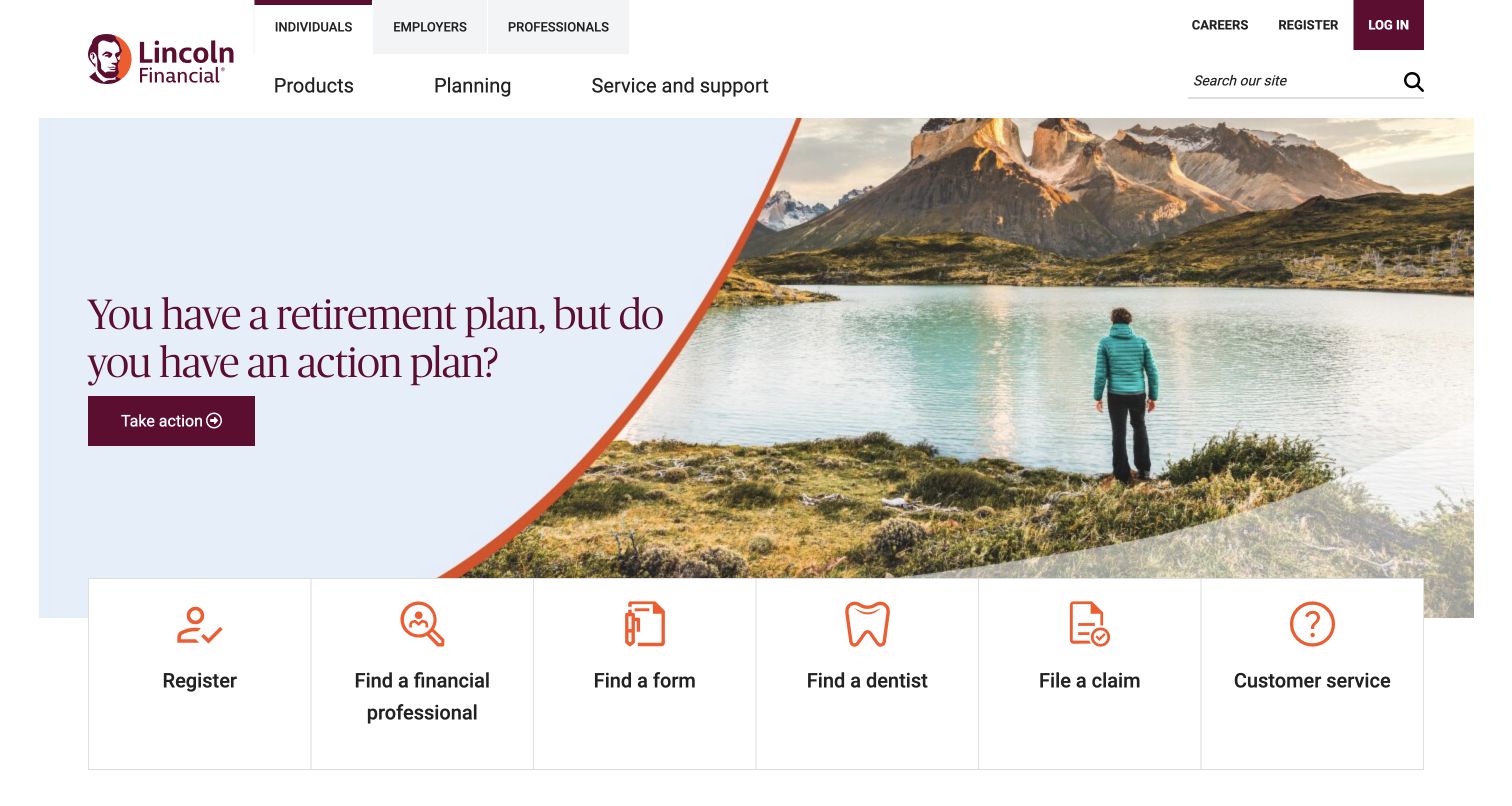
Lincoln Financial places a retirement-planning question beside a landscape photograph, then exposes a row of practical service actions. Audience tabs distinguish individuals, employers and professionals. The campaign can attract attention without replacing account, claim and support tasks, making audience context essential to any interpretation of the page’s behavior.
What you can learn
A retirement campaign is not the same task as filing a claim or finding a form. In your own project, establish separate journey groups and ensure service shortcuts remain available when optional scripts are unavailable. Do not record sensitive entered information in measurement names. The sampled mPulse reference cannot verify the organization’s internal privacy controls or the performance of its authenticated services.
Pros
The individual, employer and professional routes clarify major audience boundaries in the header.
The service-task row exposes useful destinations beneath the campaign rather than requiring a deep menu search.
Cons & considerations
The opening retirement theme may be less relevant to visitors arriving for a specific insurance claim.
Several financial product categories require careful contextual explanation beyond what the homepage can reasonably provide.
Platform source: Public mPulse loader source. Public page source observed 2026-11-03 contains a script loader for https://s.go-mpulse.net/boomerang/, documented by Akamai as an mPulse/Boomerang resource. This establishes the monitoring-snippet association, not execution for every visitor, monitoring settings or Akamai CDN delivery. Platform evidence is separate from the direct website screenshot and is not a complete current infrastructure audit.
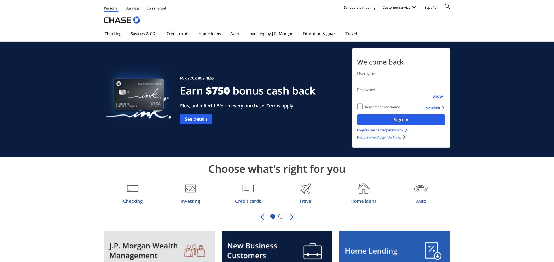
Chase places a white sign-in panel beside a navy promotional campaign, with a row of product icons below. Multiple navigation layers distinguish audiences and services. The visual separation is useful: the person returning to an account and the person comparing a new product should not be treated as the same acquisition journey.
What you can learn
Keep returning-user access separate from acquisition analysis in a comparable banking interface. Test the public navigation without entering credentials or submitting financial forms, and avoid including account information in analytics payloads. The presence of the mPulse loader does not establish how Chase classifies those journeys, which consent conditions apply or whether the visible sign-in destination shares the same delivery configuration.
Pros
The white access panel remains visually distinct against the navy campaign background.
The product icon row creates a useful second route for visitors ignoring the current promotion.
Cons & considerations
Multiple navigation layers demand careful prioritization when space becomes limited.
The large campaign can delay broader comparison information for visitors still deciding which product category fits.
Platform source: Public mPulse loader source. Public page source observed 2026-11-03 contains a script loader for https://s.go-mpulse.net/boomerang/, documented by Akamai as an mPulse/Boomerang resource. This establishes the monitoring-snippet association, not execution for every visitor, monitoring settings or Akamai CDN delivery. Platform evidence is separate from the direct website screenshot and is not a complete current infrastructure audit.
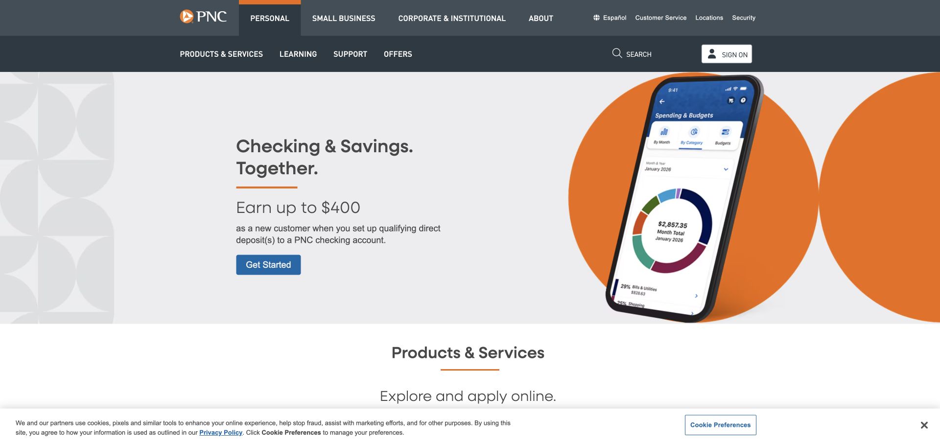
PNC uses a phone illustration and orange shapes to explain a checking-and-savings proposition against a mostly neutral background. Audience and product navigation occupy separate rows above. The design makes the campaign easy to read, but a product comparison still requires more context than the device image and headline can supply.
What you can learn
For a comparable financial-product page, distinguish campaign engagement from a meaningful product comparison. Inspect how the phone illustration and qualification copy behave on narrow screens before drawing conclusions from event counts. Keep public-page measurement independent of private account details. The source observation identifies a loader association only, not the bank’s monitoring settings, customer outcomes or complete hosting architecture.
Pros
Orange actions contrast clearly with the largely neutral page composition.
The phone and copy occupy distinct areas, giving the eye a straightforward reading order.
Cons & considerations
A large device image consumes room that could otherwise show account comparisons.
Two navigation rows require visitors to distinguish audience selection from product exploration.
Platform source: Public mPulse loader source. Public page source observed 2026-11-03 contains a script loader for https://s.go-mpulse.net/boomerang/, documented by Akamai as an mPulse/Boomerang resource. This establishes the monitoring-snippet association, not execution for every visitor, monitoring settings or Akamai CDN delivery. Platform evidence is separate from the direct website screenshot and is not a complete current infrastructure audit.
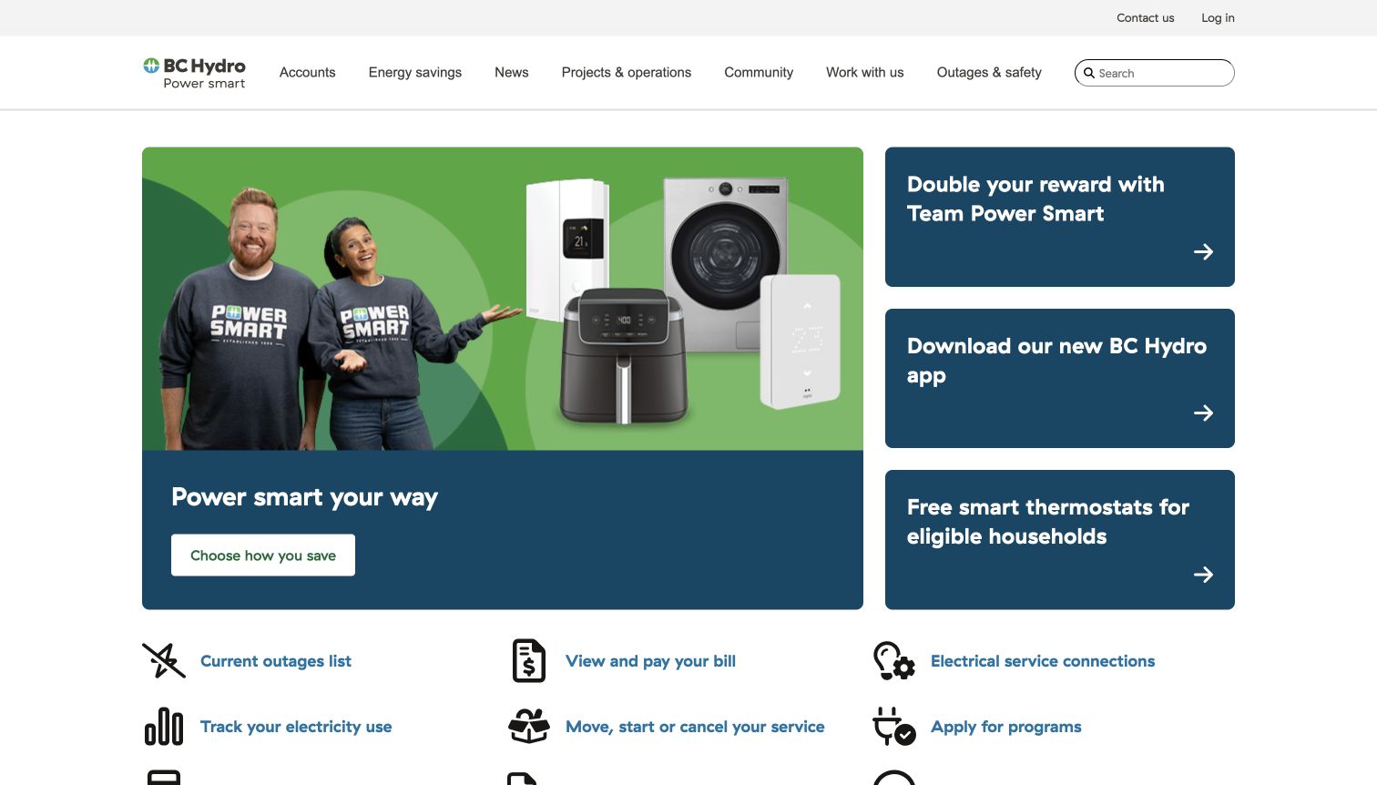
BC Hydro leads with a bright energy-saving campaign and three smaller program cards, followed by recognizable account and service shortcuts. The captured composition balances participation with practical utility tasks. A person exploring a rebate and someone checking an outage can therefore enter through the same homepage with very different urgency.
What you can learn
An outage-related visitor should not be evaluated against the same expectations as someone exploring an efficiency program. Define those paths separately and preserve service shortcuts when optional telemetry is blocked. Use a controlled test to check the public route without submitting account actions. The mPulse association does not reveal utility operations, outage accuracy or whether any particular campaign improves participation.
Pros
A consistent icon row gathers several recurring account and service tasks.
Different card sizes distinguish the main campaign from supporting programs.
Cons & considerations
The promotional opening can delay the route to an urgent practical action.
Several savings offers need careful labels so customers can distinguish their purposes.
Platform source: Public mPulse loader source. Public page source observed 2026-11-05 contains a script loader for https://s.go-mpulse.net/boomerang/, documented by Akamai as an mPulse/Boomerang resource. This establishes the monitoring-snippet association, not execution for every visitor, monitoring settings or Akamai CDN delivery. Platform evidence is separate from the direct website screenshot and is not a complete current infrastructure audit.
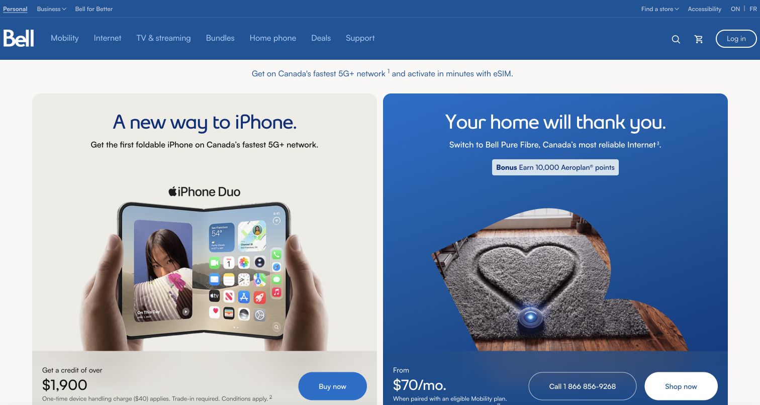
Bell presents mobile and home-internet offers in adjacent cards under a blue service header. Product imagery, monthly pricing and small qualification text establish distinct commercial propositions. The regional context above matters because an attractive headline is only useful when the offer and its conditions apply to the visitor’s actual service area.
What you can learn
In a comparable telecom storefront, separate mobile, internet and returning-customer routes, and include regional selection in the functional test plan. A visually prominent monthly amount cannot replace clear conditions. Keep analytics labels free of customer-entered details. The public snippet does not prove how Bell segments regions, whether a visitor was measured or which network delivers its account and purchasing systems.
Pros
The current province is visible and has a direct change route.
Mobile and home-internet offers keep separate images, conditions and actions.
Cons & considerations
The tall product cards limit the number of service choices visible at once.
Dense qualification text remains visually smaller than the headline device and monthly-price messaging.
Visible tech stack
Earlier / documented evidence
Akamai
Platform source: Public mPulse loader source. Public page source observed 2026-11-05 contains a script loader for https://s.go-mpulse.net/boomerang/, documented by Akamai as an mPulse/Boomerang resource. This establishes the monitoring-snippet association, not execution for every visitor, monitoring settings or Akamai CDN delivery. Platform evidence is separate from the direct website screenshot and is not a complete current infrastructure audit.
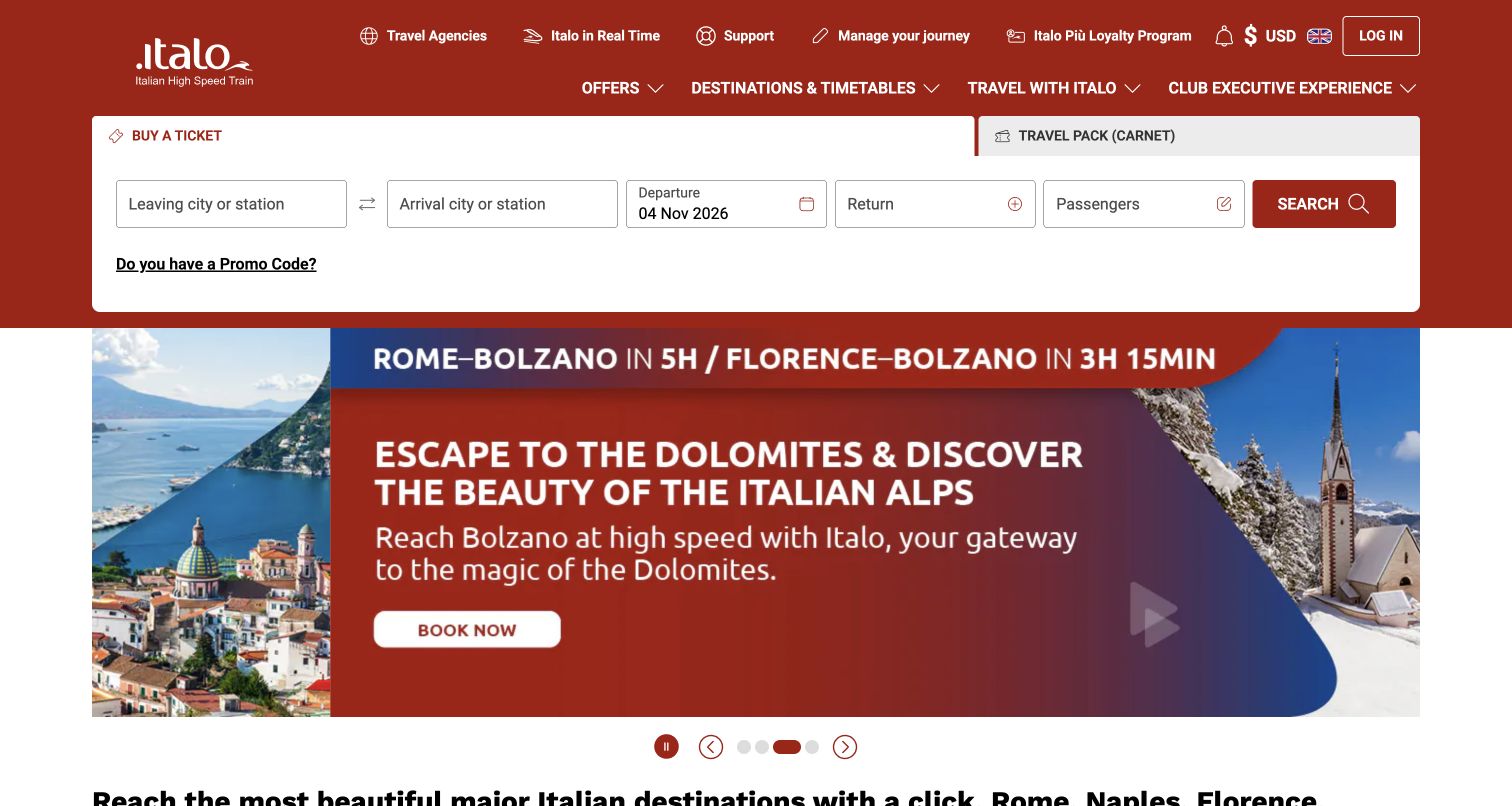
Italo keeps a white ticket-search strip above a colorful destination campaign. Departure, arrival and date fields are visually separate from inspirational imagery, while journey-management utilities remain in the header. This gives the page a clear distinction between planning travel, searching a specific trip and managing an existing booking. The search label accepts a city or station, reducing the station knowledge needed to begin comparing journeys.
What you can learn
Distinguish route search from destination inspiration and post-purchase management in your own travel measurement plan. Preserve entered public search context during ordinary navigation, but do not submit real bookings as a test. The sampled loader does not reveal passenger data, successful reservation performance or the rail operator’s monitoring configuration; those remain outside the evidence provided by this public page.
Pros
The form explicitly allows a city or station as an entry concept.
Real-time and manage-journey routes remain in the utility navigation.
Cons & considerations
Promotions and premium-service links create a busy header.
Destination inspiration must not obscure the exact station ultimately selected.
Platform source: Public mPulse loader source. Public page source observed 2026-11-05 contains a script loader for https://s.go-mpulse.net/boomerang/, documented by Akamai as an mPulse/Boomerang resource. This establishes the monitoring-snippet association, not execution for every visitor, monitoring settings or Akamai CDN delivery. Platform evidence is separate from the direct website screenshot and is not a complete current infrastructure audit.
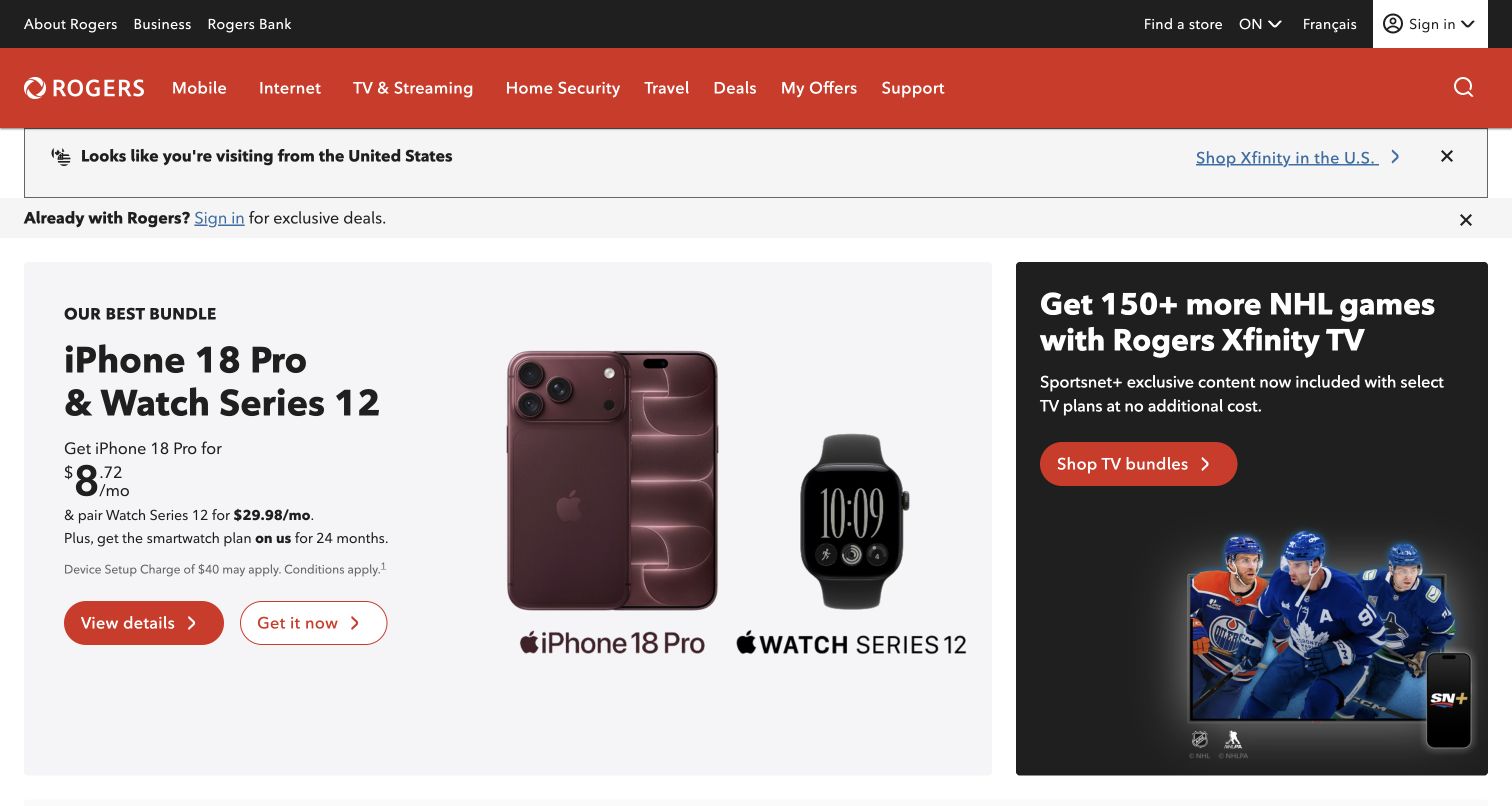
Rogers divides its opening between a device bundle and an entertainment offer, with a regional notice and customer-context link above. The broad red navigation spans several service categories. The parallel promotions create useful choice, but different pricing components and service intentions make a single undifferentiated interaction metric especially difficult to interpret.
What you can learn
A useful comparison separates the device-bundle route from entertainment and support, rather than treating all promotional interactions as one shopping funnel. Check the location notice alongside offer conditions before instrumenting a comparable page. Optional monitoring must not become a prerequisite for basic navigation. The loader association cannot establish eligibility decisions, account behavior or actual campaign conversion performance.
Pros
The split opening gives mobile and television promotions distinct destinations.
Region and existing-customer context are visible above the main promotional area.
Cons & considerations
Multiple monthly figures and bundle components can complicate a first comparison.
The broad service navigation introduces many choices for visitors with a narrow support need.
Platform source: Public mPulse loader source. Public page source observed 2026-11-05 contains a script loader for https://s.go-mpulse.net/boomerang/, documented by Akamai as an mPulse/Boomerang resource. This establishes the monitoring-snippet association, not execution for every visitor, monitoring settings or Akamai CDN delivery. Platform evidence is separate from the direct website screenshot and is not a complete current infrastructure audit.
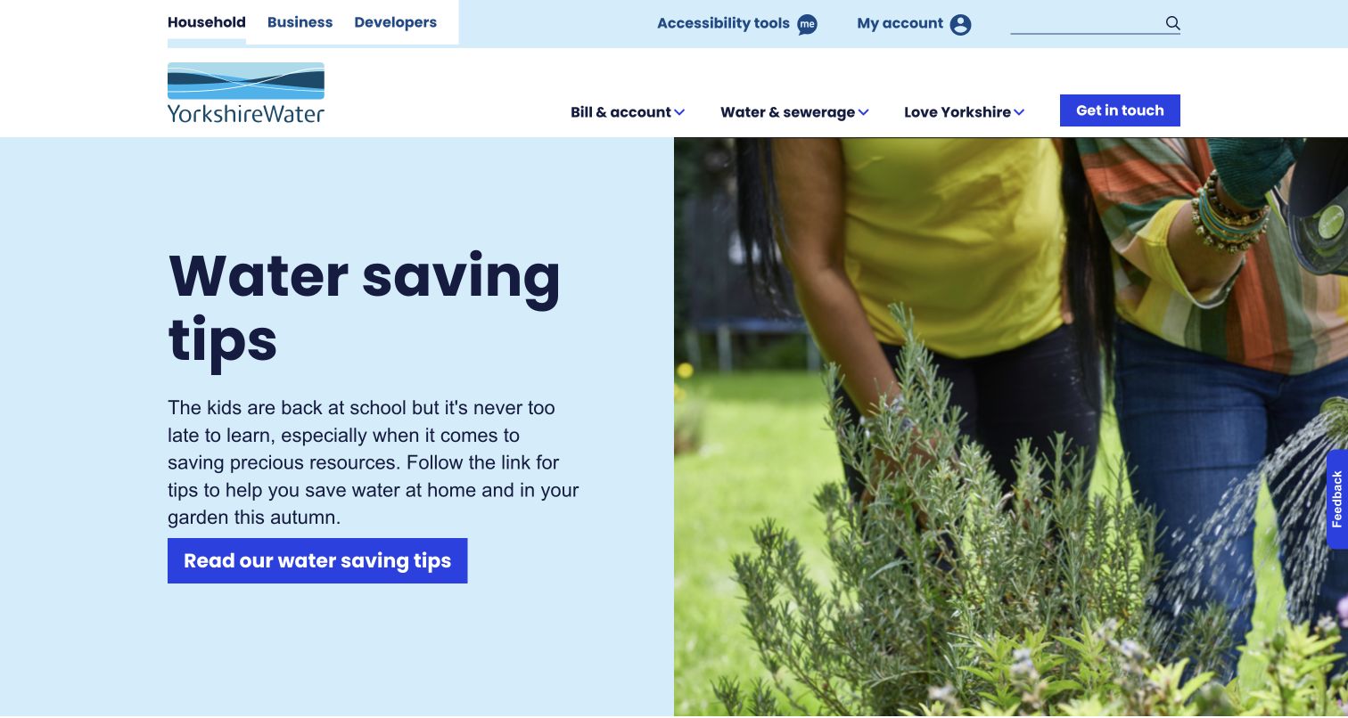
Yorkshire Water pairs a conservation headline with a gardening photograph on a pale blue background. Household, business and developer routes sit above the restrained service navigation. The seasonal message has a clear identity, while billing and supply-related tasks remain necessary alternatives for visitors whose needs are more immediate than the campaign.
What you can learn
Give urgent supply and billing routes different priorities from seasonal conservation content in a comparable service site. Ensure those destinations remain easy to find if the photograph is delayed or an optional monitor is blocked. Record only appropriate generic task context. The public snippet does not disclose customer records, operational supply information or the organization’s actual performance measurements.
Pros
The split layout makes the headline and action easy to distinguish from the photograph.
Audience links separate household needs from business and development work without expanding the main menu.
Cons & considerations
The tall hero delays the broader list of everyday service shortcuts.
Visitors with an urgent supply problem must rely on the navigation rather than a prominent incident panel in this captured view.
Platform source: Public mPulse loader source. Public page source observed 2026-11-05 contains a script loader for https://s.go-mpulse.net/boomerang/, documented by Akamai as an mPulse/Boomerang resource. This establishes the monitoring-snippet association, not execution for every visitor, monitoring settings or Akamai CDN delivery. Platform evidence is separate from the direct website screenshot and is not a complete current infrastructure audit.
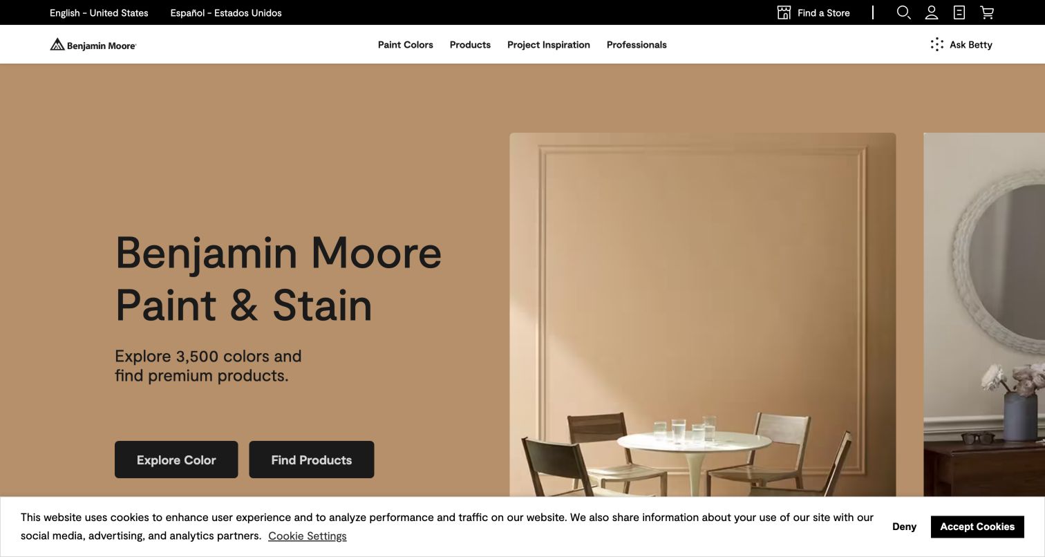
Benjamin Moore uses a warm room photograph with a concise paint-and-stain proposition and separate color and product actions. Professional routes and store finding remain in the header, while consent messaging occupies the lower edge. The composition distinguishes early inspiration from more specific shopping without asking the image to answer every technical question.
What you can learn
Separate color exploration from product selection and store finding in a comparable paint website. A beautiful room image cannot confirm screen-to-paint color accuracy, so measurement should not substitute for practical product information. Keep consent choices understandable and independent of optional scripts. The public mPulse reference does not reveal internal sales attribution or prove that a particular campaign improves decorating decisions.
Pros
Paired colour and product actions accommodate different stages of a decorating project.
Professional audience routes sit alongside consumer inspiration.
Cons & considerations
Consent messaging occupies useful space at the bottom of the initial view.
A room photograph cannot communicate finish, lighting and colour accuracy by itself.
Platform source: Public mPulse loader source. Public page source observed 2026-11-05 contains a script loader for https://s.go-mpulse.net/boomerang/, documented by Akamai as an mPulse/Boomerang resource. This establishes the monitoring-snippet association, not execution for every visitor, monitoring settings or Akamai CDN delivery. Platform evidence is separate from the direct website screenshot and is not a complete current infrastructure audit.
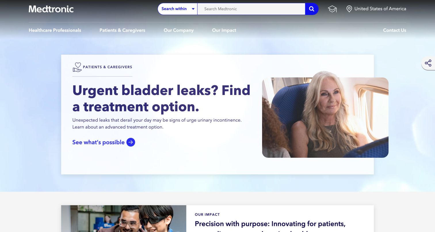
Medtronic combines an audience-scoped search control with separate professional and patient routes. A patient-facing campaign occupies the main feature panel, with additional corporate material beginning below. The public design must support different information needs without treating the campaign topic or a visitor’s search wording as appropriate material for unrestricted analytics collection. Placing the audience selector beside search makes that choice available before someone enters a query.
What you can learn
Use audience categories and generic page groups rather than health-related search terms when planning a comparable measurement program. Patient information and professional product research have different content responsibilities, and neither should depend on optional monitoring to remain readable. The loader establishes a public association only; it does not show medical data collection, clinical effectiveness or the privacy configuration of Medtronic’s services.
Pros
Search offers an explicit audience scope.
Patient and professional routes use recognizable language.
Cons & considerations
Campaign content can push product support farther down the page.
White navigation over moving imagery needs contrast testing across every frame.
Platform source: Public mPulse loader source. Public page source observed 2026-11-05 contains a script loader for https://s.go-mpulse.net/boomerang/, documented by Akamai as an mPulse/Boomerang resource. This establishes the monitoring-snippet association, not execution for every visitor, monitoring settings or Akamai CDN delivery. Platform evidence is separate from the direct website screenshot and is not a complete current infrastructure audit.
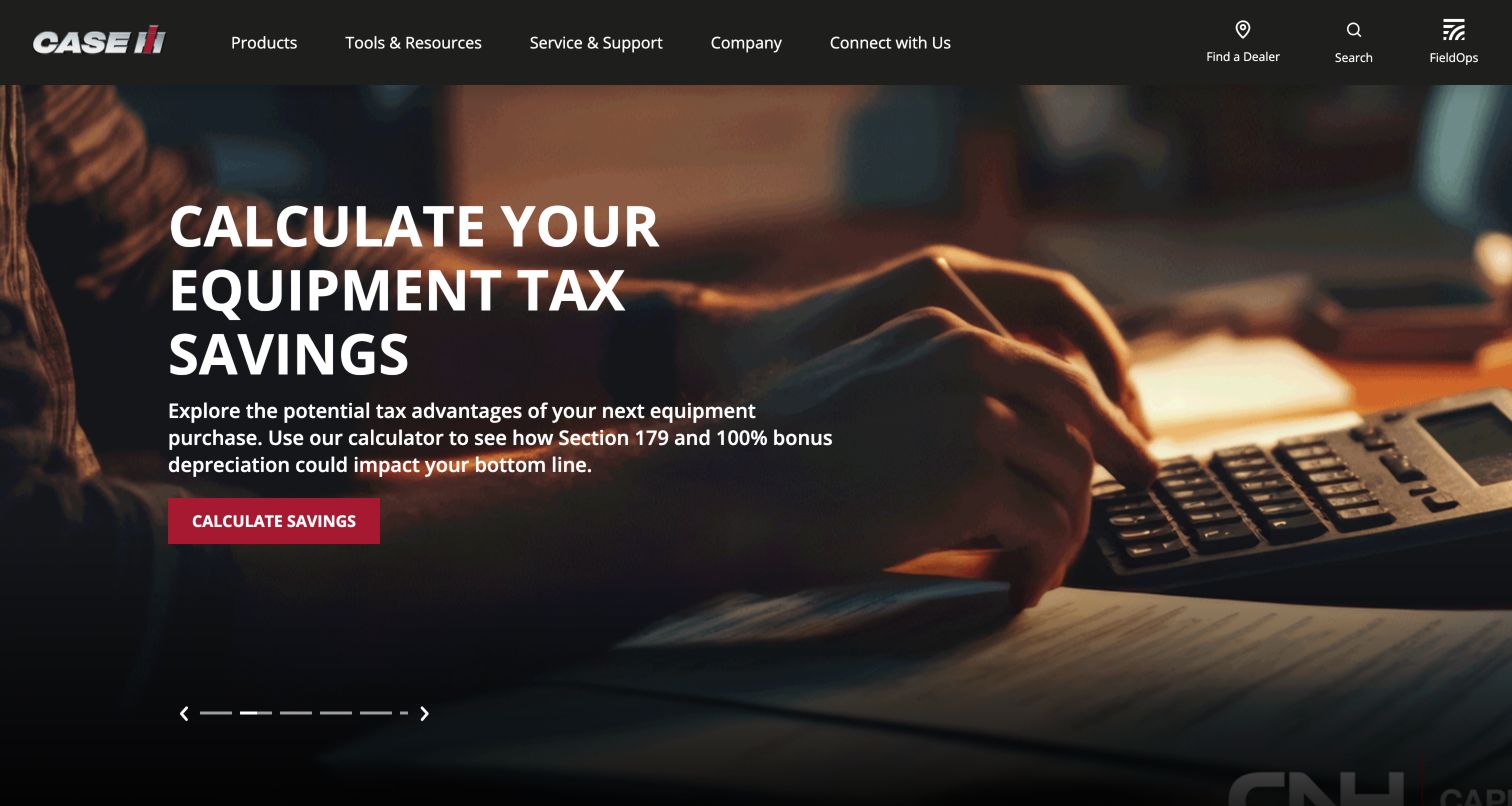
Case IH places an equipment-related financial-tool campaign inside a dark agricultural-brand frame. Product, resources and ownership-support routes remain available above, along with dealer and search utilities. The opening gives a decision aid strong prominence, but equipment research and ownership support should remain intelligible independently of that temporary promotion. Comparison specifications, Build & Price and manuals give the supporting navigation concrete research destinations before a dealer conversation.
What you can learn
Separate equipment exploration, dealer finding and support from the financial-tool promotion when planning a comparable manufacturer site. Keep the tool’s assumptions and limitations in maintained content rather than inferring them from engagement. Do not submit tax or purchasing information during public-page review. The mPulse snippet cannot establish calculator accuracy, equipment suitability or the manufacturer’s internal reporting configuration.
Pros
Tools and ownership support are visible as separate main sections.
Dealer and search routes remain present above the campaign.
Cons & considerations
The calculator promotion is not an immediate equipment overview.
Financial tools need current assumptions and clearly stated limits.
Platform source: Public mPulse loader source. Public page source observed 2026-11-05 contains a script loader for https://s.go-mpulse.net/boomerang/, documented by Akamai as an mPulse/Boomerang resource. This establishes the monitoring-snippet association, not execution for every visitor, monitoring settings or Akamai CDN delivery. Platform evidence is separate from the direct website screenshot and is not a complete current infrastructure audit.
Kegan has 15+ years of experience working with small businesses, Fortune 500 companies, and everything in between. No development job is too big or too small: he brings the same hands-on attention to a focused improvement, a complete website, or a custom application.
For Akamai projects, he can help with responsive interfaces, reusable components, custom functionality, API connections, and performance-minded implementation. He works directly with clients on scope, design, implementation, testing, and handover, with an emphasis on clear communication and a system that remains practical to maintain after launch.
Show 3 other Akamai developersHide other Akamai developers
A campaign can introduce a product without answering all comparison questions. Distinguish the first promotional interaction from meaningful exploration of a model, service or destination.
Returning-customer tasks
Billing, support, claims and account access should remain easy to reach even when a campaign changes. Give these routes their own functional checks rather than treating every visitor as a new lead.
Public information and editorial use
Stories, patient information and practical utility guidance need readable content and durable links. Define appropriate generic page groups without capturing sensitive search terms or entered personal information.
From references to requirements
Write a responsible monitoring brief
Define the question first
State which visitor task needs investigation and what decision the team expects to make. Avoid collecting extra information merely because an integration can send it.
Document appropriate boundaries
Keep credentials, health details, account information and other sensitive entered data outside generic event names. Review the implementation with the responsible privacy and security owners before expanding collection.
Test the experience without telemetry
Check navigation, visible information and useful error states when optional resources are blocked. Do not submit real financial, medical, booking or customer-service forms as part of a public design review.
A useful handover demonstration
Ask the actual team to carry out its routine job: publish a realistic update, correct a mistake, preview a narrow screen, and identify who owns an integration failure. For a library or frontend framework, also ask who maintains the content source and deployment. A polished screenshot does not answer those operational questions.
Beyond the screenshot
Akamai mPulse planning checklist
Record the exact product and public source association.
Do not infer Akamai CDN delivery from an mPulse snippet.
Separate shopping, support and returning-user journeys.
Define appropriate generic page and task groups.
Keep sensitive entered data out of measurement labels.
Respect consent and browser privacy choices.
Test useful navigation with monitoring unavailable.
Retain original evidence dates and distinguish them from later editorial review.
Test with real content, a keyboard, a small screen, slow or failed requests, and the people who will maintain the system. These are planning checks, not an accessibility, security, performance, or search-ranking certification.
Sources & editorial method
How this Akamai collection was reviewed
The candidate collection uses twenty distinct public properties with previously documented screenshots and broad technology-observation attempts. Exact s.go-mpulse.net/boomerang loader references were inspected in cached public source, and genuine screenshots were visually reviewed with original dates and dimensions retained. Source observations and image captures have separate dates. The evidence establishes the loader association only, not successful execution, sampling, privacy configuration, measured outcomes or complete hosting infrastructure. No private dashboards or real transactional flows were accessed.
Every image is an unmodified capture from the actual website, with its source and capture date. Some captures are reused from our shared catalog; their dates remain the original capture dates. None comes from a vendor gallery or a generated reconstruction. Moving imagery and live content can change.
Technology attribution uses public page assets or metadata, official platform documentation, or a cited first-party project case study. Documentary and framework-relationship evidence is identified where used; it is not a complete current backend inventory. A CMS image CDN alone does not establish a full CMS deployment. A library’s presence does not prove which individual controls use it, and a platform label does not establish AI authorship.
The composition notes, lessons, pros and tradeoffs are original editorial observations. We have not measured conversion, traffic, security, performance or accessibility conformance. Website owners retain their brands and imagery; these examples are not our client portfolio. Written, Edited and Curated are independent records, not dates advanced by a build. See our editorial standards or suggest a correction.
Questions worth asking
Akamai website development FAQs
Does an mPulse reference prove Akamai delivers the website?
No. Akamai’s documentation explicitly describes mPulse use when Akamai is not delivering the site’s traffic. The public snippet establishes the narrower monitoring association.
Does the collection show which websites are fastest?
No. Screenshots and source references are not performance benchmarks. The reviews identify useful questions and design responsibilities, not measured rankings.
Was a beacon observed for every visitor?
No. Public loader code does not prove execution for every visitor, and privacy features or consent conditions can affect monitoring. No private reporting data was inspected.
Can monitoring replace visual and functional testing?
No. A visually clear page can still have interaction problems, and a metric does not explain every editorial decision. Use appropriately scoped observations alongside direct testing of your own implementation.
Use these examples to define the visitor tasks worth understanding, then implement and review monitoring within your own privacy and functional requirements.