Best Bricks Websites of 2026 (20 Real-World Examples)
Real public websites with observed Bricks theme assets or explicitly scoped documentary evidence, reviewed for useful design decisions.
Bricks websites can look dramatically different from one another. The more useful comparison is how each site organizes content, establishes a consistent visual language and helps visitors take an appropriate next step.
A coastal inn, an education platform and a local service business need different kinds of first impressions. These examples show how photography, typography, navigation, cards and practical information can work together without converging on one recognizable page-builder aesthetic. Study the decisions that fit your own audience: a booking button that stays easy to find, a useful comparison section or a project caption that explains why an image matters.
The technology association belongs to the exact public property identified in each record. An observed Bricks theme script or stylesheet supports a presentation-layer association at its recorded date. It does not identify an entire company's infrastructure, prove how editors configured the builder or reveal the technology of a separate booking service or signed-in application. Documentary examples are qualified as such, and older screenshots and observations keep their original dates.
Before the examples
What makes good Bricks website development in 2026?
Establish defaults before arranging individual sections
A consistent site does not require every page to repeat the same composition. Define a small set of spacing, typography and action treatments, then let the content determine the layout. Bricks documents Theme Styles as site-wide defaults and distinguishes them from reusable classes and one-off element styling. The examples make the value visible: a recognizable button can survive a change from a photograph-led hero to a practical information page.
Separate the permanent frame from changing content
Headers, navigation and recurring information need a dependable place, while campaigns and featured work change more often. Bricks template conditions can assign a template to selected kinds of WordPress requests, with inclusion and exclusion rules. Plan those boundaries before adding exceptions. A seasonal event should be able to change without disturbing campus navigation; a new project should not require rebuilding the surrounding inquiry route.
A wide desktop capture can conceal problems caused by long headings, consent notices, stacked buttons and tightly cropped photographs. Bricks supports breakpoint-specific adjustments, with base styles inherited unless a more specific setting overrides them. Decide what must remain visible when columns stack. Preserve useful labels and image context, and check the actual public page with realistic content instead of assuming a builder preview proves every interaction works.
Compare each site's visible hierarchy with its actual visitor task. The reviews identify specific decisions worth borrowing and visible tradeoffs; they do not rank service quality or turn a screenshot into a performance or accessibility certification.
We start with five recognizable brands or organizations: Rackspace Technology, Kami, Fogo Island Inn, Teads, Chambers Bay. Each attribution applies to the named website property, not every product or website belonging to its organization. This is a curated reading sequence, not a measured ranking.
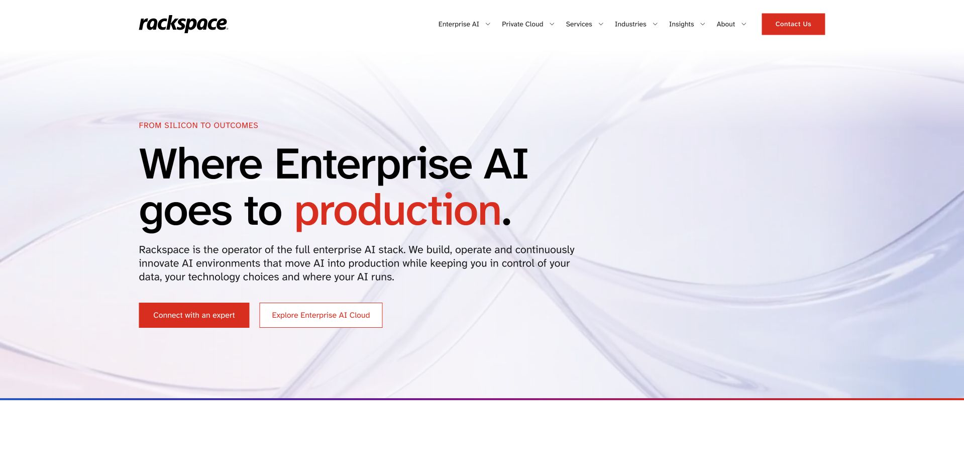
Rackspace Technology keeps its opening largely white, using black typography and red emphasis against a pale abstract background. The oversized headline highlights production in red, then a short paragraph leads to an expert conversation and an enterprise AI route. The header repeats that accent on Contact while leaving the main navigation visually quieter. Retained Bricks theme assets were observed on this marketing page. They establish a public presentation-layer association, not the infrastructure of Rackspace's cloud services. The design is useful for studying how a limited set of typography and button treatments can carry a substantial enterprise message without a crowded dashboard illustration.
What you can learn
Assign one accent color to a small number of meaningful elements, then make the headline and supporting paragraph perform different jobs. Keep a research route available beside direct contact for visitors who need more context first.
Pros
The limited palette makes the highlighted word and primary contact action immediately visible.
Two distinct actions accommodate both further exploration and a conversation with the company.
Cons & considerations
The abstract background provides little concrete explanation of how the services operate.
The very large headline needs careful wrapping as the available viewport width changes.
Platform source: Retained observed Bricks theme asset. Linked stylesheet matches Bricks Platform evidence is separate from the direct website screenshot and is not a complete current infrastructure audit.
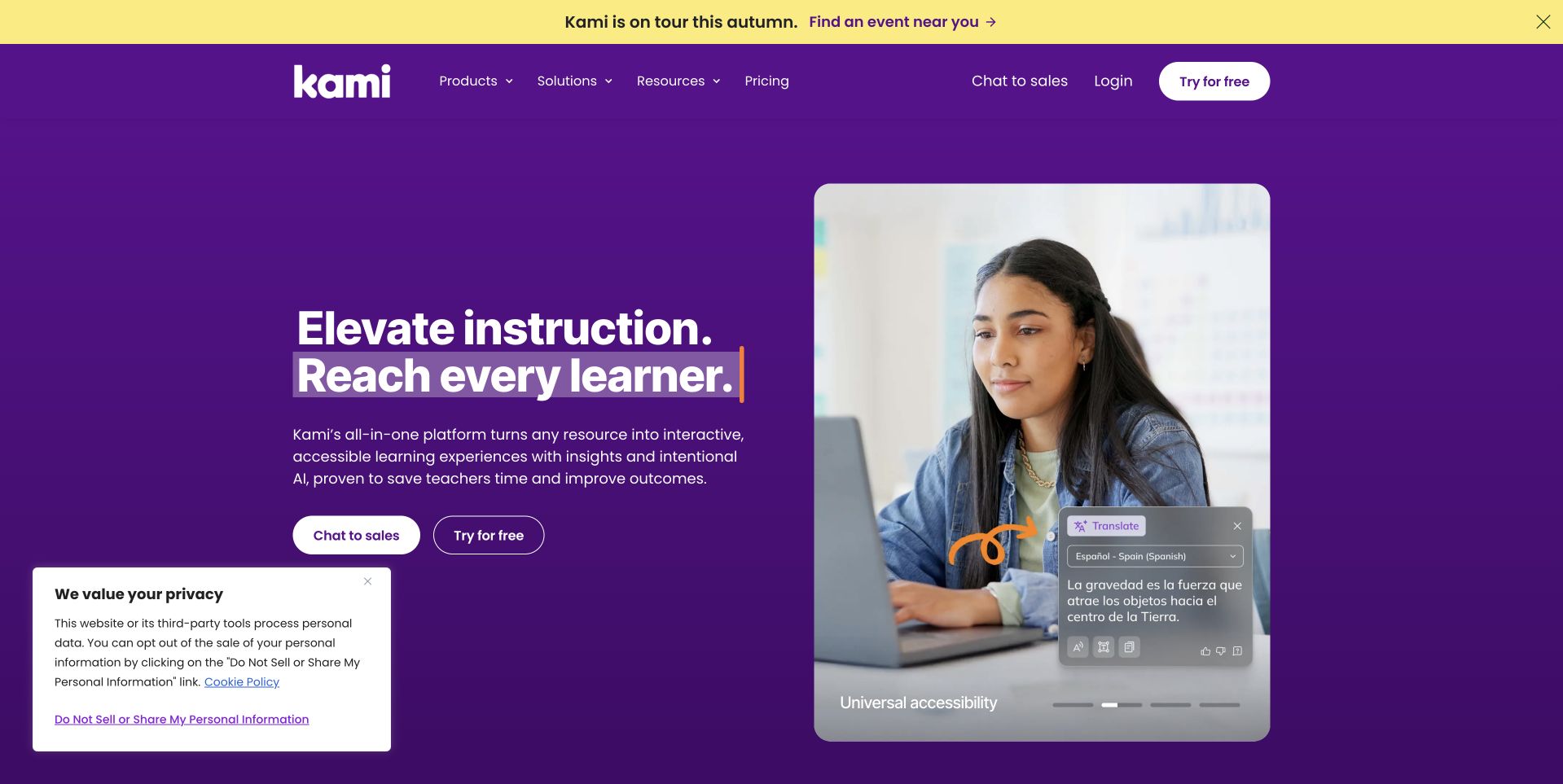
Kami combines a yellow event strip with a purple navigation and hero, then uses highlighted words to emphasize reaching every learner. The left column contains the main explanation and separate sales and free-trial actions. A rounded student photograph and interface overlay occupy the right, giving the broad educational promise a more concrete visual reference. Pagination dots and a bottom consent notice remain visible in the capture. Retained Bricks theme assets support the public marketing-page association. They do not establish the technology of Kami's signed-in learning tools or independently verify the educational outcomes suggested by its promotional copy.
What you can learn
Pair an aspirational headline with one understandable product example. Reuse a controlled set of colors, spacing and button styles, then check that trial and sales routes clearly signal their different expectations to prospective users.
Pros
The interface overlay connects the broad benefit statement with a recognizable product task.
Sales and free-trial buttons provide distinct next steps within the same visual system.
Cons & considerations
The consent notice occupies space that could otherwise reveal the next section of content.
The promotional strip, highlighted text and media controls create several competing attention points.
Platform source: Retained observed Bricks theme asset. Linked stylesheet matches Bricks Platform evidence is separate from the direct website screenshot and is not a complete current infrastructure audit.
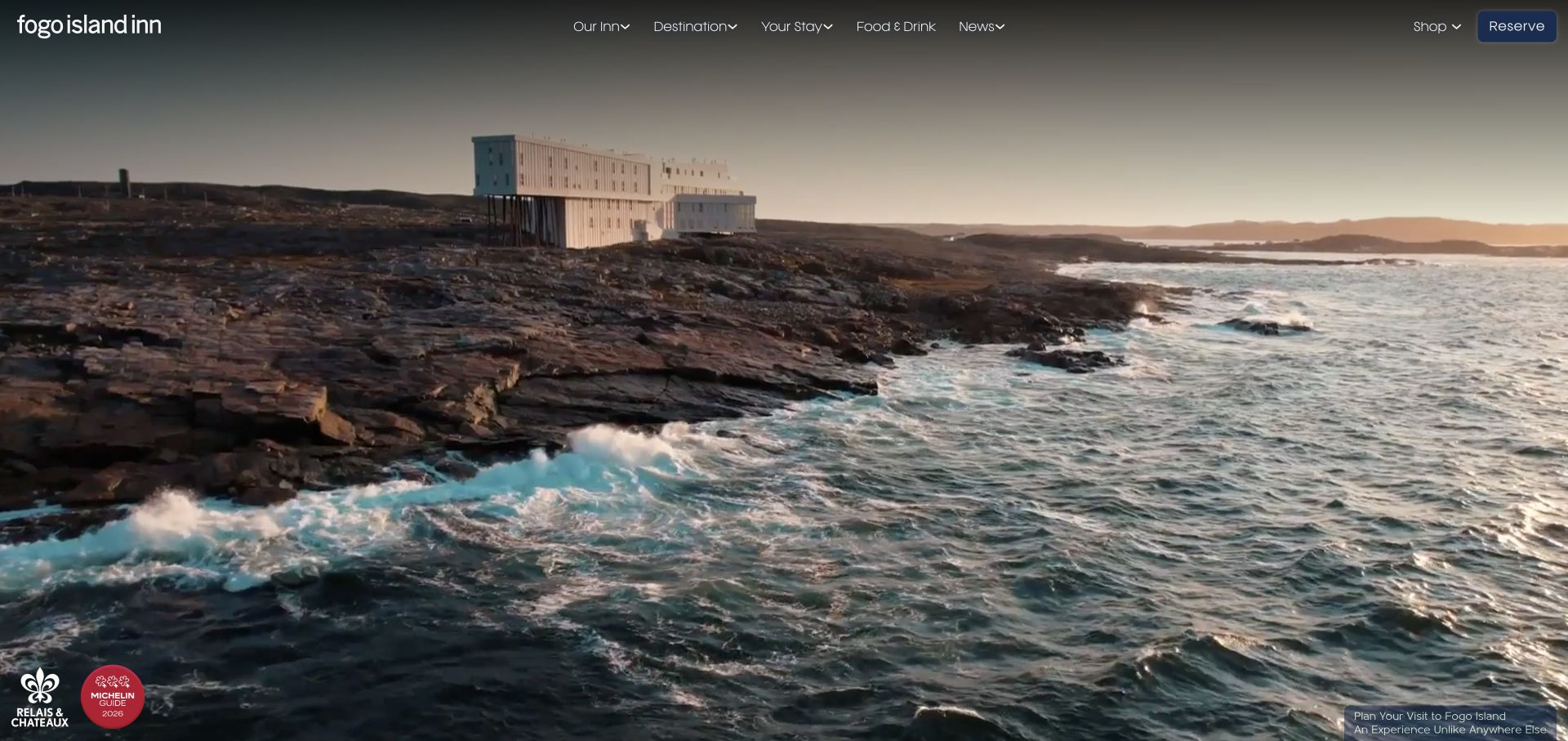
Fogo Island Inn gives almost the entire opening view to the coastline, with the building positioned within the landscape instead of isolated as a product photograph. The slim navigation keeps accommodation, destination, dining and shopping routes above the image, while a blue Reserve button supplies the clearest action. Small marks and a caption sit near the bottom without becoming a second headline. Retained source evidence identifies Bricks theme styles on this public page; it does not establish the technology of a separate reservation service. The composition is useful for studying how a reusable header can frame unusually expansive photography.
What you can learn
Start with the photograph's focal area, then establish a small set of header styles that leave it readable. Give the booking action a distinct treatment, and reserve practical accommodation details for a clear next step.
Pros
The single blue booking button stands apart from the quieter navigation links.
The image communicates a specific setting without a large block of introductory copy.
Cons & considerations
The opening supplies little practical information about rooms, access or travel logistics.
Small overlaid labels depend on the photograph maintaining sufficient contrast behind them.
Platform source: Retained observed Bricks theme asset. Linked stylesheet matches Bricks Platform evidence is separate from the direct website screenshot and is not a complete current infrastructure audit.
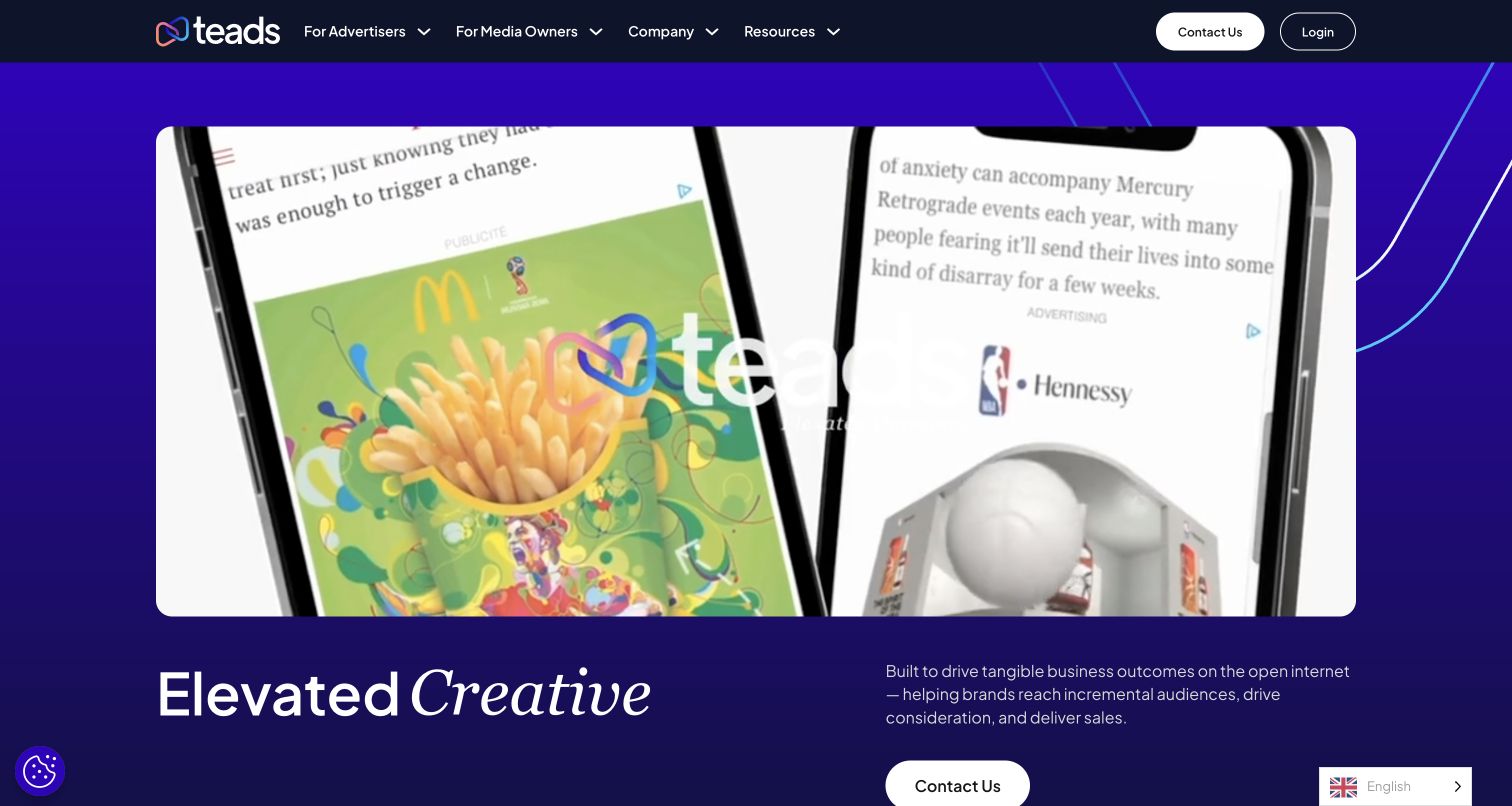
Teads places a large moving demonstration at the center of its opening screen. Devices and advertising examples occupy a rounded rectangle against a saturated purple background, while a short heading and explanation sit below. The dark navigation stays comparatively quiet, separating advertiser and media-owner routes from the contact and login actions. This arrangement gives a visitor something concrete to examine before the page introduces its broader platform story. Bricks evidence concerns this public corporate website, not the advertising delivery system or the products shown inside the demonstration.
What you can learn
When a service is easiest to understand through an example, make that example the opening visual and place a concise explanation nearby. Keep audience navigation readable and offer a stable next action outside the moving content so visitors can continue without waiting for a particular frame.
Pros
The large demonstration connects an abstract advertising proposition to a recognizable screen experience.
Distinct advertiser and media-owner navigation acknowledges two different visitor needs.
Cons & considerations
A motion-heavy opening needs a useful still state and readable accompanying text.
Rotating headline words can make the first message less stable while reading.
Platform source: Observed Bricks theme asset on the exact public page. Exact public Teads website at https://www.teads.com/; no claim about separate applications, accounts, clients or parent-brand properties. A bounded public-source audit observed linked Bricks theme scripts or styles on November 10, 2026. This identifies references on the reviewed page, not a complete backend inventory or installed version. Platform evidence is separate from the direct website screenshot and is not a complete current infrastructure audit.
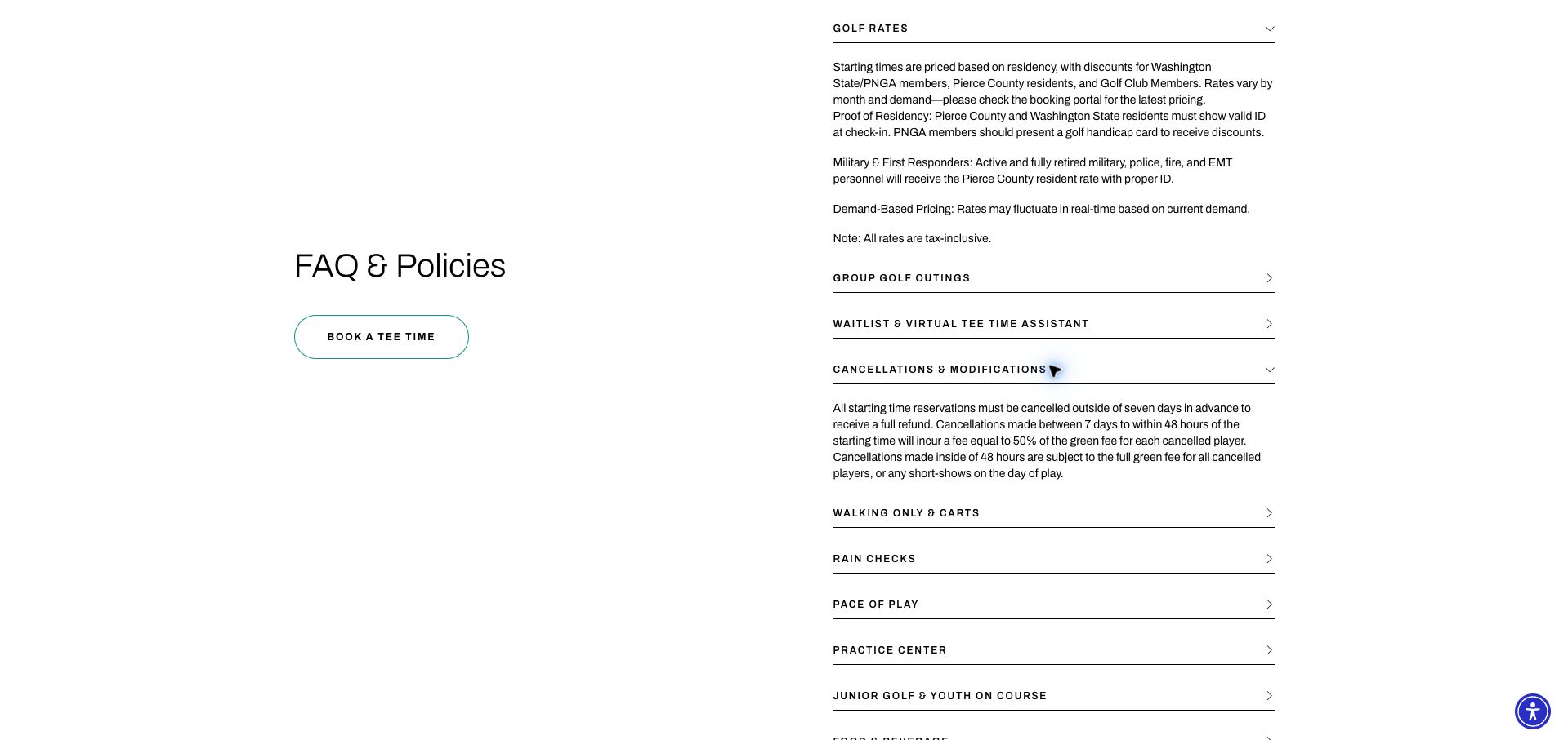
Chambers Bay is represented by its captured contact page, specifically the scrolled FAQ and Policies section. A large heading and outlined Book a Tee Time button occupy the left column; ruled question rows fill the right. Golf rates and cancellations are expanded in the saved view, while topics such as group outings, walking and rain remain compact. The result gives practical information room without turning every answer into a long wall of text. The source audit records an explicit Bricks theme script on this contact property. That evidence should remain attached to this page rather than being silently substituted with the course homepage.
What you can learn
Use a reusable question-and-answer structure for operational details, with descriptive labels and a separate conversion route. Preserve meaningful headings and test the controls with a keyboard; the screenshot establishes layout, not accessible interaction behavior.
Pros
Thin rules and ample spacing make the individual policy topics easy to scan.
The booking action stays distinct from the informational question list beside it.
Cons & considerations
Closed answers require interaction before visitors can compare several policies together.
The wide two-column spacing needs deliberate adaptation when the available width shrinks.
Platform source: Retained observed Bricks theme asset. Linked script matches Bricks Platform evidence is separate from the direct website screenshot and is not a complete current infrastructure audit.
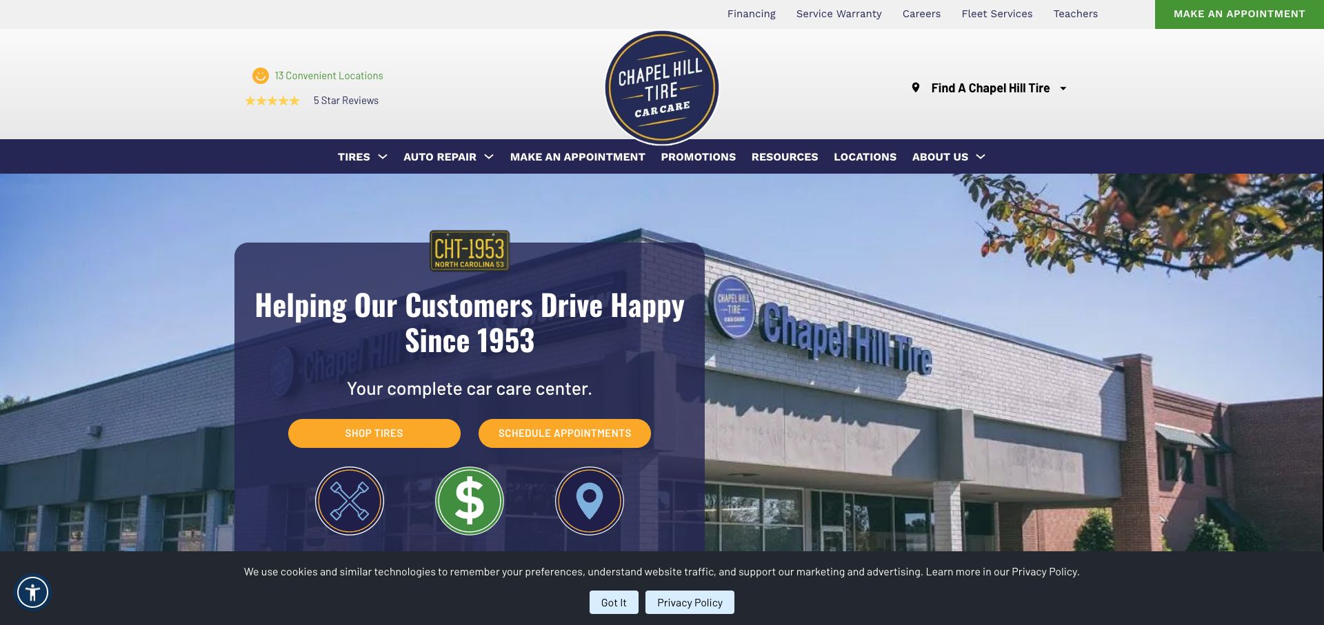
Chapel Hill Tire divides its opening into a white identity masthead, a navy service navigation bar and a large location photograph. A dark panel carries the introduction, with yellow buttons for tire shopping and appointment scheduling. Location discovery appears separately in the header, so visitors are not forced into a single inquiry route. The saved capture also retains a bottom cookie notice. Bricks theme assets were observed on the exact public page at the recorded audit date. The useful builder lesson is the consistent treatment of repeated service actions, rather than any assumption about the software behind bookings or tire inventory.
What you can learn
Define the main customer tasks before assembling the hero. Use shared button treatments for equivalent actions, keep branch discovery distinct, and check that the masthead and service navigation leave enough space for meaningful page content.
Pros
Yellow buttons make two practical next steps easy to distinguish from informational links.
A solid text panel avoids placing essential service copy directly over the photograph.
Cons & considerations
The tall header uses considerable space before the main service introduction begins.
The consent notice reduces the unobstructed area available for the opening content.
Platform source: Retained observed Bricks theme asset. Linked stylesheet matches Bricks Platform evidence is separate from the direct website screenshot and is not a complete current infrastructure audit.
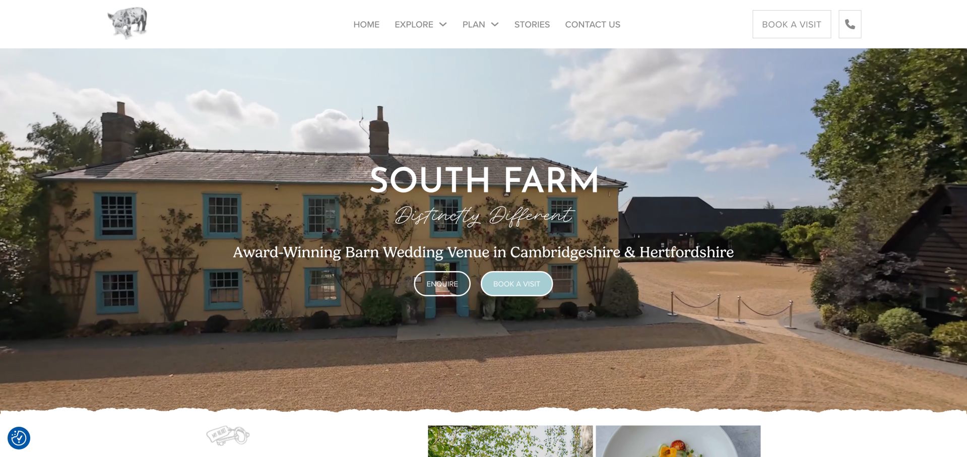
South Farm's opening uses the yellow farmhouse and turquoise window frames as a ready-made visual identity. The header remains white and comparatively quiet, while a centered title and location line sit over the venue photograph. Enquire and Book a Visit appear together, with the filled pale turquoise button giving the visit route more emphasis. A torn-paper edge softens the transition beneath the image. Retained Bricks stylesheet evidence supports this public-page association. The capture illustrates a design direction that can be expressed through consistent theme colors and button styles, without proving how the site's authors organized those settings internally.
What you can learn
Choose a small palette from genuine venue photography, then apply it consistently to action states and section transitions. Separate an initial question from a scheduled visit so visitors can choose an appropriate level of commitment.
Pros
The photograph and button color reinforce the same distinctive sense of place.
The visible location line adds useful context before visitors explore the venue further.
Cons & considerations
Light header details require careful contrast checking against the otherwise delicate styling.
Centered white copy competes with architectural details in the busy hero photograph.
Platform source: Retained observed Bricks theme asset. Linked stylesheet matches Bricks Platform evidence is separate from the direct website screenshot and is not a complete current infrastructure audit.
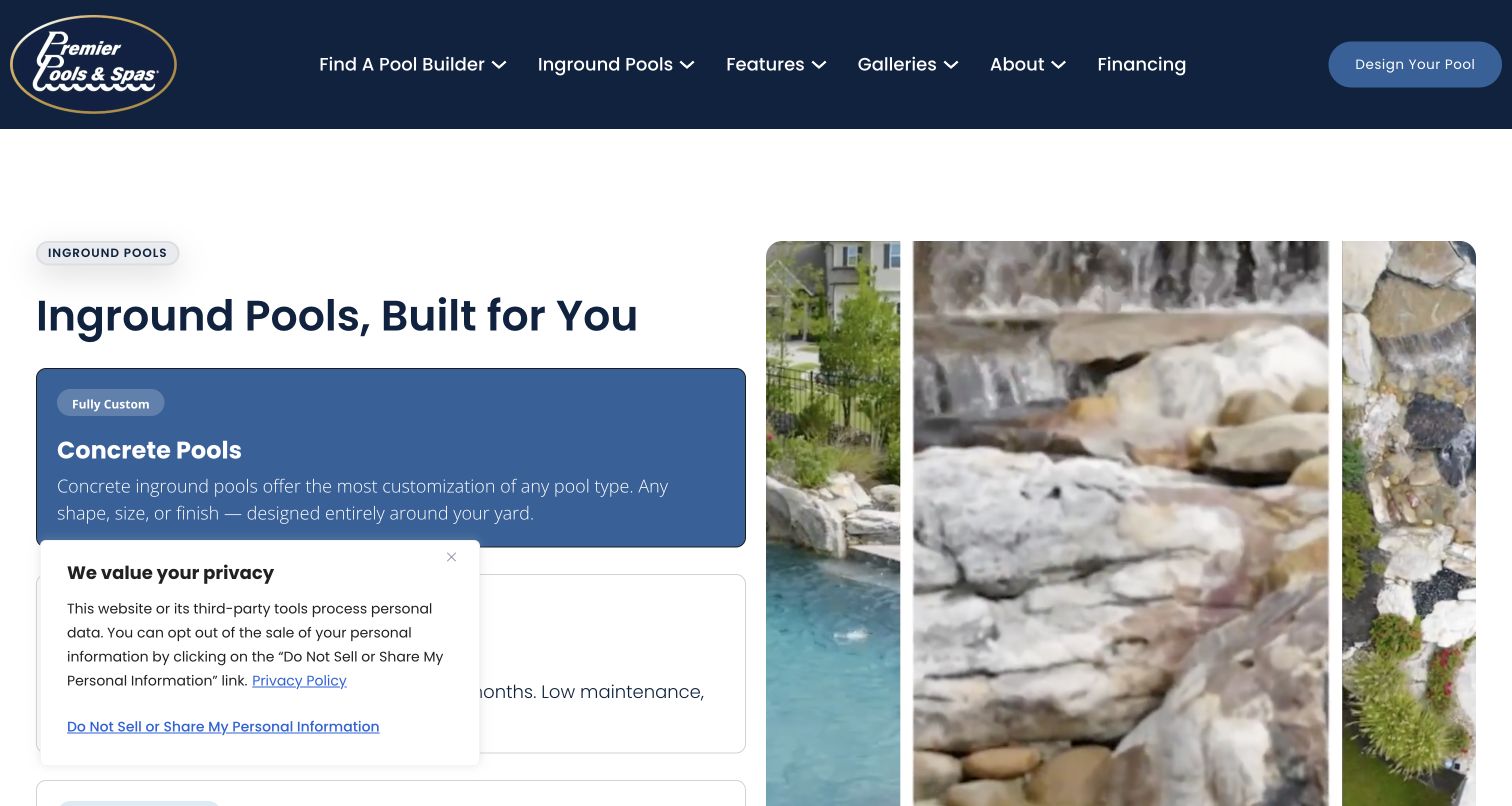
The saved Premier Pools & Spas view is a scrolled pool-type comparison, not the top of the homepage. A navy header remains above the section, while Concrete Pools receives a filled blue panel and the alternatives appear as lighter outlined choices. Tall project photographs occupy the right side, giving the comparison a concrete visual reference. A privacy notice overlaps part of the lower left content. The retained audit identifies Bricks theme assets on this exact page. The selected styling suggests a useful reusable comparison pattern, although a still image cannot confirm how its controls behave or whether every option has equivalent detail.
What you can learn
Build comparison sections around parallel information rather than color alone. Keep the selected option obvious, pair it with relevant imagery, and ensure that each alternative provides comparable details when a visitor chooses it.
Pros
The filled selection is visually distinct from the lighter alternative option panels.
Project imagery gives an otherwise abstract pool-type decision a tangible reference.
Cons & considerations
The retained privacy notice obscures part of the comparison content in this view.
Narrow photographic crops reveal atmosphere more readily than complete pool layouts.
Platform source: Retained observed Bricks theme asset. Linked stylesheet matches Bricks Platform evidence is separate from the direct website screenshot and is not a complete current infrastructure audit.
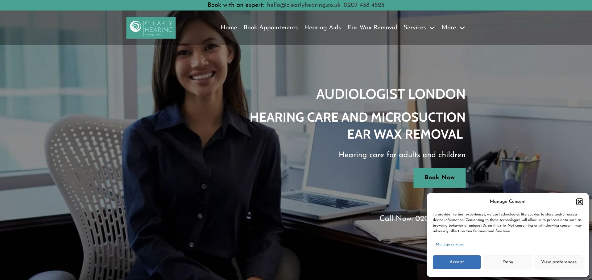
Clearly Hearing combines a turquoise contact strip, a dark translucent navigation band and a portrait-led hero. The person occupies the left side, while large white service and location text fills the right, ending in a turquoise Book Now button. This creates an immediate relationship between a human face and the practical appointment route. A large consent panel remains visible over the lower right portion of the saved capture. Retained Bricks theme styles establish the public-page association. The design is useful for studying shared contact and hero components, but neither the portrait nor the layout verifies professional credentials or clinical results.
What you can learn
Give essential contact information a stable place outside campaign copy. Pair a portrait with concise service context, then check that consent controls and other overlays do not cover the appointment route or telephone details.
Pros
The portrait gives the opening a clear human focus alongside the service explanation.
Turquoise consistently distinguishes practical contact and booking elements from the dark background.
Cons & considerations
The large consent panel obscures important lower-right information in the captured state.
Dense uppercase copy asks readers to process several messages before reaching the action.
Platform source: Retained observed Bricks theme asset. Linked stylesheet matches Bricks Platform evidence is separate from the direct website screenshot and is not a complete current infrastructure audit.
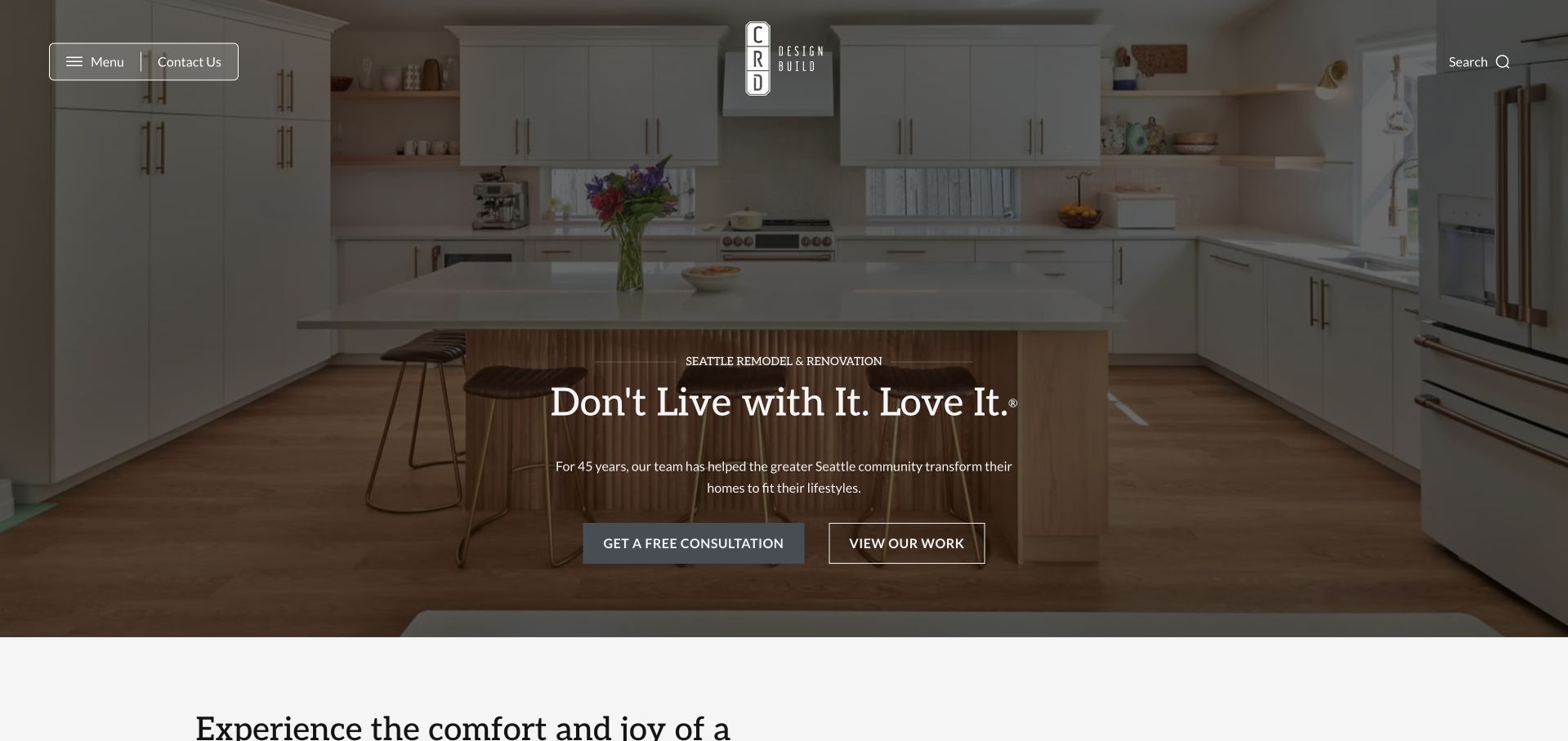
CRD Design Build places a kitchen photograph behind a centered introduction, with a dark wash protecting the white typography. The logo sits in a sparse header between compact menu and contact controls on one side and search on the other. A filled consultation button and outlined View Work button distinguish direct inquiry from further evaluation. The next section begins below the hero, making the opening feel like an introduction to a larger portfolio. Retained Bricks assets support the marketing-page association. The capture demonstrates the visual hierarchy, without proving a particular template structure or independently verifying the company's experience claims.
What you can learn
Create a hero pattern that can accept different project photographs without losing text contrast. Keep portfolio exploration available beside consultation, and make the main menu understandable without requiring visitors to guess what it contains.
Pros
The overlay protects the legibility of the headline over a detailed interior photograph.
Different button treatments separate browsing completed work from starting a consultation.
Cons & considerations
The compact menu conceals the broader information structure until a visitor opens it.
The opening's experience claim needs supporting context beyond the photograph and headline.
Platform source: Retained observed Bricks theme asset. Linked stylesheet matches Bricks Platform evidence is separate from the direct website screenshot and is not a complete current infrastructure audit.
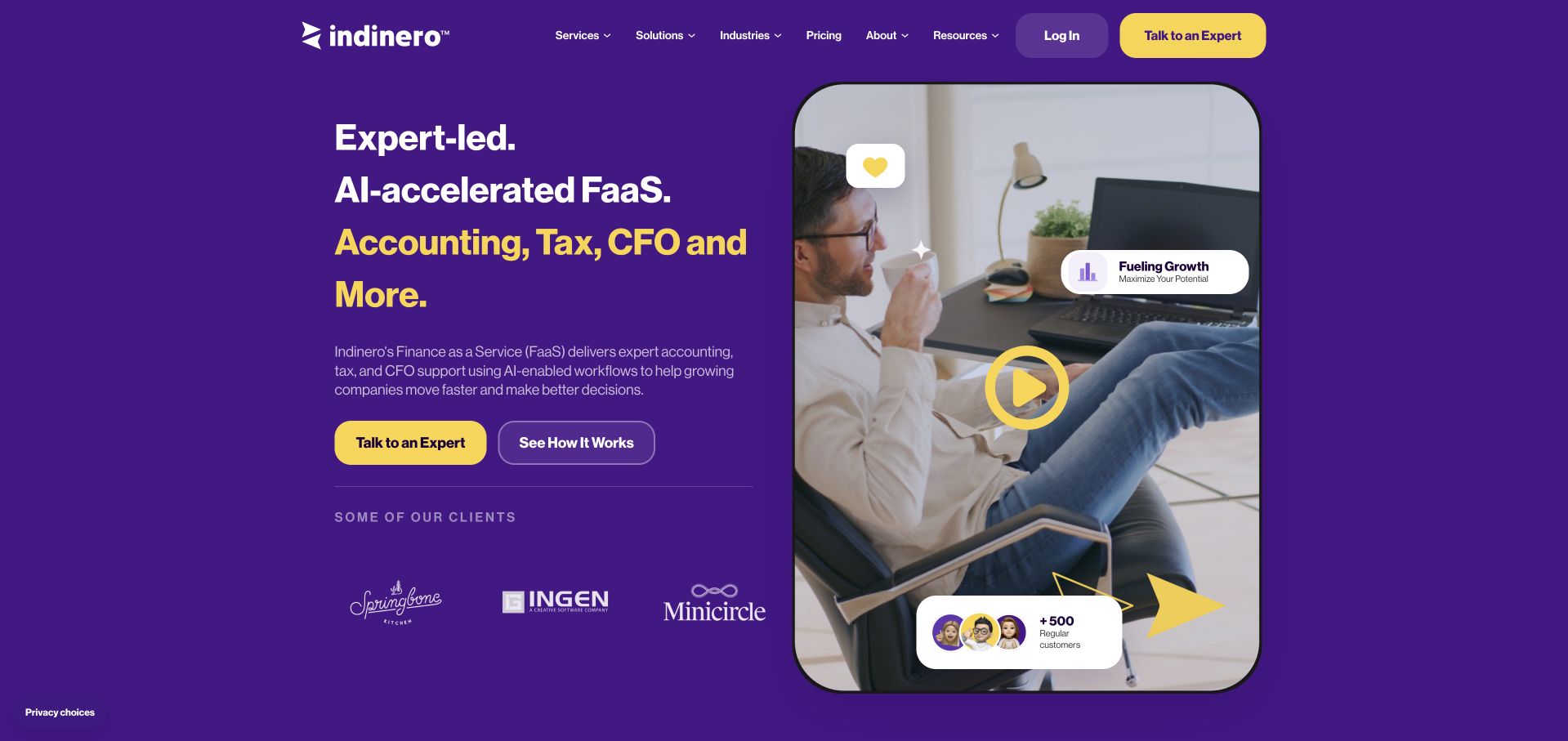
inDinero uses a purple field, yellow emphasis and rounded media to bring accounting, tax and CFO services into one visual system. The main copy and two actions sit on the left, with a portrait video preview and floating information cards on the right. A row of client logos provides a quieter transition below the pitch. Bricks theme assets were recorded on this public marketing page; they do not describe the firm's accounting systems. The capture is useful for studying how a few repeated colors and shapes can connect many content types without forcing every element into an identical card.
What you can learn
Establish clear roles for accent colors, button styles and media frames before building individual sections. Keep the core offer understandable in text, so a portrait video supports the message without becoming the only way to learn it.
Pros
Yellow emphasis gives the primary action a recognizable place within the purple layout.
The text and media columns offer complementary ways to understand the service proposition.
Cons & considerations
The prominent FaaS abbreviation adds explanation work for visitors unfamiliar with the term.
Floating statistic cards can look persuasive before their supporting context is understood.
Platform source: Retained observed Bricks theme asset. Linked stylesheet matches Bricks Platform evidence is separate from the direct website screenshot and is not a complete current infrastructure audit.
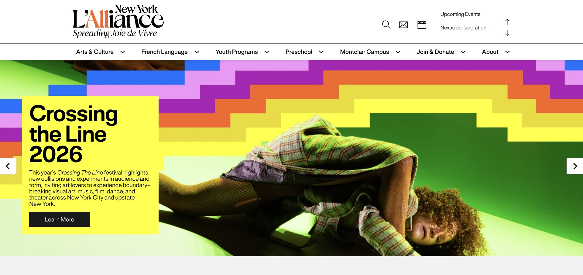
L'Alliance New York separates an expansive black-and-orange wordmark and utility links from a second row of program navigation. Below that stable institutional frame, a colorful festival photograph and yellow text panel promote Crossing the Line 2026. Small arrows identify the feature as part of a carousel, while Learn More gives the selected campaign an explicit destination. The retained audit records Bricks assets on this New York public property. The useful pattern is the separation between enduring organizational navigation and changeable event content; it does not establish anything about other Alliance organizations or the internal administration of their programs.
What you can learn
Treat event promotion as structured content inside a consistent page frame. Provide fields for title, image, description and destination, and keep essential program navigation available when the featured season or campaign changes.
Pros
The large identity and categorized navigation make the institution's broad scope visible.
A contrasting yellow feature panel keeps the campaign copy distinct from its photograph.
Cons & considerations
The feature panel carries enough text to require careful editing at smaller widths.
Carousel arrows alone do not demonstrate usable keyboard controls or predictable slide timing.
Platform source: Retained observed Bricks theme asset. Linked stylesheet matches Bricks Platform evidence is separate from the direct website screenshot and is not a complete current infrastructure audit.
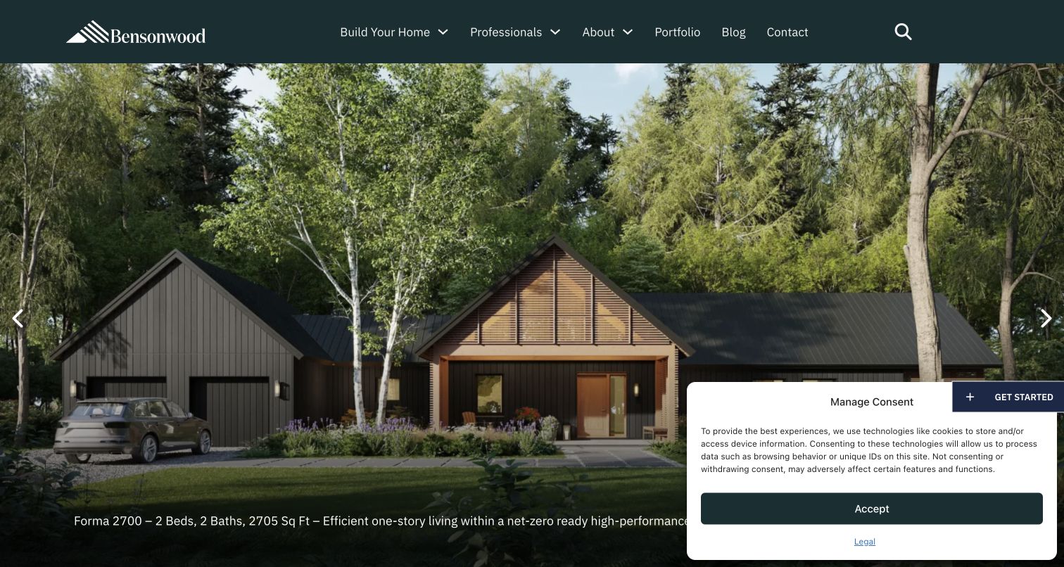
Bensonwood opens with a dark green header over a full-width photograph of a house in a wooded setting. Build Your Home and For Professionals separate two audiences before visitors enter portfolio, journal or contact routes. A project caption sits near the bottom of the image, while arrow controls indicate additional featured work. The saved view retains a consent box and a floating Get Started control that compete with the caption area. Bricks theme assets were observed on the exact public source page. The composition demonstrates an adaptable project presentation; it does not independently verify the building-performance claims attached to any project.
What you can learn
Design the project template and its captions together, then decide which navigation labels belong to each audience. Give overlays a reserved area so consent or inquiry controls do not erase the information that makes a photograph useful.
Pros
Audience-specific navigation distinguishes homeowners from professional collaborators at the first step.
The large photograph presents a complete architectural setting rather than a decorative texture.
Cons & considerations
The captured overlays compete with the lower project caption and surrounding image area.
A prominent image carousel still needs a clear route into detailed project information.
Platform source: Retained observed Bricks theme asset. Linked stylesheet matches Bricks Platform evidence is separate from the direct website screenshot and is not a complete current infrastructure audit.
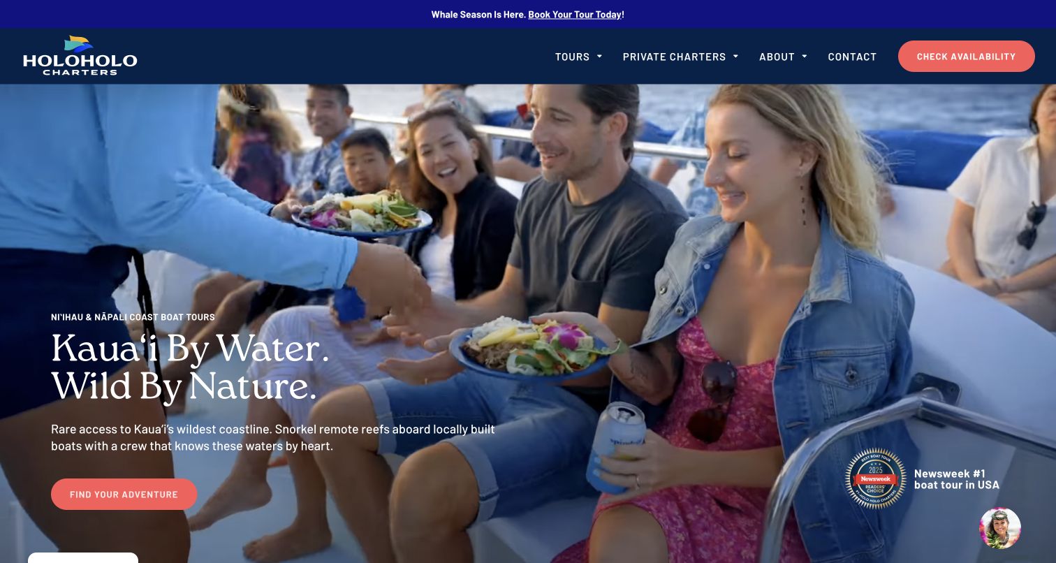
Holo Holo Charters uses a photograph of passengers sharing food aboard a boat, giving the opening a social focus rather than relying only on distant scenery. A narrow seasonal notice sits above the navy navigation, while coral availability and adventure buttons repeat the same action color. Large white destination copy anchors the lower left of the hero. An award mark and chat avatar occupy the opposite side. The retained audit identifies Bricks assets on this public homepage. This view supports analysis of the promotional layout, not a claim that every tour includes the pictured activity or that the booking system uses the same technology.
What you can learn
Use a real experience image to make an offer concrete, then keep the booking accent consistent across header and hero. Give seasonal notices their own component so temporary messages do not displace the core navigation.
Pros
The passenger photograph offers a specific human scene alongside the destination headline.
Repeated coral buttons connect availability checking with the main adventure discovery route.
Cons & considerations
The opening image alone cannot explain the differences between individual tour itineraries.
The award mark and chat avatar add competing detail around the hero's edges.
Platform source: Retained observed Bricks theme asset. Linked stylesheet matches Bricks Platform evidence is separate from the direct website screenshot and is not a complete current infrastructure audit.
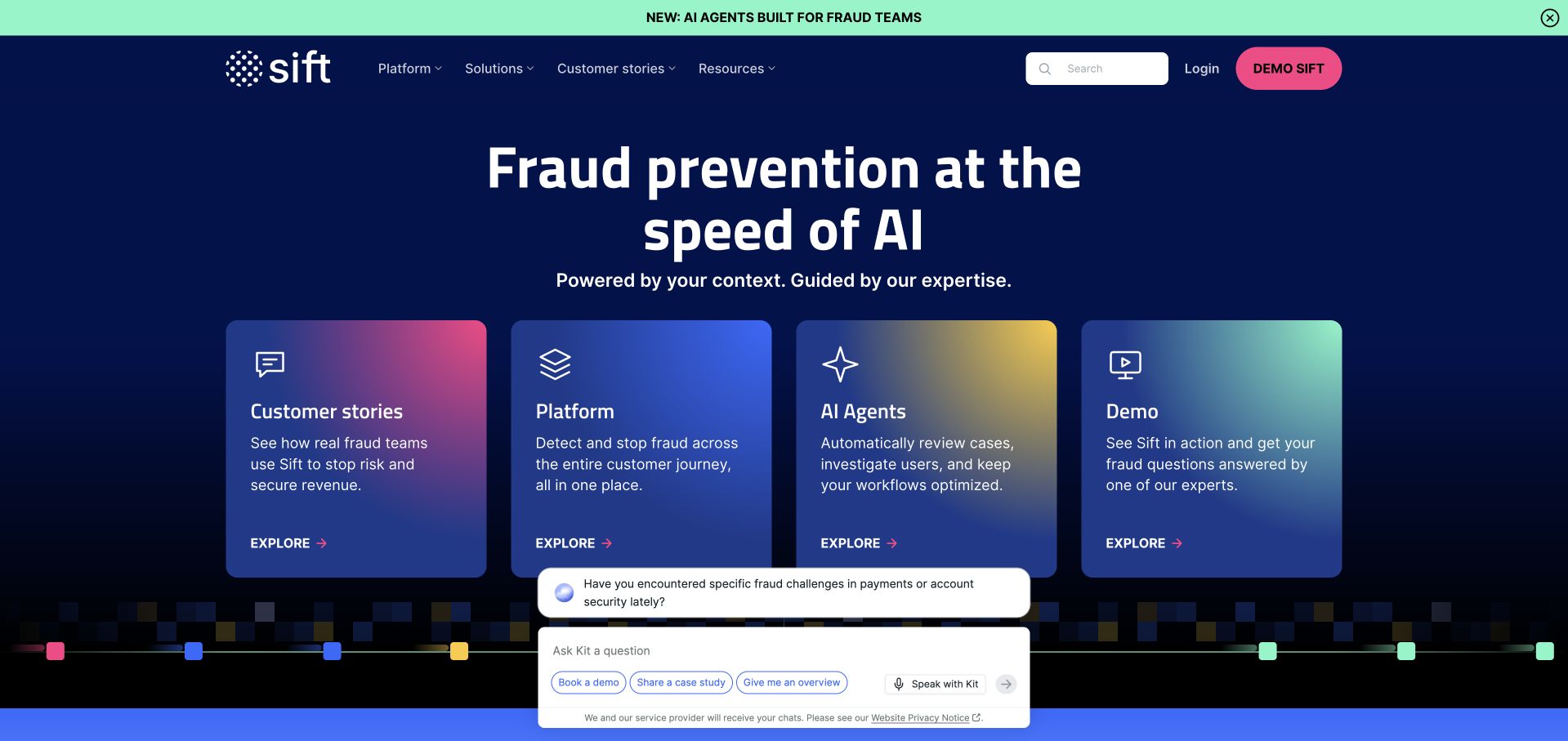
Sift places a mint announcement strip above a dark navigation and hero area, with a pink demo action providing the strongest header accent. Beneath the large introduction, four similarly sized gradient cards offer customer stories, platform information, AI agents and a demo. Their shared shape and spacing create a coherent discovery group even though the destinations serve different evaluation needs. The saved capture includes a chat widget overlapping the lower area. Retained Bricks theme references apply to this public marketing page, not the fraud-detection product. The card family offers a useful model for repeatable builder components with different content and destinations.
What you can learn
Define a card's title, supporting text, link and visual treatment as a repeatable pattern. Keep destination labels specific, and reserve stronger emphasis for the action that matters most rather than making every card equally urgent.
Pros
Consistent card dimensions make four different discovery routes easy to compare visually.
The pink demo action remains distinct from the quieter navigation and informational content.
Cons & considerations
Generic exploration labels rely on nearby text to explain their eventual destinations.
The chat widget overlaps content in the saved view and requires placement consideration.
Platform source: Retained observed Bricks theme asset. Linked stylesheet matches Bricks Platform evidence is separate from the direct website screenshot and is not a complete current infrastructure audit.
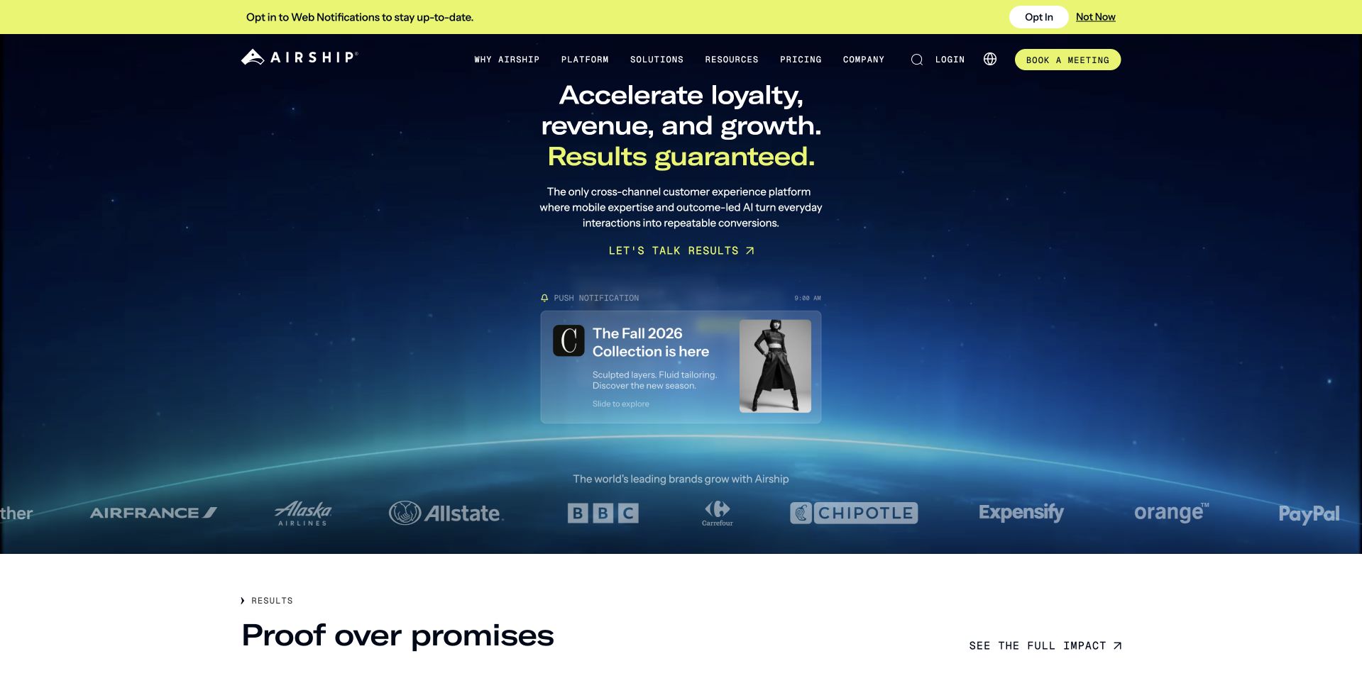
Airship centers its main headline on a dark background, using yellow emphasis to connect the message with prominent actions and a top notification request. A floating notification-style illustration makes the product category more concrete, while customer logos and the beginning of a Proof Over Promises section appear below. The navigation and meeting button remain in a distinct header. Retained Bricks theme assets were observed on this public marketing property. That evidence does not describe Airship's delivery infrastructure or the websites represented by customer logos. The page offers a useful study in repeatable headline, proof and product-illustration components within a strong color system.
What you can learn
Choose a familiar product object to explain an abstract platform, then connect the main claim to accessible supporting evidence. Keep optional notification requests subordinate to the visitor's immediate task so the opening does not become a competition between prompts.
Pros
The notification illustration gives the central marketing promise a recognizable visual reference.
Consistent yellow emphasis links the main message with selected actions across the opening.
Cons & considerations
The notification prompt competes with the initial product explanation and navigation.
Results language requires supporting evidence beyond the headline and displayed customer logos.
Platform source: Retained observed Bricks theme asset. Linked script matches Bricks Platform evidence is separate from the direct website screenshot and is not a complete current infrastructure audit.
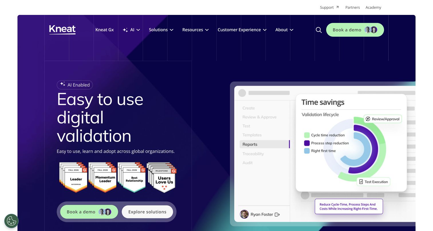
Kneat's homepage pairs a large plain-language validation message with an oversized product-interface illustration. Purple surfaces give the screen a consistent atmosphere, while pale green highlights distinguish the demo action and selected interface details. Small rating badges sit beneath the explanation instead of replacing it. The navigation separates solutions, resources and customer experience, providing routes for visitors at different stages of evaluation. The captured view shows the public marketing website; its Bricks association does not establish how Kneat's validation software, customer accounts or regulated records are implemented.
What you can learn
For specialized software, let a useful interface image carry part of the explanation. Give the main benefit sufficient space, then offer a clear demonstration route and a less committal exploration route. Supporting credentials should remain secondary to a description that a new visitor can understand.
Pros
The product illustration gives the validation proposition a concrete visual reference.
Contrasting action buttons remain distinct within the otherwise consistent purple composition.
Cons & considerations
Several animated messages and product states can compete for attention.
Dense navigation needs clear grouping to remain manageable on smaller screens.
Platform source: Observed Bricks theme asset on the exact public page. Exact public Kneat Solutions website at https://kneat.com/; no claim about separate applications, accounts, clients or parent-brand properties. A bounded public-source audit observed linked Bricks theme scripts or styles on November 10, 2026. This identifies references on the reviewed page, not a complete backend inventory or installed version. Platform evidence is separate from the direct website screenshot and is not a complete current infrastructure audit.
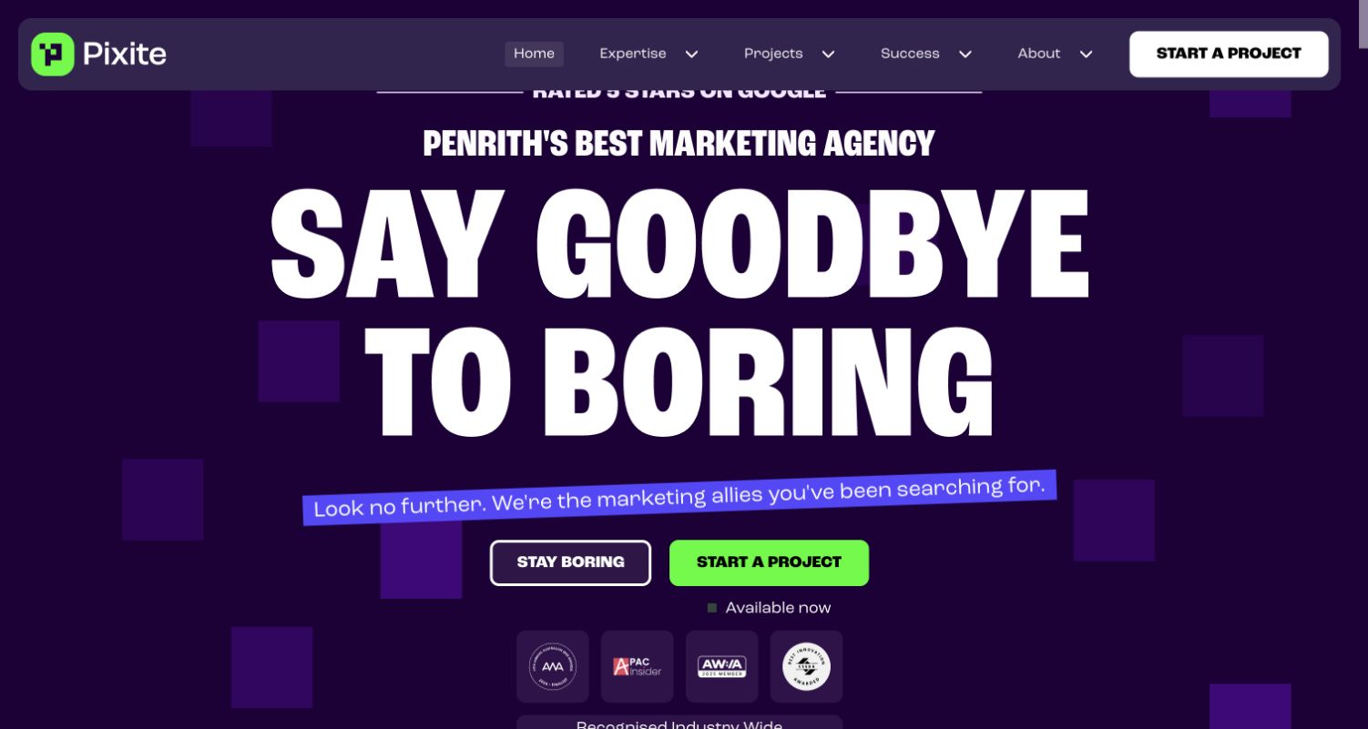
Pixite uses oversized condensed lettering, a dark purple field and bright green accents to make its homepage feel immediately distinctive. A brief positioning line names Penrith, grounding the more playful central message in a specific market. The main project button appears both in the header and beneath the introduction, while a contrasting secondary choice reinforces the site's conversational tone. Farther down, named project cards and service links provide more practical detail. The Bricks evidence applies to Pixite's own website and does not automatically describe any client project pictured in its portfolio.
What you can learn
An expressive agency homepage still needs clear orientation. State the location or audience, give the primary action a consistent visual treatment, and connect the opening personality to specific services and documented work. A memorable headline is more useful when visitors can quickly discover what the business actually provides.
Pros
Large typography and a limited accent palette create a strong first impression.
Repeated project actions make the intended next step easy to identify.
Cons & considerations
The playful secondary action offers less practical guidance than a descriptive link.
Oversized opening type pushes some supporting detail below the first screen.
Platform source: Observed Bricks theme asset on the exact public page. Exact public Pixite website at https://pixite.com.au/; no claim about separate applications, accounts, clients or parent-brand properties. A bounded public-source audit observed linked Bricks theme scripts or styles on November 10, 2026. This identifies references on the reviewed page, not a complete backend inventory or installed version. Platform evidence is separate from the direct website screenshot and is not a complete current infrastructure audit.
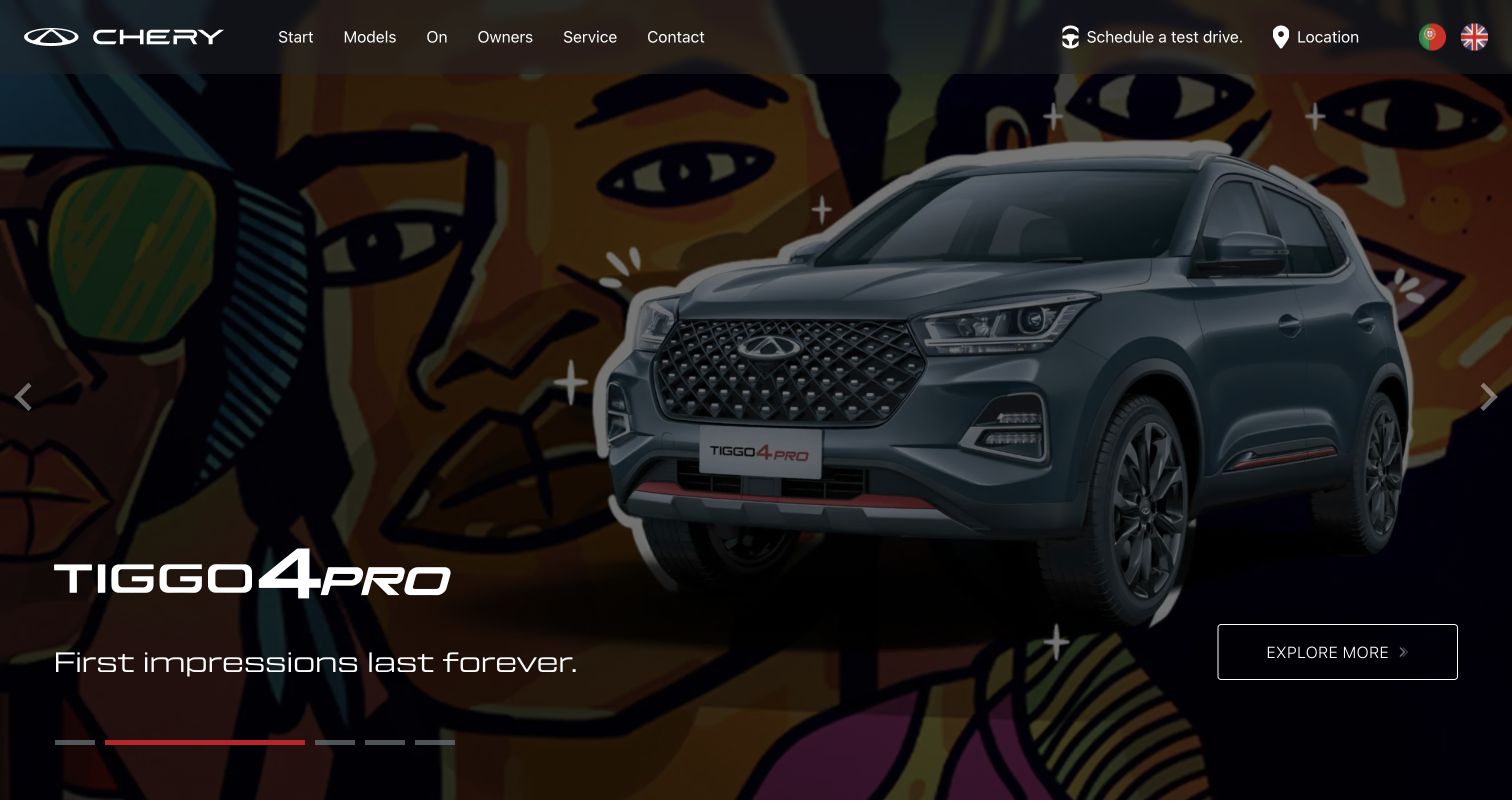
Chery Mozambique gives its opening screen to a large vehicle photograph with a short model message and a clearly outlined exploration link. The header keeps practical destinations visible: models, owners, service, contact, a test-drive route and location. Language choices acknowledge the regional audience. The photographed vehicle remains the dominant object, with darker areas supporting white interface text. This review concerns the Mozambique website specifically. Its Bricks association does not establish the technology of Chery's global corporate estate or separate vehicle systems. The original capture reflects the browser's existing English translation of the Portuguese source page.
What you can learn
For a regional automotive site, combine an aspirational product image with straightforward local tasks. Visitors should be able to find service, location and test-drive information without waiting for a carousel. Give each slide a usable destination and retain readable text over changing photography.
Pros
The prominent vehicle image makes the featured model immediately recognizable.
Local service and location routes remain available in the main header.
Cons & considerations
Automatic slides can move a useful message before someone finishes reading.
Text contrast depends on the brightness of each photographic background.
Platform source: Observed Bricks theme asset on the exact public page. Exact public Chery Mozambique website at https://chery.co.mz/; no claim about separate applications, accounts, clients or parent-brand properties. A bounded public-source audit observed linked Bricks theme scripts or styles on November 10, 2026. This identifies references on the reviewed page, not a complete backend inventory or installed version. Platform evidence is separate from the direct website screenshot and is not a complete current infrastructure audit.
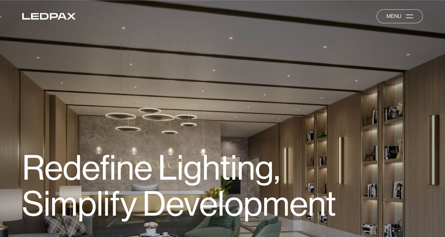
LEDPAX opens with a full-screen interior photograph in which the lighting is visible as part of the architecture. A restrained white wordmark, compact menu and oversized two-line statement leave much of the scene unobstructed. The image communicates the atmosphere of a completed space before the page expands into project examples, process stages and contact information. This is a useful approach for a service whose output is experienced in a physical environment. The Bricks association concerns the public LEDPAX website; the photograph and project claims do not establish independent performance results for its lighting products.
What you can learn
When the finished environment explains a service, choose an image that shows its role clearly. Keep the opening interface restrained, then provide named projects and an understandable process below. A dramatic image should introduce evidence that visitors can inspect, rather than become the entire explanation.
Pros
The interior image demonstrates lighting in the context where it is experienced.
Minimal navigation and large type preserve a clear visual hierarchy.
Cons & considerations
A compact menu hides destinations until the visitor opens it.
Large white text needs careful placement as background images change.
Platform source: Observed Bricks theme asset on the exact public page. Exact public LEDPAX website at https://www.ledpax.co/; no claim about separate applications, accounts, clients or parent-brand properties. A bounded public-source audit observed linked Bricks theme scripts or styles on November 10, 2026. This identifies references on the reviewed page, not a complete backend inventory or installed version. Platform evidence is separate from the direct website screenshot and is not a complete current infrastructure audit.
Kegan has 15+ years of experience working with small businesses, Fortune 500 companies, and everything in between. No development job is too big or too small: he brings the same hands-on attention to a focused improvement, a complete website, or a custom application.
For Bricks projects, he can help with responsive interfaces, reusable components, custom functionality, API connections, and performance-minded implementation. He works directly with clients on scope, design, implementation, testing, and handover, with an emphasis on clear communication and a system that remains practical to maintain after launch.
Show 3 other Bricks developersHide other Bricks developers
Begin with the questions a prospective visitor needs answered: what is offered, where it happens and how to make contact or check availability. A modest set of shared section and button styles can support a distinctive site without creating a different design system for every page. Use strong photography where it explains the offer, and give essential text a reliable background. Keep a direct action available alongside a lower-commitment route to more information.
When records share the same kinds of information, structure those fields before designing their cards. Bricks query loops repeat a layout over query results, and dynamic data within the loop can refer to the current item. That capability is useful when project titles, images and destinations need consistent treatment. It does not replace decisions about taxonomy, empty states, ordering or whether a visitor can understand each card without opening it.
A substantial marketing site beside a separate product
A software company may need a flexible public presentation while its application follows a different architecture. Keep those boundaries explicit in navigation, ownership and technology claims. Plan repeatable landing-page sections, customer-story formats and clear transitions into demos or sign-in. Template conditions can help organize which shared frame appears on each page type, but the content team still needs clear responsibilities for maintaining claims, destinations and campaign expiration dates.
List the decisions visitors need to make before choosing layouts. A venue inquiry, software trial and service appointment can all use a prominent button, but they require different supporting information. Write down what a visitor should know before taking each action, where that information belongs and who will keep it accurate. Separate permanent information from temporary campaigns so an expired promotion cannot become the only route into an important service. Next, inventory the recurring content: locations, projects, team profiles, events, FAQs or case studies. Identify which fields are genuinely shared and which need editorial flexibility. A project title and photograph may fit a common card, while accessibility details or a date range may require dedicated fields rather than freeform text. Bricks query loops can repeat a design over records, but a consistent layout cannot repair inconsistent source content. Make one representative record, one unusually long record and one incomplete record before committing to the pattern. Decide what should happen when an image or optional detail is absent. Finish by assigning an owner and review cadence to each content type. This gives the design a practical maintenance plan and helps prevent visually polished pages from accumulating stale claims and broken destinations.
Choose a limited set of text sizes, spacing relationships, colors and button treatments, then test them against the actual material the site must publish. Start with a realistic long heading and an ordinary photograph rather than a perfect demonstration asset. A hotel image may need room for a building and horizon; a product screenshot may need legible interface detail. Record those different cropping expectations instead of applying one fixed image shape everywhere. Define which action is primary, which is exploratory and which is merely informational. Repeating the same bright treatment for every link makes the hierarchy harder to understand. Bricks Theme Styles provide shared defaults, while responsive controls allow targeted changes as the layout narrows. Use those capabilities to support a coherent system rather than accumulating unexplained exceptions. Review a project card, a long FAQ answer and the main navigation together so typography and spacing remain related across different contexts. Consider consent notices, chat buttons and announcements as part of the occupied page area, not invisible additions. Several examples show how overlays can compete with captions or calls to action. Make space for them, and verify that essential information remains available without requiring visitors to dismiss several prompts before understanding the page.
Plan maintenance and evidence alongside launch content
Document the site's actual responsibilities before connecting external services. A public marketing page, booking provider and customer application may have separate owners and release schedules. Keep that distinction visible in your implementation notes and avoid describing all three as one platform merely because visitors move between them. Record where forms submit, which integrations are essential and who can change their settings. Establish a recovery plan before routine updates begin. WordPress documentation distinguishes the database from site files and explains that both are needed for a complete backup. Decide where those copies are held, how access is controlled and how restoration will be verified without disturbing the live site. Keep a list of active themes, plugins and custom changes so another maintainer can understand the environment. For editorial content, store image rights, source links and the dates on which claims were checked. A redesign should not silently turn an old screenshot into a new observation. When reviewing the finished website, inspect actual routes, forms, error states and content boundaries, then monitor the published result. A well-organized builder project still needs ongoing ownership; attractive sections do not replace accurate information, working destinations or a credible recovery procedure when something changes.
Ask the actual team to carry out its routine job: publish a realistic update, correct a mistake, preview a narrow screen, and identify who owns an integration failure. For a library or frontend framework, also ask who maintains the content source and deployment. A polished screenshot does not answer those operational questions.
Beyond the screenshot
Bricks website planning checklist
Identify the main visitor task and the information required before its primary action.
Separate permanent navigation and practical information from temporary campaign content.
Define shared typography, spacing, colors and button roles before adding page-specific exceptions.
Use structured fields for repeating projects, events, locations or case studies.
Test long titles, missing optional fields and realistic image crops in reusable layouts.
Check keyboard operation, visible focus and understandable labels on navigation and disclosure controls.
Allow room for consent notices, chat controls and announcements without covering essential content.
Verify important destinations and distinguish marketing pages from external booking or application services.
Keep image permissions, original capture dates and dated technology evidence with the relevant source property.
Back up the WordPress database and files, with a documented restoration and maintenance owner.
Test with real content, a keyboard, a small screen, slow or failed requests, and the people who will maintain the system. These are planning checks, not an accessibility, security, performance, or search-ranking certification.
Sources & editorial method
How this Bricks collection was reviewed
Each example is tied to a specific public source page and a genuine direct browser capture. Reused captures retain their original URLs, dates, dimensions and attribution; the reviews provide new Bricks-specific analysis of the visible design. Every source receives or retains a bounded broad technology-audit attempt, with observed signals separated from documentary associations and unverified claims. Explicit Bricks theme references apply to the named public property at the saved observation date, not to every service operated by the organization. The collection compares design decisions rather than endorsing business quality, proving accessibility conformance or attributing measured conversion results to the builder.
Every image is an unmodified capture from the actual website, with its source and capture date. Some captures are reused from our shared catalog; their dates remain the original capture dates. None comes from a vendor gallery or a generated reconstruction. Moving imagery and live content can change.
Technology attribution uses public page assets or metadata, official platform documentation, or a cited first-party project case study. Documentary and framework-relationship evidence is identified where used; it is not a complete current backend inventory. A CMS image CDN alone does not establish a full CMS deployment. A library’s presence does not prove which individual controls use it, and a platform label does not establish AI authorship.
The composition notes, lessons, pros and tradeoffs are original editorial observations. We have not measured conversion, traffic, security, performance or accessibility conformance. Website owners retain their brands and imagery; these examples are not our client portfolio. Written, Edited and Curated are independent records, not dates advanced by a build. See our editorial standards or suggest a correction.
Questions worth asking
Bricks website development FAQs
How can you tell that a website uses Bricks?
An explicit reference to a Bricks theme script or stylesheet on the exact public page can support an observed association at the recorded time. Official project documentation can provide a separately qualified association. A WordPress reference by itself is insufficient, and neither source reveals every private system behind the business.
Do all of these websites use Bricks for their entire product?
No. The evidence is scoped to the public property or documented project identified in each example. A software company's marketing website can use Bricks while its signed-in application, data services and infrastructure use other technologies. A booking destination may also be operated separately.
Can Bricks support a website with frequently changing projects or events?
Bricks documents query loops and dynamic data for repeating layouts over query results. That can support a content library, provided the underlying records, fields and editorial process are designed carefully. The builder does not decide which information visitors need or keep outdated content accurate automatically.
Does a Bricks website automatically work well on mobile?
Bricks provides responsive editing controls, but a good result still depends on content and design decisions. Long navigation labels, large headings, image crops and overlapping notices need attention at narrower widths. A desktop screenshot does not establish the behavior of every responsive state or interactive control.
What should be planned for ongoing maintenance?
Assign ownership for content, integrations, updates and recovery. Keep the WordPress database and site files in the backup plan, document essential dependencies and verify restoration procedures. Preserve the dates and sources behind published claims so a visual refresh does not imply that older evidence was newly checked.
Borrow a clear decision from each example: a useful navigation split, a disciplined action hierarchy, a well-framed photograph or a repeatable content pattern. Then adapt it to your own visitors, source material and maintenance responsibilities.