Best Splide Websites of 2026 (20 Real-World Examples)
Real websites with scoped Splide references, plus practical guidance for useful galleries, cards, and user-controlled carousels.
Splide is a carousel library, not the system responsible for a website’s entire design. These examples pair public product-specific asset references with visual observations about the actual pages. A detected script does not tell us which pictured component uses it.
A carousel creates a content decision before it creates a technical one: some material will be visible immediately, and some will require an additional action. That can be useful for a compact gallery or related items, but it can also bury important information. Begin by deciding what deserves to be seen without interaction. An essential service explanation or primary call to action should not depend on somebody waiting for the right slide.
Use this collection to compare composition, navigation, content density, and the relationship between imagery and useful labels. The source evidence is narrower than the design review. We found a Splide-specific public asset reference on each exact cited page; we did not inspect private configuration, certify accessibility, measure business outcomes, or attribute every moving element to the library.
Before the examples
What makes good Splide website development in 2026?
Give the hidden content a defensible purpose
Explain why a gallery or carousel helps the visitor more than a simple list. Put the most important information outside the rotating area or in a dependable initial position. A familiar component is not automatically the right information architecture.
Splide documents an explicit play-pause toggle for autoplay. Make controls understandable and usable rather than relying on movement alone to reveal that more content exists. Consider a stationary default when motion does not help the actual task.
Card proportions, text length, navigation arrows, pagination, and responsive counts affect one another. The options reference provides configuration choices, but selecting them requires a real layout and content review. Do not treat the library’s default demonstration as a finished branded component.
Study where each page places its explanation and primary actions, how much visual space images receive, and whether additional material is discoverable. A scoped Splide reference does not prove that an individual visible gallery is initialized by that library.
We start with five recognizable brands or organizations: Quicken, Rackspace Technology, Airship, Cadence Education, Chery Mozambique. Each attribution applies to the named website property, not every product or website belonging to its organization. This is a curated reading sequence, not a measured ranking.
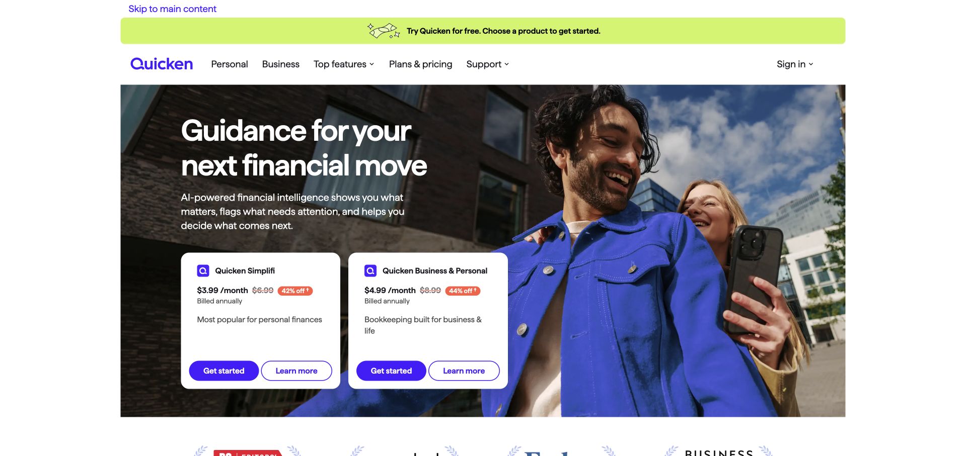
Quicken’s retained opening places two white product cards over a lifestyle photograph. Each card has a product name, a price with annual-billing context, a short description and separate Get Started and Learn More actions. The lime announcement strip and purple navigation retain the brand outside the photograph. Current source evidence references Splide styles, scripts and a named integration file. That supports a slider dependency association, but does not establish that the pictured cards are slides or identify any financial-product backend.
What you can learn
If product offers appear in a sequence, preserve directly comparable names, terms and destinations without requiring visitors to remember a previous slide. Keep billing qualifications with each offer and test keyboard access separately. A slider reference cannot verify price availability, purchase completion or which visible block is initialized.
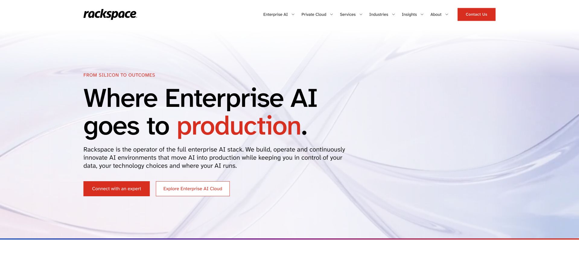
Rackspace Technology’s retained homepage uses a pale abstract background and a large black headline with red emphasis. A short supporting paragraph sits above two distinct actions: connecting with an expert and exploring the advertised offering. The white header keeps enterprise services, industries and insights available independently. Current evidence references Splide assets within a theme path. This identifies a public slider dependency, not the implementation of the advertised infrastructure, the behavior of a particular hero or every page in the organization’s estate.
What you can learn
Give each featured proposition a readable title, useful explanation and stable destination before making it part of a rotating presentation. Keep ordinary service navigation available outside the sequence. Review pause, focus and reduced-motion behavior directly; a library path cannot establish successful interaction or enterprise architecture.
Pros
The opening separates a conversation route from a research route.
Restrained colors give the proposition and primary action clear emphasis.
Cons & considerations
A broad enterprise claim needs concrete supporting pages.
The public dependency does not identify initialized elements or verify slider accessibility.
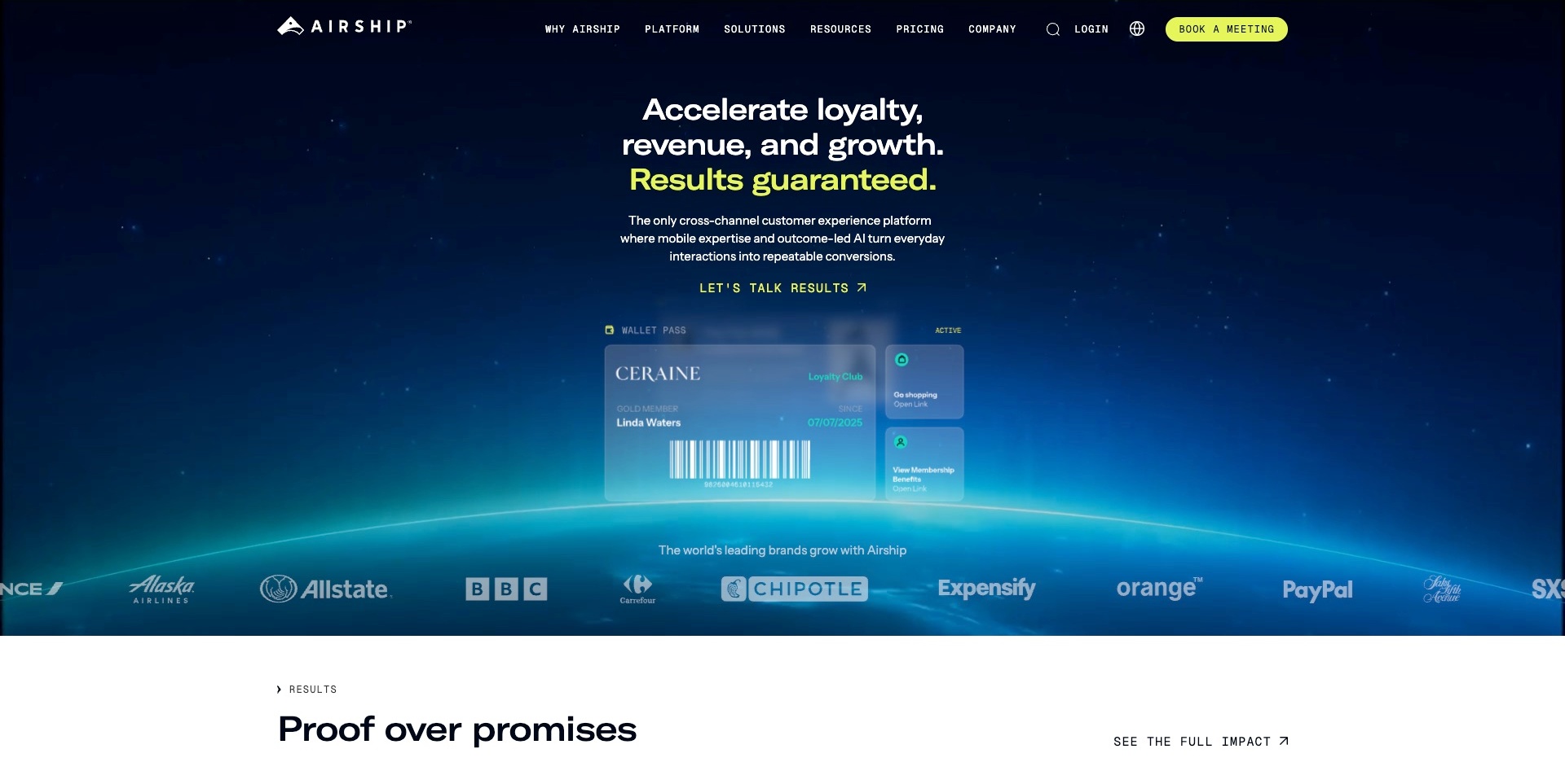
Airship’s dark blue opening centres a white-and-yellow proposition above a wallet-pass illustration. Membership details and small action panels give the broad software category a concrete object, with a customer-mark strip below. A yellow meeting button is distinct from the inline results route. Current exact-page evidence references a Splide script asset. It does not establish that the wallet illustration or any pictured movement is a Splide carousel, that a component initializes or that the supplier’s results language is independently verified.
What you can learn
Use an illustrative working object to explain the category, then connect it to appropriate product detail. For any repeated-content component, make navigation and content usable without assuming autoplay or a particular library. Keep commercial claims and customer associations scoped to their actual sources.
Pros
The wallet example gives the platform a recognisable subject.
Commercial and information actions are distinct.
The limited bright accents create a clear hierarchy.
Cons & considerations
If outcome claims lead, explain their conditions.
If customer marks support the offer, retain substantive product detail.
If a slider asset is referenced, verify the actual implemented component separately.
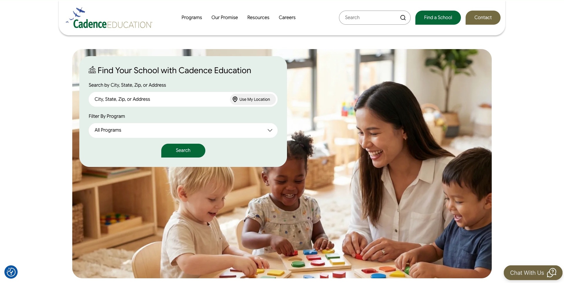
Cadence Education overlays a pale school-finder panel on a teacher-and-children photograph. The panel names city, state, ZIP or address input and separates an optional location control from a program filter. Find-a-school and contact routes also appear in the rounded header. Current exact-page evidence references a Splide script asset; that does not prove the visible finder or photograph is a slider, or establish how a search is processed. No location permission, search or enquiry was submitted during capture.
What you can learn
Give a directory task meaningful inputs and an understandable non-location-permission path. Let visitors narrow by the information they actually know. Any carousel elsewhere should support that journey rather than replace the visible school-discovery controls or become the only way to reach a location.
Pros
The discovery task is named explicitly.
Program selection is distinct from location input.
Corporate contact remains separate from finding a school.
Cons & considerations
If location permission is offered, keep manual search usable.
If imagery implies an experience, avoid treating it as quality evidence.
If a slider asset loads, independently verify its actual use and controls.
Chery Mozambique’s retained opening shows a Tiggo 4 Pro vehicle against a colorful mural, with a model label, short statement and Explore More action. Side arrows and a row of progress marks visibly indicate a sequence. The header keeps models, ownership, service, contact, location and test-drive routes in place, alongside language choices. Current source evidence references a Splide script within the local site’s theme assets. That supports an association, but does not independently prove which sequence the library initializes or describe Chery’s global technology estate.
What you can learn
Keep model identity and a meaningful destination attached to every frame, while preserving local contact and service tasks outside the carousel. Check that controls remain understandable over varied photography. A captured sequence and script reference do not verify keyboard operation, translated content accuracy or test-drive completion.
Pros
Stable header tasks remain visible around the promotional image.
The model name gives the frame more context than a vehicle photograph alone.
Cons & considerations
Dark overlays and changing imagery need contrast review.
The source reference does not establish the exact slider configuration or its fallback.
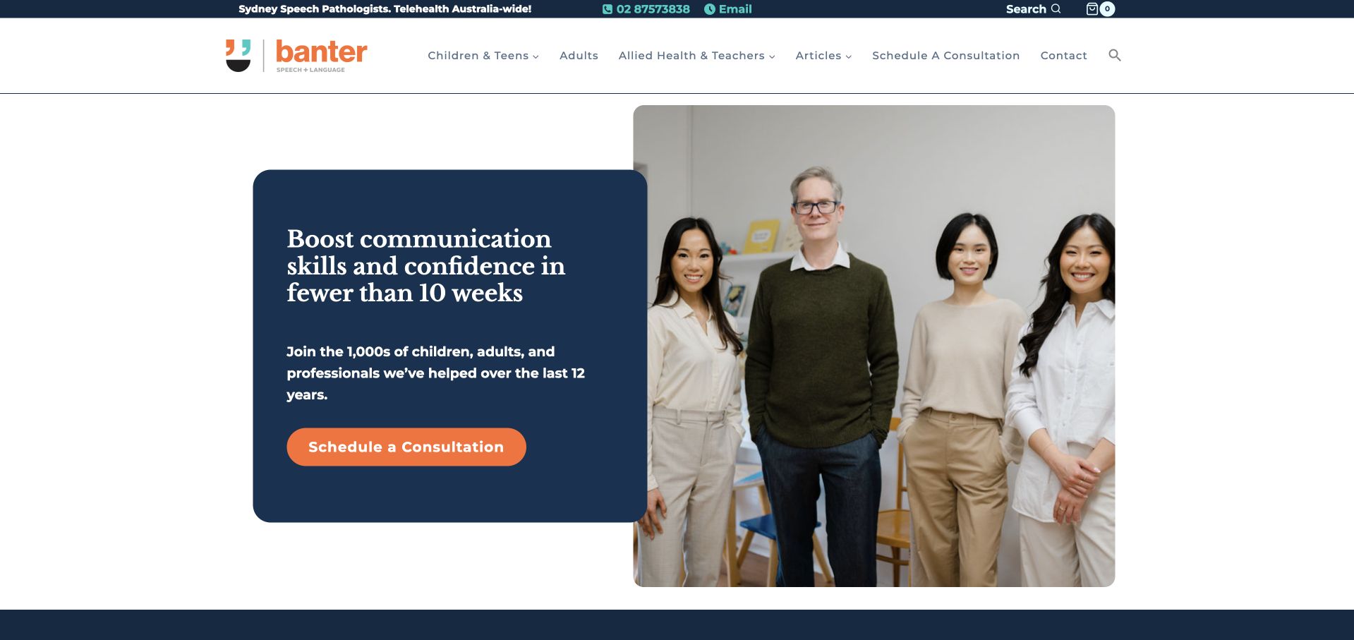
Banter Speech & Language’s retained homepage combines a dark blue text panel with a team photograph and an orange consultation action. The header separates children and teens, adults, professional audiences, articles and contact. A narrow utility strip exposes phone and email information. Current source evidence references Splide styling, scripting and initialization assets through a block-plugin path. Those references support a slider association, not a conclusion that the pictured introductory panel rotates or that any consultation workflow has been tested.
What you can learn
Use a carousel only where a sequence genuinely helps visitors, and keep audience routes and contact information available independently. Make each item understandable without remembering another panel. Clinical and timescale language requires its own substantiation; a slider dependency cannot validate care outcomes, availability or the accessibility of an appointment journey.
Pros
Audience labels offer direct routes beyond the general introduction.
A single high-contrast consultation action is easy to identify.
Cons & considerations
Strong outcome language should be evaluated separately from presentation quality.
The source assets do not identify active slides or demonstrate pause and keyboard behavior.
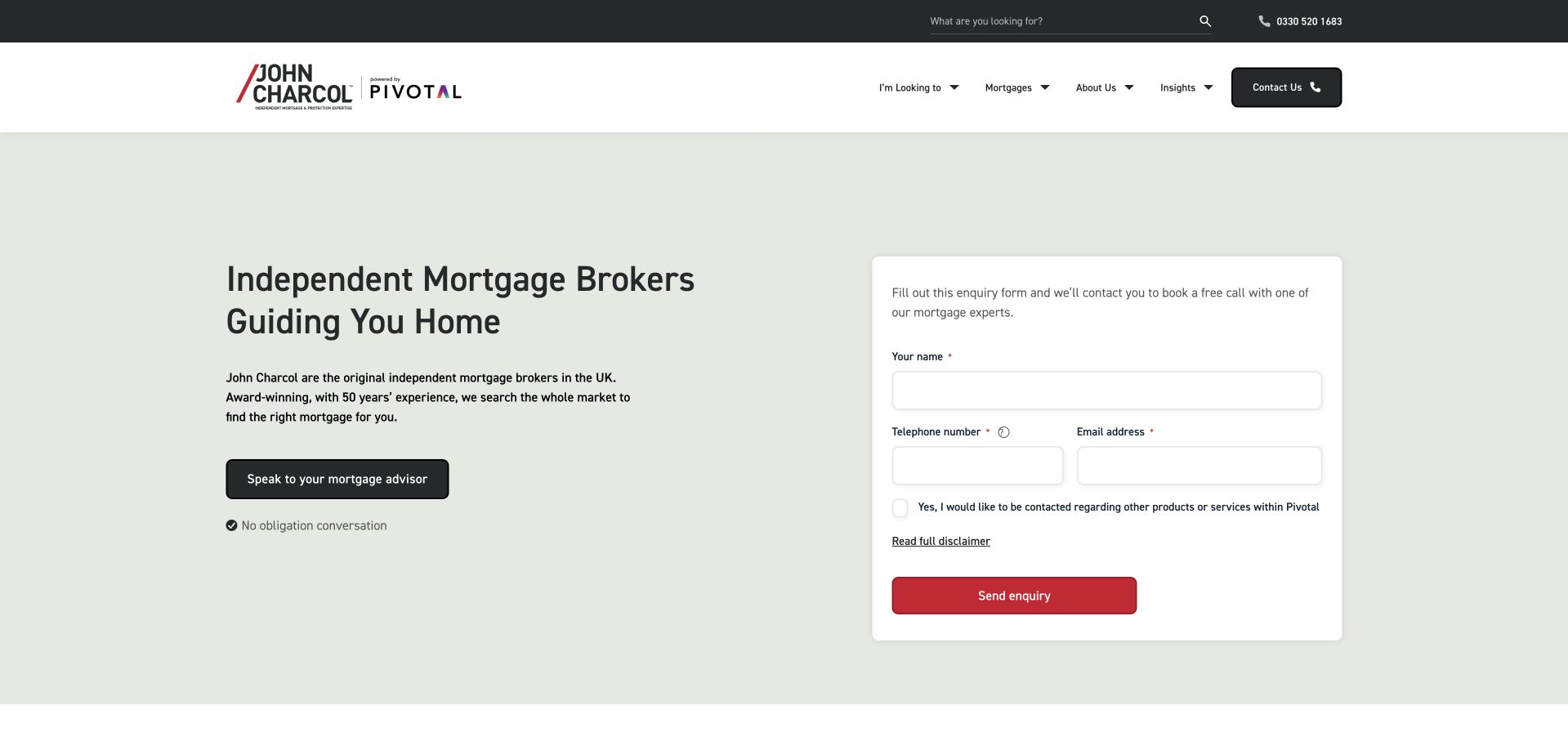
John Charcol’s retained hero places a plain broker introduction beside a contained callback form on a pale background. Visible fields request contact details, and a separate checkbox refers to other products or services. Telephone and ordinary navigation remain in the header. Current source evidence references Splide, but this frame does not identify a carousel or prove that Splide powers the form. The useful comparison is a primary task that can remain clear even when the wider page includes a separately loaded presentation library.
What you can learn
Keep any carousel independent of the main inquiry route, and explain the purpose of the form beside its fields. For slider content, provide readable labels, controls and a useful non-autoplay state. Neither an asset path nor a static capture establishes keyboard behavior or a successful submission.
Pros
The introduction and form have clearly separated visual areas.
An ordinary telephone route remains available outside the form.
Cons & considerations
A form-led opening can feel premature without nearby process information.
The source reference does not identify which component initializes Splide or validate its accessibility.
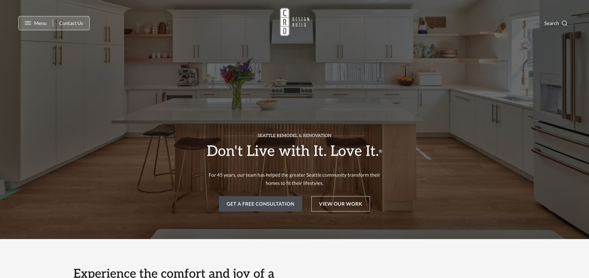
CRD Design Build’s retained opening centers white text over a wide kitchen photograph with a dark treatment. A compact mark sits above, with menu and contact controls at the left and search at the right. Free Consultation and View Our Work are separate actions beneath the introduction. Current evidence references Splide styling and JavaScript within the site’s theme assets. The association does not prove that this photograph is a carousel slide or that the library creates the overlay and layout.
What you can learn
If project imagery becomes a sequence, keep project descriptions and the ordinary portfolio destination available outside it. Distinguish exploration from an inquiry so visitors can choose their level of commitment. Test controls against every image rather than assuming an included library supplies adequate contrast, useful alternative text or a working fallback.
Pros
Portfolio browsing and consultation have different visible actions.
The restrained header leaves substantial space for the project photograph.
Cons & considerations
The large image delays detailed project identification.
The public reference does not establish active initialization or prove any inquiry outcome.
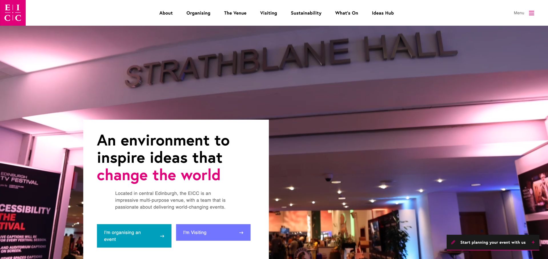
EICC places a white introductory panel over venue photography, with different colored actions for organizing an event and visiting. Its header separates venue, visitor and editorial information, and a compact planning invitation stays at the lower right. Current evidence references Splide styles and a script. This supports a dependency association on the exact page, not a claim that Splide creates the pictured hero or that a carousel was operated. The visible design is useful for keeping audience-specific tasks understandable within a large image-led introduction.
What you can learn
If a slider presents venue images or stories, keep organizer and visitor routes outside the sequence so they do not move out of reach. Give slides meaningful text and predictable controls, and test focus and reduced-motion behavior in the actual implementation rather than inferring them from a library name.
Pros
Separate actions distinguish two real visitor tasks.
The introduction has its own readable surface over the photograph.
Cons & considerations
A broad desktop navigation needs careful prioritization on small screens.
The observed Splide files do not establish which slides initialize or whether controls are usable.
Tend’s retained homepage pairs smiling portraits in rounded frames with green typography, a blue Book Now action and a separate phone option. A location-search control remains in the upper navigation. Beneath the introduction, pale service cards show Dental Exams, Emergency Care and Oral Hygiene, flanked by visible arrow controls. Current source evidence references Splide styles, scripts and an auto-scroll extension. That supports a slider association without proving which component is initialized, whether automatic movement is enabled or how appointment scheduling works.
What you can learn
Keep service names and destination links understandable when only part of a sequence is visible. Place appointment and location tasks outside optional movement, and verify keyboard focus, pause behavior and reduced-motion alternatives directly. An extension file does not demonstrate its configuration or establish a completed booking.
Pros
Service discovery is separated from the primary appointment action.
The header retains a practical location task beside the brand navigation.
Cons & considerations
Several rounded controls need distinct accessible names and focus states.
The detected assets do not prove which sequence runs or validate clinical and booking claims.
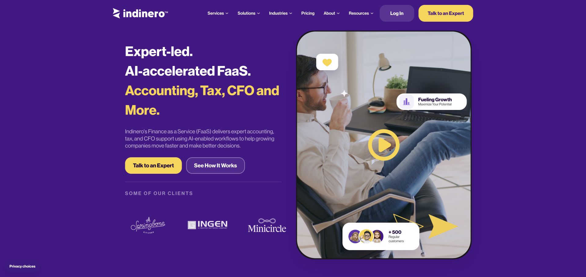
inDinero’s retained homepage uses a purple field and yellow emphasis to introduce accounting, tax and CFO services. A portrait-led video preview fills the right side, with decorative cards, while client marks begin below the written proposition. Talk to an Expert and See How It Works provide distinct routes. Current evidence references Splide styles and JavaScript within a theme path. That supports a public carousel dependency, not a finding that the video, client marks or floating cards are controlled by it.
What you can learn
Use any sequence of client proof or service content as support for an explanation that remains readable on its own. Keep destinations meaningful outside movement and avoid treating a logo carousel as evidence of outcomes. A library reference cannot identify the accounting platform, verify video playback or establish that an inquiry succeeds.
Pros
The two actions distinguish a conversation from further explanation.
Text and media have recognizable areas within the strong color system.
Cons & considerations
Decorative cards can compete with the main service explanation.
The public dependency does not identify active carousel elements or verify their controls.
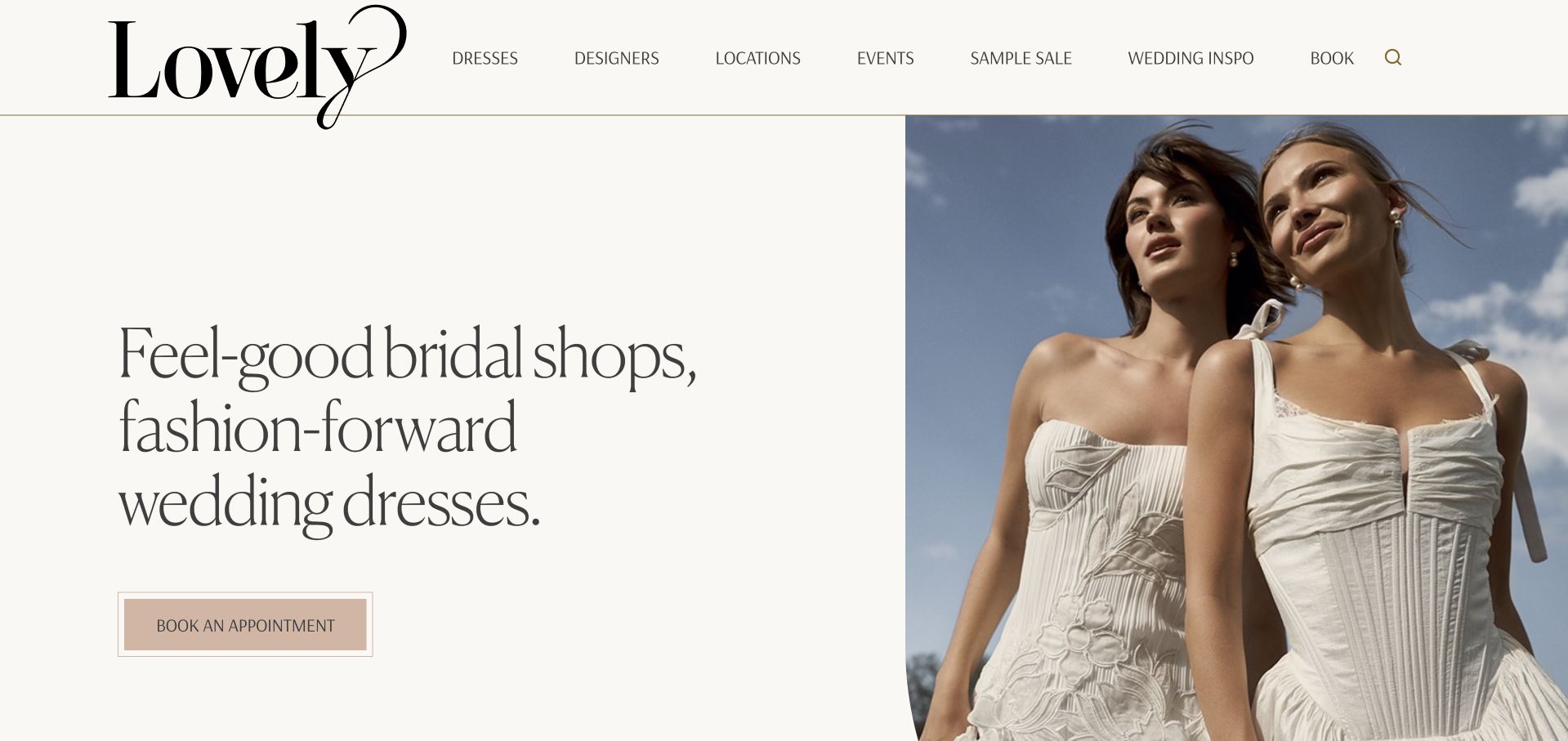
Lovely Bride’s retained opening pairs a large cream text area with a fashion photograph. The oversized serif identity continues into a short bridal-shopping proposition, while a muted appointment button remains easy to distinguish. Dresses, designers, locations, events and booking have separate header routes. Current source evidence references Splide assets through the site’s block-plugin asset paths, including its delivery domain. The evidence supports a slider association, not a conclusion that the pictured split layout rotates or that appointment and stock systems share that implementation.
What you can learn
If collections or designers appear in a carousel, preserve ordinary browsing routes and identify each item without relying on motion. Keep appointment tasks distinct from inspiration and make location context explicit at the destination. A slider dependency does not verify sample availability, booking success or keyboard behavior.
Pros
The split composition gives the written proposition its own space.
Location and designer research remain available outside the primary appointment route.
Cons & considerations
Large imagery and typography limit practical detail in the opening.
The asset association does not establish active slides or a usable fallback.
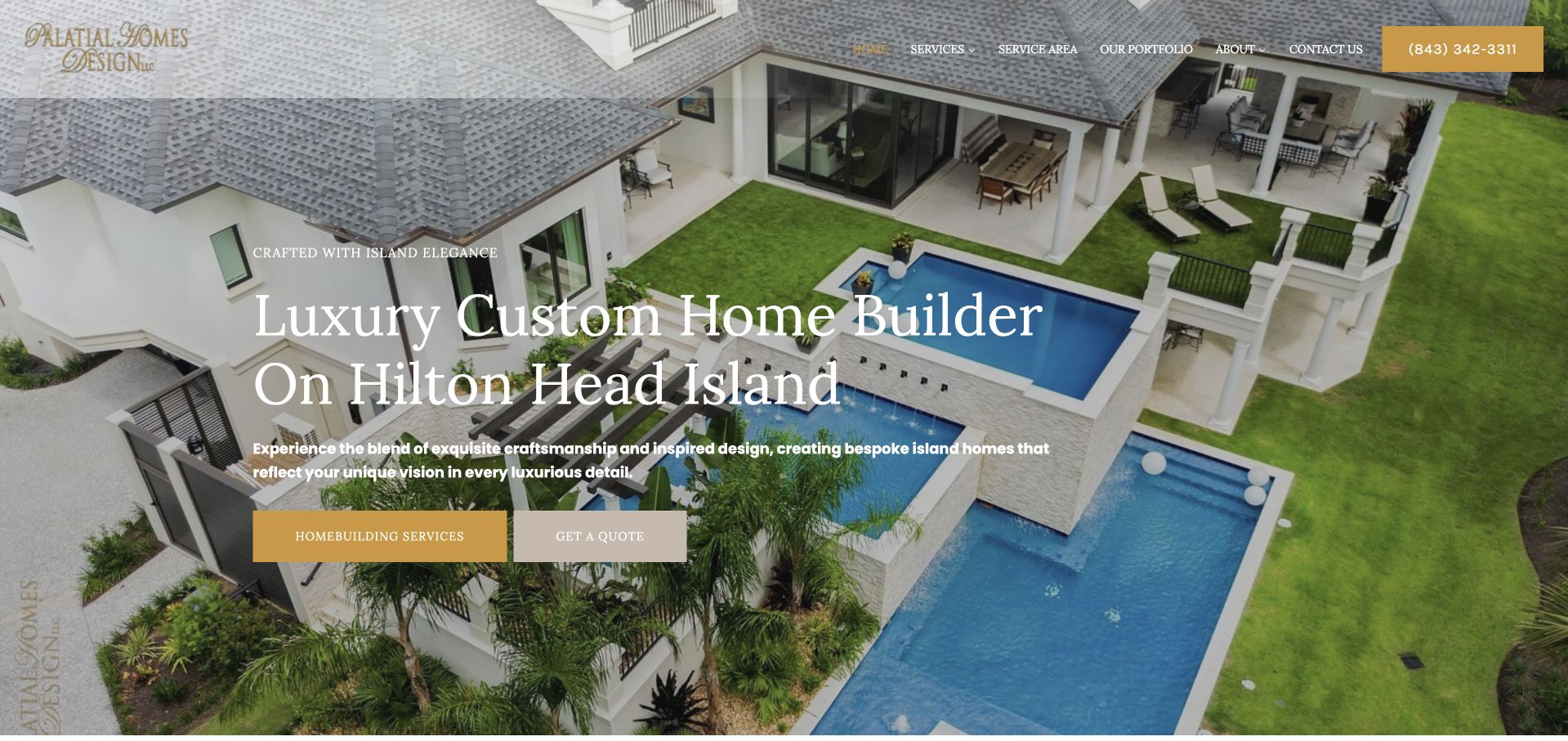
Palatial Homes Design uses an aerial residential image, white serif type and gold accents to introduce a Hilton Head Island homebuilding practice. Service and quotation actions sit below the copy, and a telephone route remains in the header. Current page evidence includes Splide assets associated with the site’s block components. That does not prove that the pictured property frame is a Splide slide, that a particular component was activated or that the library caused the layout. The useful pattern is the separation of research and inquiry actions over a visually dominant image.
What you can learn
For any project carousel, keep the service description and contact actions stable outside the changing frames. Supply project context, useful stills and accessible controls rather than making an image sequence the only evidence. Verify the actual component and fallback before attributing behavior to a referenced library.
Pros
The location is explicit within the otherwise aspirational introduction.
Separate service and quote actions support different stages of research.
Cons & considerations
White text needs contrast checking over every relevant image state.
Loaded block-library assets do not establish that every slider option is used.
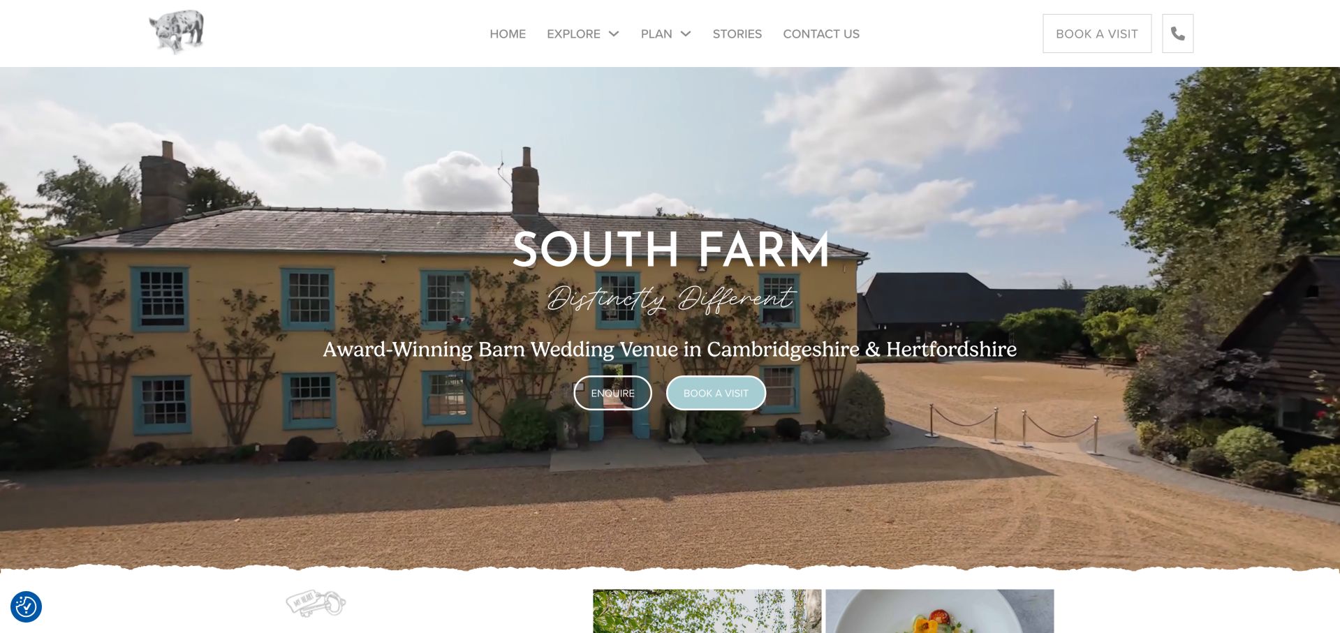
South Farm’s retained homepage places its name and regional barn-wedding description over a wide farmhouse photograph. Enquire and Book a Visit are separate actions, repeated by a practical header route. A torn-paper edge and small illustrated details extend the rural identity below the image. Current evidence references Splide styling and scripts within the site’s theme assets. That supports a slider dependency but does not establish that the captured farmhouse frame rotates or identify the system behind visits and inquiries.
What you can learn
Use a visual sequence to introduce different spaces only when each has useful context and a stable destination. Keep location, visit and inquiry information available without waiting for another slide. Check contrast across every frame and test the actual controls; a library reference is not evidence of an accessible carousel or confirmed appointment.
Pros
The introduction identifies the venue type and region alongside the image.
Inquiry and visit planning are clearly separated actions.
Cons & considerations
Large media can delay capacity and practical planning information.
The detected assets do not identify initialized components or verify visit availability.
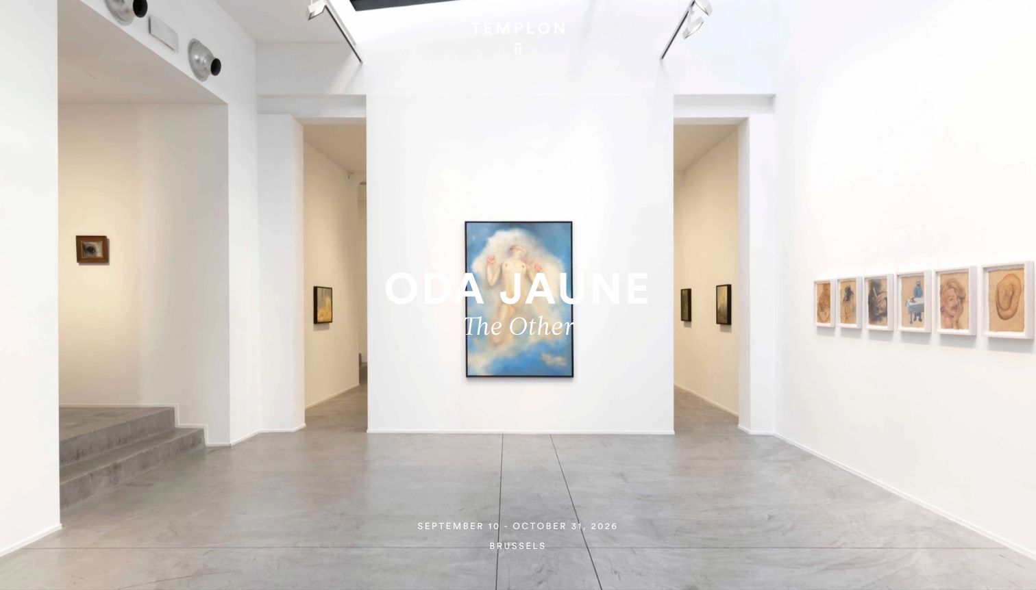
Templon’s retained opening uses a bright gallery-installation photograph with Oda Jaune’s name and exhibition title centered over it. A date range and Brussels location appear near the bottom, while the small gallery mark sits above. The pictured October closing date is historical, not a claim that the exhibition remains open. Current evidence references Splide module and bundle assets in the gallery’s theme. Those references support a slider association but do not prove the pictured installation is initialized as a slide.
What you can learn
Keep artist, exhibition, venue and dates attached to each featured item and provide ordinary archive routes when a presentation changes. Do not let a rotating image become the only source of practical information. Verify text contrast and focus behavior directly; a dependency path cannot establish current opening arrangements or accessible controls.
Pros
Artist and exhibition identity are visible within the image-led opening.
Location and dates give the feature practical context.
Cons & considerations
White text on a bright installation requires careful contrast review.
Historical content and a slider reference cannot establish current exhibitions or active configuration.
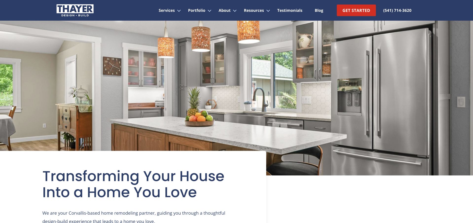
Thayer Design Build’s retained opening places a wide kitchen photograph beneath a navy header. A white text panel overlaps the image, introducing the remodeling proposition and its Corvallis context. Services, portfolio, resources and testimonials remain separate routes, with a red Get Started action and visible phone number. Current evidence references Splide assets through a block-plugin path. This identifies an observable slider dependency, not a finding that the photographed kitchen is a slide or that the library produces the overlapping panel.
What you can learn
If project photographs are sequenced, keep a useful project description and portfolio link outside the movement. Give each frame enough context to distinguish a design reference from a service promise. Test navigation and image alternatives directly; a plugin asset cannot verify accessible controls, inquiry completion or the scope of the depicted work.
Pros
Portfolio and service research have distinct header labels.
The overlapping white panel gives copy a consistent reading surface.
Cons & considerations
The image occupies much of the opening before detailed project context.
The source references do not identify active sliders or establish fallback behavior.
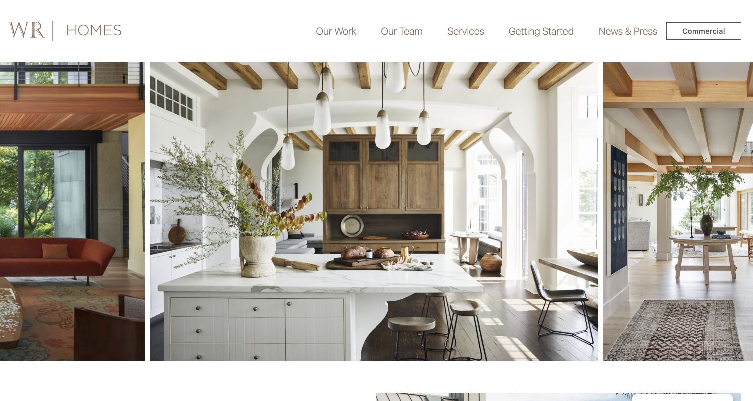
Wright-Ryan Homes’ retained opening uses a restrained WR Homes identity and adjacent interior photographs separated by narrow white gutters. The center kitchen image is larger than the neighboring views, creating a portfolio-first presentation. Our Work, Our Team, Services and Getting Started remain visible, with Commercial set apart at the right. Current source evidence references Splide assets through a block-plugin path. That supports a slider association without proving the pictured arrangement is its initialized component or describing the organization’s other websites.
What you can learn
When a portfolio uses a sequence, identify projects and retain ordinary project links rather than making movement the only browsing mechanism. Preserve the distinction between residential and commercial routes. Review focus, controls and image descriptions directly; asset detection cannot establish usable navigation or prove the library caused the photographed layout.
Pros
The restrained header leaves substantial room for the work.
Residential research and the commercial destination remain clearly separated.
Cons & considerations
Uncaptioned photographs provide limited project identification in the opening.
The observed dependency does not identify active components or demonstrate a useful fallback.
Silverts’ retained view combines several announcement rows, a large adaptive-clothing header and a sale panel over a close garment image. Feature, need and care-home routes remain in the main navigation alongside search. Current evidence references Splide resources and site-specific files whose names identify an accessible slider implementation. File names are not an accessibility assessment, and the capture does not establish which visible promotion uses those files. The useful design question is how to keep catalogue discovery stable while presentation content changes.
What you can learn
Keep feature and need categories available outside a promotional carousel, and preserve meaningful product descriptions when motion is reduced. Test slide controls, focus order and announcements directly. A library or wrapper labeled accessible does not prove that the finished configuration meets a user’s requirements.
Pros
Feature and need navigation offers different ways into the catalogue.
Search remains visible outside the promotional image area.
Cons & considerations
Stacked announcement rows reduce the space available for product context.
Public slider references do not verify the behavior or accessibility of the active component.
Chapel Hill Tire uses navy and yellow around a mechanic photograph, with separate tire-shopping and appointment actions inside a translucent panel. A centred brand badge connects the header layers, while location discovery and review-style indicators sit above. Three large icons reinforce repair, value and locations. Current exact-page evidence references Splide stylesheet and script assets. Those references do not establish that this hero uses a slider, verify a booking flow or independently substantiate the service-quality statements.
What you can learn
Make repeated content serve clear tasks rather than placing every message in a rotating introduction. Give shopping, appointments and location choice their own labels and destinations. If a carousel is actually used, evaluate its controls, focus and small-screen content independently from the presence of a library file.
Pros
Shopping and booking have different action labels.
Location discovery is visible in the header.
The palette connects identity and controls.
Cons & considerations
If multiple header layers persist, test small-screen hierarchy.
If ratings are shown, explain their source.
If slider assets are present, do not assume initialization or accessible operation.
Gold Path Solar places a dark written panel beside a white quote form over an aerial residential video frame. The supporting copy names service regions and distinguishes residential work from other offerings. The form visibly includes contact fields, a CAPTCHA and a marketing-agreement checkbox, all left untouched. Current exact-page evidence references Splide-related assets through Kadence components. That establishes public component references, not that the background video, form or a pictured element is a working Splide carousel.
What you can learn
Keep service scope readable beside an enquiry route, and explain what submitting begins. Repeated project or testimonial content should have clear controls if used, but it should not distract from the required form decisions. Verify the actual component and data-handling implementation separately from a public asset path.
Pros
Service-area text gives the proposition geographic context.
The inline enquiry route is easy to identify.
Brand navigation remains distinct from the form.
Cons & considerations
If the form dominates, retain a lower-commitment learning route.
If marketing choices are required, review the actual process carefully.
If carousel assets load, verify their scope rather than attributing the video to them.
Kegan has 15+ years of experience working with small businesses, Fortune 500 companies, and everything in between. No development job is too big or too small: he brings the same hands-on attention to a focused improvement, a complete website, or a custom application.
For Splide projects, he can help with purposeful carousels and image collections, accessible navigation and controls, responsive layouts, reduced-motion behavior, integration checks, and practical content editing. He works directly with clients on scope, design, implementation, testing, and handover, with an emphasis on clear communication and a system that remains practical to maintain after launch.
Show 3 other Splide developersHide other Splide developers
Choose the smallest interaction that supports the content
Use a normal grid for important comparisons
If visitors need to compare several services or products at once, a stable grid may communicate the relationship better. Prototype that simpler version before assuming the content needs to move. The decision should follow the reading and comparison task.
A related-items row or visual gallery can benefit from a bounded horizontal sequence. Keep the next action obvious, preserve useful card labels, and offer a practical route to the full collection when the row is only a preview. Avoid hiding the only link to a vital destination.
Splide’s installation guide covers direct inclusion and framework integrations. Choose one understood ownership model and document initialization and cleanup. A theme, page builder, and application should not all attempt to control the same component independently.
Plan a carousel people can understand, operate, and maintain
Define what should never be hidden
Write a content inventory before choosing slide counts. Separate the main proposition, essential qualification, primary action, supporting examples, and optional exploration. Decide what a first-time visitor must understand without waiting, dragging, or clicking. If a slide contains important information unavailable elsewhere, consider moving that information into ordinary page content. A rotating introduction can create a pleasing rhythm, but it is a fragile place for information that determines whether somebody can use the service. Make the initial state a designed decision rather than whichever record happens to arrive first from the CMS.
Describe why a sequence is useful. It might let a visitor browse room photographs, related articles, or project details without leaving the current context. It might instead be compensating for an unresolved argument about homepage priorities. Those situations require different solutions. Review a static version alongside the carousel and ask what is gained and lost. Record the chosen order and the rules editors may change. Keep the page understandable when there is one item, no item, or fewer items than the normal desktop row, because real content rarely stays at the demonstration count.
Specify the purpose and label of every control: previous, next, a particular position, play, pause, or opening a larger view. An unlabeled decorative shape may look restrained while offering little explanation. Place controls where they remain associated with the correct collection, especially when several carousels appear on a long page. Review contrast against real images and text rather than a convenient neutral placeholder. Make the active state and the end of a sequence understandable without relying only on a tiny color difference.
Walk through the component using the intended input methods. Check the relationship between focus, visible content, and controls; a person should not lose their place when the sequence changes. Give the carousel a meaningful accessible name appropriate to its subject. Do not claim that installing an accessibility-aware library certifies the whole implementation. Custom markup, styling, inserted links, and later edits can change the experience. Record the tested behavior and unresolved limits, and let the responsible accessibility reviewer evaluate the actual page rather than a product brochure.
Begin with a user-controlled prototype and add automatic movement only if there is a clear reason. A visitor reading a longer card should not be forced to race a timer. If autoplay is enabled, provide a clear pause mechanism and review the states after interaction. Splide’s autoplay documentation explains the play-pause control; the project still needs to decide where that control belongs and what behavior is appropriate. A sales requirement to display several messages is not evidence that visitors benefit from automatic rotation.
Review motion preferences and consider how the experience behaves when movement is reduced. Check whether background video, animated typography, and rotating cards together create an unnecessarily busy opening. Use actual copy lengths and images during this review. A short demonstration caption can make a timer appear comfortable even though the real translation needs much longer to read. Record the intended default and the conditions that change it. Treat timing as a content and usability choice, not simply a number inherited from another website’s configuration.
Prepare a representative card set containing short and long headings, missing optional details, portrait and landscape imagery, and any badge or metadata that will actually appear. Review the sequence at the relevant widths instead of relying on one perfectly aligned desktop screenshot. Decide which relationships should remain visible when the row becomes narrower. A fraction of the next card can suggest further content, but it should be an intentional affordance rather than an accidental clipping error. Keep text readable and controls reachable without requiring extremely precise dragging.
Set an image policy with practical crop and size guidance. Reserve suitable space so loading does not repeatedly shift nearby content. Separate the first useful image from items farther along the sequence when deciding what to load early. Inspect slow and failed-image states and give the content an understandable alternative where appropriate. Avoid placing essential information inside image lettering alone. These requirements belong to the component brief even though some are implemented by the theme, content system, or delivery pipeline rather than Splide itself.
Identify who supplies items, who controls their order, and which component mounts the carousel. Choose one integration approach appropriate to the existing frontend. For application navigation, account for entering a page directly, moving between views, returning with the back button, and replacing content. Ask the implementer to demonstrate that a component is not initialized twice and that old behavior is cleaned up when its owner is removed. The purpose is a predictable experience, not an elaborate implementation that only its original author can explain.
Give editors sensible limits rather than unrestricted control over every option. A content manager should understand acceptable heading lengths, image requirements, and when a sequence should become a normal list. Document what happens when items are unpublished or an external destination disappears. Keep the release version and configuration reproducible. The official installation guide recommends a specific version rather than a floating latest CDN reference; pair dependency updates with a short regression review of the actual components. A version change should not silently alter the public interface.
Accept the whole page and provide a simple fallback
Test the carousel in context with the surrounding headings, sticky navigation, cookie controls, forms, and other moving elements. Check that the page remains useful before initialization and after the relevant script fails. A component that works in isolation can still overlap another control or trap a visitor in an awkward horizontal region. Include ordinary keyboard navigation, zoom, a narrow layout, empty content, and the last item in the acceptance session. Save specific findings rather than marking the interface passed because it moves smoothly on one laptop.
At handover, demonstrate adding, reordering, correcting, and removing an item. Explain the controls and the route for reporting a failure. Maintain a known working component configuration and a straightforward recovery path. If the interaction no longer earns its complexity, the team should be able to return to an understandable list or grid without losing the content. Do not promise higher conversion or better rankings from a carousel itself. Evaluate the actual visitor task, and keep any measured result separate from the fact that a particular library is present.
Ask the actual team to carry out its routine job: publish a realistic update, correct a mistake, preview a narrow screen, and identify who owns an integration failure. For a library or frontend framework, also ask who maintains the content source and deployment. A polished screenshot does not answer those operational questions.
Beyond the screenshot
Splide component planning checklist
Explain why a sequence is preferable to a normal list.
Keep essential explanations and primary actions dependable.
Design the first, last, single-item, and empty states.
Give controls meaningful labels and clear ownership.
Review keyboard focus and visible content together.
Provide a play-pause control when enabling autoplay.
Consider reduced motion and competing animations.
Test real copy lengths, translations, images, and badges.
Set intentional responsive counts and crops.
Keep one initialization owner and test cleanup.
Use reproducible version and configuration records.
Demonstrate editorial changes and a useful failure state.
Test with real content, a keyboard, a small screen, slow or failed requests, and the people who will maintain the system. These are planning checks, not an accessibility, security, performance, or search-ranking certification.
Sources & editorial method
How this Splide collection was reviewed
Each cited exact page exposed a Splide-specific script or stylesheet reference in a dated public-source check. That does not identify every carousel, establish the active configuration, or certify performance and accessibility. The original website captures retain their own dates; visual commentary is separate from product attribution. Planning references official documentation and original project reasoning.
Every image is an unmodified capture from the actual website, with its source and capture date. Some captures are reused from our shared catalog; their dates remain the original capture dates. None comes from a vendor gallery or a generated reconstruction. Moving imagery and live content can change.
Technology attribution uses public page assets or metadata, official platform documentation, or a cited first-party project case study. Documentary and framework-relationship evidence is identified where used; it is not a complete current backend inventory. A CMS image CDN alone does not establish a full CMS deployment. A library’s presence does not prove which individual controls use it, and a platform label does not establish AI authorship.
The composition notes, lessons, pros and tradeoffs are original editorial observations. We have not measured conversion, traffic, security, performance or accessibility conformance. Website owners retain their brands and imagery; these examples are not our client portfolio. Written, Edited and Curated are independent records, not dates advanced by a build. See our editorial standards or suggest a correction.
Questions worth asking
Splide website development FAQs
Is Splide responsible for the entire website?
No. It is an interface component library. A website may use a separate content system, framework, theme, hosting service, and many other components.
Does the source reference prove a pictured slider uses it?
No. The reference associates the product with the exact page. Identifying the component that initializes it requires a narrower implementation check.
Should the homepage rotate automatically?
Not by default. Decide whether movement helps the visitor, keep essential information dependable, and provide appropriate controls when autoplay is used.
Does the library guarantee an accessible carousel?
No. Markup, labels, styles, content, focus behavior, and integration all need review in the actual page. Product capabilities are not a certification of a custom implementation.
When is a grid a better choice?
When people need simultaneous comparison or immediate access to all important items. Prototype the simpler presentation and choose the interaction based on the content task.
Borrow a clear presentation and an understandable control pattern, not movement for its own sake. A useful carousel makes a sequence easier to explore without making essential content harder to find.