Best Activewear Brand Websites of 2026 (15 Real-World Examples)
Study how activewear stores turn campaign imagery into useful choices about activity, fit and everyday wear.
An activewear website has to do more than show an attractive outfit. Visitors need to understand the activity a garment supports, how it fits, how its fabric behaves and what happens if it is unsuitable. These fifteen examples show different ways to connect a strong brand image to that practical shopping journey.
Activewear covers a wide range of intentions: lifting, running, yoga, studio classes and clothing worn between those activities. A visitor may arrive with a particular workout in mind, a familiar product name, a preferred fit or simply an outfit they saw elsewhere. Useful navigation accommodates those starting points without pretending they are the same question.
The collection compares public website presentation, not the performance of the garments. Seasonal offers, membership conditions and product availability may change after capture. Look at the information structure behind each campaign: the labels, comparison tools, product cards and supporting explanations that make a store usable once the photograph has caught someone’s attention.
Before the examples
What makes good activewear brand website design in 2026?
Give activity and product shoppers separate routes
A runner may want shorts for a particular distance, while a returning customer already knows a collection name. Provide clear garment categories and activity routes, then connect them through meaningful filters. Avoid duplicating the same product grid behind many labels without explaining what differs.
Make fit and fabric inspectable
Show the garment from several useful angles and give measurements, model information, material composition and care instructions in readable text. Explain support, compression or intended use precisely. A close-up photograph and a confident product name cannot replace the details needed to choose a size.
Keep the campaign connected to the shop
A seasonal film or striking editorial photograph can establish identity, but visitors still need a stable next step. Name the collection, show the relevant products and keep search accessible. State membership, discount and return conditions near the decisions they affect.
The collection · 15 examples
15 activewear brand websites worth studying
Compare the route each opening screen creates. Some brands prioritize a specialist activity, others a seasonal edit or a coordinated outfit. The strongest transferable idea is usually the connection between that opening promise and the product information that follows.
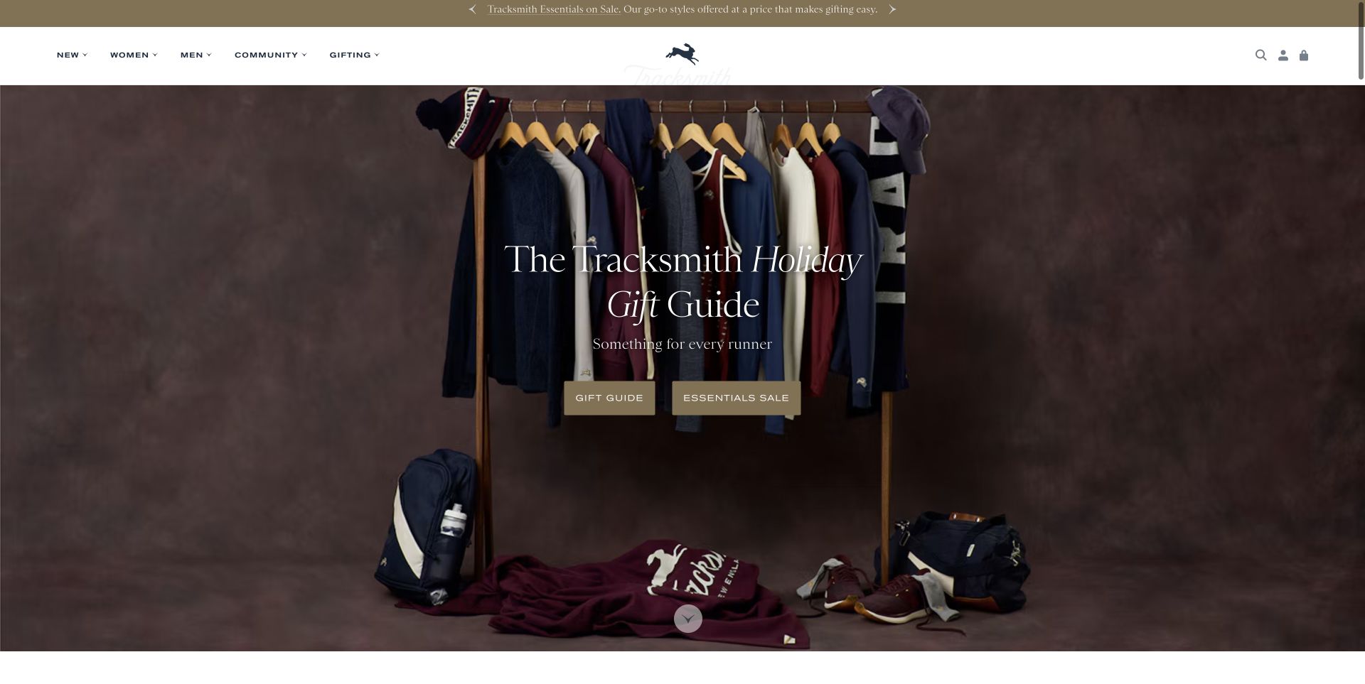
Tracksmith presents a carefully arranged rail of running clothes against a warm brown background, with restrained serif typography and two clear routes into a gift guide and an essentials sale. The header keeps Community alongside the shopping categories rather than treating the running audience as an afterthought. Below the opening, named garments have prices and separate men’s and women’s links. The useful pattern is the connection between a recognizable sporting identity and a specific edit that helps someone choose. The seasonal campaign does not have to replace the underlying product navigation.
What you can learn
Build a seasonal edit around the actual needs of a defined sporting audience. Give a gift buyer understandable product choices while keeping the regular shop and community content easy to reach.
Pros
The restrained photographic composition leaves room for a clear headline and two distinct actions.
Named garments, prices and audience links make the next section more useful than a generic inspiration gallery.
Cons & considerations
Seasonal promotions need regular expiry and price checks.
Product fabric, fit and performance details still require deeper product-page comparison.
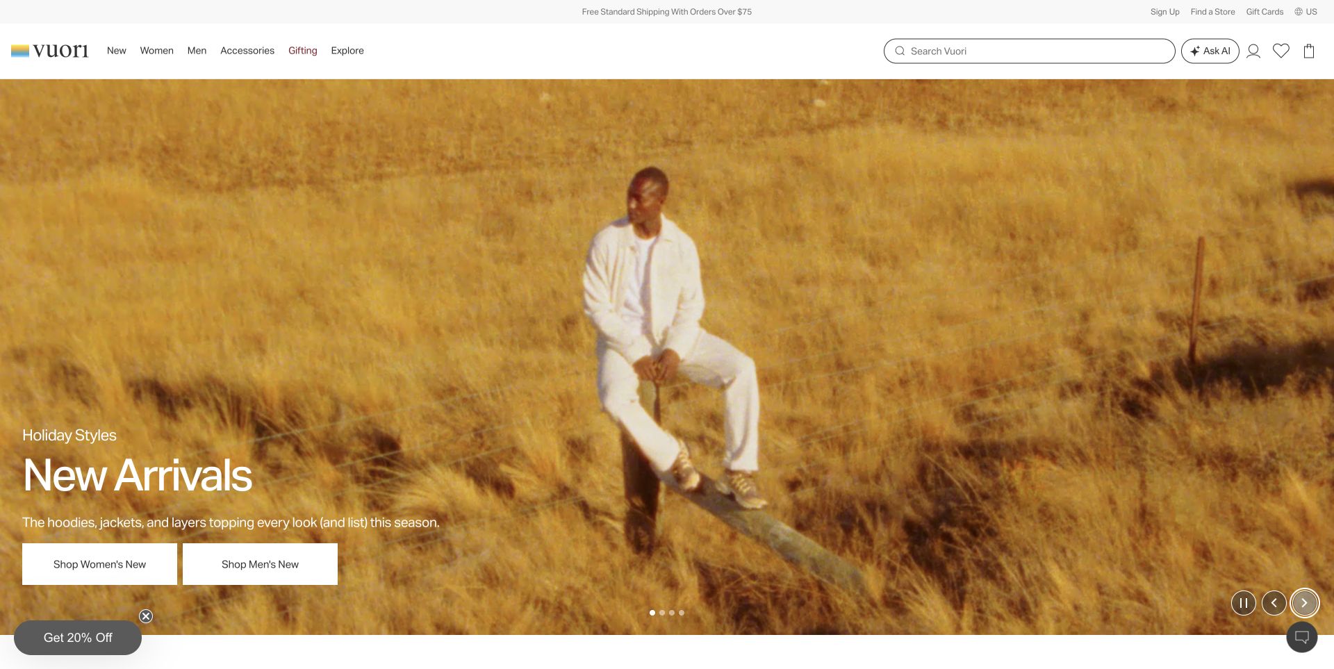
Vuori uses a large outdoor campaign film to set a relaxed tone, with a short new-arrivals heading and separate women’s and men’s buttons positioned at the lower left. The white navigation bar provides a substantial search field alongside conventional product categories. Trending product cards and named collections follow the opening. Study how the campaign establishes mood while the buttons give visitors a concrete next step. The landscape and styling are brand presentation; they do not by themselves explain fabric properties, fit or suitability for a particular workout.
What you can learn
Allow a campaign to create atmosphere, but keep the shopping routes explicit and stable over every frame. A broad lifestyle image needs a fast route to the product information that supports an actual purchase decision.
Pros
The two shopping buttons make the audience split immediately clear.
A large search field gives returning shoppers an alternative to browsing the campaign.
Cons & considerations
Autoplay imagery needs readable text over changing backgrounds.
Signup promotions can interrupt visitors before they have inspected the products.
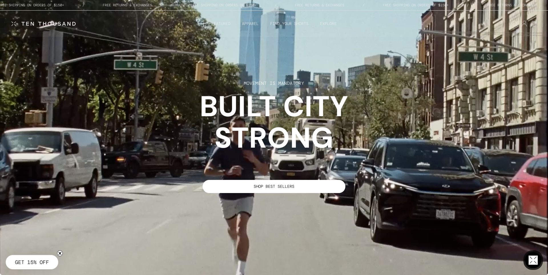
Ten Thousand opens with city-running footage, a large central headline and a single best-sellers button. The compact navigation includes Find Your Shorts as a named decision route, while the shop section offers category and activity views. This is a useful activewear pattern because it acknowledges that a shopper may know the workout before knowing a product name. The sparse monochrome treatment also keeps the brand consistent as the footage changes. Product claims and training suitability need their own evidence further into the shopping journey.
What you can learn
Offer both garment and activity routes when customers arrive with different starting points. A named product-finding tool should explain its criteria and lead to useful comparisons rather than merely another promotional page.
Pros
Find Your Shorts names a specific customer task in the main navigation.
Category and activity browsing provide two understandable approaches to the range.
Cons & considerations
The moving background can reduce the consistency of text contrast.
A very sparse first screen postpones price, fabric and fit information until later.
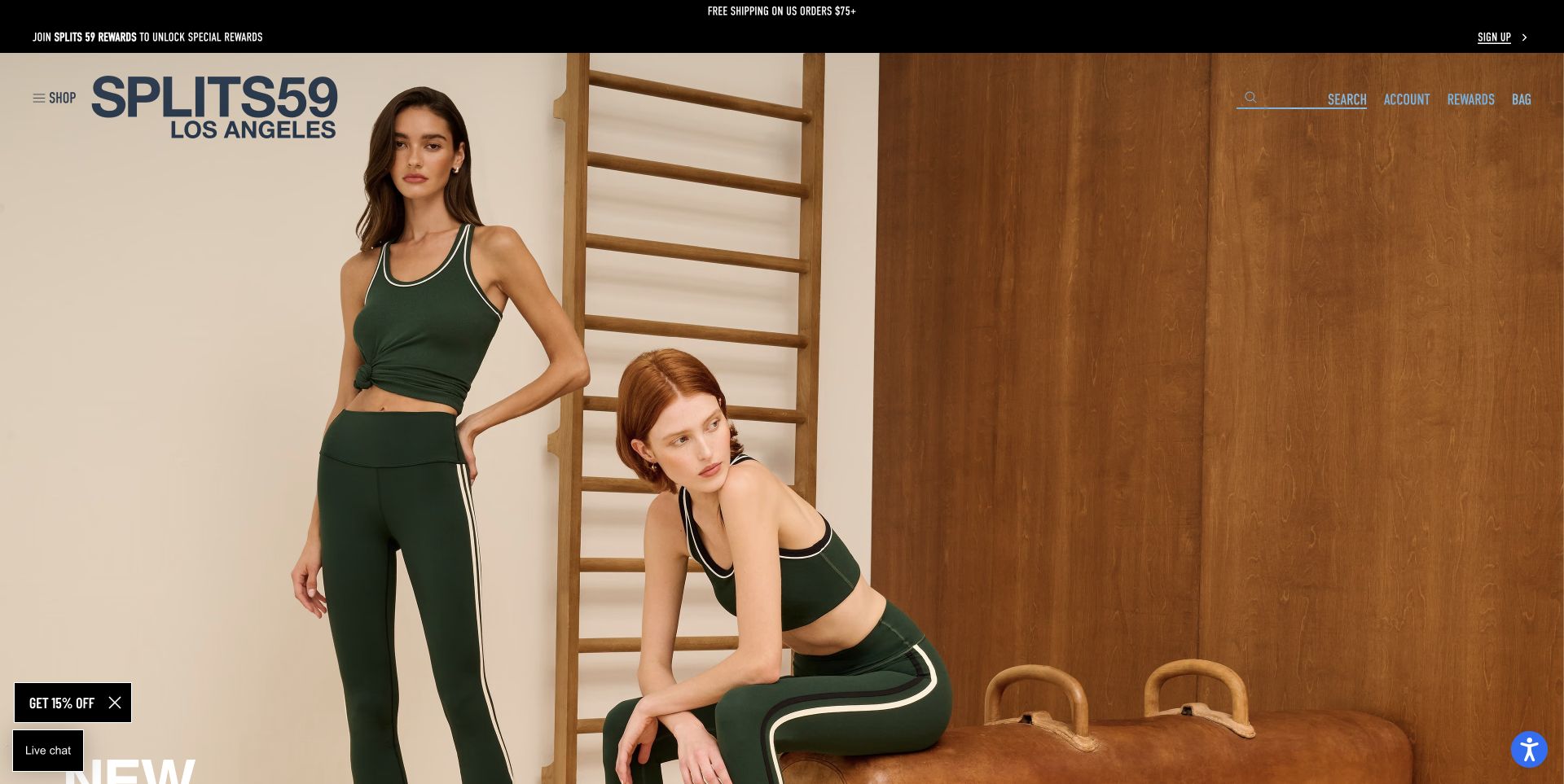
Splits59 lets a full-width photograph of coordinated green studio clothing dominate the opening. A large wordmark sits at the upper left, while the rest of the header compresses shopping into a menu, search, account, rewards and bag. The photograph communicates the styling relationship between pieces before the product grid begins. This is a useful reference for a brand whose visual collection matters, but the sparse opening also shows the tradeoff: a newcomer must open the menu or scroll to understand the range and the practical shopping details.
What you can learn
Use coordinated photography to show how products work together, then provide descriptive category labels and fit information close by. A minimal header should reduce clutter without hiding the route into the actual assortment.
Pros
The opening photograph clearly shows the coordinated garments and their trim details.
Search remains visible even though the main shopping categories are collapsed.
Cons & considerations
The first screen gives little information about garment function or price.
Large signup overlays interrupt the editorial presentation unless dismissed.
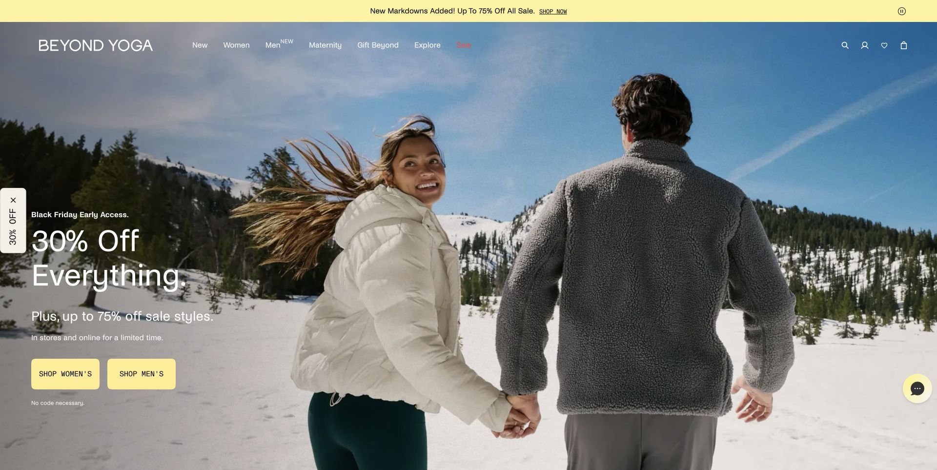
Beyond Yoga puts a seasonal offer over a snowy outdoor photograph, with contrasting yellow buttons for women’s and men’s collections. The navigation also names maternity as a distinct route. Below the hero, new-arrival cards show original and reduced prices alongside garment names. The example is useful for studying promotion consistency: the offer, audience routes and product-card pricing all explain the same event. The campaign is time-bound, so its exact discount should be treated as an observation of this capture rather than a permanent description of the brand.
What you can learn
When a promotion leads the page, connect it to the actual product cards and state exclusions clearly. Keep specialist audience categories visible so the sale message does not flatten the entire range into one undifferentiated shop.
Pros
Yellow action buttons remain distinct from the pale winter photograph.
The maternity route is named directly rather than buried inside general apparel.
Cons & considerations
Repeated promotions can crowd out fit and fabric explanations.
Time-sensitive discounts require synchronized updates across banners and product cards.
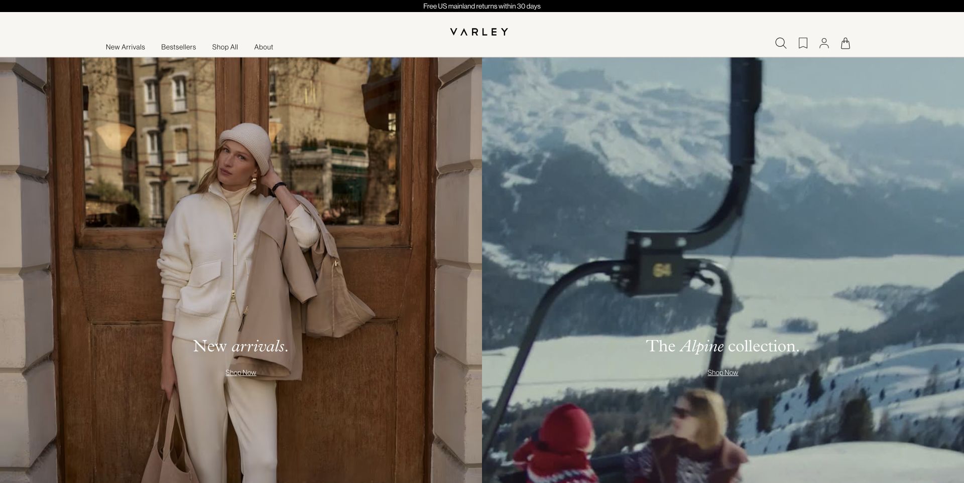
Varley divides its opening into two equally weighted editorial panels: new arrivals and the alpine collection. Minimal navigation and restrained italic headings give the page a calm magazine-like treatment. Below, image links separate knitwear, outerwear, DoubleSoft, baselayers and activewear. This structure is useful for a brand with adjacent categories because visitors can understand the different shopping contexts without a long paragraph. The capture includes lifestyle clothing as part of the brand’s wider presentation; it should not be mistaken for a technical assessment of every item shown.
What you can learn
Use parallel collection entrances when a brand spans several related settings. Keep the category names precise so shoppers can distinguish activewear, everyday layers and weather-specific garments before comparing products.
Pros
Two clear image panels communicate separate seasonal collections.
The following category links include an explicit Active route.
Cons & considerations
Subtle white labels need careful contrast over changing imagery.
Editorial styling alone does not communicate technical specifications or intended activity.
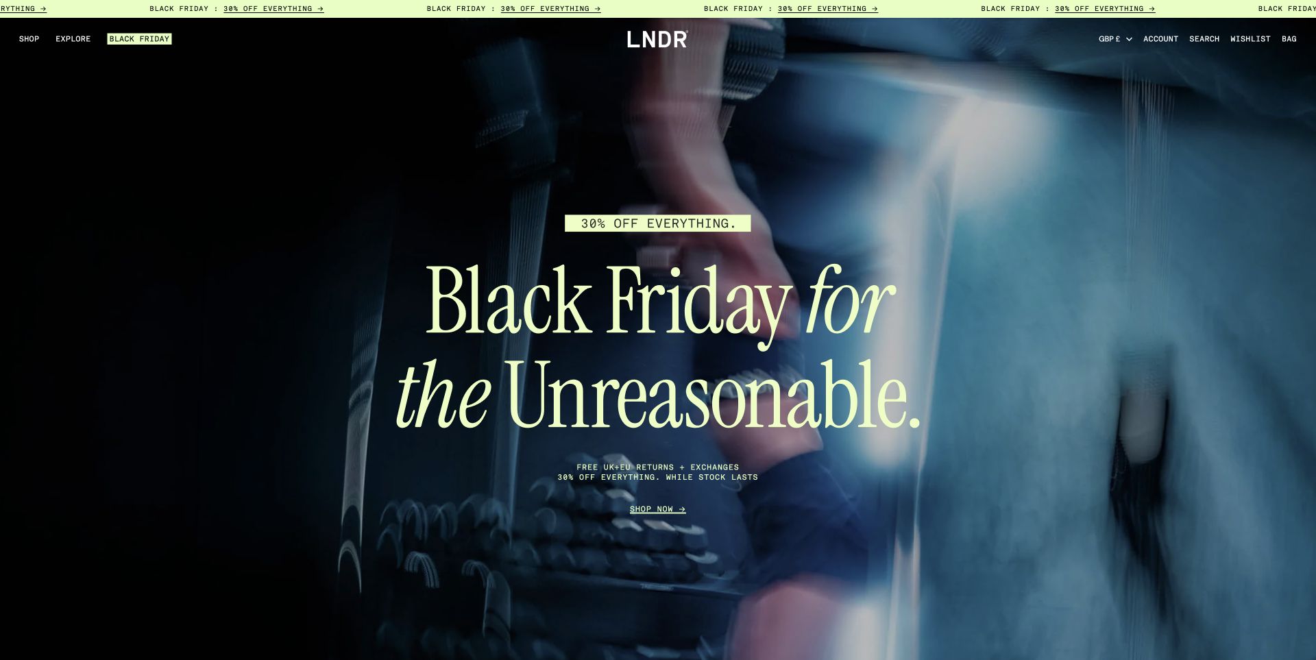
LNDR combines oversized pale yellow serif lettering with a dark, close-up campaign background and a very compact header. The promotional opening is followed by clear service cues, including returns and the brand’s stated trial policy, while Shop and Explore separate products from the brand explanation. The design is useful for studying how an activewear store can establish a distinctive voice without adding a large navigation system. Its claims about reviews, testing and garment performance remain the brand’s own statements and were not independently evaluated in this design review.
What you can learn
Give a focused product range a recognizable visual voice, then support that voice with clear returns, fit and materials information. Distinctive typography is most useful when it helps organize a decision rather than merely enlarging a slogan.
Pros
The limited palette connects the promotion strip, headline and shopping action.
Shop and Explore distinguish product browsing from supporting brand information.
Cons & considerations
The large campaign treatment occupies most of the first screen before product detail appears.
Motion and very small utility links require attention at narrower sizes.
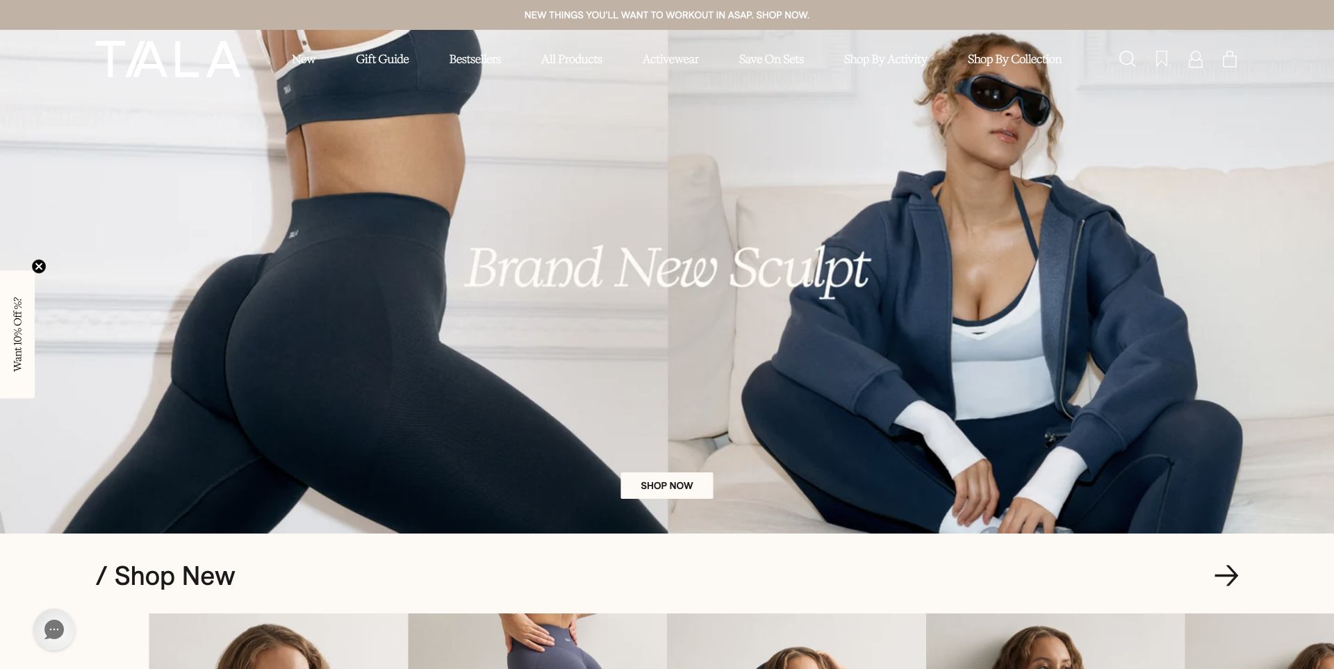
TALA pairs close-up garment photography with a full outfit in a split campaign image. A central collection heading and Shop Now button connect the visual styling to the shop. The header offers activewear, sets, activity and collection routes, followed by a new-products section immediately below the hero. This is a useful pattern for shoppers who may arrive wanting either a workout garment or a coordinated outfit. The image shows the fabric and silhouette at different scales, while the more detailed fit and material questions belong on the product pages.
What you can learn
Combine a close detail with an overall outfit when both construction and styling matter. Let customers enter by activity or collection, but keep those navigation labels distinct enough that they do not feel like duplicate routes.
Pros
The split image shows both garment detail and a complete outfit.
Activity, collection and sets are explicitly named shopping routes.
Cons & considerations
White navigation over pale photography can be difficult to distinguish.
Signup and region dialogs can delay access to the underlying collection.
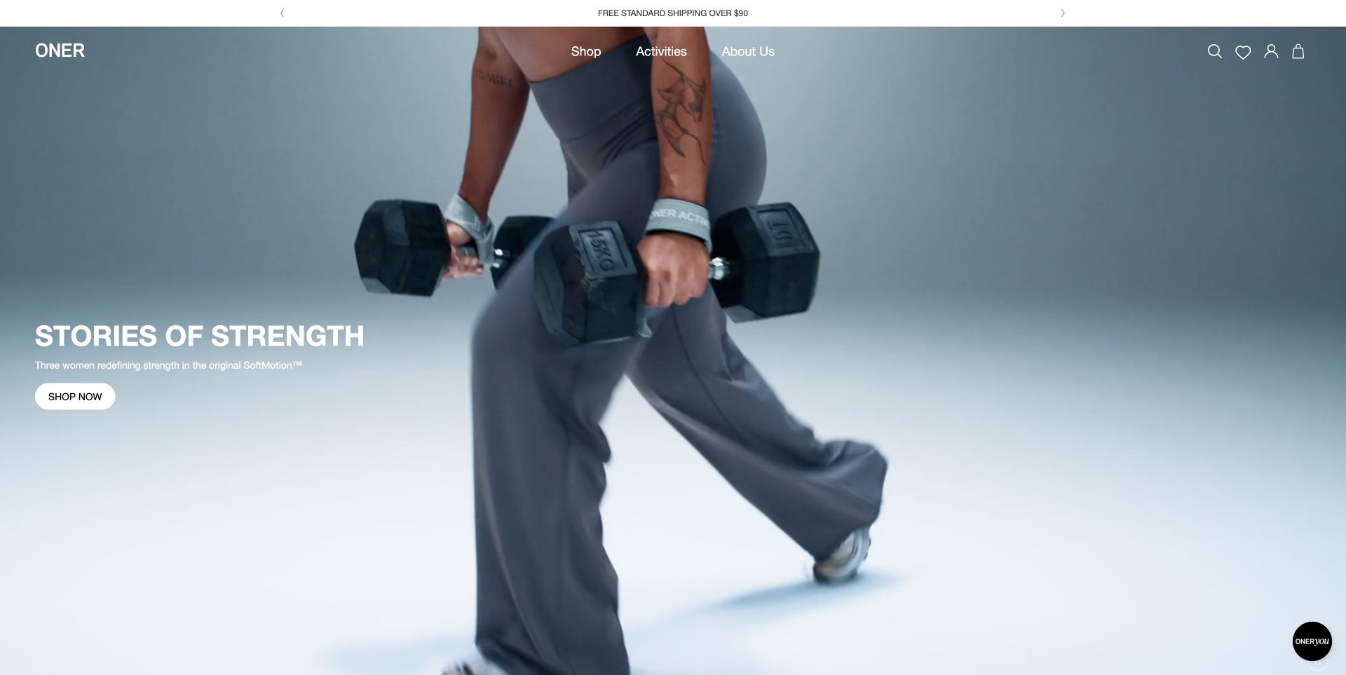
Oner Active leads with a woman carrying dumbbells, a short strength-focused message and a direct shopping button. The compact header separates Shop, Activities and About Us, leaving the photography to carry much of the first impression. The page connects the campaign to a named fabric collection instead of presenting the image as a standalone lifestyle story. This is useful for showing the activity context of clothing, provided the next product pages explain the practical fit and support details that the photograph cannot establish.
What you can learn
Show clothing in a relevant activity context and name the collection behind the image. Keep the route to practical garment details close, because a convincing workout photograph does not prove comfort, durability or suitability.
Pros
The image makes the training context apparent before visitors read the supporting copy.
The Activities route offers a useful alternative to generic product browsing.
Cons & considerations
A motion-led hero needs a stable readable message across frames.
The opening does not answer sizing or garment-support questions on its own.
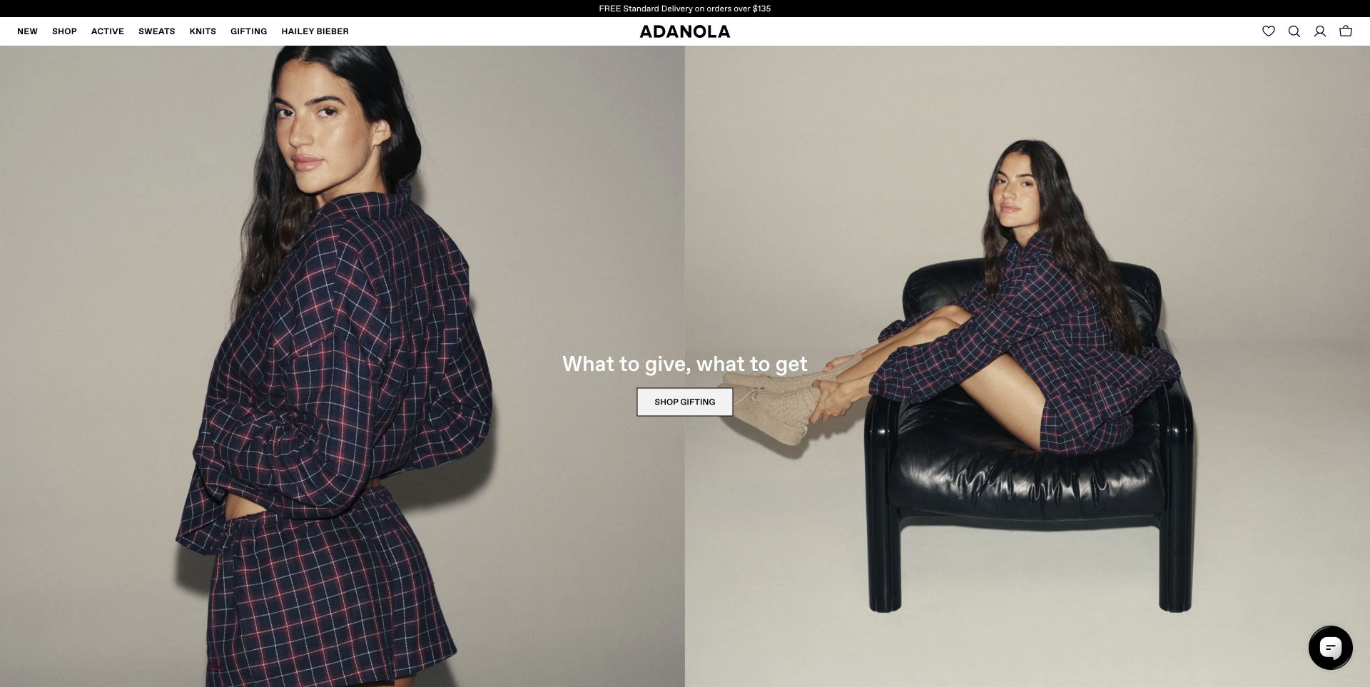
Adanola uses a paired campaign photograph with a centered gifting message and one shopping button. The compact white header makes Active, Sweats, Knits and Gifting separate choices, so the broader clothing range remains understandable. New and trending cards below include product names, prices and quick-add controls. The useful design pattern is the balance between a strong fashion image and a concise category system. The opening scene is lifestyle-led rather than a demonstration of athletic performance, and the review treats it accordingly.
What you can learn
When activewear sits beside everyday clothing, name the categories explicitly. Use campaign imagery to set the tone while product cards provide the information needed to compare specific garments.
Pros
The category bar distinguishes activewear from sweats and knitwear.
Product cards place names and prices directly alongside the images.
Cons & considerations
A gifting-led opening can obscure the original sporting focus for first-time visitors.
Quick-add controls still need clear size and stock feedback before a purchase.
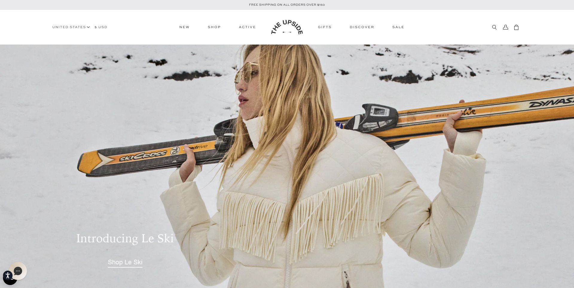
The Upside opens with a snowy fashion photograph and a simple collection introduction, under a spacious white header. The top navigation separates Active from the general shop and discovery content, while the expanded categories include sports bras, leggings and court-sport options. The useful lesson is the organization around the picture: a visually dominant campaign can coexist with conventional product routes. The ski-themed styling in this capture is presentation, not independent evidence of technical garment performance or suitability for particular mountain conditions.
What you can learn
Let a seasonal photograph carry the atmosphere, but preserve explicit activity and garment categories around it. Do not expect lifestyle styling to communicate the specifications customers need for demanding use.
Pros
The broad white header creates a stable boundary above the campaign image.
Active and court-sport routes distinguish shopping purposes within the range.
Cons & considerations
The pale campaign link is less prominent than the photograph.
Technical use questions require product-level details beyond the seasonal image.
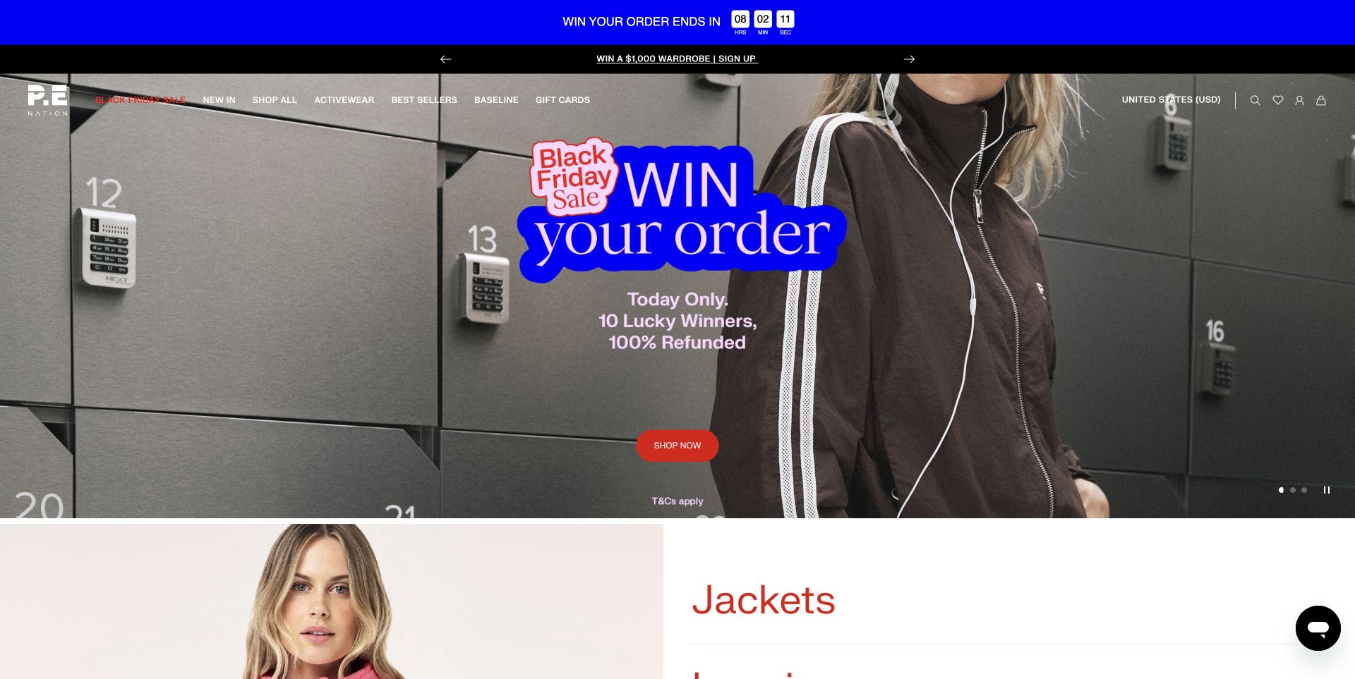
P.E Nation uses bright blue and red promotional graphics against a muted locker-room photograph, with a prominent shopping action and visible carousel controls. The next section begins with large garment-category labels, including jackets, leggings and sports bras. This example is useful for comparing a high-energy campaign with quieter activewear stores. The category structure gives shoppers a way to move beyond the promotion, while the countdown and competition language show how easily urgency can become the main visual message. No promotion entry or purchase was tested.
What you can learn
Keep product-category navigation available beneath a temporary campaign. Promotional urgency should not replace clear eligibility, terms, prices and garment information, particularly when several banners compete for attention.
Pros
The next section names garment categories plainly rather than continuing only with campaign imagery.
Carousel controls remain visible on the large hero.
Cons & considerations
Countdowns and multiple promotional strips create a busy opening.
Competition and refund messaging need clear terms and timely removal when expired.
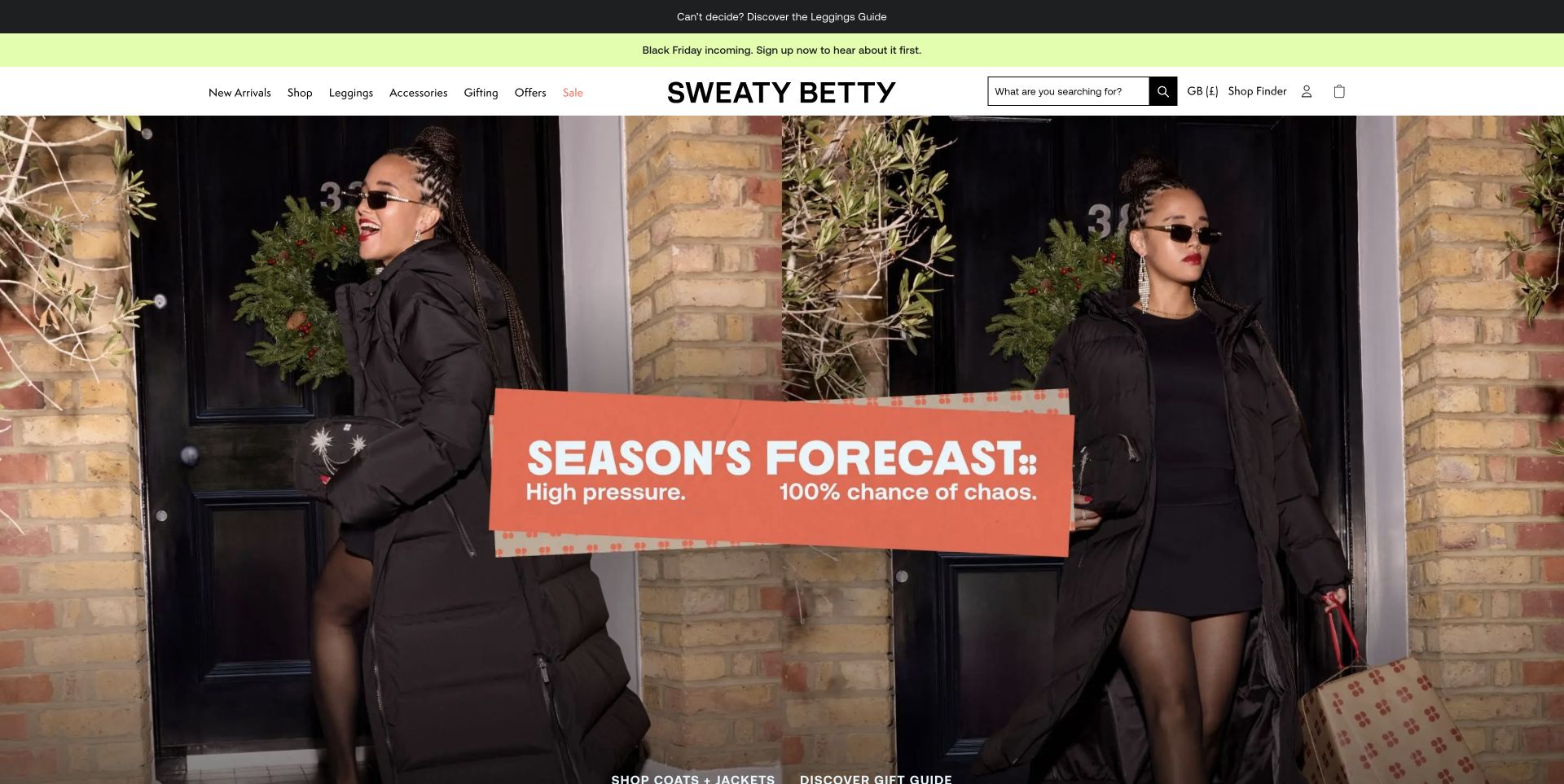
Sweaty Betty presents a playful winter campaign photograph beneath a conventional shopping header and a prominent search box. A utility banner links to a leggings guide, while the main page offers garment categories, matching sets and color edits. The useful pattern is the combination of emotional campaign imagery and a named comparison aid for a central product category. The opening photograph communicates a seasonal mood; the leggings guide and product pages are where shoppers must find the practical differences relevant to their activity and fit.
What you can learn
Identify the category that creates the most uncertainty and give it a plainly named guide. Keep that help accessible from the main shopping experience instead of relying only on promotional imagery.
Pros
The leggings guide is promoted as a direct response to uncertainty about choosing.
Search and conventional garment categories remain available above the campaign.
Cons & considerations
Several announcement strips compete for attention before the main content.
Seasonal imagery does not explain the differences between workout fabrics or support levels.
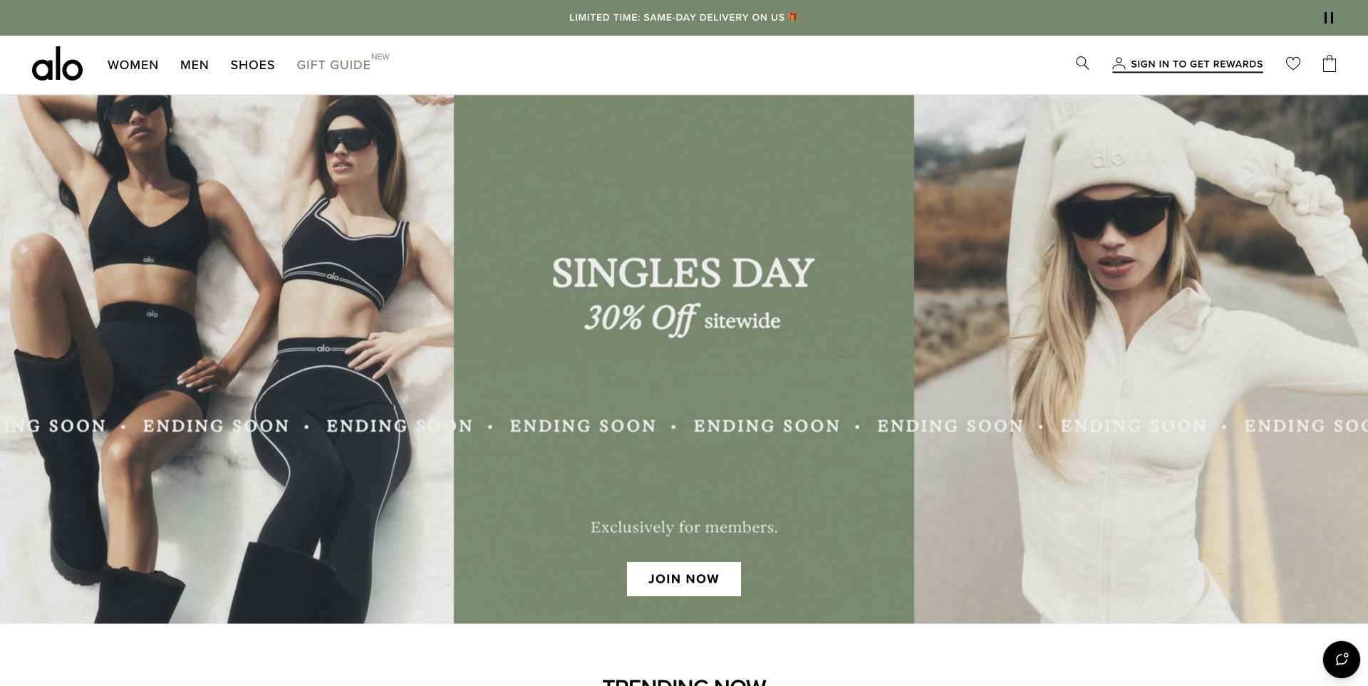
Alo arranges its opening into three panels: two clothing photographs flank a green promotional block. The central action explicitly invites visitors to join, while the standard women’s, men’s and footwear routes remain in the header. A trending section follows below. The layout is useful for studying visual symmetry and for distinguishing a membership promotion from normal product browsing. The offer in this capture is time-specific and was not tested; the important design observation is how the page labels the action and preserves other routes into the store.
What you can learn
Label a membership action honestly and keep ordinary browsing available around it. A balanced campaign composition can make an offer legible without implying that every visitor must register before inspecting products.
Pros
The central colored panel gives promotional text a stable contrasting background.
The main product navigation remains separate from the Join Now action.
Cons & considerations
A membership-led first screen postpones detailed product comparison.
Repeated urgency text can distract from the actual conditions of the offer.
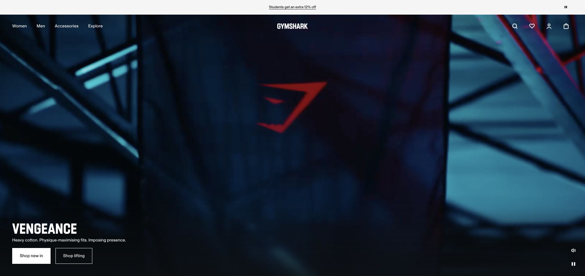
The retained Gymshark capture uses a close-up blue garment image to establish the texture and branding of a lifting collection. Two simple shopping buttons sit beneath the campaign heading, while the white header separates women, men, accessories and exploration. The composition keeps the product close to the message rather than leading only with scenery. It is a useful reference for a focused launch page within a larger apparel store. This review uses the genuine November 2 capture; the campaign and its availability are not represented as newly observed.
What you can learn
Connect a training campaign to visible garment detail and a specific shopping route. Retained campaign examples can still teach a design lesson when their original capture date and limited observation scope remain clear.
Pros
The close-up image gives the garment and brand mark substantial visual emphasis.
Two direct campaign actions sit beneath a short explanatory line.
Cons & considerations
A close crop cannot answer fit or full-garment questions without supporting images.
The retained campaign is historical and should not be read as a current inventory or availability claim.
Kegan is a freelance web designer and developer with 15+ years of experience helping businesses turn complicated website requirements into clear, maintainable digital experiences. He works directly with clients from planning and design through development, launch, and ongoing support.
For activewear brand website design, his development approach focuses on sport-specific product navigation, fit and fabric guidance, collection choices and clear shopping information. The scope can be a targeted improvement or a complete custom build, with responsive layouts, thoughtful content structure, and integrations chosen around the people using and maintaining the site.
Show 3 other activewear brand website designersHide other activewear brand website designers
Plan an activewear store around real shopping questions
Map the range before designing the campaign
List the actual product families and the activities they are intended for. Decide which distinctions customers understand: shorts versus leggings, low versus high support, training versus recovery, or a named fabric family. Use research and actual garment specifications to decide those categories, rather than adding popular activity labels without a reason.
Give each product one maintained source of truth for sizing, materials, available colors, care and returns. A campaign should link into that structure. It should not create a separate set of product facts that can drift from the main store.
Design the comparison before the conversion prompt
Let visitors inspect the range before asking for an email address. A useful product card provides a name, price, clear image and an understandable route to variants. Size selection should explain what is available and what a fit label means, rather than relying on an unexplained letter or a model photograph alone.
Test the journey of a first-time shopper, a returning customer and a gift buyer. They need different supporting information. A fit guide, a product finder or a seasonal edit should reduce a specific uncertainty and explain the basis of its suggestions.
Treat promotions and service information as maintained content
Assign responsibility for campaign dates, exclusions, shipping thresholds and return conditions. Check that banners, landing pages, cards and checkout-facing information agree. Remove expired urgency instead of leaving a perpetual countdown that visitors cannot interpret reliably.
Make policies discoverable before purchase and preserve a clear route back to the product. If the brand serves several regions, explain the current storefront and currency without forcing an unrelated signup. Keep privacy choices and newsletter invitations separate from the shopping decision.
The editing job behind the design
Choose commerce tools that support the actual product decisions
Start with the catalog and variant model. The platform must represent real size and color combinations, stock states, prices and the product information your team can maintain. A visually attractive theme cannot compensate for inconsistent variant data.
Use search, filtering and product-finding tools only when their labels and rules are understandable. An activity filter should reflect documented intended use, while a fit tool should explain its inputs and limits. Do not present a stylistic recommendation as a medical or performance guarantee.
Campaign video, personalization and chat add maintenance and loading costs. Provide readable content and ordinary links when those layers fail. The stack records below reflect bounded public observations; they do not expose private systems or prove that a particular platform caused a business result.
Our WordPress website examples offer a separate look at publishing approaches. A visible platform label is evidence for that named page, not a guarantee that the same system will suit your requirements.
Before the public launch
An activewear website checklist
Name the product families and intended activity routes clearly.
Provide fit guidance with measurements and useful model context.
Keep composition, care and support information readable outside images.
Show the price and any membership condition before the buying decision.
Explain actual color and size availability without ambiguous quick-add states.
Make search and ordinary category browsing available around campaigns.
Keep returns, shipping regions and promotion exclusions easy to find.
Use real garment photography and label retained campaign dates honestly.
Check motion, contrast and keyboard access across the shopping journey.
Allow optional signup and privacy dialogs to be dismissed through normal controls.
These checks are a project checklist, not a performance, legal, security, or accessibility certification. Test real journeys with the people responsible for the website before making claims about the result.
Sources & editorial method
How this collection was selected and reviewed
We reviewed fifteen distinct activewear brand websites, comparing their public navigation, campaign presentation and supporting shopping information. Fourteen screenshots were captured directly in the browser on November 12, 2026 UTC during the November 11 Pacific editorial session; the Gymshark example retains its genuine November 2 capture and is explicitly described as historical. Optional overlays were dismissed through normal visible controls, with no page alteration or synthetic imagery. Each newly reviewed source received a bounded broad public technology-audit attempt; retained evidence keeps its original observation scope and dates. Editors Choice is a researched website-design selection, not a garment-quality, accessibility, safety or sales-performance endorsement. We did not create accounts, enter promotions or complete purchases.
Each example links to its actual source page. Screenshots are direct browser captures with their own capture dates; moving imagery, announcements and live designs can change. The notes describe observable design choices and conditional tradeoffs, not measured traffic, conversion results, service quality, or accessibility conformance.
Technology labels use public page metadata, asset evidence, or explicitly cited platform documentation. Platform documentation is not a complete current deployment audit. A component reference may be legacy or unused; it is not a complete backend inventory. Unknown stacks are omitted. These sites are editorial examples, not our client portfolio.
Written, Edited and Curated are separate editorial records, not timestamps advanced by a rebuild. Website designs and imagery belong to their owners. See our editorial standards or suggest a correction.
Questions worth asking
Activewear Brand website design questions
Should an activewear website organize products by sport or garment type?
Usually both routes are useful, provided they reflect the real range. Garment categories help people who know what they need, while activity routes can help those choosing for a particular workout. Explain the intended-use distinctions and avoid creating duplicate categories without meaningful differences.
What product information matters beyond the photographs?
Useful details include measurements, model context, composition, care, support or compression descriptions, intended use and return conditions. Photographs show appearance and construction details, but they cannot independently establish comfort, durability or suitability for every customer.
Is a large campaign video necessary?
No. A clear photograph and well-organized product information can provide a strong opening. If video is used, keep text readable across frames, offer suitable motion controls and ensure that product navigation works without playback.
How should a store present a membership discount?
Label the membership requirement before a visitor acts, explain the relevant conditions and keep ordinary browsing available. Joining, purchasing and subscribing to marketing are different decisions and should not be obscured by a single promotional button.
Do these examples prove that a design increases sales?
No. This collection studies visible design and information choices. It does not include controlled conversion tests, private analytics, garment testing or an assessment of commercial results.
Use these stores to identify useful relationships between imagery, category labels and product detail. Then build the simplest maintained shopping structure that explains your own garments accurately.