Best Google tag Websites of 2026 (20 Real-World Examples)
Real websites with public gtag.js references, and a practical way to plan measurement without confusing a tag with a complete analytics audit.
The Google tag is a measurement layer, not a visual design system. These examples show the different kinds of public website that can reference the same library while solving very different visitor tasks.
A music group, university, local service business and online store should not share an identical measurement plan just because their pages load gtag.js. Begin with the decisions the business needs to make, then identify the smallest useful set of observations. The layout reviews below concern the actual pictured pages; they do not claim that a particular interface was created by the Google tag.
Each selected source returned a public Google tag reference during the November 13 check. That is evidence of the reference on that exact page, not access to an Analytics property, advertising account, consent configuration or collection receipt. A tag can be blocked, consent-dependent, duplicated, misconfigured or unused. Original screenshot dates remain attached to reused captures.
Before the examples
What makes good Google tag website development in 2026?
Name the business question before the event
Write down the decision a report will inform. A studio may need to distinguish portfolio exploration from an enquiry; a university may need to compare admissions routes. An event with no decision or owner attached can become permanent collection without a practical purpose.
Distinguish the library, destination and tag manager
The gtag.js framework can connect Google measurement destinations. Google Tag Manager is a separate management approach. Record which route owns the installation rather than placing overlapping snippets in a theme, plugin and container.
Keep measurement behind the appropriate privacy policy
Define permitted collection, regional handling and withdrawal with the responsible business team before implementation. Exclude enquiry messages, emails, names and private URL parameters from events. The presence of a script on a public page cannot demonstrate that its privacy handling is correct.
The collection · 20 examples
20 Google tag website examples worth studying
Start with the five established brand and institutional properties, then compare specialist businesses. Look at the visitor journey first and the scoped public tag evidence separately. No performance, conversion-rate or consent-compliance ranking is implied.
We start with five recognizable brands or organizations: Warner Music Group, Harvard Brain Science Initiative, Nutribullet, Truman State University, CentiMark. Each attribution applies to the named website property, not every product or website belonging to its organization. This is a curated reading sequence, not a measured ranking.
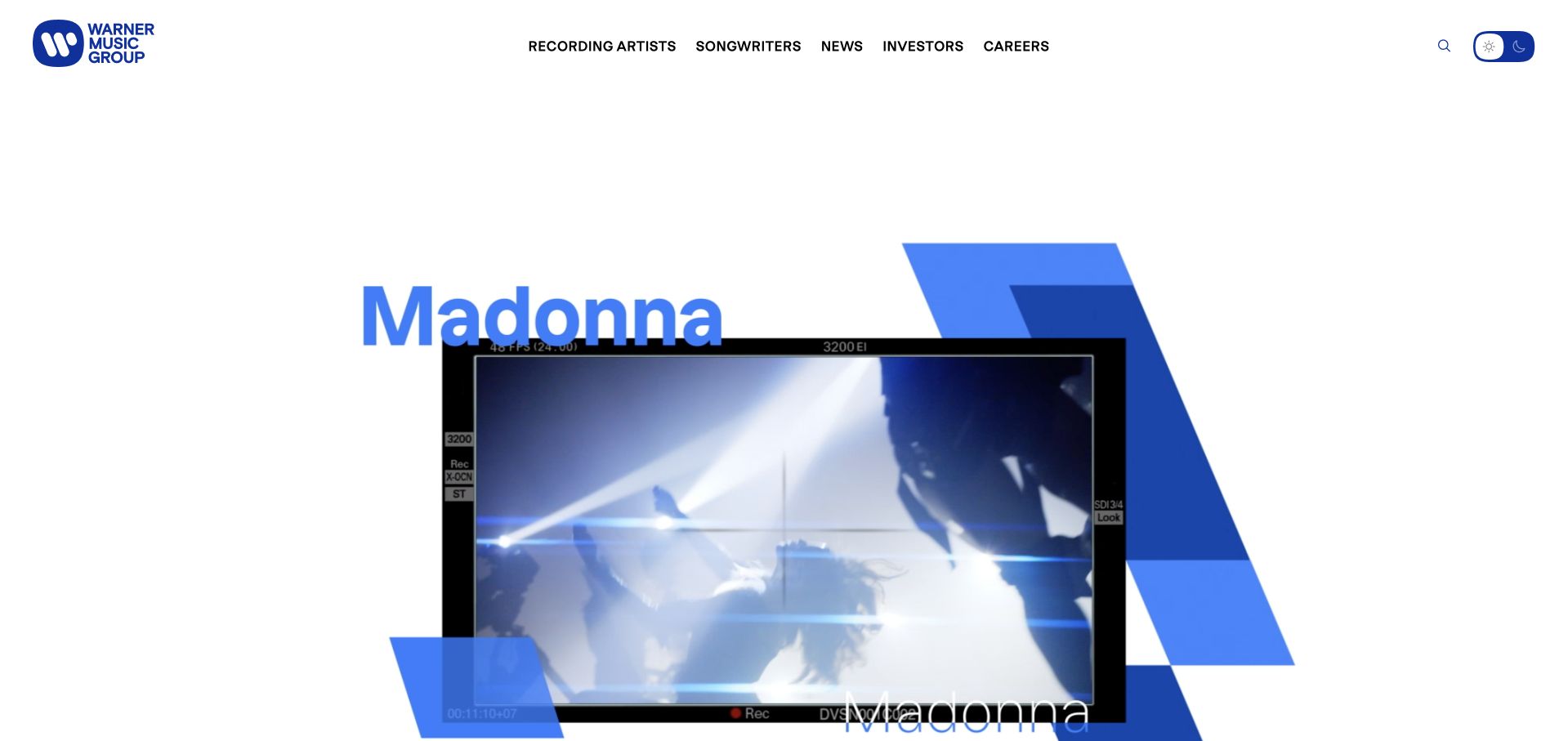
Warner Music Group uses large artist imagery, bold blue graphic elements and a deliberately sparse header to establish its creative identity. The page gives recording artists and songwriters distinct routes, with careers and corporate material available without dominating the first screen. The design is useful because the parent company remains visible while the people associated with its work supply the visual energy. It avoids presenting a music group as a generic professional-services firm.
What you can learn
Let artists lead the visual story while keeping institutional tasks explicit. Separate an artist profile, a corporate announcement and a careers destination in the information architecture. A public measurement-library reference does not reveal which of those journeys is measured or how the organization interprets it.
Pros
Artist imagery and a restrained corporate frame connect the parent organization to recognizable creative output.
Separate artist, songwriter and career routes acknowledge different audiences without requiring a complicated first-screen taxonomy.
Cons & considerations
Motion-heavy compositions need a stable, accessible fallback and should not make the main navigation dependent on animation timing.
A parent-brand presentation should preserve distinctions between labels, artists and corporate services rather than implying one uniform organizational or technical relationship.
Platform source: WordPress.org Showcase. Linked script matches Google tag. Exact public source-page sample: https://www.wmg.com/. This identifies a public Google tag reference or response association, not private configuration, complete architecture, measured performance or successful data collection. Platform evidence is separate from the direct website screenshot and is not a complete current infrastructure audit.
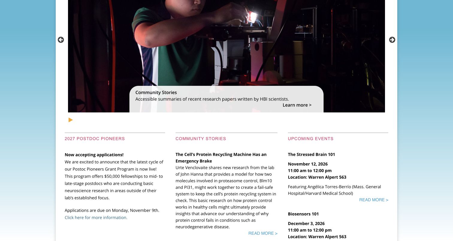
Harvard Brain Science Initiative presents research as a community of people, stories and events. The reviewed homepage combines a photographic carousel with three editorial columns for fellowship information, accessible research summaries and upcoming sessions. Those columns make different content types recognizable through repeated headings and restrained rules, while event dates and locations provide practical detail. The captured view shows the carousel paused on a scientist working at a microscope, followed by the information columns. It is a useful reference for a specialist institutional property that needs frequent updates without reducing everything to an undifferentiated news feed. Its scope is the initiative website, not Harvard’s other public sites.
What you can learn
Separate recurring content by the decision a visitor needs to make. A funding notice, research explanation and calendar entry can share a visual system while keeping their own useful metadata and reading rhythm.
Pros
Parallel columns distinguish opportunities, research stories and events in one compact overview.
Event entries include dates, times and locations beside their descriptive titles.
Cons & considerations
Long research excerpts create a dense reading area beneath the large carousel.
The rotating opening requires deliberate controls to keep a chosen story in view.
Platform source: WordPress.org Showcase. Linked script matches Google tag. Exact public source-page sample: https://brain.harvard.edu/. This identifies a public Google tag reference or response association, not private configuration, complete architecture, measured performance or successful data collection. Platform evidence is separate from the direct website screenshot and is not a complete current infrastructure audit.
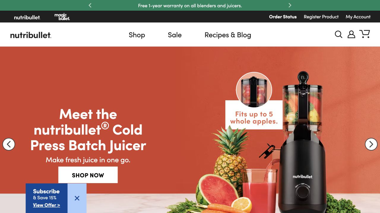
Nutribullet pairs a clearly named juicer with oversized product imagery, fruit and a small capacity illustration on an orange field. Shop, sale and recipes remain in a short navigation, while order status and registration occupy another utility layer. The composition introduces both the device and a concrete capacity question. The public Google tag reference is measurement evidence, not an explanation of the artwork or the commerce system.
What you can learn
Keep product names, measurements, units, and supporting captions as explicit reading cases in the typography brief. Test long model variants, a fallback font, and increased text size against the campaign layout. Critical capacity or compatibility information should also appear as readable text, not only inside a small image annotation. Maintain a separate hierarchy for support and registration so the visual excitement of a product launch does not make after-purchase tasks unnecessarily hard to find.
Pros
The product image and clear model description explain the category quickly.
A capacity cue introduces a concrete evaluation question beyond lifestyle imagery.
Cons & considerations
Small diagram text can become unreadable when the campaign image scales down.
Sale messaging should not obscure support, registration, or accurate specification information.
Platform source: WordPress.org Showcase. Linked script matches Google tag. Exact public source-page sample: https://www.nutribullet.com/. This identifies a public Google tag reference or response association, not private configuration, complete architecture, measured performance or successful data collection. Platform evidence is separate from the direct website screenshot and is not a complete current infrastructure audit.
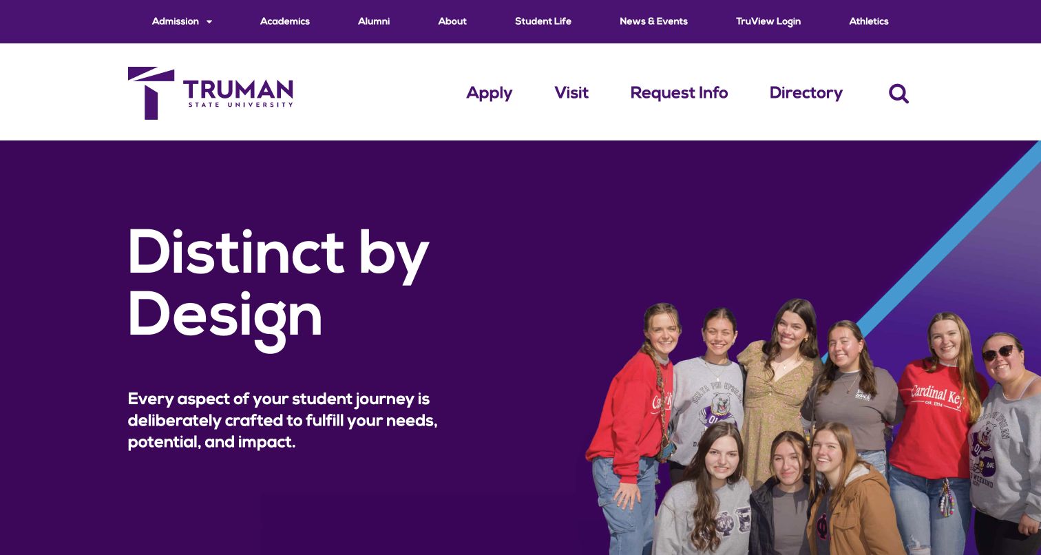
Truman State University uses a bold purple identity to connect aspiration with practical admissions routes. A large student photograph anchors the opening, while application, visiting, information-request and directory links receive their own prominent row. The main navigation covers academic and institutional areas without forcing those links into the same hierarchy as recruitment actions. Below the hero, the page introduces academic programs, student life and funding, followed by community news. The arrangement is worth studying because it recognizes that prospective students need several kinds of evidence, from what they can study to how they might fit into campus life. The screenshot documents the public homepage, not application systems.
What you can learn
Separate high-intent admissions actions from broader institutional navigation. Then organize the body around the questions a prospective student needs answered, using specific program, campus and funding destinations to support the introductory message.
Pros
Application and visit links are easy to identify in a dedicated action row.
Student imagery and consistent purple branding give the opening a coherent campus identity.
Cons & considerations
The large promotional headline offers less immediate detail than the navigation beneath it.
Multiple header rows consume substantial vertical space before the main content begins.
Platform source: WordPress.org Showcase. Linked script matches Google tag. Exact public source-page sample: https://www.truman.edu/. This identifies a public Google tag reference or response association, not private configuration, complete architecture, measured performance or successful data collection. Platform evidence is separate from the direct website screenshot and is not a complete current infrastructure audit.
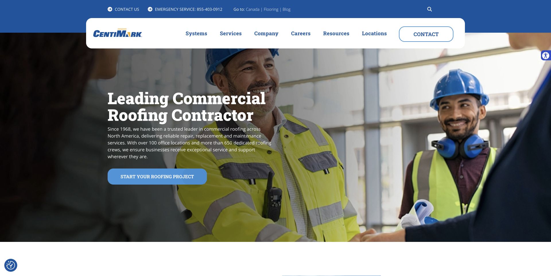
CentiMark places a rounded white navigation container over a large image of people discussing work on a roof. The utility strip handles phone, emergency, and secondary destinations, while the main menu distinguishes systems, services, company information, resources, and locations. A large white service heading and blue project action occupy the darker part of the image. Showing a conversation rather than just a roof surface makes the commercial service feel like an ongoing working relationship.
What you can learn
Use navigation categories that match how buyers investigate the work: the roof system they have, the task they need, and the location that can help. Give each category a distinct purpose instead of filling several menus with near-duplicate service labels.
Pros
The systems-versus-services distinction accommodates technically different buying questions.
The white navigation panel stays visually separate from the changing background image.
Cons & considerations
A national-scale menu would be unnecessarily complex for a small single-market roofer.
Moving hero imagery and animated controls require steady text and sensible reduced-motion behavior.
Platform source: WordPress.org Showcase. Linked script matches Google tag. Exact public source-page sample: https://www.centimark.com/. This identifies a public Google tag reference or response association, not private configuration, complete architecture, measured performance or successful data collection. Platform evidence is separate from the direct website screenshot and is not a complete current infrastructure audit.
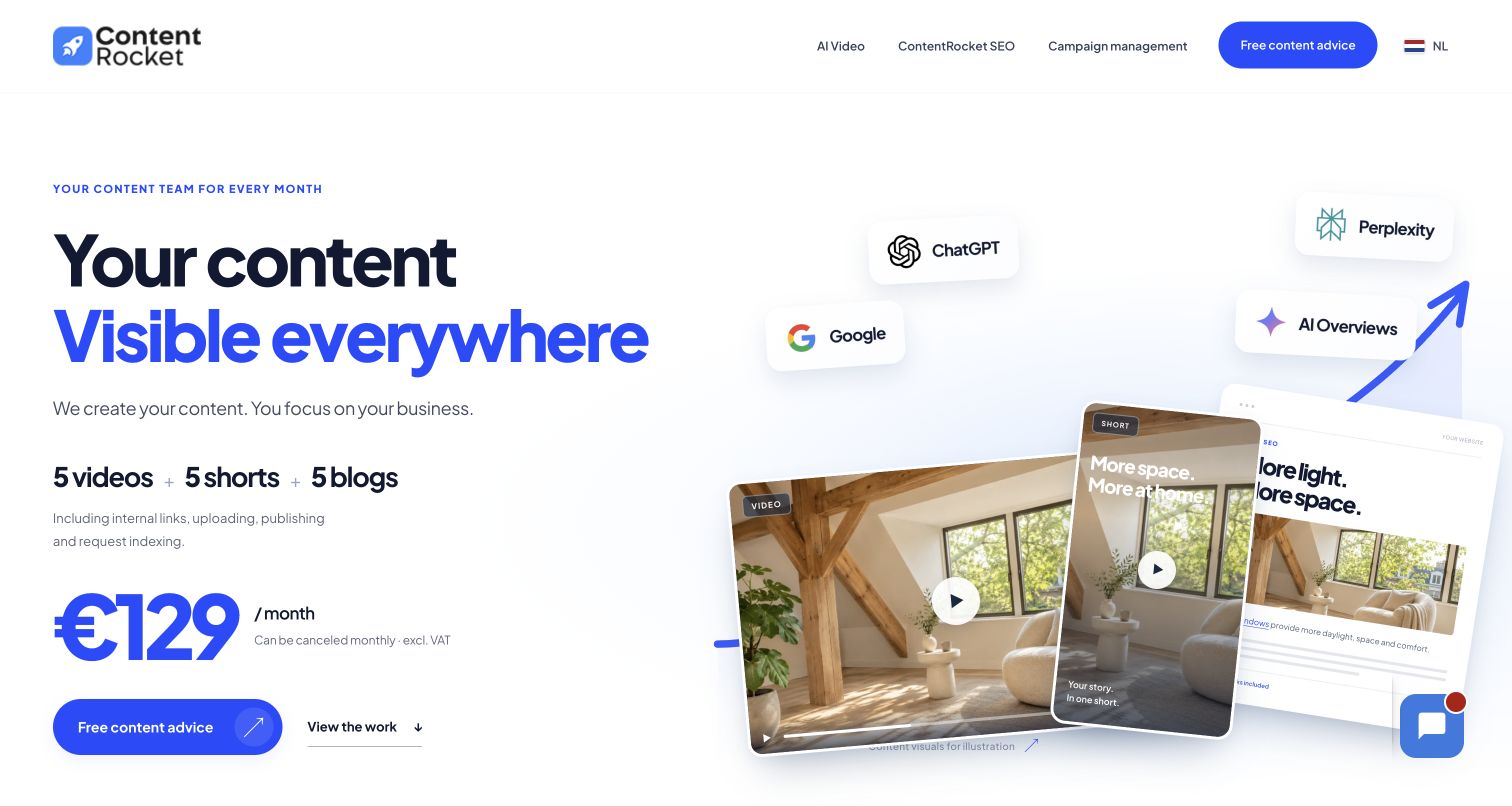
ContentRocket pairs oversized blue-and-black typography with a layered illustration of a blog, video and short. The opening package makes the monthly deliverables tangible, while a secondary link leads to examples of published work. Further down, a numbered approval workflow and comparable pricing cards explain how the service operates. The page is useful as a WordPress reference for combining an assertive campaign-style opening with structured service information. Its search-performance table is explicitly historical; it should be read as the company’s reported evidence, not independent proof of current rankings.
What you can learn
Give a recurring service a concrete shape: show the deliverables, illustrate an example, explain the approval steps and make package differences easy to compare. Keep illustrative growth graphics clearly separate from measured results, and bring visitors back to one understandable enquiry action.
Pros
Large type and a restrained blue accent establish a clear hierarchy around the offer.
Linked examples and an explicit approval sequence help explain what the client actually receives.
Cons & considerations
The long page combines several services and promotions, which can dilute the primary package.
Performance claims still require independent scrutiny; the page alone does not verify service outcomes.
Platform source: WordPress.org Showcase. Linked script matches Google tag. Exact public source-page sample: https://contentrocket.io/en/. This identifies a public Google tag reference or response association, not private configuration, complete architecture, measured performance or successful data collection. Platform evidence is separate from the direct website screenshot and is not a complete current infrastructure audit.
BowTie uses a warm taupe navigation bar and a subdued green-gray introduction beside a large photograph of a clinician speaking with a patient. The following services section begins within the captured view, using four actual treatment photographs rather than abstract medical illustrations. The nav keeps the telephone number and booking button on the same line as the main categories. This gives the homepage a practical rhythm: identify the practice, see the environment, then compare treatment categories.
What you can learn
For a neighborhood dental studio, recognizable people and rooms can explain more than another broad quality claim. Keep service labels plain and match each image to a useful category so that patients can move from a reassuring introduction to the care information relevant to them.
Pros
The services row shows a variety of real clinical contexts in a consistent image format.
A visible phone number supports visitors who do not want to use an online scheduler.
Cons & considerations
The pale hero type depends on its background settling into the intended darker state after entrance animation.
Several specialty labels in one row may need additional explanation for patients unfamiliar with dental terminology.
Platform source: WordPress.org Showcase. Linked script matches Google tag. Exact public source-page sample: https://bowtiedentalstudio.com/. This identifies a public Google tag reference or response association, not private configuration, complete architecture, measured performance or successful data collection. Platform evidence is separate from the direct website screenshot and is not a complete current infrastructure audit.
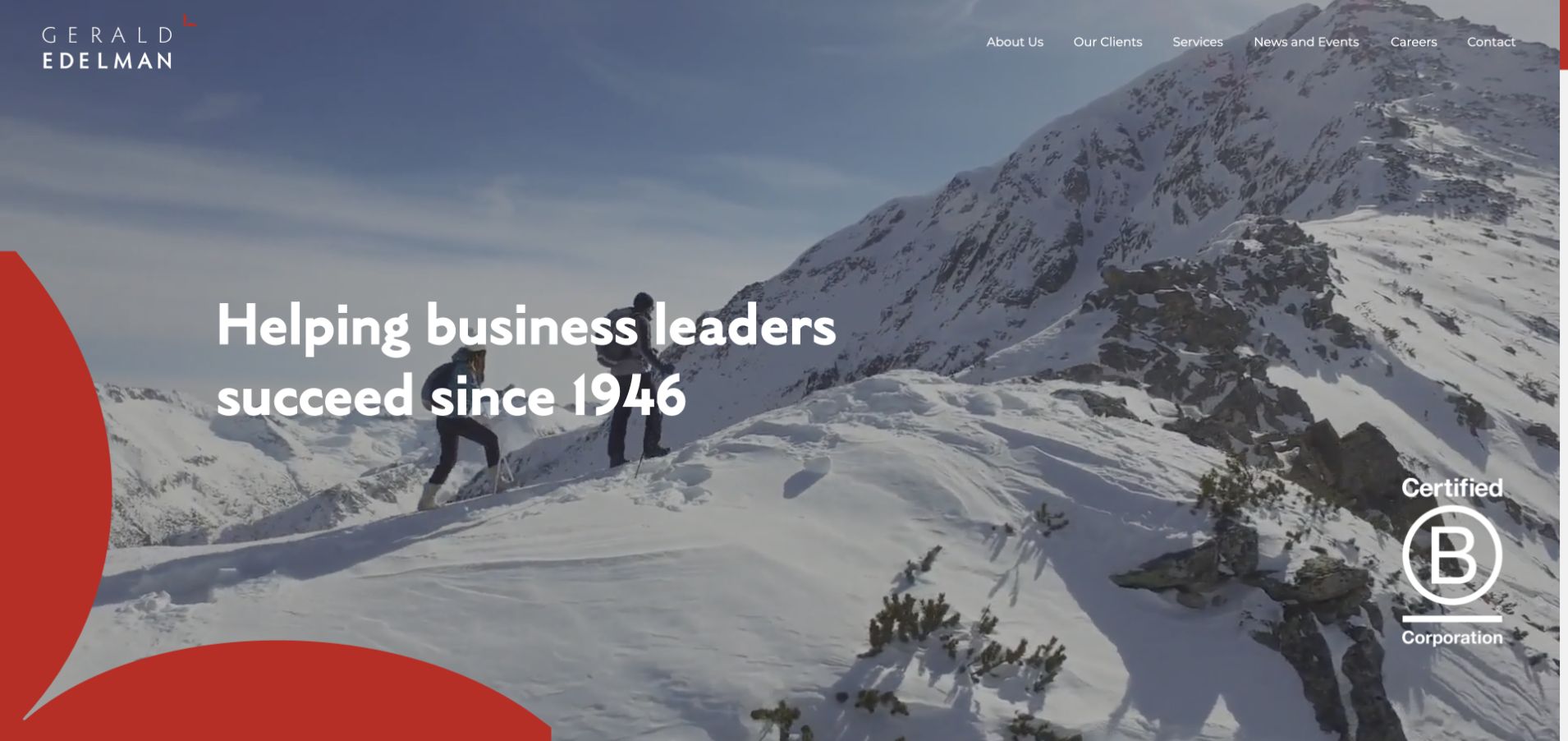
Gerald Edelman opens with snowy mountain footage, a white headline, and a curved red graphic. The thinly spaced wordmark and compact navigation leave much of the scene unobstructed. A certification mark appears separately from the headline. The visual metaphor suggests an ongoing journey, fitting relationship-led advisory positioning, but does not evidence a particular service. The useful design detail is restraint: one red curve, one dominant statement, and a limited set of header destinations. More specific service, team, and client context has to do the explanatory work after the atmospheric opening.
What you can learn
Use metaphor to establish a tone, not to carry the entire business explanation. Pair a relationship-led accounting introduction with concrete client situations and service routes before asking visitors to make an enquiry.
Pros
A single red graphic creates continuity without a collection of unrelated decorations.
The sparse header leaves a clear focal point in the hero.
Cons & considerations
Mountain imagery is less direct than showing the firm’s people or work.
Fine white navigation needs reliable contrast over moving footage.
Platform source: WordPress.org Showcase. Linked script matches Google tag. Exact public source-page sample: https://www.geraldedelman.com/. This identifies a public Google tag reference or response association, not private configuration, complete architecture, measured performance or successful data collection. Platform evidence is separate from the direct website screenshot and is not a complete current infrastructure audit.
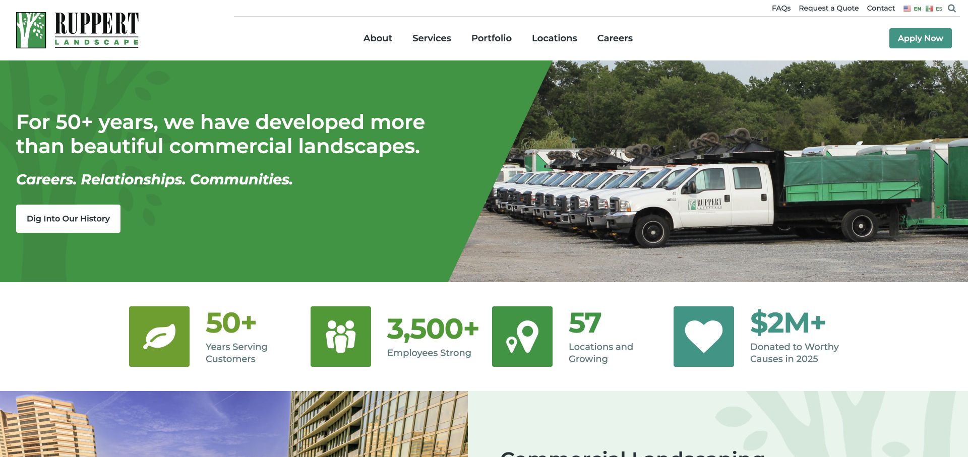
Ruppert splits its opening into a green message panel and a photograph of branded trucks. A diagonal edge joins the two halves, while a row of large icon-and-number treatments introduces company context beneath them. The header separates the main business navigation from utility links and an application button. The homepage thus presents landscaping as an organized service operation, not only as a collection of attractive spaces. The captured fleet image is a concrete counterpart to the company-focused wording.
What you can learn
Operational imagery can help explain a maintenance business, but distinguish capability evidence from sales decoration. Pair the fleet or team image with relevant service routes and portfolio examples. If recruiting is also important, make that route unmistakably different from requesting work so the two priorities can coexist.
Pros
A split hero gives the message a stable background rather than overlaying every line on photography.
The portfolio and locations routes are easy to identify in the main menu.
Cons & considerations
Company statistics occupy valuable early space and require clear context rather than decorative counting.
A prominent recruitment action can compete with the buyer’s quote or contact route.
Platform source: WordPress.org Showcase. Linked script matches Google tag. Exact public source-page sample: https://www.ruppertlandscape.com/. This identifies a public Google tag reference or response association, not private configuration, complete architecture, measured performance or successful data collection. Platform evidence is separate from the direct website screenshot and is not a complete current infrastructure audit.
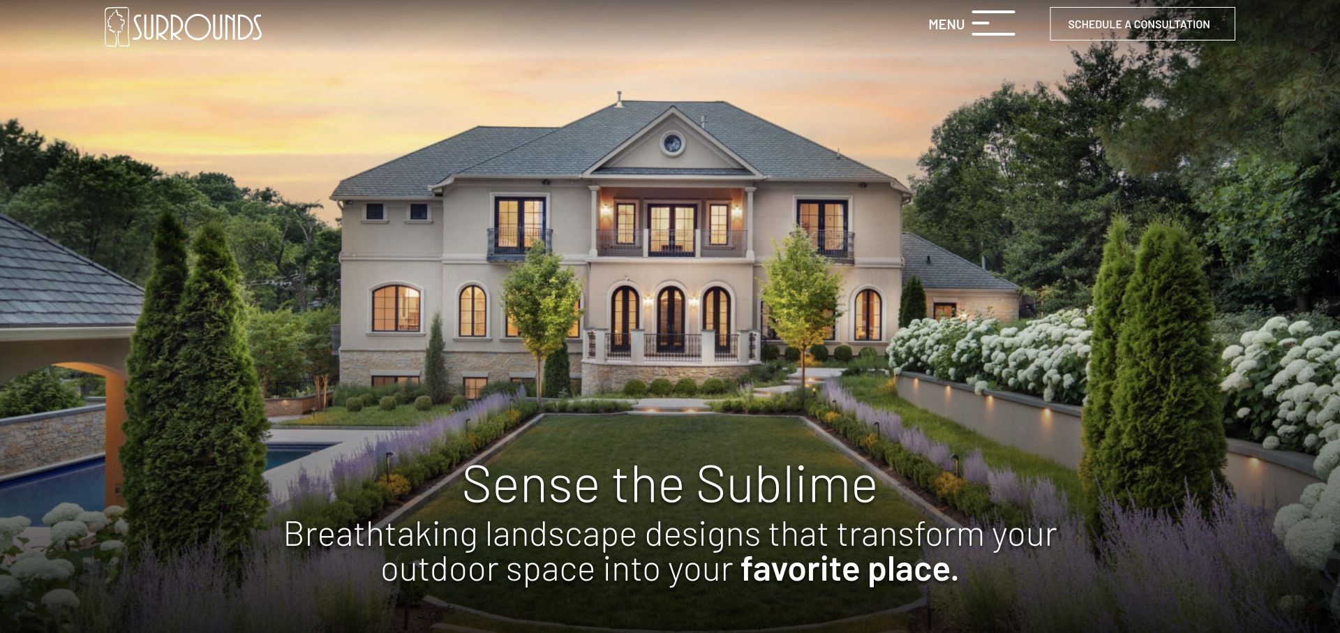
Surrounds opens with a formal garden and house at dusk, letting lighting, planting, paths, and the building’s symmetry form the composition. A light logo sits at the upper left, while a menu control and an outlined consultation button occupy the upper right. The lower headline is large but thin, with a short supporting line. The immediate experience is intentionally closer to an architectural portfolio than a lawn-maintenance directory, putting the completed environment ahead of a long service list.
What you can learn
A rich project photograph can carry an opening when the primary action remains explicit. Keep a consultation route visible even if the rest of the navigation is collapsed. Follow the atmospheric introduction with process, scope, and project context so visitors can judge fit rather than just admire the image.
Pros
The image shows several aspects of a complete outdoor environment in one coherent scene.
The consultation action remains visible without opening the menu.
Cons & considerations
Thin white typography needs careful positioning against changing image brightness.
A hidden navigation pattern adds a step for visitors looking for maintenance or service details immediately.
Platform source: WordPress.org Showcase. Linked script matches Google tag. Exact public source-page sample: https://www.surroundslandscaping.com/. This identifies a public Google tag reference or response association, not private configuration, complete architecture, measured performance or successful data collection. Platform evidence is separate from the direct website screenshot and is not a complete current infrastructure audit.
Rost uses a dark waterside landscape as a full-screen cover, placing its large serif logo and a centered aspirational headline over the scene. The menu control sits at the upper left, search at the upper right, and a vertical social rail follows the right edge. The image includes trees, water, path lighting, and lawn, so the first view conveys a complete environment. This is an atmospheric brand opening with very little conventional navigation competing against it.
What you can learn
If the portfolio is the main differentiator, let one carefully framed project establish the tone. Keep an obvious way to discover services and contact information, however, and make sure the next scroll adds practical context. A beautiful cover is an introduction to the buying journey, not a replacement for one.
Pros
The large identity and restrained text create a memorable, uncluttered focal point.
The scene shows lighting and landscape together rather than treating them as unrelated services.
Cons & considerations
A collapsed menu makes service and contact discovery less immediate.
The aspirational headline provides little geographic or project-scope information on its own.
Platform source: WordPress.org Showcase. Linked script matches Google tag. Exact public source-page sample: https://www.rostlandscaping.com/. This identifies a public Google tag reference or response association, not private configuration, complete architecture, measured performance or successful data collection. Platform evidence is separate from the direct website screenshot and is not a complete current infrastructure audit.
BODYROK’s opening is dominated by purple-tinted footage of an actual group reformer class and a very large condensed headline. A solid white header protects the brand and compact navigation from the moving background. Booking and buying classes are both visible there, with another purple booking button below the headline. The strong monochromatic image treatment makes the studio lighting feel like part of the identity rather than an unrelated background photograph.
What you can learn
Show the actual equipment and group setup when the class format is unfamiliar. Then explain the difference between reserving a class and purchasing credits, especially for a new visitor who may not know whether a package is required before a first session.
Pros
The class footage demonstrates the apparatus and group environment rather than relying on posed fitness portraits.
A short navigation leaves the primary booking and purchase controls easy to identify.
Cons & considerations
The large headline and saturated footage leave little room for practical first-timer information in the opening.
Booking and buying are adjacent actions whose relationship may need clearer explanation for a new member.
Platform source: WordPress.org Showcase. Linked script matches Google tag. Exact public source-page sample: https://bodyrok.com/. This identifies a public Google tag reference or response association, not private configuration, complete architecture, measured performance or successful data collection. Platform evidence is separate from the direct website screenshot and is not a complete current infrastructure audit.
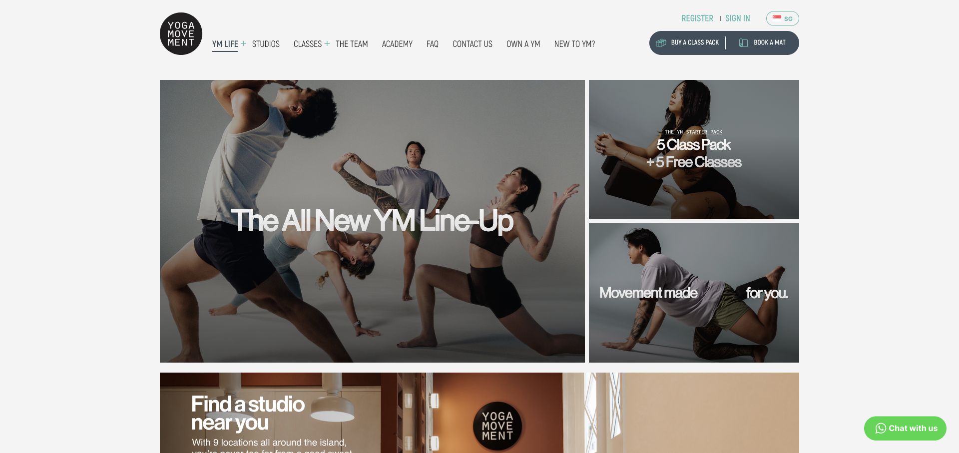
Yoga Movement organizes its opening as a large editorial tile beside two smaller photographic tiles, with a studio-finding section beginning beneath. The largest card introduces a class lineup, while the smaller panels carry an introductory package and a broader movement message. A compact top navigation includes studios, classes, team, and newcomer information; buying a class pack and booking a mat are grouped at the right. The grid allows several topics to coexist without becoming a conventional horizontal carousel.
What you can learn
A modular homepage can serve both returning students and prospective members when each tile has one clear purpose. Prioritize everyday booking and studio information, and treat temporary news or package promotions as replaceable editorial modules rather than the only content visible at the top.
Pros
The tile hierarchy distinguishes major news from smaller package and brand messages.
Buying a pack and reserving a mat use specific language suited to the actual studio workflow.
Cons & considerations
The number of simultaneous messages can make the first next step less obvious for a newcomer.
Animated media inside a grid needs reliable loading states so one unfinished tile does not dominate the composition.
Platform source: WordPress.org Showcase. Linked script matches Google tag. Exact public source-page sample: https://www.yogamovement.com/. This identifies a public Google tag reference or response association, not private configuration, complete architecture, measured performance or successful data collection. Platform evidence is separate from the direct website screenshot and is not a complete current infrastructure audit.
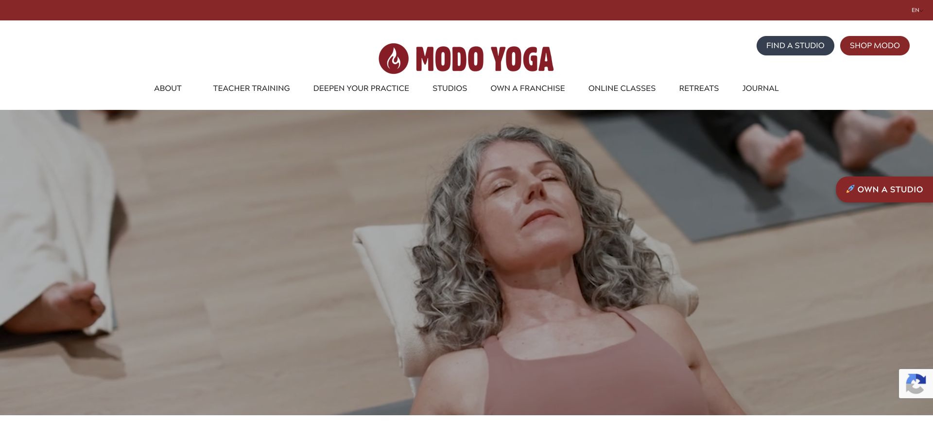
Modo Yoga uses a generous white masthead with a large red wordmark and clearly separated studio-finding and shopping buttons. The navigation stretches across several program areas, including teacher training, online classes, and retreats. Beneath it, a wide photograph shows a resting participant in a shared studio environment rather than an extreme athletic pose. Red accents connect the brand and utility elements, while most of the page remains neutral and spacious.
What you can learn
A yoga network with several business lines needs a patient navigation hierarchy: a prospective student looking for a local class should not have to understand teacher training or franchise opportunities first. Keep studio finding prominent and let the broader programs remain available without overtaking the core attendance journey.
Pros
Studio finding is given a distinct, visible button instead of being buried among the wider program links.
The human-scale class photograph offers a different visual tone from performance-focused fitness campaigns.
Cons & considerations
The large masthead and long navigation occupy considerable space before the introductory content.
Franchise and shopping promotions can distract from students who simply want nearby classes and prices.
Platform source: WordPress.org Showcase. Linked script matches Google tag. Exact public source-page sample: https://modoyoga.com/. This identifies a public Google tag reference or response association, not private configuration, complete architecture, measured performance or successful data collection. Platform evidence is separate from the direct website screenshot and is not a complete current infrastructure audit.
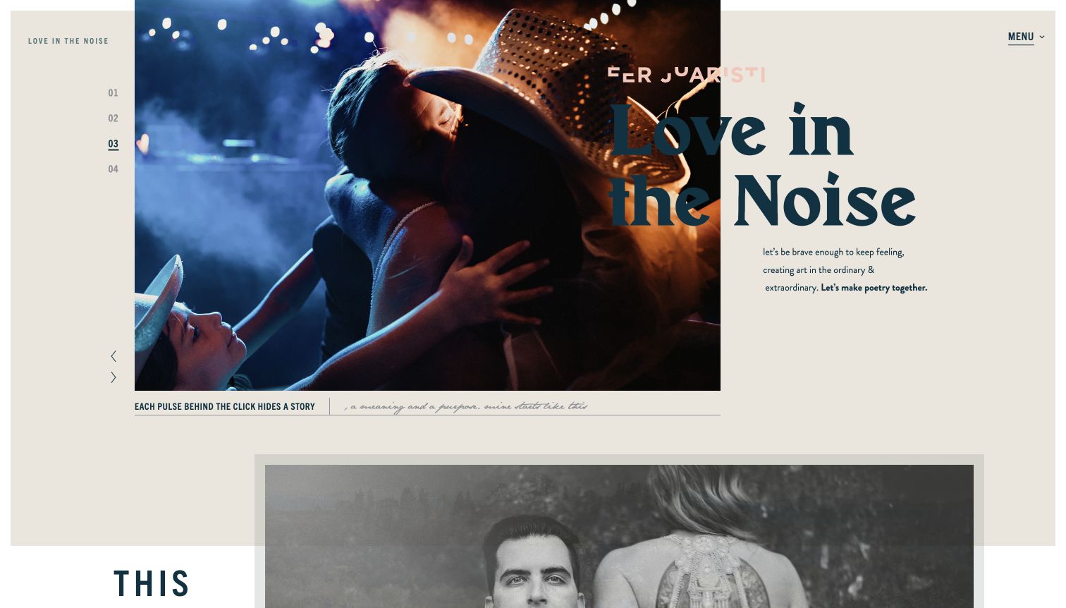
Fer Juaristi combines an off-center photograph, a numbered sequence, oversized typography, and a warm paper-like background. The headline overlaps the image boundary, giving the homepage the feel of an editorial spread rather than a conventional service landing page. Small captions and a visible menu create secondary layers around the main image. The design communicates a distinct point of view, which can help a photographer attract clients who respond to that style. It also demands careful composition: text crossing from photograph to background can lose contrast, and poetic copy does less to explain the practical service or inquiry process.
What you can learn
Use expressive layout to reflect the work, then support it with clear portfolio and contact routes. Treat overlapping text as a responsive design problem, not only a desktop composition. Give practical expectations their own plain-language page so the visual voice does not have to carry every message.
Pros
The asymmetric composition establishes a distinctive artistic identity.
Numbered controls make the image sequence visible.
Cons & considerations
Overlapping typography can lose contrast across photographs.
Platform source: WordPress.org Showcase. Linked script matches Google tag. Exact public source-page sample: https://ferjuaristi.com/. This identifies a public Google tag reference or response association, not private configuration, complete architecture, measured performance or successful data collection. Platform evidence is separate from the direct website screenshot and is not a complete current infrastructure audit.
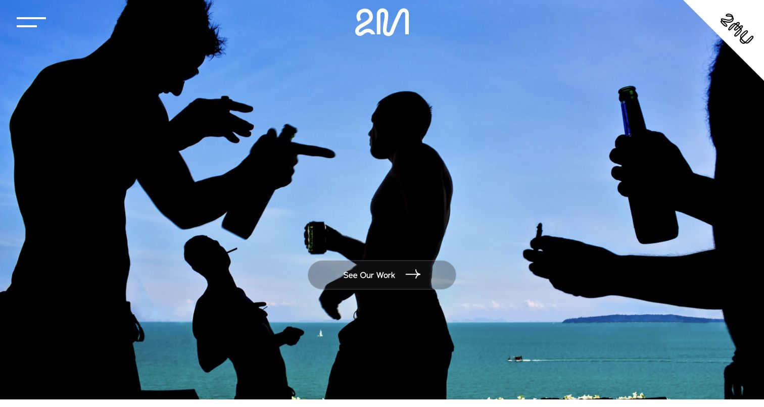
Two Mann Studios opens with a full-bleed photograph and a single See Our Work action. The compact mark and menu leave the image dominant, and the selected scene feels observational rather than a conventional posed wedding portrait. Below the opening, the studio introduces its people and broader story, giving the visual impression a human context. The design is a useful example of letting a distinctive moment communicate an approach before explaining it. The first screen still relies heavily on that one image, and a new visitor must explore further to find location, availability, or the practical inquiry route.
What you can learn
Select an opening image that demonstrates how the studio sees an event, then lead directly to a coherent body of work. Follow the visual statement with real information about the photographers and process. Keep an obvious inquiry route available for visitors who already know they want to talk.
Pros
One clear work action prevents competing calls to action.
The chosen image communicates a candid visual approach.
Cons & considerations
The first impression depends heavily on a single photograph.
Practical inquiry information is not visible in the opening view.
Platform source: WordPress.org Showcase. Linked script matches Google tag. Exact public source-page sample: https://twomann.com/. This identifies a public Google tag reference or response association, not private configuration, complete architecture, measured performance or successful data collection. Platform evidence is separate from the direct website screenshot and is not a complete current infrastructure audit.
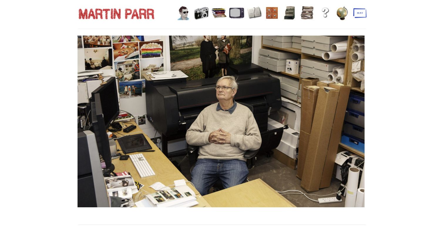
Martin Parr's site uses a red nameplate and a row of illustrated objects as navigation above a large studio photograph. The image shows the working environment rather than beginning with a conventional gallery, giving the page an informal and personal character. The underlying navigation provides routes to recent work, books, archive, biography, and contact. This is a useful reference for expressing personality through the interface without a long written introduction. The object-based menu is also the main usability tradeoff: visitors may need to interpret the icons before knowing which destination each one represents.
What you can learn
Personality can come from a small number of well-chosen interface details. Pair illustrative navigation with readable labels and predictable keyboard behavior. Make the archive and contact route understandable to someone unfamiliar with the artist rather than assuming the visual joke will explain the destination.
Pros
The studio photograph makes the site feel personal and specific.
Distinctive navigation objects reinforce the informal visual identity.
Cons & considerations
Object-based controls may require interpretation before use.
The first screen shows the studio rather than a representative project selection.
Platform source: WordPress.org Showcase. Linked script matches Google tag. Exact public source-page sample: https://martinparr.com/. This identifies a public Google tag reference or response association, not private configuration, complete architecture, measured performance or successful data collection. Platform evidence is separate from the direct website screenshot and is not a complete current infrastructure audit.
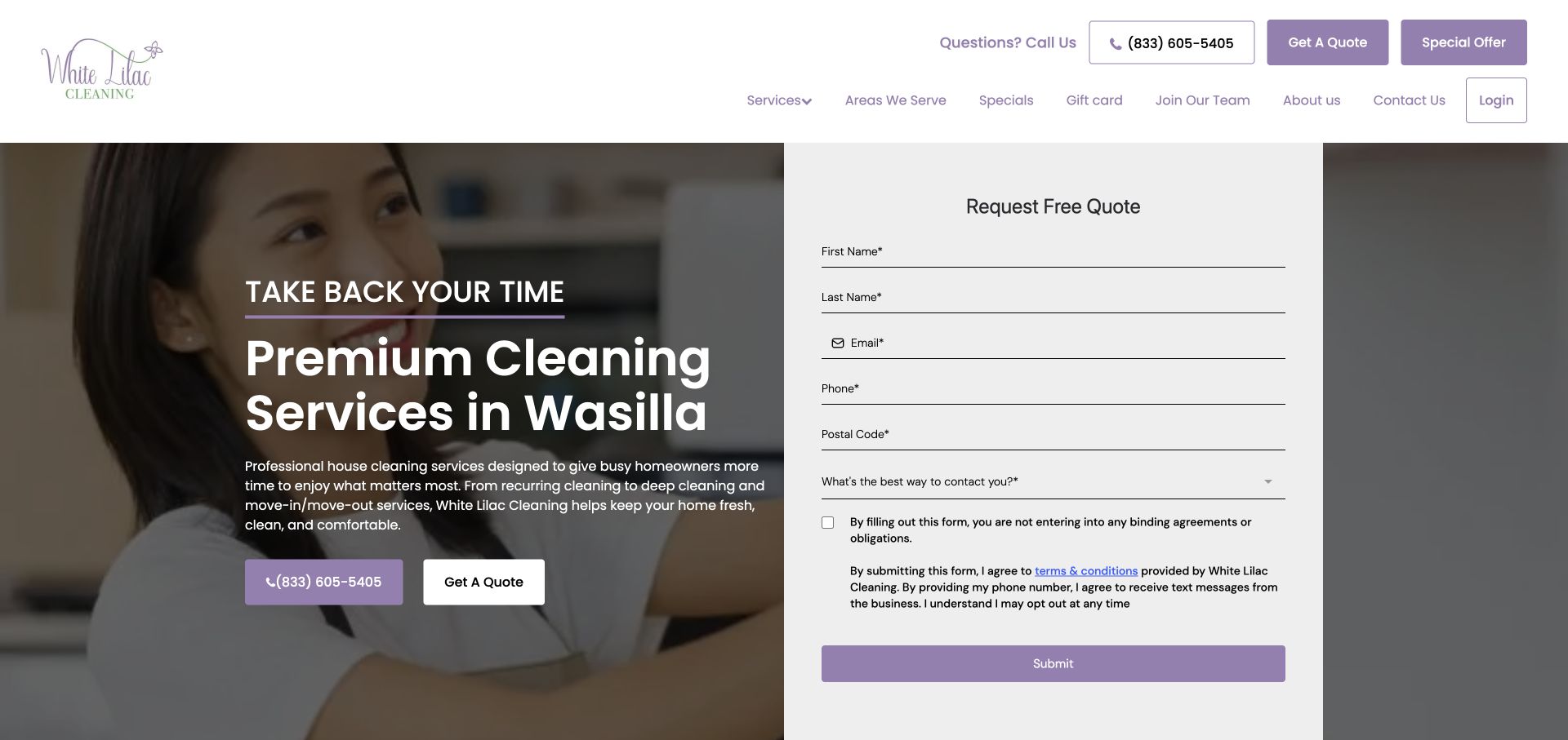
White Lilac Cleaning places a Wasilla-focused introduction beside a tall inquiry panel over a cleaner photograph. Purple actions connect phone contact, a quote request, and the form. The fields include contact details, postal code, and a preferred contact time, making the follow-up nature of the interaction more apparent. Navigation includes service areas and specialist services. The design gives a local business a concrete geographic identity while exposing the amount of information it asks visitors to provide.
What you can learn
Match the form to the real follow-up process and explain why each field is needed. A preferred contact time can be helpful when the business actually uses it; otherwise, reduce the request and keep the service-area and scope information easy to find.
Pros
The named local market establishes relevance before visitors reach the quote panel or service-area navigation.
A contact-time question acknowledges that an inquiry may lead to a conversation rather than an immediate booking.
Cons & considerations
A tall contact form can require substantial mobile scrolling before the visitor has inspected cleaning inclusions.
Service claims and contact promises should be consistent across the main page and any location-specific destinations.
Platform source: WordPress.org Showcase. Linked script matches Google tag. Exact public source-page sample: https://whitelilaccleaning.com/. This identifies a public Google tag reference or response association, not private configuration, complete architecture, measured performance or successful data collection. Platform evidence is separate from the direct website screenshot and is not a complete current infrastructure audit.
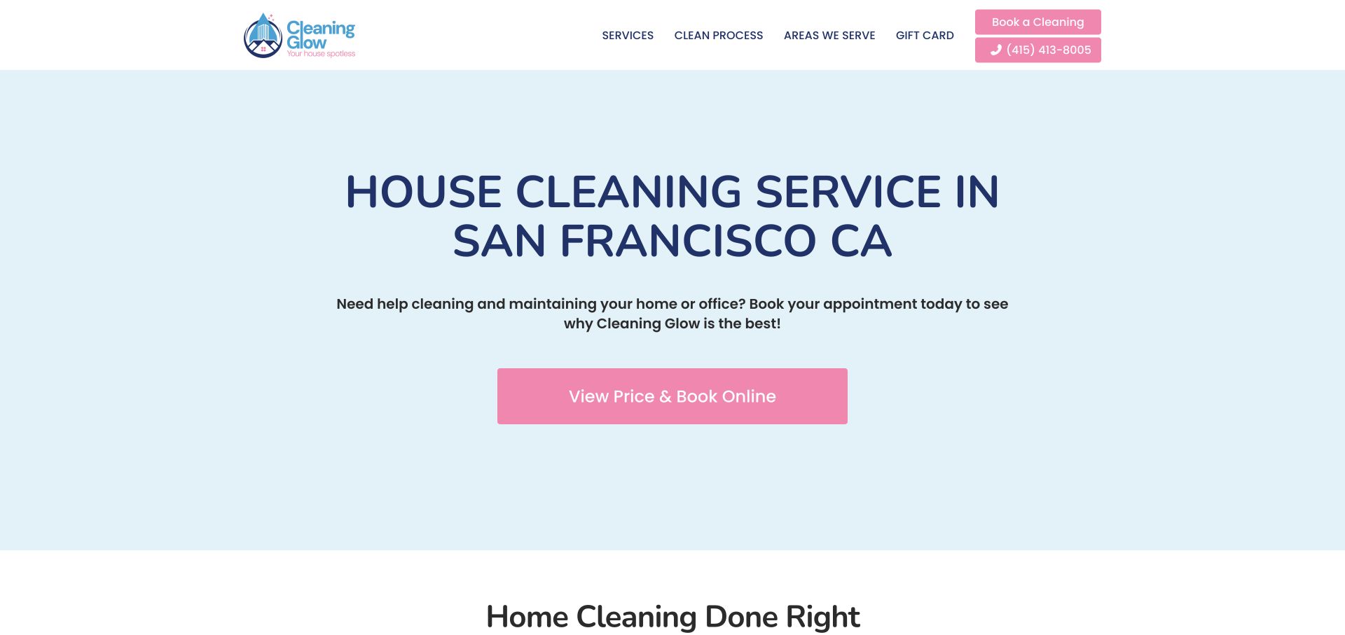
Cleaning Glow uses a pale blue field, a centered San Francisco service headline, and a pink price-and-book button. The header keeps services, process, service areas, and gift information visible without a large form. The next section begins with a cleaning-process introduction. The opening demonstrates a direct, low-density approach: it identifies the city and task, then sends interested readers toward pricing. Longer explanatory copy below should support that clarity and avoid making broad claims that the service cannot substantiate.
What you can learn
A simple hero can answer the essential location and service questions quickly. Use the rest of the page to explain scope and process in respectful, concrete language, and make the pricing destination match the promise of the button.
Pros
The centered city-and-service statement makes the basic offer easy to recognize without reading a long paragraph.
A single pink action has a clear purpose and remains visually distinct from the restrained navigation.
Cons & considerations
A minimal introduction needs useful service and process content nearby so visitors can investigate fit before booking.
Broad health or judgmental housekeeping statements in supporting copy can distract from a practical, customer-focused explanation.
Platform source: WordPress.org Showcase. Linked script matches Google tag. Exact public source-page sample: https://cleaningglow.com/. This identifies a public Google tag reference or response association, not private configuration, complete architecture, measured performance or successful data collection. Platform evidence is separate from the direct website screenshot and is not a complete current infrastructure audit.
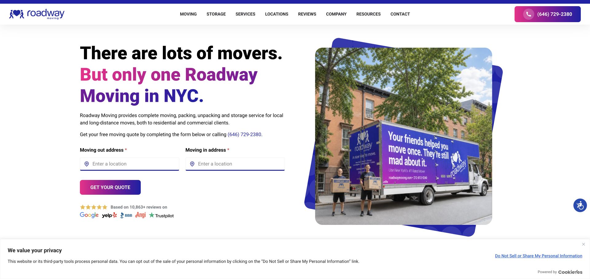
Roadway presents its New York message on the left and a branded truck photograph inside a layered geometric frame on the right. Purple and pink accents connect the headline, quote button, and phone action. The origin and destination fields are compact, and review-source logos sit beneath the inquiry area. The composition is useful for an urban mover because it combines a local service statement, a tangible fleet image, and a short first task without turning the whole screen into a form.
What you can learn
Place local context, the first estimate questions, and contact options together, then explain the rest of the move process below. Treat review logos as links to assessable evidence and avoid assuming that a familiar logo alone establishes service quality.
Pros
The truck image provides a concrete moving-service subject within a distinctive but readable visual frame.
The local headline and two-address form keep the primary inquiry task close to the explanation of the offer.
Cons & considerations
A compact quote form needs later clarification of inventory, access, packing, and scheduling before pricing is meaningful.
Multiple review marks and promotional claims should not replace clear descriptions of coverage and included services.
Platform source: WordPress.org Showcase. Linked script matches Google tag. Exact public source-page sample: https://www.roadwaymoving.com/. This identifies a public Google tag reference or response association, not private configuration, complete architecture, measured performance or successful data collection. Platform evidence is separate from the direct website screenshot and is not a complete current infrastructure audit.
Kegan has 15+ years of experience working with small businesses, Fortune 500 companies, and everything in between. No development job is too big or too small: he brings the same hands-on attention to a focused improvement, a complete website, or a custom application.
For Google tag projects, he can help with measurement requirements, a clearly owned tag installation, privacy-aware event boundaries, duplicate checks, verification, and maintainable handover. He works directly with clients on scope, design, implementation, testing, and handover, with an emphasis on clear communication and a system that remains practical to maintain after launch.
Show 3 other Google tag developersHide other Google tag developers
A direct integration for a deliberately small setup
Document where the base library is installed and which destinations it serves. Keep event definitions in one maintained location. A small setup still needs an owner, a safe test environment and a record of how to disable collection.
A managed container when several teams make changes
If a container is appropriate, define who can publish and how changes are reviewed. A convenient editor does not remove the need for naming rules, duplicate checks and a release record. Separate test destinations from live reporting.
A CMS integration when its controls match the policy
Review the plugin or platform integration rather than assuming every available tracking switch is useful. Establish how consent reaches it, whether page views are automatic and what happens after a theme change or removal. Do not add a second implementation just to make a diagnostic badge turn green.
From references to requirements
Plan observable outcomes and a verifiable handover
Create a small event contract
For each permitted observation, record its trigger, destination, parameters, exclusions and owner. Distinguish a click on a form button from a successful accepted submission. Write down what should happen when validation fails or a request is retried.
Test actual journeys, not just source presence
Verify initial loads, internal navigation and back-button behavior in the implementation being shipped. Confirm which events are expected after a refusal or withdrawal. A source scan checks references; a controlled delivery test and authorized reporting access answer different questions.
Give future maintainers a removal plan
Document account ownership, integration location and the process for changing destinations. Keep a simple rollback record. A subsequent designer should be able to remove a campaign or replace a form without silently breaking the measurement contract.
A useful handover demonstration
Ask the actual team to carry out its routine job: publish a realistic update, correct a mistake, preview a narrow screen, and identify who owns an integration failure. For a library or frontend framework, also ask who maintains the content source and deployment. A polished screenshot does not answer those operational questions.
Beyond the screenshot
Google tag implementation checklist
Name one responsible business and technical owner.
Record the installation route and authorized destinations.
Check for duplicate base snippets and automatic page views.
Exclude personal fields and private URL parameters.
Define consent, regional handling and withdrawal before launch.
Exercise failed, retried and successful form states separately.
Verify permitted delivery without using real customer enquiries.
Record test evidence, release identity and rollback instructions.
Test with real content, a keyboard, a small screen, slow or failed requests, and the people who will maintain the system. These are planning checks, not an accessibility, security, performance, or search-ranking certification.
Sources & editorial method
How this Google tag collection was reviewed
The collection uses genuine source screenshots and original visual reviews, with dated public gtag.js observations on the exact source pages. Existing editorial descriptions are retained or adapted where the same property has already been reviewed. We did not access private reporting, verify account ownership, audit every tag or infer conversion results. Google tag is distinct from the Google Tag Manager management interface.
Every image is an unmodified capture from the actual website, with its source and capture date. Some captures are reused from our shared catalog; their dates remain the original capture dates. None comes from a vendor gallery or a generated reconstruction. Moving imagery and live content can change.
Technology attribution uses public page assets or metadata, official platform documentation, or a cited first-party project case study. Documentary and framework-relationship evidence is identified where used; it is not a complete current backend inventory. A CMS image CDN alone does not establish a full CMS deployment. A library’s presence does not prove which individual controls use it, and a platform label does not establish AI authorship.
The composition notes, lessons, pros and tradeoffs are original editorial observations. We have not measured conversion, traffic, security, performance or accessibility conformance. Website owners retain their brands and imagery; these examples are not our client portfolio. Written, Edited and Curated are independent records, not dates advanced by a build. See our editorial standards or suggest a correction.
Questions worth asking
Google tag website development FAQs
Does loading gtag.js prove Google Analytics is working?
No. The reference does not prove successful delivery, the destination settings, account access or receipt in reporting.
Was the design made with the Google tag?
No such claim is made. The tag is a measurement component; the reviews study the website presentation and its public source reference separately.
Can I copy another site’s event plan?
Use its visitor tasks as a starting question, not a ready-made collection policy. Your business purpose, integrations and permitted data may differ.
Does this guide change Website Unpacked’s own tracking?
No. This is an editorial collection, not an instruction or change to this site’s analytics configuration.