A font service is one part of a readable interface. These examples show public websites with recorded Google Fonts resource references, paired with genuine screenshots and original reviews of hierarchy, navigation, forms, and campaign text. The evidence does not identify every rendered typeface or establish the site’s content management system.
Typography must support several jobs at once: helping a visitor scan a heading, read a paragraph, compare an offer, and operate a control. A strong opening photograph can hide weaknesses in the smaller labels around it. Start with those practical text roles and assess the display heading in the same system.
This collection spans institutional information, retail, documentation, hospitality, and product campaigns. Use the examples to compare reading patterns, then test your own content. A font that looks convincing in one English headline may behave differently with long navigation labels, product numbers, translated text, or a delayed download.
Before the examples
What makes good Google Fonts website development in 2026?
Write a type inventory before selecting families
List the text roles your site actually needs: page title, section heading, body, navigation, caption, control, error, and qualifying detail. Give each role a purpose and representative content. Decide which distinctions must survive without color or font weight so the hierarchy remains meaningful in less favorable viewing conditions.
Request the styles the interface uses
The Google Fonts CSS API supports specific families and styles, variable-font ranges, and a display parameter. Build requests from the type inventory, then inspect what the browser downloads. Avoid requesting a broad range simply because it is available; justify the styles against real components and measure the result.
Compare the intended font with the fallback using the same content and viewport. Look for navigation wrapping, clipped buttons, displaced images, and cards that change height. A useful fallback is a tested state of the interface, not a forgotten declaration at the end of a stylesheet.
The collection · 20 examples
20 Google Fonts website examples worth studying
The opening examples are the University of Cambridge, UC Berkeley, the United Nations, WHO, and the World Food Programme. Each has a public Google Fonts reference recorded for the named property. Reviews focus on the visible typographic system; they do not attribute a particular family to an element without separate computed-style evidence.
We start with five recognizable brands or organizations: University of Cambridge, University of California, Berkeley, United Nations, World Health Organization, World Food Programme. Each attribution applies to the named website property, not every product or website belonging to its organization. This is a curated reading sequence, not a measured ranking.
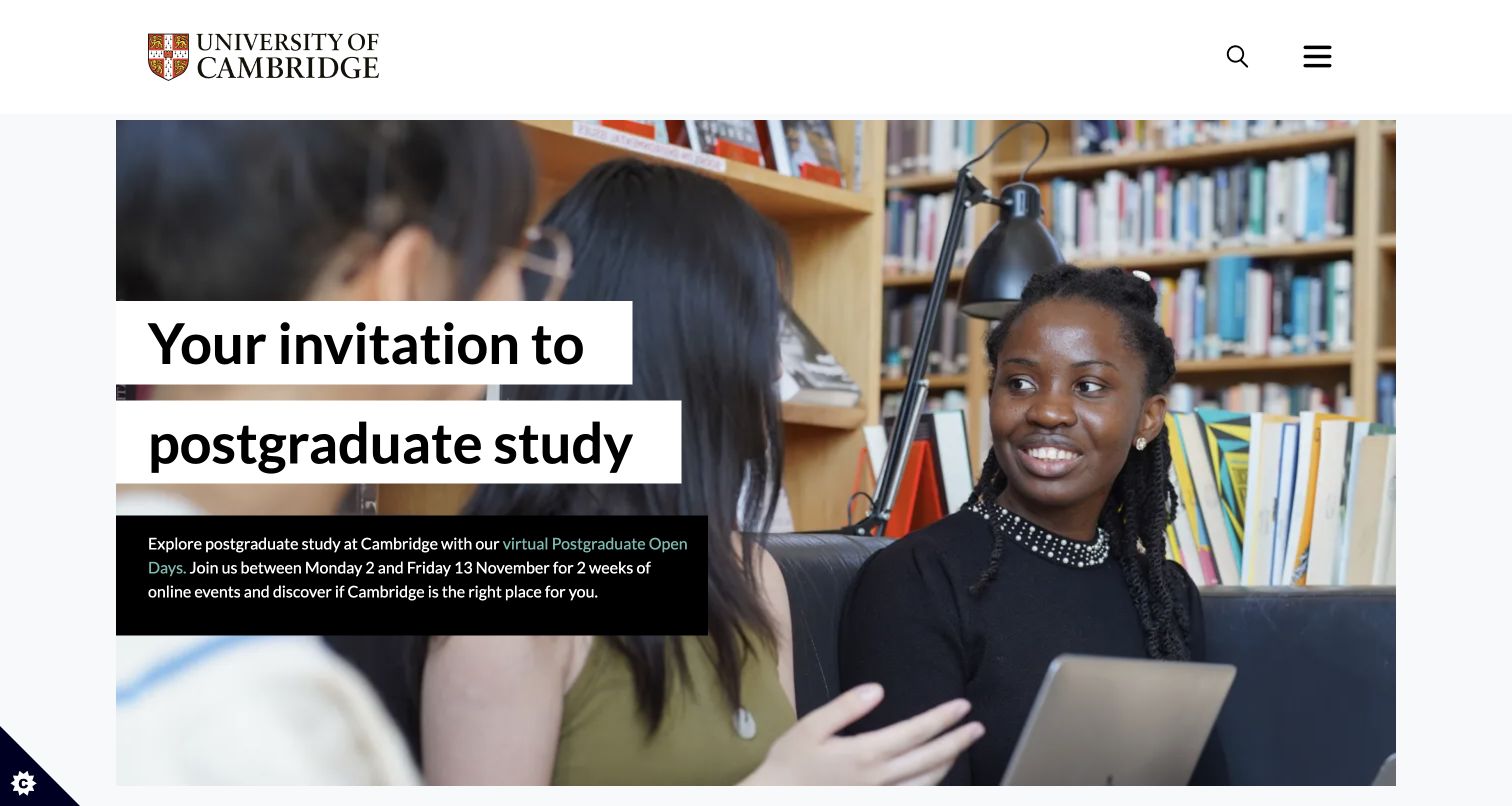
Cambridge places a large postgraduate invitation on separate white strips over a library photograph. The supporting paragraph sits in a black panel, so the message stays readable without asking the image to provide a perfectly quiet background. A compact institutional wordmark and two utility icons leave the campaign substantial space. The useful typographic relationship is between the assertive headline and the much smaller explanatory text, rather than a decorative assortment of styles.
What you can learn
Define headline, supporting copy, and navigation as separate text roles before choosing a web font. Test a longer campaign title and the fallback font inside the same blocks, including where line breaks change at phone widths.
Pros
Opaque headline backgrounds protect the main message from the busy bookshelves and portraits behind it.
The smaller paragraph gives event context without competing with the primary invitation for immediate attention.
Cons & considerations
The compact utility icons need clear accessible names and sufficiently large targets when adapted for another site.
A long headline can produce many stacked strips on a narrow screen, so the crop and vertical spacing need explicit testing.
Public source checked November 3, 2026. References may be embedded or legacy—not a complete backend inventory.
Platform source: Exact public source-page audit. The public source-page audit on 2026-11-03 recorded linked stylesheet matches google fonts for this exact property. This is a public resource reference, not a test of every user journey, a complete backend inventory, or a claim that every visible element uses Google Fonts. Platform evidence is separate from the direct website screenshot and is not a complete current infrastructure audit.
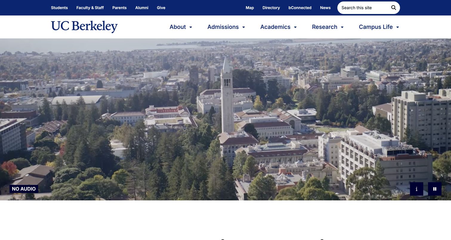
Berkeley keeps almost all opening text in two navigation bands and lets the campus photograph fill the remaining view. Audience links and search occupy the darker upper strip, while larger section labels sit beside the wordmark below. The contrast between compact utilities and larger primary navigation supplies hierarchy without requiring a headline over the campus. The Google Fonts reference is a delivery observation; the screenshot alone does not identify which visible labels use that service.
What you can learn
Make navigation typography a deliberate system with distinct roles for audience shortcuts, principal sections, and search. Test the full set of labels with fallback fonts and enlarged text before relying on a photograph to complete the introduction.
Pros
Separating audience shortcuts from academic sections makes the dense header easier to scan as two purposeful groups.
The image retains a clear campus overview because promotional text does not cover the architecture and surrounding landscape.
Cons & considerations
Many compact links across the top demand a careful mobile reflow instead of a simply scaled desktop header.
A visitor unfamiliar with the institution may still need a short written introduction after the visually generous opening.
Public source checked November 3, 2026. References may be embedded or legacy—not a complete backend inventory.
Platform source: Exact public source-page audit. The public source-page audit on 2026-11-03 recorded linked stylesheet matches google fonts for this exact property. This is a public resource reference, not a test of every user journey, a complete backend inventory, or a claim that every visible element uses Google Fonts. Platform evidence is separate from the direct website screenshot and is not a complete current infrastructure audit.
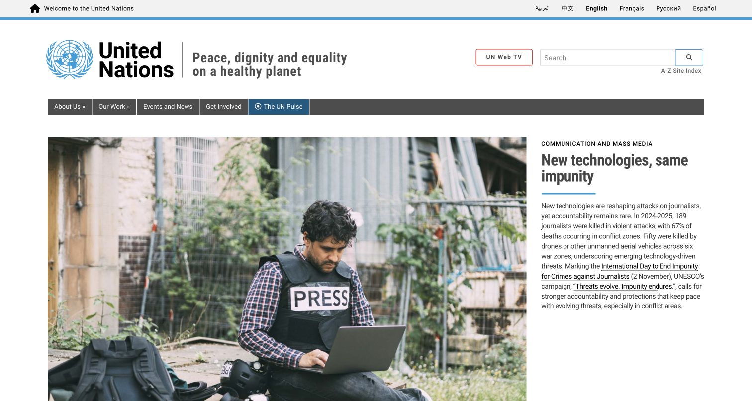
The United Nations opening pairs a large news photograph with a narrower text column. A small category label, heavy headline, blue divider, and regular paragraph create four distinct reading levels. The institutional statement and search remain in the header above the story. This is a useful Google Fonts collection example because typographic hierarchy carries a substantial amount of information without requiring oversized promotional copy throughout the entire page.
What you can learn
Write a small set of editorial text roles and test them with real translated headlines. Keep the category subordinate, let the title wrap naturally, and give the summary enough line spacing to remain readable when its column narrows.
Pros
The side-by-side story layout keeps the photograph available while giving the explanatory paragraph its own uncluttered background.
A consistent blue accent joins the identity, divider, and navigation without making every text level visually identical.
Cons & considerations
The narrow summary column can become tall when translation or editorial context increases the amount of text.
A large institutional header uses considerable vertical space; smaller screens need an intentional priority order for its utilities.
Public source checked November 3, 2026. References may be embedded or legacy—not a complete backend inventory.
Platform source: Exact public source-page audit. The public source-page audit on 2026-11-03 recorded linked stylesheet matches google fonts for this exact property. This is a public resource reference, not a test of every user journey, a complete backend inventory, or a claim that every visible element uses Google Fonts. Platform evidence is separate from the direct website screenshot and is not a complete current infrastructure audit.
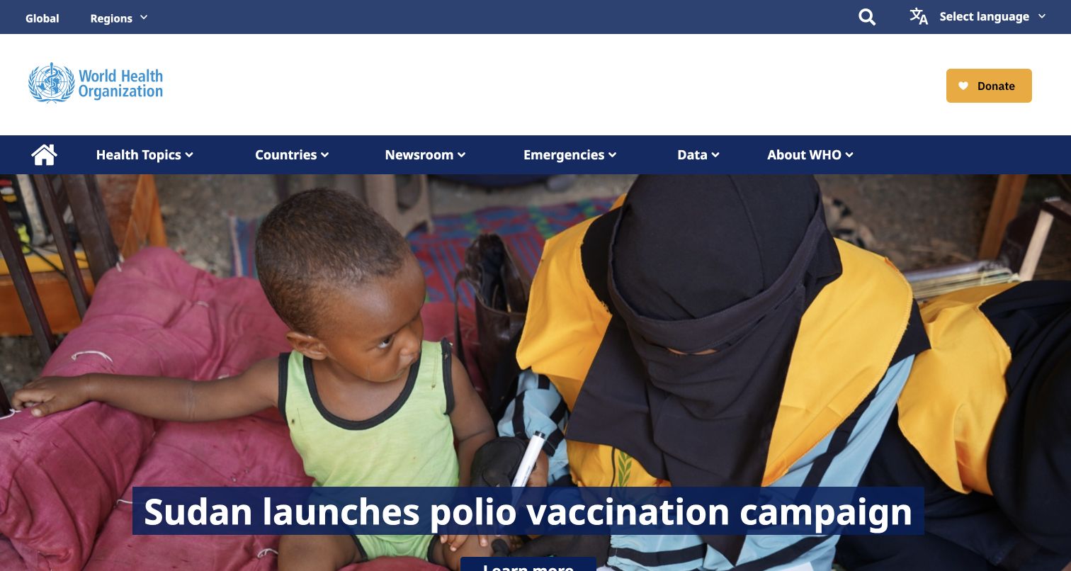
WHO uses several blue navigation bands, a large white identity area, and a full-width news photograph. The lead story title appears in bold white type on a dark blue rectangle near the bottom of the image. That backing gives the headline a predictable reading surface. The composition connects a dense public-information navigation system to a focused story, while the smaller donation action remains visually separate from the editorial headline.
What you can learn
Use a bounded headline component for photographic stories and test long titles before release. Separate its typography from navigation and fundraising controls, then verify the layout remains understandable when web fonts arrive late or the image is unavailable.
Pros
The solid title backing avoids depending on the photograph's changing tones to provide readable contrast behind the words.
Topic, country, newsroom, emergency, and data routes are visibly differentiated from the larger story area below them.
Cons & considerations
Multiple header bands can push the story action below the initial viewport, particularly at shorter laptop heights.
A headline anchored low over an image needs deliberate phone positioning so neither essential copy nor the subject is cropped.
Public source checked November 3, 2026. References may be embedded or legacy—not a complete backend inventory.
Platform source: Exact public source-page audit. The public source-page audit on 2026-11-03 recorded linked stylesheet matches google fonts for this exact property. This is a public resource reference, not a test of every user journey, a complete backend inventory, or a claim that every visible element uses Google Fonts. Platform evidence is separate from the direct website screenshot and is not a complete current infrastructure audit.
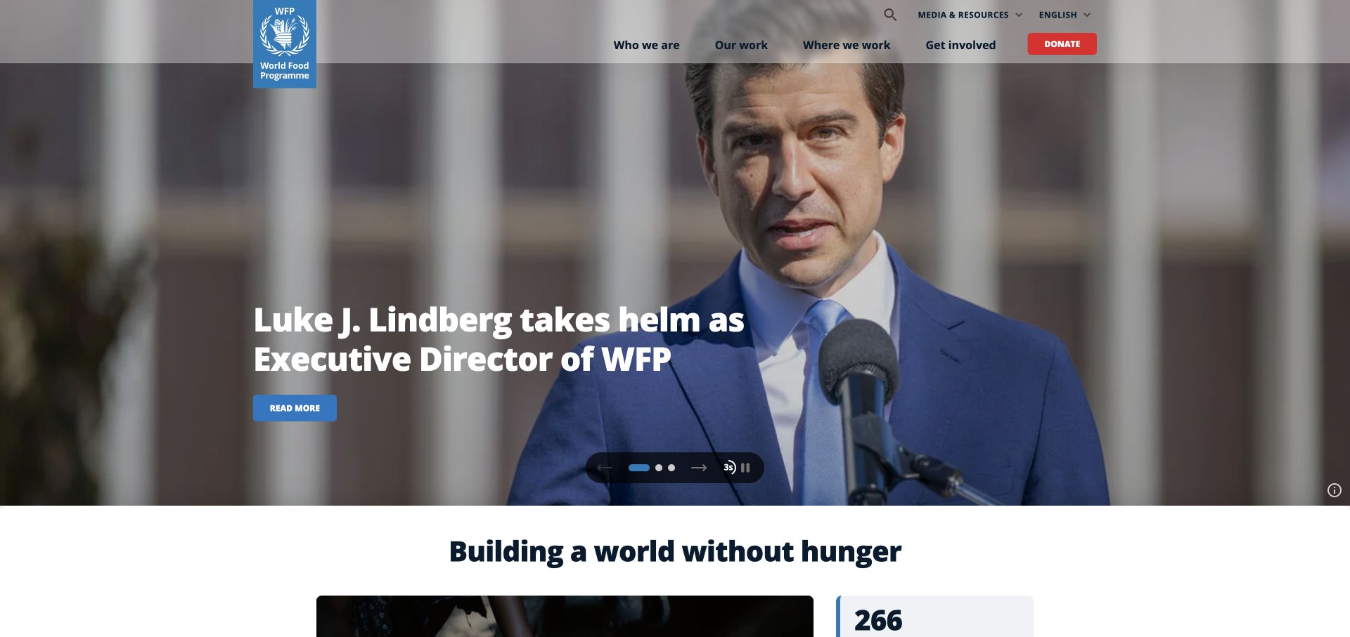
WFP gives a news photograph most of the opening, placing a large white headline and a small blue reading action over its darker left side. The organizational mission then appears as a bold centered heading on white below. The two headings perform different jobs: one announces a particular story, while the other restores the institution's enduring purpose. The saved capture shows this editorial hierarchy; its news content should be read as dated material.
What you can learn
Give each homepage heading an explicit lifespan. A temporary news title and a permanent mission statement can share a type family while using different scale, alignment, and placement. Test both together rather than approving each module in isolation.
Pros
The mission heading beneath the image provides an immediate transition from a changing story to a stable organizational purpose.
A restrained reading button gives the headline a destination without introducing another large competing text block over the portrait.
Cons & considerations
White text over photography still needs testing across every slide and crop, even when one captured frame is readable.
Carousel indicators and pause controls require adequate target sizes and clear names when the same pattern is implemented elsewhere.
Public source checked November 3, 2026. References may be embedded or legacy—not a complete backend inventory.
Platform source: Exact public source-page audit. The public source-page audit on 2026-11-03 recorded linked stylesheet matches google fonts for this exact property. This is a public resource reference, not a test of every user journey, a complete backend inventory, or a claim that every visible element uses Google Fonts. Platform evidence is separate from the direct website screenshot and is not a complete current infrastructure audit.
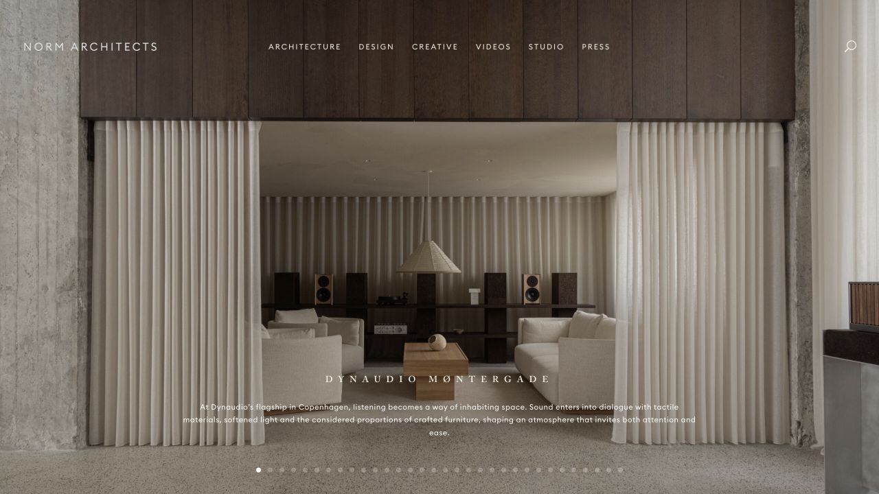
Norm Architects uses a restrained navigation row, widely spaced project title, and small centered description over a full-bleed interior photograph. The typography is deliberately quieter than the materials and symmetry of the room. Its scale makes the scene feel expansive, but also makes the reading experience dependent on careful contrast and line length. The audit establishes a Google Fonts reference on this property, without proving a particular typeface assignment in the image.
What you can learn
Set a minimum readable size for project labels before pursuing a quiet visual effect. Keep the original photograph's focal point, test darker and lighter frames, and compare the intended web font with a metrically different fallback at the same width.
Pros
The small amount of text leaves the room's textures and proportions available for close visual inspection by prospective clients.
Centered project identification provides enough context to distinguish the featured work from an anonymous atmospheric background image.
Cons & considerations
Widely tracked small text can become difficult to read on phones or when visitors enlarge the page for comfort.
A portfolio with many unfamiliar project names may need clearer descriptive labels and a more obvious route to practical project facts.
Public source checked November 3, 2026. References may be embedded or legacy—not a complete backend inventory.
Platform source: Exact public source-page audit. The public source-page audit on 2026-11-03 recorded linked stylesheet matches google fonts for this exact property. This is a public resource reference, not a test of every user journey, a complete backend inventory, or a claim that every visible element uses Google Fonts. Platform evidence is separate from the direct website screenshot and is not a complete current infrastructure audit.
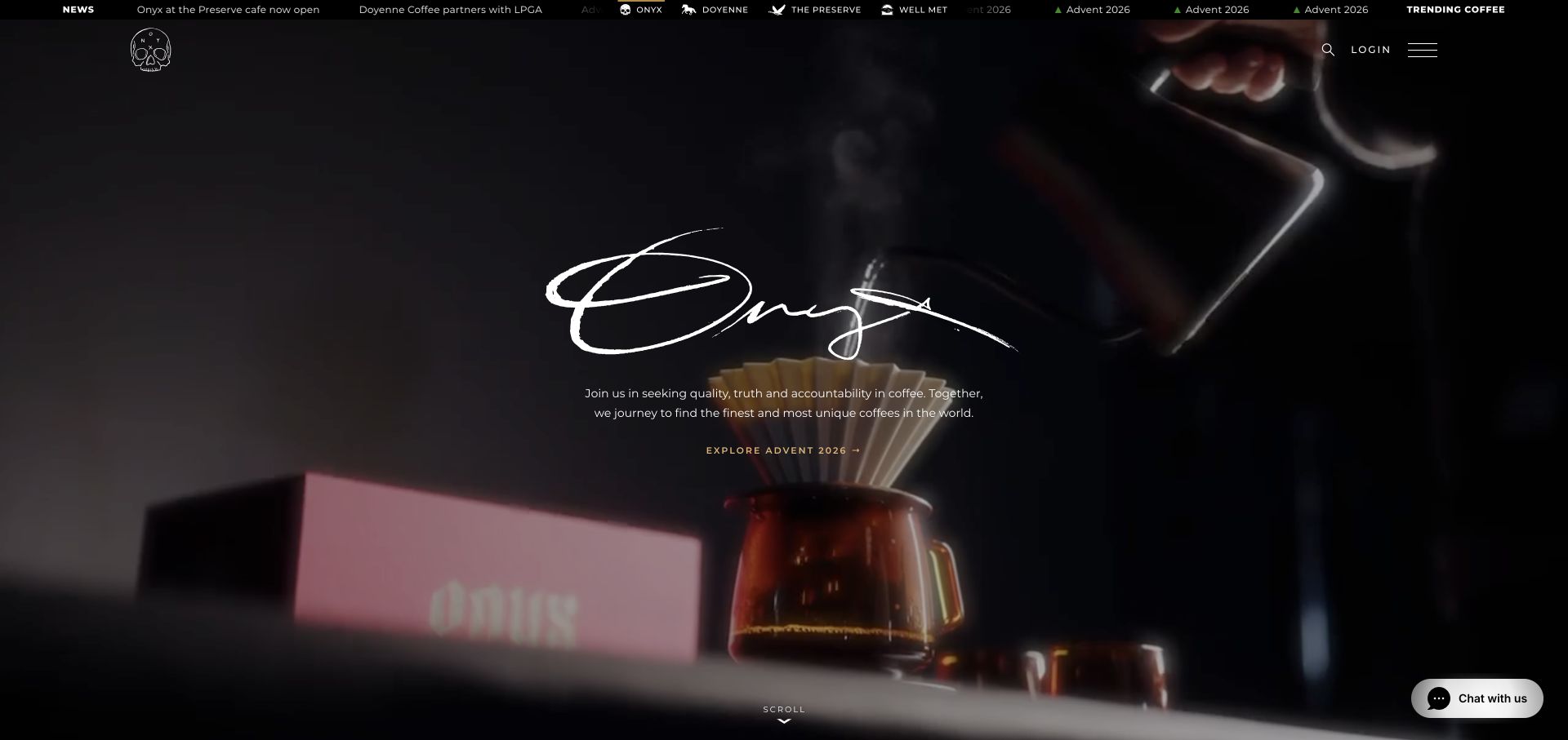
Onyx centers a large handwritten brand treatment over a dark coffee scene, then uses smaller, plainer text for its introduction and seasonal action. The contrast lets the distinctive mark supply personality while the surrounding interface handles ordinary reading. A thin news strip and compact utilities add another layer at the top. This separation is worth studying when selecting web fonts: expressive branding need not dictate the style of every navigational label.
What you can learn
Reserve the most expressive lettering for short identity moments. Use a readable companion treatment for descriptions, navigation, and product actions, and test whether those practical labels remain legible when the background footage changes brightness or the font request fails.
Pros
The oversized central mark is clearly distinguished from the more functional introduction and seasonal link immediately below it.
The darkened background creates a calm reading area around the center without removing the coffee preparation imagery entirely.
Cons & considerations
The opening action is comparatively small; a new visitor may need a more explicit route into the everyday product catalog.
Several thin text layers near the top can become crowded when a desktop navigation system is translated to a small screen.
Public source checked November 3, 2026. References may be embedded or legacy—not a complete backend inventory.
Platform source: Exact public source-page audit. The public source-page audit on 2026-11-03 recorded linked stylesheet matches google fonts for this exact property. This is a public resource reference, not a test of every user journey, a complete backend inventory, or a claim that every visible element uses Google Fonts. Platform evidence is separate from the direct website screenshot and is not a complete current infrastructure audit.
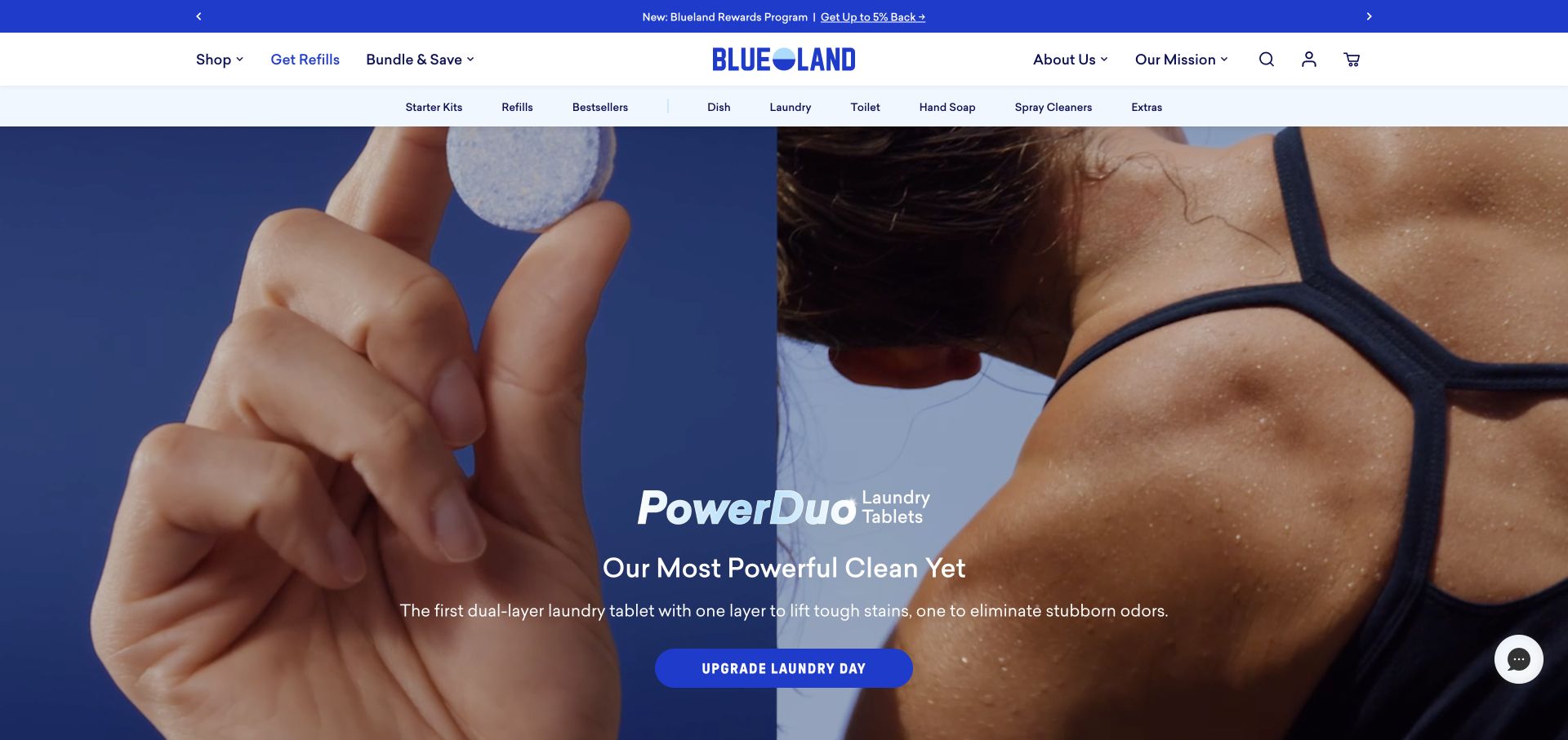
Blueland combines a three-level header with an expansive product campaign. The lower hero text distinguishes a branded product name, a larger benefit statement, explanatory copy, and a rounded action. The tablet photograph makes the physical format clear while the type explains its intended use. For Google Fonts planning, the useful lesson is that a consistent interface can contain a more expressive campaign without losing the navigational vocabulary customers already understand.
What you can learn
Specify text roles for product name, benefit, explanation, and action separately. Test longer product names and real translated category labels, then limit the requested font styles to the weights those roles actually require across the storefront.
Pros
The campaign explains the product format with both imagery and a short sentence instead of relying entirely on the product name.
Persistent categories above the hero keep repeat shopping and refills visible while the new campaign receives most of the screen.
Cons & considerations
Text laid across a split photograph needs careful alignment and contrast testing as the two image regions move on mobile.
Three header rows can compress the usable opening area; shorter viewports need a deliberate treatment of secondary navigation and promotions.
Public source checked November 3, 2026. References may be embedded or legacy—not a complete backend inventory.
Platform source: Exact public source-page audit. The public source-page audit on 2026-11-03 recorded linked stylesheet matches google fonts for this exact property. This is a public resource reference, not a test of every user journey, a complete backend inventory, or a claim that every visible element uses Google Fonts. Platform evidence is separate from the direct website screenshot and is not a complete current infrastructure audit.
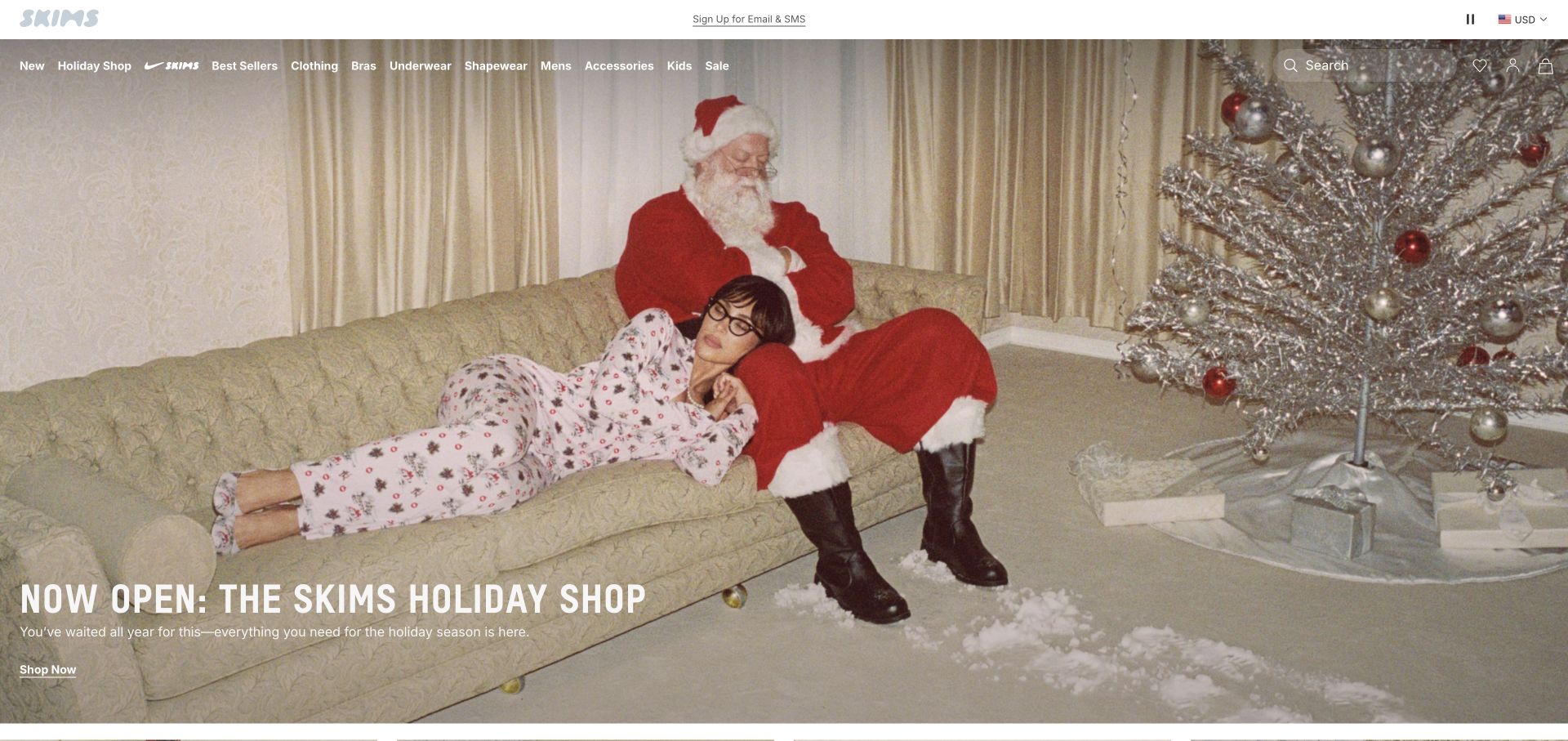
SKIMS overlays a dense row of shopping categories on a full-width seasonal photograph and places the campaign message near the lower left. The heavy uppercase title is much larger than the supporting sentence and underlined shopping link. Most of the image remains available to communicate the collection's mood. The audit's font-service evidence and this visual review have different scopes: the reference does not establish which rendered text belongs to a specific font family.
What you can learn
Treat a seasonal hero as a repeatable editorial template with limits for title length, supporting copy, and action labels. Check fallback typography against those limits so a late font cannot cover an important part of the model or product.
Pros
The large campaign title can be located quickly without filling the photograph with multiple competing promotional messages.
The category row provides familiar product routes for visitors who are not interested in the current seasonal presentation.
Cons & considerations
White navigation over detailed light photography needs separate contrast checks from the much larger campaign headline near the bottom.
A long run of categories is unsuitable for simple scaling; mobile navigation needs another arrangement with comfortable readable labels and controls.
Public source checked November 3, 2026. References may be embedded or legacy—not a complete backend inventory.
Platform source: Exact public source-page audit. The public source-page audit on 2026-11-03 recorded linked stylesheet matches google fonts for this exact property. This is a public resource reference, not a test of every user journey, a complete backend inventory, or a claim that every visible element uses Google Fonts. Platform evidence is separate from the direct website screenshot and is not a complete current infrastructure audit.
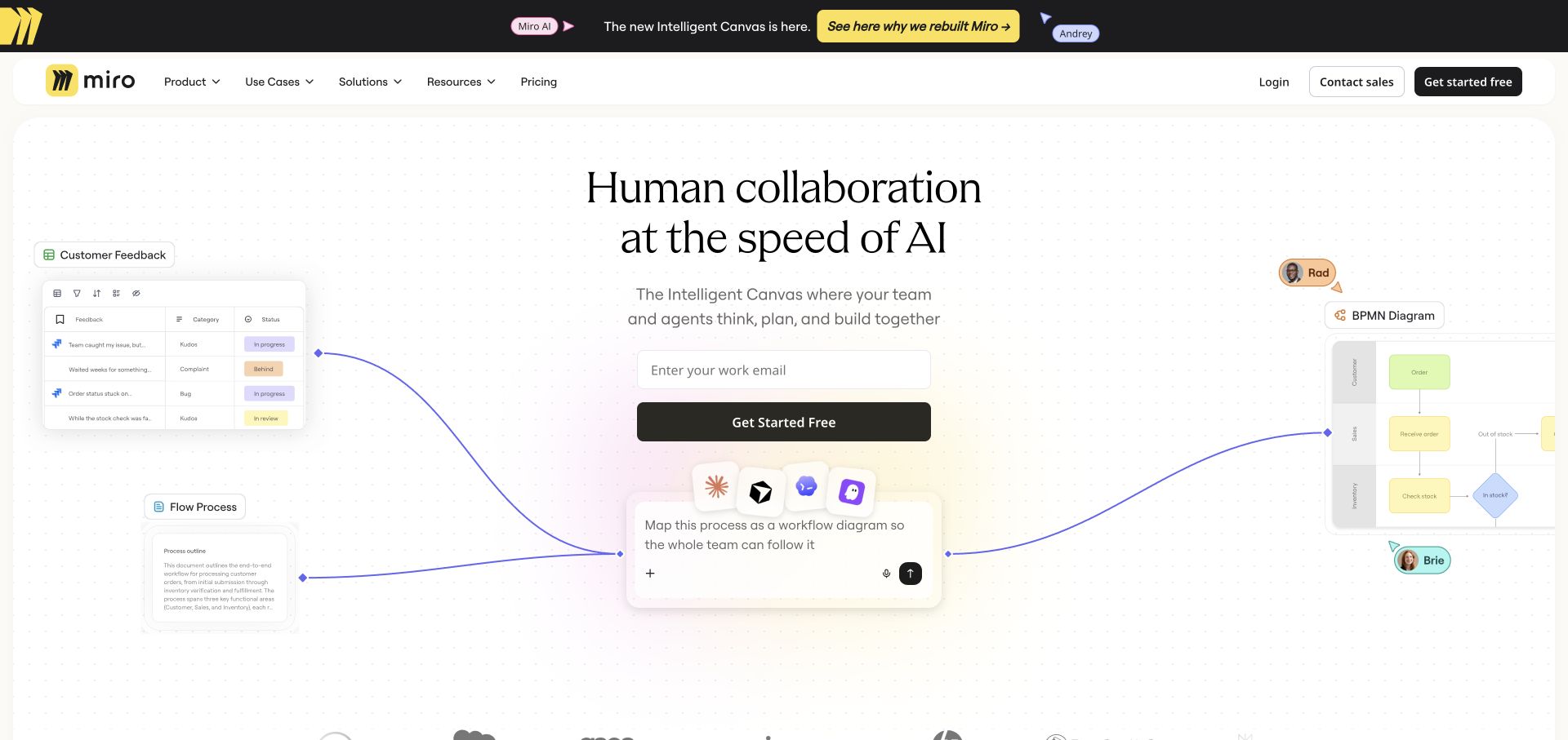
Miro places a large centered serif headline above a quieter explanation, email field, and dark action button. Around that center are miniature interface cards connected by curved lines. The headline has a different character from the compact navigation and card text, helping the page balance a broad product idea with practical interface detail. This is a useful example of assigning distinct typographic roles without claiming the visible product illustration demonstrates live software behavior.
What you can learn
Choose typography for both the marketing statement and the smallest interface label. Test the headline beside diagrams, then ensure the surrounding illustration supports the message without becoming the only place important information is available.
Pros
A centered message and action remain visually dominant despite the many smaller interface fragments arranged around the main column.
The headline's editorial character contrasts with practical controls, separating the brand explanation from the ordinary mechanics of signing up.
Cons & considerations
Small text inside illustrative cards may be unreadable on phones and should not carry information visitors must recover to understand the offer.
A mixed font system needs disciplined loading and fallback testing so the headline and form do not jump into one another.
Public source checked November 3, 2026. References may be embedded or legacy—not a complete backend inventory.
Platform source: Exact public source-page audit. The public source-page audit on 2026-11-03 recorded linked stylesheet matches google fonts for this exact property. This is a public resource reference, not a test of every user journey, a complete backend inventory, or a claim that every visible element uses Google Fonts. Platform evidence is separate from the direct website screenshot and is not a complete current infrastructure audit.
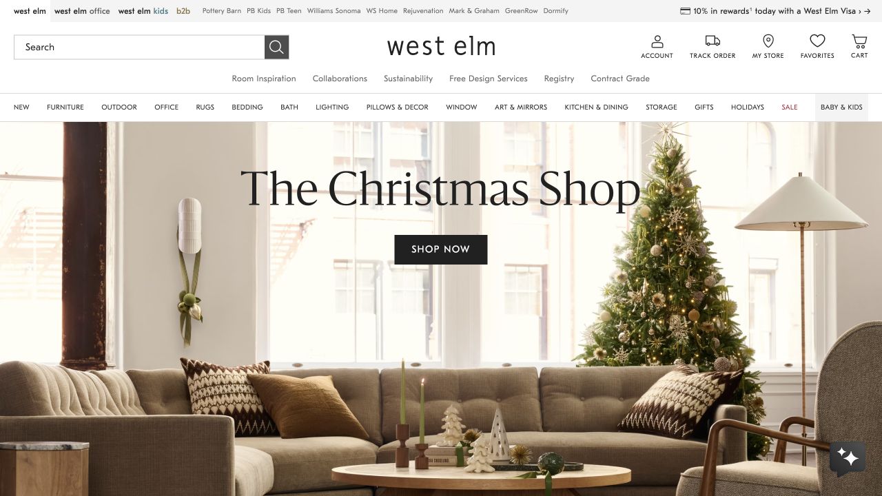
West Elm layers compact brand-family links, search and account utilities, service links, and product categories above a room photograph. A large serif seasonal title floats near the center with a solid black action beneath. The layout makes the difference between inspiration and navigation very clear through scale. It also shows the practical challenge of web typography in a large store: many small labels must remain readable alongside a deliberately spacious promotional headline.
What you can learn
Build a typography inventory from the shopping header before styling the hero. Give dense utilities tested size and spacing, and verify that the title fits with a fallback font and a longer seasonal message.
Pros
The dark action button remains identifiable against the bright room and is visually separate from the large editorial headline.
Search and category navigation provide direct routes into the catalog for shoppers who already know what they need to find.
Cons & considerations
Several compact header rows create a demanding scan; mobile users need fewer simultaneous labels without losing essential shopping and account functions.
A headline over windows and furniture can compete with the photograph when the crop changes or the text wraps into additional lines.
Public source checked November 3, 2026. References may be embedded or legacy—not a complete backend inventory.
Platform source: Exact public source-page audit. The public source-page audit on 2026-11-03 recorded linked stylesheet matches google fonts for this exact property. This is a public resource reference, not a test of every user journey, a complete backend inventory, or a claim that every visible element uses Google Fonts. Platform evidence is separate from the direct website screenshot and is not a complete current infrastructure audit.
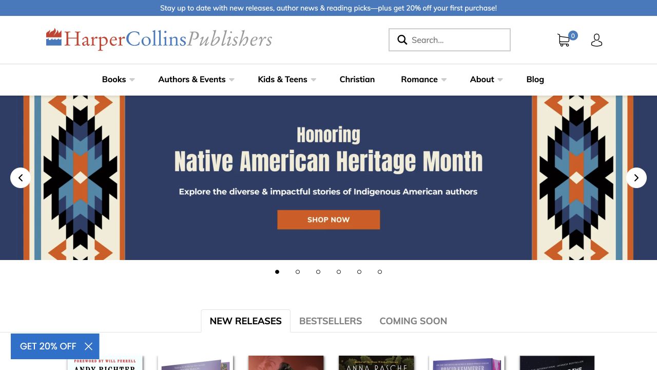
HarperCollins uses a large identity and ordinary navigation above a colorful campaign panel. The campaign's condensed lettering, short explanatory line, and orange shopping action are followed by tabbed routes into new releases, bestsellers, and forthcoming books. The page demonstrates how a publisher can give one editorial collection a distinct visual voice while keeping the catalog structure stable. The Google Fonts reference is not evidence that lettering embedded within campaign artwork is selectable web text.
What you can learn
Separate live interface typography from artwork typography in the brief. Keep campaign meaning available as text, test tabs and search, and make sure the reading hierarchy survives when a promotional image is absent or replaced.
Pros
The book-discovery tabs establish a useful next step after the large campaign without asking visitors to return to the main navigation.
A contained blue campaign surface gives its heading and action a predictable visual background despite the decorative side patterns.
Cons & considerations
If campaign words are baked into artwork, they need an equivalent accessible description and cannot adapt naturally to different viewport widths.
The many competing promotional layers require editing discipline so a discount prompt does not distract from discovering authors and books.
Public source checked November 3, 2026. References may be embedded or legacy—not a complete backend inventory.
Platform source: Exact public source-page audit. The public source-page audit on 2026-11-03 recorded linked stylesheet matches google fonts for this exact property. This is a public resource reference, not a test of every user journey, a complete backend inventory, or a claim that every visible element uses Google Fonts. Platform evidence is separate from the direct website screenshot and is not a complete current infrastructure audit.
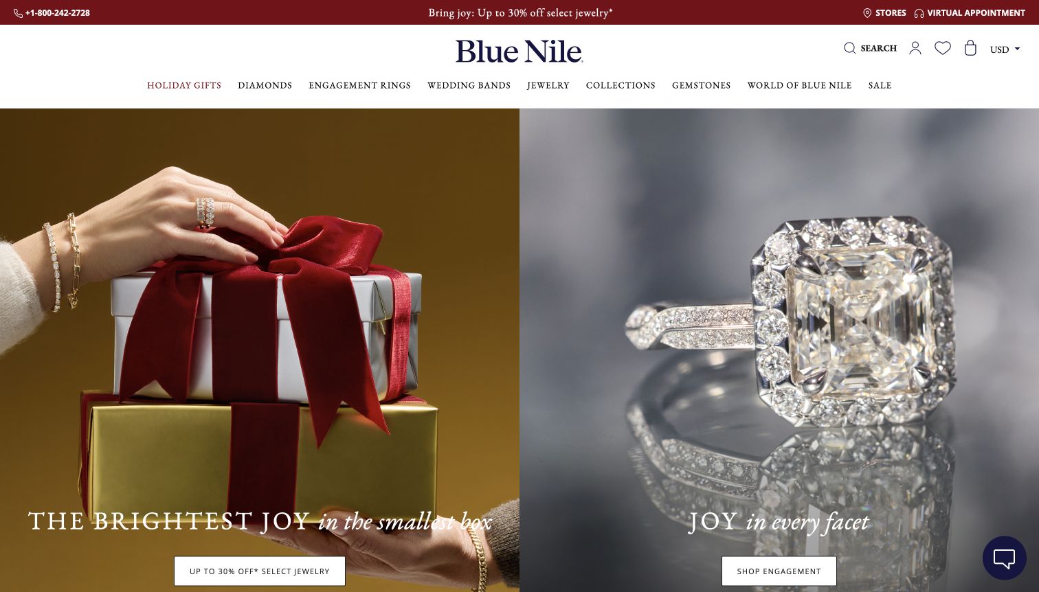
Blue Nile divides the hero into two equal photographic panels: one for jewelry gifts and one for engagement rings. Serif campaign lines sit low in each panel, with compact rectangular actions beneath. A broad white navigation area and a darker service strip sit above. The shared type treatment ties different purchase intentions together, while each panel retains its own visual subject and destination. This is a design comparison rather than an appraisal of the jewelry or offers.
What you can learn
Design paired campaigns with a shared text hierarchy and independent content limits. Test both panels with unequal title lengths and verify the phone layout preserves their distinct destinations instead of producing an undifferentiated image sequence.
Pros
The parallel panel treatment helps visitors distinguish everyday gifting from engagement shopping without requiring an initial menu decision.
The white header isolates detailed category labels from the visually busy jewelry photography occupying the larger area below.
Cons & considerations
Delicate white type over reflective jewelry or gift photography needs crop-specific contrast checks rather than reliance on a single approved image.
Two low-positioned actions may fall below short viewports; the reading order should remain clear when the hero becomes vertically stacked.
Public source checked November 3, 2026. References may be embedded or legacy—not a complete backend inventory.
Platform source: Exact public source-page audit. The public source-page audit on 2026-11-04 recorded linked stylesheet matches google fonts for this exact property. This is a public resource reference, not a test of every user journey, a complete backend inventory, or a claim that every visible element uses Google Fonts. Platform evidence is separate from the direct website screenshot and is not a complete current infrastructure audit.
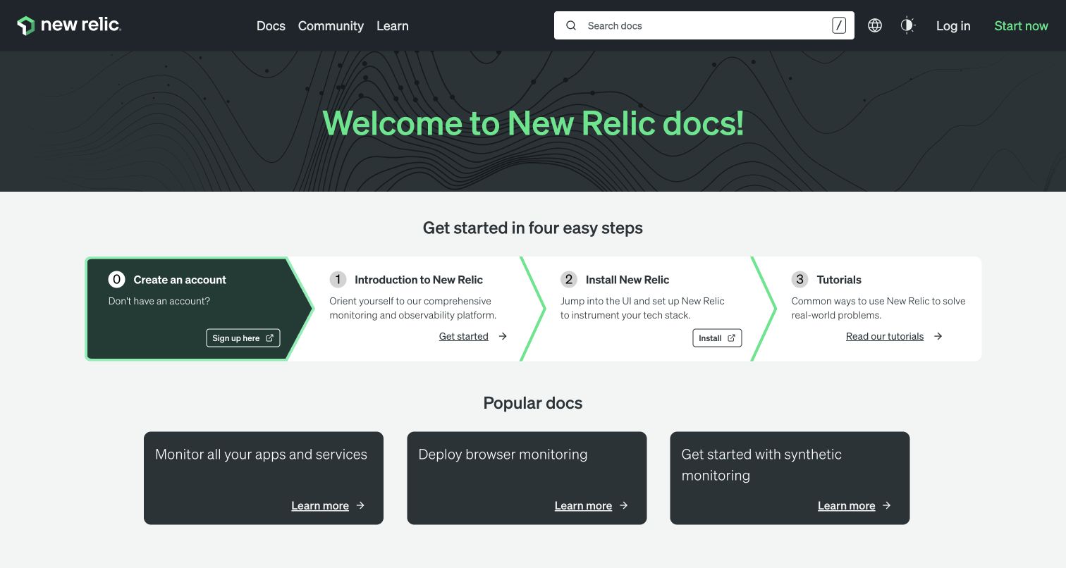
New Relic's documentation opening pairs a prominent search box with a large green welcome heading. Below it, four numbered panels move from account creation to introduction, installation, and tutorials. The text hierarchy differentiates the step name, explanation, and action without depending on photographic content. Smaller popular-document cards follow. The capture makes a useful typography study because successful reading depends on alignment and emphasis across repeated information components rather than one dramatic headline.
What you can learn
Test a font system on the longest description and narrowest card before polishing the welcome heading. Use real technical terms, preserve readable line lengths, and ensure emphasis communicates sequence even when color or font weight is unavailable.
Pros
Numbered panels offer a visible starting path while the large search field supports experienced readers with a specific question in mind.
Repeated title, description, and action positions make it easier to compare the four entry points without relearning each card's structure.
Cons & considerations
A horizontal progression needs an explicit small-screen reading order and should not compress all four descriptions into unusably narrow columns.
The varied weights and green accents need restraint deeper in the documentation so code and reference text remain scannable.
Public source checked November 3, 2026. References may be embedded or legacy—not a complete backend inventory.
Platform source: Exact public source-page audit. The public source-page audit on 2026-11-03 recorded linked stylesheet matches google fonts for this exact property. This is a public resource reference, not a test of every user journey, a complete backend inventory, or a claim that every visible element uses Google Fonts. Platform evidence is separate from the direct website screenshot and is not a complete current infrastructure audit.
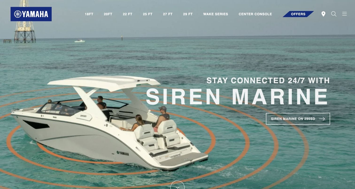
Yamaha Boats places a large uppercase product-feature title over a boat and open-water scene. A smaller line introduces the idea, while an outlined action names a specific boat model. Navigation uses compact uppercase labels organized largely by boat length. The hierarchy creates a clear scale contrast between selection tools and the campaign. The audit identifies a Google Fonts resource reference for the property, not an endorsement of the feature or proof of the headline's exact font.
What you can learn
Test display typography with letters and numbers. Keep model identifiers legible, constrain long campaign phrases, and check that the navigation remains readable over every image frame and after the fallback font changes available width.
Pros
The action includes a model identifier, giving the broad promotional headline a concrete destination for further product research.
The large title is visually distinct from the compact range navigation, making the opening's promotional and browsing roles immediately different.
Cons & considerations
White navigation and outlined controls can lose definition over pale water or sky when the hero image changes or is cropped.
A wide title may require more lines on a phone, so its relationship with the boat photograph needs separate design.
Public source checked November 3, 2026. References may be embedded or legacy—not a complete backend inventory.
Platform source: Exact public source-page audit. The public source-page audit on 2026-11-03 recorded linked stylesheet matches google fonts for this exact property. This is a public resource reference, not a test of every user journey, a complete backend inventory, or a claim that every visible element uses Google Fonts. Platform evidence is separate from the direct website screenshot and is not a complete current infrastructure audit.
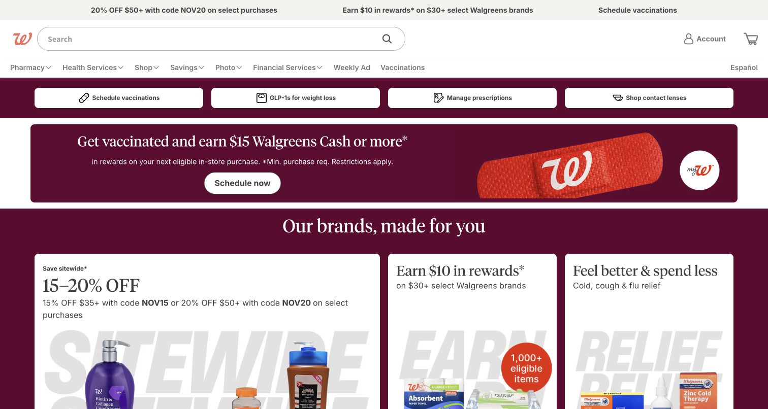
Walgreens places search near the top, follows it with category navigation and large service buttons, then presents a vaccination promotion and retail offer cards. Serif promotional headings contrast with plainer utility labels. The screenshot contains several different reading tasks, from managing prescriptions to comparing discounts. It is useful for font planning because a lively commercial identity must coexist with clear task text, conditions, and navigation that should not depend on promotional styling.
What you can learn
Define separate type roles for essential service actions, campaign claims, and qualifying details. Test the smallest text at enlarged settings, and keep crucial task labels readable even if the promotional font or photography is unavailable.
Pros
The large service buttons give common practical tasks a visible place above the more elaborate retail promotions and offer cards.
Different heading styles distinguish promotional content from the search and navigation that visitors may need for repeat visits.
Cons & considerations
Several offers compete within one opening view, so a new implementation needs a clear priority rather than equal emphasis for every promotion.
Qualifying terms shown beneath large offers must remain readable and associated with the relevant claim when cards stack on smaller screens.
Public source checked November 3, 2026. References may be embedded or legacy—not a complete backend inventory.
Platform source: Exact public source-page audit. The public source-page audit on 2026-11-03 recorded linked stylesheet matches google fonts for this exact property. This is a public resource reference, not a test of every user journey, a complete backend inventory, or a claim that every visible element uses Google Fonts. Platform evidence is separate from the direct website screenshot and is not a complete current infrastructure audit.
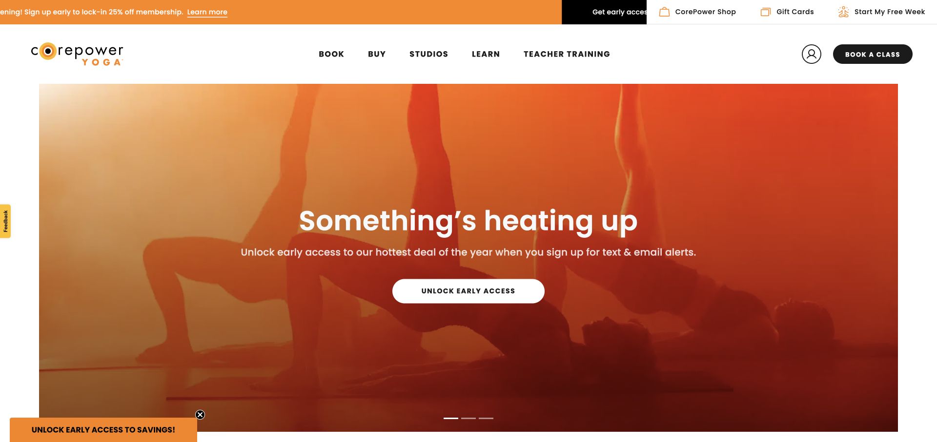
CorePower Yoga combines a crisp white navigation area with a large orange-tinted campaign image. The centered white heading is followed by a short explanatory sentence and a wide light action button. Booking remains prominent in the header, so the promotional message does not entirely replace a returning visitor's task. The contrast between small uppercase navigation and a broad sentence-case heading offers a useful model for a limited, consistent web-font palette.
What you can learn
Build the type system around both repeat booking and new-member campaigns. Specify readable navigation labels and a robust campaign title size, then test components with long offers, enlarged text, and a fallback.
Pros
The persistent booking action gives existing customers a straightforward route even when the homepage is devoted to an acquisition campaign.
The restrained number of text levels makes the central promotion easier to scan despite the energetic photographic background beneath it.
Cons & considerations
A promotional overlay at the lower edge can compete with the main action, especially when a small screen reduces available space.
White text on tinted photography still requires testing across the complete image and every responsive crop rather than assuming the color wash is sufficient.
Public source checked November 3, 2026. References may be embedded or legacy—not a complete backend inventory.
Platform source: Exact public source-page audit. The public source-page audit on 2026-11-03 recorded linked stylesheet matches google fonts for this exact property. This is a public resource reference, not a test of every user journey, a complete backend inventory, or a claim that every visible element uses Google Fonts. Platform evidence is separate from the direct website screenshot and is not a complete current infrastructure audit.
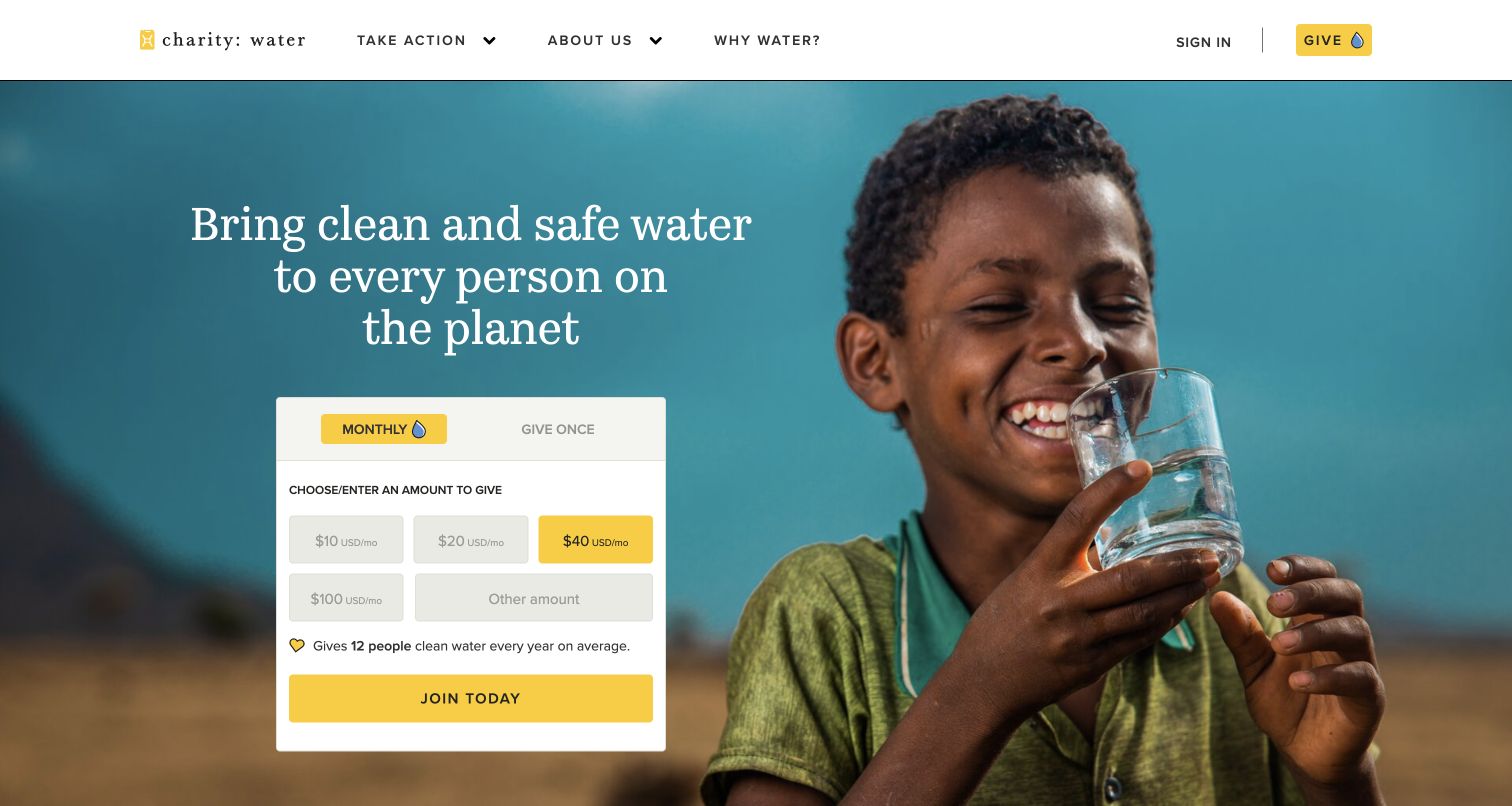
charity: water places a centered serif mission statement beside a large portrait, with a white donation panel immediately underneath the text. The panel switches to compact functional labels for frequency, amounts, and the main action. That contrast gives the message warmth while keeping the transaction controls structured. The screenshot is useful for studying the relationship between expressive editorial text and ordinary form text; no donation or completion flow was tested for this review.
What you can learn
Choose the donation panel's typography using amounts, currency labels, validation messages, and recurring-payment explanations. Keep those roles independent of the mission headline so an editorial font change cannot obscure a financial decision.
Pros
The mission and initial donation choices share one area, connecting the appeal with a clear next step instead of separating them widely.
A plain panel background protects small form labels from the much more varied colors and detail in the surrounding portrait.
Cons & considerations
The relationship between monthly and one-time giving must remain explicit without relying on color or selected styling.
A large mission sentence can push the form down when translated, so test longer language and enlarged text before fixing the hero height.
Public source checked November 3, 2026. References may be embedded or legacy—not a complete backend inventory.
Platform source: Exact public source-page audit. The public source-page audit on 2026-11-03 recorded linked stylesheet matches google fonts for this exact property. This is a public resource reference, not a test of every user journey, a complete backend inventory, or a claim that every visible element uses Google Fonts. Platform evidence is separate from the direct website screenshot and is not a complete current infrastructure audit.
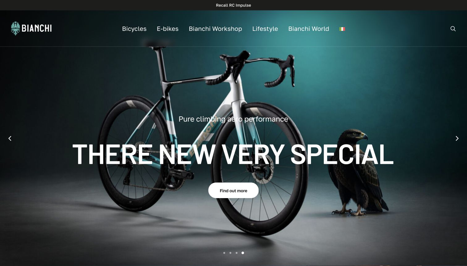
Bianchi puts an oversized uppercase bicycle title across a dark product photograph, with a shorter performance line above and a rounded action below. The header remains comparatively restrained, with clearly spaced category labels and a compact search icon. The arrangement gives the model name a strong visual role without adding long copy. A Google Fonts reference is present in the audit, but the review does not infer the particular family or weight assigned to the title.
What you can learn
Set a maximum line length for model titles and test names that exceed it. Preserve enough image space to identify the product, and make the action text more specific to distinguish similar models.
Pros
The small supporting line and large model title form an obvious reading sequence before the visitor reaches the single central action.
The dark photographic treatment provides a relatively quiet setting for bright typography without eliminating detail in the bicycle's outline.
Cons & considerations
Large uppercase titles can dominate a phone layout and obscure the product if their scale is not adjusted deliberately.
A broad action such as learning more needs meaningful destination context nearby when the same campaign pattern is reused for multiple products.
Public source checked November 3, 2026. References may be embedded or legacy—not a complete backend inventory.
Platform source: Exact public source-page audit. The public source-page audit on 2026-11-04 recorded linked stylesheet matches google fonts for this exact property. This is a public resource reference, not a test of every user journey, a complete backend inventory, or a claim that every visible element uses Google Fonts. Platform evidence is separate from the direct website screenshot and is not a complete current infrastructure audit.
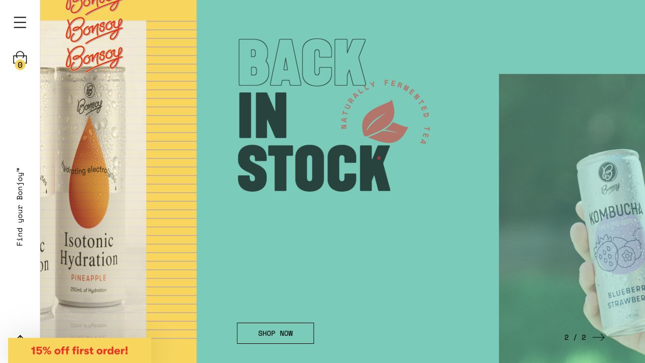
Bonsoy arranges product photography, colored panels, outlined lettering, and solid stacked words in an unusually graphic composition. A narrow vertical utility rail sits at the left, while a small outlined shopping button anchors the central panel. The typography is part of the visual rhythm rather than just a caption. It demonstrates the flexibility of a web-font system, but also the need to distinguish readable interface text from decorative campaign artwork.
What you can learn
Document which text is functional or decorative before building an expressive campaign. Keep the shopping action and product context understandable without the artwork, and test the headline's reading order when overlapping panels become a vertical mobile sequence.
Pros
The alternating solid and outlined lettering creates a distinctive hierarchy while the central background keeps the short campaign message visually contained.
A small, consistent action style gives the exuberant product imagery a practical shopping destination without adding another large visual motif.
Cons & considerations
The narrow side navigation and rotated wording need careful keyboard, label, and small-screen treatment in similar arrangements.
Layered promotional panels may require a simpler phone composition so decorative type does not push useful product information and actions out of view.
Public source checked November 3, 2026. References may be embedded or legacy—not a complete backend inventory.
Platform source: Exact public source-page audit. The public source-page audit on 2026-11-03 recorded linked stylesheet matches google fonts for this exact property. This is a public resource reference, not a test of every user journey, a complete backend inventory, or a claim that every visible element uses Google Fonts. Platform evidence is separate from the direct website screenshot and is not a complete current infrastructure audit.
A small, consistent family selection can serve navigation, forms, documentation, and supporting copy. Compare ambiguous characters, numbers, punctuation, and the longest labels. Keep decorative identity separate where it would make ordinary controls harder to read. Review text at realistic sizes rather than choosing only from oversized specimens.
Pair expressive headings with practical text
A campaign or editorial title can use a more distinctive treatment when the supporting text remains clear. Define where the expressive style stops. Test the pair in actual components: hero, card, form, and navigation. Two attractive specimen lines do not demonstrate that the combination works across a complete page.
Use variable ranges deliberately
Variable fonts can expose ranges of supported axes through the CSS API. Select only the axes and ranges the design needs, document their intended roles, and compare the delivered resources with a simpler fixed-style approach. The appropriate choice depends on the real page rather than a general assumption that one format is always smaller.
Collect long titles, product names, prices, dates, form errors, navigation labels, and at least one dense paragraph from the actual project. Include the languages you intend to support. Review the specimen in the real layout at narrow and wide widths so the selection reflects the site’s reading demands.
Measure with and without the font response
Record the initial render and final layout on a realistic connection. Temporarily block the font request in your own test environment, then compare the navigation, hero, and conversion controls. Treat clipping and inaccessible text as release issues, and keep a record of the fallback decision for later campaigns.
Give font changes an owner
Record the chosen families, styles, source, licensing review, and delivery configuration. A new marketing page should reuse the system or explicitly justify an addition. Revisit the inventory when a new language, brand campaign, or documentation section introduces requirements that the original specimen did not cover.
A useful handover demonstration
Ask the actual team to carry out its routine job: publish a realistic update, correct a mistake, preview a narrow screen, and identify who owns an integration failure. For a library or frontend framework, also ask who maintains the content source and deployment. A polished screenshot does not answer those operational questions.
Beyond the screenshot
Before releasing a Google Fonts implementation
Inventory every meaningful text role with real content.
Choose families and styles against the smallest labels as well as the largest headings.
Check the requested CSS API families, styles, ranges, and display setting.
Test the fallback with delayed and unavailable font responses.
Review long titles, numbers, punctuation, and supported languages.
Check text enlargement, keyboard focus, narrow screens, and photographic backgrounds.
Measure downloaded resources and layout changes on representative pages.
Record font sources, licensing decisions, delivery configuration, and maintenance ownership.
Test with real content, a keyboard, a small screen, slow or failed requests, and the people who will maintain the system. These are planning checks, not an accessibility, security, performance, or search-ranking certification.
Sources & editorial method
How this Google Fonts collection was reviewed
This collection was authored on November 4, 2026 using genuine saved public-page captures with their original capture dates, dimensions, and attribution retained. Every selected image was visually inspected for this typography review. Google Fonts associations come from exact-property public resource observations whose original timestamps remain in the evidence records. A resource reference does not identify the font used by every visible element, prove a CMS, or establish current performance.
Every image is an unmodified capture from the actual website, with its source and capture date. Some captures are reused from our shared catalog; their dates remain the original capture dates. None comes from a vendor gallery or a generated reconstruction. Moving imagery and live content can change.
Technology attribution uses public page assets or metadata, official platform documentation, or a cited first-party project case study. Documentary and framework-relationship evidence is identified where used; it is not a complete current backend inventory. A CMS image CDN alone does not establish a full CMS deployment. A library’s presence does not prove which individual controls use it, and a platform label does not establish AI authorship.
The composition notes, lessons, pros and tradeoffs are original editorial observations. We have not measured conversion, traffic, security, performance or accessibility conformance. Website owners retain their brands and imagery; these examples are not our client portfolio. Written, Edited and Curated are independent records, not dates advanced by a build. See our editorial standards or suggest a correction.
Questions worth asking
Google Fonts website development FAQs
Does a Google Fonts reference identify the font in the headline?
No. It establishes a public resource association. Identifying the rendered family for a particular element requires additional evidence such as computed styles and the font actually used by the browser. The screenshot reviews deliberately avoid making that attribution.
How many font families should a website use?
Use the smallest set that adequately supports the content and identity. There is no universal number. Begin with the required text roles, test a restrained system, and add a family only when it solves a specific reading or branding problem.
Can Google Fonts identify the website’s CMS?
No. Font delivery and content management are separate layers. A Google Fonts resource can appear in many kinds of sites, including custom code and numerous publishing platforms. Any CMS claim needs its own evidence.
What should a font review include beyond appearance?
Review fallback behavior, text enlargement, long and translated content, loading, layout stability, request size, and maintenance. The best choice for a project is the one that remains readable across its actual content and operating conditions.