Best Academic Advising Websites of 2026 (22 Real-World Examples)
How to make academic support understandable before asking a student or family to book a conversation.
A useful academic-advising website explains who it serves, what kind of guidance it provides and what the visitor should do next. Independent admissions consultants and university advising teams solve different problems, but both need clear boundaries, recognisable tasks and practical information that survives beyond a campaign headline.
Academic advising spans several stages of education. A prospective applicant might need help understanding a college search, while an enrolled student might need the correct adviser for a course-planning question. A family comparing an independent consultancy should not mistake that service for an institution’s own admissions or degree-advising office. This collection examines those differences through public website design, not through the quality of individual advice, teaching or admissions outcomes.
The most transferable patterns are often small: a named adviser beside an ordinary explanation, a clear distinction between incoming and current students, or a visible appointment route that also explains eligibility. A campus photograph can establish context, but it cannot tell a visitor whether the office handles their particular issue. Effective information architecture connects the broad purpose of advising to the specific questions people bring to the page.
Use these examples to build a brief around your actual audiences and responsibilities. Screenshots preserve the design at their recorded capture time, not a permanent statement about a service or timetable. The original images and source observations have their own dates. Our notes concern visible layouts, public content and conditional tradeoffs; they do not verify application systems, confidential student workflows, financial advice, legal obligations or the likelihood of admission.
Before the examples
What makes good academic advising website design in 2026?
The kind of advising is explicit
Name the service in language a visitor recognises: academic course planning, college admissions guidance, transfer support or a particular pre-professional route. Explain whether the provider is an independent business or part of an institution. A broad word such as guidance is not enough if the actual scope depends on enrolment, a school division or the student’s stage.
People find the route for their situation
Separate prospective, incoming, current and transfer students where those distinctions affect the next step. Families, faculty and staff may need their own destinations, but they should not crowd out the primary student journey. Explain unfamiliar institutional labels near the relevant link instead of requiring visitors to understand the organisation chart.
The next action has an honest meaning
Differentiate finding an adviser, requesting an appointment, asking a general question and applying to a paid programme. Describe what happens after the action and whether eligibility or preparation is required. A consultation request is not a university application, a reserved service place or an assurance of any educational outcome.
Practical information is available before contact
Offer enough public information about format, location, scope and fees or payment arrangements for a visitor to investigate relevance. A student should not need to disclose a transcript merely to find out which office handles their question. Explain any external scheduling handoff and keep an alternative contact route available when it is appropriate.
Evidence and claims stay within their limits
Present adviser biographies, institutional roles and genuine sources accurately, without implying that logos or testimonials establish results. If outcomes or acceptance figures are published, explain their scope and period. Design can make the service easier to understand; a screenshot cannot establish whether its advice is effective, impartial or suitable for an individual.
The collection · 22 examples
22 academic advising websites worth studying
These 22 public website examples cover independent college-planning consultancies and institutional academic-advising destinations. The reviews distinguish those responsibilities rather than treating them as interchangeable services. Editors Choice highlights a specialist independent practice with a clear human identity and understandable service formats, not a ranking of advice or educational outcomes.
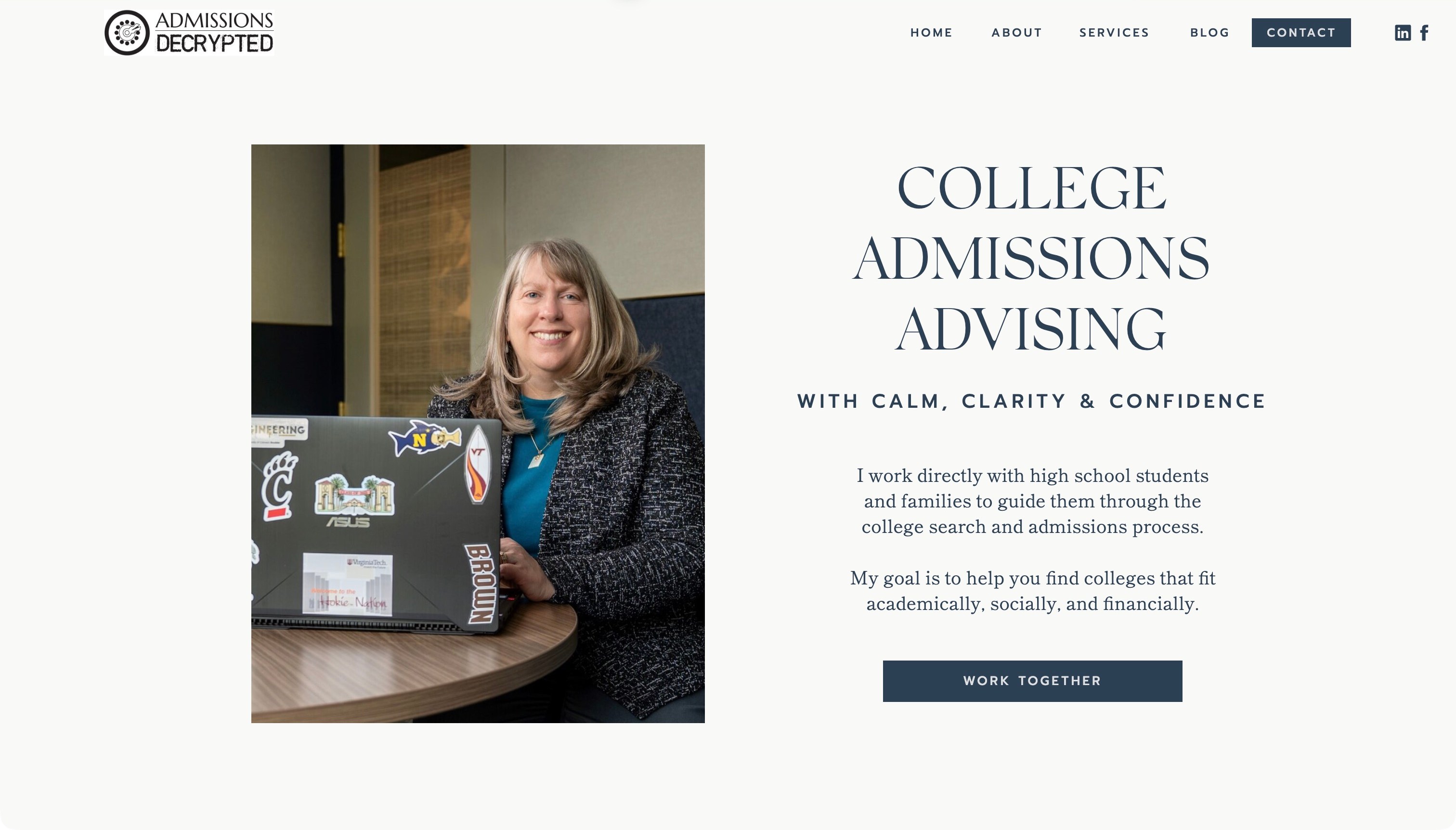
Admissions Decrypted places Lisa Rielage’s photograph beside a large college-admissions heading and a short explanation of working directly with students and families. The restrained cream-and-blue opening leads to a clearly labelled service action, while the public page later distinguishes comprehensive planning, hourly advising and military-programme support. The useful pattern is the connection between a recognisable person and an understandable offer, with distinct service formats rather than one interchangeable package.
What you can learn
Introduce who does the work and what the visitor is considering before asking for contact. A small advising business can make its role understandable with a plain scope statement, then let families investigate the available formats. Keep that explanation distinct from any promise about admission or the suitability of a particular college.
Pros
The opening connects a named adviser with the actual service.
Separate format descriptions clarify different ways to work together.
Cons & considerations
If practical fees and process information sit lower down, give visitors a direct route to them.
If a specialist programme is offered, explain its boundaries rather than relying on a familiar institution’s image.
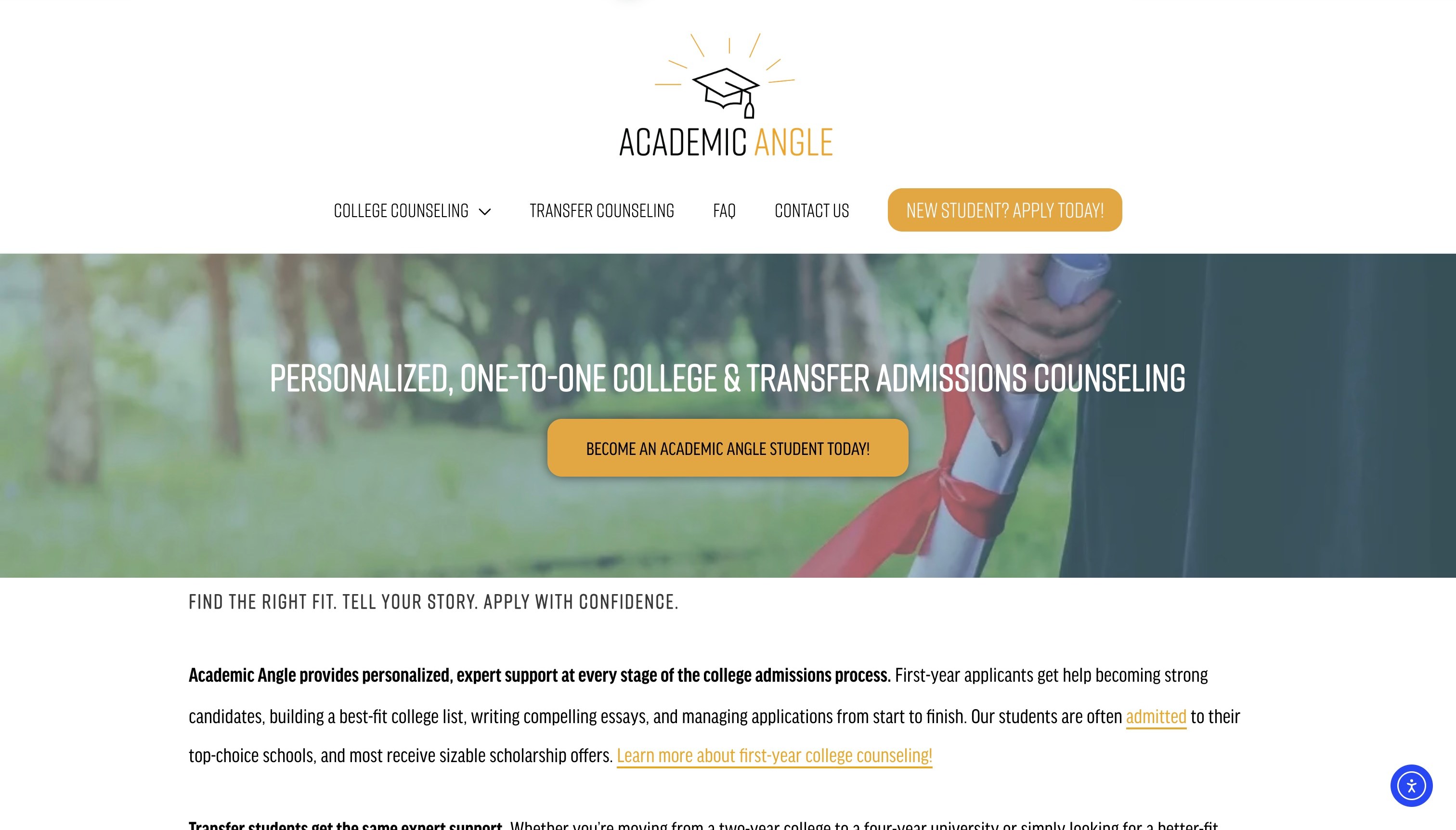
Academic Angle combines a substantial white header with a graduation photograph, gold accents and a direct new-student action. The public content separates earlier high-school planning, later application preparation and transfer guidance, then explains a sequence from an initial application through a consultation and proposal. This is useful because the same admissions theme can conceal different starting points. The visible structure gives those stages their own place rather than expecting every family to interpret a general counselling headline in the same way.
What you can learn
Organise service choices around the student’s actual stage when that changes the work. A transfer applicant and a younger high-school student may need different explanations, preparation and timelines. Describe what the initial application means so visitors do not confuse applying to the advisory business with applying to a college.
Pros
First-year and transfer needs receive distinct service context.
The public process description explains more than a single contact button.
Cons & considerations
If the header and photograph dominate the first screen, keep the programme routes easy to reach.
If professional logos appear beside a biography, state the relationship without implying guaranteed results.
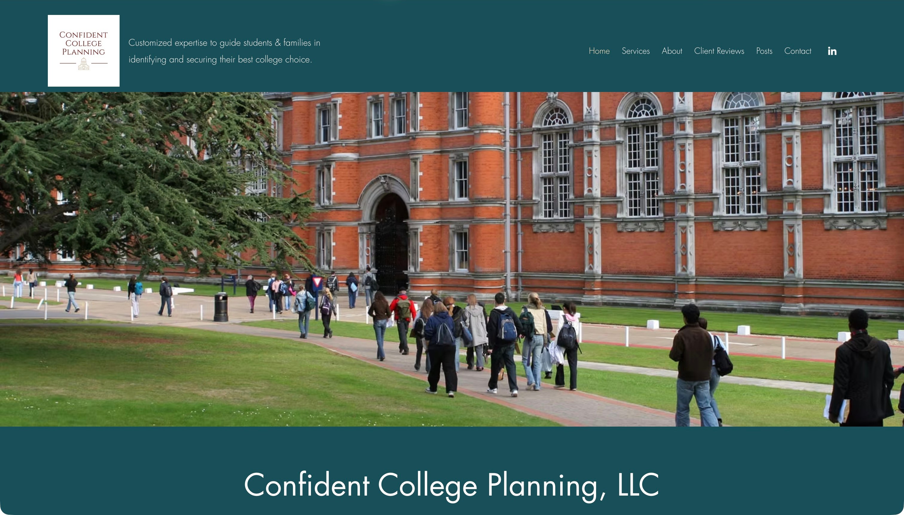
Confident College Planning uses a teal identity, a white logo panel and a broad campus photograph. A short navigation includes services, the adviser’s background, reviews, posts and contact, while the public page identifies Nancy Adis and describes individual planning. Academic, social and financial fit appear in the explanation rather than being left entirely to the campus image. The design connects a personal professional story with the practical account of what a family can request.
What you can learn
Let a biography establish the person without making it the only way to understand the service. A family should be able to find the working format and relevant scope before reading a complete career history. Keep claims about fit as an explanation of the intended process, not proof that a particular placement will result.
Pros
The compact navigation names familiar investigation tasks.
The adviser’s identity is connected to an explicit one-to-one offer.
Cons & considerations
If the campus photograph fills much of the opening, provide a nearby service-specific route.
If a long biography precedes practical arrangements, add a concise service summary for first-time visitors.
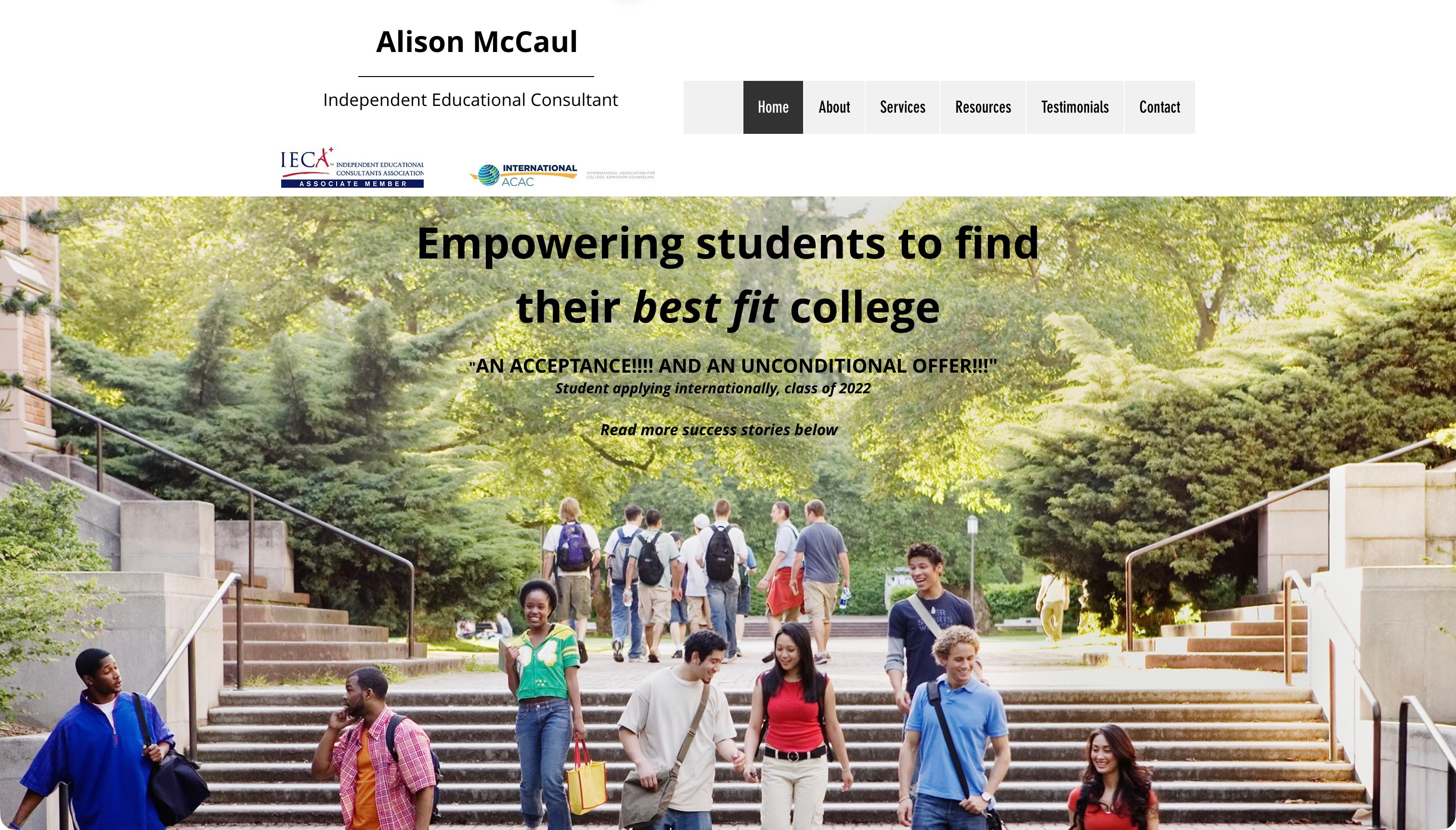
Go College Advising puts Alison McCaul’s name and independent-consultant role in the header before a large campus photograph. The restrained navigation distinguishes background, services, resources, testimonials and contact. Public copy explains an individual planning process and the adviser’s approach rather than presenting only a catalogue of colleges. Visitors can identify the person behind the business immediately, while still having routes to investigate the service beyond that personal introduction.
What you can learn
Make the professional identity and service scope explicit, then organise supporting material by the questions a family is likely to ask. A testimonial can illustrate one person’s experience, but the main explanation should still describe the process and available support without requiring visitors to infer those details from praise or a campus setting.
Pros
The header identifies the person and independent role directly.
Services and resources remain separate from the biography and testimonials.
Cons & considerations
If text overlays a photograph, review readability on every displayed image and smaller screen.
If older testimonials remain visible, keep their dates and scope clear rather than implying current universal results.
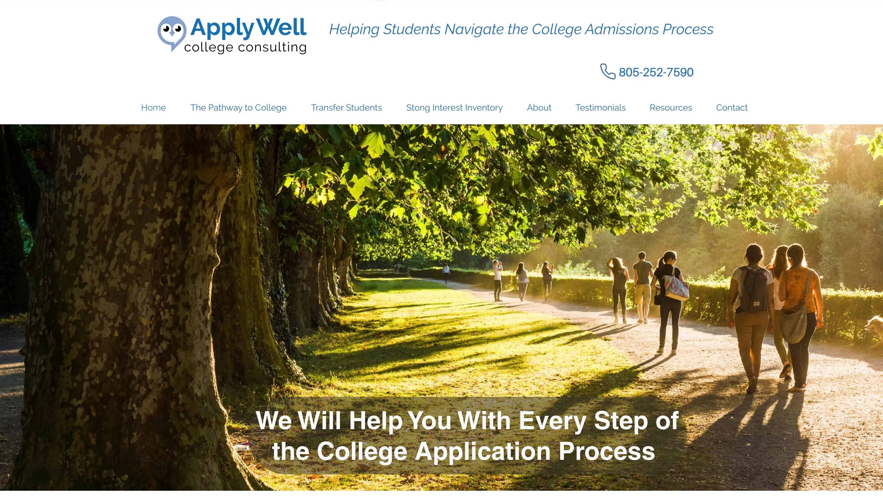
ApplyWell College uses a white header with an owl identity, a practical phone contact and a large tree-lined campus image. Its navigation names the pathway to college, transfer students and an interest-assessment route alongside background and resources. Current public material identifies Janice Brown and describes course choices, exploration and application support. The useful pattern is the decision to surface different starting situations in the navigation instead of putting every service behind one undifferentiated contact action.
What you can learn
Use clear navigation to identify genuinely different visitor situations, and explain any specialist assessment label in ordinary language. A broad planning service can still provide a direct route for transfer applicants. The visual introduction should support that orientation rather than becoming the only information someone sees before deciding whether to enquire.
Pros
Transfer students have a named route rather than an implied inclusion.
Phone and background information are visible within the shared identity.
Cons & considerations
If hero imagery rotates, keep the essential service message stable across frames.
If an assessment has a technical name, explain what it is for before expecting families to select it.
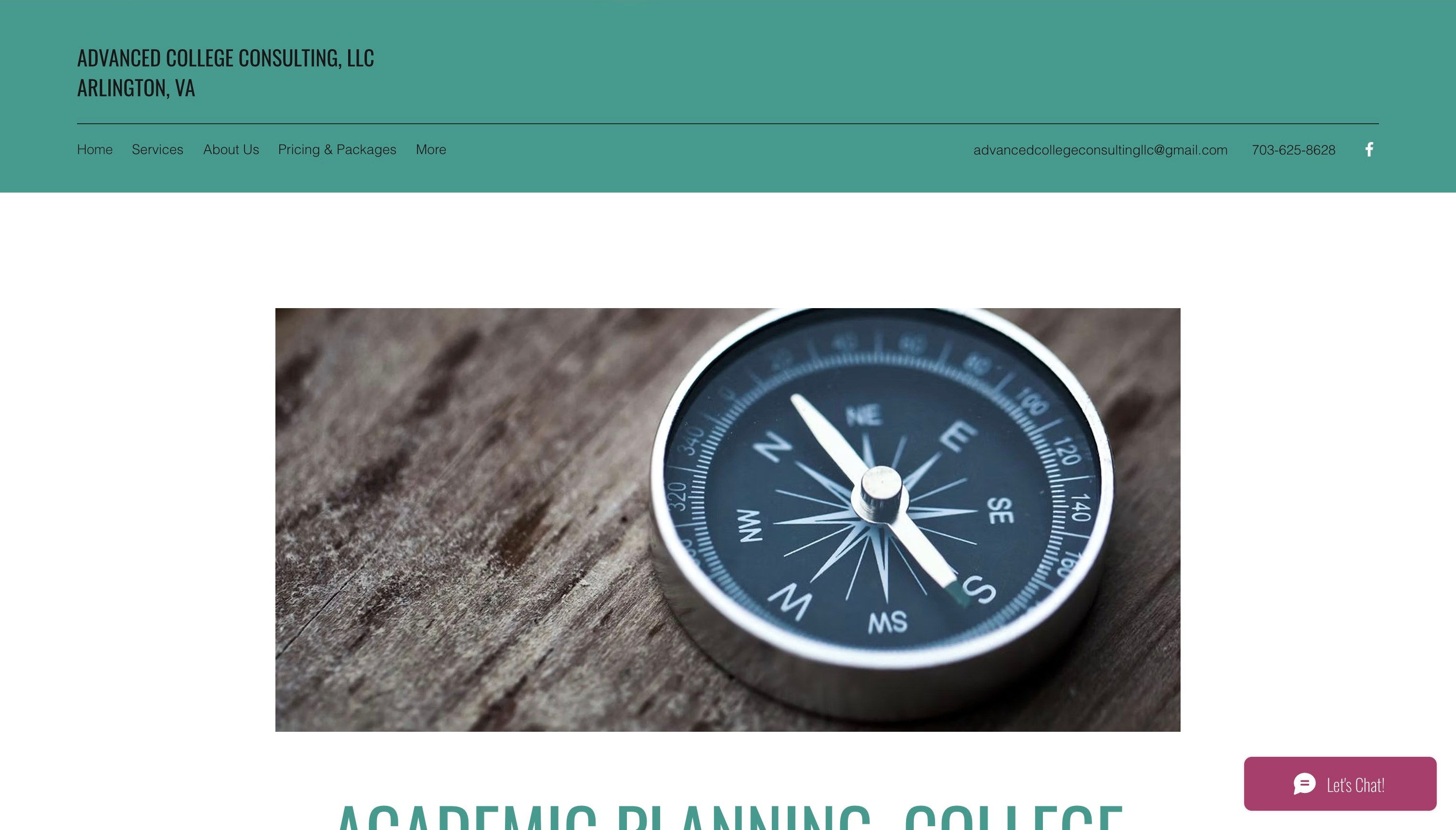
Advanced College Consulting introduces its name and Arlington location in a restrained teal header, with compact navigation and direct contact details. A large compass photograph occupies much of the opening before the page develops its explanation of academic planning and college support. The public content names services, adviser roles and pricing arrangements. The visual suggests direction, but the text and navigation still need to explain the advisory service.
What you can learn
A symbolic image can support a brand, but it cannot replace a clear service definition. Keep scope, people and the next step easy to find without requiring visitors to interpret the metaphor. When a small practice publishes pricing or time-based arrangements, connect those details to the relevant service rather than leaving them detached from the offer.
Pros
The header supplies a location and direct contact context.
Services and pricing have explicit investigation routes.
Cons & considerations
If the visual pushes the service explanation below the first screen, add a concise introduction above it.
If a More menu contains important actions, check that their labels remain discoverable on smaller screens.
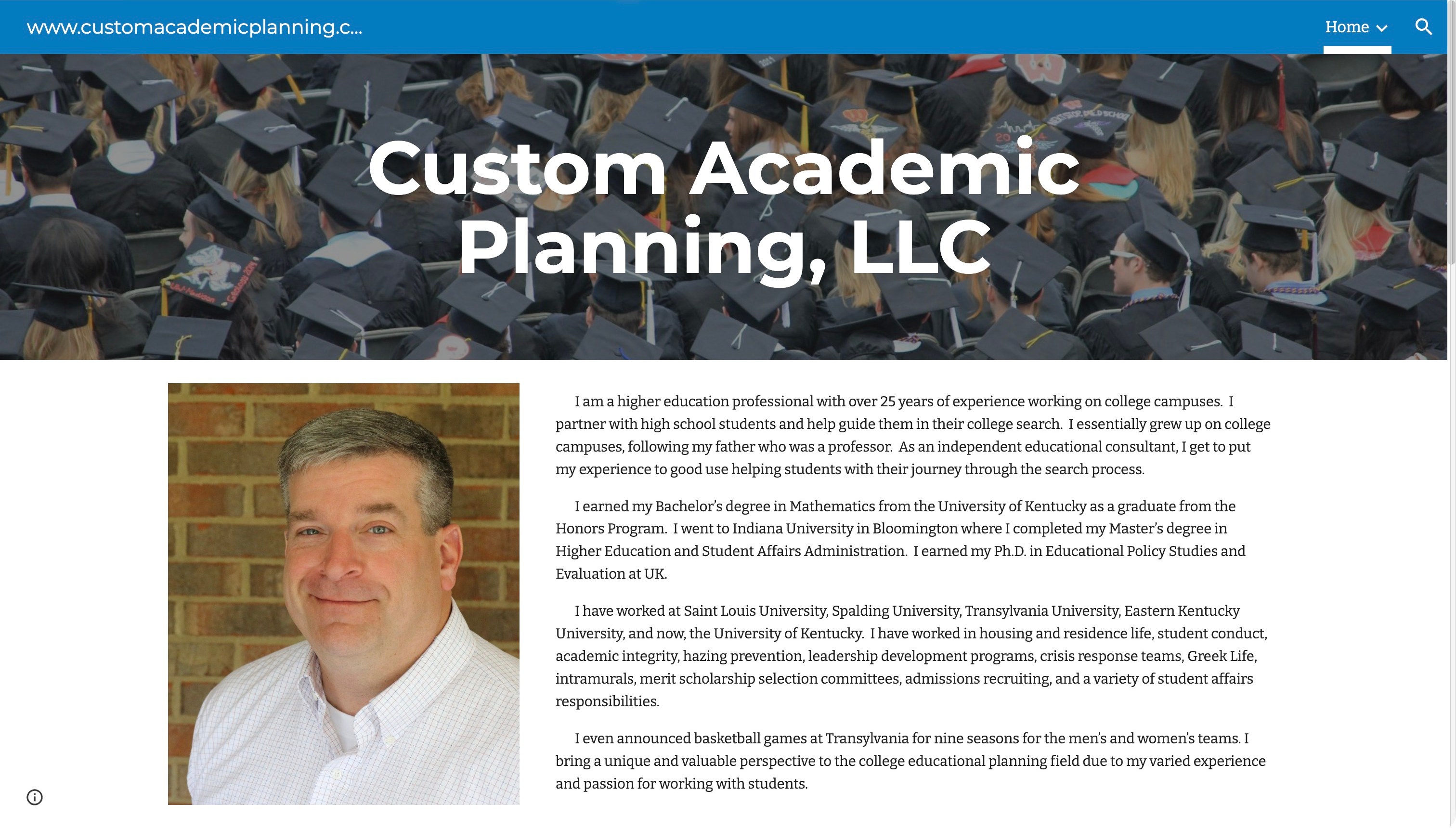
Custom Academic Planning places its business name over a graduation photograph, then brings a named adviser’s portrait and biography into a simple reading layout. Email, phone and a student-portal route appear within the public information, and the page distinguishes college-planning work from a separate higher-education consulting offer. Fees and service descriptions provide practical context. The design tension concerns the balance between a professional history and a new family’s service questions.
What you can learn
Make the person easy to identify, but separate audience and service decisions from the career narrative. A family should not have to read an entire biography to distinguish student guidance from consulting for institutions. Keep client-only tools recognisable as such so a first-time visitor does not mistake a portal link for the public enquiry route.
Pros
Direct contact details sit alongside the named adviser.
Public service and fee information extends beyond the visual introduction.
Cons & considerations
If several audiences share a long page, give each a concise labelled destination.
If an acceptance list is displayed, retain its context without presenting it as a guarantee for future clients.
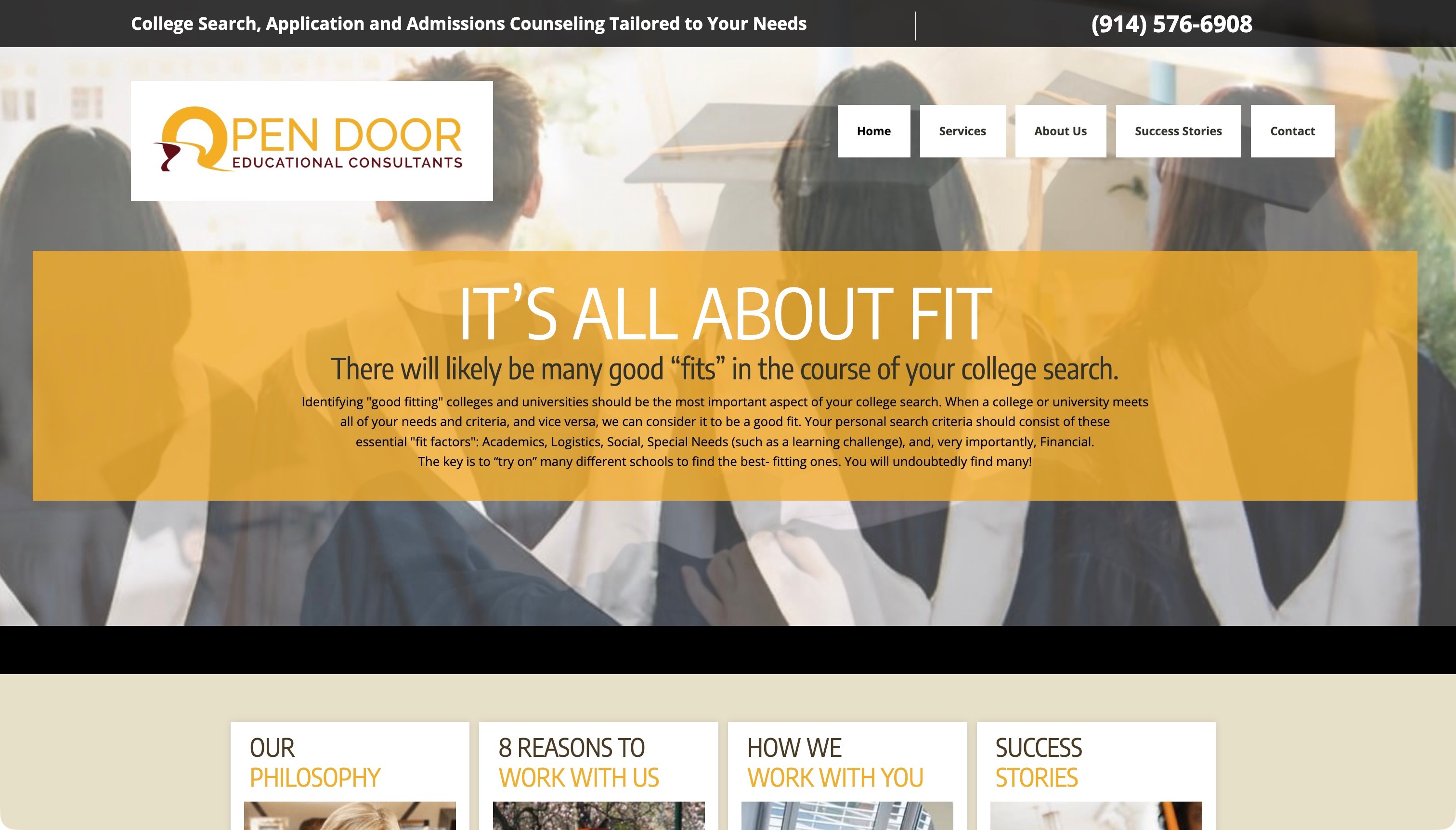
Open Door Educational Consultants combines a practical utility strip, a white-and-yellow identity and a graduation photograph beneath a gold text panel. The opening describes fit, while a set of subsequent cards links to the philosophy, approach and supporting stories. Public service content explains planning and admissions-related support. The useful design question is how a broad idea becomes something a visitor can investigate: several routes extend the message, but their labels and summaries still need to explain what each destination will actually answer.
What you can learn
Translate an abstract positioning theme into concrete questions and steps. If fit is the organising idea, explain which factors the process considers and what the adviser helps a student do. Supporting stories can add context, but the service description must stand independently of promotional claims or a graduation scene.
Pros
Contact context is present before the main visual introduction.
Several explanatory destinations extend the opening message.
Cons & considerations
If small text sits over a photograph, test legibility across the actual layout sizes.
If several cards repeat a generic Read More label, make their destination clear from the adjacent heading and summary.
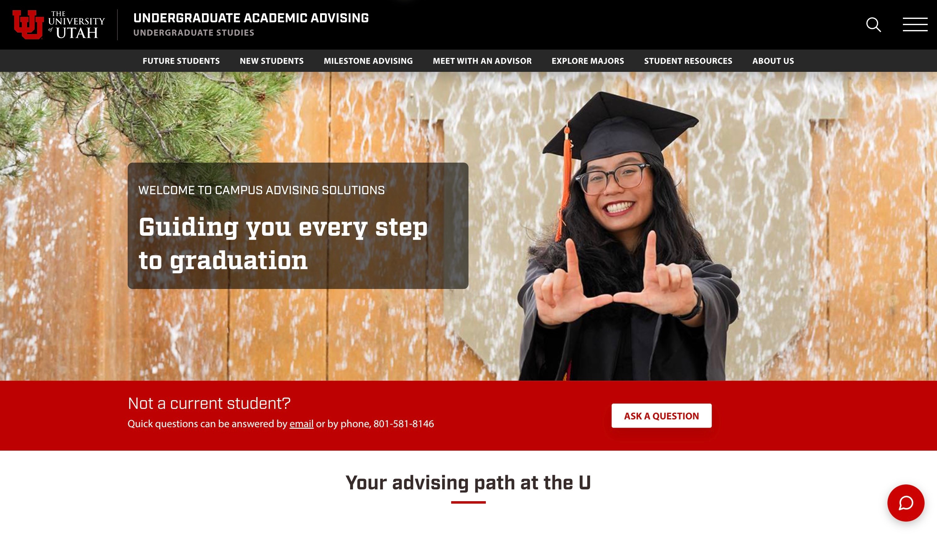
The University of Utah’s Undergraduate Academic Advising page uses a black institutional header, a red identity and a navigation organised around student stages and practical tasks. A large graduate photograph introduces the service, while a separate strip recognises visitors who are not current students. The public page offers routes for future students, new students, milestones and finding an adviser. The design is useful because it acknowledges that not every visitor is already enrolled or familiar with the university’s internal advising arrangements.
What you can learn
Separate stages only where the process actually differs, then explain what the labels mean. Someone considering the university should not be forced into a current-student workflow to ask an initial question. Keep that orientation distinct from broad completion language: a website route can clarify support without demonstrating a student’s academic outcome.
Pros
The navigation names student stages rather than only internal departments.
A non-current-student route recognises a different starting point.
Cons & considerations
If Future and New are both used, explain the boundary in ordinary language.
If many planning tools are linked, prioritise the first task instead of making every resource equally prominent.
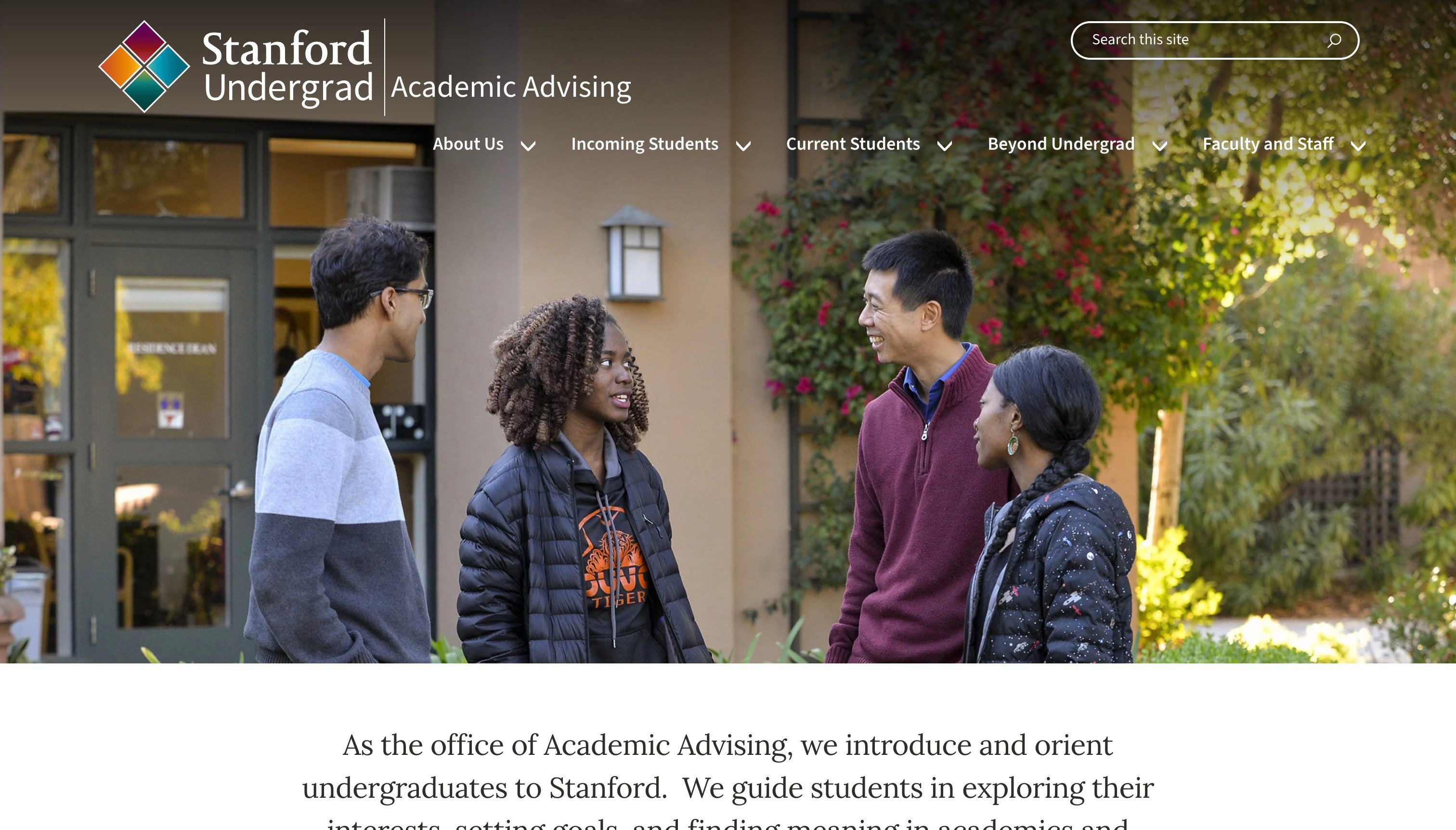
Stanford’s Academic Advising page places its institutional identity over a wide campus-group photograph and uses primary navigation for incoming students, current students, study beyond undergraduate life, and faculty or staff. The explanatory content below the image introduces the advising service, with public resources covering planning and related student questions. Its audience structure separates student-facing information from material for the people supporting them.
What you can learn
Start from the visitor’s relationship to the institution, then connect that relationship to the relevant practical tasks. An incoming student may need an introduction before choosing a course-planning tool, while a member of staff may need different resources. Maintain a clear path to an appointment or contact without assuming that visitors know the office’s terminology.
Pros
Student and staff audiences are separately named in the main navigation.
The public content provides an explanation beyond the campus image.
Cons & considerations
If the large photograph delays the practical action, retain a clear route near the introduction.
If the resource inventory grows, organise it by task rather than adding every document to the primary menu.
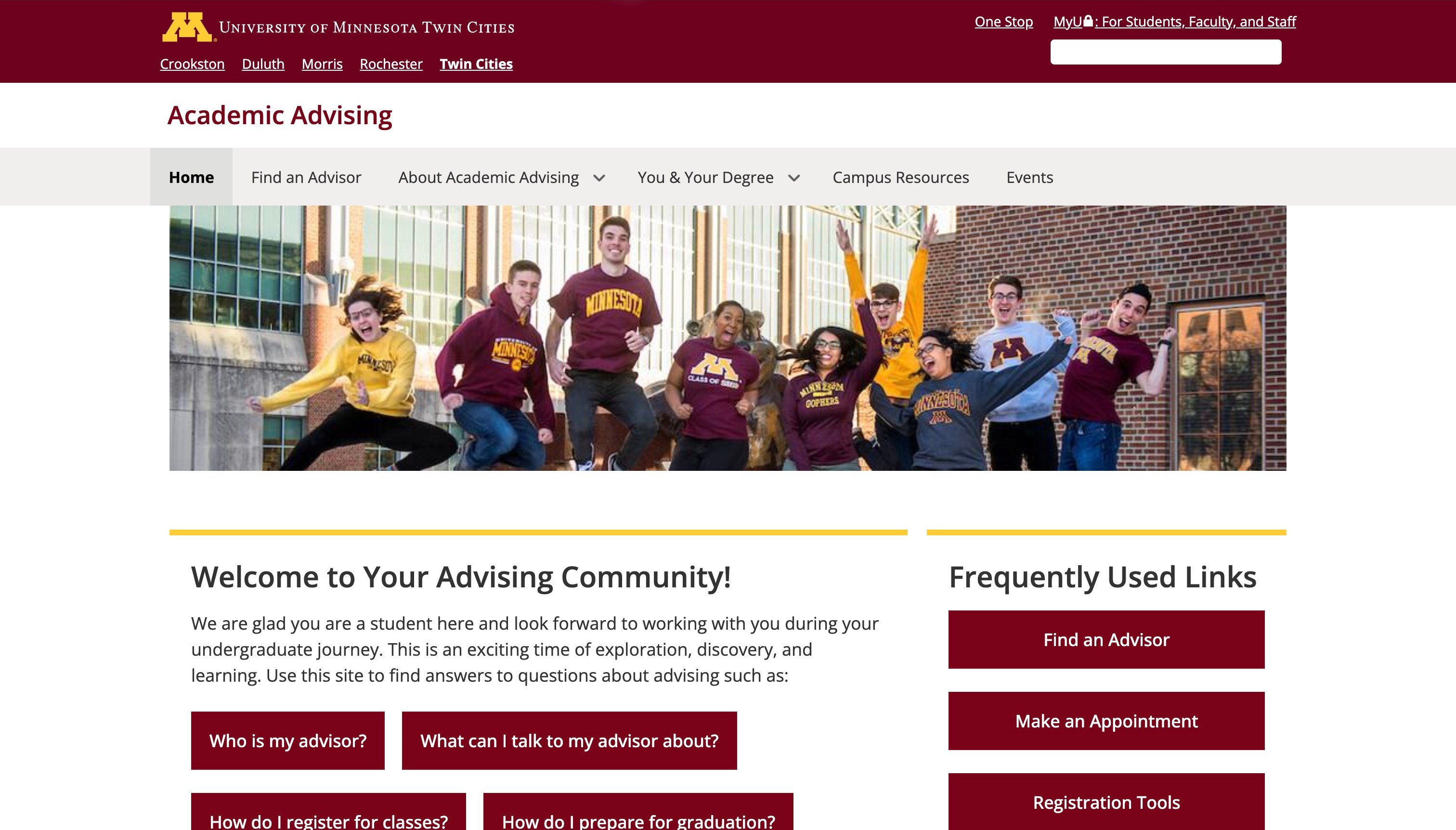
The University of Minnesota Academic Advising homepage uses its maroon institutional identity above a concise local navigation. A shallow student photograph is followed by a two-column introduction: common student questions on one side and frequently used actions on the other. The public questions cover finding an adviser, discussing academic plans and related course or degree tasks. The information-led opening places familiar problems beside the routes people can use.
What you can learn
Write the introduction from the questions students bring, not only from the office’s mission statement. Pair those questions with a small set of named actions, and explain whether a destination is a directory, a general information page or an appointment process. The structure should help a visitor choose a route before they need to understand the institution’s full support network.
Pros
Ordinary questions make the purpose of advising concrete.
Frequently used actions sit near the explanatory content.
Cons & considerations
If the same task appears in several places, keep its labels and destination consistent.
If institution-wide links compete with local actions, preserve a clear hierarchy for the advising journey.
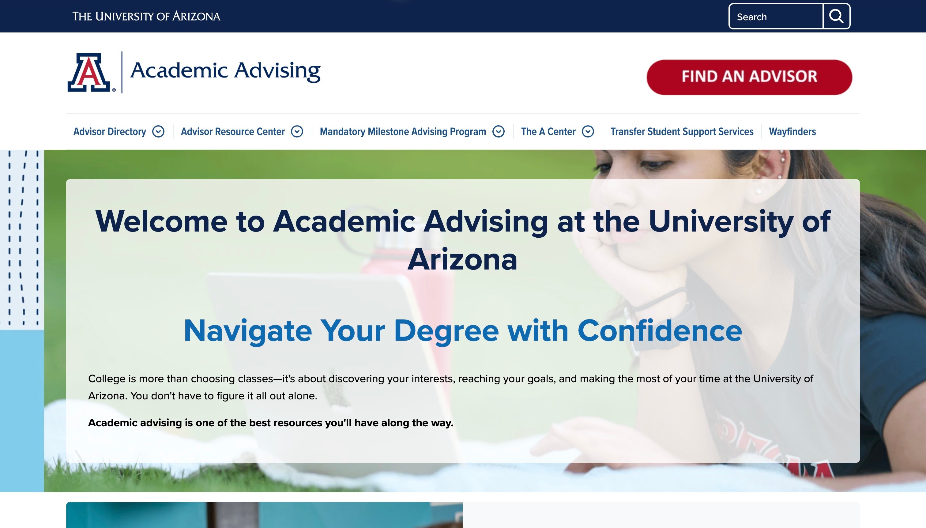
The University of Arizona Academic Advising page pairs a navy institutional band with a white local identity and a prominent Find Advisor action. Navigation exposes the adviser directory and several support destinations, while the introductory panel explains academic advising over a campus photograph. The public content describes why a student may encounter several advising roles. The directory is paired with the context needed to choose an appropriate adviser.
What you can learn
Explain the support network before assuming that a visitor knows the right office. Where several advisers can be involved, describe their roles in plain language and connect that explanation to the directory. Keep institution-specific programme names from becoming a barrier for new or transferring students who do not yet understand the local vocabulary.
Pros
The main adviser-finding action is visually distinct in the header.
Public role explanations add context to the directory.
Cons & considerations
If an acronym or branded centre name appears in navigation, explain its purpose nearby.
If an introductory panel overlays imagery, test the actual text contrast and responsive arrangement rather than judging from one frame.
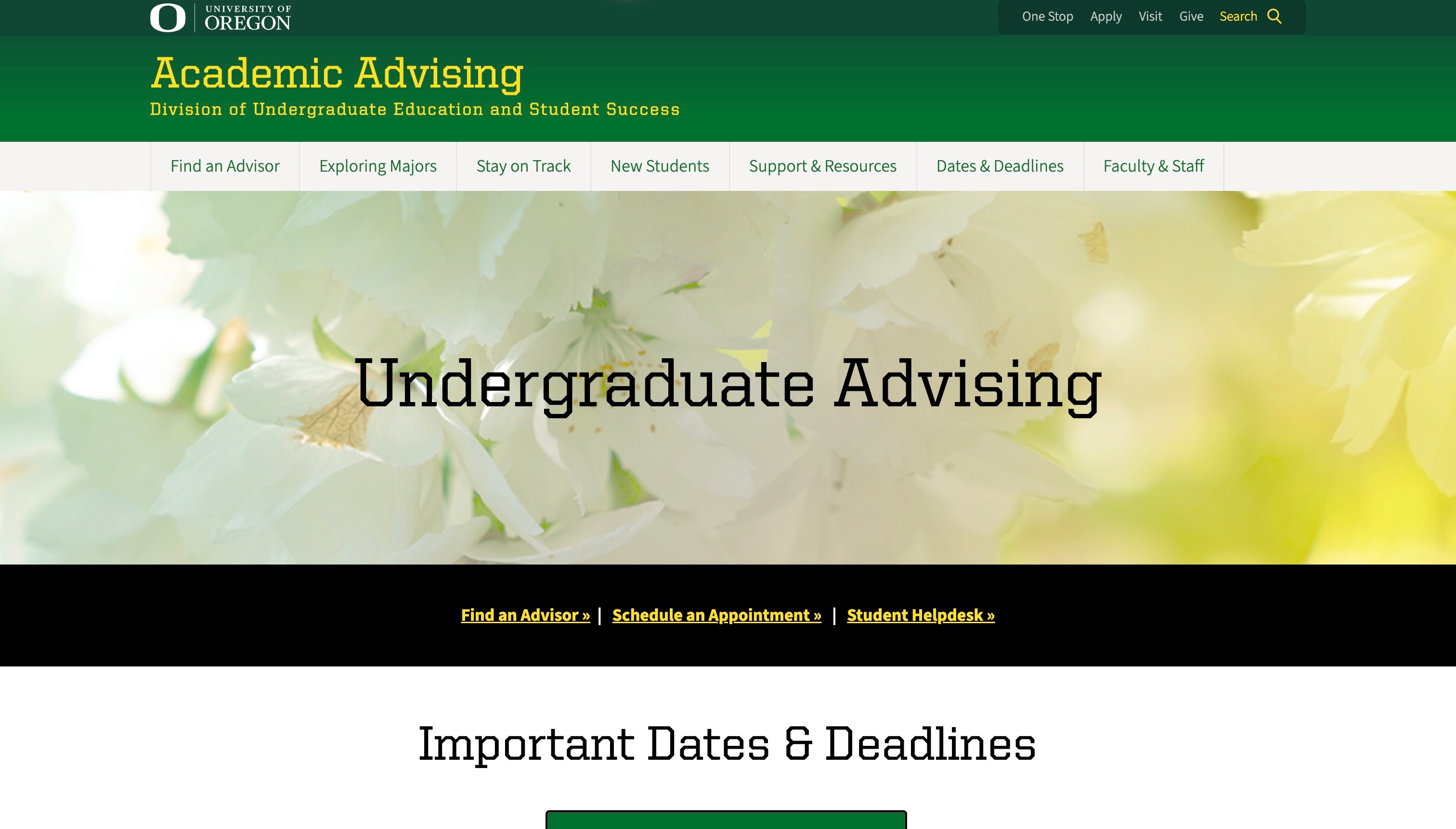
The University of Oregon Academic Advising page uses a green-and-yellow identity and a floral background image, then introduces a dark strip with three direct routes: finding an adviser, scheduling an appointment and reaching a student helpdesk. The wider navigation covers majors, new students and staying on track. The design distinguishes finding the appropriate person from booking an appointment with an adviser a student already knows.
What you can learn
Separate finding the correct person from booking a meeting, and explain when a general helpdesk is the appropriate alternative. A small set of task links can make a broad institutional service navigable, provided their destinations and eligibility are clear. Keep operational dates and support details connected to the specific question rather than relying on a decorative campus identity.
Pros
The action strip names several distinct student tasks.
The navigation recognises both new-student orientation and ongoing planning.
Cons & considerations
If an atmospheric image occupies substantial space, keep the service definition visible beside it.
If helpdesk and adviser routes overlap, explain the difference so students do not have to guess where to begin.
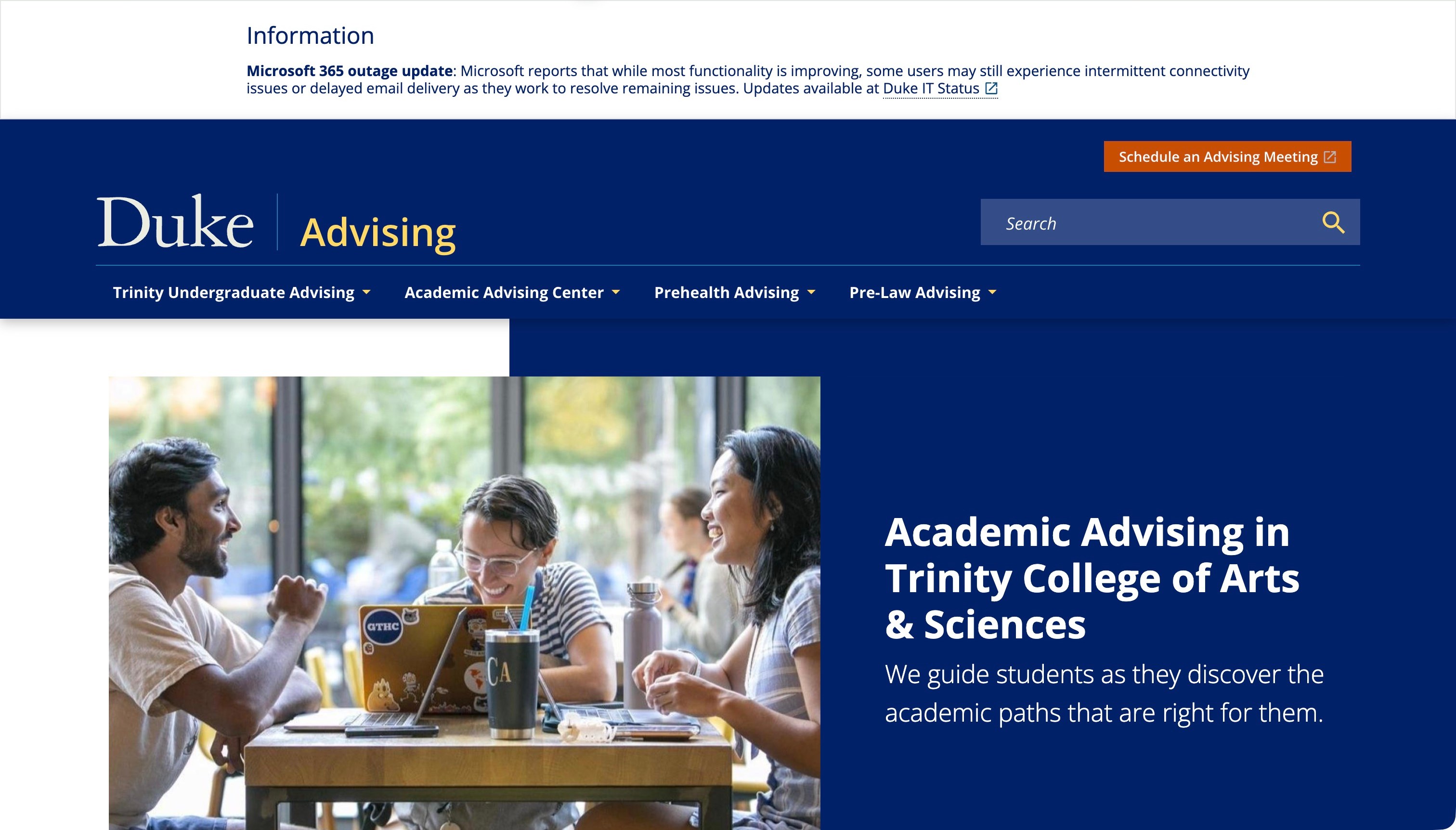
Duke’s Academic Advising page combines a navy identity with an orange meeting action and navigation for the advising centre and pre-professional routes. A split introduction pairs a conversation photograph with the relevant undergraduate college and its advising explanation. An operational notice was visible above the page at capture time, not a permanent current announcement. The design connects an appointment route and a specific remit while accommodating temporary information.
What you can learn
Make the service’s institutional boundary explicit even when the university name is familiar. A student needs to know whether this is the right advising destination for their college or stage. Temporary notices should have a separate editorial owner and expiry process so that an operational message does not silently become a permanent part of the introduction.
Pros
The meeting action is distinct from the main navigation.
The introduction names the college context rather than only the university.
Cons & considerations
If an operational notice occupies the top of the page, review its relevance and expiry.
If several colleges use different processes, explain the correct route instead of assuming the brand establishes eligibility.
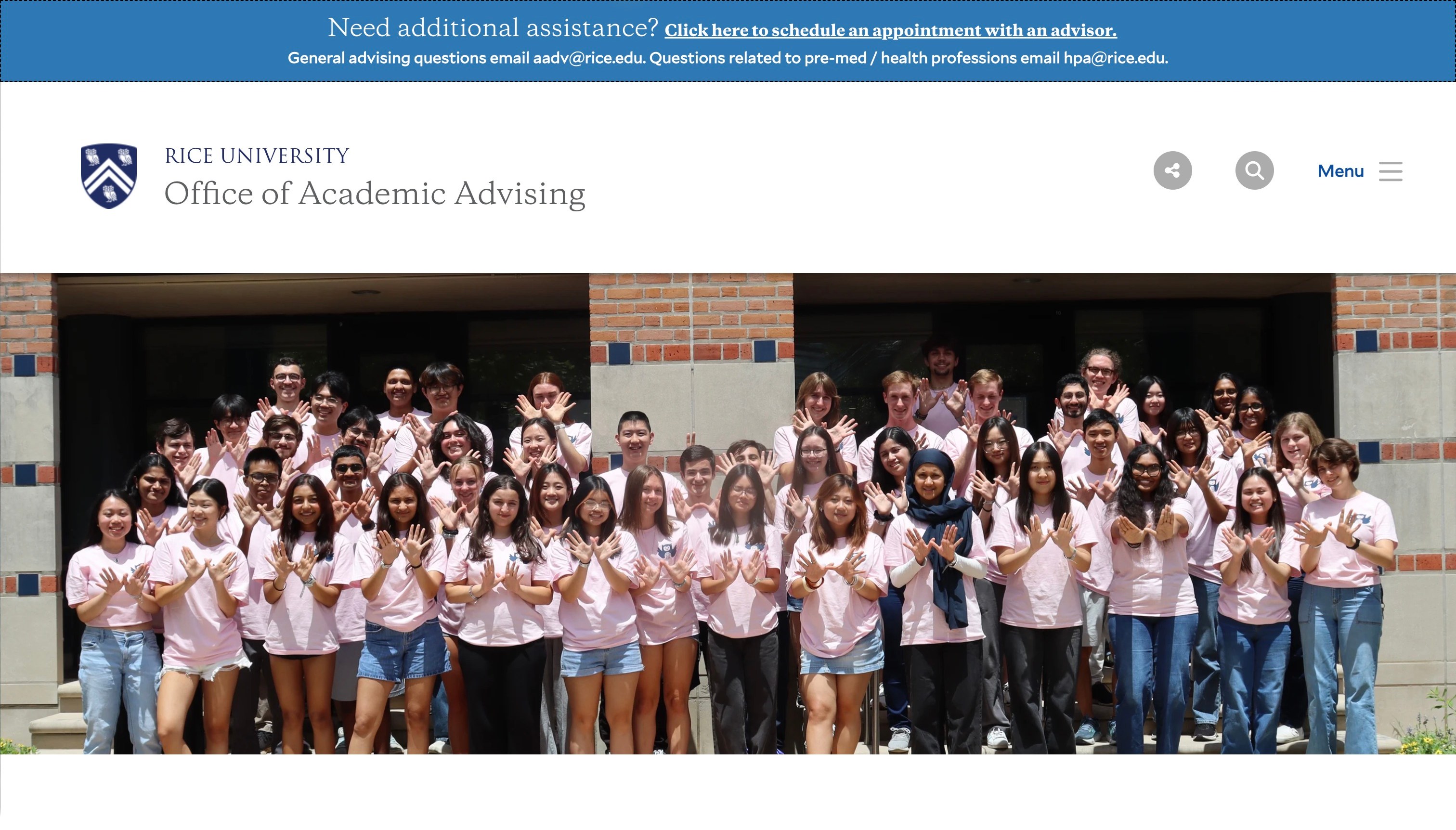
Rice’s Office of Academic Advising places an assistance strip above the main institutional identity, with an appointment route and distinct contact context for general and pre-health questions. A large group photograph leads into an explanation of the advising community and its resources. The public page includes planning information and role-oriented destinations. Practical help appears before the longer mission statement, with context for specialist questions.
What you can learn
Keep contact and appointment context available before a visitor reads the complete introduction. Explain the distinction between a general advising question and a specialist route, then connect each to the responsible team. A community-oriented visual can support the identity, but it should not require students to infer who is eligible or which person will handle their enquiry.
Pros
An assistance strip makes practical contact routes visible early.
General and specialist questions receive distinct context.
Cons & considerations
If a large group image delays the role explanation, add a compact service summary nearby.
If a Menu control contains key destinations, test its labels and keyboard behaviour on the actual implementation.
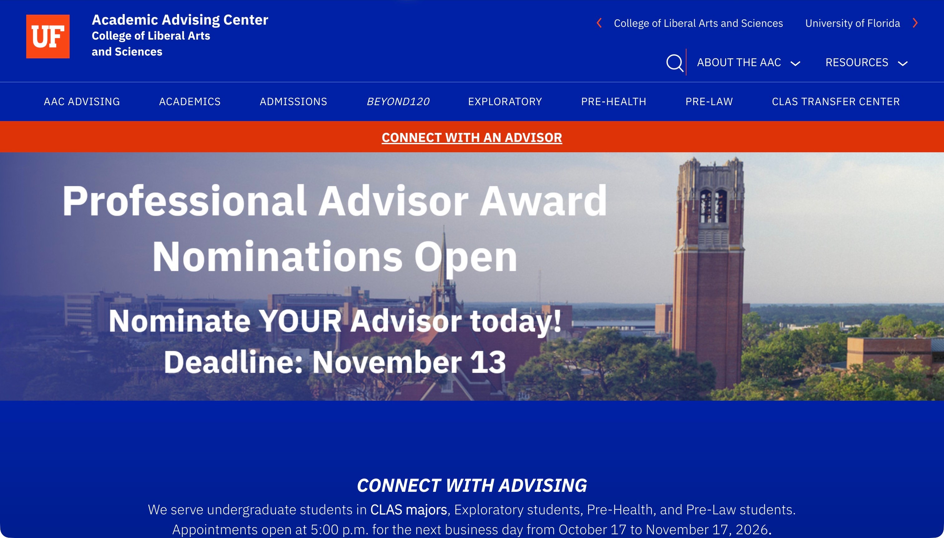
The University of Florida Academic Advising Center uses a blue institutional identity, a broad local navigation and an orange strip directing visitors to connect with an adviser. At capture time, a large campus-tower campaign promoted adviser-award nominations with a dated deadline; that notice is historical page content, not a current opportunity. The practical advising section continues below it. A recurring student task retains a distinct route alongside the temporary campaign.
What you can learn
Give recurring tasks a stable position that does not depend on the current campaign. A visitor looking for academic help should not need to interpret an awards announcement to find the relevant office. Assign temporary material an expiry rule and explain institution-specific school or college abbreviations wherever they affect the service boundary.
Pros
The connect-with-advising strip remains distinct from the campaign.
The local navigation exposes different academic support topics.
Cons & considerations
If a dated campaign dominates the introduction, remove or update it through an owned process.
If the office serves a particular college, state that scope without relying only on an abbreviation in the brand.
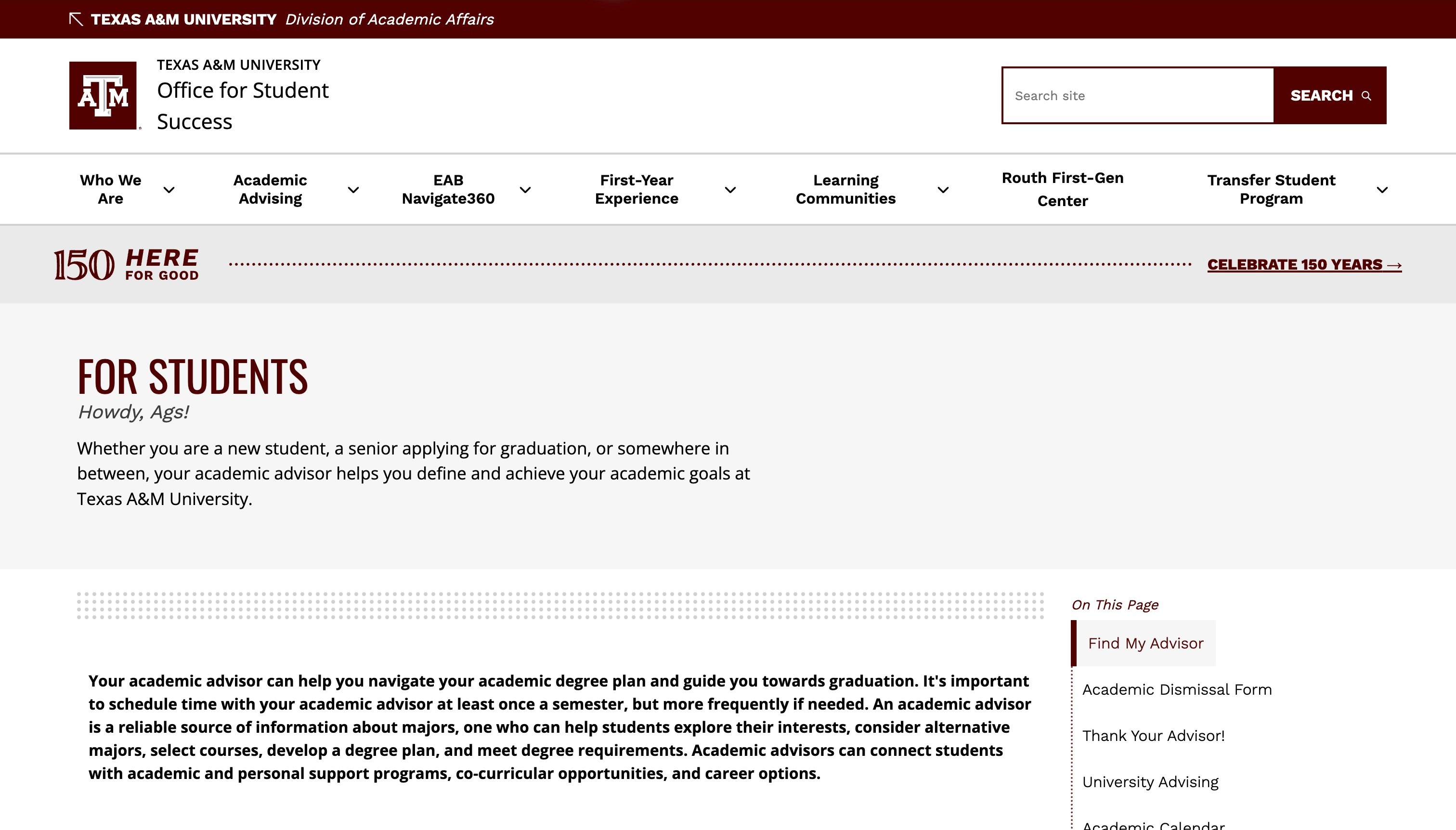
Texas A&M’s Office for Student Success places its institutional header above a plain student-facing page. The opening explains academic advising, while an adjacent On This Page index identifies practical destinations such as finding an adviser and the advising calendar. The public content distinguishes appointment and drop-in information and explains common planning questions. A local index separates this page’s practical tasks from the broader office navigation.
What you can learn
Use a local task index when a single page contains several substantial answers. Give that index concrete labels and ensure that a direct visitor can establish the page’s academic-advising context from its heading and introduction. Do not assume that the broader student-success brand explains which department or process owns a specific question.
Pros
The local index exposes practical tasks within the long page.
The introduction explains advising before listing every supporting resource.
Cons & considerations
If the main heading is a broad audience label, retain clear service context in the surrounding hierarchy.
If urgent or sensitive tasks appear among many links, give them appropriate wording and a reliable destination.
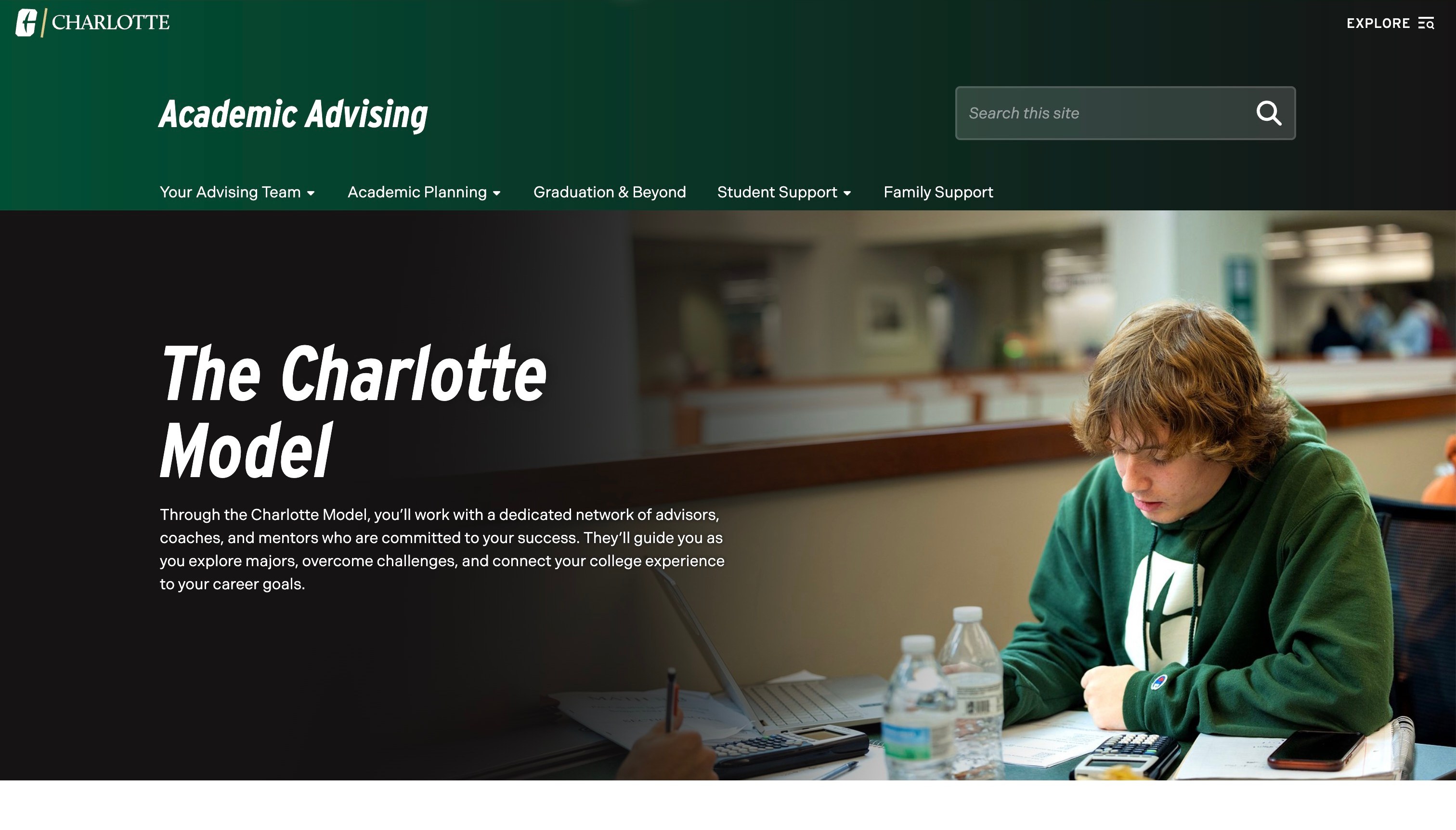
UNC Charlotte’s Academic Advising page uses a dark-green identity and navigation for the advising team, academic planning, graduation and student or family support. A student photograph carries an introductory panel describing the Charlotte Model and its network of advisers, coaches and mentors. Public links expose planning and support tools. The design question is how a branded model connects to recognisable people and tasks for a new student.
What you can learn
Introduce any branded support model with a plain account of the roles involved and the next relevant action. A tool name does not establish what help it provides, just as a link to that tool does not identify the public website’s technology stack. Organise planning information around the question rather than assuming that existing terminology is self-explanatory.
Pros
The navigation separates planning, graduation and family-support needs.
The introduction describes several roles within the support network.
Cons & considerations
If a model name leads the opening, give it an immediate practical definition.
If several external tools are linked, explain their purposes and preserve a clear return path to the public information.
Great College Advice combines a white header, a compass identity and a large graduation image with a clear admissions-counselling introduction and consultation action. The public page develops the offer through named stages, including assessment, planning, a college list, essays and applications. This makes the underlying work more visible than a headline alone. The useful pattern is the progression from a broad promise of guidance to a set of understandable activities, while keeping the enquiry separate from resources and team information.
What you can learn
Describe the actual work behind a large service claim. A staged explanation helps families understand what they are comparing and where their current situation fits. Keep any published outcome figures separate from the process description, with a clear basis and scope, rather than letting statistics imply that following those stages guarantees a result.
Pros
Named stages explain several parts of the advisory process.
Consultation, resources and team investigation have distinct routes.
Cons & considerations
If the visual introduction is large, keep the practical process easy to reach.
If outcome percentages are promoted, explain their evidence and limits without presenting them as universal expectations.
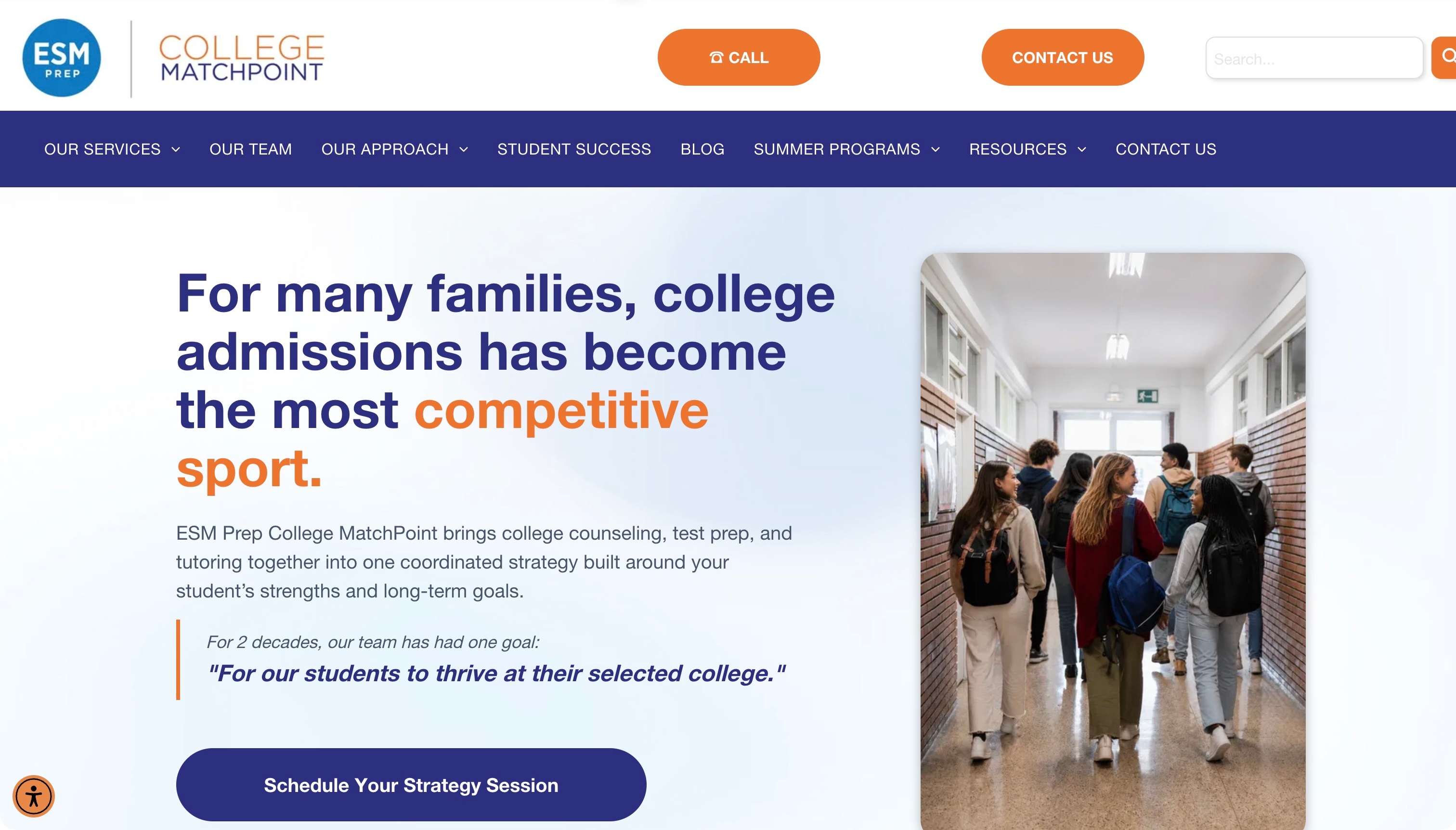
ESM Prep College MatchPoint combines a substantial white header with a navy service navigation, orange contact actions and a split introduction pairing a large headline with students in a school corridor. The public content distinguishes college counselling, test preparation, tutoring and essay support, then offers routes for different school stages. Related services are grouped without becoming one unexplained package. The source’s promotional outcome claims are not treated as independent evidence of results.
What you can learn
Explain how related services differ before describing how they fit together. A family should be able to investigate the relevant part of the offer and understand the first conversation without assuming that every student needs the same combination. School-stage routes can add context when their content genuinely explains a different starting point.
Pros
Distinct service names make a multi-part offer more understandable.
School-stage routes give the broad introduction a more specific context.
Cons & considerations
If a large header consumes substantial viewport space, prioritise the core task labels.
If a competitive framing leads the headline, balance it with an ordinary account of scope, process and limits.
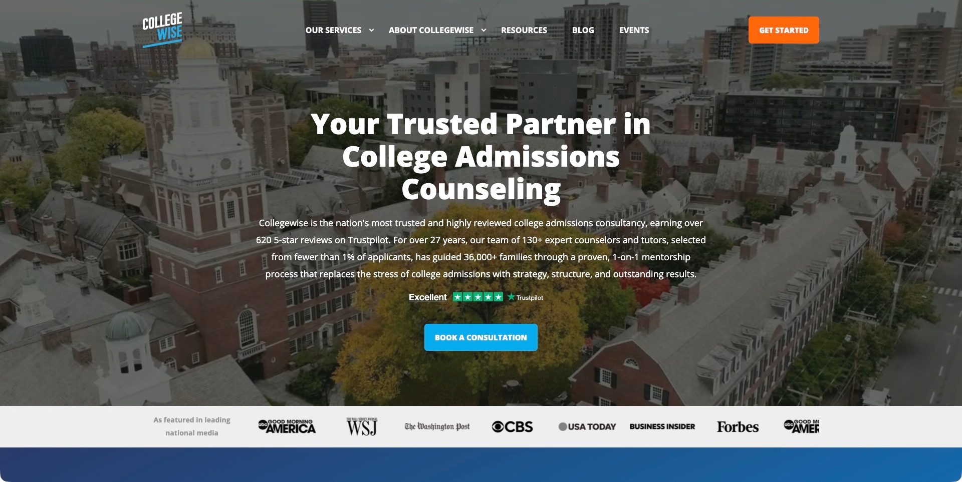
Collegewise uses a full-width campus backdrop beneath a dark overlay, with a white headline, a blue consultation action and an orange starting button in the header. The navigation separates services, background, resources, blog and events. Further public content distinguishes college counselling, tutoring, essay support and other programmes rather than leaving the broad headline as the entire offer. Review and outcome claims are prominent in the presentation; this review records their place in the hierarchy without treating the company’s figures as independent evidence of results.
What you can learn
Connect a broad introduction to specific service choices and an understandable first conversation. A larger advisory business needs to explain the differences between its programmes, not simply accumulate credibility signals. Keep any claimed results separate from the practical account of what a family can investigate or request.
Pros
The consultation action is labelled with its actual purpose.
Separate service descriptions explain several parts of the broader offer.
Cons & considerations
If changing imagery sits behind text, test readability across every frame and screen size.
If review or outcome figures lead the message, state their basis and limits rather than implying a guarantee.
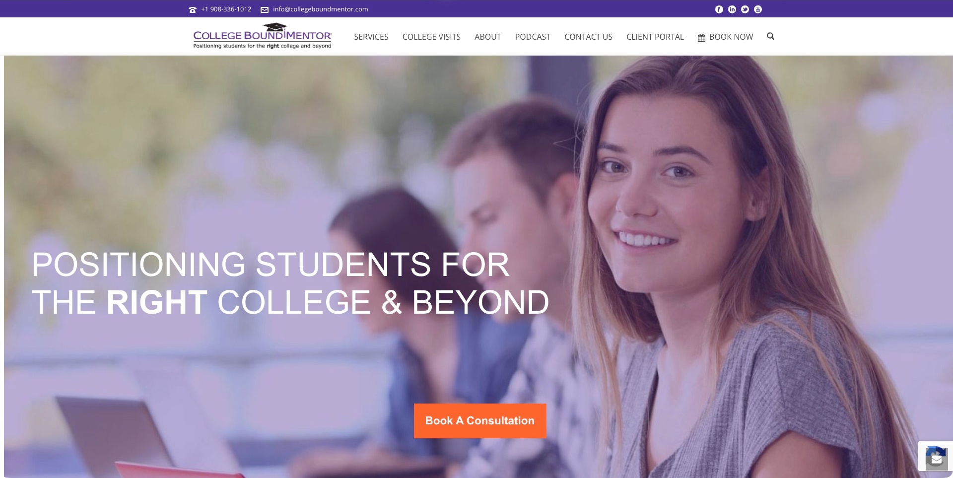
College Bound Mentor pairs a purple contact strip and white navigation with a large student photograph, an admissions-oriented headline and an orange consultation action. The header distinguishes services, college visits, a podcast, contact and an existing-client portal. Lower on the public page, a needs-based section separates the application package, essay assistance and graduate-school or career support. The useful design pattern is the relationship between an approachable visual entrance and several concrete reasons for visiting, with the client tool kept distinct from public investigation.
What you can learn
Give a new visitor a way to recognise the relevant service without confusing that journey with an existing-client login. Supporting resources can demonstrate the kind of information available, but the main routes still need to explain the work and the meaning of a consultation before an external scheduling handoff.
Pros
The navigation distinguishes the client portal from public contact and services.
Needs-based service labels extend the broad introduction with practical choices.
Cons & considerations
If the hero occupies most of the first screen, keep the next service explanation easy to reach.
If consultation booking opens another service, explain the handoff and keep its labels consistent.
Kegan is a freelance web designer and developer with 15+ years of experience helping businesses turn complicated website requirements into clear, maintainable digital experiences. He works directly with clients from planning and design through development, launch, and ongoing support.
For academic advising website design, his development approach focuses on clear distinctions between independent college-planning and institutional advising, audience-specific service formats, human adviser profiles, useful public resources, and straightforward consultation or student-support handoffs without outcome guarantees. The scope can be a targeted improvement or a complete custom build, with responsive layouts, thoughtful content structure, and integrations chosen around the people using and maintaining the site.
Show 3 other academic advising website designersHide other academic advising website designers
Plan an academic-advising website around the questions people actually bring
Define the service boundary before the sitemap
Write a short account of what the team does, who can use it and what sits outside its responsibility. An independent consultant might work with families on a college search and application process; a university office might help enrolled students understand course choices and direct them to a programme adviser. Those are different website jobs. Do not use the same generic enquiry language for both without explaining the relationship.
List the questions the team cannot answer and the correct destinations for them. A visitor may confuse admissions decisions, course registration, financial aid, disability support and academic planning. A useful boundary is not a defensive disclaimer buried in a footer: it is an ordinary explanation beside the relevant route, with a clear handoff when the responsibility belongs elsewhere.
Build audience routes from real differences in the process
Interview the people who answer incoming questions and group the situations they encounter. For an institution, this might distinguish an applicant, a newly admitted student before orientation, a current student with a declared major and a student considering a transfer. For a consultancy, the important distinction might be school year, transfer status or a limited hourly service rather than a comprehensive programme.
Only create separate routes when they lead to genuinely different information or actions. Too many audience buttons can reproduce the organisation chart without helping anyone. Test whether a visitor can recognise their starting point from the label alone. If two groups share the same process, a clear combined explanation may work better than several thin pages with nearly identical introductions.
Give each service or office destination a useful information pattern
Agree a repeatable set of fields for the pages people use to decide what to do next. Include the scope, intended audience, participation format, location or time zone, relevant timing, preparation and next action. Explain whether a visitor will speak with a named adviser, a central office or the first available member of a team. Do not let the portrait or a promotional headline carry those practical details by implication.
For an independent business, explain the available service formats and what an initial conversation is for. If pricing is public, keep qualifications beside the figures and distinguish a package from an hourly arrangement. If pricing is not public, explain how it is established without implying that an enquiry creates a commitment. For an institution, identify the office’s remit and show how a student finds their assigned or relevant adviser.
Treat scheduling as a handoff, not the whole explanation
Map the path from a public page to the actual appointment mechanism. The public website should explain who may use the route, the kind of meeting to select and what happens next. A third-party calendar or student portal may be necessary, but the page should not simply drop a visitor into an unfamiliar interface without context. Keep labels consistent across the boundary where the team controls them.
Test the actual handoff with the office or business owner rather than assuming that a prominent button proves the workflow works. Review closed calendars, unavailable appointments, mistaken eligibility, changed advisers and an interrupted session. Decide who owns corrections when the destination changes. Our public examples do not verify those private systems; your project needs its own authorised end-to-end testing.
Show the people and process without promising a result
A named adviser, a clear role and an ordinary description of the work can make an unfamiliar service understandable. Explain who will be involved, how the work is organised and where the visitor can read more. Use current biographies and photographs with permission. Avoid letting an accumulation of institutional logos stand in for a description of the actual relationship.
Separate an account of the process from a claim about its outcome. Testimonials describe an individual’s experience; acceptance lists and statistics need a defined basis, date and qualification. Do not write a page as though admission, graduation, a scholarship or an improvement in performance is assured. A useful brief asks which claims the organisation can support and who will review them, not how to make the largest number sound most persuasive.
Make dates, announcements and resources maintainable
Academic calendars change, and a deadline or operational notice can quickly dominate the homepage. Give each time-sensitive item an owner, an expiry rule and a place in the content model. Show the year and relevant audience where ambiguity would matter. A campaign may deserve prominent space temporarily, but finding an adviser should not disappear every time a new announcement is added.
Resource collections need a similar maintenance plan. Group material by the task it supports, identify the responsible office or author and avoid several unmanaged copies of the same instructions. A page about course registration should not quietly become the authority for a process owned by another department. Build a way to report a broken or outdated destination and test how that correction reaches the right editor.
Keep the public enquiry proportionate to the first conversation
Start by deciding what information is genuinely necessary to route a question. A general enquiry may need much less detail than an ongoing advising relationship. Do not ask for private academic documents simply because the form builder makes an upload field easy to add. The organisation should decide the appropriate information, destination, retention and access arrangements with the responsible people before implementation.
Explain the purpose of the enquiry and the expected next step in normal language. A confirmation should distinguish receipt from a booked appointment or an accepted client relationship. Review error messages and alternative contact instructions. These are design and operational planning questions, not a claim that a particular form, platform or screenshot meets privacy, security or legal requirements.
Test complete journeys with realistic starting points
Use task scenarios rather than asking reviewers whether they like the homepage. Can a new student find the relevant orientation advice? Can a current student distinguish a general question from a major-specific appointment? Can a family understand an independent consultant’s service format without inferring it from a university photograph? Can a visitor arriving from search establish context on a lower-level page?
Review those tasks on small screens and with keyboard navigation, alongside the people responsible for the service. Record the points of uncertainty, unclear labels, stale instructions and external handoffs. Test accessible interaction and content readability rather than declaring conformance from appearance. Agree a post-launch owner for recurring checks so the site does not become a polished but unreliable directory.
The editing job behind the design
Choose publishing tools around the advising team’s editing and routing jobs
Start with the information model, not a platform copied from a reference website. A small consultancy may need a manageable set of service pages, adviser information, resources and enquiries. A university destination may need departmental ownership, audience-specific navigation, an adviser directory and careful links to systems maintained elsewhere. The right editing workflow depends on who approves changes and how often those details change.
Keep the public publishing layer separate from assumptions about student records or scheduling. A visible calendar link does not identify the website’s backend, and a university brand does not prove that every office shares the same content system. Document the actual integration requirements, permissions and responsible teams before choosing tools. Unknown technology remains unknown until there is relevant evidence.
Give the content model stable fields for office or adviser roles, audience, programme scope, next-step destinations and review dates. Where a link opens an external service, store it once if the editorial system permits and make its ownership explicit. Review the platform’s real editing, accessibility, security and maintenance needs with the team; the public examples are design references, not a procurement verdict or a tested architecture.
Our WordPress website examples offer a separate look at publishing approaches. A visible platform label is evidence for that named page, not a guarantee that the same system will suit your requirements.
Before the public launch
Academic-advising website planning checklist
State whether the provider is independent or part of an educational institution.
Name the actual advising scope and intended student or family audience.
Distinguish prospective, incoming, current and transfer routes where they differ.
Explain unfamiliar office names and institutional abbreviations.
Give each service a consistent format, preparation and next-step description.
Separate a general question, consultation request, appointment and application.
Keep current adviser roles and contact destinations under named editorial ownership.
Qualify fees, package boundaries and eligibility beside the relevant information.
Identify the responsible source for deadlines and academic-calendar information.
Give campaigns and operational notices an owner and an expiry process.
Review claims, testimonials and statistics without implying guaranteed results.
Keep initial enquiry fields proportionate to the routing task.
Test external scheduling and portal handoffs through authorised real journeys.
Check mobile layout, keyboard interaction, errors and alternative contact routes.
These checks are a project checklist, not a performance, legal, security, or accessibility certification. Test real journeys with the people responsible for the website before making claims about the result.
Sources & editorial method
How this collection was selected and reviewed
The original 22-example industry target was drawn and saved before research and has not been rerolled. Distinct public advising websites and directly relevant institutional destinations were examined for their actual audience, visible design and task structure. Genuine direct browser captures retain their original UTC timestamps; 20 earlier accepted images are unchanged and two resumed captures were added when normal browser access was restored. Only browser toolbars were cropped away, never website content or obstructing overlays. Original notes concern public presentation, not confidential student systems, admission prospects, service quality or accessibility conformance. Editors Choice is an explicit website-design judgment about a specialist practice’s identity, scope and service explanation, independent of outreach availability. Unknown technology items are omitted pending relevant source evidence.
Each example links to its actual source page. Screenshots are direct browser captures with their own capture dates; moving imagery, announcements and live designs can change. The notes describe observable design choices and conditional tradeoffs, not measured traffic, conversion results, service quality, or accessibility conformance.
Technology labels use public page metadata, asset evidence, or explicitly cited platform documentation. Platform documentation is not a complete current deployment audit. A component reference may be legacy or unused; it is not a complete backend inventory. Unknown stacks are omitted. These sites are editorial examples, not our client portfolio.
Written, Edited and Curated are separate editorial records, not timestamps advanced by a rebuild. Website designs and imagery belong to their owners. See our editorial standards or suggest a correction.
Questions worth asking
Academic Advising website design questions
Should a consultancy and a university office use the same website structure?
Not automatically. A consultancy needs to explain the independent service, formats and first conversation. An institutional office must establish its remit, student eligibility and the correct adviser or department. Both benefit from clear tasks and practical information, but their responsibilities and handoffs are different. Start with the actual process rather than copying a familiar campus layout.
Does a prominent appointment button make the page complete?
No. Visitors also need to know whether the appointment is relevant, what kind of meeting to choose and what happens after the handoff. A booking tool cannot replace public explanations of scope, eligibility or preparation. The actual scheduling workflow needs separate authorised testing; a screenshot only records the visible page at its capture time.
Can admission statistics or testimonials establish the quality of advice?
They do not establish suitability for a particular student or guarantee an outcome. Any published figures need a defined basis, period and qualification, and testimonials describe specific experiences. This collection examines website presentation and public information. It does not assess the accuracy of individual advice, confidential cases or educational results.
What information should an initial enquiry ask for?
Decide that from the actual routing task with the responsible team. Explain what the information is for and avoid requesting private academic documents merely to determine which service applies. Data handling, access and retention require their own review. A good public form distinguishes receipt of a message from a confirmed appointment or accepted service relationship.
Why do some examples omit a visible technology stack?
A public page does not always reveal reliable platform evidence. A linked student portal, a scheduling product or a university’s other website cannot establish the pictured page’s complete technology stack. Unknown items are left out, and any later audit must preserve its actual observation date and the limits of the evidence.
Borrow the clarity of the strongest audience routes, not promises about results. Start with your actual remit, the questions people bring and the information needed before contact. Then connect those decisions to a publishing and scheduling workflow the responsible team can maintain.