Best Neo4j Websites of 2026 (20 Real-World Examples)
Public design references from organizations with documented graph workloads.
Explore 20 public interfaces beside specific Neo4j customer accounts. The collection distinguishes graph-based business and research systems from the technology of the pictured website.
Intuit, BASF, Bayer, Cisco and Caterpillar introduce the collection. Their cited graph workloads address particular connected-data questions, including security, value-chain analysis and research. A source about drug-target information is not clinical validation, and a source from one division is not evidence across an entire group.
Later examples include a museum, energy infrastructure, business information and specialist research companies. Basecamp Research is not the Basecamp project-management product; BNP Paribas Personal Finance is a specific business. Those identity boundaries are retained so the examples remain useful rather than becoming a loose collection of famous logos.
Before the examples
What makes good Neo4j website development in 2026?
Name the relationship question before drawing a graph
Start with the question someone cannot answer well today. Explain what a connection means, who supplied it and what would make it wrong. A visually dense network is not automatically a useful model. Give reviewers a small example whose relationships they can explain in ordinary language.
Treat identity and provenance as product requirements
Two records with similar names are not necessarily the same entity. Define stable identities, source ownership and the rules for correcting a mistaken connection. A graph interface should help users understand why information is related, not hide uncertainty behind a confident line between two nodes.
Review integrity and access against the actual edition
Neo4j documents several constraint types and edition-dependent availability. Its authentication and authorization guidance also describes supported access arrangements. Confirm the intended deployment and entitlement before promising a control. Keep privileged connections behind the application boundary and test what ordinary users may actually retrieve.
Twenty independently inspected public pages with bounded primary Neo4j associations. The interface lesson and documented graph workload are intentionally separate.
We start with five recognizable brands or organizations: Intuit, BASF, Bayer, Cisco, Caterpillar. Each attribution applies to the named website property, not every product or website belonging to its organization. This is a curated reading sequence, not a measured ranking.
Intuit uses a large photograph of a person at work beneath a white header that exposes its product family. Oversized white wording makes the introduction conversational, while smaller supporting text supplies the broader company context. The composition is useful for studying how a multi-product organization can present a shared identity without making every visitor start with a technical catalog. Neo4j's customer account documents Intuit's security knowledge layer for mapping infrastructure and network relationships. That is a specific security-team workload, not evidence that the corporate page or every financial product uses Neo4j, and its reported protection outcomes are not independently validated here.
What you can learn
Keep the public brand introduction and the documented technical workload distinct. A recognizable product bar can help visitors choose a destination, but the corporate design should not be treated as a diagram of the organization's complete data architecture.
Pros
The product-family bar makes several major destinations visible before scrolling.
Human imagery gives the broad corporate introduction a specific visual subject.
Cons & considerations
A large conversational headline still needs literal product and company context.
Product breadth requires clear routing after the shared brand introduction.
Platform source: Primary documented Neo4j association. Documented association: Knowledge-layer security workload; not every financial product or the corporate public frontend. Platform evidence is separate from the direct website screenshot and is not a complete current infrastructure audit.
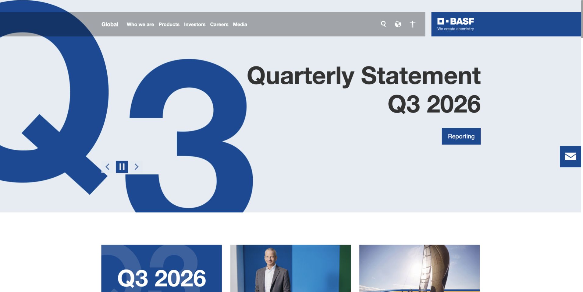
BASF uses a pale blue reporting feature with a very large quarter marker and a bold quarterly-statement title. A compact blue action sits within the feature, while the gray header separates global company, product, investor, career, and media routes. Additional content cards begin below. This is useful for studying a corporate page whose current reporting task is unmistakable without a crowded first-screen grid. Neo4j documents BASF's WeDecide value-chain analytics platform, including relationships among materials, costs, and production processes. That bounded internal analytical association does not identify the public corporate publishing system or establish use across every BASF division and process.
What you can learn
Give time-sensitive corporate content an explicit place and maintain its dates and destination. Preserve separate product and stakeholder routes, and keep a documented analytical platform distinct from claims about the technology rendering the public page.
Pros
The oversized quarter marker makes the featured reporting period immediately recognizable.
Stakeholder navigation remains separate from the main reporting action.
Cons & considerations
A reporting-led hero can delay product discovery for other audiences.
Large decorative numerals need sensible cropping and reading order on phones.
Platform source: Primary documented Neo4j association. Documented association: Specific connected-data workload documented in the customer case; not every BASF division or public website. Platform evidence is separate from the direct website screenshot and is not a complete current infrastructure audit.
Bayer opens with a large photograph of children and a short white mission statement. The company mark sits near the top, while a compact floating navigation pill and search control occupy the lower area of the image. This is useful for studying a mission-led corporate introduction that gives the photograph substantial space. It also shows why detailed stakeholder tasks need discoverable routes beyond a broad emotional message. Neo4j's account describes Bayer research and development work involving CardioKG and connected biological and cardiac-imaging data. This is research-information scope, not independent validation of therapeutic predictions, clinical effectiveness, treatment suitability, or the public site's backend.
What you can learn
Separate a broad corporate mission from specific scientific evidence and visitor tasks. Keep research claims qualified to their actual project and stage, and make important company, product, and contact destinations available without relying on the hero image.
Pros
The restrained floating navigation leaves the human photograph visually prominent.
Large white type creates a clear focal point within the mission-led composition.
Cons & considerations
A broad mission statement provides little immediate detail about distinct business areas.
Floating controls need careful contrast and comfortable touch targets over imagery.
Platform source: Primary documented Neo4j association. Documented association: Cited graph workload in the organization; no inference across every business line, clinical result or public-page runtime. Platform evidence is separate from the direct website screenshot and is not a complete current infrastructure audit.
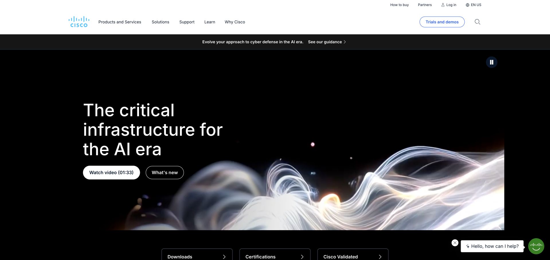
Cisco uses a dark hero with luminous abstract forms and a concise infrastructure introduction. A compact white header separates products, solutions, support, learning, company information, and trials, while small content controls sit within the hero. This is useful for studying how a large technology catalog can begin with one clear theme without putting every product on the opening screen. Neo4j's customer story describes document clustering, ontology creation, and machine tagging within a Cisco content workflow. That specific connected-information case does not establish the technology behind this public page, every network product, or the organization's complete current data architecture.
What you can learn
Use a focused introduction to orient the audience, then provide literal product and support paths. Keep technical associations scoped to the documented workflow rather than presenting one vendor case as proof of every product or the public marketing runtime.
Pros
The white header clearly separates practical product and support navigation.
The dark hero provides strong contrast for the concise infrastructure message.
Cons & considerations
Abstract imagery needs literal supporting explanations of the offer.
Small content controls can be easy to miss within a large visual hero.
Platform source: Primary documented Neo4j association. Documented association: Documented graph workload; not the implementation of every network product or public website. Platform evidence is separate from the direct website screenshot and is not a complete current infrastructure audit.
Caterpillar uses yellow and black framing around a wide reporting feature with people and equipment visible in the photograph. A compact release action appears beneath the quarterly-results heading. The next white section introduces a broader corporate message beside another image, while search and stakeholder navigation remain above. This is useful for studying a corporate page that separates a current news task from its continuing company introduction. Neo4j's case documents a natural-language and ontology workload involving equipment-repair information. That is a specific connected-knowledge application, not proof of the public publishing system, every machine's software, repair outcomes, or the complete industrial data architecture.
What you can learn
Give reporting and evergreen company content distinct surfaces and accurate destinations. Use industrial imagery as context, while keeping a documented knowledge-processing workload separate from claims about product performance or the technology behind the public page.
Pros
Yellow and black provide a recognizable hierarchy around the reporting feature.
The following white section creates a clear transition into broader corporate information.
Cons & considerations
A results-led opening can delay product and service discovery.
Small upper navigation needs adequate spacing across a wide stakeholder catalog.
Visible tech stack
Earlier / documented evidence
Neo4j
Platform source: Primary documented Neo4j association. Documented association: Specific graph-based business workload; separate from the public corporate publishing system. Platform evidence is separate from the direct website screenshot and is not a complete current infrastructure audit.
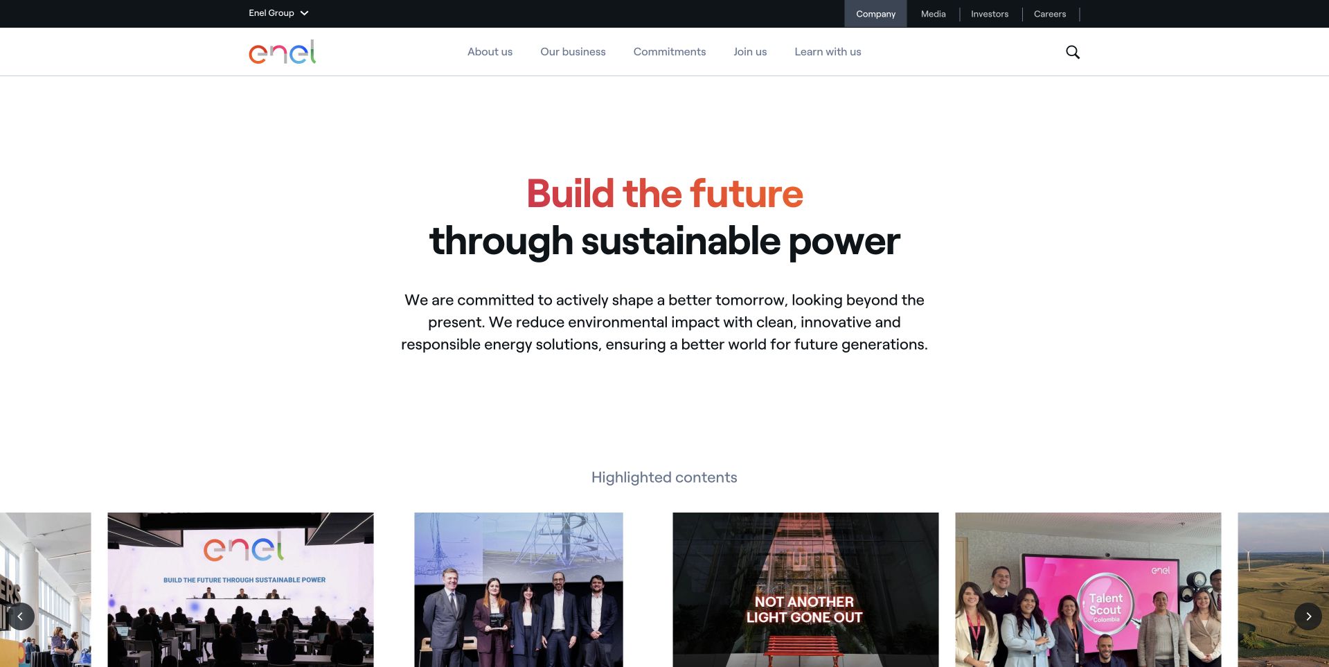
Enel uses a spacious white introduction with a centered gradient-accented heading and a short supporting paragraph. A restrained header separates company, business, commitments, careers, and learning routes, with stakeholder links in a narrow upper band. The next content section begins below the generous opening. This is useful for studying a corporate site that prioritizes readable wording over a full-screen background image. Neo4j's customer account documents a grid digital-twin workload for connected network analysis and planning. That infrastructure association does not identify the public website's content system, prove implementation across every energy operation, or independently validate the case's performance and automation claims.
What you can learn
Keep the public corporate introduction concise while giving different stakeholders literal paths. A documented operational digital twin can inform a technical case study, but it should not be inferred from a page's visual style or generalized to every system.
Pros
The solid white surface gives the main introduction reliable reading contrast.
Company and stakeholder navigation remain distinct from the central message.
Cons & considerations
Generous empty space can delay practical content on smaller screens.
Broad corporate wording needs specific business and project information after the introduction.
Visible tech stack
Earlier / documented evidence
Neo4j
Platform source: Primary documented Neo4j association. Documented association: Grid digital-twin workload; not the public corporate site or a claim across all energy systems. Platform evidence is separate from the direct website screenshot and is not a complete current infrastructure audit.
Gilead uses a large laboratory photograph with a blue gradient behind a short white introduction. The company mark and compact navigation sit over the upper part of the image, separating science, medicines, responsibility, stories, company, and careers. This is useful for studying a scientific corporate page that gives people and working context a prominent role without a large intake panel. Neo4j documents an analytical platform within Global Product Security and Anti-Counterfeiting for investigating pharmaceutical fraud, diversion, and program misuse. That scoped association is not evidence of the public page's CMS, clinical effectiveness, patient outcomes, or independently verified investigative performance.
What you can learn
Use scientific imagery as context rather than proof of a product or result. Keep medicine, corporate, and career routes distinct, and qualify technical case material to the responsible function instead of extending it across research or clinical systems.
Pros
The blue gradient gives the introductory wording separation from the laboratory detail.
The header distinguishes several scientific and corporate stakeholder tasks.
Cons & considerations
Small white navigation over a photograph requires careful contrast checks.
A broad scientific introduction needs more specific evidence and product context beyond the hero.
Platform source: Primary documented Neo4j association. Documented association: Pharmaceutical-fraud analytical workload; not clinical outcomes or public-page CMS proof. Platform evidence is separate from the direct website screenshot and is not a complete current infrastructure audit.
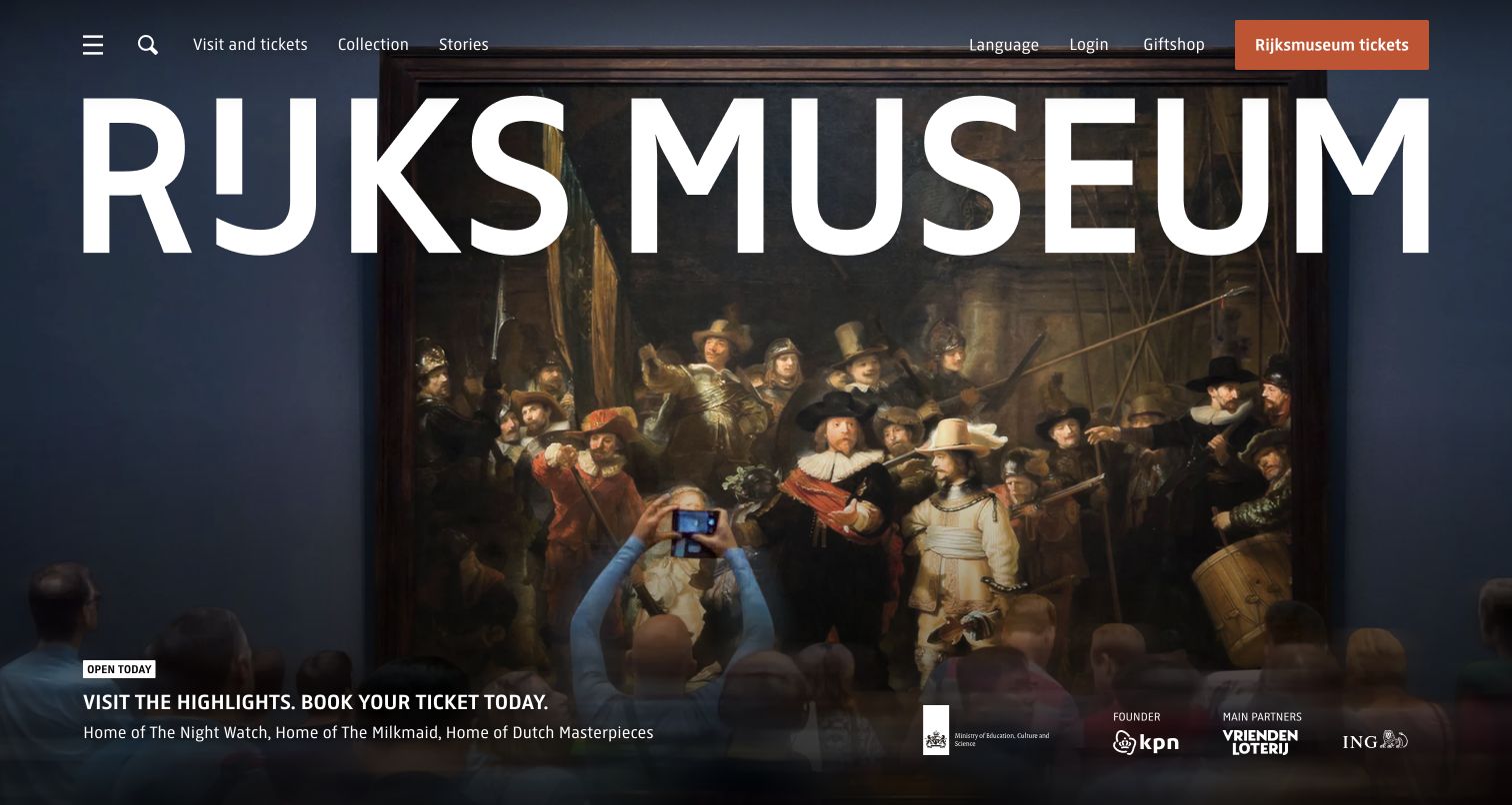
Rijksmuseum places very large institutional lettering over an artwork-led opening. Compact navigation exposes visits, tickets, the collection, stories, language, login, and the shop, while a distinct ticket action remains near the top. The image is given substantial space, with practical visit wording positioned below. This is useful for studying how a museum can balance visual identity with concrete visitor tasks. Neo4j's customer account specifically documents the connected-data Online Collection experience using AuraDB on Azure. That narrower collection association should not be turned into proof that every public museum page or ticketing component runs on Neo4j, and reported audience growth remains vendor-case material.
What you can learn
Keep collection exploration and ticket purchase understandable as different journeys. Let artwork carry the visual identity, while documenting the actual scope of any collection-data case rather than treating one feature as a complete museum website architecture.
Pros
The artwork-led image establishes a strong cultural context immediately.
Visit, collection, and ticket routes are visible as distinct tasks.
Cons & considerations
Oversized lettering covers part of the artwork and needs careful responsive cropping.
A dramatic opening still needs accessible practical information outside the image.
Platform source: Primary documented Neo4j association. Documented association: Museum connected-data workload; public collection design remains separately inspected. Platform evidence is separate from the direct website screenshot and is not a complete current infrastructure audit.
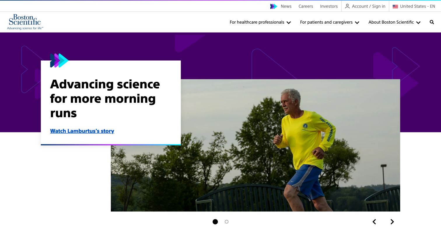
Boston Scientific uses a purple geometric background with an offset white story card over a photograph of a runner. The header distinguishes healthcare-professional, patient-and-caregiver, company, investor, and regional routes. This is useful for studying a medical-technology corporate page that presents a human story without making the story itself the whole navigation structure. Neo4j's case describes graph analysis of manufacturing supply-chain relationships among products, parts, and failures. That specific analytical workflow does not establish the public site's backend, medical-device performance, clinical outcomes, or suitability. The human image and science-oriented wording should likewise not be treated as independent clinical evidence.
What you can learn
Separate a human story from technical and clinical claims, and make audience routes explicit. Describe graph-based manufacturing analysis as its own documented workload rather than inferring that it powers the corporate story page or validates product outcomes.
Pros
The offset white card gives the story wording a stable reading surface.
Professional and patient audiences have separate routes in the header.
Cons & considerations
Overlapping cards and imagery need a clear reading order on phones.
Human outcome imagery requires careful context rather than implied product or clinical endorsement.
Platform source: Primary documented Neo4j association. Documented association: Specific graph workload; not medical-device performance or public website runtime. Platform evidence is separate from the direct website screenshot and is not a complete current infrastructure audit.
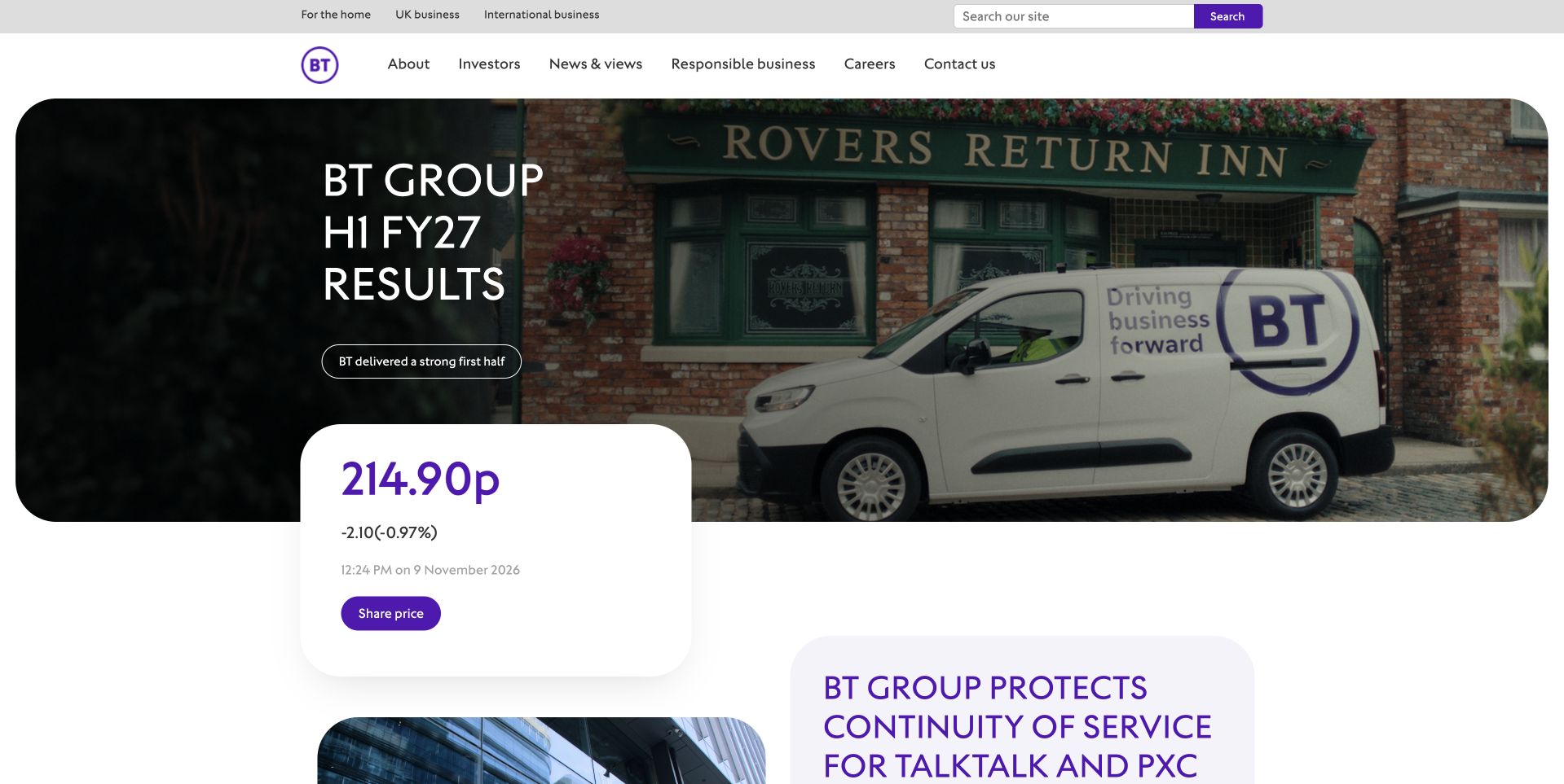
BT Group uses a rounded wide photograph of a branded vehicle with current-results wording on the left. A white share-price card overlaps the lower edge, and another corporate news panel begins beneath. The header separates company, investors, news, responsible business, careers, contact, and search. This is useful for studying a corporate rather than consumer-service surface: the principal tasks concern reporting and group information. Neo4j's customer case documents SRIMS, a network-inventory platform integrating connected infrastructure data and other business systems. That operational workload does not establish the public About page's technology or prove implementation across every BT product and service; reported efficiency results are not independently tested here.
What you can learn
Match the opening task to the actual corporate audience and date-sensitive content. Keep investor displays maintained and accessible, while describing an operational inventory case separately from the publishing and consumer-service systems visitors can see.
Pros
The white share-price card clearly separates a data-oriented investor task.
Rounded imagery gives the reporting feature a distinct visual boundary.
Cons & considerations
Overlapping financial cards need careful mobile spacing and timely data context.
A reporting-led hero can delay other company and career tasks.
Platform source: Primary documented Neo4j association. Documented association: Telecommunications connected-data workload; no inference across every BT service or public page. Platform evidence is separate from the direct website screenshot and is not a complete current infrastructure audit.
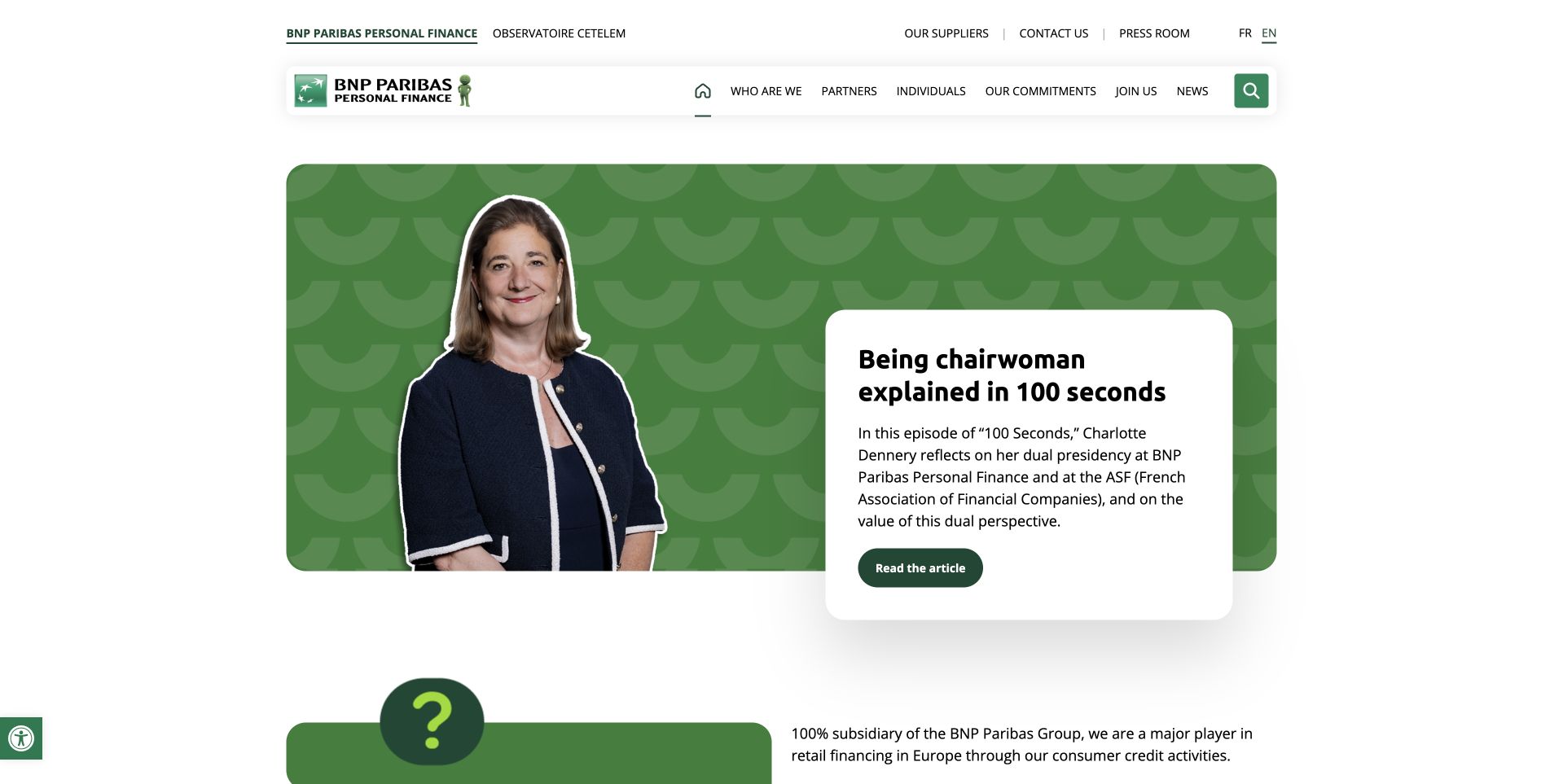
BNP Paribas Personal Finance uses a green patterned feature with a portrait on the left and an offset white article card on the right. The card explains the subject of a leadership feature, while compact navigation separates company, partners, individuals, commitments, careers, and news. This is useful for studying a division-specific corporate site that gives a person and an editorial story a clear place. Neo4j's case concerns fraud-analysis work within BNP Paribas Personal Finance, including its French risk function. It is not evidence about the entire BNP Paribas group, the public page's backend, lending suitability, or independently verified fraud outcomes.
What you can learn
Keep the legal and organizational entity clear when presenting a recognizable group brand. Give editorial stories readable summaries and destinations, and preserve the exact division and function scope of technical evidence instead of extending it to the whole organization.
Pros
The portrait and white article card create a clear editorial feature structure.
Navigation distinguishes corporate, partner, individual, and career audiences.
Cons & considerations
Overlapping story cards need a sensible mobile reading sequence.
A shared group identity requires consistent division-specific context throughout the journey.
Platform source: Primary documented Neo4j association. Documented association: Personal Finance business workload; not the entire BNP Paribas group or public banking stack. Platform evidence is separate from the direct website screenshot and is not a complete current infrastructure audit.
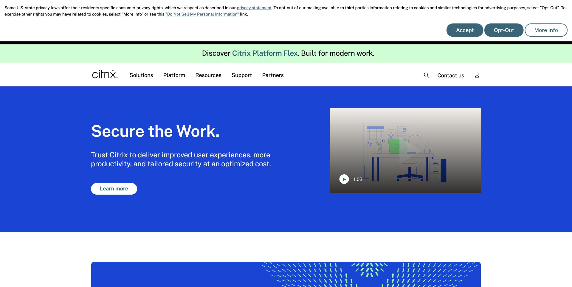
Citrix uses a blue opening surface with concise white wording and a pale learn-more control on the left. A video preview sits on the right, while the white header separates solutions, platform, resources, support, and partners. A narrow announcement adds another product route above the header. This is useful for studying a platform introduction whose text remains readable independently of the media. Neo4j's customer account documents connected customer, application, and service data within Citrix Analytics. That bounded analytical association is not proof of every current delivery product or the public marketing frontend, and security and productivity outcomes in the case are not independently validated here.
What you can learn
Keep the main explanation useful without playing video. Separate product announcements from the core introduction, and describe the documented analytics workload precisely rather than treating an enterprise customer story as a complete account of current platform or website architecture.
Pros
The solid blue surface provides reliable contrast for the main wording and action.
Video is presented as a separate optional content element.
Cons & considerations
An announcement strip adds another competing route before the main introduction.
A broad platform message needs literal product and audience detail after the opening.
Platform source: Primary documented Neo4j association. Documented association: Cited graph-based business workload; not every current application-delivery product or marketing page. Platform evidence is separate from the direct website screenshot and is not a complete current infrastructure audit.
CAST uses a dark abstract background with a restrained white introduction about software mapping and intelligence. A short supporting line sits below, and a row of recognizable customer marks begins beneath the hero. This is useful for studying a technical product page that avoids covering the opening with a large dashboard screenshot or long form. It also makes concrete explanation important: broad clarity language needs a useful product destination. Neo4j's case describes CAST's software-architecture visualization, representing components and relationships in the CAST Imaging System. That product-workload association does not identify this marketing page's backend or independently validate software-analysis accuracy, security, or customer results.
What you can learn
Turn an abstract technical proposition into an understandable product journey with examples and accurate scope. Keep customer marks attributable and distinguish a documented software-intelligence data model from claims about the public site's implementation or independently measured product performance.
Pros
The restrained dark composition gives the short introduction a clear focal point.
Customer marks form a separate supporting band rather than covering the hero.
Platform source: Primary documented Neo4j association. Documented association: Software-intelligence graph workload; not proof of the public product-marketing frontend. Platform evidence is separate from the direct website screenshot and is not a complete current infrastructure audit.
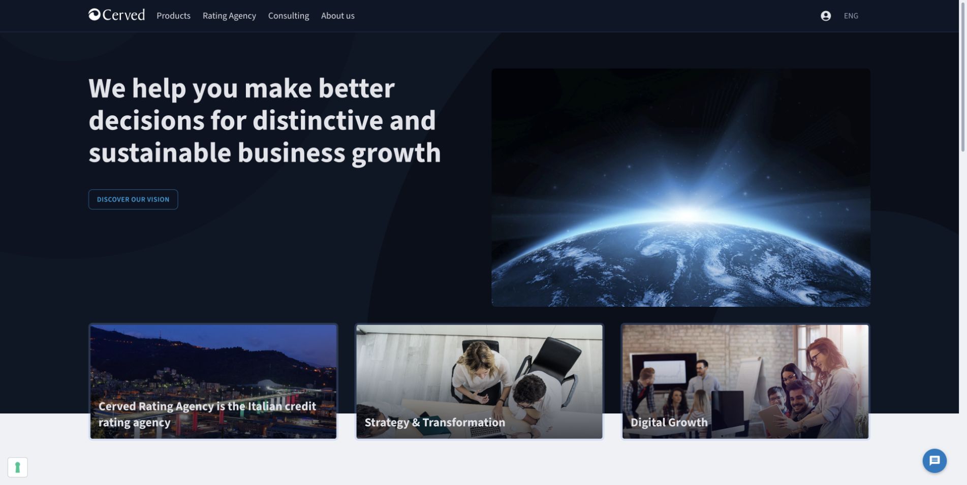
Cerved uses a dark blue split composition with a large white business-information introduction on the left and an earth-at-horizon image on the right. A compact action appears below the text, with content cards beginning underneath. The header separates products, ratings, consulting, company information, and language selection. This is useful for studying a broad information business whose major categories remain visible despite an abstract opening image. Neo4j's case describes Cerved's ownership-link analysis and Aracne-related applications, including experimentation beginning in 2011. That historical business-information workload is not proof of every current product or the public page's implementation, and reported performance remains case-source material.
What you can learn
Keep product categories literal when the visual concept is abstract. Preserve historical scope and dates in technical case descriptions, and distinguish connected ownership-data analysis from claims about the current corporate frontend or the quality of business decisions made with it.
Pros
The dark blue text surface separates the main wording from the abstract image.
Product, ratings, and consulting routes remain distinct in the header.
Cons & considerations
An earth image supplies limited information about the actual business products.
A broad business proposition needs specific product examples beyond the initial message.
Platform source: Primary documented Neo4j association. Documented association: Business-information graph workload; no claim about every product or public-page implementation. Platform evidence is separate from the direct website screenshot and is not a complete current infrastructure audit.
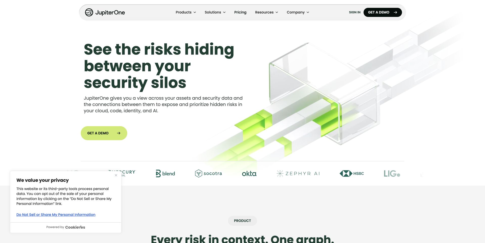
JupiterOne uses a white opening with dark green text and a large translucent architectural graphic carrying bright green connections. A lime demo action sits beneath the explanation, while the compact header separates products, solutions, pricing, resources, and company information. This is useful for studying a technical introduction that gives connected-data language a visual reference without displaying a dense real dashboard immediately. Neo4j's customer case documents JupiterOne's re-architected cyber-asset knowledge layer. The case is a specific product-data association, not a public-page stack audit or independent validation of security coverage, risk detection, reported cost savings, or query performance.
What you can learn
Use an abstract relationship graphic to orient, then provide concrete examples and scope. Keep a demo request distinct from product evidence, and describe the graph workload precisely rather than turning vendor-reported benefits into an unqualified security promise.
Pros
The pale composition keeps the main explanation readable beside the graphic.
Lime contact emphasis creates a clear primary action without a large intake form.
Cons & considerations
Abstract architecture imagery needs specific product examples to clarify the metaphor.
Security-oriented claims require more evidence than the visual relationship concept provides.
Platform source: Primary documented Neo4j association. Documented association: Cyber-asset connected-data workload; not an independent security endorsement or homepage stack audit. Platform evidence is separate from the direct website screenshot and is not a complete current infrastructure audit.
Infinitus uses a dark text area beside a photograph of a clinician and patient. A short communication-oriented introduction leads to a demonstration action, while large numerical claims occupy a separate lower row. The header distinguishes solutions, platform, clinical evidence, resources, company, and contact. This is useful for studying how a healthcare technology page separates its explanatory message from supporting claims and imagery. Neo4j's case documents a connected prescription-coverage information workflow using AuraDB on Google Cloud. That scope is not clinical-effectiveness evidence, proof of the public page's technology, or a guarantee that a particular coverage question will be resolved.
What you can learn
Explain the coordination task and the limits of the service plainly. Keep numerical marketing claims attributable and link to appropriate evidence, while separating information-workflow performance from patient outcomes, coverage decisions, and the implementation of the public marketing page.
Pros
The dark text area provides separation from the human photograph.
Clinical-evidence and platform routes are distinct in the navigation.
Cons & considerations
Large numerical claims need clear scope and supporting evidence.
Patient imagery can imply outcomes unless the communication service is explained carefully.
Visible tech stack
Earlier / documented evidence
Neo4j
Platform source: Primary documented Neo4j association. Documented association: Prescription-coverage information workflow; not clinical effectiveness or public-page technology. Platform evidence is separate from the direct website screenshot and is not a complete current infrastructure audit.
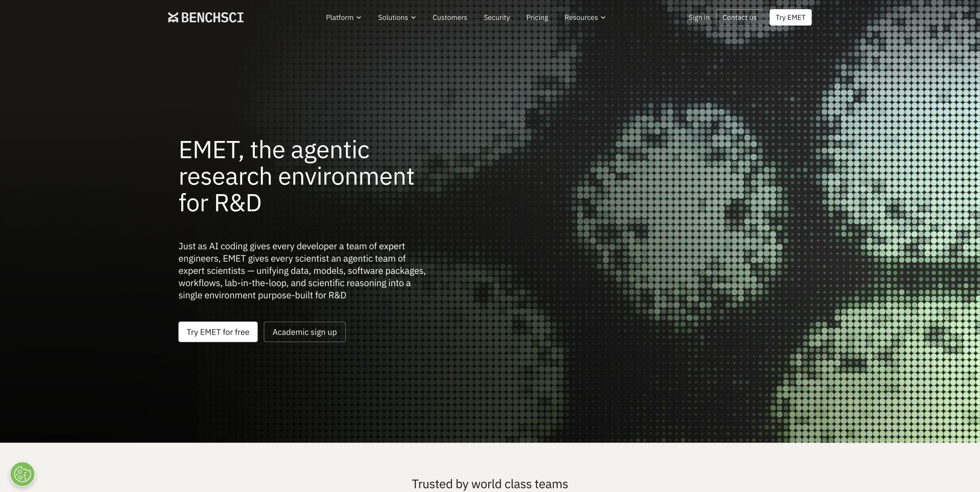
BenchSci uses a dark composition with a large halftone human image on the right and a concise EMET research-environment introduction on the left. Separate free-use and academic routes appear below the explanation, while the upper navigation separates platform, science, customer, company, and contact information. This is useful for studying a scientific software page that makes audience and product access visible without an immediate long form. Neo4j's case documents BenchSci's Biological Evidence Knowledge Graph and its relationship-modeling foundation. That research-information association is not independent validation of laboratory results, drug-discovery outcomes, scientific predictions, or the public marketing frontend.
What you can learn
Name the actual product and distinguish access routes for different audiences. Keep the evidence and limits of scientific claims accessible, and describe a graph-based research-information workload separately from assertions about successful experiments or the technology rendering the public page.
Pros
The product name and research-environment scope appear in the main introduction.
Academic and general access routes acknowledge different visitor relationships.
Cons & considerations
Halftone imagery can add visual weight without explaining the product itself.
Scientific and outcome-oriented language needs careful evidence and scope beyond the hero.
Platform source: Primary documented Neo4j association. Documented association: Research-information graph workload; not independent validation of laboratory outcomes. Platform evidence is separate from the direct website screenshot and is not a complete current infrastructure audit.
Basecamp Research uses a pale gray hero with large stacked white wording on the left and a textured green biological visualization on the right. The restrained header exposes data, AI-model, therapeutic-pipeline, company, and contact routes. This is useful for studying a research business that gives its visual identity room without a dense first-screen form. The entity is Basecamp Research, not the similarly named project-management product. Neo4j's customer case describes BaseGraph, a connected biological-information workload. That association does not establish this public site's backend or independently validate protein discoveries, therapeutic results, model performance, or the case's reported scale and benefits.
What you can learn
Make entity identity and research scope explicit before describing technology adoption. Use scientific visualization as context, not proof of a result, and keep data, model, and pipeline destinations distinct enough for different research and commercial audiences.
Pros
The restrained layout gives the biological visualization a clear visual role.
Data, model, and pipeline routes are separately named in the header.
Cons & considerations
White display text on a pale background needs deliberate contrast testing.
Broad discovery language requires specific evidence and research-stage context afterward.
Platform source: Primary documented Neo4j association. Documented association: Research connected-data workload; unrelated to the Basecamp project-management product. Platform evidence is separate from the direct website screenshot and is not a complete current infrastructure audit.
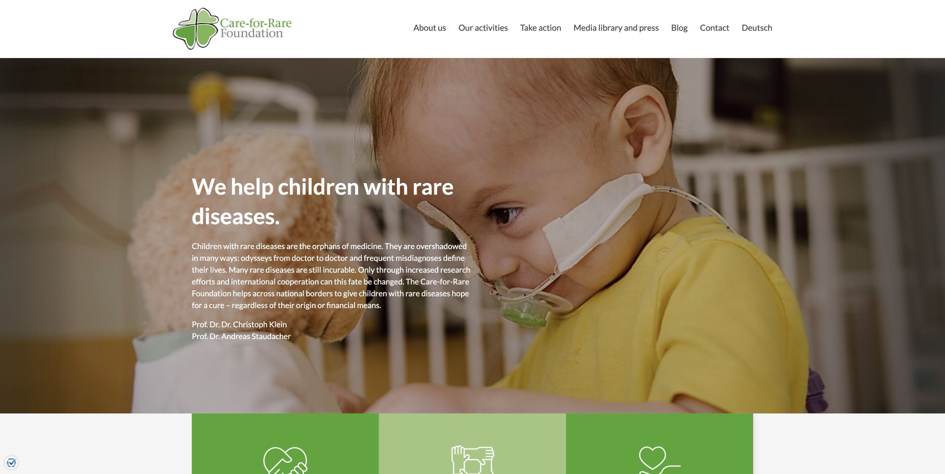
Care-for-Rare uses a large photograph of a child with a short white foundation introduction over a darkened area. A white header separates company information, activities, support, media, blog, contact, and language routes, while green panels begin below. This is useful for studying a research charity whose human context is immediate without an introductory donation modal. Neo4j's account describes a Clinical Knowledge Graph proof of concept associated with the foundation and Dr. von Hauner Children's Hospital. That research-stage information project is not evidence of established diagnostic accuracy, treatment effectiveness, individual patient outcomes, or the public foundation website's CMS.
What you can learn
Keep the mission understandable while distinguishing research stages from established care. Use sensitive imagery with appropriate permission and context, and make support and scientific-information routes explicit without turning a proof of concept into a promise for a particular family.
Pros
The header exposes support and information routes without covering the human image.
Green lower panels create a clear transition into additional foundation content.
Cons & considerations
Text over a sensitive human photograph needs careful contrast and contextual judgment.
Research claims require explicit stage and evidence boundaries beyond a compassionate introduction.
Platform source: Primary documented Neo4j association. Documented association: Rare-disease research information workload; not treatment advice or public CMS proof. Platform evidence is separate from the direct website screenshot and is not a complete current infrastructure audit.
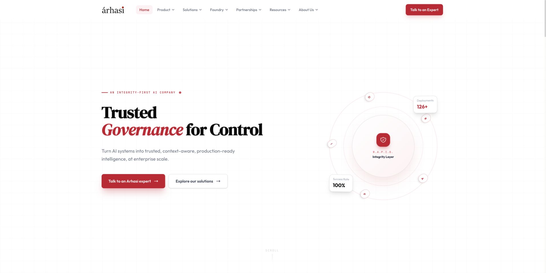
Arhasi uses a spacious white composition with black serif wording, red governance emphasis, and a pale relationship graphic on the right. A red expert-contact action and a lighter solutions route sit beneath the introduction. The compact header separates products, solutions, research, partnerships, resources, and company information. This is useful for studying an enterprise AI page whose main message is readable without a dense dashboard illustration. Neo4j's customer account documents a knowledge-graph architecture associated with Arhasi's TrustHouse and a particular asset-management client workflow. That account does not identify the public page's runtime or independently validate compliance, security, accuracy, return on investment, or the absence of AI errors.
What you can learn
Explain the actual governance and product relationship in concrete terms after the concise introduction. Keep client-case outcomes attributable and bounded, and distinguish expert contact from evidence that a system meets a particular organization's compliance or performance requirements.
Pros
The white background gives the main governance wording a stable reading surface.
Expert contact and solution browsing are separately labeled.
Cons & considerations
A pale relationship graphic provides limited operational detail by itself.
Broad trust and governance language needs specific scope and evidence beyond the hero.
Platform source: Primary documented Neo4j association. Documented association: Knowledge-graph AI workload; vendor-reported outcomes are not independent benchmarks or public runtime detection. Platform evidence is separate from the direct website screenshot and is not a complete current infrastructure audit.
Kegan has 15+ years of experience working with small businesses, Fortune 500 companies, and everything in between. No development job is too big or too small: he brings the same hands-on attention to a focused improvement, a complete website, or a custom application.
For Neo4j projects, he can help with data modeling, application data access, query design, search and cache integrations, migration planning, access boundaries, and maintainable handover. He works directly with clients on scope, design, implementation, testing, and handover, with an emphasis on clear communication and a system that remains practical to maintain after launch.
Show 3 other Neo4j developersHide other Neo4j developers
Choose a narrow set of entities and a question that requires following their connections. Design a readable result with a text or table alternative where appropriate. The first version should help a user understand a relationship, not ask them to navigate an unexplained universe of nodes.
A bounded application decision-support feature
Define the information a reviewer needs and the authority of the output. Keep an analytical suggestion distinct from an automated decision. Show source context and a correction route, especially where a mistaken association could affect a person or organization.
An existing graph with difficult data quality
Begin with duplicate identities, stale connections and unclear ownership. Preserve examples of known errors and define the corrected result. A new visualization will not repair the underlying model by itself. Budget for reconciliation and a repeatable way to prevent the same errors returning.
From references to requirements
Plan the model, the explanation and the operating boundary
Make a small model that subject experts can challenge
List the entities in the first use case and define what each relationship means. Include direction, relevant time and the source of the claim. Ask a subject expert to identify an ambiguous case. A useful model survives that challenge by making assumptions explicit rather than treating a convenient label as universal truth.
Keep a known-answer example with a few deliberately awkward records: similar names, a changed organization, an expired relationship and an unverified source. Decide which distinctions the application must preserve. Record the difference between a missing connection and evidence that no connection exists. Those states can look alike in a graph while meaning very different things.
Only then design the initial query and presentation. Start with the information the user needs to understand, not the most impressive network shape. A concise explanation or list of relevant connections may be more effective than a full-screen visualization for a first task.
Design explanations, permissions and correction together
For every result, decide what supporting context the reader needs. A source label, observation date or short relationship explanation can prevent the interface from implying more certainty than the data supports. Give users a way to report a mistaken association without editing information they do not own.
Review the actual Neo4j access model for the chosen deployment. The operations documentation distinguishes authentication from authorization and describes supported controls. Match those controls to the application’s audiences. Do not expose an administrator connection in public browser code or assume that hiding a navigation item prevents a user from querying restricted information.
Test both useful access and denied access. Include an ordinary authorized user, someone outside the intended scope and a user whose access has changed. A graph can reveal information through connections as well as properties, so acceptance should consider the result the application permits, not merely whether the login screen works.
Keep imports, constraints and recovery maintainable
Document where each source originates and how it is refreshed. Explain what happens when a record changes identity, a source disappears or an import is repeated. The import should have an accountable owner and an observable outcome. A successful job status is not enough if the resulting relationships are wrong.
Neo4j’s constraint documentation is a useful implementation reference for integrity rules, with availability that depends on edition. Review the intended rules explicitly and test violations with representative records. Keep business meaning outside the database terminology too, so a non-developer reviewer can understand why an import was rejected or a record needs attention.
At handoff, provide the model definitions, source inventory, access ownership, change process and recovery steps. Keep a small comparison graph with expected query results. Ask another maintainer to follow the instructions and explain a failed import. The graph is sustainable when the organization can correct and recover it without treating its model as an untouchable artifact.
Ask the actual team to carry out its routine job: publish a realistic update, correct a mistake, preview a narrow screen, and identify who owns an integration failure. For a library or frontend framework, also ask who maintains the content source and deployment. A polished screenshot does not answer those operational questions.
Beyond the screenshot
Neo4j project planning checklist
Name the relationship question and intended user.
Define entities and stable identities.
Explain direction and meaning for each relationship.
Keep source and relevant time context.
Distinguish unknown from confirmed absence.
Review ambiguous and duplicate records with an expert.
Confirm edition-specific integrity controls.
Keep privileged database connections server-side.
Test permitted and denied result scopes.
Provide an understandable correction route.
Document repeatable imports and reconciliation.
Keep known-answer queries and a rehearsed recovery procedure.
Test with real content, a keyboard, a small screen, slow or failed requests, and the people who will maintain the system. These are planning checks, not an accessibility, security, performance, or search-ranking certification.
Sources & editorial method
How this Neo4j collection was reviewed
Twenty public interfaces are reviewed beside primary Neo4j customer accounts. Organization, subsidiary and research boundaries are retained. This collection provides original design observations and a planning framework, not a current complete backend inventory or validation of vendor outcome claims.
Every image is an unmodified capture from the actual website, with its source and capture date. Some captures are reused from our shared catalog; their dates remain the original capture dates. None comes from a vendor gallery or a generated reconstruction. Moving imagery and live content can change.
Technology attribution uses public page assets or metadata, official platform documentation, or a cited first-party project case study. Documentary and framework-relationship evidence is identified where used; it is not a complete current backend inventory. A CMS image CDN alone does not establish a full CMS deployment. A library’s presence does not prove which individual controls use it, and a platform label does not establish AI authorship.
The composition notes, lessons, pros and tradeoffs are original editorial observations. We have not measured conversion, traffic, security, performance or accessibility conformance. Website owners retain their brands and imagery; these examples are not our client portfolio. Written, Edited and Curated are independent records, not dates advanced by a build. See our editorial standards or suggest a correction.
Questions worth asking
Neo4j website development FAQs
Are these public websites built with Neo4j?
That is not claimed. The sources describe specific graph workloads; screenshots show separately reviewed public interfaces.
Does a graph visualization prove the data model is useful?
No. Start with a real relationship question and known-answer examples. A dense network can be visually impressive while answering very little.
Can two similarly named records be merged automatically?
Not without an explicit identity rule and appropriate review. Similar labels alone do not establish that two records represent the same entity.
Are all constraints available in every edition?
No. Check the current documentation for the chosen deployment and edition before making integrity commitments.
How should research or security customer claims be interpreted?
Within the cited workload. A documented use does not independently validate clinical outcomes, guarantee security effectiveness or identify every system at the organization.