An interior design website should make the work feel distinctive and help a prospective client understand what commissioning it might involve.
Large project photography is compelling, but a prospective client also needs context: the type of project, the studio’s role, the places it works and the process for starting a conversation. A useful portfolio connects those details instead of relying on taste alone.
This collection includes residential studios, hospitality specialists and practices with product or editorial businesses. Compare the way they separate projects, services and commerce. The websites are references for presentation, not independent assessments of the work or its results.
Before the examples
What makes good interior design website design in 2026?
Give projects enough context to be useful
Pair images with a concise brief, project type, relevant locality and the studio’s actual scope. Credit photographers and collaborators appropriately. A project title should help the visitor understand the work rather than act as a private code known only to the studio.
Make the offer visible beside the aesthetic
Clarify whether the practice provides full-service interiors, furnishing, architecture, consultation or another defined scope. Distinguish residential and commercial journeys if the process differs. Do not make every prospective client infer the service from a room photograph.
Create an appropriate first conversation
Explain what a prospective client should share: project type, location, stage and broad scope can be enough to start. Describe process and fit without implying a guaranteed project acceptance. Keep product-shop and press inquiries from competing with commissioned-work requests.
The collection · 20 examples
20 interior design websites worth studying
Look for useful connections between project imagery, service scope and the studio’s point of view. A magazine-like approach can be effective, but it still needs a legible route for a prospective client.
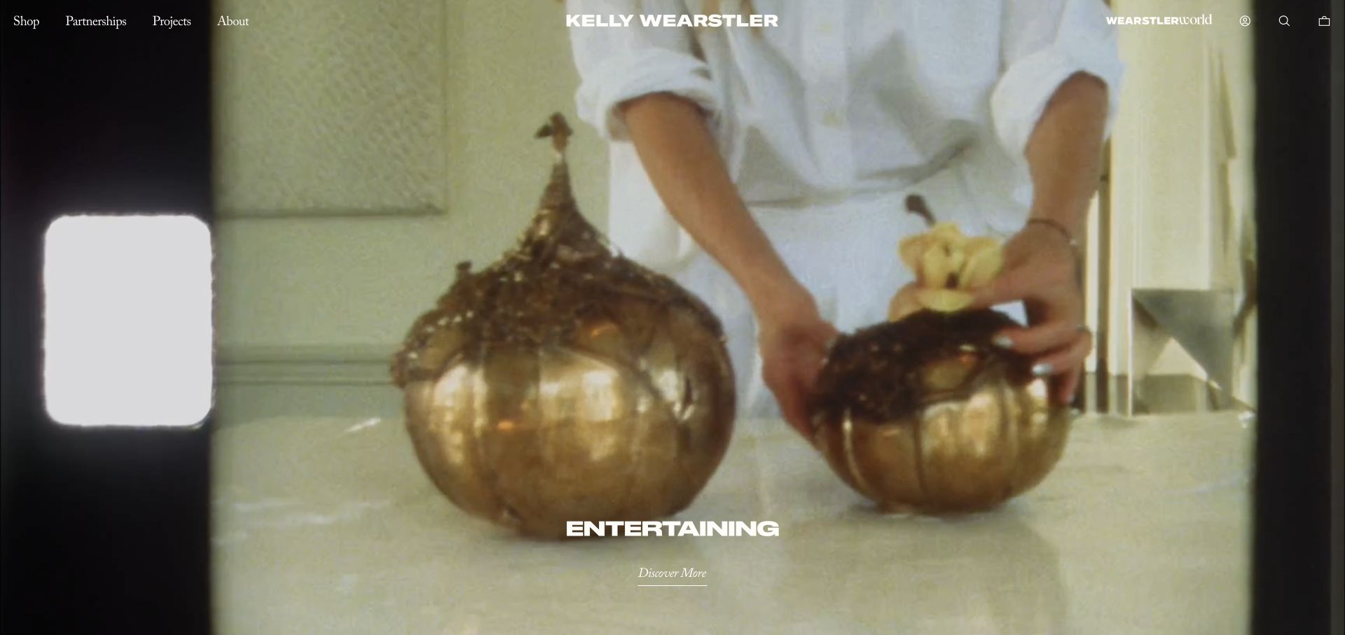
Kelly Wearstler uses an immersive moving image, a central wordmark, and a restrained navigation line that separates shop, partnerships, projects, and company information. In the reviewed scene, hands arrange sculptural tableware; a short campaign label and an understated discovery link sit near the bottom. The opening is not a conventional interior-design sales page. It introduces a broader creative world, using material, styling, and atmosphere to connect the studio’s spaces with its products and collaborations.
What you can learn
A multidisciplinary practice can organize around clear content types rather than forcing everything into one portfolio. Make the project route visible beside commercial collections, and choose imagery that expresses a coherent material sensibility. Less familiar studios should add enough context that a new visitor can identify the actual service without already knowing the name.
Pros
Projects, product shopping, and partnerships have distinct first-level destinations.
The restrained interface leaves the material-focused visual story room to communicate.
Cons & considerations
A campaign-led homepage may initially obscure the interior-design service for new visitors.
Video and small overlaid links need an equally legible static and reduced-motion presentation.
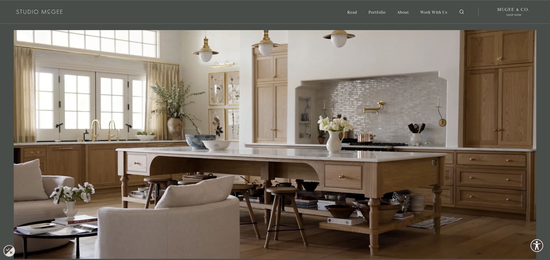
Studio McGee frames its hero photography inside a muted dark-green surround rather than extending it to every edge. The slim header separates reading, portfolio, company information, working together, and the associated shop. The reviewed image shows a lived-in kitchen and adjacent seating, with generous margins and very little text obscuring the room. This makes the home itself the opening evidence while keeping editorial and commercial destinations available in a familiar navigation row.
What you can learn
A studio with both an audience and a client service should distinguish those activities clearly. Let visitors choose between learning, seeing completed work, inquiring about a project, and shopping. Use a consistent frame or background color to make varied photography feel like one publication without grading every image into the same tone.
Pros
Portfolio and project-inquiry destinations remain separate from the retail brand.
A restrained frame gives the room photograph a deliberate editorial presentation.
Cons & considerations
The image-first opening gives little immediate explanation of project scope or location.
A subscription modal can interrupt visitors before they have seen enough work to want ongoing updates.
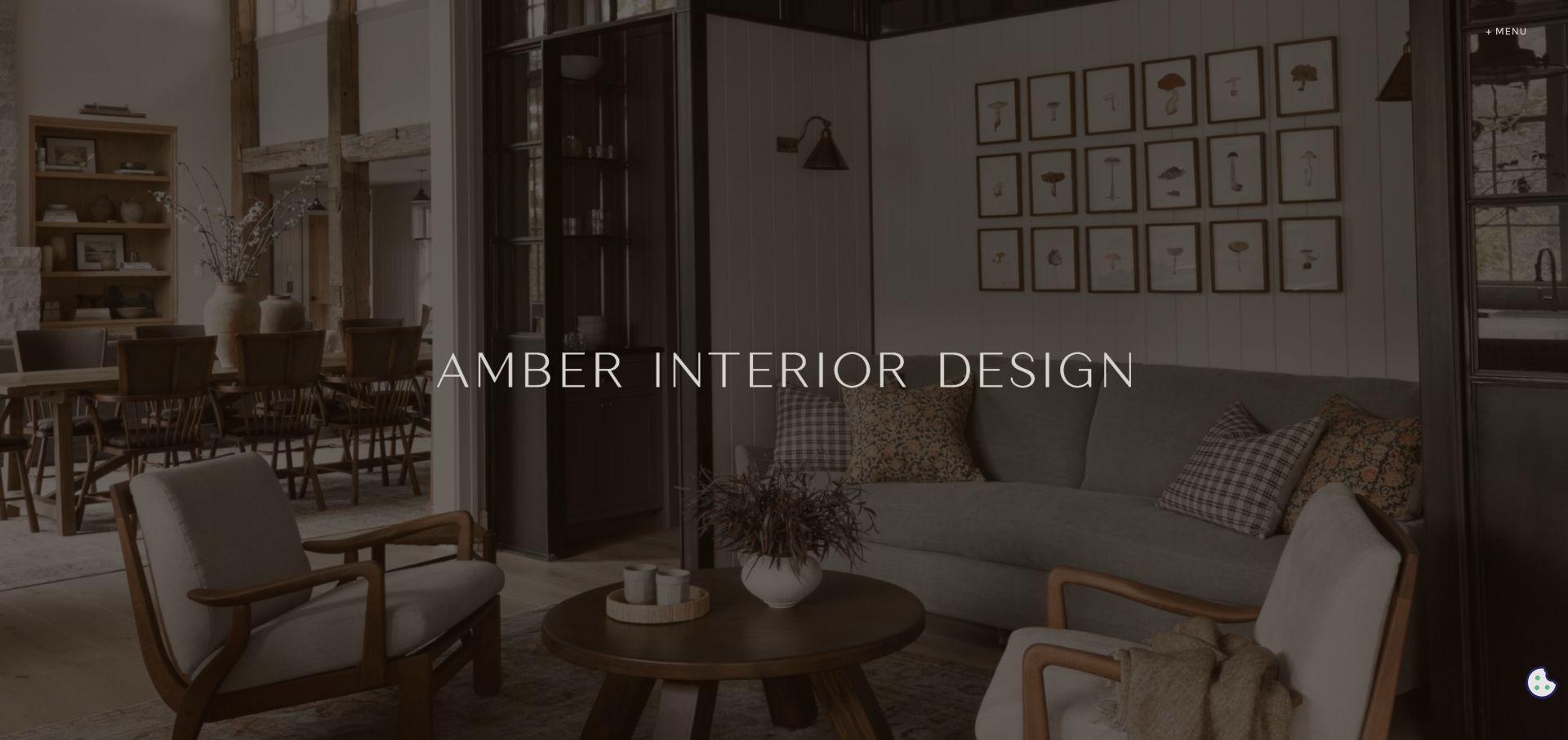
Amber Interiors uses a full-screen interior photograph under a dark warm overlay, with a widely spaced studio name at the center and a small menu trigger in the upper right. The reviewed room includes a seating area, dining space, timber, and carefully framed openings, so the visual story is about the relationship between spaces rather than one isolated decorative object. Almost all conventional navigation is held back, giving the opening the character of a portfolio cover.
What you can learn
An atmospheric cover works when the photography genuinely explains the practice’s sensibility. Keep the brand readable, but do not use so much overlay that the work becomes anonymous. The menu and the next scroll should quickly reveal projects, services, contact, and commissioning context for visitors who need more than inspiration.
Pros
The room image communicates material and spatial relationships without competing promotional blocks.
Minimal controls create a strong, focused first impression.
Cons & considerations
A very small menu trigger makes practical navigation less immediate.
The dark overlay reduces the detail available for visitors trying to inspect finishes and furniture.
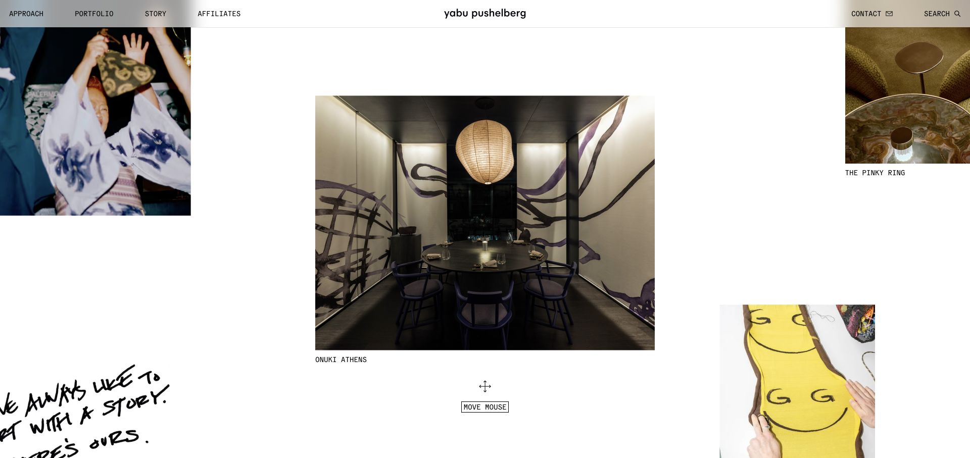
Yabu Pushelberg arranges project and process images in a spacious, irregular field, placing a larger hospitality interior near the center and smaller images around it. Short captions identify the pieces, while a narrow top bar provides approach, portfolio, story, affiliates, contact, and search routes. The visible movement prompt makes the interface feel exploratory rather than sequential. This allows interiors, products, team culture, and material experiments to coexist without being forced into identical rectangular cards.
What you can learn
An exploratory layout can express a multidisciplinary practice, but keep a conventional portfolio route available for task-focused visitors. Captions are essential: they turn attractive fragments into identifiable work. The interaction should enhance discovery while still leaving every project reachable through a straightforward keyboard and small-screen path.
Pros
Varied image scales create a useful distinction between a featured room and supporting fragments.
Captions give the visual field context instead of leaving visitors to guess what each image represents.
Cons & considerations
A movement-led interface can be less predictable than a normal project index.
Large open areas and off-edge imagery may be awkward on touch devices without an alternate layout.
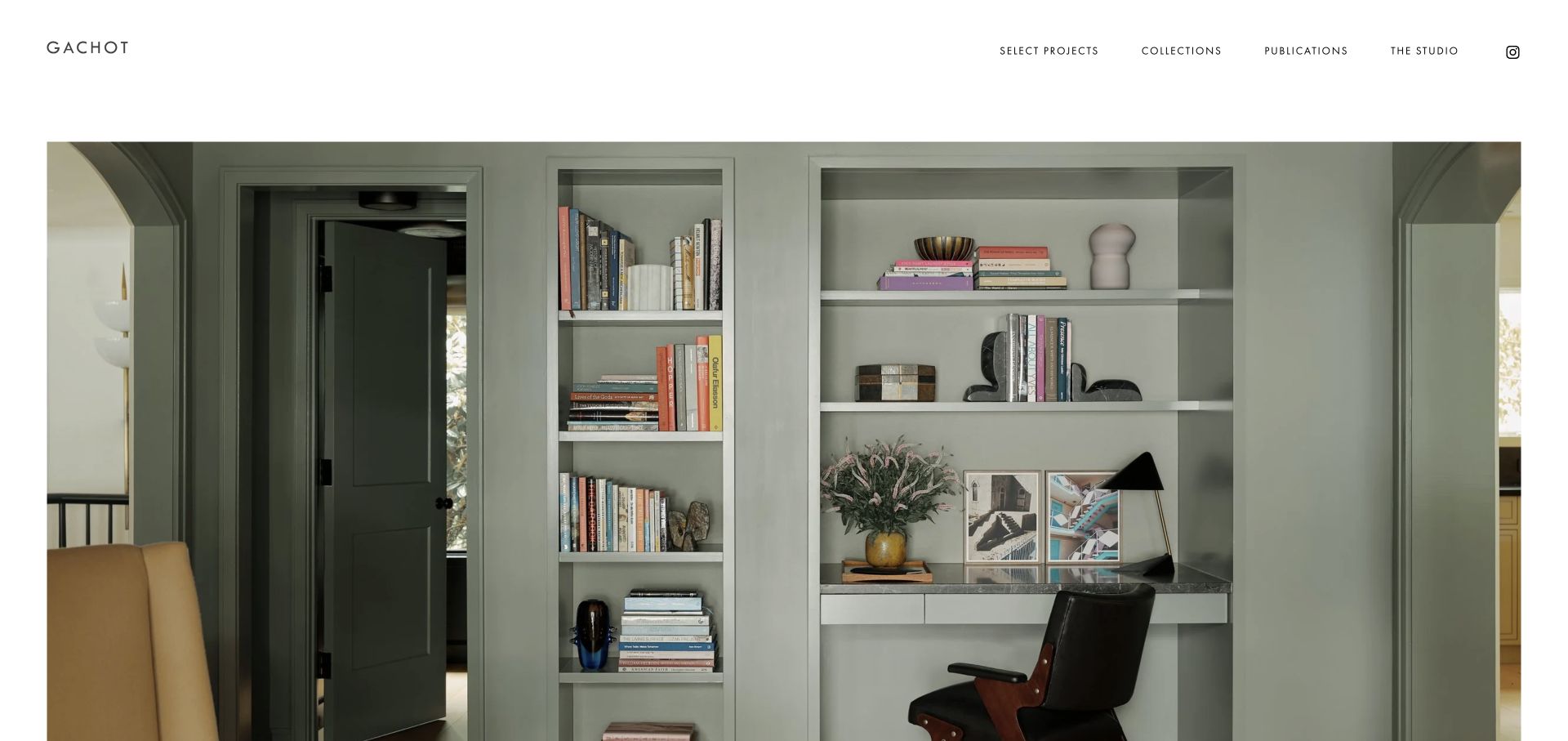
Gachot uses a white background, widely spaced navigation, and a substantial interior image held within generous margins. The wordmark sits at the left, with selected projects, collections, publications, and studio information across the right. The reviewed photograph shows an integrated shelving and desk area, using a composed architectural detail rather than a broad collage. The page creates room to examine joinery, color, and objects, while the small navigation leaves the work visually dominant.
What you can learn
A portfolio-first homepage does not require full-screen motion. A well-chosen still image with consistent margins can make close observation easier. Choose a view that demonstrates the studio’s decisions, then make the project index and practice information simple to find. Provide a direct inquiry route for visitors who arrive ready to discuss work.
Pros
Generous margins and a plain background keep the photograph easy to inspect.
Separate collections and publications routes acknowledge work beyond commissioned interiors.
Cons & considerations
The minimal first screen offers little immediate information about service scope or geography.
Small, widely spaced navigation labels can become difficult to use if not adapted for mobile.
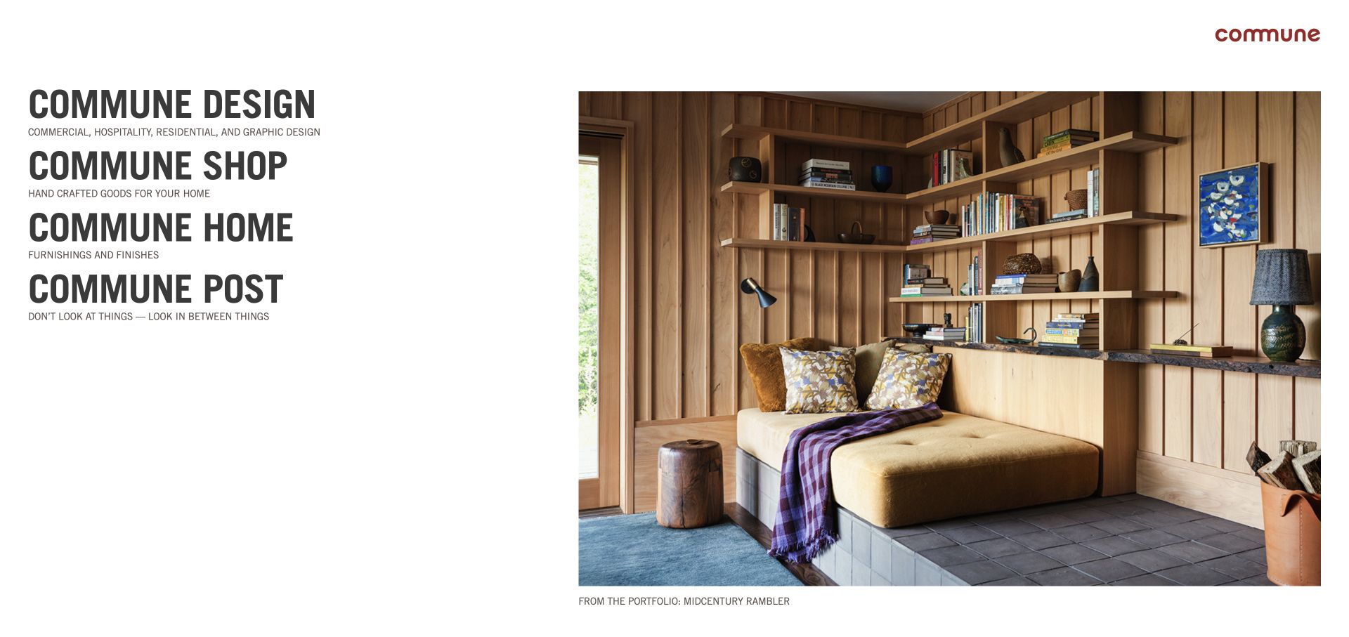
Commune places four large stacked text destinations on the left and one substantial interior photograph on the right. Each destination has a short descriptor, distinguishing the design practice, shop, furnishings partnerships, and editorial content. The featured image carries a project caption below it rather than a layer of sales copy over the room. The opening therefore works as a directory to the studio’s wider ecosystem, with condensed typography supplying most of the graphic character.
What you can learn
Use plain descriptive sublabels when several brand divisions share a name. Visitors should understand the difference between commissioning design, buying products, and reading ideas without opening every link. Pair that directory with a clearly identified example of the work so the homepage remains more than a navigation exercise.
Pros
Short descriptors make the purpose of each large destination clear.
The project caption connects the large image to a specific portfolio entry.
Cons & considerations
Four similarly weighted destinations can make the primary client journey less obvious.
The large typographic column needs careful scaling so it does not overwhelm the photograph on narrower screens.
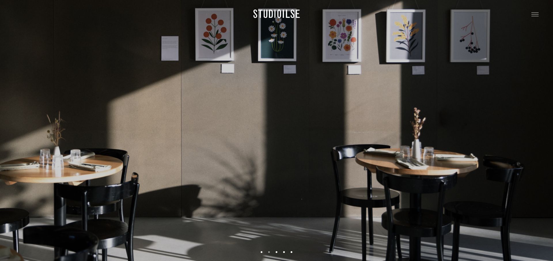
Studioilse fills the opening with an interior scene, placing the wordmark near the top center and a compact menu control at the upper right. Small slide indicators remain near the bottom. In the reviewed view, light crosses a wall of framed botanical images and simple dining tables, making shadow, texture, and everyday use the subject. The interface is restrained enough that it initially feels closer to entering a room than scanning a conventional service website.
What you can learn
Choose images that express how a space feels in use, not just its most dramatic object. A minimal interface can support that approach, but the next interaction should reveal the practice’s work and contact routes predictably. Preserve the atmosphere without making essential project context dependent on an animated caption or a hidden slide.
Pros
The unbroken photograph makes light and material relationships easy to appreciate.
Small controls avoid competing with the calm spatial composition.
Cons & considerations
A hidden menu creates an extra step for finding service and inquiry information.
A near-textless first view gives unfamiliar visitors limited context about the practice or project.
MBDS uses a very large abbreviated wordmark in the upper left and a small menu label at the upper right over full-screen moving imagery. The captured frame focuses on a sculptural classical detail and planting rather than a whole room. This presents the studio’s aesthetic through texture, craft, and atmosphere before explaining the service. The contrast between the enormous identity and almost absent interface gives the homepage the feeling of a title sequence or exhibition introduction.
What you can learn
A cinematic opening can communicate a design sensibility, but it should lead quickly to identifiable projects. Build an equally intentional still fallback and make the menu unmistakable. For a newer studio, an additional line about the practice may be more useful than expecting visitors to infer the service from a material detail.
Pros
The abbreviated identity is immediately dominant without adding a long promotional message.
Close-up imagery foregrounds craft and texture instead of relying only on room-wide photography.
Cons & considerations
The first frame gives little project or service context to someone unfamiliar with the studio.
A moving title-sequence approach can delay practical navigation if the fallback and controls are not considered.
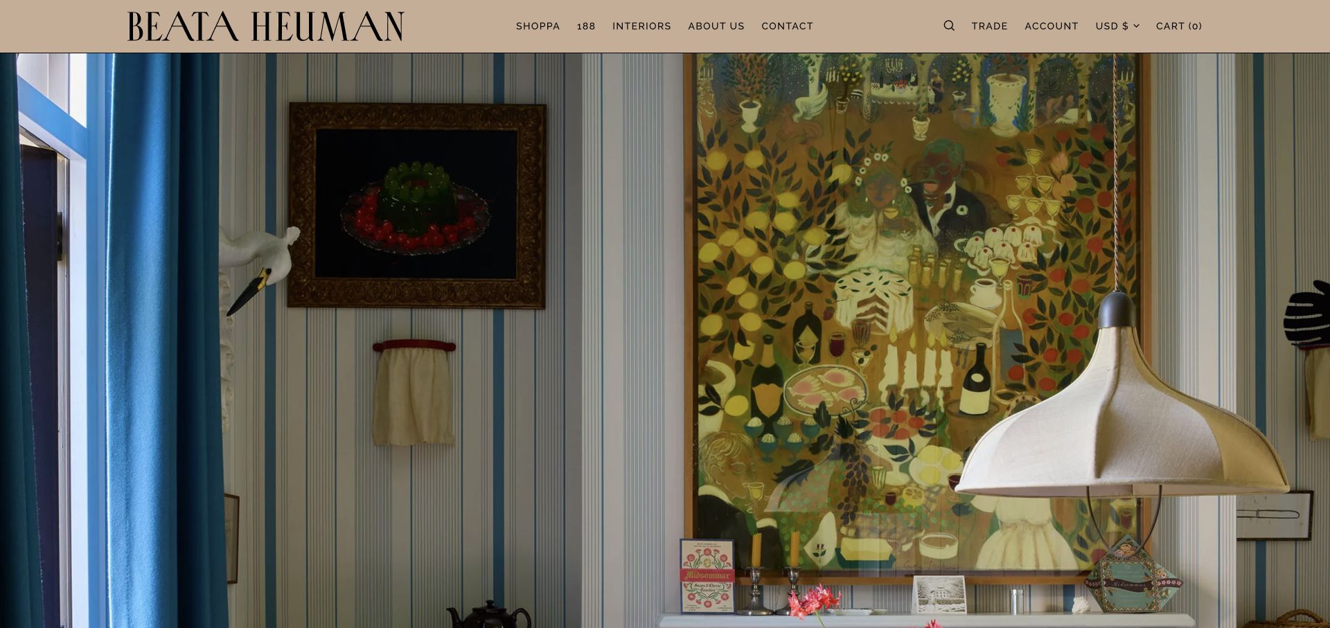
Beata Heuman uses a warm tan header, a large serif wordmark, and clearly labeled routes for the shop, interiors, company information, and contact. A full-width room photograph begins directly beneath the header, showing patterned walls, artwork, a sculptural lamp, and a bright blue window treatment. The image conveys the studio’s layered visual character without an additional explanatory headline. Retail controls remain visible, but the interiors route is also explicit, so the practice is not presented purely as an online store.
What you can learn
When a studio sells products, separate project work from shopping through labels rather than trying to remove the commercial interface. Choose photography that shows the products in a coherent space. The lesson is consistency of character: typography, background color, and imagery should feel related without all using the same decorative motif.
Pros
The room photograph makes the studio’s use of pattern and contrast immediately visible.
Interiors and contact remain distinct from account, trade, and cart tasks.
Cons & considerations
Retail controls add complexity for visitors who only want to commission design.
Without a visible project caption, the opening image provides less context about the work shown.
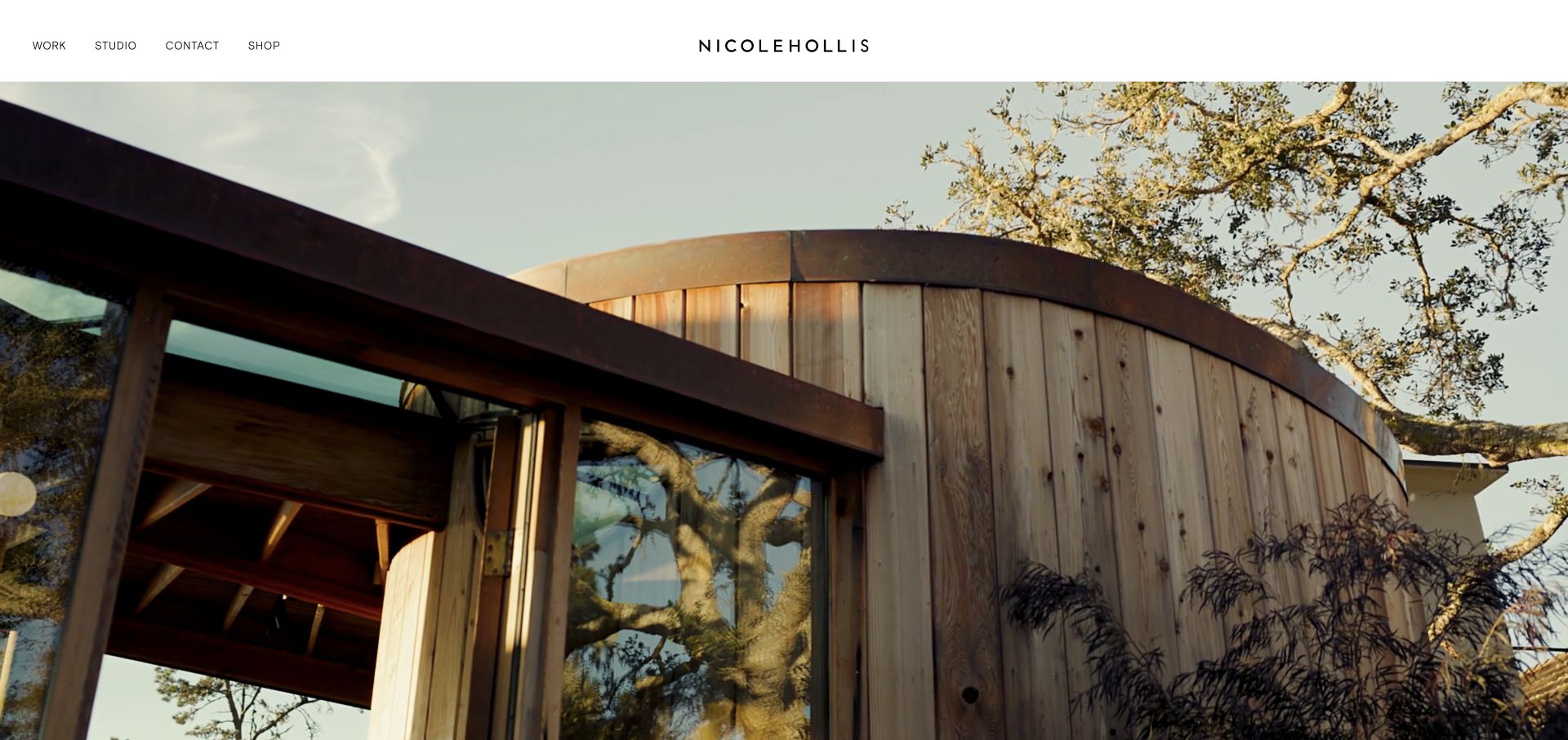
NicoleHollis pairs a slim white header with a project film filling the screen below. The centered wordmark is balanced by work, studio, contact, and shop links on the left. The reviewed frame shows timber, steel, glass, and surrounding trees, emphasizing the relationship between interior and exterior rather than presenting a collage of decorative details. The visual establishes the practice’s material sensibility with almost no promotional copy over it.
What you can learn
If a project film is the opening evidence, keep navigation stable and give the image enough context elsewhere on the page. Separate the commercial collection from the studio portfolio without hiding either. A considered still frame is important because visitors may never see the sequence in the way its editor intended.
Pros
The white header keeps key navigation legible independently of the moving image.
A small set of destinations makes work, practice information, and inquiry easy to distinguish.
Cons & considerations
A text-light opening gives limited immediate explanation of the services or project shown.
The visual argument depends heavily on high-quality media and a coherent fallback when motion is unavailable.
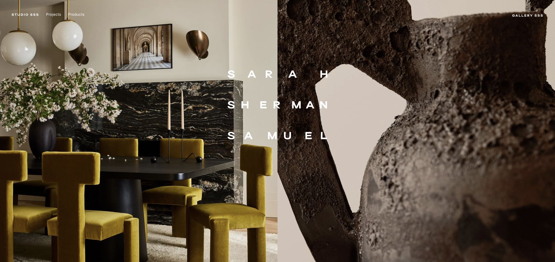
Sarah Sherman Samuel splits the screen between an interior scene and a close view of a textured sculptural object. A widely spaced name spans the middle, while the navigation distinguishes projects, products, and the gallery. The two images share a warm material palette but operate at different scales: one explains a room and the other invites attention to an object. The homepage therefore establishes the relationship between the studio’s spatial work and its independent pieces before the visitor starts browsing.
What you can learn
A split visual can explain two related activities without a paragraph of corporate positioning. Choose images that genuinely belong together, and label the corresponding routes clearly. Keep each half meaningful on its own so the composition can stack on mobile without becoming an unexplained crop of texture.
Pros
The paired room and object images make the multidisciplinary offer understandable visually.
Projects and products are explicit navigation choices rather than mixed into one undifferentiated feed.
Cons & considerations
A name crossing both images can be harder to read where their brightness differs.
The image-led first view still needs clear commissioning and contact information beyond the opening.
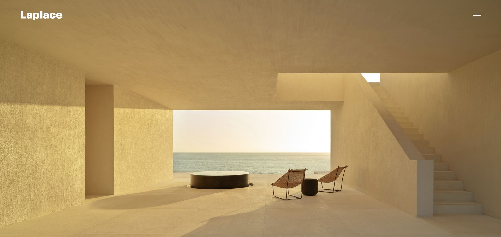
Laplace fills the opening with a single spatial photograph: a warm, sheltered terrace with a sea view, minimal furniture, and strong geometric openings. The white wordmark sits in the upper left and a compact menu icon at the upper right. Small carousel controls are available, but there is no competing sales panel or dense navigation. The image establishes a strong sense of proportion, material, and view, making the first impression about a designed spatial experience rather than a list of capabilities.
What you can learn
For a practice whose work is spatial, select a photograph that reveals structure and atmosphere together. Let the image breathe, but ensure a clear project index and service explanation follow. A minimal cover should make the next step obvious enough that visitors do not mistake the homepage for a static presentation slide.
Pros
The photograph communicates proportion and the relationship between interior and landscape in one view.
Very limited interface elements preserve the composition and focal point.
Cons & considerations
The hidden menu delays access to project categories and contact information.
An uncaptioned hero provides less context for visitors wanting to identify the project or location immediately.
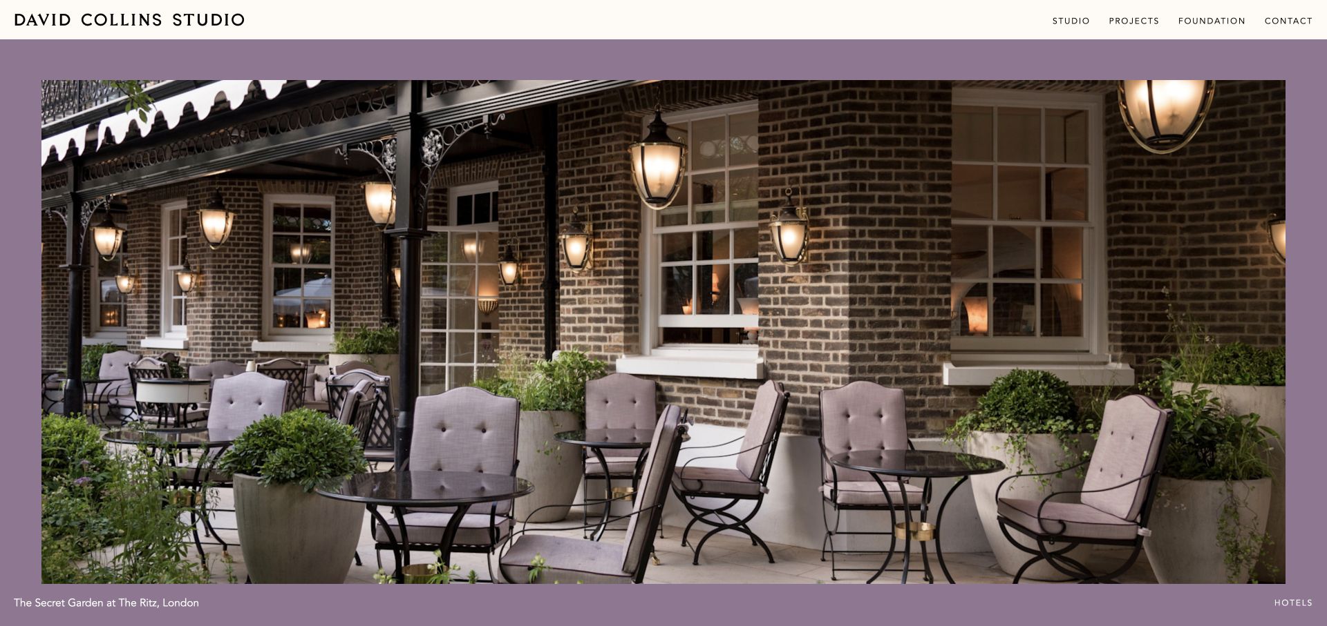
David Collins Studio uses a narrow cream header, a large framed project photograph, and a muted purple surround that relates to the furnishings in the image. The captured slide shows an outdoor hospitality setting, with its project name at the lower left and a category label at the lower right. Navigation stays short: studio, projects, foundation, and contact. The caption is a valuable detail because it makes the large image an identifiable piece of work rather than generic visual atmosphere.
What you can learn
Treat portfolio imagery as editorial content with names and categories. A background color drawn from the project can add character without adding decoration over the photograph. Keep the frame and caption system consistent as images change, so each project can remain visually different while the website still feels cohesive.
Pros
Project and category captions establish useful context directly beside the image.
The colored surround gives the portfolio a distinctive identity without obscuring the work.
Cons & considerations
The large single-project view makes comparison slower than a compact index.
Minimal introductory copy leaves service scope and geographic reach to subsequent pages.
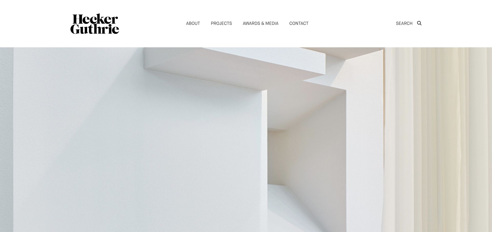
Hecker Guthrie uses a substantial white header with a stacked serif identity and a small set of navigation labels. About, projects, awards and media, contact, and search are visible before a large image begins. The reviewed hero focuses on pale sculptural architectural surfaces rather than a busy room scene. That restraint makes the studio’s graphic identity and attention to material feel connected, while the conventional navigation offers a familiar route into the actual project collection.
What you can learn
A quiet visual system can still be distinctive if the logo, margins, and photography have clear roles. Keep the navigation descriptive and use close-up images as part of a broader portfolio story, not as the only evidence of the work. Visitors comparing firms should be able to reach complete projects directly.
Pros
The plain white header keeps navigation stable and easy to distinguish from the image.
The typographic identity adds character without requiring extra graphics in the hero.
Cons & considerations
A detail-led opening gives less immediate understanding of the kinds of spaces the studio designs.
The tall header uses considerable space before the first project view on smaller displays.
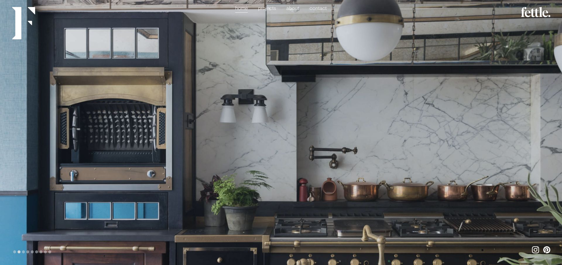
Fettle uses a full-screen interior photograph with a small centered navigation row, a large initial at the left, and its wordmark at the upper right. The reviewed view shows a detailed hospitality kitchen with metalwork, marble, timber, and lighting. Small carousel dots sit at the bottom left, and social icons stay near the opposite corner. The room fills almost the entire frame, allowing the different materials and functional elements to be read together rather than as separate detail crops.
What you can learn
A room-wide image is useful when the studio’s work depends on the interaction between materials and function. Keep the interface quiet, but make project and contact routes explicit. Give the carousel clear controls and provide contextual captions elsewhere so the work is not reduced to an anonymous aesthetic.
Pros
The wide view reveals how several materials and functional elements work together.
Home, projects, company information, and contact are available without opening a hidden menu.
Cons & considerations
Small light navigation can be difficult to read over brighter portions of alternate photographs.
The hero does not immediately identify the project or explain the practice’s hospitality specialization.
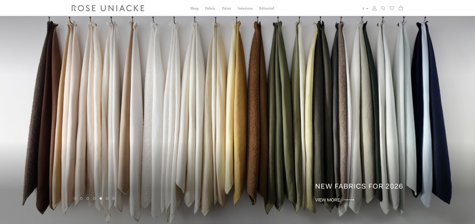
Rose Uniacke uses a restrained white header with a widely spaced wordmark and separate routes for shop, fabric, paint, interiors, and editorial content. The reviewed hero shows a row of fabric samples, with a short collection label and a discovery action in the lower right. The presentation is deliberately material-led rather than showing a complete interior. This makes sense as a combined studio and product business, but it also demonstrates the importance of keeping commissioned interiors discoverable alongside retail categories.
What you can learn
A studio can use products as an expression of its material philosophy without merging them into the project portfolio. Keep those destinations plainly labeled, and give visitors an easy route back to spatial work. A material image should show texture, range, and context rather than functioning as a purely decorative background.
Pros
The navigation clearly distinguishes interiors from individual product categories.
The material photograph makes the palette and tactile character of the collection visible.
Cons & considerations
A retail campaign may not explain the commissioned design service to first-time visitors.
A rotating hero needs captions and actions that remain readable across very different campaign images.
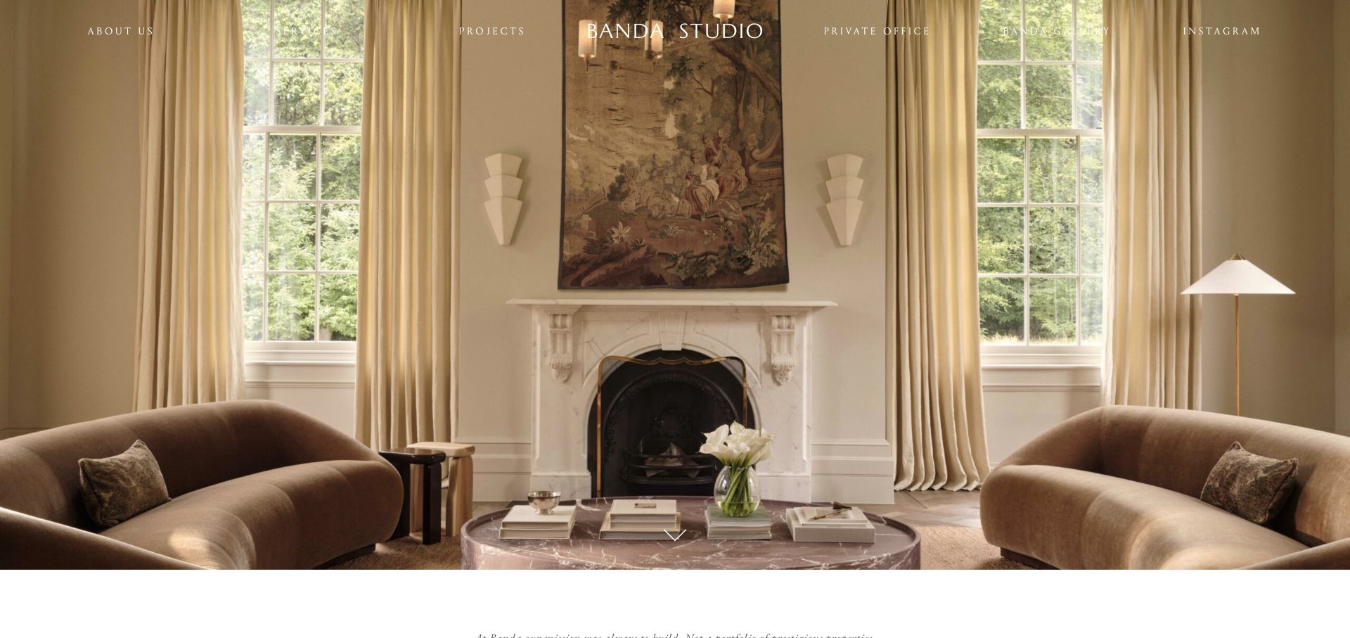
Banda presents a full-width living room with a centered fireplace, paired seating, tall windows, and a restrained neutral palette. The centered studio name aligns with the room’s symmetry, while navigation spans the upper edge in widely spaced lettering. Routes include company information, services, projects, a private office, and a separate gallery. A small downward cue introduces the continuation below. The first impression is tightly composed: the image and interface share the same measured, balanced rhythm.
What you can learn
Align the interface with the photograph’s natural structure when it strengthens the reading order. A central brand can work beautifully over a symmetrical room, but service and project routes must remain legible across all images. Follow the visual statement with a clear explanation of what the practice actually delivers.
Pros
The centered identity reinforces the room’s architectural balance instead of fighting it.
Services and projects are visible routes alongside the studio’s other activities.
Cons & considerations
Widely spaced white navigation can be fragile over pale curtains and windows.
The quiet image-led opening provides limited context about project location, scope, or commissioning process.
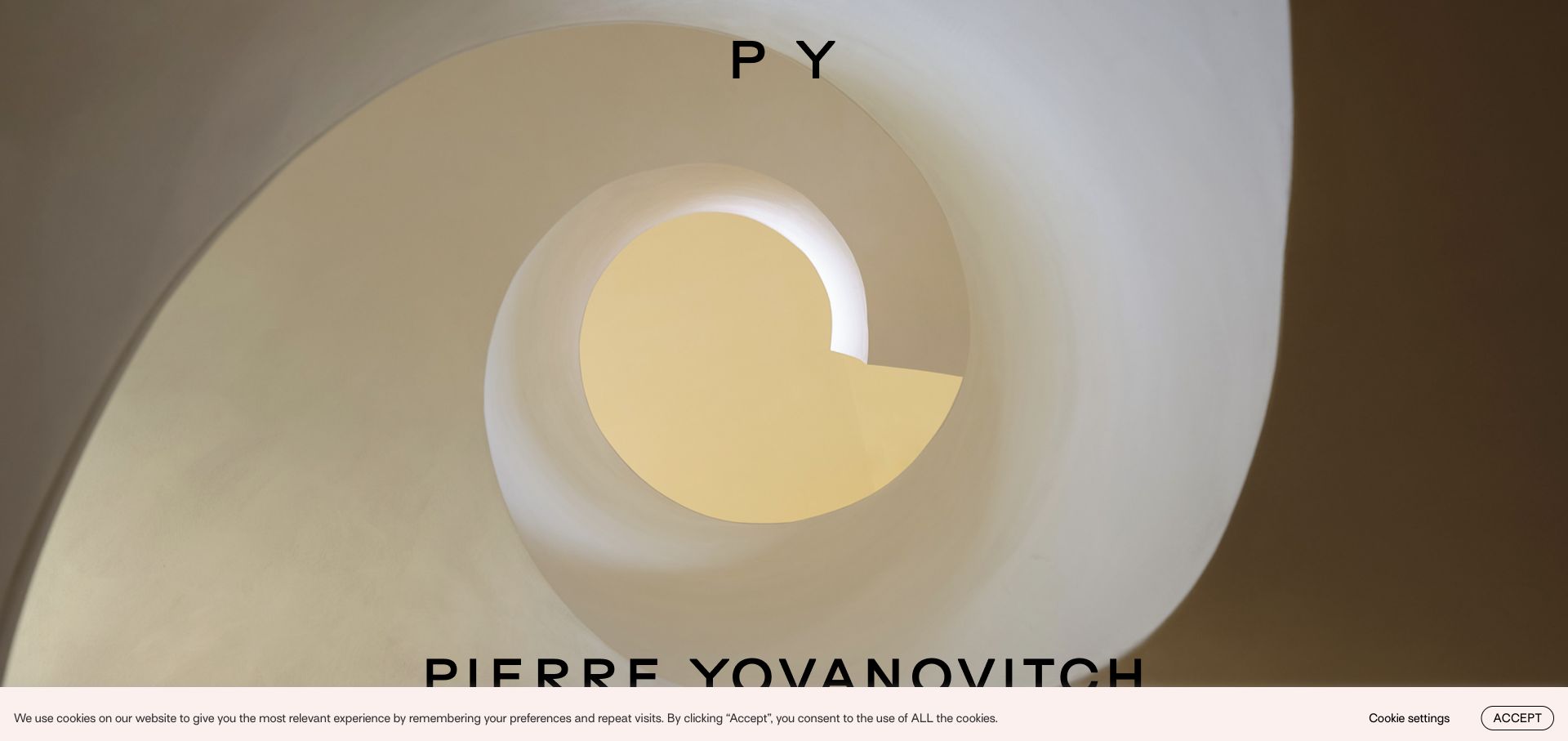
Pierre Yovanovitch opens with a large interior image, a compact monogram near the top, and the full name along the lower edge. The captured view looks up through a curved stair opening, using form, light, and warm surfaces rather than a conventional furnished-room overview. The practice’s project and furniture navigation is held in the broader interface. The image is a strong spatial signature, but it expects visitors to continue exploring before they understand the full range of work.
What you can learn
A distinctive architectural detail can introduce a practice when it is clearly connected to a deeper project collection. Keep the name legible without covering the important geometry, and make the next navigation step predictable. A recognizable visual signature should support clear project discovery, not replace the information needed to commission work.
Pros
The stair photograph communicates sculptural space and light with very little explanatory copy.
The monogram provides a compact identity that leaves most of the work unobstructed.
Cons & considerations
The first view does not immediately explain the relationship between interiors and furniture.
A very large lower-edge name can be cropped or crowded by browser and consent controls.
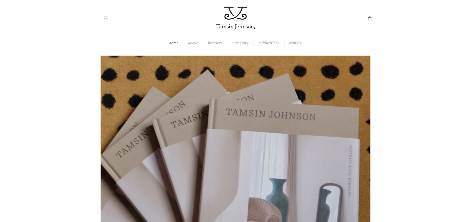
Tamsin Johnson uses a centered monogram and name, a small italic navigation row, and a large image surrounded by white space. The reviewed frame shows a stack of the studio’s publications, making the opening feel like an editorial introduction. Interiors, inventory, publications, and contact are distinct destinations, so the visitor can differentiate commissioned work from objects and books. The overall hierarchy is quiet and highly centered, with the website behaving more like a considered catalog than an aggressive service landing page.
What you can learn
When books and objects are part of the practice, use clear categories to prevent them from obscuring the interior portfolio. A consistent frame can connect publication imagery and room photography. Ensure a first-time visitor can still find service information and contact details without needing to understand the brand’s existing audience.
Pros
The content categories separate interiors, inventory, and publications in plain language.
Generous margins give each image an intentional, publication-like frame.
Cons & considerations
A publication-led first frame says less about the current commissioned interior work.
Small pale italic navigation needs careful contrast and touch-target treatment on mobile.
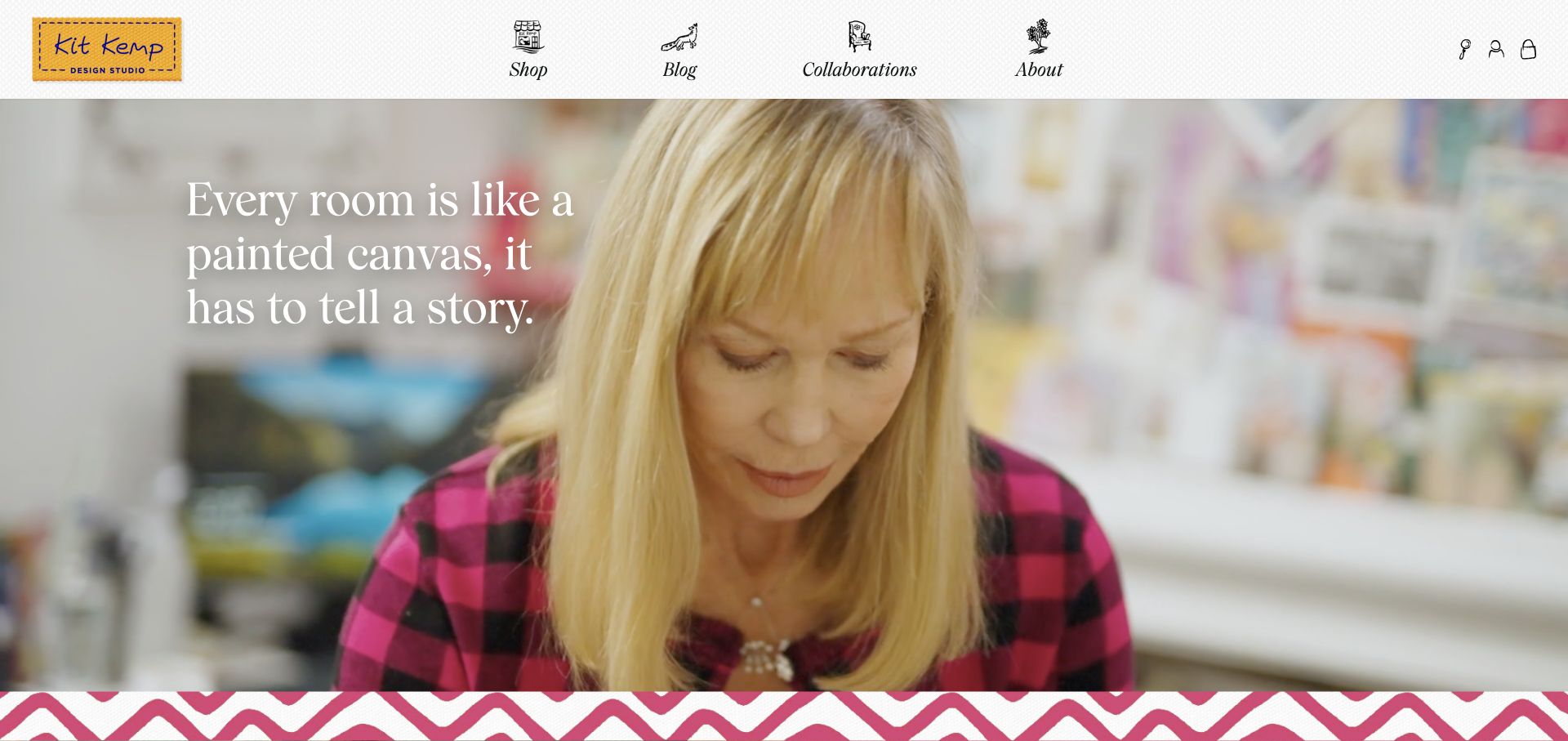
Kit Kemp uses a stitched-label-style identity, small hand-drawn category illustrations, and serif navigation above a large moving visual. Shop, blog, collaborations, and company information each receive an illustrated cue. The captured scene shows a person working with materials, paired with a short statement about rooms and storytelling; a pink zigzag band marks the lower edge. The interface is visibly more playful than the restrained white galleries common in the sector, yet its categories remain recognizable.
What you can learn
Brand character can come from a small set of repeatable details rather than adding decorative effects everywhere. Here, illustration, texture, and pattern make the website feel related to the design work. Keep each icon accompanied by text, and make the route to commissioned spaces or project information as clear as the editorial and retail destinations.
Pros
Illustrations and a textile-like identity create a coherent, memorable visual language.
Text labels accompany the navigation artwork, keeping the categories understandable.
Cons & considerations
Editorial and retail categories dominate the first view more than commissioned project discovery.
Moving imagery and a patterned transition can compete with the overlaid statement if not carefully balanced.
Gather approved photographs, photographer credits, collaborator roles and publication permissions alongside the written project brief. Decide which location details can be public. A beautiful asset library is not ready for publishing until those questions are resolved.
Define the studio’s commissioning process
Write down the actual stages and information needed for an initial discussion. Distinguish a consultation from a full-service commission. A short useful explanation can be more informative than an elaborate brand manifesto.
Set an editorial rhythm the team can sustain
Choose who publishes new projects, press mentions and team changes. Keep an archive that still works when photographs are vertical, horizontal or sparse. Avoid a homepage whose composition only works with one specially cropped launch image.
The editing job behind the design
Choose an editor for projects, credits and flexible imagery
A structured project type should support galleries, short descriptions, credits, categories and related work. Give editors image guidance and focal-point controls where appropriate. Consider how a project can be previewed before publication without exposing private client material.
If the practice also sells products, decide whether the shop belongs in the same system or a separate commerce platform. Keep commission inquiries and product support distinct. A custom front end is justified by a real experience requirement, not by the assumption that an expressive portfolio needs one.
Our WordPress website examples offer a separate look at publishing approaches. A visible platform label is evidence for that named page, not a guarantee that the same system will suit your requirements.
Before the public launch
Interior design website launch checklist
Record photograph licenses, project permissions and collaborator credits.
Check that service scope and project role are described accurately.
Test galleries with mixed image proportions and slow loading.
Confirm project categories and related-work links remain useful on mobile.
Route commission, press and product inquiries appropriately.
Assign an owner for new projects, team changes and rights corrections.
These checks are a project checklist, not a performance, legal, security, or accessibility certification. Test real journeys with the people responsible for the website before making claims about the result.
Sources & editorial method
How this collection was selected and reviewed
We reviewed official interior design practice sites with varied project types and publishing models. Notes concern portfolio presentation and inquiry clarity; they do not evaluate design services or claim that visual choices produce a measured business outcome.
Each example links to its actual source page. Screenshots are direct browser captures with their own capture dates; moving imagery, announcements and live designs can change. The notes describe observable design choices and conditional tradeoffs, not measured traffic, conversion results, service quality, or accessibility conformance.
Technology labels use public page metadata, asset evidence, or explicitly cited platform documentation. Platform documentation is not a complete current deployment audit. A component reference may be legacy or unused; it is not a complete backend inventory. Unknown stacks are omitted. These sites are editorial examples, not our client portfolio.
Written, Edited and Curated are separate editorial records, not timestamps advanced by a rebuild. Website designs and imagery belong to their owners. See our editorial standards or suggest a correction.
Questions worth asking
Interior Design website design questions
How many projects should a studio show?
Enough to demonstrate relevant range without diluting the point of view. A smaller set with strong context can be more useful than a large unexplained archive. Choose projects that reflect the work the studio actually wants to discuss.
Should every project have its own page?
A dedicated page is useful when it can provide a coherent gallery, brief and credits. Very small or private projects may fit a more selective overview. Let the available approved material determine the format.
Can an image-only portfolio work?
It can create an impression, but it makes scope, context and accessibility harder to communicate. Add concise readable descriptions and sensible navigation even if the imagery remains dominant.
Should budgets be in the inquiry form?
Ask only if the studio uses that information to assess fit, and explain the context. Optional ranges can be less intimidating than a mandatory exact number. Do not imply a fixed quote before the scope is understood.