Definitive guide · Site Kit by Google website development
Best Site Kit by Google Websites of 2026 (20 Real-World Examples)
WordPress websites with dated Site Kit evidence
These 20 examples pair visible website design with public evidence of Google’s Site Kit plugin, while keeping measurement configuration separate from appearance.
Site Kit brings selected Google service information into WordPress. It is not a page builder, so the designs below are examples of sites with a supported plugin association rather than layouts produced by Site Kit.
Heatherwick Studio, Hensel Phelps, La Marzocco, Noma, and Market Basket open the collection. Existing direct captures retain their original dates, and each plugin observation keeps its own audit date.
Before the examples
What makes good Site Kit by Google website development in 2026?
Define the measurement question first
Decide which decisions the team needs to make about content discovery and useful visitor actions. A dashboard is valuable only when someone can connect its metrics to a practical question.
A google-site-kit resource establishes an association, not which Google products are connected, whether data is complete, or what an administrator can see.
Keep website design independently accountable
Review navigation, service information, and action labels on their own merits. The presence of a measurement plugin cannot establish conversion performance.
The collection · 20 examples
20 Site Kit by Google website examples worth studying
The association is based on dated public google-site-kit resource observations. No private WordPress dashboards, Google accounts, or conversion results were inspected.
We start with five recognizable brands or organizations: Heatherwick Studio, Hensel Phelps, La Marzocco USA, Noma, Market Basket. Each attribution applies to the named website property, not every product or website belonging to its organization. This is a curated reading sequence, not a measured ranking.
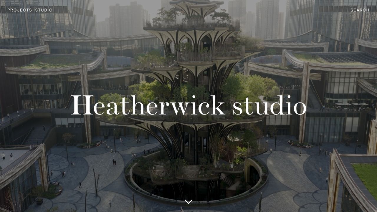
Heatherwick Studio places a dramatic architectural photograph behind an unusually large serif wordmark. Projects and Studio occupy one corner, Search the other, and a downward arrow supplies the only additional prompt in the opening view. That restraint creates a clear contrast between viewing work, understanding the practice, and finding something specific. The dated public audit identifies a Site Kit consent-mode script in the WordPress plugin directory. This supports plugin presence on the inspected page, not a claim about its private reporting configuration or consent compliance. The visual design belongs to the studio website; Site Kit is an accompanying integration rather than the source of the layout.
What you can learn
Define a small number of meaningful discovery routes before adding analytics. A portfolio can distinguish project exploration, organizational research, and search while preserving an immersive opening; assess each journey separately instead of treating all homepage clicks as equivalent engagement.
Pros
Minimal navigation leaves the architectural work visually dominant.
A scroll cue provides an alternative to opening a menu.
Cons & considerations
The opening image does not identify the featured project.
Small white navigation relies on sufficient contrast throughout the background.
Platform source: Public-page Site Kit observation, 2026-11-03. The exact public-page audit observed Site Kit by Google resource references. This identifies plugin delivery on the source page, not private dashboard access, analytics configuration, consent behavior, or measured results. Platform evidence is separate from the direct website screenshot and is not a complete current infrastructure audit.
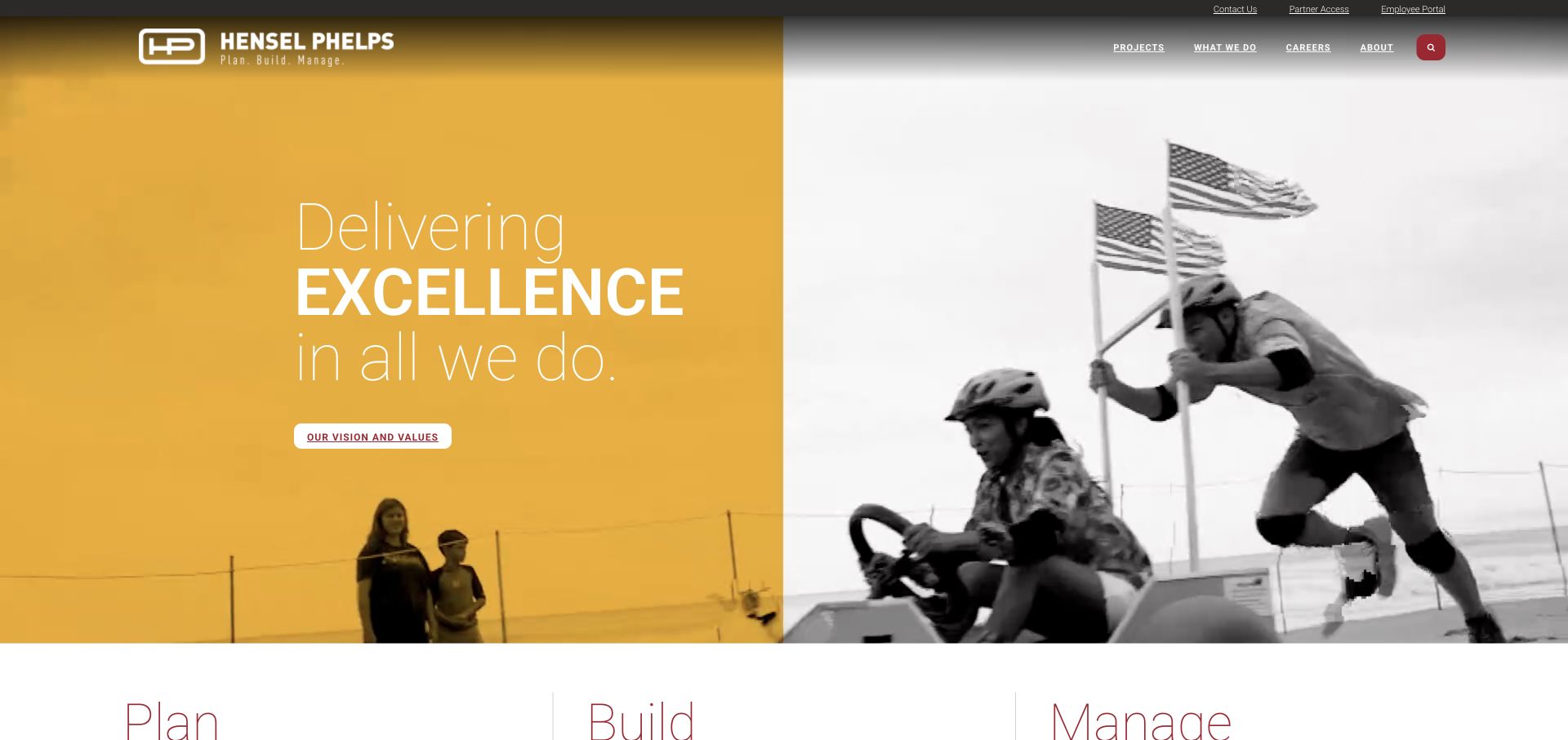
Hensel Phelps divides its opening campaign into a yellow message panel and monochrome photography, then introduces Plan, Build, and Manage beneath it. The top navigation serves projects, capabilities, careers, and company information, while a quieter utility strip handles contact and existing partner or employee access. A dated audit observed a Site Kit content-events script on this public WordPress page. The observation does not establish which clicks are recorded, how reporting is configured, or what runs inside the linked portals. The useful design lesson is the separation of audience tasks: a prospective client and a returning employee are given visibly different entry points.
What you can learn
Give corporate campaigns a structured landing place. Pair the broad brand statement with named service categories and keep recurring operational links in a stable utility area, so later measurement can distinguish discovery from routine access.
Pros
The service trio introduces a memorable capability structure.
Utility links avoid overwhelming the primary project and careers navigation.
Cons & considerations
The opening values message is less specific than the service labels below.
Light navigation over changing imagery can be difficult to read in some frames.
Platform source: Public-page Site Kit observation, 2026-11-03. The exact public-page audit observed Site Kit by Google resource references. This identifies plugin delivery on the source page, not private dashboard access, analytics configuration, consent behavior, or measured results. Platform evidence is separate from the direct website screenshot and is not a complete current infrastructure audit.
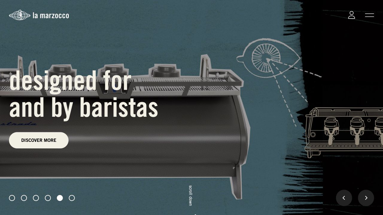
La Marzocco USA treats its opening product campaign like a textured editorial spread. A large espresso machine, hand-drawn details, and condensed white lettering establish the category before a single Discover More button asks for the next step. Pagination dots and directional arrows reveal that this is one of several campaign panels, while account and menu icons remain in the upper corner. The recorded public audit found a Site Kit consent-mode script in the WordPress plugin path. That evidence concerns this regional public property; it does not verify commerce reporting, purchase attribution, or settings across other La Marzocco websites.
What you can learn
Keep each product campaign focused on one next action and give it a destination that explains the product. When reviewing a carousel, consider individual campaign exposure and navigation separately; the presence of an analytics integration alone says nothing about campaign effectiveness.
Pros
The product remains recognizable within the expressive collage.
A single primary button avoids competing purchase and discovery instructions.
Cons & considerations
Discover More is less informative than a product-specific destination label.
Icon-only navigation and multiple slides add steps before visitors can compare products.
Platform source: Public-page Site Kit observation, 2026-11-03. The exact public-page audit observed Site Kit by Google resource references. This identifies plugin delivery on the source page, not private dashboard access, analytics configuration, consent behavior, or measured results. Platform evidence is separate from the direct website screenshot and is not a complete current infrastructure audit.
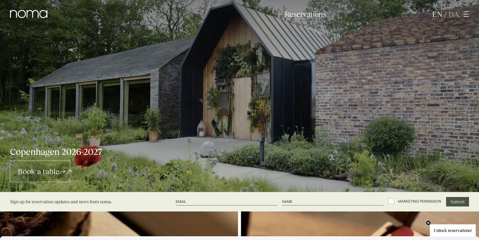
Noma’s photographed entrance creates a strong sense of place, but the opening screen also has concrete business paths. A dated Copenhagen season sits above Book a Table, Reservations remains in the header, and a horizontal newsletter form offers a separate route for visitors who want future updates. Language controls sit beside the menu. Public audit evidence includes Site Kit content-event and Contact Form 7 integration scripts. Those files establish an observed integration, not a verified newsletter submission, reservation outcome, or private conversion report. The screenshot retains its original capture date; the season shown is an editorial detail of that view rather than a promise of current availability.
What you can learn
Separate immediate booking intent from interest in future announcements. Give each a recognizable label and keep permission wording next to the subscription fields, then evaluate the journeys as different tasks rather than one generic conversion.
Pros
The season and booking action appear together.
Newsletter permission is visible beside the form controls.
Cons & considerations
The newsletter bar and floating reservation prompt compete near the lower edge.
White text over the garden photograph depends on local image contrast.
Platform source: Public-page Site Kit observation, 2026-11-03. The exact public-page audit observed Site Kit by Google resource references. This identifies plugin delivery on the source page, not private dashboard access, analytics configuration, consent behavior, or measured results. Platform evidence is separate from the direct website screenshot and is not a complete current infrastructure audit.
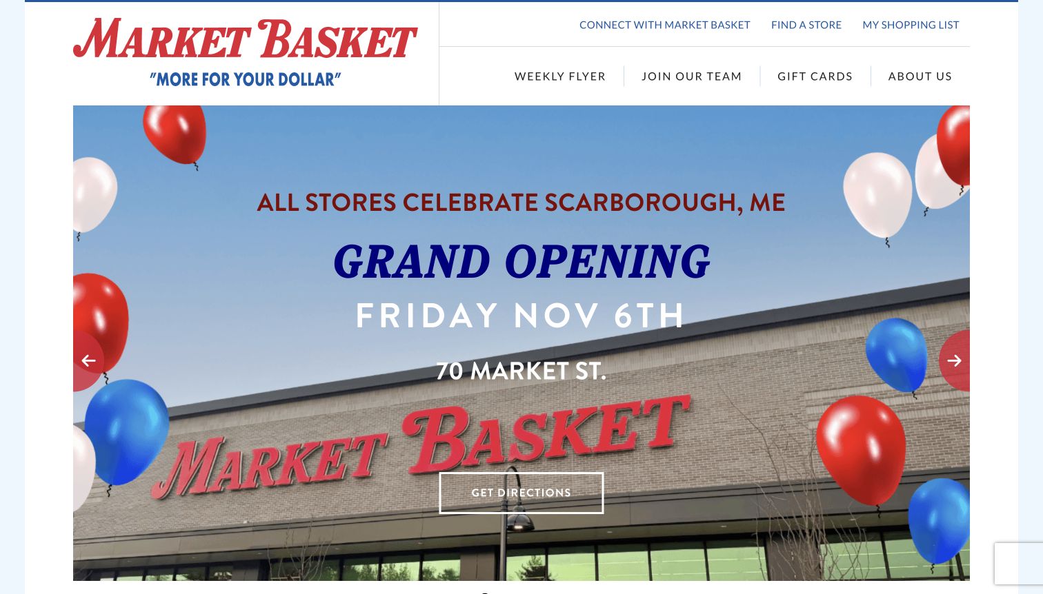
Market Basket’s captured homepage promotes the Scarborough store opening with a large storefront photograph, a prominent date, and a directions action. Above it, two navigation rows preserve everyday tasks such as finding a store, reading the weekly flyer, and opening a shopping list. This makes a location-specific campaign coexist with repeat shopping behavior rather than replacing it. A dated public-page audit identified a Site Kit content-events script under the WordPress plugin directory. It does not prove that directions clicks are tracked or that any resulting store visits can be attributed to the website. The announcement is documented as captured, not presented as a future event.
What you can learn
Keep location and date information close to a campaign action, while preserving stable shortcuts for returning customers. Review campaign exploration and routine shopping tasks separately so a temporary promotion does not obscure the website’s recurring purpose.
Pros
The directions action has a specific geographic context.
Frequent shopping utilities remain outside the campaign carousel.
Cons & considerations
A tall promotional slide delays other homepage content.
Time-sensitive opening copy needs an explicit retirement or archive plan after the event.
Platform source: Public-page Site Kit observation, 2026-11-04. The exact public-page audit observed Site Kit by Google resource references. This identifies plugin delivery on the source page, not private dashboard access, analytics configuration, consent behavior, or measured results. Platform evidence is separate from the direct website screenshot and is not a complete current infrastructure audit.
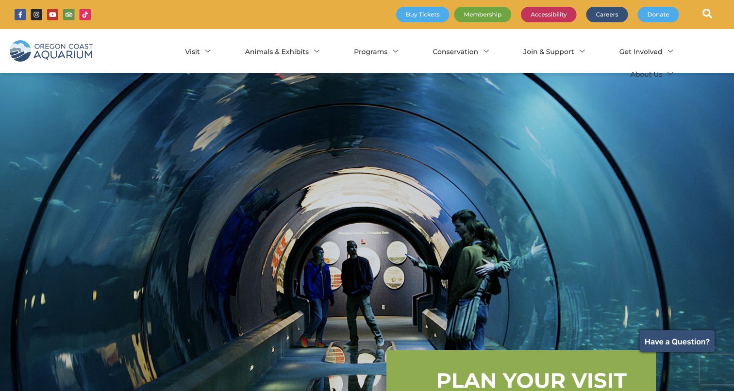
Oregon Coast Aquarium uses a tunnel photograph to make the visitor experience tangible before presenting the Plan Your Visit panel. A bright utility strip keeps tickets, membership, accessibility, careers, and donations visible, while the main navigation handles animals, programs, conservation, and participation. The result is a public attraction page with several clearly named intentions rather than a single undifferentiated call to action. Its dated audit recorded Site Kit content-event and Contact Form 7 integration scripts. This confirms public plugin references; it does not establish ticket checkout tracking, donation reporting, or the accessibility of any linked transaction system.
What you can learn
Organize measurement around the tasks the interface actually names. A ticket purchase, membership investigation, accessibility inquiry, and conservation article serve different visitor needs; keep those paths recognizable before trying to compare their engagement.
Pros
Distinct utility buttons expose the major transactional and support paths.
The photograph demonstrates an experience instead of relying on abstract claims.
Cons & considerations
The dense desktop navigation wraps About Us beneath the main row in this capture.
The floating question prompt overlaps the lower portion of the hero.
Platform source: Public-page Site Kit observation, 2026-11-05. The exact public-page audit observed Site Kit by Google resource references. This identifies plugin delivery on the source page, not private dashboard access, analytics configuration, consent behavior, or measured results. Platform evidence is separate from the direct website screenshot and is not a complete current infrastructure audit.
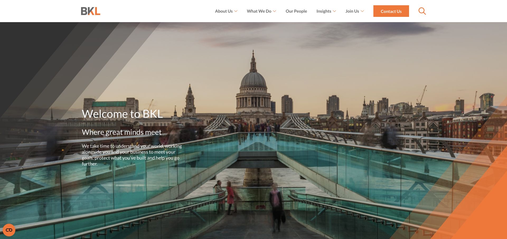
BKL frames its introduction with a London cityscape, diagonal brand graphics, and a short statement about understanding the visitor’s business. The white header is more practical: What We Do, Our People, Insights, and Join Us distinguish prospective clients, readers, and applicants, while an orange Contact Us button remains easy to locate. The public audit recorded Site Kit consent-mode and content-event resources on this WordPress property. Those observations are evidence of integration assets, not proof of lead attribution, reporting quality, or private client-system technology. The review concerns the marketing interface and its visible routes into more detailed information.
What you can learn
Make an atmospheric professional-services introduction answerable by specific next steps. Pair a relationship claim with service, people, and insight routes, and treat contact intent separately from recruitment or article reading when planning an analytics implementation.
Pros
The contact button has a distinct color and stable header position.
People and services receive separate routes for different research needs.
Cons & considerations
The opening welcome message does not immediately name the professional disciplines.
Small white introductory copy sits across a visually busy photograph.
Platform source: Public-page Site Kit observation, 2026-11-03. The exact public-page audit observed Site Kit by Google resource references. This identifies plugin delivery on the source page, not private dashboard access, analytics configuration, consent behavior, or measured results. Platform evidence is separate from the direct website screenshot and is not a complete current infrastructure audit.
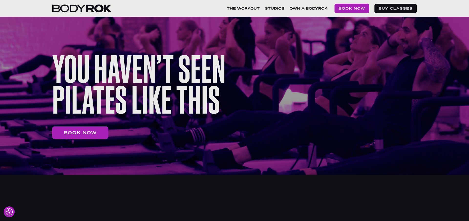
BODYROK opens with a strongly tinted studio photograph, oversized condensed lettering, and a bright Book Now button. The same action appears in the header beside Buy Classes, while The Workout, Studios, and Own a BODYROK serve explanation, location discovery, and business inquiries. That separation is useful because choosing a session and buying class credit are not necessarily the same task. A dated audit observed a Site Kit Ninja Forms integration script on the public WordPress site. It does not demonstrate a submitted form, a completed booking, or analytics coverage inside any separate scheduling service.
What you can learn
Name actions according to the visitor’s next decision. Keep learning about a workout, selecting a studio, booking attendance, and buying classes legible as separate journeys; implementation and measurement should preserve those distinctions rather than collapsing them into a single button label.
Pros
Booking and class purchases receive visibly separate header buttons.
A restricted palette makes the primary campaign action easy to find.
Cons & considerations
The opening claim offers little detail about class format or suitability.
Large campaign lettering leaves practical information below the initial view.
Platform source: Public-page Site Kit observation, 2026-11-03. The exact public-page audit observed Site Kit by Google resource references. This identifies plugin delivery on the source page, not private dashboard access, analytics configuration, consent behavior, or measured results. Platform evidence is separate from the direct website screenshot and is not a complete current infrastructure audit.
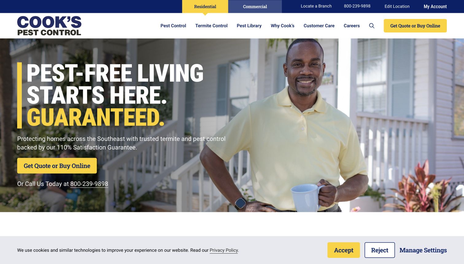
Cook’s Pest Control gives Residential and Commercial a dedicated switcher above its main navigation. Branch location, an editable location control, telephone access, and account entry share that utility row. The hero then combines a household photograph with a quote-or-buy action and a telephone alternative. A dated public audit identifies Site Kit’s content-events script on the WordPress page. It does not verify quote completion, call attribution, service coverage for a particular address, or the guarantee promoted in the copy. The captured cookie banner also remains visible, which is relevant to how much of the initial viewport the campaign occupies.
What you can learn
Establish audience and location context before requesting a service inquiry. Keep phone and online routes explicit, and plan separate evaluation for residential, commercial, and existing-customer tasks instead of assuming every prominent click represents a new lead.
Pros
Residential and commercial audiences have an obvious distinction.
Telephone and online inquiry options appear beside the same service message.
Cons & considerations
The combined quote-or-buy label covers two different levels of commitment.
The cookie banner reduces the visible space available for supporting content.
Platform source: Public-page Site Kit observation, 2026-11-03. The exact public-page audit observed Site Kit by Google resource references. This identifies plugin delivery on the source page, not private dashboard access, analytics configuration, consent behavior, or measured results. Platform evidence is separate from the direct website screenshot and is not a complete current infrastructure audit.
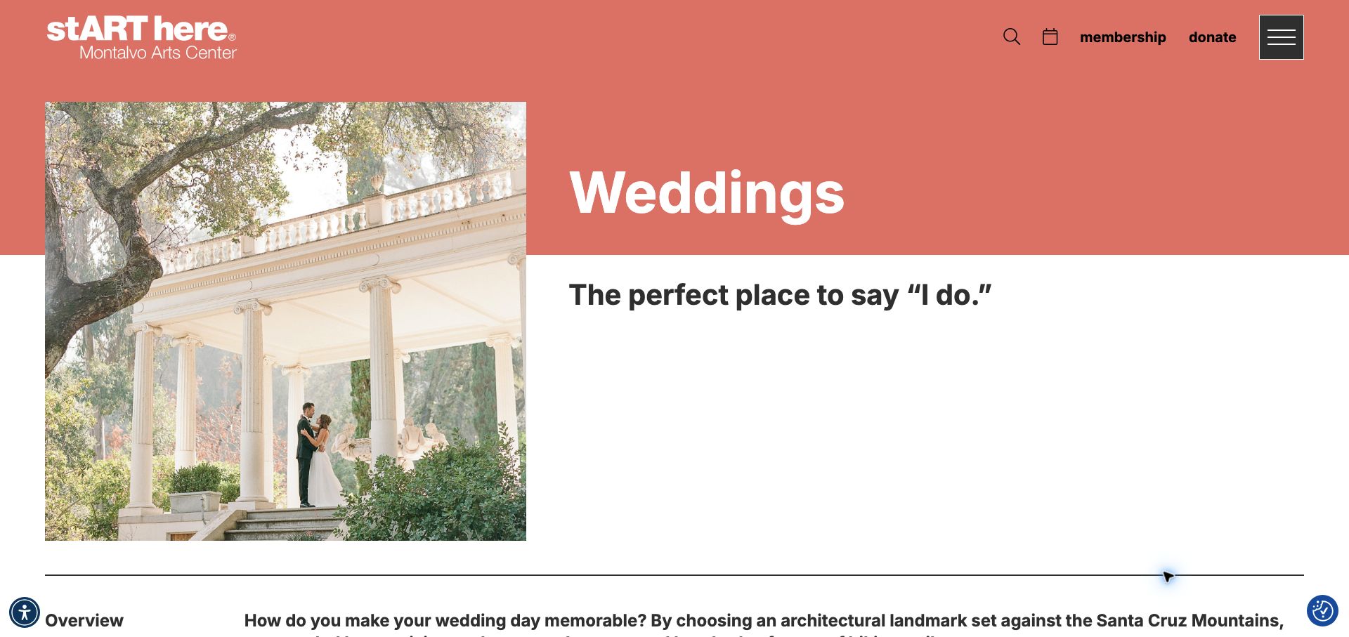
Montalvo Arts Center’s wedding page uses a coral title band, a large ceremony photograph, and a simple Weddings heading to distinguish this service from the institution’s wider program. The image crosses the boundary between the colored header and white body, creating continuity without putting the main title over a busy photograph. Membership, donation, calendar, and search controls remain in the shared header. A dated audit identifies a Site Kit consent-mode script on this exact public page. It does not establish wedding inquiry tracking, booking availability, or analytics behavior elsewhere on the arts center’s website.
What you can learn
Give a specialist landing page an unmistakable subject while retaining the parent organization’s navigation. Evaluate venue research separately from event attendance and donations; a shared WordPress integration does not make these visitor intentions interchangeable or reveal how they are reported.
Pros
The page title states the service immediately.
The asymmetric photograph and title preserve a recognizable institutional design.
Cons & considerations
No inquiry action appears in the initial captured view.
The generous introductory spacing pushes practical venue details beneath the fold.
Platform source: Public-page Site Kit observation, 2026-11-06. The exact public-page audit observed Site Kit by Google resource references. This identifies plugin delivery on the source page, not private dashboard access, analytics configuration, consent behavior, or measured results. Platform evidence is separate from the direct website screenshot and is not a complete current infrastructure audit.
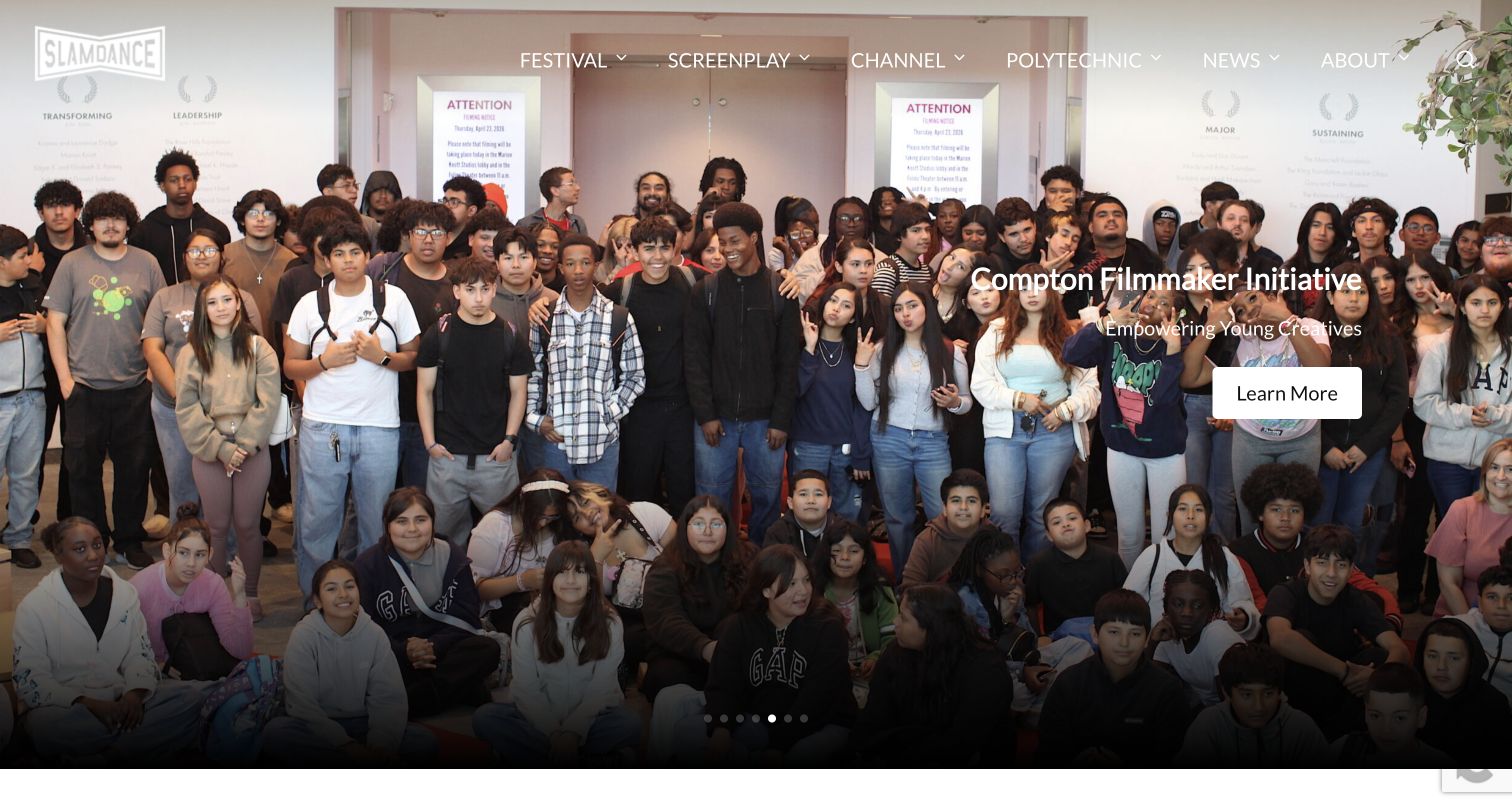
Slamdance’s captured carousel panel promotes its Compton Filmmaker Initiative through a group photograph and a concise invitation to learn more. The header gives Festival, Screenplay, Channel, Polytechnic, News, and About their own routes, exposing a broader organization than the single featured program. Pagination dots make the campaign sequence visible at the bottom of the image. A public audit recorded Site Kit’s content-events resource under the WordPress plugin directory. This is evidence of the integration on the inspected homepage, not proof of video viewing analytics, application reporting, or measurement across every program destination.
What you can learn
Keep program identity visible when a homepage rotates between organizational priorities. Use a specific initiative name beside each action and preserve stable navigation for visitors arriving with an existing goal; compare campaign engagement only with its placement and exposure in mind.
Pros
The featured initiative is named beside its action.
Main navigation separates festival, education, and editorial interests.
Cons & considerations
White navigation crosses bright parts of the photograph.
The generic Learn More label needs surrounding context to explain its destination.
Platform source: Public-page Site Kit observation, 2026-11-04. The exact public-page audit observed Site Kit by Google resource references. This identifies plugin delivery on the source page, not private dashboard access, analytics configuration, consent behavior, or measured results. Platform evidence is separate from the direct website screenshot and is not a complete current infrastructure audit.
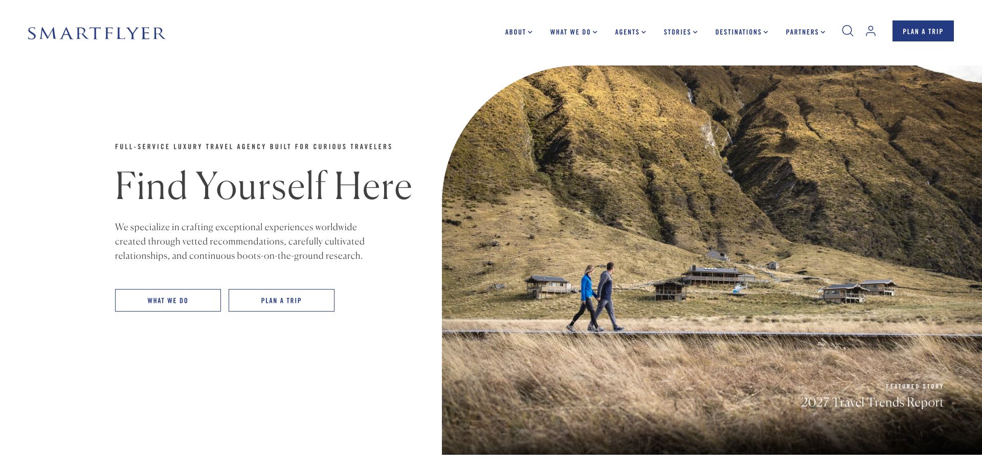
SmartFlyer places a restrained service introduction beside a large destination photograph with an arched corner. What We Do and Plan a Trip appear together beneath the introductory copy, while the header repeats the planning action and separates agents, stories, destinations, and partners. A featured report caption makes the photograph an editorial entry point as well as atmosphere. The dated audit found Site Kit content-event and Mailchimp integration resources. Those references do not establish newsletter delivery, inquiry attribution, or access to a traveler’s private itinerary. The visible design is useful for studying the relationship between editorial discovery and a more committed service request.
What you can learn
Offer a lower-commitment explanation beside a planning action. Name the destination of editorial images, keep agent and destination research accessible, and distinguish reading from inquiry when deciding what a meaningful visitor journey should look like.
Pros
Service explanation and trip planning have separate buttons.
The image caption gives the large photograph an editorial purpose.
Cons & considerations
Small condensed header labels demand careful reading.
The opening aspirational message provides limited detail about the planning process or costs.
Platform source: Public-page Site Kit observation, 2026-11-03. The exact public-page audit observed Site Kit by Google resource references. This identifies plugin delivery on the source page, not private dashboard access, analytics configuration, consent behavior, or measured results. Platform evidence is separate from the direct website screenshot and is not a complete current infrastructure audit.
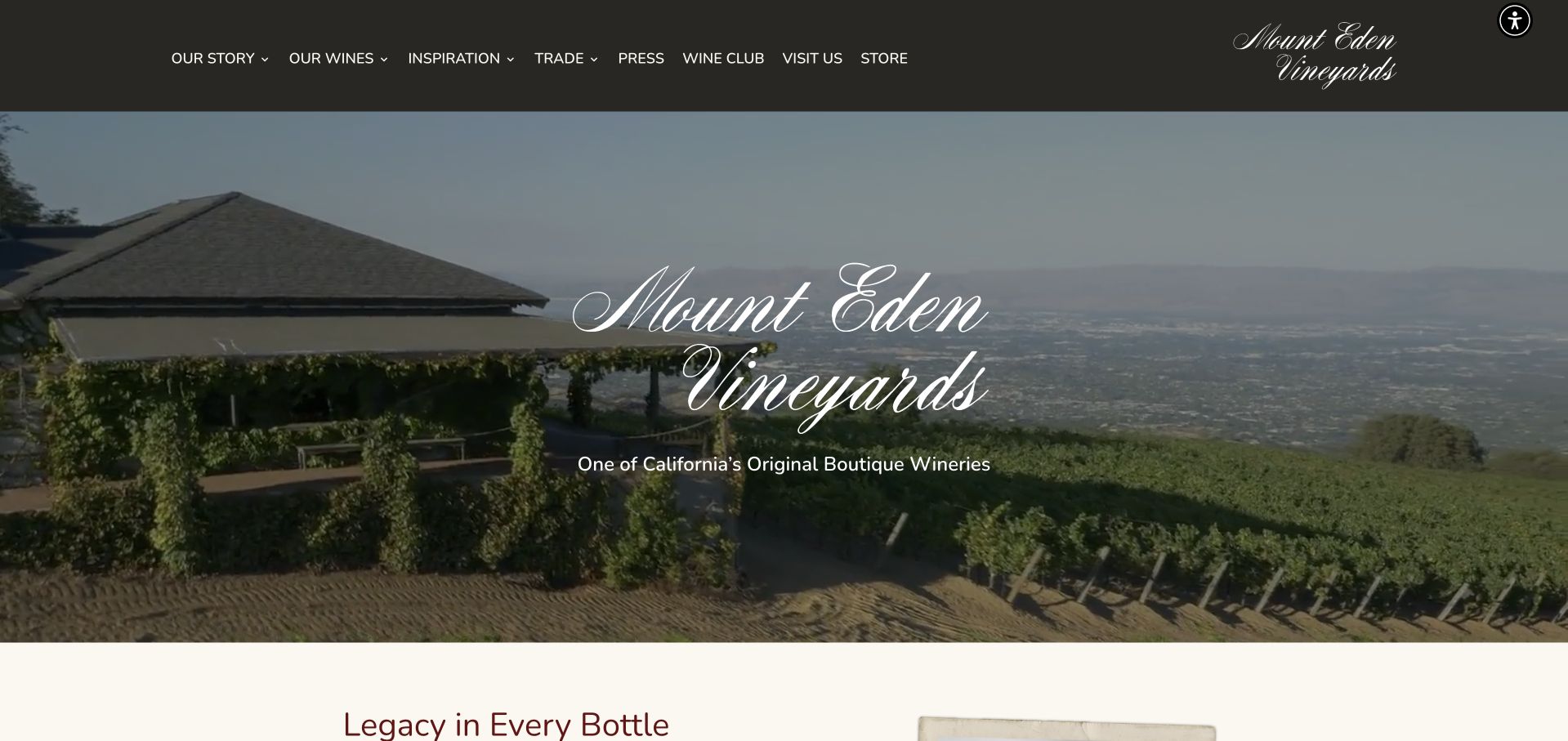
Mount Eden Vineyards uses an elevated vineyard view and script lettering to establish place and heritage. The dark header then supplies a more structured menu: story, wines, inspiration, trade, press, wine club, visits, and store. The contrast between the atmospheric hero and practical navigation is the main point of interest. A dated public audit recorded a Site Kit content-events script on the WordPress homepage. It does not demonstrate purchase attribution, wine-club reporting, tasting availability, or technology inside a linked store. The screenshot documents the public introduction and retains its original capture date rather than implying a new observation of every connected service.
What you can learn
Keep audience-specific routes explicit around a brand-led opening. A trade visitor, a prospective guest, and a retail customer need different supporting information, so preserve those distinctions in navigation and any later measurement plan instead of treating all onward clicks as purchase intent.
Pros
Trade and press routes remain distinct from consumer shopping.
The landscape supports the winery’s sense of place.
Cons & considerations
Decorative script is less immediately readable than the navigation type.
The hero offers no direct action beside its introductory claim.
Platform source: Public-page Site Kit observation, 2026-11-06. The exact public-page audit observed Site Kit by Google resource references. This identifies plugin delivery on the source page, not private dashboard access, analytics configuration, consent behavior, or measured results. Platform evidence is separate from the direct website screenshot and is not a complete current infrastructure audit.
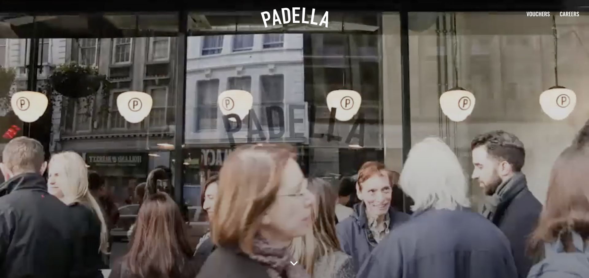
Padella’s captured opening devotes almost the entire screen to the restaurant environment. The centered wordmark, Vouchers and Careers links, and a downward chevron are the main interface elements over the busy scene. The composition communicates energy and place with very little explanatory text, but it also makes scrolling important for visitors seeking practical restaurant information. A dated public-page audit identifies a Site Kit content-events script in the WordPress plugin directory. This supports the presence of that integration, not proof of scroll tracking, voucher sales, reservations, or any relationship between the moving imagery and visitor outcomes.
What you can learn
Decide deliberately how much practical information an atmospheric first screen can defer. Keep an obvious route to the next section, then evaluate whether guests can find location, menu, and visit information without mistaking time spent watching a hero for successful task completion.
Pros
The restrained interface leaves the restaurant scene dominant.
The downward cue makes the intended continuation visible.
Cons & considerations
Location and dining logistics are absent from the captured opening.
Light lettering depends on contrast against changing background details.
Platform source: Public-page Site Kit observation, 2026-11-03. The exact public-page audit observed Site Kit by Google resource references. This identifies plugin delivery on the source page, not private dashboard access, analytics configuration, consent behavior, or measured results. Platform evidence is separate from the direct website screenshot and is not a complete current infrastructure audit.
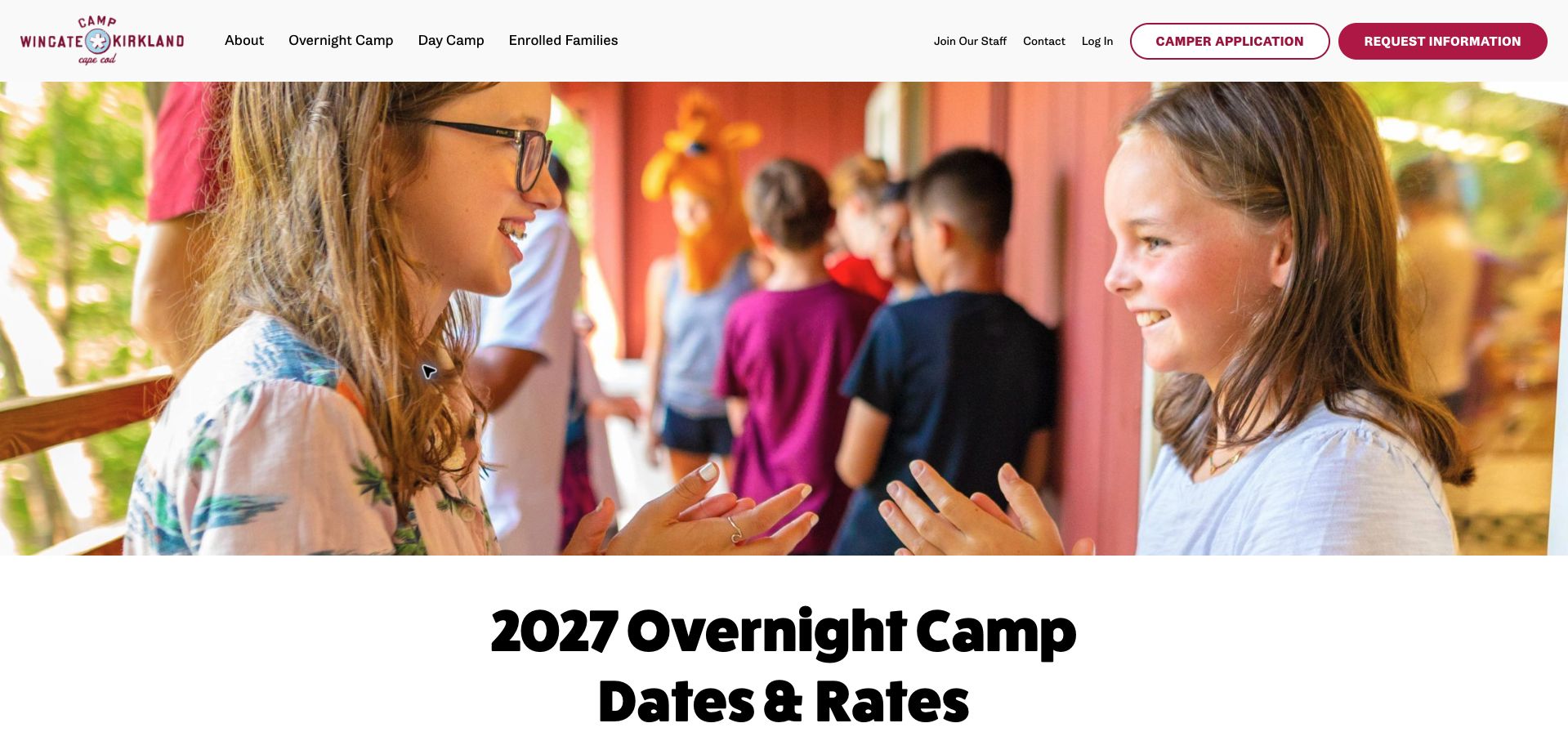
Camp Wingate Kirkland’s dates and enrollment page places a wide camper photograph above a bold 2027 Overnight Camp Dates & Rates heading. The header separates overnight camp, day camp, and enrolled families, while Camper Application and Request Information are distinct buttons. That structure acknowledges that families may be comparing options before they are ready to apply. The dated public audit found a Site Kit content-events script on this exact WordPress page. It does not confirm application completion, collection of camper information, or reporting inside a separate family portal. The displayed year is part of the captured page and should remain explicit in any reused example.
What you can learn
Keep the camp year and program type attached to practical information, and distinguish an inquiry from an application. Content measurement should help assess whether families reach the relevant details without requiring assumptions about private enrollment records.
Pros
The year and overnight program are prominent in the page heading.
Inquiry and application actions have visibly different labels.
Cons & considerations
The large introductory photograph delays the actual dates and rates.
A crowded header gives several audiences competing routes in limited space.
Platform source: Public-page Site Kit observation, 2026-11-07. The exact public-page audit observed Site Kit by Google resource references. This identifies plugin delivery on the source page, not private dashboard access, analytics configuration, consent behavior, or measured results. Platform evidence is separate from the direct website screenshot and is not a complete current infrastructure audit.
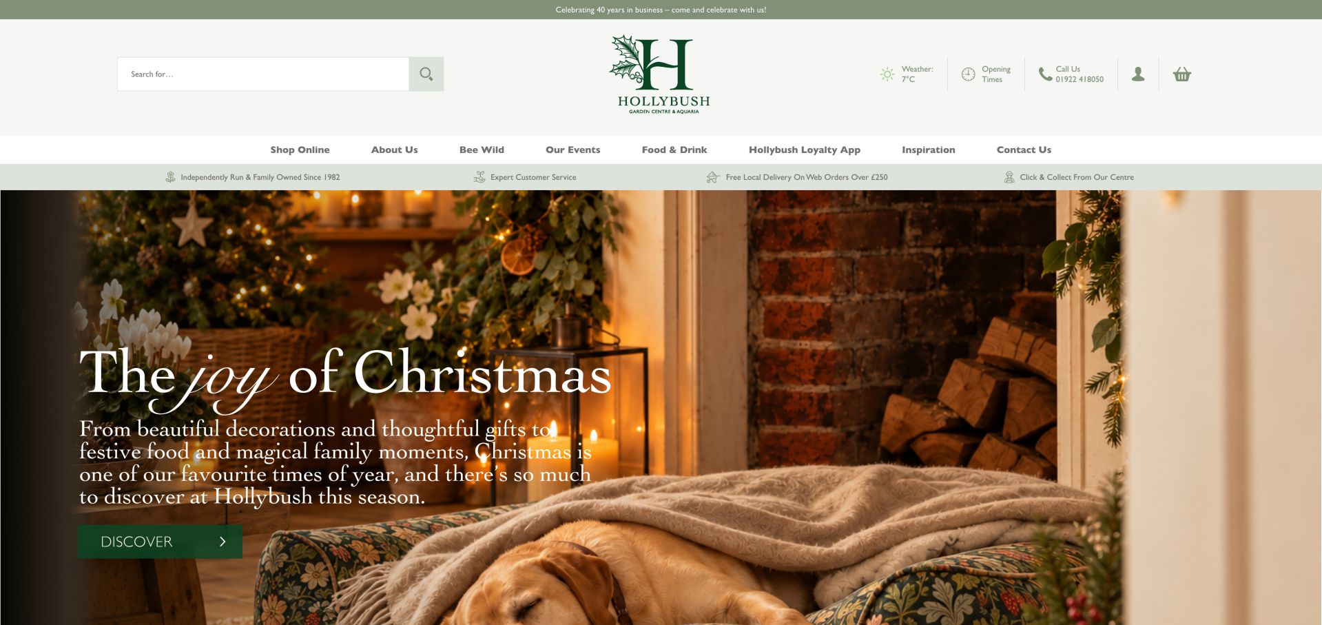
Hollybush combines a seasonal interior photograph with Christmas messaging, while its substantial header preserves product search, opening times, a telephone number, account access, and the basket. The navigation includes online shopping, events, food and drink, inspiration, and the loyalty app, showing how a garden center can serve more than a product catalogue. A dated audit observed a Site Kit consent-mode script on the public WordPress page. This does not verify consent behavior, online revenue attribution, event attendance, or the separate loyalty application. The review concerns the captured public interface and the way it keeps local information available around seasonal promotion.
What you can learn
Keep essential store utilities stable when campaign content changes. Treat product discovery, visit planning, dining, and event research as different tasks, and use specific destinations for seasonal actions so the campaign’s role can be evaluated without assuming every visit is a purchase.
Pros
Search and opening information remain prominent above the campaign.
Delivery and collection messages connect online browsing to local fulfillment.
Cons & considerations
Several stacked header rows consume substantial vertical space.
The generic Discover action does not identify the next page by itself.
Platform source: Public-page Site Kit observation, 2026-11-06. The exact public-page audit observed Site Kit by Google resource references. This identifies plugin delivery on the source page, not private dashboard access, analytics configuration, consent behavior, or measured results. Platform evidence is separate from the direct website screenshot and is not a complete current infrastructure audit.
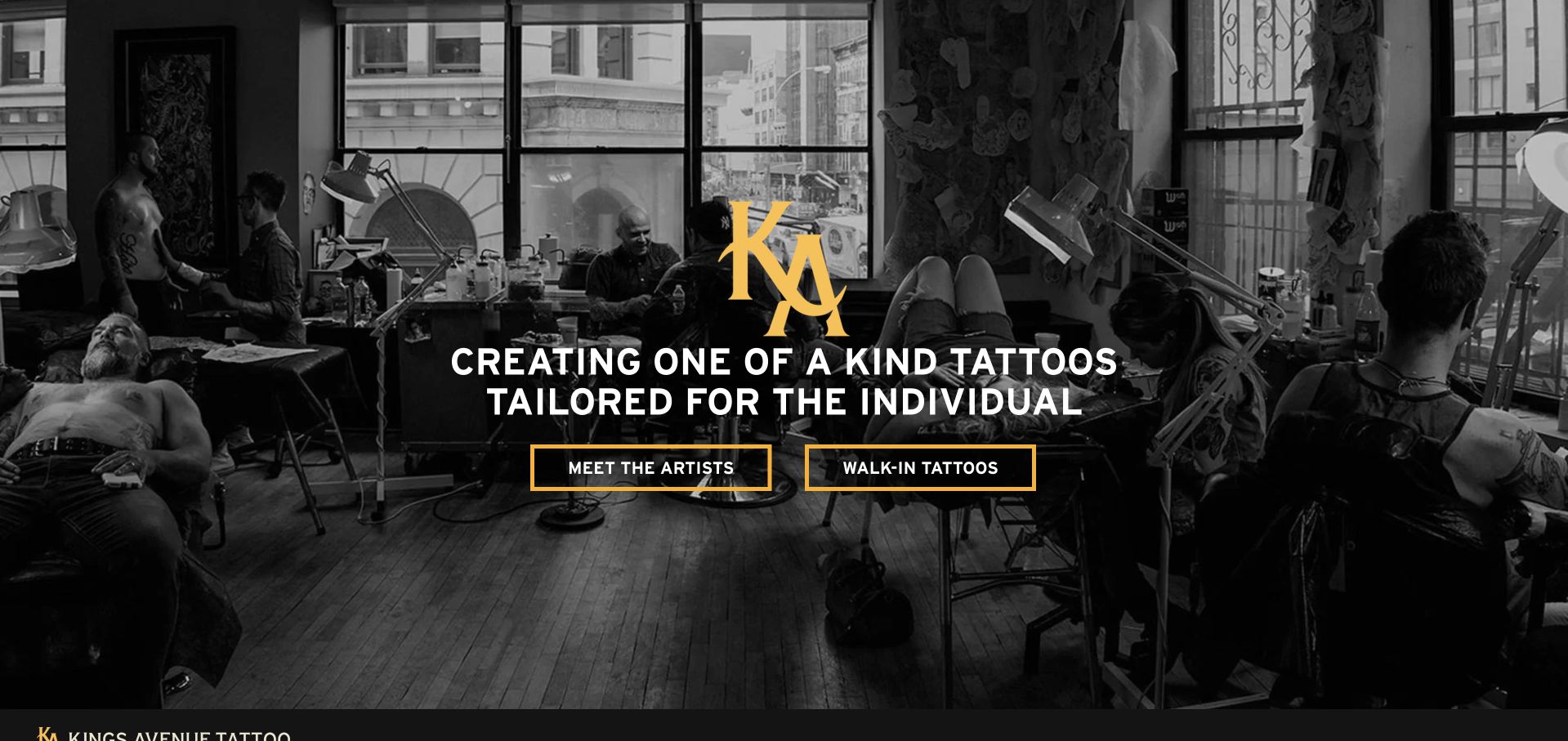
Kings Avenue Tattoo places a gold monogram and white positioning statement over a monochrome studio photograph. Two outlined buttons divide the next step into Meet the Artists and Walk-In Tattoos. The distinction is valuable: selecting an artist through their work and seeking a more immediate visit require different information. A dated public audit identifies Site Kit content-event and Contact Form 7 integration scripts on this WordPress homepage. The references do not prove completed inquiries, appointment availability, or how any customer information is handled. The photographed working environment supplies context, but this website review is not an assessment of tattoo services or outcomes.
What you can learn
Let the opening interface distinguish research from immediate service intent. Connect artist discovery to portfolios and walk-in interest to practical logistics, then evaluate those journeys on their own terms rather than treating every inquiry button as the same conversion.
Pros
The two actions describe meaningfully different visitor goals.
A limited gold, white, and black palette creates a clear hierarchy.
Cons & considerations
The opening view provides no visible location context.
Outlined buttons rely on the darkened photograph to maintain strong contrast.
Platform source: Public-page Site Kit observation, 2026-11-06. The exact public-page audit observed Site Kit by Google resource references. This identifies plugin delivery on the source page, not private dashboard access, analytics configuration, consent behavior, or measured results. Platform evidence is separate from the direct website screenshot and is not a complete current infrastructure audit.
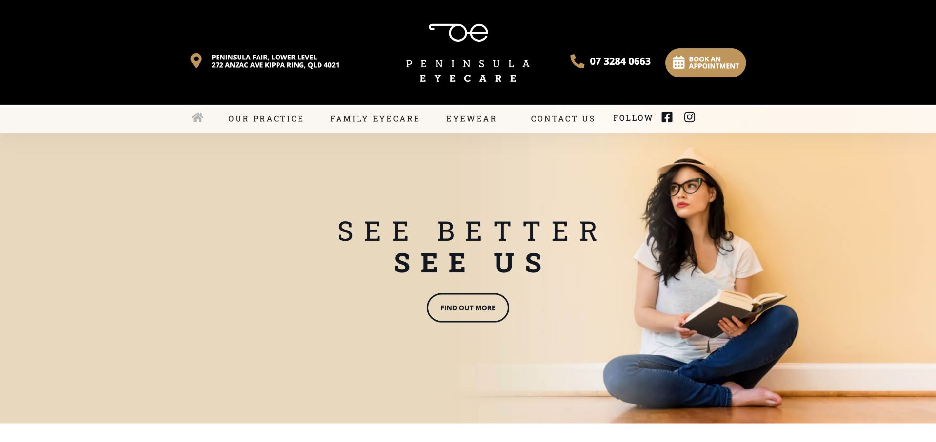
Peninsula Eyecare places its street address, telephone number, and appointment button in a substantial black header above a lighter navigation row. The hero uses a simple eyewear photograph and short slogan, with a Find Out More action for visitors still exploring. Family Eyecare and Eyewear remain separate navigation choices. The dated audit recorded a Site Kit content-events script on the public WordPress homepage. This is evidence of a public integration resource, not proof of appointment tracking, access to patient information, or the technology of a linked booking service. The visual review evaluates information hierarchy rather than clinical care.
What you can learn
Keep location and appointment information outside a rotating marketing message. Give service research and retail browsing their own labels, and distinguish these public journeys from private booking or patient workflows when planning either interface changes or analytics.
Pros
Address, phone, and appointment access are visible together.
Service and eyewear navigation distinguish two common research interests.
Cons & considerations
The two-level header takes a large share of the opening screen.
Find Out More gives little destination detail without its surrounding campaign.
Platform source: Public-page Site Kit observation, 2026-11-06. The exact public-page audit observed Site Kit by Google resource references. This identifies plugin delivery on the source page, not private dashboard access, analytics configuration, consent behavior, or measured results. Platform evidence is separate from the direct website screenshot and is not a complete current infrastructure audit.
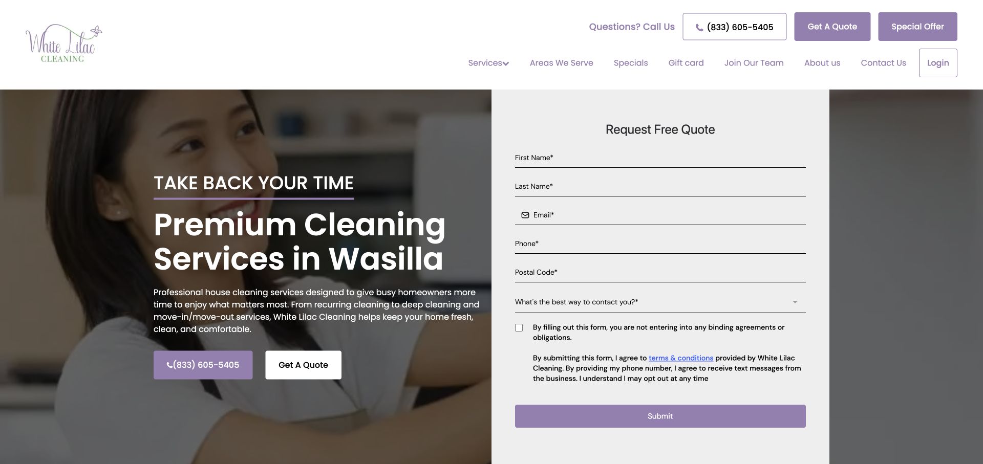
White Lilac Cleaning pairs a Wasilla service introduction with an immediately visible quote form. Names, email, telephone, postal code, preferred contact method, and explanatory consent text appear together, making the requested information visible before submission. Phone and quote buttons are also repeated in the surrounding interface, while service area and recruitment links address other visitors. A dated audit observed a Site Kit content-events script on the public WordPress page. It does not establish successful form delivery, phone-call measurement, or the correctness of consent handling. No quote was submitted as part of this review; the example concerns the public form’s presentation.
What you can learn
Show the practical scope of an inquiry alongside its value proposition. Ask only for information needed for the next step, keep contact preferences and terms readable, and distinguish form exposure from a verified submission when assessing the journey.
Pros
The service location is explicit in the main heading.
The full visible form makes its required fields and terms inspectable.
Cons & considerations
The number of fields makes this a substantial first interaction.
Repeated quote actions can feel redundant beside an already open form.
Platform source: Public-page Site Kit observation, 2026-11-03. The exact public-page audit observed Site Kit by Google resource references. This identifies plugin delivery on the source page, not private dashboard access, analytics configuration, consent behavior, or measured results. Platform evidence is separate from the direct website screenshot and is not a complete current infrastructure audit.
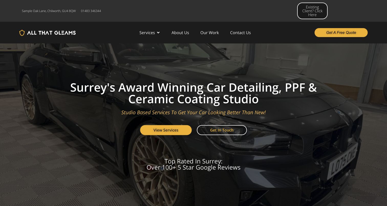
All That Gleams uses a dark vehicle photograph, yellow accents, and a service-specific headline to introduce detailing, paint protection film, and ceramic coating. View Services and Get In Touch sit together in the hero, while a quote button and a separate existing-client shortcut occupy the header. The address and telephone number provide immediate local context. A dated public audit recorded Site Kit content-event and Contact Form 7 integration scripts. These references do not prove lead quality, completed form submissions, or the review and award claims shown in the campaign. The assessment is limited to the public interface and its visible organization of visitor intent.
What you can learn
Provide a comparison route before asking every visitor for a quote, and give existing clients a separate entry. Keep public marketing claims linked to support where possible, and assess service exploration independently from confirmed inquiry completion.
Pros
Service names and geographic context are available in the opening view.
Returning clients receive a distinct shortcut above the main navigation.
Cons & considerations
Several contact and quote labels compete for similar attention.
Prominent reputation claims need supporting detail beyond their appearance in the hero.
Platform source: Public-page Site Kit observation, 2026-11-06. The exact public-page audit observed Site Kit by Google resource references. This identifies plugin delivery on the source page, not private dashboard access, analytics configuration, consent behavior, or measured results. Platform evidence is separate from the direct website screenshot and is not a complete current infrastructure audit.
Kegan has 15+ years of experience working with small businesses, Fortune 500 companies, and everything in between. No development job is too big or too small: he brings the same hands-on attention to a focused improvement, a complete website, or a custom application.
For Site Kit by Google projects, he can help with custom themes and templates, publishing workflows, plugin integrations, migrations, and ongoing maintenance. He works directly with clients on scope, design, implementation, testing, and handover, with an emphasis on clear communication and a system that remains practical to maintain after launch.
Show 3 other Site Kit by Google developersHide other Site Kit by Google developers
Choose the implementation around the operating model
Use a dashboard for a clear reporting routine
Identify who reviews the information, how often, and which content decisions follow. Avoid collecting metrics without an owner.
Integrate with an existing measurement setup
Inventory tags and tools before making changes so the same action is not counted several times. Confirm the actual configuration in an authorized administrative review.
Keep a minimal setup when needs are narrow
Choose only the services and reporting required by the project. Do not assume every integration shown on the product site must be enabled.
From references to requirements
Plan the content and everyday maintenance
Write an event and data plan
Define meaningful actions and the information required to measure them. Keep form contents and private customer details out of event payloads.
Review consent and access behavior
Test the site’s chosen privacy behavior and account permissions in the actual implementation. Public screenshots cannot establish whether these settings are correct.
Validate reports against real workflows
Check page identity, duplicate events, failed submissions, and external handoffs using appropriate test fixtures. Distinguish a button click from a completed business action.
A useful handover demonstration
Ask the actual team to carry out its routine job: publish a realistic update, correct a mistake, preview a narrow screen, and identify who owns an integration failure. For a library or frontend framework, also ask who maintains the content source and deployment. A polished screenshot does not answer those operational questions.
Beyond the screenshot
Site Kit by Google project checklist
Define reporting questions.
Name a reporting owner.
Inventory existing tags.
Avoid duplicate events.
Separate clicks from success.
Keep private fields out of events.
Test consent behavior.
Review account access.
Preserve audit dates.
Document configuration changes.
Test with real content, a keyboard, a small screen, slow or failed requests, and the people who will maintain the system. These are planning checks, not an accessibility, security, performance, or search-ranking certification.
Sources & editorial method
How this Site Kit by Google collection was reviewed
Twenty distinct public properties have direct website captures and original design reviews. The first five are explicitly identified recognizable organizations or established specialists. Platform evidence is scoped to each named property; documentary associations, dated observations, and narrower asset-only signals remain qualified. Captures and technology verification have independent dates. A bounded public stack audit was attempted for every source, preserving inaccessible and unknown results. No private administration or transactions were inspected.
Every image is an unmodified capture from the actual website, with its source and capture date. Some captures are reused from our shared catalog; their dates remain the original capture dates. None comes from a vendor gallery or a generated reconstruction. Moving imagery and live content can change.
Technology attribution uses public page assets or metadata, official platform documentation, or a cited first-party project case study. Documentary and framework-relationship evidence is identified where used; it is not a complete current backend inventory. A CMS image CDN alone does not establish a full CMS deployment. A library’s presence does not prove which individual controls use it, and a platform label does not establish AI authorship.
The composition notes, lessons, pros and tradeoffs are original editorial observations. We have not measured conversion, traffic, security, performance or accessibility conformance. Website owners retain their brands and imagery; these examples are not our client portfolio. Written, Edited and Curated are independent records, not dates advanced by a build. See our editorial standards or suggest a correction.
Questions worth asking
Site Kit by Google website development FAQs
Does Site Kit create these website layouts?
No. The collection concerns a plugin association on WordPress sites, not the tool responsible for the visible design.
Can a public resource reveal the connected Analytics account?
It may expose public identifiers, but it does not establish the complete authorized configuration or reporting access.
Do attractive sites prove strong conversion results?
No. The reviews describe visible design; private performance data was not inspected.
Why are some captures older than the plugin observation?
Capture and technology verification are separate events. Reusing an authentic earlier image does not justify changing its date.