Best Adaptive Sports Program Websites of 2026 (20 Real-World Examples)
Real adaptive sports websites with practical lessons in activity discovery, preparation, participation and community support.
A welcoming photograph should be the beginning of the journey—not the only information someone receives before joining an activity.
People may arrive looking for a particular sport, a first experience, equipment information, a volunteer opportunity or a way to support an organisation. These are different tasks. Adaptive sports websites also need to explain individual program arrangements without assuming that one general statement about inclusion answers every practical question.
This collection includes local activity providers, regional outdoor organisations and larger programs across several settings. Some examples show program or organisational pages rather than homepages; source labels identify the actual view. The reviews assess public website communication, not accessibility certification, medical suitability, staff competence, safety procedures or the outcomes of participating. Ask the actual provider about individual arrangements.
Before the examples
What makes good adaptive sports program website design in 2026?
Help people identify a relevant activity
Use recognisable sport and recreation labels with concise explanations, actual locations and seasonal context. A new participant should be able to understand the broad offer before being asked for an account or personal details.
Explain preparation and individual arrangements
Publish verified information about equipment, lesson format, booking, relevant requirements and assistance routes. Describe what staff can discuss rather than implying that one image or universal welcome establishes suitability for everyone.
Separate participants, volunteers and supporters
Give each audience a clear route. Donations sustain programs, but a fundraising campaign should not obscure practical participation information. Distinguish returning-user login from first-time registration and orientation.
Make dates and operational states dependable
Keep seasons, calendars, availability and registration periods current. Explain cancellations or changed operating arrangements where verified, and provide a practical contact route when a portal or booking system is unavailable.
The collection · 20 examples
20 adaptive sports program websites worth studying
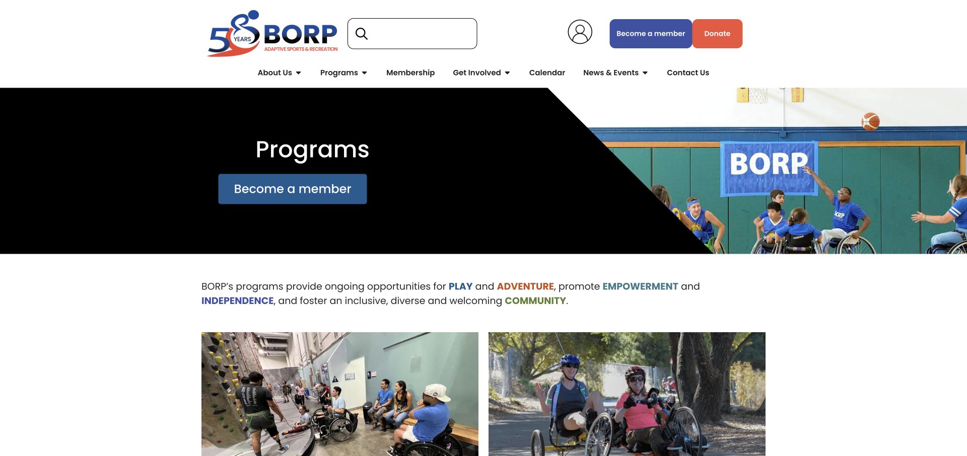
The original random target was 20, saved before research. These 20 distinct providers have directly reviewed public pages and genuine accepted source captures. BORP’s Programs page is the explicit Editors Choice for activity discovery and clear separation of membership, calendar and contact tasks.
BORP’s program page uses a clear heading and membership route, then presents actual activities with photographs and short descriptions. Climbing, cycling, fitness, kayaking and team sports receive recognisable labels rather than a single vague adventure category. The surrounding navigation separates programs, membership, the calendar and getting involved, while the footer records practical contact details.
What you can learn
Organise an activity directory around the choices participants recognise. Use a brief description and relevant photograph to explain each route before asking someone to complete registration. An activity card should lead into its own practical requirements, rather than making membership appear to establish that every sport has identical equipment, assistance or scheduling arrangements.
Pros
Named activities make a varied program easier to scan.
Membership, calendar and contact routes remain distinct.
Cons & considerations
Membership should not be the only way to understand participation requirements.
Repeated small arrow links need clear destinations and consistent labelling.
Oregon Adaptive Sports makes outdoor participation the visual centre of its homepage. The navigation gives programs, events, volunteering and donations separate routes. Within the program structure, registration, equipment, safety, scholarships and operating conditions receive their own destinations rather than being left inside a general mission statement.
What you can learn
Put practical preparation beside the invitation to participate. Weather, equipment and assistance questions deserve clear destinations, particularly when the visual introduction is expansive. Keep operating conditions connected to the activity and date they affect. A scholarship explanation, equipment question and registration action answer different preparation needs, even when all three sit beneath the same outdoor photograph.
Pros
The program navigation names practical preparation topics.
Distinct volunteer and participant routes recognise different tasks.
Cons & considerations
A large rotating visual can leave the first screen short on practical details.
Safety and registration explanations should remain readable without relying on video.
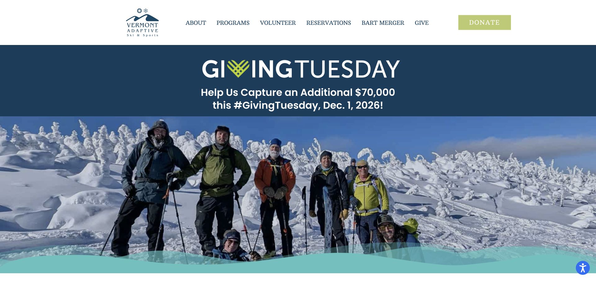
Vermont Adaptive uses winter participation imagery and a restrained regional identity to establish its setting. Programs, volunteering and reservations appear as distinct navigation items. The observed homepage also gives substantial space to a dated fundraising campaign, followed by program news and an invitation to join the volunteer community.
What you can learn
Keep participant tasks visible when a fundraising campaign takes over the main visual area. A seasonal campaign and an evergreen reservation route need different content lifecycles. The reservation route should remain useful after the fundraising artwork changes. Keep campaign deadlines separate from program dates, so an expired appeal does not make the whole organisation appear seasonally closed.
Pros
Reservations and volunteering have recognisable primary navigation labels.
Actual outdoor photographs give the program a local seasonal context.
Cons & considerations
Fundraising occupies much of the observed opening screen.
Campaign dates and program-news archives need clear current and past states.
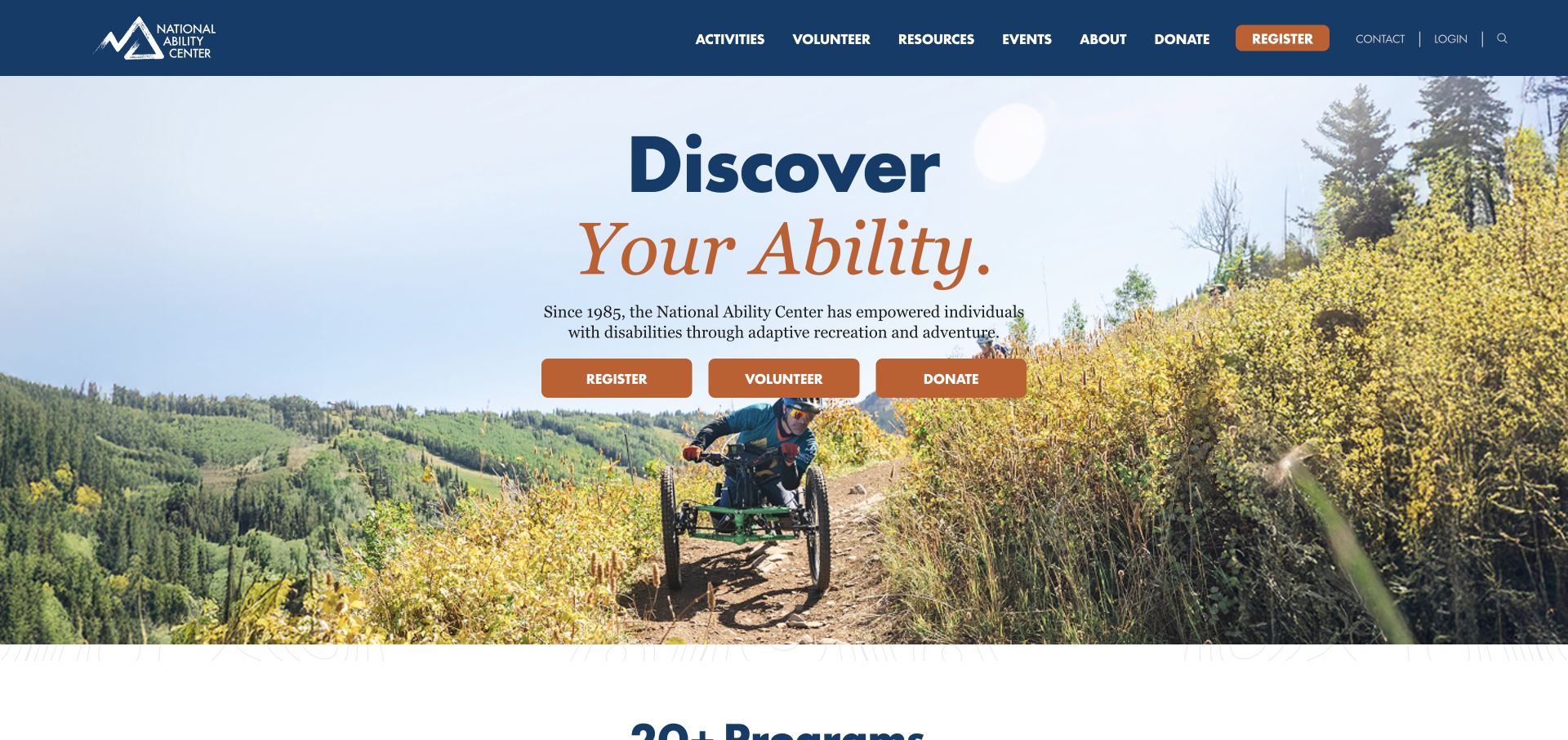
The National Ability Center places a short adaptive recreation explanation above separate Register, Volunteer and Donate buttons. Its large background image shows outdoor participation, while the next section introduces a range of named activities. Contact and login are kept in a smaller utility area rather than mixed into the main introductory sentence.
What you can learn
Use an explicit three-way task split when an organisation depends on several audiences. Pair it with a plain explanation so the buttons do not require prior knowledge. A shared introductory image can connect the audiences emotionally, but each action needs its own explanation of commitment. Volunteering, donating and joining an activity should not begin with interchangeable instructions.
Pros
Register, Volunteer and Donate are visually distinct choices.
Named activity descriptions extend the introductory image.
Cons & considerations
Direct account registration should be preceded by enough program information.
Text placed over changing photography requires reliable contrast.
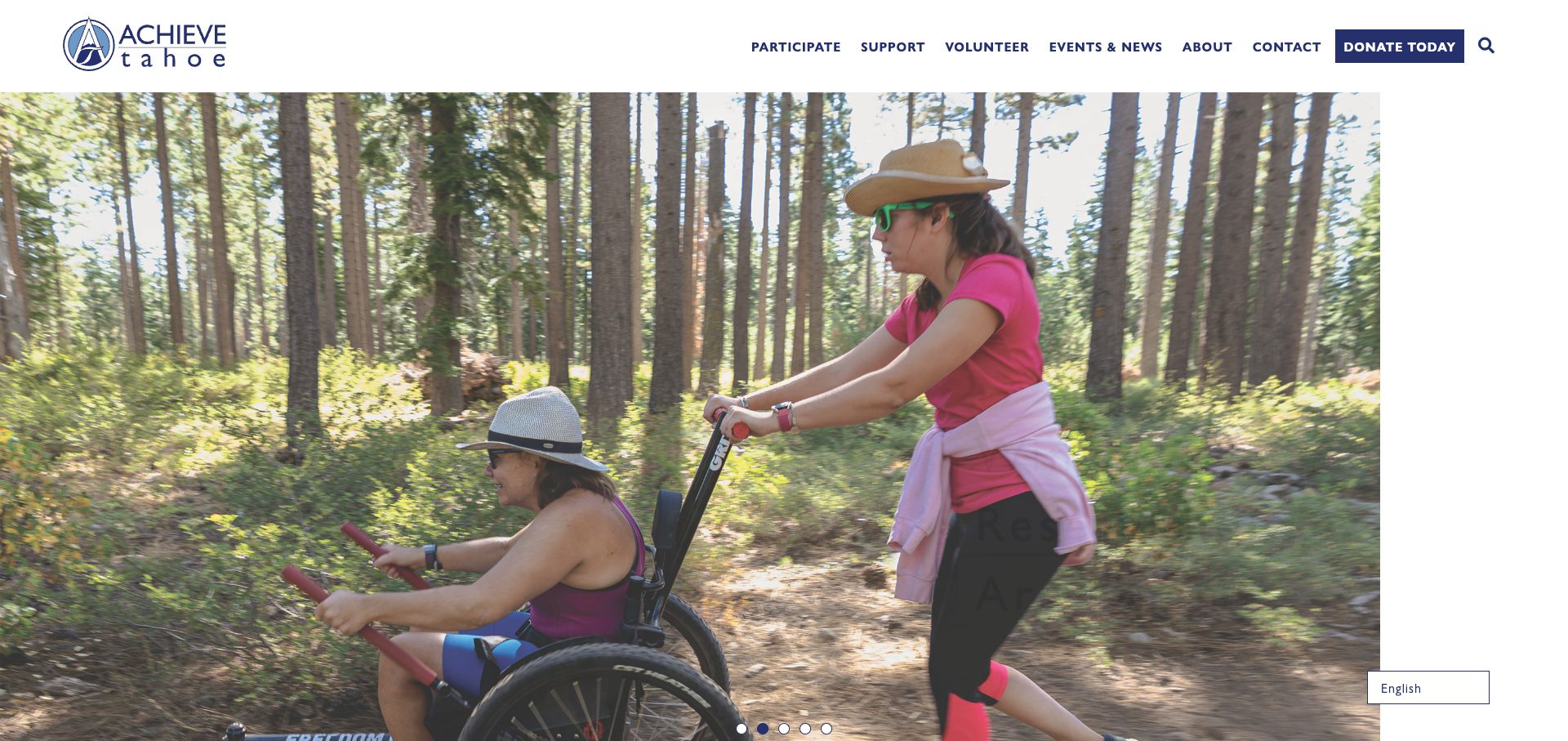
Achieve Tahoe puts Participate at the beginning of its main navigation and separates it from support and volunteering. Program signups, a calendar and individual activities sit within that participation structure. The homepage combines real outdoor photographs with community stories, while the footer distinguishes the mailing address from the physical program location.
What you can learn
Make the participant journey a first-class section and separate the address someone visits from the address used for correspondence. Small logistical distinctions can matter more than another promotional panel. Tie the physical program location to the selected activity and its preparation instructions. The mailing address belongs in correspondence context, not as an ambiguous alternative destination for somebody planning arrival.
Pros
A dedicated Participate section groups activity and signup information.
Physical and mailing addresses are explicitly distinguished.
Cons & considerations
A very large image carousel postpones much practical information.
Calendar and program labels need maintenance as seasons change.
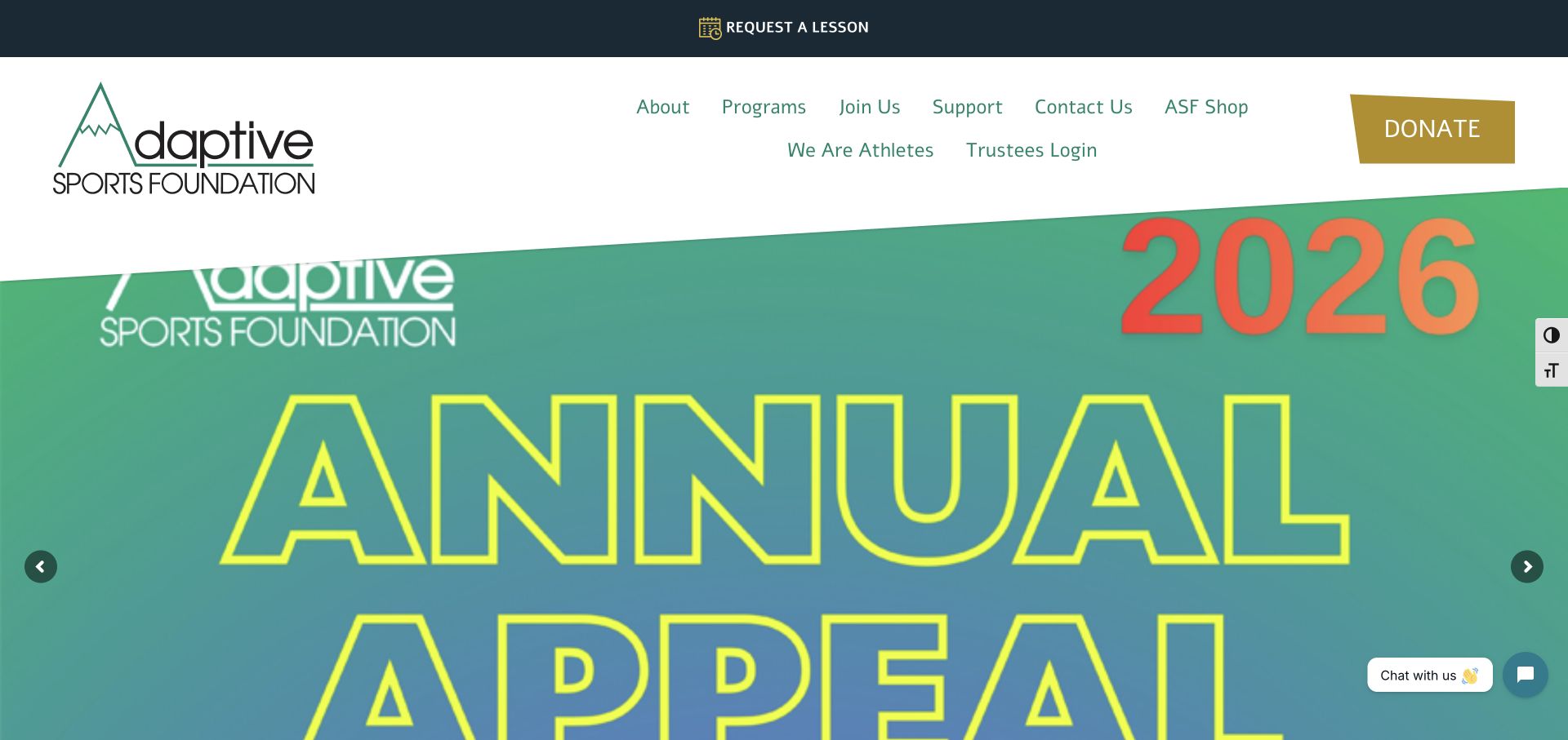
The Adaptive Sports Foundation gives Request a Lesson its own top strip. Programs and joining are separate from support, and the page links to participant-oriented guidance about choosing a lesson. Stories and film material communicate the community, while a substantial footer exposes seasonal programs and practical contact information.
What you can learn
Make the lesson enquiry recognisable without confusing it with a donation. Help visitors understand the type of lesson before requesting detailed participant information. A lesson request should explain what remains to be confirmed before participation. Keep the teaching information outside fundraising panels so a family can prepare without watching a film or interpreting a donation campaign.
Pros
The lesson-request route is visible above the main navigation.
Seasonal program and lesson-choice information have dedicated destinations.
Cons & considerations
The observed large fundraising carousel delays the program introduction.
Video and fundraising content can compete with a new participant’s questions.
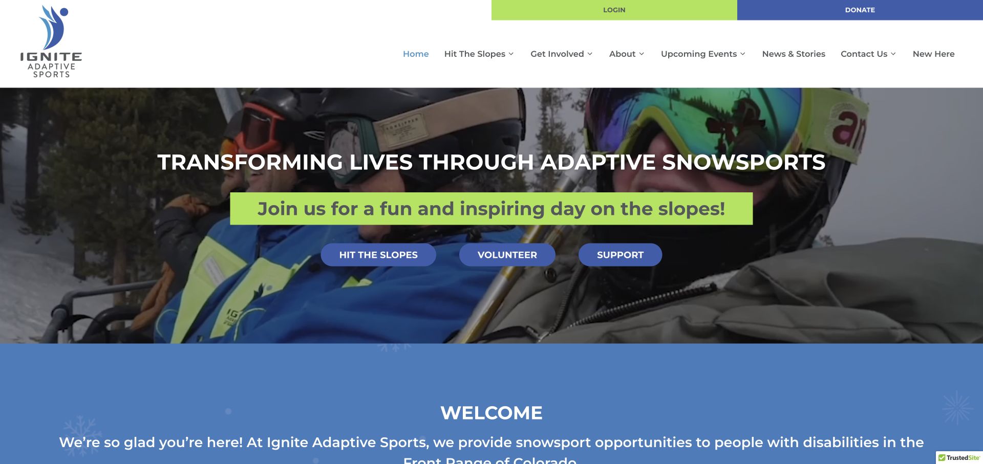
Ignite introduces its snowsport focus directly and offers separate athlete, volunteer and support actions. The header includes a New Here route as well as login, which helps distinguish orientation from returning-user tasks. Athlete fees, group arrangements, equipment and FAQs appear as named information destinations rather than being hidden inside a registration account.
What you can learn
Give newcomers an orientation route that is different from login. Explain the specialty and the practical participation questions before asking someone to enter a portal. Use the newcomer route to explain how fees, equipment and group arrangements relate to the athlete action. Returning participants should still reach their account without repeating introductory material intended for first visits.
Pros
New Here explicitly acknowledges first-time visitors.
Athlete, volunteer and support actions are separated in the introduction.
Cons & considerations
Multiple introductory calls to action need a clear visual hierarchy.
Background motion needs a readable still fallback and usable controls.
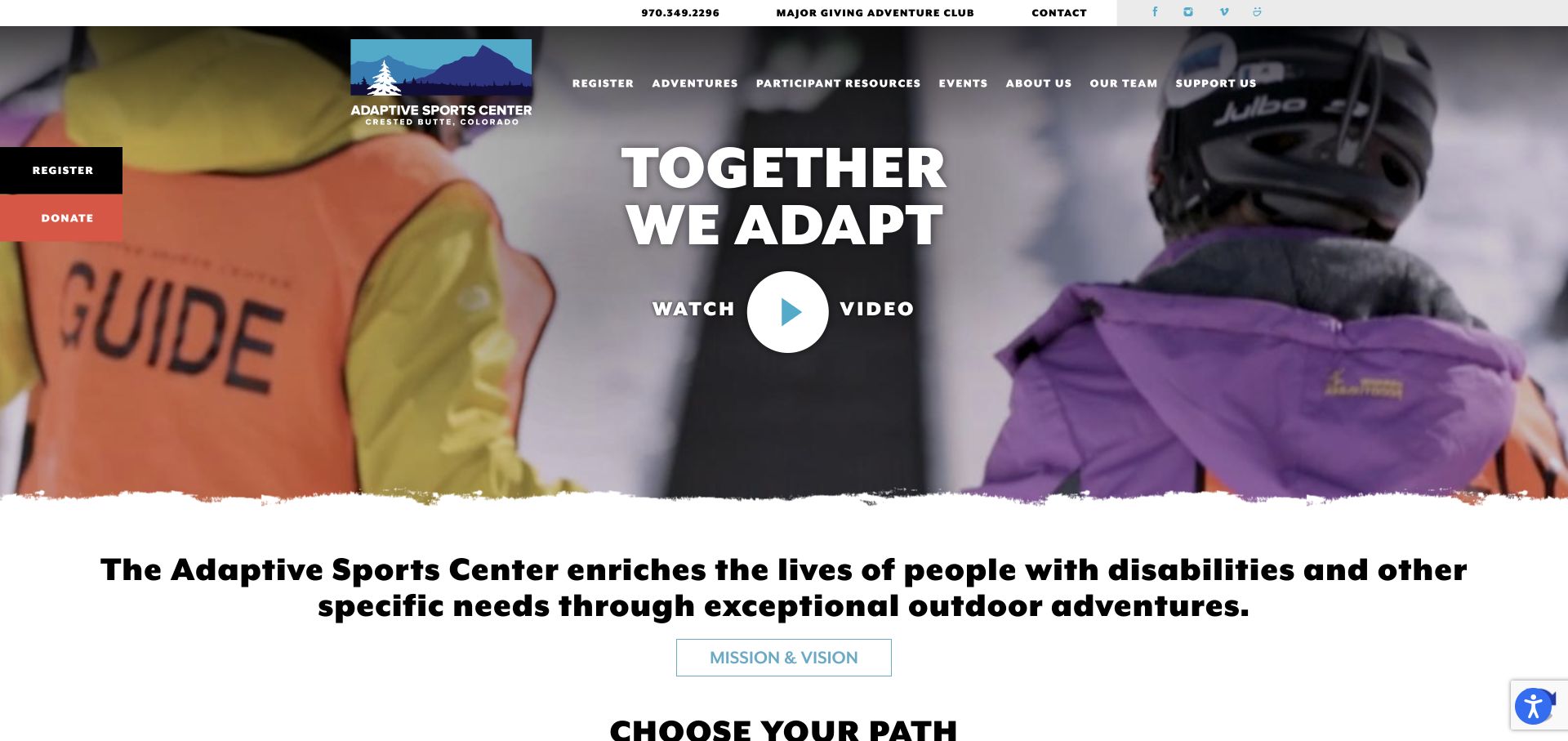
The Adaptive Sports Center combines a prominent adventure introduction with a dedicated Participant Resources section in its navigation. The content structure includes getting there, lodging, planning, schedules and groups. Seasonal adventures are separated from support, and registration remains visible alongside the broader information about the Crested Butte program.
What you can learn
Treat travel and preparation as part of the participation experience. Visitors should be able to establish logistics and relevant costs before committing to registration. Link lodging and travel guidance to the relevant seasonal adventure rather than presenting them as unrelated tourism content. A person planning a group visit should be able to distinguish preparation information from a confirmed reservation.
Pros
Participant Resources makes practical planning easy to identify.
Seasonal adventures and group arrangements have separate routes.
Cons & considerations
The large video-led introduction offers little immediate schedule detail.
Persistent registration and donation controls can compete on a narrow screen.
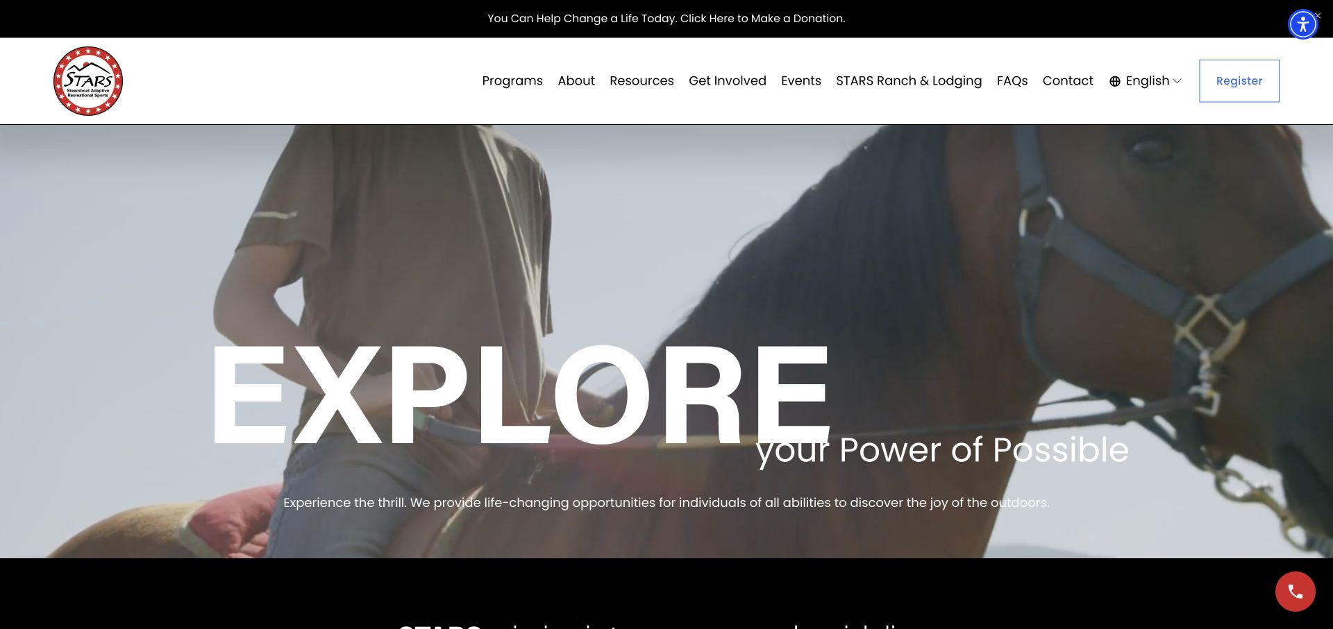
STARS presents a large outdoor introduction, then divides its program offer into winter/spring and summer/fall. Resources, FAQs and lodging are visible in the header, alongside a registration route. The broader homepage includes participant stories and explicit practical questions about equipment, getting started and financial assistance.
What you can learn
Separate the seasonal activity structure from the logistics surrounding a visit. Keep lodging and preparation available without forcing everyone through a single booking path. Seasonal categories should clarify which activities require a further date or location choice. Keep equipment and financial-assistance explanations available beside that comparison, so a visitor can investigate practical fit before interpreting a registration button as a commitment.
Pros
Seasonal program labels explain year-round participation.
Resources, lodging and FAQs address practical planning questions.
Cons & considerations
The expansive moving introduction pushes detailed information further down.
Promotional dialogs should be easy to dismiss before visitors explore programs.
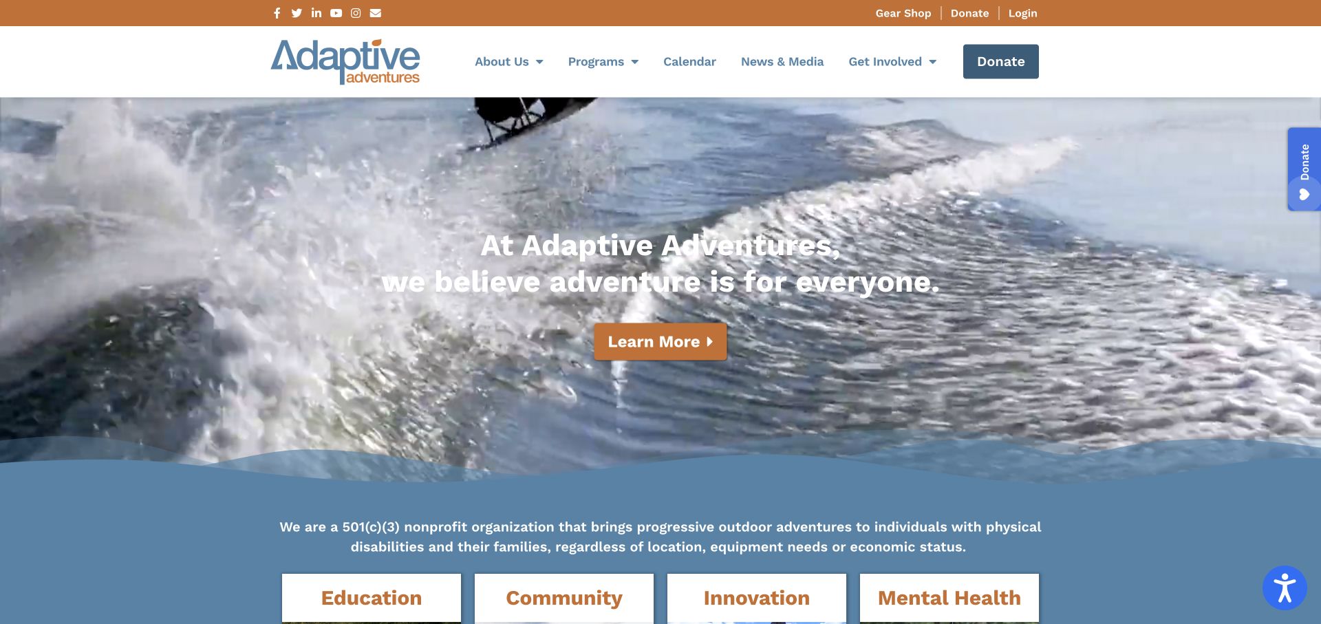
Adaptive Adventures uses active outdoor imagery and a direct introduction to explain its program mission. Programs and Calendar are separate primary destinations, with login and giving in a utility strip. The homepage also presents named participant videos, while the footer identifies the organisation’s nationwide scope and headquarters separately.
What you can learn
When activities are not tied to one facility, make the calendar and actual locations central to planning. Participant stories should add context without replacing program details. A headquarters address should not become the implied meeting point for every activity. Calendar entries need enough location context to connect the nationwide invitation with the particular outing a participant is considering.
Pros
Programs and Calendar are clearly named destinations.
The stated operating scope is distinct from the headquarters address.
Cons & considerations
A large video collection needs a usable text alternative.
Donation panels should not obscure the introduction or practical program links.
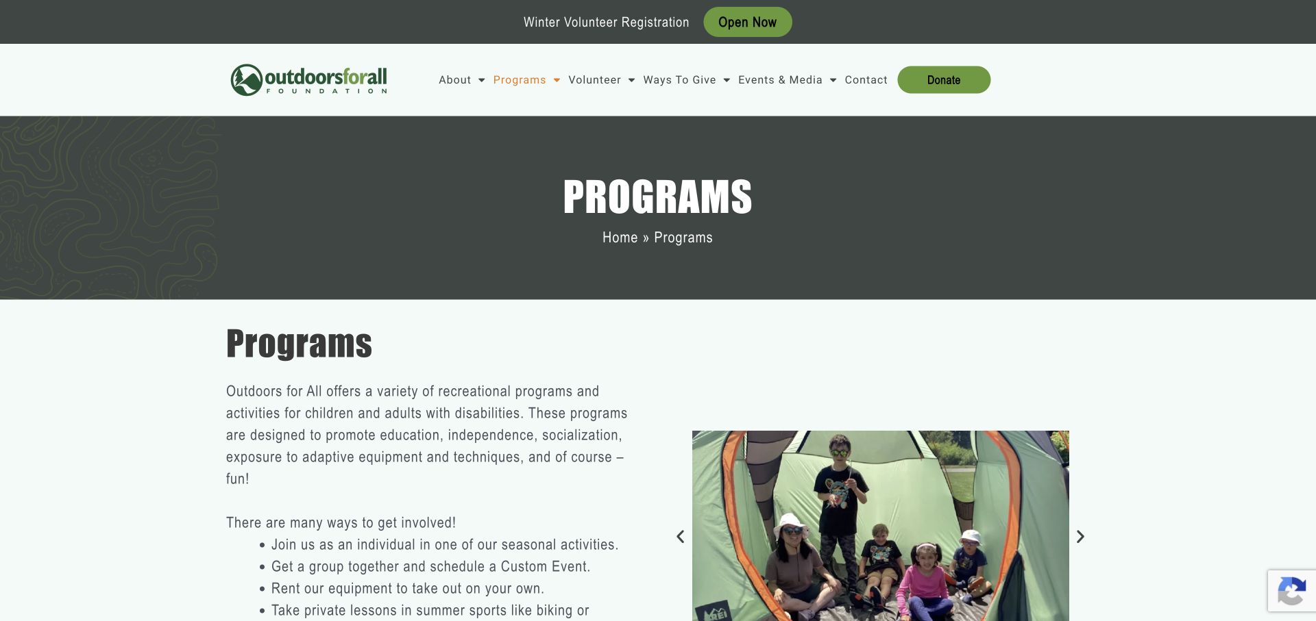
Outdoors for All’s program overview explains individual activities, custom events, equipment rental, private lessons and day camps as different ways to participate. A photograph carousel supports the text rather than serving as the only introduction. The page then links to recreation programs, registration, community resources and staff contact information.
What you can learn
Explain different participation modes before presenting the registration step. Someone seeking equipment hire may need a different journey from someone joining a supervised activity. Separate the responsibilities attached to a rental, private lesson and group event. Similar activity photographs should not imply the same supervision or equipment arrangement; the linked explanation needs to establish what each participation mode means.
Pros
The introductory list distinguishes several participation arrangements.
Registration and staff contact routes follow the program explanation.
Cons & considerations
Program details should remain accessible beyond the rotating photographs.
The repeated Programs heading uses space without adding much orientation.
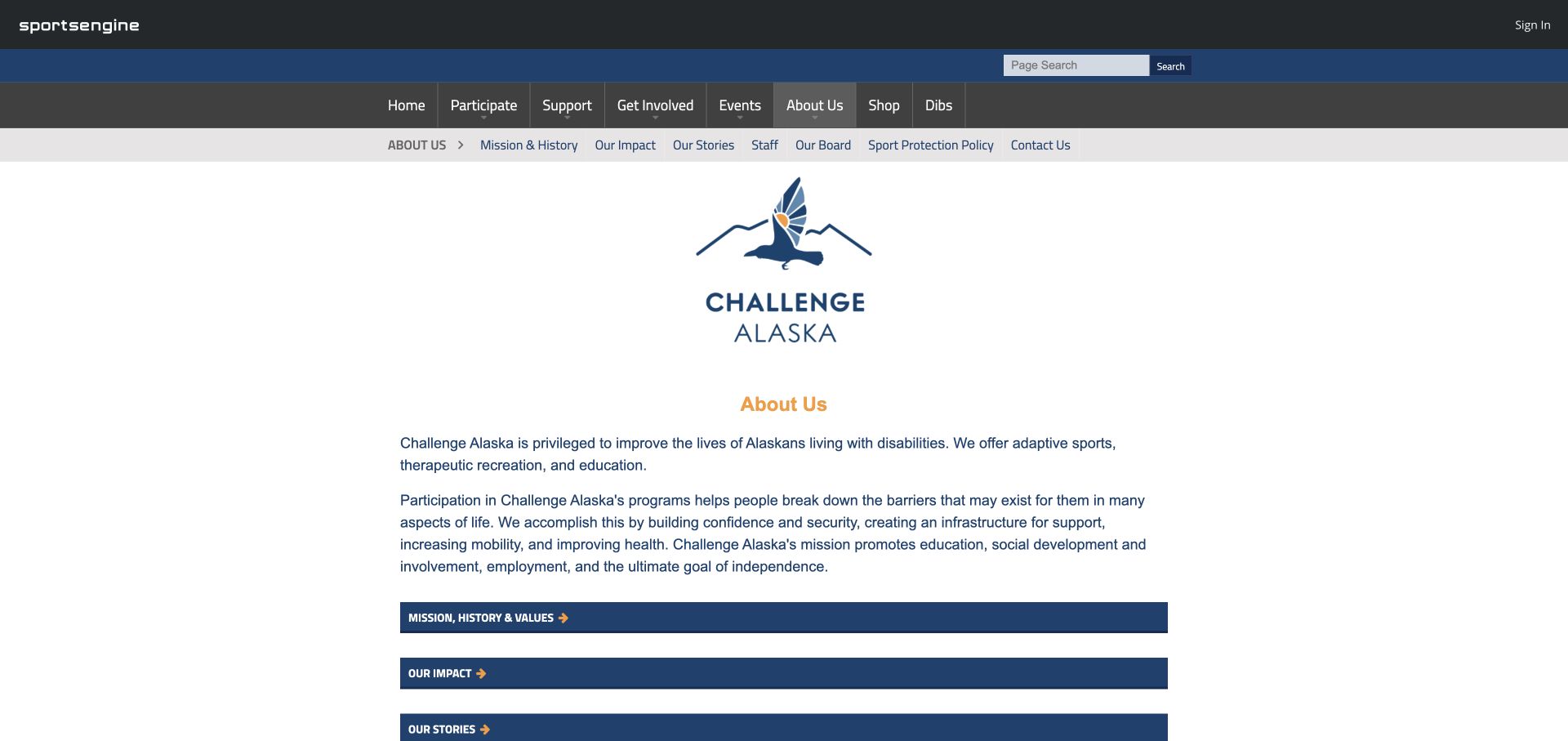
Challenge Alaska’s About page uses a simple identity, a concise description and a set of strong horizontal links to mission, impact, stories, staff and contact information. A secondary navigation keeps these organisational destinations together, while the main navigation retains participation and support as separate sections.
What you can learn
A plain page can still make useful distinctions. Give organisational questions a compact index without making participants search through the entire institution for contact information. The organisational index can help someone identify the right person to ask, but it should not become a compulsory detour. Keep the route from mission or impact material back to actual programs easy to recognise.
Pros
A local navigation groups related organisational information.
Contact and program routes are not replaced by social links alone.
Cons & considerations
The dense multi-level header occupies substantial space.
A mission-focused page needs a direct route back to practical participation details.
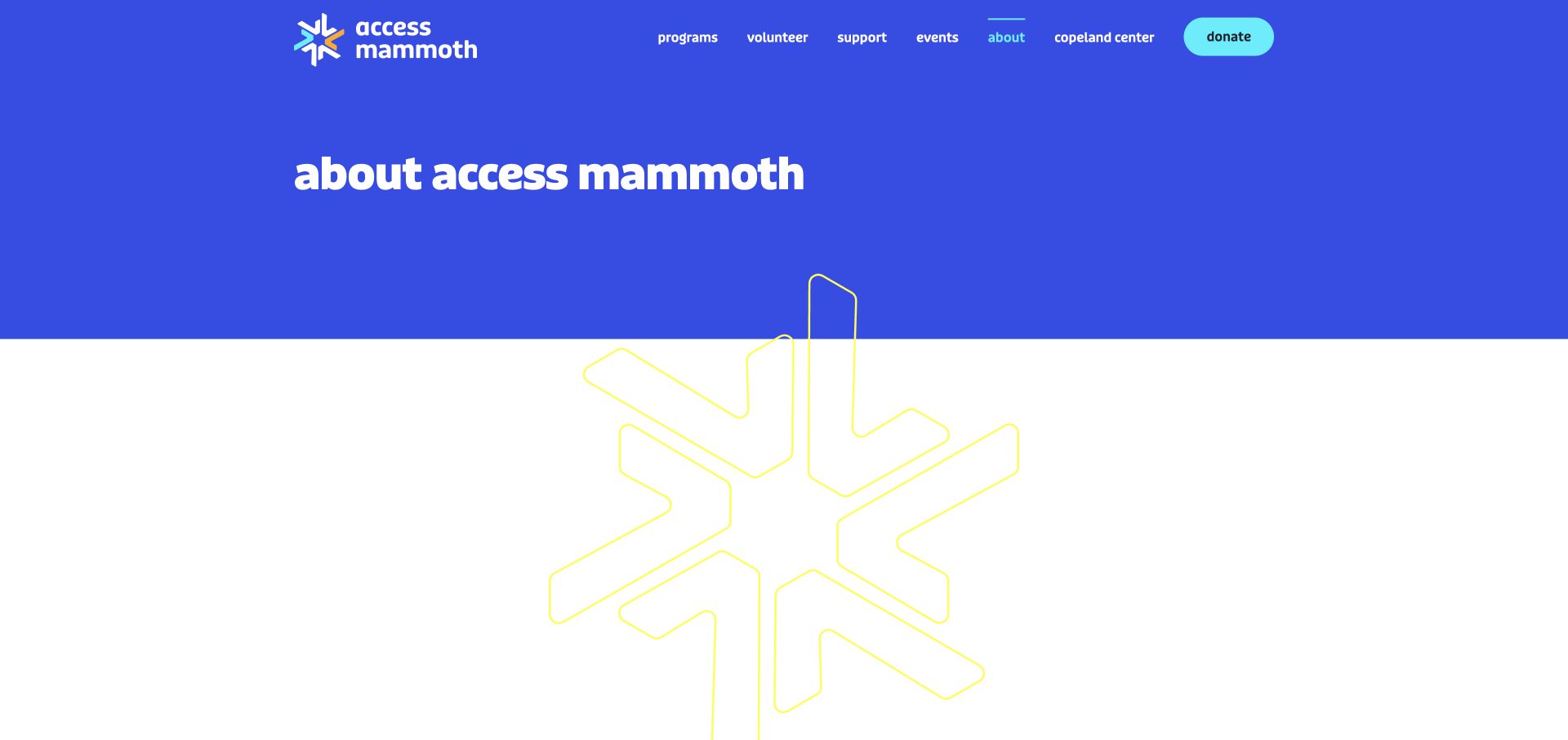
Access Mammoth uses a strong blue-and-turquoise identity on its About page and explicitly connects the new name with Disabled Sports Eastern Sierra. The page separates its story, team, leadership and locations. Individual location sections distinguish mountain activity, a supporting thrift shop and a centre, rather than assuming every address serves the same purpose.
What you can learn
Explain a name change plainly and preserve the context returning visitors recognise. Distinguish operational locations so an updated brand does not make practical information harder to find. The location descriptions should identify why someone would use each destination. A thrift-shop visit, program arrival and enquiry about a centre are different tasks despite sharing one brand.
Pros
The former name is explicitly connected to the current organisation.
Locations and organisational roles receive separate explanations.
Cons & considerations
The oversized introductory brand graphic delays the actual story.
Proposed or rendered facility images need clear labels distinct from existing facilities.
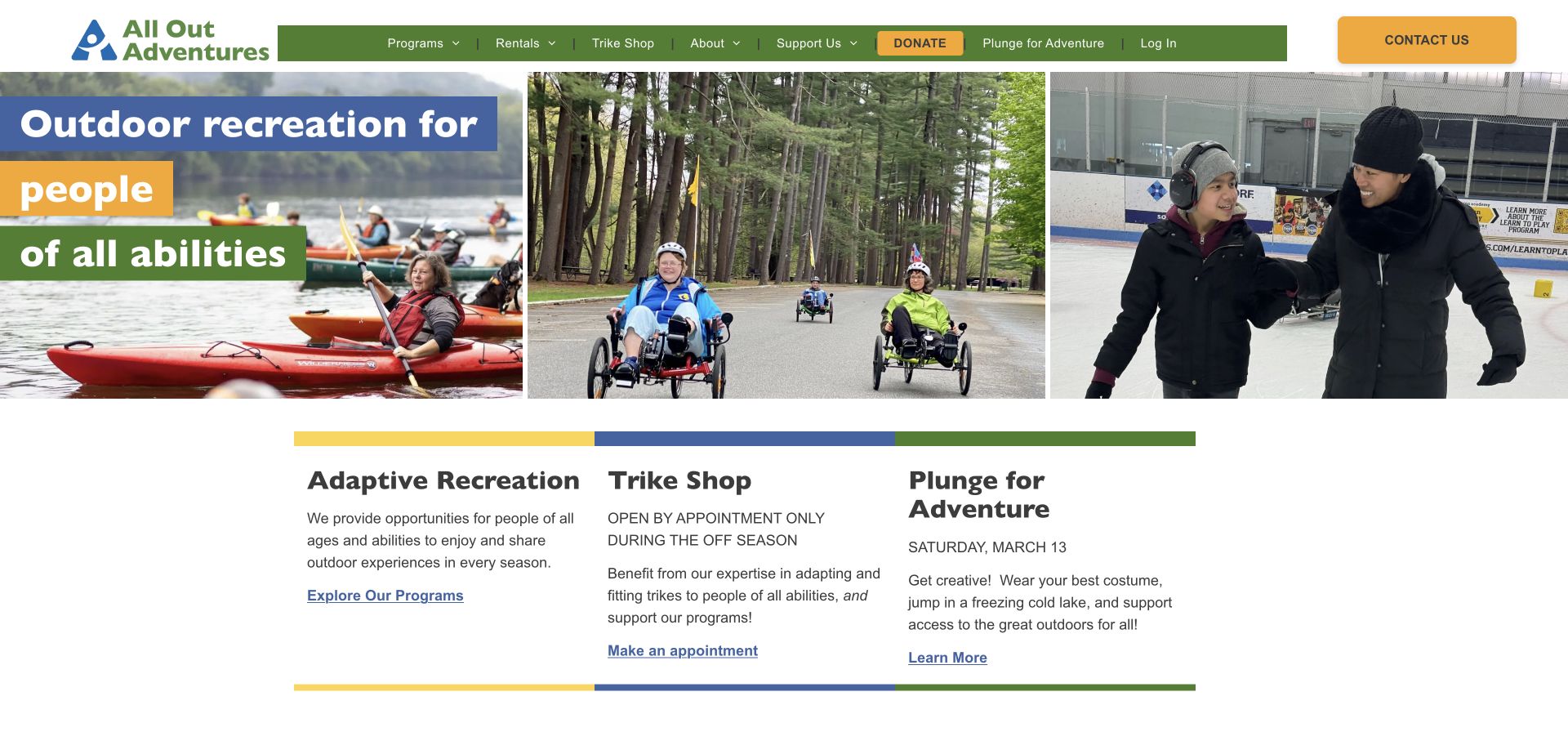
All Out Adventures opens with a three-image view of participation across different settings. The next row separates adaptive recreation, the trike shop and a fundraising event, each with a concise explanation. Navigation also distinguishes programs from rentals, while the shop panel states its appointment-only off-season arrangement.
What you can learn
Separate the service a visitor joins from the equipment they rent or buy. Practical conditions such as appointment-only opening deserve visibility beside the action. Preserve the off-season appointment condition wherever the shop is promoted, not only on one homepage panel. The three-part introduction also gives seasonal fundraising a bounded place without making it appear to be another recreation service.
Pros
Programs, rentals and shop services have separate routes.
The homepage states an appointment-only shop arrangement.
Cons & considerations
Many top-level navigation choices need careful mobile prioritisation.
Event dates should include enough context to distinguish the relevant year.
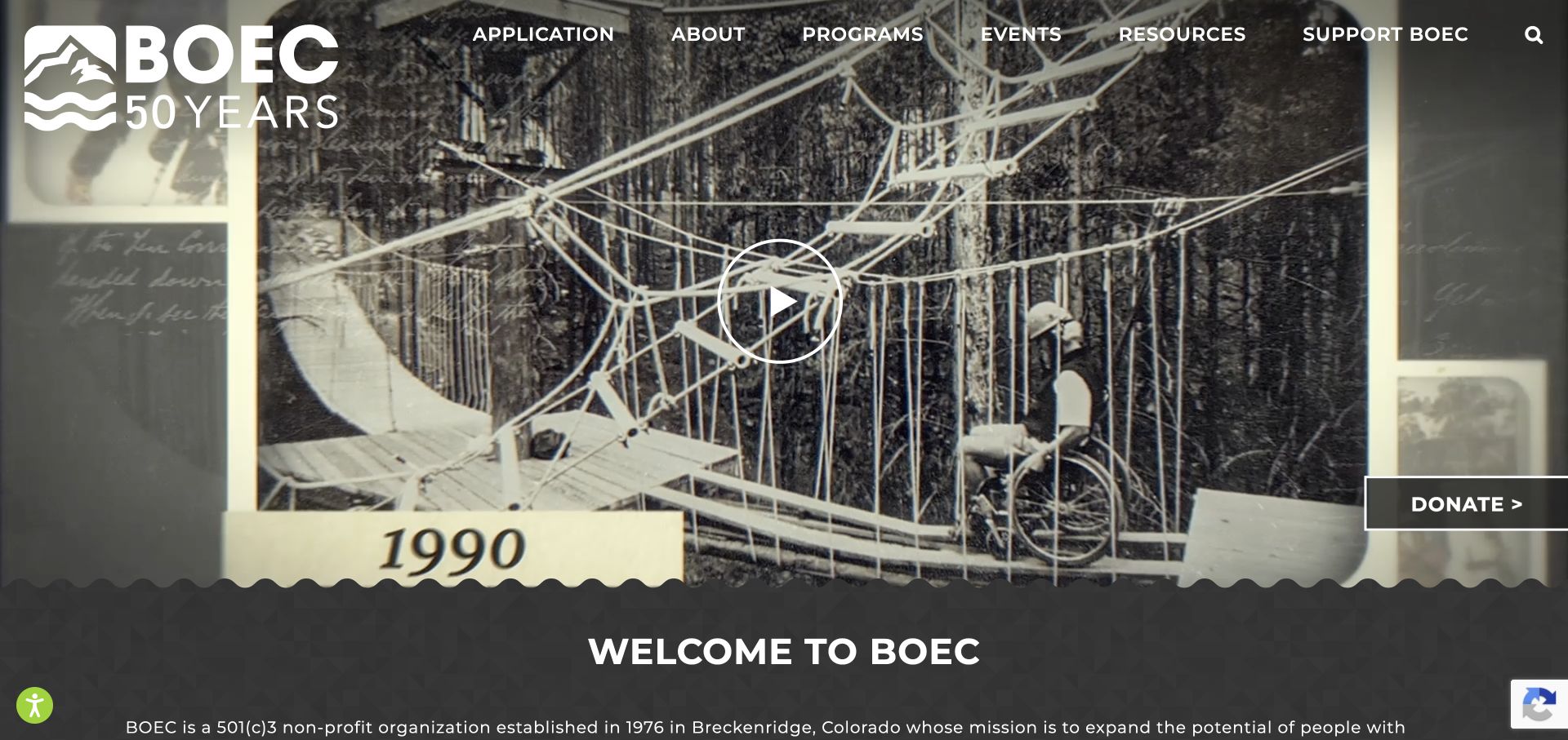
BOEC’s observed homepage uses archival imagery and its anniversary identity to establish a history of outdoor participation. The main navigation gives Application and Programs separate positions, while summer and winter receive their own sections. A plain introduction explains the organisation before the page moves into participant perspectives and current editorial stories.
What you can learn
Use historical material to explain continuity, but keep today’s participation routes separate from the anniversary campaign. An archive is context rather than a substitute for current arrangements. Pair anniversary imagery with clearly current application and seasonal information. Historical photographs can enrich the story without establishing the equipment, assistance arrangements or availability that a new participant should expect today.
Pros
Application and program information have distinct primary routes.
Seasonal sections help organise a varied outdoor offer.
Cons & considerations
A large anniversary treatment delays some current program information.
Historical images should not imply that pictured equipment or arrangements are current.
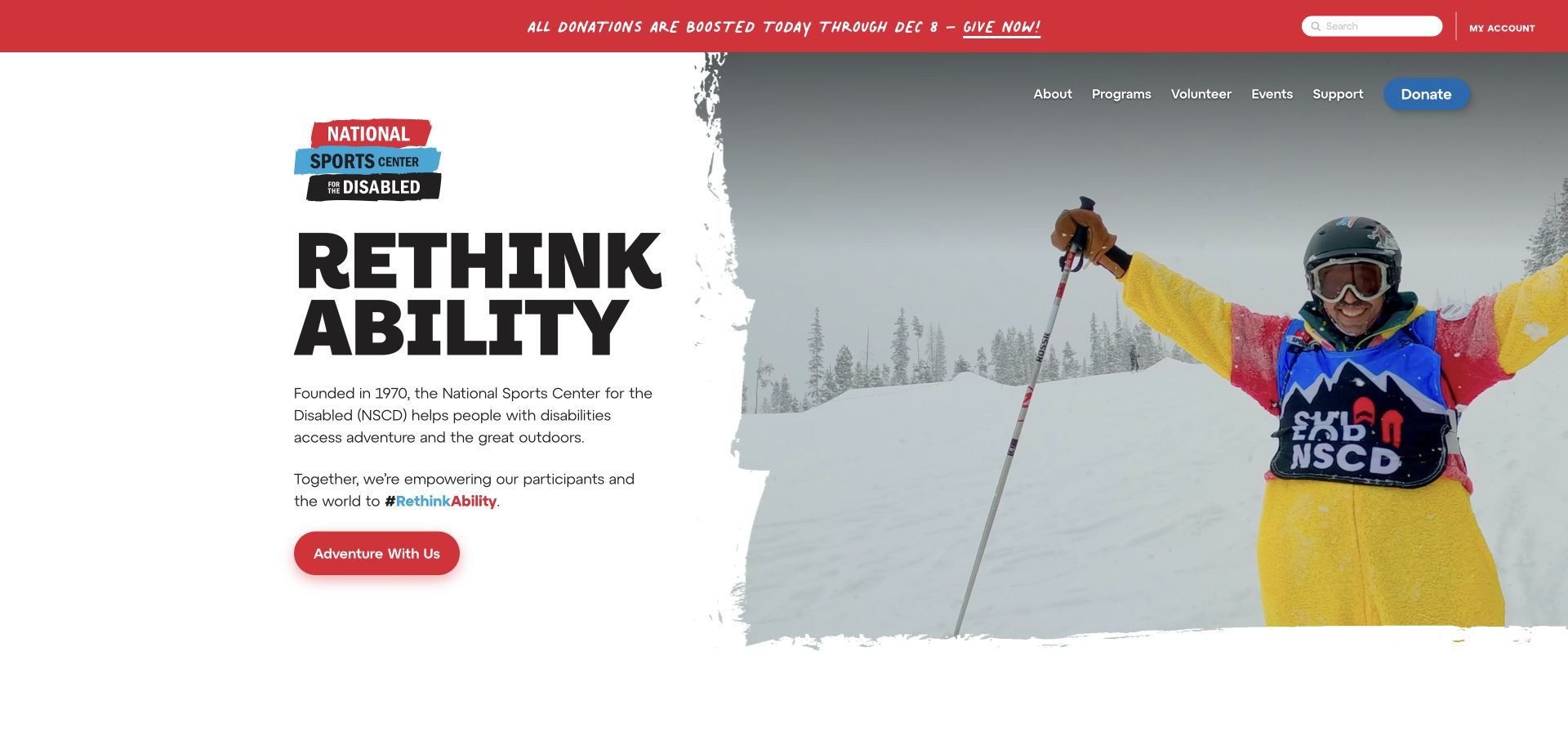
NSCD pairs a large Rethink Ability headline with a short explanation and an Adventure With Us link. The page identifies its mountain and metropolitan settings and lists activities beneath a dedicated program introduction. Support, volunteering and account access remain separate, while seasonal notices explain current registration and fundraising activity.
What you can learn
An expressive brand line works better when a nearby sentence explains the actual service. Connect the invitation to a program directory and location information, not directly to a vague enquiry. The mountain and metropolitan settings need to remain attached to their relevant activities. A shared brand line can introduce both, but should not imply interchangeable meeting points, schedules or preparation requirements.
Pros
The opening combines a brand message with a plain service explanation.
Program and location content extend the initial activity image.
Cons & considerations
Changing seasonal notices need regular review.
Multiple campaign carousels can distract from comparing actual activities.
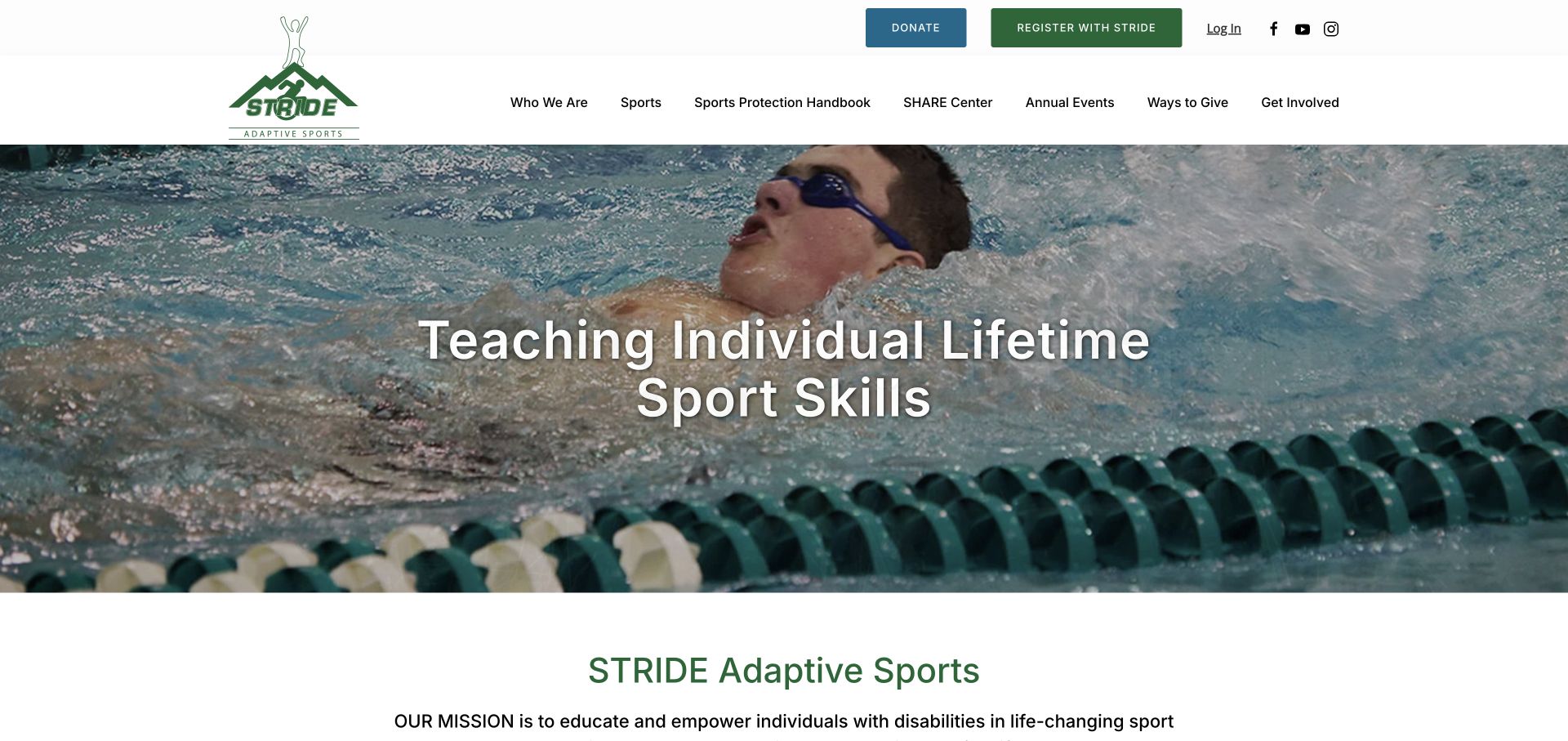
STRIDE uses participation photographs and a straightforward mission introduction, then publishes a visible monthly program calendar. The current calendar names individual sessions rather than listing only annual fundraising events. Registration and donating are separate utility actions, and volunteer, sponsorship and contact routes appear beside the main program content.
What you can learn
Recurring community sport benefits from a maintained public calendar. Show the activity and relevant session information before requiring an account, while keeping private participant details off the public view. A public calendar should explain sessions without exposing participant identities or private support needs. Keep seasonal changes visible in the session record, so registration does not depend on interpreting an unrelated fundraising announcement.
Pros
The homepage exposes actual scheduled program sessions.
Registration and donation actions are separately labelled.
Cons & considerations
A dense calendar needs an accessible small-screen alternative.
Repeated rotating statements should not become the only program explanation.
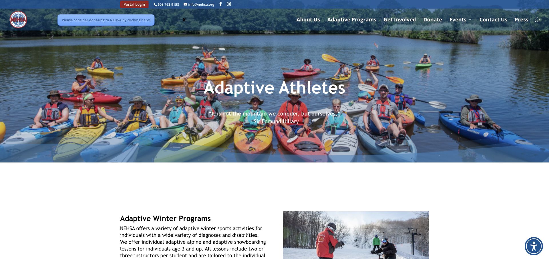
NEHSA’s Adaptive Athletes page puts practical lesson information in ordinary page content. It distinguishes seasonal activities, explains lesson formats and includes cost and inclusion statements. Existing-user portal access and a request for a new account are separate actions, with additional guidance for creating a profile and requesting assistance.
What you can learn
Keep enough program information outside the portal for someone to judge whether to proceed. Separate returning-user login from the first-time account request and explain the booking conditions. Keep the account request connected to the lesson explanation rather than treating a profile as confirmed participation. Prices and inclusions need a clear seasonal context wherever visitors compare activities or return from the portal.
Pros
Lesson formats and practical inclusions are explained before login.
New and returning portal users receive different actions.
Cons & considerations
Seasonal prices and booking statements need explicit maintenance.
Dense long-form information benefits from in-page navigation.
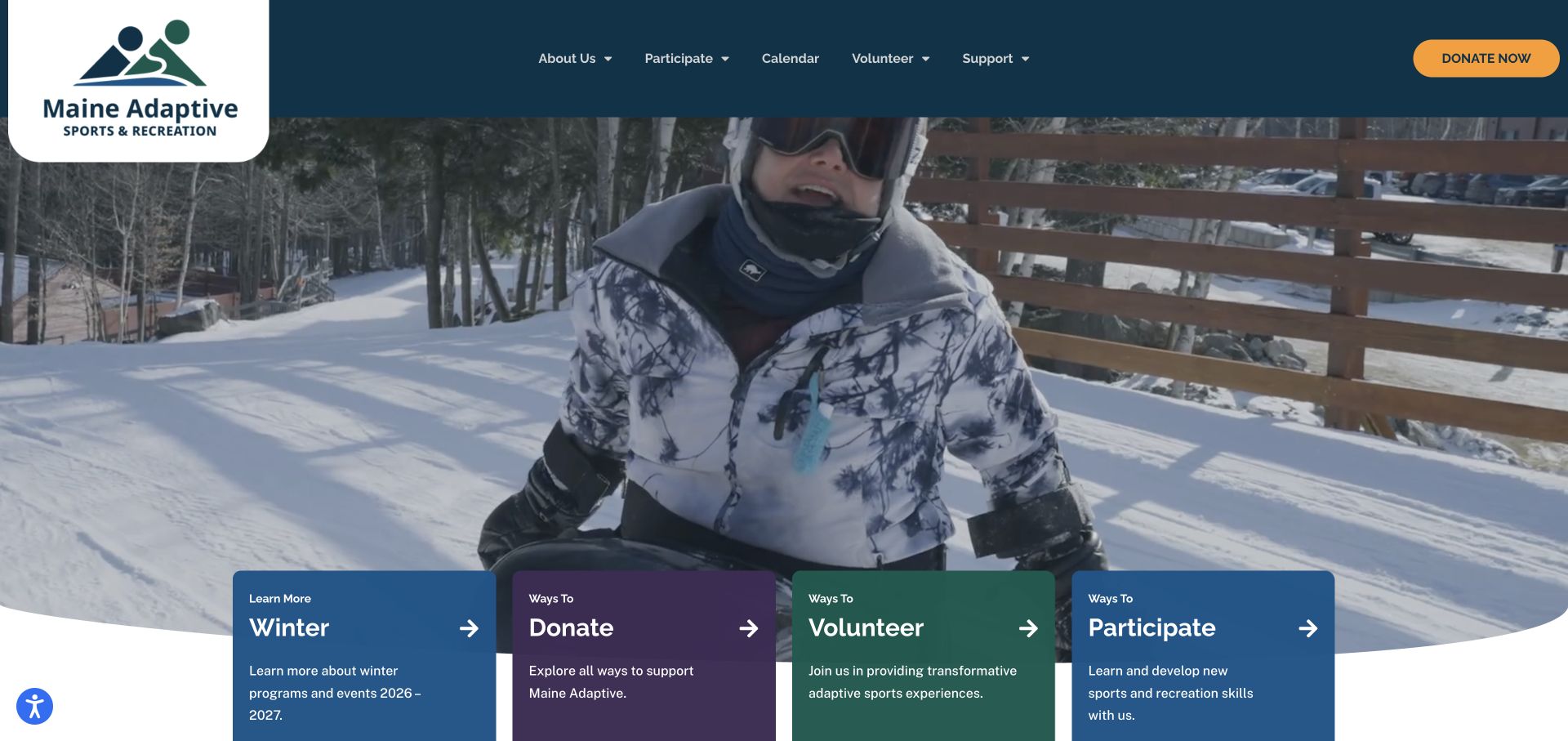
Maine Adaptive places cards for winter information, donating, volunteering and participating directly below its outdoor introduction. A program section then groups activities by Winter, Specialty and Summer. The header retains calendar and participation navigation, so a first-time visitor can move from the seasonal image to a relevant practical destination.
What you can learn
Use a small set of clearly labelled cards to turn a large image into useful choices. Keep the season and participation action explicit rather than relying on an image alone. Each seasonal tab should retain a meaningful heading and direct participation route. An image change alone should not leave readers uncertain whether they are viewing winter preparation or a general program invitation.
Pros
Four clear cards recognise different visitor intentions.
Seasonal tabs provide a structure for a varied program offer.
Cons & considerations
Tab and carousel controls need usable keyboard and touch behaviour.
Metadata and page titles should agree with the season currently promoted.
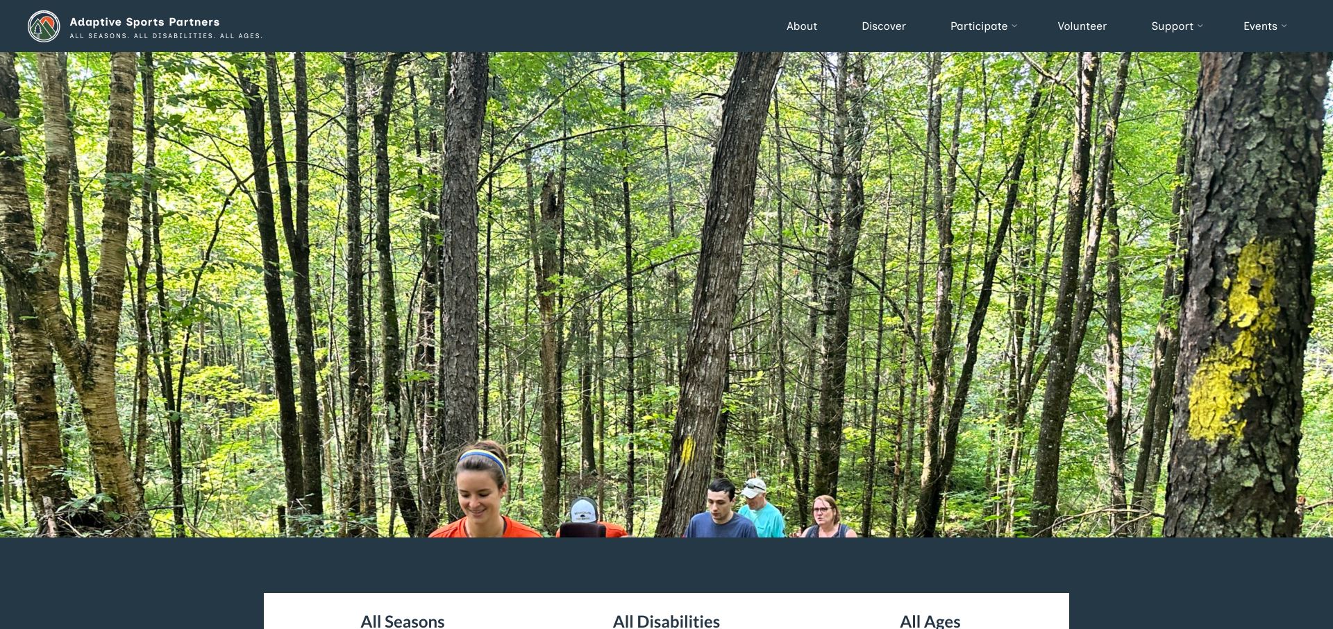
Adaptive Sports Partners combines a simple mountain identity with outdoor photographs and short all-season, all-age messages. Its main navigation separates discovering the organisation from participating, volunteering and supporting. The body explains the North Country and Northeast Kingdom context, while direct actions repeat the participant, donor and volunteer choices.
What you can learn
State the actual region in readable content and give each audience a recognisable route. Welcoming language should lead to specific program and preparation information rather than stand in for it. Carry the regional description into the relevant program explanation rather than leaving geography only in the mission. All-season language should still lead to current activity dates and practical preparation for that particular place.
Pros
The organisation’s geographic context appears in its mission explanation.
Participation, volunteering and support remain separately labelled.
Cons & considerations
The oversized rotating photographs postpone the detailed introduction.
Broad welcoming statements still need program-specific eligibility and preparation information.
Kegan is a freelance web designer and developer with 15+ years of experience helping businesses turn complicated website requirements into clear, maintainable digital experiences. He works directly with clients from planning and design through development, launch, and ongoing support.
For adaptive sports program website design, his development approach focuses on program eligibility, equipment and support information, location and access details, current schedules, and distinct participation, volunteer and donation routes. The scope can be a targeted improvement or a complete custom build, with responsive layouts, thoughtful content structure, and integrations chosen around the people using and maintaining the site.
Show 3 other adaptive sports program website designersHide other adaptive sports program website designers
Plan an adaptive sports website around an informed first step
Build useful activity records before adding campaign modules
For each activity, record its actual name, setting, relevant season, schedule, type of instruction or support and booking route. Decide which facts are common across the organisation and which belong to a specific lesson or session. The public explanation should remain useful when a seasonal registration period is closed.
Separate an activity description from a dated occurrence. A weekly sport session, a multi-day camp and a private lesson require different fields even if they share photographs. Give the team maintained places for time, meeting point, relevant requirements and the next action. Avoid copying conflicting dates into the homepage, calendar and registration instructions.
Use plain labels for the sport and the arrangement. Welcome language and ambitious mission statements have a role, but visitors also need to recognise whether they are looking at a group activity, an individual lesson, equipment hire or a public event. A familiar label helps someone decide what to read next without knowing the organisation’s internal vocabulary.
Explain preparation without collecting sensitive details too early
Publish verified equipment and preparation information in ordinary readable content. Explain what is provided, what someone may need to bring, how to discuss individual arrangements and which questions staff need to answer before booking. Do not assume that the equipment in a photograph is available for every activity or participant.
Where a provider has specific participation criteria, link to the maintained source and describe its purpose accurately. This inspiration collection does not evaluate those criteria or decide who may participate. The website should direct personal questions to the actual program staff, not collect detailed health or support information through an unprotected general contact field.
Keep sensitive participant records out of public calendars, page source and analytics. Ask only for what the relevant workflow requires and explain who receives it. If an external portal is involved, name the handoff clearly and provide an alternative route for questions. A public website review does not establish the privacy or security of the private registration system.
Give new and returning participants different routes
A returning participant may need only account access or a current calendar. Someone new may need to understand the program, its cost structure and the sequence for joining. Do not make both visitors begin with the same login screen or require an account merely to read the practical explanation.
An orientation page can explain the steps in the actual order: review activities, ask relevant questions, complete the required registration and request or book a session. Distinguish a request from a confirmed reservation. Only publish acknowledgement timing or availability promises that the team has approved and can support.
Test the public journey without submitting real participant information or creating an unneeded account. Check meaningful links, keyboard focus, zoom, visible status messages and the alternative contact route. Keep critical instructions available when a video, social feed or third-party registration interface does not load.
Support the community without letting fundraising take over
Participants, volunteers and donors can share one visual identity while following different information paths. Present separate tasks in the main navigation or a concise set of introductory cards. Make it possible to understand the service without dismissing a series of donation, newsletter and event prompts.
Use actual credited participation photography with appropriate permissions. Let people see the kind of activity and setting without turning a personal story into a guarantee about someone else’s experience. Avoid claiming that an attractive website, a familiar partner logo or a moving testimonial independently verifies program quality or safety.
Fundraising campaigns and seasonal activities need explicit end states. Retain a useful archive where appropriate, but remove misleading registration and donation urgency when the campaign ends. Assign responsibility for the calendar, operational notices, costs and location details. A small maintained content system is more valuable than a large homepage whose most prominent sections are out of date.
The editing job behind the design
Choose tools around activity information and protected participation records
Model activities, sessions, venues, people and public events as related records rather than one long promotional page. Reuse verified dates and location information across the directory and calendar, while keeping private participant details in the appropriate protected system.
A registration portal, donation service, calendar and video host are separate dependencies. Keep a useful public explanation and a contact alternative for each important handoff. Do not make the core service understandable only through motion, a PDF or a social feed.
Visible stacks come from bounded public-source audit attempts, not a complete architecture inventory. A script reference does not establish the accessibility of the interface or the safety of private records. Unavailable or blocked observations remain qualified rather than being filled with presumed platforms.
Our WordPress website examples offer a separate look at publishing approaches. A visible platform label is evidence for that named page, not a guarantee that the same system will suit your requirements.
Before the public launch
Adaptive sports website planning checklist
Use recognisable activity and participation-mode labels.
State the actual location and relevant seasonal context.
Separate an activity description from dated sessions.
Publish verified equipment and preparation information.
Explain costs, inclusions and assistance routes in context.
Direct individual suitability questions to actual program staff.
Keep new-participant orientation distinct from returning-user login.
Distinguish a registration request from a confirmed booking.
Keep participant, volunteer and donor actions separate.
Use real participation imagery with appropriate credits and permissions.
Provide readable alternatives to video, carousels and portal-only instructions.
Assign owners for calendars, operational notices and seasonal content.
These checks are a project checklist, not a performance, legal, security, or accessibility certification. Test real journeys with the people responsible for the website before making claims about the result.
Sources & editorial method
How this collection was selected and reviewed
The original target of 20 was randomly drawn and saved before research. Each accepted source page was directly reviewed and genuinely captured on November 13, 2026 UTC; actual timestamps and image dimensions are preserved. Several captures show dedicated program or organisational pages, identified by their labels. Obstructed first captures were rejected and retained privately. Clean subsequent views of STARS and Adaptive Adventures were visually checked; no DOM or CSS hiding was used. Outdoors for All uses its informative Programs page instead of the homepage’s blank media area. Sportable was excluded because its donor-toast overlay remained visible; Adaptive Sports Partners is a separately reviewed genuine provider, not a duplicate or invented example. The site’s normal small accessibility/contact launchers are not certifications and were not used to alter source content. BORP was explicitly selected for public information design, not service or medical outcomes. Each accepted source received a bounded broad public technology-audit attempt; unavailable results remain unavailable.
Each example links to its actual source page. Screenshots are direct browser captures with their own capture dates; moving imagery, announcements and live designs can change. The notes describe observable design choices and conditional tradeoffs, not measured traffic, conversion results, service quality, or accessibility conformance.
Technology labels use public page metadata, asset evidence, or explicitly cited platform documentation. Platform documentation is not a complete current deployment audit. A component reference may be legacy or unused; it is not a complete backend inventory. Unknown stacks are omitted. These sites are editorial examples, not our client portfolio.
Written, Edited and Curated are separate editorial records, not timestamps advanced by a rebuild. Website designs and imagery belong to their owners. See our editorial standards or suggest a correction.
Questions worth asking
Adaptive Sports Program website design questions
What should an adaptive sports website explain first?
Identify the actual activities, setting and relevant seasonal context, then give a clear route to preparation and participation information. A welcoming mission statement should not replace those practical details.
Should participants need an account to read program information?
No. Keep the public explanation, relevant requirements and booking sequence readable before login. Give returning participants a separate account route and provide an alternative for questions.
How should a provider present individual participation arrangements?
Publish verified program information and explain how to discuss individual questions with the actual staff. Do not imply that a general welcome or a photograph establishes suitability for every person or activity.
How can fundraising coexist with participant information?
Use distinct donor and participant routes, and keep campaigns from obscuring the core service explanation. Give dated campaigns and seasonal registration periods maintained end states.
Why is BORP the Editors Choice?
Its reviewed Programs page pairs named activities and concise explanations with actual participation photographs, while membership, calendar and contact routes remain distinct. The choice concerns website information design, not program quality, safety or outcomes.
Begin with clear activity records and dependable next steps. Use the organisation’s people and outdoor setting to add character around those facts, then maintain the details that make participation understandable.