A hotel website needs to sell a sense of place while answering the details that make a stay possible.
Guests may be comparing properties, choosing a room, arranging an event or checking practical details after booking. A cinematic introduction can establish the destination, but it should not obscure dates, room information or the distinction between a single property and a hotel collection.
These official sites offer different approaches to luxury, independent stays and multi-property navigation. Compare their room storytelling, booking hierarchy and destination content. Visual polish does not establish service quality, room availability or the accuracy of a quoted rate.
Before the examples
What makes good hotel website design in 2026?
Clarify property, destination and booking context
Make it obvious which hotel a visitor is viewing and where the booking control will take them. A collection needs a property-selection step; a single hotel can be more direct. Keep the primary booking action visible without forcing every browsing visitor into a date selector immediately.
Show the room as well as the mood
Give room types consistent information about occupancy, layout, relevant amenities and meaningful differences. Use representative photography with clear labels. Destination films and lifestyle imagery should complement, not replace, the information a guest needs to choose a suitable room.
Answer pre-arrival questions honestly
Provide current arrival guidance, contact options and approved policies. Explain accessibility features with useful specifics supplied by the property rather than a vague universal claim. Keep dining, events and wellness journeys distinct so non-staying guests can find their own next step.
The collection · 20 examples
20 hotel websites worth studying
Study property selection, room detail and booking handoffs as carefully as the imagery. The collection is not a hotel ranking or a verification of availability, rates, amenities or accessibility.
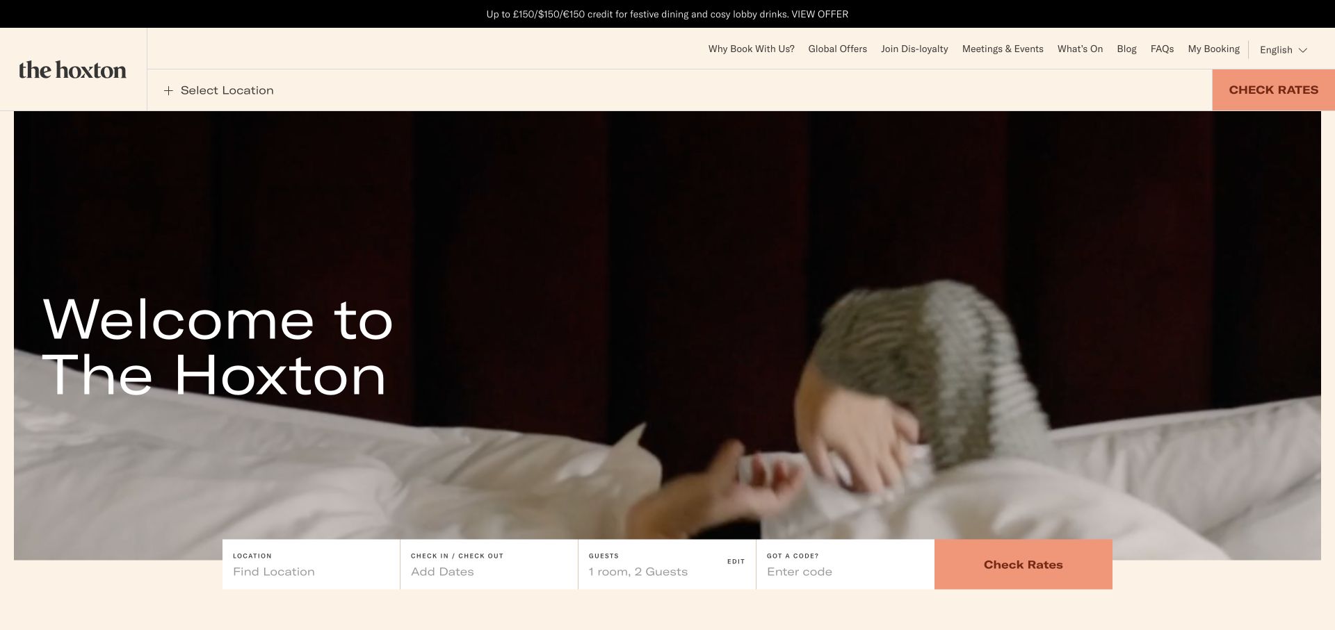
The Hoxton frames its large lifestyle film with a warm cream header and a horizontal reservation bar. Location selection and rate checking are visible in the top navigation and again beside dates and guest information below the image. Salmon accents identify the rate action, while editorial and event links occupy a quieter upper row. The film shows the stay as a social experience rather than presenting only an empty room photograph.
What you can learn
For a hotel collection, keep destination, dates, and party size separate from the emotional brand story. Visitors should be able to check whether the relevant hotel exists and start comparing a stay without watching the whole film or hunting through an editorial menu.
Pros
The reservation bar exposes the major search inputs together instead of hiding them behind a generic booking label.
A solid header keeps practical controls readable regardless of the current video frame.
Cons & considerations
Multiple header levels make the opening information-dense despite the simple hero headline.
Lifestyle footage needs supporting room and amenity photography so guests can evaluate the actual accommodation.
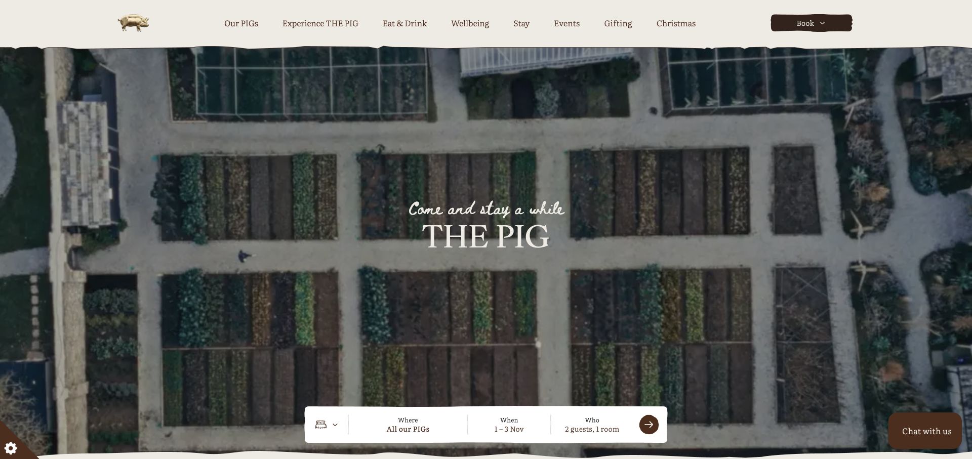
THE PIG uses an overhead garden scene, a centered serif identity, and a small handwritten introduction. Its cream navigation has subtly irregular edges, matching the rustic imagery without turning every control into an illustration. A white reservation capsule sits near the bottom of the hero, separating where, when, and who. The main navigation makes eating, wellbeing, staying, and events different categories, acknowledging that a visit does not always mean an overnight booking.
What you can learn
A country hotel can lead with its grounds and dining culture while preserving a straightforward reservation tool. Distinguish day visits, restaurant reservations, and room stays so that the evocative story does not send every visitor into the same unsuitable booking flow.
Pros
The grouped reservation capsule is compact but still names the three key booking decisions.
Food and non-overnight experiences are visible categories rather than secondary footer links.
Cons & considerations
The opening garden image provides limited information about room layouts or the individual property.
A broad collection-level introduction needs strong location pages to prevent different hotels from blending together.
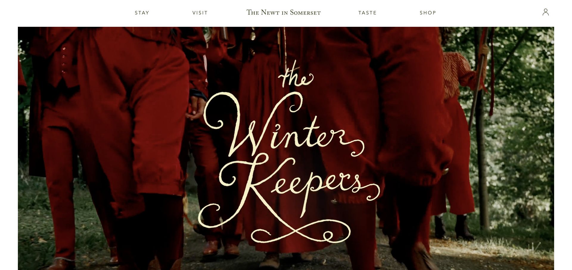
The Newt uses a spare white masthead with the estate name centered between stay, visit, taste, and shop. The captured seasonal campaign fills a large inset image area with red costuming and expressive cream lettering. Rather than crowding the scene with several booking widgets, the header organizes the estate by visitor intention. The white perimeter makes the campaign feel like a page in a printed publication rather than a full-bleed travel advertisement.
What you can learn
A hotel that is also a garden, restaurant, and visitor attraction needs clear audience modes. Start by asking what the visitor wants to do, then expose the appropriate dates, tickets, dining, or room details within that route. Do not assume every homepage visitor is booking accommodation.
Pros
The four short navigation categories map to distinct kinds of estate visits.
A generous image border gives seasonal creative room without obscuring the permanent navigation.
Cons & considerations
The campaign artwork reveals little about rooms or the estate’s location in the first view.
Expressive lettering inside an image should be accompanied by real page text for essential event information.
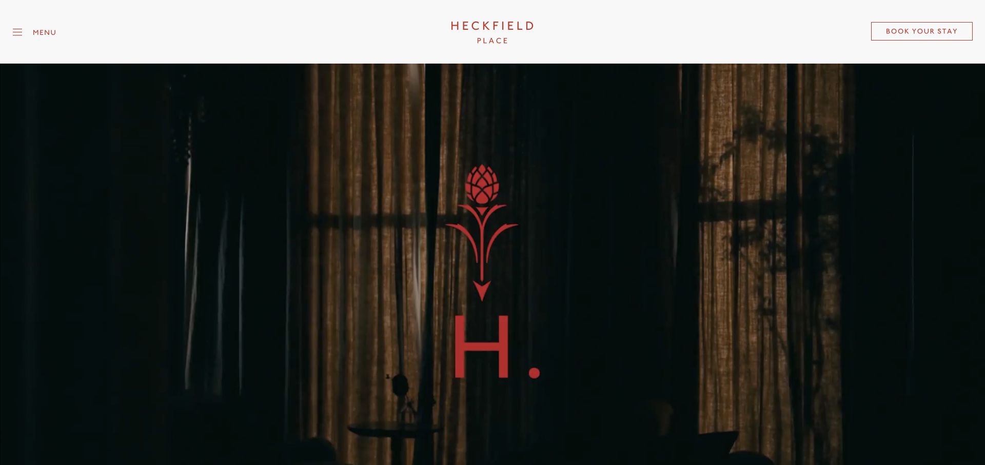
Heckfield Place uses a white masthead with a centered red wordmark, a simple menu label, and an outlined stay-booking control. Beneath it, a cinematic film introduces the house and grounds with almost no additional interface. A red botanical emblem connects the footage with the masthead’s small accent color. The opening feels deliberately unhurried: the property is introduced through atmosphere and visual details rather than a grid of offers.
What you can learn
A setting-led hotel can give its imagery substantial space, but the booking route should remain stable while film scenes change. Follow the atmosphere with useful room comparisons, travel information, and dining details so that guests can move from interest to a considered choice without relying on a telephone inquiry.
Pros
The solid masthead keeps menu and booking controls clear over any scene in the film.
A restrained red accent establishes identity without competing with the property photography.
Cons & considerations
The minimal opening does not immediately explain location, room choices, or the scope of a stay.
A collapsed desktop menu adds a step for visitors who want practical information before watching a film.
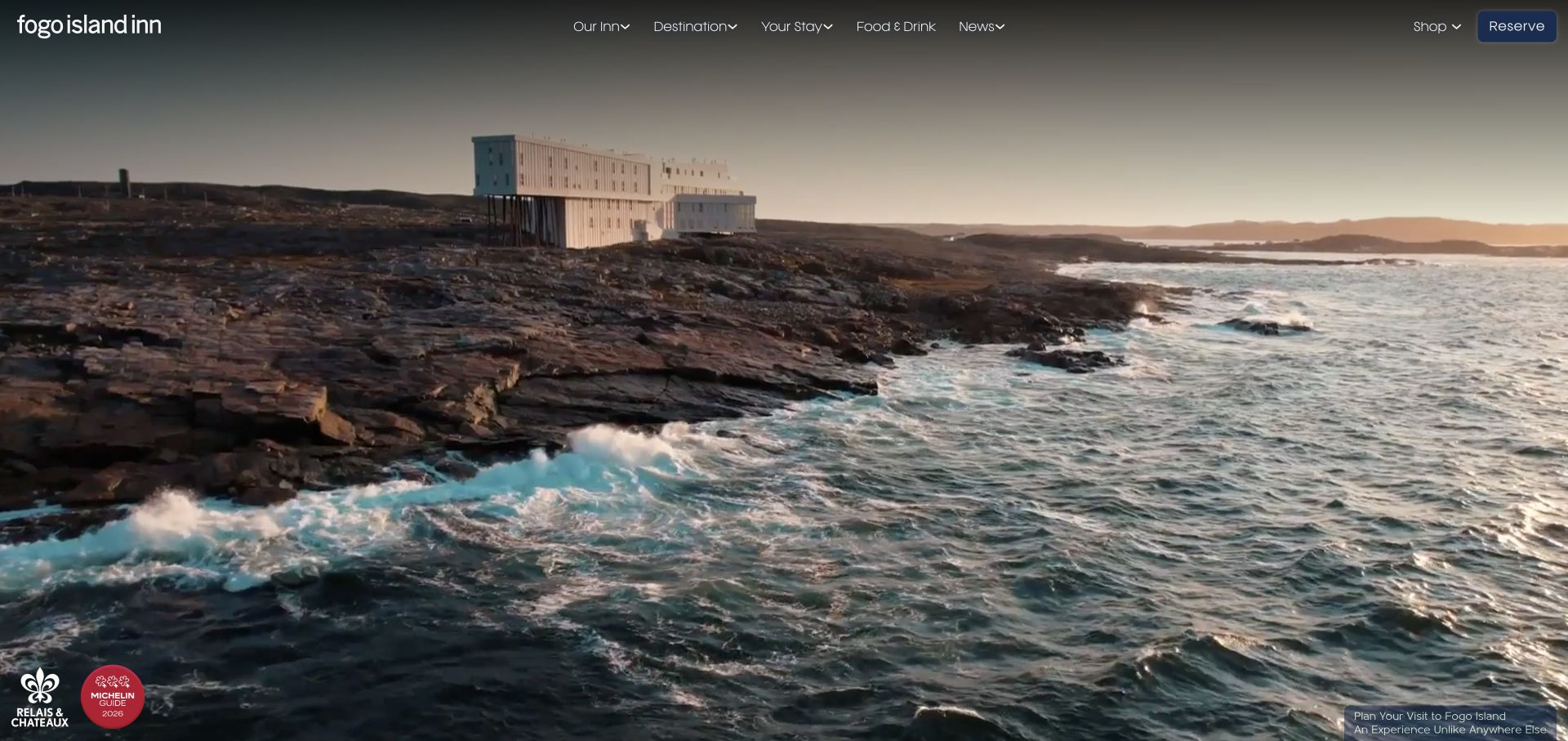
Fogo Island Inn opens with a panoramic view of its distinctive building on the rocky coastline. The small white wordmark and transparent navigation leave almost the entire viewport to the landscape. A blue reserve control is isolated at the upper right, while destination and stay information are separate menu categories. Small affiliation marks sit near the bottom without replacing the main photographic story. The visual scale communicates the relationship between the inn and its surroundings.
What you can learn
For a remote hotel, place is part of the booking decision, not just decoration. Show the setting honestly, then provide explicit arrival logistics, seasonal considerations, inclusions, and room information. A spectacular image cannot tell a guest what the journey or the complete stay will involve.
Pros
The wide view shows the building in its coastal context instead of cropping it into an anonymous luxury image.
Destination and stay information are separate routes in the main navigation.
Cons & considerations
The sparse opening delays practical details such as getting there and what the room rate includes.
White navigation over moving scenery needs contrast protection across the entire film, not only the first scene.
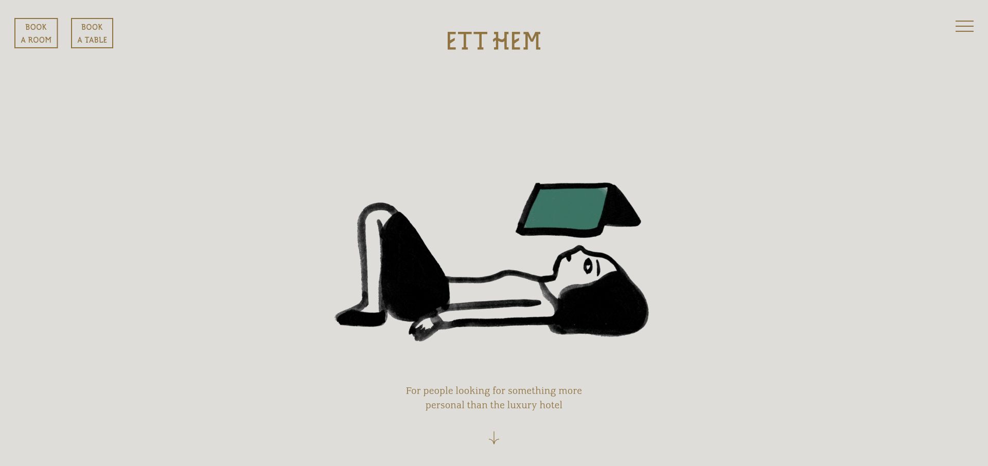
Ett Hem opens with a hand-drawn figure reading on a warm gray background. The gold wordmark and fine outlined controls keep the interface quiet, with room and table booking clearly separated in the upper-left corner. A short centered introduction sits beneath the illustration, and a small menu icon occupies the opposite corner. The page establishes personality with one unusual asset rather than a collage of luxury interiors or a large promotional headline.
What you can learn
A memorable illustration can make a small hotel feel individual, provided guests can quickly reach actual room imagery and practical details afterward. Keep accommodation and restaurant reservations distinct; they are different tasks even when the same intimate hospitality identity connects both.
Pros
The illustration creates a recognizable first impression without relying on generic destination photography.
Separate room and table controls accommodate overnight guests and restaurant visitors equally clearly.
Cons & considerations
The opening does not show the rooms or physical property, so the following content must do that work.
Fine gold type and borders need sufficient contrast against the pale background to remain easy to read.
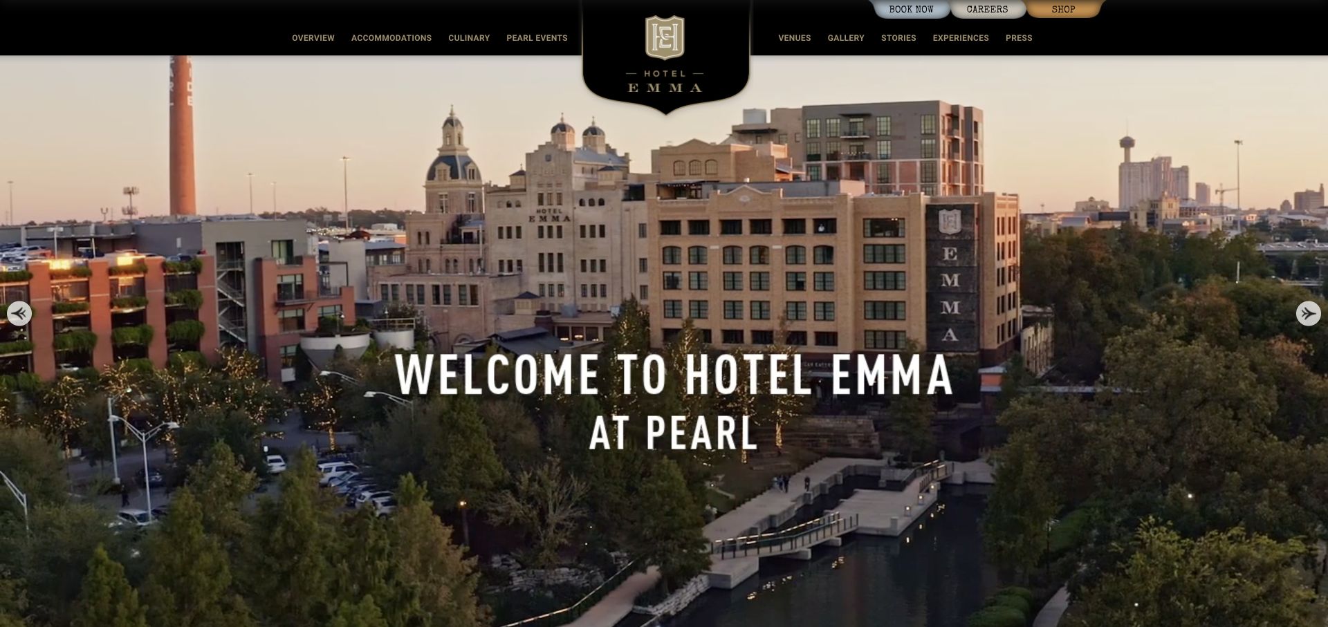
Hotel Emma uses a black-and-gold masthead with a large central crest extending into the panoramic hero. The image shows the hotel alongside its surrounding district rather than isolating one bedroom. Condensed white type names the property and Pearl setting, while the navigation separates accommodations, culinary experiences, venues, and stories. Small tab-like controls at the top provide booking, careers, and shopping. The overall presentation borrows from historic signage without abandoning familiar hotel categories.
What you can learn
A landmark hotel should show what makes its building and neighborhood distinctive, then translate that identity into useful choices for rooms, dining, and events. Keep the booking action obvious enough that the decorative masthead does not become the only memorable part of the interface.
Pros
The panoramic image explains the property’s relationship to the surrounding urban destination.
Dining and events are given concrete routes alongside accommodation rather than hidden in general experiences.
Cons & considerations
The elaborate crest and dense small navigation take up substantial attention in the opening.
The small booking tab competes with less urgent corporate links such as careers and shopping.
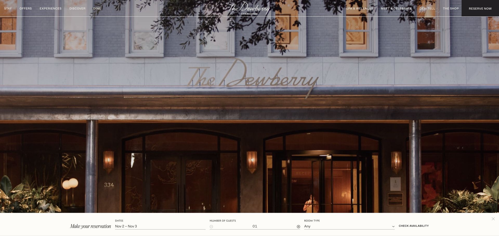
The Dewberry fills the opening with a photograph of its entrance at dusk. A transparent navigation splits around the centered script logo, and the reserve control sits against a darker panel at the far right. A pale reservation strip runs along the bottom, exposing dates, guest count, room type, and availability checking. The photograph supplies architectural atmosphere while the form remains visually separate and straightforward.
What you can learn
A hotel hero can be atmospheric without withholding practical booking decisions. Keep the date and room controls on a stable background, and make room-type filtering understandable before sending a visitor into a separate reservation system. The entrance image is useful orientation, but it should lead naturally to actual room comparisons.
Pros
The reservation strip labels dates, guests, and room type in one coherent horizontal sequence.
The entrance photograph establishes a specific property rather than a generic travel mood.
Cons & considerations
The small transparent navigation can be difficult to scan over detailed windows and foliage.
A crowded set of dining, wellness, event, and shopping links needs careful prioritization on narrower screens.
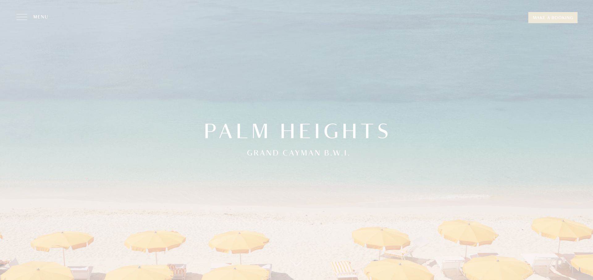
Palm Heights uses an expansive pale beach scene with yellow umbrellas at the bottom of the frame. The widely spaced white wordmark and Grand Cayman location are centered, while a menu label and booking rectangle occupy opposite upper corners. There is almost no supporting copy in the first view. The color palette comes largely from the setting itself: pale blue water, warm sand, and a soft yellow accent.
What you can learn
A strong coastal photograph can establish location and mood quickly, but the next sections must explain the actual suites, amenities, and reservation terms. Keep a visible booking route while allowing guests to inspect the accommodation before committing; a beautiful beach is not enough information to compare a hotel stay.
Pros
The property’s geographic location is part of the central identity rather than buried in contact information.
The uncluttered composition allows the distinctive umbrella color to become part of the brand impression.
Cons & considerations
White type against a very pale beach scene risks losing contrast in the quiet visual treatment.
The minimal header hides practical categories such as suites, dining, and arrival details behind the menu.
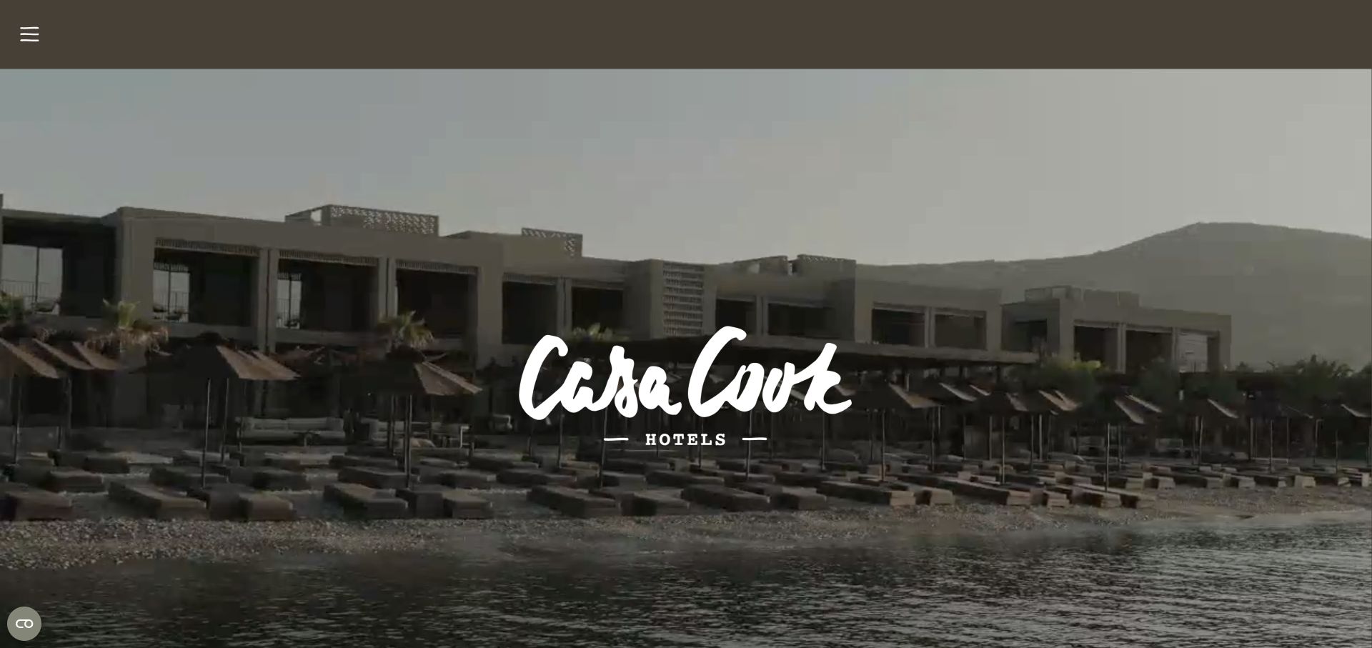
Casa Cook uses a full-width film with a centered white handwritten wordmark. An earthy dark header carries a small menu icon, leaving the opening almost entirely to landscapes and resort architecture. The imagery and subdued palette are doing the work normally handled by a large marketing headline. This establishes a coherent mood for the collection, but the first view is much less task-oriented than hotel sites that expose dates or location selection immediately.
What you can learn
A resort collection can use a consistent visual tone to connect varied destinations. Follow that tone promptly with a clear hotel selector and useful differences between properties, including setting, guest suitability, room choices, and booking conditions. Shared atmosphere should not make the individual destinations interchangeable.
Pros
The restrained logo treatment leaves the resort footage visible instead of covering it with several offers.
The muted colors create a coherent identity across imagery of landscapes and architecture.
Cons & considerations
The first view provides little immediate way to compare hotels or begin a reservation.
A nearly empty desktop header can make practical travel planning depend too heavily on opening a menu.
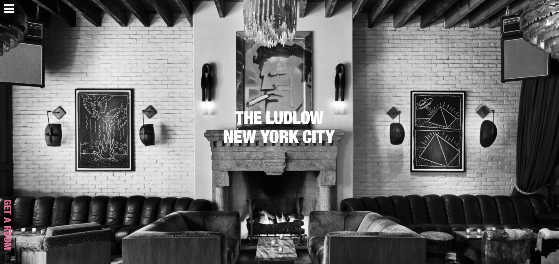
The Ludlow opens with a black-and-white lounge photograph showing the fireplace, art, seating, and exposed beams. Large condensed white type identifies the hotel and New York City in the center. A small menu icon is tucked into the top-left corner, while a pink vertical room-booking tab runs down the left edge. The visual character comes from the interior itself rather than decorative interface elements or a long introductory paragraph.
What you can learn
An original interior photograph can communicate a boutique hotel’s personality more effectively than a generic luxury claim. Keep the room-booking route recognizable and provide accessible room, location, and dining information immediately beyond the opening, especially when the visible navigation is intentionally minimal.
Pros
The interior photograph provides concrete details of the hotel’s shared environment and design character.
The pink reservation tab is visually distinct from the otherwise monochromatic scene.
Cons & considerations
Vertical booking text is less conventional to scan than a standard horizontal action button.
The sparse opening does not explain room options or neighborhood context beyond the city name.
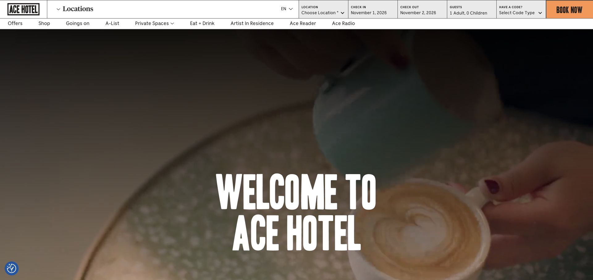
Ace Hotel places a dense reservation grid across the top: location, dates, guests, code, and an orange booking button. A second navigation row includes events, food, artist programs, and editorial projects. Beneath it, a large film and condensed white welcome headline provide the emotional introduction. The interface uses thin black rules and rectangular cells rather than soft cards, giving the practical booking machinery the same graphic character as the brand.
What you can learn
A culturally active hotel needs to serve more than overnight guests, but room search should remain easy to identify. Group the reservation inputs clearly and distinguish editorial or event destinations from the steps required to compare a stay, so a rich brand ecosystem does not become an obstacle to booking.
Pros
The booking grid exposes the main reservation parameters together before a visitor enters another system.
The secondary row makes local programming and food visible as genuine parts of the hotel offering.
Cons & considerations
The many compact input cells can feel crowded on a wide screen and need a careful mobile arrangement.
A broad cultural navigation creates more competing destinations than a single-property hotel would usually need.
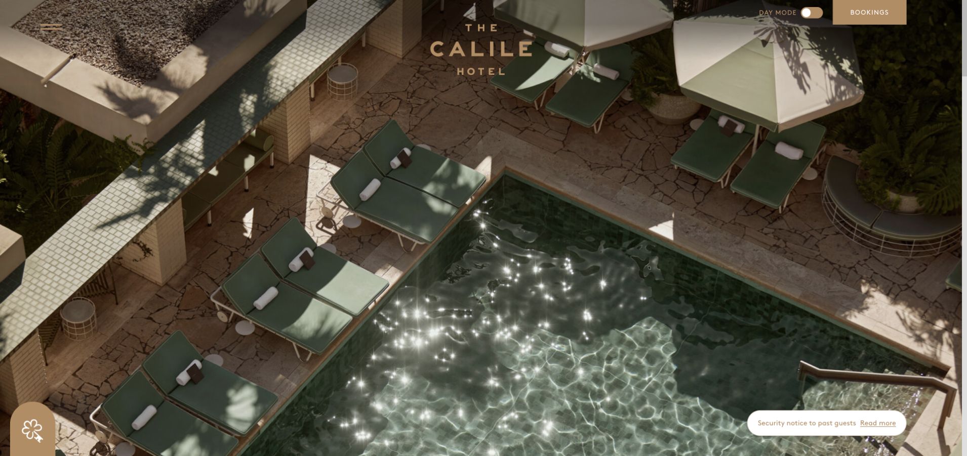
The Calile uses an overhead pool photograph with strong geometric lines, sage loungers, pale stone, and deep shadows. Its centered wordmark is small relative to the image, with a menu icon at the upper left and a booking rectangle on the right. A visible day-mode control adds an unusual interface detail. The opening is almost entirely visual, letting the hotel’s materials and architecture establish the tone rather than adding a large headline.
What you can learn
Strong architectural photography can make a hotel recognizable without heavy promotional copy. Preserve a clear reservation control, then quickly supply room dimensions, amenity details, and neighborhood context. An evocative pool scene should be one part of evaluating a stay, not the only readily visible evidence of what guests receive.
Pros
The overhead composition shows distinctive materials and spatial relationships rather than an anonymous pool close-up.
Booking remains a separate rectangular control instead of disappearing into the menu.
Cons & considerations
The opening provides little immediate explanation of the property’s location or room choices.
Small controls placed over light and dark architectural areas need reliable contrast in both visual modes.
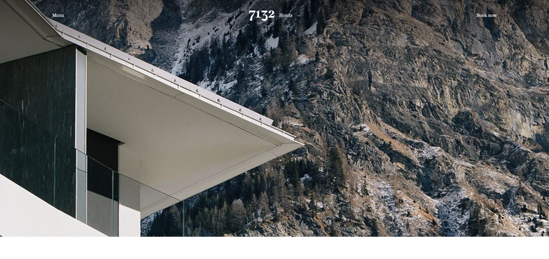
7132 places a close architectural view against a steep mountain landscape. The white numerical identity sits near the center of a very sparse header, with a hotel selector alongside, menu to the left, and booking to the right. A small gallery control appears near the lower corner. The image does not need much decorative framing because the building’s angular roof and the mountain texture already create a strong composition.
What you can learn
A destination property can show the relationship between building and landscape before presenting individual room types. Keep the property selector and booking language explicit, particularly when several accommodations share one destination identity. Guests still need clear comparisons of rooms, access, facilities, and what each booking includes.
Pros
The photograph connects architecture with the surrounding landscape instead of presenting them as unrelated sections.
A visible hotel selector acknowledges that the destination includes more than one accommodation option.
Cons & considerations
The spare opening postpones practical context about location and facilities until a visitor continues.
Small white controls can lose definition against bright architectural surfaces and detailed mountain textures.
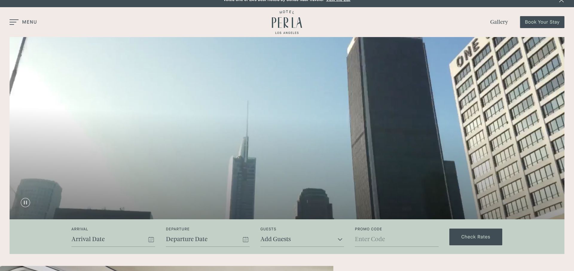
Hotel Per La uses a pale blush masthead with a centered dark green wordmark, a menu label, gallery link, and a clear stay-booking control. The film introduces the hotel within downtown Los Angeles rather than showing only isolated interiors. A sage booking strip beneath exposes arrival, departure, guests, and a promotional code before rate checking. The muted green and blush colors make the form feel integrated with the editorial presentation.
What you can learn
Show a city hotel in its actual surroundings, then give visitors a stable place to explore dates and party size. Keep the room gallery easy to reach before reservation, since neighborhood atmosphere and a rooftop view do not answer questions about the accommodation itself.
Pros
The solid reservation strip clearly labels the main search fields and keeps them independent of the film.
A gallery link is visible beside booking, giving prospective guests a useful exploratory route.
Cons & considerations
The opening film can show the city more than the hotel, delaying specific accommodation information.
A prominent promotional-code input may distract guests who do not have a code or need one.
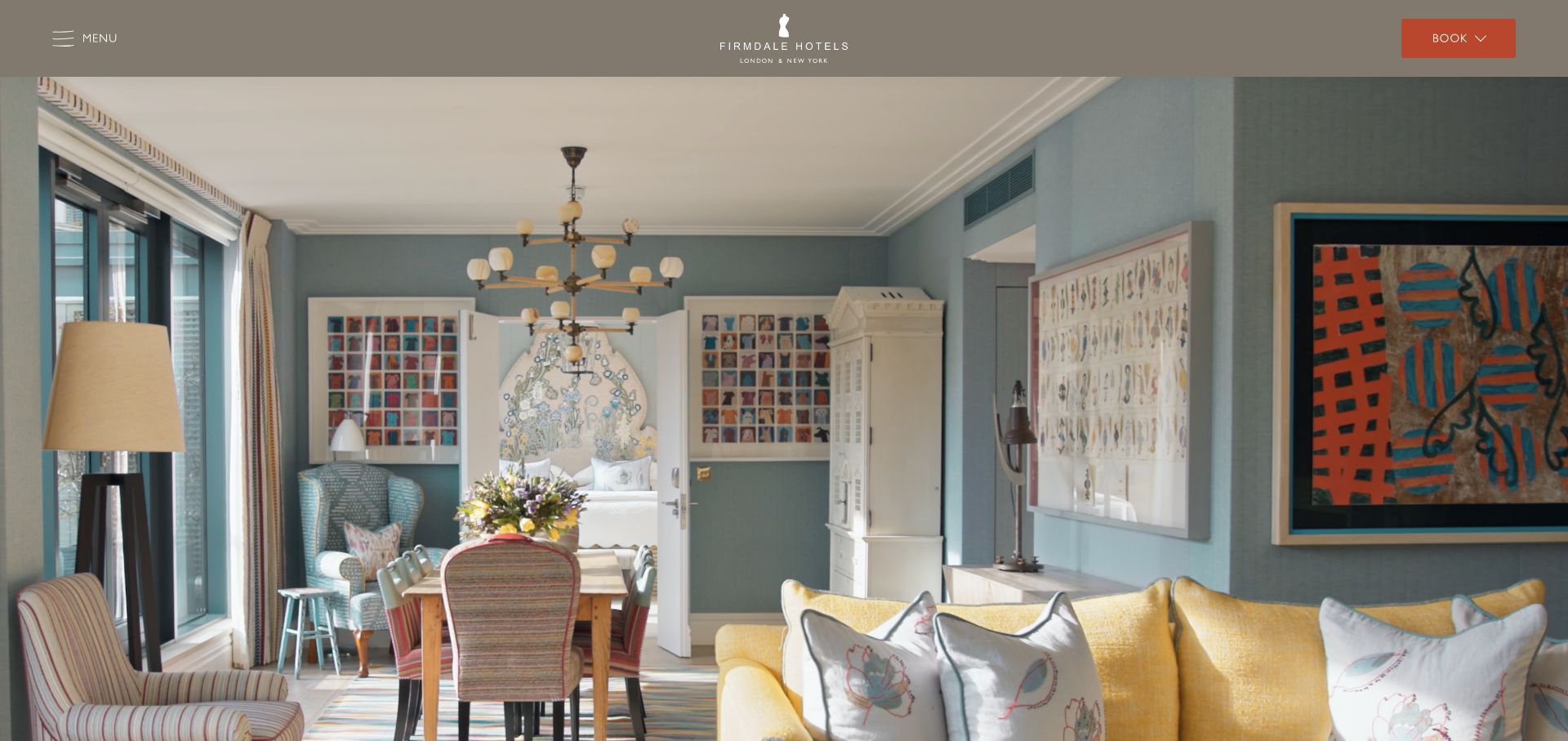
Firmdale uses a taupe masthead, centered small identity, menu label, and a terracotta booking control. The captured opening image shows a richly furnished interior with pale blue walls, patterned fabrics, framed art, and a yellow sofa. The photograph is allowed to fill the view without a competing promotional headline. The contrasting details make the room design itself the collection’s introduction, while the header remains quiet enough to serve several properties.
What you can learn
A hotel collection can establish a shared identity through its interiors without giving every property identical content. Follow the visual introduction with clear location and property choices, then show enough room-specific detail to distinguish the actual stay a guest is considering.
Pros
Original interior photography communicates a distinctive design language more concretely than broad luxury adjectives.
The booking action uses a contrasting solid color without adding multiple competing hero buttons.
Cons & considerations
The menu conceals the location choices that a new visitor may want immediately.
A collection-level interior image needs clear attribution nearby so guests know which property they are viewing.
Visible tech stack
Referenced on the public page
Vite
Vimeo
reCAPTCHA
Public source checked November 3, 2026. References may be embedded or legacy—not a complete backend inventory.
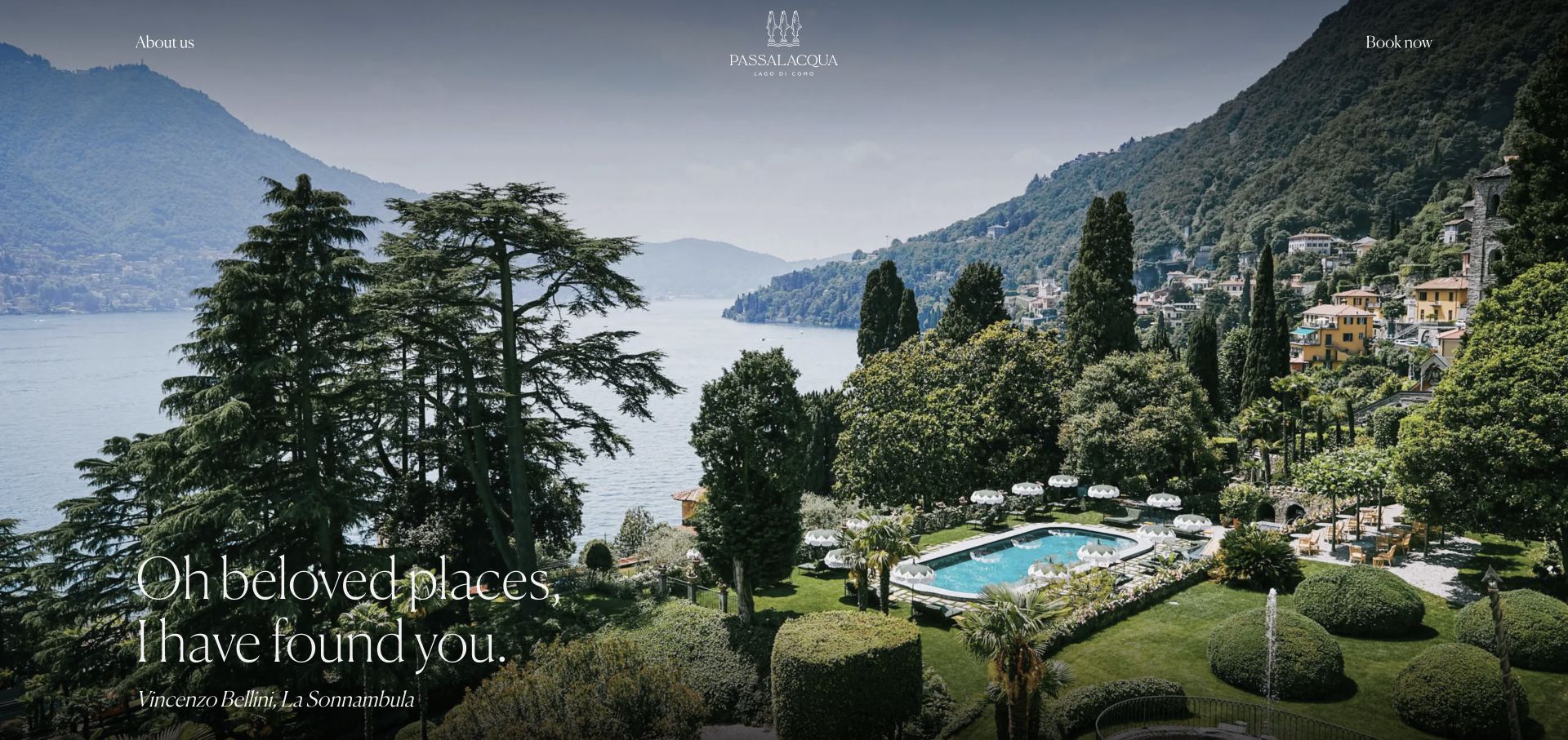
Passalacqua opens with a sweeping view across gardens, a pool, and Lake Como. A small centered crest and name sit above, with about and booking links at opposite corners. Fine white serif text and an attributed literary line occupy the darker lower-left area without obscuring the landscape. The composition leaves the setting as the main information source, using typography and scale to give the page an editorial rather than promotional character.
What you can learn
A distinctive landscape can orient guests and establish the property’s character in one image. Keep the booking route obvious and use the following content to explain rooms, seasonal differences, access, and inclusions. A quotation can add tone, but it should not carry essential information about the stay.
Pros
The panorama shows the relationship between the hotel grounds and the lake rather than a disconnected scenic crop.
The small number of opening controls gives the landscape and booking route a clear hierarchy.
Cons & considerations
The first view offers little direct access to rooms, dining, or arrival information.
Fine white type requires careful placement on a photograph with bright sky and dark foliage.
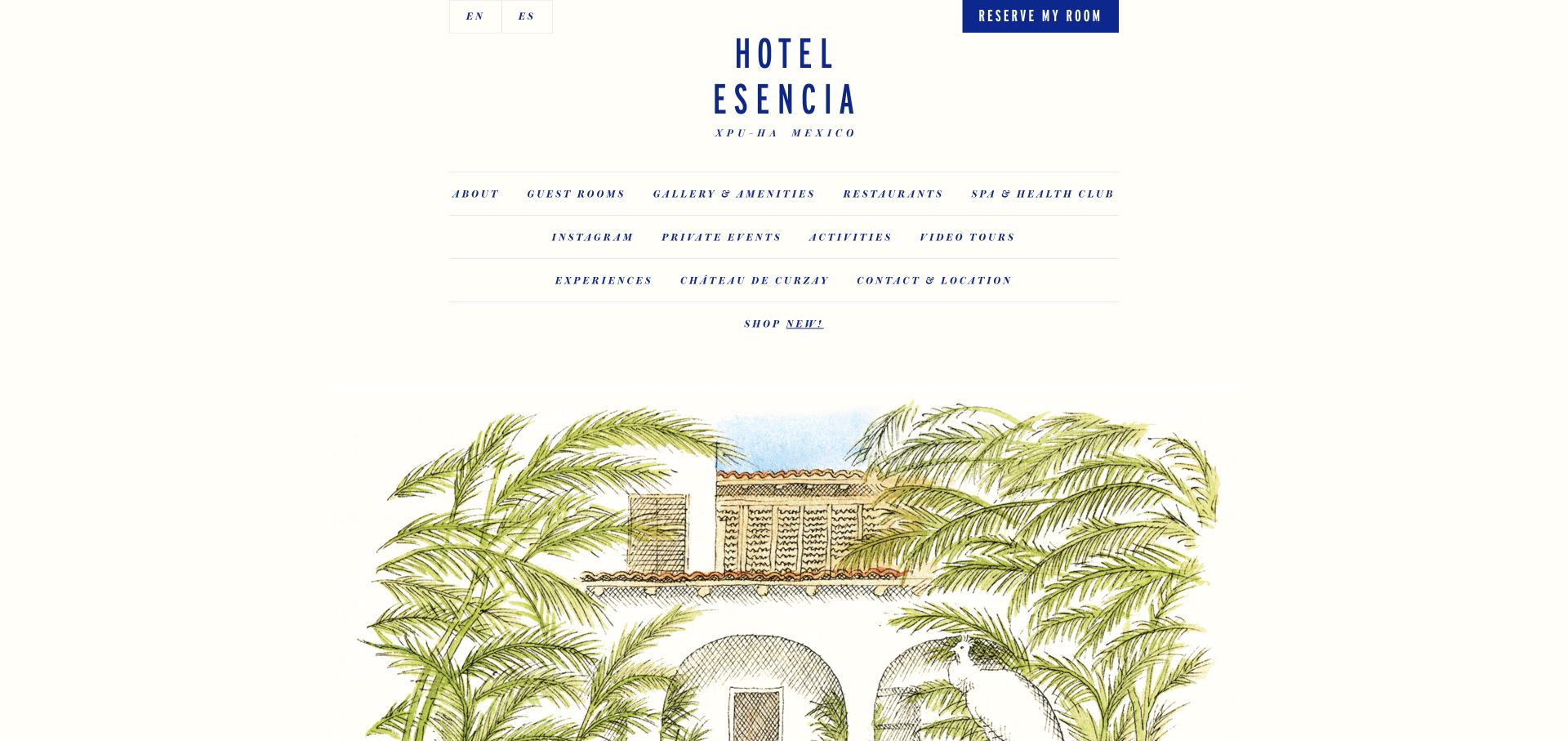
Hotel Esencia uses a narrow centered column, generous cream whitespace, and blue typography that recalls printed stationery. A stacked wordmark sits above three ruled navigation rows, while room reservation and language choices remain at the top. Below, a hand-drawn architectural illustration and palms introduce the property instead of a conventional full-screen photograph. The composition is unusually typographic for a resort homepage, with guest rooms, amenities, dining, activities, and location all directly named.
What you can learn
An independent resort can stand apart through original illustration and disciplined typography, not just larger beach imagery. Preserve a visible room-reservation action and ensure the broad navigation leads to concrete photographs and practical details for each experience, rather than making the editorial identity the only way to understand the property.
Pros
The named navigation categories give guests direct access to rooms, amenities, dining, and location.
The original illustration creates a distinctive identity without needing a full-viewport video.
Cons & considerations
Several rows of small italic navigation can be slower to scan than a shorter primary menu.
The illustration is evocative but cannot substitute for current room and facility photographs.
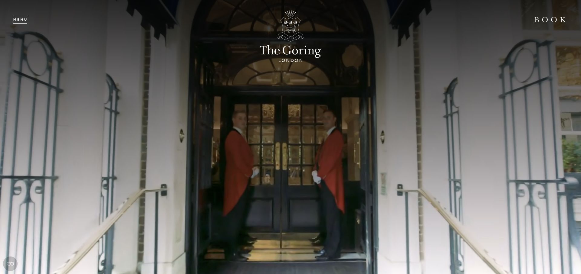
The Goring opens with a film of its entrance and uniformed staff, placing the crest and hotel name near the top center. Menu and booking labels sit at opposite corners, both framed with generous empty space. The interface is almost entirely white over the darkened scene, keeping the focus on the arrival rather than an offer or room search form. This is a direct visual expression of a traditional hospitality identity.
What you can learn
A hotel with a strong arrival ritual can use that experience as its opening story. Keep the booking route visible, then quickly provide clear room comparisons, location information, and dining options. The ceremonial tone should not make practical tasks feel dependent on watching a film or speaking with reservations staff.
Pros
The arrival scene introduces actual service context rather than relying only on empty architectural images.
Booking and menu have separate, consistent positions at the edges of the composition.
Cons & considerations
The minimal opening leaves room categories and practical stay information out of immediate view.
Small white navigation over film needs contrast protection as the image changes.
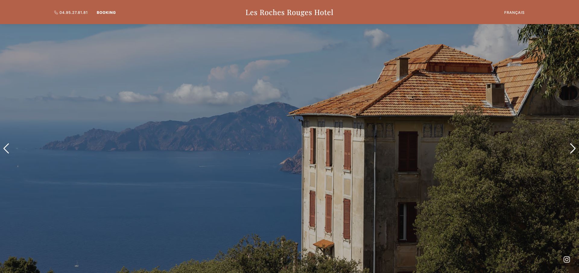
Les Roches Rouges in Piana uses a terracotta header with a centered serif hotel name, phone and booking controls on the left, and a language link on the right. The opening photograph shows the historic building against the Corsican coast and mountains. A pair of clear carousel controls sits at the image edges without adding a large text overlay. The color of the masthead echoes the roof, linking the interface to the real property.
What you can learn
A regional hotel can make a compelling first impression with one accurate property photograph and straightforward contact options. Let the location do the visual work, but provide room, restaurant, access, and seasonal information below so guests can make a practical comparison before reserving.
Pros
The building and coastline appear together, giving more useful context than a generic beach photograph.
Phone, booking, and language controls are visible in a stable solid header.
Cons & considerations
The sparse opening does not explain rooms or facilities until the visitor continues down the page.
Carousel imagery should not be the only place important property information appears, since not every guest will change slides.
Plan the stay before designing the destination story
Create a dependable room and property model
Inventory room types, occupancy, approved amenities and image sets. Decide which fields are shared across a collection and which vary by property. Make it difficult for editors to accidentally apply one hotel’s policy to another.
Define the booking-engine boundary
Map the transition from the website to the reservation system: property, dates, occupancy and any offer conditions. Confirm who owns rate information and how changes propagate. Test unavailable dates and a return from the booking engine, not only a successful first click.
Give operations an update process
Identify owners for temporary closures, dining hours, seasonal offers and arrival guidance. Plan translations and review cycles where relevant. A launch should include the everyday job of keeping guests informed after the design team has left.
The editing job behind the design
Choose the CMS around property content, not rate management
Use the property management, central reservation or booking system as the appropriate source for transactional availability and rates. The public CMS can manage room descriptions, photography, destination information and approved offers. Define the source of truth for every field rather than maintaining competing copies.
A headless approach can suit a multi-property experience, but it adds integration and preview work. A conventional CMS may be easier for a small hotel team. In either case, test translated content, image handling and the booking handoff before committing to elaborate motion.
Our WordPress website examples offer a separate look at publishing approaches. A visible platform label is evidence for that named page, not a guarantee that the same system will suit your requirements.
Before the public launch
Hotel website launch checklist
Verify room descriptions, occupancy and representative images with the property.
Test property, dates and guest details through the booking handoff.
Check unavailable dates, offer conditions and the route back to browsing.
Confirm arrival, contact and approved policy information.
Review mobile room comparisons, image loading, keyboard focus and zoom.
Assign owners for seasonal offers, translations and operational notices.
These checks are a project checklist, not a performance, legal, security, or accessibility certification. Test real journeys with the people responsible for the website before making claims about the result.
Sources & editorial method
How this collection was selected and reviewed
We compared official hotel and hotel-collection sites with distinct approaches to property navigation, rooms and destination storytelling. The review is limited to observable website presentation and does not evaluate stays or test real bookings.
Each example links to its actual source page. Screenshots are direct browser captures with their own capture dates; moving imagery, announcements and live designs can change. The notes describe observable design choices and conditional tradeoffs, not measured traffic, conversion results, service quality, or accessibility conformance.
Technology labels use public page metadata, asset evidence, or explicitly cited platform documentation. Platform documentation is not a complete current deployment audit. A component reference may be legacy or unused; it is not a complete backend inventory. Unknown stacks are omitted. These sites are editorial examples, not our client portfolio.
Written, Edited and Curated are separate editorial records, not timestamps advanced by a rebuild. Website designs and imagery belong to their owners. See our editorial standards or suggest a correction.
Questions worth asking
Hotel website design questions
Should a hotel publish prices in the CMS?
Avoid maintaining rate copies that can drift from the booking system. If displaying a starting rate or offer, define its source, assumptions and update owner. Confirm the approach with the team responsible for reservations.
Does every property need a separate website?
Not necessarily. A collection can share a CMS and design system while giving each property distinctive imagery and accurate local information. The choice depends on brand, operations, languages and booking requirements.
Is a homepage booking bar essential?
A clear booking route is important, but its form should fit the audience. Compare an immediate date selector with a simple booking action and property selection. Validate the journey on smaller screens.
Can a video replace a room gallery?
No. Guests still need representative room images and practical details. Treat video as optional atmosphere with a useful still fallback, not the only way to inspect a room.
Borrow the sense of place, but build the room information and booking journey around the property’s real operations and the guest’s practical decisions.