A newsletter signup is an exchange: a visitor shares an address in return for clearly described updates. These examples combine genuine website screenshots, recorded Mailchimp resource references, and original reviews of how that promise can fit the surrounding content.
Strong subscriptions begin with useful content and honest expectations. A publisher can promise reporting, a gallery can announce exhibitions, and a retailer can share new releases. Each should explain the type of communication rather than relying on a generic request to stay connected.
The collection includes cultural institutions, publications, retailers, hospitality, and service businesses. A public Mailchimp reference establishes a website integration association, not inbox delivery, audience ownership, a working form submission, or commerce synchronization. The design reviews identify questions to test on your own website without pretending to see the example organization’s private email program.
Before the examples
What makes good Mailchimp website development in 2026?
Make the subscription promise concrete
Explain what readers will receive and give a realistic sense of frequency. Match the sender identity, welcome message, and destination pages to that promise. If editorial and promotional updates differ substantially, make the distinction understandable before asking for an address.
Choose the form placement deliberately
Mailchimp documents several signup options, including forms that can be connected to a website. Select a placement that fits the reading or shopping task. A quiet footer can work for occasional updates; a dedicated page may provide room for examples and preferences.
Review the complete path after the visitor acts: feedback, any confirmation step, welcome content, preference changes, and unsubscribe. Those screens and messages should use plain language. Do not let an attractive embedded form hide an unclear or inconsistent subscriber experience.
The collection · 20 examples
20 Mailchimp website examples worth studying
Spotify’s For the Record newsroom, the Whitney, Quanta Magazine, Primrose Schools, and Europa Editions open the collection. Each named public property has recorded Mailchimp resource or signup evidence and a genuine capture.
We start with five recognizable brands or organizations: Spotify — For the Record, Whitney Museum of American Art, Quanta Magazine, Primrose Schools, Europa Editions. Each attribution applies to the named website property, not every product or website belonging to its organization. This is a curated reading sequence, not a measured ranking.
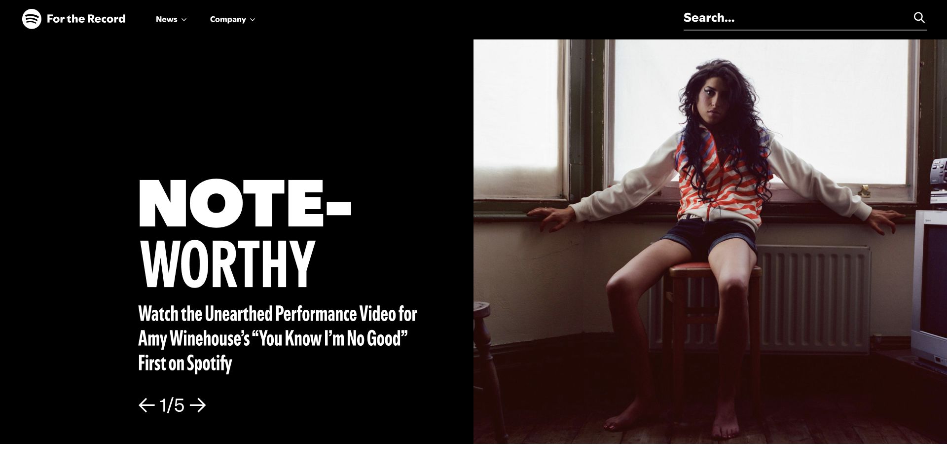
Spotify’s For the Record uses a black stage, oversized lettering, and an artist portrait to make a newsroom story feel like a feature rather than a corporate announcement. The restrained news and company navigation gives the property its own editorial identity. For a Mailchimp integration, that identity should carry into the subscription promise: readers need to know whether they are requesting newsroom stories, product offers, or something else. The sampled public resource does not prove the signup process or email delivery. It also says nothing about the technology of Spotify’s listening application.
What you can learn
Write a specific editorial signup promise and show a representative type of story before collecting an address. Test the acknowledgment, preference management, and unsubscribe experience in an owned test audience, while keeping newsroom subscriptions separate from account or product notifications.
Pros
The distinctive story presentation gives a clear idea of the publication’s editorial tone.
A dedicated newsroom identity can support a recognizable sender and subscription purpose.
Cons & considerations
An attractive feature does not explain newsletter frequency or scope by itself.
Public Mailchimp resources do not verify delivery, consent records, or listening activity.
Platform source: Exact public source-page evidence. The exact sampled page references a Mailchimp resource or signup endpoint. This supports a public website integration, not proof of a submitted subscription, email delivery, or ownership of every form. Platform evidence is separate from the direct website screenshot and is not a complete current infrastructure audit.
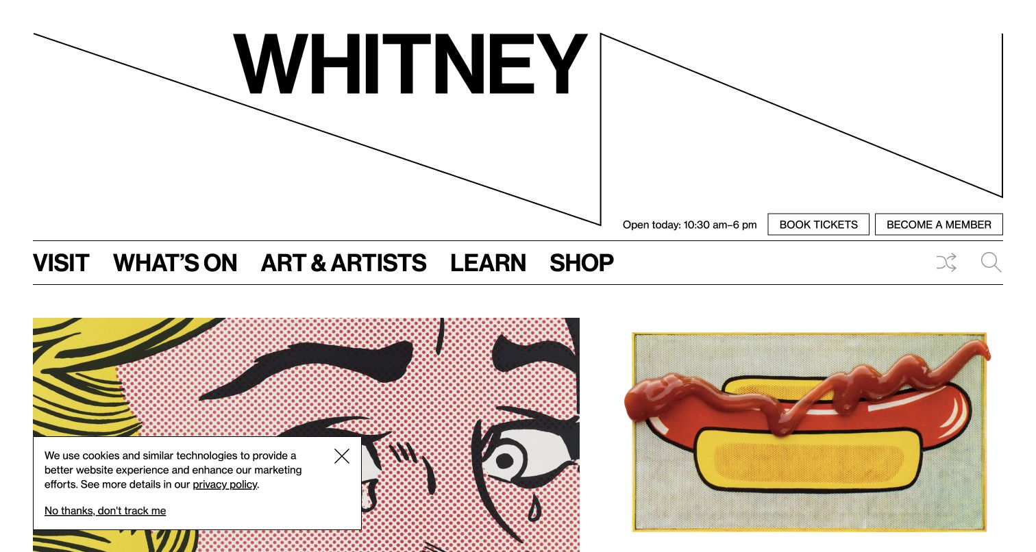
The Whitney’s oversized wordmark and angular lines establish a strong identity above practical visit navigation. Opening hours, tickets, and membership are visible near a pair of artwork images. A Mailchimp connected museum site can use that same balance of culture and utility in its subscription experience. Readers may want exhibition announcements without becoming members or booking a visit. Those choices should remain distinct. The observed page association does not establish that Mailchimp handles ticketing, membership records, or every form, and the screenshot is not evidence that any email was submitted successfully.
What you can learn
Describe whether updates cover exhibitions, events, or institutional news, and keep membership and ticket confirmations separate. For your own museum, test mobile form labels and confirmation copy, then make preference changes as easy to find as the original signup.
Pros
The museum identity is memorable while practical visitor information remains nearby.
Artwork previews provide meaningful context for a cultural newsletter’s potential content.
Cons & considerations
A large masthead can push supporting subscription context below the first view.
Newsletter interest should not be treated as a membership purchase or ticket sale.
Platform source: Exact public source-page evidence. The exact sampled page references a Mailchimp resource or signup endpoint. This supports a public website integration, not proof of a submitted subscription, email delivery, or ownership of every form. Platform evidence is separate from the direct website screenshot and is not a complete current infrastructure audit.
Quanta Magazine’s homepage combines a restrained masthead with subject navigation and a large illustrated science feature. Physics, mathematics, biology, and computer science are named directly, giving readers a clear sense of the publication’s scope. That is useful when planning a Mailchimp integration: a subscription can promise the editorial experience the website actually offers instead of relying on a vague request to stay connected. The sampled resource establishes a public integration association, not the audience settings, sending schedule, or deliverability of the publication’s email program. Those require separate verification.
What you can learn
Base signup language on the publication’s real subject areas and publishing rhythm. Explain whether readers receive a general digest or topic selections, test the confirmation experience without adding real subscribers, and avoid treating article reading as permission to send email.
Pros
Explicit subject navigation makes the editorial scope understandable before subscription.
The large illustration gives complex reporting a distinctive and approachable visual identity.
Cons & considerations
A subject rich homepage still needs a clear email frequency and content promise.
The resource evidence does not reveal list management or inbox placement results.
Platform source: Exact public source-page evidence. The exact sampled page references a Mailchimp resource or signup endpoint. This supports a public website integration, not proof of a submitted subscription, email delivery, or ownership of every form. Platform evidence is separate from the direct website screenshot and is not a complete current infrastructure audit.
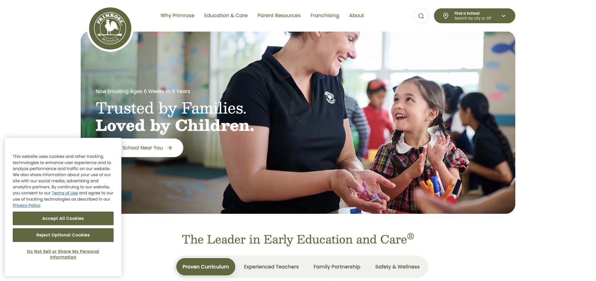
Primrose Schools places a classroom photograph and a short trust centered message beside a route to find a nearby school. Navigation distinguishes educational information, parent resources, franchising, and organizational background. Those audiences should also remain distinct in a Mailchimp integration plan. A parent exploring local options may want information without requesting enrollment, while a franchise prospect has an entirely different purpose. The public resource signal does not establish the school’s enrollment system, contact records, or handling of children’s information. The useful pattern is a local next step supported by educational context.
What you can learn
Make general newsletter signup optional and separate from school inquiries. Ask only for appropriate initial contact information, explain the relevance of any location choice, and verify that confirmation messages do not imply enrollment, availability, or permission for unrelated marketing.
Pros
The school finder gives interested families a concrete and location aware next step.
Parent resources offer useful information before a visitor decides to make contact.
Cons & considerations
A national homepage cannot establish availability at an individual school.
Mailchimp resource evidence does not verify enrollment workflows or child data handling.
Platform source: Exact public source-page evidence. The exact sampled page references a Mailchimp resource or signup endpoint. This supports a public website integration, not proof of a submitted subscription, email delivery, or ownership of every form. Platform evidence is separate from the direct website screenshot and is not a complete current infrastructure audit.
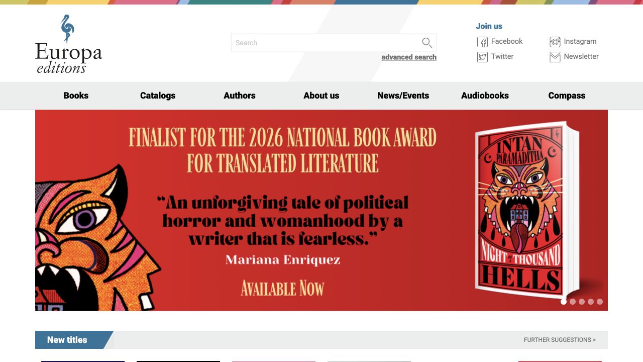
Europa Editions places a prominent book promotion below a detailed publishing navigation, with search and a newsletter link grouped in the upper area. Books, catalogs, authors, news, and audiobooks give the page several discovery paths. The newsletter is therefore a natural continuation of an editorial relationship, rather than an interruption unrelated to the content. A Mailchimp integration should preserve that clarity. The observed resource supports a public association but does not prove which audience receives updates, whether the form confirms addresses, or how the publisher separates retail and professional readers.
What you can learn
Promise concrete literary content such as new titles, author events, or catalog highlights, and match the welcome message to that promise. If booksellers or press need different information, provide an explicit choice rather than inferring professional status from browsing behavior.
Pros
A visible newsletter link sits alongside other ways to follow the publisher.
Author and catalog navigation give readers substantive reasons to return.
Cons & considerations
A broad newsletter label does not explain frequency or the balance of promotional content.
Public evidence cannot establish the internal segmentation of readers and trade contacts.
Platform source: Exact public source-page evidence. The exact sampled page references a Mailchimp resource or signup endpoint. This supports a public website integration, not proof of a submitted subscription, email delivery, or ownership of every form. Platform evidence is separate from the direct website screenshot and is not a complete current infrastructure audit.
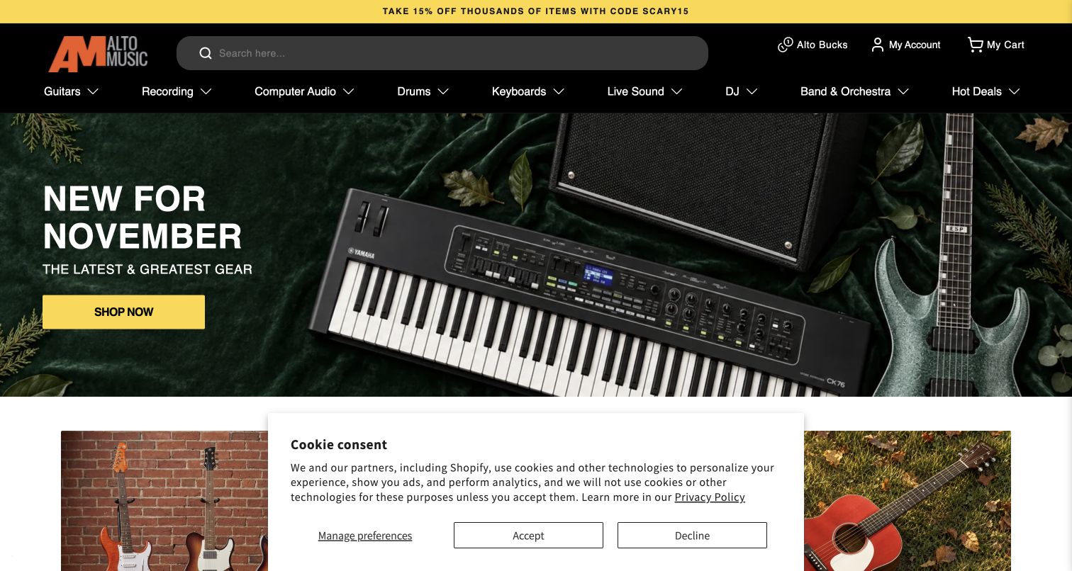
Alto Music’s homepage uses a dark navigation bar, broad product categories, and a seasonal gear promotion with a bright shopping action. Search has substantial space, recognizing that some musicians arrive knowing exactly what they need. A Mailchimp integration can complement that discovery with relevant announcements, but a retail newsletter is different from transactional order communication. The observed resource does not establish inventory synchronization, purchase data handling, or the system that sends receipts. The design lesson is to connect email promises to actual merchandise interests without making every browsing visit a subscription decision.
What you can learn
Offer clear update choices around relevant gear or store news and keep promotional permission separate from checkout requirements. Test campaign links against available products, explain discounts accurately, and verify that unsubscribe choices do not interfere with necessary order or service messages.
Pros
Prominent search supports shoppers who have a specific instrument or model in mind.
Product categories give a useful vocabulary for optional email interests.
Cons & considerations
Seasonal promotions can become misleading when linked inventory or offers expire.
A Mailchimp script does not prove commerce data synchronization or receipt delivery.
Platform source: Exact public source-page evidence. The exact sampled page references a Mailchimp resource or signup endpoint. This supports a public website integration, not proof of a submitted subscription, email delivery, or ownership of every form. Platform evidence is separate from the direct website screenshot and is not a complete current infrastructure audit.
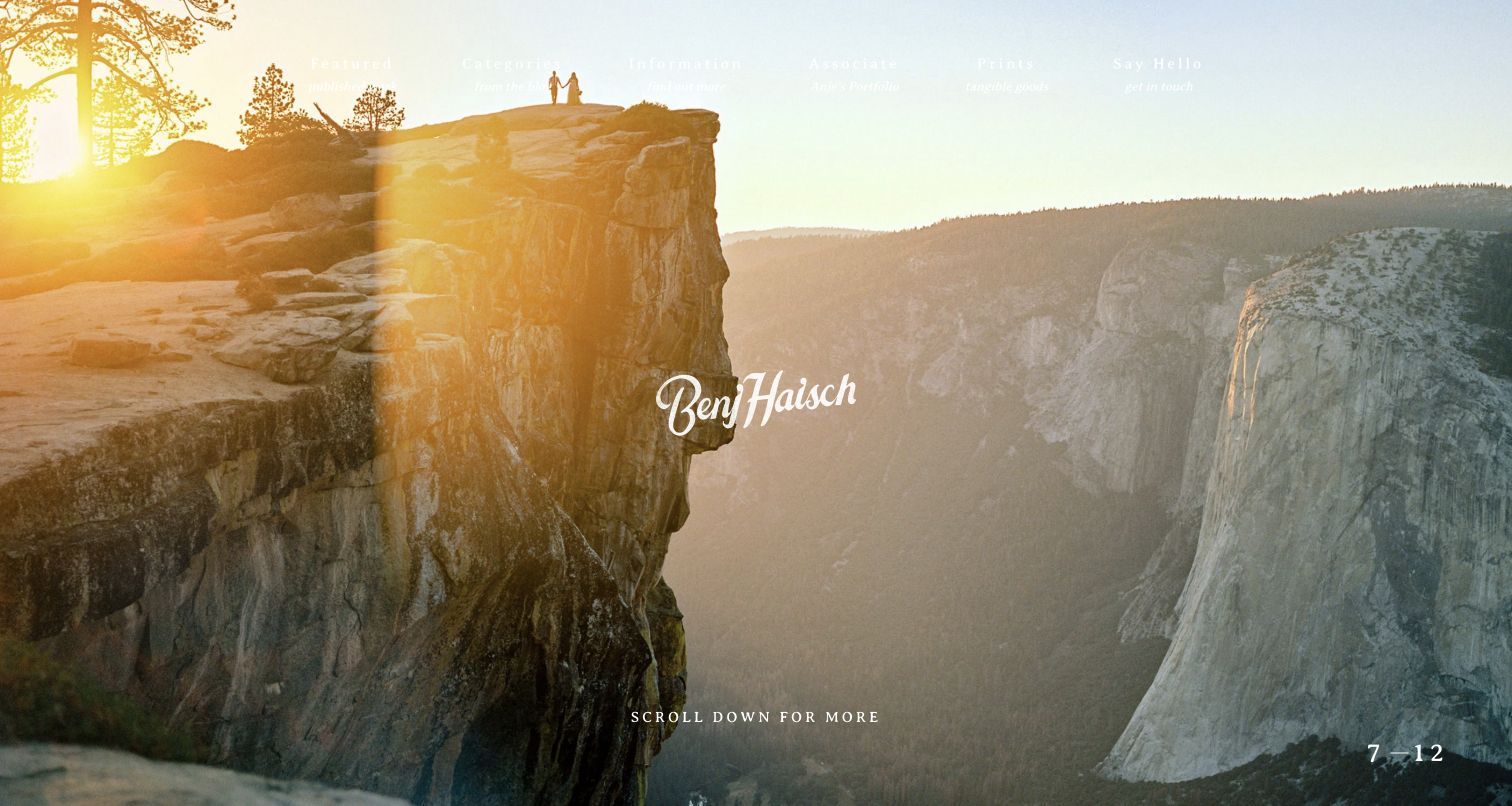
Benj Haisch’s homepage fills the opening view with a dramatic landscape photograph and a small personal signature. The navigation is quiet, and a scroll invitation lets the image establish the photographer’s sensibility before asking for more attention. A Mailchimp integration on a portfolio like this should extend that personal relationship with a clear reason to subscribe. Wedding inquiries, educational updates, and new work announcements are different requests. The resource evidence does not identify the actual audience or prove that any visible contact mechanism is connected to Mailchimp.
What you can learn
State what subscribers will receive in the photographer’s own voice and distinguish education from client inquiries. Keep the signup compact but labeled, show how often updates are likely, and test welcome and unsubscribe messages so they remain as clear as the portfolio itself.
Pros
A single strong photograph gives visitors a clear impression of the creative style.
Restrained navigation lets the work establish trust before any contact decision.
Cons & considerations
Small light navigation can be difficult to read over changing photographs.
A portfolio’s emotional impact does not replace a specific email subscription promise.
Platform source: Exact public source-page evidence. The exact sampled page references a Mailchimp resource or signup endpoint. This supports a public website integration, not proof of a submitted subscription, email delivery, or ownership of every form. Platform evidence is separate from the direct website screenshot and is not a complete current infrastructure audit.
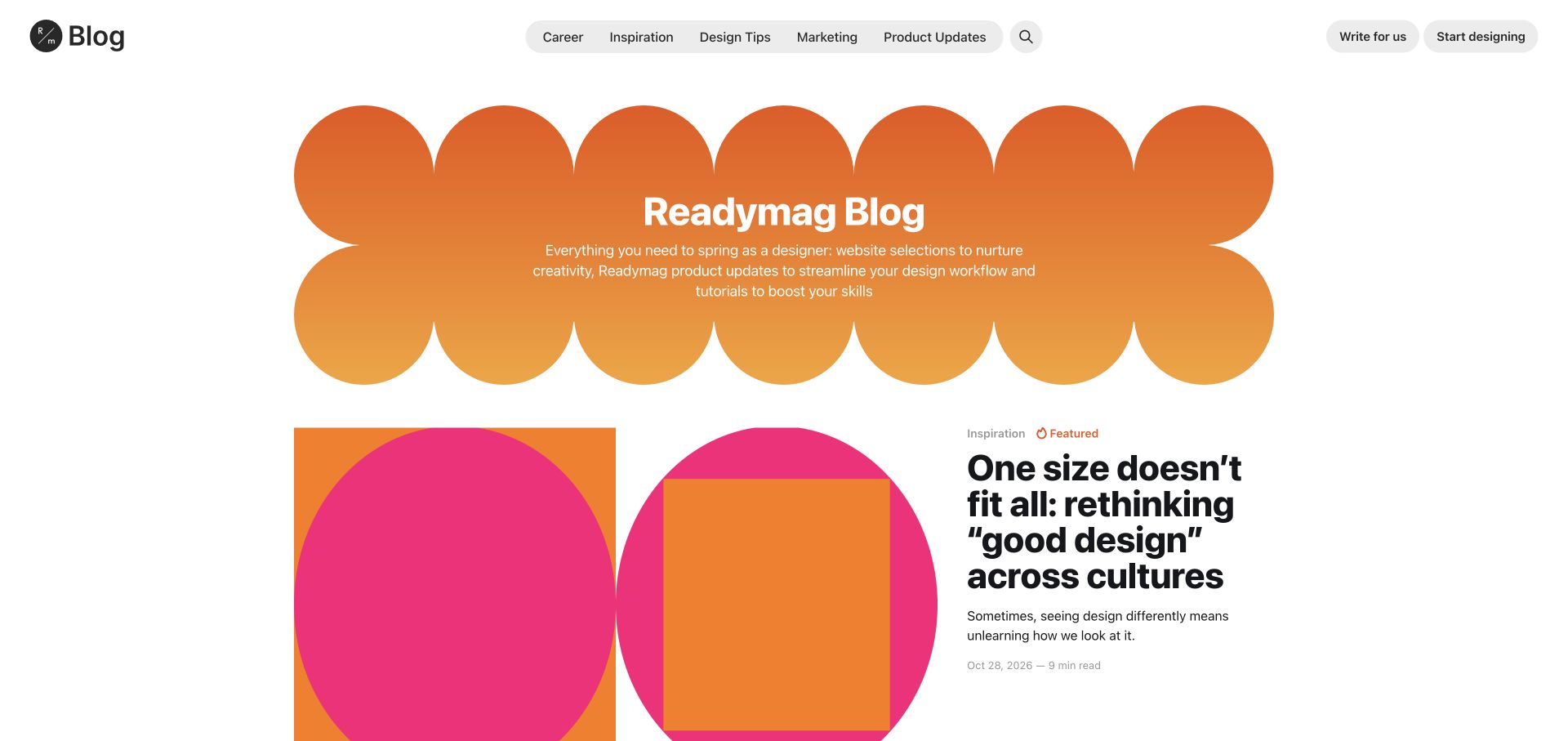
Readymag’s blog uses a large orange decorative masthead above colorful article imagery and a compact set of editorial categories. Career, inspiration, design tips, marketing, and product updates are named individually. That structure offers a useful Mailchimp planning lesson: readers may value the publication even when they are not ready to become product customers. A subscription should explain the balance of editorial and product communication. The sampled resource applies to this blog property; it does not establish how the main application is built or how users’ published projects are hosted.
What you can learn
Use the blog’s real content categories to write a precise signup promise or optional preference choices. Keep product account notices independent, and verify that welcome emails and campaign destinations remain on the expected editorial or product path rather than mixing them without explanation.
Pros
Distinct categories give readers an immediate sense of the publication’s range.
Strong visual styling connects the editorial experience with the design oriented brand.
Cons & considerations
Editorial and product updates can feel inconsistent if one generic subscription hides the mix.
The blog integration does not establish the technology behind customer projects.
Platform source: Exact public source-page evidence. The exact sampled page references a Mailchimp resource or signup endpoint. This supports a public website integration, not proof of a submitted subscription, email delivery, or ownership of every form. Platform evidence is separate from the direct website screenshot and is not a complete current infrastructure audit.
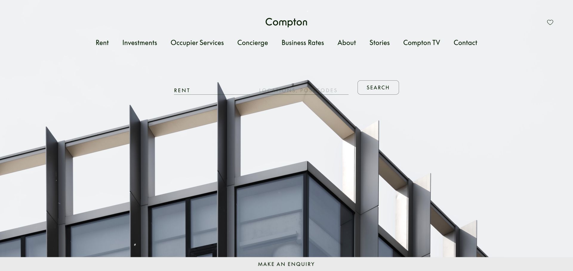
Compton’s homepage combines a pale architectural photograph with a compact property search and a restrained navigation spanning rental, investment, occupier services, stories, and contact. A persistent inquiry strip reinforces the practical purpose without dominating the image. For a Mailchimp integration, the useful distinction is between property availability alerts and broader company or market updates. Those messages have different relevance and urgency. The public resource does not reveal the internal property database, inquiry routing, or subscriber segmentation, so the collection treats it as an integration example rather than a verified operational workflow.
What you can learn
Let prospective subscribers choose the kind of property or editorial updates they need, and explain any location filters. Keep an inquiry response separate from ongoing marketing permission, then test that expired listing links and preference changes are handled clearly.
Pros
Search and inquiry routes provide practical next steps alongside the architectural presentation.
Named service areas can help visitors choose relevant communication interests.
Cons & considerations
Property availability can change faster than an email campaign or landing page.
A public Mailchimp reference does not verify listing feeds or contact routing.
Platform source: Exact public source-page evidence. The exact sampled page references a Mailchimp resource or signup endpoint. This supports a public website integration, not proof of a submitted subscription, email delivery, or ownership of every form. Platform evidence is separate from the direct website screenshot and is not a complete current infrastructure audit.
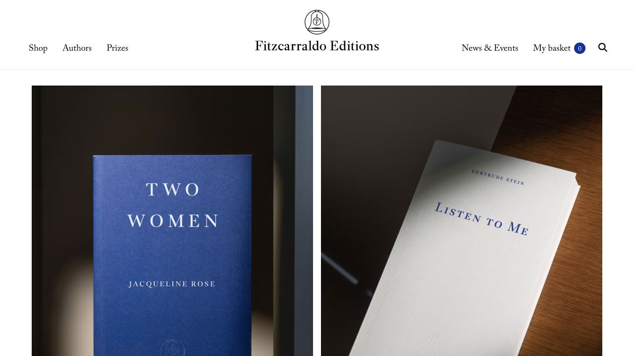
Fitzcarraldo Editions gives its books generous photographic space beneath a centered wordmark and a spare set of links. Shop, authors, prizes, and news establish the publisher’s world with little interface clutter. This is a strong starting point for a Mailchimp integration because the catalog already supplies a recognizable visual and editorial language. The challenge is to explain why an email is useful beyond repeating a cover image. Public resource evidence does not prove the publisher’s actual email design, sending cadence, or purchase integration; those remain outside the sampled page.
What you can learn
Build a subscription promise around new books, author context, and relevant events. Use the same clear identity in the welcome message, keep retail receipts separate, and test book links and image alternatives so the email remains useful when pictures are unavailable.
Pros
Book photography and restrained typography create a recognizable catalog identity.
Author and news routes provide material for more than purely promotional updates.
Cons & considerations
Minimal navigation can leave subscription details out of the opening view.
A strong visual identity alone does not explain email frequency or audience preferences.
Platform source: Exact public source-page evidence. The exact sampled page references a Mailchimp resource or signup endpoint. This supports a public website integration, not proof of a submitted subscription, email delivery, or ownership of every form. Platform evidence is separate from the direct website screenshot and is not a complete current infrastructure audit.
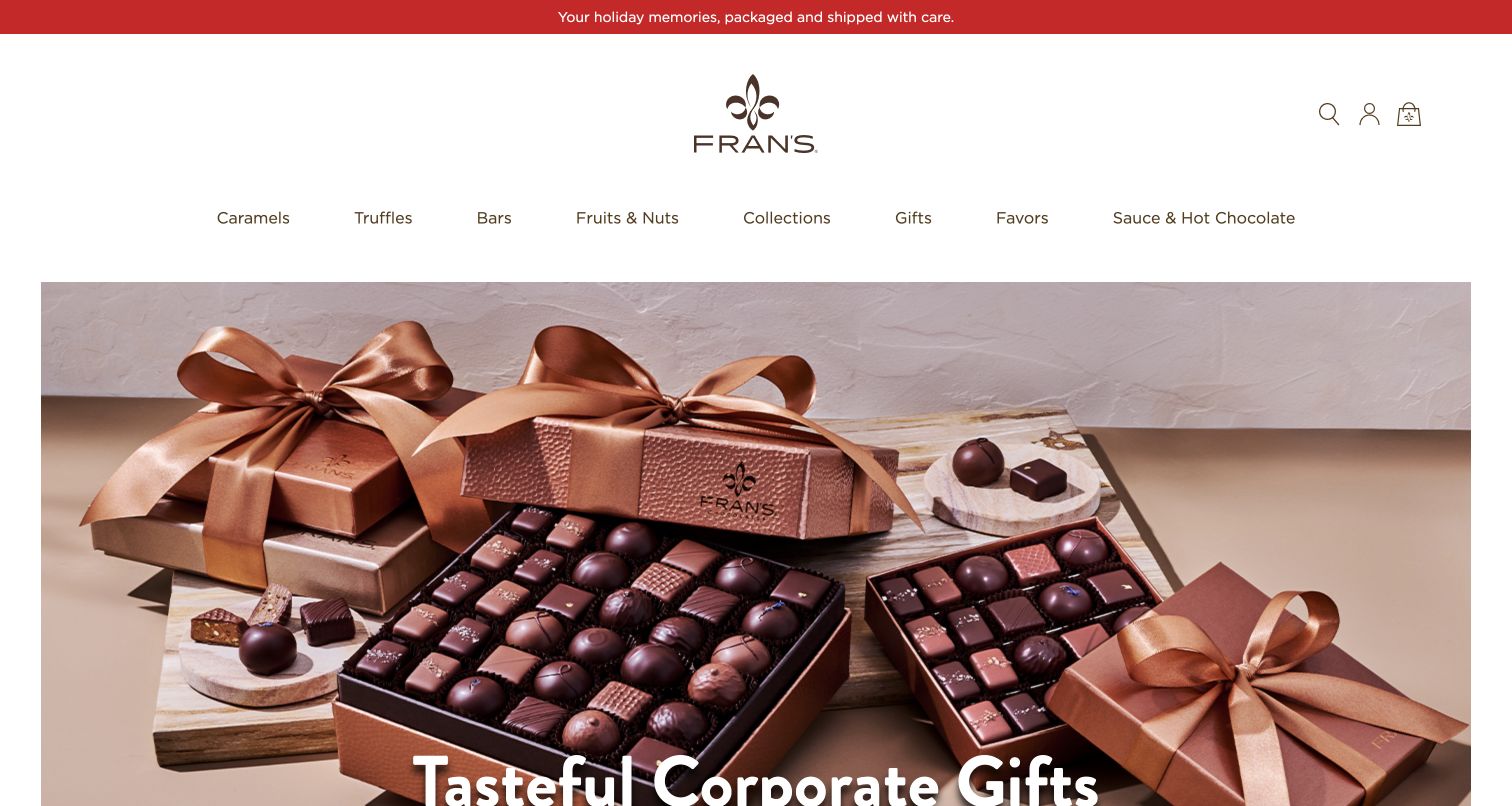
Fran’s Chocolates uses a pale, spacious layout to present boxed chocolates and ribbons, with product families and gifting routes clearly named above. A narrow seasonal strip adds timely context without replacing the product image. For Mailchimp planning, the design suggests several different communications: new collections, holiday deadlines, and corporate gifting information. These should not be confused with shipping updates or support. The observed resource supports a website association only, not proof of how orders, customer records, or corporate inquiries are connected behind the storefront.
What you can learn
Make seasonal subscription content explicit and keep service messages authoritative in the order system. If corporate gifting has a separate inquiry, explain that distinction, and verify delivery deadline claims and campaign destinations before reusing a holiday email or landing page.
Pros
Product categories and gift imagery make the commercial context immediately understandable.
The slim seasonal message leaves the merchandise as the main visual focus.
Cons & considerations
Shipping promises and seasonal deadlines need active maintenance across channels.
A Mailchimp resource does not establish order status synchronization or fulfillment accuracy.
Platform source: Exact public source-page evidence. The exact sampled page references a Mailchimp resource or signup endpoint. This supports a public website integration, not proof of a submitted subscription, email delivery, or ownership of every form. Platform evidence is separate from the direct website screenshot and is not a complete current infrastructure audit.
Hiller’s homepage foregrounds a branded service vehicle beneath a large service promise. Plumbing, HVAC, electrical, promotions, and pricing appear in the navigation, with online scheduling given a distinct button. This creates a practical context for a Mailchimp integration: maintenance reminders and company promotions can be useful, but they are different from the response to a requested appointment. The sampled page does not establish that Mailchimp handles scheduling or technician dispatch. A sound implementation should let homeowners reach essential service information without requiring them to join a marketing audience.
What you can learn
Separate appointment communication from optional seasonal maintenance or promotional email. Explain the type of updates offered, use service areas only when necessary, and test that a visitor can decline marketing while still requesting help or finding a telephone contact.
Pros
Named service categories help homeowners identify the relevant kind of assistance.
The scheduling button creates a clear practical next step in the header.
Cons & considerations
Broad service guarantees require supporting terms beyond the introductory headline.
Marketing integration evidence cannot verify scheduling, dispatch, or appointment completion.
Platform source: Exact public source-page evidence. The exact sampled page references a Mailchimp resource or signup endpoint. This supports a public website integration, not proof of a submitted subscription, email delivery, or ownership of every form. Platform evidence is separate from the direct website screenshot and is not a complete current infrastructure audit.
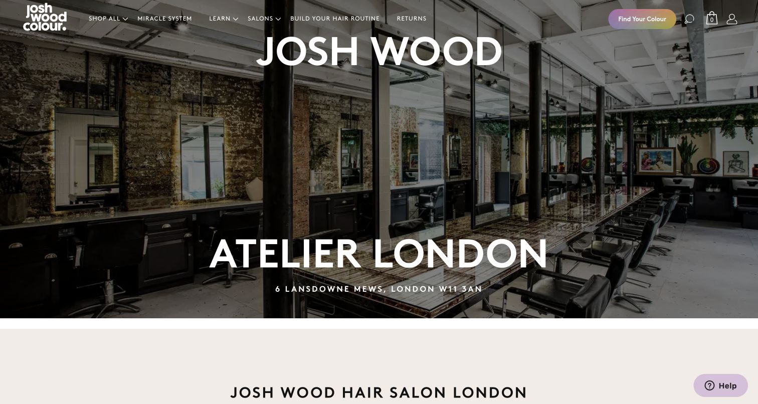
Josh Wood’s London atelier page shows the salon interior under a large location title, while the surrounding header also offers shopping, learning, salon, and routine building routes. The specific page gives a physical service a place within a broader consumer brand. That is a useful Mailchimp integration boundary. Someone researching a salon visit may want different updates from a product shopper. The exact sampled page supports a public integration association, but it does not identify the booking system or prove how salon clients and retail subscribers are organized internally.
What you can learn
Write location specific service updates and product marketing as separate choices when their audiences differ. Keep booking confirmations independent, provide practical salon details before a subscription request, and test that campaign links preserve the correct location and service context.
Pros
The salon photograph and address connect the brand to a concrete physical destination.
Service and product navigation remain available without requiring a separate brand site.
Cons & considerations
A combined retail and salon header can distract from practical appointment questions.
Mailchimp resource evidence does not establish booking availability or client record handling.
Platform source: Exact public source-page evidence. The exact sampled page references a Mailchimp resource or signup endpoint. This supports a public website integration, not proof of a submitted subscription, email delivery, or ownership of every form. Platform evidence is separate from the direct website screenshot and is not a complete current infrastructure audit.
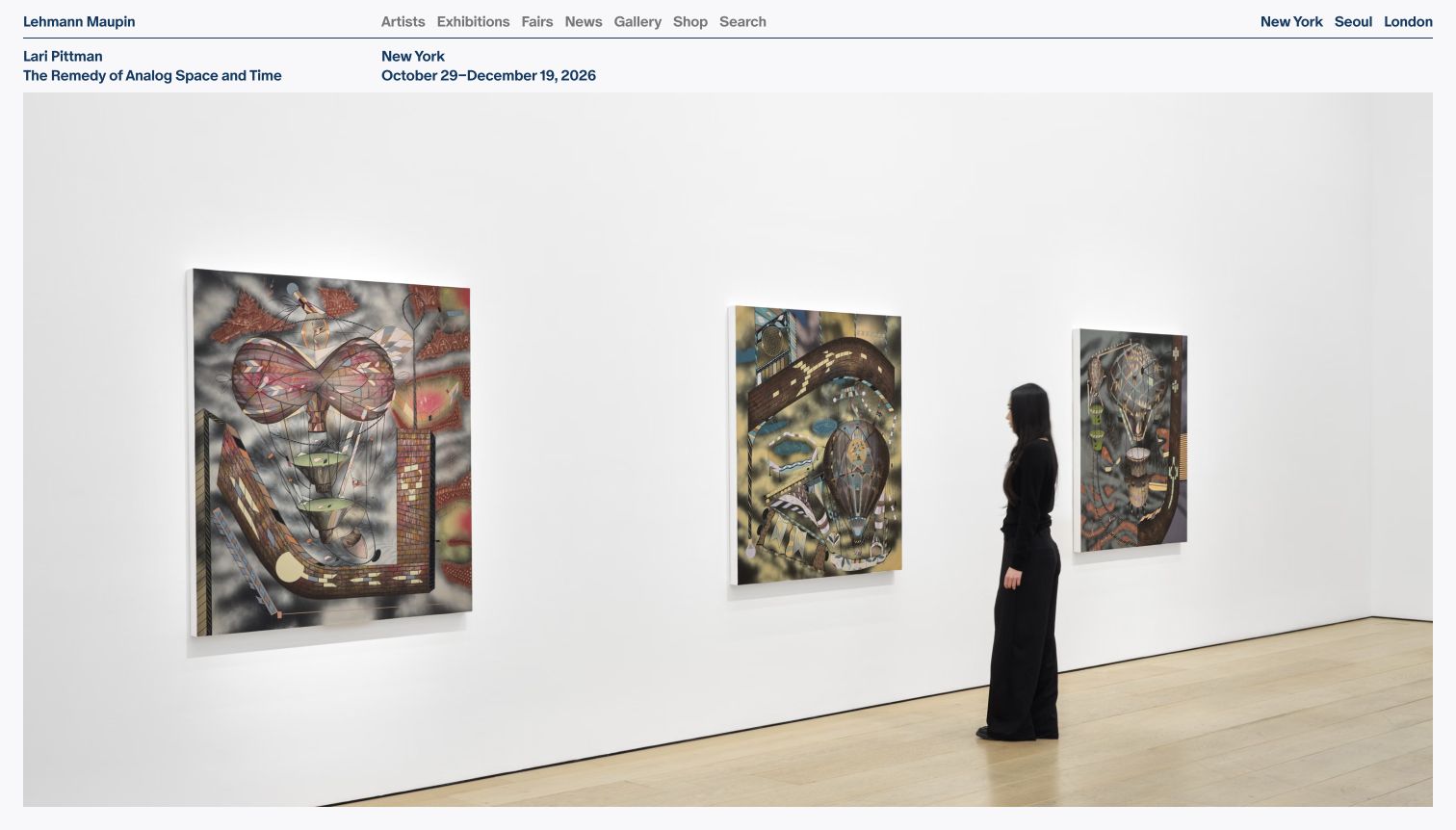
Lehmann Maupin places a wide installation photograph below a compact exhibition title, location, and date line. The header distinguishes artists, exhibitions, fairs, news, and gallery information, with cities named at the edge. This supplies useful structure for a Mailchimp subscription promise: gallery updates are most valuable when readers understand the location and timing. The sampled resource does not prove how collector interests are stored or whether every inquiry is connected to Mailchimp. The visible design instead demonstrates how concise metadata can give a richly visual art presentation practical context.
What you can learn
Keep exhibition dates and locations explicit in signup choices, email subjects, and destination pages. Distinguish general program updates from artwork inquiries, and test time sensitive links and image alternatives before sending campaigns that may be read after an exhibition has ended.
Pros
Exhibition metadata provides useful context without competing with the installation photograph.
Named cities help an international audience recognize the relevant physical location.
Cons & considerations
Time sensitive exhibitions require coordinated updates across email and website archives.
A public resource does not reveal collector records or private inquiry workflows.
Platform source: Exact public source-page evidence. The exact sampled page references a Mailchimp resource or signup endpoint. This supports a public website integration, not proof of a submitted subscription, email delivery, or ownership of every form. Platform evidence is separate from the direct website screenshot and is not a complete current infrastructure audit.
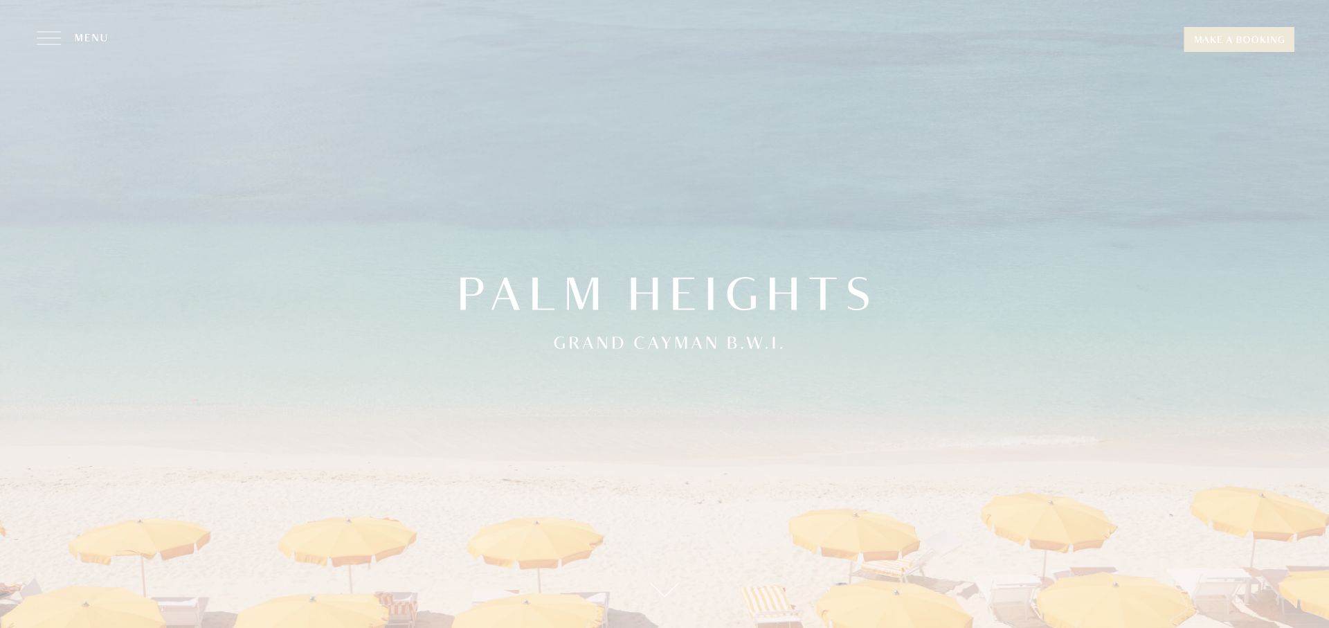
Palm Heights opens with a pale coastal view, a centered hotel identity, and small menu and booking controls. The restrained palette makes the destination feel quiet and spacious. A Mailchimp integration can extend that atmosphere into occasional updates, but the subscription still needs a practical explanation. Seasonal offers, cultural events, and hotel news are different from reservation confirmations. The public resource association does not establish the booking provider or the content of guest communications. The transferable lesson is to preserve the calm presentation while making any request for an email address understandable.
What you can learn
State what hotel updates include and how they differ from messages about a booked stay. Keep booking access visible without an email gate, label form fields clearly against pale imagery, and verify that seasonal campaign links lead to current and relevant information.
Pros
A focused coastal image communicates the property’s atmosphere with very little interface noise.
The booking control remains present despite the deliberately minimal opening view.
Cons & considerations
Low contrast text over light photography requires careful readability checks.
A visual mood does not explain newsletter frequency, offers, or reservation terms.
Platform source: Exact public source-page evidence. The exact sampled page references a Mailchimp resource or signup endpoint. This supports a public website integration, not proof of a submitted subscription, email delivery, or ownership of every form. Platform evidence is separate from the direct website screenshot and is not a complete current infrastructure audit.
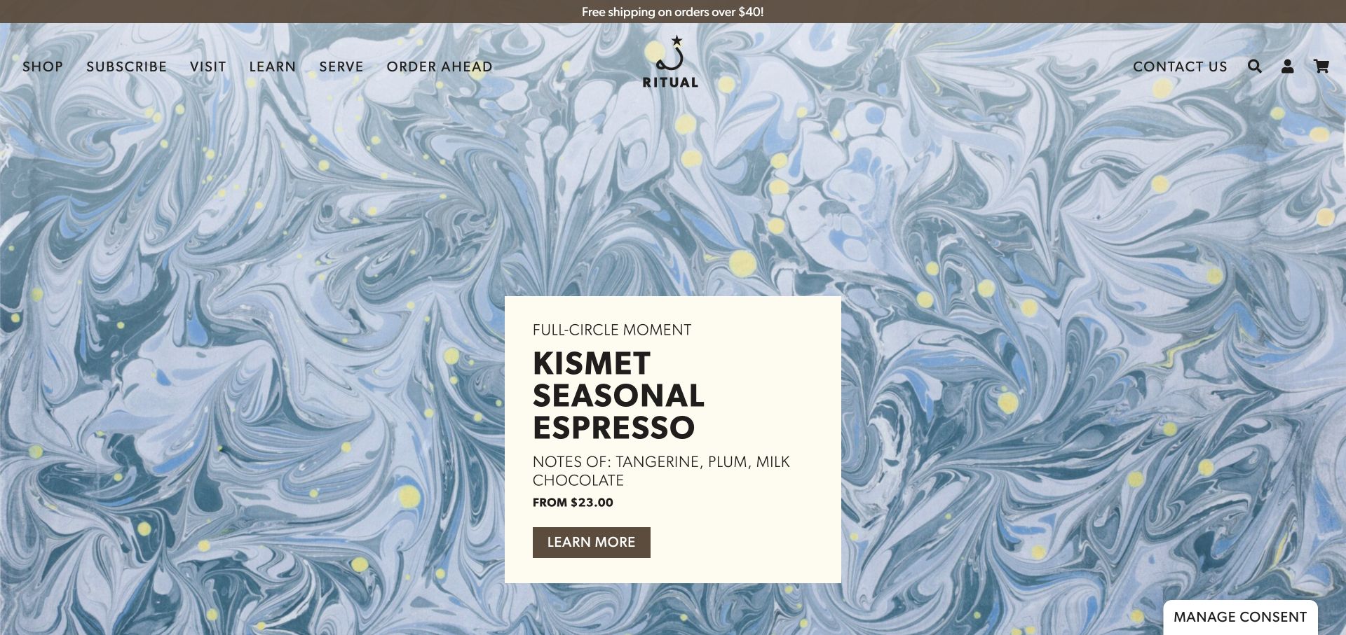
Ritual Coffee’s marbled blue campaign background surrounds a compact card with a named seasonal espresso, tasting notes, price, and a further information action. The navigation includes both shopping and a subscription route. That creates an important Mailchimp design distinction: a paid coffee subscription is not an email subscription. The public resource evidence does not establish the commerce platform’s recurring billing or the ownership of every signup form. A useful implementation would make the two commitments obvious and use the website’s concrete product information to support relevant, permission based updates.
What you can learn
Use unambiguous labels for recurring coffee deliveries and marketing email. Keep billing and fulfillment messages in their intended systems, describe the value of optional release updates, and test that email preferences never accidentally change a customer’s paid product subscription.
Pros
The campaign card includes useful product details rather than relying entirely on imagery.
Shopping, visiting, and learning routes support several relationships with the roaster.
Cons & considerations
The word subscription can describe two very different commitments on a coffee website.
A Mailchimp reference does not prove recurring billing or inventory integration.
Platform source: Exact public source-page evidence. The exact sampled page references a Mailchimp resource or signup endpoint. This supports a public website integration, not proof of a submitted subscription, email delivery, or ownership of every form. Platform evidence is separate from the direct website screenshot and is not a complete current infrastructure audit.
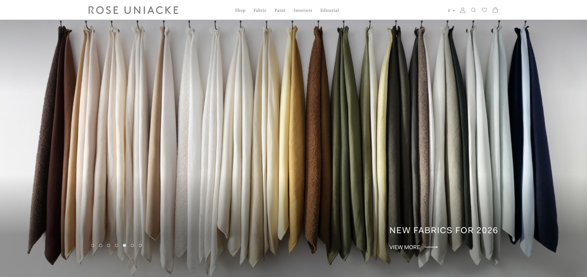
Rose Uniacke’s homepage gives a row of hanging fabric samples nearly the whole first view, with a small new collection label and understated navigation. The image communicates texture, color range, and a carefully controlled aesthetic. For a Mailchimp integration, the opportunity is to offer meaningful collection news or editorial context without overwhelming that visual restraint. Trade inquiries, product availability, and general inspiration may deserve different routes. The sampled resource does not establish a customer database, trade account system, or the exact design of the brand’s email campaigns.
What you can learn
Describe whether subscribers receive collection releases, editorial stories, or events, and provide a separate path for trade assistance. Test product links and image alternatives in email, and preserve a readable text explanation when a campaign relies heavily on subtle material photography.
Pros
The fabric photograph presents the collection’s range in one coherent visual composition.
A restrained release label supplies timely context without obscuring the material details.
Cons & considerations
Subtle color differences may not translate reliably across screens or email clients.
A public integration cannot verify trade account permissions or stock availability.
Platform source: Exact public source-page evidence. The exact sampled page references a Mailchimp resource or signup endpoint. This supports a public website integration, not proof of a submitted subscription, email delivery, or ownership of every form. Platform evidence is separate from the direct website screenshot and is not a complete current infrastructure audit.
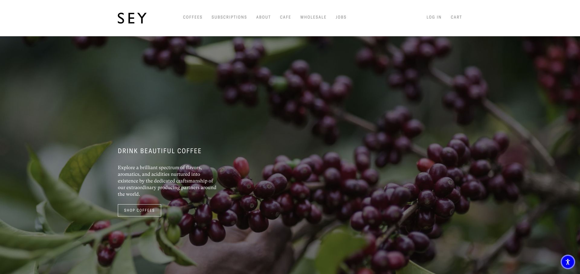
Sey Coffee places a quiet product message over a photograph of coffee fruit, with coffee, subscription, cafe, and wholesale routes in the header. The first view emphasizes origin and craft before individual merchandise. A Mailchimp connected site can build on that editorial approach with release or producer updates, but it should distinguish those messages from a recurring coffee order. The observed resource applies to the public page and does not prove order synchronization, subscription billing, or a particular email strategy. The useful pattern is a clear brand story with practical destinations nearby.
What you can learn
Name email signup explicitly and explain its content, while keeping paid coffee subscriptions and wholesale inquiries separate. Test links to new coffees before sending campaigns, retain accessible descriptions when imagery is unavailable, and verify preference changes independently from order management.
Pros
Origin imagery gives the product story context beyond packaging or discounts.
Cafe and wholesale links acknowledge audiences with different practical needs.
Cons & considerations
A broad subscription label can be ambiguous without surrounding explanation.
The Mailchimp signal does not establish paid subscription or wholesale account workflows.
Platform source: Exact public source-page evidence. The exact sampled page references a Mailchimp resource or signup endpoint. This supports a public website integration, not proof of a submitted subscription, email delivery, or ownership of every form. Platform evidence is separate from the direct website screenshot and is not a complete current infrastructure audit.
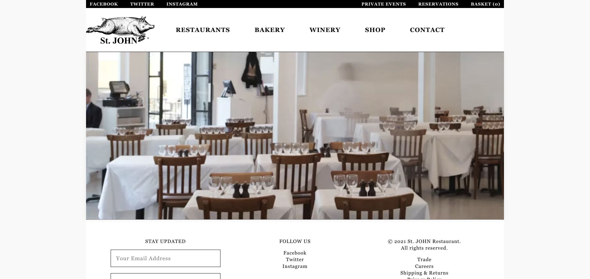
St. JOHN’s homepage uses a compact, traditional layout with a dining room photograph, clear restaurant, bakery, winery, and shop links, and a visible update signup near the footer. The form sits within the site’s actual content rather than interrupting the first view with a large promotion. That is a useful Mailchimp pattern for a restaurant whose audience may want occasional news. The public source association does not prove what happens after submission or whether reservations use the same platform. The design lesson is modest placement paired with a sufficiently clear promise.
What you can learn
Explain what staying updated means, including the kind of news and approximate frequency. Keep reservations and private event requests separate, provide proper field labels and confirmation feedback, and test the form without adding unconsenting contacts to a real mailing audience.
Pros
The update form appears as a natural continuation of the restaurant information.
Separate business links make the scope of the wider St. JOHN brand understandable.
Cons & considerations
A brief stay updated label can leave frequency and message content uncertain.
A footer form still needs accessible labels, error feedback, and a confirmed subscription state.
Platform source: Exact public source-page evidence. The exact sampled page references a Mailchimp resource or signup endpoint. This supports a public website integration, not proof of a submitted subscription, email delivery, or ownership of every form. Platform evidence is separate from the direct website screenshot and is not a complete current infrastructure audit.
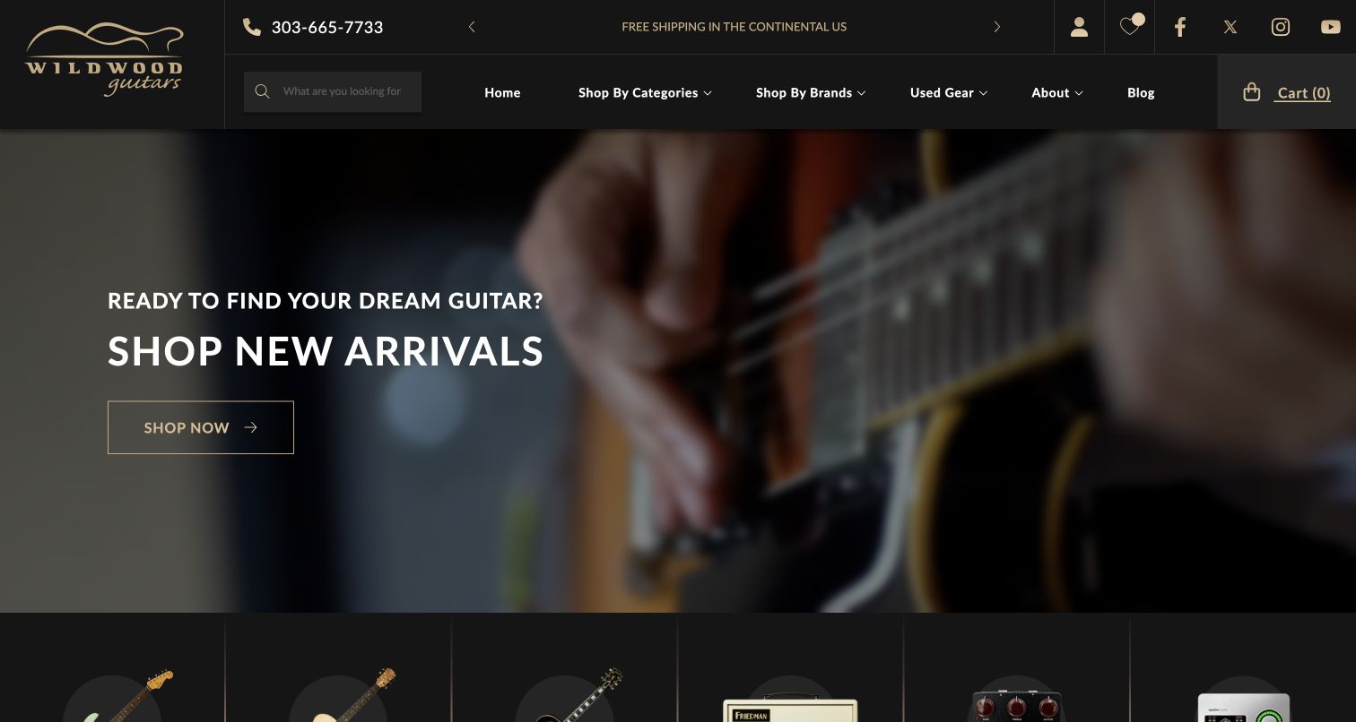
Wildwood Guitars places a large closeup of a played instrument behind a new arrivals message, with search, category, brand, and used gear routes in a dark header. The page combines enthusiasm for the instrument with practical ways to find a specific item. A Mailchimp integration can support timely arrival announcements, but availability is central to their usefulness. The observed resource does not establish an inventory feed or prove that an email recipient can still purchase a promoted guitar. The strongest transferable pattern is to connect exciting imagery with a reliable, current product destination.
What you can learn
Write update promises around the types of instruments subscribers want to hear about, and verify availability links before campaigns. Keep purchase receipts and service messages separate, show alternatives when unique stock sells, and avoid implying that joining email reserves an instrument.
Pros
Search and brand navigation support shoppers with specific instrument preferences.
The hero connects new inventory with an emotionally relevant playing image.
Cons & considerations
Unique or limited instruments can sell before an email campaign is opened.
A Mailchimp resource does not establish live inventory or transactional message handling.
Platform source: Exact public source-page evidence. The exact sampled page references a Mailchimp resource or signup endpoint. This supports a public website integration, not proof of a submitted subscription, email delivery, or ownership of every form. Platform evidence is separate from the direct website screenshot and is not a complete current infrastructure audit.
Mailchimp’s embedded form guidance explains adding a signup form to a website. Place the form beside a clear promise, preserve labels and error feedback, and verify the generated integration in the actual page layout rather than judging it only inside a form editor.
A dedicated signup page can show sample topics, explain frequency, and distinguish audience choices without crowding an article or product page. Keep the number of fields modest and make the main website easy to return to if the visitor decides not to subscribe.
Keep email separate from paid subscriptions
Coffee deliveries, memberships, reservations, and product orders can also use the word subscription or confirmation. Label the email choice explicitly. Keep necessary transaction messages independent from optional marketing preferences and verify any integration with the appropriate system owner.
From references to requirements
Plan the audience experience beyond the first field
Define audience choices
List the updates you actually plan to publish and the reasons someone would want them. Avoid speculative categories that nobody maintains. If local information or professional interests matter, ask clearly and explain how the choice affects the messages.
Prepare a safe testing process
Use an owned test audience and designated addresses to examine field validation, confirmations, mobile layouts, and preference changes. Do not subscribe real people during website QA. Check that a successful interface state corresponds to the intended subscriber status.
Maintain campaign destinations
Review links when products sell out, exhibitions end, or offers expire. Preserve useful archive pages and explain changes rather than leaving an old email with a broken destination. Assign responsibility for both the website form and the continuing publication schedule.
A useful handover demonstration
Ask the actual team to carry out its routine job: publish a realistic update, correct a mistake, preview a narrow screen, and identify who owns an integration failure. For a library or frontend framework, also ask who maintains the content source and deployment. A polished screenshot does not answer those operational questions.
Beyond the screenshot
Mailchimp website signup checklist
Describe the content and expected frequency of updates.
Use a recognizable sender and a matching welcome message.
Label email signup distinctly from paid subscriptions or bookings.
Collect only the fields needed for the stated purpose.
Keep labels, errors, and confirmation feedback accessible.
Test with an owned audience and designated addresses.
Review preference and unsubscribe paths as part of the design.
Maintain campaign links and retire outdated offers or forms.
Test with real content, a keyboard, a small screen, slow or failed requests, and the people who will maintain the system. These are planning checks, not an accessibility, security, performance, or search-ranking certification.
Sources & editorial method
How this Mailchimp collection was reviewed
Each example is based on a genuine direct browser capture and an exact-source Mailchimp resource or endpoint observation retained at its original date. The reviews are original analysis of the visible website. They do not claim that a form was submitted, an email arrived, or a private audience configuration was inspected.
Every image is an unmodified capture from the actual website, with its source and capture date. Some captures are reused from our shared catalog; their dates remain the original capture dates. None comes from a vendor gallery or a generated reconstruction. Moving imagery and live content can change.
Technology attribution uses public page assets or metadata, official platform documentation, or a cited first-party project case study. Documentary and framework-relationship evidence is identified where used; it is not a complete current backend inventory. A CMS image CDN alone does not establish a full CMS deployment. A library’s presence does not prove which individual controls use it, and a platform label does not establish AI authorship.
The composition notes, lessons, pros and tradeoffs are original editorial observations. We have not measured conversion, traffic, security, performance or accessibility conformance. Website owners retain their brands and imagery; these examples are not our client portfolio. Written, Edited and Curated are independent records, not dates advanced by a build. See our editorial standards or suggest a correction.
Questions worth asking
Mailchimp website development FAQs
Does a Mailchimp resource prove that a signup works?
No. A resource or endpoint supports an integration association. Submission handling, confirmation, subscriber status, and delivery require separate testing with appropriate access and designated addresses.
Should a newsletter popup appear immediately?
That depends on the task and audience. Give visitors enough context to understand the offer, preserve access to the content, and test keyboard and mobile behavior. A popup is one placement choice, not a requirement.
Is an email subscription the same as a product subscription?
No. A recurring product order or paid membership is a different commitment. Use explicit labels and keep billing and service communication separate from optional marketing preferences.
What should a welcome message do?
Confirm the choice, identify the sender, restate the content promise, and explain how to manage preferences. It should match what the website offered without adding unexpected obligations.