Best Accessible Travel Websites of 2026 (30 Real-World Examples)
How to explain destinations, specific access information and support arrangements without turning an accessible label into a blanket promise.
Accessible-travel website design starts with useful information about the actual journey. Travellers need to understand what is offered, which access details are known, what still needs confirming and who is responsible for each arrangement. Attractive destination imagery matters, but it cannot answer those practical questions on its own.
Accessible travel is not one uniform product or one audience. A wheelchair user comparing room layouts, a blind traveller investigating a guided group holiday and an adult considering a supported vacation may need very different information. Their preferences cannot be inferred from a disability label or a photograph. A useful website identifies its actual service model, explains the relevant features and lets people establish whether a more detailed conversation is worthwhile.
The clearest opportunities for design concern the relationship between inspiration and specifics. A destination can be appealing while a particular transfer, room or activity remains unsuitable for an individual requirement. A catalogue needs to distinguish a general property from the room being offered; a group tour needs to explain its assistance model; a specialist agency needs to clarify the parts of the trip it arranges and the parts it does not. Those distinctions belong in the public information, not only in an eventual booking conversation.
Use these website examples as references for information architecture and presentation, not as travel recommendations or independent access assessments. Public service descriptions establish the kind of business or resource being studied; they do not verify the suitability of a holiday, quality of care, safety, availability, legal protection or an individual travel outcome. The collection distinguishes supported holidays, sensory-travel specialists, local tour providers, accommodation platforms and information resources rather than treating their responsibilities as interchangeable.
Before the examples
What makes good accessible travel website design in 2026?
The actual travel model is clear
Explain whether the visitor is exploring a tailored holiday, a scheduled group departure, accommodation search, a local tour, transport or an information resource. Separate independent travel with arranged logistics from staff-assisted travel. Avoid presenting these models as interchangeable merely because they all appear beneath an accessible-travel heading.
Specific features replace a single universal label
Give relevant details for the actual room, vehicle, activity or route and explain the basis of that information. A wheelchair symbol alone does not establish dimensions, surfaces, transfer arrangements, hearing provision or sensory conditions. Distinguish a documented feature from a requested arrangement, a supplier statement and something that still needs checking.
Support and participation are explained without assumptions
Describe the assistance included in the actual service, what may be available by separate arrangement and any participation requirements. A sighted guiding partnership, dedicated support, personal care and general tour leadership are different things. Let the traveller decide what information is relevant; do not assume a person’s abilities or preferences from a diagnosis or an image.
An enquiry is not confused with a confirmed booking
Make it clear whether the next step requests advice, proposes an itinerary, checks a feature or reserves a specific offer. Explain when dates, room types, equipment or support arrangements remain subject to confirmation. A visible price or availability calendar must not quietly imply that every individual access requirement is already agreed.
Travellers can investigate before disclosing sensitive details
Publish enough service and feature information for an initial relevance decision. Keep the first enquiry proportionate to routing the request, explain why any information is requested and distinguish practical access questions from unnecessary medical history. The responsible organisation must decide the actual information-handling process rather than inheriting it from a generic travel form.
The digital journey is tested with the people using it
An accessible-travel business should not assume its website is usable because the subject is disability. Review content structure, keyboard access, forms, filters, contrast, media alternatives and external handoffs with appropriate users and specialists. Appearance, a badge or a public screenshot does not establish digital accessibility conformance.
The collection · 30 examples
30 accessible travel websites worth studying
These 30 public website examples compare specialist operators, supported-holiday organisations, booking and planning platforms, and accessible-tourism information resources. Each review identifies the actual service model and the pictured page. Editors Choice highlights a focused specialist whose audience and holiday formats are clear, not an independent ranking of travel services or individual suitability.
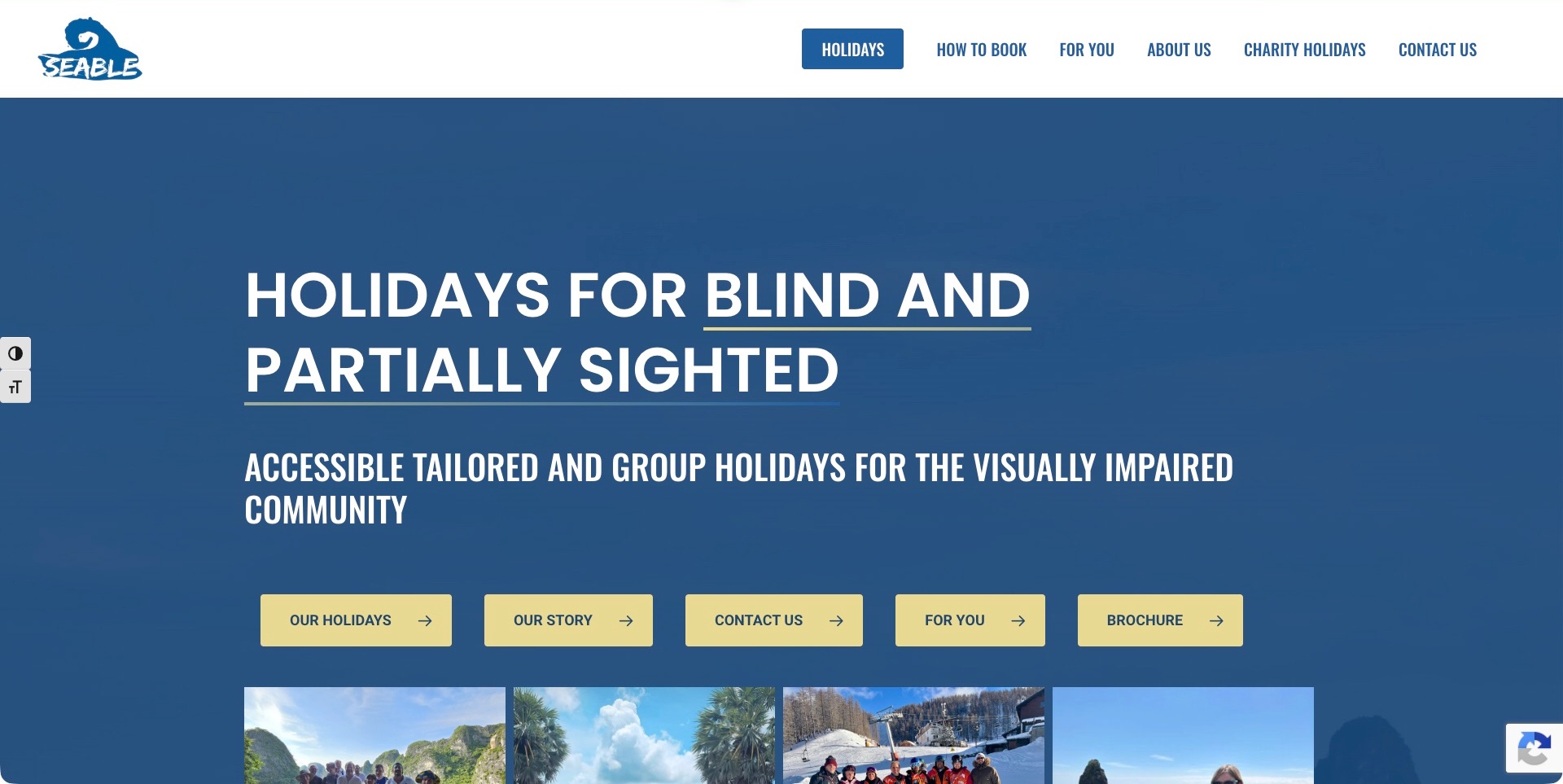
Seable opens with a blue-and-yellow typographic introduction that explicitly names blind and partially sighted travellers. Its white header separates holidays, booking information, audience information and contact, and the opening action row also offers the story and brochure. Public content distinguishes tailored and group holidays and describes sighted-guiding arrangements. This is a useful specialist example because the visitor encounters a specific audience and travel format before a broad destination promise, while photographs support the explanation farther down the page.
What you can learn
Explain the actual audience and travel model before asking someone to choose a destination. A specialist provider can connect inspiration to booking information without implying that every kind of assistance is interchangeable. Keep the scope of guiding and any separately arranged support explicit on the relevant offer, not merely inside a general accessibility statement.
Pros
The introduction names the intended audience in ordinary language.
Booking information is a primary route rather than a hidden footer link.
Cons & considerations
If several opening buttons have equal visual weight, keep their purposes distinct.
If tailored and group formats differ, explain the assistance included before a traveller requests a specific holiday.
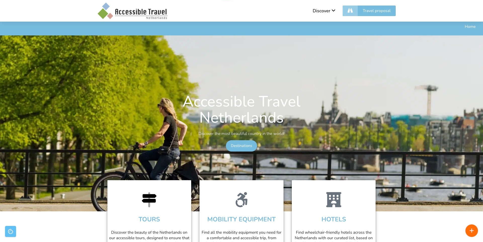
Accessible Travel Netherlands pairs a restrained white header with a canal-side photograph and a blue destination action. Three large cards then separate tours, mobility equipment and hotels, while a distinct header button requests a travel proposal. The public page also explains that proposal as a non-binding planning step. The useful design pattern is the separation between exploring a place, arranging one practical component and discussing a more complete trip, rather than treating every visitor as ready for the same booking action.
What you can learn
Organise a specialist travel offer by the decisions a traveller needs to make. Someone seeking equipment may not need a complete itinerary, while a broader proposal requires a different conversation. Explain what the next action produces and keep the practical components discoverable without relying on a scenic photograph to establish individual suitability.
Pros
Tours, equipment and hotels have visibly distinct entry cards.
The proposal action is separate from general destination exploration.
Cons & considerations
If white text sits over a bright photograph, test readability across responsive crops.
If a hotel route contains access information, distinguish the listed features from availability for a particular stay.
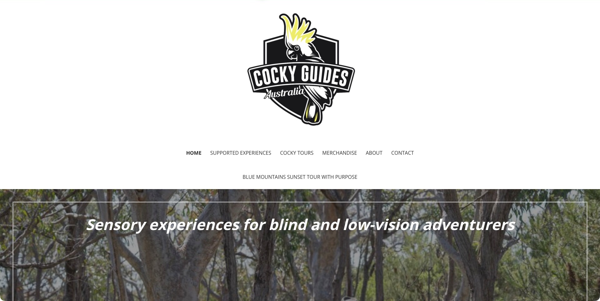
Cocky Guides gives its cockatoo identity considerable space above a compact navigation and a forest-backed introduction to experiences for blind and low-vision travellers. Supported Experiences is a named route alongside other tours, while the public homepage explains the intended mobility and guiding model. It also qualifies dedicated one-to-one support as a separate, availability-dependent arrangement. The useful design lesson is the combination of a memorable regional identity with a specific service description, rather than assuming that an adventurous landscape communicates what assistance is provided.
What you can learn
Make the experience appealing, then explain how participation works in practical terms. A small-group service and a dedicated support arrangement are different offers. Give each a clear route so a traveller or companion can investigate the actual format without inferring it from the brand, a photograph or a broad inclusive-travel statement.
Pros
The service description explicitly identifies blind and low-vision travellers.
Supported experiences have a named route within the navigation.
Cons & considerations
If the large identity pushes the explanation down, retain an early service summary.
If several tour brands share the site, distinguish their intended audiences and support arrangements.
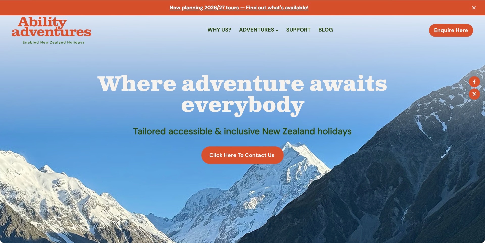
Ability Adventures places its red-and-green identity over a broad mountain landscape, with a plain statement that the holidays are tailored to accessible travel in New Zealand. Adventures and Support have separate navigation routes, and an enquiry action remains distinct from the dated planning announcement above the header. Current public information distinguishes guided, partly guided and self-drive formats. The useful design choice is to connect a recognisable destination with different ways of travelling, rather than assuming that every visitor wants the same level of organisation or accompaniment.
What you can learn
Make the delivery format part of the travel explanation, not something a visitor discovers only after sending a message. Someone comparing an independently driven itinerary with a guided trip needs different practical information. Keep that distinction visible while leaving individual arrangements and availability subject to the actual planning conversation.
Pros
The introduction names New Zealand and the tailored-travel scope directly.
Adventures and support information have separately labelled routes.
Cons & considerations
If the scenic introduction is large, retain an easy route to the practical format comparison.
If a dated planning strip stays prominent, assign an owner to update or expire it.
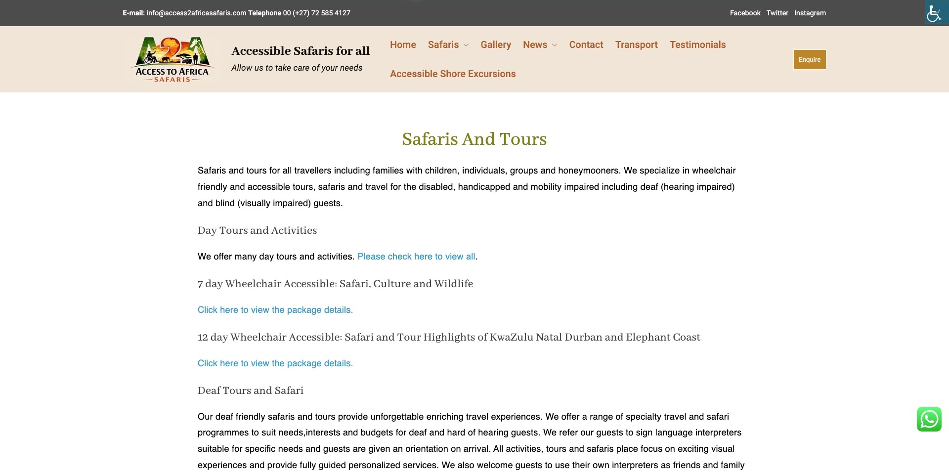
Access2Africa’s safari page places a cream navigation band above a straightforward reading column. Rather than filling the opening with one large landscape, it names day tours and multi-day itineraries, then separates information for different traveller situations. Transport and shore excursions also have explicit navigation routes. The useful pattern is the visibility of practical service categories: visitors can begin with the trip format or the kind of information they need instead of relying on a generic safari photograph to establish relevance.
What you can learn
Use a clear index when an operator offers several distinct travel arrangements. Let the reader find the relevant itinerary and supporting transport information, then provide the actual details on that destination. Categories can orient a visitor, but they do not establish individual suitability or confirm that a particular arrangement is available.
Pros
Named itinerary headings give the service page a scan-friendly structure.
Transport information is a distinct primary navigation destination.
Cons & considerations
If several links repeat generic wording, keep each destination clear from its adjacent heading.
If categories identify different access situations, explain the actual arrangements rather than treating the category as a guarantee.
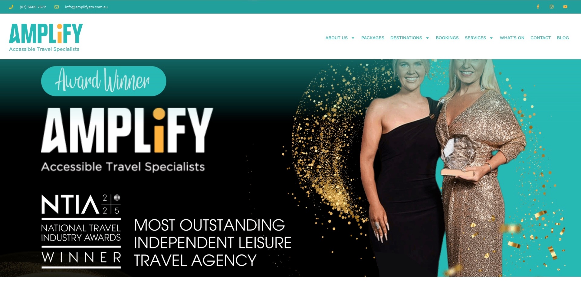
Amplify uses a teal contact strip and a large white header whose navigation separates packages, destinations, bookings and services. At capture time, an oversized award-themed graphic occupies the opening image area, while the agency’s accessible-travel identity remains visible in the logo. Further public content describes travel support and vehicle arrangements. This is useful for examining the tension between a strong temporary campaign and a visitor’s practical question: what can this agency arrange, and where can the relevant details be investigated?
What you can learn
Keep an agency’s actual service structure available even when a campaign dominates the introduction. A destination browser and someone seeking a particular arrangement may need different routes. Make the offer and responsibilities understandable without expecting an award image or a broad statement about confidence to establish the suitability of a trip.
Pros
The header separates destinations, packages and booking-related tasks.
The brand explicitly identifies its accessible-travel specialism.
Cons & considerations
If a campaign fills the first screen, retain an early plain-language service explanation.
If separate support providers are involved, distinguish their responsibilities before a traveller requests arrangements.
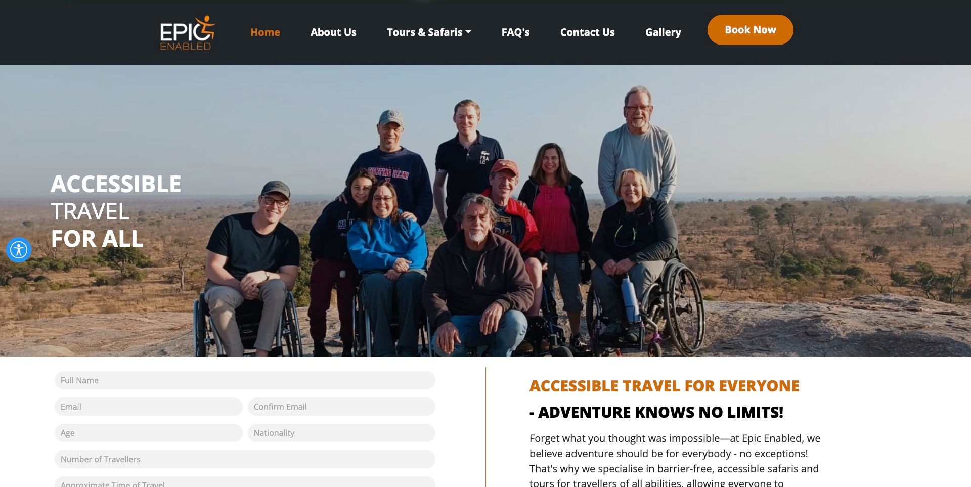
Epic Enabled places a group photograph beneath a dark navigation bar with orange accents and a distinct booking action. Tours and safaris, FAQs and contact have separate routes. Below the image, an in-page enquiry form sits beside an explanation of the accessible-safari offer, so the practical conversation is visible rather than hidden behind the opening photograph. Public content also describes equipment that can be requested. The design connects a recognisable travel experience with a planning step, while the actual arrangements still require individual clarification.
What you can learn
Use photographs to introduce an experience, then explain the scope and the conversation needed to plan it. A visible enquiry can help establish the next step, but broad inclusion language must not substitute for details about a particular vehicle, route, room or requested equipment. Keep availability and responsibilities clear on the relevant offer.
Pros
Tours, FAQs and contact are separately named navigation routes.
The enquiry is placed beside explanatory content rather than isolated from the offer.
Cons & considerations
If age or nationality is requested early, explain why it is needed for the enquiry.
If an inclusive headline is broad, qualify the actual arrangements instead of implying universal suitability.
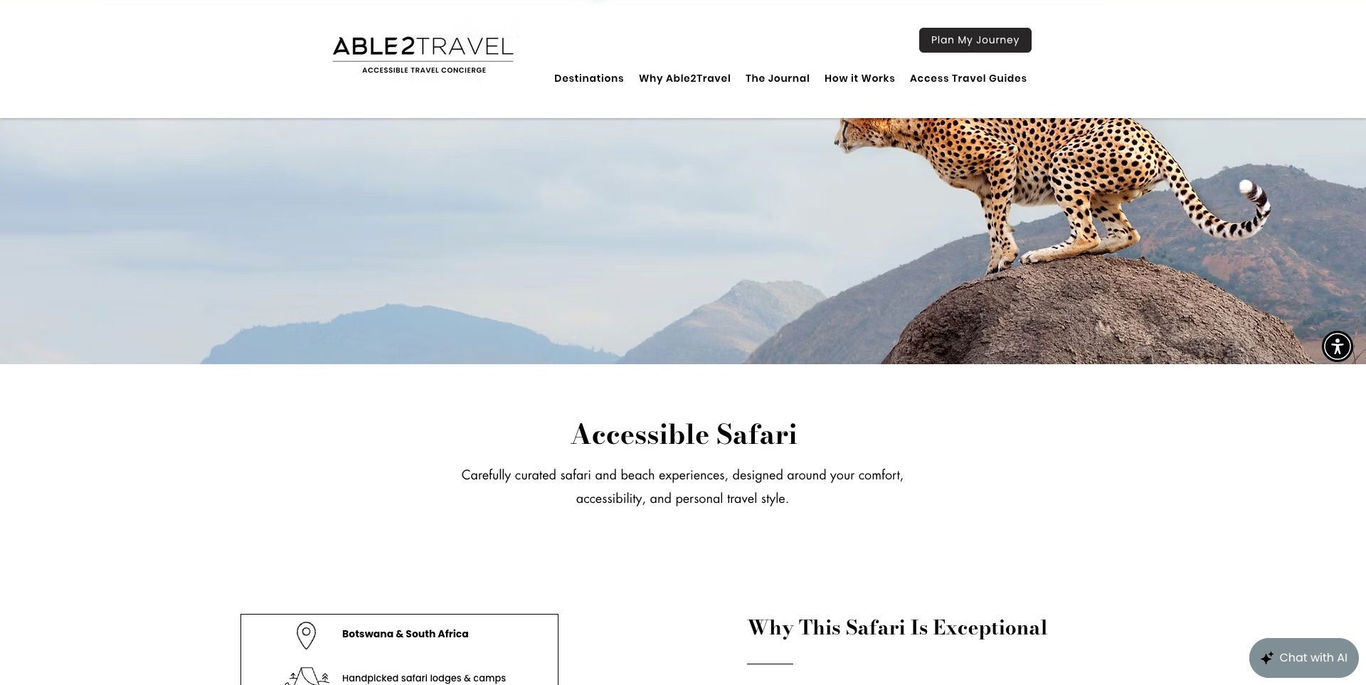
Able2Travel uses a black-and-white header with separate routes for destinations, the journal, travel guides and the planning process. A leopard photograph introduces the safari page, followed by an experience title and a short explanation of the offer. Practical sections begin beneath that opening rather than competing with the photograph. The contrast between an evocative landscape and a sparse reading area is worth studying: the image establishes the kind of trip, while the page structure has room to explain what must actually be arranged.
What you can learn
Give a particular experience its own information page instead of sending every enquiry through a general homepage. Connect accommodation, transport and itinerary details to that experience. A photograph can introduce the destination, but it cannot demonstrate the suitability of a vehicle, room or route for an individual traveller.
Pros
The header distinguishes destination browsing from guides and the planning process.
A dedicated safari title keeps the pictured experience connected to a specific offer.
Cons & considerations
If the opening photograph is large, retain an obvious route to the practical details.
If an accessibility rating is used, explain its criteria and observation date rather than treating it as universal suitability.
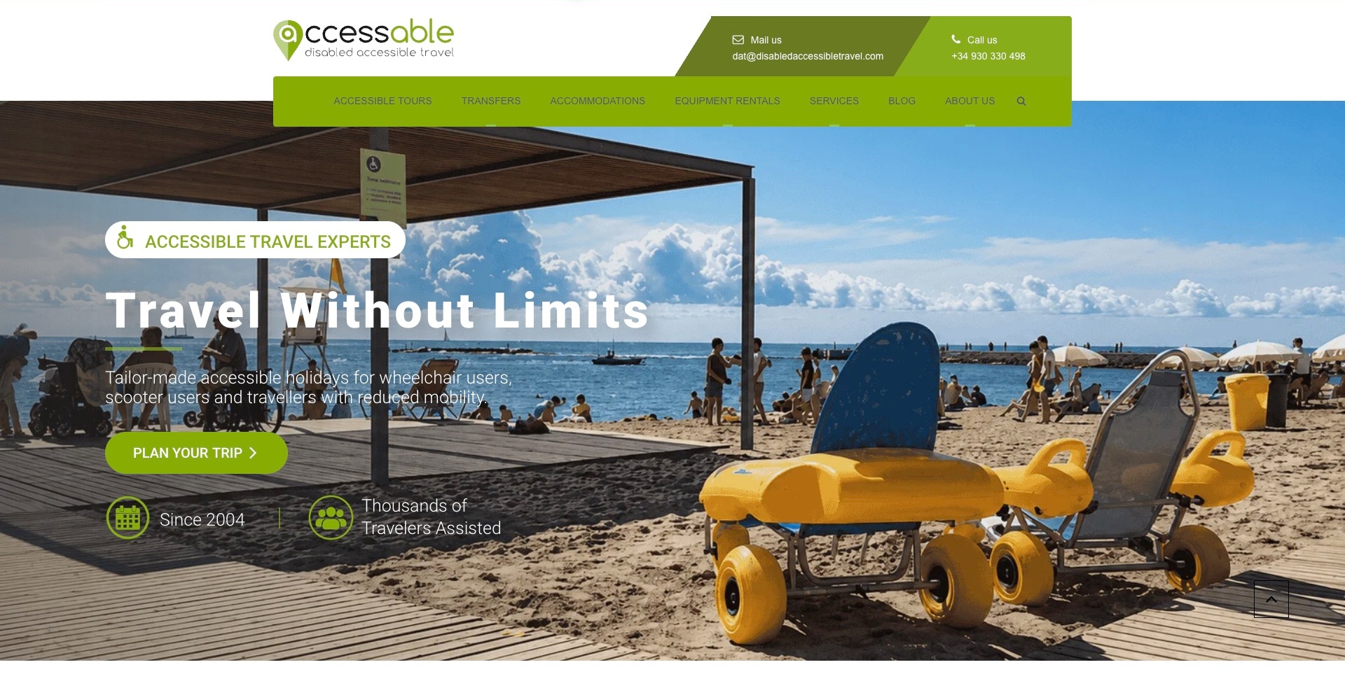
Disabled Accessible Travel presents its accessable identity beside visible email and telephone information, then uses a green navigation bar to distinguish tours, transfers, accommodation and equipment rentals. The opening beach photograph includes an adaptive beach chair, but the accompanying text also explicitly identifies the intended travel audience. A contrasting trip-planning button provides the main next step. The useful pattern is not simply the choice of an inclusive photograph: practical service categories remain visible above it, allowing someone who needs one arrangement to find a different route from someone planning a whole holiday.
What you can learn
Break a travel offer into the components a person may need to investigate separately. A transfer, an equipment rental and an accommodation enquiry require different details. Keep those routes discoverable and describe the actual features and arrangements on their destination pages, rather than expecting an inclusive headline to answer individual access questions.
Pros
Tours, transfers, accommodation and equipment are distinct navigation labels.
Telephone and email options are visible beside the brand.
Cons & considerations
If text overlays a detailed photograph, test its readability across image crops.
If an arrangement depends on a particular room or supplier, distinguish listed features from confirmed availability.
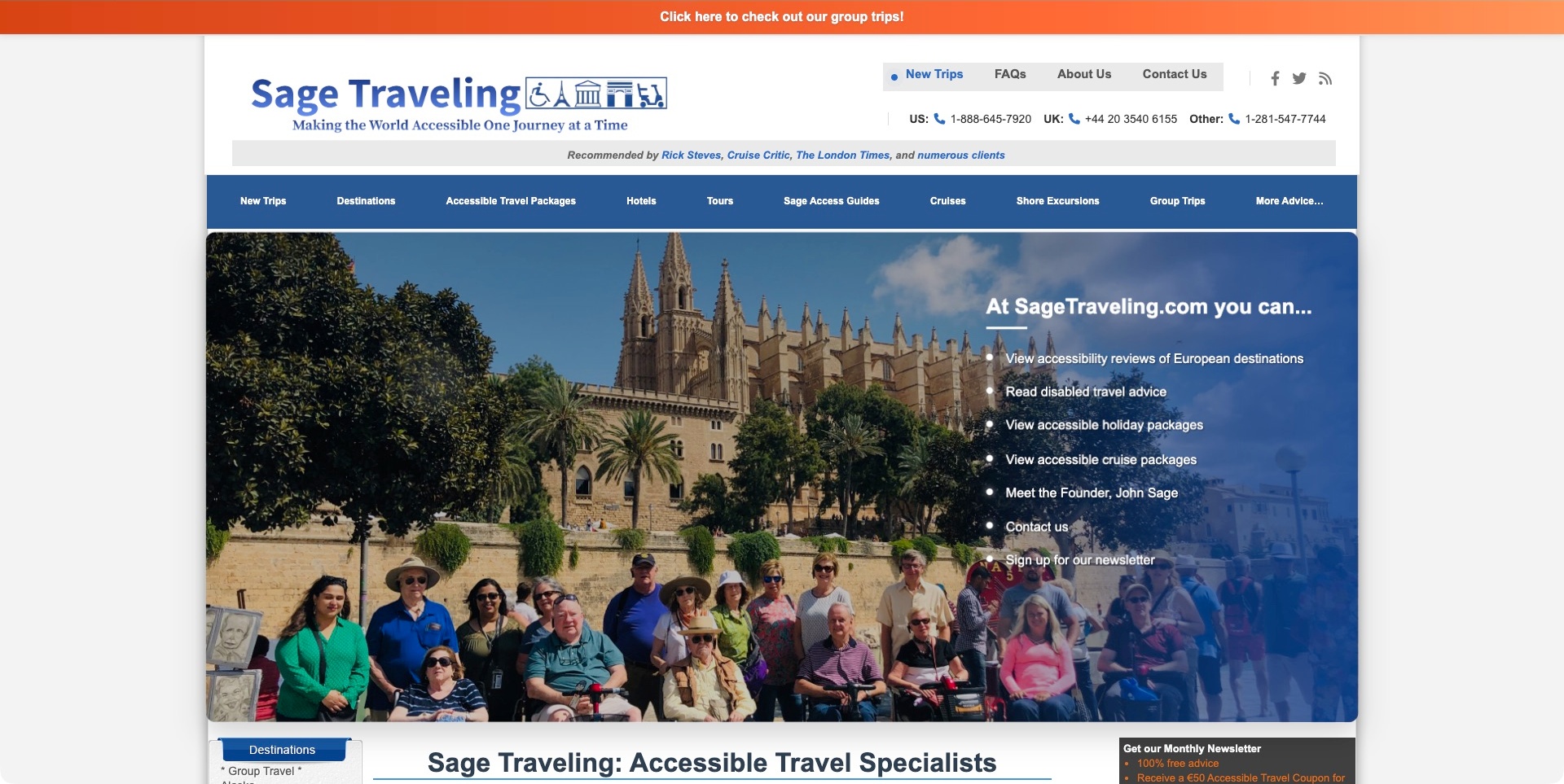
Sage Traveling places its identity and telephone options above a service navigation. Destinations, hotels, tours, access guides, cruises and shore excursions are separately named, while a large group photograph introduces the page below. A blue-tinted panel over that image outlines different things a visitor can investigate, including destination information and holiday packages. The fixed-width layout feels more like a substantial reference catalogue than a minimal campaign page. Its useful design question is how to connect research material with a planning service without making either audience search through the other’s entire journey.
What you can learn
Distinguish information that helps someone evaluate a place from services that require an enquiry or booking. Consistent category names can connect those journeys while preserving their different purposes. Keep destination observations specific and dated; a general guide does not establish that every hotel, excursion or transport option will suit a particular traveller.
Pros
Access guides and service categories have explicitly different navigation labels.
Contact numbers remain visible before the extensive catalogue navigation.
Cons & considerations
If many categories share one row, prioritise the most common visitor tasks.
If explanatory bullets overlay photography, preserve readable text size and contrast at smaller widths.
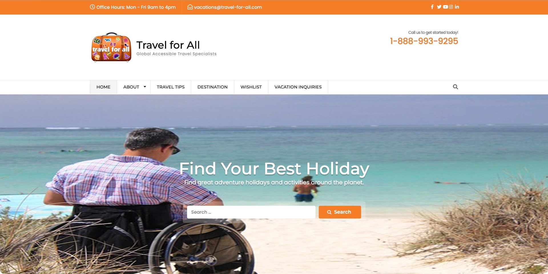
Travel for All places office hours and email in an orange strip above its brand and telephone number. The navigation separates travel tips, destinations, a wishlist and vacation enquiries. A beach photograph then supports a holiday-search field and an orange search action. The page combines familiar travel-site conventions with an explicitly named accessible-travel specialism. It is useful for studying the distinction between looking for an idea and asking the agency to investigate arrangements: the two tasks have separate routes rather than sharing an ambiguous contact button.
What you can learn
Keep inspiration browsing distinct from a bespoke planning request. A search can help a visitor discover a destination or article, but its scope should be clear before the person expects live availability or a confirmed arrangement. Use the enquiry destination to explain the next conversation and the practical details needed to assess a trip.
Pros
Office hours and contact options are visible in the opening header.
Vacation enquiries have a named route separate from the search.
Cons & considerations
If the search covers content rather than availability, label that scope plainly.
If a large header occupies much of the opening screen, keep the service explanation easy to reach.
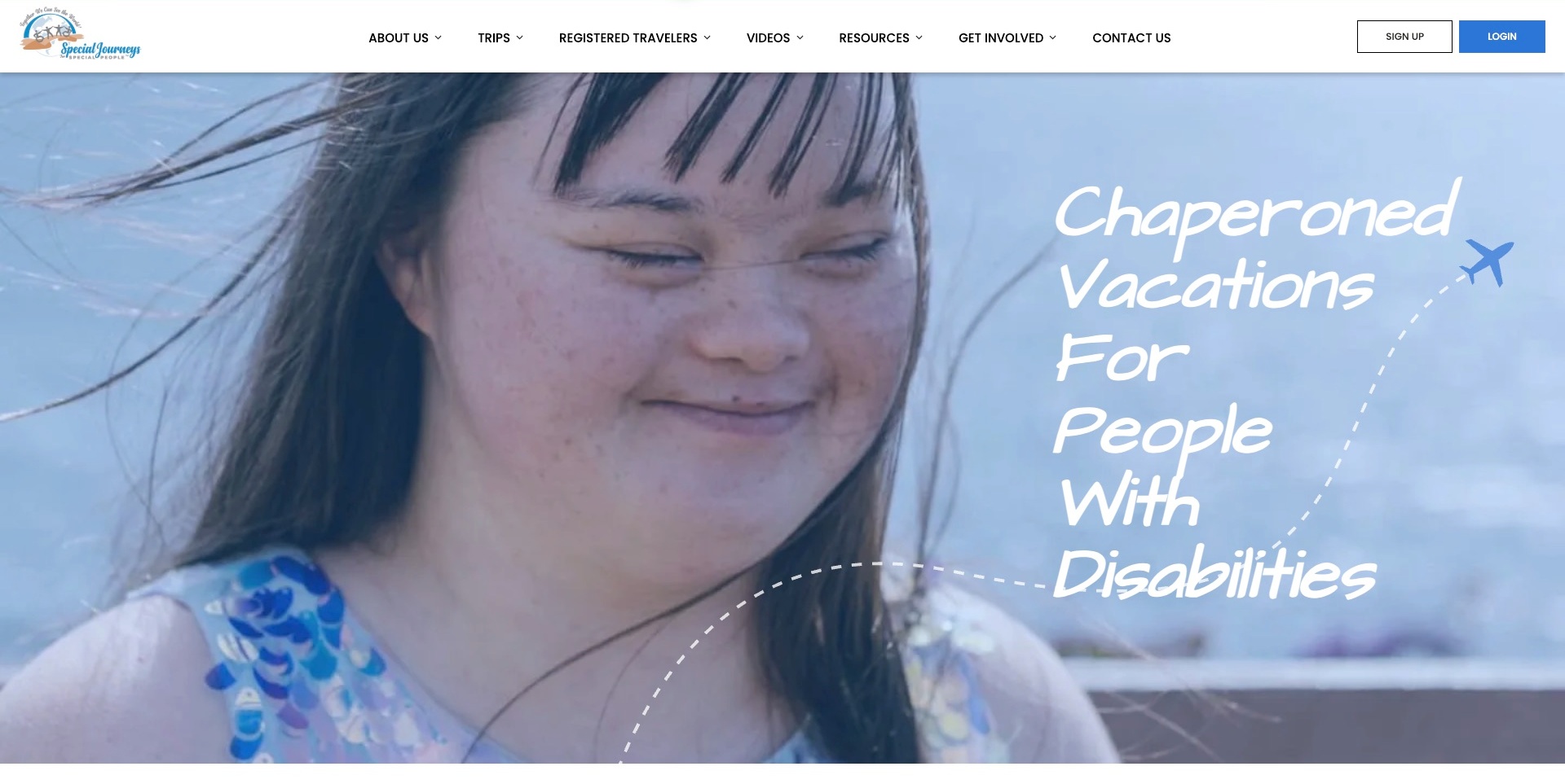
Special Journeys uses a compact white header with distinct destinations for trips, registered travellers, resources and getting involved. Sign-up and login actions sit separately at the right. Below, a large portrait photograph carries the chaperoned-vacation introduction and an illustrated flight path. The useful design structure is the separation of audiences in the navigation: a new visitor can investigate the offer without confusing that task with an existing traveller’s account or someone’s interest in helping the organisation. The portrait establishes a human setting, but participation and support still need explanation.
What you can learn
Design the first navigation around genuinely different visitor tasks rather than making one contact form serve everyone. Explain who a trip is intended for and what the next step means in ordinary language. Photographs should support that explanation, not be treated as evidence of someone’s diagnosis, eligibility or the level of assistance provided.
Pros
Registered-traveller information is separated from general trip discovery.
Resources and getting involved have distinct routes beside the main offer.
Cons & considerations
If sign-up can mean several things, explain the resulting account or application.
If a portrait fills the first screen, keep participation and support information straightforward to find.
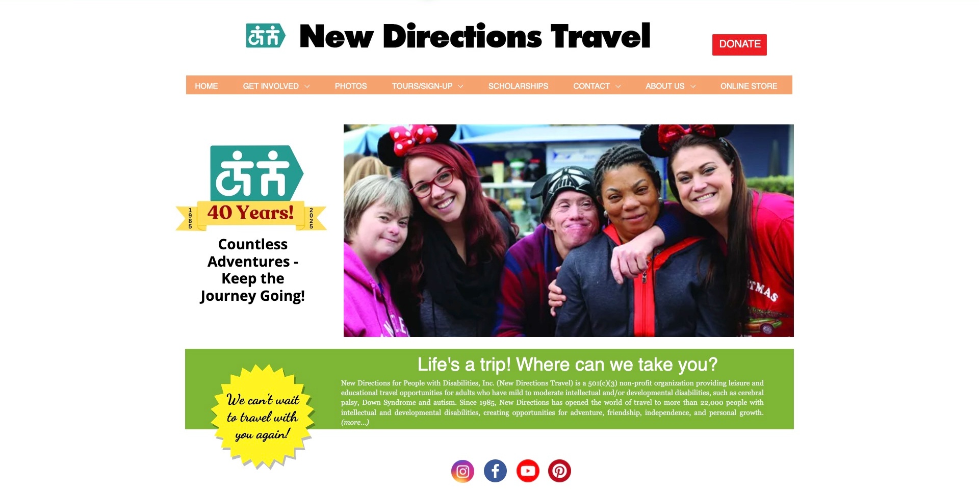
New Directions Travel places a bold black wordmark above a peach navigation strip and a conspicuous red donation action. Tours and sign-up sit alongside scholarships, getting involved and contact, while a large group photograph occupies the main introductory area. An anniversary graphic and a green explanatory panel add organisational context below. The screenshot is useful for studying the different roles of those elements: the photograph introduces a social travel experience, the text identifies the adult-traveller offer, and the navigation gives supporters routes that are not confused with joining a trip.
What you can learn
Let participant information and support opportunities coexist without making them the same task. A scholarship enquiry, a trip registration and a donation each require different explanations. Preserve a clear service introduction beside campaign material, and avoid expecting a group photograph or longevity message to establish individual support arrangements.
Pros
Tours, scholarships and donation actions have visibly different labels.
A plain explanatory panel identifies the organisation’s travel focus beneath the image.
Cons & considerations
If anniversary artwork stays prominent after its campaign year, keep its context clear.
If the introduction contains substantial detail, divide it into readable sections rather than one dense panel.
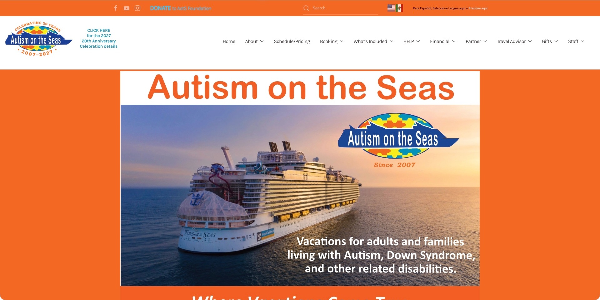
Autism on the Seas combines a bright orange utility bar with a large white header and an extensive navigation. Schedule and pricing, booking, inclusions, help and financial information are separately named before the cruise-ship introduction. The opening image includes a plain audience description rather than relying on the ship photograph to explain the service. This is useful for studying a specialist layer added to a familiar holiday product: visitors need to understand the particular supported departure and what that service includes, not simply recognise the type of trip being pictured.
What you can learn
Make support scope and the actual departure schedule easy to investigate before booking. Explain which arrangements belong to the specialist service and which belong to the underlying travel provider. A recognisable cruise photograph can establish context, but it does not demonstrate that every sailing includes the same staff, activities or assistance.
Pros
Schedule and pricing are visible primary navigation destinations.
Inclusions have a separate route rather than appearing only inside booking information.
Cons & considerations
If the navigation serves travellers, partners and staff, prioritise the traveller’s main route.
If an anniversary campaign occupies the header, keep practical departure information prominent beside it.
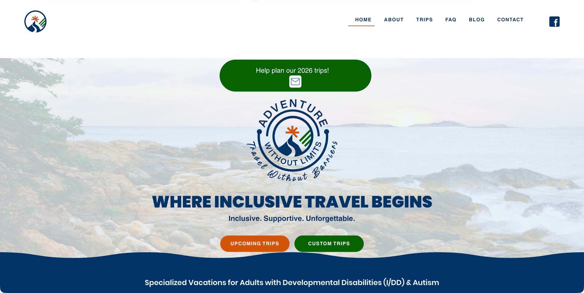
Adventure Without Limits uses a spacious white header, a coastal background and a large central brand mark. Two contrasting actions distinguish upcoming trips from custom trips, and the section below explicitly names an adult developmental-disability and autism focus. An in-page planning survey is separate from those actions. The useful pattern is the distinction between joining an existing programme and asking about a different arrangement. The routes lead to different questions about dates, participation, preparation and support.
What you can learn
Explain the difference between a scheduled departure and a custom enquiry before a visitor chooses a route. A programme page can emphasise dates and the steps to register, while a custom request needs to establish what the provider will investigate. Keep the actual participation and support requirements discoverable rather than relying on a broad inclusive-travel message.
Pros
Upcoming and custom trips have separate, plainly labelled opening actions.
The intended adult audience is named below the introduction.
Cons & considerations
If the large brand mark delays the service explanation, retain a concise early summary.
If a planning survey is dated, update or retire it without obscuring the main trip routes.
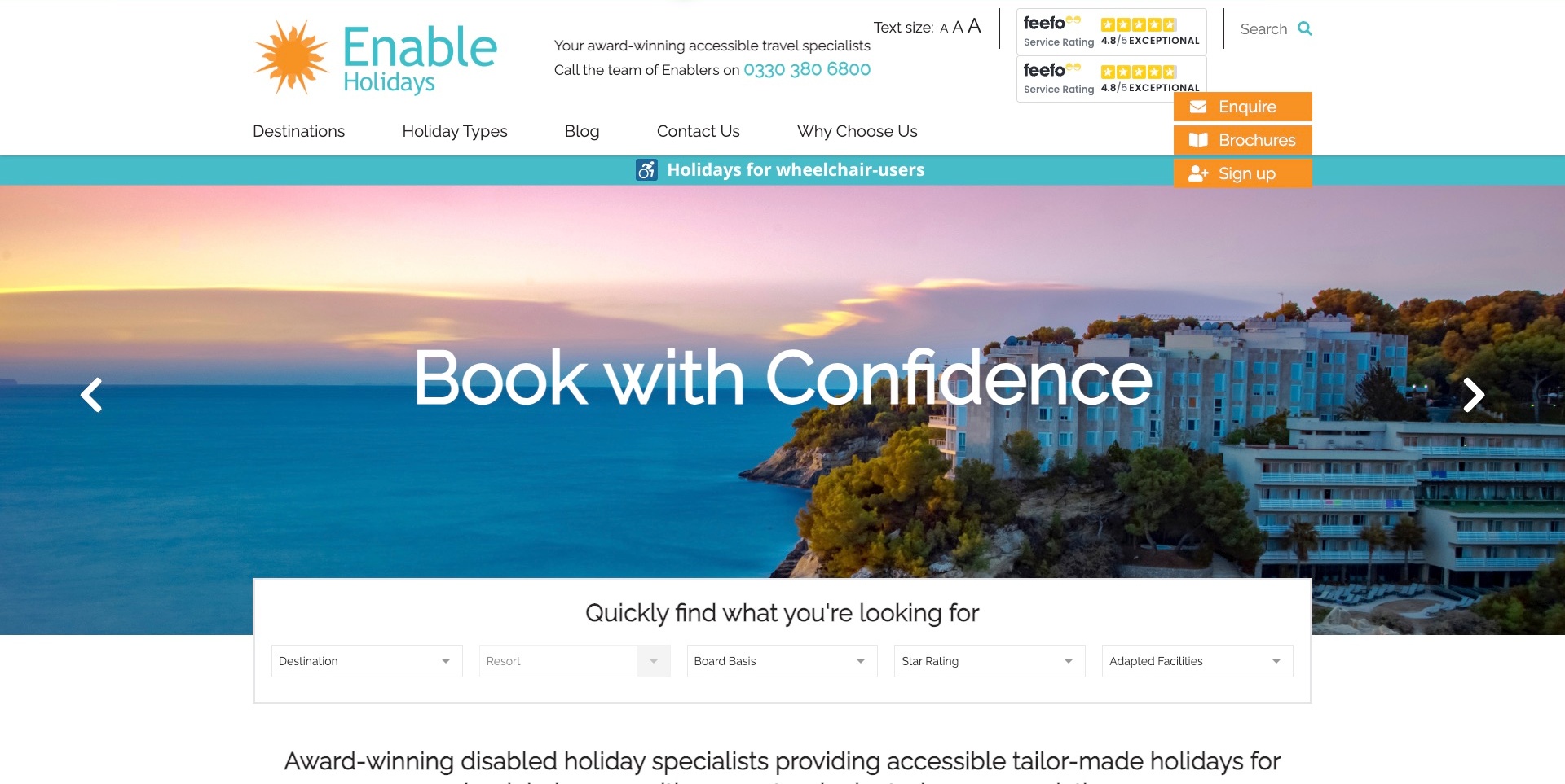
Enable Holidays uses orange and turquoise accents, visible telephone information and separate destinations for enquiries, brochures and sign-up. Beneath a scenic carousel, a filter strip combines destination, resort, board basis and star rating with adapted facilities. The important design idea is the addition of a practical access-related decision to familiar holiday-browsing categories. Visitors can recognise the usual trip-planning structure while seeing that a specific facility question belongs in the search. The photograph introduces a destination, but the filters and the subsequent accommodation information need to carry the actual planning detail.
What you can learn
Include practical requirements alongside ordinary travel preferences instead of treating them as a separate afterthought. Explain what a facilities filter represents and how listed information relates to a particular room or stay. A property description, an enquiry and confirmed availability are different stages, even when they share the same destination photograph.
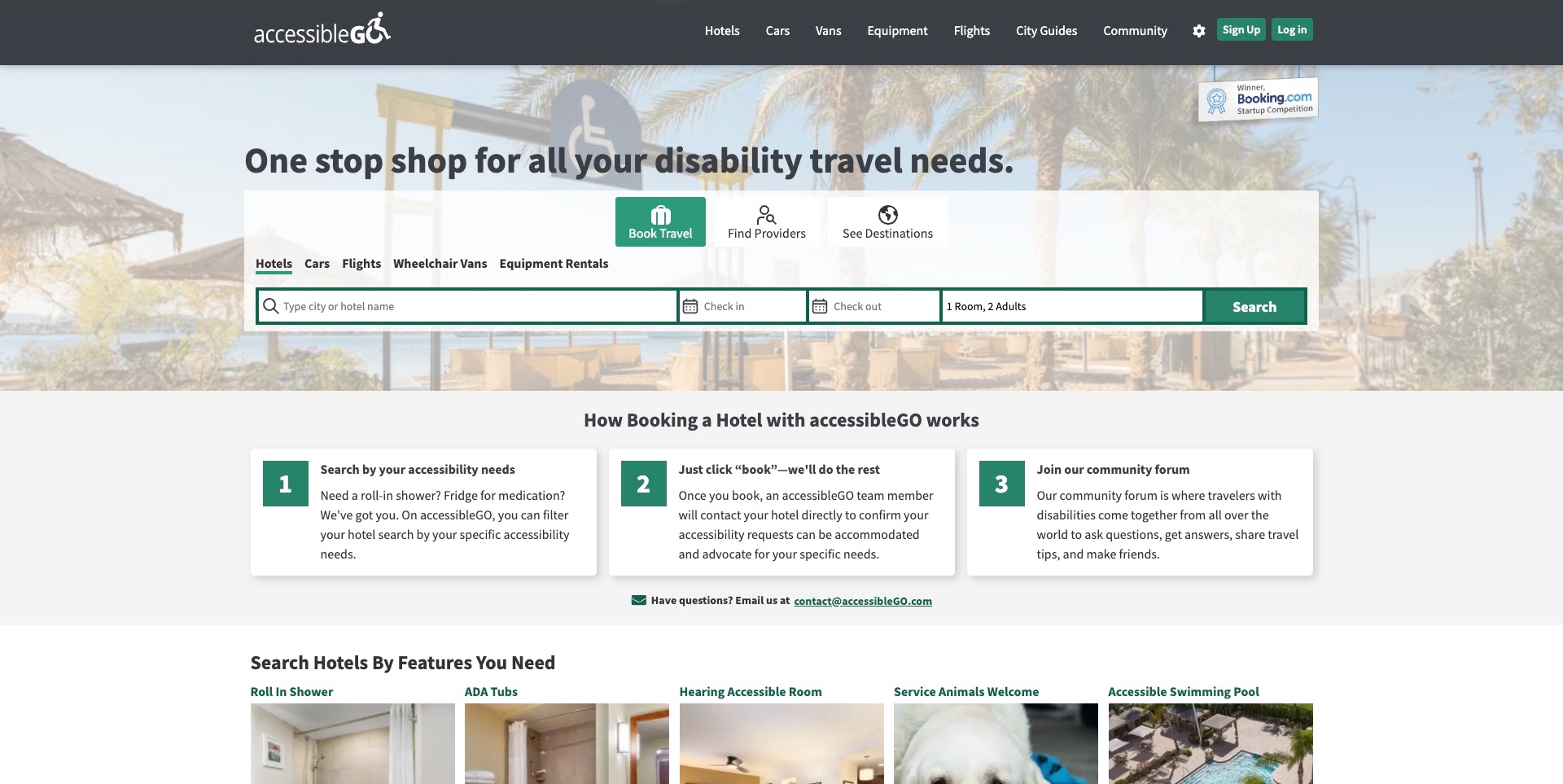
accessibleGO opens with a dark product navigation and a large search area over a faded beach photograph. Book Travel, Find Providers and See Destinations are separate tabs, while the booking controls distinguish hotels, cars, flights, vans and equipment. Directly below, three numbered cards explain the platform’s hotel-booking process, including the stated follow-up about accessibility requests. Specific room-feature links appear beneath that explanation. The useful structure connects the search interface with what happens afterward: the service model is not left to be inferred from a search button.
What you can learn
Explain the process beside the interface that begins it. A traveller needs to know the difference between finding an option, making a booking and having a particular request checked. Feature filters can organise research, but the page should distinguish those filters from confirmation that a specific room or arrangement meets an individual requirement.
Pros
Booking, provider discovery and destination research are separately labelled tabs.
The process explanation sits immediately below the main search controls.
Cons & considerations
If several product types share one panel, make the active search scope unmistakable.
If a feature requires later confirmation, state that timing before a person relies on the result.
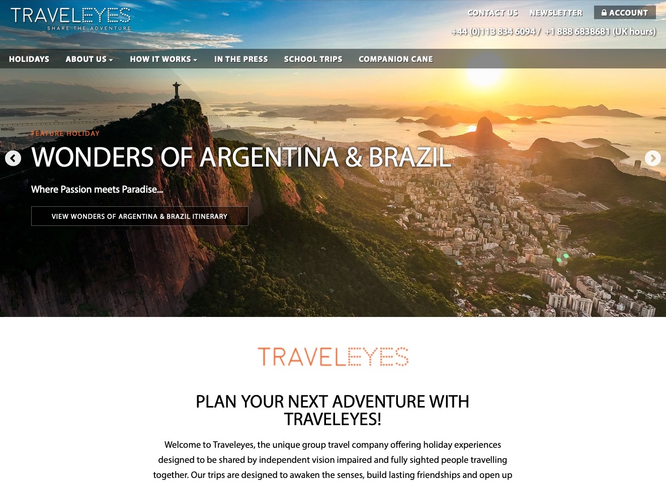
Traveleyes introduces a featured itinerary through a large destination photograph, while the navigation keeps holidays and the explanation of how trips work as separate routes. The introduction beneath the image identifies group holidays shared by blind and sighted travellers. Public information then distinguishes those traveller perspectives rather than assuming that a scenic photograph explains the experience. The useful design pattern is the connection between an appealing destination and a specific participation model: the visitor can investigate both the itinerary and how the group arrangement actually works.
What you can learn
Give an unfamiliar travel model an explicit explanation alongside the catalogue. Different participants may need different information even when they are considering the same holiday. Keep those routes understandable without turning a description of shared travel into a promise that every support requirement is included or every itinerary suits every person.
Pros
The navigation separates holiday discovery from how the travel model works.
The introduction explicitly identifies blind and sighted travellers sharing group experiences.
Cons & considerations
If the featured photograph is large, keep the participation explanation easy to reach.
If traveller roles differ, explain responsibilities and requirements before booking a departure.
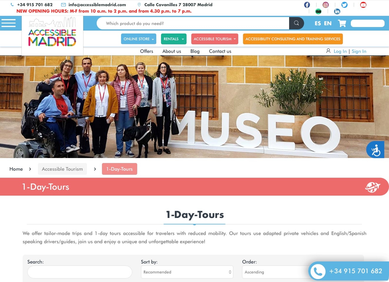
Accessible Madrid’s one-day-tour page sits within a broader site whose header separates an online store, rentals, accessible tourism and consulting. A group photograph introduces the tourism area, followed by a breadcrumb and a plain explanation of the day-trip offer. Search and sorting controls begin below that explanation. The useful pattern is the explicit context for a service inside a multi-purpose business: a visitor can recognise that they are investigating a tour, rather than assuming the product search or rental catalogue describes the same transaction.
What you can learn
Use page context and specific navigation labels when one organisation has several different offers. A tourism enquiry needs a different explanation from buying or renting equipment. Describe the relevant transport and itinerary arrangements on the actual service destination, while leaving individual requirements and availability to be confirmed through the planning process.
Pros
The breadcrumb identifies the accessible-tourism and day-tour context.
The introduction explains the type of trip before presenting catalogue controls.
Cons & considerations
If retail controls dominate the header, keep the tour journey distinguishable.
If floating contact buttons overlap filters at smaller widths, test that the underlying controls remain usable.
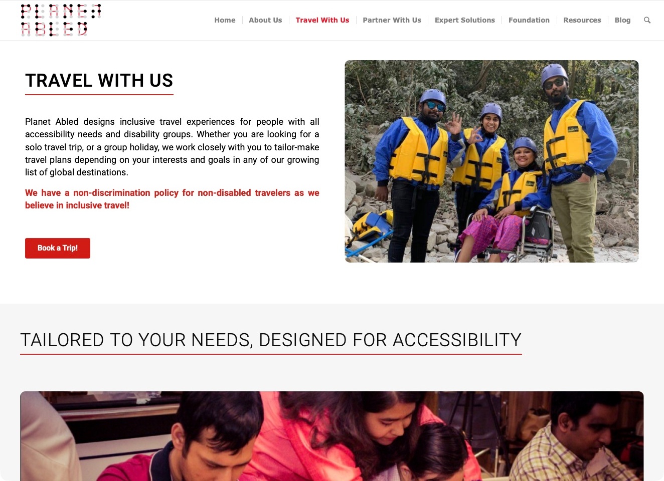
Planet Abled’s Travel With Us page uses a simple two-column opening: the travel explanation and booking action sit beside an outdoor photograph. The active navigation distinguishes that traveller destination from partnerships, expert solutions, the foundation and resources. The copy discusses tailored solo and group arrangements, followed by a section about individual requirements. This is useful for studying the separation of audiences within one organisation. The traveller’s offer is given its own reading space instead of being left to compete with every professional or partnership service on the homepage.
What you can learn
Create a dedicated journey when an organisation serves both travellers and industry partners. Explain the actual format and the planning conversation on the consumer destination. An inclusive headline and a group photograph can establish context, but neither independently demonstrates the suitability of an activity or the assistance available for an individual trip.
Pros
The active travel route is separate from partnership and expert-service navigation.
The opening pairs a plain offer explanation with a distinct next action.
Cons & considerations
If the booking action begins an enquiry rather than a reservation, explain that transition.
If inclusion language is broad, specify arrangements and limitations on the relevant itinerary.
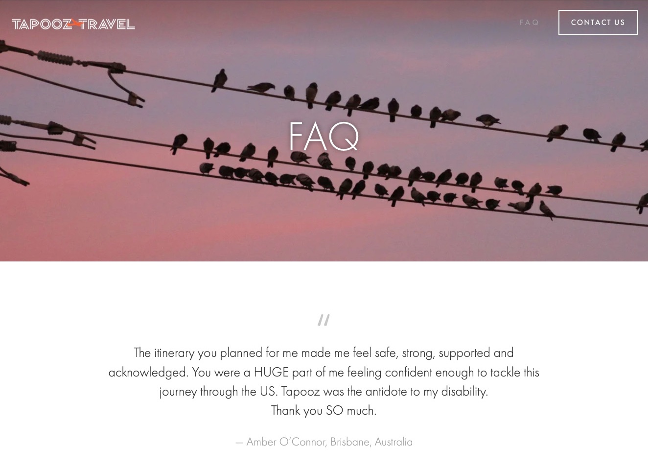
Tapooz Travel’s FAQ page uses a restrained header, a birds-on-wires photograph and a large page label, followed by a testimonial before the substantive questions. The public answers distinguish independent travel, accompanied arrangements and trips combining both, with separate questions about equipment, accommodation, transport and pricing. The useful pattern is the scope of the practical explanation rather than the decorative opening: the FAQ gives a prospective traveller several ways to understand what the company may arrange before beginning a tailored planning conversation.
What you can learn
Use questions to explain real differences in the service, not merely to repeat promotional claims. Independent logistics and accompanied travel require different expectations. Keep the actual responsibilities, exclusions and confirmation process clear, and do not treat another traveller’s testimonial as evidence that a future itinerary or assistance arrangement will suit someone else.
Pros
Questions distinguish independent, supported and mixed travel formats.
Equipment, accommodation and transport are addressed as separate planning topics.
Cons & considerations
If an introductory testimonial precedes the answers, provide an easy route to the questions.
If a long FAQ covers several subjects, group or index them for quick comparison.
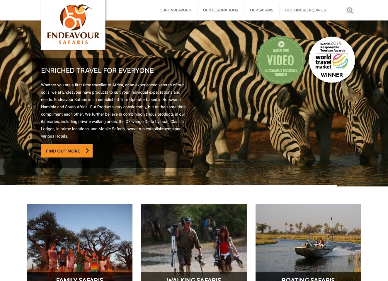
Endeavour Safaris uses a zebra photograph beneath a white header and a prominent orange-and-brown identity. The opening text introduces the operator’s destinations and varied itinerary formats, while destination, safari and booking routes remain separately named. Further public content gives accessible safaris their own category alongside other trip types. The useful design structure is the relationship between a broad travel brand and a specific service route: a visitor can recognise the overall experience without needing to assume that every pictured walking, boating or family itinerary has identical arrangements.
What you can learn
Keep a specialist travel category findable within a larger catalogue. Explain its actual itinerary, transport and assistance scope on the relevant destination rather than expecting a general inclusion message or a symbol in the logo to answer those questions. Scheduled and tailored trips may require different planning information.
Pros
Destinations, safari categories and booking enquiries have distinct navigation labels.
Accessible safaris are explicitly named within the public service structure.
Cons & considerations
If award graphics remain prominent, preserve their dates and avoid implying a current assessment.
If text overlays a detailed photograph, test readability across different image crops.
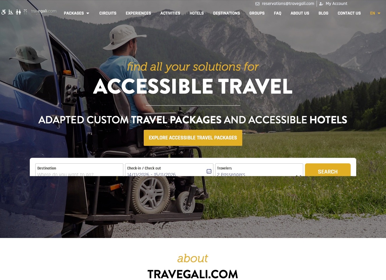
Travegali places an adapted-vehicle photograph behind a large travel introduction, with a contrasting package-exploration action and an inline destination-and-date search. The navigation names packages, experiences, activities, hotels and destinations separately. These are different planning tasks, even though they share the same opening image. The useful pattern is the attempt to connect inspiration with a concrete search while preserving distinct product categories. The captured search frame is visibly clipped vertically, an important reminder that an embedded interface needs its own responsive and integration checks.
What you can learn
Distinguish a tailored package enquiry from searching accommodation by destination and date. Explain what each route can establish, and keep requested features separate from confirmed availability for a particular stay. When another interface is embedded, review its actual height, focus behaviour and error states rather than assuming it inherits the surrounding page’s layout.
Pros
The navigation gives packages and hotels separately named destinations.
The opening provides both package exploration and a destination-based search.
Cons & considerations
If a search is embedded, prevent its fields or actions from being clipped.
If a broad access label introduces accommodation, explain the actual room features and confirmation process.
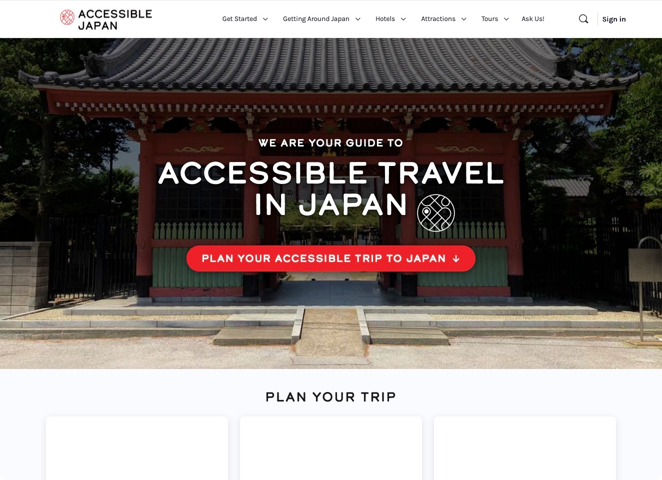
Accessible Japan uses a compact white header above a large temple photograph and a clear destination-specific introduction. The navigation distinguishes getting started, getting around Japan, hotels, attractions and tours, with a separate route for questions. A prominent planning action leads into the next section below the image. The useful structure is the organisation of a substantial destination resource around practical stages of a visit, rather than an undifferentiated list of articles. It gives a visitor several starting points without implying that the resource directly operates every linked travel service.
What you can learn
Organise destination information by the decisions a traveller needs to make. Preparation, transport and a particular hotel or attraction answer different questions. Keep source dates, feature details and external-service responsibilities clear on their relevant pages; a destination photograph or an information article cannot confirm an individual room, route or booking.
Pros
The navigation separates preparation, transport, accommodation and attraction research.
A dedicated question route sits beside the main information categories.
Cons & considerations
If the image occupies most of the opening screen, keep research categories readily discoverable.
If a planning link leads to another provider, explain that handoff and its scope.
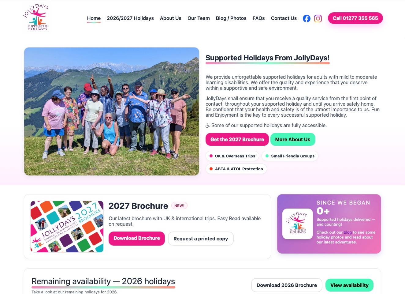
JollyDays pairs a mountain group photograph with a plain introduction to its supported holidays and the intended adult audience. A current brochure action sits beside an organisation-information link, while the next section distinguishes downloading the brochure from requesting a printed copy. The header gives holidays, the team, FAQs and contact their own routes. The useful pattern is the connection between a recognisable social travel experience and several practical ways to investigate it, rather than assuming that every visitor wants to begin with the same online booking interface.
What you can learn
Explain the programme and offer useful information formats before requesting a commitment. A brochure, a question page and a planning conversation can serve different stages of a decision. Keep actual participation and support arrangements explicit on the relevant offer, rather than treating an audience label or a group photograph as proof of individual suitability.
Pros
The opening identifies the supported-holiday focus and intended adult audience.
Download and printed-brochure options have separate actions.
Cons & considerations
If a statistic depends on animation, provide a meaningful fallback instead of an uninitialised zero.
If brochures cover different years, make their dates and current availability unmistakable.
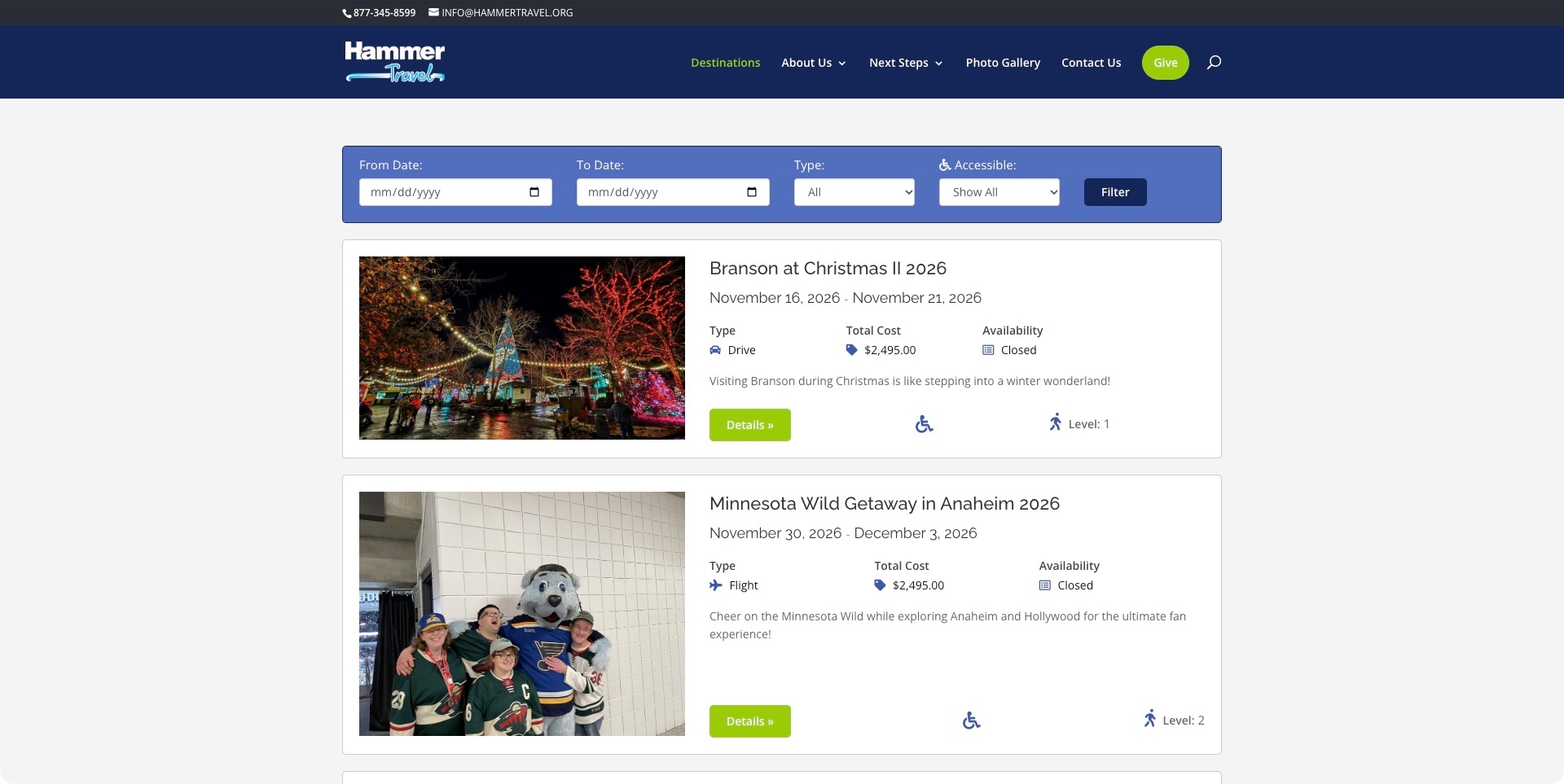
Hammer Travel’s destination page begins with a compact blue filter panel rather than another scenic introduction. Date fields, transport type and an accessibility selector sit above broad white trip cards. The visible cards pair a destination photograph with travel dates, a transport label, total cost and an explicit closed availability state. A details action and a separate activity-level marker extend that comparison. The dark header keeps destination discovery distinct from organisational information and next steps. This is a supported-holiday catalogue, not evidence that every trip or assistance arrangement suits every traveller.
What you can learn
Give practical comparison information a consistent home on each trip card. Timing, transport and availability answer different questions from an appealing destination image. Explain the meaning of access and activity markers on the relevant details page, and distinguish those labels from an individual participation or support assessment.
Pros
Closed departures are labelled before someone opens their details.
Dates, transport and cost occupy consistent positions across the visible cards.
Cons & considerations
If activity levels use numbers, explain the scale close to the decision.
If an accessibility filter is broad, describe its criteria and what still needs confirmation.
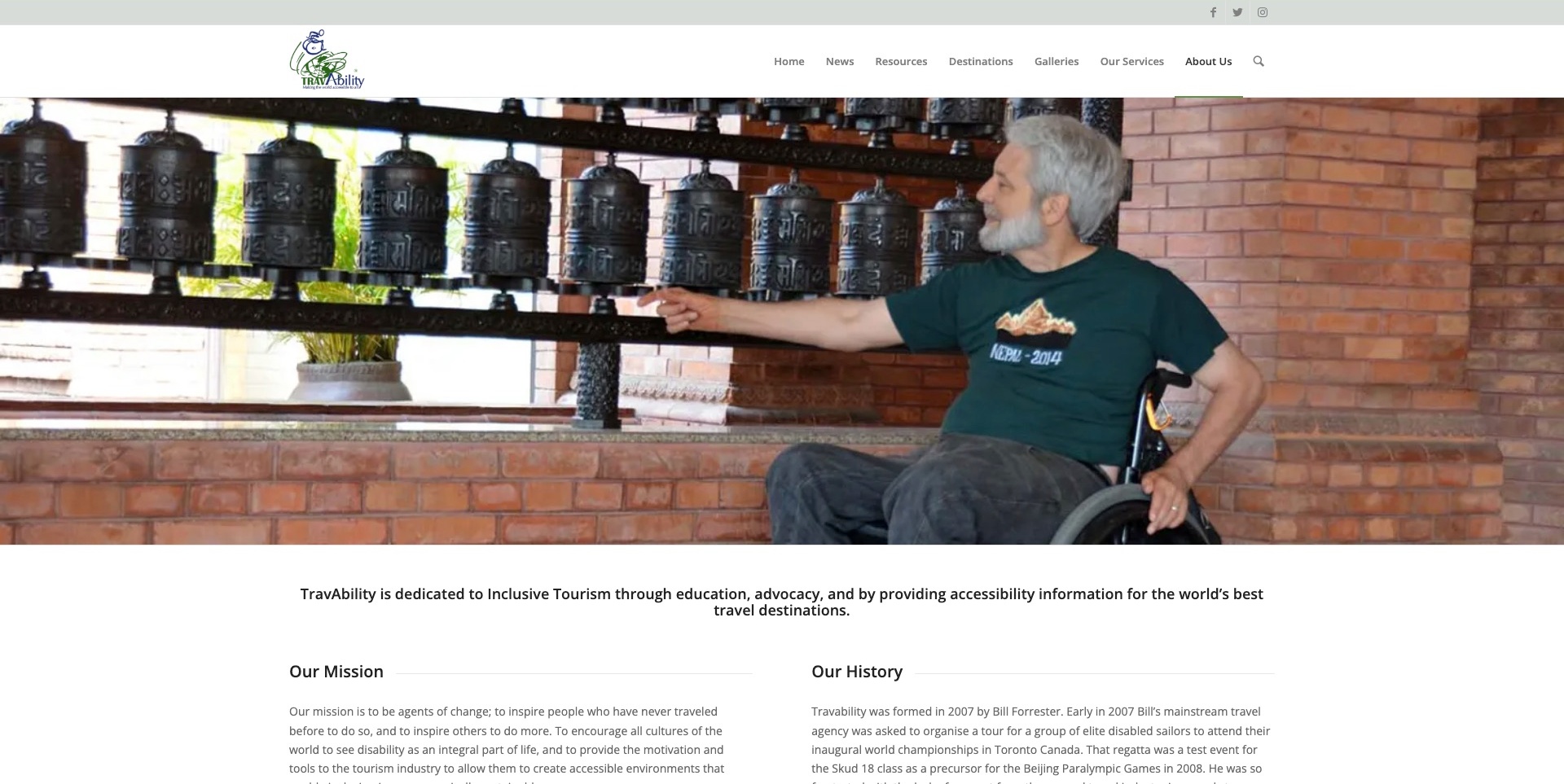
TravAbility’s About page combines a white header with a wide photograph of a wheelchair user beside prayer wheels. A statement beneath the image identifies education, advocacy and accessibility information as its focus. Mission and history sit in parallel text columns, while the navigation distinguishes resources, destinations, galleries and services. Further public content introduces the founder and a contact route. The useful pattern is a resource organisation explaining why it exists and what information it provides; this page is not confirmation that a current holiday can be booked.
What you can learn
Give an information-led travel organisation a clear account of its role before directing visitors into a resource library. Organisational history can explain the motivation, but current services need their own dated description. Keep advocacy, destination information and operational travel arrangements distinct instead of letting one inclusive headline stand for all three.
Pros
The opening statement directly identifies education, advocacy and information.
Resources and services have different navigation routes.
Cons & considerations
If the lead image dominates the opening, keep the mission easy to reach.
If historical copy remains extensive, distinguish it from the current scope of services.
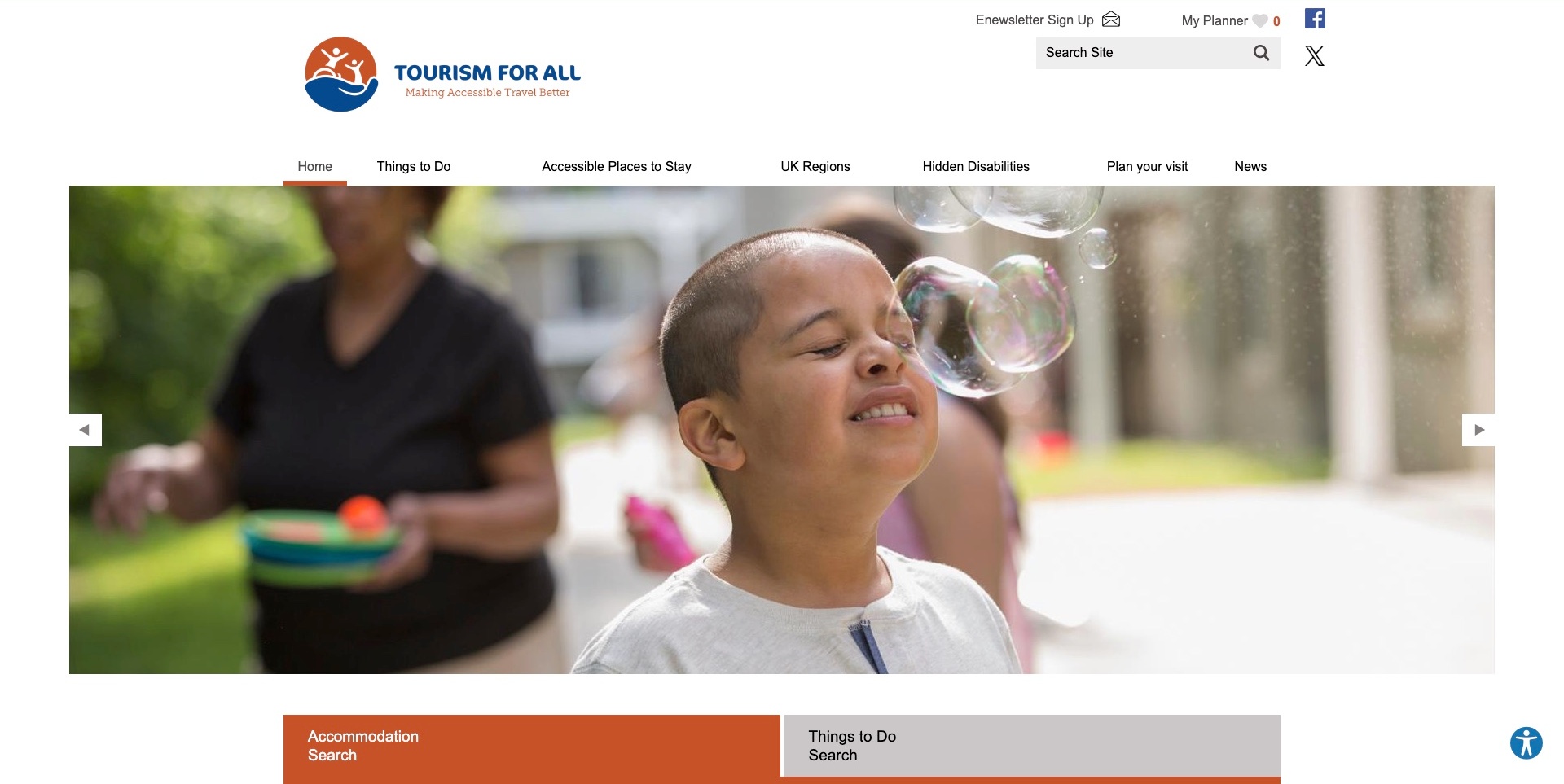
Tourism for All gives its identity, site search and saved planner a white header. The navigation separates things to do, places to stay, UK regions, hidden disabilities and visit planning. A photograph leads into distinct accommodation and activity search tabs. The introduction explains the directory’s UK focus and links specific features such as hoists and Changing Places rather than relying only on a general holiday label. This is a discovery and information resource; the presentation does not independently establish the suitability or availability of a particular listing.
What you can learn
Organise a tourism library around the decisions it supports. Someone comparing accommodation needs different details from someone finding an activity or researching a sensory requirement. Keep the scope and source of each feature explicit, and explain whether a result leads to information, a supplier enquiry or an external booking step.
Pros
Accommodation and activity discovery have separately labelled search routes.
Practical planning and hidden-disability information are primary navigation items.
Cons & considerations
If a large carousel precedes the introduction, keep the directory’s purpose easy to find.
If feature filters describe a property, distinguish them from the exact room or visit being requested.
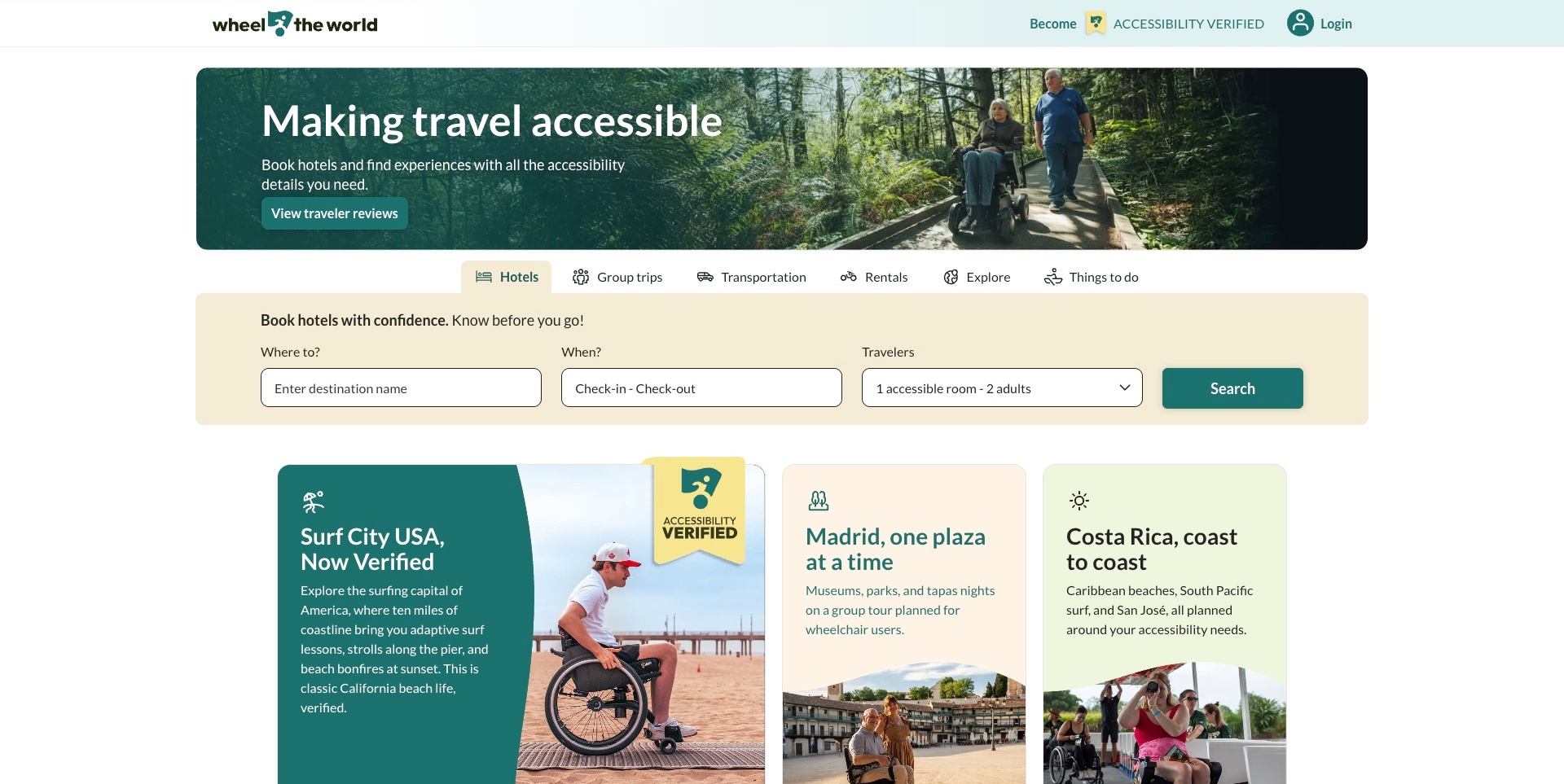
Wheel the World places a forest-path photograph and concise travel introduction above product tabs for hotels, group trips, transportation, rentals, exploration and activities. Hotels is selected in the captured view, with destination, dates and traveller controls arranged across a pale search panel. Destination cards follow with different visual treatments and short explanations. A separate verification-labelled programme appears in the header and on some cards. The useful design pattern is a clear relationship between the chosen product and its search inputs, not independent proof of the platform’s verification or service claims.
What you can learn
Make each product category change the context of the next decision rather than funnelling every visitor into an undifferentiated enquiry. Hotel search needs room-level information, while transport or a group itinerary has different questions. Explain the scope of any verification label on the relevant offer and retain confirmation of individual requirements as a separate task.
Pros
Product tabs make several travel components visibly distinct.
The active hotel panel labels destination, dates and travellers together.
Cons & considerations
If verification badges are prominent, make their criteria and limits easy to investigate.
If tabs change the form, test labels, retained selections and keyboard behaviour across categories.
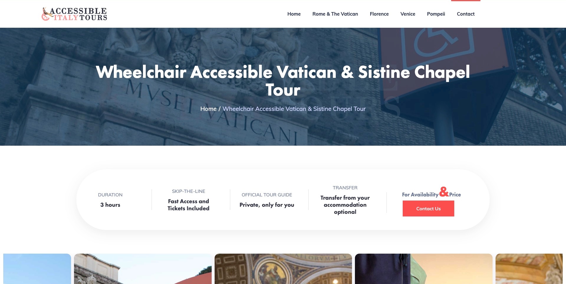
Accessible Italy Tours gives the Vatican and Sistine Chapel itinerary a blue-toned destination header. Beneath it, a rounded strip separates duration, ticket arrangements, a private guide, an optional accommodation transfer and a contact action for availability and price. Photographs and an itinerary description follow, with a list of visited sites and an enquiry route. The useful design pattern is the separation of a tour’s practical components. The wheelchair-oriented title establishes the offer being described, not independent confirmation of access features or suitability for a visitor.
What you can learn
Treat an itinerary page as a practical decision aid rather than a generic destination advertisement. Explain what is included, which arrangements are optional and which questions require a conversation. Keep the route, assistance and meeting arrangements specific enough to investigate without implying that a title or access symbol answers every individual requirement.
Pros
The summary separates included elements from an optional transfer.
Availability and price lead to an explicitly labelled contact action.
Cons & considerations
If a scenic header occupies much of the screen, keep practical details immediately below it.
If the itinerary uses a broad access label, describe relevant route constraints and confirmation requirements.
Kegan is a freelance web designer and developer with 15+ years of experience helping businesses turn complicated website requirements into clear, maintainable digital experiences. He works directly with clients from planning and design through development, launch, and ongoing support.
For accessible travel website design, his development approach focuses on clear travel-service and information-resource distinctions, specific access information, destination and itinerary discovery, respectful imagery, and proportionate enquiry journeys without blanket suitability or service guarantees. The scope can be a targeted improvement or a complete custom build, with responsive layouts, thoughtful content structure, and integrations chosen around the people using and maintaining the site.
Show 3 other accessible travel website designersHide other accessible travel website designers
Plan an accessible-travel website around a traveller’s real decisions
Define responsibilities across the journey
Start by documenting what the organisation actually provides. A local tour operator may arrange an adapted vehicle and guide but not flights or accommodation. A specialist agency may coordinate suppliers rather than operate each service. A destination-information website may help people research without booking anything. Describe those responsibilities plainly before designing a single enquiry funnel for every visitor.
Map the whole proposed journey and identify the responsible party for each component: getting to the destination, transfers, the specific room, activities, equipment and any human assistance. The public site does not need to reproduce an internal operations manual, but it should explain the offer’s boundaries and where confirmation comes from. Do not let a broad inclusive headline conceal exclusions or unresolved arrangements.
Model access information at the level where the decision is made
Decide which details belong to a destination, a property, an individual room, a vehicle or an activity. A hotel may have some adapted rooms alongside others without the relevant features. A tour route may change with the selected departure or vehicle. If the content model stores one accessible checkbox for the whole business, the website may be unable to express distinctions that matter to the traveller.
Use fields that describe observable features and their scope, with room for measurements, photographs, source and review date where appropriate. Explain uncertainty rather than filling every field with a reassuring answer. The exact information should be developed with the relevant travellers and operational specialists; copying a competitor’s icon set does not establish that the fields answer your users’ actual questions.
Separate the support model from the destination story
Create a concise explanation of the assistance available for each service format. A group travelling with general leaders is different from a private guide, a sighted-guide arrangement or individually planned support. State what is included, what needs a separate request and which responsibilities remain with the traveller or their own companion. Do not use a staff photograph as a substitute for that explanation.
Where participation criteria apply, make them findable before a visitor invests time in a date or destination. Write in respectful, practical language and explain how someone can discuss their circumstances. Avoid broad statements that everyone can take part when the actual service has a defined model. Equally, do not assume that a person needs a particular form of assistance solely because of their disability.
Make discovery filters honest and useful
A large accommodation or destination library needs filters that correspond to real information in the listings. Define what each filter means, whether it applies to the property or the offered room, and what source supports it. Show when details are missing or still need confirmation instead of treating unknown as either a positive feature or a definite exclusion.
Test combinations that produce few or no results, clear reset controls and the ability to return to a previous selection. Important information should not depend entirely on a map or a hover interaction. A list view, clear result headings and understandable feature descriptions can support comparison, but the actual controls still need accessibility and usability testing rather than an assumption that familiar search patterns are sufficient.
Design the enquiry and confirmation as distinct stages
Decide what an initial message needs to accomplish. It might establish the destination, timing, group size and the features a traveller wants to discuss, without gathering a complete personal history. Explain why information is needed and what will happen next. Let users provide practical requirements in their own terms rather than forcing every situation into a single diagnosis list.
Keep receipt, availability checks, a proposal and final confirmation distinct. A thank-you page should not imply that a specific room, vehicle, item of equipment or support arrangement has been reserved merely because the form was submitted. Review the real operational process with the responsible team, including follow-up questions and changes, before writing claims about response times or the certainty of an arrangement.
Show the basis and limits of information
Make it possible to understand where practical details come from. Information might be supplied by a property, recorded during a visit, reported by a traveller or confirmed for a particular booking. Those sources are not identical. Give relevant information its own date and responsible editor, and explain how a visitor can ask for a missing detail or report a change.
Testimonials and photographs can add context but cannot verify another person’s future trip. A broad accessible badge should not replace the features and qualifications behind it. If a third-party assessment or accreditation is mentioned, state the actual relationship and scope accurately rather than implying that the whole journey has been independently certified. Do not introduce new legal or conformance promises as a design shortcut.
Pair destination appeal with practical visual evidence
Use destination photography to communicate the experience, then add relevant practical images where the organisation has the right to publish them. A room layout, entrance or vehicle arrangement may answer a different question from a scenic landscape. Label what the image actually shows and avoid implying that every room or departure shares the pictured features.
Plan image rights, alternatives and maintenance along with the visual design. Descriptive text should carry important information rather than relying on a person interpreting a photograph. If video demonstrates an arrangement, provide suitable alternatives and explain its scope. Do not generate fictitious access features, traveller experiences or support demonstrations to fill gaps in the available evidence.
Keep the information useful after the first launch
Assign ownership for supplier details, feature changes, seasonal routes, equipment availability and external links. Some information needs checking for each booking, while other material can have a defined editorial review cycle. Record the difference. A rebuild or a new homepage photograph does not mean that every access detail has been validated again.
Agree how corrections are received and how uncertainty is shown while they are investigated. Test the ordinary journeys from a search result to a detailed listing, from a listing to an enquiry, and from a public page to any external booking service. Keep those checks separate from the operational assessment of a trip itself. Neither a design review nor an automated website test establishes the suitability or safety of a travel arrangement.
The editing job behind the design
Choose publishing and booking tools that preserve feature-level information
Start with the content structure and the team’s responsibilities. A small specialist operator may need clear service pages, a manageable itinerary collection and a well-explained proposal request. An accommodation platform may require room-level feature data, filters, supplier updates and distinct booking states. Those requirements matter more than matching the platform used by an attractive reference site.
Identify what each external system actually controls. A hotel-search integration, a calendar, an enquiry form and a supplier database have different jobs. Do not infer a complete backend from a public logo or a linked booking engine. Document the necessary handoffs, ownership, error handling and update process with the responsible team before selecting or connecting tools.
Treat accessibility, information handling and maintenance as project work rather than benefits implied by a product name. Review the actual forms, filters, keyboard interaction, media and external journeys. Decide where source dates and feature-level qualifications live so an editor can update them without rewriting a whole page. Unknown technologies in reference sites remain omitted; there is no reason to manufacture a stack inventory to complete the design brief.
Our WordPress website examples offer a separate look at publishing approaches. A visible platform label is evidence for that named page, not a guarantee that the same system will suit your requirements.
Before the public launch
Accessible-travel website planning checklist
Identify whether the offer is a tour, tailored trip, accommodation service or information resource.
Separate independent travel arrangements from staff-assisted or supported holiday formats.
Explain the provider’s responsibilities, exclusions and supplier handoffs.
Store relevant access details at the room, vehicle, route or activity level.
Distinguish measured, supplier-reported, requested, unknown and confirmed information.
Explain the actual assistance model and any participation requirements respectfully.
Show feature sources and review dates without implying universal suitability.
Keep discovery filters consistent with the information actually held in listings.
Offer usable alternatives to map-only, hover-only or image-only information.
Keep initial enquiry fields proportionate and explain their purpose.
Separate message receipt, availability checks, proposals and final confirmations.
Review practical image accuracy, publication rights and suitable text alternatives.
Assign ownership for changing supplier, itinerary and equipment information.
Test forms, filters, keyboard use and external booking handoffs with appropriate users.
Provide a clear route for missing information and corrections.
These checks are a project checklist, not a performance, legal, security, or accessibility certification. Test real journeys with the people responsible for the website before making claims about the result.
Sources & editorial method
How this collection was selected and reviewed
The original 30-example industry target was drawn and saved before research and has not been rerolled. Distinct public sources were examined for their actual travel audience, service model, visible design and practical information structure. Each example has a genuine direct browser capture, an original source-specific review, its actual source URL, UTC capture time, decoded dimensions and independently computed image hash. Earlier accepted images remain unchanged; resumed captures retain their own later dates. Only native browser toolbars were cropped away, never website content, consent layers or loading frames. Held and superseded attempts remain excluded in the private evidence history. Editors Choice is an explicit website-design judgment about Seable’s specific audience, holiday formats and booking-information hierarchy, independent of contact availability. Provider marketing is not independent verification of service quality, care, safety, legal protection, digital accessibility or an individual trip. Technology lists remain limited to separately supported public evidence; unknown items are omitted.
Each example links to its actual source page. Screenshots are direct browser captures with their own capture dates; moving imagery, announcements and live designs can change. The notes describe observable design choices and conditional tradeoffs, not measured traffic, conversion results, service quality, or accessibility conformance.
Technology labels use public page metadata, asset evidence, or explicitly cited platform documentation. Platform documentation is not a complete current deployment audit. A component reference may be legacy or unused; it is not a complete backend inventory. Unknown stacks are omitted. These sites are editorial examples, not our client portfolio.
Written, Edited and Curated are separate editorial records, not timestamps advanced by a rebuild. Website designs and imagery belong to their owners. See our editorial standards or suggest a correction.
Questions worth asking
Accessible Travel website design questions
Should every service be labelled simply accessible?
A single label rarely explains enough. Describe the relevant features, support model, source and scope for the actual room, route, vehicle or activity. Explain what is unknown or requires confirmation. A useful website helps a traveller ask informed questions; it should not imply that a broad category establishes suitability for every person.
Are supported holidays and wheelchair-accessible tours the same thing?
No. A provider may specialise in a particular support model, participant audience or type of trip. Wheelchair access, sighted guiding, general tour leadership and individual care arrangements answer different questions. Explain what the specific offer includes and any participation requirements without treating all disability-related travel as one interchangeable product.
Can a website screenshot establish that a trip or hotel is accessible?
No. A screenshot records public presentation at a particular time. It does not test a room, vehicle, route, private booking workflow or assistance arrangement. Practical feature information and individual requirements need their own confirmation through the responsible provider; the website-design review is not a safety, service-quality or accessibility certification.
What should an initial travel enquiry ask for?
Decide that from the actual routing task with the responsible team. Explain the purpose of any requested information and avoid collecting a complete medical history merely to establish relevance. A visitor may need to describe practical requirements in their own words. Information handling and final arrangements need their own operational review, not assumptions based on a generic form template.
How should an accessible-travel website be tested?
Test realistic discovery, comparison, enquiry and handoff tasks with appropriate users and the people responsible for maintaining the information. Review keyboard use, forms, filters, content structure and media alternatives. Keep digital usability and accessibility testing separate from checking travel-service features. Passing a website test does not establish that a holiday is suitable or that support arrangements are available.
Borrow the strongest information patterns, not blanket promises. Explain the actual offer, give practical details their proper scope and make uncertainty visible. Then design a clear route from destination interest to an informed conversation with the people responsible for the arrangement.