People visit law firm websites looking for relevance and reassurance. The design should help them understand the practice, the people and the next step without making promises about an outcome.
A prospective individual client may be stressed and unfamiliar with legal terminology. An in-house team may be comparing specialist experience across jurisdictions. A recruitment candidate needs something different again. Good navigation recognizes those audiences instead of putting every message in one rotating headline.
The collection spans focused practices and larger firms. Use it to compare practice-area structure, lawyer profiles, editorial depth and inquiry routes—not to infer legal competence from production value.
Before the examples
What makes good law firm website design in 2026?
Use recognizable practice and audience labels
Explain the kinds of matters the firm handles in language prospective clients can recognize. Connect a practice page to relevant lawyers, offices and useful background material. Do not make a visitor decode a slogan before finding out whether the firm is a plausible match.
Make people and experience easy to evaluate
Give lawyer profiles consistent fields for roles, admissions where appropriate, relevant work and direct contact routes. Describe matters accurately and review permissions before publishing client names or outcomes. Design the distinction between firm statements and outside recognition clearly.
Make the inquiry boundary clear
Explain what the initial contact route is for and discourage sending sensitive case details through an ordinary public form. Have the responsible firm reviewer approve intake language, advertising claims and jurisdiction-specific notices. A polished interface is not a substitute for that review.
The collection · 20 examples
20 law firm websites worth studying
Look at how each firm handles the tradeoff between institutional authority and a visitor’s immediate need to find a relevant practice or person. These are visual and content observations, not legal recommendations.
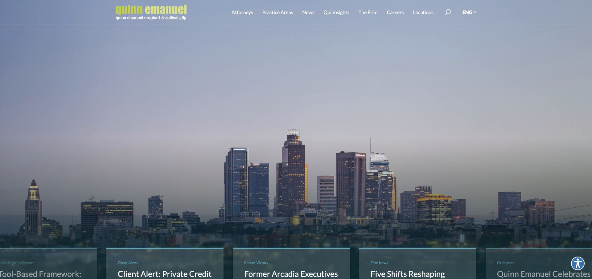
A lime wordmark sits over a panoramic city photograph, while a slim navigation gives attorneys, practice areas, locations, and news separate destinations. The striking color is doing useful identification work: it distinguishes the firm without adding another decorative illustration to an already detailed skyline. News enters as a lower horizontal layer rather than replacing the entire navigation. This is an institutional homepage, not a small intake landing page, and the emphasis on people and practice browsing reflects that distinction. The broad photograph communicates scale, but the useful lesson is how the header remains organized above it.
What you can learn
For a litigation firm, use a memorable brand accent around concrete research routes. Pair the visual statement with immediately available lawyer and practice directories rather than expecting an atmospheric image to explain legal capability.
Pros
The lime identity remains easy to recognize against the darker city scene.
People and practice-area routes are named directly in the primary navigation.
Cons & considerations
A city skyline alone does not establish experience with a particular dispute.
The large moving hero can postpone more specific matter information.
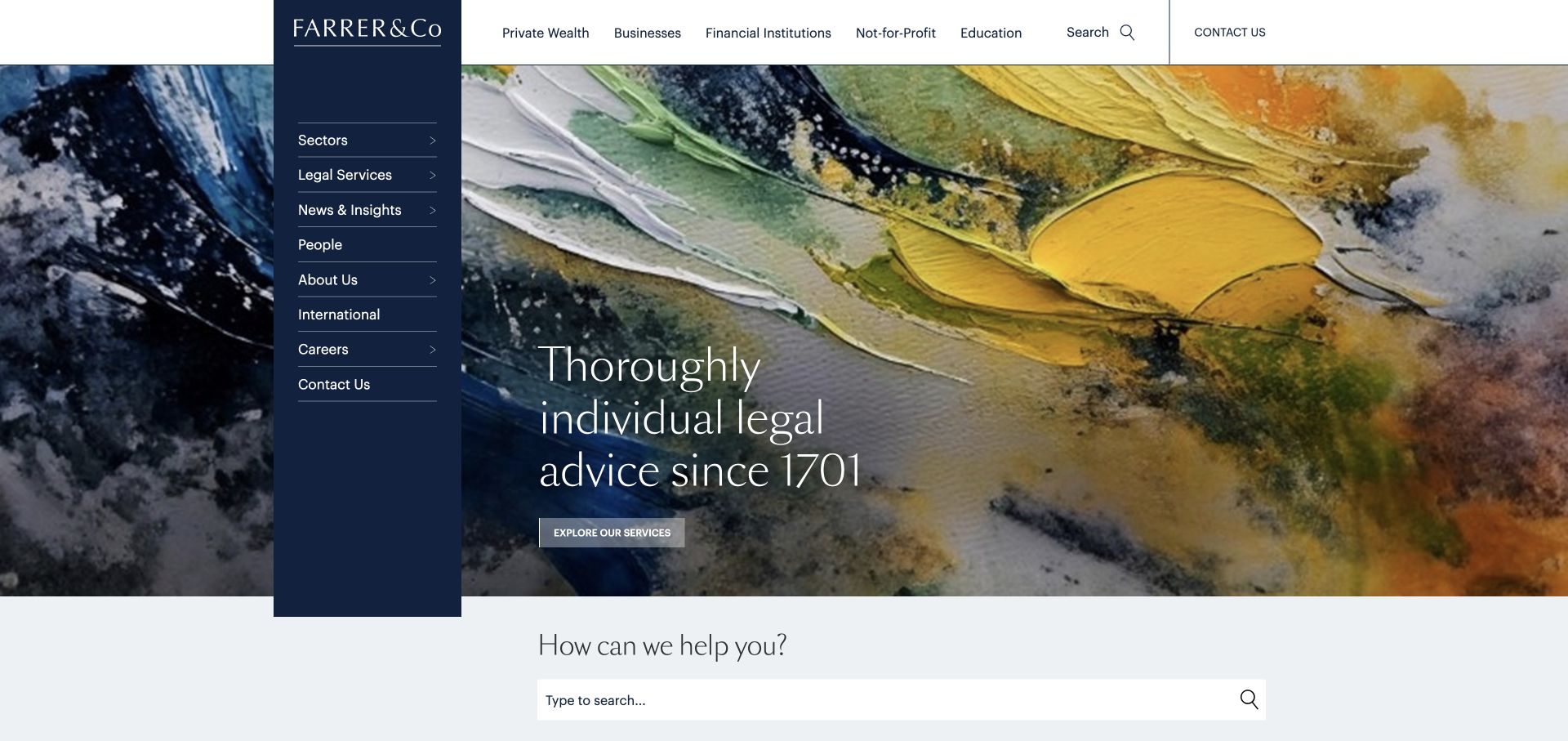
Farrer & Co uses a dark vertical rail for its identity and a separate upper row for client groups. The opening feels more like a publication than a conventional legal-services template. A yellow-and-blue painted background provides texture without pretending to be a photograph of legal work. The restrained display type and generous open area give the service introduction room to breathe. Private wealth, businesses, financial institutions, education, and not-for-profit visitors can orient themselves by their own situation before learning the firm’s internal department names. A search-led help section follows the opening rather than forcing every possible need into the hero.
What you can learn
Organize a broad legal offering around recognizable client circumstances. Keep a second route for visitors who already know the service or lawyer they need, since audience navigation and expertise navigation answer different questions.
Pros
Client categories translate a large practice into understandable starting points.
The dark identity rail and painterly hero create a distinctive composition.
Cons & considerations
The vertical rail consumes space that smaller screens cannot spare.
Fine display lettering needs careful contrast over the textured artwork.
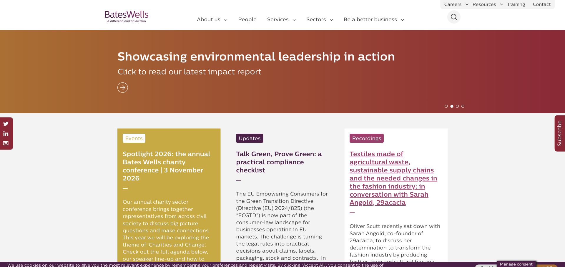
A warm orange-to-burgundy campaign panel establishes the tone beneath a white header. The plum navigation and rounded color treatment feel related without requiring every section to share the same background. Below the hero, editorial material is separated into event, update, and recording formats, which helps readers choose the kind of information they have time for. This is useful for a firm publishing commentary alongside individual legal services. Subscription and social controls remain at the edge of the composition, while the main area retains a clear reading order. The homepage demonstrates how a values-based identity can coexist with ordinary navigation.
What you can learn
If publishing is important to a law firm, label content by its practical format as well as its subject. Readers should distinguish an upcoming event from a recording before opening either item.
Pros
Color creates a recognizable tone without abandoning a familiar header.
Content-format labels make the editorial section easier to scan.
Cons & considerations
A rotating campaign needs a clear fallback for visitors seeking services.
Edge-mounted subscription controls can compete with the main reading column.
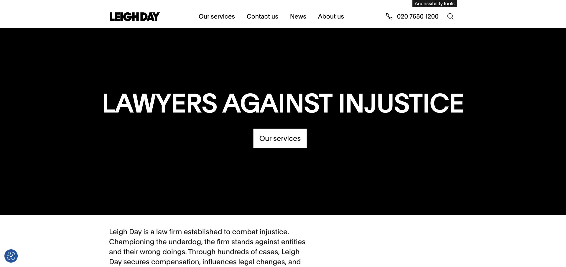
Leigh Day opens with a black statement panel beneath a white header, keeping the first impression almost entirely typographic. A prominent telephone number and straightforward services, contact, news, and about routes surround that statement. The white service button is easy to isolate because there are few competing shapes or colors in the hero. The introduction below adds context without relying on photography. This restrained approach can suit visitors arriving with a stressful problem who need a recognizable route to information. It also shows the limits of a powerful general statement: the next layer still has to identify actual legal needs.
What you can learn
Use strong, plain positioning to reduce uncertainty, then connect it quickly to practice-specific guidance. Telephone access is useful, but should sit alongside clear written routes for people not ready to call.
Pros
A highly limited palette makes the main service action conspicuous.
The telephone and contact routes remain visible in the header.
Cons & considerations
The tall statement panel uses substantial space before detailed guidance appears.
A broad purpose statement cannot replace explicit practice-area descriptions.
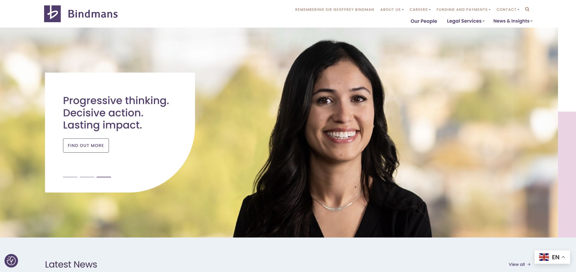
Bindmans places a white, asymmetrically shaped text panel against a purple architectural background. The solid panel gives the headline and action a stable reading surface, avoiding text laid directly across busy masonry. The header separates people, legal services, news, and insights, with funding and payment information in a utility layer. Those practical routes acknowledge that a legal visitor may need administrative help as well as marketing information. The hero behaves as a rotating editorial feature, while the repeated purple identity ties it back to the wordmark and navigation. The composition sits between a plain information page and an entirely cinematic opening.
What you can learn
Reserve a solid text surface when using detailed photography. For legal services, keep funding and practical client information findable without giving it the same visual weight as the main practice navigation.
Pros
The white panel protects text legibility from the detailed background.
Funding, people, and legal-service links address different visitor tasks.
Cons & considerations
A news-led carousel can delay the route to a specific legal problem.
Multiple utility layers need a simplified plan at narrow widths.
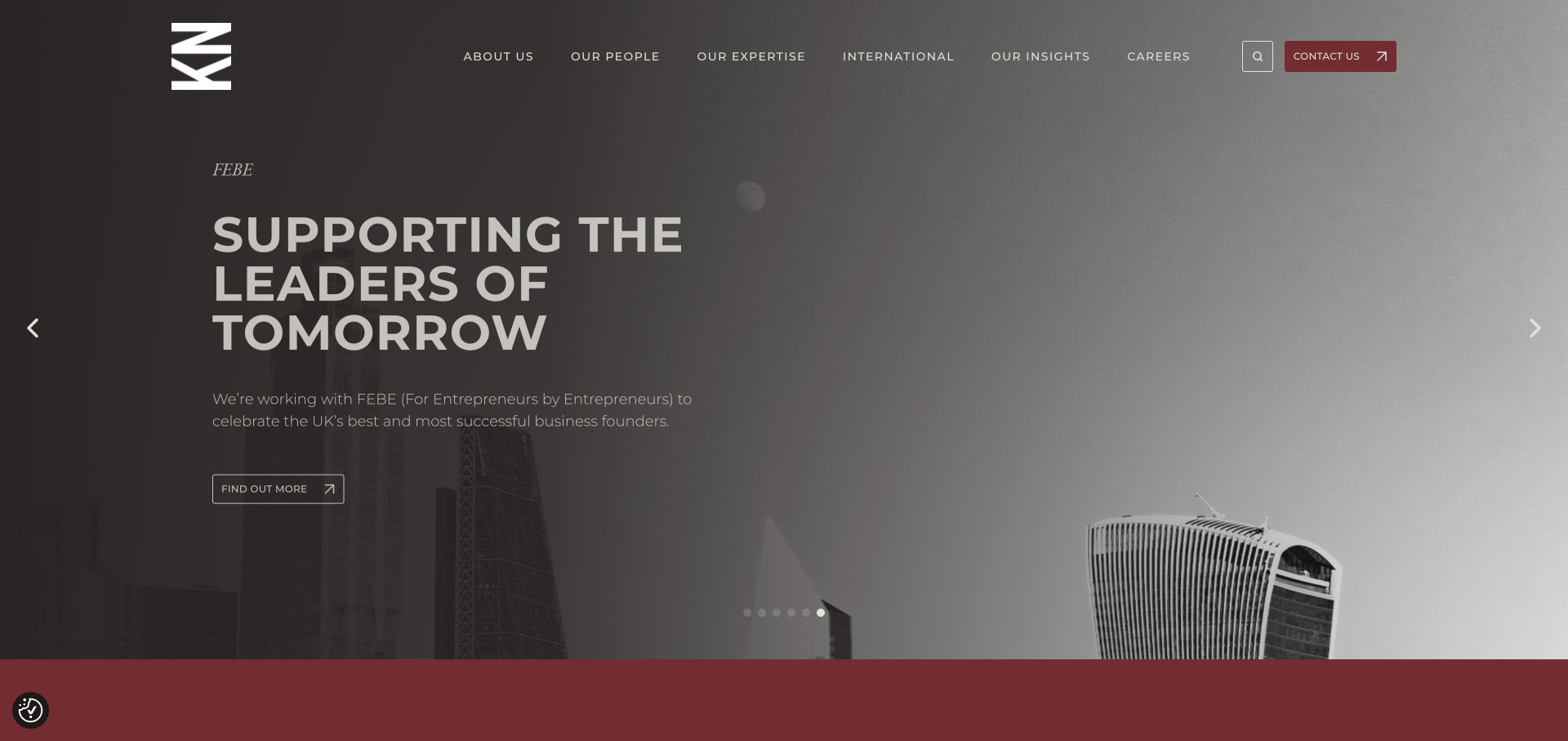
A black-and-white London panorama gives Kingsley Napley a quiet background for large white type and a red contact button. The tall identity mark anchors the header, while people and expertise remain direct navigation choices. Red is reserved for the most obvious action rather than being applied to every link. This distinguishes contact from the changing editorial story. Multiple carousel indicators show that the hero is a sequence, not a permanent explanation. The result is formal without gavels or books, but its effectiveness still depends on the clarity of each slide’s subject and relationship to the relevant practice.
What you can learn
A restrained photographic palette can give a single action color more significance. Keep essential people and expertise links outside a carousel so that campaign changes do not alter the basic wayfinding.
Pros
The red contact action has a clear visual role against monochrome imagery.
People and expertise remain available independently of the featured slide.
Cons & considerations
Six carousel positions spread the opening message across several states.
Transparent navigation needs contrast checks across every background frame.
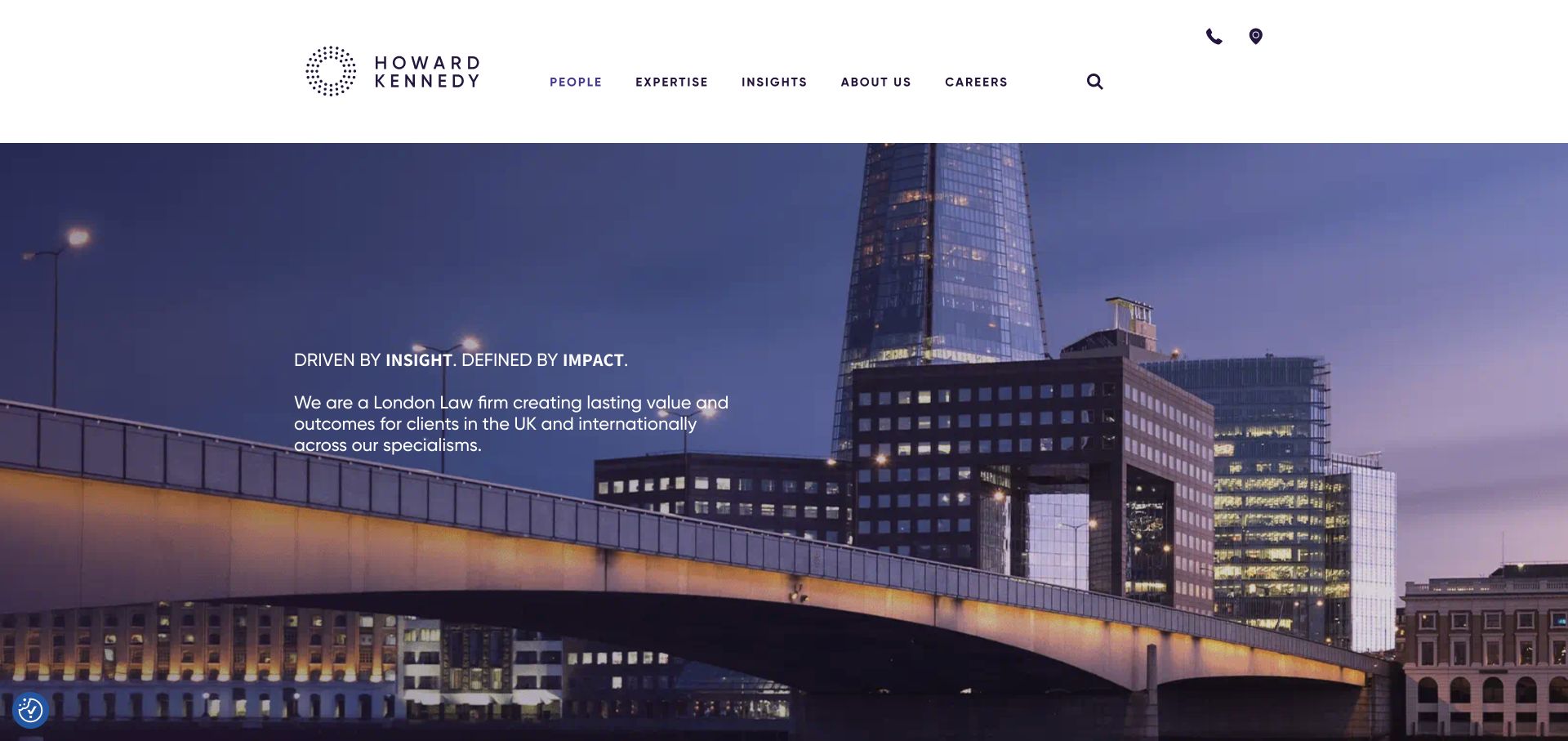
Howard Kennedy uses a large purple wordmark in an airy white header above London’s riverside architecture. The compact, left-aligned headline leaves most of the image free from decorative text. People, expertise, insights, about, and careers form a manageable main navigation rather than an exhaustive practice list. The photograph locates the business visually, while the white header keeps navigation stable. Small utility icons keep contact and location functions present without expanding the header into another full row. The design is a study in restraint, though it asks the next section to explain the firm’s actual specialties.
What you can learn
Use a persistent solid header when a photographic hero is doing the atmospheric work. A short introduction can be effective if the following section promptly offers expertise, relevant people, and an explicit enquiry route.
Pros
The solid white header isolates navigation from the busy skyline.
A short set of primary routes avoids an overloaded service menu.
Cons & considerations
A recognizable city does not by itself distinguish legal expertise.
Small utility icons need clear labels and sufficient interaction space.
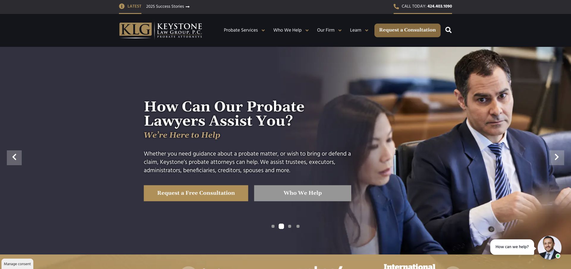
Keystone Law Group is immediately identifiable as a probate practice rather than a general law firm. A charcoal-and-gold opening combines a meeting photograph with a left-hand question, a short explanation, and a prominent consultation action. The navigation includes both probate services and the people the firm helps. That second approach helps someone who understands their estate role but not the precise proceeding. A telephone number and success-story link add routes without replacing the main intake action. Several conversion devices include a chat launcher; the strongest lesson is specificity rather than the number of contact opportunities.
What you can learn
Write an intake page around the visitor’s situation and role, then connect those labels to relevant legal services. Explain what happens after a consultation request instead of relying on a free-consultation button alone.
Pros
The probate focus is explicit in both the hero and navigation.
Role-based pathways help non-specialists recognize where they belong.
Cons & considerations
Multiple calls to action and chat can compete for attention.
Consultation language needs clear process and eligibility information nearby.
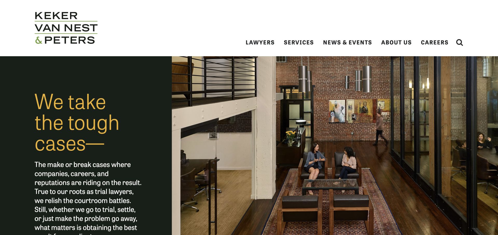
Keker, Van Nest & Peters splits the opening between a deep green text field and a red-brick building photograph. Gold display type gives the left-hand side an editorial character, while the masonry supplies a more particular image than another anonymous skyline. A white header contains the stacked firm name and bold, compact navigation. Supporting copy is part of the hero, not hidden in a promotional overlay. The composition feels rooted in a place rather than a generic corporate image library. The text side is deliberately dense, making the balance between statement, explanation, and next action worth studying.
What you can learn
Use a real office when it adds something specific to a legal brand. Give large display lettering room, but do not let the statement crowd out the service explanation or useful next step.
Pros
A recognizable building creates a concrete sense of the firm’s identity.
The green-and-gold text field is visually separate from the photograph.
Cons & considerations
Dense supporting text can fall low in a tall split-screen hero.
An immediately obvious enquiry action is less prominent than the brand statement.
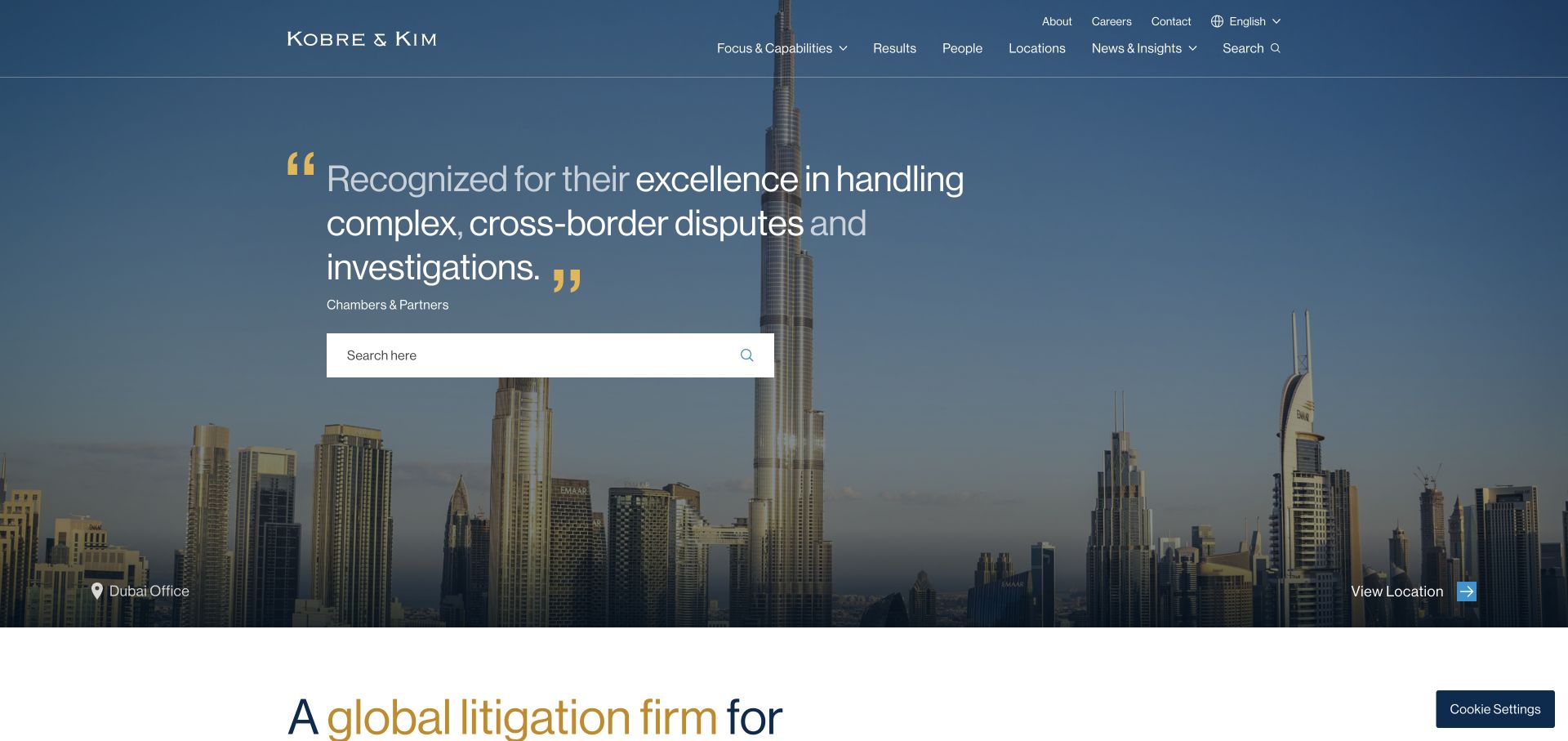
Kobre & Kim layers a large search field and an attributed quotation over a darkened city panorama. A location label and action connect the photograph to an actual office rather than anonymous decoration. Capabilities, results, people, and locations form a restrained upper navigation, with language and contact in a separate utility position. The layout recognizes several research tasks: finding a person, examining work, or searching a known term. Gold quotation marks supply an identifying accent without another illustration. The quotation is a confidence device, though anonymous client attribution is less specific than a named case study.
What you can learn
If search is a central route, make its purpose explicit and pair it with browsable capabilities. Give location photography a destination and caption so it contributes to wayfinding rather than merely filling space.
Pros
Search is treated as a useful primary task, not a tiny header icon.
The city image is linked to a visible location destination.
Cons & considerations
Visitors without legal vocabulary may still need guided practice navigation.
An anonymous quotation offers less inspectable context than a named example.
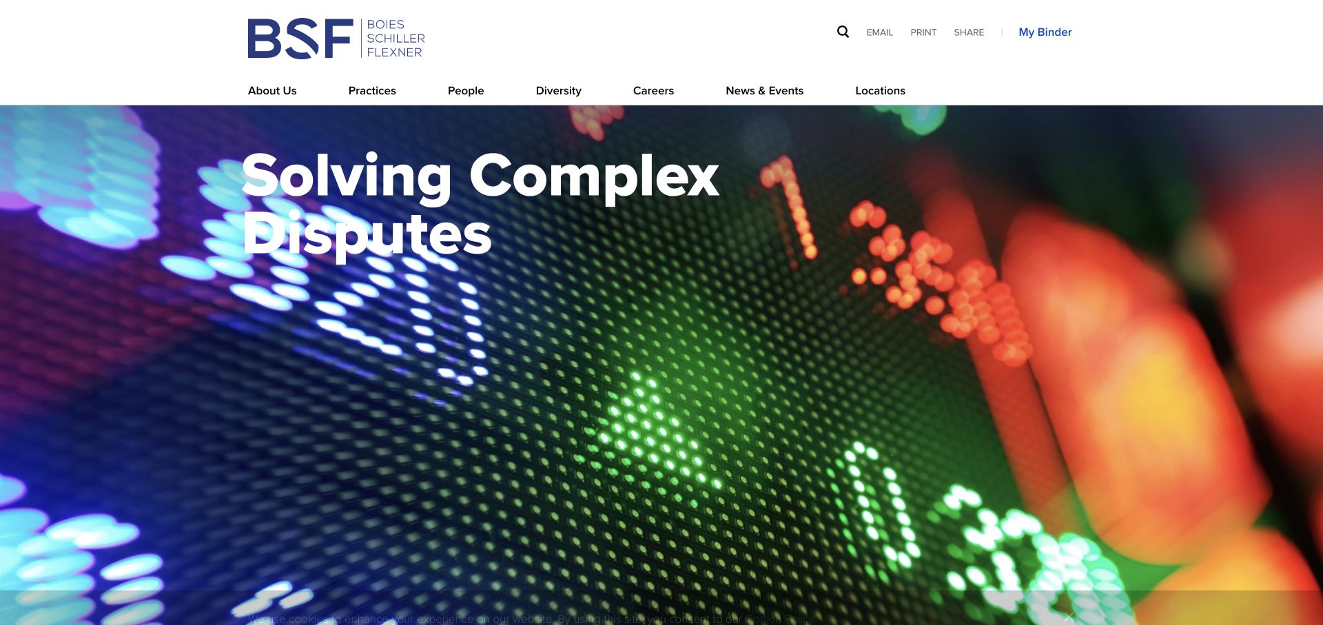
Boies Schiller Flexner places a research-oriented header above a colorful, blurred hero image. The blue wordmark remains on white, while large white text occupies the photograph below. Practices, people, locations, news, and firm information are immediately available. A utility row includes search, sharing, printing, email, and a binder function, accommodating visitors gathering information rather than only sending an enquiry. These tools give the header a document-research character. Abstract lights are expressive without suggesting a particular client matter, but cannot explain practice capabilities. The example distinguishes a brand-led visual layer from a task-led information layer.
What you can learn
For research-heavy legal sites, consider how a visitor saves or shares material as well as how they contact the firm. Keep these utilities secondary so they do not obscure the practice and lawyer routes.
Pros
People and practice navigation remain independent of the rotating hero.
Research utilities acknowledge that legal selection often involves comparison and sharing.
Cons & considerations
Numerous utility links make the header visually busy.
Abstract hero imagery needs specific adjacent copy to explain the legal focus.
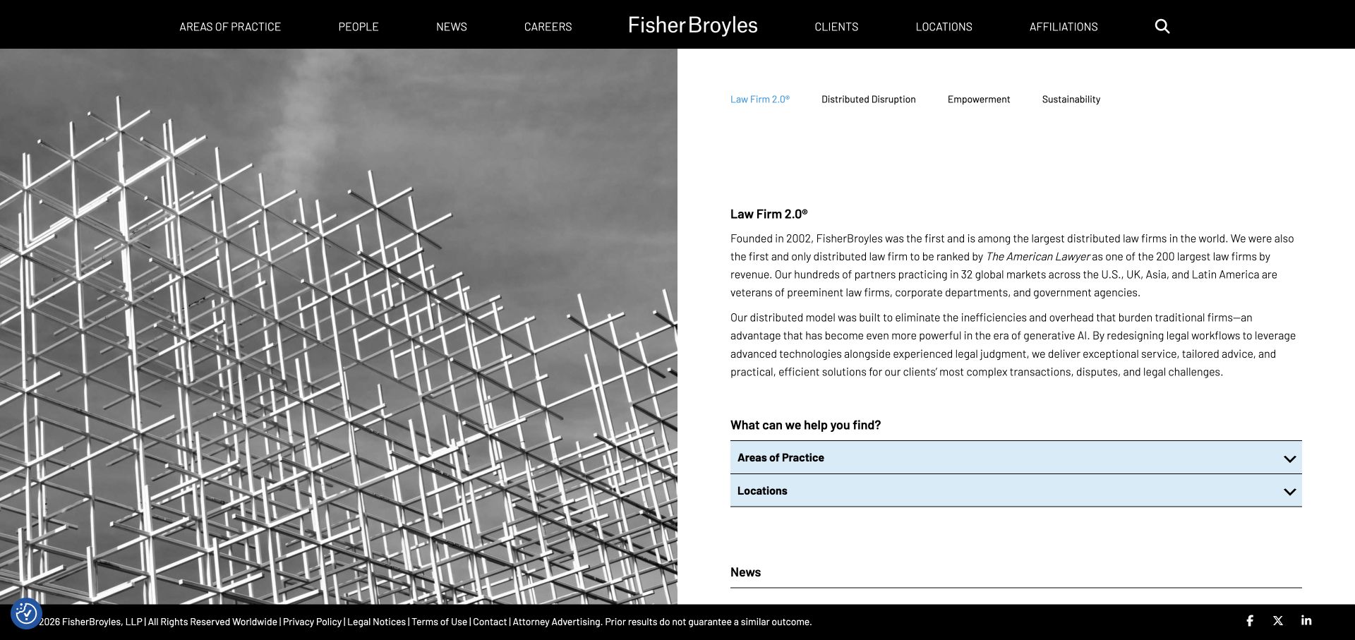
FisherBroyles uses black, white, and pale blue to introduce its distributed-firm model. A black bar centers the identity, while an architectural image occupies half the opening and explanatory text occupies the other. Tabs organize the model discussion, with practice and location accordions beneath. The structure does not assume visitors already understand the business. It gives the proposition written context rather than compressing it into an unsupported slogan. The tradeoff is density: explaining the model asks for reading time before a particular service or lawyer appears. This suits a distinctive organization better than a firm primarily offering local specialization.
What you can learn
Explain a genuinely different operating model in plain language, but keep practice and location shortcuts visible nearby. The homepage should support both the curious first-time reader and the visitor arriving with an immediate legal need.
Pros
Written explanation makes the model more inspectable than a slogan alone.
Practice and location accordions create clear next layers of information.
Cons & considerations
Tabs and long paragraphs introduce several reading decisions at once.
The firm’s structure can overshadow the client’s immediate task.
Stinson repeats an orange diagonal from its wordmark into the hero. An architectural tunnel photograph provides depth, with large white type and short value statements occupying distinct areas. People, capabilities, and firm information lead the header; news, locations, careers, and search occupy a quieter secondary position. That separation prevents one undifferentiated navigation row. The recurring diagonal gives the composition an identifying device without multiple competing graphic styles. The first screen remains a brand statement, so practice-specific evidence must follow. This illustrates visual consistency, not a requirement for every legal site to use a large photographic campaign.
What you can learn
Choose one repeatable visual cue and use it deliberately across identity and layout. Preserve a strong navigation hierarchy so a memorable hero does not become a barrier to finding the relevant capability or person.
Pros
The orange diagonal connects the logo and hero as one visual system.
Primary research routes are separated from lower-priority corporate navigation.
Cons & considerations
Broad values need concrete matter or practice evidence to become persuasive.
A full-height carousel delays the first detailed service content.
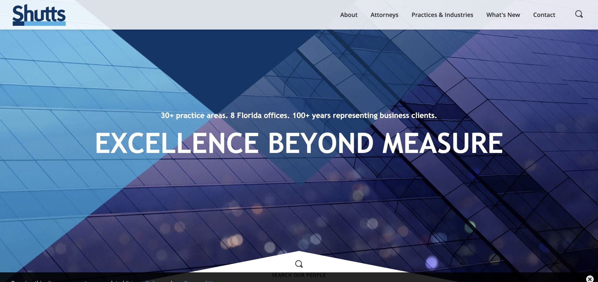
Shutts & Bowen pairs a white header with a blue architectural hero. A small scope statement above the large headline establishes the category before the main promise. A pointed white transition introduces people search, connecting the visual opening to a practical legal-selection task. Primary navigation names attorneys, practices, industries, news, and contact directly. This familiar structure gains an identifiable detail from the geometric transition. The building photograph remains a backdrop rather than a substitute for practice information. For a broad-service firm, the important idea is the immediate bridge from institutional identity to the person a visitor actually needs.
What you can learn
Place the most common research task at the seam between hero and content. A lawyer directory deserves more prominence than a buried footer link when people selection is central to how enquiries begin.
Pros
The scope line adds context before the oversized brand message.
A people-search entry connects the hero to a concrete task.
Cons & considerations
The headline occupies space that could show more specific service context.
Blue building imagery alone offers little distinctive practice evidence.
Stark & Stark divides its opening between a meeting photograph and a red panel. Three boxed routes distinguish injury matters, business work, and individual or family needs. This saves visitors from immediately scanning an intimidating legal taxonomy. A white header supplies people, services, resources, locations, and contact, with a contrasting telephone block. The photography suggests discussion rather than courtroom spectacle, keeping the tone closer to consultation. The first screen contains many useful routes, but also a chat prompt, making prioritization important. Its strongest lesson is translating practice breadth into a few recognizable starting points.
What you can learn
Group services into a few client-recognizable pathways before exposing the full directory. Keep the telephone route visible, and ensure chat does not cover the very options visitors need to choose their next step.
Pros
Three explicit client paths make a broad service list less daunting.
The telephone number has a distinct, stable header treatment.
Cons & considerations
Condensed uppercase labels require enough space to remain readable.
Automatic chat can compete with the intake routes beneath it.
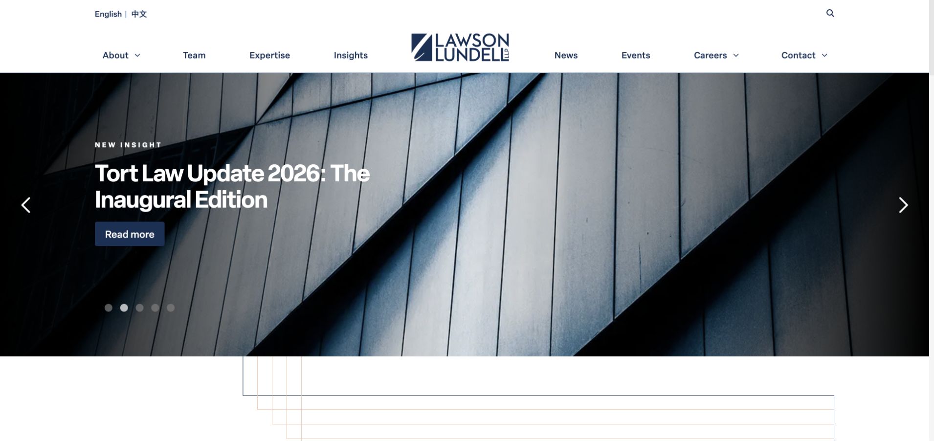
Lawson Lundell centers its identity in a white two-level header above a dark architectural photograph and featured insight. The content type appears above the headline, with a blue reading action distinct from surrounding text. People and expertise retain permanent navigation positions as campaigns change. A language option sits in the utility layer rather than interrupting reading. Fine lines beneath the hero continue the visual frame into the next section. Commentary signals current thinking for business-law audiences, but the story is only one entry point. Readers seeking representation still need permanent practice and team routes.
What you can learn
Use topical analysis to demonstrate what a firm is thinking about, with a clear content-type label. Keep evergreen services and people outside rotating features so the homepage remains usable when a campaign changes.
Pros
A visible insight label tells readers what the featured action opens.
People, expertise, and language controls have stable positions in the header.
Cons & considerations
A featured story may not match a visitor’s urgent legal issue.
Two navigation levels need careful reduction on smaller screens.
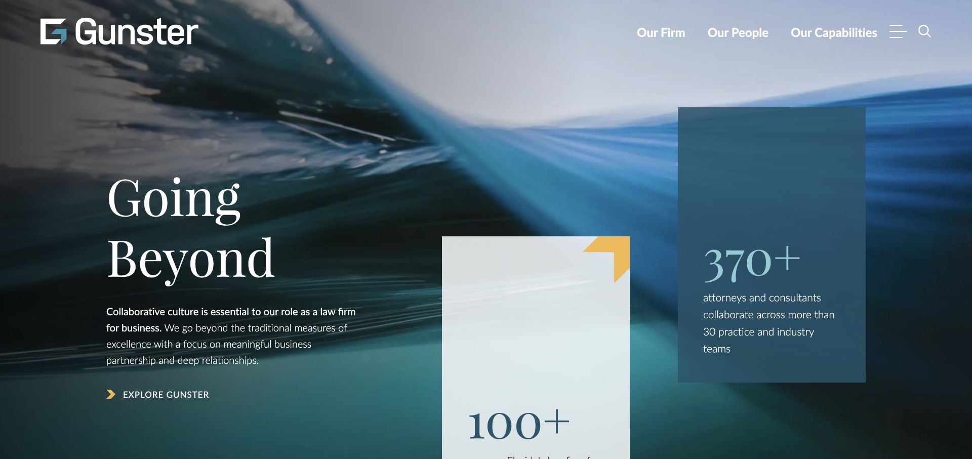
Gunster places an oversized serif statement over blue water imagery, adding staggered cards at the right. Those cards introduce supporting facts alongside the brand promise rather than leaving the opening entirely atmospheric. Main navigation is reduced to the firm, people, and capabilities, with further functions behind menu and search controls. A complex hero therefore has a relatively simple top edge. Cream and blue cards add contrast without a separate visual language. This puts evidence-like content near the introduction, though cards still need context: prominent numbers and claims are not independently verified by their visual treatment.
What you can learn
Keep supporting information close to the proposition, and give it context or a destination. If the main menu is deliberately short, make the three visible routes broad enough to cover the visitor’s most likely research tasks.
Pros
A short main menu leaves space for a distinctive editorial composition.
Staggered cards break the hero into readable supporting pieces.
Cons & considerations
Broad positioning still needs specific practice and matter information below.
Motion and overlapping cards require a sensible reading order on mobile.
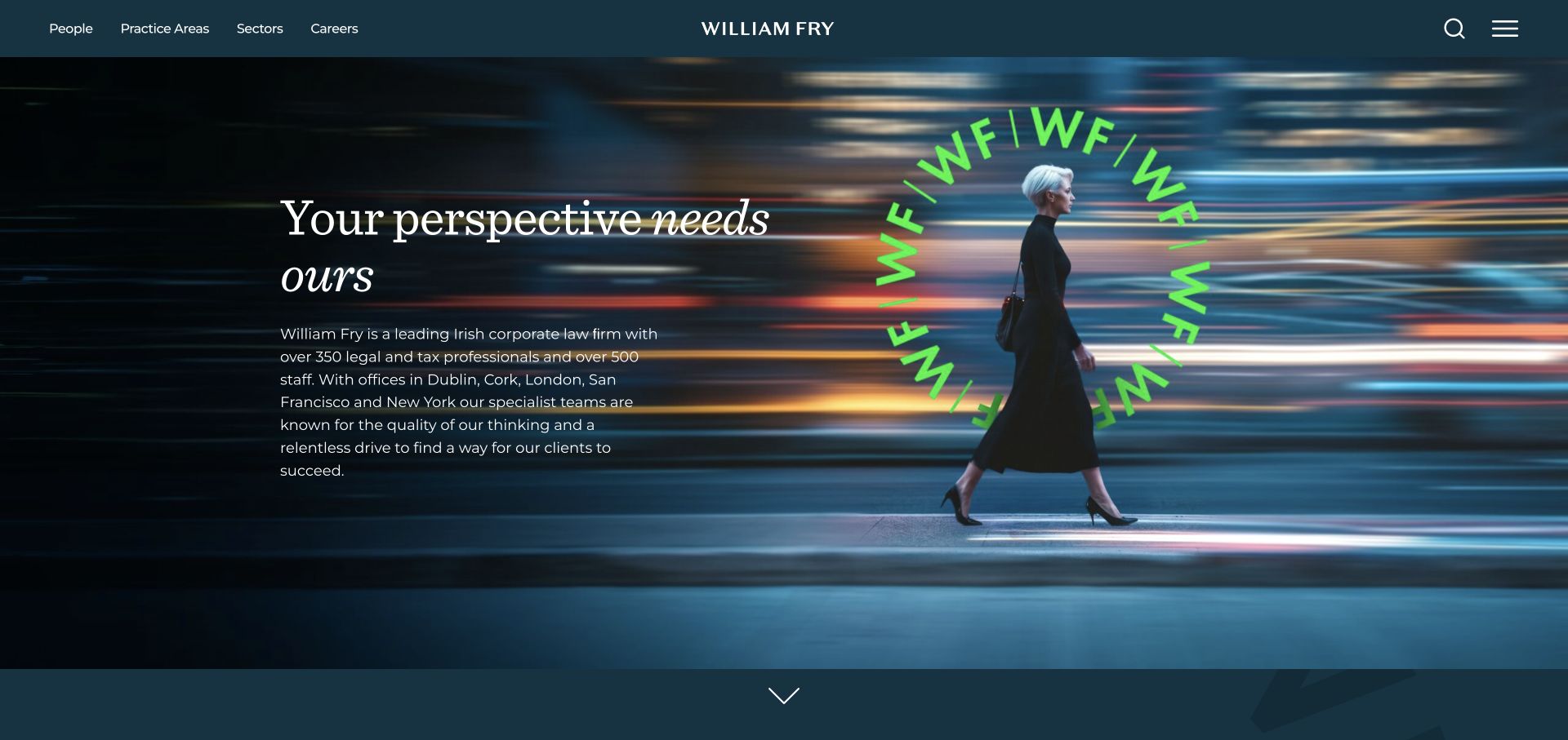
William Fry uses a dark teal header, fine white serif type, and a vivid green circular monogram. A person moving through a city supplies contemporary business context rather than a literal legal prop. People, practice areas, and sectors are separate navigation routes, useful when visitors know their industry but not the legal service required. A short paragraph accompanies the headline, giving the opening more substance than a purely visual campaign. Search and menu remain at the right, with careers on its own route. The visual signature is memorable, though understated typography and a long introduction require careful reading conditions.
What you can learn
Offer both sector and practice routes when commercial buyers describe their needs in different ways. A distinctive monogram can supply recognition, leaving photography free to support the tone rather than explain every service.
Pros
Separate sector and practice routes support two valid research approaches.
Teal and green create a consistent, recognizable visual signature.
Cons & considerations
Fine serif text must stay legible over every photographic frame.
An understated next step can be missed within a large hero.
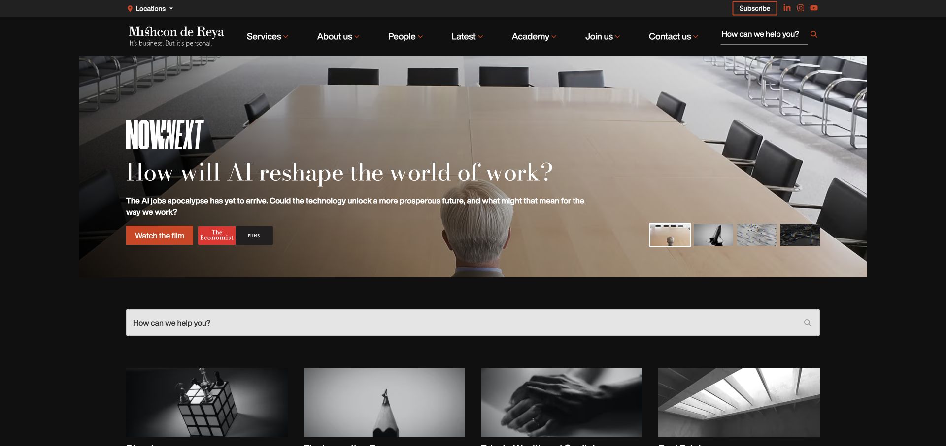
Mishcon de Reya opens like a publication: black masthead, large film feature, smaller stories, and a broad help-search field below. Red identifies the viewing action; white serif type establishes an editorial tone. Permanent navigation still names services, people, contact, and firm information, so media is not the only route. Monochrome content cards reinforce the regularly updated publication feel. This can support a genuine publishing operation, but cannot substitute for service information. The useful detail is the search seam between campaign and content, giving task-focused readers a practical way out of the editorial journey.
What you can learn
If film and commentary lead the homepage, build an equally obvious route for visitors with a specific problem. Editorial ambition needs a maintenance plan and a service taxonomy that stays clear between campaigns.
Pros
The red viewing action clearly distinguishes film from ordinary navigation.
A broad help-search field gives task-focused visitors an alternative route.
Cons & considerations
Media can dominate the first screen before expertise becomes specific.
Multiple search and subscription controls can create competing entry points.
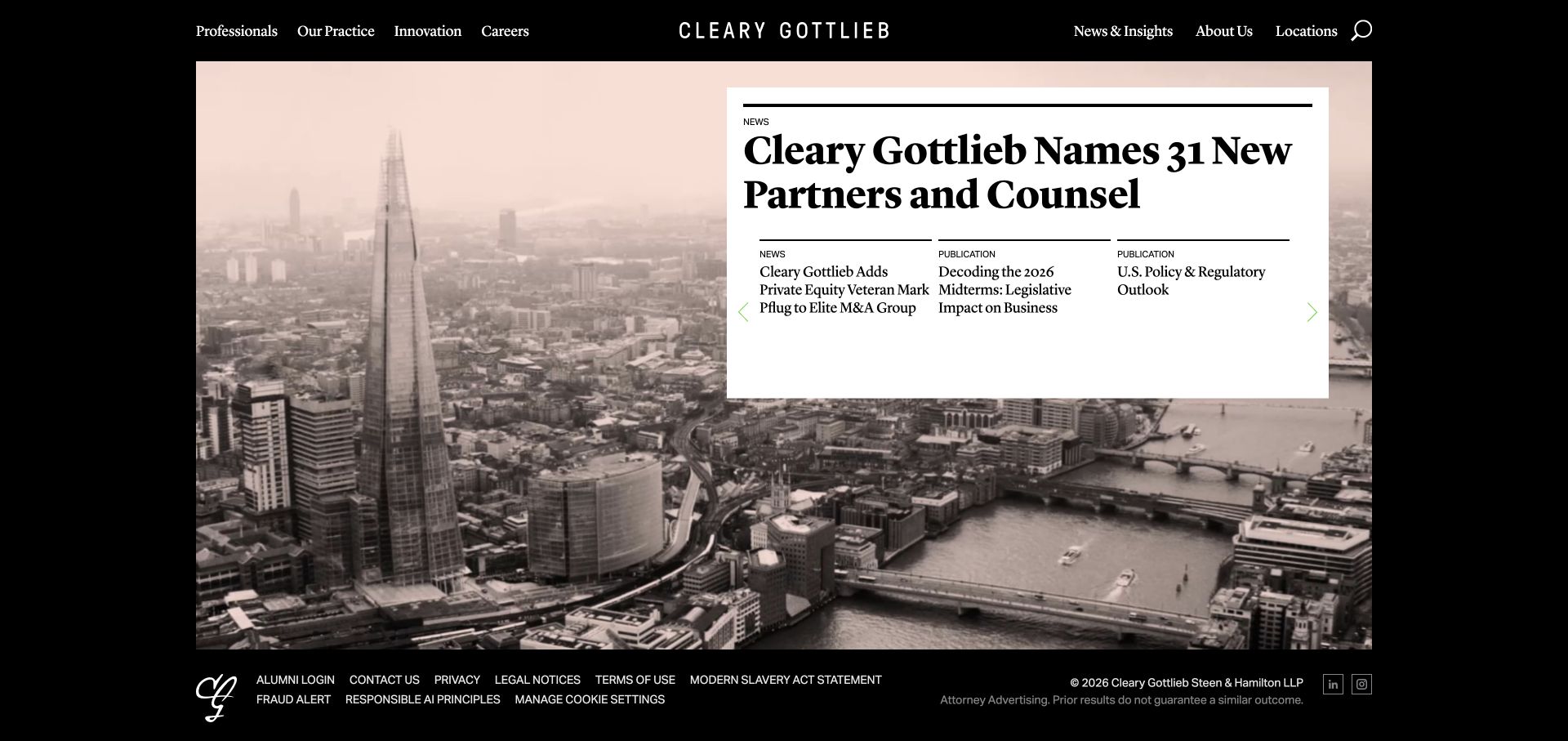
Cleary Gottlieb frames its homepage in black, with a desaturated city scene behind a white editorial panel. A firm-news headline leads while smaller columns distinguish further news and publications. Typography and tight hierarchy resemble a front page rather than promotional cards. The compact composition brings legal and contact information unusually close to the first screen instead of stretching every section into a full-height panel. This suits an institution whose audience recognizes the name and wants recent work or commentary. For unfamiliar visitors, however, editorial priorities explain less about services than a client-led introduction would.
What you can learn
Treat the homepage as a carefully edited selection, not a container for every announcement. If news leads, keep clear people and expertise routes alongside it and reserve enough type size for the secondary stories.
Pros
Editorial hierarchy distinguishes the lead story from smaller supporting items.
The compact layout brings practical institutional information closer to the opening.
Cons & considerations
Firm news may not answer a first-time visitor’s service question.
Small secondary serif headlines can become dense at narrower widths.
Create a simple model for practices, lawyers, offices, industries and insights. A practice should surface related people without requiring editors to duplicate the same biographies. Decide how departures, new admissions and office changes are reviewed and updated.
Separate inquiry from confidential intake
Decide which requests can start with a short form and which need a protected intake process. Show a clear alternative if a visitor cannot use the form. Route recruiting, media and prospective-client inquiries to appropriate teams rather than a single uncontrolled mailbox.
Make editorial ownership explicit
Assign a reviewer for practice descriptions, biographies, case references and dated commentary. Keep a record of approvals. If the firm publishes many articles, support author relationships and a genuine review date instead of automatically making every page appear newly updated.
The editing job behind the design
Build around connected profiles and reviewed publishing
Choose a CMS that can represent relationships between people, services and locations and can provide draft review before publication. A carefully configured conventional system is often easier for a small firm to operate than a custom front end with a fragile editing workflow.
Treat client portals and document exchange as separate security decisions. Do not imitate a portal in the marketing site or collect confidential material just because a form plugin offers file upload. Review third-party analytics and chat tools with the people responsible for the firm’s information handling.
Our WordPress website examples offer a separate look at publishing approaches. A visible platform label is evidence for that named page, not a guarantee that the same system will suit your requirements.
Before the public launch
Law firm website launch checklist
Have the firm approve practice descriptions, profile details and required notices.
Confirm permission for matters, testimonials, client names and recognitions.
Check lawyer, office and practice relationships in both directions.
Test inquiry routing without confidential matter information.
Review mobile navigation, search, keyboard access and readable article layouts.
Set a process for departures, stale articles and corrections.
These checks are a project checklist, not a performance, legal, security, or accessibility certification. Test real journeys with the people responsible for the website before making claims about the result.
Sources & editorial method
How this collection was selected and reviewed
We reviewed official law firm sites across different practice sizes and visual approaches. The selection concerns observable publishing, navigation and presentation; it does not assess legal services, results or professional standing.
Each example links to its actual source page. Screenshots are direct browser captures with their own capture dates; moving imagery, announcements and live designs can change. The notes describe observable design choices and conditional tradeoffs, not measured traffic, conversion results, service quality, or accessibility conformance.
Technology labels use public page metadata, asset evidence, or explicitly cited platform documentation. Platform documentation is not a complete current deployment audit. A component reference may be legacy or unused; it is not a complete backend inventory. Unknown stacks are omitted. These sites are editorial examples, not our client portfolio.
Written, Edited and Curated are separate editorial records, not timestamps advanced by a rebuild. Website designs and imagery belong to their owners. See our editorial standards or suggest a correction.
Questions worth asking
Law Firm website design questions
Should every practice have its own page?
A distinct page is useful when it can explain a real service, audience and relevant experience. Avoid thin pages created only to target slight keyword variations.
Do attorney biographies matter more than the homepage?
They can be important decision pages. Make them easy to find from practice and location content, with consistent relevant information and approved contact routes. Use your own audience research to decide priorities.
Should the site include a live chat?
Only with a defined staffing, routing and information-handling process. Explain who operates it and what visitors should not share. A clear contact page can be preferable to an unattended widget.
Can the examples be treated as compliant templates?
No. They are design references. Have the firm’s appropriate reviewer evaluate advertising, privacy, accessibility and jurisdiction-specific requirements for its own site.
Borrow the clarity of the navigation and the structure of the profiles. Build the actual claims, intake process and publishing review around the firm’s own responsibilities.