A useful location feature helps someone choose a place, understand its details, or plan a journey. These examples pair public website design with recorded references to the Google Maps JavaScript API. A loader reference establishes that narrower relationship; it does not prove which visible control uses it, whether a map was displayed, or how the website stores location data.
Location is often part of a larger task. A parent is choosing a childcare center, a customer is checking a repair location, and a mover is describing two addresses. Begin with that task before deciding how much of the screen a map should occupy. The surrounding labels, results, and contact information often matter as much as the map itself.
The twenty properties below demonstrate different entrances to location-related work. The retained screenshots show the public pages on their actual capture dates. Their separate, dated resource evidence records a Google Maps JavaScript request. No location permission was granted, private address submitted, or completed customer transaction tested for this collection.
Before the examples
What makes good Google Maps website development in 2026?
Choose the smallest mapping feature that serves the task
Google distinguishes interactive JavaScript maps from simpler embedded maps and directions links. Describe what the visitor needs to do before selecting a product. A contact page, a searchable branch directory, and a custom geographic application have different interaction and maintenance needs.
Maintain names, addresses, contact routes, and service information in a readable list or detail view. Let a map help visitors compare geography without becoming the only way to select a result. Make the currently selected place clear in both representations.
Load the necessary capability at the useful moment
Google documents direct script loading and dynamic library imports. Review the actual libraries the feature needs and when the user encounters it. A location section near the bottom of a page should not casually determine the entire opening experience's loading cost.
Compare the relationship between the opening message, location controls, and practical next steps. The design review is separate from the evidence of the API request; no screenshot is treated as proof of an unseen mapping workflow.
We start with five recognizable brands or organizations: The Nature Conservancy, AAMCO, Bright Horizons, KinderCare, Atlas Van Lines. Each attribution applies to the named website property, not every product or website belonging to its organization. This is a curated reading sequence, not a measured ranking.
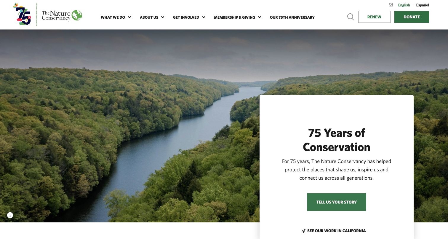
The Nature Conservancy opens with a river landscape and a white anniversary panel. The prominent story invitation makes the scene part of an organizational narrative, while a smaller California link offers a regional next step. Donation and membership controls remain in the header, giving supporters a route that does not depend on exploring the image. A recorded Maps JavaScript loader supports a page-level API association; it does not identify which visible control uses it or establish that a map was displayed in this captured view.
What you can learn
Connect an evocative landscape to a named place and a useful next action. Keep local information available as text even when the map or photograph cannot load.
Pros
The inset text panel separates the main message from the visually detailed river and forest.
Regional navigation can connect broad conservation storytelling to a visitor's interest in a specific place.
Cons & considerations
A small regional link may be missed when the anniversary message occupies most of the attention.
If maps are added below, preserve the organization's practical location details outside the interactive view.
Public source checked November 3, 2026. References may be embedded or legacy—not a complete backend inventory.
Platform source: Exact public source page with a dated Google Maps resource observation. Linked script matches Google Maps. A recorded Maps JavaScript loader supports a page-level API association; it does not identify which visible control uses it or establish that a map was displayed in this captured view. Platform evidence is separate from the direct website screenshot and is not a complete current infrastructure audit.
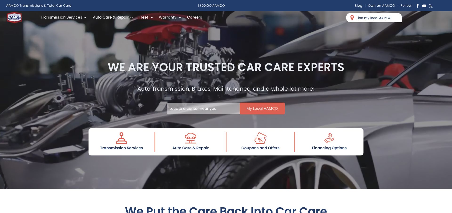
AAMCO places a center lookup directly beneath its car-care headline. The workshop photograph establishes the service category, while four white shortcuts separate transmission work, general repair, offers, and financing. This arrangement turns geographic intent into an early decision without removing the broader service explanation or the familiar brand navigation. A recorded Maps JavaScript loader supports a page-level API association; it does not identify which visible control uses it or establish that a map was displayed in this captured view.
What you can learn
Ask for location at the point where it changes the service offer. Preserve the chosen center as the visitor moves from a general category into an appointment route.
Pros
The center field has a visible relationship to the main service promise rather than sitting in an unrelated footer.
Distinct service shortcuts make the next step understandable before visitors know their nearest branch.
Cons & considerations
A location field needs a useful manual alternative if suggestions or geolocation are unavailable.
Busy workshop imagery can compete with input labels unless contrast holds across all campaign crops.
Public source checked November 3, 2026. References may be embedded or legacy—not a complete backend inventory.
Platform source: Exact public source page with a dated Google Maps resource observation. Linked script matches Google Maps. A recorded Maps JavaScript loader supports a page-level API association; it does not identify which visible control uses it or establish that a map was displayed in this captured view. Platform evidence is separate from the direct website screenshot and is not a complete current infrastructure audit.
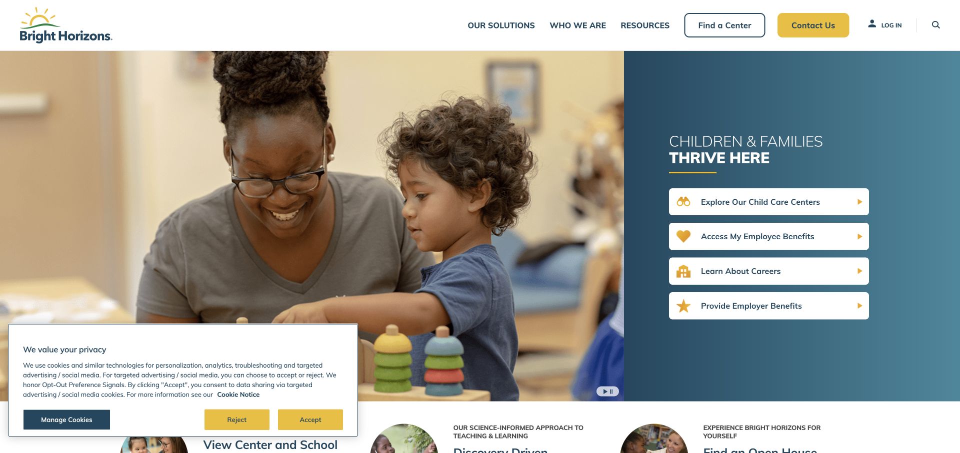
Bright Horizons pairs an adult-and-child photograph with a blue panel of four audience routes. Exploring centers is presented alongside employer benefits, careers, and employer services. The Find a Center control also appears in the header. This provides a location-oriented entrance without assuming that every visitor arrives as a prospective parent. A recorded Maps JavaScript loader supports a page-level API association; it does not identify which visible control uses it or establish that a map was displayed in this captured view.
What you can learn
Separate the visitor's purpose before asking for a location. A parent seeking care and an employer researching benefits need different explanations even when they share the same site.
Pros
Labeled audience choices reduce ambiguity between enrollment, employment, and business-service paths.
The persistent center control offers a shortcut for visitors who already know what they need.
Cons & considerations
The captured privacy panel occupies part of the photograph and needs consideration at narrower widths.
Center search should distinguish ordinary availability questions from confirmed enrollment or appointment outcomes.
Public source checked November 3, 2026. References may be embedded or legacy—not a complete backend inventory.
Platform source: Exact public source page with a dated Google Maps resource observation. Linked script matches Google Maps. A recorded Maps JavaScript loader supports a page-level API association; it does not identify which visible control uses it or establish that a map was displayed in this captured view. Platform evidence is separate from the direct website screenshot and is not a complete current infrastructure audit.
KinderCare's opening uses a classroom portrait and a short family-facing message. A red Find a Center button sits beside the copy, and the navigation repeats a nearby-center route. Colorful tiles below introduce additional programs. The layout makes the local next step clear while retaining broader information for families comparing educational approaches. A recorded Maps JavaScript loader supports a page-level API association; it does not identify which visible control uses it or establish that a map was displayed in this captured view.
What you can learn
Give location discovery one clear label and repeat it consistently. Keep program descriptions and practical center details connected so visitors can compare before making an inquiry.
Pros
The primary button is visually distinct from the photograph and surrounding blue navigation.
Program tiles create a second layer of exploration without obscuring the initial local-search task.
Cons & considerations
A nearby label should not imply that the site has already obtained or verified the visitor's location.
If a map accompanies results, provide the same center names, addresses, and contact routes in a readable list.
Public source checked November 3, 2026. References may be embedded or legacy—not a complete backend inventory.
Platform source: Exact public source page with a dated Google Maps resource observation. Linked script matches Google Maps. A recorded Maps JavaScript loader supports a page-level API association; it does not identify which visible control uses it or establish that a map was displayed in this captured view. Platform evidence is separate from the direct website screenshot and is not a complete current infrastructure audit.
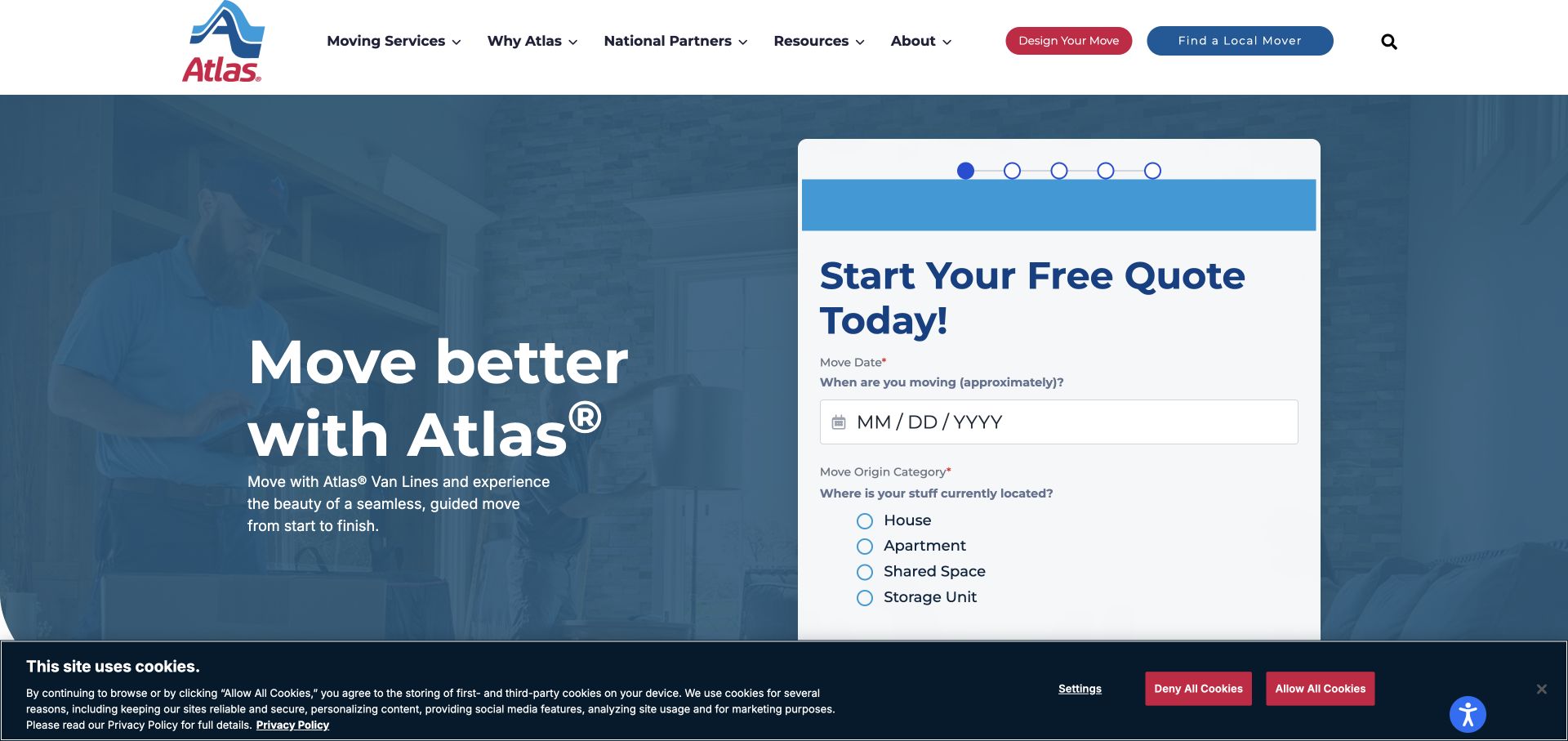
Atlas Van Lines uses a large quote panel over a blue-tinted moving photograph. The visible first step asks about timing and the type of current home. A separate Find a Local Mover button remains in the header. The design accommodates both visitors ready to describe a move and those who want to inspect an agent first. A recorded Maps JavaScript loader supports a page-level API association; it does not identify which visible control uses it or establish that a map was displayed in this captured view.
What you can learn
Keep the quote workflow distinct from location browsing. Let customers understand the responsible local provider before asking them to commit to a long sequence of personal details.
Pros
The staged form exposes a manageable first question rather than every moving detail at once.
The local-mover shortcut supports visitors who need geographic reassurance before starting a quote.
Cons & considerations
The cookie bar overlaps the lower area of the captured form and deserves small-screen testing.
Location suggestions should retain entered addresses after an error instead of resetting the entire quote sequence.
Public source checked November 3, 2026. References may be embedded or legacy—not a complete backend inventory.
Platform source: Exact public source page with a dated Google Maps resource observation. Linked script matches Google Maps. A recorded Maps JavaScript loader supports a page-level API association; it does not identify which visible control uses it or establish that a map was displayed in this captured view. Platform evidence is separate from the direct website screenshot and is not a complete current infrastructure audit.
Le Bernardin's captured opening is unusually quiet: a chef portrait, restrained wordmark, reservation label, and a slim footer containing the address and telephone number. The image carries the personality while practical contact details remain literal. It is a useful contrast to sites that make a large interactive map the central visual feature. A recorded Maps JavaScript loader supports a page-level API association; it does not identify which visible control uses it or establish that a map was displayed in this captured view.
What you can learn
A single destination rarely needs a map to explain its identity. Keep the street address and booking route immediately usable, then offer mapping where it helps the journey.
Pros
The address is represented as text rather than relying on a map marker or photograph.
The spacious composition makes the restaurant identity legible without a competing promotional grid.
Cons & considerations
Small footer contact text may need greater size and prominence on narrow or zoomed views.
A sparse opening should still reveal accessibility, arrival, and reservation information through clear subsequent navigation.
Public source checked November 3, 2026. References may be embedded or legacy—not a complete backend inventory.
Platform source: Exact public source page with a dated Google Maps resource observation. Linked script matches Google Maps. A recorded Maps JavaScript loader supports a page-level API association; it does not identify which visible control uses it or establish that a map was displayed in this captured view. Platform evidence is separate from the direct website screenshot and is not a complete current infrastructure audit.
Third Space places a dramatic training scene behind a short lifestyle statement. Clubs, membership, classes, personal training, and wellness sit in the top navigation, with Join Us separated at the right. The opening establishes the tone of the brand; the Clubs route is the practical bridge from that atmosphere to a specific place. A recorded Maps JavaScript loader supports a page-level API association; it does not identify which visible control uses it or establish that a map was displayed in this captured view.
What you can learn
Use visual atmosphere to introduce the experience, but give every club a direct route with its own address, access information, and facilities. Keep those facts separate from campaign imagery.
Pros
The uncluttered headline leaves room for a distinctive training image and recognizable brand tone.
The club and membership labels distinguish choosing a place from starting a commercial relationship.
Cons & considerations
White text over dark photography needs rechecking whenever the image, crop, or motion changes.
Visitors comparing facilities may need a location list sooner than a full-screen campaign allows.
Public source checked November 3, 2026. References may be embedded or legacy—not a complete backend inventory.
Platform source: Exact public source page with a dated Google Maps resource observation. Linked script matches Google Maps. A recorded Maps JavaScript loader supports a page-level API association; it does not identify which visible control uses it or establish that a map was displayed in this captured view. Platform evidence is separate from the direct website screenshot and is not a complete current infrastructure audit.
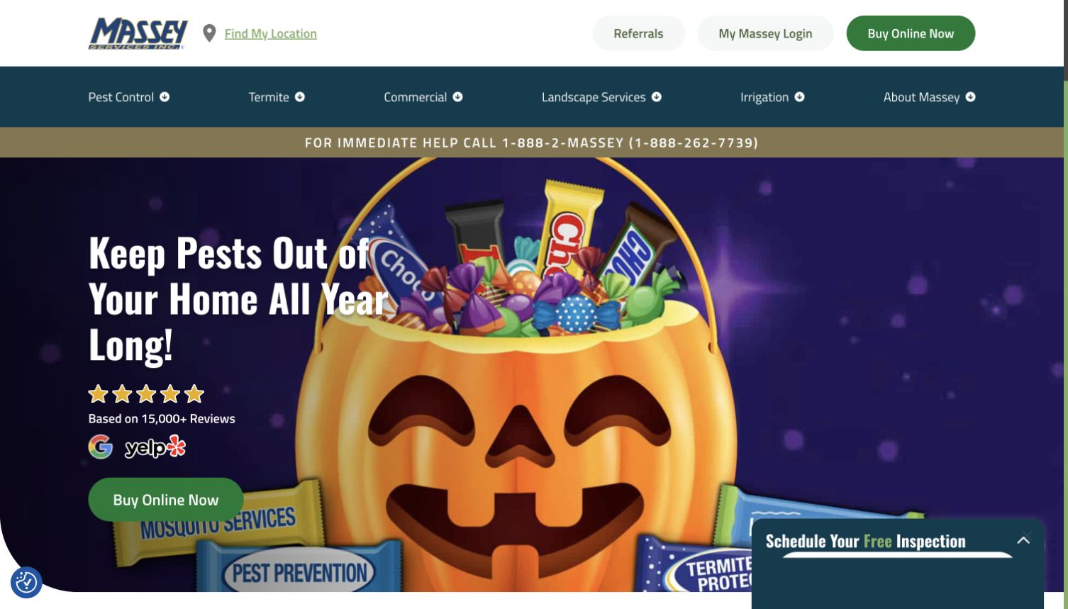
Massey Services uses a seasonal pest-prevention campaign with bright packaging and a large purchase button. Above it, Find My Location remains beside the brand, while a telephone strip separates the navigation from the campaign. The page keeps local service utility available even when the main promotional image changes with the calendar. A recorded Maps JavaScript loader supports a page-level API association; it does not identify which visible control uses it or establish that a map was displayed in this captured view.
What you can learn
Treat branch discovery as stable navigation rather than campaign copy. Seasonal offers can change, while the location route should continue to explain who serves the visitor's address.
Pros
The location label stays near the brand, where returning visitors can find it quickly.
The separate phone strip gives urgent visitors an alternative to browsing a visual promotion.
Cons & considerations
A busy seasonal illustration can reduce the prominence of practical service details on small screens.
A purchase action should confirm service coverage before visitors assume that a promotion applies locally.
Public source checked November 3, 2026. References may be embedded or legacy—not a complete backend inventory.
Platform source: Exact public source page with a dated Google Maps resource observation. Linked script matches Google Maps. A recorded Maps JavaScript loader supports a page-level API association; it does not identify which visible control uses it or establish that a map was displayed in this captured view. Platform evidence is separate from the direct website screenshot and is not a complete current infrastructure audit.
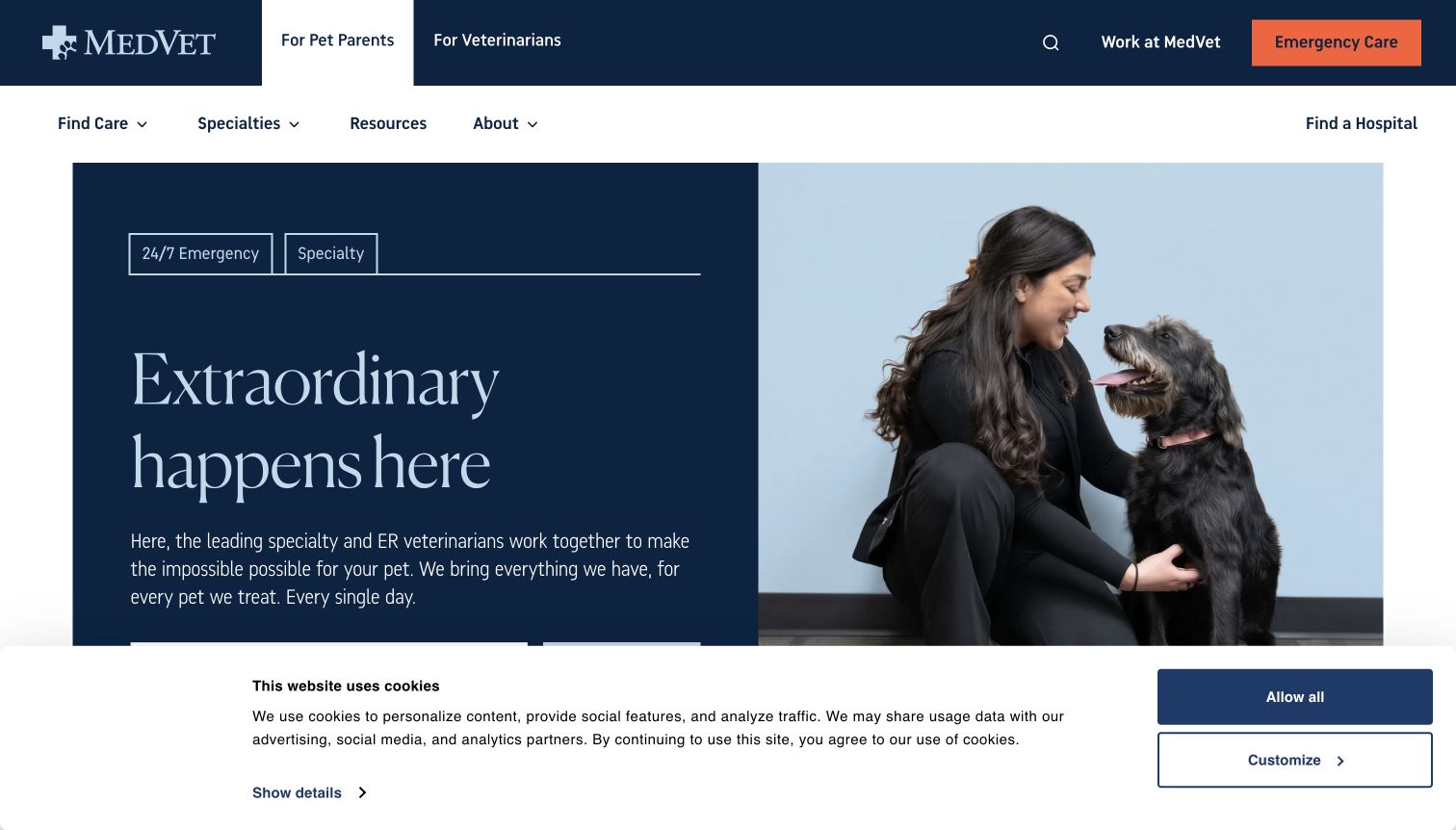
MedVet separates pet parents from referring veterinarians in its header and gives Emergency Care a contrasting orange button. The main panel pairs a clinician-and-dog portrait with specialty-care copy. Find a Hospital remains a distinct route. The hierarchy recognizes that locating urgent help and researching specialist services are related but different tasks. A recorded Maps JavaScript loader supports a page-level API association; it does not identify which visible control uses it or establish that a map was displayed in this captured view.
What you can learn
Keep urgent location discovery separate from general brand storytelling. Show the relevant facility information as readable text, and make the next contact step explicit before introducing map controls.
Pros
The emergency action is visually differentiated from ordinary informational navigation and search.
Audience tabs can help owners and professional referrers reach different levels of service detail.
Cons & considerations
The captured consent panel obscures the lower portion of the introductory content and needs responsive review.
A nearest result should not imply that a particular service is available without facility-specific confirmation.
Public source checked November 3, 2026. References may be embedded or legacy—not a complete backend inventory.
Platform source: Exact public source page with a dated Google Maps resource observation. Linked script matches Google Maps. A recorded Maps JavaScript loader supports a page-level API association; it does not identify which visible control uses it or establish that a map was displayed in this captured view. Platform evidence is separate from the direct website screenshot and is not a complete current infrastructure audit.
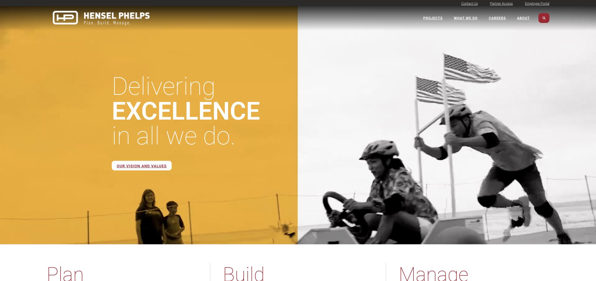
Hensel Phelps combines a yellow brand panel with a monochrome human scene and an excellence statement. Projects, business lines, careers, and an About route remain in compact navigation. Large Plan, Build, and Manage headings begin below. The page introduces a service model before asking visitors to understand the company's geographic footprint. A recorded Maps JavaScript loader supports a page-level API association; it does not identify which visible control uses it or establish that a map was displayed in this captured view.
What you can learn
Use a map to clarify where the organization works, while letting project and service descriptions establish why those places matter. Geography should support the portfolio rather than replace it.
Pros
The split composition gives text a stable surface instead of placing it over every photographic detail.
The three service headings provide a recognizable structure for a large and varied body of work.
Cons & considerations
Compact navigation can hide location or office information from visitors arriving with a specific regional need.
A geographic portfolio should distinguish office addresses from completed-project locations and current service coverage.
Public source checked November 3, 2026. References may be embedded or legacy—not a complete backend inventory.
Platform source: Exact public source page with a dated Google Maps resource observation. Linked script matches Google Maps. A recorded Maps JavaScript loader supports a page-level API association; it does not identify which visible control uses it or establish that a map was displayed in this captured view. Platform evidence is separate from the direct website screenshot and is not a complete current infrastructure audit.
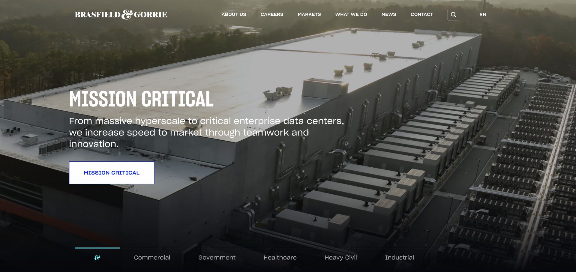
Brasfield & Gorrie leads with an aerial view of a large facility and a Mission Critical label. A short explanation and button identify the featured sector, while a lower strip lists additional markets. The opening makes a project category tangible; any geographic interface elsewhere should preserve that category context rather than reduce the work to anonymous pins. A recorded Maps JavaScript loader supports a page-level API association; it does not identify which visible control uses it or establish that a map was displayed in this captured view.
What you can learn
Connect mapped projects to the same market labels used in the portfolio. A visitor should be able to move from location to project details without losing the reason for the selection.
Pros
The facility image communicates physical scale more directly than a generic corporate illustration would.
The market strip exposes alternative project types while the featured story occupies the main screen.
Cons & considerations
Large image-led openings need useful text when the photograph is slow to load or unavailable.
Project locations should not be confused with publicly accessible offices or places that visitors can tour.
Public source checked November 3, 2026. References may be embedded or legacy—not a complete backend inventory.
Platform source: Exact public source page with a dated Google Maps resource observation. Linked script matches Google Maps. A recorded Maps JavaScript loader supports a page-level API association; it does not identify which visible control uses it or establish that a map was displayed in this captured view. Platform evidence is separate from the direct website screenshot and is not a complete current infrastructure audit.
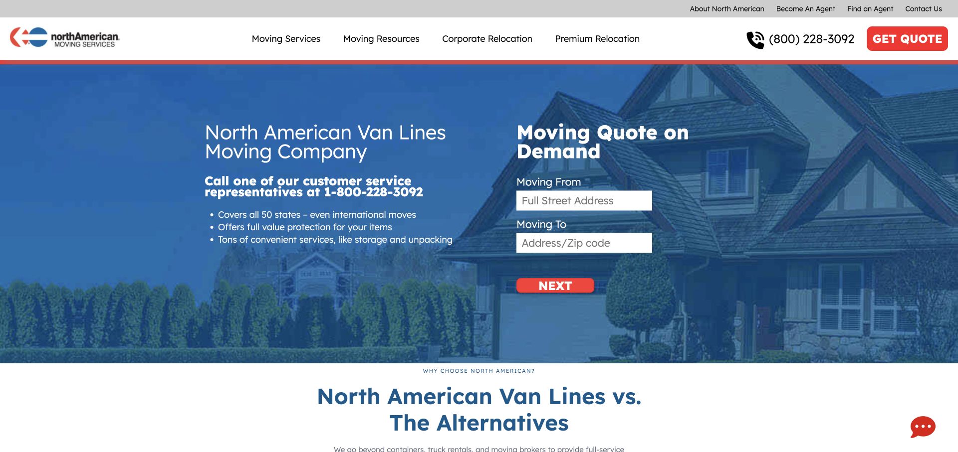
North American Van Lines places Moving From and Moving To fields beside a concise service explanation. A red Next button creates a clear continuation, and a quote shortcut remains in the header. The two-field arrangement makes geography part of the actual customer task rather than a decorative map placed after the marketing content. A recorded Maps JavaScript loader supports a page-level API association; it does not identify which visible control uses it or establish that a map was displayed in this captured view.
What you can learn
Ask for origin and destination only when both are useful to the next decision. Preserve the typed values and explain what happens before collecting additional details or contact information.
Pros
The paired fields match the basic mental model of a move between two places.
The next-step button sits directly beneath the inputs, making the immediate sequence easy to follow.
Cons & considerations
Address suggestions need clear handling for apartments, incomplete streets, and destinations outside normal coverage.
A location-based estimate should distinguish an initial enquiry from a confirmed price or scheduled move.
Public source checked November 3, 2026. References may be embedded or legacy—not a complete backend inventory.
Platform source: Exact public source page with a dated Google Maps resource observation. Linked script matches Google Maps. A recorded Maps JavaScript loader supports a page-level API association; it does not identify which visible control uses it or establish that a map was displayed in this captured view. Platform evidence is separate from the direct website screenshot and is not a complete current infrastructure audit.
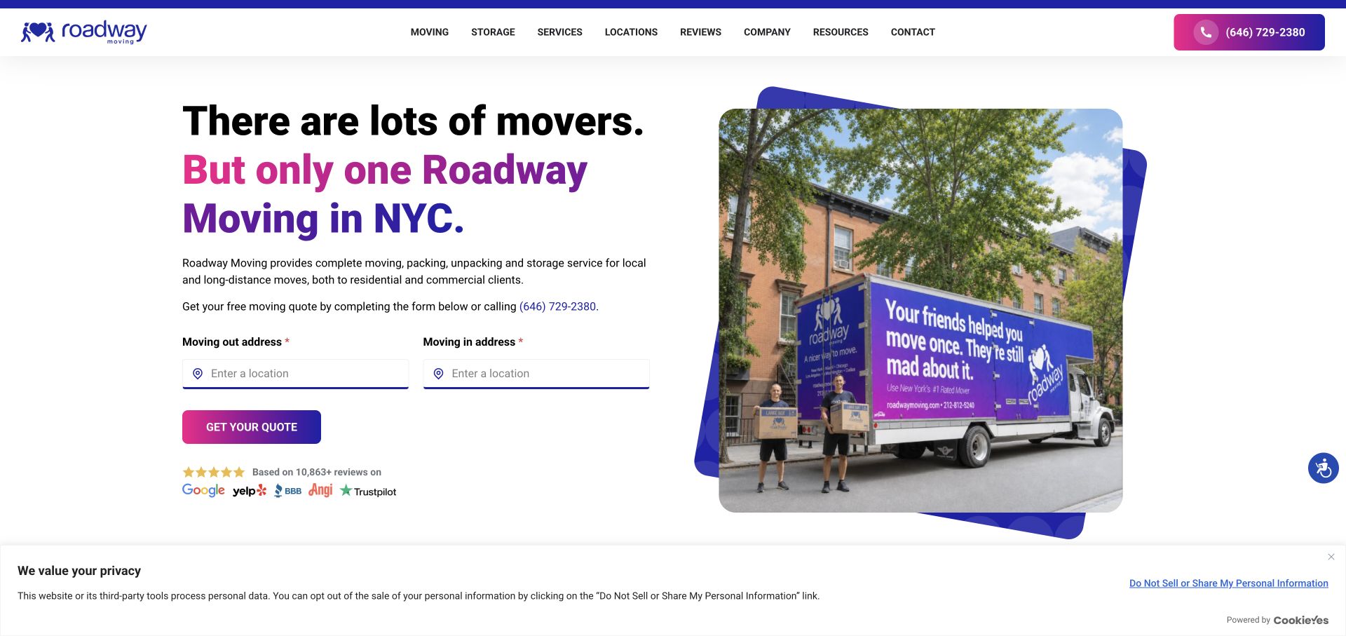
Roadway Moving places its purple truck photograph beside a headline about New York service. Two understated address fields lead to a quote button, with a telephone route and review marks nearby. The white background gives the practical fields room to breathe. The design ties a recognizable local identity to the first step of a moving enquiry. A recorded Maps JavaScript loader supports a page-level API association; it does not identify which visible control uses it or establish that a map was displayed in this captured view.
What you can learn
Keep address entry close to an explanation of the service area. Use the photograph to establish context, then let clear labels and preserved form state do the practical work.
Pros
The split layout separates readable form content from the busy truck and street photograph.
The telephone alternative supports visitors who cannot complete or do not prefer the address workflow.
Cons & considerations
Subtle input borders may need stronger focus and error states than a static capture can demonstrate.
Prominent review claims need their own verification and should not substitute for coverage or service details.
Public source checked November 3, 2026. References may be embedded or legacy—not a complete backend inventory.
Platform source: Exact public source page with a dated Google Maps resource observation. Linked script matches Google Maps. A recorded Maps JavaScript loader supports a page-level API association; it does not identify which visible control uses it or establish that a map was displayed in this captured view. Platform evidence is separate from the direct website screenshot and is not a complete current infrastructure audit.
Monro's opening is dominated by a savings campaign, tire logos, and a row of offer cards. The header reserves a compact area for finding a location and scheduling an appointment. This creates a fast route for returning customers, although the promotional density means a first-time visitor must identify the location control among several competing messages. A recorded Maps JavaScript loader supports a page-level API association; it does not identify which visible control uses it or establish that a map was displayed in this captured view.
What you can learn
Associate promotions with a selected branch before visitors act on them. Keep the branch name, service availability, and appointment route visible as customers move between offers and location results.
Pros
The persistent header location control remains available above changing seasonal offer artwork.
The offer cards make multiple service categories visible without requiring the visitor to inspect a map first.
Cons & considerations
Dense promotional content can make a small location input harder to notice or operate on mobile.
Discount imagery should not imply universal eligibility when terms, dates, or availability differ by location.
Public source checked November 3, 2026. References may be embedded or legacy—not a complete backend inventory.
Platform source: Exact public source page with a dated Google Maps resource observation. Linked script matches Google Maps. A recorded Maps JavaScript loader supports a page-level API association; it does not identify which visible control uses it or establish that a map was displayed in this captured view. Platform evidence is separate from the direct website screenshot and is not a complete current infrastructure audit.
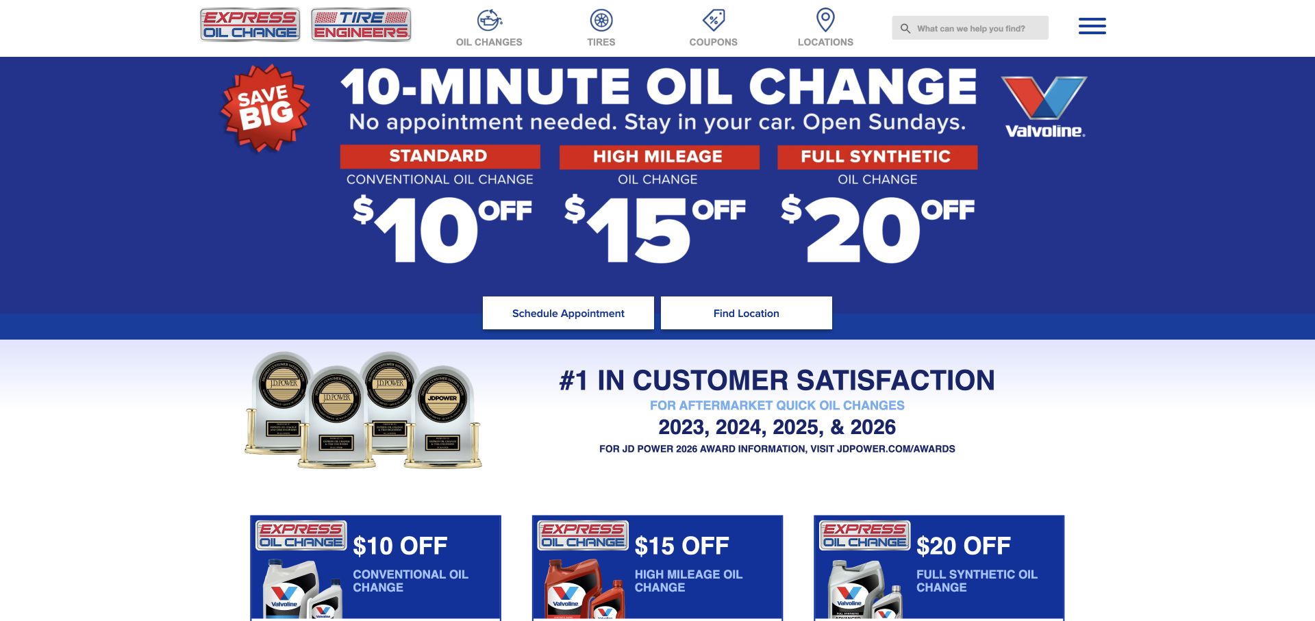
Express Oil Change & Tire Engineers uses bold discount figures and a strong blue field to promote its core service. Schedule Appointment and Find Location appear as separate buttons below the campaign. The header repeats service and location categories. The distinction is useful because some visitors need directions while others want to arrange work in advance. A recorded Maps JavaScript loader supports a page-level API association; it does not identify which visible control uses it or establish that a map was displayed in this captured view.
What you can learn
Separate locating a center from booking a service, and explain which services require appointments. Keep operating details attached to the selected location rather than buried in a national promotion.
Pros
Two plainly labeled buttons expose different customer intents without requiring a long introductory explanation.
The stable navigation provides a location route even when the main promotional offer changes.
Cons & considerations
Large price graphics can distract from conditions that materially affect the visitor's next decision.
A map result should include readable hours and service details instead of relying solely on a pin.
Public source checked November 3, 2026. References may be embedded or legacy—not a complete backend inventory.
Platform source: Exact public source page with a dated Google Maps resource observation. Linked script matches Google Maps. A recorded Maps JavaScript loader supports a page-level API association; it does not identify which visible control uses it or establish that a map was displayed in this captured view. Platform evidence is separate from the direct website screenshot and is not a complete current infrastructure audit.
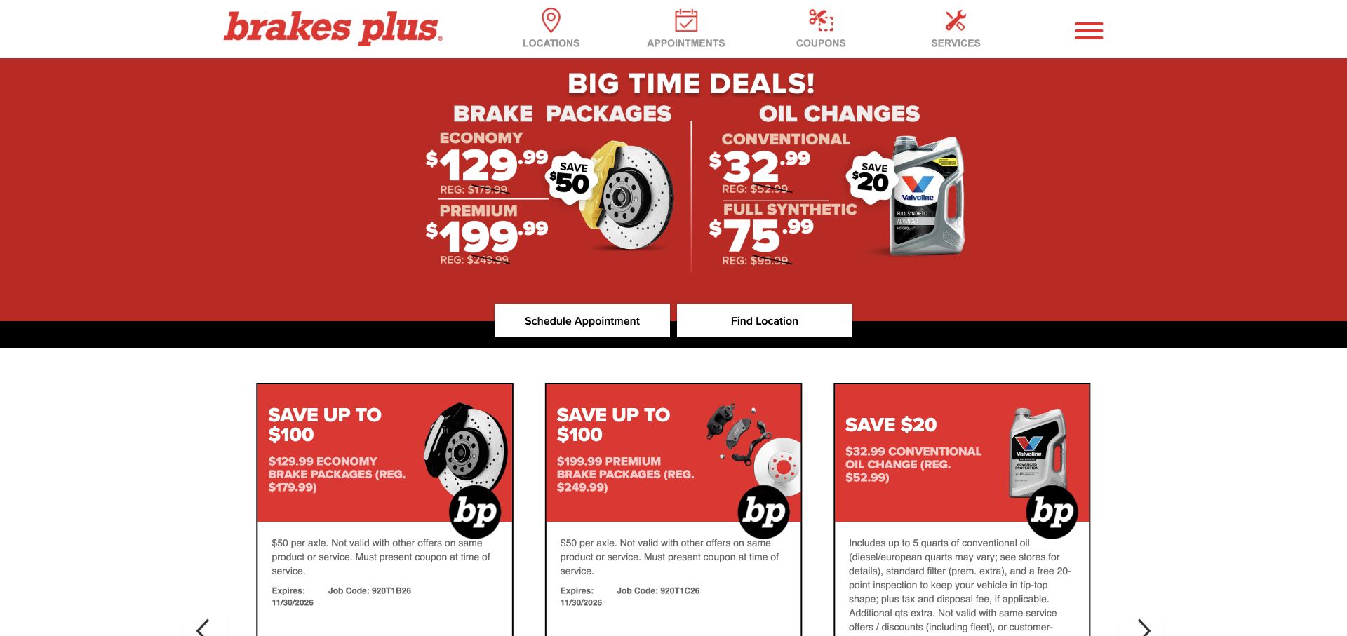
Brakes Plus presents a red offer panel above a grid of coupons, with Schedule Appointment and Find Location placed together. A restrained icon navigation identifies locations, appointments, coupons, and services. The page keeps the branch handoff visible while allowing promotion-focused visitors to inspect the offer details before choosing their next action. A recorded Maps JavaScript loader supports a page-level API association; it does not identify which visible control uses it or establish that a map was displayed in this captured view.
What you can learn
Keep the location and appointment relationship explicit. Choosing a center should carry that choice into the next page and reveal any local qualifications before a visitor begins an enquiry.
Pros
The paired actions are easy to compare because they share the same placement and visual weight.
The compact navigation labels expose the main service tasks without a large menu of competing links.
Cons & considerations
Coupon-heavy layouts need readable conditions and expiry information when scaled to a narrow screen.
A nearby-center result is incomplete without textual contact details and a clear way to change the selection.
Public source checked November 3, 2026. References may be embedded or legacy—not a complete backend inventory.
Platform source: Exact public source page with a dated Google Maps resource observation. Linked script matches Google Maps. A recorded Maps JavaScript loader supports a page-level API association; it does not identify which visible control uses it or establish that a map was displayed in this captured view. Platform evidence is separate from the direct website screenshot and is not a complete current infrastructure audit.
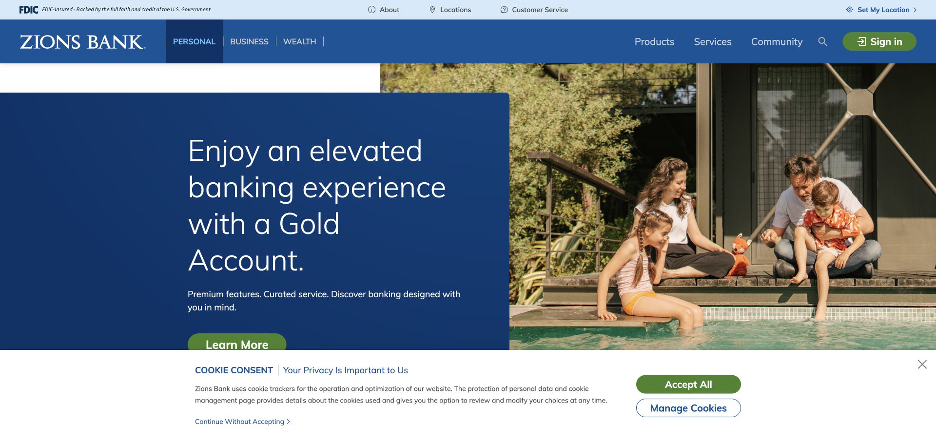
Zions Bank leads with a lifestyle photograph and a blue account-promotion panel. Locations and Set My Location sit in the upper utility area, while personal, business, and wealth routes occupy the main bar. This separates geographic assistance from the product hierarchy, allowing existing customers to seek a branch without navigating through account marketing. A recorded Maps JavaScript loader supports a page-level API association; it does not identify which visible control uses it or establish that a map was displayed in this captured view.
What you can learn
Keep branch discovery independent of product promotion. A selected location should show the services and contact details relevant to that branch without implying that every facility offers the same assistance.
Pros
The utility area preserves a dedicated location route above the main account and service categories.
The solid text panel gives the promotional message a predictable reading surface beside the photograph.
Cons & considerations
Small utility links may require more prominence for visitors whose main task is an in-person visit.
The captured consent panel covers lower content, so branch links should remain usable before any optional choice.
Visible tech stack
Referenced on the public page
Google Maps
Public source checked November 3, 2026. References may be embedded or legacy—not a complete backend inventory.
Platform source: Exact public source page with a dated Google Maps resource observation. Linked script matches Google Maps. A recorded Maps JavaScript loader supports a page-level API association; it does not identify which visible control uses it or establish that a map was displayed in this captured view. Platform evidence is separate from the direct website screenshot and is not a complete current infrastructure audit.
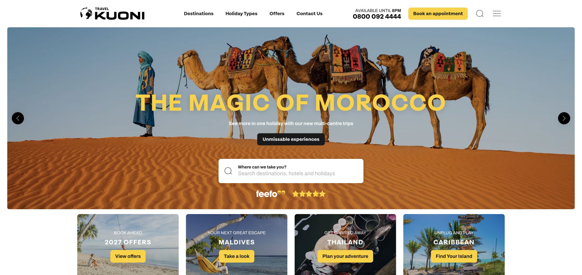
Kuoni combines a Morocco campaign photograph with a central holiday search field. A yellow appointment button and telephone details remain in the header, and destination cards begin below. The opening offers both independent exploration and a human-advice route. Geographic features should preserve the distinction between a holiday destination and the place where advice is provided. A recorded Maps JavaScript loader supports a page-level API association; it does not identify which visible control uses it or establish that a map was displayed in this captured view.
What you can learn
Label destination search and store search differently. A traveler looking for a resort and someone seeking a local appointment should not have to infer which geography a control represents.
Pros
The central search provides a practical next step within an otherwise strongly visual destination campaign.
The appointment and telephone options remain accessible for visitors who prefer assisted planning.
Cons & considerations
A rotating scenic campaign needs clear text alternatives and controls that remain readable over each image.
Map-based destinations should retain the itinerary and service context rather than becoming an undifferentiated pin collection.
Visible tech stack
Referenced on the public page
Google Maps
Cloudflare Turnstile
Public source checked November 3, 2026. References may be embedded or legacy—not a complete backend inventory.
Platform source: Exact public source page with a dated Google Maps resource observation. Linked script matches Google Maps. A recorded Maps JavaScript loader supports a page-level API association; it does not identify which visible control uses it or establish that a map was displayed in this captured view. Platform evidence is separate from the direct website screenshot and is not a complete current infrastructure audit.
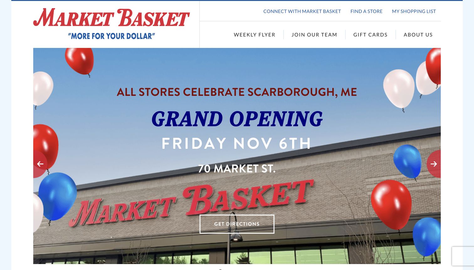
Market Basket's captured opening announces a store opening over a photograph of the storefront. The street address and a Get Directions button are part of the main campaign, while Find a Store remains in the header. This connects the promotion to an actual journey and gives visitors another route if the featured location is not relevant to them. A recorded Maps JavaScript loader supports a page-level API association; it does not identify which visible control uses it or establish that a map was displayed in this captured view.
What you can learn
When a campaign promotes a place, include the literal address and a directions action together. Keep the full store directory visible so the campaign does not become a geographic dead end.
Pros
The address and directions button make the featured opening more actionable than a celebratory image alone.
The persistent store-finding route serves visitors outside the geography of the current promotion.
Cons & considerations
Event-specific dates need an owner and an update plan after the opening period ends.
Directions should not imply current opening hours or service availability without a maintained store-detail record.
Public source checked November 3, 2026. References may be embedded or legacy—not a complete backend inventory.
Platform source: Exact public source page with a dated Google Maps resource observation. Linked script matches Google Maps. A recorded Maps JavaScript loader supports a page-level API association; it does not identify which visible control uses it or establish that a map was displayed in this captured view. Platform evidence is separate from the direct website screenshot and is not a complete current infrastructure audit.
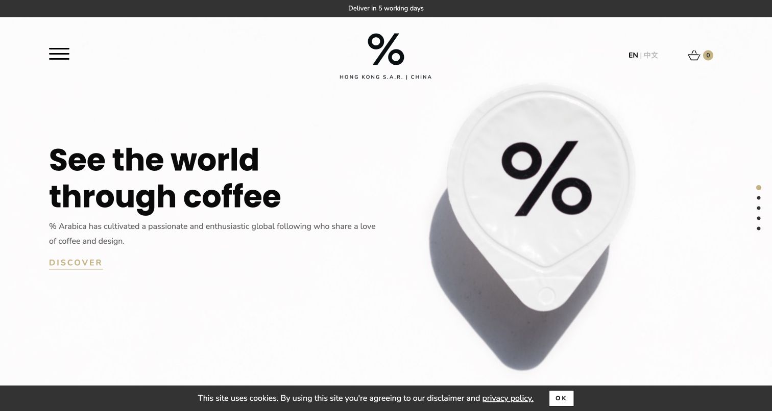
% Arabica uses a white background, a large branded cup, and a brief statement linking coffee to travel. The compact header leaves the visual identity largely uninterrupted. This is a strong brand introduction, but a visitor looking for a particular café will need a clearly labeled location path beyond the immediate campaign message. A recorded Maps JavaScript loader supports a page-level API association; it does not identify which visible control uses it or establish that a map was displayed in this captured view.
What you can learn
Let a distinctive brand image set the tone while ensuring location discovery remains explicit. Each café should have a readable address and practical visit details beyond any interactive map.
Pros
The uncluttered composition makes the percent mark and product silhouette immediately recognizable.
The short headline gives a coherent theme that can connect individual cafés to the broader brand.
Cons & considerations
A collapsed menu can make location discovery less obvious than a dedicated header label would.
A global location list should distinguish café visits from online-shop delivery regions and order availability.
Public source checked November 3, 2026. References may be embedded or legacy—not a complete backend inventory.
Platform source: Exact public source page with a dated Google Maps resource observation. Linked script matches Google Maps. A recorded Maps JavaScript loader supports a page-level API association; it does not identify which visible control uses it or establish that a map was displayed in this captured view. Platform evidence is separate from the direct website screenshot and is not a complete current infrastructure audit.
Give the address, arrival information, and contact route first. Add a map or directions link where it makes the journey easier. Avoid asking for the visitor's location if the page can answer the question without it.
A directory of branches
Make result names, services, and geographic scope easy to compare. Keep the selected branch consistent between the result list, map, and detail page. Support a typed location and useful empty-result message.
An address-based enquiry
Explain why origin, destination, or service address is needed. Preserve entered values through validation and navigation. Distinguish a suggested address from an accepted service area or a confirmed booking.
From references to requirements
Plan the content and the map together
Define the authoritative location record
Assign ownership for addresses, hours, services, temporary closures, and contact details. Decide how changes reach both the textual directory and the geographic view. A polished map cannot compensate for an outdated branch record.
Design for partial failure
Test unavailable suggestions, empty results, a blocked script, and an address outside the service area. Keep a usable contact or manual-selection route. Retain input and explain the next step without claiming a successful location match.
Preserve the required attribution and content boundaries
Review Google's current product policies when deciding how map content, place details, and attribution appear. Do not hide provider attribution behind overlays or assume that API content can be copied into an unrelated permanent directory.
Ask the actual team to carry out its routine job: publish a realistic update, correct a mistake, preview a narrow screen, and identify who owns an integration failure. For a library or frontend framework, also ask who maintains the content source and deployment. A polished screenshot does not answer those operational questions.
Beyond the screenshot
Before releasing a location feature
State whether the task is finding a place, comparing locations, or entering an address.
Provide readable location details outside the map.
Keep selected results consistent across list, map, and detail views.
Support keyboard use, visible focus, zoom, and narrow screens.
Retain input after empty results and temporary failures.
Distinguish service-area checks from confirmed availability or bookings.
Review loading behavior, attribution, and the product's current requirements.
Assign an owner for location records and operational changes.
Test with real content, a keyboard, a small screen, slow or failed requests, and the people who will maintain the system. These are planning checks, not an accessibility, security, performance, or search-ranking certification.
Sources & editorial method
How this Google Maps collection was reviewed
The collection was curated on November 4, 2026, from existing direct browser captures and exact-page public stack audits. Screenshot dates remain November 1–4 as recorded per source. The named evidence is a Maps JavaScript API resource observed on the specified public page, with its original audit timestamp retained. No API key values or visitor addresses are reproduced. Resource presence does not prove a particular visual control, successful map interaction, location accuracy, server architecture, or complete technology inventory. The twenty pages and five opening brands are distinct public properties.
Every image is an unmodified capture from the actual website, with its source and capture date. Some captures are reused from our shared catalog; their dates remain the original capture dates. None comes from a vendor gallery or a generated reconstruction. Moving imagery and live content can change.
Technology attribution uses public page assets or metadata, official platform documentation, or a cited first-party project case study. Documentary and framework-relationship evidence is identified where used; it is not a complete current backend inventory. A CMS image CDN alone does not establish a full CMS deployment. A library’s presence does not prove which individual controls use it, and a platform label does not establish AI authorship.
The composition notes, lessons, pros and tradeoffs are original editorial observations. We have not measured conversion, traffic, security, performance or accessibility conformance. Website owners retain their brands and imagery; these examples are not our client portfolio. Written, Edited and Curated are independent records, not dates advanced by a build. See our editorial standards or suggest a correction.
Questions worth asking
Google Maps website development FAQs
Does a Maps JavaScript request prove that the visible search box uses Google Maps?
No. It establishes a resource relationship for the recorded page. A particular control's behavior requires separate interaction or implementation evidence. These reviews keep that distinction explicit.
Does every location page need an interactive map?
No. Start with the visitor's decision. A readable address and directions route may be sufficient for a single destination; a more complex comparison may benefit from an interactive geographic view.
Should a map replace a branch list?
A list remains useful for scanning names, services, and contact details, and for visitors who cannot or do not want to operate a map. Keep both views connected when both are offered.
Are the photographed pages guaranteed to retain the same implementation?
No. The screenshot and resource observation have recorded dates. Websites change, and the collection does not turn an earlier public observation into a claim of permanent or exclusive use.