Best Catering Websites of 2026 (29 Real-World Examples)
Catering websites that turn an event idea into a useful first conversation
These 29 catering websites examine the balance between food photography, event evidence, service boundaries and an inquiry that gives planners enough context to respond.
A catering visitor is usually planning an occasion, not buying a single dish. They need to understand where the company works, which service formats it offers, and whether their venue, guest count and date belong in the same conversation. Beautiful tables are useful evidence only when the page explains what the caterer actually supplied.
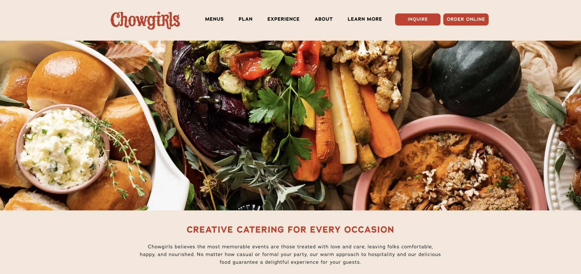
Chowgirls is our Editors Choice for a recognizable regional identity and an unusually clear distinction between full-service catering, concept menus, boxed food and drinks. Its cream-and-red presentation is memorable, but the more transferable lesson is the way the offering is organized around different planning needs.
Before the examples
What makes good catering website design in 2026?
Separate service formats before event aesthetics
Full-service events, staffed buffets, drop-off meals and workplace contracts involve different expectations. Give each a short explanation and its own next step. A visitor ordering lunch tomorrow should not have to complete the same questionnaire as a couple planning a wedding.
Show the work with enough context
Pair event photography with occasion, location, service style and the company’s role. Identify photography credits. Avoid presenting a venue, floral installation or planner’s work as though every pictured element is included in a catering proposal.
Make the inquiry useful without overpromising
Ask for date, location, approximate guest count, service format and a budget range when it helps qualification. Explain that an inquiry is not a confirmed booking. Publish lead-time and service-area guidance before the form, not after submission.
The collection · 29 examples
29 catering websites worth studying
The examples range from compact regional caterers to hospitality groups. Compare how each makes its scope understandable, supports food and event imagery with information, and moves a suitable visitor toward the right kind of inquiry.
Chowgirls combines a cream background, red identity, patterned illustrations, and food photographs with unusually clear service distinctions. Classic, Concepts, By the Box, and Cordial explain different ways to use the company rather than presenting one undifferentiated inquiry. Inquire and Order Online remain separate actions in the header.
What you can learn
If ordering a prepared platter and commissioning an event require different conversations, make that distinction explicit. Give each service a name, a short explanation, and an appropriate next action. For Classic and By the Box, carry the selected service into the next page or form so visitors do not have to repeat that operational choice.
Pros
Inquiry and online ordering are visibly separate.
Service illustrations and photography share a coherent palette.
Cons & considerations
New visitors must learn several sub-brand names.
The large opening media area can delay the service comparison.
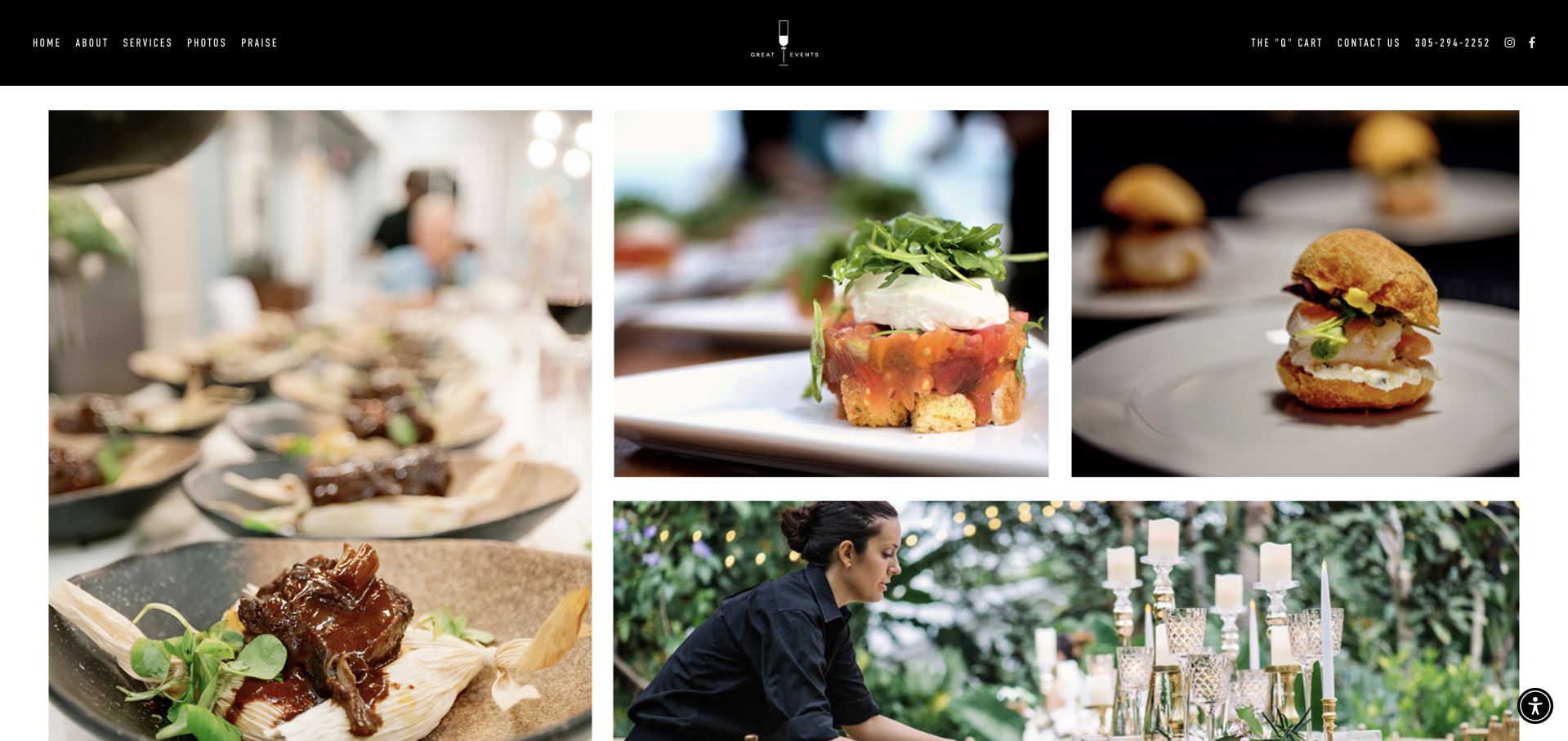
Great Events opens with a black navigation strip above an asymmetric arrangement of plated food, table settings, and service photography. The page then names its Florida Keys focus and separates weddings, corporate events, private chefs, and charters. A planning link and detailed event inquiry give the imagery a practical destination.
What you can learn
Photograph the complete occasion as well as individual dishes. Then name the service area and event types so visitors can translate a visual preference into a relevant inquiry. For the Florida Keys wedding, charter and private-chef routes, keep the selected event format attached to the inquiry so the same photographs do not imply an identical service.
Pros
Food and event-setting photographs work together.
The service routes distinguish private-chef and charter needs.
Cons & considerations
The opening mosaic postpones the geographic explanation.
The long inquiry needs careful completion on a small screen.
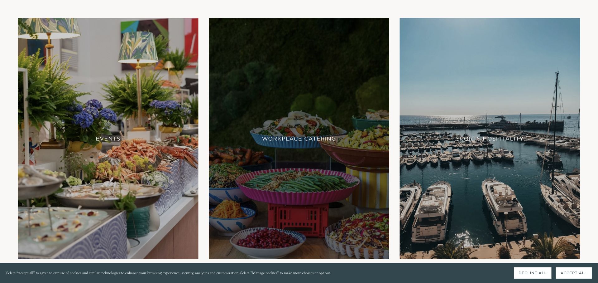
Rocket uses a restrained blue-green and white presentation, with separate links for events, workplace catering, and sports hospitality. Below its broad introduction, the homepage links named case studies, including museum and motorsport occasions. Food, weddings, venues, and sustainability receive their own routes rather than being buried in a single gallery.
What you can learn
Use actual event stories to explain a wide catering offer. Identify the setting and event type so the work helps visitors judge relevance instead of functioning only as decorative photography. Give museum and motorsport case studies a repeatable brief covering event type, setting and service contribution, so another organizer can identify the relevant part of the work.
Pros
Distinct markets have direct navigation links.
Case-study titles identify concrete occasions.
Cons & considerations
The opening media region occupies substantial space.
A broad hospitality menu can distract a visitor with one simple event need.
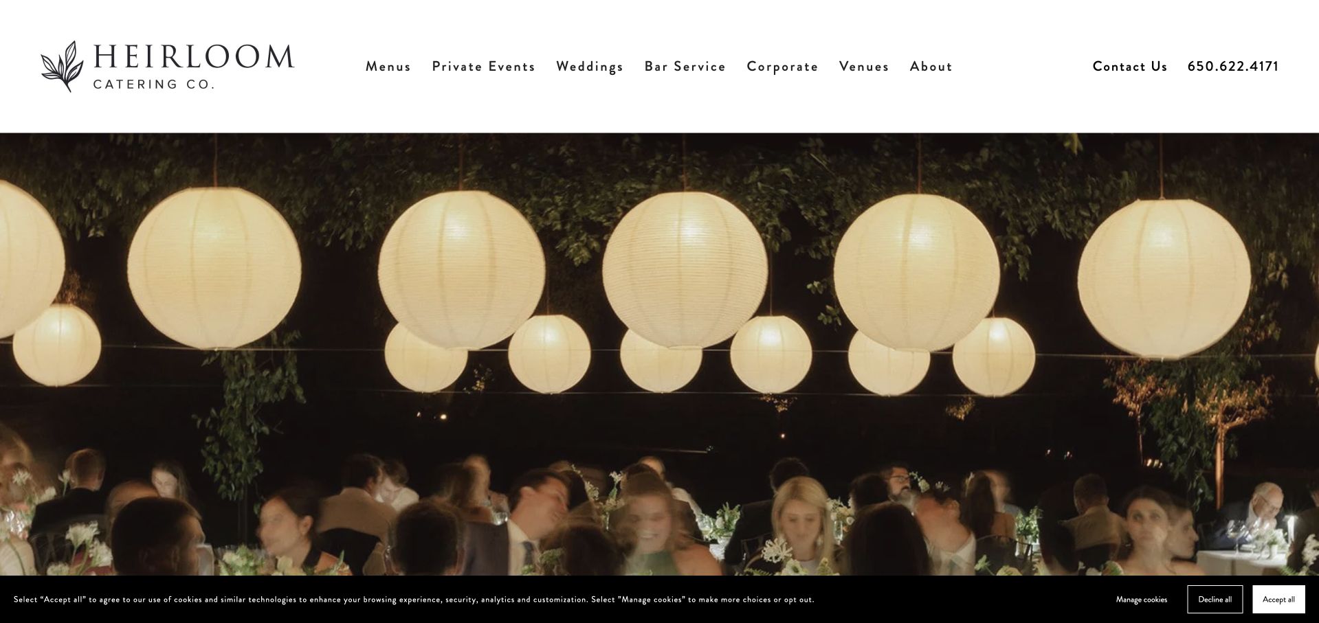
Heirloom Catering Co. places its botanical wordmark in a spacious white header and leads with wedding-table photography. Private Events, Weddings, Bar Service, and Corporate are plainly named, while menu and venue groups offer further detail. The homepage also publishes its Belmont address and phone number, grounding the event imagery in a real local business.
What you can learn
Keep the main service names familiar even when the identity is refined. Audit every image-card destination: links that expose a builder subdomain can make an otherwise consistent journey feel unfinished. For wedding, corporate and bar-service cards, test destination URLs as carefully as their visual labels; an unfamiliar builder address breaks the expectation established by the local header.
Pros
The header names practical service categories.
Address and phone are available in the footer.
Cons & considerations
Some homepage card links expose a Squarespace subdomain.
The large slideshow places service detail below the first view.
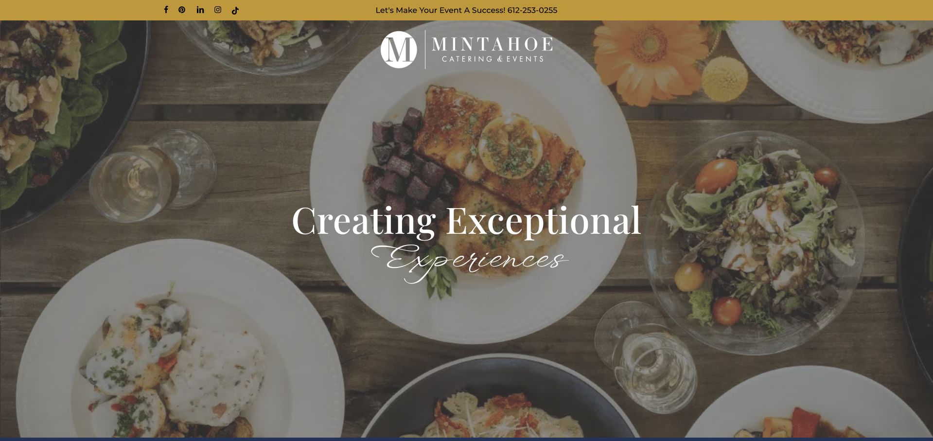
Mintahoe pairs a gold utility strip and prominent phone number with a full-width dining image and centered identity. The following text specifically names Minneapolis, St. Paul, and the Twin Cities, then explains full-service, corporate, picnic, and venue offerings. Services and inquiry actions precede a wedding film and an extensive testimonial section.
What you can learn
State the actual region and breadth of service before relying on client praise. A venue-and-catering company benefits from explaining what can be coordinated together and what the next planning step involves. For Twin Cities venue visitors, explain whether the space and catering are coordinated together or explored independently, then retain that distinction through the inquiry rather than relying on testimonials.
Pros
Regional coverage is stated in readable text.
Services and inquiry are paired next actions.
Cons & considerations
The opening hero does not immediately compare service options.
A long testimonial sequence can slow access to operational details.
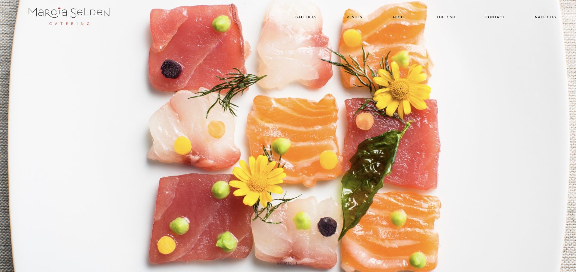
Marcia Selden makes a close-up crudo photograph the entire opening canvas, with a delicate wordmark and small navigation over the image. Below it, ingredient illustrations and separate Wine & Dine and Let’s Party galleries sustain the playful culinary identity. Gourmet To Go introduces a different use case, but the first view relies almost entirely on the photograph.
What you can learn
A distinctive dish can establish a visual language more effectively than a generic banquet image. Preserve that character while adding a plainly named route for visitors who already know they need delivery or event planning. Keep Gourmet To Go identifiable as a different ordering task even when its photography shares the same playful visual language as the event galleries.
Pros
The food image has a strong, specific composition.
The gallery categories separate food and party atmosphere.
Cons & considerations
The first screen supplies little practical event information.
Small navigation over photography needs contrast care.
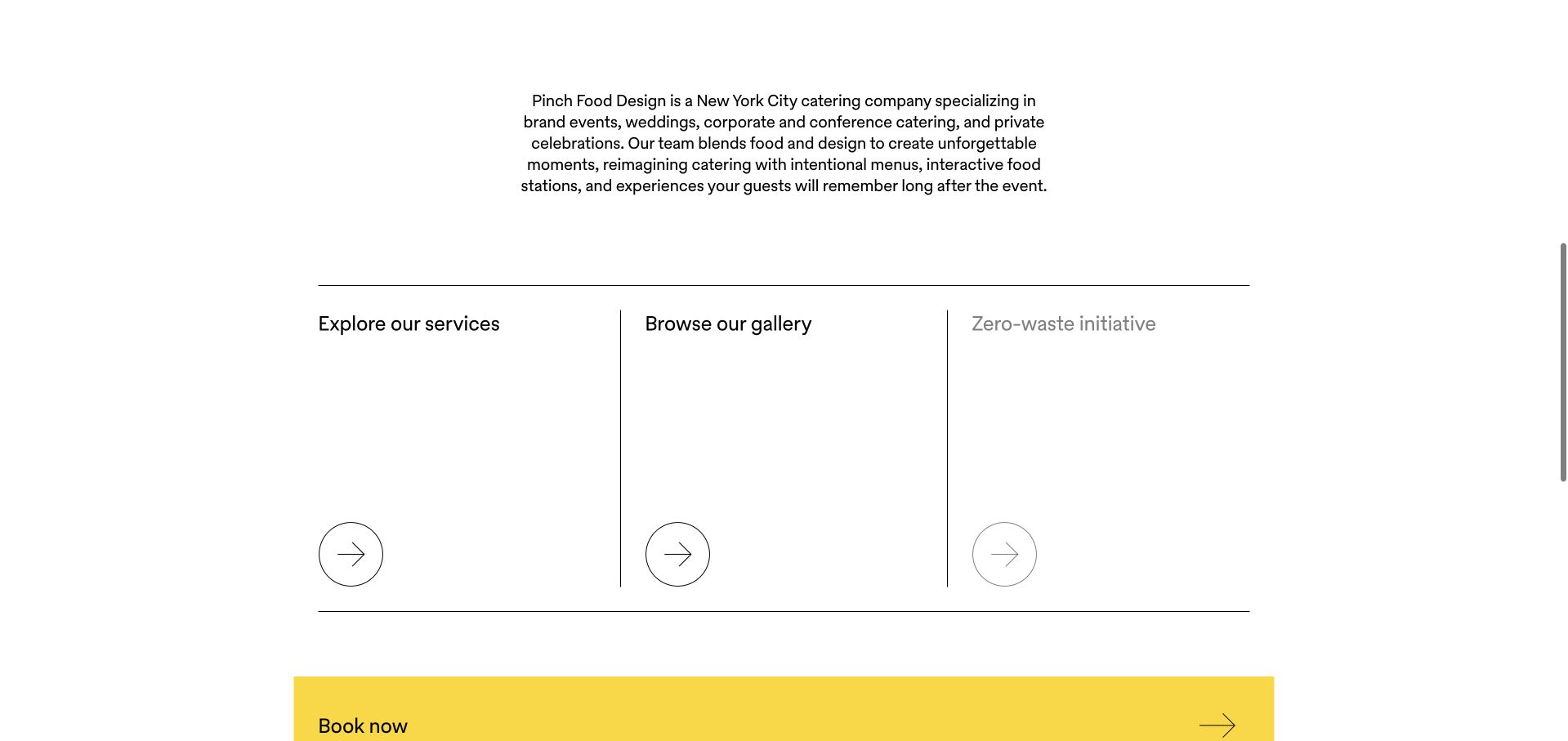
Pinch Food Design uses generous white space, a compact yellow identity, thin rules, and oversized arrows. Its readable introduction identifies New York and lists the event types it serves. Three adjacent routes explain services, gallery, and zero-waste information, while a yellow booking band creates a clear transition from exploration to inquiry.
What you can learn
Let a minimal layout organize concrete choices, not just create empty space. Describe the business in direct language, then give every editorial panel a clear destination. Make the yellow inquiry band follow a concise account of the New York service offer, and replace generic panel links with labels that identify the information ahead.
Pros
Service and gallery routes are easy to distinguish.
A strong yellow action band anchors the page.
Cons & considerations
The large opening media area can appear visually sparse.
Repeated generic Read more labels depend on surrounding context.
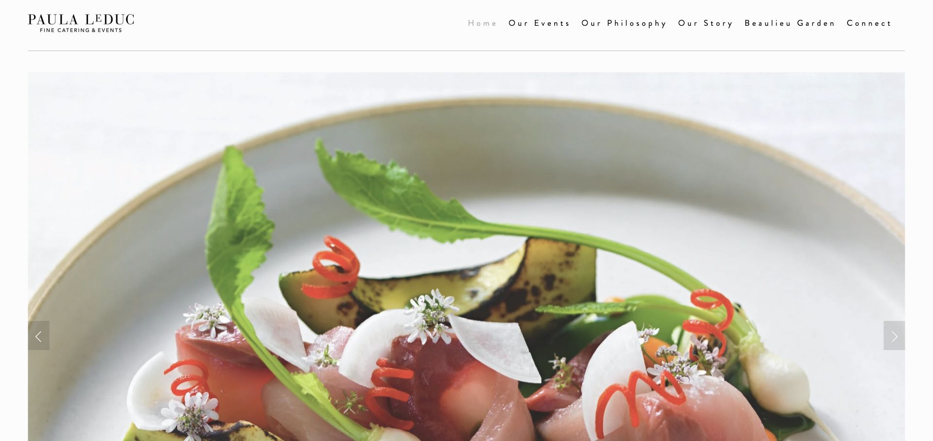
Paula LeDuc frames detailed dish photography within wide white margins and a finely spaced navigation row. Our Events, Our Philosophy, Our Story, and Beaulieu Garden describe the company through work, approach, and place. The short introductory text and team-contact link keep the page compact, though visitors seeking sample menus must explore further.
What you can learn
Give photography room when texture and presentation are central to the offer. Balance the visual portfolio with one concise explanation of the service and an unmistakable planning contact. Connect the Beaulieu Garden route to a concrete venue explanation, while preserving a separate team-contact path for clients whose event already has a setting.
Pros
Dish imagery remains the central visual subject.
The navigation distinguishes work, philosophy, and venue.
Cons & considerations
A slideshow reveals only one example at a time.
Menu and event-fit information are not prominent in the opening view.
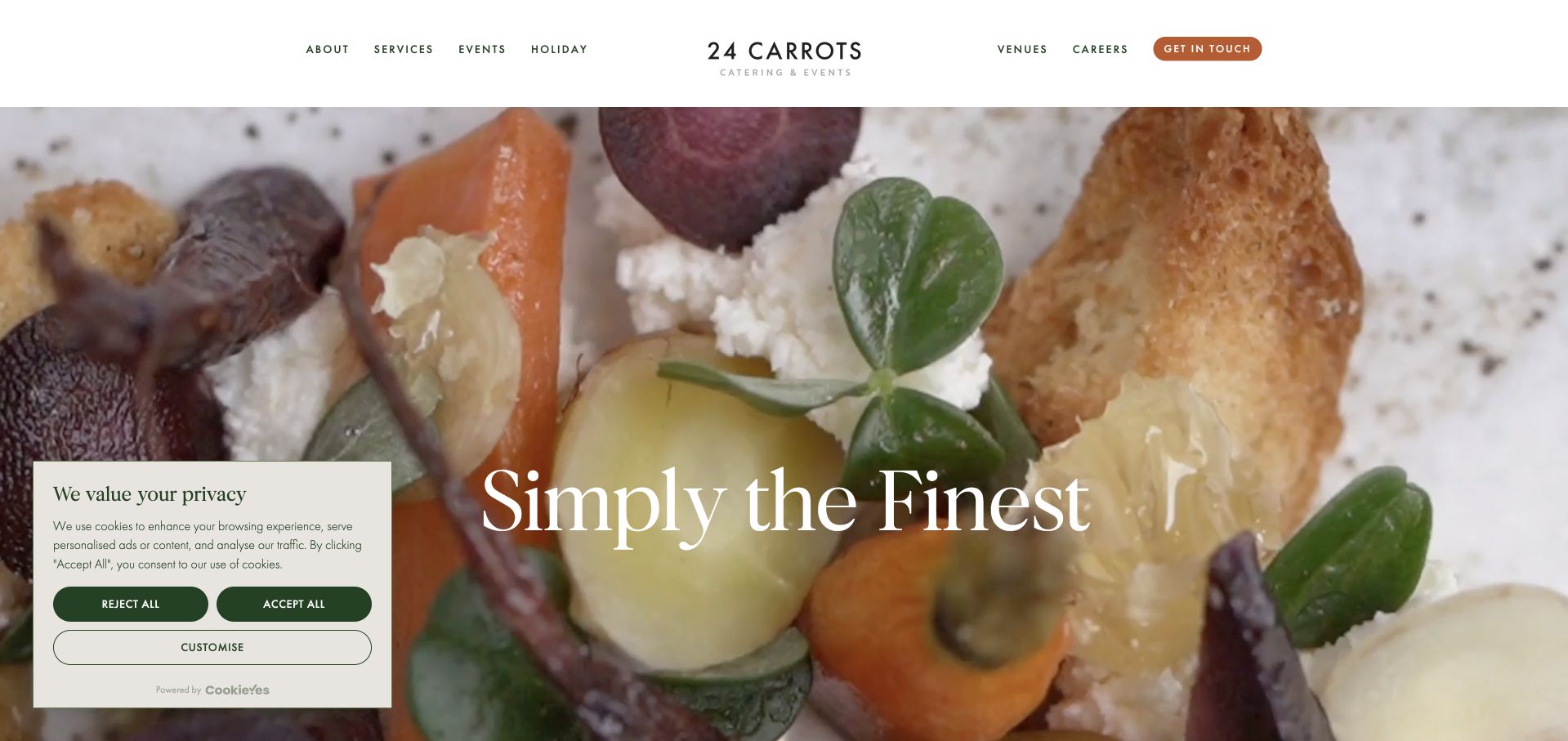
24 Carrots opens with oversized serif type over close-up food imagery and a compact centered identity. The page distinguishes social events, corporate events, weddings, and venues, then develops venue and service sections with further links. Its Get in Touch action is visible in the header, but the cinematic first screen postpones the actual service explanation.
What you can learn
Use the homepage to connect an emotional event image to a structured set of services. Keep venue discovery separate from the catering inquiry so each visitor can follow their own planning order. After the social, corporate and wedding introductions, let visitors compare the service or venue relevant to that category without restarting from a cinematic brand-level homepage.
Pros
Event types are separated into readable sections.
The header maintains a clear contact action.
Cons & considerations
The broad first-screen slogan supplies little event-fit detail.
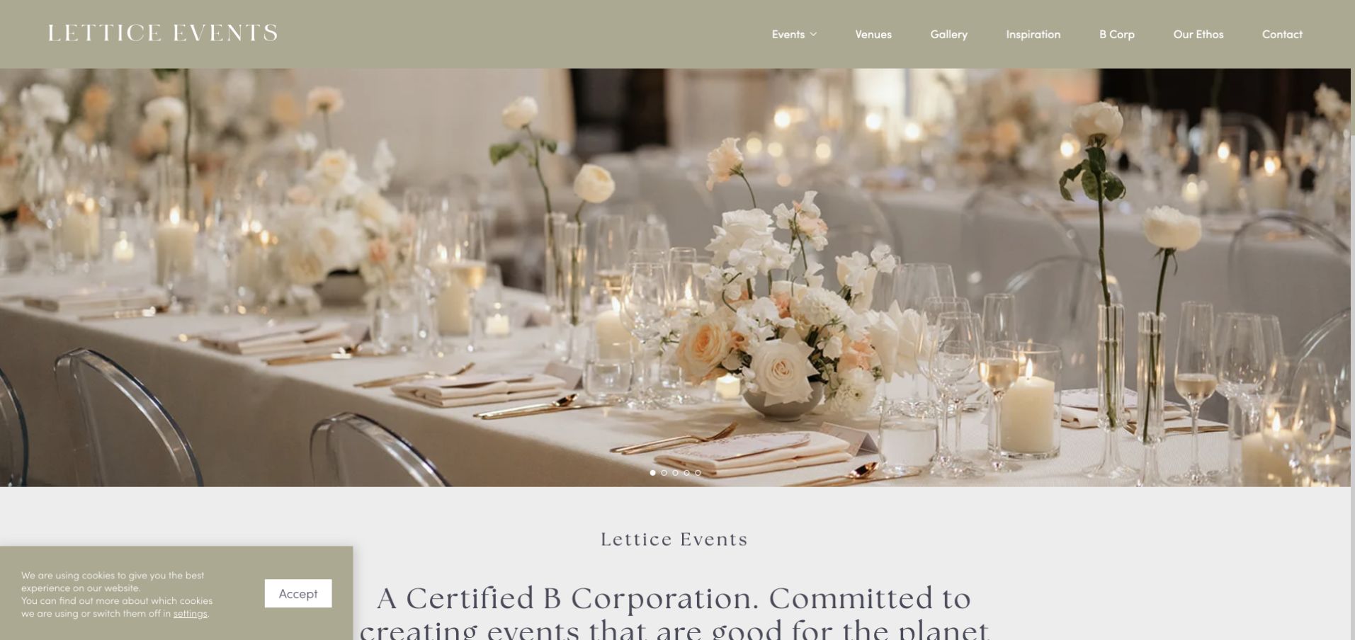
Lettice uses soft olive tones, formal event photography, and serif headings. Weddings, corporate events, private parties, venues, and gallery cards make the offering browsable, while B Corp and Our Ethos have dedicated navigation positions. The site states its sustainability positioning directly; the design lesson is the visibility of supporting information, not independent verification of every claim.
What you can learn
If an operating philosophy matters to clients, give it a specific explanatory destination. Keep that material alongside useful event categories rather than letting values language replace the basic offer. Keep B Corp and ethos explanations close to the event routes they support, with clear attribution, so an organizational badge does not become a substitute for service information.
Pros
Event cards name recognizable planning needs.
Ethos information is accessible from the main navigation.
Cons & considerations
Rotating hero messages make the opening less stable.
The cookie panel competes with introductory text on arrival.
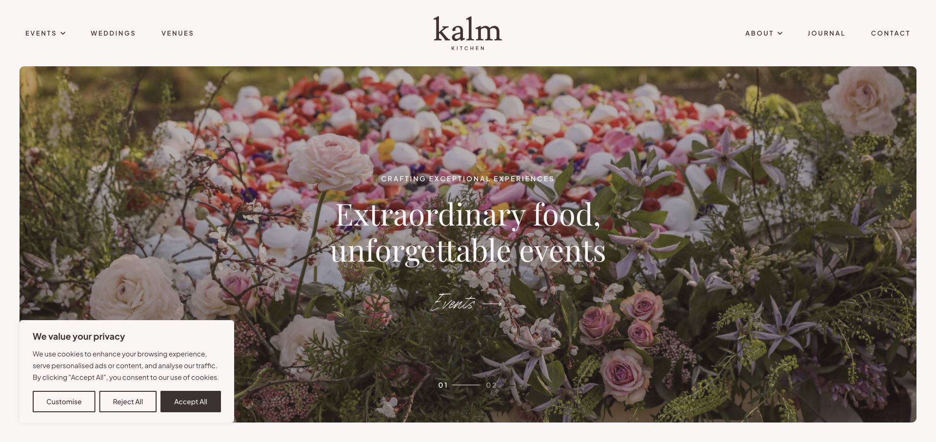
Kalm Kitchen combines an understated identity with separate Events and Weddings openings, followed by numbered routes for events, weddings, partnerships, and the company. A substantial homepage question section names coverage, notice periods, pricing inclusions, dietary needs, and recommended venues. These questions acknowledge the planning uncertainties that attractive event photographs alone cannot resolve.
What you can learn
Use the homepage to prepare a better inquiry. Name the questions clients actually have about coverage, lead time, inclusions, and dietary requirements before inviting them to describe an event. Turn coverage, notice, inclusions and dietary-question topics into a short pre-inquiry guide, allowing a wedding planner to prepare a useful brief before encountering a detailed form.
Pros
The FAQ topics address practical planning concerns.
Events and weddings have distinct starting routes.
Cons & considerations
The initial branded loading transition delays the content.
Several carousel-based sections require deliberate exploration.
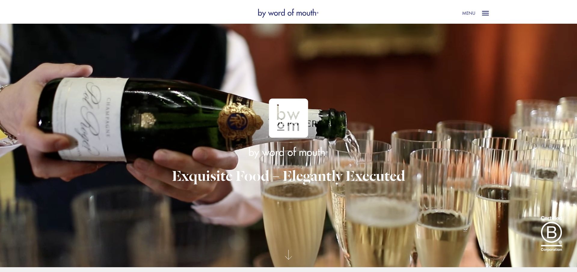
By Word of Mouth places its identity and serif headline over a close-up hospitality film, with a compact menu and downward cue. The following section plainly explains catering and event management, gives phone and email contact, and links venues. Separate Food & Drink, Events & Design, and Art of Service sections show how the overall offer is divided.
What you can learn
A cinematic opening works best when the next section immediately becomes useful. Follow the mood with service boundaries and a direct contact route instead of another layer of promotional slogans. The Food & Drink and Events & Design branches should explain their relationship in the next screen, while the introductory phone and email remain available for uncertain clients.
Pros
The post-hero introduction explains the combined offer.
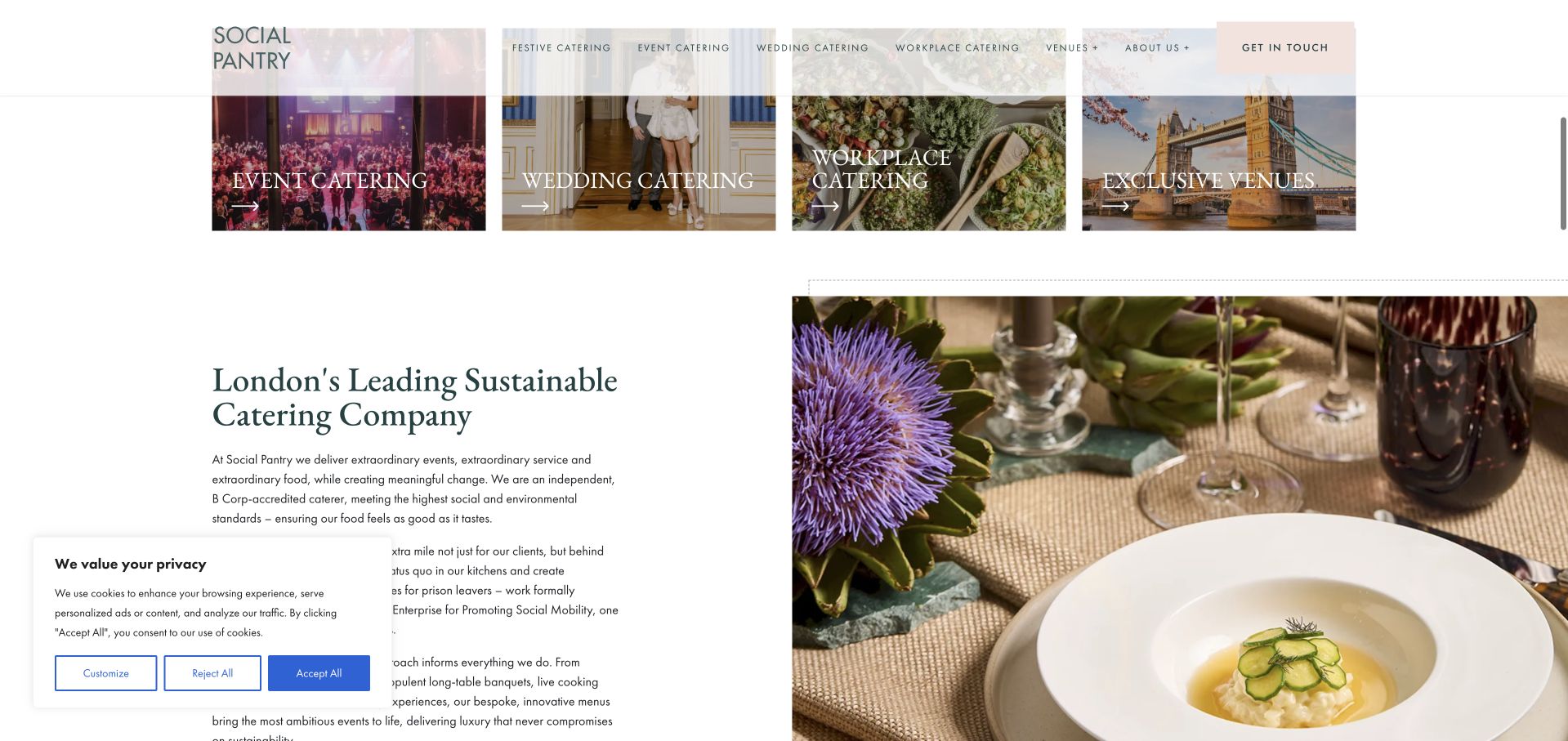
Social Pantry begins with a large typographic statement and visible organizational badges, then presents event catering, wedding catering, workplace catering, and venues as separate image-led routes. Its navigation exposes many specific event and workplace contexts. That breadth can support targeted discovery, although the density asks more from a visitor who just wants to understand the basic service.
What you can learn
Separate audiences when their purchasing needs genuinely differ. Use a small number of primary routes, then put detailed event formats beneath the relevant branch. Workplace catering needs a different introductory brief from a wedding; preserve that audience choice before presenting the more detailed event formats already exposed in the navigation.
Pros
The main market categories are easy to identify.
A dedicated contact action remains visible.
Cons & considerations
The detailed navigation contains many competing options.
The initial positioning statement takes more space than practical service detail.
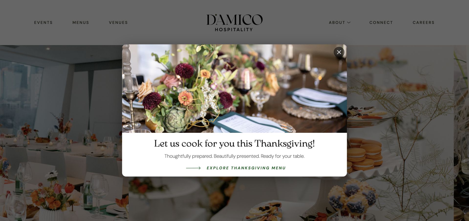
D’Amico Hospitality uses a clean, centered identity and an image carousel with visible pause and navigation controls. Menus, events, and venues are the main routes, and the homepage introduces a reception menu before presenting a collection of spaces. A seasonal Thanksgiving popup was visible during inspection, demonstrating both timely promotion and an interruption to the underlying planning journey.
What you can learn
When food and venue decisions are connected, present them as complementary routes. Give moving photography a pause control and keep seasonal overlays easy to dismiss. Use the reception-menu introduction to establish food context before venue browsing, and give the Thanksgiving overlay an expiry process that leaves the underlying planning routes intact.
Pros
Carousel controls include pause.
Menus and venues are equally clear navigation destinations.
Cons & considerations
The seasonal popup interrupts the first visit.
Large carousels reveal only a small part of the collection at once.
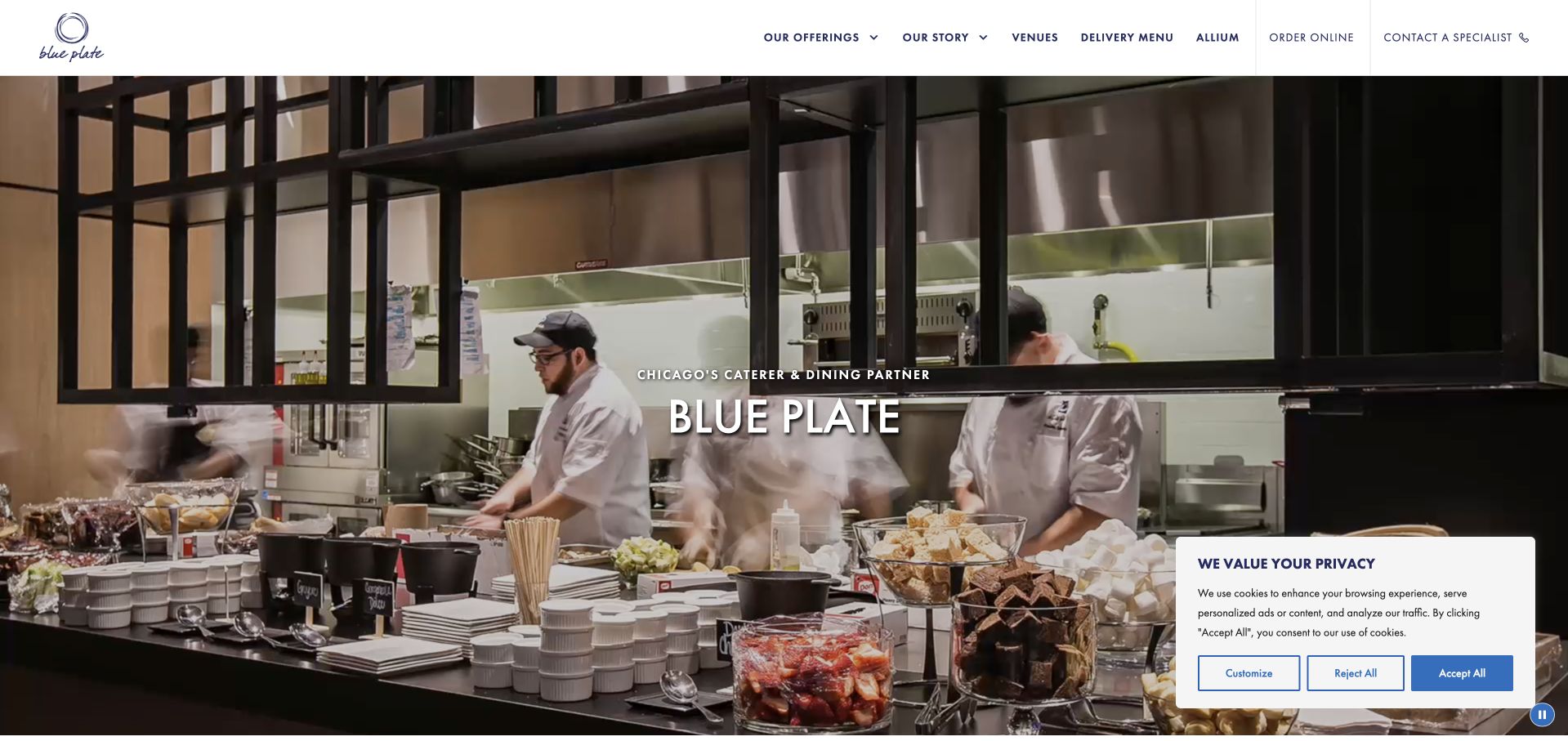
Blue Plate identifies Chicago in its opening message and shows chefs at work rather than relying only on a finished table. The homepage explicitly divides catered events, workplace dining, and delivery, with different explanatory and contact links for each. Order Online and Contact a Specialist remain distinct header actions, making the operational split understandable.
What you can learn
Match the action to the service: a delivery customer and a workplace-dining prospect should not enter the same undifferentiated form. Name both the offer and the person or system that handles the next step. Retain the distinction between Order Online and Contact a Specialist when the visitor leaves the header for a particular delivery or workplace-dining destination.
Pros
Different service markets have their own handoffs.
The hero includes a video pause control.
Cons & considerations
The cookie panel covers part of the opening image.
The broad corporate homepage can feel extensive for a small delivery order.
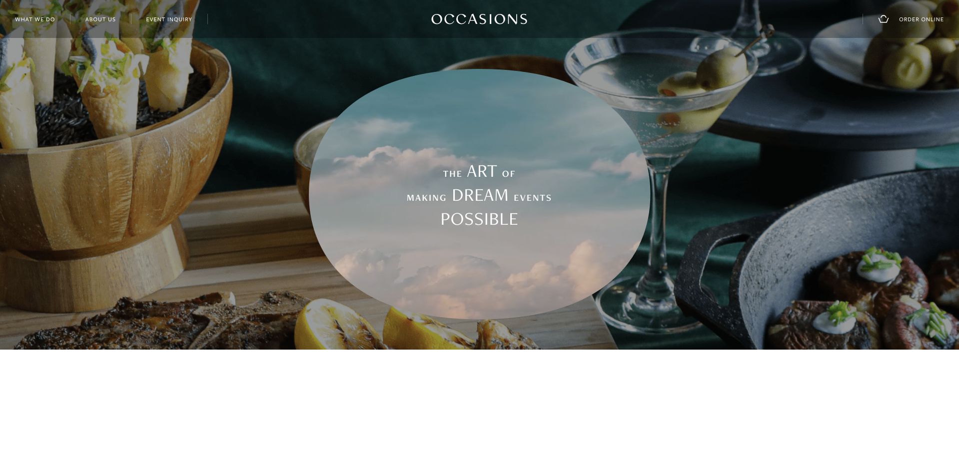
Occasions uses oversized, broken-line display typography and a highly visual sequence to introduce food and events. A Request for Proposal section asks for date, time, venue, guest count, and event format, while online ordering has a separate route. The page also introduces exclusive venues, connecting the inquiry with the physical setting.
What you can learn
Ask for the details that make a proposal possible, and explain why they matter. Keep prepared-food ordering distinct so a simple purchase is not mistaken for a custom event consultation. Group venue, date and guest-count questions into a readable first stage, with approximate answers allowed where the planning brief is still developing rather than already finalized.
Pros
The proposal fields reflect actual event-planning variables.
Online ordering is separate from a custom inquiry.
Cons & considerations
Large display words demand substantial scrolling.
The detailed inquiry can feel demanding before service scope is understood.
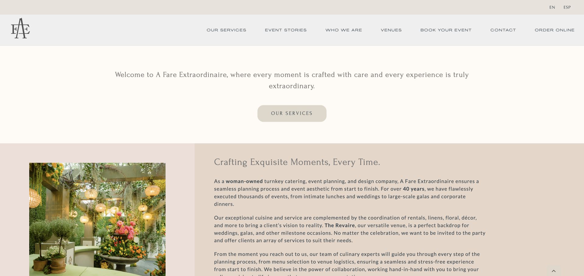
A Fare Extraordinaire provides English and Spanish navigation and places services, event stories, venues, booking, contact, and online ordering in its main menu. The introduction explains the combination of catering, planning, design, rentals, linens, and floral coordination. Its Houston address and direct contact details provide a practical anchor beneath the atmospheric opening.
What you can learn
Explain what turnkey actually includes instead of leaving visitors to interpret the phrase. Support an image-led brand with a short, concrete account of the event elements the team can coordinate. Keep the Spanish journey equivalent through service explanations and the ordering handoff, particularly when catering, rentals and floral coordination are presented as one combined planning offer.
Pros
The service explanation names concrete event elements.
English and Spanish routes are visible.
Cons & considerations
The opening transition can delay useful content.
Several different booking and ordering destinations need clear expectations.
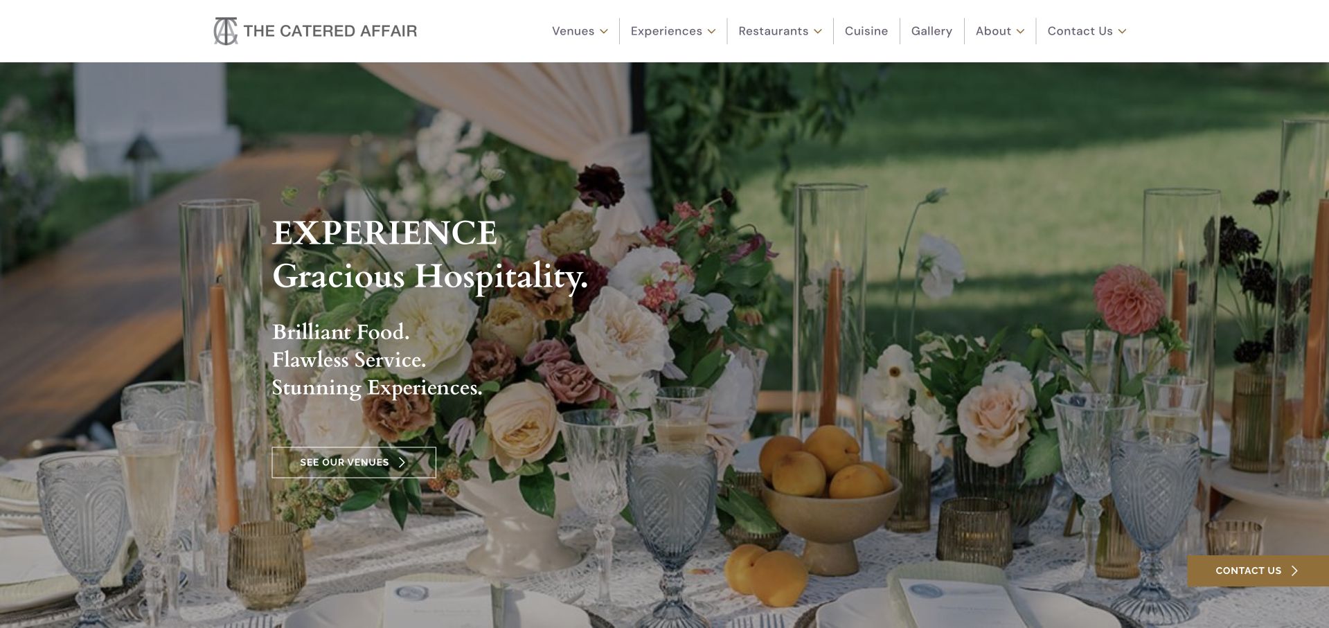
The Catered Affair uses a restrained white header and a softly treated event-table image, with See Our Venues as the main introductory action. Cuisine, experiences, restaurants, and gallery links remain accessible above it. The contact interface distinguishes weddings, corporate or social events, and partnerships, acknowledging that different visitors require different conversations.
What you can learn
Choose a first action that reflects how clients actually plan. If venue selection leads the process, make it explicit while preserving a direct route for clients who already have a location. A client who already has a venue should still reach catering information directly; See Our Venues can be prominent without becoming a mandatory first step for everyone.
Pros
Venue discovery is a clear primary action.
Contact categories distinguish different inquiry purposes.
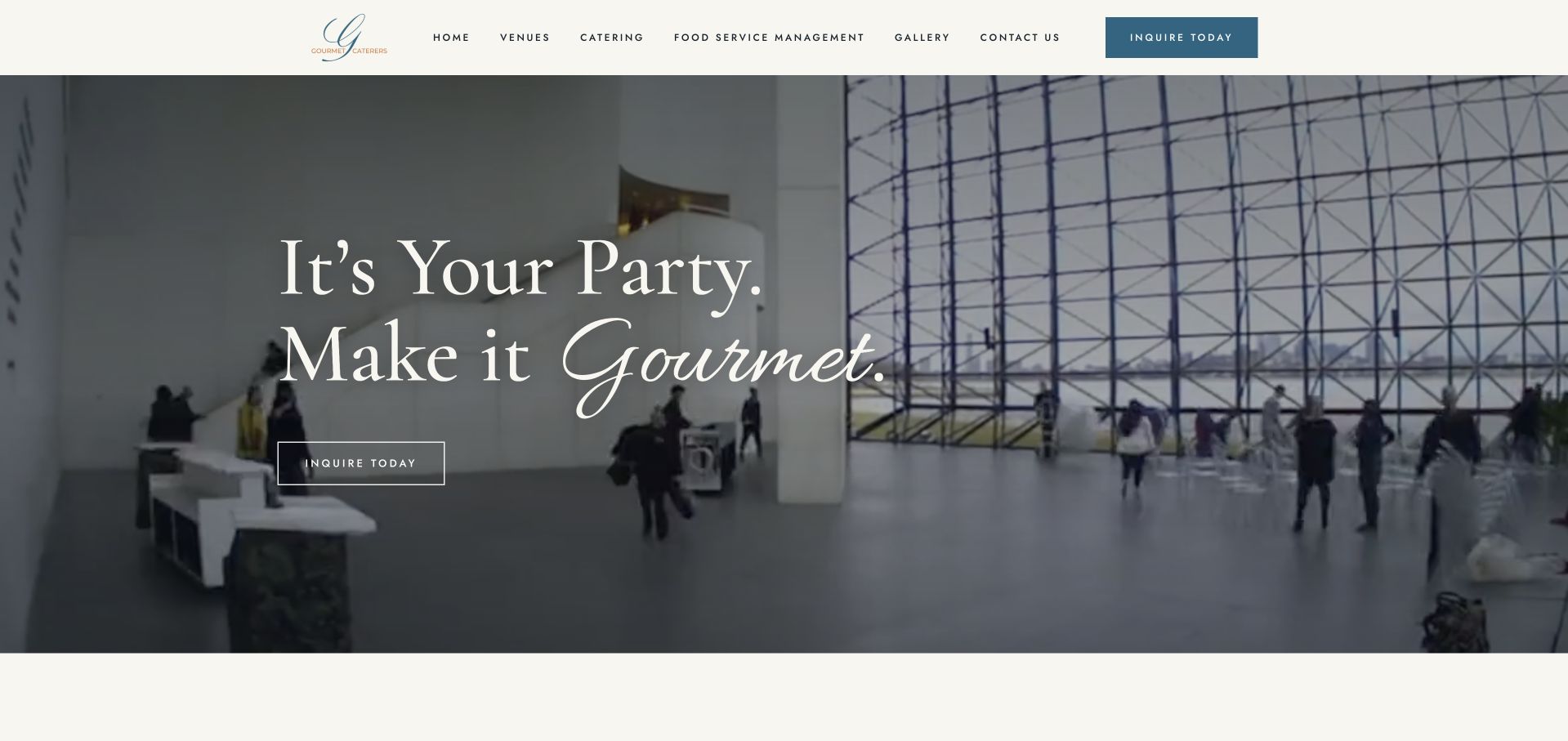
Gourmet Caterers places a concise invitation over venue footage and repeats Inquire Today in the header and hero. The page follows with a specific Boston-area history, a service carousel, and a venue selector naming cultural institutions and estates. These named destinations make its regional context more tangible than a generic claim to cater everywhere.
What you can learn
Use real place names to establish geographic relevance. Pair local history with current, browsable service and venue information so the company story supports planning rather than replacing it. For the cultural institutions and estates in the selector, attach location and event context to each destination so the regional history becomes a usable planning reference.
Pros
Venue names provide specific regional context.
The inquiry action is consistently positioned.
Cons & considerations
Service and venue carousels conceal some options initially.
Long testimonial copy can dominate later browsing.
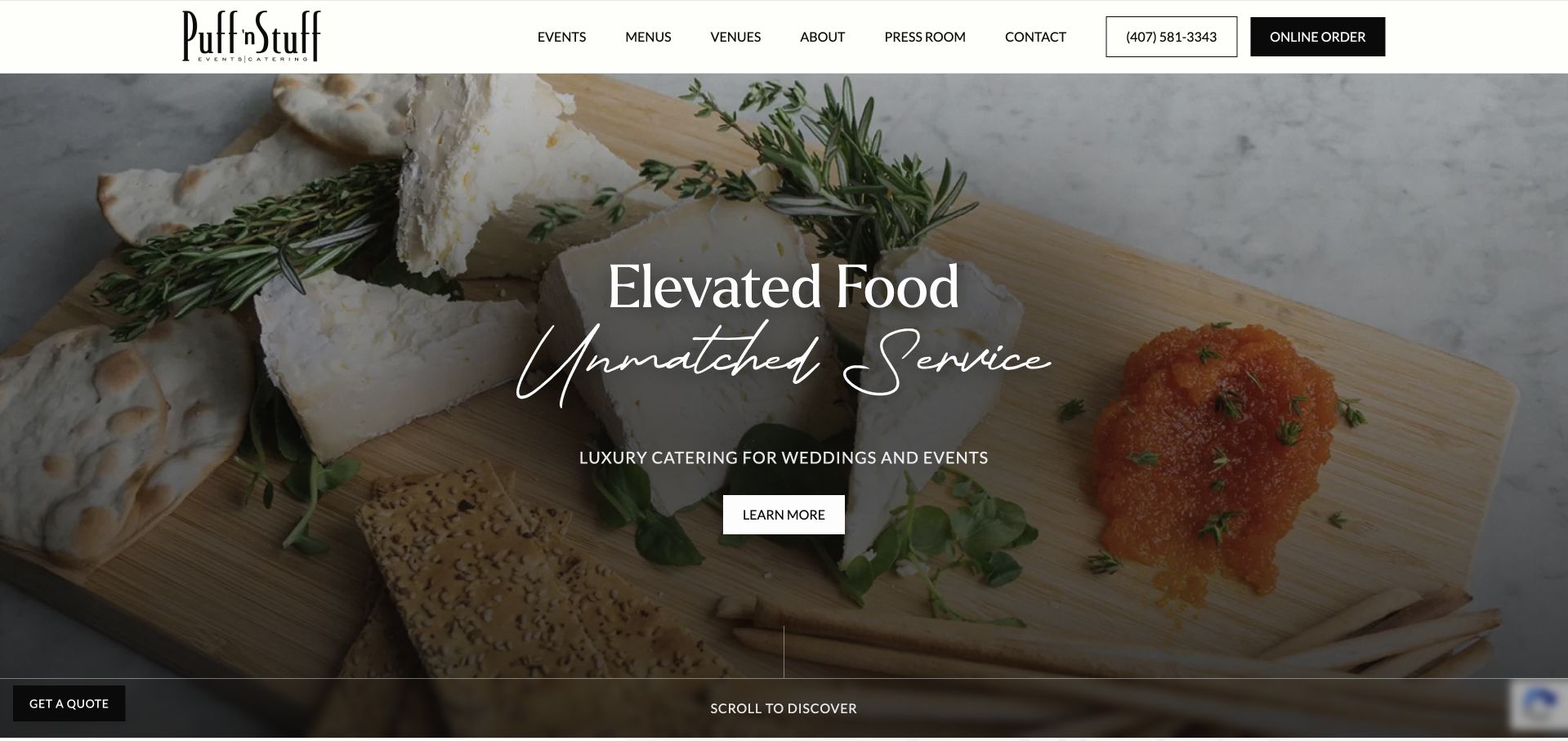
Puff ’n Stuff combines close-up food photography with a prominent phone number and online-order action. Its homepage asks visitors to distinguish events from delivery, then presents breakfast, lunch, dinner, wedding, reception, and holiday menu routes. Venue browsing is organized by Florida locations, giving an otherwise broad offer a useful geographic structure.
What you can learn
Make service mode a first-class decision. A delivery menu, a wedding menu, and an event inquiry may share a brand, but they need different expectations about ordering and coordination. Preserve the selected Florida region when moving from venue browsing to an inquiry, and label breakfast, wedding and holiday PDFs with their service format and current date.
Pros
Events and delivery are explicitly distinguished.
Venue browsing has recognizable regional controls.
Cons & considerations
Many sample menus open as PDFs.
A long sequence of menu and venue cards increases page length.
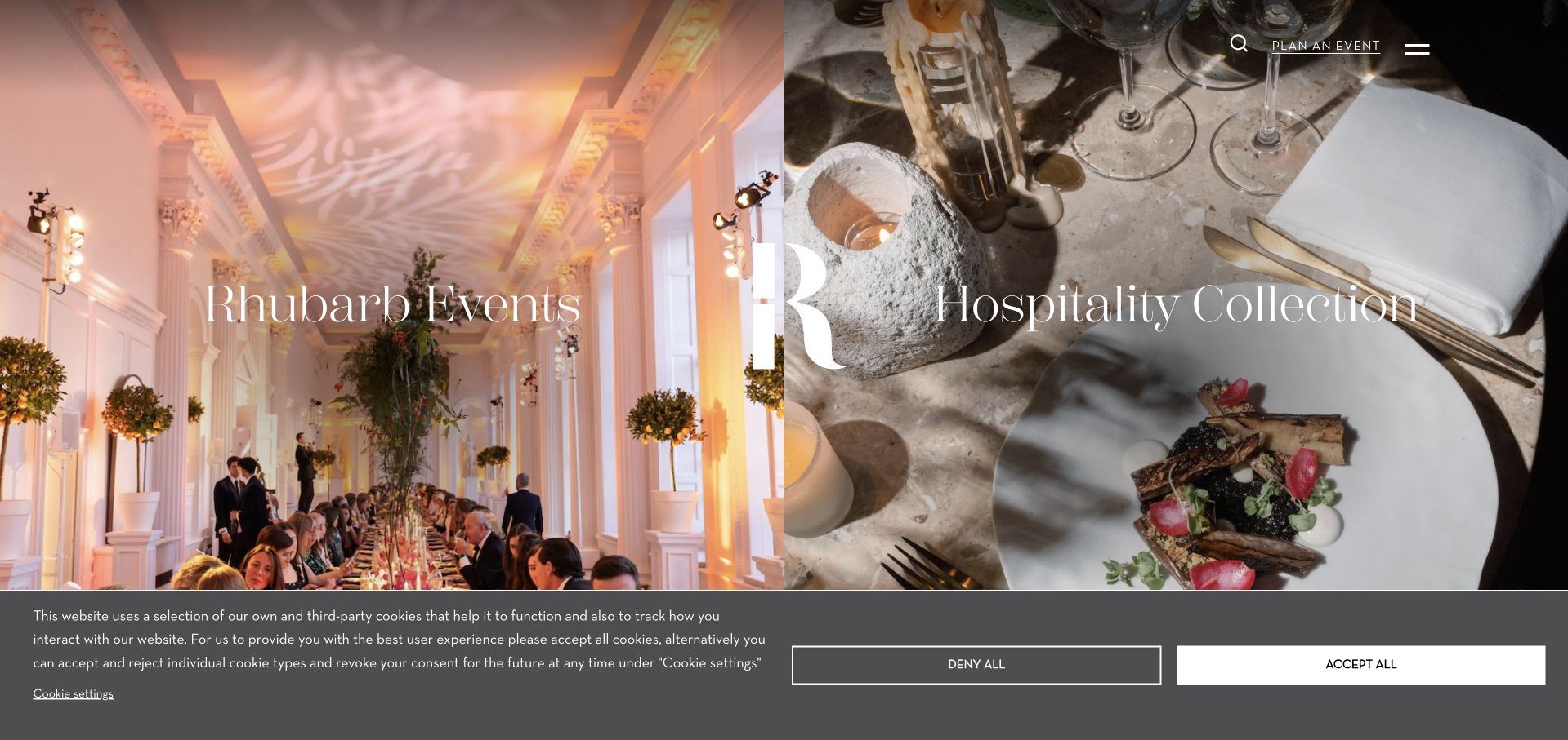
Rhubarb divides its opening screen between event photography and a plated dining scene, labeling Rhubarb Events separately from Hospitality Collection. Later sections introduce a seasonal menu, team, and sustainability information. A Plan an Event action remains available even though the parent brand also covers dining destinations and venue management.
What you can learn
If a brand serves two different business models, separate them at the entrance. Keep the event-planning action visible so a prospective host does not have to decode the whole corporate portfolio. Keep Rhubarb Events identifiable through the next page, rather than sending a host back into the permanent-venue portfolio after they have already chosen event planning.
Pros
The two main business branches are visually explicit.
A named seasonal menu supplies current food context.
Cons & considerations
A large cookie banner obscures part of the opening.
The parent-company breadth can add an extra decision for an event client.
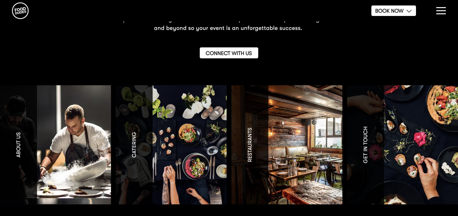
The Food Dudes uses a black canvas, condensed display lettering, and a persistent Book Now action. Its homepage lists named productions and links catering separately from restaurants, then groups venue information around Toronto and Miami. The work-led structure is more informative than a single photo gallery, although visitors must open the menu to see the full navigation.
What you can learn
Give an event portfolio meaningful labels. A named production, venue, and region help visitors understand the context of the work without turning a visual review into an unsupported claim about outcomes. Pair the named productions with their Toronto or Miami context, then keep the relevant regional contact attached to the work instead of presenting one group-wide booking destination.
Pros
Named events make the portfolio concrete.
Toronto and Miami contacts are separately identified.
Cons & considerations
The dark opening leaves substantial space to media.
The compact menu postpones the broader navigation.
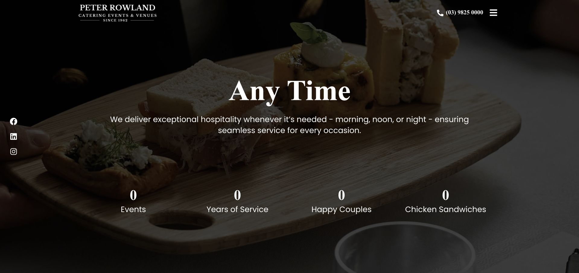
Peter Rowland places its heritage-led wordmark and phone number over a dark food image. The opening rotates Any Time, Any Where, and Any Place messages, while the footer provides direct corporate, wedding, event, and online-order links. The contrast and concise messages are memorable, but concrete service choices are less visible than the visual promise in the first screen.
What you can learn
A short phrase can organize a visual introduction, but it should not be the only information above the fold. Keep practical service links near the opening for visitors arriving with a specific catering need.
Pros
The phone route is visible at the top.
Footer service links use familiar category names.
Cons & considerations
Service discovery relies heavily on the hidden menu or footer.
Animated statistics can show transitional values during loading.
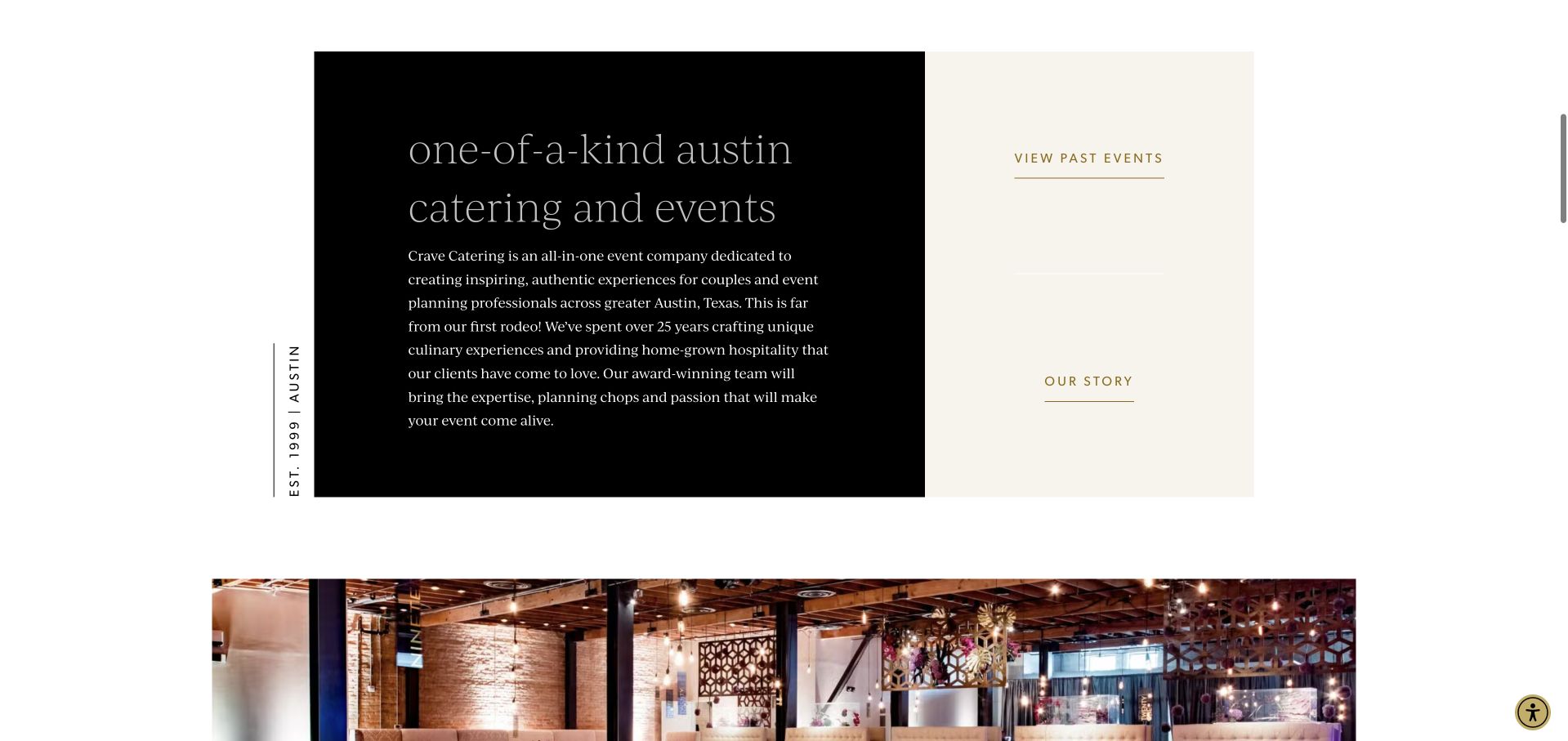
Crave identifies Austin and its founding year alongside restrained cream, black, and gold styling. Beyond the food slideshow, a four-step process explains the initial conversation, proposal, presentation, and booking or tasting. Weddings, event types, menus, and venues are direct navigation routes, helping the warm identity translate into a tangible planning sequence.
What you can learn
Explain the work that follows a contact form. A brief process gives prospective clients a way to anticipate the conversation and prepare the details needed for a useful proposal. Use the four-stage process to explain when a proposal becomes a booking and where a tasting fits, helping an Austin host distinguish discussion from a confirmed event.
Pros
The four planning stages are described in plain language.
Austin positioning is explicit.
Cons & considerations
The media-led opening delays the process explanation.
Several event categories require dropdown navigation.
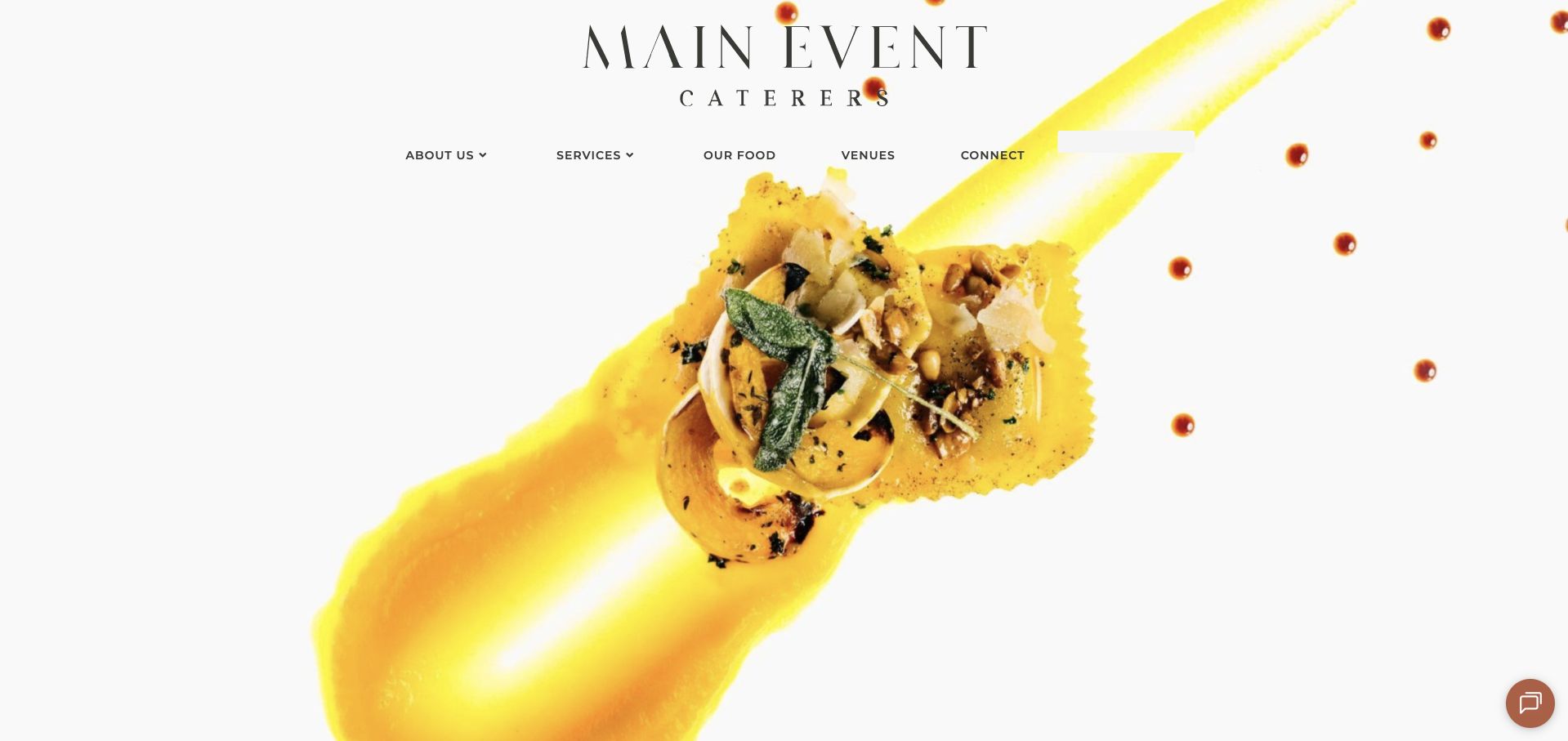
Main Event makes a bright ravioli composition the opening background, allowing its large serif identity to remain readable against white. The main links are About Us, Services, Our Food, Venues, and Connect. Subsequent sections alternate imagery and short statements about event design, food, and local sourcing, creating a straightforward visual rhythm.
What you can learn
Use a food image whose composition leaves natural room for navigation and identity. Follow the visual opening with specific service information so the photograph becomes an introduction rather than the entire explanation. The ravioli image leaves useful white space; place a specific service or inquiry action there without covering the dish or adding another broad statement about event design.
Pros
The white photographic background supports a clear identity.
The main navigation uses a small, understandable set of routes.
Cons & considerations
The first view has no strongly differentiated inquiry button.
General promotional statements require further exploration for details.
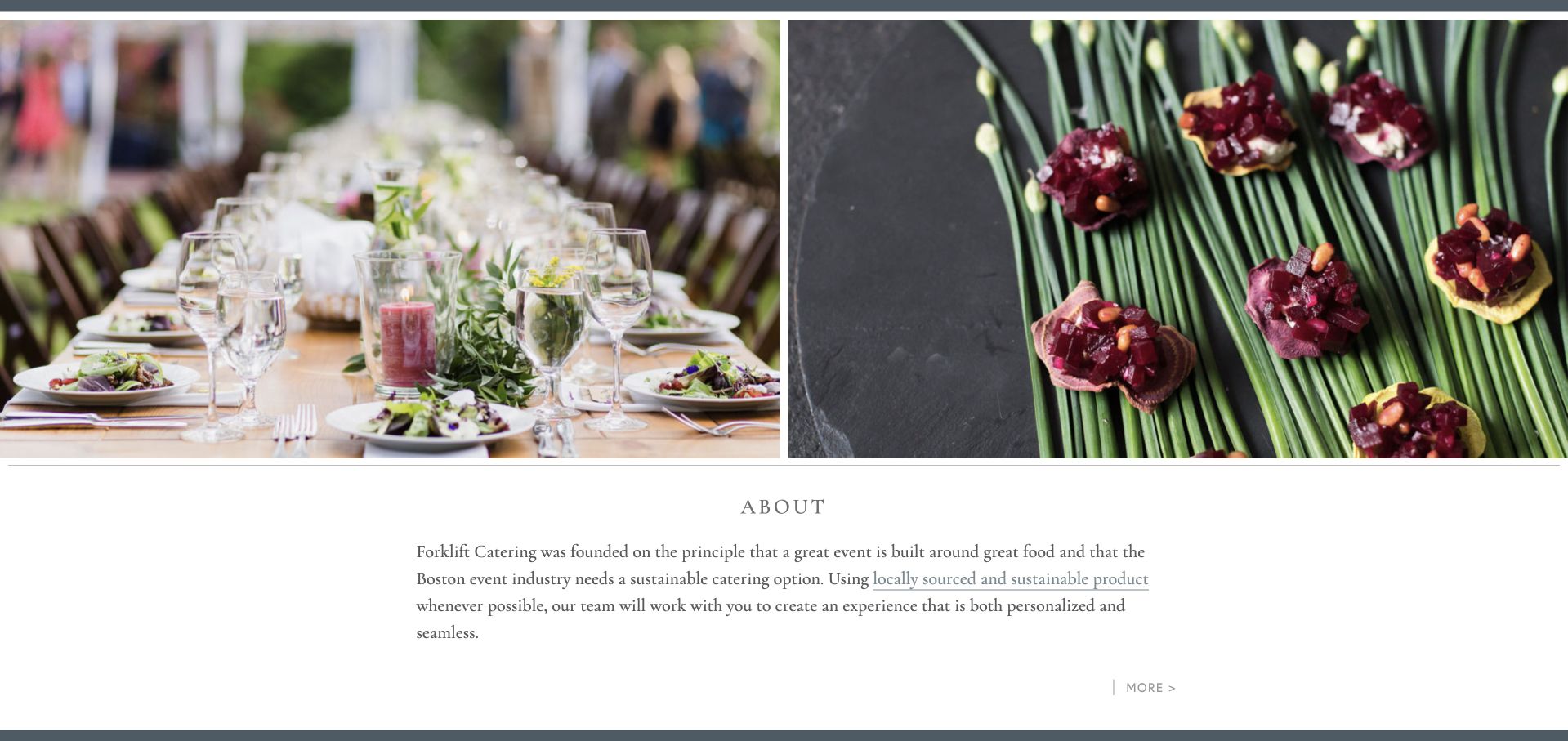
Forklift combines a fine-line fork identity with a blue-gray statement band and alternating event and food imagery. Weddings, social events, corporate events, and galas are distinct categories. Seasonal menu inspiration and local partners receive their own routes, turning the caterer’s stated sourcing approach into material visitors can explore.
What you can learn
Make a sourcing position discoverable through named partners and seasonal material. Keep event categories separate so visitors can find a relevant application of that approach. Give seasonal menu inspiration and partner pages a consistent structure with dates and roles. That lets a wedding or gala client understand the sourcing story without assuming every seasonal example is available unchanged.
Pros
Seasonal inspiration is organized into clear categories.
Local partners have a dedicated destination.
Cons & considerations
The large opening media area postpones the main explanation.
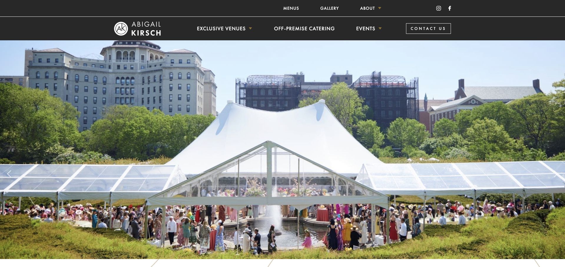
Abigail Kirsch uses a dark two-tier header to distinguish menus and company information from venues, events, and off-premise catering. The homepage names individual properties with their cities and later explains culinary creativity and catering away from those venues. This distinction helps visitors understand that selecting the caterer does not necessarily mean selecting one of its signature spaces.
What you can learn
Explain the relationship between a caterer and its venues. Distinguish exclusive properties from off-premise services before sending every visitor into the same gallery or inquiry. For each named property, explain the relationship to the catering offer; an off-premise prospect should not mistake the venue collection for a required choice of event location.
Pros
Off-premise catering is a primary navigation item.
Named venues include geographic context.
Cons & considerations
The two-tier header creates several simultaneous choices.
Large animated content regions can delay readable copy.
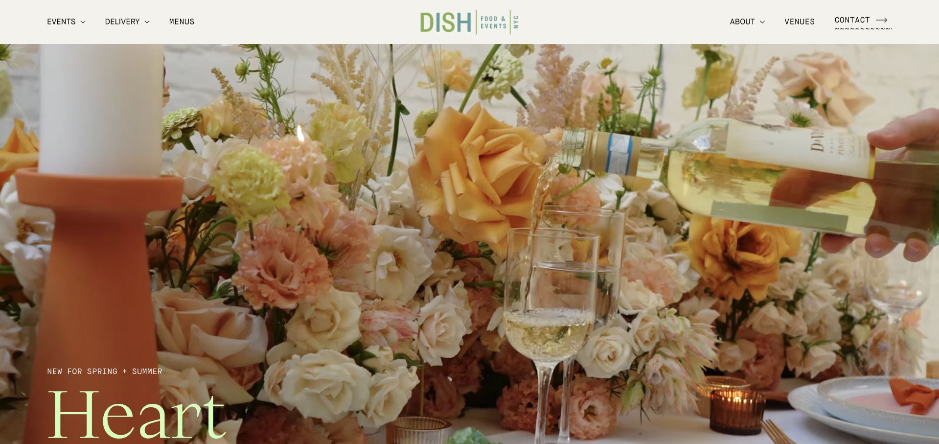
Dish uses cream, green, and warm photographic tones, with Events and Delivery separated in the header. A clear New York introduction precedes cards for weddings, corporate events, social events, and conferences. Menu links and named recent-event stories give the service categories substance, while a repeated Start Planning action keeps the next step recognizable.
What you can learn
Give conferences their own route when their food and timing needs differ from social events. Pair each event category with a brief explanation, then support it with menus and actual event stories. Carry the conference or social-event choice into Start Planning, and connect the recent-event stories to the matching service category rather than leaving them as a separate visual archive.
Pros
Events and delivery are distinct header choices.
Conferences receive a dedicated planning route.
Cons & considerations
A large animated word sequence competes with the opening message.
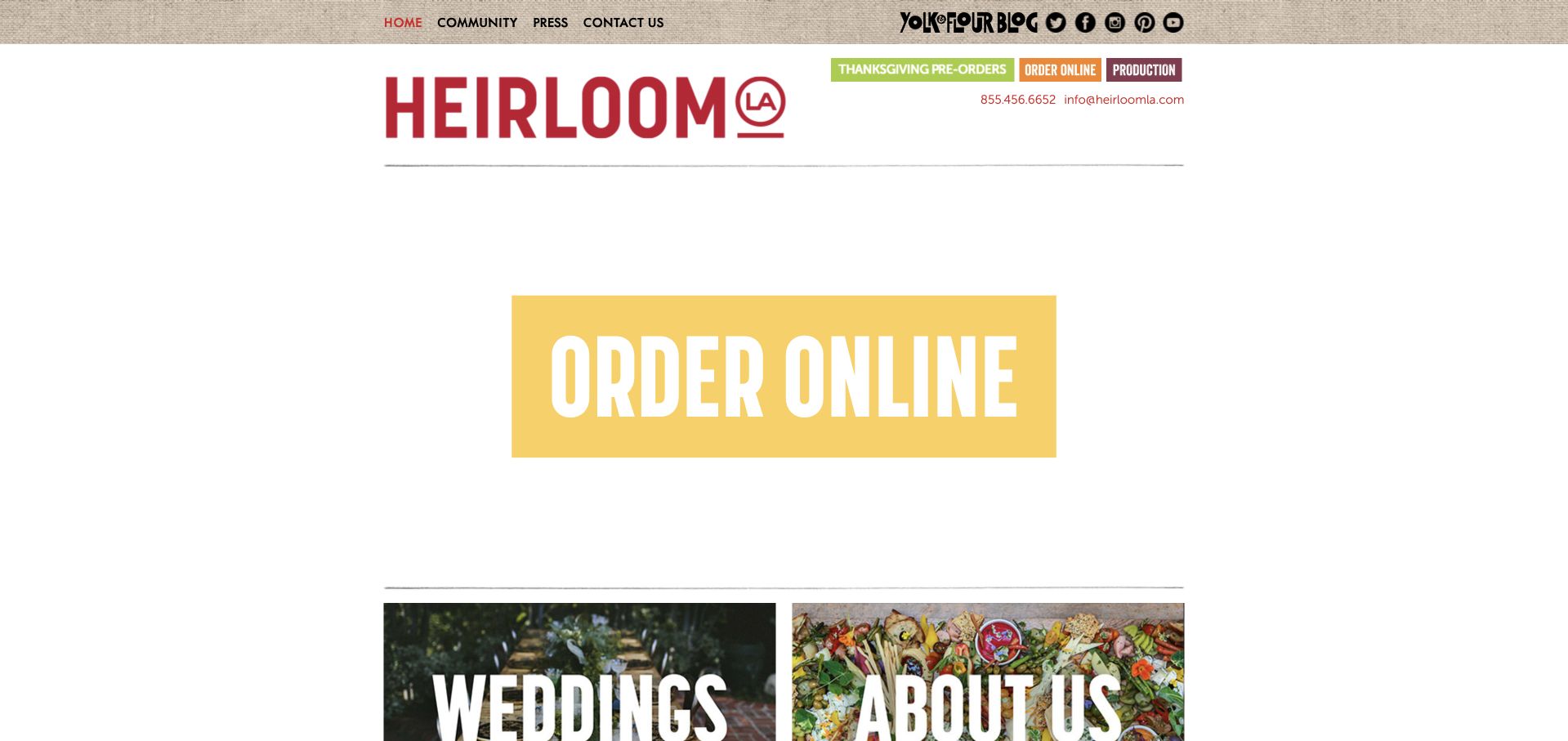
Heirloom LA uses a compact, textured header, a prominent red wordmark, and large visual links for online ordering, weddings, and company information. Holiday pre-orders and production information are separately available above the main content. The structure is direct, though important destinations are conveyed largely through artwork rather than explanatory page text.
What you can learn
A short homepage can be effective when it exposes the few choices visitors need. Keep visual buttons understandable in text as well, and explain when an action leads to a separate ordering property. Add a short text explanation beside each artwork-led destination, identifying whether holiday preorders, everyday ordering or wedding information opens before the visitor leaves for another domain.
Pros
Online ordering is unmistakably prominent.
Holiday and production routes are separated.
Cons & considerations
Several key destinations rely on image-based labels.
Different ordering domains can make the handoff feel fragmented.
Kegan is a freelance web designer and developer with 15+ years of experience helping businesses turn complicated website requirements into clear, maintainable digital experiences. He works directly with clients from planning and design through development, launch, and ongoing support.
For catering website design, his development approach focuses on event-format and menu discovery, genuine food and event photography, coverage and lead-time information, and qualified catering inquiries. The scope can be a targeted improvement or a complete custom build, with responsive layouts, thoughtful content structure, and integrations chosen around the people using and maintaining the site.
Show 3 other catering website designersHide other catering website designers
Document service area, travel policy, minimum order or event size, staffing options, rentals and bar arrangements. Decide which facts are universal and which require a custom proposal. Use the same terminology in navigation, menus and sales conversations.
Build a repeatable event-story format
Collect a small set of strong photographs with service notes rather than publishing an unstructured gallery. A conference lunch, garden wedding and private dinner should demonstrate different constraints and choices. Give the team a reliable process for permissions and credits.
Test the inquiry as a real planner would
Rehearse a mobile visit with an uncertain date, a venue outside the usual area and a dietary question. Check that someone can find a direct contact alternative and understand what happens next. Do not require an exact menu before a planner has explained the available formats.
The editing job behind the design
Choose publishing tools that match the catering operation
Use structured service and event-story pages that the team can update without redesigning the layout. Keep menus dated and identify samples as samples. A readable web menu can support discovery, with a downloadable document offered as a convenience rather than the only source of information.
Connect the inquiry to the team’s actual planning process, but keep drop-off ordering and recurring workplace requests distinct. Do not duplicate live prices, availability or confirmed-event status across disconnected pages. Technology labels in this collection are included only when public evidence supports them.
Our WordPress website examples offer a separate look at publishing approaches. A visible platform label is evidence for that named page, not a guarantee that the same system will suit your requirements.
Before the public launch
Catering website planning checklist
State the geographic service area.
Distinguish staffed service from drop-off.
Label sample menus and their dates.
Explain minimums or quote-dependent pricing.
Show actual food and events with credits.
Describe the role performed in case studies.
Ask for approximate guest count and venue.
Provide a route for dietary questions without guarantees.
Explain inquiry versus confirmed booking.
Assign an owner to seasonal offers and menu updates.
These checks are a project checklist, not a performance, legal, security, or accessibility certification. Test real journeys with the people responsible for the website before making claims about the result.
Sources & editorial method
How this collection was selected and reviewed
These 29 examples match the exact collection count saved before research. The public company pages were opened directly and visually inspected on November 8, 2026 Pacific time; fresh screenshot files were captured on November 9 UTC, as individually dated. Screenshots show actual public pages, including meaningful inner-page sections where appropriate, and are not generated website concepts or vendor-supplied images. Reviews describe observed website design and information, not product or service quality, safety, availability or promised outcomes. Public technology labels are included only with source evidence; unknown stacks remain unlisted. No purchases, reservations, age-verification submissions, inquiries or private forms were completed. Security gates and unrelated or parked domains were excluded. Images and trademarks belong to their owners.
Each example links to its actual source page. Screenshots are direct browser captures with their own capture dates; moving imagery, announcements and live designs can change. The notes describe observable design choices and conditional tradeoffs, not measured traffic, conversion results, service quality, or accessibility conformance.
Technology labels use public page metadata, asset evidence, or explicitly cited platform documentation. Platform documentation is not a complete current deployment audit. A component reference may be legacy or unused; it is not a complete backend inventory. Unknown stacks are omitted. These sites are editorial examples, not our client portfolio.
Written, Edited and Curated are separate editorial records, not timestamps advanced by a rebuild. Website designs and imagery belong to their owners. See our editorial standards or suggest a correction.
Questions worth asking
Catering website design questions
Should a caterer publish prices?
Publish useful starting ranges, minimum orders or package prices when they accurately reflect the operation. If staffing, rentals and venue logistics change the quote, explain those variables instead of presenting a misleading universal per-person figure.
Is a gallery enough to explain the service?
No. A gallery establishes an aesthetic, but visitors also need service formats, geography, planning expectations and the caterer’s role. A short event story gives photographs much more practical meaning.
Should weddings and corporate catering share a form?
They can share a system, but the visible questions and guidance should reflect the service. A long wedding brief is unnecessary for an office meal, while a simple food-order form is inadequate for a staffed event.
How should dietary requests be presented?
Describe the process for discussing requirements and identifying menu information. Do not turn a website label into a blanket guarantee about allergens or suitability; direct specific questions to the business.