A construction website must make relevant experience easy to evaluate. These examples show different ways to connect project photography, delivery capabilities, locations, and people without asking a visitor to understand the entire company first.
Construction buyers often arrive with a defined project type, location, or procurement question. A useful site lets them move from a strong first impression into comparable work, the contractor's actual responsibility, and a contact who can discuss the requirement. A spectacular image is a starting point; the case study supplies the explanation.
This collection includes general contractors, infrastructure builders, and integrated development organizations. Their audiences also include trade partners, employees, and applicants. Compare how each site separates those routes, names the work it shows, and explains a broad service portfolio. The reviews concern the visible website design and information structure, not the quality of construction services.
Before the examples
What makes good construction website design in 2026?
Name the work and the role
Give every featured project a title, location, building type, and clear explanation of the company's involvement. Where several parties contributed, distinguish construction, design, development, and management responsibilities. Readers should understand why an example belongs in the portfolio.
Offer sector and location routes
A hospital client and a local trade partner may enter with entirely different questions. Use recognizable sector labels and office information, then connect both routes to relevant project records and a specific team. Avoid making a corporate menu the only way into useful evidence.
Make partnership paths explicit
Project inquiries, subcontractor interest, and job applications need different information and handling. Label those destinations plainly. A concise introduction to each path can explain what the visitor should prepare and what response to expect.
The collection · 16 examples
16 construction websites worth studying
Study the relationship between the opening image and the next useful step. Some examples lead with a named project; others organize services, people, or current news. The strongest pattern for your firm is the one that exposes relevant experience and an appropriate contact.
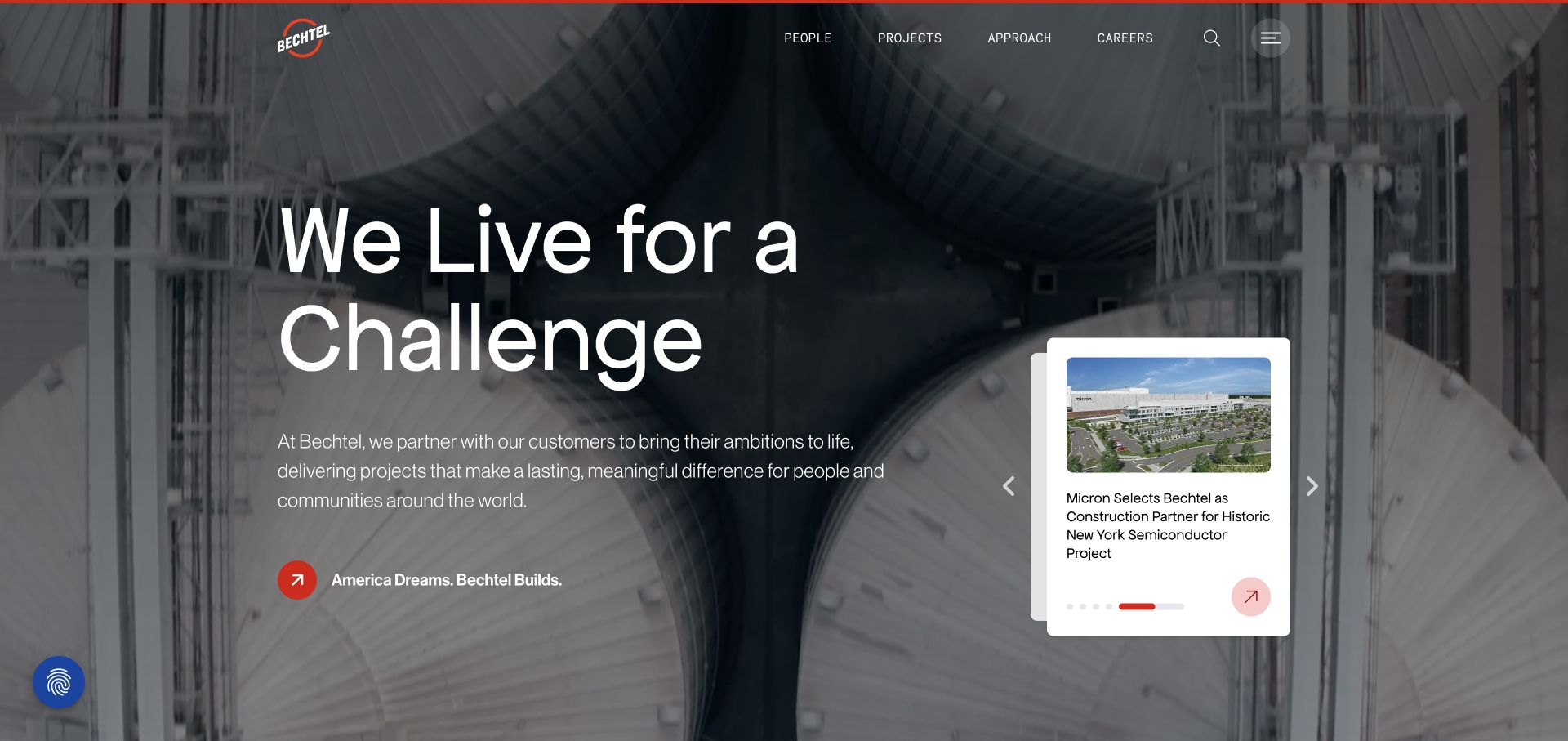
Bechtel puts a dramatic industrial image behind a very large challenge-focused headline, making the scale of its work visible before a visitor opens a project. The compact upper navigation separates people, projects, approach, and careers, while an editorial card introduces current company stories. This is a useful construction pattern because it gives both prospective clients and recruits a way into the same substantial portfolio without turning the hero into a long capabilities list.
What you can learn
Pair ambitious imagery with concrete project records that explain the location, construction problem, and team's role. The opening can establish character, but the next click should supply the practical evidence a procurement reader needs to assess relevance.
Pros
The industrial photograph communicates the kind of physical work more immediately than an abstract brand graphic.
People and careers receive deliberate navigation space alongside the project portfolio and delivery approach.
Cons & considerations
A challenge-oriented slogan needs supporting project detail before it becomes meaningful evidence of relevant capability.
An editorial carousel requires maintained stories and visible controls so older material does not define the first impression.
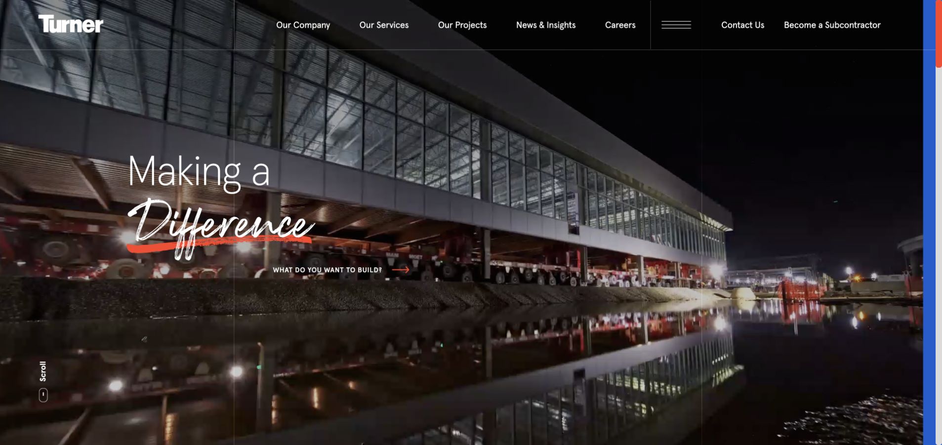
Turner's opening uses a broad architectural photograph and a restrained headline rather than a crowded collection of service icons. The question about what the visitor wants to build supplies a bridge into projects, careers, and a better future. Contact and subcontractor access remain available in the surrounding navigation. The composition recognizes that a large contractor has several audiences, and gives the architecture enough room to carry the visual identity while the entry choices explain where to go.
What you can learn
Write audience choices around recognizable intentions, then keep the destination specific. A project inquiry, an employment search, and a subcontractor relationship need different next steps even when they share the same polished introduction and company narrative.
Pros
The large project image makes the built environment the central evidence in the opening screen.
Intent-based pathways acknowledge visitors who are researching work, employment, or the company's broader commitments.
Cons & considerations
The understated opening copy may require a second step for visitors seeking a particular construction specialty.
Image-led presentation needs carefully chosen crops so the building and overlaid navigation remain understandable on smaller screens.
Visible tech stack
Referenced on the public page
reCAPTCHA
Apache HTTP ServerReported response header
Public source checked November 3, 2026. References may be embedded or legacy—not a complete backend inventory.
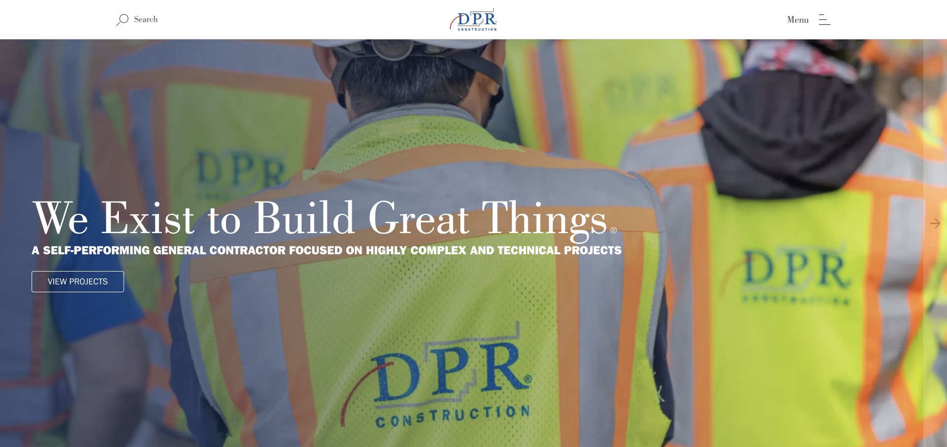
DPR combines a close view of construction personnel with oversized serif typography, giving its introduction a more personal tone than a conventional skyline banner. A concise description identifies the company as a technical builder, and the project call to action provides a practical route beyond the visual statement. Search and menu controls keep the header sparse. The result is a clear example of using the people who perform the work as part of the brand, while retaining a route to completed projects.
What you can learn
If culture is central to the contractor's positioning, show actual work and connect it to relevant project evidence. Avoid making the team photograph carry every message; a plain description of project types and responsibilities can anchor the expressive presentation.
Pros
The close human perspective gives the construction subject a recognizable point of view beyond building photography.
A direct project action connects the expressive first screen to a practical evaluation path for clients.
Cons & considerations
A minimal menu can hide sector and location options until the visitor deliberately opens navigation.
Oversized type and tight image crops require review at mobile widths to preserve both meaning and context.
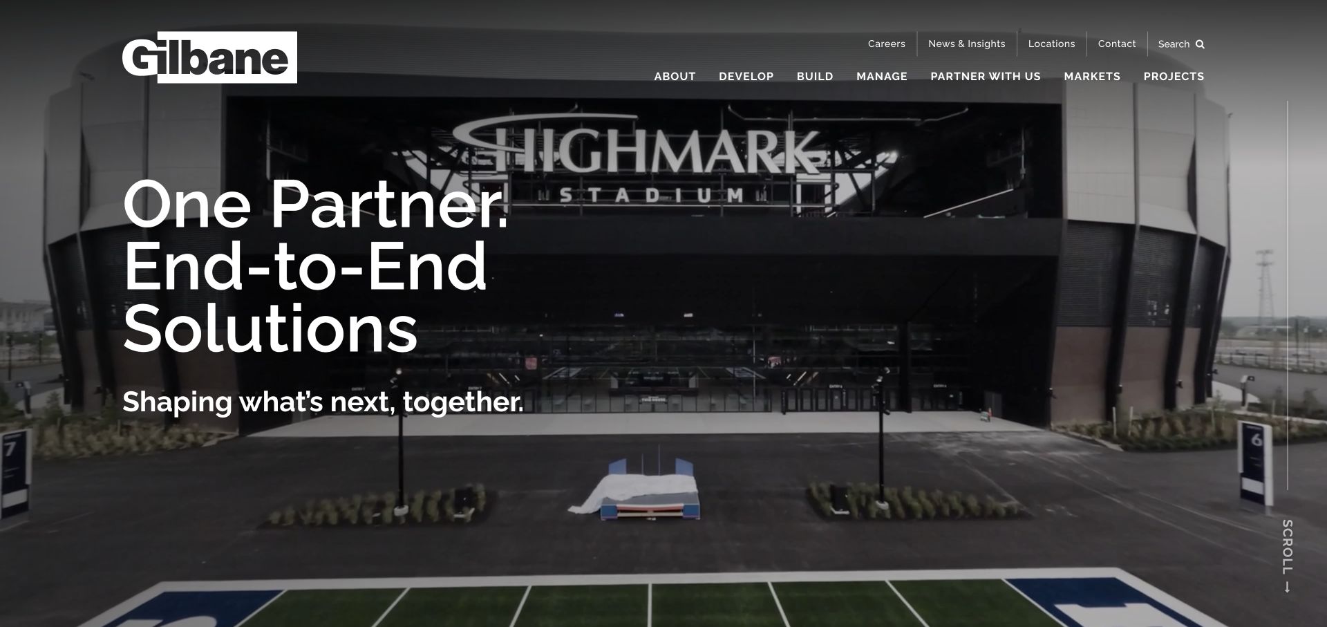
Gilbane presents a stadium-scale project beside a concise end-to-end partnership message. The primary navigation organizes the offer into Develop, Build, and Manage, which gives the company's breadth a readable structure. Utility links for careers, news, locations, and contact sit above that core sequence. Instead of asking every visitor to understand the corporate organization first, the opening provides a lifecycle model that can guide clients toward the work they actually need and still leave room for recruiting and partner relationships.
What you can learn
When a business spans development, delivery, and operations, organize the primary routes around those stages. Explain what each stage includes on its destination page, with relevant projects and an identifiable contact rather than repeated corporate overview copy.
Pros
The develop-build-manage grouping translates a broad organization into a small set of useful service choices.
The large project photograph provides tangible context for a claim about end-to-end construction capabilities.
Cons & considerations
A broad partnership headline still needs examples that distinguish each service's actual scope and responsibility.
Multiple utility and service navigation layers may become dense if further corporate categories are added without prioritization.
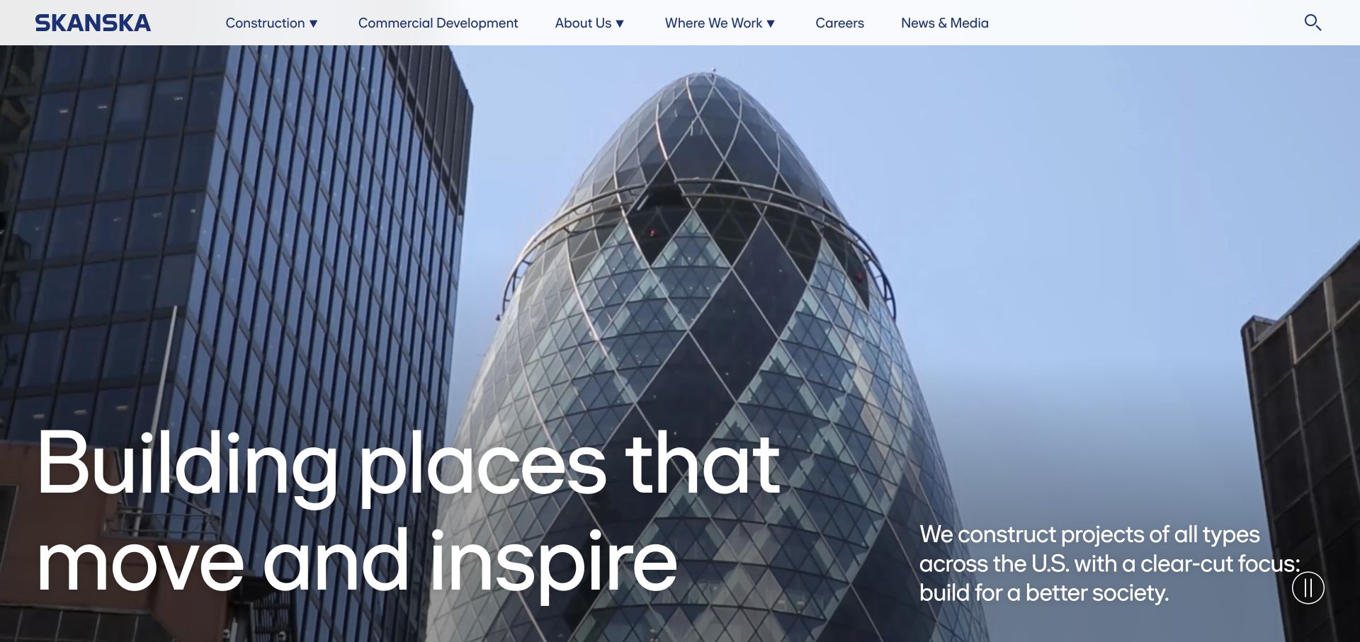
Skanska's US page pairs a tall urban project image with a large statement about places and a short explanatory passage. The navigation exposes construction, commercial development, and company information rather than treating every visitor as a single kind of client. The spacious arrangement lets the architecture remain legible while the copy explains why the work matters. It is a useful reference for a large construction organization that needs to balance a public-facing brand story with routes into distinct business activities.
What you can learn
Give different business lines clear labels and destination pages, then use one consistent visual system to connect them. A concise introductory paragraph can clarify an evocative headline without filling the first screen with organizational detail or unrelated promotional material.
Pros
The architectural image and supporting copy share the screen without turning the project into a tiny thumbnail.
Distinct business routes make the company structure available to readers with different commercial research goals.
Cons & considerations
The broad place-making message needs project and sector detail for a visitor evaluating a narrowly defined tender.
Large imagery and motion controls should receive deliberate small-screen review before adopting a similar opening treatment.
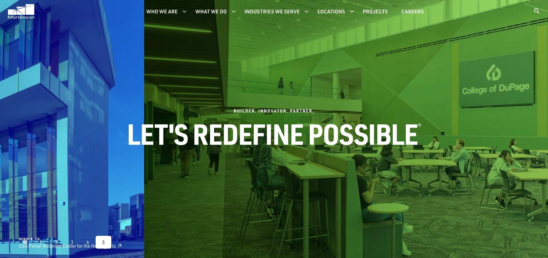
Mortenson uses large project imagery, including the education setting in the saved view with an uppercase headline, a visible project caption, and numbered slide controls. Its main navigation includes industries, locations, projects, and careers, allowing the visual story to sit beside recognizable research routes. The project caption is a valuable detail: it gives the image an identity instead of using construction photography only as decoration. Further page material connects portfolio work with local offices and insights, supporting readers who need either inspiration or a more specific point of contact.
What you can learn
Caption major project photography with enough information to identify the work and open its case study. Preserve straightforward sector and office navigation around the image so visitors can move from visual interest to a relevant team or comparable project.
Pros
Visible project names make the hero imagery useful evidence that readers can investigate further.
Industries and locations provide complementary routes for visitors whose requirements are either technical or geographic.
Cons & considerations
A rotating hero may hide a particularly relevant project unless visitors notice and use its slide controls.
A wide sector portfolio needs consistent case-study fields so project comparisons do not depend on uneven storytelling.
Visible tech stack
Referenced on the public page
Adobe Fonts
Public source checked November 3, 2026. References may be embedded or legacy—not a complete backend inventory.
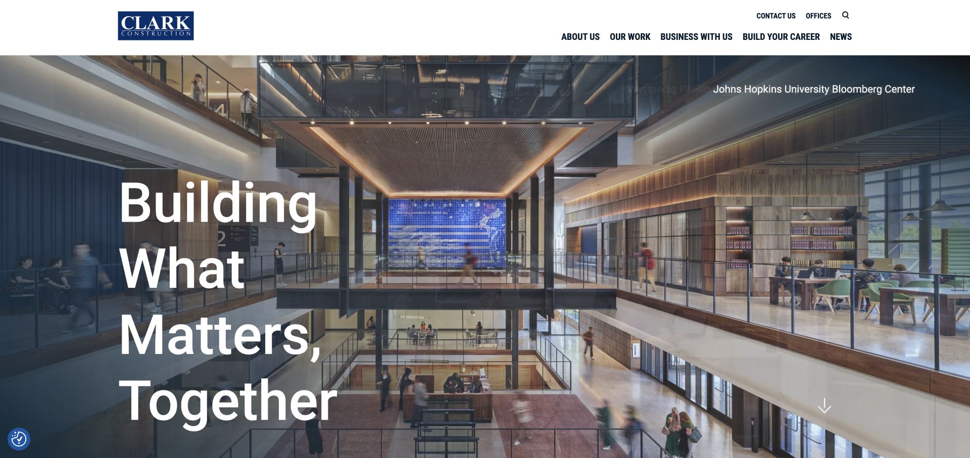
Clark's homepage places a large multiline statement over an architectural interior while naming the featured project near the edge of the image. Its compact navigation distinguishes Our Work, Business With Us, careers, and news, with offices and contact available as utilities. The combination turns the hero into a gateway to identifiable work, while acknowledging trade partners as a distinct audience. The selected view of the Johns Hopkins University Bloomberg Center demonstrates how an interior can communicate construction complexity without needing a collage of several projects.
What you can learn
Treat a project photograph as a linked editorial object, with its name and case-study destination close by. Separate partnership and recruiting routes from client portfolio browsing so each audience can find an appropriate next step without guessing the company hierarchy.
Pros
The project credit gives visitors a specific subject to investigate rather than leaving the hero anonymous.
Business With Us provides an explicit route for partners alongside client-facing work and employment information.
Cons & considerations
A short brand statement cannot replace the scope, constraints, and delivery details required in the linked case study.
Long project names need careful placement when the hero image and typography are adapted to a narrow screen.
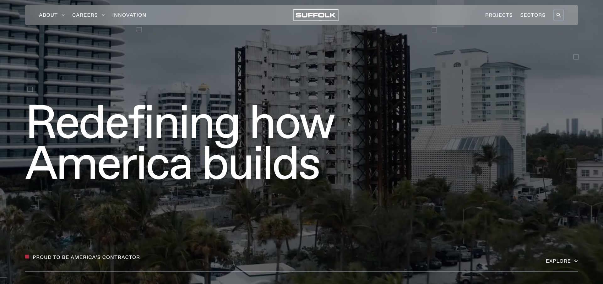
Suffolk opens with a dense structural construction image and a large statement about how America builds. A floating navigation bar keeps project and sector routes visible while the hero establishes a strong visual identity. The page then presents its delivery approach through named components covering operations, technology, data, and expertise. That sequence is useful because it gives a contractor's process a structure readers can explore, rather than leaving innovation as a single unsupported adjective in the headline.
What you can learn
Explain a delivery approach in concrete components and connect each component to examples of work. Branded process language becomes more useful when readers can see which decisions, coordination steps, or project responsibilities it describes in practice.
Pros
The construction-stage imagery foregrounds the work of building rather than only a finished architectural result.
The named process components give the company a framework for explaining its approach beyond the homepage slogan.
Cons & considerations
Technology and data language needs specific project evidence before readers can judge its relevance to their own needs.
A visually busy structural image requires strong contrast and deliberate text placement as the viewport changes.
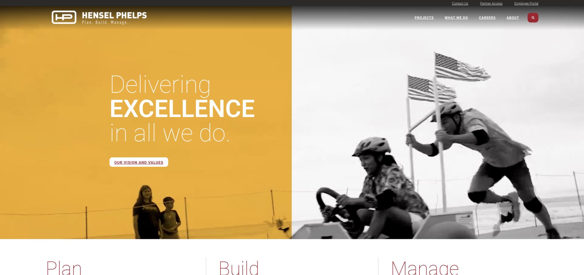
Hensel Phelps pairs a gold color field with monochrome imagery of people and work and a concise delivery-focused headline. Immediately below, Plan, Build, and Manage introduce the service structure. The upper utilities include contact, partner access, and an employee portal, which keeps operational audiences visible without inserting them into the main brand message. This is a useful reference for a company whose relationship with a project begins before construction and may continue into facility management after the building opens.
What you can learn
Use lifecycle stages to explain a broad offer, but make the boundaries between them explicit. Link planning, construction, and management to distinct services and representative work so clients can identify whether they need the whole relationship or one part.
Pros
The three-stage structure gives an extensive service portfolio a memorable and understandable organizing principle.
Partner and employee utilities acknowledge recurring operational visits separately from the introductory marketing content.
Cons & considerations
A compact lifecycle label needs enough destination detail to distinguish consulting, construction, and facility responsibilities.
Strong color and monochrome photography can become repetitive unless project pages introduce useful visual and factual variety.
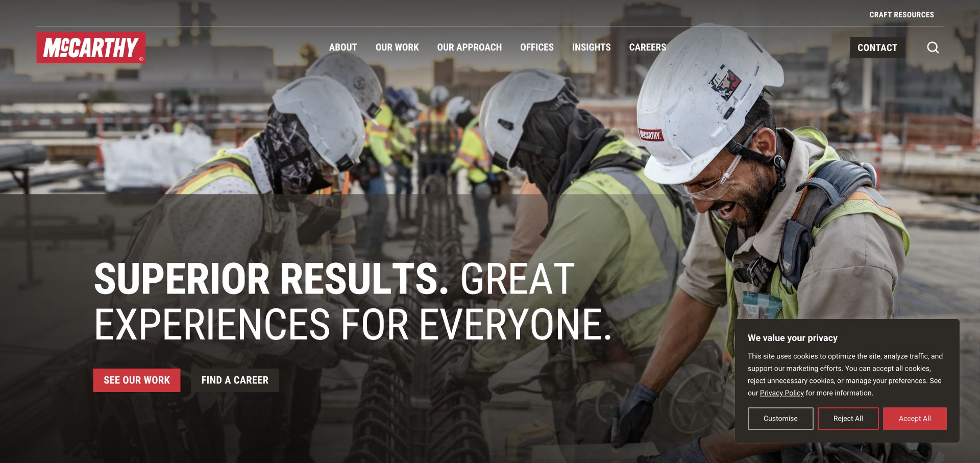
McCarthy's first screen shows construction workers in context, accompanied by a bold uppercase statement and separate actions for seeing work and finding a career. The visual focus gives the company's workforce a central role in the identity. Below that opening, employee ownership, project work, and craft resources offer different ways to understand the organization. This is an instructive construction pattern because the primary actions directly acknowledge two major audiences without requiring a recruitment message to compete with a client inquiry form.
What you can learn
Give project research and employment research explicit routes when both are important to the business. Support the workforce narrative with specific roles, responsibilities, and project examples rather than expecting a statement about culture to answer every visitor's questions.
Pros
Construction personnel provide a direct connection between the company's identity and the people delivering the work.
The paired actions make project browsing and career exploration recognizable from the first screen.
Cons & considerations
A broad performance statement still requires concrete case-study details for readers evaluating comparable work.
Recruiting and client stories need careful balance so one audience does not dominate every subsequent homepage section.
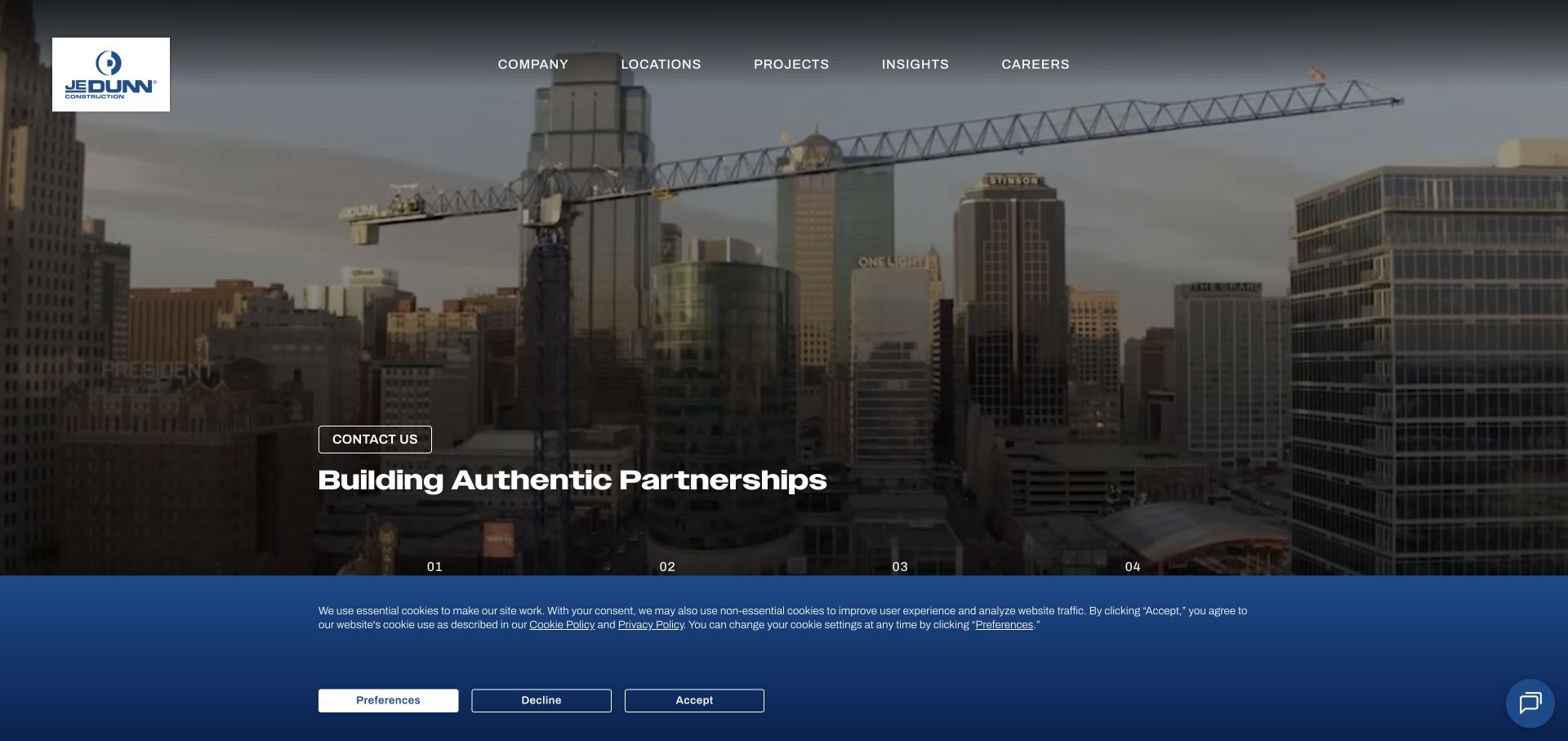
JE Dunn frames a large dusk photograph with a dark blue visual system and a partnership-led introduction. Its numbered section navigation breaks the company story into who it is, how it builds, what it builds, and news or insights. The sequence creates an editorial rhythm for visitors who are learning about the contractor, while markets and local office connections support more directed research. The useful idea is the ordered progression from identity to delivery approach to evidence, rather than a homepage assembled from unrelated promotional panels.
What you can learn
Arrange the introductory story so each section answers the next likely question. Explain the team, then the delivery approach, then the projects that demonstrate it, while retaining short routes for readers who already know the service or office they need.
Pros
Numbered section labels make the long company narrative easier to scan and understand as a sequence.
A consistent blue frame ties project photography, company information, and navigation into a coherent visual system.
Cons & considerations
A narrative sequence should not force experienced buyers to scroll past introductory material to reach specific capabilities.
Partnership language needs project-level examples of coordination and responsibility to become useful evaluation evidence.
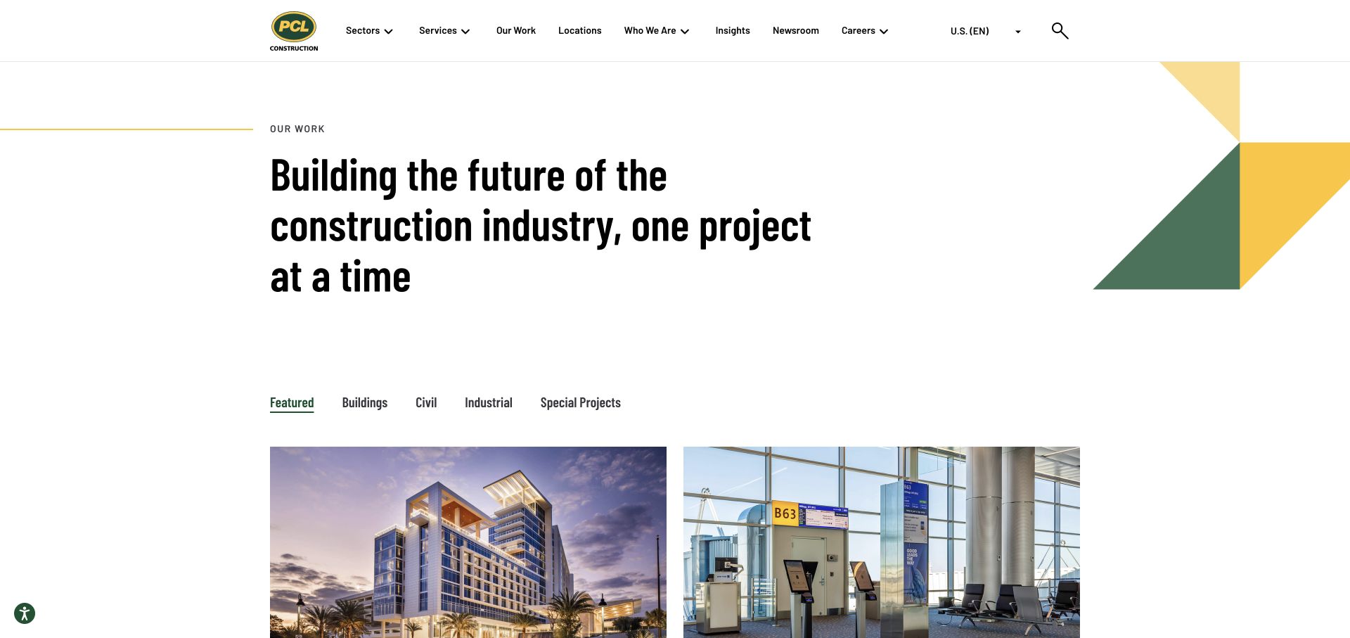
PCL's captured Our Work page is a project portfolio rather than the corporate homepage. It combines a large introductory statement with visible categories for Featured, Buildings, Civil, Industrial, and Special Projects. Project thumbnails begin beneath that navigation, while green and yellow geometry supplies brand recognition without overwhelming the work. The page is useful as a reference for organizing an extensive construction archive: readers can understand the portfolio's main divisions before choosing an individual project and its more detailed story.
What you can learn
Build the project index around categories that match how clients compare relevant experience. Keep project titles and sector context close to the images, and ensure the selected category remains obvious as readers move between the overview and individual case studies.
Pros
The portfolio categories provide a practical starting point for narrowing a broad construction body of work.
Brand colors and geometric elements frame the projects while leaving photography as the principal content.
Cons & considerations
Sector filters alone may not answer readers who need to compare location, scale, delivery method, or project role.
A large project archive needs consistent metadata and maintained links to avoid uneven results within each category.
Visible tech stack
Referenced on the public page
Google Tag Manager
Google Fonts
Public source checked November 3, 2026. References may be embedded or legacy—not a complete backend inventory.
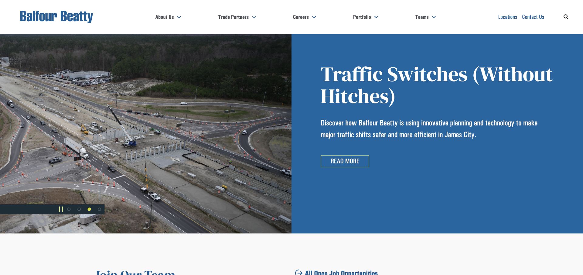
Balfour Beatty US uses a prominent blue editorial hero featuring a road-project story in the captured view. Its carousel also presented company news during review. The surrounding navigation keeps portfolio, teams, locations, careers, trade partners, and contact available. This offers a different construction pattern from an image-only hero: the homepage acts as a current front page for the organization. The permanent navigation lets a prospective client reach project experience even when the lead story changes to another subject.
What you can learn
If news leads the homepage, retain durable links to capabilities, projects, and offices around it. Choose editorial stories that add context to the company, and give the team responsibility for replacing time-sensitive material before it becomes the default identity indefinitely.
Pros
The editorial opening gives returning visitors an immediate signal that the company has new information to share.
Portfolio and trade-partner routes remain visible alongside the news-led introduction and recruitment links.
Cons & considerations
A changing lead story may not match a first-time visitor’s specific construction requirement, making permanent sector routes essential.
News-centered hero content needs a publishing owner and a clear process for retiring outdated lead stories.
Visible tech stack
Referenced on the public page
Google Analytics
YouTube
ASP.NETReported response header
Microsoft IISReported response header
Public source checked November 3, 2026. References may be embedded or legacy—not a complete backend inventory.
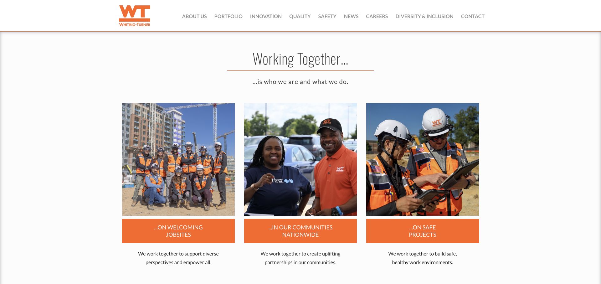
Whiting-Turner uses a restrained white header, orange brand mark, and a centered working-together message. Three visible photographic cards introduce welcoming jobsites, community involvement, and safety. The page gives these themes separate visual space instead of layering every message over one large hero photograph. Its conventional navigation also makes the portfolio available without relying on an unfamiliar interaction. For construction firms, the design demonstrates how a modest introductory layout can make organizational priorities visible while reserving detailed project information for a dedicated area.
What you can learn
Choose a small set of meaningful operating themes and give each a clear destination. Use the homepage cards to introduce those themes, then provide specific examples and project context so the statements can be assessed beyond their visual presentation.
Pros
Three distinct image cards make the company's chosen cultural topics easy to recognize at a glance.
The simple header leaves room for recognizable navigation rather than requiring visitors to decode a custom menu.
Cons & considerations
Cultural themes may need a more immediate project or sector route for buyers with a specific construction requirement.
Broad commitments such as safety need substantive supporting material and should not rely on a photograph alone.
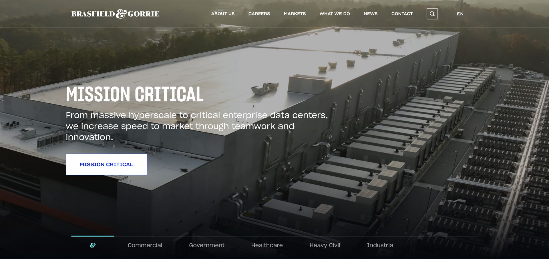
Brasfield & Gorrie's captured opening features a mission-critical project image, explanatory copy, and an action tied to that sector. A horizontal set of sector labels introduces other areas of work, including commercial, government, healthcare, and industrial construction. The pairing is useful because the hero does more than display an attractive building: it identifies the kind of project and points toward related expertise. The broader service navigation then offers routes into delivery capabilities and the company behind the work.
What you can learn
Match the hero image, explanatory text, and destination to the same construction sector. If several sectors rotate through the opening, make the alternatives visible and provide a stable sector index so important expertise is not hidden behind the current slide.
Pros
The sector label and matching action make the featured image a clear starting point for relevant research.
Visible alternatives communicate portfolio breadth without placing every service description inside the hero.
Cons & considerations
A rotating sector presentation can leave some specialties less visible unless the controls are easy to understand.
Sector introductions need linked project details that explain the contractor's own role rather than only the building type.
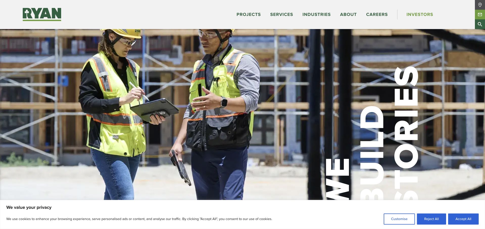
Ryan Companies pairs a large image of construction personnel at work with a compact green brand identity and a story-oriented headline treatment. Its navigation separates sectors, services, and projects, accommodating visitors who know the property type they need as well as those researching the company's role. The service range includes development, design, construction, management, and investment-related activities. The design is useful for understanding how one brand can introduce an integrated real estate organization without forcing every visitor through a long organizational explanation on arrival.
What you can learn
Offer both a sector route and a service route when projects involve several disciplines. On individual project pages, identify which roles the company performed so the integrated story stays clear and readers do not mistake portfolio involvement for responsibility for every aspect.
Pros
The sector-service-project navigation supports several valid ways to research an integrated property business.
Large project photography keeps the built result visible while the surrounding labels explain the available research routes.
Cons & considerations
An integrated service list needs clear role attribution on case studies to avoid blurring design, construction, and ownership.
A decorative or rotated headline treatment should retain a straightforward reading order on narrow screens and assistive views.
Choose representative work across sectors and locations, then gather approved images, a concise brief, the company's role, and useful delivery context. Use consistent fields so smaller projects can be as understandable as landmark work. Assign responsibility for keeping the archive current.
Map the audiences to destinations
Create short journeys for prospective clients, trade partners, recruits, and returning contacts. Give each journey a clear destination and remove duplicated routes that lead to the same generic form. Test navigation labels with the words those visitors actually use.
Build a manageable publishing rhythm
Separate durable capabilities from dated news. Give current announcements a place without allowing them to obscure sector expertise indefinitely. Establish review dates for office contacts, project descriptions, team profiles, and expired recruitment or partnership notices.
The editing job behind the design
Choose tools for a maintained project portfolio
Start with the content model: projects, sectors, offices, services, people, and news should have predictable relationships. An editorial system should let the team update those records without rebuilding every page by hand. The examples do not establish a preferred platform, and no unverified stack labels are assigned.
Use image handling that preserves useful project context at different screen sizes, and provide a clear fallback for video-led openings. Review navigation, filters, forms, and downloads on ordinary devices. Choose integrations based on how inquiries are routed and maintained, not on the visual style of another contractor's homepage.
Our WordPress website examples offer a separate look at publishing approaches. A visible platform label is evidence for that named page, not a guarantee that the same system will suit your requirements.
Before the public launch
Construction website review checklist
Each featured project has a readable name and a working case-study link.
Project records explain the company's actual scope and contribution.
Sector and office routes lead to relevant examples and current contacts.
Client, trade-partner, and career actions have distinct destinations.
Images remain understandable when cropped for a narrow screen.
Video and carousel controls can be identified and operated without guessing.
News dates and recruiting links are reviewed on a defined schedule.
Forms explain the requested information and the next step after submission.
These checks are a project checklist, not a performance, legal, security, or accessibility certification. Test real journeys with the people responsible for the website before making claims about the result.
Sources & editorial method
How this collection was selected and reviewed
We directly viewed the public websites and captured their rendered pages on 3 November 2026. Each example has its own source URL, image provenance, and original review. The PCL example is its project portfolio page; the other captures show the respective public opening pages. Observations cover visible layout, navigation, and content organization. We did not test inquiry completion, independently audit business claims, or infer platforms from appearance.
Each example links to its actual source page. Screenshots are direct browser captures with their own capture dates; moving imagery, announcements and live designs can change. The notes describe observable design choices and conditional tradeoffs, not measured traffic, conversion results, service quality, or accessibility conformance.
Technology labels use public page metadata, asset evidence, or explicitly cited platform documentation. Platform documentation is not a complete current deployment audit. A component reference may be legacy or unused; it is not a complete backend inventory. Unknown stacks are omitted. These sites are editorial examples, not our client portfolio.
Written, Edited and Curated are separate editorial records, not timestamps advanced by a rebuild. Website designs and imagery belong to their owners. See our editorial standards or suggest a correction.
Questions worth asking
Construction website design questions
Should a construction homepage lead with a project or a service?
Lead with the information that helps the main audience recognize relevant capability. A named project can be effective when its role and sector are clear. A service-led opening may suit a broad organization, provided it quickly links to comparable work.
What belongs in a construction case study?
Include the project name, location, building or infrastructure type, the contractor's role, approved photography, and a concise explanation of the challenge and approach. Add delivery details only when they are accurate and approved for publication.
How should trade partners and careers fit into navigation?
Give them identifiable routes with their own instructions and contact handling. They can remain visible in utility navigation without competing with every client-facing action. Avoid sending all three audiences to an undifferentiated inquiry form.
Are these examples recommendations for hiring a contractor?
No. This is a website design reference collection. Its reviews describe the public presentation and information structure, and do not assess construction quality, pricing, availability, safety performance, or suitability for a particular project.
Use these references to make your own construction experience easier to inspect. Begin with accurate project records and clear audience paths, then choose a visual treatment that supports those essentials.