These public properties have recorded reCAPTCHA resource references. Their screenshots show the browsing and task entrances around possible protected actions; they do not prove that a particular form verifies responses correctly. The design reviews focus on preserving context, explaining failures, and distinguishing a completed request from an uncertain result.
Protection is part of a form’s operating behavior. A visitor still needs to understand what will happen, what information is required, and whether the request reached its destination. A challenge or background assessment should fit into that task model without erasing the information the person has already entered.
The examples range from editorial browsing and public information to shopping, software signup, service discovery, and travel inquiries. Their visible interfaces suggest useful planning questions. No real forms, payments, accounts, reservations, or inquiries were submitted during this review, and the collection does not rate the sites’ security.
Before the examples
What makes good reCAPTCHA website development in 2026?
Name the action being protected
Distinguish reading a page from subscribing, creating an account, sending an inquiry, or placing an order. Define the server operation and its completion signal. Keep ordinary public browsing available where possible, and explain the protected action in words that match the visitor’s intention rather than the name of a security service.
Verify responses at the server boundary
Google’s verification documentation requires server-side verification of the response. It describes response tokens as single-use and valid for two minutes. Design the application around the result of that verification and the result of the business operation; receiving a frontend token is not a completed submission.
When verification fails, keep the visitor’s draft where appropriate and explain the next step beside the affected action. Avoid replacing the page with a generic failure that loses the selected product, location, dates, or inquiry topic. Confirm whether the business operation occurred before inviting another attempt.
The collection · 20 examples
20 reCAPTCHA website examples worth studying
Spotify For the Record, Tate, Heinz US, Mazda USA, and Asana open the collection, followed by fifteen other distinct public properties. Exact-source observations establish reCAPTCHA references. The collection does not infer the version, challenge type, server policy, or coverage of every linked form from that reference alone.
We start with five recognizable brands or organizations: Spotify — For the Record, Tate, Heinz US, Mazda USA, Asana AI. Each attribution applies to the named website property, not every product or website belonging to its organization. This is a curated reading sequence, not a measured ranking.
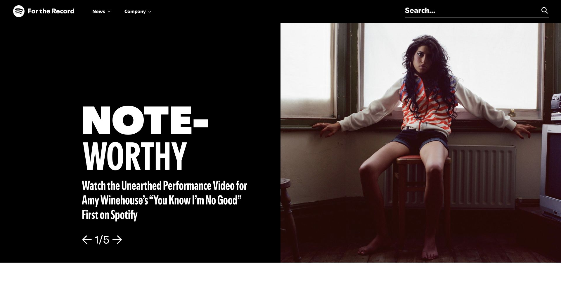
Spotify's For the Record opening uses a stark black background, an oversized story treatment, a portrait, and an unusually visible search field. The page invites reading before it asks for any account interaction. Its public source audit recorded a reCAPTCHA reference; the screenshot does not show a challenge, identify a protected action, or establish how requests are assessed. The design lesson concerns keeping ordinary editorial discovery clear while security integrations remain scoped to the appropriate workflow.
What you can learn
Map reading, searching, subscribing, and submitting as separate actions before adding protection. Preserve the simple public browsing route, and design clear waiting and recovery states only for operations that need server-side assessment and create an external effect.
Pros
The strong text-and-image split makes the featured story identifiable without a form competing for attention in the opening.
A broad search field gives returning readers a direct alternative to browsing the featured carousel and navigation categories.
Cons & considerations
The large story typography needs a careful phone layout so the search and article destination remain easy to reach.
A visible script reference cannot verify abuse prevention, challenge accessibility, or the handling of expired responses on an unseen submission flow.
Public source checked November 3, 2026. References may be embedded or legacy—not a complete backend inventory.
Platform source: Exact public source-page audit. The public source-page audit on 2026-11-03 recorded linked script matches recaptcha for this exact property. This is a public resource reference, not a test of every user journey, a complete backend inventory, or a claim that every visible element uses reCAPTCHA. Platform evidence is separate from the direct website screenshot and is not a complete current infrastructure audit.
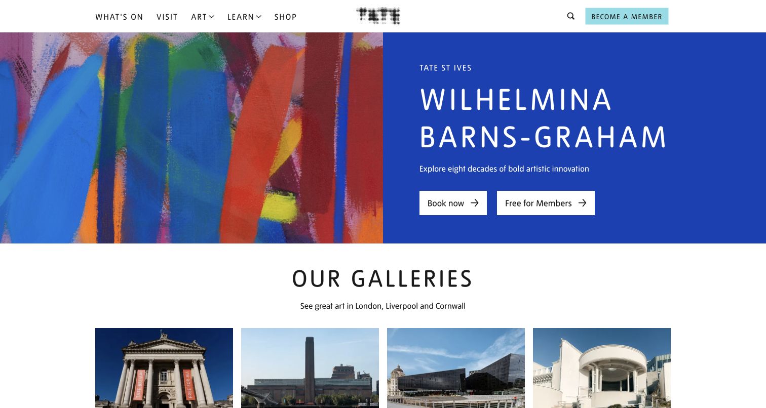
Tate pairs exhibition artwork with a solid blue information panel containing the venue, artist, short description, and two booking-related actions. A row of galleries begins immediately below. The layout distinguishes learning about the exhibition from taking a ticketing or membership route. The reCAPTCHA audit establishes only a resource reference on this public property; neither booking nor membership was submitted, and the capture does not demonstrate a challenge or ticket-system security behavior.
What you can learn
Define protection around the actual booking or membership submission rather than the entire art-browsing experience. Preserve selected dates and visitor details if verification expires, and provide a comprehensible recovery route without making people restart their exhibition research.
Pros
Venue and exhibition context appear beside the actions, helping visitors understand what they are about to investigate or book.
The gallery row gives an alternative way to browse when the featured exhibition is not relevant to the visitor's plans.
Cons & considerations
Two neighboring actions need clear destination descriptions and focus treatment so membership and ordinary booking remain distinguishable on small screens.
A successful public-page resource scan cannot establish that every ticketing provider, embedded form, or third-party checkout uses the same protection.
Visible tech stack
Referenced on the public page
reCAPTCHA
Public source checked November 3, 2026. References may be embedded or legacy—not a complete backend inventory.
Platform source: Exact public source-page audit. The public source-page audit on 2026-11-03 recorded linked script matches recaptcha for this exact property. This is a public resource reference, not a test of every user journey, a complete backend inventory, or a claim that every visible element uses reCAPTCHA. Platform evidence is separate from the direct website screenshot and is not a complete current infrastructure audit.
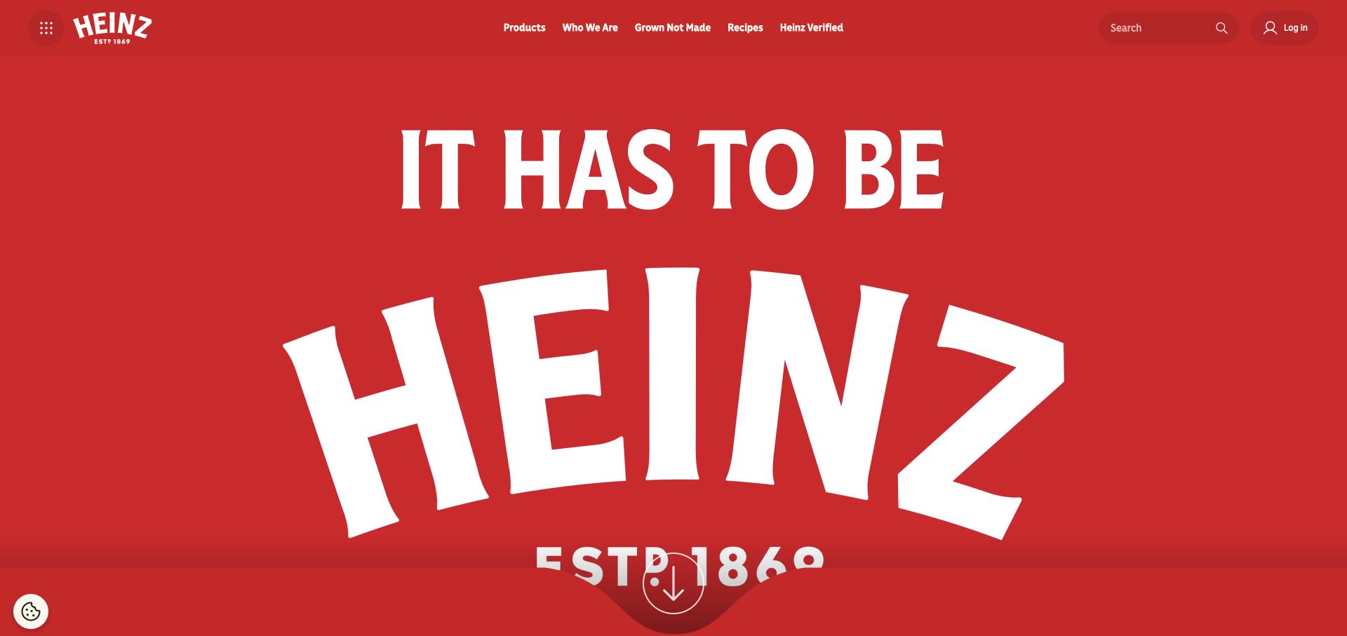
Heinz devotes most of its opening to a large white brand statement on red. Product, company, recipe, and campaign routes remain compact across the header, with search and login separated to the right. The public surface makes brand recognition its main task while retaining practical utilities. A reCAPTCHA resource was recorded in the source audit, but the capture offers no basis for identifying which login, contact, or campaign operation depends on it.
What you can learn
Keep account and campaign submission requirements distinct from freely available product information. If a form uses verification, explain failures next to the action and retain the user's input; an error should not replace the site's ordinary navigation or product context.
Pros
The small group of named content routes remains available even though the brand treatment occupies most of the initial viewport.
Search and login have recognizable separate positions, preventing their different purposes from being merged into one ambiguous generic account control.
Cons & considerations
An oversized brand opening delays concrete product details, so another implementation should verify that the audience benefits.
The security reference does not prove challenge behavior, server verification, or protection of any form on another Heinz-owned domain.
Public source checked November 3, 2026. References may be embedded or legacy—not a complete backend inventory.
Platform source: Exact public source-page audit. The public source-page audit on 2026-11-03 recorded linked script matches recaptcha for this exact property. This is a public resource reference, not a test of every user journey, a complete backend inventory, or a claim that every visible element uses reCAPTCHA. Platform evidence is separate from the direct website screenshot and is not a complete current infrastructure audit.
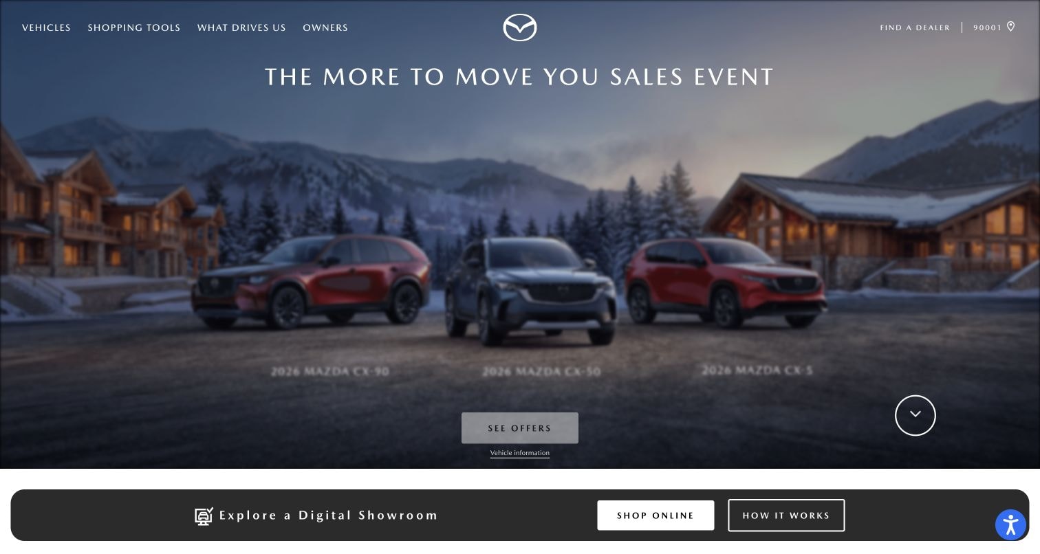
Mazda's opening presents three vehicles against a wintry setting, a sales-event heading, and a restrained offers button. Dealer access and owner information remain in the header; a digital-showroom strip follows below. The arrangement separates the campaign from several practical next steps. The audit recorded a reCAPTCHA reference on the Mazda USA page, without testing a lead form, dealer request, financing interaction, or any associated verification response.
What you can learn
Map each handoff from model research to a dealer inquiry or saved configuration. Apply assessment at a clearly defined submission boundary, preserve the chosen vehicle when verification fails, and distinguish an unsent request from a confirmed receipt in the interface.
Pros
Persistent dealer and owner routes support visitors with an existing relationship rather than forcing everyone through the seasonal sales presentation.
The showroom strip offers a practical continuation below the hero and gives exploratory visitors another named way to begin.
Cons & considerations
Small white labels over changing imagery need contrast checks independent of the large campaign heading and more prominent showroom controls.
A frontend script cannot confirm whether a dealer's separate domain or embedded system follows the same validation and recovery process.
Public source checked November 3, 2026. References may be embedded or legacy—not a complete backend inventory.
Platform source: Exact public source-page audit. The public source-page audit on 2026-11-03 recorded linked script matches recaptcha for this exact property. This is a public resource reference, not a test of every user journey, a complete backend inventory, or a claim that every visible element uses reCAPTCHA. Platform evidence is separate from the direct website screenshot and is not a complete current infrastructure audit.
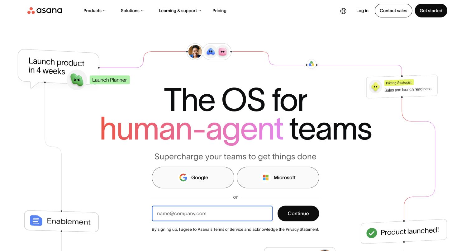
Asana centers a large product statement above Google and Microsoft options and a separate work-email field. Terms and privacy links sit directly under the form, while a surrounding workflow illustration supplies product context. This opening makes the next action unusually explicit. The public audit recorded reCAPTCHA, but no signup was performed and no assessment result was observed. The review therefore concerns the visible entry design, not the effectiveness of Asana's account protections.
What you can learn
Specify the state transitions for each signup option, including waiting, rejected input, expired verification, and an existing account. Keep the email available after a recoverable failure and explain whether the account was created before offering another attempt.
Pros
The email path and identity-provider options are visually distinct, helping visitors choose the route that fits their existing work account.
Legal links are placed near the signup action, while the product illustration stays outside the central input area rather than interrupting it.
Cons & considerations
Signup methods need consistent failure language so a visitor can tell whether to retry, switch methods, or sign in instead.
A marketing screenshot and script observation cannot establish the server-side assessment policy or prove that an account action occurred.
Public source checked November 3, 2026. References may be embedded or legacy—not a complete backend inventory.
Platform source: Exact public source-page audit. The public source-page audit on 2026-11-04 recorded linked script matches recaptcha for this exact property. This is a public resource reference, not a test of every user journey, a complete backend inventory, or a claim that every visible element uses reCAPTCHA. Platform evidence is separate from the direct website screenshot and is not a complete current infrastructure audit.
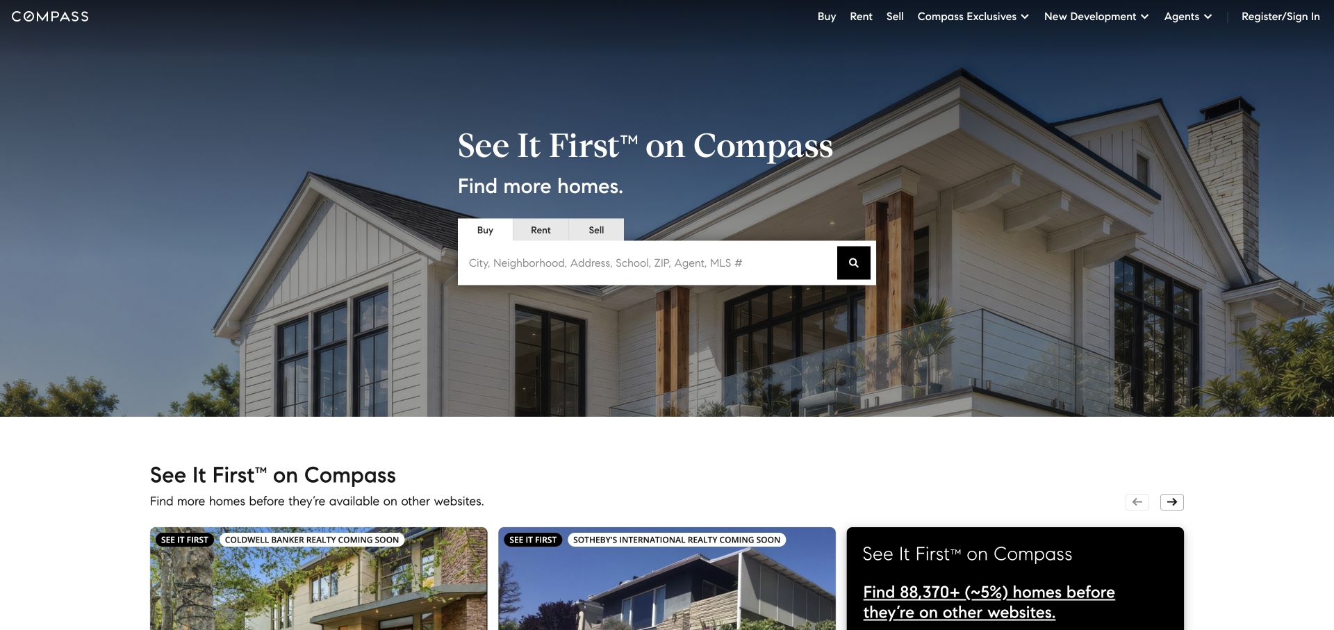
Compass puts a prominent property-search box over a residential photograph, with tabs for buying, renting, and selling. Registration and sign-in sit in the upper navigation, while featured property cards begin below the hero. The design gives anonymous discovery a clear place before an account decision. The reCAPTCHA resource is evidenced on the public property, but the review did not submit search alerts, inquiries, registration, or any other consequential form.
What you can learn
Separate simple property discovery from saved searches and agent inquiries in the interaction plan. Where verification is required, retain the location, filters, and selected listing through an error so protection does not erase the request context.
Pros
Three task tabs clarify the intent of the large search control instead of asking one generic field to represent every property workflow.
The account route remains available without dominating the search-centered hero or turning the public introduction into a registration form.
Cons & considerations
Search placeholder text should not be the only accessible label, particularly when the field contains a location or address.
A reCAPTCHA script does not establish which search, alert, or contact endpoint performs verification or how its server handles duplicate attempts.
Public source checked November 3, 2026. References may be embedded or legacy—not a complete backend inventory.
Platform source: Exact public source-page audit. The public source-page audit on 2026-11-03 recorded linked script matches recaptcha for this exact property. This is a public resource reference, not a test of every user journey, a complete backend inventory, or a claim that every visible element uses reCAPTCHA. Platform evidence is separate from the direct website screenshot and is not a complete current infrastructure audit.
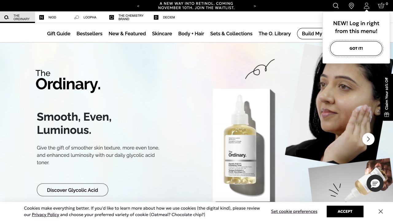
The Ordinary presents a product-and-benefit campaign with a substantial explanation and a clear discovery action. The captured view also includes an account-menu announcement, a side discount prompt, and a bottom cookie banner. These layers demonstrate the crowded environment in which a validation message might later appear. The exact page had a reCAPTCHA reference in the audit; no account, marketing signup, purchase, or verification challenge was completed for this review.
What you can learn
Inventory every overlay and form message before adding a security state. Give verification feedback a stable location near the relevant input, preserve entered details, and ensure visitors distinguish it from promotions and cookie preferences.
Pros
The product explanation and named discovery action provide a more concrete starting point than an image or brand slogan alone.
Account access is visible in the header, allowing repeat customers to find it without replacing the product-browsing presentation with a full login form.
Cons & considerations
Account, discount, and consent layers can make an additional validation notice difficult to locate without deliberate prioritization and dismissal behavior.
The audit proves a resource reference, not which checkout or account function uses it, whether challenges are accessible, or whether submissions are verified correctly.
Public source checked November 3, 2026. References may be embedded or legacy—not a complete backend inventory.
Platform source: Exact public source-page audit. The public source-page audit on 2026-11-03 recorded linked script matches recaptcha for this exact property. This is a public resource reference, not a test of every user journey, a complete backend inventory, or a claim that every visible element uses reCAPTCHA. Platform evidence is separate from the direct website screenshot and is not a complete current infrastructure audit.
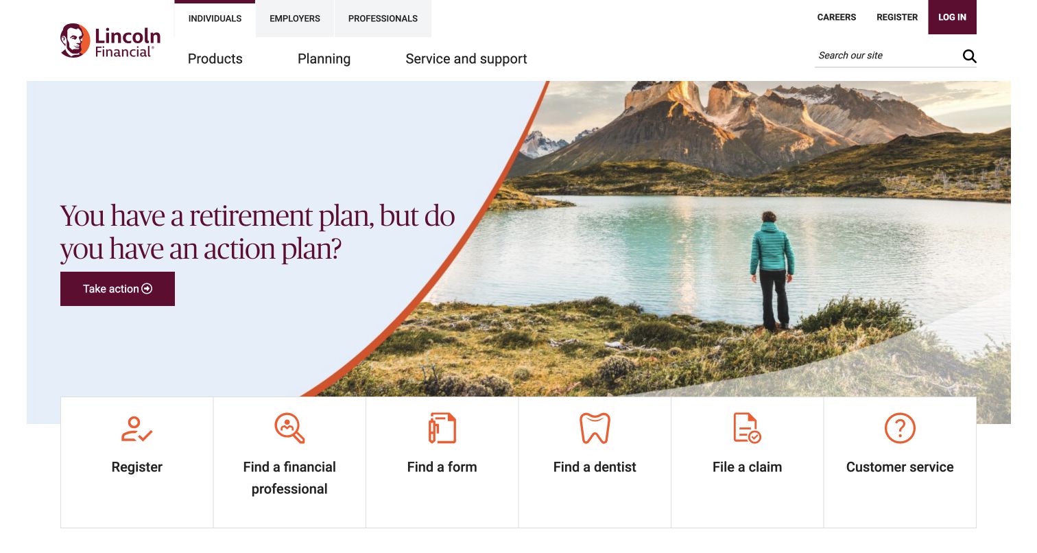
Lincoln Financial separates individuals, employers, and professionals in its header, then places a retirement-themed message above six practical task cards. Registration, forms, claims, professional search, and customer service have explicit routes. The useful design pattern is the distinction between reading general information and starting a specific service process. A reCAPTCHA reference was observed for this exact public page; no financial account, claim, or registration flow was entered or submitted.
What you can learn
Give each protected service its own task model and confirmation state. Preserve entered information after a recoverable validation error, identify the next safe step, and keep support reachable when a person cannot finish verification through their device.
Pros
The task cards use plain labels and icons, allowing returning customers to bypass a campaign that may not match their immediate needs.
Audience tabs acknowledge that individuals, employers, and professionals require different routes and should not receive one undifferentiated form journey.
Cons & considerations
A large set of service shortcuts needs careful reading order and focus treatment when the desktop row wraps into multiple mobile rows.
A public reCAPTCHA resource cannot certify account security or establish the controls applied inside authenticated financial services and third-party claim systems.
Public source checked November 3, 2026. References may be embedded or legacy—not a complete backend inventory.
Platform source: Exact public source-page audit. The public source-page audit on 2026-11-03 recorded linked script matches recaptcha for this exact property. This is a public resource reference, not a test of every user journey, a complete backend inventory, or a claim that every visible element uses reCAPTCHA. Platform evidence is separate from the direct website screenshot and is not a complete current infrastructure audit.
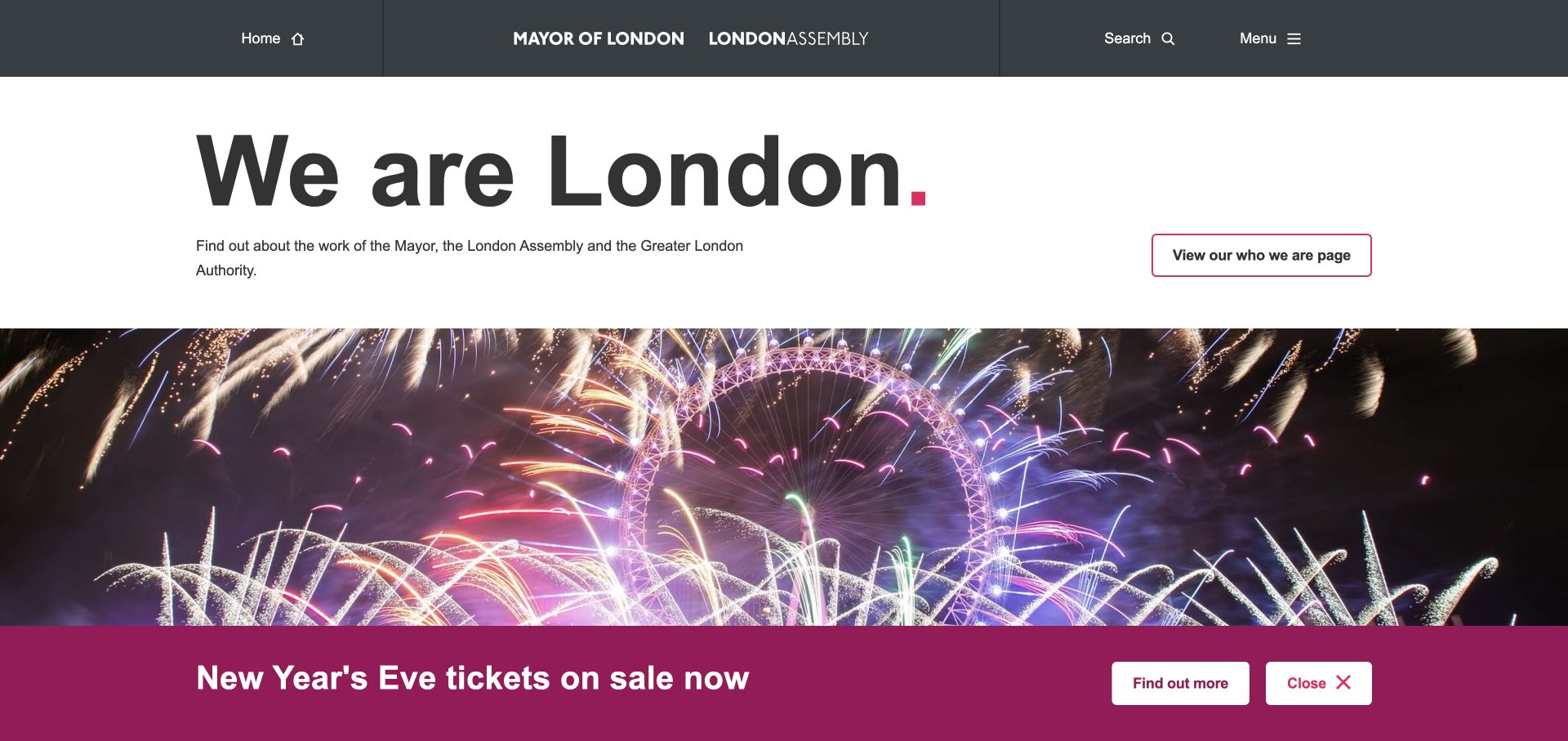
London City Hall leads with a large civic introduction, a short explanation of the organizations represented, and a named information action. A fireworks photograph and event-ticket announcement follow beneath. The two sections have different purposes: institutional orientation and a time-sensitive event route. The source audit recorded reCAPTCHA on this property, but no ticket request, public consultation, account, or contact form was submitted during this review.
What you can learn
Keep public information available independently of a transactional event workflow. If a ticket or participation form needs verification, explain the relevant step, retain selections through recoverable failures, and make it clear whether the request was received before encouraging another attempt.
Pros
The institutional explanation uses a clean white background that remains distinct from the more visually energetic event photograph and announcement.
The event bar includes a clear action and dismissal control, giving a temporary campaign its own recognizable interaction area.
Cons & considerations
A persistent promotional bar can obscure lower content on short screens unless its dimensions and keyboard behavior are tested alongside other notices.
A detected script does not establish how a separate ticket vendor or civic participation form verifies users or handles duplicate requests.
Public source checked November 3, 2026. References may be embedded or legacy—not a complete backend inventory.
Platform source: Exact public source-page audit. The public source-page audit on 2026-11-03 recorded linked script matches recaptcha for this exact property. This is a public resource reference, not a test of every user journey, a complete backend inventory, or a claim that every visible element uses reCAPTCHA. Platform evidence is separate from the direct website screenshot and is not a complete current infrastructure audit.
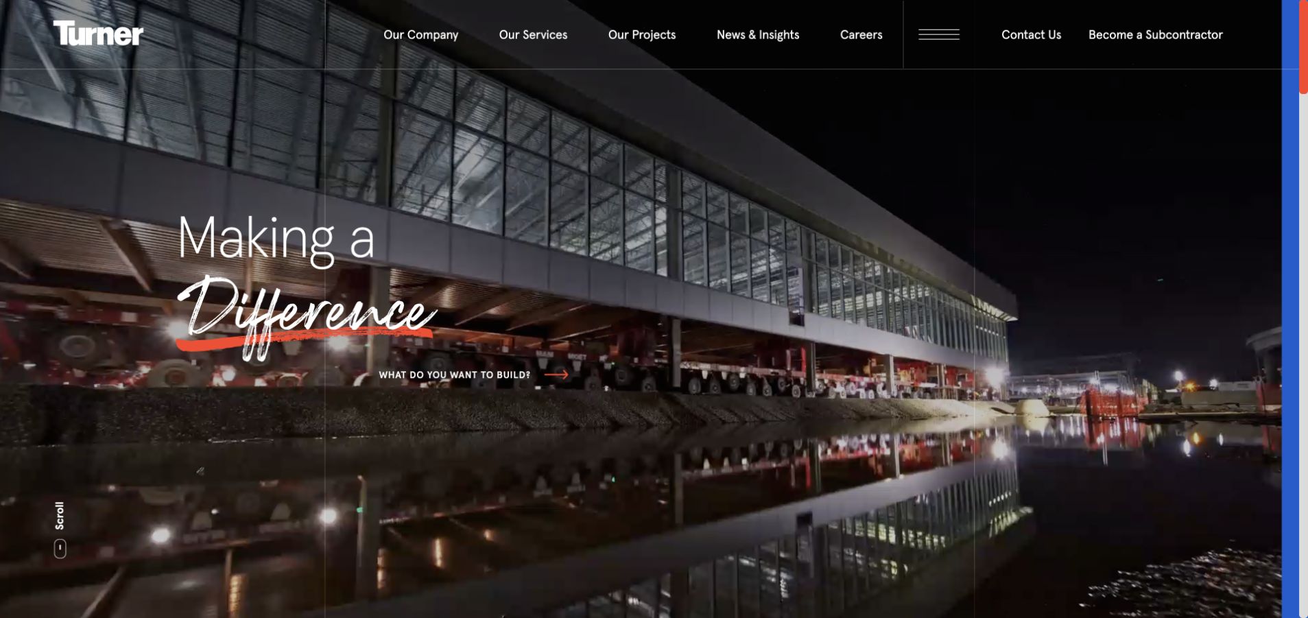
Turner fills the opening with a large nighttime project image and a brief brand statement. The header separates services, projects, news, careers, general contact, and subcontractor entry. Those labels reveal several different reasons someone might reach the site. The reCAPTCHA audit is scoped to this public source page; it does not demonstrate the submission behavior of any careers platform, supplier system, or project inquiry form linked from it.
What you can learn
Treat project inquiries, employment applications, and supplier registration as separate workflows with their data and confirmation requirements. Place any verification at a boundary and preserve the visitor's selected topic when a recoverable error interrupts their request.
Pros
Contact and subcontractor routes are explicitly named, helping prospective partners avoid a generic inquiry path that might reach the wrong team.
The large project photograph communicates the firm's field of work while navigation provides access to more concrete service and project evidence.
Cons & considerations
Thin white navigation over dark imagery still needs contrast and target-size checks across changing project media and narrower screen layouts.
The presence of reCAPTCHA does not reveal whether every linked form uses it or establish that any submitted inquiry reaches the intended team.
Public source checked November 3, 2026. References may be embedded or legacy—not a complete backend inventory.
Platform source: Exact public source-page audit. The public source-page audit on 2026-11-03 recorded linked script matches recaptcha for this exact property. This is a public resource reference, not a test of every user journey, a complete backend inventory, or a claim that every visible element uses reCAPTCHA. Platform evidence is separate from the direct website screenshot and is not a complete current infrastructure audit.
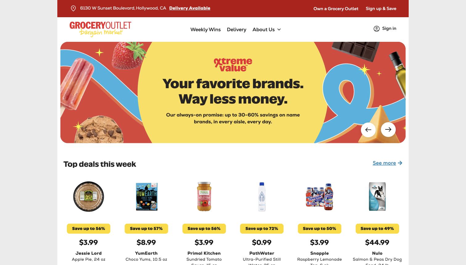
Grocery Outlet places the current store address and delivery availability in a red strip above the navigation. A bright value campaign leads into individual weekly deal cards with product imagery and prices. Sign-in is visible but secondary to local shopping information. The audited reCAPTCHA reference belongs to this exact page; it does not prove protection of an account, delivery provider, store-ownership application, or promotional signup that was not exercised.
What you can learn
Maintain store context through any protected signup or account action. Explain whether an error affected only verification or the request, and preserve the selected store so customers do not return to another location’s offers.
Pros
The store address is established before the promotion, giving the visible deals a clearer local context than an unqualified national offer page.
A straightforward deal grid provides practical shopping information immediately below the campaign, rather than requiring account creation to understand the page.
Cons & considerations
Local inventory, offers, and delivery messages need their own freshness controls; a security integration does not keep promotional details accurate.
If account or signup interfaces appear as overlays, their verification feedback must remain visible without concealing the store context or selected offer.
Public source checked November 3, 2026. References may be embedded or legacy—not a complete backend inventory.
Platform source: Exact public source-page audit. The public source-page audit on 2026-11-04 recorded linked script matches recaptcha for this exact property. This is a public resource reference, not a test of every user journey, a complete backend inventory, or a claim that every visible element uses reCAPTCHA. Platform evidence is separate from the direct website screenshot and is not a complete current infrastructure audit.
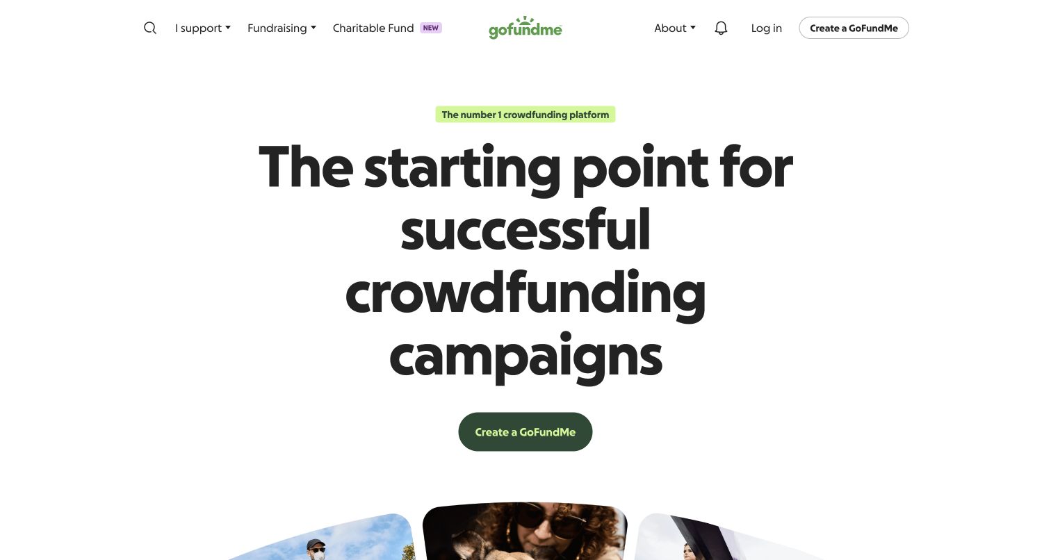
GoFundMe uses a very large centered fundraising statement, restrained green accents, and a single prominent creation action. Search, browsing, login, and an additional creation button stay in the header. The opening reduces the first decision to beginning a campaign or exploring existing content. The reCAPTCHA reference comes from the public page audit; no fundraiser, account, donation, or server assessment was created or tested, and promotional claims are not independently adopted here.
What you can learn
Define what the first creation action does and when a fundraiser becomes public. Verification errors should preserve draft details and state whether anything was saved, while a completed submission should receive an authoritative receipt.
Pros
The principal creation action is easy to find because it has ample space and very little competing content around the central statement.
Browsing and login remain separate header routes for people who are not ready to start a new campaign from this page.
Cons & considerations
A broad promise about successful fundraising needs supporting context; interface clarity alone cannot establish campaign outcomes or the validity of particular appeals.
A frontend reference cannot verify identity checks, fraud review, payment controls, or the protection of campaign and donation steps.
Public source checked November 3, 2026. References may be embedded or legacy—not a complete backend inventory.
Platform source: Exact public source-page audit. The public source-page audit on 2026-11-03 recorded linked script matches recaptcha for this exact property. This is a public resource reference, not a test of every user journey, a complete backend inventory, or a claim that every visible element uses reCAPTCHA. Platform evidence is separate from the direct website screenshot and is not a complete current infrastructure audit.
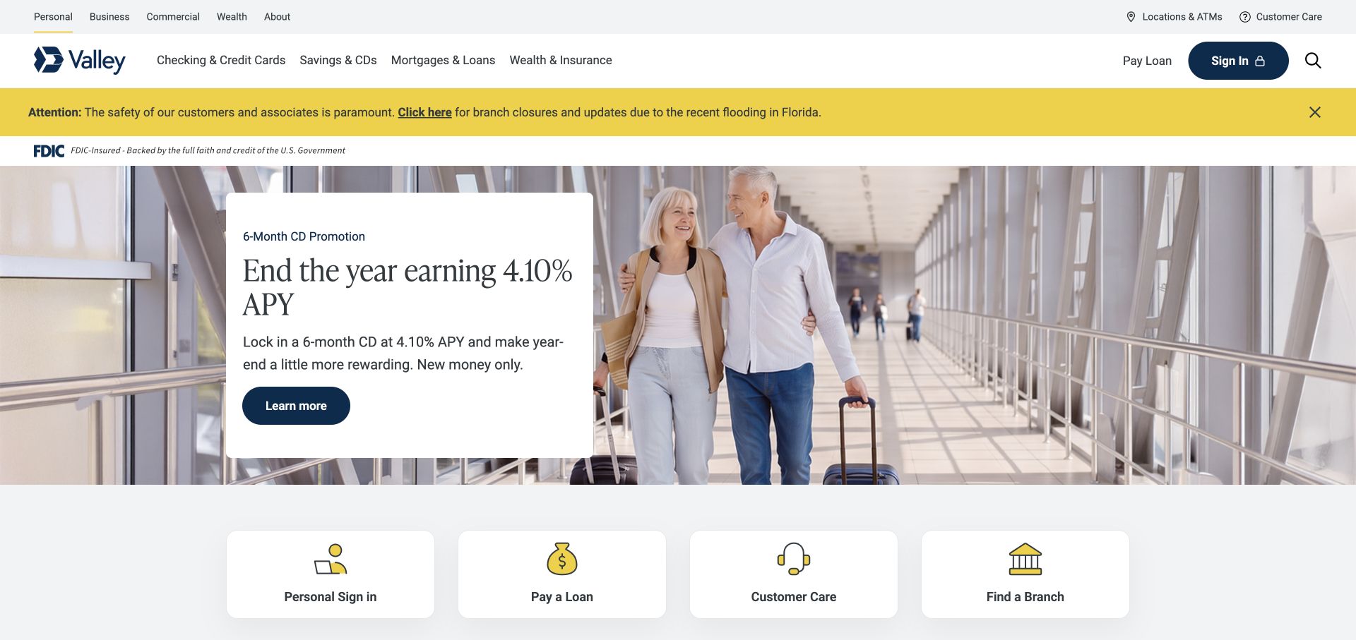
Valley Bank places audience navigation and sign-in above a conspicuous service notice, then presents a product offer on a white card over photography. Four task shortcuts below support sign-in, loan payment, customer care, and branch discovery. The pattern keeps customer service visible beside acquisition content. The reCAPTCHA observation concerns the public page only; it does not evaluate banking security, transaction controls, or the behavior of an authenticated session.
What you can learn
Keep verification feedback within the relevant account or inquiry flow and preserve a clear path back to customer care. Distinguish a blocked attempt from a completed request, especially when a visitor might otherwise repeat an action with financial consequences.
Pros
Customer care and branch discovery have explicit destinations below the hero, offering practical alternatives to the featured product promotion.
The white promotional card isolates important text from the photograph, while the separate service notice receives a clear attention treatment above it.
Cons & considerations
Many header and notice layers consume vertical space, so smaller screens need to prioritize urgent information and existing-customer tasks carefully.
A reCAPTCHA reference cannot establish fraud prevention, banking authentication quality, or whether a payment was accepted; those require separate authoritative verification.
Public source checked November 3, 2026. References may be embedded or legacy—not a complete backend inventory.
Platform source: Exact public source-page audit. The public source-page audit on 2026-11-03 recorded linked script matches recaptcha for this exact property. This is a public resource reference, not a test of every user journey, a complete backend inventory, or a claim that every visible element uses reCAPTCHA. Platform evidence is separate from the direct website screenshot and is not a complete current infrastructure audit.
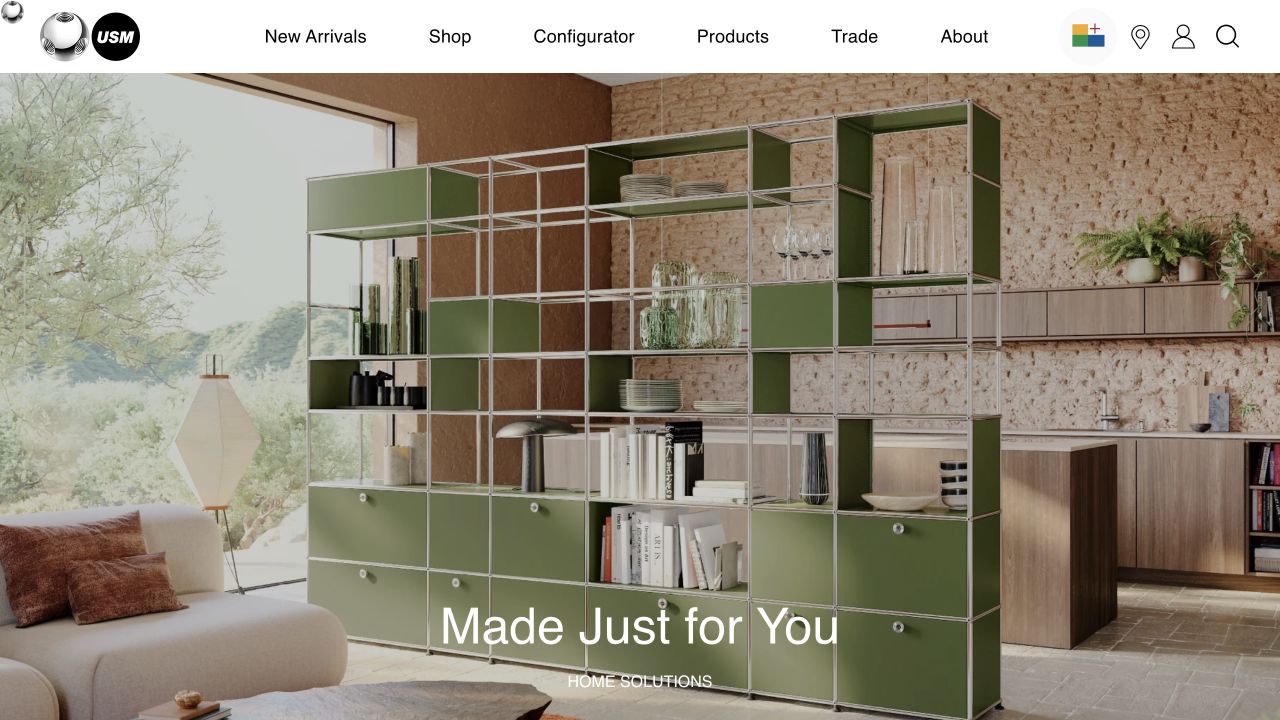
USM opens with a large interior photograph showing its modular furniture and a short home-solutions message near the bottom. The white header includes separate routes for shopping, a configurator, products, and trade visitors. This distinction matters when planning protected interactions: browsing an arrangement and submitting a saved design or inquiry are different tasks. The reCAPTCHA audit establishes a resource reference, without testing the configurator, account, checkout, or any associated form.
What you can learn
Define when a configuration is only local, when it is saved, and when it becomes an inquiry or order. If verification fails at a handoff, retain the configuration and give a recovery action that avoids duplicate requests.
Pros
The dedicated configurator label tells visitors there is a more tailored route beyond ordinary product browsing and the general shopping destination.
A large contextual photograph shows the system in a room, making the brief opening message easier to interpret without a dense explanation.
Cons & considerations
A minimal hero supplies little practical detail, so dimensions, rules, and assistance should be easy to reach next.
Public script evidence does not reveal whether configuration data, trade inquiries, or checkout operations use the same validation service or recovery behavior.
Public source checked November 3, 2026. References may be embedded or legacy—not a complete backend inventory.
Platform source: Exact public source-page audit. The public source-page audit on 2026-11-03 recorded linked script matches recaptcha for this exact property. This is a public resource reference, not a test of every user journey, a complete backend inventory, or a claim that every visible element uses reCAPTCHA. Platform evidence is separate from the direct website screenshot and is not a complete current infrastructure audit.
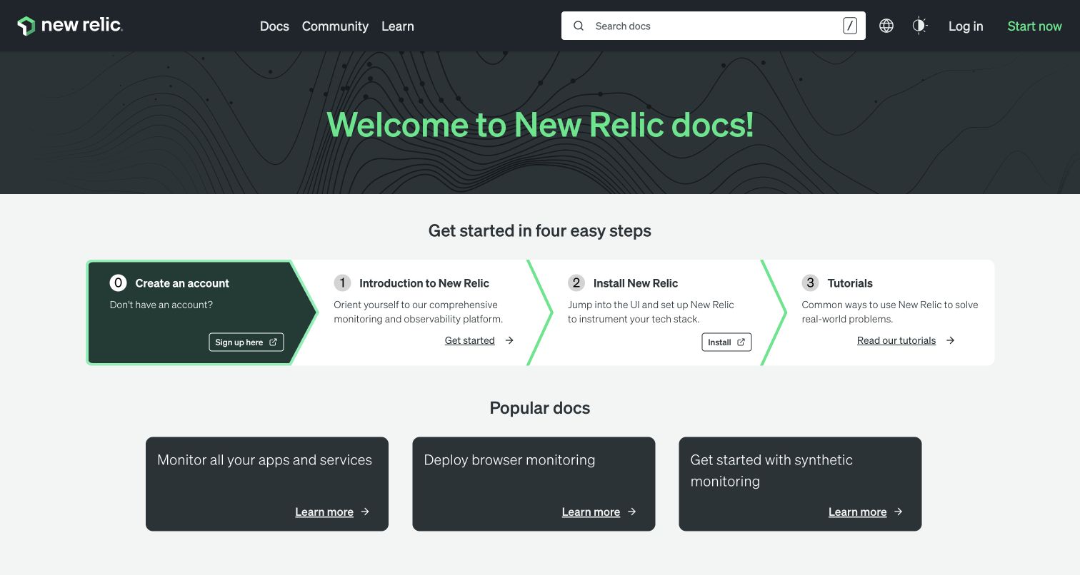
New Relic's documentation home shows a prominent search field, a welcome heading, and four starting steps. Account creation appears as the first step, but introductions, installation guidance, tutorials, and popular documents also have visible routes. The public source audit recorded reCAPTCHA. That observation does not identify whether search, feedback, registration, or another embedded feature invokes it, and the review did not submit a form or trigger a protected operation.
What you can learn
Keep documentation readable when optional account or feedback services fail. For a protected contribution or signup, distinguish missing input from expired verification and preserve the article or task context.
Pros
Search offers a direct path for experienced users, while the numbered introduction supports people who need orientation before choosing specific documentation.
Several practical content routes remain visible beside account creation, preventing the opening from reading as a mandatory signup wall for every visitor.
Cons & considerations
A four-step horizontal layout needs a mobile sequence so account creation does not obscure the freely readable information available after it.
The script reference alone cannot establish whether registration is protected, whether a challenge appears, or how the server responds to an invalid token.
Public source checked November 3, 2026. References may be embedded or legacy—not a complete backend inventory.
Platform source: Exact public source-page audit. The public source-page audit on 2026-11-03 recorded linked script matches recaptcha for this exact property. This is a public resource reference, not a test of every user journey, a complete backend inventory, or a claim that every visible element uses reCAPTCHA. Platform evidence is separate from the direct website screenshot and is not a complete current infrastructure audit.
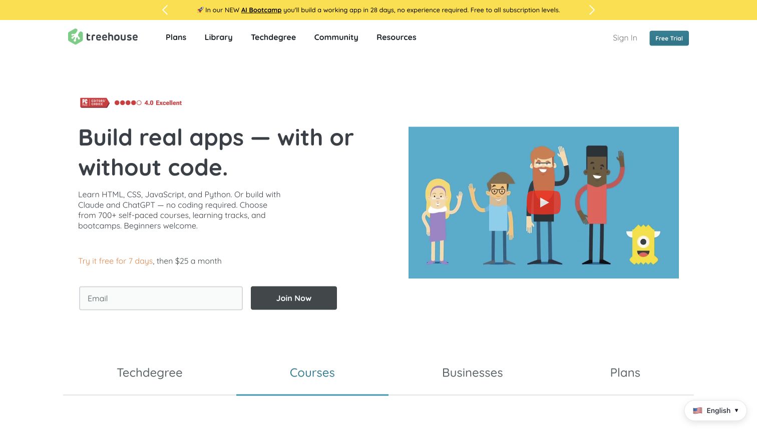
Treehouse pairs a plain-language learning promise and course description with a video illustration. A short trial statement leads to a single email field and join button, while plans, library, community, and resources remain in the header. The design makes the account entrance visible without filling the screen with a long form. The audit recorded reCAPTCHA on this public page; no trial, subscription, account, or verification challenge was initiated.
What you can learn
Define whether email starts a draft, creates an account, or begins a trial. Give each outcome distinct copy, preserve the address after a recoverable failure, and separate verification feedback from billing and eligibility information.
Pros
The brief form sits beside an explanation of the learning offer, so visitors can understand the purpose before entering an address.
Plan and library routes remain visible for people who want to inspect the curriculum or subscription details before beginning the signup sequence.
Cons & considerations
Trial and recurring-price details need a readable relationship to the action; a security notice should not displace that practical subscription context.
A resource reference cannot demonstrate the protection of enrollment, payment, or course-access operations that occur after the initial public signup entrance.
Public source checked November 3, 2026. References may be embedded or legacy—not a complete backend inventory.
Platform source: Exact public source-page audit. The public source-page audit on 2026-11-04 recorded linked script matches recaptcha for this exact property. This is a public resource reference, not a test of every user journey, a complete backend inventory, or a claim that every visible element uses reCAPTCHA. Platform evidence is separate from the direct website screenshot and is not a complete current infrastructure audit.
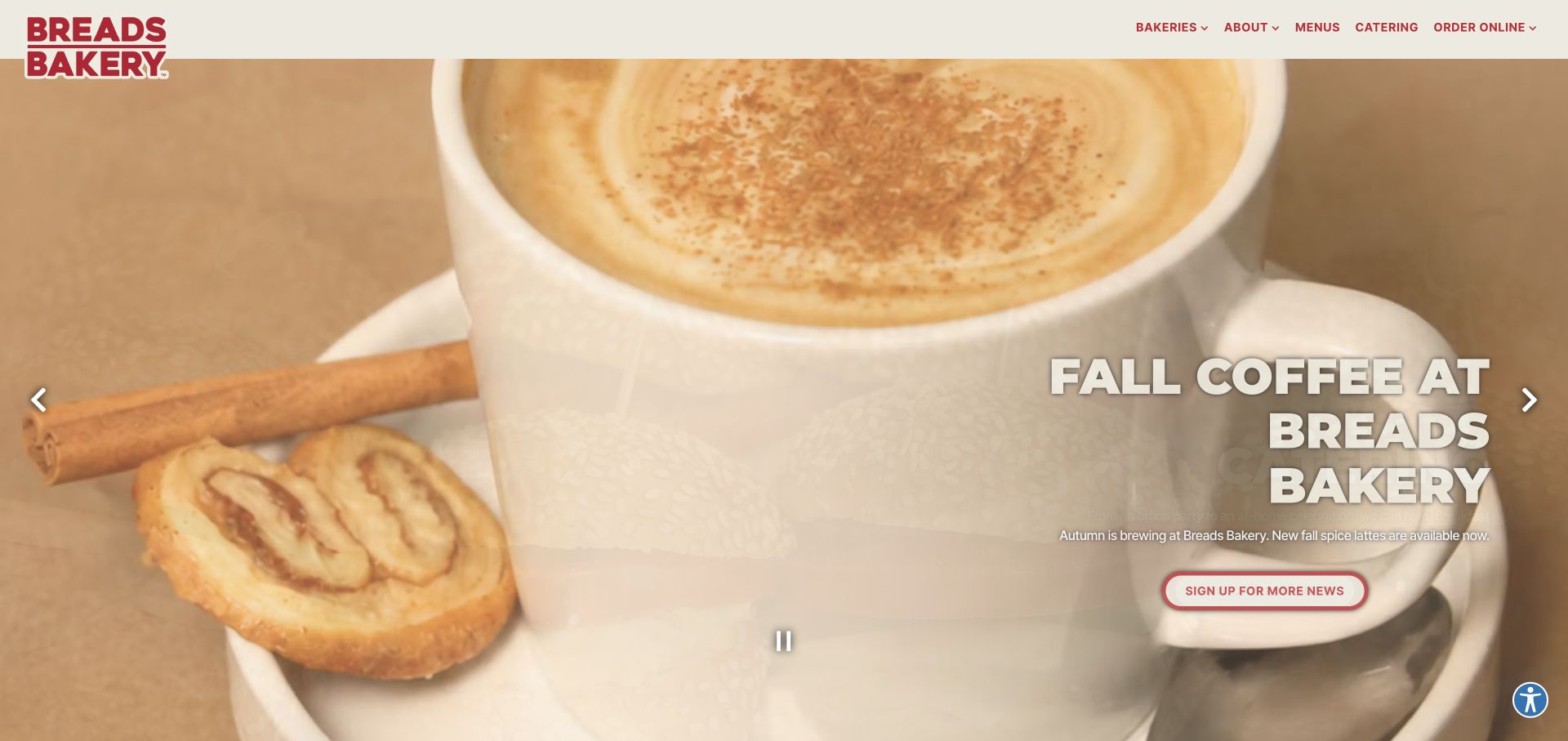
Breads Bakery uses a close food photograph, a large seasonal heading, and a small newsletter action in the hero. The header keeps bakery locations, menus, catering, and online ordering visible. This gives visitors several distinct tasks beyond receiving promotions. The public audit recorded reCAPTCHA, but the screenshot does not show a challenge or establish which newsletter, catering, ordering, or contact action uses the integration. No form was submitted during review.
What you can learn
Separate newsletter signup from catering and ordering so each has a confirmation and retry policy. Retain the visitor's address or inquiry after a recoverable verification error, and make clear whether submission succeeded before inviting another attempt.
Pros
Locations, menus, and ordering are named directly in the header, supporting visitors with an immediate practical need rather than only campaign interest.
The newsletter action is visually subordinate to the food presentation, preserving the homepage's browsing character instead of opening with a full signup form.
Cons & considerations
White supporting text over light food photography need stronger contrast checks than the large shadowed seasonal title.
A script reference cannot establish which external ordering or email platform handles the request, nor whether its protection and confirmation work correctly.
Public source checked November 3, 2026. References may be embedded or legacy—not a complete backend inventory.
Platform source: Exact public source-page audit. The public source-page audit on 2026-11-03 recorded linked script matches recaptcha for this exact property. This is a public resource reference, not a test of every user journey, a complete backend inventory, or a claim that every visible element uses reCAPTCHA. Platform evidence is separate from the direct website screenshot and is not a complete current infrastructure audit.
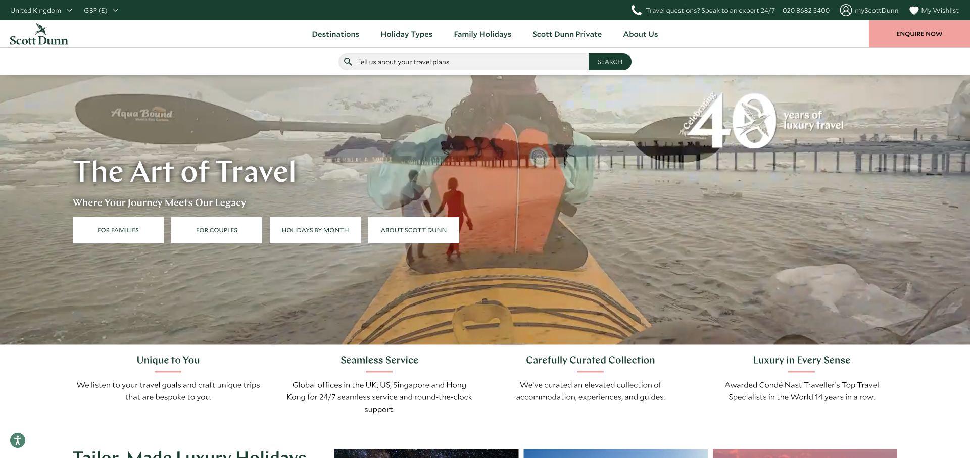
Scott Dunn combines a scenic travel montage with destination, holiday-type, and family routes. A broad search control and a contrasting inquiry button sit above the hero, while four audience-oriented actions appear over the image. The result offers both browsing and human assistance. The exact-page audit includes reCAPTCHA, but no travel inquiry, wishlist, account, or search request was submitted, and the capture does not reveal assessment or challenge behavior.
What you can learn
Keep destination and travel-party context attached to an inquiry as it moves between browsing and forms. Verification should fail with an explanation and preserve drafts; a timeout is not proof that an advisor received the request.
Pros
A distinct inquiry button offers a clear route to assistance without removing destination and holiday-type browsing from the primary navigation.
The audience actions provide several useful starting points for visitors who have a trip style in mind but no exact destination yet.
Cons & considerations
A layered header and several hero actions can be demanding on phones, so priority and reading order need deliberate testing.
The presence of reCAPTCHA does not establish that an inquiry reaches an advisor or that linked account and booking services use the same controls.
Public source checked November 3, 2026. References may be embedded or legacy—not a complete backend inventory.
Platform source: Exact public source-page audit. The public source-page audit on 2026-11-03 recorded linked script matches recaptcha for this exact property. This is a public resource reference, not a test of every user journey, a complete backend inventory, or a claim that every visible element uses reCAPTCHA. Platform evidence is separate from the direct website screenshot and is not a complete current infrastructure audit.
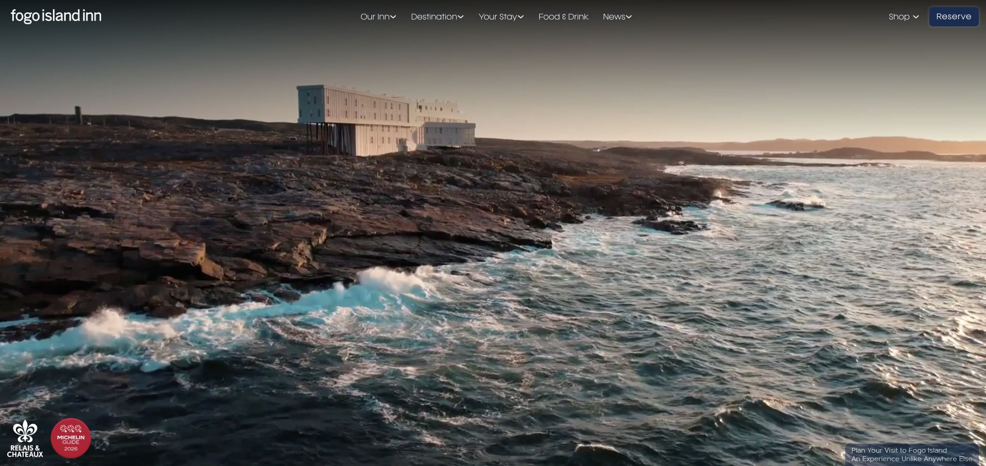
Fogo Island Inn lets a coastal scene occupy nearly the entire opening. Navigation groups the inn, destination, stay, food, and news, while the reservation button remains at the upper right. Small affiliation marks and a discreet visit message occupy the lower corners. The page's restraint highlights the distinction between public inspiration and a booking workflow. The reCAPTCHA reference is from the exact source audit, without a reservation or inquiry submission.
What you can learn
Preserve dates, guest counts, and room selection when a protected booking handoff encounters an error. Explain whether a reservation exists before suggesting another attempt, and keep human assistance available when verification cannot be completed on their device.
Pros
The clearly named reservation action remains visible while the expansive photograph communicates the property's distinctive setting and architectural character.
Navigation separates destination information from stay details, supporting both early research and visitors ready to investigate practical arrangements for their trip.
Cons & considerations
A text-free opening may need more immediate context for unfamiliar visitors who do not recognize the property or its location.
The homepage resource reference cannot establish the controls used by a separate reservation engine or verify availability, payment handling, or confirmed booking status.
Public source checked November 3, 2026. References may be embedded or legacy—not a complete backend inventory.
Platform source: Exact public source-page audit. The public source-page audit on 2026-11-03 recorded linked script matches recaptcha for this exact property. This is a public resource reference, not a test of every user journey, a complete backend inventory, or a claim that every visible element uses reCAPTCHA. Platform evidence is separate from the direct website screenshot and is not a complete current infrastructure audit.
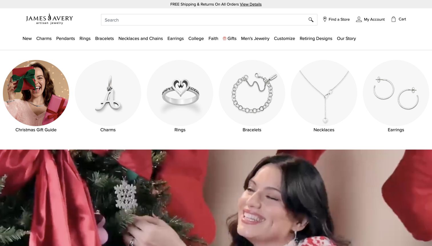
James Avery places a wide search field and practical store, account, and cart links above a detailed category row. Circular product-category images offer another browsing route before the seasonal campaign begins. The opening favors catalog discovery over an immediate account prompt. The source audit recorded reCAPTCHA on this page, but no account, customization request, purchase, or marketing form was submitted; the observed integration does not establish protection across those separate workflows.
What you can learn
Keep browsing, customization, and checkout as separate states in the interaction design. If verification interrupts a saved design or inquiry, retain product options, then state whether anything was submitted before offering a retry or assistance.
Pros
The large search field and illustrated categories support visitors who know a product type without requiring them to interpret the seasonal campaign.
Store and account access are plainly labeled in the header, giving repeat customers practical routes alongside new-product and gifting discovery.
Cons & considerations
The long category row needs a considered mobile navigation system; shrinking labels would make browsing and later error recovery difficult.
A public resource reference does not show whether third-party checkout, store assistance, or customization tools validate responses or prevent duplicate submissions.
Public source checked November 3, 2026. References may be embedded or legacy—not a complete backend inventory.
Platform source: Exact public source-page audit. The public source-page audit on 2026-11-04 recorded linked script matches recaptcha for this exact property. This is a public resource reference, not a test of every user journey, a complete backend inventory, or a claim that every visible element uses reCAPTCHA. Platform evidence is separate from the direct website screenshot and is not a complete current infrastructure audit.
Choose a verification flow that fits the application
Start with a bounded public form
For an inquiry or newsletter form, document required fields, validation, verification, submission, and receipt. Keep these stages distinguishable in the interface and support logs. A simple form still needs clear handling for an expired response, unavailable network, duplicate click, and a result that arrives after the visitor has moved on.
Handle visible widget states explicitly
For a reCAPTCHA v2 widget implementation, Google documents explicit rendering plus expiration and error callbacks. Connect those states to readable feedback near the form, keep focus behavior predictable, and test the configured language and size. Do not assume those widget details describe every property in this collection.
Treat account and transaction flows as separate systems
A signup, booking, or checkout requires a broader state model than a contact form. Identify the point at which a record or charge can be created. Reconcile the authoritative outcome after a timeout before retrying, and preserve a support route for people who cannot finish verification on their current device.
From references to requirements
Plan verification with the whole submission lifecycle
Write the state model before visual styling
Define empty, editing, invalid, verifying, submitting, completed, rejected, and uncertain states. Give each a user-facing explanation and a safe next action. Map those states to actual server responses so a successful animation cannot appear merely because a client-side callback ran.
Test failures in an authorized test environment
Use test configurations and nonproduction endpoints. Exercise missing responses, expired tokens, unavailable dependencies, repeated clicks, and server errors. Confirm that drafts survive recoverable failures and that retrying cannot create duplicate business records. Do not perform unrequested real submissions on the example websites.
Maintain an operational feedback loop
Record enough diagnostic context to distinguish verification failure from application failure without collecting unnecessary form content. Assign responsibility for configuration, accessible recovery, support instructions, and provider changes. Revisit the flow when a new form or external destination is introduced, rather than assuming a site-wide script covers it.
A useful handover demonstration
Ask the actual team to carry out its routine job: publish a realistic update, correct a mistake, preview a narrow screen, and identify who owns an integration failure. For a library or frontend framework, also ask who maintains the content source and deployment. A polished screenshot does not answer those operational questions.
Beyond the screenshot
Before releasing a reCAPTCHA-protected action
Name the specific action and the server operation it can create.
Confirm the applicable product configuration and supported integration documentation.
Implement server verification before accepting the protected operation.
Test expiration, network errors, duplicate clicks, and uncertain outcomes.
Preserve appropriate draft input and selected context after recoverable failure.
Keep status, errors, focus, and recovery understandable with a keyboard and on phones.
Provide an authoritative completion state and a practical support route.
Assign configuration, monitoring, support, and maintenance ownership.
Test with real content, a keyboard, a small screen, slow or failed requests, and the people who will maintain the system. These are planning checks, not an accessibility, security, performance, or search-ranking certification.
Sources & editorial method
How this reCAPTCHA collection was reviewed
Authored November 4, 2026 from genuine saved screenshots, each visually inspected with its original capture date and attribution retained. Inclusion uses a reCAPTCHA public resource reference on the exact named property, preserving the original audit timestamp and fingerprint provenance. No real forms were submitted, and no authenticated, payment, reservation, or security testing occurred. Public references do not establish server enforcement, product version, challenge accessibility, or resistance to abuse.
Every image is an unmodified capture from the actual website, with its source and capture date. Some captures are reused from our shared catalog; their dates remain the original capture dates. None comes from a vendor gallery or a generated reconstruction. Moving imagery and live content can change.
Technology attribution uses public page assets or metadata, official platform documentation, or a cited first-party project case study. Documentary and framework-relationship evidence is identified where used; it is not a complete current backend inventory. A CMS image CDN alone does not establish a full CMS deployment. A library’s presence does not prove which individual controls use it, and a platform label does not establish AI authorship.
The composition notes, lessons, pros and tradeoffs are original editorial observations. We have not measured conversion, traffic, security, performance or accessibility conformance. Website owners retain their brands and imagery; these examples are not our client portfolio. Written, Edited and Curated are independent records, not dates advanced by a build. See our editorial standards or suggest a correction.
Questions worth asking
reCAPTCHA website development FAQs
Does a reCAPTCHA script prove a form is protected?
No. A frontend reference establishes only that the public page includes or references the resource. Server verification, action binding, application behavior, and the actual submission outcome require separate implementation evidence and authorized testing.
What happens when a response expires?
The integration should explain that verification needs to be completed again while preserving appropriate draft context. Google’s server documentation describes a two-minute, single-use response token. The application must handle expiration deliberately rather than treating an old response as a fresh one.
Should a timeout automatically trigger another submission?
Only after the application has established that the earlier operation did not complete and that retrying is safe. A missing confirmation is uncertain. Check the authoritative record or operation status before creating another account, booking, message, or payment.
Are all examples using the same reCAPTCHA version?
The collection does not make that claim. Exact public resource evidence is retained for each example, but a general reference may not establish the version, challenge type, assessment policy, or coverage of every action on the property.