Definitive guide · jQuery Migrate website development
jQuery Migrate website examples and compatibility planning (20 Real-World Examples)
Twenty public websites with dated jQuery Migrate references, genuine screenshots, and original lessons for preserving useful journeys during an upgrade.
Compatibility work begins with the experience people need to keep using. These references show editorial sequences, location finding, practical service links, and product discovery on pages that reference jQuery Migrate.
jQuery Migrate is an upgrade aid for jQuery code. The official project describes compatibility support for removed APIs and diagnostic warnings in its development build. Its version must match the relevant jQuery generation. A public script reference does not show whether a particular component uses a deprecated API or still needs the compatibility layer.
This collection therefore examines visible design and content decisions separately from the script association. The original capture and observation dates remain attached to each property. The useful question is what a modernization project must preserve: recognizable links, understandable state, permanent content identity, and a coherent path when enhancement fails.
Before the examples
What makes good jQuery Migrate website development in 2026?
Inventory dependencies before removing the bridge
In your own source, identify the actual jQuery generation, Migrate version, plugins, and custom code. Use the matching official guidance and test in a controlled environment. The presence of a compatibility script on an unrelated public page is neither a recommendation for that version nor proof that it can safely be removed.
The development build provides diagnostic warnings; the minified production build has different diagnostic behavior. Follow warnings to the responsible code and verify the relevant journey after a change. An absence of visible errors in one homepage screenshot cannot establish compatibility across an application.
Keep content identity independent from enhancement
Articles, products, exhibitions, and service records need useful destinations even when their promotional components change. Preserve links and relationships before replacing a carousel, menu, or filter. Use the official upgrade guide for your chosen generation alongside an editorial route inventory.
Disney Experiences, Spotify’s For the Record, UC Berkeley, the United Nations, and the Guggenheim open this collection. They are specific public properties with exact script-reference evidence, not claims about every service operated by those organizations.
We start with five recognizable brands or organizations: Disney Experiences, Spotify — For the Record, University of California, Berkeley, United Nations, Solomon R. Guggenheim Museum. Each attribution applies to the named website property, not every product or website belonging to its organization. This is a curated reading sequence, not a measured ranking.
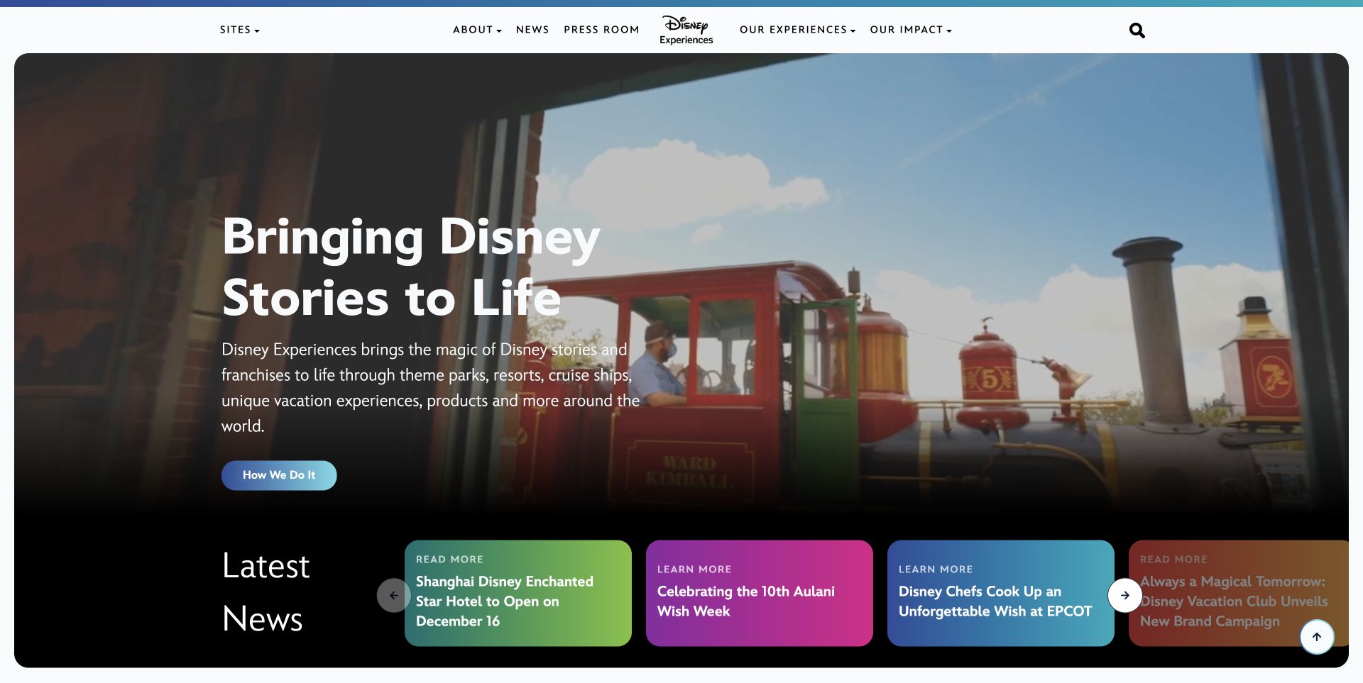
Disney Experiences places a concise portfolio message over a theme-park photograph, then gives current stories a colorful strip along the bottom. The compact navigation keeps the corporate overview, press room, experiences, and impact material separate. This is a useful compatibility reference because an established publishing property can accumulate several generations of navigation and promotional components. Its dated source audit references jQuery Migrate; that finding identifies a compatibility script, not the code responsible for the photographed hero or news strip. The capture also represents the current destination of the former Disney Connect address.
What you can learn
For a similar migration, write down the journeys that must survive before changing dependencies: a press-room visit, an old article link, portfolio browsing, and the featured-story controls. Preserve meaningful destinations and editorial relationships while testing both enhanced and ordinary link behavior. A successful library update should leave readers able to recognize where they have arrived.
Pros
The portfolio introduction has a clear visual relationship to the featured stories.
Permanent navigation remains distinct from the changing news selection.
Cons & considerations
Several compact story cards can become crowded when headlines expand.
Historic corporate names require deliberate redirects and clear destination identity.
Platform source: Dated public page and linked-resource audit. Linked script matches jQuery Migrate. Dated public script reference only. A reference does not prove that any particular visible component depends on Migrate, initializes successfully, or requires its compatibility behavior. Platform evidence is separate from the direct website screenshot and is not a complete current infrastructure audit.
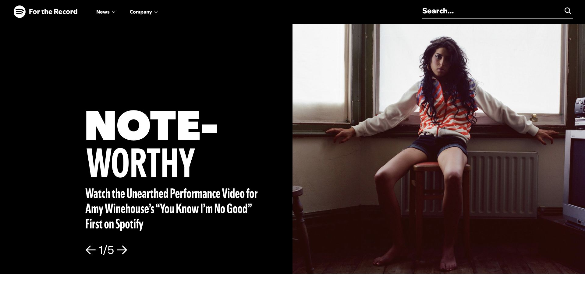
Spotify's For the Record gives one artist story a dramatic split-screen treatment: large display lettering on black beside a photograph. A visible position indicator and directional controls explain that the feature belongs to a sequence. Search occupies its own prominent area above the image, while News and Company provide ordinary navigation. The jQuery Migrate resource belongs to this newsroom's sampled public page. It does not establish anything about Spotify's listening application, accounts, or recommendation services, and it does not prove that this particular sequence needs the compatibility layer.
What you can learn
Use the design as a prompt for an editorial regression plan. Follow a story from its lead position to its permanent article, search result, and archive entry. Test long titles, keyboard entry into sequence controls, and a usable initial story when enhancement fails. Keep content identifiers independent of the component that temporarily promotes them.
Pros
Search gives readers a direct alternative to browsing the featured sequence.
The image and headline create a strong single editorial emphasis.
Cons & considerations
Large display lettering needs deliberate wrapping at narrow widths.
A rotating lead adds states that a static screenshot cannot demonstrate working.
Platform source: Dated public page and linked-resource audit. Linked script matches jQuery Migrate. Dated public script reference only. A reference does not prove that any particular visible component depends on Migrate, initializes successfully, or requires its compatibility behavior. Platform evidence is separate from the direct website screenshot and is not a complete current infrastructure audit.
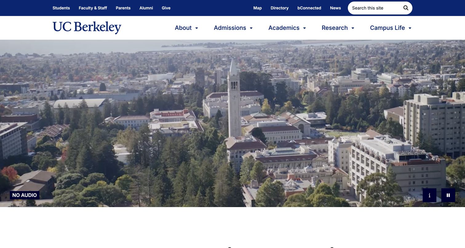
Berkeley's blue-and-gold header separates recurring audience utilities from academic navigation before a broad campus view fills the page. The captured media includes a no-audio label, an information control, and a pause button. These visible controls make the opening a useful test case when updating older front-end dependencies: stopping motion, reaching a description, and navigating away should remain understandable. The exact source page references jQuery Migrate, but the observation does not identify which campus-video or menu code uses it. The design combines institutional identity with practical routes for applicants, researchers, and existing community members.
What you can learn
Inventory these journeys separately rather than treating a visually unchanged homepage as sufficient proof after an upgrade. Verify that pause controls retain state, descriptions remain available, and audience links work without waiting for media. Test a narrow screen and a keyboard-only visit using real navigation labels before removing any temporary compatibility dependency.
Pros
Audience utilities are visibly separated from the main academic sections.
Explicit media controls acknowledge visitors who need to stop or understand the opening imagery.
Cons & considerations
The large campus view delays more specific academic information.
Multiple navigation rows create a substantial header that needs careful mobile prioritization.
Platform source: Dated public page and linked-resource audit. Linked script matches jQuery Migrate. Dated public script reference only. A reference does not prove that any particular visible component depends on Migrate, initializes successfully, or requires its compatibility behavior. Platform evidence is separate from the direct website screenshot and is not a complete current infrastructure audit.
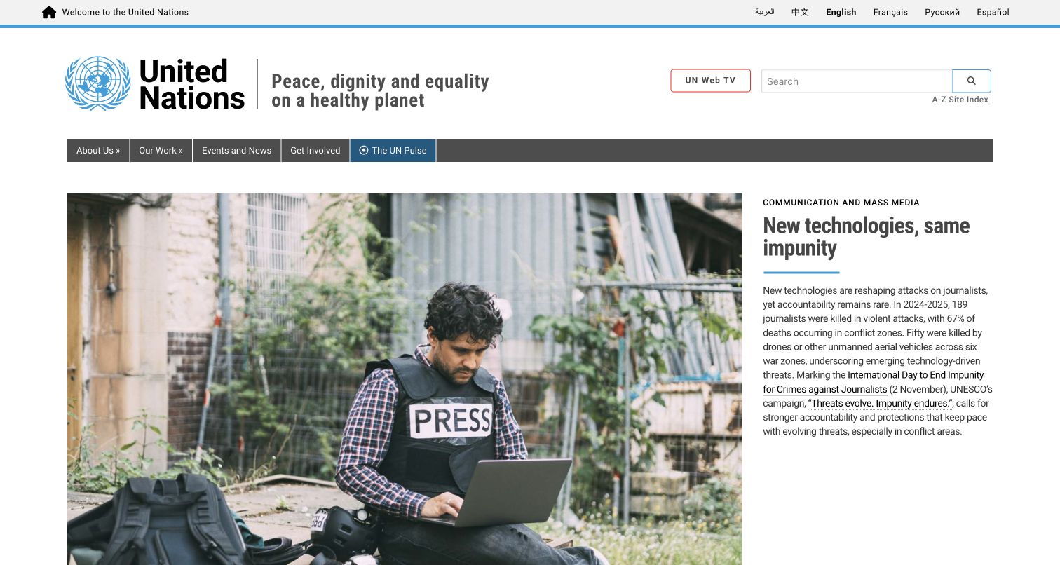
The United Nations homepage places language choices above a generous identity band, then separates its main navigation from the lead news item. A broad documentary photograph sits beside a narrower text column with a category, headline, and explanation. The hierarchy works because the institutional controls remain outside the story's visual treatment. A dated audit found a jQuery Migrate script reference on this exact English-language property. That observation is limited to the reviewed page and cannot be extended to every UN agency, language edition, or connected service.
What you can learn
For compatibility work on a similar publication, include language switching, search, navigation, and direct article entry in the same test plan. Use translated headlines of realistic length rather than short placeholders. Verify that an old enhancement does not become the only route to a story, and preserve ordinary links when components are replaced or their initialization changes.
Pros
The category and explanatory paragraph establish context beyond the headline.
Language and search controls retain a consistent role outside the editorial feature.
Cons & considerations
Large identity and navigation bands postpone the first substantive story.
The narrow text column can grow considerably with longer translations and headlines.
Platform source: Dated public page and linked-resource audit. Linked script matches jQuery Migrate. Dated public script reference only. A reference does not prove that any particular visible component depends on Migrate, initializes successfully, or requires its compatibility behavior. Platform evidence is separate from the direct website screenshot and is not a complete current infrastructure audit.
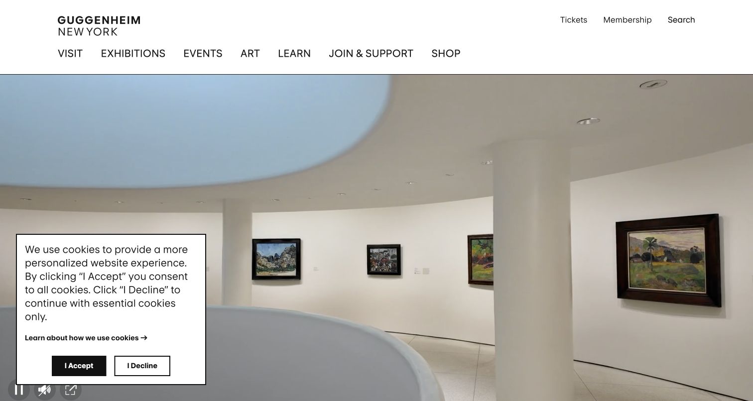
The Guggenheim's opening photograph makes the museum's interior architecture immediately recognizable. Above it, a white header keeps visiting, exhibitions, events, learning, and support routes plainly named, with ticketing and membership treated as utilities. The captured cookie panel partly covers the photograph, making the first view a useful reminder that overlays participate in the experience too. The sampled page references jQuery Migrate. That compatibility association does not establish which exhibition, consent, or navigation component depends on it, nor does it validate their interactive behavior.
What you can learn
Plan upgrade checks around a visit rather than around the hero alone. Find an exhibition, confirm its date, reach the relevant admission information, dismiss an optional panel, and return to the original context. Keep exhibition records and practical details independent from rotating imagery. Test these paths with keyboard focus visible and with delayed or unavailable media.
Pros
The building communicates place while the header preserves recognizable visitor tasks.
Tickets and membership remain distinct from the exhibition categories.
Cons & considerations
The consent panel obscures part of the first impression in the retained capture.
Image-led presentation can postpone the dates and conditions needed to plan a visit.
Platform source: Dated public page and linked-resource audit. Linked script matches jQuery Migrate. Dated public script reference only. A reference does not prove that any particular visible component depends on Migrate, initializes successfully, or requires its compatibility behavior. Platform evidence is separate from the direct website screenshot and is not a complete current infrastructure audit.
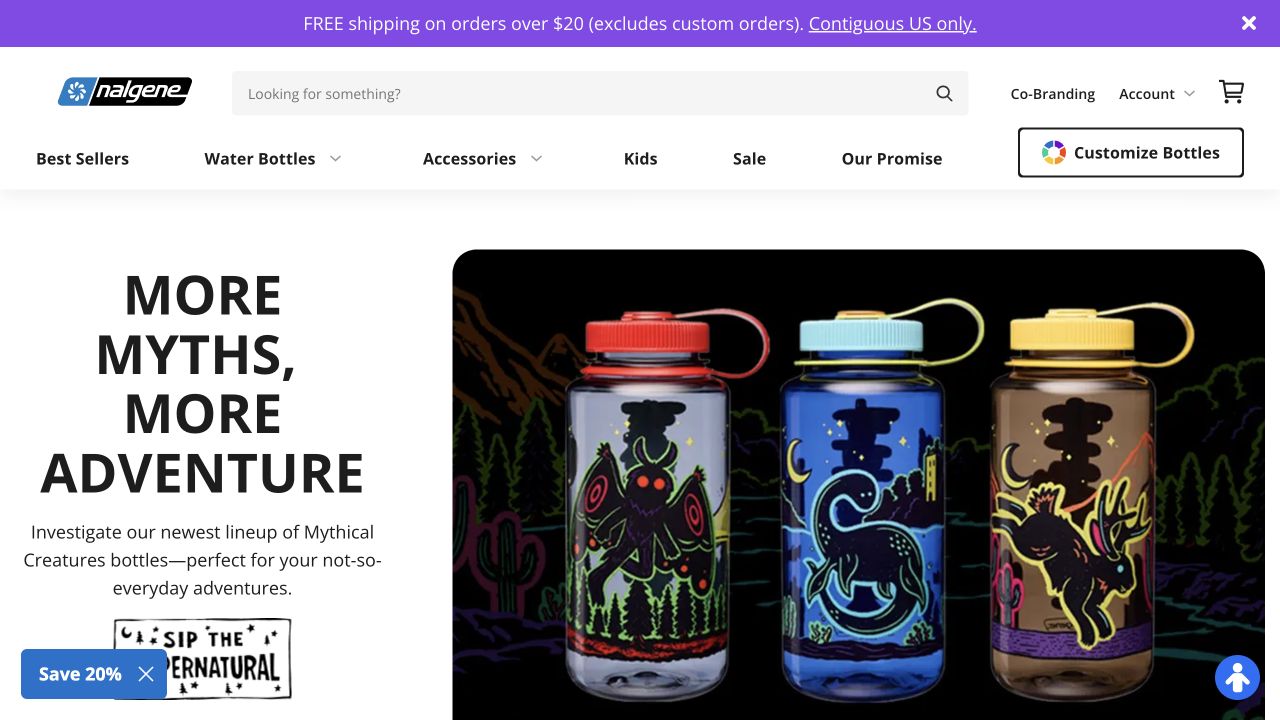
Nalgene places a substantial search field near the wordmark, with product categories beneath and a separate Customize Bottles control. The campaign shows colorful bottles against black while a shipping strip and newsletter prompt occupy smaller surfaces. The distinction between ordinary browsing and customization is especially useful during front-end maintenance: these are related journeys with different state requirements. The public source references jQuery Migrate, but that observation does not identify the technology inside the customizer or prove that any specific cart or menu behavior uses the plugin.
What you can learn
Before updating dependencies, trace a standard product visit and a customization visit independently. Record how size, artwork, and other selected options are represented, and check how users return to the catalog without losing their place. Keep search, category links, and product details understandable if an optional promotional component fails to initialize.
Pros
The large search field provides a practical alternative to browsing bottle variations.
Customization is explicitly named instead of being hidden within campaign copy.
Cons & considerations
Shipping, newsletter, and seasonal messages can compete when all expand.
A promotional hero supplies less comparison detail than a visible product listing.
Platform source: Dated public page and linked-resource audit. Linked script matches jQuery Migrate. Dated public script reference only. A reference does not prove that any particular visible component depends on Migrate, initializes successfully, or requires its compatibility behavior. Platform evidence is separate from the direct website screenshot and is not a complete current infrastructure audit.
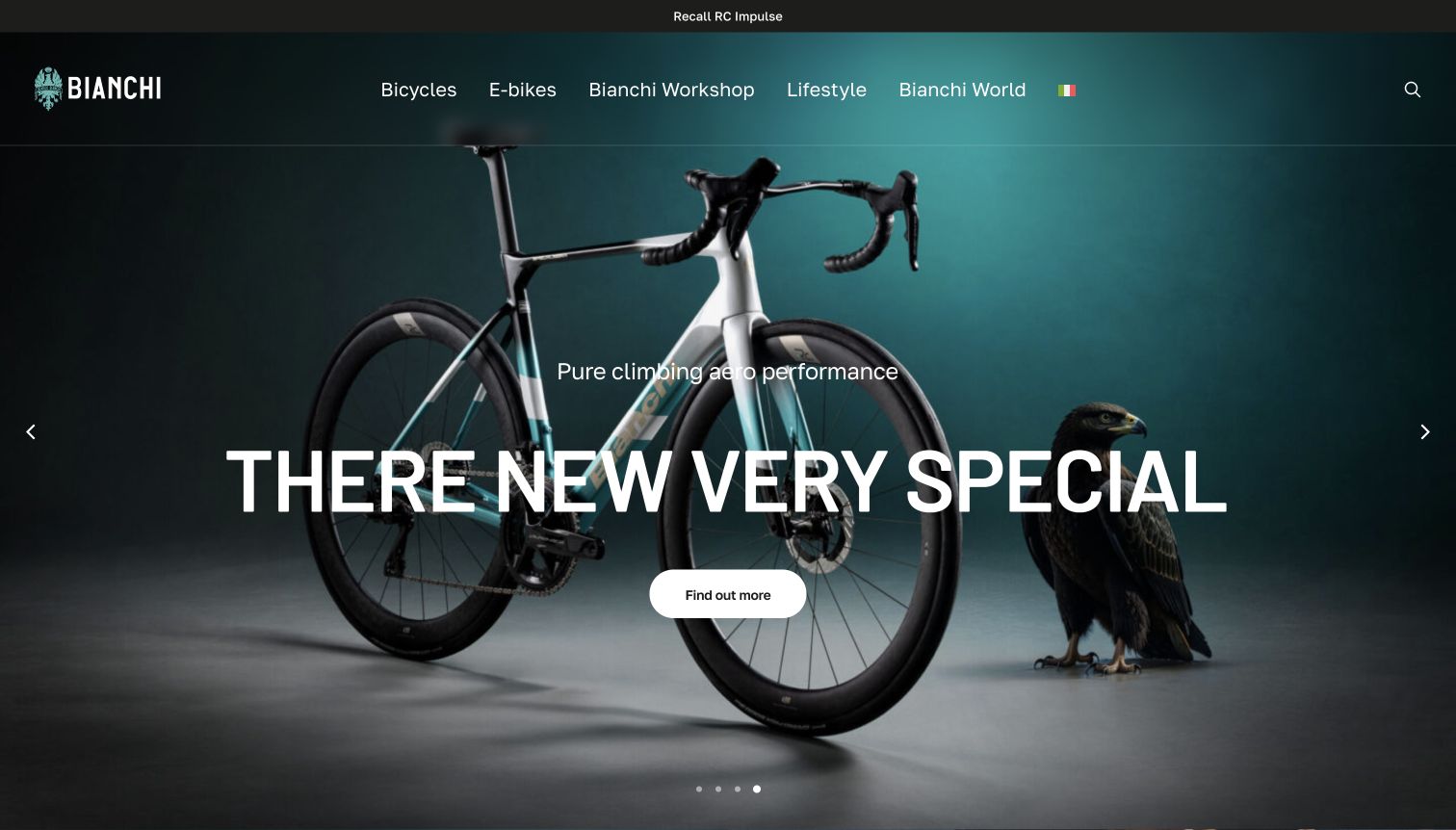
Bianchi presents a complete road bicycle against a dark teal studio background, with its wordmark and bicycle categories above. A recall link occupies the narrow strip at the very top, separate from the performance campaign. The retained capture also shows an awkward translated headline, while the underlying source navigation was Italian. That real mismatch matters more than a polished technology badge: compatibility testing should include the content that visitors actually see. The page's dated audit references jQuery Migrate without identifying the implementation of the campaign controls.
What you can learn
Use a stable model identifier and protect product names when testing translated interfaces. Follow the recall route as well as the primary product action, and check that navigation remains coherent after a carousel or language enhancement changes. A migration review should include notices and support destinations, not merely confirm that the main bicycle photograph still loads.
Pros
The full bicycle silhouette makes the product category immediately clear.
The separate recall strip keeps ownership information outside the promotional hierarchy.
Cons & considerations
The observed translation damages the meaning of the campaign heading.
Overlaid text covers parts of the frame and cockpit that shoppers may want to inspect.
Platform source: Dated public page and linked-resource audit. Linked script matches jQuery Migrate. Dated public script reference only. A reference does not prove that any particular visible component depends on Migrate, initializes successfully, or requires its compatibility behavior. Platform evidence is separate from the direct website screenshot and is not a complete current infrastructure audit.
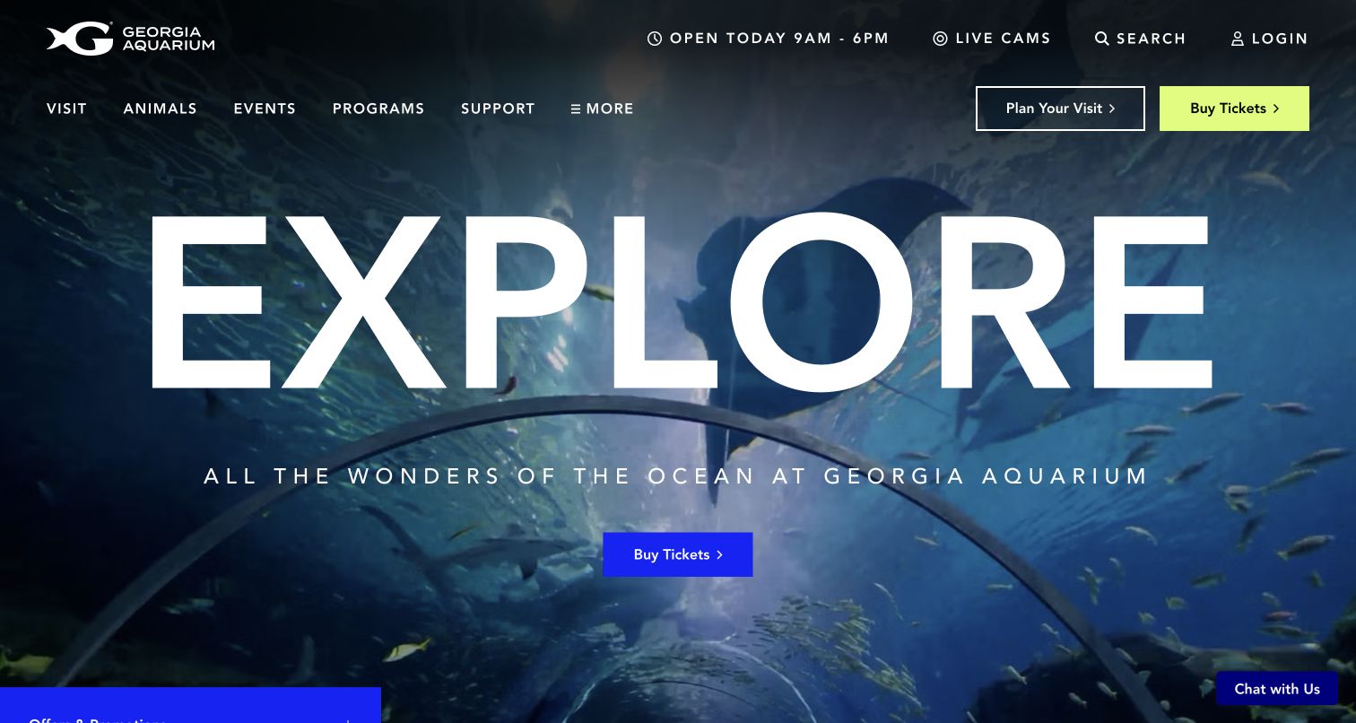
Georgia Aquarium uses an underwater tunnel photograph and an enormous Explore heading to establish the scale of a visit. The permanent header gives Plan Your Visit and Buy Tickets separate controls, alongside hours, live cameras, search, and account access. The distinction is valuable because visitors may need maps, accessibility information, or presentation schedules before choosing admission. A dated jQuery Migrate reference supports inclusion in this compatibility collection, but it does not prove that the ticket service or a particular menu uses that library.
What you can learn
Maintain separate regression paths for planning and purchase entry when changing front-end dependencies. Check that daily hours, navigation, and promotional dismissal remain available with slow scripts and on narrow screens. Keep optional offers from becoming the only way to reach an encounter or event, and verify that the main planning link preserves its meaning when campaigns change.
Pros
The paired planning and ticket actions recognize different stages of a visit decision.
Current hours and practical utilities remain visible above the large destination image.
Cons & considerations
The oversized heading leaves limited room for explanatory admission detail.
The observed expanding promotion can obscure the hero and compete with principal actions.
Platform source: Dated public page and linked-resource audit. Linked script matches jQuery Migrate. Dated public script reference only. A reference does not prove that any particular visible component depends on Migrate, initializes successfully, or requires its compatibility behavior. Platform evidence is separate from the direct website screenshot and is not a complete current infrastructure audit.
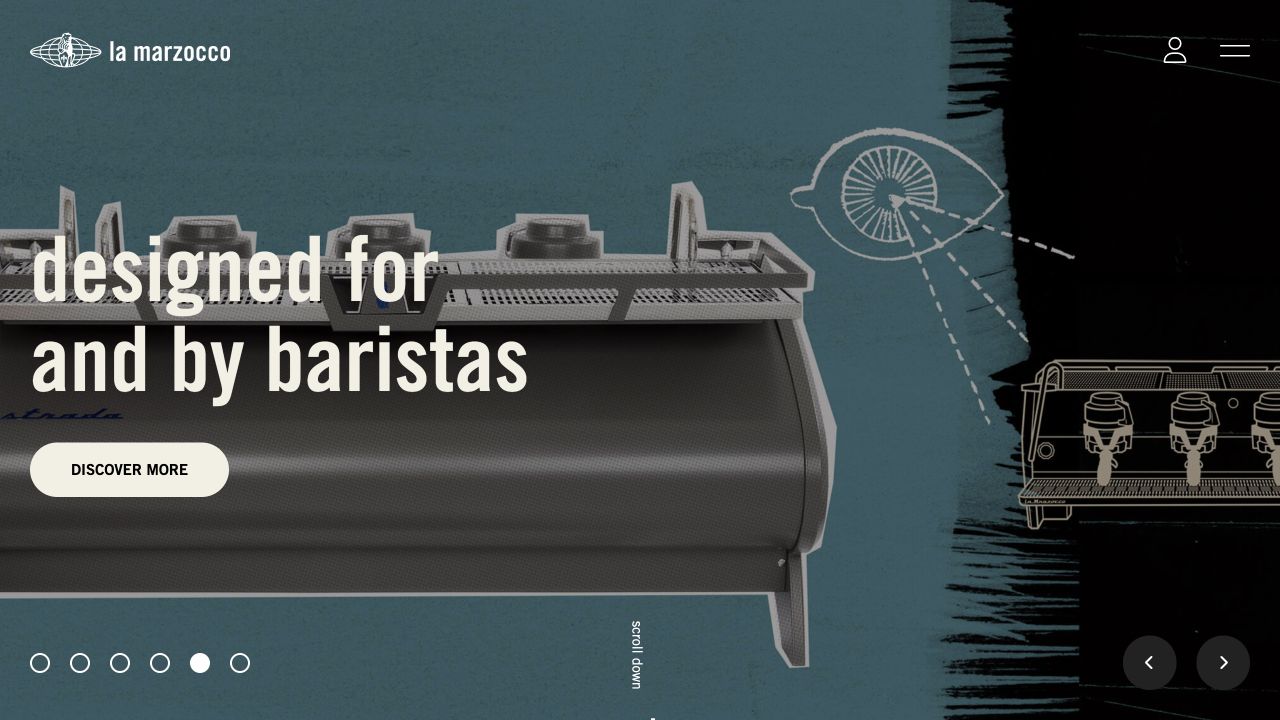
La Marzocco USA lets a large espresso-machine image and a short barista-oriented statement dominate the opening. A compact wordmark, account icon, and menu control leave the photograph room, while position dots and directional controls disclose a sequence. The presentation can introduce a specialized product without immediately overwhelming the visitor with specifications. Its sampled public page references jQuery Migrate; the evidence does not establish that the sequence uses it or describe the implementation of any connected ordering system.
What you can learn
For a similar site, test the path from campaign to model information and from the compact menu to support resources during a dependency update. Preserve model names and useful destination links outside animation timing. Include a nonrotating initial state and verify that focus and reading order remain coherent after someone opens the menu, changes a feature, or returns from a product page.
Pros
The machine photograph gives the product a clear physical presence.
A restrained header keeps competing labels away from the campaign statement.
Cons & considerations
Compact icon controls require understandable accessible names beyond their appearance.
A sequence can conceal other product messages unless an ordinary catalog route stays easy to find.
Platform source: Dated public page and linked-resource audit. Linked script matches jQuery Migrate. Dated public script reference only. A reference does not prove that any particular visible component depends on Migrate, initializes successfully, or requires its compatibility behavior. Platform evidence is separate from the direct website screenshot and is not a complete current infrastructure audit.
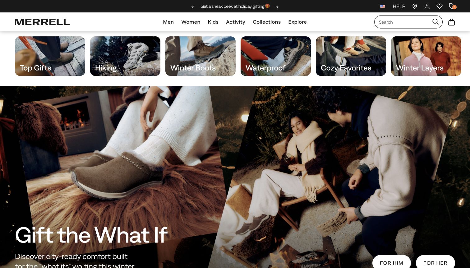
Merrell's captured US storefront combines ordinary top-level shopping navigation with a row of image-backed shortcuts such as hiking, winter boots, and waterproof products. A large seasonal scene follows, with separate shopping actions for different audiences. The arrangement gives a promotional campaign a place without removing category discovery. The exact reviewed page includes a dated jQuery Migrate resource association. That is evidence of a compatibility reference on this property, not proof that its shopping filters, account area, or checkout share one implementation.
What you can learn
Use seasonal changes as regression fixtures when modernizing the front end. Test a shortcut, a search, and a product visit with a long category label and a changed campaign crop. Preserve recognizable category URLs even when artwork changes, and check that back navigation returns to a useful context. Keep gift messaging distinct from the information needed to compare footwear.
Pros
Image shortcuts make several practical product categories visible before scrolling.
The permanent navigation remains available above the seasonal campaign.
Cons & considerations
Several horizontal promotional layers can consume much of a small viewport.
A lifestyle scene gives little immediate information about fit, materials, or availability.
Platform source: Dated public page and linked-resource audit. Linked script matches jQuery Migrate. Dated public script reference only. A reference does not prove that any particular visible component depends on Migrate, initializes successfully, or requires its compatibility behavior. Platform evidence is separate from the direct website screenshot and is not a complete current infrastructure audit.
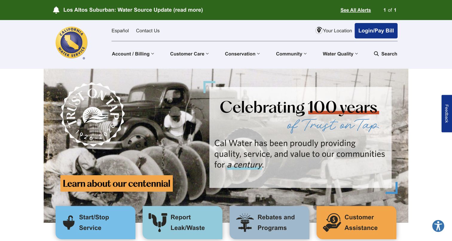
California Water Service places a service alert above its account and support navigation, then uses a centennial campaign as the main image. Large cards for starting service, reporting a leak, rebates, and assistance sit across the lower edge. This is a useful compatibility example because urgent notices and everyday service links must retain priority even when an older promotional interface is replaced. The dated audit found a jQuery Migrate resource reference on the public source; it does not identify the implementation of the account or payment destination.
What you can learn
Build the test plan around service urgency. Confirm that an alert remains readable, its destination works directly, and a customer can reach leak reporting or assistance without interacting with the anniversary feature. Include long place names, simultaneous notices, and keyboard traversal of the service cards. Treat the campaign as replaceable content while maintaining the operational routes.
Pros
The alert is positioned before the celebratory message rather than inside it.
Service cards translate broad navigation categories into concrete customer tasks.
Cons & considerations
An anniversary image occupies space that could otherwise explain urgent service conditions.
Multiple bright cards need careful ordering when the layout becomes a single column.
Platform source: Dated public page and linked-resource audit. Linked script matches jQuery Migrate. Dated public script reference only. A reference does not prove that any particular visible component depends on Migrate, initializes successfully, or requires its compatibility behavior. Platform evidence is separate from the direct website screenshot and is not a complete current infrastructure audit.
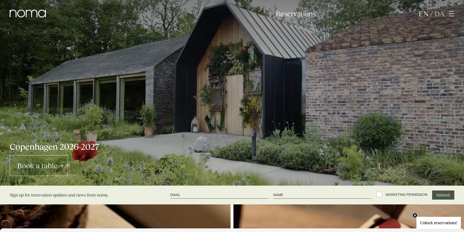
Noma uses a photograph of its planted entrance to explain the restaurant's setting before showing food. Reservations and language choice remain at the top, while a seasonal Copenhagen message and a booking control sit within the image. A pale newsletter strip introduces a different, longer-term relationship beneath it. The sampled source references jQuery Migrate, including a WordPress-hosted compatibility resource. This does not reveal the technology behind the reservation service or demonstrate that a booking interaction depends on the script.
What you can learn
When updating a similar presentation, test the season's message, the permanent reservations link, the language switch, and the newsletter boundary separately. Give dated availability copy an owner and review point. Keep practical booking information in real text rather than embedding it in imagery, and verify that replacing the hero does not move focus unexpectedly or obscure the next action.
Pros
Reservations and language choice are visible outside the seasonal campaign text.
The entrance photograph communicates the character of arriving at the restaurant.
Cons & considerations
White text over detailed planting needs crop-specific contrast checks.
Seasonal booking messages can become misleading if their editorial review is missed.
Platform source: Dated public page and linked-resource audit. Linked script matches jQuery Migrate. Dated public script reference only. A reference does not prove that any particular visible component depends on Migrate, initializes successfully, or requires its compatibility behavior. Platform evidence is separate from the direct website screenshot and is not a complete current infrastructure audit.
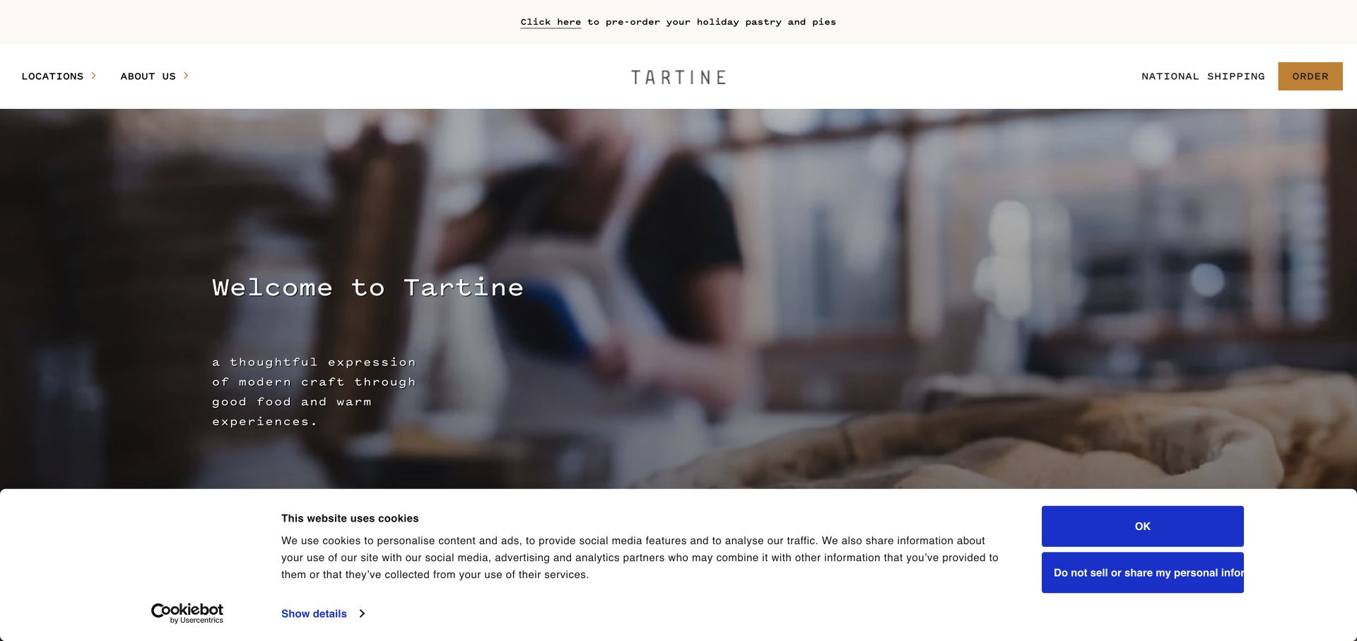
Tartine's opening uses a quiet wordmark and a working-bakery scene, with locations, national shipping, and ordering represented in the slim header. The retained screenshot includes a wide cookie panel across the lower portion, so the reference preserves a real obstacle rather than presenting an artificially cleaned view. A dated jQuery Migrate script association belongs to the sampled public page. It does not establish which location, ordering, or consent tools depend on that compatibility layer.
What you can learn
For a bakery with several destinations, make branch selection part of the upgrade checks. Follow a location to its menu and ordering entrance, then return to the shared homepage. Confirm that shipping is not confused with local collection and that dismissing a consent panel restores the expected reading and focus position. Maintain branch-specific hours and seasonal order conditions separately from the atmospheric campaign.
Pros
The spare header preserves room for photography while retaining practical ordering routes.
Shipping is labeled separately from location-based browsing.
Cons & considerations
The consent panel covers a substantial part of the first captured screen.
Atmosphere appears before detailed product choices and location-specific service conditions.
Platform source: Dated public page and linked-resource audit. Linked script matches jQuery Migrate. Dated public script reference only. A reference does not prove that any particular visible component depends on Migrate, initializes successfully, or requires its compatibility behavior. Platform evidence is separate from the direct website screenshot and is not a complete current infrastructure audit.
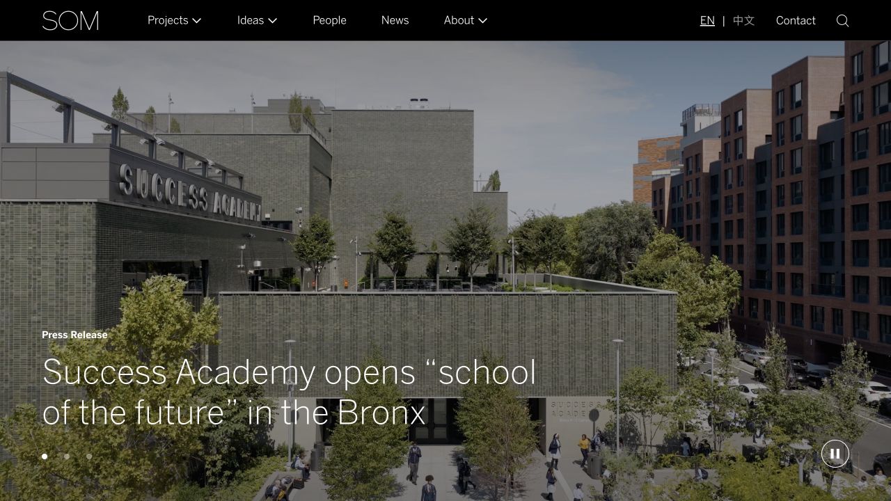
SOM places a large project photograph beneath a restrained dark header, with Projects, Ideas, People, News, and About Us named plainly. The captured feature is a press release, showing how a project image can also introduce institutional news. That overlap makes content relationships important during maintenance: a story and a project may have different permanent destinations even when they share media. The sampled page references jQuery Migrate, but the observation does not identify which archive or navigation feature requires it.
What you can learn
Before replacing older enhancements, trace an editorial feature to its project and related people where those relationships exist. Check direct entry, search, and return navigation with realistic archive depth. Keep content identifiers stable when reorganizing templates, and use long project titles as layout fixtures. The objective is to preserve the usefulness of the archive, not merely the appearance of its latest promoted photograph.
Pros
Clear navigation gives visual work and editorial thinking separate destinations.
The minimal shell accommodates varied architectural imagery without changing identity.
Cons & considerations
A large archive requires maintained categories and relationships beyond its top-level labels.
White text on photography needs review whenever the featured image changes.
Platform source: Dated public page and linked-resource audit. Linked script matches jQuery Migrate. Dated public script reference only. A reference does not prove that any particular visible component depends on Migrate, initializes successfully, or requires its compatibility behavior. Platform evidence is separate from the direct website screenshot and is not a complete current infrastructure audit.
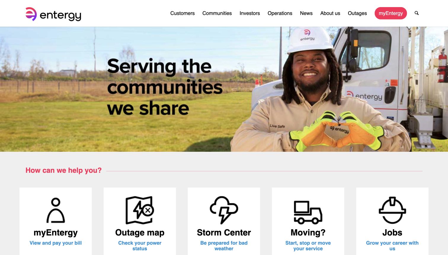
Entergy places a field employee beside a community-focused heading, then presents large cards for account access, outages, storm preparation, moving, and jobs. Icons and short descriptions help distinguish related customer needs. The useful design question is which routes deserve equal prominence: current outage information and a career search have different urgency. A jQuery Migrate resource was observed on this exact public page, but it does not identify the architecture of the account portal, outage map, or careers system.
What you can learn
Test those handoffs individually when changing the public front end. Preserve useful link names and ensure that a visitor can reach urgent information without waiting for the hero or optional enhancements. Include an active service notice and a long card description in regression fixtures. Check the mobile order deliberately rather than accepting whichever card happens to follow in the desktop grid.
Pros
Short explanatory lines distinguish current outage information from storm preparedness.
The cards provide concrete alternatives to navigating broad corporate categories.
Cons & considerations
Careers competes visually with more immediate customer-service tasks.
Generic underlying link names need review even when visible card labels look understandable.
Platform source: Dated public page and linked-resource audit. Linked script matches jQuery Migrate. Dated public script reference only. A reference does not prove that any particular visible component depends on Migrate, initializes successfully, or requires its compatibility behavior. Platform evidence is separate from the direct website screenshot and is not a complete current infrastructure audit.
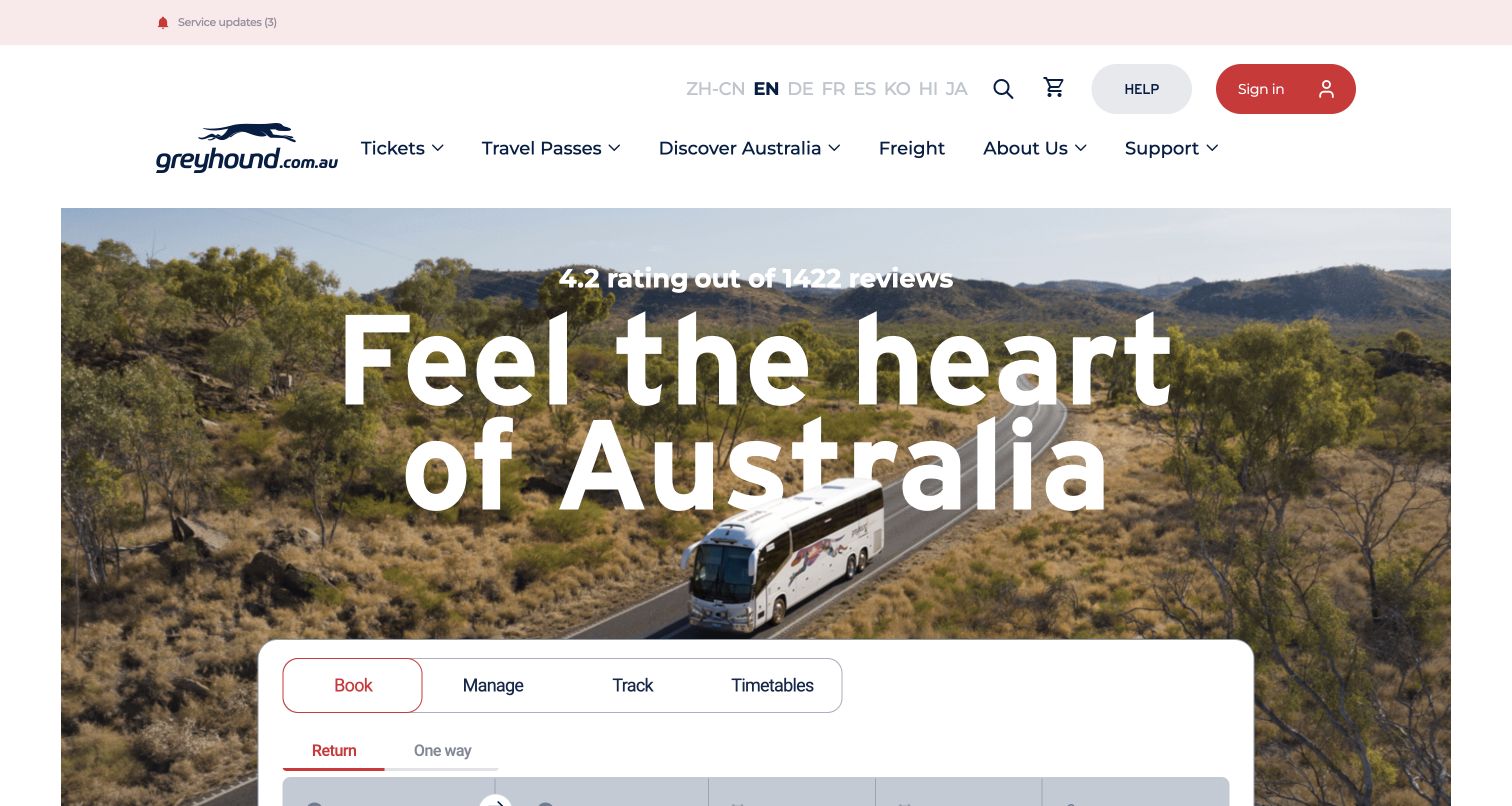
Greyhound Australia's homepage overlaps a scenic travel campaign with a white passenger panel containing Book, Manage, Track, and Timetables tabs. The layout acknowledges that a traveler returns with different needs before and after purchase. A service-updates link sits above the main navigation, separate from the promotional landscape. The page's dated jQuery Migrate reference is scoped to this Australian property; it neither describes the North American brand's website nor establishes the implementation of the booking service.
What you can learn
During compatibility work, treat each tab as a separate journey with its own inputs, labels, and return state. Test switching away from partially entered travel details, then using a timetable or tracking route. Keep service updates discoverable before a new booking begins. Include long destination names and narrow screens, where a large campaign can push the useful passenger controls out of the initial view.
Pros
The four labeled tabs distinguish purchasing from managing and researching travel.
Operational service updates have a position outside the sales campaign.
Cons & considerations
The tall hero leaves some passenger controls below the captured first screen.
The smaller service-update link competes with a much larger travel message.
Platform source: Dated public page and linked-resource audit. Linked script matches jQuery Migrate. Dated public script reference only. A reference does not prove that any particular visible component depends on Migrate, initializes successfully, or requires its compatibility behavior. Platform evidence is separate from the direct website screenshot and is not a complete current infrastructure audit.
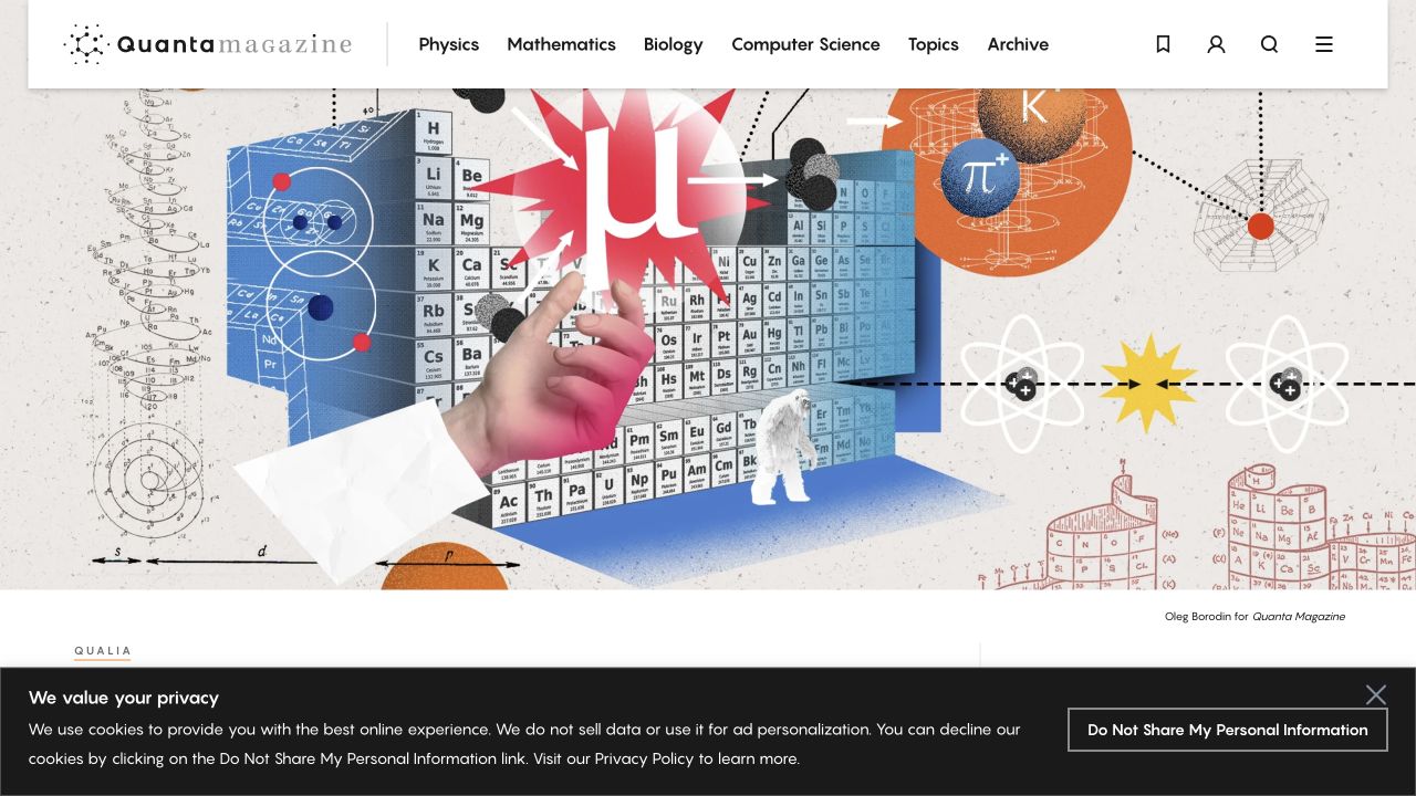
Quanta Magazine places discipline navigation above a richly illustrated scientific feature. Physics, mathematics, biology, computer science, topics, and archive routes offer several ways into the publication. The illustration carries atmosphere and subject cues, while the underlying editorial structure needs to explain relationships that an image cannot. A dated public audit references jQuery Migrate on the reviewed page. That observation does not prove how the archive, search, or multimedia features are implemented or whether any particular feature needs the compatibility plugin.
What you can learn
Use a dependency upgrade to verify topic and format relationships rather than copying only the current homepage arrangement. Follow an older article through a discipline archive, inspect the clarity of its title and credits, and check that direct links remain useful. Test a feature without its image and with a long specialist headline so the publication retains meaning beyond the campaign artwork.
Pros
Discipline labels give readers a stable route into a varied scientific publication.
The illustrated opening gives an abstract subject a distinctive editorial identity.
Cons & considerations
An illustration alone may not explain the precise subject or argument of a story.
Overlapping disciplines need consistent tagging so archive navigation remains predictable.
Platform source: Dated public page and linked-resource audit. Linked script matches jQuery Migrate. Dated public script reference only. A reference does not prove that any particular visible component depends on Migrate, initializes successfully, or requires its compatibility behavior. Platform evidence is separate from the direct website screenshot and is not a complete current infrastructure audit.
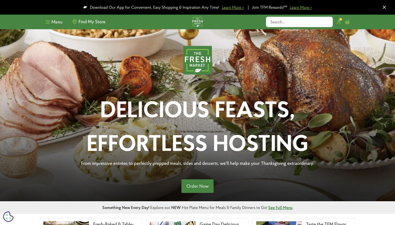
The Fresh Market uses a holiday table and a large hosting message to promote prepared food through one green ordering action. A compact store finder and search remain in the header, while app and rewards promotion sits above them. The distinction between a seasonal prepared meal and routine grocery shopping matters because fulfillment conditions can differ. The sampled page references an identifiable jQuery Migrate resource; that association is not a claim about checkout, rewards, or the store-specific pricing system.
What you can learn
For a similar maintenance project, test store selection before following the seasonal order route. Check that portions, collection dates, and deadlines are explained at the relevant destination, and that returning to the campaign does not silently change context. Keep permanent shopping controls usable if optional promotional code fails. A compelling food photograph should introduce the occasion without becoming the only source of ordering meaning.
Pros
The seasonal feature provides one next action rather than several competing buttons.
Store finding and search remain visible above the large food image.
Cons & considerations
The first view postpones portions, deadlines, and collection details.
App and rewards messaging adds another promotional layer before the visitor reaches the meal offer.
Platform source: Dated public page and linked-resource audit. Linked script matches jQuery Migrate. Dated public script reference only. A reference does not prove that any particular visible component depends on Migrate, initializes successfully, or requires its compatibility behavior. Platform evidence is separate from the direct website screenshot and is not a complete current infrastructure audit.
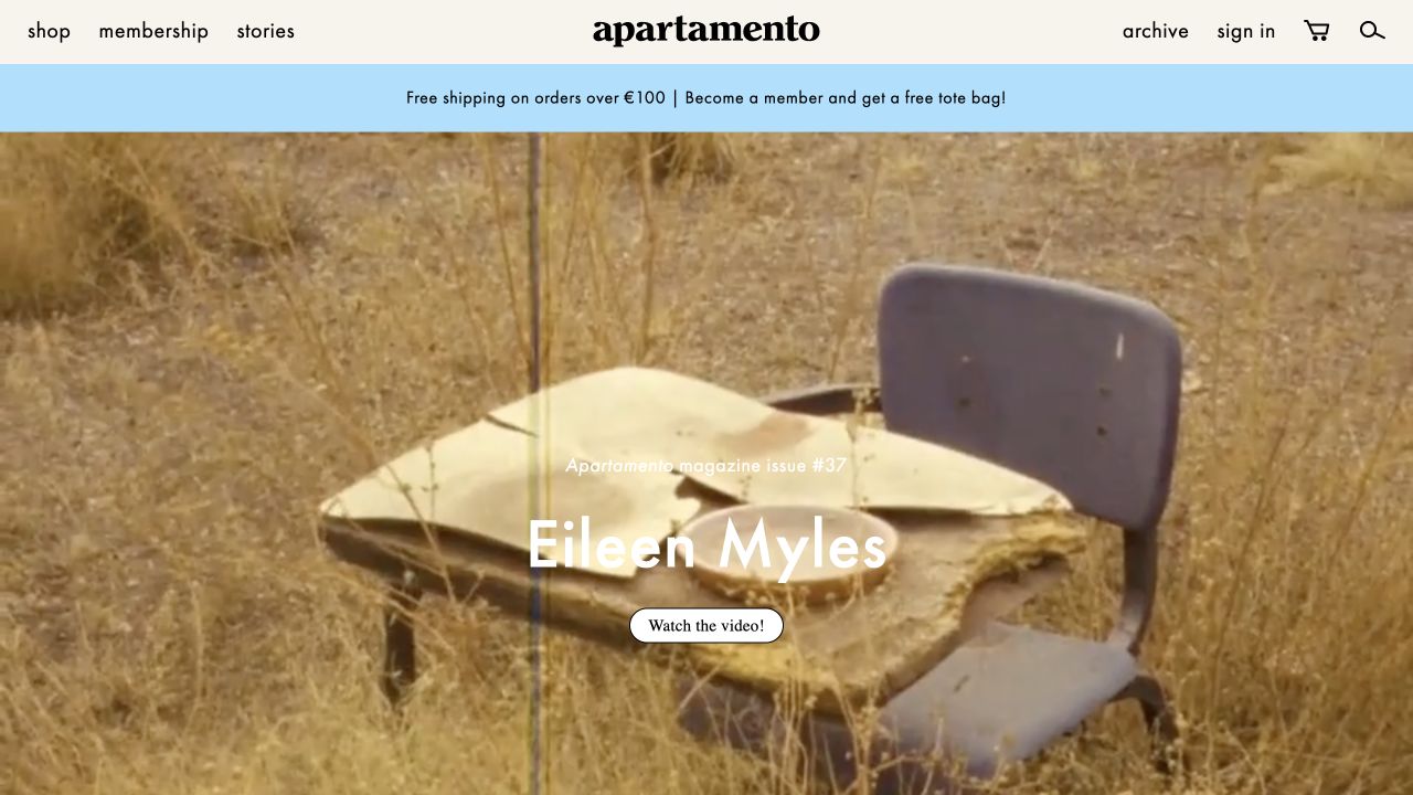
Apartamento combines a restrained magazine identity with shopping, membership, stories, archive, and account routes. The captured lead is a video-oriented editorial feature, while a shipping strip introduces the commercial side of the publication. This is a useful compatibility example because similar visual treatments can lead to very different destinations: a story, an issue, a film, or a product. The exact public page references jQuery Migrate, without establishing the implementation of its player, membership, or shopping functions.
What you can learn
When modernizing a mixed editorial storefront, label those destinations explicitly in the regression checklist. Verify a story link, a product link, a membership explanation, and a usable alternative to video playback. Preserve contributor and issue relationships when changing templates. Test the navigation with media unavailable so readers can still distinguish what they are opening and whether the next step involves reading, watching, or buying.
Pros
Stories and archive routes remain separate from ordinary shopping labels.
A consistent visual identity connects editorial features with the publication's physical products.
Cons & considerations
Large video-led imagery can postpone the text needed to understand a feature.
Shared styling can make editorial and commercial destinations difficult to distinguish at a glance.
Platform source: Dated public page and linked-resource audit. Linked script matches jQuery Migrate. Dated public script reference only. A reference does not prove that any particular visible component depends on Migrate, initializes successfully, or requires its compatibility behavior. Platform evidence is separate from the direct website screenshot and is not a complete current infrastructure audit.
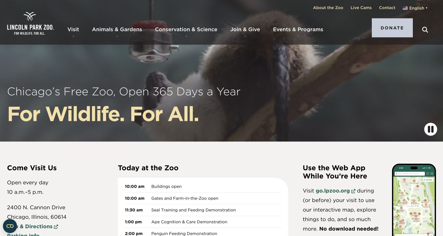
Lincoln Park Zoo states that it is Chicago's free zoo and open every day before introducing its wildlife message. The opening footage is followed by hours, an address, a daily schedule, and a web-app introduction. The homepage therefore supports a spontaneous visit without forcing everyone into a ticket purchase. Its dated source audit references jQuery Migrate, but that finding does not identify the technology of the schedule or on-site web app, nor validate their behavior.
What you can learn
Use this reference to plan compatibility checks around practical information. Confirm that hours, location, and today's program remain available when motion is paused or enhancement is delayed. Distinguish ordinary admission from separately ticketed events wherever applicable. Keep schedule records date-aware and test an empty day as well as a busy one, so a redesigned component cannot present stale activities as current opportunities.
Pros
The free-entry and year-round statements answer common planning questions immediately.
Arrival details and daily activities appear directly below the atmospheric opening.
Cons & considerations
The wildlife message serves several audiences and needs clearly differentiated onward routes.
A daily program requires dependable editorial ownership to avoid stale visitor information.
Platform source: Dated public page and linked-resource audit. Linked script matches jQuery Migrate. Dated public script reference only. A reference does not prove that any particular visible component depends on Migrate, initializes successfully, or requires its compatibility behavior. Platform evidence is separate from the direct website screenshot and is not a complete current infrastructure audit.
Kegan has 15+ years of experience working with small businesses, Fortune 500 companies, and everything in between. No development job is too big or too small: he brings the same hands-on attention to a focused improvement, a complete website, or a custom application.
For jQuery Migrate projects, he can help with responsive interfaces, reusable components, custom functionality, API connections, and performance-minded implementation. He works directly with clients on scope, design, implementation, testing, and handover, with an emphasis on clear communication and a system that remains practical to maintain after launch.
Show 3 other jQuery Migrate developersHide other jQuery Migrate developers
Define the journeys that compatibility work must preserve
Editorial publishing
Follow a featured story to its permanent article, search result, and archive context. Keep titles, credits, and topic relationships intact when a presentation component changes.
Location and service discovery
Test a known location, an unfamiliar service, a long label, and a direct visit from an old link. Preserve urgent routes outside optional promotional interfaces.
Commerce and visitor planning
Separate browsing from customization, account access, reservations, and ticketing. Verify each public handoff without assuming that a shared brand implies a shared implementation.
From references to requirements
Write a migration brief around observable behavior
Record a meaningful baseline
List the public routes and states that matter, with representative long content and narrow-screen layouts. Capture the behavior of menus, media controls, filters, and overlays before changing dependencies.
Update one dependency relationship at a time
Identify the component owner and the relevant supported release path. Keep a recovery point, verify the affected journeys, and record the change rather than removing compatibility code because a screenshot still looks familiar.
Check ordinary navigation and failure states
Test direct links, browser return, delayed media, and unavailable optional scripts. Preserve focus and understandable labels around state changes. A strong visual first screen is only one part of the public experience.
A useful handover demonstration
Ask the actual team to carry out its routine job: publish a realistic update, correct a mistake, preview a narrow screen, and identify who owns an integration failure. For a library or frontend framework, also ask who maintains the content source and deployment. A polished screenshot does not answer those operational questions.
Beyond the screenshot
jQuery Migrate planning checklist
Identify actual jQuery and Migrate versions from your own source.
Inventory third-party plugins and custom code with responsible owners.
Use the appropriate development diagnostics in a controlled environment.
Preserve permanent article, product, location, and service URLs.
Test keyboard entry, dismissal, and focus restoration for enhanced controls.
Include long labels, translations, delayed media, and narrow screens.
Verify public handoffs without submitting real purchases or inquiries.
Remove compatibility support only after the relevant code and journeys are verified.
Test with real content, a keyboard, a small screen, slow or failed requests, and the people who will maintain the system. These are planning checks, not an accessibility, security, performance, or search-ranking certification.
Sources & editorial method
How this jQuery Migrate collection was reviewed
Twenty distinct public properties were selected from stable authoring records and dated public source audits. Their genuine captures, dimensions, source URLs, and attribution were retained with original dates; each new review was written for this compatibility-focused collection. Every source has a broad public stack-audit attempt. A jQuery Migrate reference establishes a sampled resource association, not execution, deprecated-API use, a current vulnerability, or dependence of any particular visible component. The screenshots were visually re-reviewed; no private application behavior or real transaction was tested.
Every image is an unmodified capture from the actual website, with its source and capture date. Some captures are reused from our shared catalog; their dates remain the original capture dates. None comes from a vendor gallery or a generated reconstruction. Moving imagery and live content can change.
Technology attribution uses public page assets or metadata, official platform documentation, or a cited first-party project case study. Documentary and framework-relationship evidence is identified where used; it is not a complete current backend inventory. A CMS image CDN alone does not establish a full CMS deployment. A library’s presence does not prove which individual controls use it, and a platform label does not establish AI authorship.
The composition notes, lessons, pros and tradeoffs are original editorial observations. We have not measured conversion, traffic, security, performance or accessibility conformance. Website owners retain their brands and imagery; these examples are not our client portfolio. Written, Edited and Curated are independent records, not dates advanced by a build. See our editorial standards or suggest a correction.
Questions worth asking
jQuery Migrate website development FAQs
Does a Migrate reference mean the website is broken?
No. It identifies a compatibility-script reference in the sampled source. It does not show whether deprecated APIs execute, whether the site has a defect, or whether the script is still necessary.
Can I copy the version used by one of these websites?
The examples are not version recommendations. Confirm your own jQuery generation, dependencies, and supported upgrade path with the official project guidance.
Which visible components use Migrate?
The public evidence does not establish that mapping. The reviews describe visible interfaces and recommend what to test; they do not assign a carousel, menu, or booking panel to Migrate without direct proof.
Are the screenshots and audits from the same day?
Not necessarily. Original capture dates and technology observation dates are retained separately from this collection’s editorial review date. Reused evidence is not relabeled as a fresh observation.