Best Breeze Websites of 2026 (20 Real-World Examples)
A WordPress cache plugin should support a dependable visitor experience, not turn a performance score into the only definition of success.
Breeze can be one layer in a WordPress delivery setup. Study the website itself, then plan caching, file optimization and maintenance around the pages that genuinely need to behave differently.
Breeze is the WordPress caching and optimization plugin developed by Cloudways. Its public footprint can support an association with a specific page without proving the hosting provider, every enabled option or the performance of the completed site. The examples should preserve those limits rather than treating a cached-file path as a complete infrastructure diagram.
A sensible implementation begins with the content and interactions being delivered. An article, a search result, an account page and a shop can have different freshness and privacy needs. The goal is to make the site usefully responsive while preserving correct behavior. A plugin setting, a vendor claim or a polished screenshot does not establish that those requirements have been met.
Before the examples
What makes good Breeze website development in 2026?
Map freshness before deciding what to cache
Identify which pages are public and stable, which change frequently and which depend on a particular visitor. Record the expected behavior for search, filters, forms, accounts and any commercial functions before enabling broad settings. A page that appears quickly but displays inappropriate or outdated information is not a successful optimization.
Cloudways documents URL and query-string controls for Breeze. Use those capabilities only within a deliberate cache policy, with the actual implementation reviewed and tested. Do not copy a list of exclusions from another website and assume it captures this site’s needs. Keep personalized or sensitive responses out of shared public caching unless a qualified implementation has explicitly addressed that behavior.
Measure the experience, not just the presence of optimization
Choose representative pages and define the measurements that matter before making changes. Include a normal content page, a heavier landing page and a page with an important interaction. Compare like-for-like conditions and keep the test context visible. A single score from a warm desktop request does not describe all visitors or prove that a change helped.
Inspect usability alongside loading behavior. The navigation, form validation, content visibility and keyboard focus still need to work when assets are optimized. Do not hide important content, delay an essential control or change consent behavior simply to produce a more attractive test result. Keep a baseline and a way to reverse the latest configuration change.
Give every delivery layer a clear responsibility
A WordPress site may use application caching, server caching, a content-delivery network and browser caching at the same time. Identify the layers actually present and who can change or purge them. Public Breeze evidence does not independently prove that every example uses Cloudways hosting, Varnish or a particular CDN.
Document how a content correction reaches visitors. An editor should know what happens after publishing, which cache may remain and who investigates an outdated page. Avoid treating repeated manual full purges as a substitute for understanding the setup. The performance plan should include freshness, operational ownership and recovery, not just a collection of enabled switches.
Compare the supported public properties as design references, with Breeze evidence scoped to the named page. The screenshots do not measure speed, establish an enabled configuration or reveal the complete hosting and cache architecture.
We start with five recognizable brands or organizations: Gilbane, Kinfolk, CCIB Barcelona, Kobre & Kim, North American Roofing. Each attribution applies to the named website property, not every product or website belonging to its organization. This is a curated reading sequence, not a measured ranking.
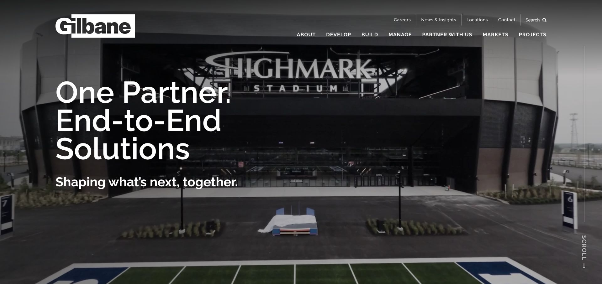
Gilbane presents a stadium-scale project beside a concise end-to-end partnership message. The primary navigation organizes the offer into Develop, Build, and Manage, which gives the company's breadth a readable structure. Utility links for careers, news, locations, and contact sit above that core sequence. Instead of asking every visitor to understand the corporate organization first, the opening provides a lifecycle model that can guide clients toward the work they actually need and still leave room for recruiting and partner relationships.
What you can learn
When a business spans development, delivery, and operations, organize the primary routes around those stages. Explain what each stage includes on its destination page, with relevant projects and an identifiable contact rather than repeated corporate overview copy.
Pros
The develop-build-manage grouping translates a broad organization into a small set of useful service choices.
The large project photograph provides tangible context for a claim about end-to-end construction capabilities.
Cons & considerations
A broad partnership headline still needs examples that distinguish each service's actual scope and responsibility.
Multiple utility and service navigation layers may become dense if further corporate categories are added without prioritization.
Platform source: WordPress.org Showcase. Linked script matches Breeze. Exact public source-page reference: https://www.gilbaneco.com/. This is an observed component association, not proof of private configuration, a paid plan, measured results or complete architecture. Platform evidence is separate from the direct website screenshot and is not a complete current infrastructure audit.
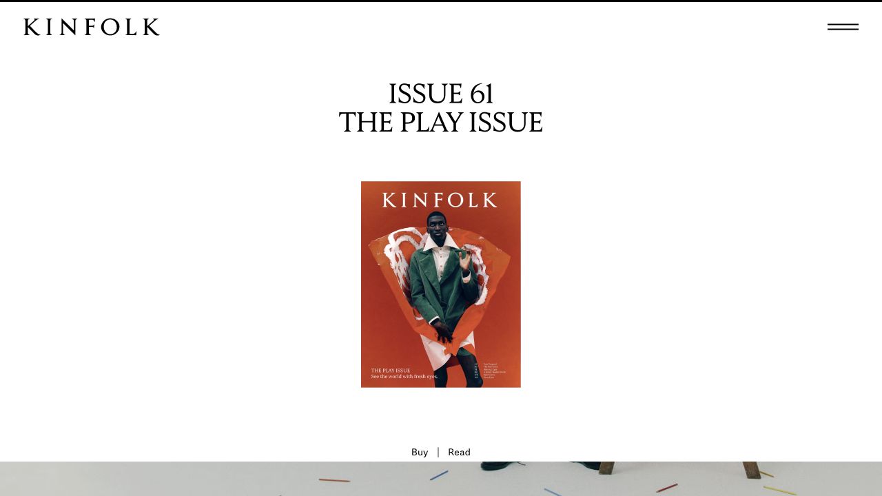
Kinfolk’s opening gives its current numbered issue, cover and theme considerable white space. A compact masthead and menu avoid competing with the issue presentation, while separate buying and reading routes acknowledge different intentions. Latest stories subsequently use categories such as interiors, fashion and culture. This is an issue-first design rather than a breaking-news front page: the publication’s editorial package receives more immediate attention than a long chronological feed of individual articles.
What you can learn
Decide whether the issue or the individual story is the primary discovery unit. If both matter, connect every applicable article to an issue record with its own cover, publication information and contents. Keep buying a physical copy distinct from reading a digital story, and provide a durable archive rather than treating the featured issue as a disposable campaign.
Pros
The cover and issue number make the current edition unmistakable.
Separate reading and buying actions acknowledge different visitor tasks.
Cons & considerations
A quiet issue-led opening exposes relatively few stories immediately.
Readers following a subject need useful category routes beyond the featured edition.
Platform source: WordPress.org Showcase. Linked script matches Breeze. Exact public source-page reference: https://www.kinfolk.com/. This is an observed component association, not proof of private configuration, a paid plan, measured results or complete architecture. Platform evidence is separate from the direct website screenshot and is not a complete current infrastructure audit.
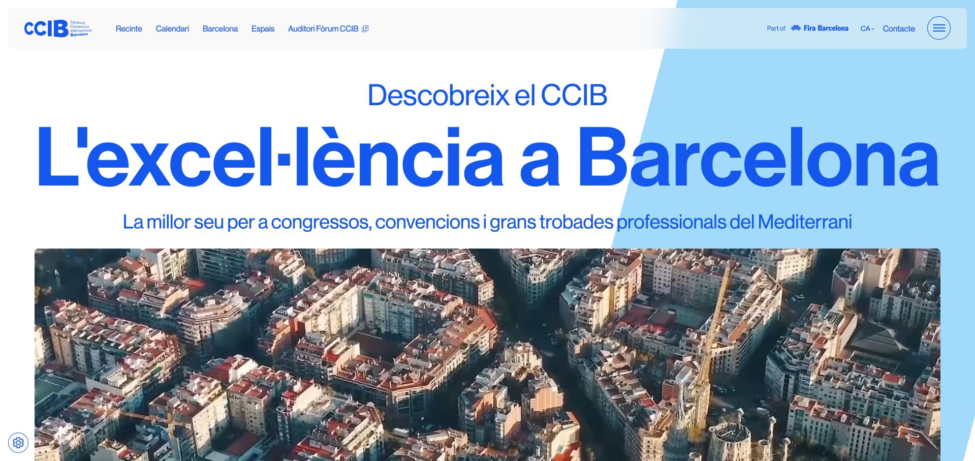
CCIB uses oversized blue typography and Barcelona imagery to connect the building with its setting. The navigation leads into spaces, the calendar and city information, while production, audiovisual, IT, furniture and signage services receive their own treatment. That breadth helps a planner understand what must be coordinated beyond the room. The inspected English entry redirected to Catalan, so international language routing deserves as much care as the visual identity.
What you can learn
Show production responsibilities as clearly as room choices. For an international venue, test the actual language destinations instead of assuming a language label guarantees equivalent content. Translate the practical planning journey, including capacities, audiovisual requirements and contact expectations. Keep source-page redirects and regional context visible so a visitor understands which version they have reached.
Pros
Production and supporting services are clearly differentiated
Venue, events and destination information share a coherent structure
Cons & considerations
Requested English route redirected to Catalan during inspection
Large imagery and typography postpone detailed specifications
Platform source: WordPress.org Showcase. Linked script matches Breeze. Exact public source-page reference: https://ccib.es/. This is an observed component association, not proof of private configuration, a paid plan, measured results or complete architecture. Platform evidence is separate from the direct website screenshot and is not a complete current infrastructure audit.
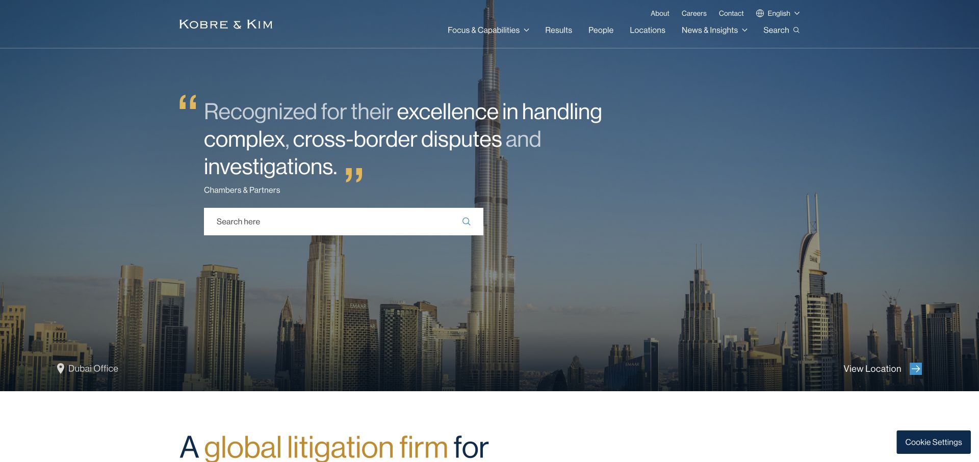
Kobre & Kim layers a large search field and an attributed quotation over a darkened city panorama. A location label and action connect the photograph to an actual office rather than anonymous decoration. Capabilities, results, people, and locations form a restrained upper navigation, with language and contact in a separate utility position. The layout recognizes several research tasks: finding a person, examining work, or searching a known term. Gold quotation marks supply an identifying accent without another illustration. The quotation is a confidence device, though anonymous client attribution is less specific than a named case study.
What you can learn
If search is a central route, make its purpose explicit and pair it with browsable capabilities. Give location photography a destination and caption so it contributes to wayfinding rather than merely filling space.
Pros
Search is treated as a useful primary task, not a tiny header icon.
The city image is linked to a visible location destination.
Cons & considerations
Visitors without legal vocabulary may still need guided practice navigation.
An anonymous quotation offers less inspectable context than a named example.
Platform source: WordPress.org Showcase. Linked script matches Breeze. Exact public source-page reference: https://kobrekim.com/. This is an observed component association, not proof of private configuration, a paid plan, measured results or complete architecture. Platform evidence is separate from the direct website screenshot and is not a complete current infrastructure audit.
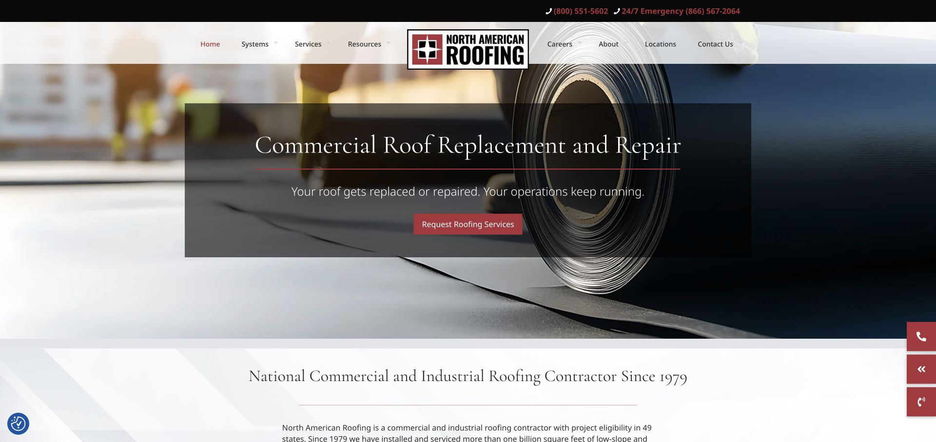
North American Roofing uses a centered logo that divides the navigation, with a separate dark phone strip above it. The captured hero promotes commercial replacement and repair over a close view of roofing material, placing the message inside a translucent dark panel. The opening transitions into a light introduction that explicitly names the commercial and industrial audience. The overall treatment is more traditional than a sparse portfolio site, but the material photograph keeps the subject matter specific.
What you can learn
A service campaign can sit inside a broader company homepage if the audience and contact routes remain clear. Give recurring programs and replacement work their own concise explanation, then provide the wider service context below. Avoid relying on a rotating slide to carry information that every buyer needs.
Pros
The material-focused image explains the work more directly than unrelated lifestyle photography.
Normal and emergency phone routes are distinct in the utility bar.
Cons & considerations
A centered logo and long navigation row demand a carefully reworked mobile header.
Translucent panels and rotating slides can weaken legibility during transitions if not tested.
Platform source: WordPress.org Showcase. Linked script matches Breeze. Exact public source-page reference: https://naroofing.com/. This is an observed component association, not proof of private configuration, a paid plan, measured results or complete architecture. Platform evidence is separate from the direct website screenshot and is not a complete current infrastructure audit.
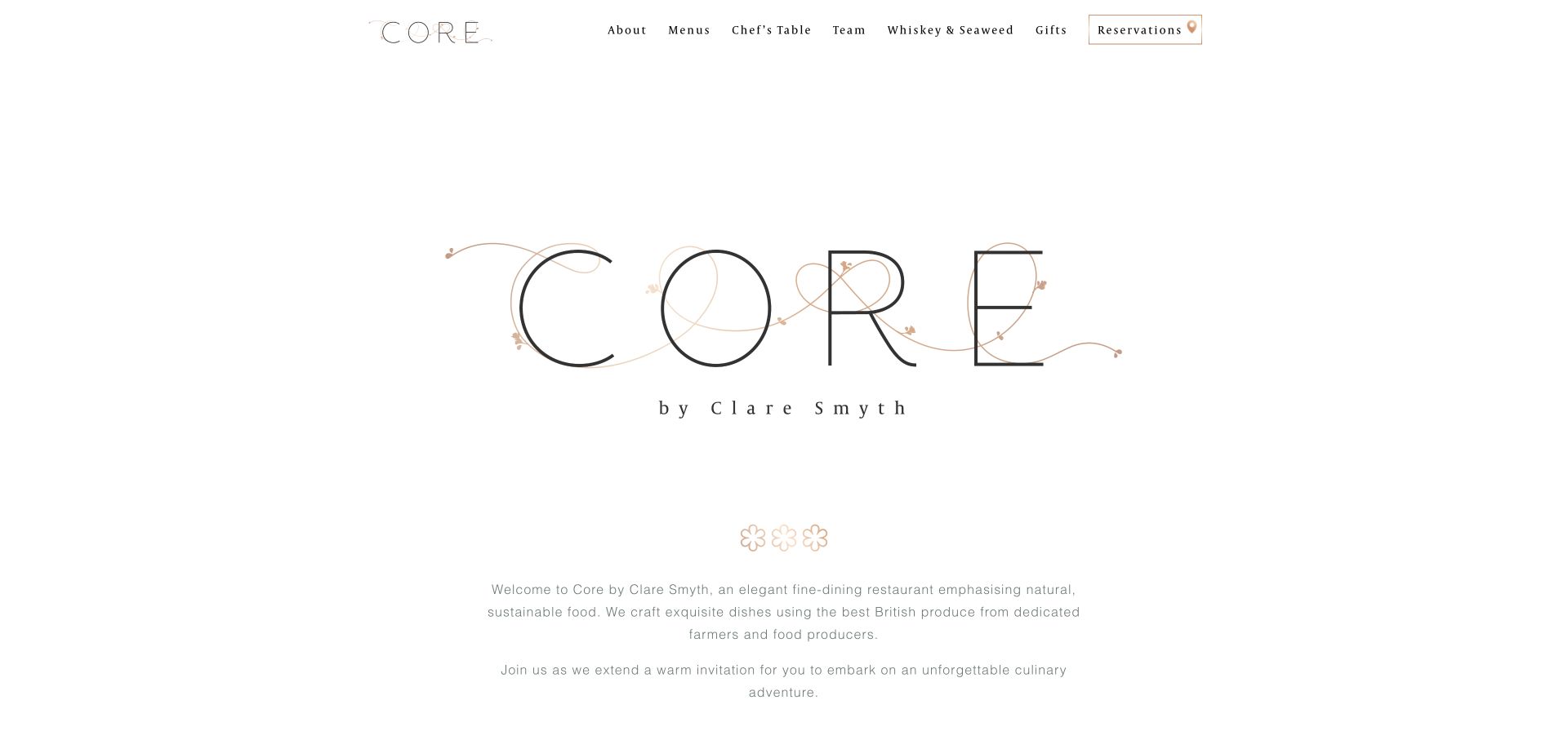
Core uses an unusually light opening: a large fine-line wordmark, generous white space and a short centered introduction. A compact header names menus, the chef’s table, team and other restaurant experiences, with reservations receiving an outlined treatment. The captured view communicates restraint through typography and spacing rather than a collage of dishes. Below the introduction, separate routes to reserve and inspect menus translate the brand presentation into practical guest choices.
What you can learn
A restaurant does not need a full-bleed photograph to feel distinctive. Establish a visual hierarchy with type, spacing and a concise explanation, then give the menu and reservation different routes. The copy should add information about the experience instead of merely repeating the logo’s premium tone.
Pros
Menus and reservations are named directly in the header.
The limited palette and centered composition make the identity easy to recognize.
Cons & considerations
The pale, delicate typography needs attention to readability at small sizes.
Large empty areas defer the first food or room photograph and practical detail.
Platform source: WordPress.org Showcase. Linked script matches Breeze. Exact public source-page reference: https://corebyclaresmyth.com/. This is an observed component association, not proof of private configuration, a paid plan, measured results or complete architecture. Platform evidence is separate from the direct website screenshot and is not a complete current infrastructure audit.
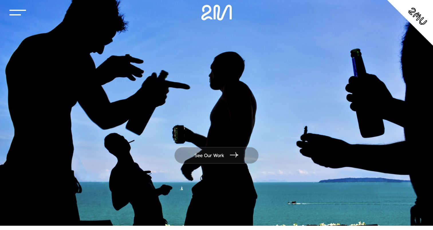
Two Mann Studios opens with a full-bleed photograph and a single See Our Work action. The compact mark and menu leave the image dominant, and the selected scene feels observational rather than a conventional posed wedding portrait. Below the opening, the studio introduces its people and broader story, giving the visual impression a human context. The design is a useful example of letting a distinctive moment communicate an approach before explaining it. The first screen still relies heavily on that one image, and a new visitor must explore further to find location, availability, or the practical inquiry route.
What you can learn
Select an opening image that demonstrates how the studio sees an event, then lead directly to a coherent body of work. Follow the visual statement with real information about the photographers and process. Keep an obvious inquiry route available for visitors who already know they want to talk.
Pros
One clear work action prevents competing calls to action.
The chosen image communicates a candid visual approach.
Cons & considerations
The first impression depends heavily on a single photograph.
Practical inquiry information is not visible in the opening view.
Platform source: WordPress.org Showcase. Linked script matches Breeze. Exact public source-page reference: https://twomann.com/. This is an observed component association, not proof of private configuration, a paid plan, measured results or complete architecture. Platform evidence is separate from the direct website screenshot and is not a complete current infrastructure audit.
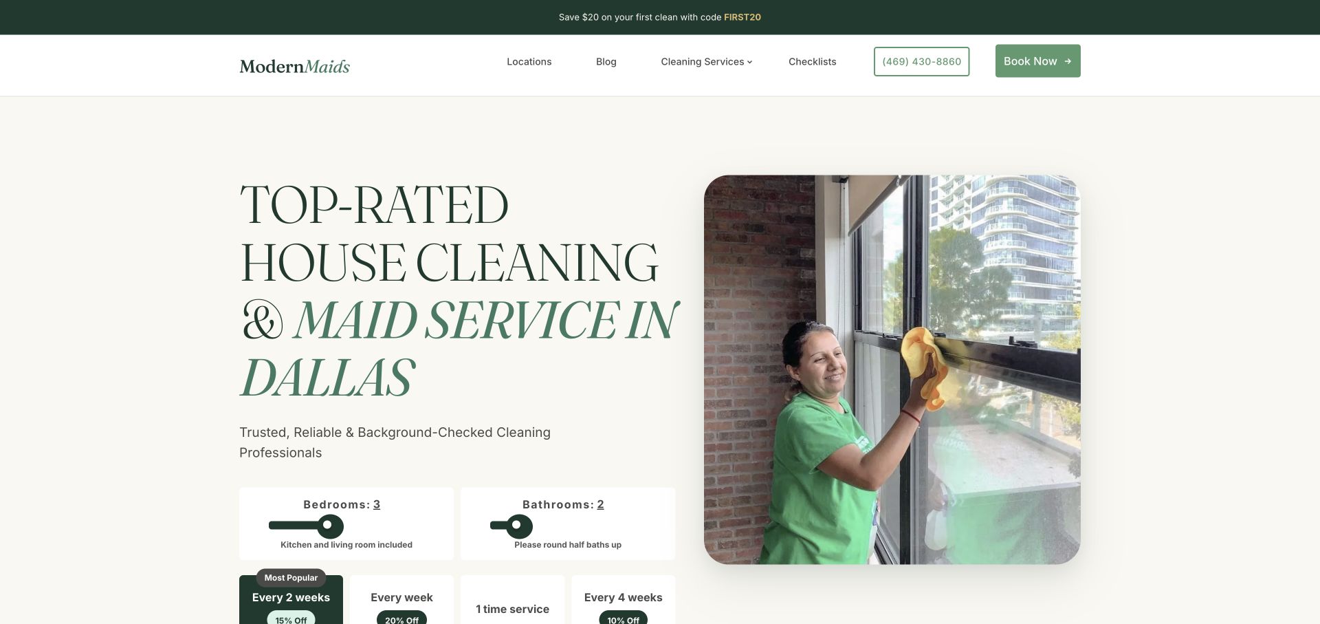
Modern Maids pairs a large serif Dallas headline with a working-cleaner photograph and green accents. Room-count controls and cleaning-frequency choices begin directly below the introduction. Further content includes neighborhood coverage, service descriptions, room checklists, and before-and-after images. This gives the page more depth than a single quote form. The useful pattern is the connection between household characteristics, visit frequency, and scope information, which helps readers understand the dimensions of the service they are comparing.
What you can learn
Explain how size, frequency, and cleaning level relate before asking visitors to choose a plan. Room checklists and examples can support that comparison, but pricing conditions and any claims about alternatives should remain precise, current, and appropriately qualified.
Pros
Frequency choices are visible alongside household-size controls, making recurring service an explicit decision.
Room-level checklists and neighborhood information provide practical research material beyond the opening booking interface.
Cons & considerations
A long page needs clear anchors and hierarchy so detailed scope information remains easy to find.
Comparisons with independent cleaners require careful substantiation and should avoid treating every alternative as identical.
Platform source: WordPress.org Showcase. Linked script matches Breeze. Exact public source-page reference: https://modern-maids.com/. This is an observed component association, not proof of private configuration, a paid plan, measured results or complete architecture. Platform evidence is separate from the direct website screenshot and is not a complete current infrastructure audit.
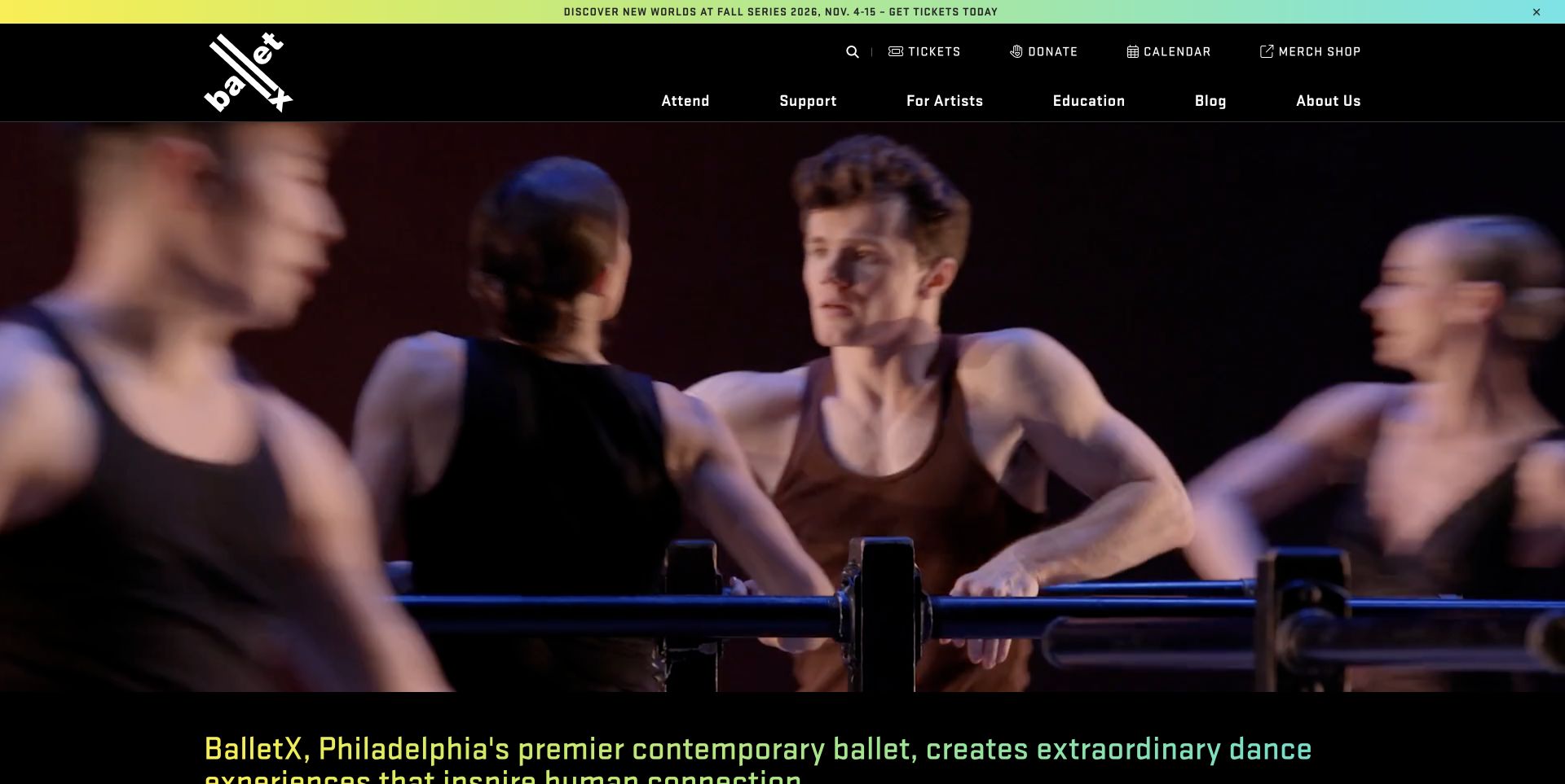
BalletX leads with moving performance footage under a black header and a thin, colorful announcement strip. Its angled logo and bright gradient accents give the page an energetic identity without putting a large text panel over the dancers. The next section states the company's purpose, followed by upcoming series, touring dates and artist profiles. Event entries distinguish ticket links from further information and identify locations. The design is especially useful as a study in connecting expressive motion with structured operational content, rather than expecting the opening video alone to explain what can be attended.
What you can learn
Treat performance footage as an introduction, then make the event structure precise. A visitor should be able to distinguish a home series from a tour stop and choose information or tickets without interpreting the visual campaign.
Pros
The event list supplies dates, locations and separate ticket and information routes.
Dancer profiles connect the performance imagery to identifiable artists.
Cons & considerations
The large video can delay the first detailed event choices on a short screen.
Several carousels and icon-heavy controls create a busy browsing experience farther down.
Platform source: WordPress.org Showcase. Linked script matches Breeze. Exact public source-page reference: https://www.balletx.org/. This is an observed component association, not proof of private configuration, a paid plan, measured results or complete architecture. Platform evidence is separate from the direct website screenshot and is not a complete current infrastructure audit.
Manhattan Bridge Orthodontics introduces the practice with a group photograph of clinicians in an actual treatment environment. The white header, restrained navigation and yellow appointment action give the image room without turning the page into a purely photographic presentation. Elsewhere, the practice distinguishes its Manhattan and Flushing offices with separate address information, and the copy emphasises communication with patients. The useful pattern is the connection between identifiable people and concrete places. A visitor can move from seeing who works there to checking where to attend, rather than confronting an anonymous brand with one generic enquiry destination.
What you can learn
For a practice with more than one office, show the team but keep location choice explicit throughout the contact journey. Pair each address with its relevant practical information, and avoid assuming that an attractive group photograph answers questions about availability or accessibility.
Pros
A real clinician group provides a human introduction more specific than generic stock imagery.
Separate office addresses give the practice’s multiple-location offer a practical structure.
Cons & considerations
A large team photograph can delay treatment explanations if introductory copy remains secondary.
Visitors still need office-specific logistics rather than assuming every location offers identical arrangements.
Platform source: WordPress.org Showcase. Linked script matches Breeze. Exact public source-page reference: https://manhattanbridgeortho.com/. This is an observed component association, not proof of private configuration, a paid plan, measured results or complete architecture. Platform evidence is separate from the direct website screenshot and is not a complete current infrastructure audit.
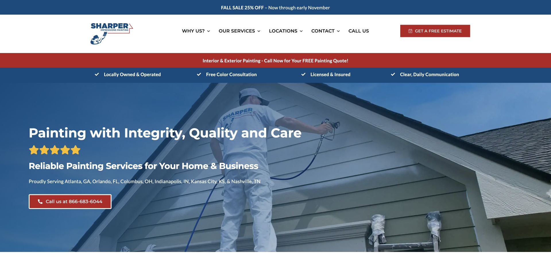
Sharper Impressions layers a seasonal promotion, white navigation, a red service strip and a blue checklist above its main project image. The blue-tinted photograph shows a worker painting siding, so the service remains recognisable behind the text. Four short assurances address ownership, colour consultation, insurance and communication; the company then names the cities it serves directly in the hero. This is a practical information hierarchy for a visitor checking availability, although the accumulation of horizontal bands makes the page feel more promotional than quiet. The primary telephone action has a distinct red outline.
What you can learn
A short checklist can summarise the operational questions buyers bring to a painting project. Use specific, maintainable commitments and connect them to fuller explanations below. A concise list of genuine markets is more useful than an unsupported nationwide implication, particularly when a company operates in several separated metropolitan areas.
Pros
The work-in-progress photograph communicates painting more directly than a generic interior image.
Named cities make the initial service-area check possible without opening a locator.
Cons & considerations
Multiple promotional and assurance strips consume substantial vertical space on desktop.
Several assurance claims would benefit from direct links to their terms or evidence.
Platform source: WordPress.org Showcase. Linked script matches Breeze. Exact public source-page reference: https://www.sharperimpressionspainting.com/. This is an observed component association, not proof of private configuration, a paid plan, measured results or complete architecture. Platform evidence is separate from the direct website screenshot and is not a complete current infrastructure audit.
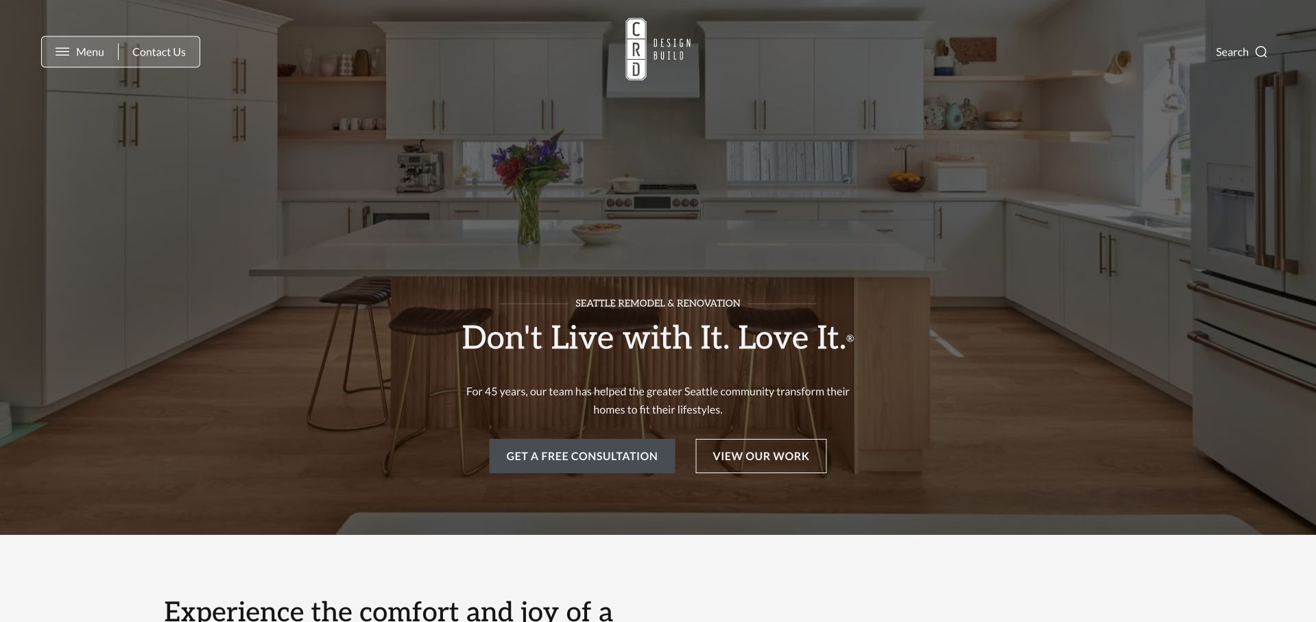
CRD Design Build places a kitchen photograph behind a centered introduction, with a dark wash protecting the white typography. The logo sits in a sparse header between compact menu and contact controls on one side and search on the other. A filled consultation button and outlined View Work button distinguish direct inquiry from further evaluation. The next section begins below the hero, making the opening feel like an introduction to a larger portfolio. Retained Bricks assets support the marketing-page association. The capture demonstrates the visual hierarchy, without proving a particular template structure or independently verifying the company's experience claims.
What you can learn
Create a hero pattern that can accept different project photographs without losing text contrast. Keep portfolio exploration available beside consultation, and make the main menu understandable without requiring visitors to guess what it contains.
Pros
The overlay protects the legibility of the headline over a detailed interior photograph.
Different button treatments separate browsing completed work from starting a consultation.
Cons & considerations
The compact menu conceals the broader information structure until a visitor opens it.
The opening's experience claim needs supporting context beyond the photograph and headline.
Platform source: WordPress.org Showcase. Linked script matches Breeze. Exact public source-page reference: https://www.crddesignbuild.com/. This is an observed component association, not proof of private configuration, a paid plan, measured results or complete architecture. Platform evidence is separate from the direct website screenshot and is not a complete current infrastructure audit.
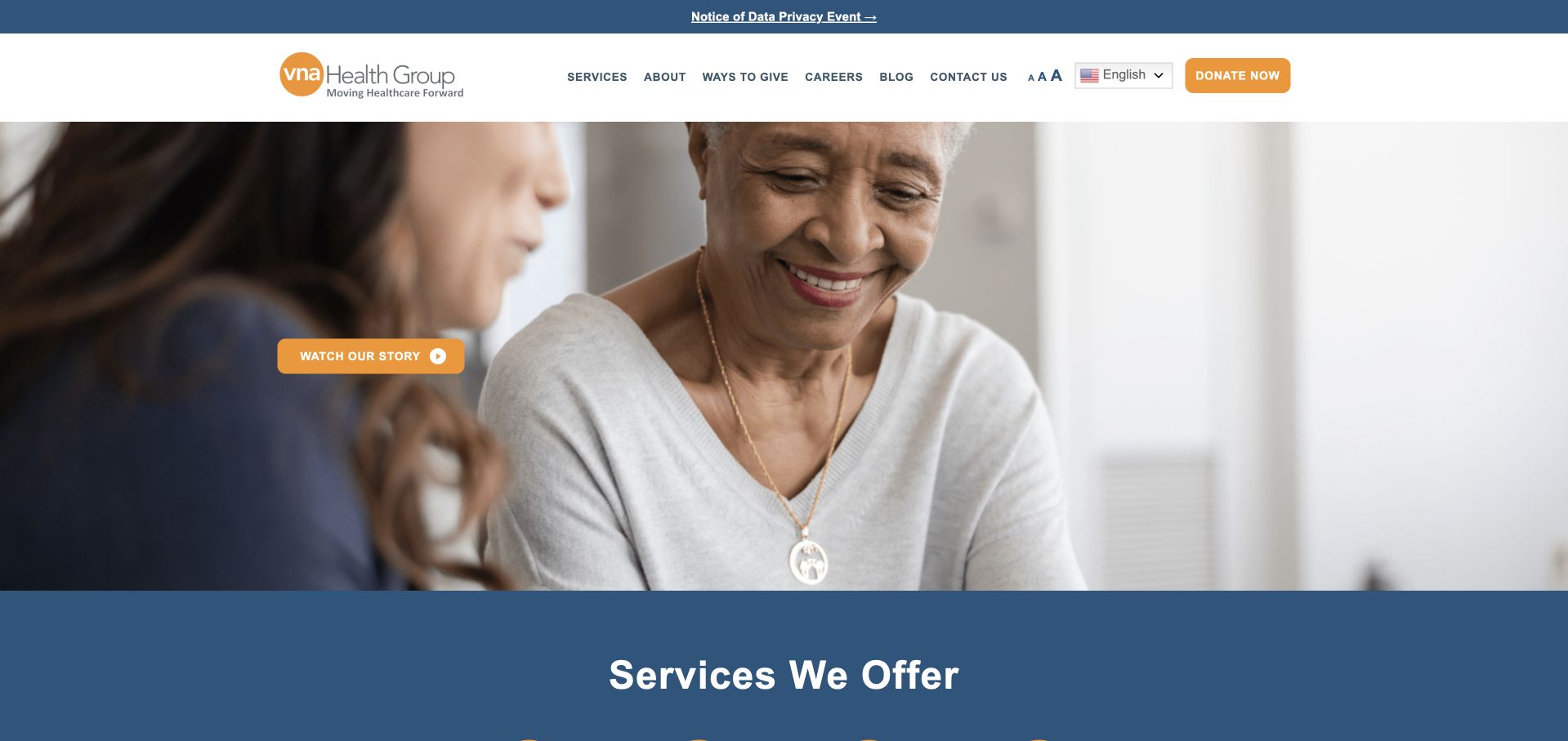
VNA Health Group uses a large care-interaction photograph and a restrained orange action, followed by a broad blue service section. The white header separates services, about, ways to give, careers and public information. That structure acknowledges that a nonprofit-style visiting-nurse organisation has donors and volunteers as well as families and referring professionals. The hero itself carries relatively little explanatory text, leaving the service section to make the organisation understandable. The useful lesson is that the navigation should preserve those different relationships. A general request or support action should not be mistaken for a clinical referral or a promise of local availability.
What you can learn
Use the opening photograph to establish tone, then make service scope and geographic coverage concrete. Keep donations and organisational participation separate from the public care-information and professional-referral journeys.
Pros
The navigation recognises support and employment tasks without treating every visitor as a prospective patient.
A dedicated service section follows the image rather than relying exclusively on the hero to explain the organisation.
Cons & considerations
A lightly labelled hero can leave unfamiliar visitors uncertain about the immediate next step.
Service categories need current local detail rather than a general network-wide availability assumption.
Platform source: WordPress.org Showcase. Linked script matches Breeze. Exact public source-page reference: https://vnahg.org/. This is an observed component association, not proof of private configuration, a paid plan, measured results or complete architecture. Platform evidence is separate from the direct website screenshot and is not a complete current infrastructure audit.
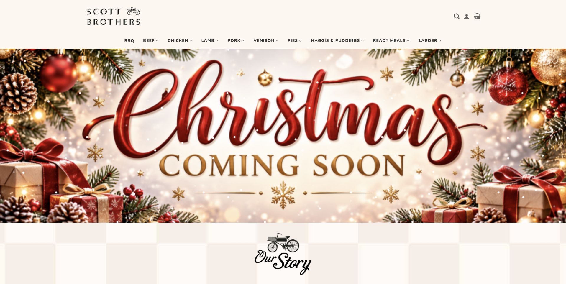
Scott Brothers Butchers keeps a small black wordmark and conventional navigation above a large Christmas graphic. Decorative red lettering, foliage and pale space give the campaign a greeting-card quality rather than the dark close-up meat photography used elsewhere in this collection. An Our Story section begins below, creating a clear transition from temporary promotion to the longer-lived business introduction. The design is useful for considering how a familiar family shop can update its homepage around seasonal trading without changing the whole brand. The seasonal graphic attracts attention, but the ordinary shop navigation remains the reliable route into the assortment.
What you can learn
Treat seasonal artwork as a replaceable campaign layer. Keep the family story, category labels and practical shop information stable underneath it, and make sure Coming Soon messages are removed or updated when the relevant ordering period actually opens.
Pros
The seasonal graphic is visually distinct from the permanent black wordmark.
The next section gives the family story its own place below the campaign.
Cons & considerations
Decorative lettering can be harder to read on small or low-resolution displays.
A Coming Soon campaign needs a clear update plan and useful destination.
Platform source: WordPress.org Showcase. Linked script matches Breeze. Exact public source-page reference: https://www.scottbrothersbutchers.co.uk/. This is an observed component association, not proof of private configuration, a paid plan, measured results or complete architecture. Platform evidence is separate from the direct website screenshot and is not a complete current infrastructure audit.
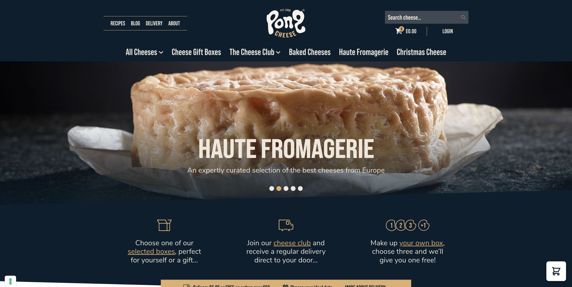
Pong Cheese uses a playful white wordmark on navy, then introduces a large close-up of a cheese-filled pastry under its Haute Fromagerie campaign. The dark background keeps the food as the bright focal point. Beneath the hero, three illustrated benefit blocks explain choosing a gift, joining the club and making a box. This is useful because it translates a stylized campaign into distinct ways to buy. The menu above also separates individual cheeses and boxes. The design makes the store feel characterful, but the practical lesson is the small decision structure immediately below the photograph rather than the novelty of the headline alone.
What you can learn
After an attention-grabbing food campaign, offer a short set of concrete customer choices. Distinguish gifts, recurring orders and custom assortments, then explain their terms on separate pages so customers do not confuse a subscription with a one-time cheese box.
Pros
The navy background gives the pastry photograph strong visual prominence.
Three buying-model blocks turn a playful campaign into understandable next steps.
Cons & considerations
Special campaign names require supporting wording for visitors unfamiliar with the range.
The top menu still needs clear mobile grouping as product categories grow.
Platform source: WordPress.org Showcase. Linked script matches Breeze. Exact public source-page reference: https://www.pongcheese.co.uk/. This is an observed component association, not proof of private configuration, a paid plan, measured results or complete architecture. Platform evidence is separate from the direct website screenshot and is not a complete current infrastructure audit.
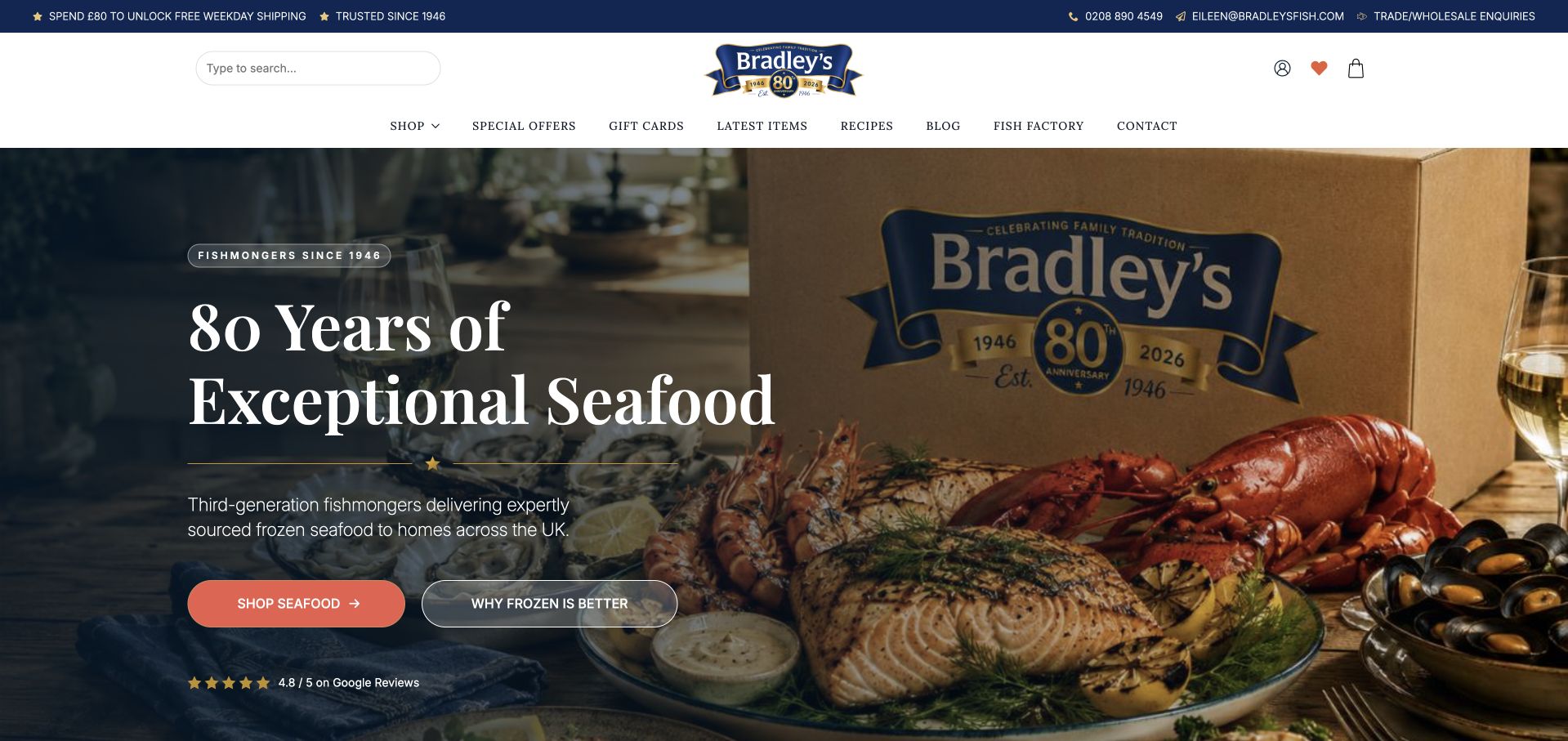
Bradley’s Fish combines a navy-and-white header with a staged seafood photograph and a branded shipping box. Large serif lettering introduces the anniversary campaign, while two contrasting actions lead toward shopping and an explanation of frozen seafood. That second route is the particularly useful feature: it acknowledges a question a newcomer might have before choosing a product. Categories, offers and delivery information remain accessible in the header. The page is a reference for connecting product appetite with service explanation. Its anniversary and quality wording are publisher claims, while the visible design makes the delivery format more tangible than a generic fish photograph would.
What you can learn
If the buying model needs explanation, give that explanation its own obvious route beside the shop action. Show the real packaging context, then document delivery handling, coverage and customer responsibilities without promising that a styled box photograph proves the entire process.
Pros
The branded box makes the delivery format visible alongside the seafood.
A separate explanatory action addresses a likely question before product selection.
Cons & considerations
An anniversary campaign needs dates and supporting context beyond the large headline.
The detailed hero still needs careful contrast and crop testing on phones.
Platform source: WordPress.org Showcase. Linked script matches Breeze. Exact public source-page reference: https://bradleysfish.com/. This is an observed component association, not proof of private configuration, a paid plan, measured results or complete architecture. Platform evidence is separate from the direct website screenshot and is not a complete current infrastructure audit.
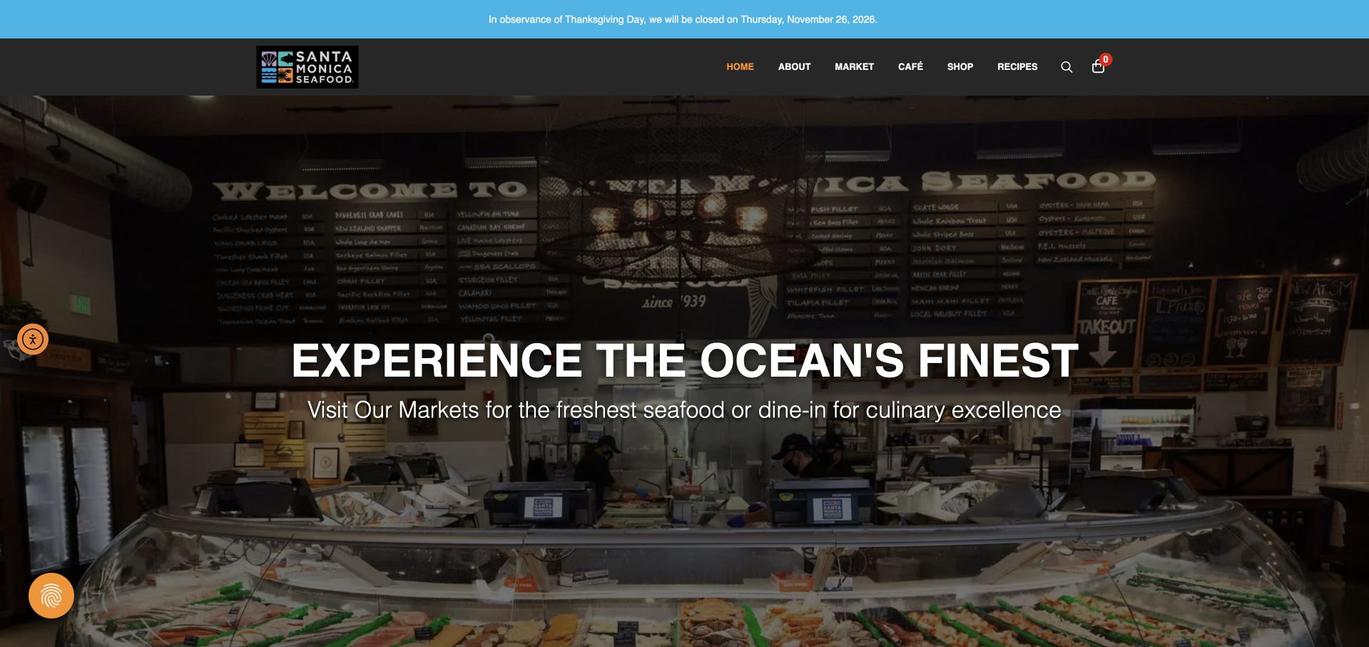
Santa Monica Seafood Market & Café uses a photograph of its actual counter beneath a dark header. The large white introduction sits over the interior, while a thin blue notice above carries current holiday closure information. The menu distinguishes market, café, recipes and location-related routes, reflecting the business’s dual purpose. The reviewed source is the public market-and-café landing page, not a wholesale supplier homepage. That scope matters when borrowing from it. The strongest design feature is the real counter scene: customers can understand the place they might enter rather than seeing only a polished plate or an anonymous delivery package.
What you can learn
Show the physical counter when the visit is central to the offer, and keep market shopping separate from café menus. Put exceptional closure information in an editable notice with a date, while maintaining ordinary location and opening details on stable pages.
Pros
The real counter photograph makes the local market setting concrete.
A separate holiday notice can change without replacing the main location introduction.
Cons & considerations
The darkened interior needs adequate contrast without obscuring the actual market details.
Market and café services require clearly differentiated menus and location information.
Platform source: WordPress.org Showcase. Linked script matches Breeze. Exact public source-page reference: https://smseafoodmarket.com/market-home/. This is an observed component association, not proof of private configuration, a paid plan, measured results or complete architecture. Platform evidence is separate from the direct website screenshot and is not a complete current infrastructure audit.
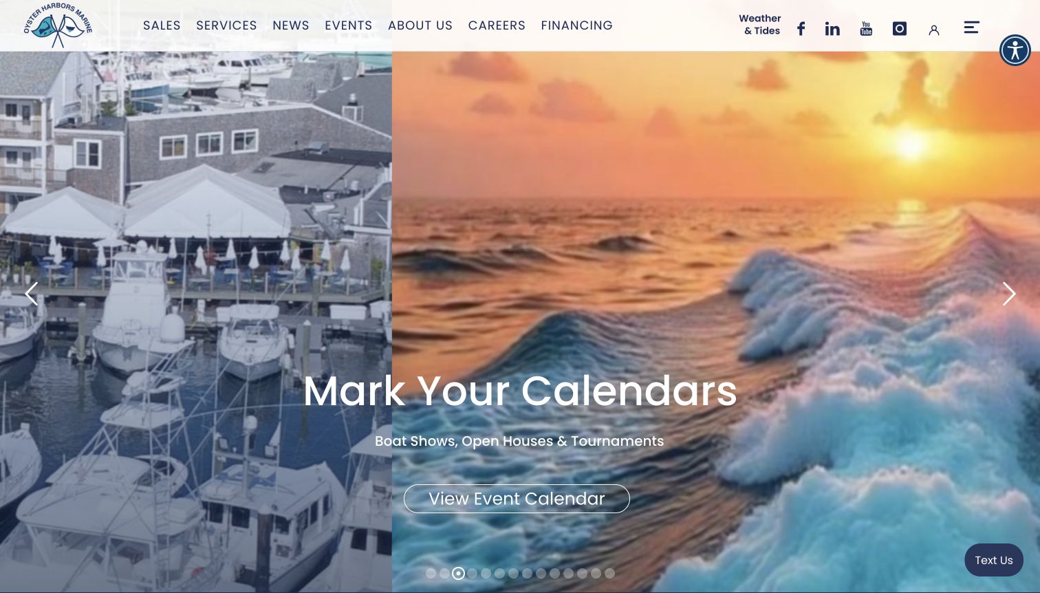
Oyster Harbors Marine places its brand and primary service navigation over a large rotating maritime scene. The captured slide promotes events, while the longer homepage supplies the more practical buying tools: inventory controls for condition, make, model, class, broker, price, length and year. Just-listed cards distinguish new, used and brokerage boats and attach location information to each listing. Regional offices, fuel-dock hours, boating articles and event notices give the dealer a presence beyond the catalog. The page therefore serves both active shoppers and existing boaters, although its many modules make the principal sales route compete with several other interests.
What you can learn
Pair evocative coastal imagery with a dependable inventory entry point. When a dealer combines brokerage, new sales and marina services, label those relationships explicitly and keep local details close to the relevant boat or office.
Pros
Listing cards communicate condition and place before a visitor opens a vessel.
Broker, size and price controls accommodate shoppers with a developed search brief.
Cons & considerations
A changing promotional hero can delay the first direct inventory cue.
The extensive homepage asks visitors to navigate several competing content priorities.
Platform source: WordPress.org Showcase. Linked script matches Breeze. Exact public source-page reference: https://oysterharborsmarine.com/. This is an observed component association, not proof of private configuration, a paid plan, measured results or complete architecture. Platform evidence is separate from the direct website screenshot and is not a complete current infrastructure audit.
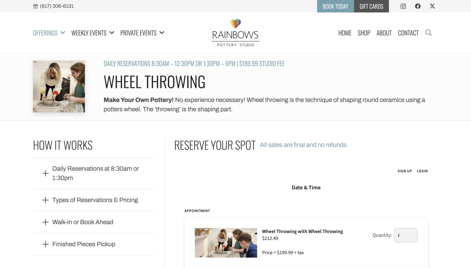
Rainbows' wheel-throwing page introduces the technique in plain language alongside a small photograph of instruction at the wheel. A prominent title and a concise reservation line establish the topic before a two-column layout separates How It Works from Reserve Your Spot. Expandable questions cover reservations, pricing, walk-ins and collection of finished pieces. The booking area remains visible beside that explanation, and the reviewed page distinguishes a studio fee from optional expert instruction rather than presenting every cost as one undifferentiated package. This is a helpful information pattern, although important details sit inside collapsed panels and the separate booking component has its own visual language. The review concerns the page's communication; no slot, quantity or paid option was selected.
What you can learn
Explain the class and the booking terms beside each other. If instruction, materials or finishing are separate options, make those distinctions understandable before a visitor reaches the transaction step, and keep the finished-piece collection process visible.
Pros
Practical questions sit alongside the reservation area.
The technique is explained for a newcomer.
Cons & considerations
Collapsed panels can hide important pricing details.
The booking component introduces a different visual style.
Platform source: WordPress.org Showcase. Linked script matches Breeze. Exact public source-page reference: https://www.rainbowspottery.com/offerings/wheel-throwing/. This is an observed component association, not proof of private configuration, a paid plan, measured results or complete architecture. Platform evidence is separate from the direct website screenshot and is not a complete current infrastructure audit.
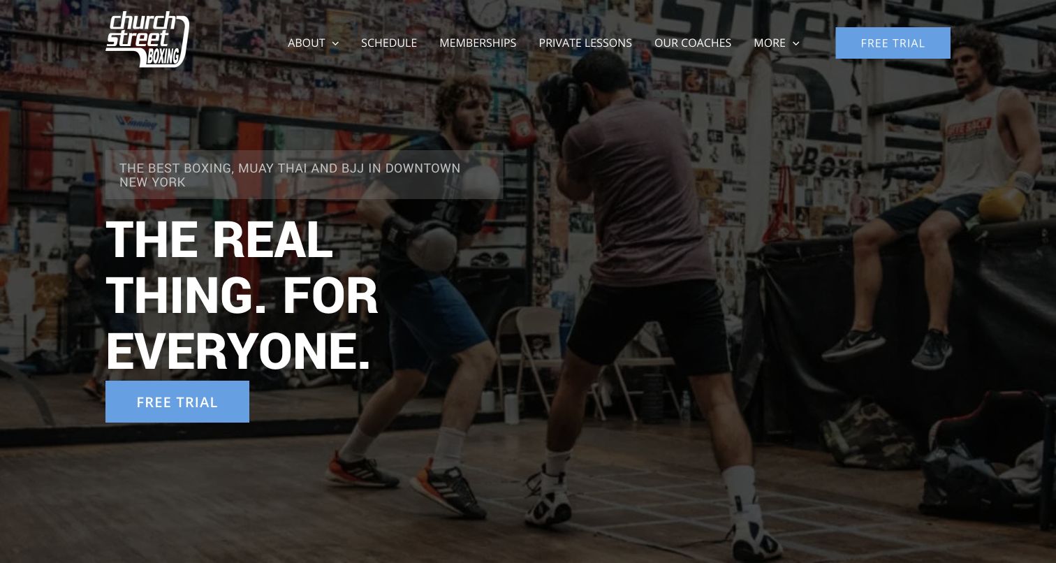
Church Street Boxing’s Park Place site opens with a real training photograph, a short inclusive statement and a blue free-trial action. The next section turns that invitation into a three-stage process: visit, discuss a program and begin training. This is more useful than a general promise to transform someone’s fitness because it describes what happens at the gym. Separate program descriptions cover boxing alongside Muay Thai, Brazilian jiu-jitsu and youth options. The page also links schedules, memberships, private lessons and coaches through a concise header. The broad photograph gives the gym character, although it delays the program comparison. Visitors still need to distinguish boxing instruction from the other disciplines before selecting the most appropriate session.
What you can learn
Answer the emotional uncertainty of a first visit with a simple, factual sequence. Pair a welcoming headline with program distinctions and a visible schedule rather than making the trial button carry every explanation.
Pros
The first-visit sequence makes an unfamiliar process concrete.
Coaching and membership tasks are clearly named.
Cons & considerations
The large hero postpones program details.
Several disciplines require careful audience separation.
Platform source: WordPress.org Showcase. Linked script matches Breeze. Exact public source-page reference: https://csboxinggymparkplace.com/. This is an observed component association, not proof of private configuration, a paid plan, measured results or complete architecture. Platform evidence is separate from the direct website screenshot and is not a complete current infrastructure audit.
Kegan has 15+ years of experience working with small businesses, Fortune 500 companies, and everything in between. No development job is too big or too small: he brings the same hands-on attention to a focused improvement, a complete website, or a custom application.
For Breeze projects, he can help with WordPress cache boundaries, logged-in and transactional exclusions, asset-handling checks, cache invalidation, representative testing and maintainable handover. He works directly with clients on scope, design, implementation, testing, and handover, with an emphasis on clear communication and a system that remains practical to maintain after launch.
Show 3 other Breeze developersHide other Breeze developers
Choose a Breeze setup that matches the website and its delivery layers
Begin with a conservative baseline and a controlled comparison
Record the existing configuration and test the current site before enabling additional optimization. Work on staging with representative content and a realistic theme and plugin combination. Change one defined group of settings, compare the result and test the key interactions. A list of available options is not an instruction to activate every option together.
Cloudways’ current configuration guidance distinguishes presets and warns that more extensive file changes can affect themes and plugins. Treat a preset as a starting configuration to evaluate rather than proof that it fits every site. Keep the expected cache behavior and recovery steps written down. If a change causes an error, preserve the observation and investigate it instead of layering more settings over an unexplained problem.
Review file optimization against real script dependencies
Minifying, combining, deferring and delaying resources are different operations. A theme’s menu, a form plugin and an embedded application may rely on a particular loading relationship. Test those features deliberately after a change, including a fresh visit and a direct link to an inner page. An opening screenshot cannot establish whether the later interaction still works.
Breeze provides file-optimization and exclusion controls, documented by Cloudways. Use specific exclusions when the tested implementation needs them and record the reason. Do not keep an unexplained collection of broad exceptions that nobody can maintain. When updating a theme or plugin, revisit the relevant assumption rather than expecting an old filename-based rule to remain correct indefinitely.
Coordinate with the actual host and CDN integration
Confirm what the hosting platform already provides before adding another cache or purge mechanism. Identify whether the proposed integration is supported in that environment and who holds any necessary access. A plugin can offer several delivery-related features without making all of them interchangeable across providers. Keep secrets out of public code, screenshots and ordinary content fields.
The documented Breeze Cloudflare purge integration is specifically tied to the Cloudways Cloudflare Enterprise setup, not a general connection for arbitrary personal Cloudflare credentials. Preserve that scope when writing the brief. If the site uses a different CDN or host, consult its applicable supported integration rather than copying constants or credentials from an unrelated example. Test that an actual content update reaches the intended public page.
Plan the tests, publishing process and maintenance handover
Create a representative set of pages and states
Choose pages by behavior as well as appearance. Include an ordinary article, an archive or listing, a search or filtered view, a contact path and any authenticated or transactional area relevant to the project. Use fictional test data and approved test accounts. Do not put real customer information into a staging demonstration simply to make the page look complete.
Define the expected result for each state: what should remain current, which content is public and what must not be shared across visitors. Compare cold and repeat visits where appropriate and record the test conditions. Keep visual layout checks distinct from response, storage and interaction checks. A fast-looking homepage or a public cache asset is not evidence that the entire site behaves correctly.
Rehearse content changes and configuration recovery
Ask an editor to publish a correction and verify the intended public result through the agreed process. Include images and inner pages rather than testing only a headline. Record which layers can retain an older resource and how an authorized maintainer diagnoses the situation. Make the normal publishing workflow understandable without giving every editor unnecessary infrastructure access.
Breeze’s Tools documentation describes configuration export and import. Keep an appropriate private configuration backup before a significant adjustment, but review it before applying settings to another environment. A staging site and production site can have different domains, services and responsibilities. A successful import does not establish that the destination has the same cache requirements or that external integrations have been configured correctly.
Give ongoing optimization an owner and a safe boundary
Assign responsibility for the WordPress plugin inventory, performance observations, cache policy and incident response. Review relevant behavior after theme, plugin and infrastructure changes. Keep a short record of why a nondefault setting exists and what test demonstrates its value. That record is more useful than an administrator screen full of switches with no explanation of the original problem.
Treat database-cleanup tools as separate operational changes with their own review and backup requirements, not routine decoration in a speed project. Do not remove content or historical records merely because a tool labels them as cleanup candidates. Agree what can be changed and rehearse recovery. Optimization should preserve the organization’s information and important visitor tasks while addressing a measured problem, not make unexplained destructive changes in pursuit of a score.
A useful handover demonstration
Ask the actual team to carry out its routine job: publish a realistic update, correct a mistake, preview a narrow screen, and identify who owns an integration failure. For a library or frontend framework, also ask who maintains the content source and deployment. A polished screenshot does not answer those operational questions.
Beyond the screenshot
Before launching a Breeze configuration
Record the current WordPress, theme, plugin, host and CDN responsibilities.
Define public, personalized, frequently changing and transactional page behavior.
Keep a measured baseline and representative test pages.
Check the current official documentation for the installed configuration.
Test staged optimization changes before public deployment.
Review menus, forms, embeds, consent controls and keyboard access after changes.
Document cache exclusions and the specific reasons they exist.
Verify content publishing and correction behavior across actual cache layers.
Keep configuration backups private and review environment differences before reuse.
Assign update, rollback and incident-response ownership.
Review any database cleanup separately with explicit scope and recovery safeguards.
Test with real content, a keyboard, a small screen, slow or failed requests, and the people who will maintain the system. These are planning checks, not an accessibility, security, performance, or search-ranking certification.
Sources & editorial method
How this Breeze collection was reviewed
The examples pair genuine direct website captures with public Breeze evidence scoped to the exact property. That association does not establish hosting, enabled options, commercial results or measured performance. Current official WordPress.org and Cloudways documentation supports the product-specific planning statements. Screenshots and technical observations retain their own actual dates; the collection is not a speed benchmark or a recommendation to apply identical settings to every site.
Every image is an unmodified capture from the actual website, with its source and capture date. Some captures are reused from our shared catalog; their dates remain the original capture dates. None comes from a vendor gallery or a generated reconstruction. Moving imagery and live content can change.
Technology attribution uses public page assets or metadata, official platform documentation, or a cited first-party project case study. Documentary and framework-relationship evidence is identified where used; it is not a complete current backend inventory. A CMS image CDN alone does not establish a full CMS deployment. A library’s presence does not prove which individual controls use it, and a platform label does not establish AI authorship.
The composition notes, lessons, pros and tradeoffs are original editorial observations. We have not measured conversion, traffic, security, performance or accessibility conformance. Website owners retain their brands and imagery; these examples are not our client portfolio. Written, Edited and Curated are independent records, not dates advanced by a build. See our editorial standards or suggest a correction.
Questions worth asking
Breeze website development FAQs
Does a Breeze asset prove that a site is hosted on Cloudways?
No. It can identify the supported plugin association without proving the complete hosting environment. Hosting and CDN claims need their own property-specific evidence.
Should every available optimization setting be enabled?
No. Begin with the site’s requirements and test a controlled configuration. File changes and caching behavior can affect themes, plugins and visitor tasks. An option’s availability does not establish that it is appropriate for a particular implementation.
Can these examples prove that Breeze makes a website faster?
No. A screenshot and public plugin evidence do not establish a performance comparison. Use representative measurements with clear conditions and test the important interactions as well as the loading result.
Can the same exported settings be applied to every site?
Treat an export as a useful configuration record, not a universal policy. Review differences in content, personalized pages, domains, hosting and integrations before reusing it, then verify the result.
Is cache cleanup the same as deleting database records?
No. Treat database changes as a separate operational action with explicit scope, appropriate backups and recovery checks. A performance project should not silently remove information merely because a cleanup tool offers the option.
Borrow a useful design pattern from the examples, then optimize the delivery of your own content with measured tests, clear cache boundaries and a maintenance process the team can actually follow.