Amazon CloudFront is a content-delivery service, not a page builder. Its public signal describes part of a delivery path—not the design system, complete hosting architecture, or quality of a website.
The examples range from storefronts and collaborative products to public-service and editorial properties. Each exposed a scoped CloudFront delivery reference in the public source review. A large brand can use different providers across websites, routes, and assets; the attribution applies to the named property, not everything that brand operates.
The design lesson begins with what must reach a visitor and how quickly a correction must become visible. Campaign imagery, a changed service notice, and a signed-in account response are not interchangeable content classes. A CDN choice does not remove the need to define those differences.
Before the examples
What makes good Amazon CloudFront website development in 2026?
Name the content class before choosing its cache behavior
Inventory public documents, versioned assets, application endpoints, and personalized content separately. Record which system sets response behavior and who approves changes. Never assume that a rule suitable for an image is suitable for an account page, form response, or frequently corrected notice.
Make freshness an editorial requirement
Decide what a visitor should see after an urgent correction, expired campaign, or routine image replacement. AWS documents how cache policies, TTLs, and origin headers interact. Verify the actual distribution settings and responses instead of assuming a header added at one layer always determines the final behavior.
Treat the origin and delivery layer as separate responsibilities
Document where content comes from, who can release it, and what happens when that origin fails. Keep cache, browser, and application behavior distinguishable during diagnosis. A reported delivery header cannot establish the origin’s technology, security settings, or operational reliability.
Look at how each public interface combines stable navigation with changing campaigns, content, or product information. The CloudFront reference is scoped delivery evidence, not an independent measurement of speed or a guarantee that the entire property uses one provider.
We start with five recognizable brands or organizations: Disney Experiences, Nike storefront, Figma marketing website, Atlassian Support, Vodafone UK. Each attribution applies to the named website property, not every product or website belonging to its organization. This is a curated reading sequence, not a measured ranking.
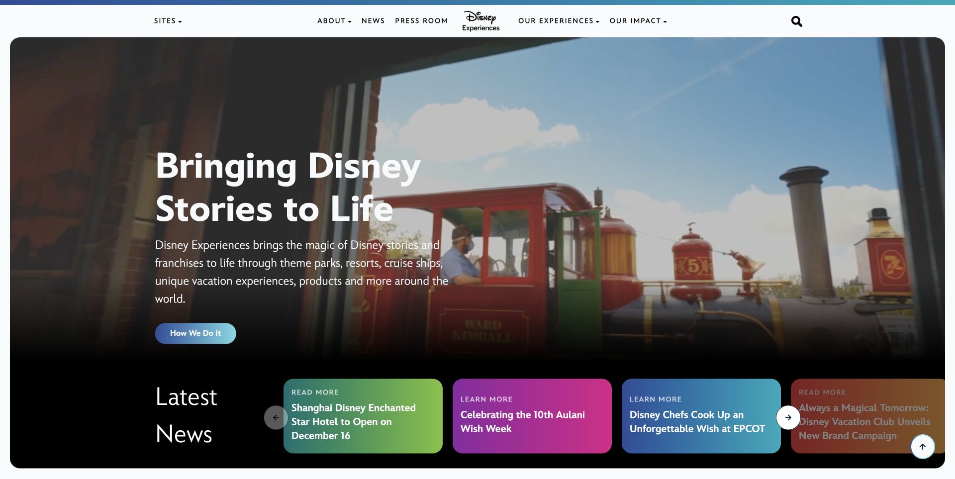
Disney Experiences combines a large branded scene, a short portfolio introduction, and a contrasting strip of current stories. The current property is the destination of the former Disney Connect address, so the migration matters as well as the visible design. CloudFront-related delivery evidence was observed on the sampled response. It does not establish that every origin, image, booking service, or Disney application is delivered through the same architecture.
What you can learn
For a similar portfolio, classify the homepage document, versioned campaign assets, and news records separately. A revised statement may need prompt publication while an unchanged image can retain a longer-lived URL. Test old host and article redirects alongside cache refresh, and verify that removing a feature does not strand its news destination. An edge delivery service should implement a deliberate content policy rather than become a reason to cache every branded response identically.
Pros
The news strip provides specific destinations beneath the broad portfolio introduction.
The large scene and concise text establish one coherent opening identity.
Cons & considerations
Legacy property names require a clear migration and destination plan.
A fast-changing story strip needs freshness rules distinct from long-lived campaign imagery.
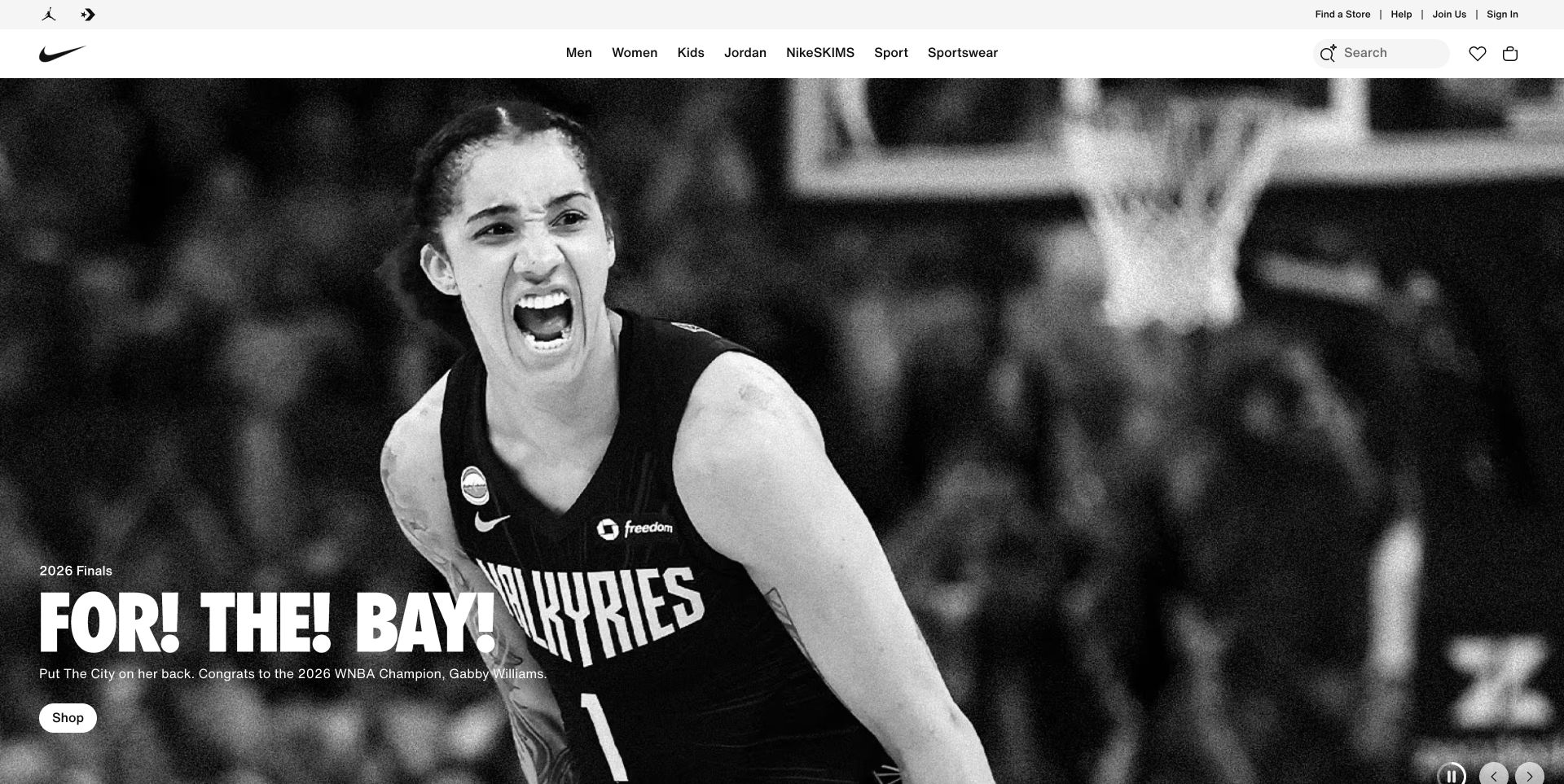
Nike's captured storefront places a monochrome sports scene under a solid two-level commerce header. Audience and product categories differ from help, account, search, favorites, and bag utilities. Small campaign copy and a shopping action sit low in the image. CloudFront evidence was observed for this public property, not demonstrated as the complete implementation of account, inventory, checkout, or every regional shopping experience.
What you can learn
Separate static campaign files from responses that vary by market or customer state. Test the storefront with an empty bag, a changed region, an unavailable image, and an older campaign link. Keep public catalog information useful without requiring the scene's optional media behavior. A delivery plan should explain which variations belong in a cache key and which responses must remain outside shared caching, rather than treating the entire shopping shell as one interchangeable asset.
Pros
Commerce utilities remain in predictable positions above the expressive campaign.
The audience and product taxonomy does not depend on the current image.
Cons & considerations
Low-positioned overlay copy needs testing across short screens and replacement crops.
Region and account state introduce variations that a campaign image alone does not explain.
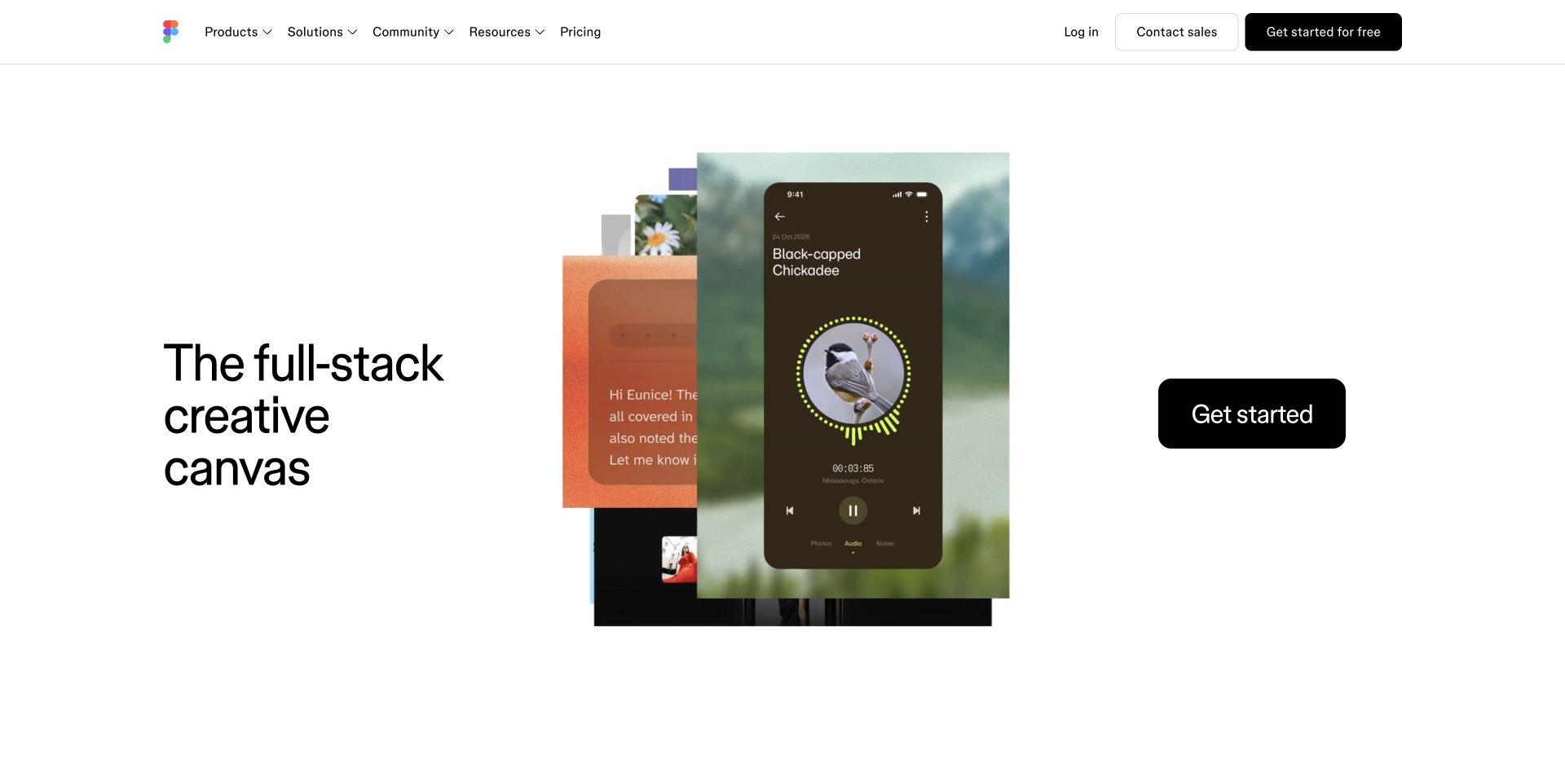
Figma uses a spare white shell around a layered montage of product surfaces. A short introduction, a large getting-started action, and a compact navigation frame the changing imagery. The montage illustrates breadth without becoming a full application interface. The sampled CloudFront signal concerns public delivery; it is not an account of the collaborative editor, customer documents, or real-time product infrastructure.
What you can learn
Keep the montage's build assets and the public document under intentional version and freshness rules. Test a failed media request and a delayed script without losing the explanation or main destination. Make registration a clear handoff to a different responsibility, and never assume that a marketing cache policy is appropriate for a user's private design document. Rehearse an asset rollback with HTML and media references kept compatible.
Pros
The minimal shell gives the product demonstration a clear visual role.
One dominant action remains easy to distinguish from the compact global navigation.
Cons & considerations
A changing montage needs an understandable still and text alternative.
Detailed product imagery can be mistaken for a live working interface unless its role is clear.
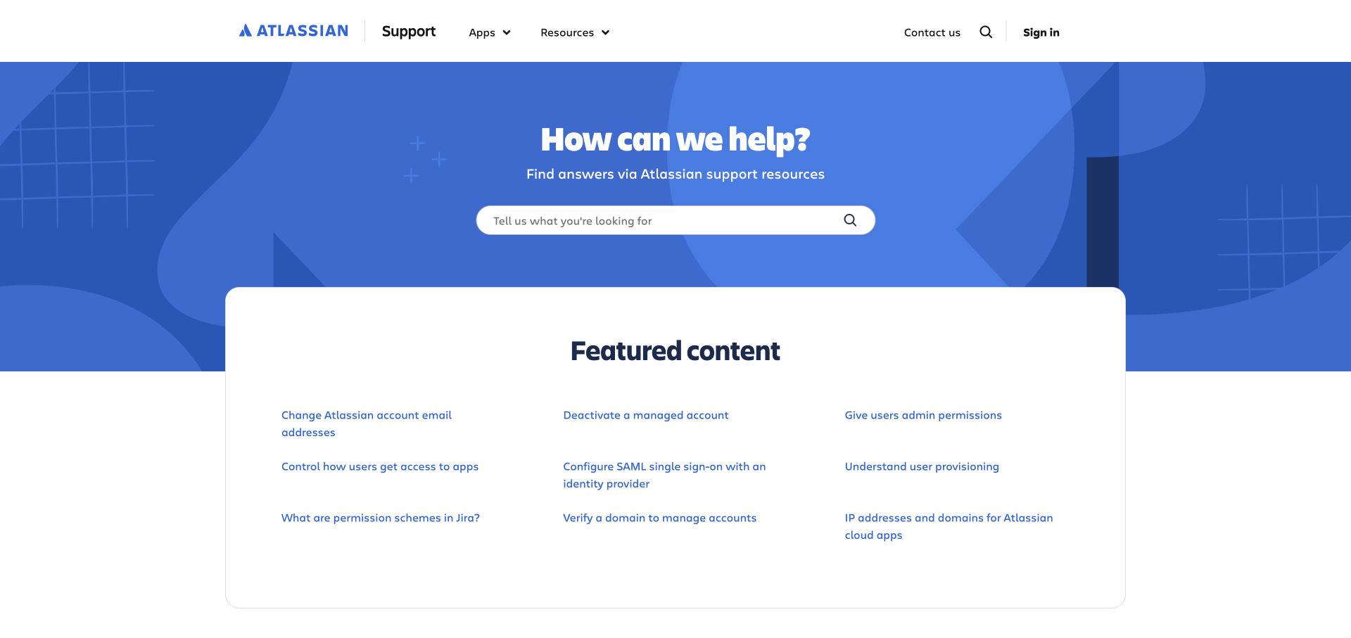
Atlassian Support leads with a blue search panel and a bounded collection of featured help destinations. Apps and resources form distinct navigation groups, while sign-in remains separate. The task is finding an answer rather than starting a product trial. CloudFront delivery evidence was observed on this support property specifically, not established for Jira, Confluence, or every authenticated Atlassian application.
What you can learn
Maintain useful stable help URLs and clear product/version relationships before optimizing delivery. Test how a corrected article reaches public caches, and ensure an obsolete instruction is not revived by an inconsistent deployment. Search results and personalized account responses need different consideration from static article illustrations. Preserve a conventional featured directory when search is unavailable, so a delivery or integration failure does not leave the support page with nothing but an empty query field.
Pros
Search has an unmistakable primary role in the opening.
Featured links offer a concrete alternative to constructing a query.
Cons & considerations
Broad help libraries need precise product and version labeling.
Search-dependent discovery requires a useful fallback for unavailable or poor results.
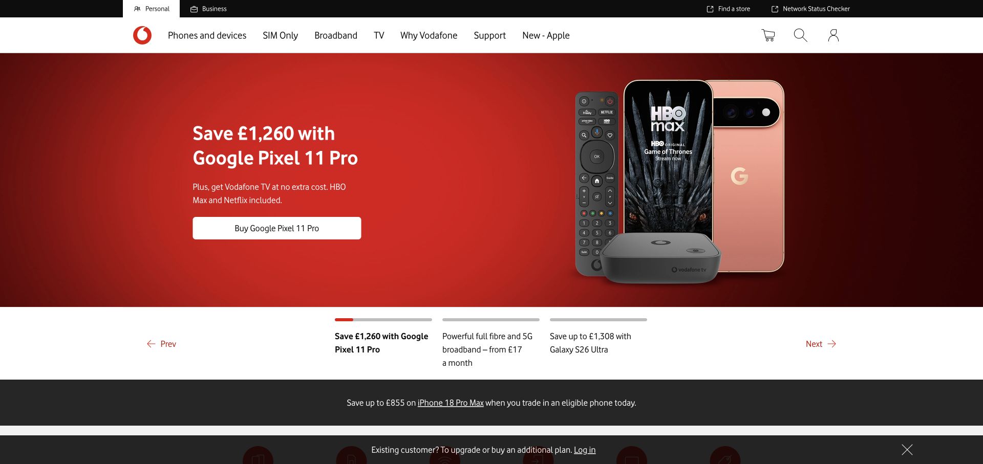
Vodafone UK's opening places a device and short offer copy within a red campaign field beneath an orderly product header. Labeled carousel choices provide more context than anonymous dots, and supporting information continues below. The CloudFront observation is scoped to the public UK property. It does not describe the telecommunications network, billing, private accounts, or every Vodafone regional website.
What you can learn
Define offer expiry, market context, and supporting terms as content responsibilities before setting cache duration. A device photograph can remain unchanged while its price or eligibility conditions require a correction. Test the labeled campaign destinations after a refresh and after an old offer is removed. Keep service and account handoffs recognizable, and preserve enough plain information for someone who reaches an expired promotion from a saved message or external search result.
Pros
The labeled campaign choices make alternate offers more interpretable.
The market-scoped navigation provides a stable frame around changing device promotions.
Cons & considerations
Prices and eligibility details need coordinated updates across campaign and terms pages.
Several promotional and informational strips can crowd a short viewport.
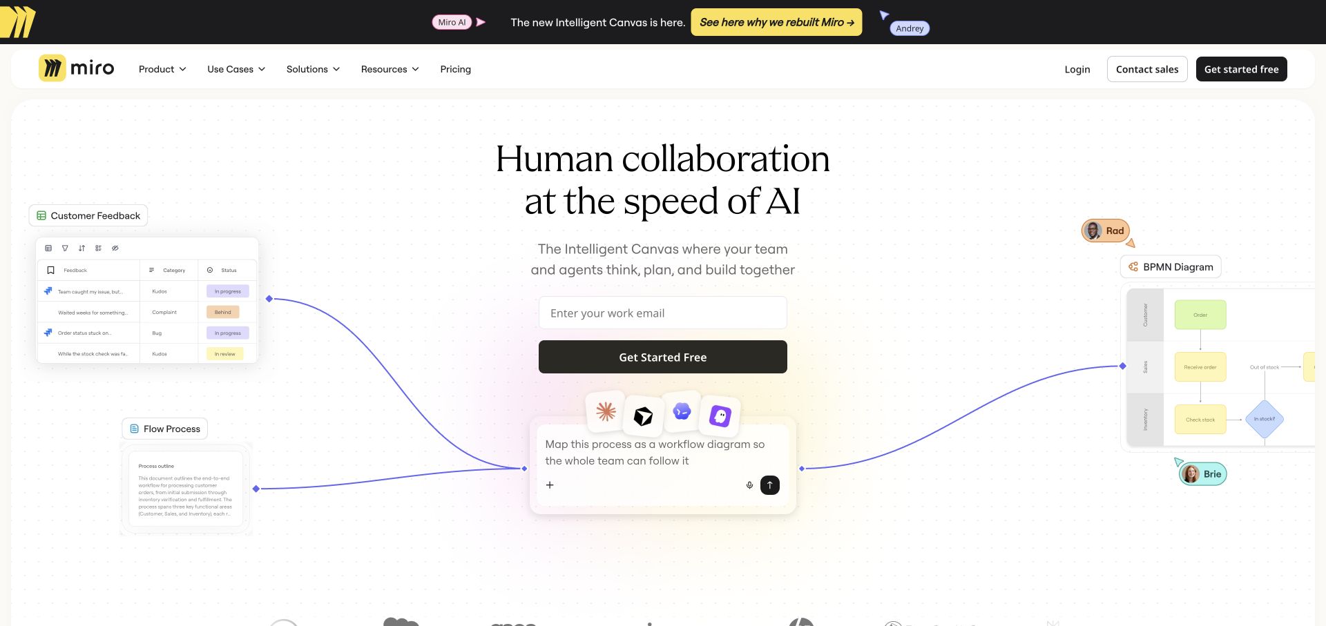
Miro surrounds a centered proposition and email entrance with small interface fragments connected across a lightly dotted canvas. Feedback, process, and prompt examples communicate a shared workspace without turning the page into the application. The sampled response contained CloudFront-related evidence. That does not identify the implementation of private boards, authenticated collaboration, or any particular user's content.
What you can learn
Treat interface fragments as explanatory assets with versioned references, while keeping the main document and signup explanation current. Test the page with one missing fragment and without connector animation. The real registration destination needs a separate, deliberate handoff and an appropriate handling plan for submitted information. Do not let a public marketing cache rule leak into responses associated with private workspaces merely because both experiences use the same brand and illustrations.
Pros
The connected fragments explain a collaborative product through concrete visual tasks.
The central proposition remains distinct from the surrounding illustrative interface pieces.
Cons & considerations
A complex visual canvas needs a clear reading order on mobile.
An email entrance needs an explicit purpose and next-state rather than relying on the product metaphor.
Compass places buy, rent, and sell choices above a broad location search on a residential photograph. A black search action is distinct from the white field, and property cards begin underneath. Agents and new development remain available in the header. The CloudFront signal is public delivery evidence, not proof about the listing database, freshness of inventory, or authenticated client systems.
What you can learn
Design the cache and route plan around the difference between a stable search shell and changing results. Preserve transaction type and location context in useful links without accidentally sharing personalized states. Test an unavailable property, a removed listing, and a changed location after deployment. Make empty and stale results honest to the visitor, rather than treating a visually correct search panel as proof that the information behind it is current.
Pros
The transaction type is explicit before a location query is entered.
The strong field/action contrast clarifies where the search begins.
Cons & considerations
Listing freshness and availability cannot be inferred from an attractive property card.
Search results need useful empty and removed-listing states, not only a successful default view.
Savills introduces a broad service proposition over a skyline and places market choice prominently within the feature. The yellow action and identity remain recognizable above property, service, research, and contact navigation. This is a global gateway rather than a local inventory page. CloudFront evidence was observed in the public response, not as a complete description of every regional website or property-search service.
What you can learn
Keep market selection explicit in the routing and content model. A shared global image may be cacheable independently from region-specific notices, currencies, or contact destinations. Test bookmarked local URLs, an unavailable market, and a switch between language versions. Retain direct research and service routes for visitors who already know their destination so the gateway does not become an unnecessary repeated interruption every time someone returns to the site.
Pros
The location choice acknowledges the geographic breadth of the business.
Research and professional-service routes remain distinct from residential discovery.
Cons & considerations
A gateway can add friction for visitors who already have a specific local task.
Regional context must survive a handoff rather than reset to a generic global introduction.
Visible tech stack
Referenced on the public page
Amazon CloudFront
Public source checked November 3, 2026. References may be embedded or legacy—not a complete backend inventory.
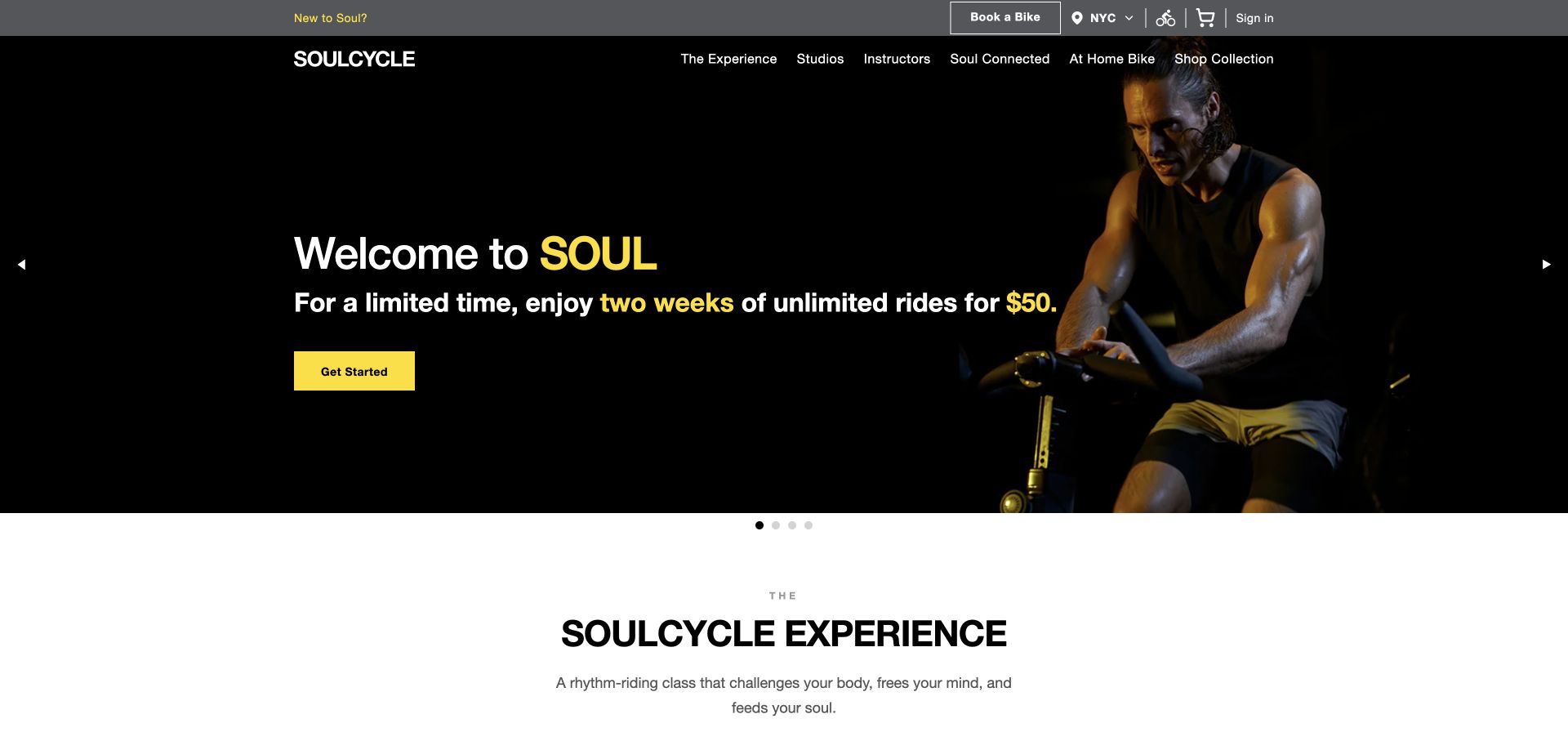
SoulCycle separates booking, region, account access, and shopping into a utility layer above a dark activity-led campaign. Yellow emphasizes the introductory offer and action, while another section begins explaining the experience below. The public property exposed CloudFront delivery evidence. The review did not inspect class inventory, account sessions, payment handling, or the system responsible for managing a rider's bookings.
What you can learn
Keep the public offer, regional class discovery, and private account experience under explicit ownership. A campaign expiry must not be hidden by long-lived cached HTML, while static imagery can follow a different version policy. Test a region change and unavailable class destination as well as the normal introduction. Provide enough plain first-visit context that someone does not have to start a booking session merely to understand the experience being advertised.
Pros
Operational controls have a distinct position above the acquisition message.
The photograph clearly communicates the physical activity behind the brand.
Cons & considerations
Introductory offers need visible eligibility, location, and validity context.
Multiple utility and navigation layers require careful mobile priority.
Imperial places its large institutional identity and research photography above a functional course finder. The finder distinguishes undergraduate, postgraduate, doctoral, and other learning routes, while research and campus stories continue around it. CloudFront-related evidence was observed on the public page. The result is not a description of admissions processing, laboratory systems, or all authenticated university services.
What you can learn
Classify course data, public search responses, campaign assets, and account handoffs separately. Test removed programs and a changed study level after a deployment, preserving useful course URLs where appropriate. Define how corrected deadlines reach public pages and intermediaries. Keep the strong institutional feature from becoming the only useful response when a course finder is unavailable; conventional study categories should remain a meaningful alternative for a visitor with a practical question.
Pros
Course discovery is close to the institutional introduction rather than buried in a menu.
Different study levels are explicitly distinguished.
Cons & considerations
Searchable course information needs deliberate freshness and expired-program behavior.
Rankings and broad reputation statements should not obscure concrete study requirements.
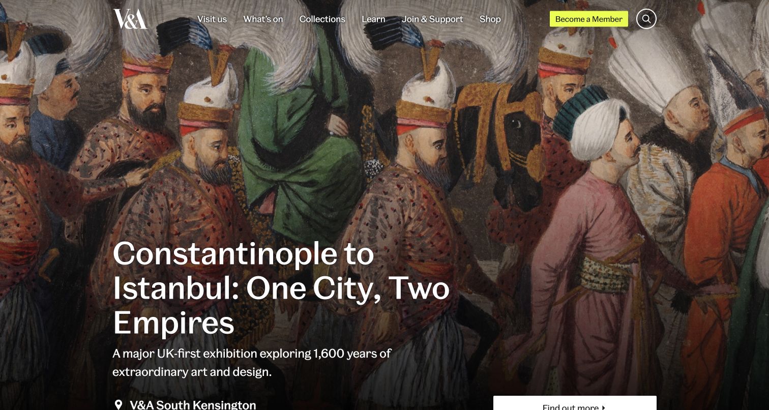
The V&A gives an exhibition image prominent space before explaining its family of museums. Visits, collections, learning, and support remain in the main navigation. Program content provides venue and availability context beyond a title and photograph. The CloudFront observation concerns sampled public delivery, not a demonstrated ticketing implementation or synchronized information from every museum in the group.
What you can learn
Separate exhibition media from dates, venue details, and admission states in the content and cache plan. A corrected closure or sold-out notice needs a clear update path even when the campaign photograph remains unchanged. Test a direct link to an ended exhibition and an unavailable ticketing provider. Keep the museum's public explanation useful before a visitor leaves for a transaction, rather than making an external booking response the only source of practical context.
Pros
The image-led introduction connects to a broader venue structure.
Program records recognize practical distinctions such as location and entry state.
Cons & considerations
Beautiful exhibition cards are incomplete without dependable dates and admission context.
A family of venues needs clear ownership of each operational update.
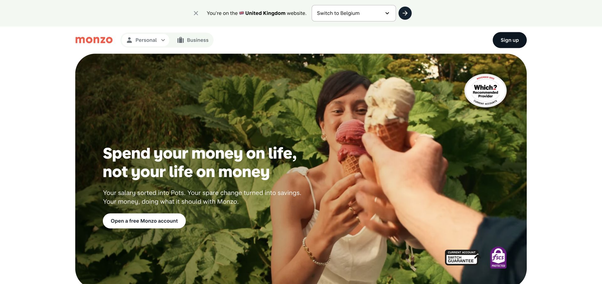
Monzo pairs a rounded lifestyle feature with informal copy, a compact header, and a prominent account-opening route. Product ideas such as savings and money organization are introduced through the campaign rather than a dense opening menu. A region prompt is visible above. CloudFront was observed in public delivery, not as evidence about account security, balances, application decisions, or the private banking application.
What you can learn
Make the difference between public explanation and account activity explicit in the route and cache inventory. Region-specific terms and eligibility content need deliberate ownership rather than a universal cached campaign. Test an expired promotion, missing video, and a changed regional destination. Keep product descriptions understandable without relying on a lifestyle film, and have the appropriate organization reviewer approve financial statements before they are distributed through any public edge cache.
Pros
The focused proposition avoids an overwhelming first-screen product catalog.
The region prompt acknowledges that the offer has a market context.
Cons & considerations
A lifestyle introduction still needs clear practical product conditions nearby.
Changing regional or eligibility information requires more deliberate treatment than static video assets.
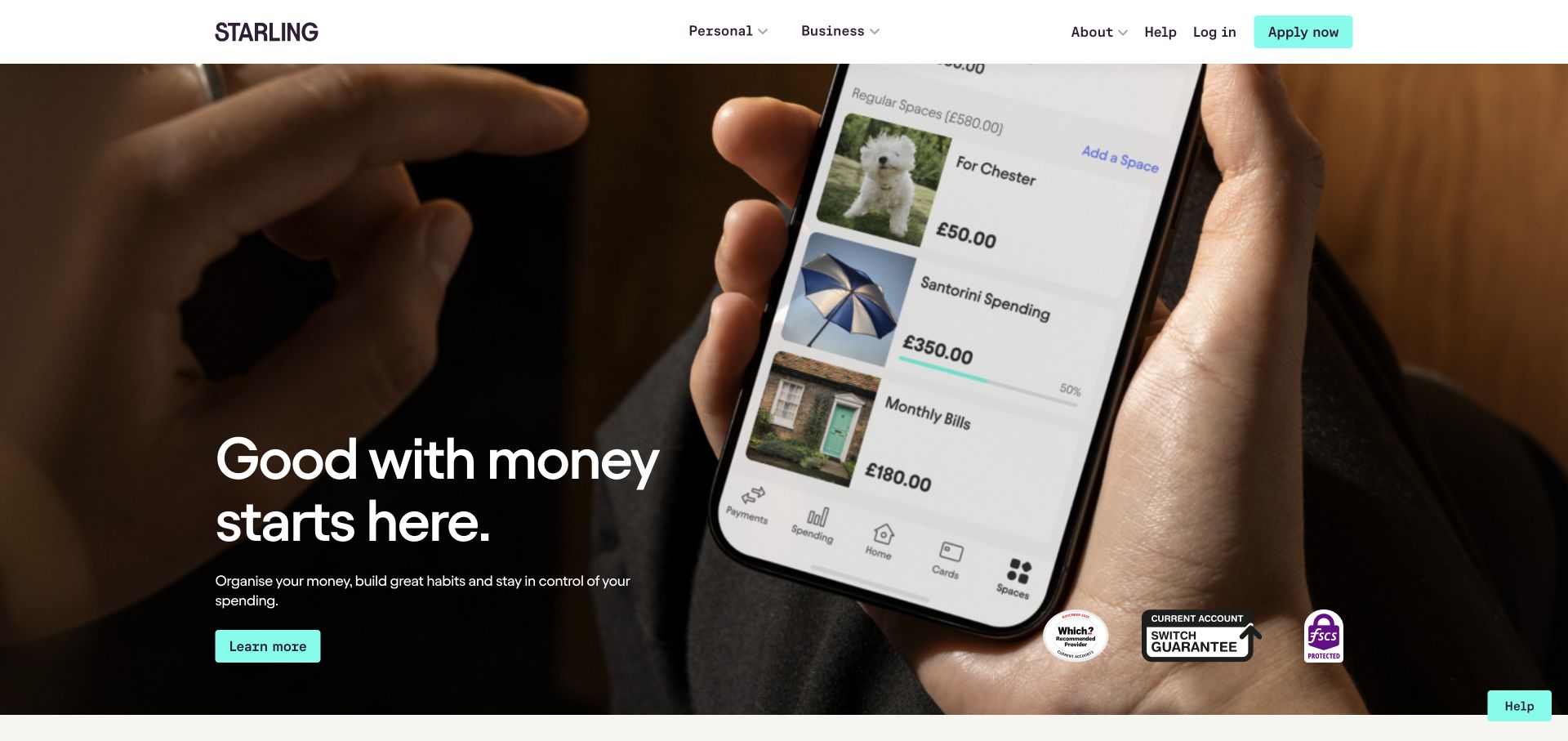
Starling uses a compact white header above a full-width app-focused film. Personal and business routes are separate, with login and application controls retained as recognizable utilities. White copy and a turquoise action sit over the imagery. The public response showed CloudFront delivery evidence; no account information, application, or banking transaction was accessed or evaluated.
What you can learn
Keep private account responses outside policies designed for public media, and define region and product variation explicitly. A production test should include the film unavailable, a longer business-product explanation, and an old application link. Verify that the public page remains useful before a visitor enters a separate protected journey. The app shown in the image is an explanatory surface, not proof that the marketing site's delivery configuration also governs real customer sessions.
Pros
The personal and business audience split is stated before detailed features.
The restrained header gives the app-focused campaign a coherent visual frame.
Cons & considerations
Text over app footage needs contrast and reduced-motion consideration.
An app demonstration can postpone the terms and practical details required for product evaluation.
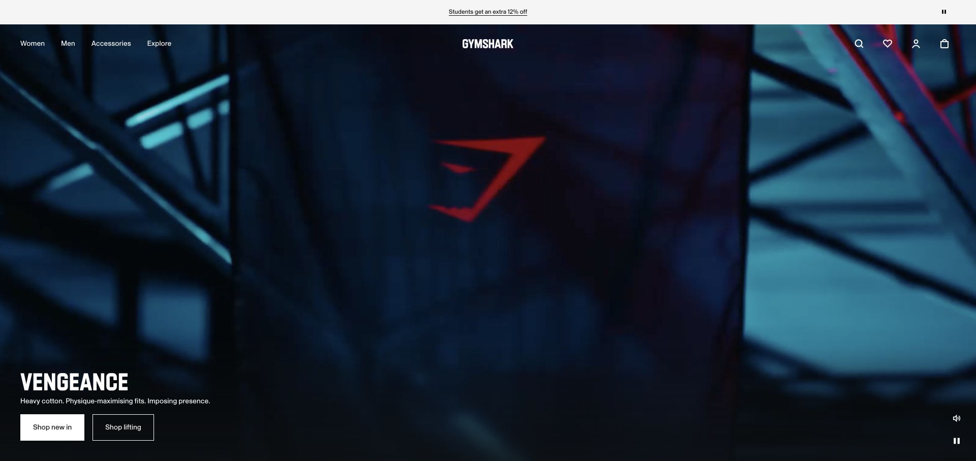
Gymshark opens with a dark training campaign, a centered white identity, and compact audience navigation. Search, favorites, account, and bag utilities occupy the opposite side, while campaign actions sit lower in the scene. Sound and pause controls are visible. CloudFront-related evidence was observed alongside a separate documented commerce association; the public page should not therefore be described as one standard theme or an audited complete retail architecture.
What you can learn
Assign ownership to the campaign document, media assets, catalog, and private commerce states separately. Test unavailable video, an expired campaign, and a changed region while preserving conventional navigation. Keep HTML and versioned media compatible during release and rollback. A page can use several providers without making every response suitable for the same cache policy, especially when public storytelling sits immediately beside account and bag destinations.
Pros
Shopping utilities remain recognizable around the visually dominant training scene.
Visible media controls acknowledge different viewing preferences.
Cons & considerations
Dark moving imagery can make small campaign actions difficult to discover.
Audience and regional context must remain clear when the feature hands off into product evaluation.
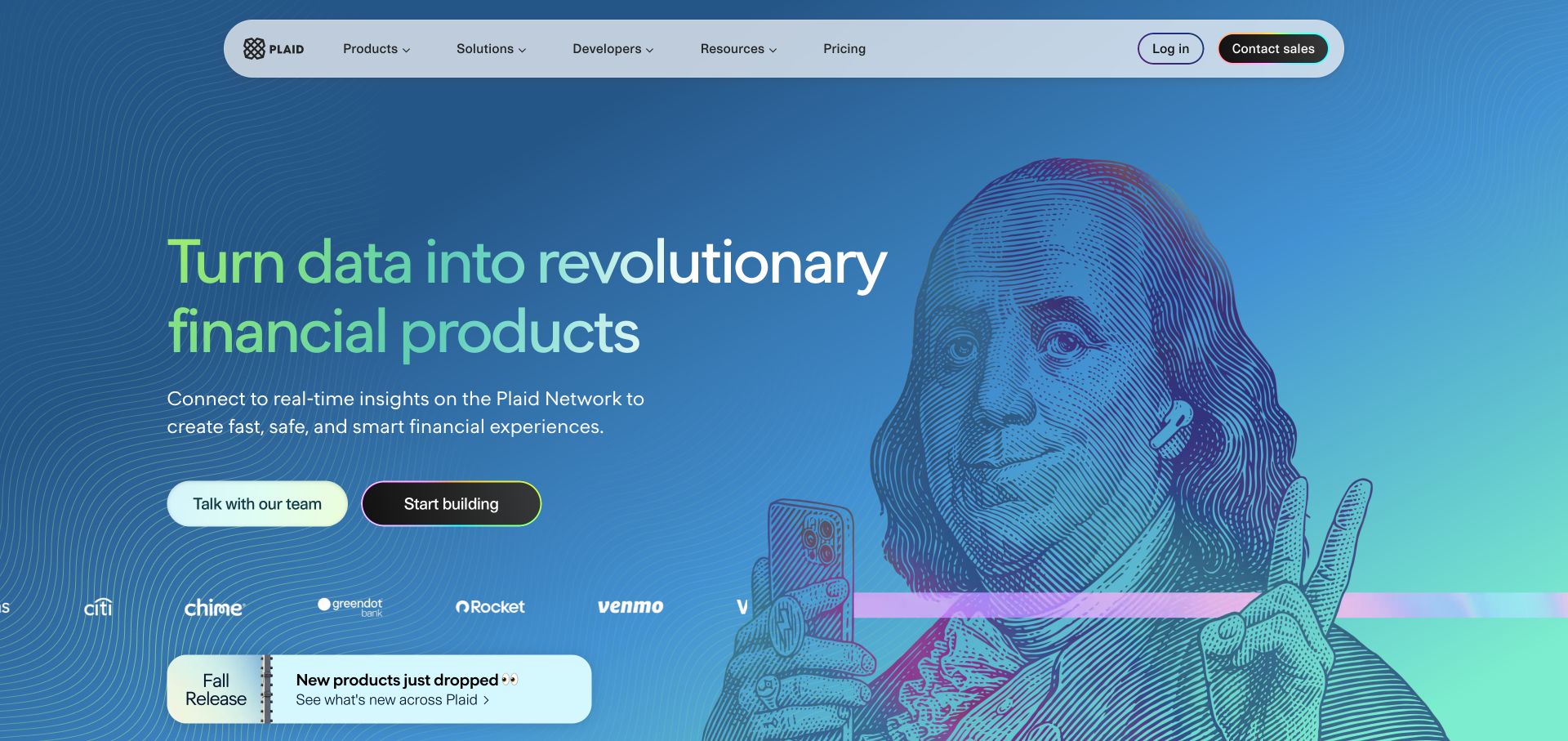
Plaid uses a blue gradient and engraved-style illustration around a large financial-product statement. Two actions distinguish commercial evaluation from building, while the compact navigation separates products, solutions, developer resources, and broader information. CloudFront evidence belongs to the sampled marketing page. It is not a claim about financial-data processing, account linking, or the security of the systems represented by the marketing copy.
What you can learn
Keep public marketing, technical documentation, and protected application responses in an explicit delivery inventory. Version illustrative assets independently from frequently corrected product explanations. Test developer and commercial handoffs after a release, including an unavailable destination. A content correction about a financial capability needs a reliable refresh path; the presence of an edge service is not a substitute for assigning an appropriate technical and organizational reviewer to the statement itself.
Pros
The paired actions acknowledge different professional reasons to investigate the product.
The distinctive graphic adds identity without replacing readable navigation.
Cons & considerations
A broad financial-data proposition requires concrete capability explanations beyond the hero.
Developer and commercial destinations need a clear boundary rather than interchangeable action labels.
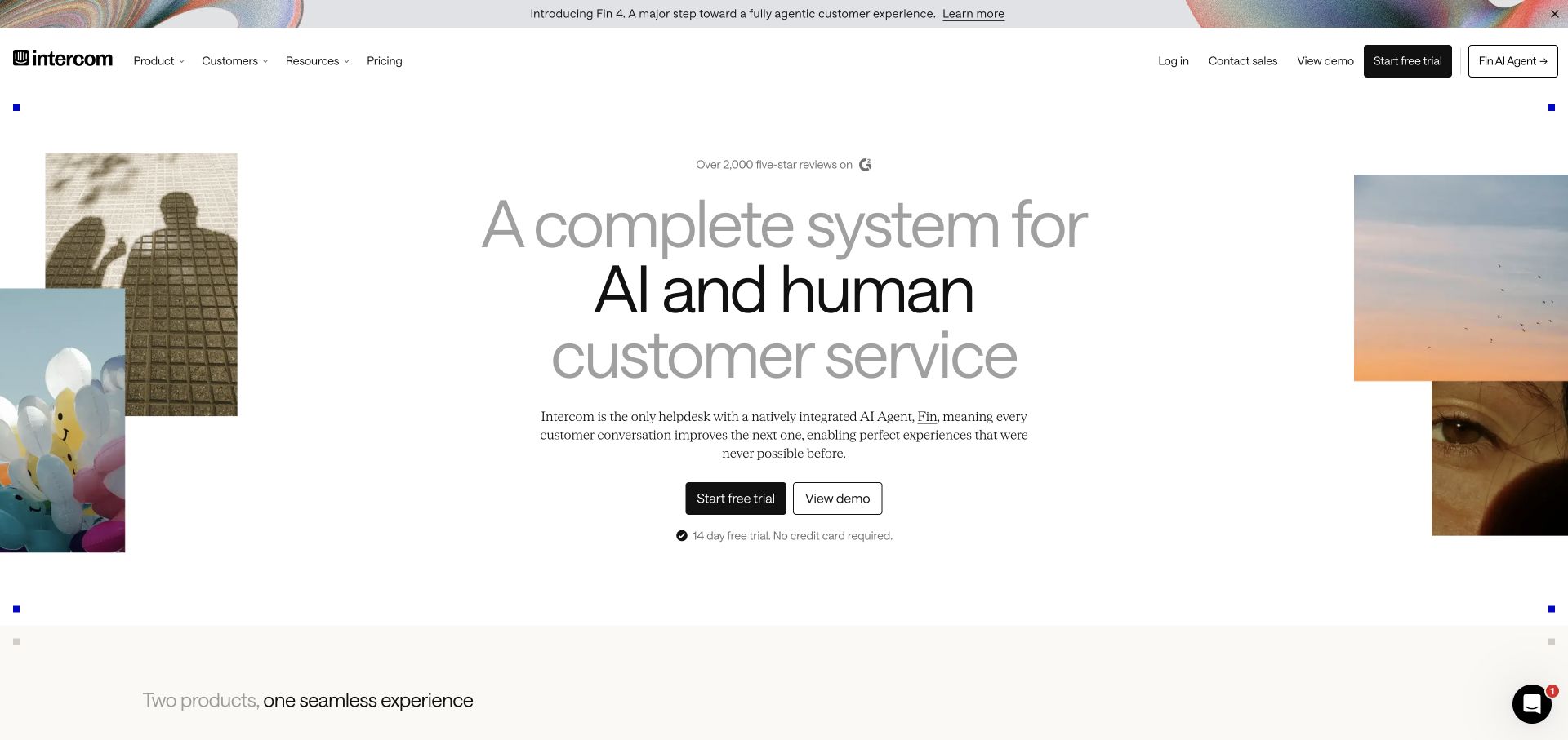
Intercom centers a large multi-line statement between small photographic fragments, followed by a concise explanation and trial or demonstration actions. A narrow announcement strip introduces related news without replacing the primary navigation. The sampled public property exposed CloudFront-related delivery evidence. The messaging application, AI-agent runtime, customer conversations, and authenticated account experience were not inspected as part of this marketing reference.
What you can learn
Maintain announcement and core proposition content separately so an expired product launch does not require rebuilding the entire page. Test the public document with one missing decorative fragment and a failed optional integration. Keep trial and demo handoffs explicit, with private customer information outside shared marketing caches. Verify the actual corrected page after a release rather than assuming that changing an origin file guarantees every intermediary has the intended version immediately.
Pros
The main proposition and two evaluation routes have a clear visual hierarchy.
A narrow announcement adds news without creating a second full hero.
Cons & considerations
Very large multi-line copy needs testing with longer translations.
Trial and demonstration actions need clear expectations about the next interaction.
The Department of Energy places a photographic announcement beneath compact institutional navigation. Funding opportunities have a separate route, while policy, leadership, topics, and news share the main header. Position and pause controls accompany the feature. The CloudFront observation relates to public delivery only, not grants processing, research databases, or the agency's internal operational infrastructure.
What you can learn
Set separate responsibilities for time-sensitive announcement text, stable reference documents, and funding-system handoffs. A corrected public statement may need a different refresh response from an unchanged photograph. Test an ended announcement and a moved funding page without returning a misleading success shell for a missing document. Keep the public page useful when its media cannot load, and preserve the meaning of older external links through deliberate archive and redirect decisions.
Pros
Funding discovery has a permanent entrance outside the current feature.
Media controls are visibly distinguished from the institutional navigation.
Cons & considerations
Several information and campaign layers can compete for the initial reading space.
Policy and funding content need genuine dates and an intentional expired-state strategy.
The European Commission combines an official-site banner, institutional identity, language control, and broad search. A dark navigation separates organizational information, priorities, topics, resources, and participation. The campaign below uses a photograph, short explanatory copy, and one contrasting action. CloudFront-related public delivery evidence was observed on the reviewed English route, not established for every Commission service or authenticated application.
What you can learn
Define language, path, and search behavior before selecting cache policies. The English index is not interchangeable with another edition simply because both share the same header. Test direct translated links, missing equivalent content, and a corrected campaign message after release. Preserve ordinary topic navigation if search is unavailable, and keep sensitive service responses separate from public institutional pages even where they reuse a common visual identity.
Pros
The public campaign sits within a clearly structured institutional shell.
Language and search are visible tools rather than hidden assumptions.
Cons & considerations
Stacked identity and navigation layers can occupy much of a short screen.
Multilingual equivalence needs editorial judgment as well as technically valid redirects.
Modern Animal pairs a person-and-dog photograph with a restrained serif introduction on cream and blue. Locations, services, and plans are visible beside a telephone number and booking action, with practical explanations continuing lower down. CloudFront was observed in public delivery. This is not evidence about veterinary records, individual care, private communication, or appointment-system architecture.
What you can learn
Give location, plan, and public service information a maintained source with an explicit refresh policy. A pricing correction and a large unchanged photograph should not be treated as the same delivery problem. Test booking and telephone destinations after a location update, using fictional data for development checks. Keep private care responses outside shared public caches, and retain a useful explanation when an optional booking provider or marketing image is unavailable.
Pros
Practical location and plan routes support the relationship-led introduction.
The photograph gives the service a recognizable human and animal context.
Cons & considerations
The opening offers relatively little detailed service explanation before the next section.
Muted overlay text depends on predictable contrast as photography changes.
Sydney places a study invitation over student photography, followed by course discovery and subject routes. Application guidance, fees, scholarships, and international information provide practical continuation. Research and institutional navigation remain available beyond the recruitment emphasis. The sampled public response exposed CloudFront evidence; it does not establish how admissions decisions, student records, or every linked course application are implemented.
What you can learn
Maintain course identity, study level, and relevant audience context in the route model before optimizing public delivery. Test updated deadlines, a retired program, and a missing course image after publication. Distinguish a public recruitment document from an account or application response, and ensure corrections reach the pages that actually display them. A campaign image should not be the only place where essential study information or a useful destination is communicated.
Pros
The broad study promise leads into concrete subject and practical-information routes.
International-student material is recognized as a distinct part of evaluation.
Cons & considerations
Recruitment headlines need current supporting conditions rather than reputation alone.
Course and fee updates require precise ownership across several related public pages.
Choose a delivery model around the website’s update patterns
Serve versioned public assets with a clear release relationship
Treat an asset filename and the page that references it as parts of one release. Plan how old pages continue to load their required files and how a rollback finds a consistent set. Do not remove an earlier asset solely because the newest build has a different filename.
Coordinate a publication’s cache and editorial workflow
A publisher needs a dependable path from approved correction to visible content. Define the intended update window and the procedures for exceptional changes. Rehearse a corrected title, image, or service notice with the editorial team rather than testing only an unchanged homepage.
Keep application and personalized traffic explicitly scoped
For routes involving authentication, individual account data, or mutations, have the operating team review the complete request and cache behavior. Keep public content delivery rules distinct from private application responses. Do not reproduce a reference brand’s apparent architecture without understanding its boundaries.
From references to requirements
Plan releases, corrections, and delivery failures together
Build a route-to-policy inventory
List representative paths and the intended response, origin, and freshness behavior for each. Include query variants, redirects, downloads, errors, and private routes. Use the inventory to review configuration changes and capture observed results, rather than keeping important exceptions in one developer’s memory.
Rehearse a real correction and a rollback
Change an approved test page and its referenced image, then observe the intended result through the actual delivery path. Repeat the exercise for recovery to a previous release. Include the browser’s cached state and a direct deep link, since a fresh homepage request alone can conceal inconsistent versions.
Assign operational ownership beyond deployment
Record the people responsible for origin access, distribution configuration, domains, certificates, release permissions, and investigations. Agree which failures generate attention and how visitors get a useful alternative. Keep diagnostic data appropriately restricted rather than exposing internal request details in public error pages.
A useful handover demonstration
Ask the actual team to carry out its routine job: publish a realistic update, correct a mistake, preview a narrow screen, and identify who owns an integration failure. For a library or frontend framework, also ask who maintains the content source and deployment. A polished screenshot does not answer those operational questions.
Beyond the screenshot
CloudFront website delivery checklist
Map the exact public properties, origins, and routes in scope.
Separate documents, versioned assets, application responses, and private content.
Review how distribution settings and origin headers determine freshness.
Test an editorial correction and an expired campaign through the real delivery path.
Verify redirects, query variants, missing files, and origin-failure behavior.
Keep pages and referenced assets consistent during deployment and rollback.
Confirm owners for origin access, domains, configuration, and incident handling.
Record test evidence without treating a CDN brand as a performance certification.
Test with real content, a keyboard, a small screen, slow or failed requests, and the people who will maintain the system. These are planning checks, not an accessibility, security, performance, or search-ranking certification.
Sources & editorial method
How this Amazon CloudFront collection was reviewed
Each named property had a supported public Amazon CloudFront delivery signal in the bounded source review. The signal may describe an intermediary or sampled resource and does not identify every origin or corporate service. Actual dated screenshots support the editorial interface observations; no private distribution settings, accounts, or performance reports were accessed.
Every image is an unmodified capture from the actual website, with its source and capture date. Some captures are reused from our shared catalog; their dates remain the original capture dates. None comes from a vendor gallery or a generated reconstruction. Moving imagery and live content can change.
Technology attribution uses public page assets or metadata, official platform documentation, or a cited first-party project case study. Documentary and framework-relationship evidence is identified where used; it is not a complete current backend inventory. A CMS image CDN alone does not establish a full CMS deployment. A library’s presence does not prove which individual controls use it, and a platform label does not establish AI authorship.
The composition notes, lessons, pros and tradeoffs are original editorial observations. We have not measured conversion, traffic, security, performance or accessibility conformance. Website owners retain their brands and imagery; these examples are not our client portfolio. Written, Edited and Curated are independent records, not dates advanced by a build. See our editorial standards or suggest a correction.
Questions worth asking
Amazon CloudFront website development FAQs
Does CloudFront tell us which CMS a company uses?
No. A delivery reference does not establish the content platform or origin application. Those technologies need separate public evidence or clearly attributed documentation.
Does a CDN guarantee the website is fast?
No. The complete experience depends on page structure, media, application work, network conditions, and configuration. We have not run comparative performance benchmarks for the examples.
Should every response have the same cache duration?
No single duration follows from the brand name. Define content classes, freshness needs, and private-response boundaries, then have the actual behavior reviewed and tested for the application.
Are the examples’ CloudFront settings published here?
No. The research is limited to public delivery evidence and visible interfaces. It does not disclose or certify private origin, cache, access, or distribution configuration.
Borrow a useful balance between stable navigation and changing content. Then define exactly how a release, correction, or delivery failure should reach your own visitors.