Definitive guide · Fathom Analytics website development
Best Fathom Analytics Websites of 2026 (20 Real-World Examples)
Real public Fathom Analytics references across cultural, product, publishing and service websites, with a focused measurement-planning brief.
A useful analytics setup should answer a small number of meaningful questions without turning every possible interaction into a reporting project.
These websites share a public Fathom script reference, not one visual style or business model. A museum, developer documentation site and local service provider have different definitions of a useful visit. Compare their information hierarchy and visitor tasks before deciding which aggregate observations would help your own team.
The source check does not reveal a Fathom dashboard, account configuration, collection receipt or the rest of the site’s privacy behavior. Nor does the use of one privacy-focused tool make every other embed, form or marketing integration compliant. The reviews separate visible design observations from the bounded evidence for the analytics component.
Before the examples
What makes good Fathom Analytics website development in 2026?
Start with a short reporting brief
Choose the recurring decisions the team needs to make: whether visitors find location information, reach a useful documentation section or complete an accepted enquiry. State which observations are deliberately out of scope and who will review the report.
Keep page measurement and business success distinct
A page view or button click is not a sale, a booked appointment or a successful form submission. Fathom’s help center documents its script and event options. Define the exact meaning of an outcome in your own system rather than relying on a convenient label.
List other analytics, advertising, embedded media and form providers separately. Review the applicable configuration and disclosures with the responsible team. A public script reference cannot establish the behavior of every service that appears after interaction.
Begin with the five established cultural and developer-platform references. The collection also includes several distinct Vue ecosystem properties, explicitly presented as related projects rather than separate corporate customers. Compare their visitor tasks, not their supposed analytics results.
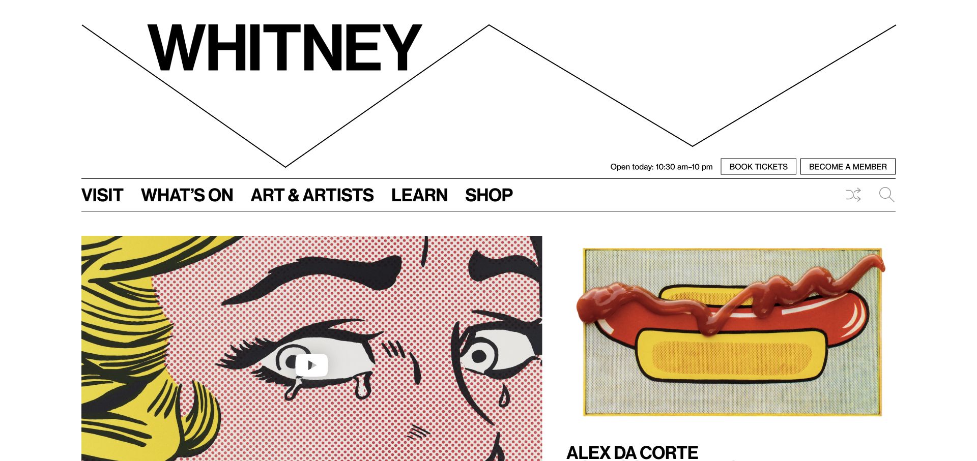
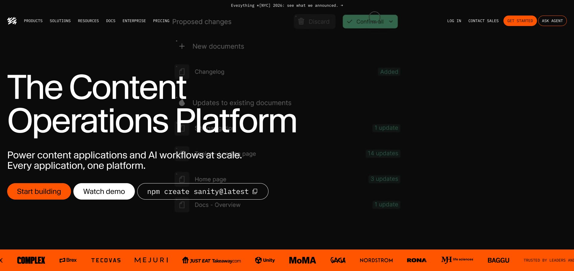
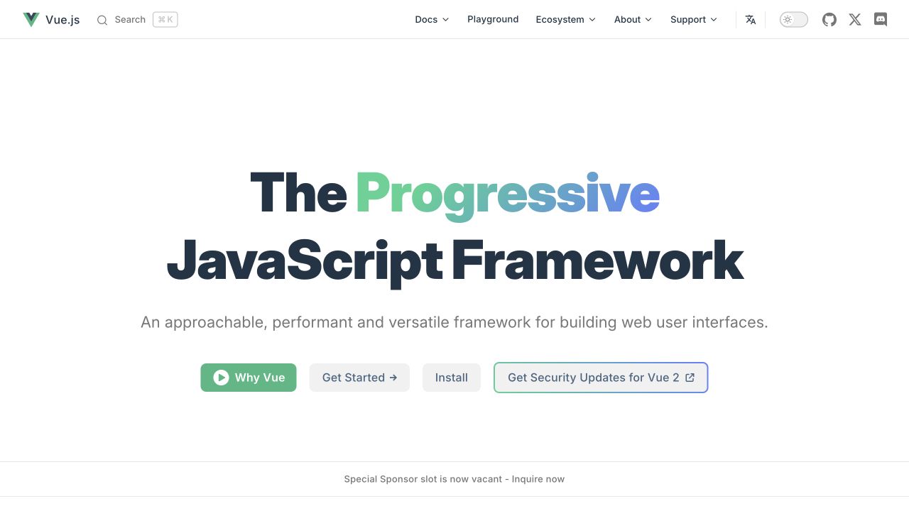
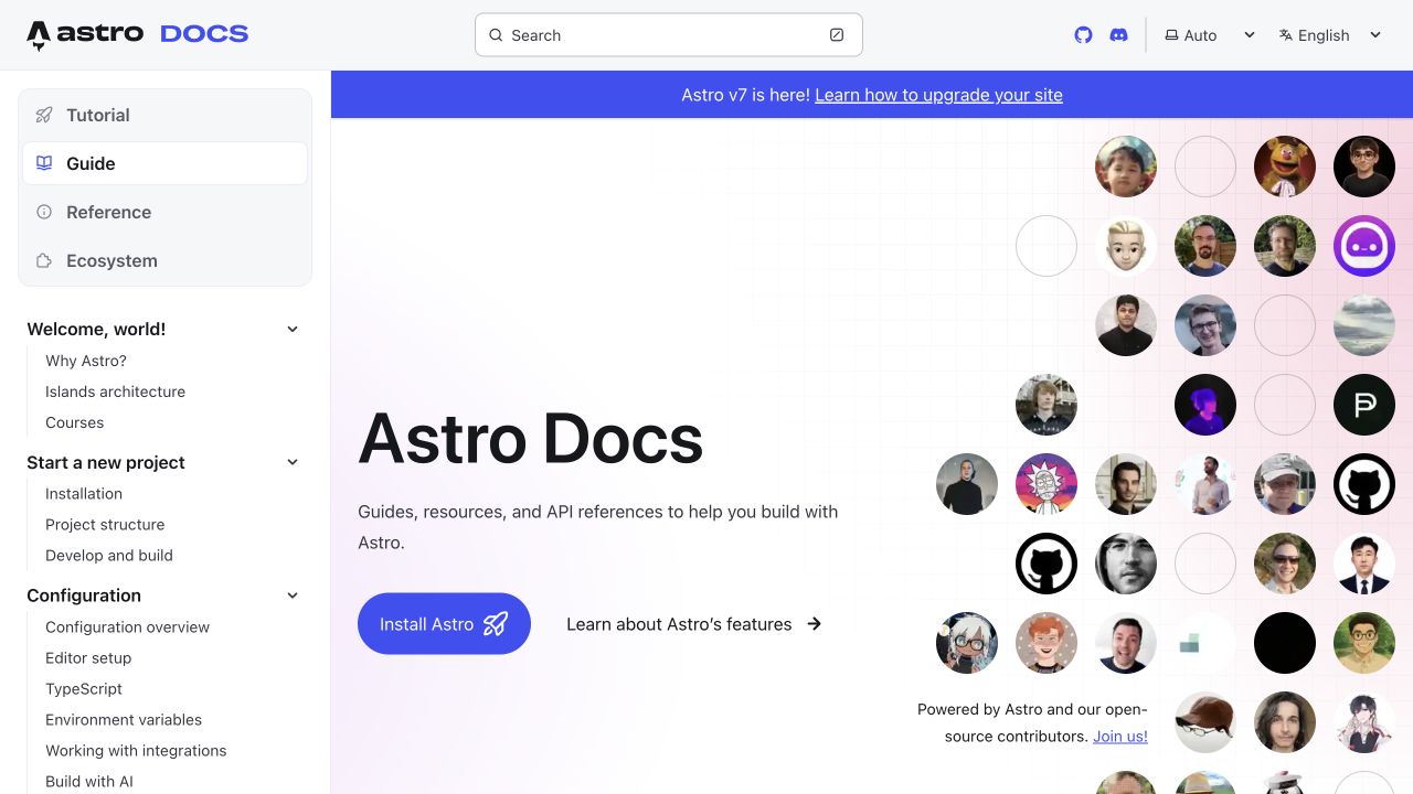
We start with five recognizable brands or organizations: Whitney Museum of American Art, Sanity, Vue.js official website, Astro documentation, Treehouse. Each attribution applies to the named website property, not every product or website belonging to its organization. This is a curated reading sequence, not a measured ranking.
The Whitney pairs its expansive wordmark with a compact visitor navigation and large exhibition images. Opening hours, tickets and membership sit close to the top, while free-access programming receives its own explanation below. The graphic identity is strong without requiring every action to become an unusual interface. This makes the site useful for studying how a museum can express its character while preserving familiar visit tasks and giving admission initiatives an identifiable place in the page structure.
What you can learn
Let distinctive typography carry the brand while keeping essential actions conventional. Publish access initiatives with their exact schedule and conditions, and connect them to the same ticket and planning system used elsewhere so visitors do not have to reconcile conflicting information.
Pros
Hours and ticket actions remain visible alongside the museum’s expressive typographic identity.
The free-access section explains a practical visit route instead of treating it as a vague promotional badge.
Cons & considerations
The large wordmark uses substantial vertical space before the current exhibition content begins.
Multiple exhibition images and shop promotions can compete unless the primary visit path stays visually consistent.
Platform source: WordPress.org Showcase. Linked script matches Fathom Analytics. Exact public source-page sample: https://whitney.org/. This identifies a public Fathom Analytics reference or response association, not private configuration, complete architecture, measured performance or successful data collection. Platform evidence is separate from the direct website screenshot and is not a complete current infrastructure audit.
Sanity places an exceptionally large white title over a darkened product-workflow background. A shorter explanatory line and starting controls sit below, while a bright orange customer strip marks the lower edge. Compact uppercase navigation creates a sharp scale contrast with the hero. The accepted November 13 capture follows rejection of non-essential cookies through the site’s normal controls and shows the underlying opening without a consent overlay. The public Fathom reference is an analytics association; neither the backdrop nor a script reference demonstrates how the private editing product behaves.
What you can learn
Use an explicit type scale rather than letting one oversized heading determine the whole layout. The background should support the topic while remaining dispensable to understanding it. Test long title variants, consent-panel presence, and text zoom together, because an already crowded opening can lose its action area quickly.
Pros
The contrast in type sizes makes the main proposition unmistakable.
The bright lower band creates a clear boundary after the dark introduction.
Cons & considerations
The oversized headline leaves limited room for a detailed explanation in the opening.
Changing background imagery and interface illustrations need reliable contrast and reduced-motion alternatives.
Platform source: WordPress.org Showcase. Linked script matches Fathom Analytics. Exact public source-page sample: https://www.sanity.io/. This identifies a public Fathom Analytics reference or response association, not private configuration, complete architecture, measured performance or successful data collection. Platform evidence is separate from the direct website screenshot and is not a complete current infrastructure audit.
Vue’s homepage centers a short framework description above distinct learning and installation actions. Documentation, APIs and ecosystem routes occupy the header, while open space keeps the first decision clear. This is a useful reference for a technical project serving both newcomers and experienced developers. Its public Fathom reference concerns measurement on the project’s website, not analytics requirements for applications built with Vue. Learning, installation and API lookup remain separate visitor tasks. The restrained opening leaves the wider ecosystem discoverable without requiring someone to understand it before taking a first useful step.
What you can learn
Design the first screen around the reader's next task: understand the project, begin learning or install it. Preview changes with the actual documentation destinations, and keep older-version guidance visibly distinct from the recommended current path.
Pros
Separate introductory and installation actions serve readers with different levels of familiarity.
The concise central explanation avoids overwhelming new visitors with the full ecosystem at once.
Cons & considerations
A large ecosystem still needs coherent ownership of external links and maintained examples.
Version-related notices must remain clear so readers do not mix legacy instructions with current documentation.
Platform source: WordPress.org Showcase. Linked script matches Fathom Analytics. Exact public source-page sample: https://vuejs.org/. This identifies a public Fathom Analytics reference or response association, not private configuration, complete architecture, measured performance or successful data collection. Platform evidence is separate from the direct website screenshot and is not a complete current infrastructure audit.
Astro’s documentation welcome page places its guide hierarchy in a persistent left column and a prominent search field at the top. The main panel combines a short introduction, an installation action, a feature-learning route and contributor portraits. Configuration topics remain visible within the real documentation tree rather than being separated into another microsite. The page shows how a technical reference can welcome a new reader without hiding its depth. Its public Fathom reference applies to this exact documentation property; the screenshot is not access to reporting or proof of which learning actions are measured.
What you can learn
Expose the real documentation structure early so readers can move from installation to configuration without relearning navigation. Keep quick-start material, conceptual guidance and exact reference destinations distinct. A measurement brief should reflect those different reading tasks without assuming that more clicks mean more successful learning.
Pros
The sidebar gives configuration topics a predictable and visible location.
Search and installation serve both returning readers and first-time visitors.
Cons & considerations
Contributor imagery consumes room that could hold a minimal working example.
A release banner adds another navigation choice above the introductory content.
Platform source: WordPress.org Showcase. Linked script matches Fathom Analytics. Exact public source-page sample: https://docs.astro.build/en/getting-started/. This identifies a public Fathom Analytics reference or response association, not private configuration, complete architecture, measured performance or successful data collection. Platform evidence is separate from the direct website screenshot and is not a complete current infrastructure audit.
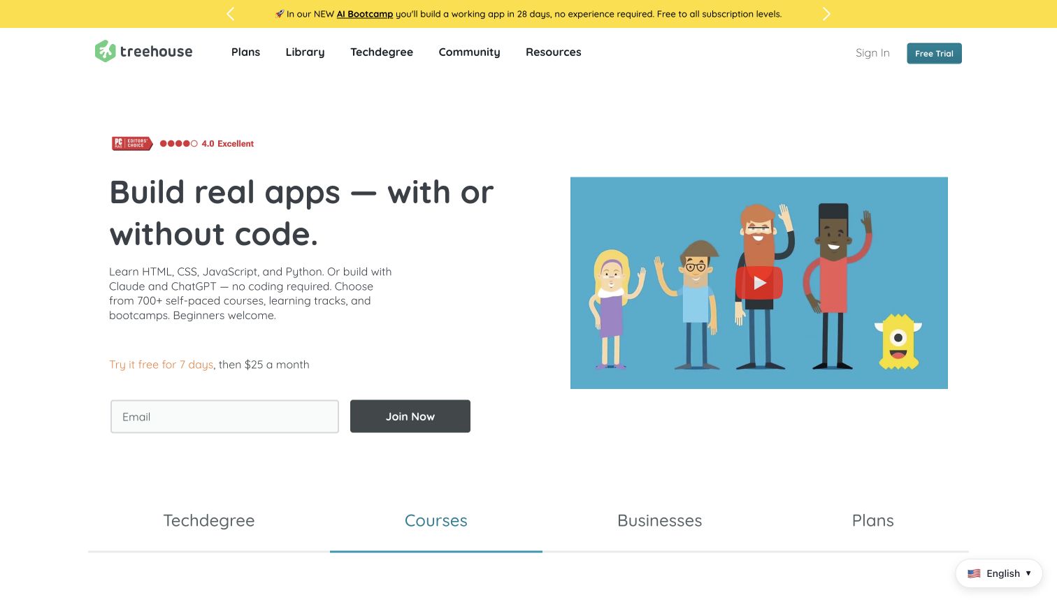
Treehouse’s opening uses a simple two-column layout with a rounded, informal headline and an illustrated video thumbnail. The copy names programming languages and AI tools while explicitly welcoming beginners. A short trial-and-price line sits above an email field and Join Now button. Plans, Library, Techdegree, Community and Resources remain separate header destinations. Along the lower edge, a tab-like row introduces Techdegree, Courses, Businesses and Plans, giving the page another way to divide its offers without a crowded grid of individual lessons.
What you can learn
Plain language and an optional introduction can reduce anxiety for newcomers. Keep price and trial terms near the action, and clearly explain how a subscription differs from a longer program. Tool names should clarify what students learn; visitors should not have to infer whether coding knowledge is required from a photograph or a technology badge.
Pros
The visible trial line provides commitment context beside the email action.
The headline directly acknowledges both coding and no-code interests.
Cons & considerations
Several program categories appear before their differences are explained.
An introductory video thumbnail does not replace a text description of lesson structure.
Platform source: WordPress.org Showcase. Linked script matches Fathom Analytics. Exact public source-page sample: https://teamtreehouse.com/. This identifies a public Fathom Analytics reference or response association, not private configuration, complete architecture, measured performance or successful data collection. Platform evidence is separate from the direct website screenshot and is not a complete current infrastructure audit.
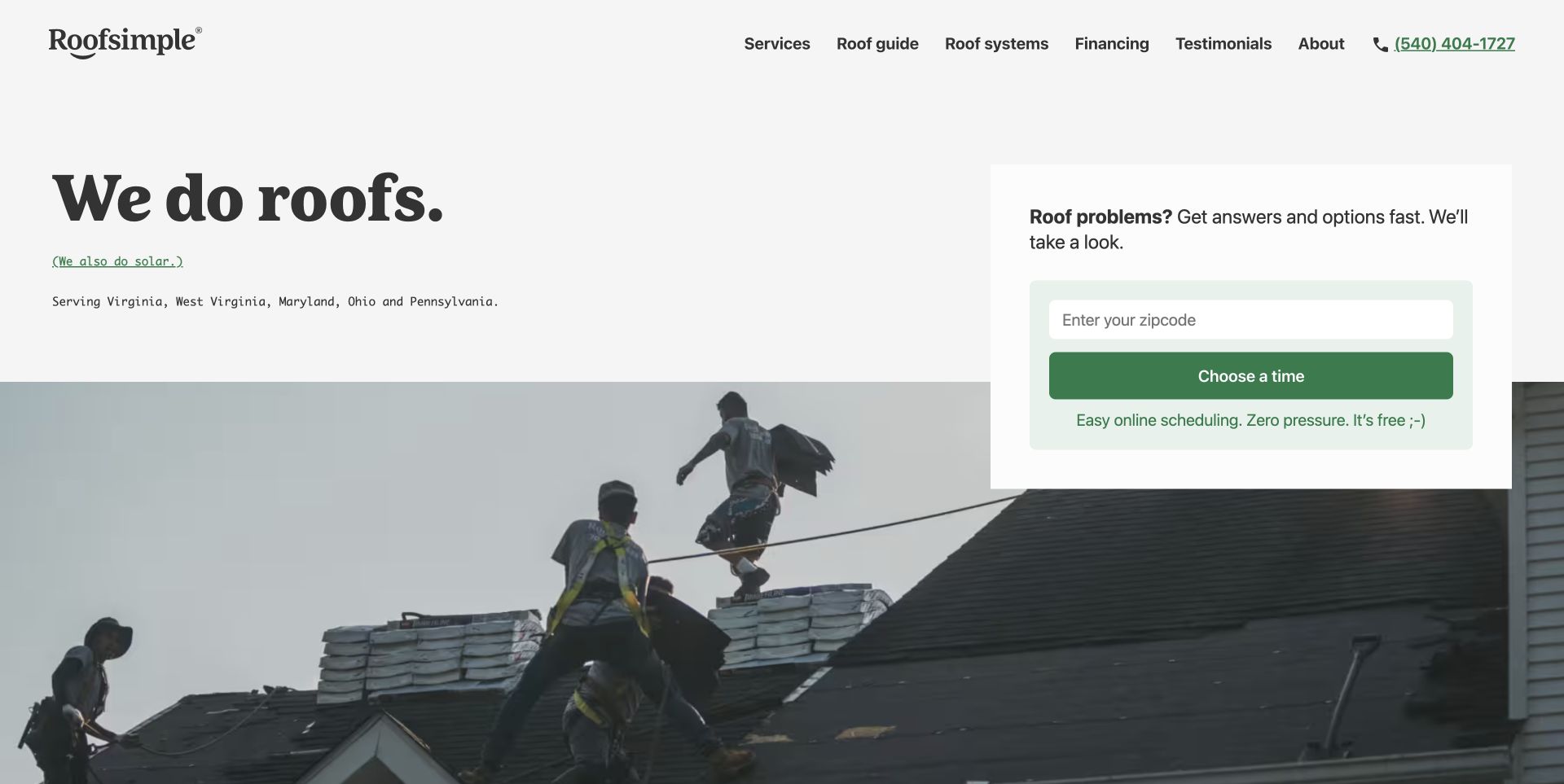
Roofsimple takes a noticeably quieter approach: a pale background, a large serif service statement, small monospaced location copy, and a green scheduling panel. Rather than asking for a full project description at once, the visible starting field asks for a ZIP code. A worksite photograph begins below the text, connecting the friendly tone to the physical roofing service. The header still offers guides, roof systems, financing, and testimonials for visitors who are not ready to schedule.
What you can learn
A simple first step works best when it has an obvious purpose. Here, location comes before appointment choice, so the visitor can understand why the field exists. Preserve educational routes for research-stage buyers instead of assuming everyone arriving on the homepage wants to fill out a long quote form.
Pros
The ZIP-first panel asks for a clear, limited piece of information.
Distinct serif, monospaced, and sans-serif roles give the layout personality without extra graphics.
Cons & considerations
The brief service statement needs supporting detail for buyers comparing specialized capabilities.
The scheduling promise should match the actual next screen and local availability.
Platform source: WordPress.org Showcase. Linked script matches Fathom Analytics. Exact public source-page sample: https://roofsimple.com/. This identifies a public Fathom Analytics reference or response association, not private configuration, complete architecture, measured performance or successful data collection. Platform evidence is separate from the direct website screenshot and is not a complete current infrastructure audit.
The Gentlewoman gives a prominent portrait generous white space beneath its masthead. A compact set of routes connects the current magazine with a club, a library, shopping and collaborations. The opening makes the featured person and edition feel like the editorial center of the publication, not merely another item in a rapidly updating grid. This is a useful reference for a slower publishing rhythm in which a durable profile library matters as much as the latest issue.
What you can learn
Model a person, their profile and the issue as related but separate records. Keep names and descriptive text outside the portrait image, and make the interview library searchable without requiring familiarity with past covers. Clarify which collaboration pages are editorial, promotional or commercial so that the restrained visual style does not conceal a meaningful difference in purpose.
Pros
A focused portrait gives the current editorial subject a clear visual priority.
The library route supports discovery beyond the latest edition.
Cons & considerations
The initial view offers little explanation for readers unfamiliar with the subject.
Portrait cropping and text placement require considered mobile alternatives.
Platform source: WordPress.org Showcase. Linked script matches Fathom Analytics. Exact public source-page sample: https://thegentlewoman.co.uk/. This identifies a public Fathom Analytics reference or response association, not private configuration, complete architecture, measured performance or successful data collection. Platform evidence is separate from the direct website screenshot and is not a complete current infrastructure audit.
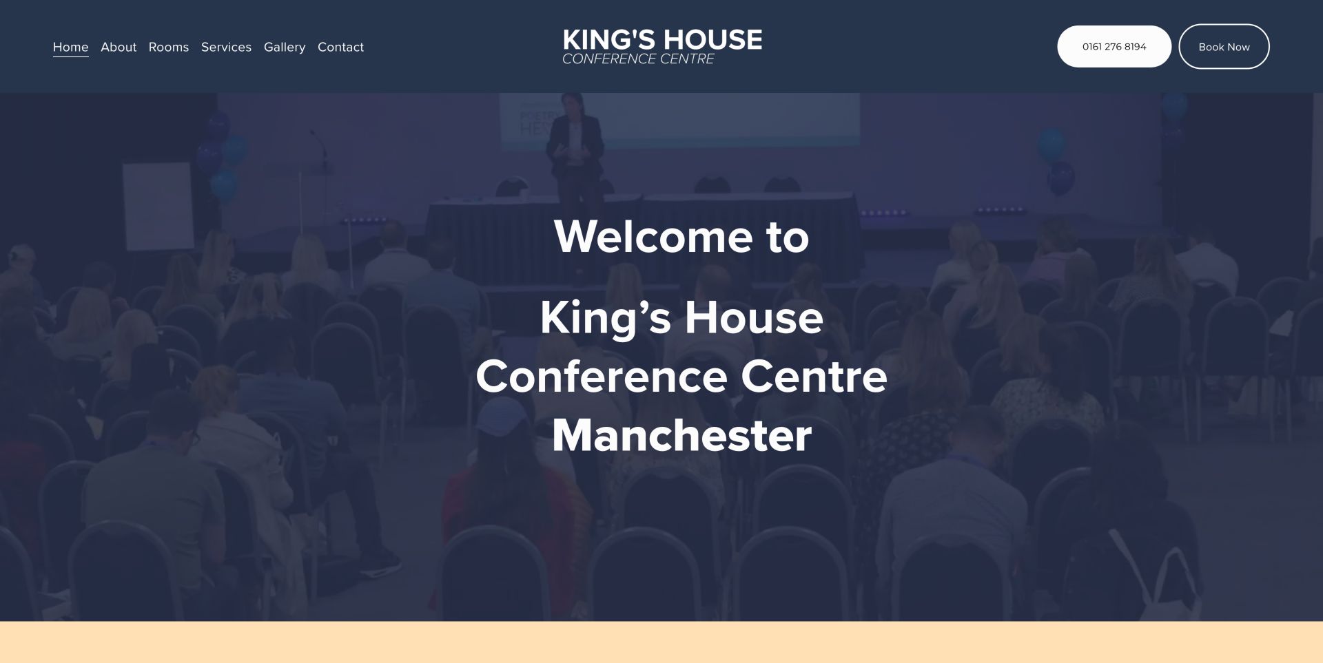
King's House places its Manchester identity, telephone number and enquiry route around an actual auditorium photograph. The site's most useful detail is its separation of rooms, technology and catering, supported by direct links to room rates, equipment rates, delegate rates and capacities. That is a strong model for a focused regional venue because it helps a planner prepare a meaningful enquiry. The Book Now wording could be clearer when the next step is an enquiry rather than confirmed availability.
What you can learn
Publish the documents that let a planner scope an event before contacting the venue. Label an enquiry as an enquiry instead of implying immediate availability. Distinguish a visit to a rates page, a click on a contact action and an accepted request when defining any measurement; a public analytics script cannot reveal which of those outcomes the venue actually records.
Pros
Room, equipment and delegate-rate resources are distinct
Technical, catering and location information support planning
Cons & considerations
Book Now wording can overstate the immediacy of the next step
Platform source: WordPress.org Showcase. Linked script matches Fathom Analytics. Exact public source-page sample: https://www.kingshouse.co.uk/home. This identifies a public Fathom Analytics reference or response association, not private configuration, complete architecture, measured performance or successful data collection. Platform evidence is separate from the direct website screenshot and is not a complete current infrastructure audit.
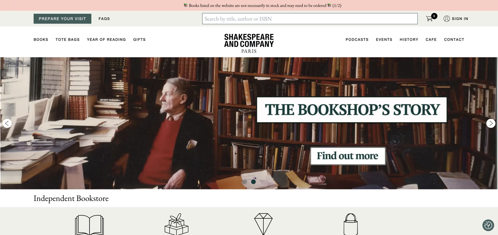
Shakespeare and Company balances its literary identity with unusually explicit practical information. Prepare Your Visit sits beside a large title, author, or ISBN search, while navigation separates books and gifts from events, podcasts, history, and the café. The captured carousel shows the bookshop’s story through an atmospheric photograph, then the page continues into curated titles, subscriptions, rare books, and staff selections. A notice also explains that listed titles are not necessarily in stock, preventing the catalogue from implying immediate availability. The page offers considerable depth, but its many sections create a long browsing journey. The large rotating artwork also gives less immediate product detail than the clearly structured listings further down.
What you can learn
A destination bookstore needs to answer visiting and shopping questions at the same time. Put stock limitations and visit planning near the top, then let history and curation deepen the experience without obscuring those practical routes.
Pros
Visit planning and catalogue search are both prominent.
The stock notice sets a useful expectation before ordering.
Cons & considerations
The long homepage asks visitors to scan many distinct sections.
Large rotating artwork delays individual book information.
Platform source: WordPress.org Showcase. Linked script matches Fathom Analytics. Exact public source-page sample: https://www.shakespeareandcompany.com/. This identifies a public Fathom Analytics reference or response association, not private configuration, complete architecture, measured performance or successful data collection. Platform evidence is separate from the direct website screenshot and is not a complete current infrastructure audit.
Supporting Strategies opens with a people-led photograph beneath a conventional white header. Services, company information, solutions, knowledge and contact are plainly named, followed by an introduction to the team’s experience. The understated visual system emphasizes an ongoing professional relationship rather than an illustrated financial dashboard. The photograph creates context but does not explain client matching, included work or information handling. Those practical questions need service and onboarding detail. The public analytics reference identifies a measurement component, not access to client records or evidence about business outcomes.
What you can learn
Use real people to introduce a bookkeeping service, then describe the relationship in operational terms. Explain coverage, team responsibility, review and communication before asking for records. A professional photograph should support the scope explanation rather than substitute for it or imply results that have not been established.
Pros
Conventional navigation labels make the main service and information routes easy to recognize.
The human imagery keeps attention on an ongoing professional relationship rather than software alone.
Cons & considerations
A large photograph can delay the specific explanation of service scope and onboarding.
Broad people-and-experience language needs named roles and practical process detail to become meaningful.
Platform source: WordPress.org Showcase. Linked script matches Fathom Analytics. Exact public source-page sample: https://www.supportingstrategies.com/. This identifies a public Fathom Analytics reference or response association, not private configuration, complete architecture, measured performance or successful data collection. Platform evidence is separate from the direct website screenshot and is not a complete current infrastructure audit.
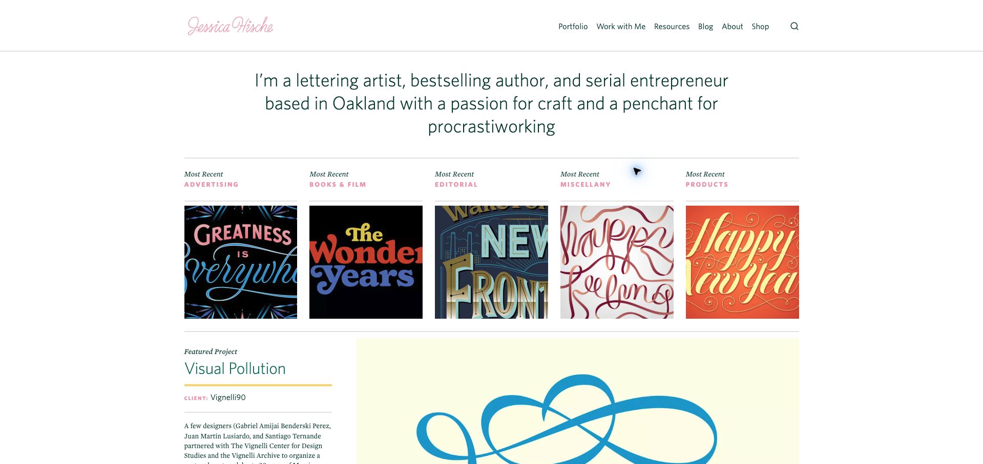
Jessica Hische introduces her lettering practice in a spacious text block before presenting recent work across five named categories. Advertising, books and film, editorial, miscellaneous projects and products each receive an image, making the range understandable without a dense filter interface. The featured project below adds a title, client context and a short explanation, moving beyond a visual mood board. The restrained green and pink interface lets the lettering samples carry the color. A newsletter overlay interrupted the initial visit and was dismissed for the saved view; the clean page demonstrates how effective the underlying information hierarchy is once that interruption is removed.
What you can learn
Explain the practice briefly, then use a few meaningful work categories to help clients find relevant evidence. Pair selected projects with client and role information rather than relying entirely on a recognizable finished image.
Pros
The category labels clarify the kinds of commission represented.
Featured-project copy adds context beyond a grid of attractive lettering.
Cons & considerations
The initial newsletter overlay delays access to the work.
Five equal columns can make category images relatively small on intermediate screens.
Platform source: WordPress.org Showcase. Linked script matches Fathom Analytics. Exact public source-page sample: https://jessicahische.is/. This identifies a public Fathom Analytics reference or response association, not private configuration, complete architecture, measured performance or successful data collection. Platform evidence is separate from the direct website screenshot and is not a complete current infrastructure audit.
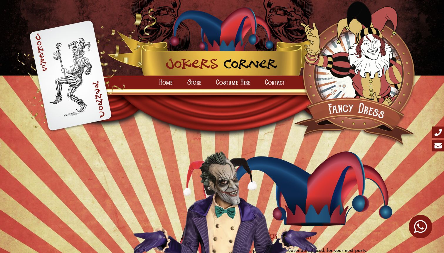
Jokers Corner commits strongly to its theatrical identity. Illustrated cards, curtains, gold ribbons and a central jester motif surround a short navigation bar for the store, costume hire and contact. That compact menu is easier to understand than the dense decorative background might suggest. The homepage distinguishes purchase and hire in its rotating content and links visitors toward the Coventry shop. It also promotes accessories and themed occasions as ways to assemble an outfit. The opening is memorable, but the large decorative treatment delays useful product and service details.
What you can learn
A distinctive theme can support a local shop’s identity, provided the essential routes remain plain. Match each button’s promise to the destination visitors actually reach.
Pros
A short menu keeps store browsing, rental information and contact as recognizable choices within an elaborate design.
The site acknowledges both buying and hiring, rather than treating every costume inquiry as the same transaction.
Cons & considerations
Large decorative artwork occupies most of the opening screen before visitors see practical assortment information.
Several shopping-style campaign labels lead to contact, which can interrupt expectations of direct product browsing.
Platform source: WordPress.org Showcase. Linked script matches Fathom Analytics. Exact public source-page sample: https://jokerscorner.co.uk/. This identifies a public Fathom Analytics reference or response association, not private configuration, complete architecture, measured performance or successful data collection. Platform evidence is separate from the direct website screenshot and is not a complete current infrastructure audit.
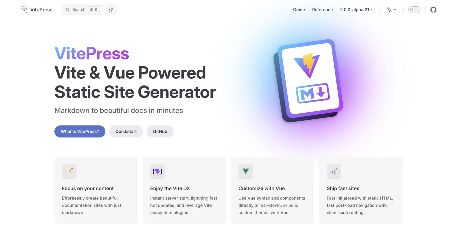
VitePress's own homepage pairs a large publishing-tool introduction with a colorful book-like illustration. What Is VitePress, Quickstart and GitHub give distinct next steps. Four compact feature cards summarize authoring, the development workflow, Vue customization and delivery. The header separates Guide and Reference while showing the selected release context. It is a concise demonstration of the visual vocabulary many other examples extend.
What you can learn
Start with the default theme as a useful baseline, then customize only where a real reading task benefits. VitePress can combine Markdown content with Vue components, but that capability does not require an interactive element on every page. Keep guide and configuration reference separate, and document which framework release the site actually targets. Product copy about speed should become a project testing question, not an assumed performance result for any site using the generator.
Pros
The three hero actions distinguish explanation, setup and source exploration.
A small feature set makes the page easy to scan before entering the documentation.
Cons & considerations
A familiar default composition may need more product-specific context to feel distinctive.
An alpha release label requires deliberate dependency and upgrade decisions rather than automatic adoption.
Platform source: WordPress.org Showcase. Linked script matches Fathom Analytics. Exact public source-page sample: https://vitepress.dev/. This identifies a public Fathom Analytics reference or response association, not private configuration, complete architecture, measured performance or successful data collection. Platform evidence is separate from the direct website screenshot and is not a complete current infrastructure audit.
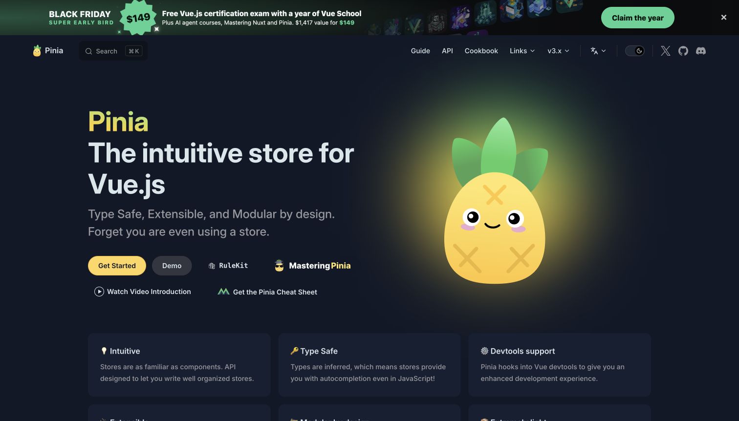
Pinia uses a large pineapple character against a dark background, with an introduction and prominent Get Started action. Guide, API and Cookbook remain separate in the header. The opening also includes demos, courses and cheat-sheet links, and the captured state contains a large training promotion above the navigation. The mascot creates a memorable identity, while the surrounding links show how quickly useful secondary resources can accumulate.
What you can learn
Preserve the distinction between official documentation, interactive examples and external training. VitePress's home actions and feature cards provide room for those routes, but each new link should earn its place in the hierarchy. Keep the primary learning action visible when promotional banners appear, and give campaigns an expiry owner. Check dark-theme contrast for supporting copy and feature cards rather than evaluating only the bright mascot and main heading.
Pros
Guide, API and Cookbook labels distinguish different implementation needs.
The mascot gives a focused technical library a recognizable visual identity.
Cons & considerations
Training promotions and several secondary actions can compete with the main start path.
Dark cards and muted text require contrast checks beyond the most prominent hero elements.
Platform source: WordPress.org Showcase. Linked script matches Fathom Analytics. Exact public source-page sample: https://pinia.vuejs.org/. This identifies a public Fathom Analytics reference or response association, not private configuration, complete architecture, measured performance or successful data collection. Platform evidence is separate from the direct website screenshot and is not a complete current infrastructure audit.
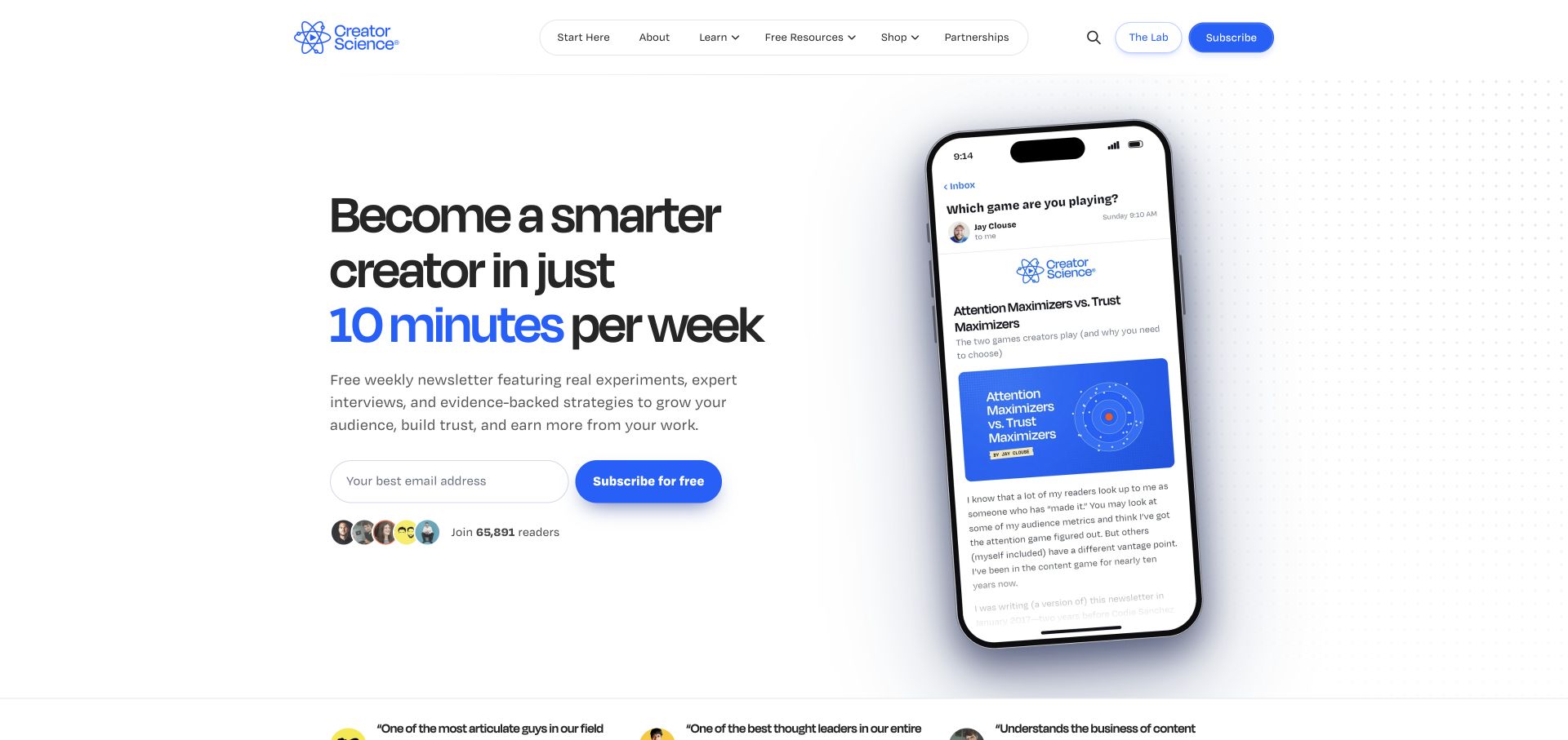
Creator Science pairs a large typographic promise with a tilted phone preview of an email. Blue accents connect the time commitment, subscription action and product identity. Navigation separates learning resources, a shop and the Lab, while the main email form remains short. The layout turns an abstract newsletter into a visible recurring product. Its public Fathom reference is separate from the publication and community systems. The screenshot cannot verify audience size, learning outcomes or how a subscriber moves between the different offers.
What you can learn
Explain the reading commitment and show a representative issue before expanding the page with testimonials or products. Keep free publishing, paid community and shopping destinations conceptually separate. A visitor should understand which relationship an email signup creates without assuming that every action grants the same access.
Pros
The sample email shows the format readers can expect instead of relying only on promotional language.
Free subscription and the separate Lab destination are visually distinguishable in the header.
Cons & considerations
The large phone mockup can compete with the actual signup explanation on narrow screens.
Several resource and commerce categories need clear destinations so the publication does not feel like an undifferentiated funnel.
Platform source: WordPress.org Showcase. Linked script matches Fathom Analytics. Exact public source-page sample: https://creatorscience.com/. This identifies a public Fathom Analytics reference or response association, not private configuration, complete architecture, measured performance or successful data collection. Platform evidence is separate from the direct website screenshot and is not a complete current infrastructure audit.
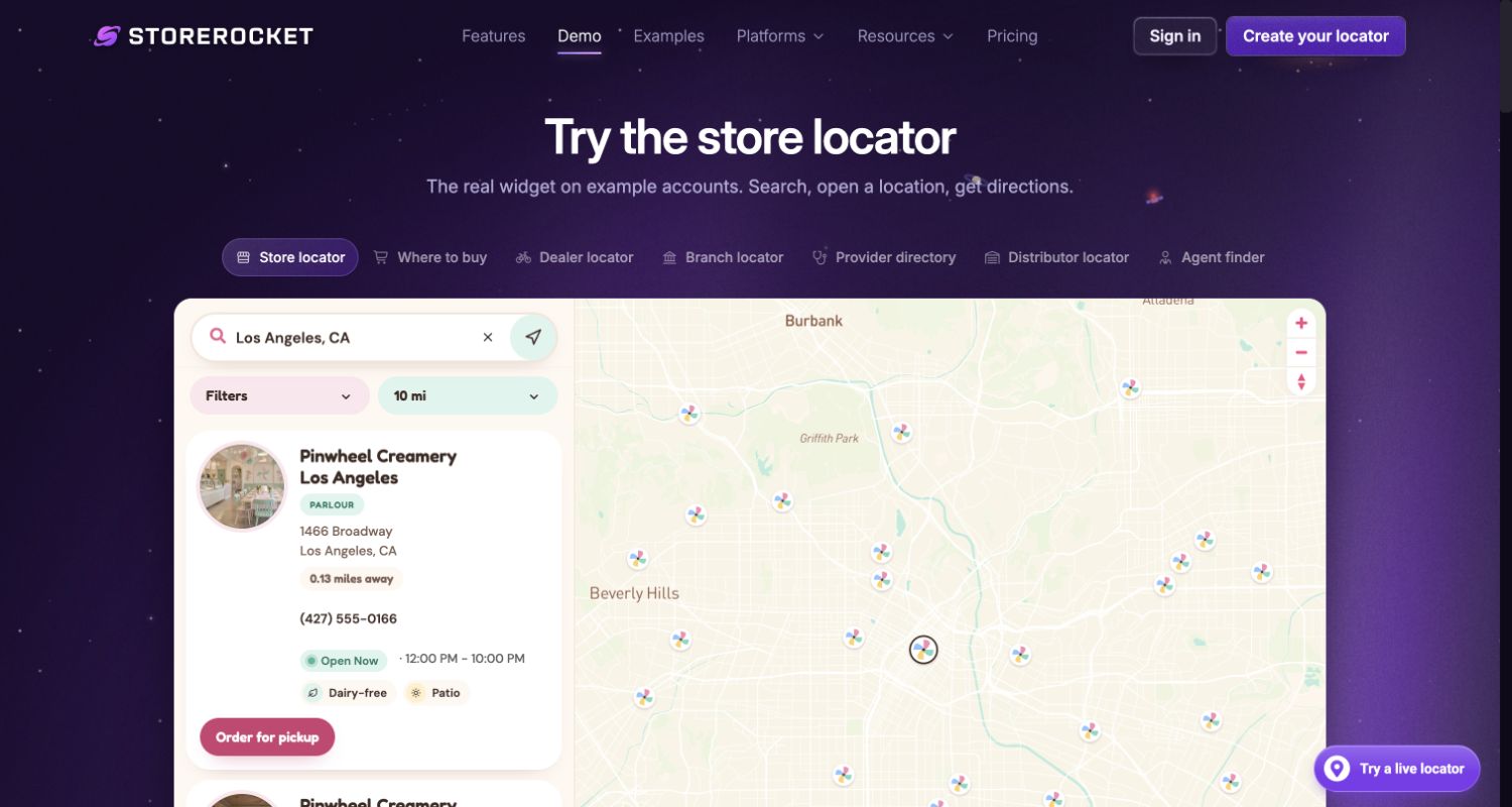
StoreRocket's demo places a working locator beneath a clear heading and a row of use-case tabs. Search, distance, filters, location cards and the map can be evaluated in the same bounded area. The page explicitly labels its example account and data, so the named ice-cream locations should not be mistaken for independently verified client businesses. This is one real product website demonstrating its interface, not several additional customer examples. The purple surrounding shell distinguishes the vendor's explanation from the embedded experience. It is a useful reference for showing prospective buyers the actual interaction model before requiring an account.
What you can learn
Label fictional demo data separately from customer claims. Evaluate search, filters, empty results and keyboard access in the embedded experience. Keep measurement of the surrounding product page distinct from the real customer location records and from an assumed successful purchase.
Pros
A public working demo communicates the interaction more clearly than a static feature diagram.
Platform source: WordPress.org Showcase. Linked script matches Fathom Analytics. Exact public source-page sample: https://storerocket.io/demo. This identifies a public Fathom Analytics reference or response association, not private configuration, complete architecture, measured performance or successful data collection. Platform evidence is separate from the direct website screenshot and is not a complete current infrastructure audit.
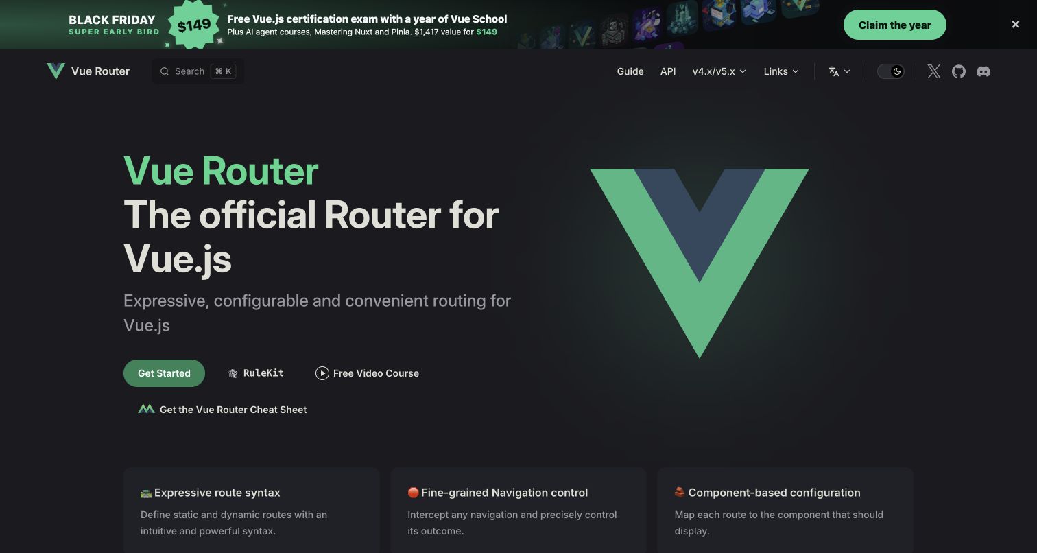
Vue Router pairs a large Vue mark with a concise description of its role. Get Started is the principal action, while training and cheat-sheet links sit nearby. The header is unusually compact, separating Guide and API alongside a version-family selector. The captured dark theme includes a substantial campaign banner above the header and feature cards below, placing practical navigation within a recognizable ecosystem identity.
What you can learn
For an official ecosystem package, familiar branding can reduce orientation work, but compatibility context still needs explicit text. Use VitePress navigation to distinguish the guide from exact API lookup, and keep the version-family selector understandable when several majors share one property. External training should remain optional and visibly separate. Test whether a campaign header changes the position of important controls or crowds the first installation link on shorter screens.
Pros
Guide and API remain clear even with a very small top-level menu.
The introduction immediately establishes the package's relationship to Vue.
Cons & considerations
Multiple secondary education links can complicate a simple installation decision.
A version-family selector needs precise labeling when readers support different application generations.
Platform source: WordPress.org Showcase. Linked script matches Fathom Analytics. Exact public source-page sample: https://router.vuejs.org/. This identifies a public Fathom Analytics reference or response association, not private configuration, complete architecture, measured performance or successful data collection. Platform evidence is separate from the direct website screenshot and is not a complete current infrastructure audit.
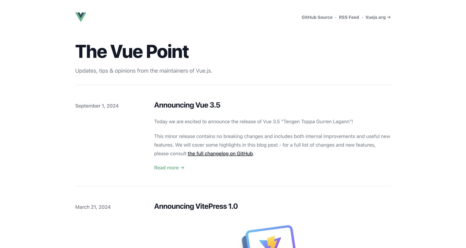
The Vue Point uses a simple masthead, a short description and a chronological article list. Publication dates sit beside post titles and excerpts, while source, RSS and the main Vue site are available in the small header. Unlike the documentation examples, the captured page has no large sidebar or feature grid. The visible leading articles retain their original dates, making the page clearly an editorial archive rather than a current-version reference.
What you can learn
VitePress can publish an editorial site through a custom layout without reproducing its documentation theme. Preserve publication dates and link announcements to maintained references when instructions may age. Keep RSS and source links available for repeat readers. Do not automatically advance old release dates or present the newest visible archive item as the current software release. This approach is useful when project news and evergreen setup material have different owners and update rhythms.
Pros
Visible dates make the age and sequence of announcements understandable.
The small header provides repeat-use routes without overwhelming the article archive.
Cons & considerations
An infrequently updated archive may need clearer links to current documentation and release status.
Long excerpts can reduce scanning efficiency when the archive grows substantially.
Platform source: WordPress.org Showcase. Linked script matches Fathom Analytics. Exact public source-page sample: https://blog.vuejs.org/. This identifies a public Fathom Analytics reference or response association, not private configuration, complete architecture, measured performance or successful data collection. Platform evidence is separate from the direct website screenshot and is not a complete current infrastructure audit.
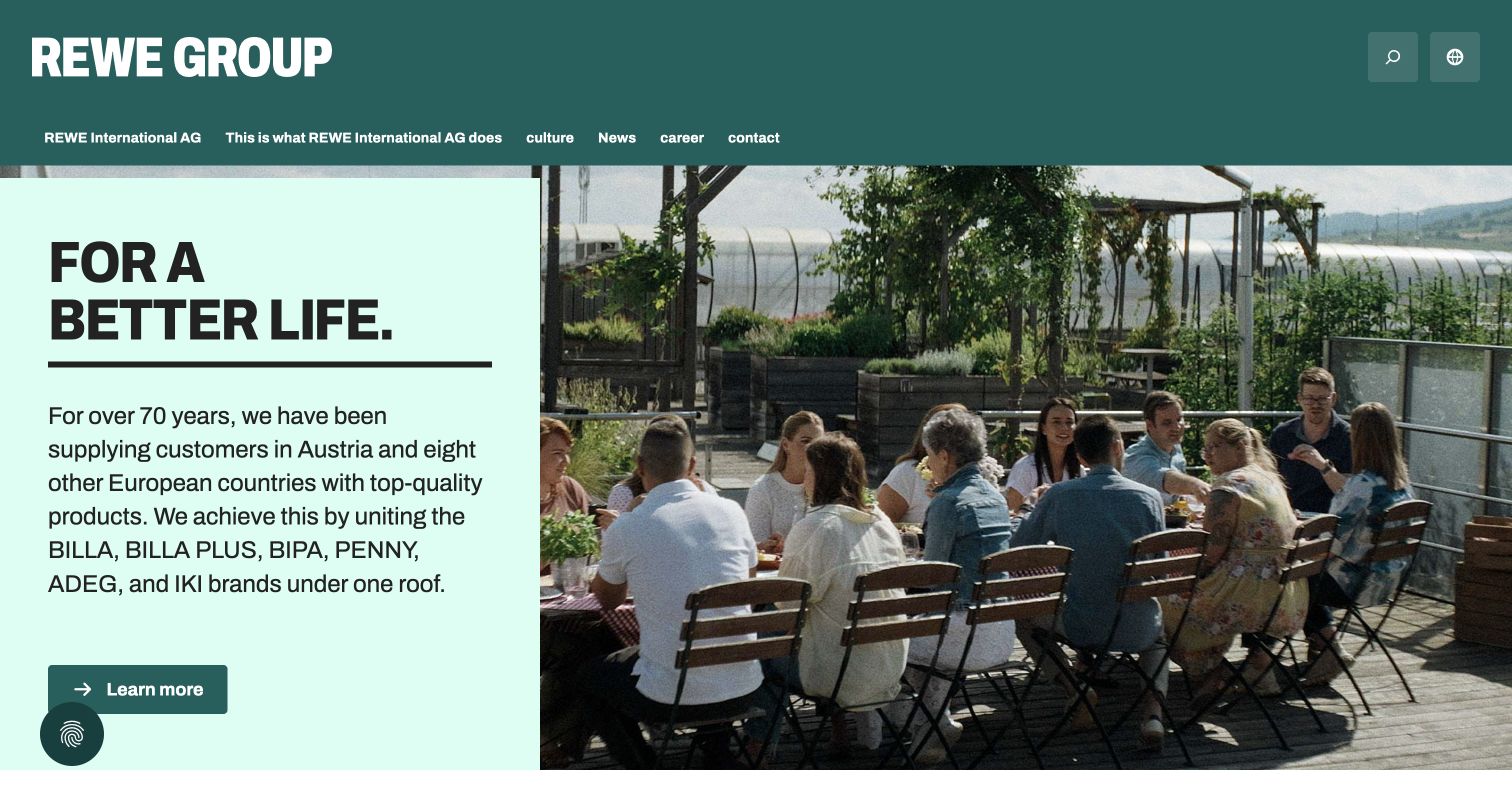
REWE International AG’s Austrian corporate site balances a large group identity with an everyday human image. The opening combines a dark green masthead, a pale green text panel and a photograph of colleagues on a terrace. A short purpose statement introduces regional retail brands, followed by a single learn-more action. Company information, careers and news have distinct routes rather than being treated as one audience. This is the Austrian corporate property, not every REWE store or booking service. The retained capture shows the browser’s existing English translation; that state is not proof of the website’s own translated edition. The composition demonstrates a calm editorial approach to a complex regional organization.
What you can learn
Separate long-lived company information from dated news, while preserving a recognizable visual system. Keep brand, regional entity and language context explicit so that a translated introduction does not imply that every business unit offers the same information or services.
Pros
People-focused photography makes an institutional introduction approachable.
The visible paths distinguish company information from careers and news.
Cons & considerations
Several regional brand names compete for attention in the introductory paragraph.
Language changes need to preserve the selected corporate and regional context.
Platform source: WordPress.org Showcase. Linked script matches Fathom Analytics. Exact public source-page sample: https://rewe-group.at/de/. This identifies a public Fathom Analytics reference or response association, not private configuration, complete architecture, measured performance or successful data collection. Platform evidence is separate from the direct website screenshot and is not a complete current infrastructure audit.
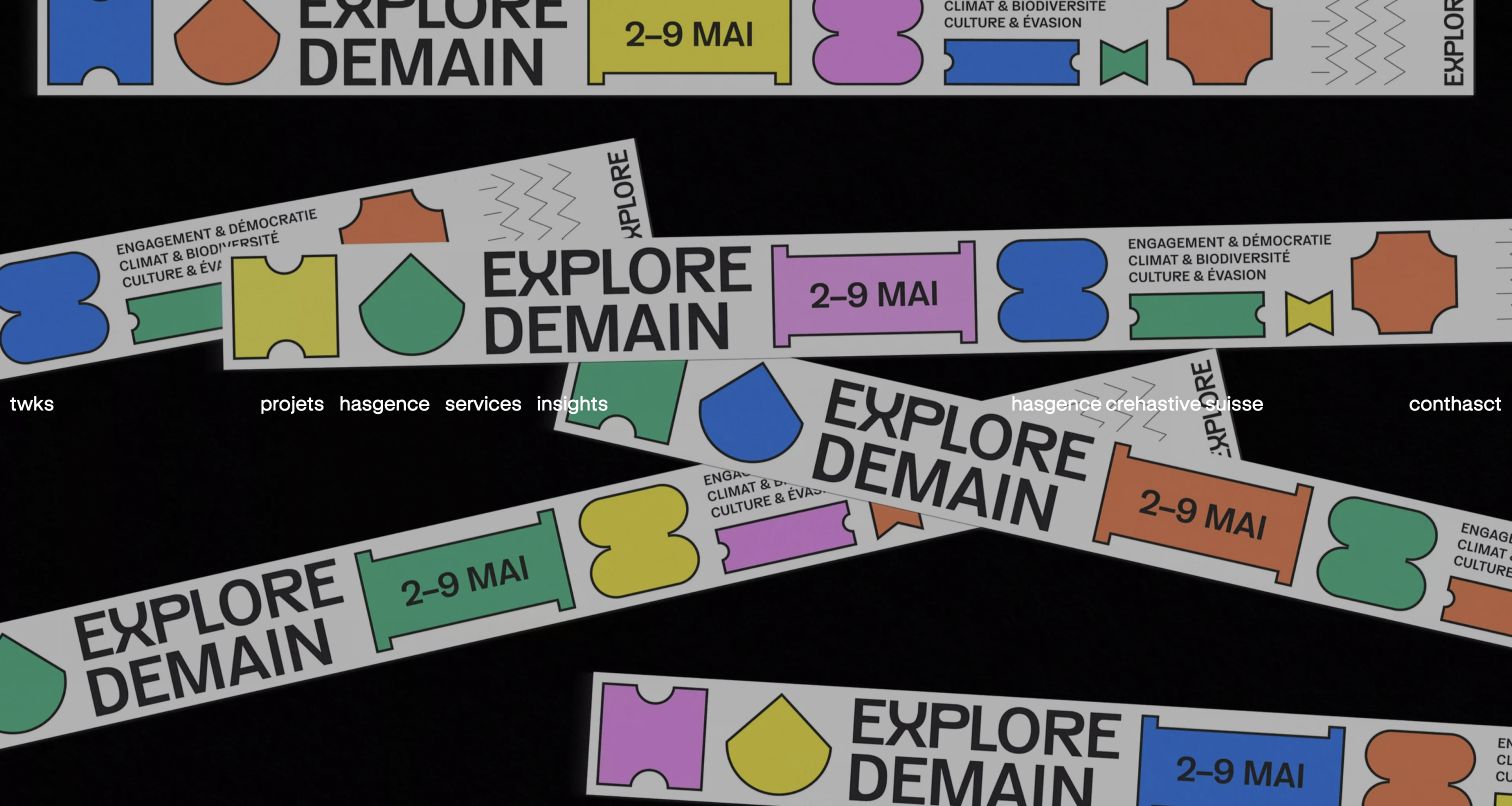
twks opens with its creative work as the visual argument. Bold campaign artwork combines colored shapes with repeated print-like elements, while the studio wordmark and navigation sit over the image. This establishes a strong character but makes label contrast dependent on the changing background. Projects, agency, services and insights remain separate routes, followed by case cards connecting client names with concise design challenges. A loading introduction preceded the accepted completed view. The retained screenshot preserves the browser’s existing translation of some navigation lettering. The public Fathom reference does not attribute the creative work or reveal its commercial results.
What you can learn
Let a creative opening demonstrate the kind of work a studio wants to attract, but give the portfolio a stable descriptive structure underneath. Project names, services and short problem statements should remain readable when motion or imagery changes.
Pros
Distinctive campaign artwork communicates the studio’s visual character.
Project cards connect client identity to a specific creative task.
Cons & considerations
Overlay navigation needs reliable contrast across changing imagery.
Loading intros and animated lettering can delay or complicate orientation.
Platform source: WordPress.org Showcase. Linked script matches Fathom Analytics. Exact public source-page sample: https://twks.ch/. This identifies a public Fathom Analytics reference or response association, not private configuration, complete architecture, measured performance or successful data collection. Platform evidence is separate from the direct website screenshot and is not a complete current infrastructure audit.
Kegan has 15+ years of experience working with small businesses, Fortune 500 companies, and everything in between. No development job is too big or too small: he brings the same hands-on attention to a focused improvement, a complete website, or a custom application.
For Fathom Analytics projects, he can help with a focused measurement brief, website integration, clearly defined observations, privacy-aware configuration review, testing, and practical reporting handover. He works directly with clients on scope, design, implementation, testing, and handover, with an emphasis on clear communication and a system that remains practical to maintain after launch.
Show 3 other Fathom Analytics developersHide other Fathom Analytics developers
Choose the smallest measurement model that remains useful
Page-level reporting for a focused information site
For a straightforward publication or brochure site, start by identifying the pages that answer important questions. A maintained page taxonomy and meaningful reporting cadence may be more valuable than a large event vocabulary.
A few deliberately defined outcomes
Add outcome observations only when their meaning can be tested. An accepted request should be distinct from a button press. Explain missing or blocked measurement rather than treating every gap as proof of visitor abandonment.
Separate operational records from analytics
Keep actual enquiries, orders and appointments in their appropriate systems. Aggregate analytics can help investigate discovery and navigation; it should not become an improvised database of customer details or replace the authoritative transaction record.
From references to requirements
Plan implementation, verification and routine review
Write the reporting vocabulary
Define a short set of page groups and permitted outcome names. Avoid visitor-supplied text in those labels. Make sure the terminology means the same thing to the person designing the interface and the person reading a monthly report.
Test the integration’s actual boundary
Check initial loads, internal navigation and any approved event trigger. Confirm that repeated submissions do not create misleading duplicate outcomes. Distinguish a locally dispatched request from verified provider receipt when documenting the test.
Schedule interpretation, not just collection
Assign a reader and an action cadence. Record major changes to navigation, campaigns or forms so that a later comparison has context. If a report never informs a decision, reconsider whether the observation needs to remain enabled.
A useful handover demonstration
Ask the actual team to carry out its routine job: publish a realistic update, correct a mistake, preview a narrow screen, and identify who owns an integration failure. For a library or frontend framework, also ask who maintains the content source and deployment. A polished screenshot does not answer those operational questions.
Beyond the screenshot
Focused analytics handover checklist
Write the decisions the reporting should support.
Identify the exact public property and reporting owner.
Inventory other scripts, embeds and form providers.
Exclude personal details and private URL parameters.
Define page views, clicks and accepted outcomes separately.
Test duplicate and failed interaction states.
Document delivery checks and any verification limits.
Record reporting access, maintenance and removal instructions.
Test with real content, a keyboard, a small screen, slow or failed requests, and the people who will maintain the system. These are planning checks, not an accessibility, security, performance, or search-ranking certification.
Sources & editorial method
How this Fathom Analytics collection was reviewed
A fresh bounded November 13 source audit found Fathom references on these exact public pages. Screenshots are genuine; retained captures keep their dates, and two newly unobstructed source captures are separately recorded. No private dashboard, visitor totals, event setup or commercial results were accessed. References are not a certification of privacy compliance.
Every image is an unmodified capture from the actual website, with its source and capture date. Some captures are reused from our shared catalog; their dates remain the original capture dates. None comes from a vendor gallery or a generated reconstruction. Moving imagery and live content can change.
Technology attribution uses public page assets or metadata, official platform documentation, or a cited first-party project case study. Documentary and framework-relationship evidence is identified where used; it is not a complete current backend inventory. A CMS image CDN alone does not establish a full CMS deployment. A library’s presence does not prove which individual controls use it, and a platform label does not establish AI authorship.
The composition notes, lessons, pros and tradeoffs are original editorial observations. We have not measured conversion, traffic, security, performance or accessibility conformance. Website owners retain their brands and imagery; these examples are not our client portfolio. Written, Edited and Curated are independent records, not dates advanced by a build. See our editorial standards or suggest a correction.
Questions worth asking
Fathom Analytics website development FAQs
Can the screenshots show how Fathom is configured?
No. The images show the public website. Script evidence and access to a private reporting configuration are separate things.
Does this collection rank the sites by traffic?
No. We do not have verified comparable traffic or conversion figures. The observations concern interface decisions and scoped public evidence.
Are the Vue projects all separate customers?
We do not make that claim. Vue, its blog and related documentation properties are distinct public examples within the same broader ecosystem.
Does using Fathom remove every consent or disclosure obligation?
Do not infer that from a tool name. The whole implementation, other services, configuration and relevant requirements need their own review.