Best Actuarial Consulting Websites of 2026 (25 Real-World Examples)
Actuarial practices with useful ways to explain specialist advice, professional teams, analytical work and client research.
An actuarial consultancy website should make a specialist appointment easier to understand without turning a clear presentation into a promise about financial outcomes.
Actuarial consulting covers different professional contexts. A pension-scheme trustee, an insurer and a risk manager are not trying to answer the same question, even when their advisers use related analytical disciplines. A useful website identifies the relevant context before introducing a long service list. It should help a reader understand what the practice does, who is responsible and how an initial conversation differs from a project-specific conclusion.
The useful comparison is not which firm presents the largest figure or the most confident prediction. Look instead at service boundaries, audience labels, professional profiles, dated resources and the handoff into confidential work. Some practices combine consulting with software, administration or broader employee-benefit services. Those relationships should be explained rather than left for a prospective client to infer from the company name.
Before the examples
What makes good actuarial consulting website design in 2026?
Name the actual consulting context
Distinguish pension work, insurance-related analysis, risk management and other services the firm genuinely provides. Explain specialist terms close to the relevant task. Do not make a visitor decode a broad analytics slogan before finding out whether the practice works in the appropriate area.
Make responsibility and relevance visible
Connect a service with appropriate people, offices and professional experience. Have the practice verify qualifications, role descriptions and jurisdictional statements. A polished biography is not independent proof of appointment suitability, but a consistent profile can support more informed research.
Give publications dates, authors and scope
A market note, a technical paper, a training session and a client case answer different questions. Label each clearly. Do not make an old article appear newly authoritative because its page template or internal links were refreshed.
Separate public enquiry from confidential analysis
Explain what information starts a discussion and how sensitive records will be exchanged later. A public website should not request a full claims file or member dataset merely because its form supports attachments.
The collection · 25 examples
25 actuarial consulting websites worth studying
Compare how actuarial practices explain audiences, services and the people behind their work. The examples are website design and communication references, not recommendations about actuarial appointments, insurance decisions, pension arrangements or financial results.
Pinnacle’s captured homepage uses white type on a charcoal introduction, with orange accents marking the main action and the following study feature. The header separates customers, expertise, team, insights and events instead of placing every subject under a generic services menu. A conversation route is distinct from careers and client login, making several visitor intentions visible at once. The dated risk-retention-group benchmarking feature begins immediately below the introduction. Current first-party material establishes the property-and-casualty actuarial focus and a named professional directory, connecting the people-oriented positioning with concrete ways to research the practice.
What you can learn
Help prospective clients investigate both the relevant discipline and the people who deliver it. A focused practice can make expertise approachable through clear navigation, then use service and profile pages to explain scope, qualifications and a sensible first conversation without promising an analytical outcome.
Pros
Customer, expertise and team routes address different questions before an enquiry.
The dated study feature supplies a concrete next research step beyond the introductory statement.
Cons & considerations
A broad people-focused headline needs a clear statement of actuarial specialty nearby.
A large introductory area can delay specific engagement detail on compact displays.
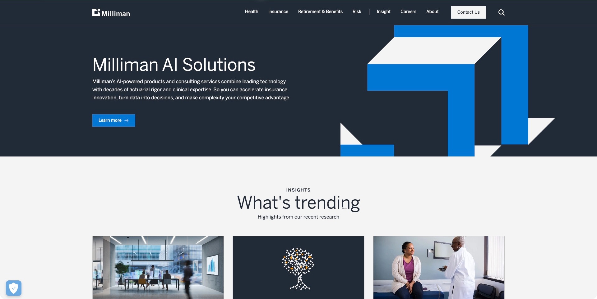
Milliman’s US homepage uses a dark blue campaign panel, large geometric artwork and a concise introduction to its AI solutions. The header keeps health, insurance, retirement and benefits, and risk visible as separate subjects, with research beginning immediately below the campaign. That separation is useful because an interested visitor may be looking for a consulting relationship, a specific tool or an explanation of an industry issue. The pictured campaign is current marketing content, not evidence that every engagement uses the same technology or that the marketing website exposes the models behind the consultancy’s work.
What you can learn
Keep durable subject navigation independent of a changing campaign. An actuarial client should still find the relevant discipline when the homepage feature changes from a research report to a software offering; give each destination its own scope, audience and next step.
Pros
Stable subject labels remain visible around a time-sensitive promotional feature.
A research section provides an onward route beyond the campaign’s main action.
Cons & considerations
A broad AI-solutions headline needs clear product and consulting boundaries in the destination.
Published insights require dates and jurisdictional context before informing a reader’s particular decision.
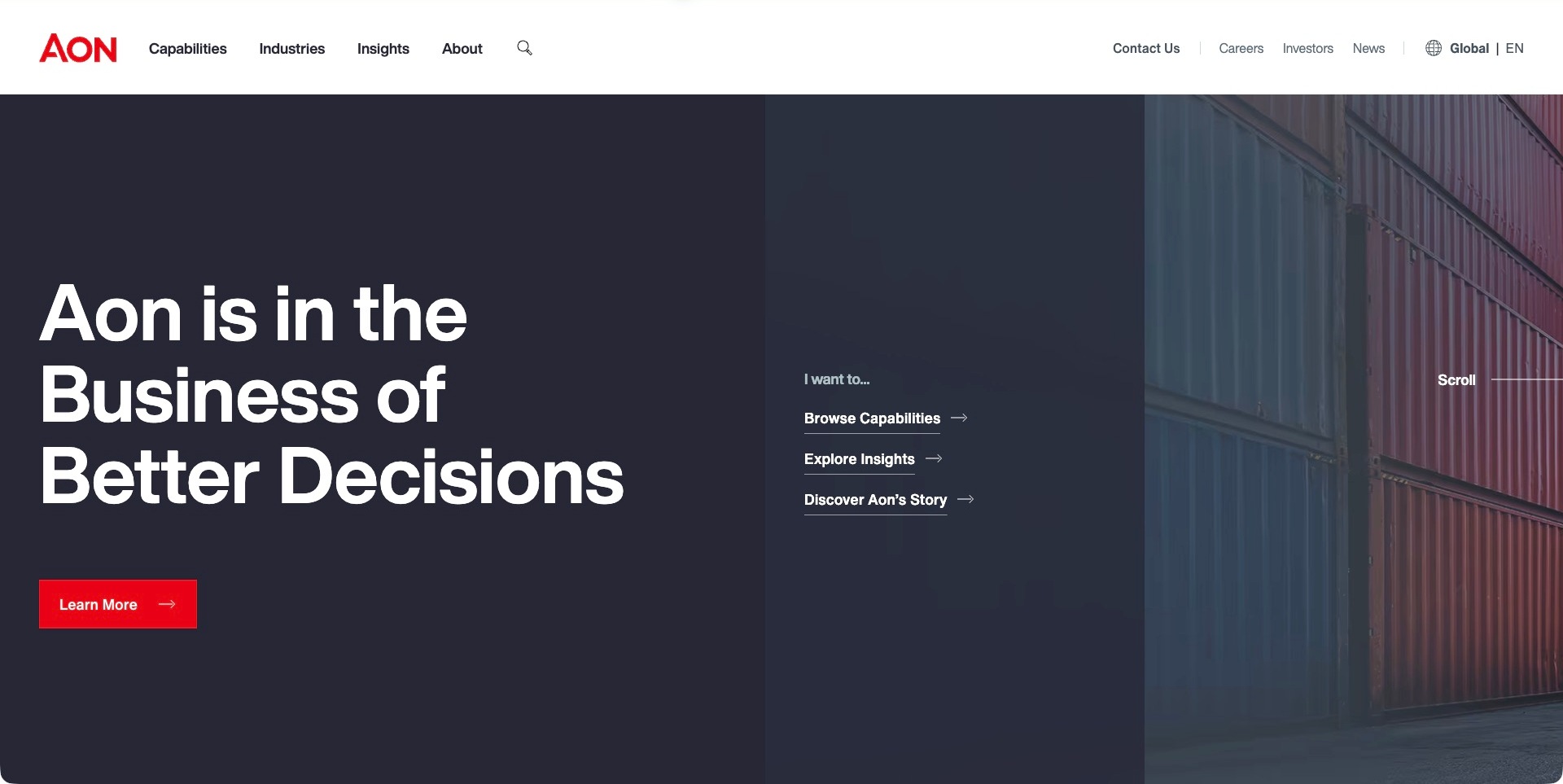
Aon divides the opening screen into three distinct areas: an oversized white headline on navy, a short task menu, and an architectural photograph. The red logo and main action provide a restrained accent rather than competing with every navigation item. The central choices distinguish browsing capabilities, reading insights and learning about the business, which gives the corporate statement a practical next step. This is the broad Aon homepage, not a dedicated actuarial landing page; its separate pension actuarial services page establishes the relevant consulting scope. That distinction matters when borrowing the composition for a more specialized practice with fewer service lines.
What you can learn
Pair a broad positioning statement with a small number of recognizable visitor tasks. Keep the route to the actuarial discipline explicit rather than expecting a pension-plan sponsor to interpret a general business slogan or explore every corporate capability.
Pros
Three visual zones distinguish positioning, onward tasks and supporting imagery.
The header separates service discovery from corporate, employment and investor information.
Cons & considerations
A broad capabilities route needs descriptive intermediate labels for specialist actuarial visitors.
Large introductory typography can delay detailed service scope on smaller screens.
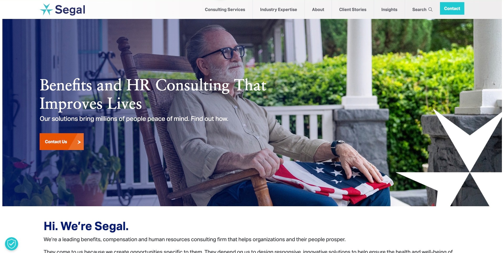
Segal opens with a photograph of an older person on a porch, a large serif benefits-and-HR heading, and a strong orange contact action. A dark blue gradient gives the white copy a defined reading area, while an enlarged star motif connects the image to the turquoise identity in the header. The following introduction makes clear that this is a broader benefits and human-resources consultancy. Its retirement consulting page separately names actuarial work alongside plan design, governance and administration. The design therefore offers a useful example of approachable institutional communication, not a standalone pension calculator or evidence that a particular retirement outcome is guaranteed.
What you can learn
Show why technical work matters to people, then make the professional scope easy to inspect. Human photography should support specific service, audience and engagement information rather than substitute for an explanation of the actuarial work a plan sponsor is seeking.
Pros
Service and industry routes offer two different ways into the consultancy.
The photograph and contrasting contact button create a clear opening hierarchy.
Cons & considerations
Benefits imagery alone does not explain the boundaries of an actuarial engagement.
A broad wellbeing promise needs careful qualification on individual service pages.
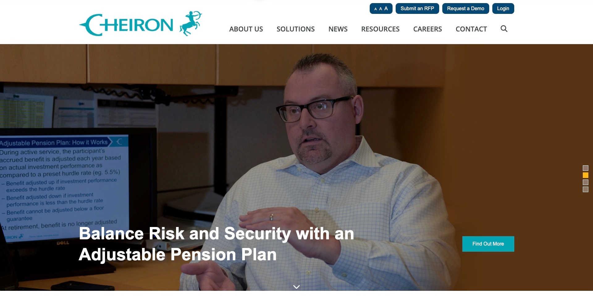
Cheiron places an explanatory pension-plan feature in a large photographic hero beneath a distinctly organized white header. The captured frame shows a speaker beside a presentation, with a clear topic headline and a turquoise onward action, rather than an abstract chart presented without context. Above the main navigation, the website separates an RFP submission, a demonstration request and an existing-client login. Visible text-size controls are another deliberate interface choice, although their presence alone does not establish accessibility compliance. The source describes pension and health consulting, while the homepage feature supplies a focused subject through which to introduce that broader practice.
What you can learn
Separate procurement, product evaluation and client access before designing the main contact journey. A board requesting proposals should not have to interpret a software demonstration button, and an existing client should not need to pass through a prospect enquiry form.
Pros
Distinct header actions acknowledge different stages of the professional relationship.
A specific explanatory topic makes the hero more tangible than a general risk slogan.
Cons & considerations
A rotating feature needs a durable route to the full service scope.
Presentation imagery and specialist terminology may need a plain-language companion summary.
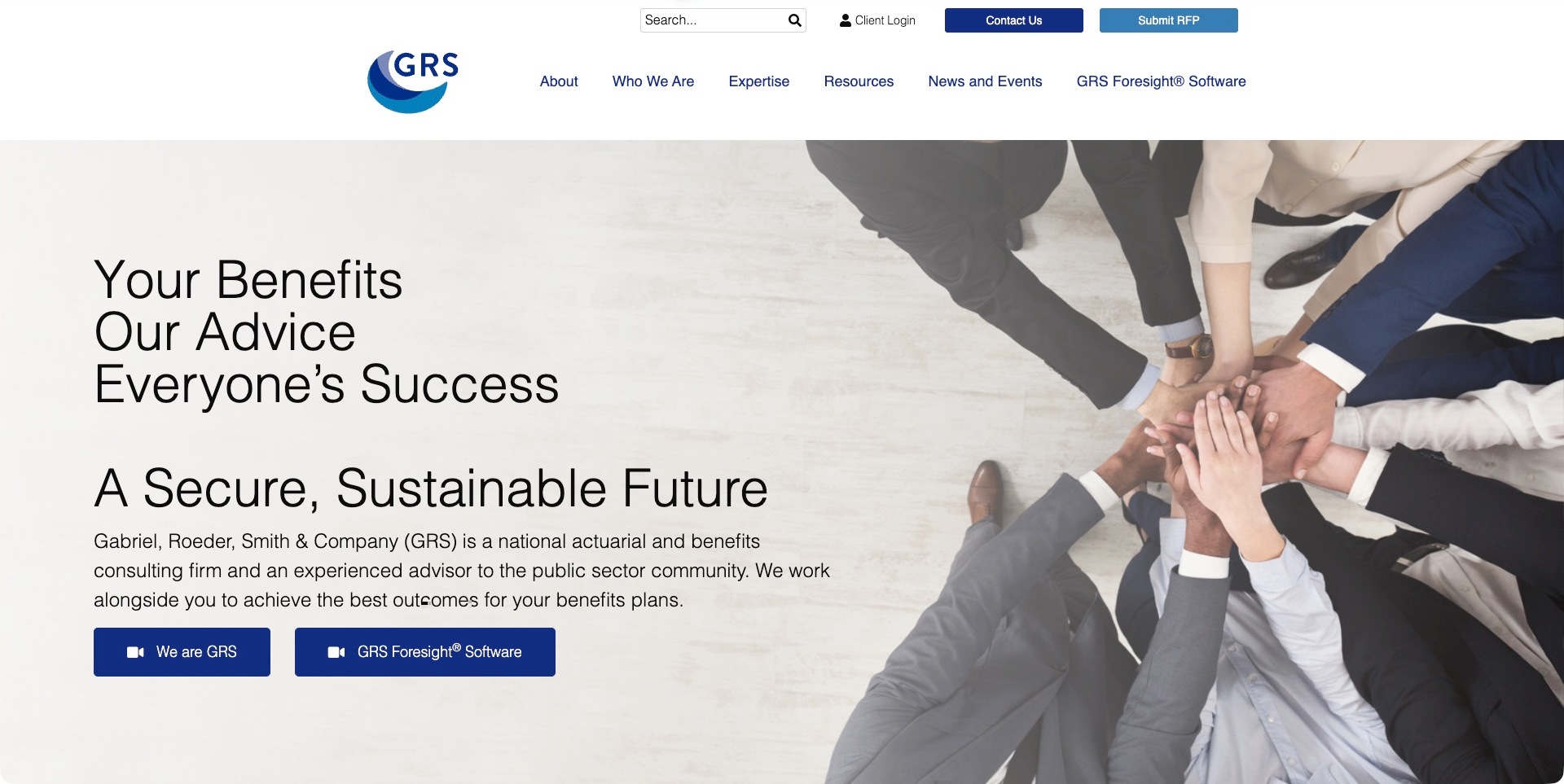
GRS combines a pale teamwork photograph with large black introductory copy, leaving the firm’s name and public-sector actuarial focus visible within the first screen. The header keeps expertise, resources, news and its Foresight software in separate destinations; client login and RFP submission sit in a smaller utility row. Two prominent hero actions introduce the organization and the software through different videos. This is useful communication architecture for a consultancy with more than one kind of offering. The photograph conveys collaboration, but the adjacent scope statement does the more important work of identifying the audience and professional service category.
What you can learn
Give a proprietary analytical product its own route without allowing it to stand in for the consulting engagement. Explain who the advice is for, what the software helps illustrate and which next step starts a conversation about a specific plan.
Pros
The first screen explicitly identifies actuarial consulting and its public-sector context.
RFP, client access and software navigation remain separately labeled.
Cons & considerations
Teamwork stock imagery contributes less specificity than a well-explained project example.
Video introductions need useful text alternatives for visitors who cannot or prefer not to play them.
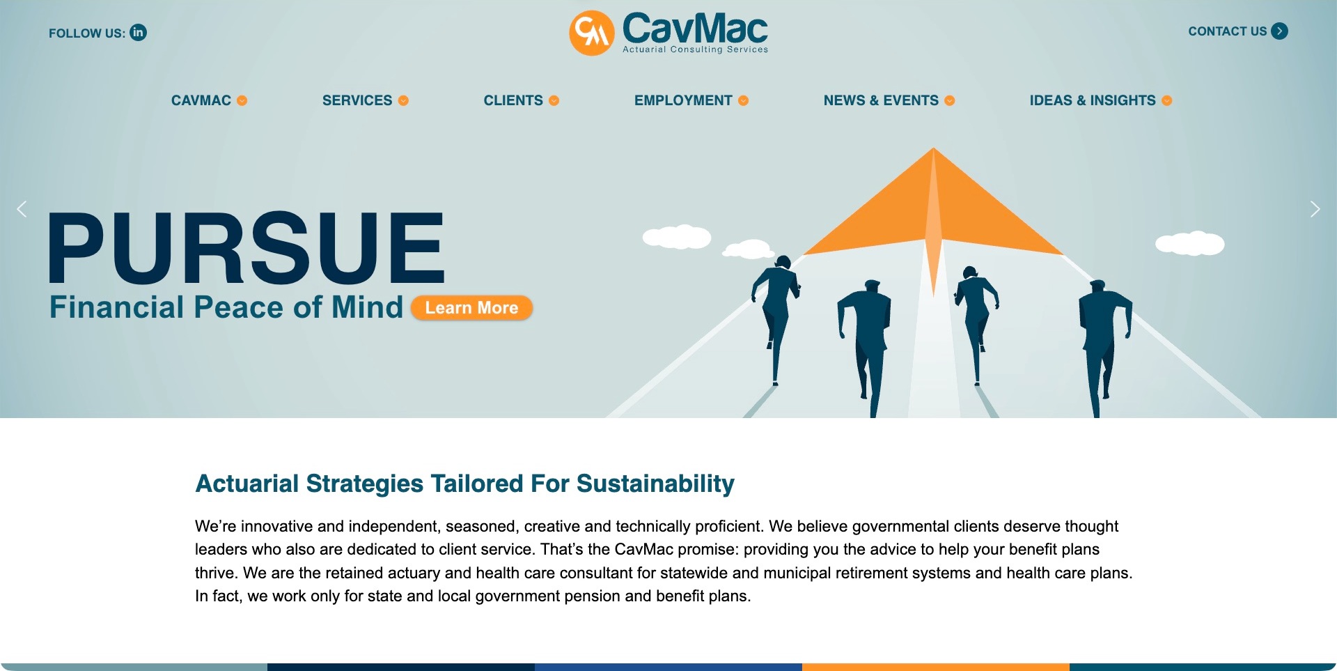
CavMac uses a pale blue field, navy type and orange accents to turn an otherwise technical introduction into a recognizable illustrated scene. People run behind an orange paper aircraft, while the oversized headline occupies the other half of the hero. More importantly, the paragraph immediately below states that the firm works for state and local government pension and benefit plans. That narrow scope gives the service introduction substance beyond the broad opening promise. Services, clients, employment, news and ideas have separate header routes, so a plan sponsor and a prospective colleague are not offered the same undifferentiated path.
What you can learn
Put a precise audience definition close to an expressive brand statement. A specialist actuarial website can be visually distinctive while still telling visitors which plan types it handles; describe the work without presenting the illustration or headline as proof of financial results.
Pros
A consistent orange-and-navy illustration creates a recognizable visual vocabulary.
The introduction explicitly limits the firm’s audience to public-sector plans.
Cons & considerations
An aspirational financial headline needs specific service detail immediately nearby.
Large illustrated sliders can make important audience information easier to miss on compact displays.
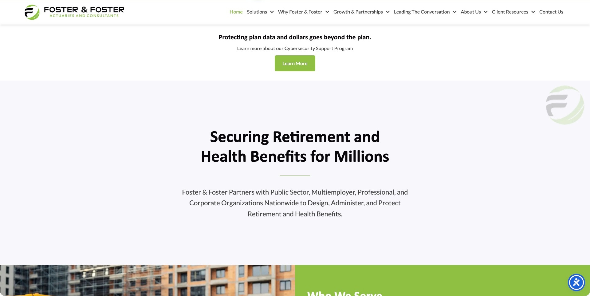
Foster & Foster’s opening screen favors centered typography and pale space over a full-bleed lifestyle image. The green identity appears in the logo, small divider and campaign action, while the main introduction names retirement and health benefits and lists the types of organizations it serves. A separate cybersecurity-support promotion sits above that introduction, making the current campaign distinct from the practice’s durable scope. The navigation also separates solutions, partnerships, thought leadership, company information and client resources. These are useful content distinctions for an actuarial firm that needs to introduce its work without treating every visitor as a new sales prospect.
What you can learn
Make campaign content visibly separate from the enduring explanation of the practice. Retirement boards, employer sponsors and current clients need stable service and resource routes even when a support program or timely issue is being promoted at the top of the homepage.
Pros
The main introduction states both benefit disciplines and institutional audiences.
Client resources have their own header destination rather than being buried in general contact.
Cons & considerations
The large introductory whitespace can postpone concrete engagement details.
A cybersecurity-support promotion should not be mistaken for a guarantee about website or plan-data security.
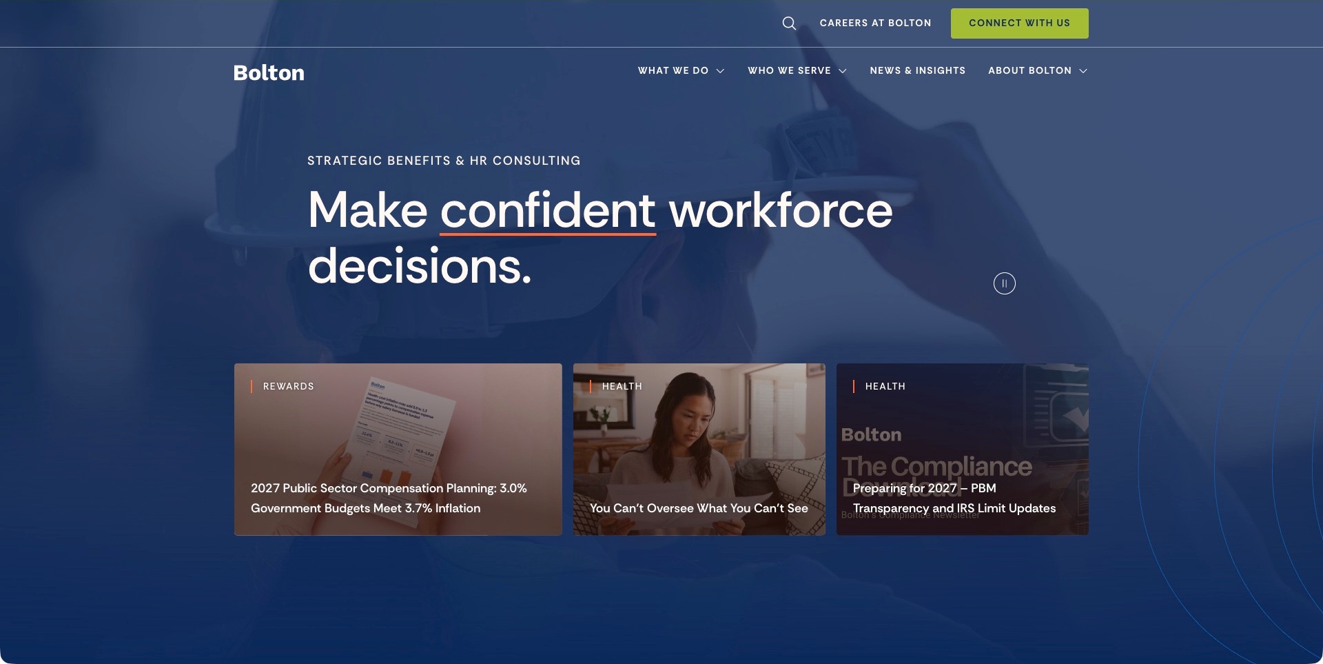
Bolton places a concise workforce headline over a dark blue photographic background, with coral emphasis and a lime contact button creating a clear brand contrast. Three resource cards begin within the opening screen, giving the homepage an active editorial character. The navigation separates what the firm does from who it serves, a useful distinction when retirement, health and rewards topics share one corporate identity. Its retirement page supplies the actual actuarial scope, including valuations and plan-related consulting. The marketing homepage should therefore be studied as a broad routing and editorial design, not a detailed description of one actuarial assignment.
What you can learn
Let visitors choose by either service or organization type, then connect current articles to those durable routes. A timely workforce issue can attract attention, but a pension-plan sponsor still needs a clear explanation of engagement scope, relevant specialists and how to start an enquiry.
Pros
Service and audience navigation provide complementary discovery routes.
Visible topical cards offer a next step beyond a general corporate introduction.
Cons & considerations
Time-sensitive resource cards require an ongoing editorial maintenance plan.
A broad workforce message may need a more direct actuarial entry point for specialist visitors.
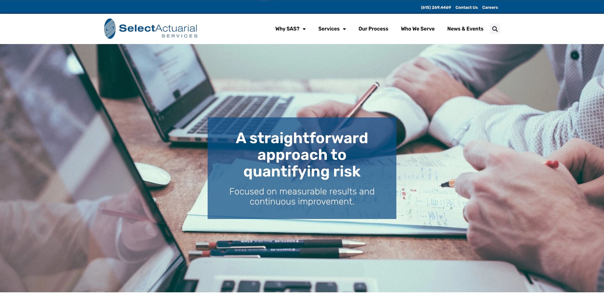
Select Actuarial Services uses a conventional but legible composition: a white logo-and-navigation band, a blue contact strip and a large meeting photograph with a translucent blue text panel. The restrained palette makes the central introduction easy to locate without filling the hero with competing actions. The navigation is particularly useful for this collection because it gives process its own destination alongside services and the organizations the firm serves. That makes the website more than a list of technical capabilities. A prospective client can investigate both what the firm does and how the working relationship is organized before using the visible contact route.
What you can learn
Treat engagement process as useful buying information rather than internal methodology. Explain the initial question, information requirements, review stages and deliverables in language a risk manager can follow, without implying a generic workflow guarantees a particular result.
Pros
Services, process and audience routes address different pre-enquiry questions.
The blue panel provides a defined reading area over a detailed photograph.
Cons & considerations
A general meeting photograph contributes little evidence of specialist actuarial work.
Broad measurable-results language needs concrete, qualified engagement examples nearby.
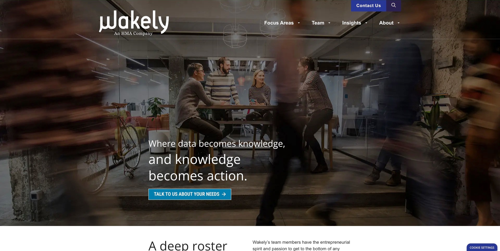
Wakely uses a darkened office photograph behind a short, stepped headline and a contrasting conversation button. The large wordmark includes its HMA affiliation directly, so the relationship is visible without sending the visitor to a corporate-history page. Focus areas, team, insights and company information form a compact navigation rather than a long catalogue across the header. The next content begins with a team-oriented introduction, reinforcing the importance of finding an appropriate specialist. This is a healthcare actuarial consultancy’s marketing homepage, not an interactive clinical analysis or proof of the technology used in its consulting work.
What you can learn
Make practice focus, relevant people and organizational affiliation easy to inspect together. A buyer may need to understand who would handle an assignment before choosing a service label; concise team and subject routes can be more useful than an oversized list of technical terms.
Pros
The HMA relationship is disclosed directly in the visible brand lockup.
Team and subject navigation support different paths toward a professional conversation.
Cons & considerations
An abstract knowledge headline needs explicit healthcare service detail below it.
A dark moving-image composition requires careful contrast and motion handling across devices.
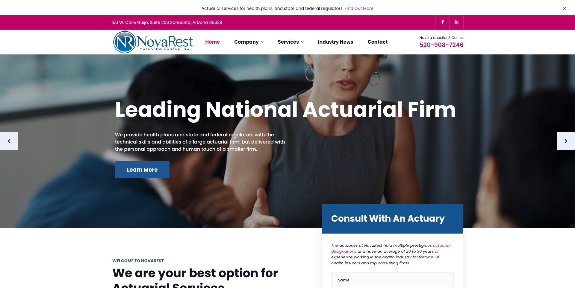
NovaRest combines blue corporate styling with a strong magenta accent in the utility bar and telephone details. Its opening copy explicitly names health plans and state and federal regulators, supplying more useful context than the larger general positioning headline. A blue-and-white consultation panel begins beside the next section, while company, services, industry news and contact remain distinct header choices. The design demonstrates how a focused practice can place a human enquiry route close to its service explanation. The website’s claims about expertise and firm standing are marketing statements, not independently verified rankings or an assurance about a particular regulatory assignment.
What you can learn
Name the actual institutional audience before asking for an enquiry. A health-plan representative and a regulator may share technical questions but need different scope, reporting and confidentiality information; use the next pages to explain those distinctions rather than overloading a single form.
Pros
The introductory copy specifies both commercial and regulatory audiences.
Telephone and consultation routes are visible without searching the footer.
Cons & considerations
Several stacked header bands consume space before the core service explanation.
A consultation form should explain appropriate information and avoid requesting confidential plan data initially.
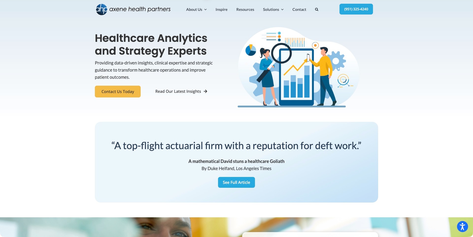
Axene Health Partners uses a light blue background, dark readable type and an illustrated analytics scene rather than a dense technical dashboard. A yellow contact action sits beside an insights route, giving visitors a choice between conversation and further reading. Immediately below, a quotation panel names its publication source and offers a route to the full article. That attribution is worth studying as a pattern: it provides context rather than presenting an anonymous praise fragment. The quotation is the website’s cited material, not our endorsement, and the illustration does not demonstrate the accuracy or clinical effectiveness of an underlying analytical model.
What you can learn
Use a simple visual explanation to introduce specialist work, then make supporting references inspectable. A press quotation should retain its source and context; professional service detail should explain the relevant assignment instead of relying on the authority implied by a publication name.
Pros
Contact and insights are distinct, immediately visible next steps.
The publication panel retains a named source and a full-article destination.
Cons & considerations
A general analytics illustration cannot communicate a specific actuarial method by itself.
A prominent historic quotation needs contextual dating and must not substitute for current service evidence.
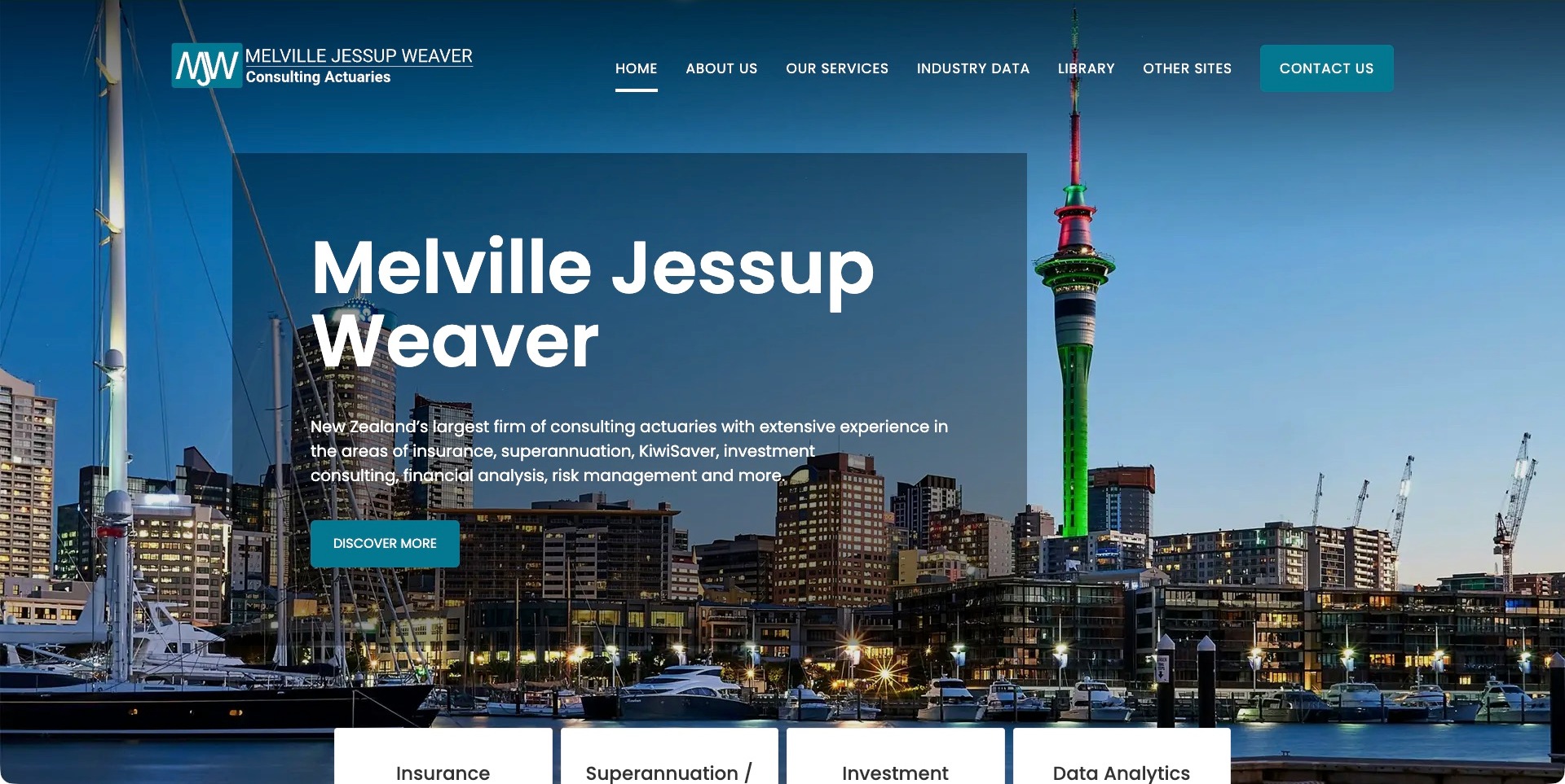
Melville Jessup Weaver places an Auckland waterfront photograph behind a large translucent blue introduction. The full firm name and consulting-actuary descriptor remain visible in the header, while the main paragraph lists insurance, superannuation, KiwiSaver, investment consulting and related analytical work. Service cards begin at the lower edge of the opening screen, turning that broad introduction into more concrete subject routes. Industry data and the library are separate navigation choices, suggesting different reading tasks from a direct service enquiry. The firm’s scale claim is its own positioning, not a measured ranking established by this collection.
What you can learn
Use regional identity to establish context, then show the actual disciplines visitors can explore. Distinguish service explanations from data publications and reference material, with dates and scope on the destinations so readers know whether they are evaluating a consultancy or consulting a particular resource.
Pros
The visible introduction names locally relevant retirement and insurance disciplines.
Services, industry data and library content have separate navigation routes.
Cons & considerations
A large scenic hero can delay detailed engagement information on compact screens.
Published industry data needs clear periods, definitions and usage qualifications before reuse.
Finity’s opening screen uses a coastal-road photograph under a dark overlay, with fine white type and a restrained gold accent. The two central actions explicitly distinguish capabilities from products, a useful choice when a firm’s professional services and analytical offerings share one brand. The white header repeats that distinction and keeps industry routes, insights and existing-client access visible. The introductory copy states an actuarial approach without presenting a model output or a performance chart as evidence. This is a useful example of organizing a broad analytics business, rather than a demonstration of the proprietary software or datasets used in an engagement.
What you can learn
Give products and professional services different destinations, then explain where they connect. A prospective client should be able to distinguish a tool, a data subscription and a consulting assignment before choosing a next step, especially when all three use similar analytics language.
Pros
Capabilities and products receive parallel, explicitly labeled hero actions.
Existing-client access remains separate from the public contact route.
Cons & considerations
A scenic background offers less practice specificity than a carefully explained case study.
Broad transformation language needs concrete service boundaries and qualified examples below the hero.
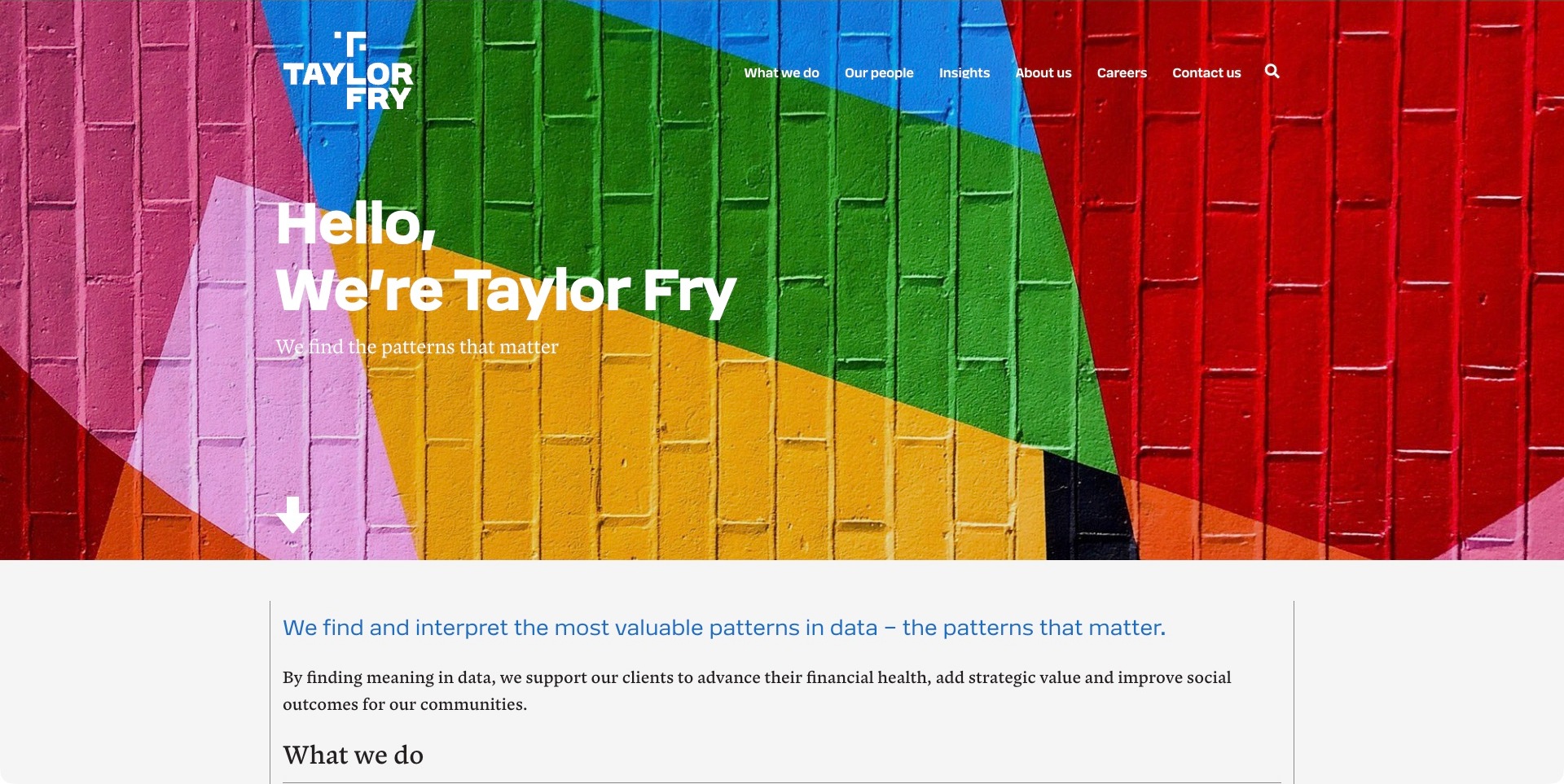
Taylor Fry trades the familiar blue corporate skyline for a vivid painted-brick background, with a white stacked wordmark and a short conversational introduction. The bold geometry supplies visual character while the header keeps work, people, insights and contact in plain-language destinations. A downward cue leads directly into a quieter, text-led explanation of its approach to finding patterns in data. That transition is useful: the expressive image does not have to carry every detail of the service proposition. The actual website identifies an actuarial and analytics consultancy; the brand metaphor itself does not establish a method’s accuracy or guarantee a social or financial outcome.
What you can learn
Let the brand opening be memorable, but move promptly into a concrete explanation of the work. Separate people, practice areas and published insights so visitors can evaluate professional relevance without translating a visual metaphor or relying on an aspirational headline.
Pros
An unusual photographic texture distinguishes the brand from conventional financial imagery.
Plain-language navigation keeps people and work easy to locate.
Cons & considerations
The initial pattern metaphor needs explicit actuarial subject detail nearby.
High-saturation photography requires contrast checks for every text position and responsive crop.
SIGMA uses a Nashville skyline as the setting for a direct introduction aimed at risk-management and insurance professionals. Burgundy actions stand out from the blue photograph, while the white header gives actuarial consulting, RISK66, captive resources, education and project initiation their own destinations. Both the SIGMA symbol and RISK66 identity appear at the left, making the product relationship visible without silently treating the two as interchangeable. The homepage is especially useful for studying how a specialist practice can combine advice and educational material. Its analytical positioning does not establish the suitability of a particular model for a reader’s insurance program.
What you can learn
Label the different kinds of help a visitor can request. Educational resources, a product demonstration and an actuarial consulting assignment have different information requirements; give them distinct destinations before asking a prospective client to share project details.
Pros
The opening identifies risk-management and insurance professionals rather than an unspecified audience.
Consulting, product, captive and educational destinations remain explicitly separated.
Cons & considerations
Two adjacent identities need clear explanations of the relationship on their destinations.
A long desktop navigation requires a carefully prioritized smaller-screen equivalent.
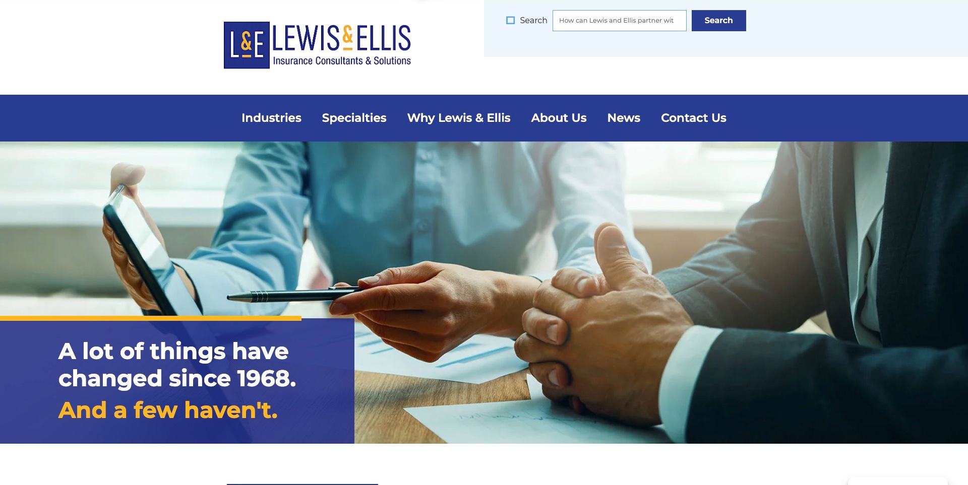
Lewis & Ellis gives its blue-and-gold identity substantial space above a broad navigation bar. Industries and specialties are separate routes, which is useful when a visitor recognizes the insurance market they operate in but not the actuarial service name. A prominent search field provides another discovery option, and a meeting photograph carries a compact blue caption panel with a gold accent. The site identifies insurance consulting and solutions in the logo area, providing context before the visitor reaches detailed content. The historical positioning statement is part of the firm’s own marketing, not independent verification of experience or service quality.
What you can learn
Offer both sector and specialty discovery when clients arrive with different vocabularies. A regulator, insurer and risk manager may describe the same need differently; navigation and search should converge on clearly scoped pages rather than require every visitor to know the consultancy’s internal practice structure.
Pros
Industries and specialties provide complementary routes to relevant expertise.
The insurance descriptor remains visible beside the firm identity.
Cons & considerations
The large header occupies considerable space before detailed service information begins.
A broad history-led message needs specific current examples and engagement information below it.
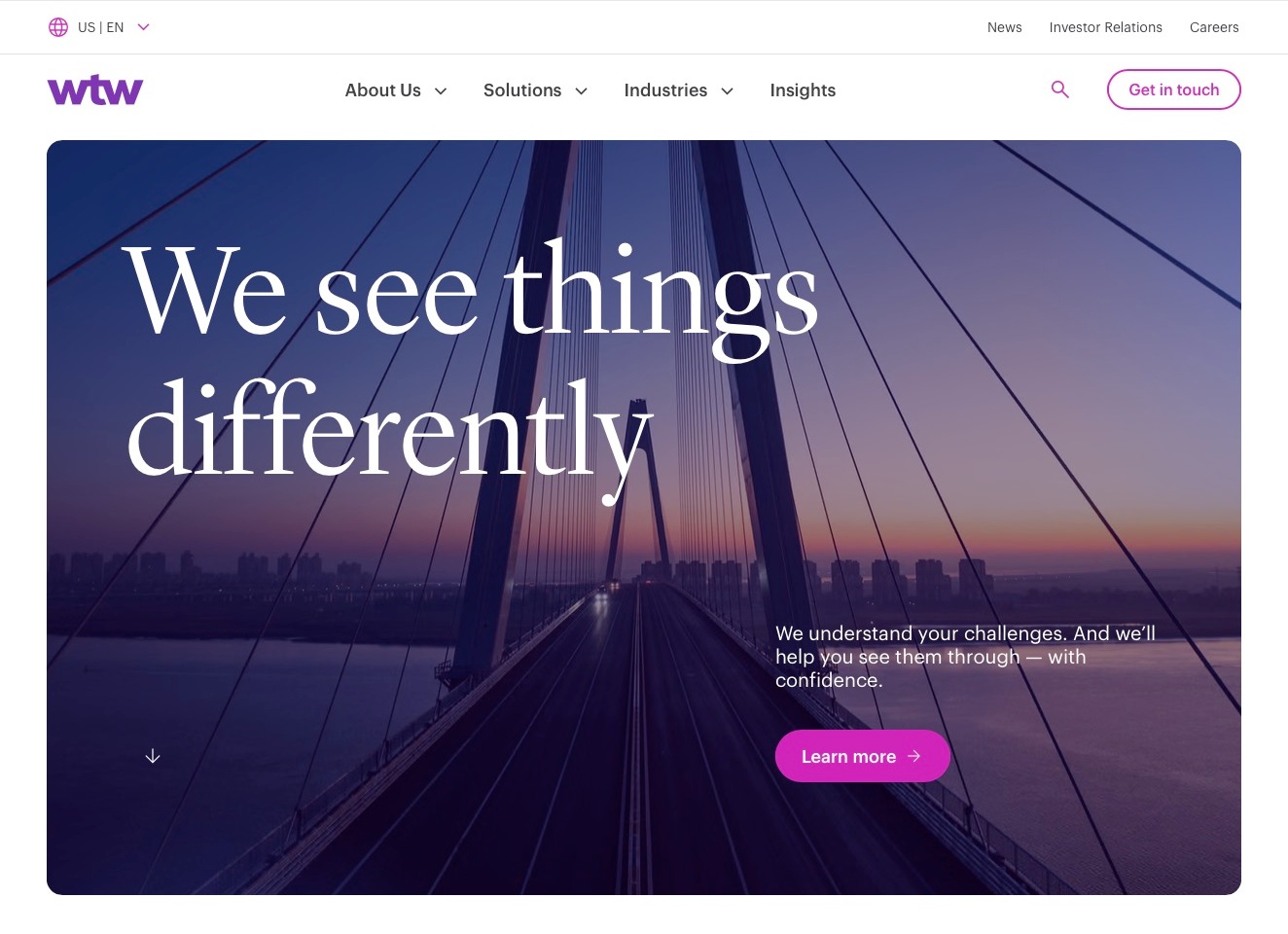
WTW’s US-English homepage uses a white header, a compact purple identity and a large rounded photographic feature showing a bridge at dusk. The spacious composition and serif headline are more editorial than dashboard-like, while solutions, industries and insights remain stable navigation choices. The regional indicator is important for a firm whose services and publications may differ by jurisdiction. Its first-party retirement and actuarial-outsourcing pages establish the relevant practice context; the pictured corporate introduction is broader than a dedicated actuarial service page. Neither the bridge metaphor nor visual polish demonstrates a financial outcome or the architecture of any consulting tool.
What you can learn
Make geography and practice scope explicit when a global brand serves different markets. Use the corporate homepage to orient visitors, then give actuarial destinations clear audiences, relevant jurisdictions and concrete engagement information rather than sending everyone into an undifferentiated capabilities list.
Pros
The regional label gives readers context before they explore the wider firm.
Stable solution and industry routes provide alternatives to the featured corporate story.
Cons & considerations
A broad editorial hero can delay a direct route for specialist plan-sponsor enquiries.
Global insight material needs clear jurisdiction and date context on its destination pages.
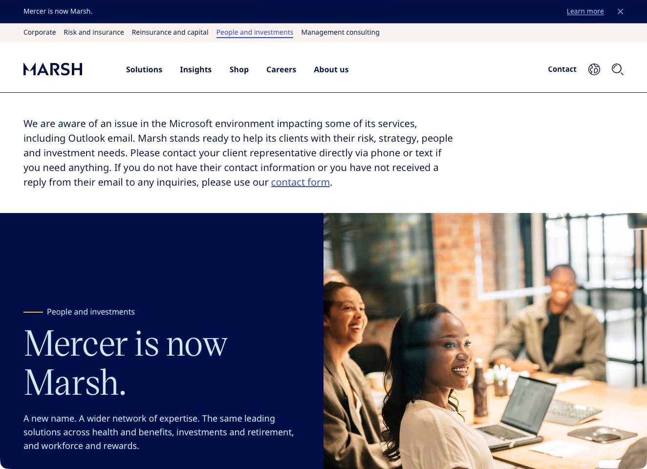
The captured Mercer US destination now presents Marsh branding and a notice that Mercer is now Marsh. A business-area navigation identifies people and investments, while the main corporate navigation and contact routes remain visible around the announcement. This is a current rebrand destination, not the older independent Mercer homepage. Its pension actuarial-solutions material provides the relevant consulting context within that wider offering. For website planning, the important subject is continuity: visitors arriving through a name need to understand where they have landed and how to find their practice or usual point of contact without assuming the former website has disappeared.
What you can learn
Treat a rebrand as a routing task, not just a logo replacement. Explain the old and new names together, preserve useful service destinations and show existing clients where to continue; separate service continuity information from broad corporate campaigns and temporary operational notices.
Pros
The relationship between the former and current brand is stated explicitly.
A business-area label helps orient visitors inside a broader corporate site.
Cons & considerations
Multiple corporate and practice navigation levels can complicate specialist service discovery.
Operational notices and campaign media need careful placement so they do not obscure rebrand guidance.
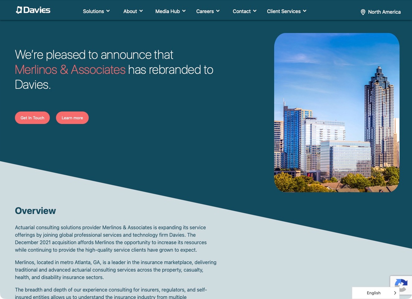
The former Merlinos & Associates destination opens on a Davies North America page that explicitly explains the rebrand. A teal header and rounded city photograph frame a concise introduction, with separate actions for contacting the business and learning more. The current page identifies the actuarial consulting context rather than presenting the old firm as a still-independent homepage. That makes it a useful transition-page example: a visitor arriving through a remembered name receives a direct explanation instead of a silent redirect into unrelated corporate content. The page communicates an organizational change; it does not establish unchanged staff or commercial terms.
What you can learn
Preserve the meaning of an older company name when bringing visitors into a new corporate site. State the relationship clearly, retain the relevant specialty and offer a practical contact route; do not make visitors infer continuity from a parent-company logo alone.
Pros
The former practice name and new brand are explained on the destination itself.
Contact and further background are presented as separate next steps.
Cons & considerations
An acquisition landing page still needs direct links to current actuarial services and people.
A short rebrand statement cannot substitute for specific information about an existing engagement.
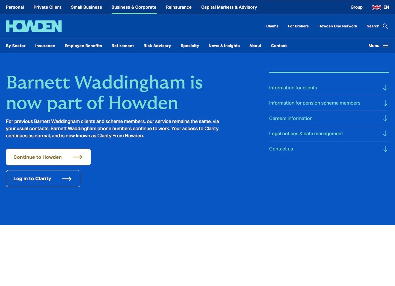
The former Barnett Waddingham destination is now a Howden handoff page, with a large blue field and pale green type explicitly explaining the relationship. The body distinguishes existing-client information from pension-scheme member information, careers, legal/data notices and contact. Separate actions lead into Howden and the Clarity login, preserving recognizable tasks rather than merely replacing an old homepage with a new corporate hero. This is a transition-page example within the collection, not evidence that the previous brand still operates independently. Its practical value is the organization of continuity information for several audiences with different questions.
What you can learn
During a professional-services transition, prioritize the tasks people came to complete. Existing clients, pension members and prospective employees need different answers; present those paths explicitly and keep account access distinct from general corporate navigation or a new-business enquiry.
Pros
The old and new names are connected in a direct, readable explanation.
Audience-specific sections and a separate login action support continuity tasks.
Cons & considerations
A transition page needs current ownership and service details rather than indefinitely stale announcements.
Existing-client guidance must remain distinct from any new-business service proposition.
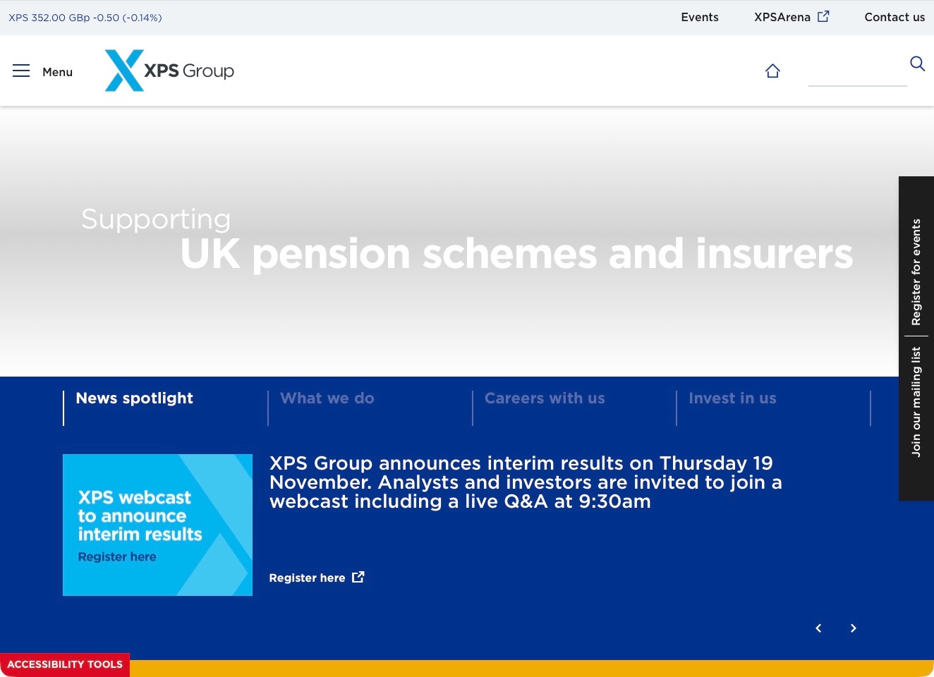
XPS Group’s homepage gives corporate utility information and access routes their own band above the main identity and menu. Contact, events and XPSArena are visibly separated, while search provides another path into a broad site. The lower opening area introduces a news feature rather than relying solely on a general service statement. Current primary material establishes a pensions consultancy context, but the pictured corporate page is not a member benefit statement or a public demonstration of pension calculations. For this collection, the useful pattern is the separation of different relationship types within one professional brand.
What you can learn
Distinguish information for prospective clients from scheme-related tools, events and corporate audiences. Describe what an access portal is for before asking someone to sign in, and make the public service explanation useful without relying on an authenticated system to supply missing context.
Pros
Named utility destinations acknowledge tasks beyond a new-business enquiry.
Search offers an alternative to navigating a broad corporate menu.
Cons & considerations
The pale headline needs reliable contrast against the hero background in every rendered state.
Portal and newsletter controls need clear audience labels so visitors do not choose an inappropriate route.
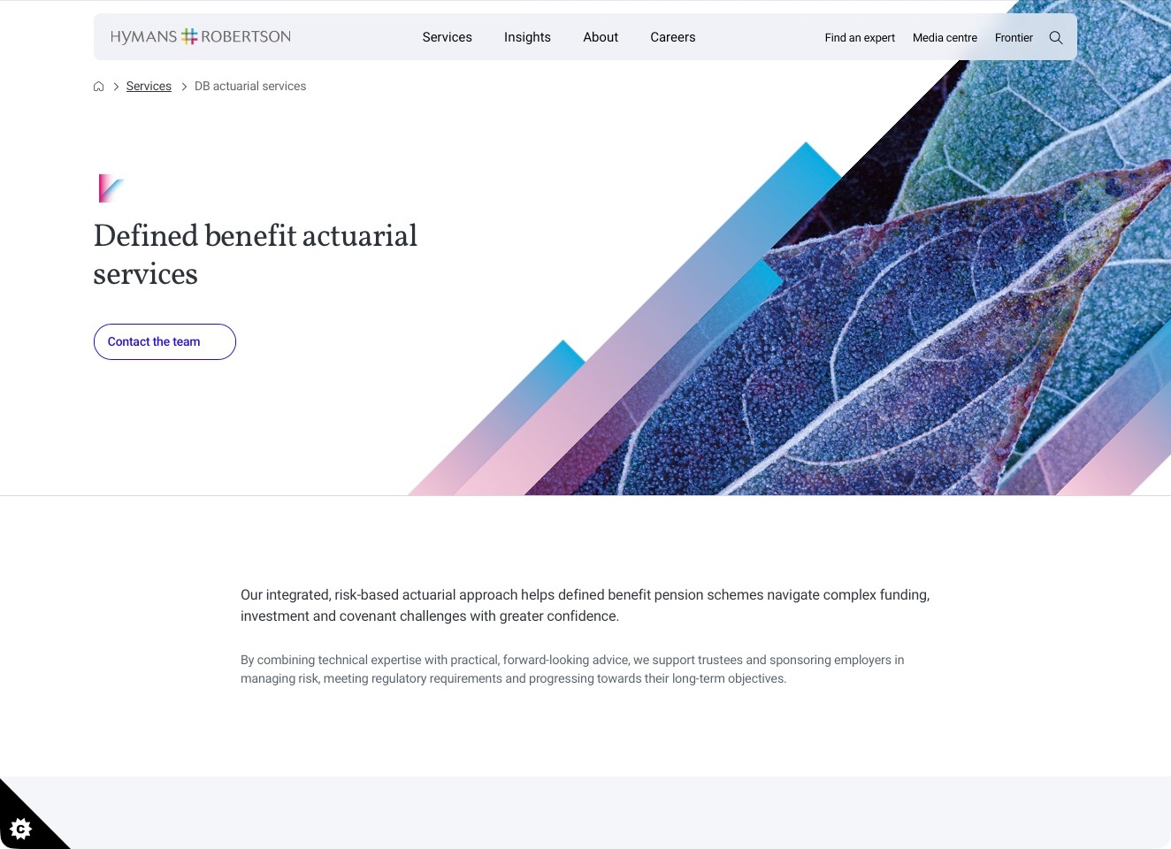
Hymans Robertson’s defined-benefit actuarial page pairs a serif service title with a large close-up leaf photograph, cut diagonally by blue-and-pink graphic bands. The pictured destination is a specific service page, not the broader homepage. Breadcrumbs locate the subject within services, while the compact header preserves insights and expert discovery alongside the main business routes. An outlined team-contact action sits beside the title, followed by a readable introduction naming trustees and sponsoring employers. That explicit audience definition makes the decorative treatment useful context rather than asking a general corporate slogan to explain the engagement.
What you can learn
Give each specialist discipline a destination that states its audience and scope before presenting supporting research. Keep a direct route to relevant people, then explain how service subjects relate without suggesting that general website copy supplies advice for an individual pension scheme.
Pros
The service-specific title and breadcrumbs remove ambiguity about the subject and navigation level.
A direct team-contact action is supported by an introduction naming the intended institutional audiences.
Cons & considerations
A large illustrative opening needs a concise explanation nearby on compact screens.
Risk and confidence language requires scoped supporting information rather than implying certainty about a scheme’s outcome.
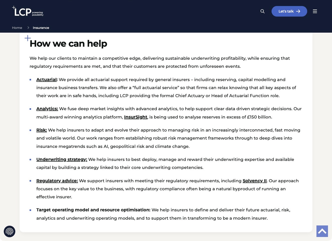
The pictured LCP insurance page is normally scrolled to its service breakdown, with the navy branded header and insurance breadcrumb still visible. A white rounded panel gives six subjects their own paragraphs: actuarial work, analytics, risk, underwriting strategy, regulatory advice and operating-model support. Bold linked lead-ins provide a quick scan before the explanatory text, and the small plus motif connects this practical content to the wider identity. This is a useful service-page reference rather than an invented view of the homepage hero. The company’s statements about commercial and regulatory outcomes remain its positioning, not independent verification.
What you can learn
Break related services into linked subjects and explain their differences. Keep the practice visible while visitors read and connect subjects to relevant people and engagement scope; do not let an analytics product stand in for the advisory relationship.
Pros
Linked lead-ins make a long service explanation scannable without relying on decorative illustrations.
Persistent brand and insurance context keep the reader oriented within the broader consultancy.
Cons & considerations
Long paragraphs still need careful line lengths and spacing on smaller displays.
Outcome and regulatory language needs exact scope and supporting detail, not interpretation as a general assurance.
Kegan is a freelance web designer and developer with 15+ years of experience helping businesses turn complicated website requirements into clear, maintainable digital experiences. He works directly with clients from planning and design through development, launch, and ongoing support.
For actuarial consulting website design, his development approach focuses on clear actuarial-service and client-sector distinctions, appropriately qualified technical publications, specialist team profiles, and practical business enquiry routes without implying financial outcomes. The scope can be a targeted improvement or a complete custom build, with responsive layouts, thoughtful content structure, and integrations chosen around the people using and maintaining the site.
Show 3 other actuarial consulting website designersHide other actuarial consulting website designers
Plan an actuarial consulting website around the client’s question and the information boundary
Define the audience before choosing a broad service headline
List the actual people who commission or use the practice’s work. A trustee may need to understand a pension-service relationship, while an insurance professional may be investigating loss reserving or pricing analysis. A member seeking help with an existing arrangement needs another route again. These examples should guide the information architecture, not become a claim that one firm can serve every audience. Start with the services and regions the practice has confirmed.
Cheiron separates pension and health consulting, while Select Actuarial Services organizes property-and-casualty work around its clients and defined service areas. Those are different professional contexts, not interchangeable versions of a generic analytical offer. The useful design lesson is an honest first division. An audience label should lead to a meaningfully relevant explanation, not a duplicate page with only the heading changed.
Translate the first technical term without flattening its meaning. A short description can explain the purpose of a service, the kind of question it addresses and the next useful research step. Keep detailed methods and qualifications available for professional readers. Avoid a homepage that is either an unexplained glossary or an entirely generic promise of certainty. The right level of explanation can acknowledge complexity without making every reader master the profession first.
Describe the engagement rather than advertising a guaranteed answer
Explain what an initial discussion establishes, what a scoped engagement may include and what remains outside it. Discovery, data review, modelling, reporting and ongoing support are different activities. The website can make these stages understandable without pretending that every project follows one universal process. Use the practice’s actual terms of appointment and responsible reviewers as the authority for service language, not a designer’s guess about what an actuary normally does.
Separate consulting from software access, administration and educational support. A buyer exploring an analytical platform is not automatically appointing a consulting team. An existing client looking for a portal should not have to complete a new-business form. Cheiron’s client login has a different purpose from its public pension and health explanations. Wakely’s NEST product material likewise needs a distinct identity from the wider consultancy’s service focus areas.
Keep benefits qualified by the circumstances that matter to the work. A concise page can describe the questions the team investigates without promising a particular cost reduction, return or decision. If the firm publishes a result or comparison, retain the scope, time period, method and permission behind it. Testimonials can provide perspective on a relationship, but should not be styled as independently verified analytical evidence.
Connect professional people with relevant, maintained evidence
Use a consistent profile structure: current role, relevant consulting areas, professional qualifications as approved by the firm, office or service region and a suitable contact route. Connect profiles to authored articles and relevant service pages where those relationships are genuine. Make team changes easy to maintain so a person’s departure does not leave a misleading contact route or an orphaned expert profile.
Do not use a list of initials as the whole explanation of relevance. A reader should understand what the person works on and whether the next conversation belongs with that team. At the same time, avoid inventing a simplified credential definition or a jurisdictional entitlement. Have the practice approve the wording and provide an appropriate source when a formal qualification or registration needs explanation.
Case studies should identify the problem context and the firm’s contribution without exposing confidential client information. An anonymized case can still be useful when it explains the type of work accurately and clearly labels its limits. Do not combine several engagements into an apparent single client story unless that treatment is explicit. Review permissions for names, figures and quotations separately from the permission to publish the general page.
Treat publications and events as maintained professional content
Build a small taxonomy for insights, technical resources, training, news and event recordings. Pinnacle’s homepage distinguishes a dated benchmarking study, upcoming webinars and articles. That variety is useful only when a reader can tell what is current, what is educational and what belongs to a particular market context. A download should have a descriptive title and enough information to judge relevance before opening a large file.
Preserve publication and substantive review dates honestly. An article discussing a particular reporting period or framework needs an editorial owner who can decide when it is superseded. Do not silently change the visible date to today after fixing a link. When a session has passed, replace registration language with an archive or recording destination if one genuinely exists, rather than keeping an expired invitation as the primary action.
Connect resources with the appropriate service without turning every paragraph into a sales pitch. A professional reader may be trying to understand a question before deciding whom to contact. Useful context, authorship and a clear next research route can support that task. Avoid claiming that a general article provides the reader with a tailored conclusion or removes the need to discuss their circumstances with the appointed professionals.
Design an enquiry that does not become an uncontrolled data intake
Ask the team what it actually needs before the first conversation. A short enquiry might identify the organization, broad service area, jurisdiction where relevant and a brief description. It should not require a visitor to upload sensitive member, employee, claims or policyholder records to prove that the enquiry is serious. Explain a suitable later exchange process once the responsible team has established what is needed.
Keep the public marketing site separate from client workspaces, analytical applications and document repositories. State when a link leaves the public website and provide help for a person who reaches the wrong portal. Do not display real client data in sample dashboards, testing accounts or screenshots. Design previews can use clearly fictional records, but a fictional chart must never be presented as evidence of a real consulting outcome.
Test the whole handoff: form completion, confirmation, internal routing, failure handling and a usable alternative contact route. Assign a person to maintain the workflow when staff or offices change. The confirmation should accurately describe receipt without implying that the firm has accepted an appointment, reviewed the underlying data or provided an opinion. The practice’s responsible reviewer should approve those boundaries.
The editing job behind the design
Build for reviewed publishing and controlled client handoffs
Represent services, audiences, people, offices, publications and events as connected content. A profile should not need to be copied into every service page, and an event date should not remain hidden inside an image that no editor can update. Support draft review so technical and professional statements are checked before release.
Keep confidential workspaces and data-processing tools outside the scope of the marketing-site implementation unless the firm explicitly commissions and reviews them. Public website technology signals do not establish the analytical software, assumptions, data systems or controls used in an actuarial engagement.
Plan document accessibility, search and retention alongside the page design. Descriptive download links, readable summaries and clear supersession notices make a publication library more useful than a large unstructured folder. Choose an editing workflow the practice can sustain rather than a highly customized system that turns every correction into a development project.
Our WordPress website examples offer a separate look at publishing approaches. A visible platform label is evidence for that named page, not a guarantee that the same system will suit your requirements.
Before the public launch
Actuarial consulting website planning checklist
Confirm the practice’s actual consulting areas and professional audiences.
Distinguish pensions, insurance and other service contexts accurately.
Explain the purpose of each specialist service in readable language.
Separate public research, software, administration and client access.
Have the firm verify roles, qualifications and geographic statements.
Connect genuine author, service and publication relationships.
Record permissions for case details, quotations and numerical claims.
Keep publication, review and event dates honest and maintained.
Label educational material separately from project-specific work.
Avoid sensitive datasets in ordinary public enquiry forms.
Test document links, search, keyboard navigation and mobile reading.
Verify confirmation language and internal request routing.
Assign owners for staff, office and publication-library changes.
These checks are a project checklist, not a performance, legal, security, or accessibility certification. Test real journeys with the people responsible for the website before making claims about the result.
Sources & editorial method
How this collection was selected and reviewed
This collection reviews public website structure and communication by practices with an explicit actuarial consulting role. It distinguishes service descriptions from software, administration and broader corporate material. Company claims and testimonials are treated as source statements, not independently verified financial outcomes. The examples do not establish professional competence, regulatory status, appointment suitability or the merits of a pension or insurance decision.
Each example links to its actual source page. Screenshots are direct browser captures with their own capture dates; moving imagery, announcements and live designs can change. The notes describe observable design choices and conditional tradeoffs, not measured traffic, conversion results, service quality, or accessibility conformance.
Technology labels use public page metadata, asset evidence, or explicitly cited platform documentation. Platform documentation is not a complete current deployment audit. A component reference may be legacy or unused; it is not a complete backend inventory. Unknown stacks are omitted. These sites are editorial examples, not our client portfolio.
Written, Edited and Curated are separate editorial records, not timestamps advanced by a rebuild. Website designs and imagery belong to their owners. See our editorial standards or suggest a correction.
Questions worth asking
Actuarial Consulting website design questions
What should an actuarial consultancy explain on its homepage?
Identify the main professional audience, the type of consulting offered and a clear route into service detail. Avoid making a visitor decode every technical term before understanding whether the practice is relevant.
Should technical papers be open or gated?
Choose according to the practice’s genuine publishing and support goals. Give enough context to judge a resource before asking for information, explain any registration purpose and avoid collecting sensitive project data merely to download an introductory article.
How should a consulting site present numerical results?
Use approved, supportable examples with their scope, conditions, period and permissions intact. A number should not imply a universal outcome or replace the explanation of the work. These design observations do not validate the underlying analysis.
What belongs in the first enquiry?
Enough information to route a conversation, such as the organization, broad service area and a short description. Define an appropriate later process for confidential records rather than placing a full analytical data request in an ordinary public form.
Are these recommendations about which actuarial firm to appoint?
No. They are references for website design and communication. Appointment, qualification and project-suitability questions require their own review by the responsible people and are not established by a screenshot or editorial selection.
Make specialist work understandable, keep professional evidence current and give the first conversation a clear information boundary. A credible consulting website supports investigation without selling certainty that the page cannot substantiate.