Best Statamic Websites of 2026 (20 Real-World Examples)
Twenty public properties with documented Statamic projects, genuine captures and specific lessons in content structure. Documentary relationships are distinct from current public stack observations.
A useful Statamic website starts with the material people need to publish and the tasks visitors need to complete. These examples show how a content platform can support very different public experiences without imposing one visual style.
This collection spans developer marketing, a parliamentary youth portal, regional news, creative portfolios, public service information and campaign microsites. Each property is individually linked by an official Statamic showcase, and each review studies a real source capture rather than a vendor mockup. Five recognizable organizations open the collection; their identity sources are separate from the platform evidence.
The relationship has a defined scope. REWE’s showcase describes an earlier Austrian corporate project; its current page exposes WordPress signals. Wild At Heart documents a Statamic content API feeding an Astro static build. TV SYD is the exact regional property linked by a showcase titled TV2. None of those facts supports a claim about every service operated by the parent organization.
Use the examples to think about editorial models, navigation and content ownership. A convincing screenshot does not establish a hidden backend, prove accessibility or demonstrate business performance. The planning advice below translates visible patterns into questions a project team can answer before implementation.
Before the examples
What makes good Statamic website development in 2026?
Model the recurring editorial objects
A news story, project, programme and campaign announcement need different fields and lifecycles. Identify those objects before designing page layouts. Statamic collections group related entries and define shared behavior such as routes, available blueprints and dates; useful modeling starts with how the editorial team actually works.
The same collection can support an expressive portfolio or a restrained directory when its essential fields remain clear. Decide which information must always be present, then let the design vary around it. Blueprints provide the field structure; they should reduce editorial guesswork rather than force every entry into a generic block of prose.
Separate public experience from implementation evidence
A website may change platform after a case study, or use Statamic behind a separate frontend. Record the exact property, the documented role and the evidence date. Review the visible experience on its own terms, without assuming that the current screenshot proves the original project architecture.
The collection · 20 examples
20 Statamic website examples worth studying
The sequence begins with Laravel, REWE International AG, Cisco Duo, Blue Origin and the German Bundestag’s youth portal, then moves through specialist public properties. Their order is editorial, with no technology awards or claims about commercial performance.
We start with five recognizable brands or organizations: Laravel, REWE International AG, Cisco Duo, Blue Origin, German Bundestag — mitmischen. Each attribution applies to the named website property, not every product or website belonging to its organization. This is a curated reading sequence, not a measured ranking.
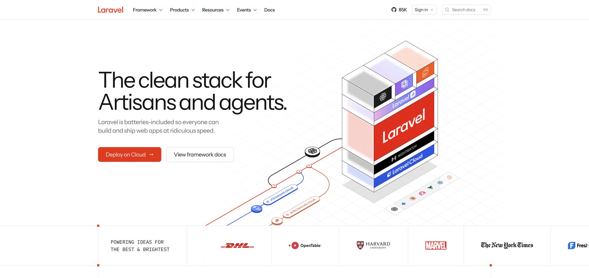
Laravel turns a broad developer ecosystem into a legible opening story. The retained capture places a large, two-line promise beside an exploded stack illustration, with red accents connecting the product layers to the wordmark and primary action. Framework documentation and hosted deployment receive separate buttons, acknowledging that someone learning the framework has a different immediate task from someone ready to ship. The top navigation then separates products, resources, events and documentation instead of forcing every destination into the hero. Statamic's official showcase identifies the marketing property's content implementation; that documentary association does not establish the stack of Laravel customer applications. The screenshot remains dated November 9, rather than being presented as a new capture.
What you can learn
Make an ecosystem understandable through a small number of named layers, then give learning and buying separate routes. A diagram should orient the visitor without becoming the only place essential relationships are explained.
Pros
Distinct documentation and deployment actions serve different levels of intent.
Red accents connect identity, illustration and the main action.
Cons & considerations
The large illustration demands careful small-screen composition.
Customer logos are context, not evidence about those customers’ implementations.
Platform source: Official Statamic exact-property showcase. Statamic’s official Laravel showcase identifies content and marketing use on laravel.com. This is a documentary association for the public marketing property, not the implementation of Laravel customer applications. Platform evidence is separate from the direct website screenshot and is not a complete current infrastructure audit.
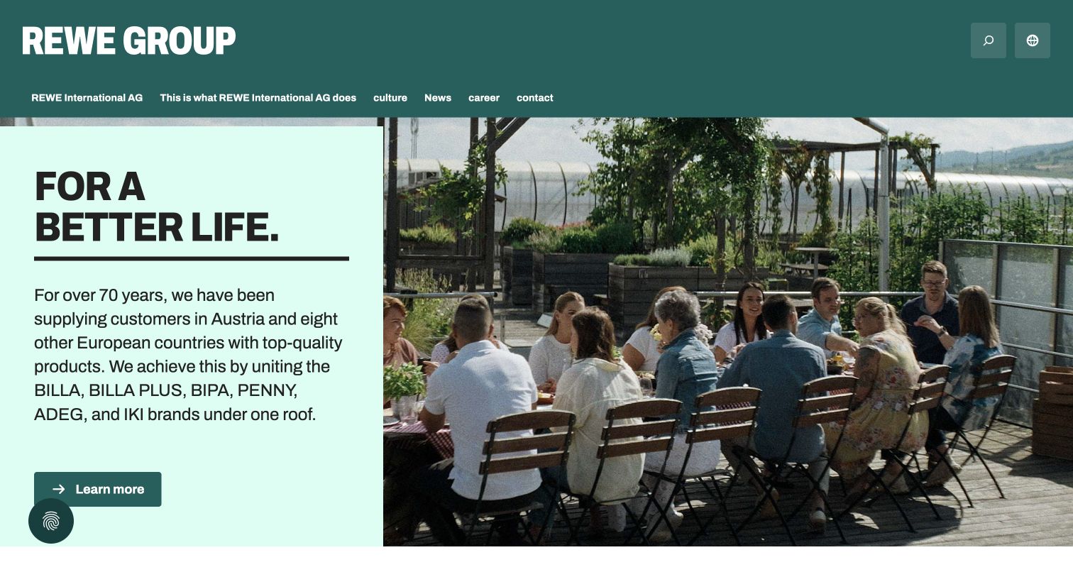
REWE International AG's Austrian site balances corporate scale with an everyday human image. The opening uses a dark green masthead, a pale green text panel and a photograph of colleagues gathered on a terrace. A short purpose statement leads into an explanation of the regional retail brands, followed by a single learn-more action. This is the Austrian corporate and newsroom property linked by Statamic's showcase, not every REWE store or booking service. The present page exposes WordPress-style markup, so the Statamic relationship is treated as an earlier documented project. The direct capture shows the current visual presentation with the browser's existing English translation; the research did not change that setting.
What you can learn
Separate long-lived corporate information from dated newsroom entries, while letting both share a recognizable visual system. Preserve an explicit distinction between a documented implementation and the technology visible after a later redesign.
Pros
People-focused photography makes an institutional introduction approachable.
The visible paths distinguish company information from careers and news.
Cons & considerations
The opening paragraph contains several brands competing for attention.
An older showcase cannot establish the current content platform.
Platform source: Official Statamic exact-property showcase. Official Statamic showcase documents an earlier REWE International AG Austrian corporate/newsroom project linked to rewe-group.at. The current /de/ page audit observes WordPress and related signals; Statamic is an earlier documented association, not a current CMS claim or groupwide retail claim. Platform evidence is separate from the direct website screenshot and is not a complete current infrastructure audit.
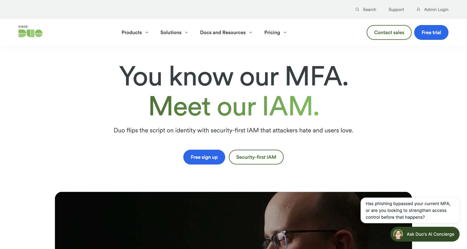
Cisco Duo introduces its broader identity offering by starting with a familiar product category. A large centered heading moves from MFA to IAM, using a green second line to emphasize the expansion. Beneath it, the blue signup button and outlined product-explanation button create two clear next steps. The header reserves a separate utility row for search, support and administrator login, so existing customers can find operational destinations without competing with the main sales navigation. A small concierge prompt competes with the hero while leaving the main message readable. The official Statamic showcase links this exact public marketing property; it does not describe Duo's authentication service internals.
What you can learn
When a product's scope expands, connect the new proposition to something visitors already recognize. Keep customer support and login accessible, but distinguish those tasks from evaluation and trial routes in the main hierarchy.
Pros
A clear typographic transition explains the expanded proposition.
Utility navigation gives existing customers a separate route.
Cons & considerations
Several calls to action require disciplined priority across the page.
The floating assistance prompt consumes part of the visible content area.
Platform source: Official Statamic exact-property showcase. Official Statamic showcase links the Cisco Duo marketing property at duo.com. Documentary public-site association only; authentication products and customer identity infrastructure are outside its scope. Platform evidence is separate from the direct website screenshot and is not a complete current infrastructure audit.
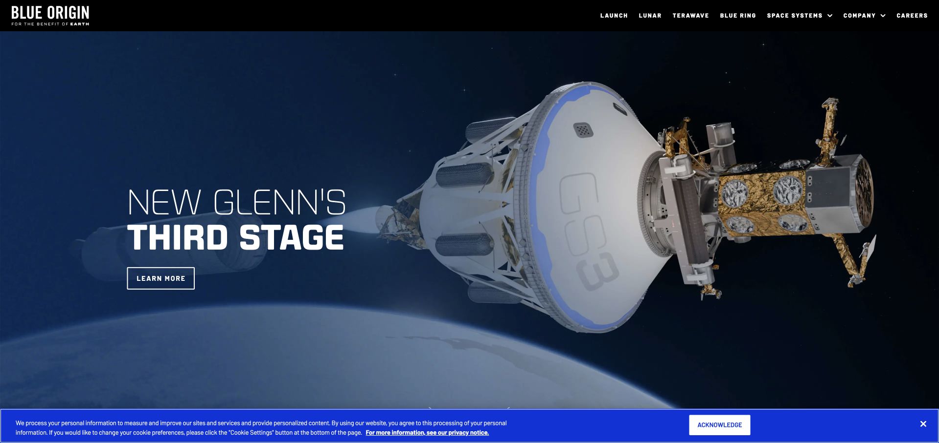
Blue Origin uses scale and contrast to make an engineering announcement feel tangible. In the retained capture, a large spacecraft rendering dominates the right side while a compact headline and outlined action sit against the darker left edge. The black masthead keeps the wordmark and a short set of program categories visible without competing with the image. That choice works best when the navigation supplies reliable routes to the wider program portfolio and careers information. A blue privacy notice remains visible along the bottom of the original capture. Statamic's official showcase documents work on the public website; it is not evidence about flight systems, mission infrastructure or every Blue Origin service. The November 9 capture date is retained.
What you can learn
Give a complex technical story one visual focal point and a concise next step. Use structured program navigation to carry the broader information load rather than compressing every initiative into the opening banner.
Pros
The dark image treatment gives the headline a clear reading zone.
A restrained action keeps the announcement focused.
Cons & considerations
Image-led storytelling needs useful text alternatives and lighter delivery.
The visible privacy notice reduces the uninterrupted first-screen area.
Platform source: Official Statamic exact-property showcase. Official Statamic showcase describes building and maintaining Blue Origin’s public website on Statamic. This documentary relationship does not identify flight, mission or customer application infrastructure. Platform evidence is separate from the direct website screenshot and is not a complete current infrastructure audit.
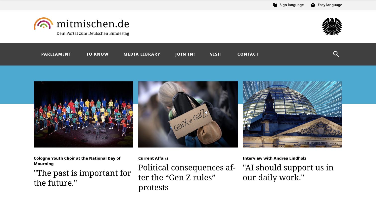
The German Bundestag's mitmischen portal presents parliamentary information through an editorial structure aimed at younger readers. Its masthead combines a welcoming rainbow mark with the federal eagle, establishing both personality and institutional ownership. A dark navigation band separates parliament, knowledge, media, participation and visits. Below it, three large article cards use distinct photographs, small topic labels and substantial serif headlines, allowing current affairs and behind-the-scenes explanations to coexist. This is the specific public youth portal identified in Statamic's showcase, not a claim that the entire Bundestag web estate uses the same CMS. The capture retains the browser’s existing English translation and original German URLs.
What you can learn
Model editorial topics and practical schedules as related but distinct content. Institutional authority can remain visible while typography, image choices and navigation language help a younger audience find an approachable starting point.
Pros
Topic labels and large headlines establish useful reading levels.
Participation and visit routes are easy to distinguish from news.
Cons & considerations
Long translated headlines create uneven card heights.
A rotating article area needs predictable keyboard and pause behavior.
Platform source: Official Statamic exact-property showcase. Official Statamic showcase describes the German Bundestag youth portal mitmischen.de being relaunched from TYPO3 to Statamic and developed since 2023. Only this public youth portal is in scope, not the whole Bundestag estate. Platform evidence is separate from the direct website screenshot and is not a complete current infrastructure audit.
Claroty's homepage makes a specialized security category the center of its opening rather than beginning with a generic company slogan. Large white typography names cyber-physical systems protection against a dark industrial background, and purple accents connect the wordmark, report links and demo route. The header separates platform, industries, public sector, customers and research, supporting several different evaluation paths. These are the company's claims, not independently tested security outcomes. Optional overlays initially occupied substantial space; the selected capture records the clearer subsequent state. Statamic's official showcase supplies the documentary relationship to this public marketing site, separately from the bounded scan of its current public resources.
What you can learn
State the specialist category early, then organize supporting material around the questions different buyers bring. Evidence links should sit near the relevant proposition, with clear attribution rather than turning marketing claims into editorial conclusions.
Pros
Industrial imagery supports a concrete audience and subject.
Research and product pathways remain visible in the primary navigation.
Cons & considerations
A dense header asks new visitors to understand several categories.
Optional assistance overlays can interrupt an otherwise focused opening.
Platform source: Official Statamic exact-property showcase. Official Statamic showcase identifies and links Claroty at https://claroty.com/ as a public Statamic project. This documentary association is distinct from the current bounded public-source audit and is not a complete backend inventory. Platform evidence is separate from the direct website screenshot and is not a complete current infrastructure audit.
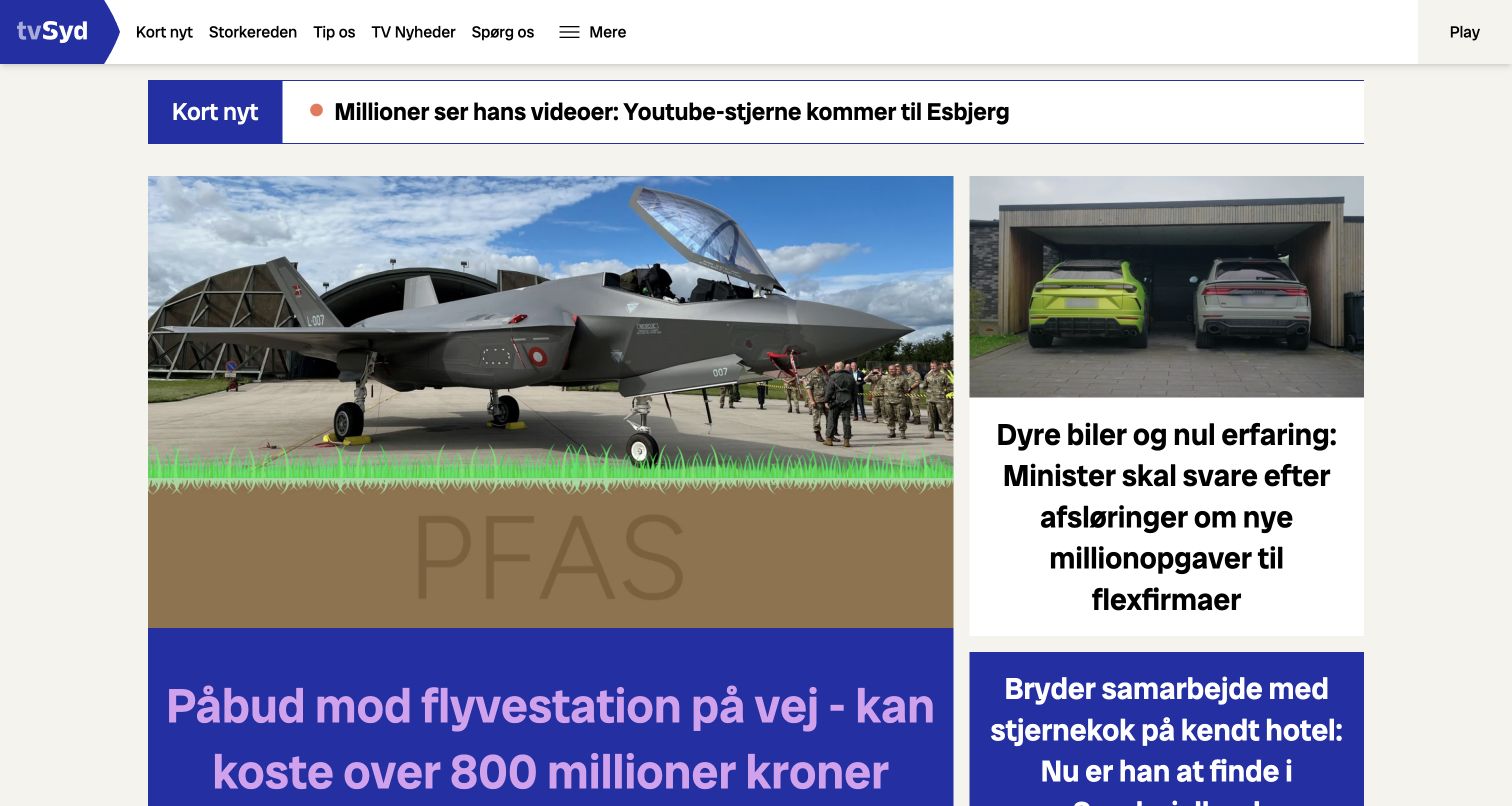
TV SYD's homepage behaves like a regional newsroom rather than a promotional landing page. A compact logo and task-oriented header leave most of the first screen for stories. The short-news strip creates an immediate update layer, followed by an asymmetric grid in which one lead photograph receives more space than the supporting articles. Bold headlines and strong blue panels keep the story hierarchy visible even when the subjects and image styles differ. Municipality links support geographic discovery. Statamic's showcase is titled TV2 but links this exact property; the guide therefore keeps the narrower TV SYD identity instead of applying that evidence to all TV2 services. The review assesses design, not reporting accuracy.
What you can learn
Build a newsroom around predictable editorial priorities: urgent updates, a lead story, supporting coverage and geographic discovery. Those priorities should survive the daily replacement of photographs and headlines rather than depend on one carefully chosen campaign.
Pros
The lead-and-supporting grid gives stories distinct visual importance.
Municipality links provide a useful regional discovery path.
Cons & considerations
Large headlines can push important story detail below the fold.
Motion in a short-news strip should remain easy to pause or ignore.
Platform source: Official Statamic exact-property showcase. The official showcase titled TV2 links the exact TV SYD regional broadcaster at tvsyd.dk. Evidence is scoped to that linked public property, not every TV2 service. Platform evidence is separate from the direct website screenshot and is not a complete current infrastructure audit.
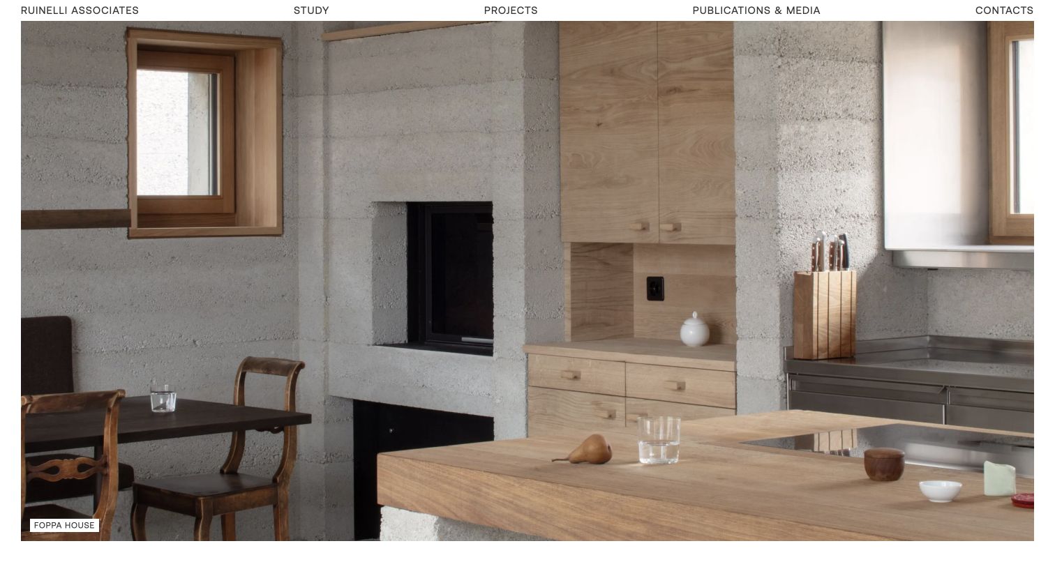
Ruinelli Associati gives architectural photography nearly the entire opening canvas. A narrow navigation row contains the practice name, studio, projects, publications and contact, while the selected image fills the space beneath with a detailed interior. The modest project caption supplies just enough context to connect the photograph to the portfolio without covering the work. Material, light and proportion consequently carry more of the first impression than descriptive marketing copy. The capture preserves the Italian destination and existing browser translation. Statamic's official showcase identifies the practice's website as a documented project; the image itself is evidence of the presentation, not of a hidden CMS.
What you can learn
For a visual portfolio, make the image-to-project relationship unmistakable even when captions are restrained. Keep project titles, descriptions and language variants structured so that a photographic opening can lead into useful, navigable case information.
Pros
The restrained header protects the visual impact of the work.
A small project caption anchors the image to a named case.
Cons & considerations
The opening gives little immediate explanation of the practice’s scope.
Large imagery needs careful loading and responsive crop decisions.
Platform source: Official Statamic exact-property showcase. Official Statamic showcase identifies and links Ruinelli Associati at https://ruinelli-associati.ch/ as a public Statamic project. This documentary association is distinct from the current bounded public-source audit and is not a complete backend inventory. Platform evidence is separate from the direct website screenshot and is not a complete current infrastructure audit.
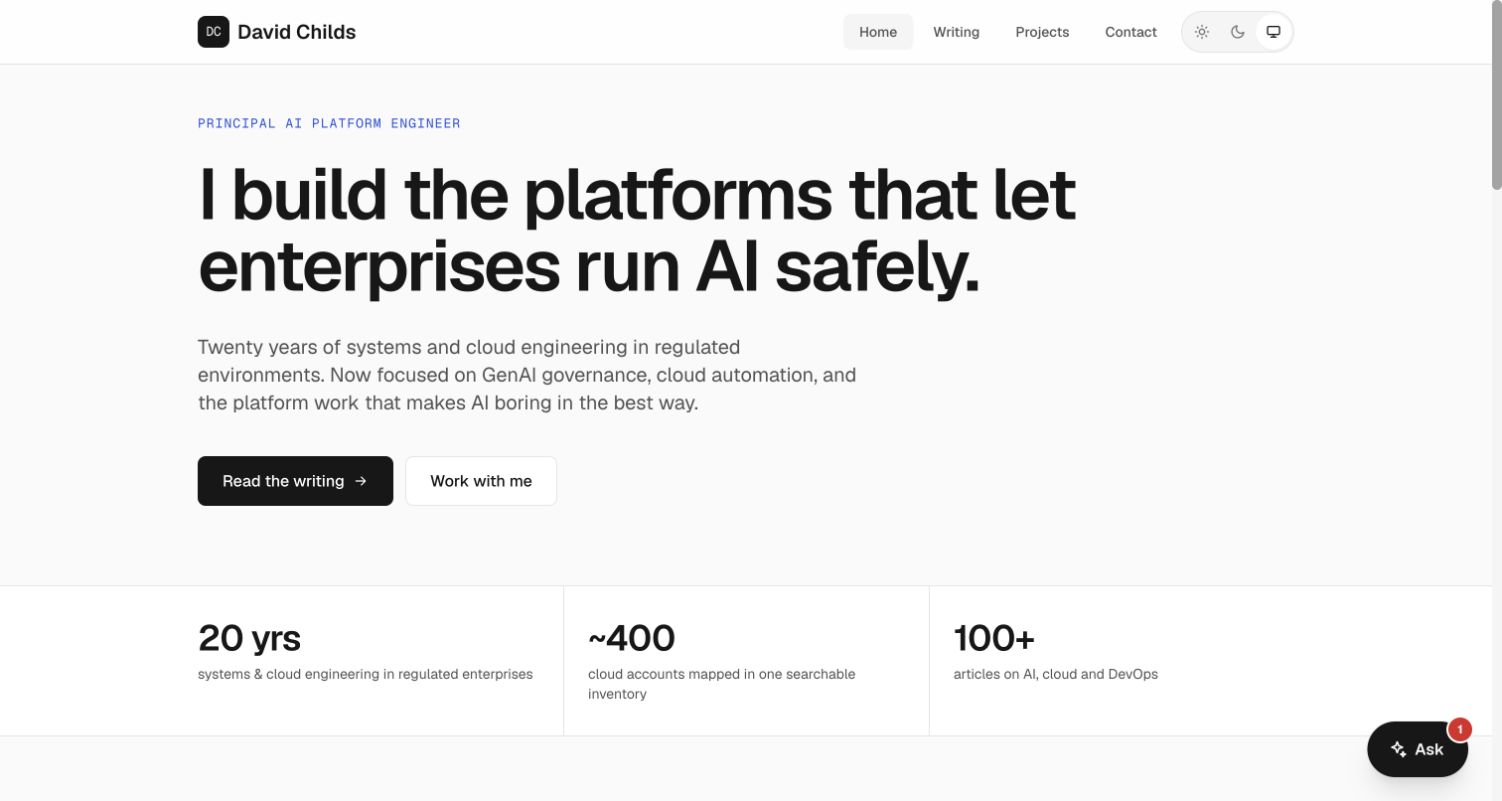
David Childs' portfolio places professional positioning ahead of decorative effects. A small role label introduces a large statement about building enterprise AI platforms, followed by a short paragraph that supplies experience and subject context. Two adjacent actions separate reading from making contact. Dated articles and topic labels support discovery; project summaries explain problems and approaches. The displayed experience and scale figures are self-reported portfolio statements rather than independently verified results. Statamic's official showcase links this exact personal property, providing a documentary implementation association that remains separate from the current public-source scan. The review used public pages only and did not interact with the embedded assistant or contact flow.
What you can learn
Lead a specialist portfolio with the work someone can hire you to do, then offer evidence in several forms. Give articles and projects consistent fields for dates, topics and outcomes so updates reinforce a clear position.
Pros
Writing and project navigation serve different evaluation needs.
The large proposition remains easy to scan without an image backdrop.
Cons & considerations
Self-reported metrics need context rather than implying audited outcomes.
The floating assistant adds another competing interaction to a simple page.
Platform source: Official Statamic exact-property showcase. Official Statamic showcase identifies and links David Childs at https://davidchilds.me/ as a public Statamic project. This documentary association is distinct from the current bounded public-source audit and is not a complete backend inventory. Platform evidence is separate from the direct website screenshot and is not a complete current infrastructure audit.
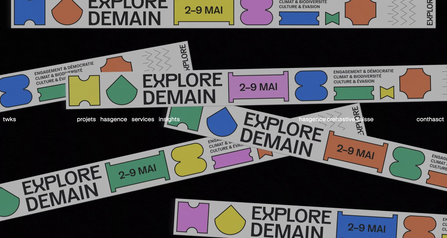
twks opens with its work as the visual argument. The captured homepage displays a bold campaign composition with colored shapes and repeated print-like elements, while the studio's wordmark and navigation sit over the image. This creates a stronger sense of creative character than a conventional split hero, but also makes contrast and label clarity dependent on the changing background. The underlying content separates projects, agency, services and insights. Case cards then connect client names to concise descriptions of the design challenge. A loading intro preceded the selected completed view. Statamic's official showcase documents this exact agency property. The direct screenshot retains the browser’s existing translation of some navigation lettering.
What you can learn
Let a creative opening demonstrate the kind of work a studio wants to attract, but give the portfolio a stable descriptive structure underneath. Project names, services and short problem statements should remain readable when motion or imagery changes.
Pros
Distinctive campaign artwork communicates the studio’s visual character.
Project cards connect client identity to a specific creative task.
Cons & considerations
Overlay navigation needs reliable contrast across changing imagery.
Loading intros and animated lettering can delay or complicate orientation.
Platform source: Official Statamic exact-property showcase. Official Statamic showcase identifies and links twks at https://twks.ch/ as a public Statamic project. This documentary association is distinct from the current bounded public-source audit and is not a complete backend inventory. Platform evidence is separate from the direct website screenshot and is not a complete current infrastructure audit.
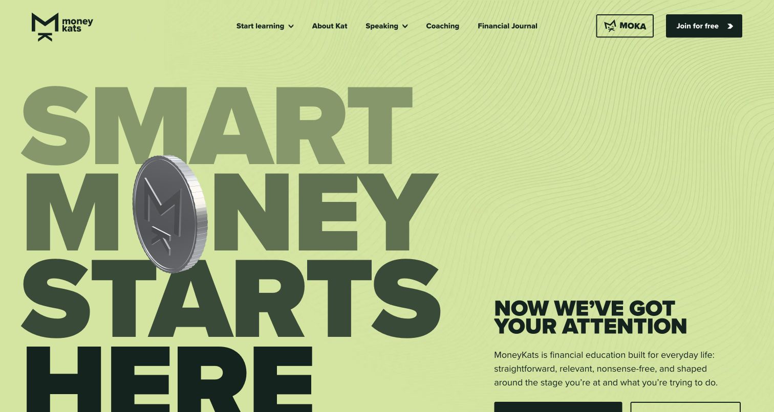
Money Kats uses a lime background, oversized lettering and a dimensional coin motif to make financial education feel energetic. The opening headline occupies the left side, while a plain-language introduction and learning route begin on the right. Navigation separates learning, the person behind the site, speaking, coaching and a journal. Life-stage links include early career, family growth and later life. That organization recognizes that visitors may understand their situation more readily than a financial topic label. The page also distinguishes education from regulated advice in its footer; this review evaluates the communication design without endorsing the financial guidance. Statamic's official showcase links the exact public property. Optional services were declined.
What you can learn
Organize a learning library around the situations readers recognize, then connect those routes to reusable subject content. An expressive hero can attract attention, but clear labels and a plain explanation must establish what the service actually provides.
Pros
Life-stage pathways create practical entry points for a broad audience.
A distinctive palette and oversized type make the identity memorable.
Cons & considerations
The hero’s scale leaves part of the introduction below the fold.
Animated decorative elements need a restrained alternative for sensitive users.
Platform source: Official Statamic exact-property showcase. Official Statamic showcase identifies and links Money Kats at https://moneykats.co.uk/ as a public Statamic project. This documentary association is distinct from the current bounded public-source audit and is not a complete backend inventory. Platform evidence is separate from the direct website screenshot and is not a complete current infrastructure audit.
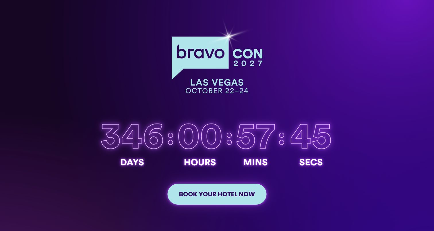
BravoCon's current site is a tightly focused announcement page for the next event. A luminous purple background frames the event identity, location and dates, followed by an oversized countdown and a prominent hotel-booking link. Past-event photographs provide context; the footer links to official updates and privacy information. The capture records the announced 2027 event as it appeared on the research date; the guide's year does not change the event date or imply ticket availability. Statamic's official showcase documents the BravoCon public property. That association is separate from the linked hotel booking service and from Bravo's wider media platforms. No booking, text subscription or account action was attempted during the review.
What you can learn
An event holding page can be useful before a complete programme exists if it states the dates, location and next available action plainly. Keep these fields structured so the announcement can evolve without leaving stale calls to action behind.
Pros
Event identity, dates and location are concentrated in one view.
The single prominent action gives the holding page a clear purpose.
Cons & considerations
A countdown can dominate space without answering programme questions.
Availability and off-site booking conditions need independent verification.
Platform source: Official Statamic exact-property showcase. Official Statamic showcase identifies and links BravoCon at https://bravocon.com/ as a public Statamic project. This documentary association is distinct from the current bounded public-source audit and is not a complete backend inventory. Platform evidence is separate from the direct website screenshot and is not a complete current infrastructure audit.
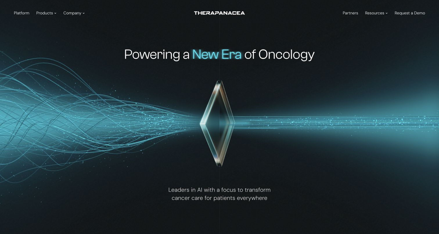
TheraPanacea introduces a technical oncology business through a calm, tightly controlled visual metaphor. A dark background holds a glass-like form that gathers many fine blue lines into a more orderly stream. The short headline above it and compact supporting statement below leave the image room to communicate complexity becoming usable. A split navigation places platform and products on one side of the centered identity, with partners, resources and a demo route on the other. Later sections distinguish current applications from future ambitions. Those claims remain attributed to the business; the review does not assess medical effectiveness or validate treatment outcomes. Statamic's official showcase links the public site as a documented implementation. The capture records the public marketing presentation.
What you can learn
Translate a complex product category into a visual idea, then support it with precise content sections. Separate present capabilities, future direction and evidence so an attractive scientific metaphor does not carry claims the page has not explained.
Pros
A centered composition keeps the technical proposition visually coherent.
Product, partner and resource destinations support deeper evaluation.
Cons & considerations
The abstract image cannot replace concrete product explanation.
Medical and performance claims require evidence beyond visual presentation.
Platform source: Official Statamic exact-property showcase. Official Statamic showcase identifies and links TheraPanacea at https://therapanacea.com/ as a public Statamic project. This documentary association is distinct from the current bounded public-source audit and is not a complete backend inventory. Platform evidence is separate from the direct website screenshot and is not a complete current infrastructure audit.
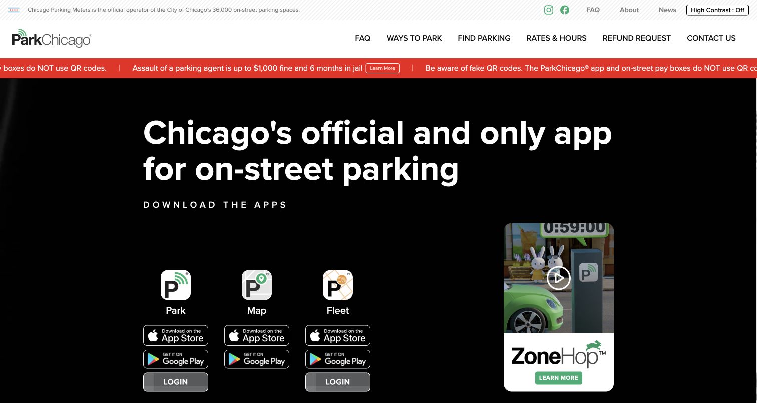
ParkChicago leads with a practical civic task: finding the appropriate way to pay for street parking. Its header gives rates, parking locations, refund requests and contact information direct routes, while the opening groups the Park, Map and Fleet apps into three clearly labeled choices. A red warning strip addresses fake QR codes before visitors reach those actions, showing how operational safety information can occupy a prominent but separate layer. The selected capture records the public information site, not a logged-in payment session or parking transaction. Statamic's official showcase provides the project association for parkchicago.com, without establishing the technology of the mobile apps or payment infrastructure. No location, vehicle, account or payment information was entered during the review.
What you can learn
Begin a utility website with the real task and explain which product handles it. Keep safety notices visible and specific, while separating informational pages from transactions so visitors understand when they are moving into an operational service.
Pros
Three named app paths clarify different parking-related tasks.
Rates, refunds and contact remain accessible from the header.
Cons & considerations
The warning strip and large hero compete for initial attention.
Similar app icons require clear labels and destination cues.
Platform source: Official Statamic exact-property showcase. Official Statamic showcase identifies and links ParkChicago at https://parkchicago.com/ as a public Statamic project. This documentary association is distinct from the current bounded public-source audit and is not a complete backend inventory. Platform evidence is separate from the direct website screenshot and is not a complete current infrastructure audit.
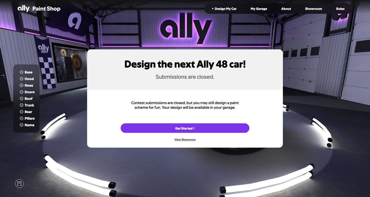
Ally Paint Shop presents a branded racing campaign as a virtual garage. Purple lighting and Ally signage frame the car area; navigation separates designing, saved work, background information, showroom and rules. The live opening places an explicit closed-submissions message in front of the experience, explaining that visitors may still explore a paint scheme for fun. That status is important to the review: this is a public campaign state, not an active contest recommendation. Statamic's official showcase links allypaintshop.com despite retaining an older URL slug, so the guide uses the current linked property's name and scope. The evidence applies to this racing microsite, not Ally Bank or its financial services.
What you can learn
Treat campaign status as content that can change independently of the visual experience. When participation closes, preserve a useful public explanation and viewing path rather than leaving a persuasive action that suggests submissions are still accepted.
Pros
The virtual garage establishes a distinctive campaign setting.
The opening notice clearly states that contest submissions are closed.
Cons & considerations
The required status dialog obscures much of the underlying experience.
A visual configurator needs an accessible alternative to purely graphical choices.
Platform source: Official Statamic exact-property showcase. The current official Statamic showcase at its retained kokers-garage slug is titled Ally Paint Shop and links allypaintshop.com. It documents the 2026 Ally Racing paint-design campaign microsite, not Ally Bank. The captured public page states contest submissions are closed. Platform evidence is separate from the direct website screenshot and is not a complete current infrastructure audit.
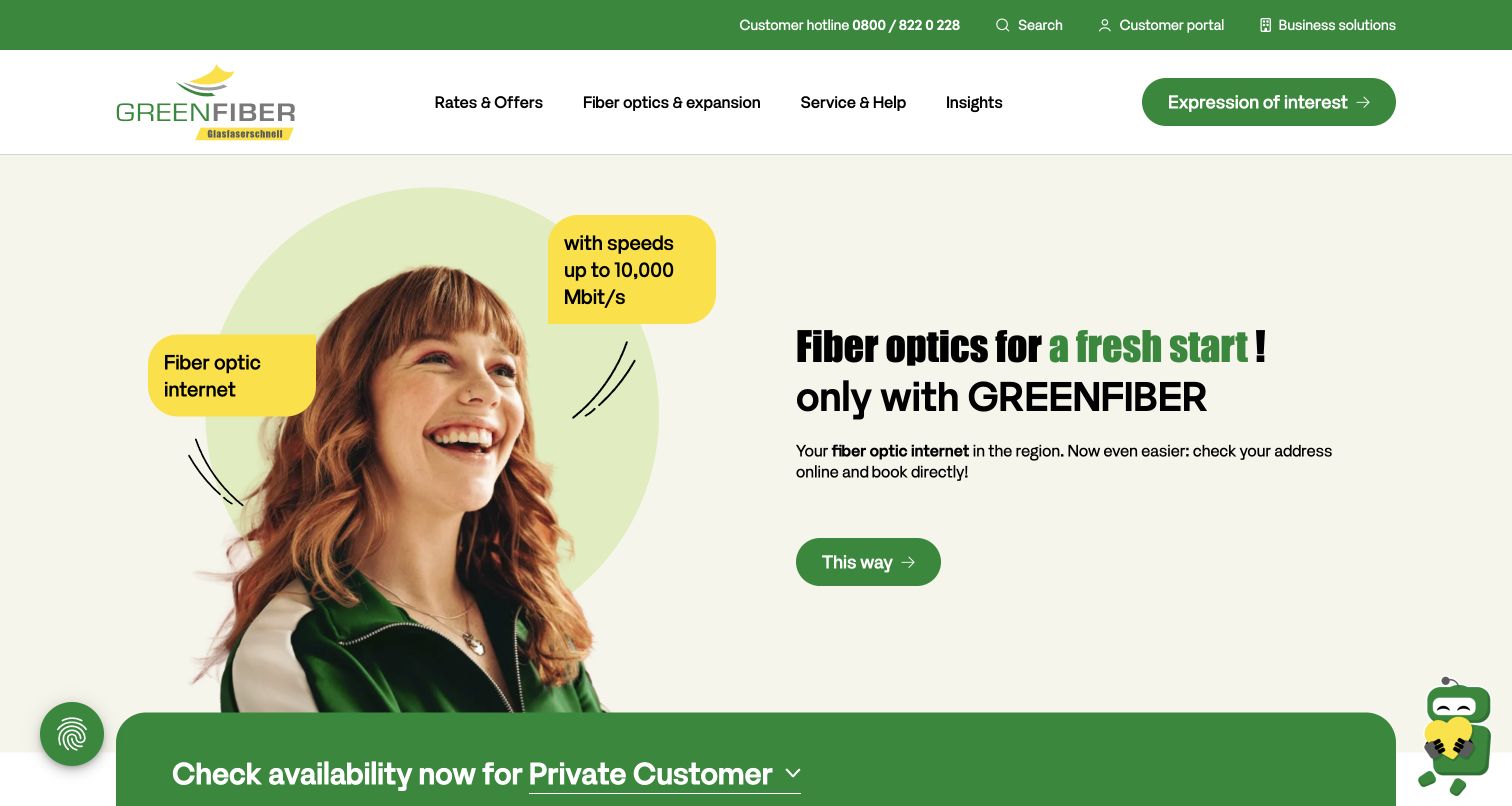
GREENFIBER introduces its regional fibre service through a bright green and yellow visual system. A cutout portrait sits beside a concise proposition, with speech-bubble shapes carrying the service category and an advertised speed. The navigation distinguishes tariffs, network expansion, help and company information, while an address-based availability form begins directly beneath the hero. That form is the useful bridge between a general promise and a visitor's actual location, although the review did not enter an address or test eligibility. The capture retains the browser’s existing translation after optional overlays were dismissed. Statamic's official showcase identifies this public provider website as a documented project; it does not independently verify connection speeds, coverage or the technology of customer accounts.
What you can learn
For a location-dependent service, make eligibility the next understandable step after the proposition. Keep the required fields and their sequence clear, and distinguish advertised capability from the service a particular address can actually receive.
Pros
The availability pathway connects general marketing to a concrete task.
Consumer, business and existing-customer routes are separated.
Cons & considerations
Multiple initial overlays can interrupt the eligibility journey.
Prominent speed claims need conditions and address-specific explanation.
Platform source: Official Statamic exact-property showcase. Official Statamic showcase identifies and links GREENFIBER at https://www.greenfiber.de/ as a public Statamic project. This documentary association is distinct from the current bounded public-source audit and is not a complete backend inventory. Platform evidence is separate from the direct website screenshot and is not a complete current infrastructure audit.
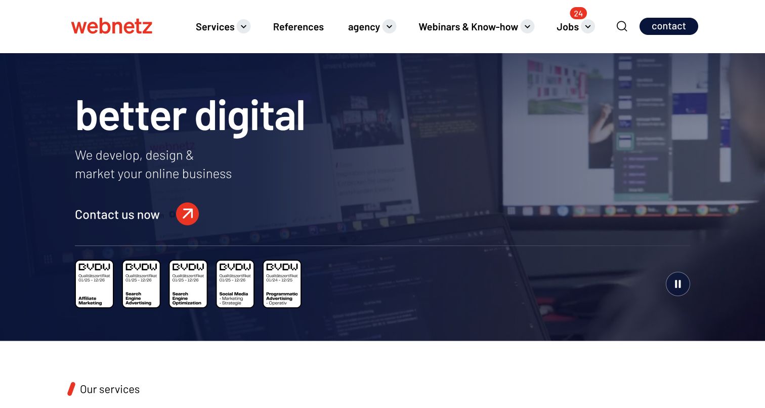
webnetz gives its service proposition a large, uncomplicated opening. The white header and orange wordmark contrast with a dark blue video background, while a short headline and two-line explanation describe the agency's role. A contact action receives an orange circular arrow, making it visible without adding a large contrasting panel. Beneath the opening, a set of displayed certification marks supplies another information layer, followed by service categories spanning strategy, marketing, content, design and development. Navigation also supports references, resources and recruitment. The review treats the displayed credentials as the site's own claims rather than independently certified editorial findings. Statamic's official showcase links this exact agency property. The capture retains existing browser translation.
What you can learn
Use a concise agency proposition to establish the work, then let services and case evidence explain the breadth. Keep recruitment and educational resources accessible without allowing them to blur the prospective client's main evaluation route.
Pros
A restrained hero makes the contact action easy to identify.
Service categories provide a clear structure beyond the opening statement.
Cons & considerations
A background video needs a readable still and manageable loading cost.
Credential marks require legible dates and supporting detail to be useful.
Platform source: Official Statamic exact-property showcase. Official Statamic showcase identifies and links webnetz at https://www.webnetz.de/ as a public Statamic project. This documentary association is distinct from the current bounded public-source audit and is not a complete backend inventory. Platform evidence is separate from the direct website screenshot and is not a complete current infrastructure audit.
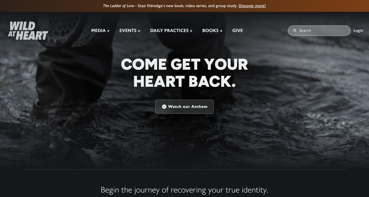
Wild At Heart creates an emotionally direct opening with monochrome outdoor footage, a bold centered invitation and one video action. The identity remains large in the upper left, while navigation separates media, events, practices, books and giving. Below the hero, the page turns into a media library with dated podcast entries, descriptive episode text and routes into the wider archive. Statamic's showcase describes a particular architecture: its content API supplies an Astro-based static build. The guide preserves that distinction instead of describing Statamic as the observed rendering server. The review concerns public editorial organization, not beliefs, programme outcomes or member services.
What you can learn
Give a mission-led site separate structures for enduring purpose and frequently published media. A concise opening can establish tone, while dated episodes, meaningful titles and descriptive summaries make the archive useful to returning visitors.
Pros
The hero has a single clear introductory action.
Dated media entries create a practical return-visit pathway.
Cons & considerations
Background motion should not be necessary to understand the message.
Long episode descriptions need summaries that remain easy to scan.
Platform source: Official Statamic exact-property showcase. Official showcase documents Statamic as a content API feeding an Astro static build on Cloudflare Workers for wildatheart.org. The public audit observes Astro; the Statamic role is documentary backend-content evidence, not an observed rendering server. Platform evidence is separate from the direct website screenshot and is not a complete current infrastructure audit.
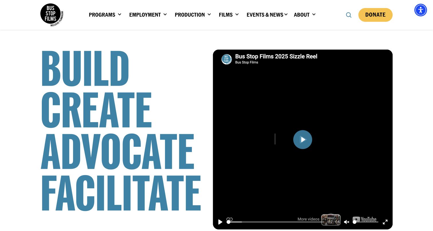
Bus Stop Films puts its purpose into four large action words beside a prominent film player. The blue typography occupies one side of the opening while the video area occupies the other, establishing both mission and medium without a complex hero illustration. The header then separates programmes, employment, production, films, events and organizational information, with a contrasting donate action. The page explains its inclusive filmmaking work and connects that explanation to current releases, events and partnerships. Different audiences therefore receive distinct starting points. The capture records the initial public player state; playback and its accessibility features were not tested. Statamic's official showcase links the exact public property. The review makes no independent claim about programme outcomes.
What you can learn
Translate a broad social mission into distinct audience tasks. Let film work demonstrate the organization's medium, but keep programme information, employment routes and production services available as readable content rather than depending entirely on a video introduction.
Pros
Clear task categories accommodate several different visitor groups.
The large verbs communicate an active organizational purpose.
Cons & considerations
The initial player state supplies little visual context before playback.
Mission text benefits from short summaries before longer explanations.
Platform source: Official Statamic exact-property showcase. Official Statamic showcase identifies and links Bus Stop Films at https://busstopfilms.com.au/ as a public Statamic project. This documentary association is distinct from the current bounded public-source audit and is not a complete backend inventory. Platform evidence is separate from the direct website screenshot and is not a complete current infrastructure audit.
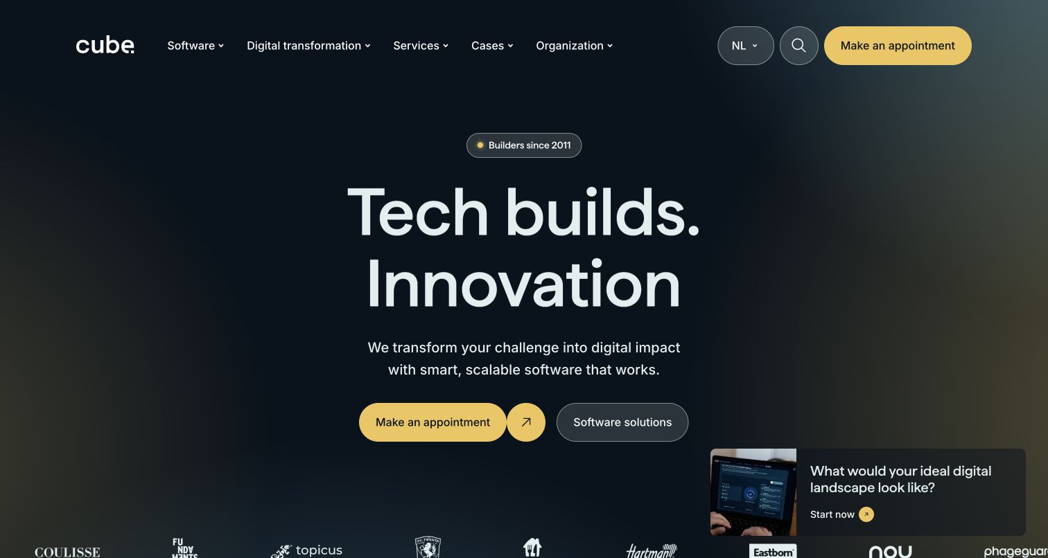
Cube's homepage uses a dark, softly graded background and oversized centered typography to position its software work. A small experience label sits above the main proposition, and a short supporting sentence leads into two contrasting actions: making contact and exploring software solutions. The header keeps software, transformation, services, cases and organization distinct, while the visible lower edge begins a client-identity strip. Expanded case descriptions connect names to concrete work such as portals, apps and data platforms, giving the broader proposition more substance. Statamic's official showcase supplies the documentary association for cube.nl; client logos do not establish those clients' technology. The capture retains the browser’s existing translation. No appointment or project information was submitted.
What you can learn
Give a broad software proposition a few concrete routes into services and case studies. Structure each case around the problem and delivered public experience, while keeping client identities separate from unsupported claims about their technical implementation.
Pros
Large typography and restrained colour establish a clear focal point.
The two primary actions support contact and independent exploration.
Cons & considerations
A floating promotional card competes with the central action pair.
A broad promise needs specific case evidence close behind it.
Platform source: Official Statamic exact-property showcase. Official Statamic showcase identifies and links Cube at https://cube.nl/ as a public Statamic project. This documentary association is distinct from the current bounded public-source audit and is not a complete backend inventory. Platform evidence is separate from the direct website screenshot and is not a complete current infrastructure audit.
Kegan has 15+ years of experience working with small businesses, Fortune 500 companies, and everything in between. No development job is too big or too small: he brings the same hands-on attention to a focused improvement, a complete website, or a custom application.
For Statamic projects, he can help with responsive interfaces, reusable components, custom functionality, API connections, and performance-minded implementation. He works directly with clients on scope, design, implementation, testing, and handover, with an emphasis on clear communication and a system that remains practical to maintain after launch.
Show 3 other Statamic developersHide other Statamic developers
Build an editorial destination around return visits
A newsroom or media library needs more than a strong opening story. Give dates, topics, geographic associations and archive routes consistent meaning. Let the lead treatment change with the publishing cycle while keeping the navigation dependable. TV SYD and mitmischen offer different visual approaches to this recurring editorial problem.
Let portfolios demonstrate the work
Ruinelli and twks place imagery at the center of their first impression. A practical portfolio still needs project names, descriptive context and stable destinations beneath that visual layer. Model those essentials independently of animation so photographs, captions and case summaries can be reused without losing their relationship.
Connect a marketing proposition to a real task
Product, utility and campaign sites benefit from a next step that matches the visitor’s intent. Documentation, availability checks, app choices and closed-event notices each require different content. Explain what a route offers before asking for personal information, and keep status changes visible when an event or campaign moves into a new phase.
From references to requirements
Plan the editorial system and delivery together
Design fields with the people who maintain them
Use representative real entries when defining blueprints. Agree on required titles, summaries, attribution, dates, relationships and useful defaults. Check how unusually long names, missing images and translated content behave. A simple editing model is valuable when it prevents omissions without forcing editors to understand the page’s implementation.
Choose caching around the parts that must stay dynamic
Statamic can serve cached static pages, but its documentation calls out interactions with features such as server-validated forms and protected content. Identify those boundaries before selecting a strategy. Include content invalidation and route changes in testing so a fast public page does not retain a stale event status or bypass a dynamic requirement.
When Statamic supplies content through its REST API, decide which resources belong in the public response and how the consuming frontend receives updates. The API and individual resources require enabling; authentication and rate limits are separate design choices. Keep credentials server-side and test the actual content contract rather than assuming that every control-panel field should be exposed.
Ask the actual team to carry out its routine job: publish a realistic update, correct a mistake, preview a narrow screen, and identify who owns an integration failure. For a library or frontend framework, also ask who maintains the content source and deployment. A polished screenshot does not answer those operational questions.
Beyond the screenshot
A practical Statamic project checklist
List the recurring content types and the team responsible for each.
Define useful titles, summaries, dates and attribution fields.
Set routes and redirects before importing existing material.
Use representative content to test blueprints and relationships.
Separate permanent information from dated news and campaigns.
Make the first visitor task clear in the opening view.
Keep navigation usable when imagery or motion fails to load.
Provide meaningful image descriptions, captions and video alternatives.
Test long text and the actual language variants the site needs.
Record which forms or protected areas must stay dynamic.
Specify cache invalidation for changed and removed content.
Expose only intended content through a separate frontend API.
Keep platform claims tied to exact properties and evidence dates.
Verify generated links, assets and live routes after deployment.
Test with real content, a keyboard, a small screen, slow or failed requests, and the people who will maintain the system. These are planning checks, not an accessibility, security, performance, or search-ranking certification.
Sources & editorial method
How this Statamic collection was reviewed
Each example uses an actual direct browser capture or an explicitly retained exact-property capture. Eighteen new captures are dated November 10 UTC; Laravel and Blue Origin retain November 9 capture dates. Existing browser translation appeared on several sources and is noted in their capture labels. Reviews describe visible public content without submitting forms, accounts, votes, bookings or donations. Every source has a bounded broad technology-audit attempt, with older records and access limitations preserved. Official Statamic showcase evidence remains a documented association rather than a claim that all current backends were independently observed. These are editorial design examples, not performance rankings, accessibility certifications or service endorsements.
Every image is an unmodified capture from the actual website, with its source and capture date. Some captures are reused from our shared catalog; their dates remain the original capture dates. None comes from a vendor gallery or a generated reconstruction. Moving imagery and live content can change.
Technology attribution uses public page assets or metadata, official platform documentation, or a cited first-party project case study. Documentary and framework-relationship evidence is identified where used; it is not a complete current backend inventory. A CMS image CDN alone does not establish a full CMS deployment. A library’s presence does not prove which individual controls use it, and a platform label does not establish AI authorship.
The composition notes, lessons, pros and tradeoffs are original editorial observations. We have not measured conversion, traffic, security, performance or accessibility conformance. Website owners retain their brands and imagery; these examples are not our client portfolio. Written, Edited and Curated are independent records, not dates advanced by a build. See our editorial standards or suggest a correction.
Questions worth asking
Statamic website development FAQs
Does every pictured page currently run on Statamic?
That is not established. Every selected property has specific official Statamic project evidence, but a current screenshot is not backend proof. REWE is explicitly treated as an earlier documented project, and Wild At Heart documents Statamic supplying content to an Astro frontend. The underlying records preserve these distinctions.
What is a Statamic collection useful for?
A collection groups related entries and provides settings that affect them, including routing, available blueprints and date behavior. Plan collections around meaningful editorial objects such as stories or projects, rather than creating a new content type for every visual variation.
How should a team approach blueprints?
Start with real examples of the material editors maintain. Define the essential fields, explain them clearly and test unusual cases. Blueprints organize the fields available to content; good field design helps prevent missing context without requiring editors to make layout decisions each time.
Can Statamic provide content to a separate frontend?
Yes. Its documented REST API can expose enabled resources to a consuming application. The project must still define the public data boundary, update behavior, authentication needs and error handling. A separate frontend does not by itself establish where every part of the website is hosted.
Should every Statamic page be statically cached?
Choose a caching strategy around the site’s actual behavior. Statamic documents caveats for features such as server-validated forms, protected content and randomization. Test those boundaries and content invalidation instead of assuming that a cached response is suitable for every route.
Why preserve an unavailable technology audit?
A bounded scan may encounter access restrictions or fail to retrieve sufficient public evidence. That outcome is retained honestly, with its original date. It is neither an empty-stack finding nor permission to bypass the restriction, and cited documentary evidence remains separately qualified.
Are these sites ranked by business results?
No. The opening sequence uses five sourced recognizable organizations, followed by specialist examples. The reviews examine visible content and design decisions; they do not measure revenue, verify product outcomes or assign technology awards.
Borrow a useful content relationship or visitor pathway, then design it around the material your team can maintain. Clear editorial ownership and honest implementation evidence matter more than copying the surface of a showcase page.