Best Smush Websites of 2026 (20 Real-World Examples)
WordPress image-delivery examples, practical media workflows, and the difference between a visible optimization signal and a measured result.
Smush is an image optimization tool for WordPress, not the builder that defines a website’s entire design. Use these examples to study image-heavy pages and the decisions around them, while keeping a detected plugin or delivery reference separate from a claim about performance.
A well-composed website can still send unnecessarily large photographs, and a small image file can still be used in an unhelpful layout. Treat visual presentation, media preparation, delivery, and measurement as related but separate jobs. A public Smush reference does not tell us which compression setting was selected or whether every image is processed.
The collection keeps the attribution at the named page and observed signal. It does not establish a complete WordPress setup, an active paid subscription, a particular savings percentage, or an independently measured improvement. The planning advice below is a project brief for choosing, testing, and maintaining an image workflow rather than a promise that installing one plugin fixes a site.
Before the examples
What makes good Smush website development in 2026?
Separate the image workflow from the page design
Smush’s documented role includes image compression and related delivery features. It does not author the whole page layout. Study how an example uses photographs, crops, text, and responsive space, then identify the separate media work your own project requires.
Make a representative visual test part of the decision
An optimization setting should be reviewed against the content that matters: detailed products, portraits, architecture, graphics, and transparent artwork can expose different tradeoffs. Keep a reviewed reference set and compare the actual delivered images rather than judging success from an attractive plugin dashboard.
A plugin asset or recognized delivery host supports a scoped technology association, not a speed guarantee, a plan entitlement, or a conclusion about all files. Explain what was observed and measure any claimed improvement on the actual pages, with comparable conditions.
Look at what each website asks images to do: establish scale, explain a product, support an article, or communicate a service. The Smush association is a separate scoped finding, not an assertion that the plugin produced the design or a measured commercial result.
We start with five recognizable brands or organizations: Warner Music Group, Interac, CertaPro Painters, Bowman, VNS Health. Each attribution applies to the named website property, not every product or website belonging to its organization. This is a curated reading sequence, not a measured ranking.
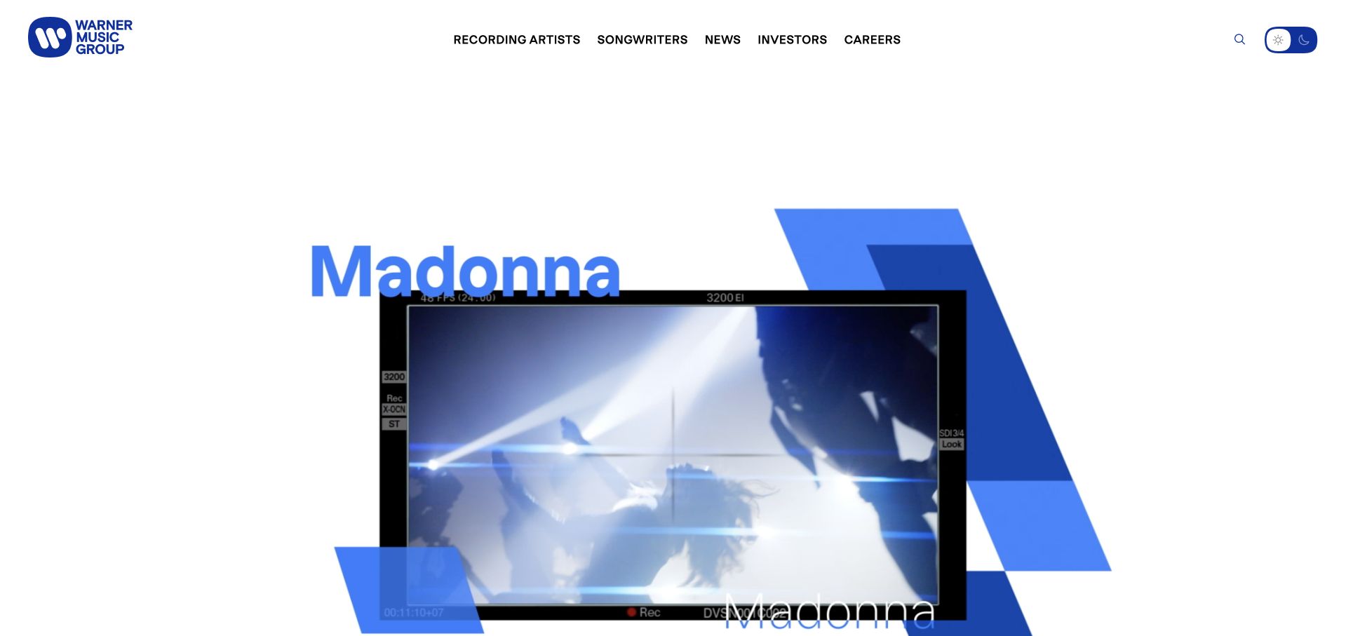
Warner Music Group uses large artist imagery, bold blue graphic elements and a deliberately sparse header to establish its creative identity. The page gives recording artists and songwriters distinct routes, with careers and corporate material available without dominating the first screen. The design is useful because the parent company remains visible while the people associated with its work supply the visual energy. It avoids presenting a music group as a generic professional-services firm.
What you can learn
A creative organization can let its artists lead the story while maintaining clear institutional tasks. Warner Music Group appears in Snowflake’s October 2024 customer fact sheet. That dated brand association does not identify this website’s CMS, a particular rights-management system or the current infrastructure of every associated label.
Pros
Artist imagery and a restrained corporate frame connect the parent organization to recognizable creative output.
Separate artist, songwriter and career routes acknowledge different audiences without requiring a complicated first-screen taxonomy.
Cons & considerations
Motion-heavy compositions need a stable, accessible fallback and should not make the main navigation dependent on animation timing.
A parent-brand presentation should preserve distinctions between labels, artists and corporate services rather than implying one uniform organizational or technical relationship.
Platform source: WordPress.org Showcase. Linked script matches Smush. Exact public source-page reference: https://www.wmg.com/. This is an observed component association, not proof of private configuration, a paid plan, measured results or complete architecture. Platform evidence is separate from the direct website screenshot and is not a complete current infrastructure audit.
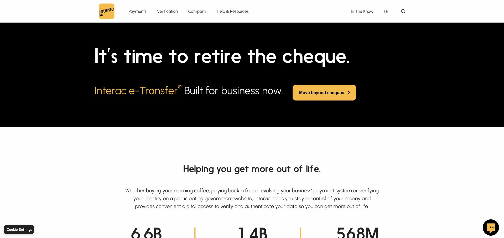
Interac’s homepage leads with a black panel, a short statement about moving beyond cheques and a yellow action. The familiar yellow brand mark remains in a restrained white header, with payment, verification, company and help routes kept separate. The next section expands into the organization’s everyday role rather than repeating the same campaign language. This is a useful way to introduce a specific behavior change while preserving a broader service identity. The simple message still needs practical supporting information about eligibility, participating institutions and the actual process. HashiCorp’s case documents Terraform within Interac’s infrastructure modernization, not the runtime of this marketing page.
What you can learn
A behavior-change campaign should identify one familiar task and offer a clear alternative. Follow the short message with concrete process information, and retain broader service navigation for visitors whose needs fall outside the featured campaign.
Pros
A limited black-and-yellow palette makes the campaign action easy to recognize.
Payment and verification routes remain distinct from company and support information.
Cons & considerations
A concise campaign cannot explain participating institutions or service conditions on its own.
Large type needs careful wrapping to preserve meaning across narrow screens.
Platform source: WordPress.org Showcase. Linked script matches Smush. Exact public source-page reference: https://www.interac.ca/en/. This is an observed component association, not proof of private configuration, a paid plan, measured results or complete architecture. Platform evidence is separate from the direct website screenshot and is not a complete current infrastructure audit.
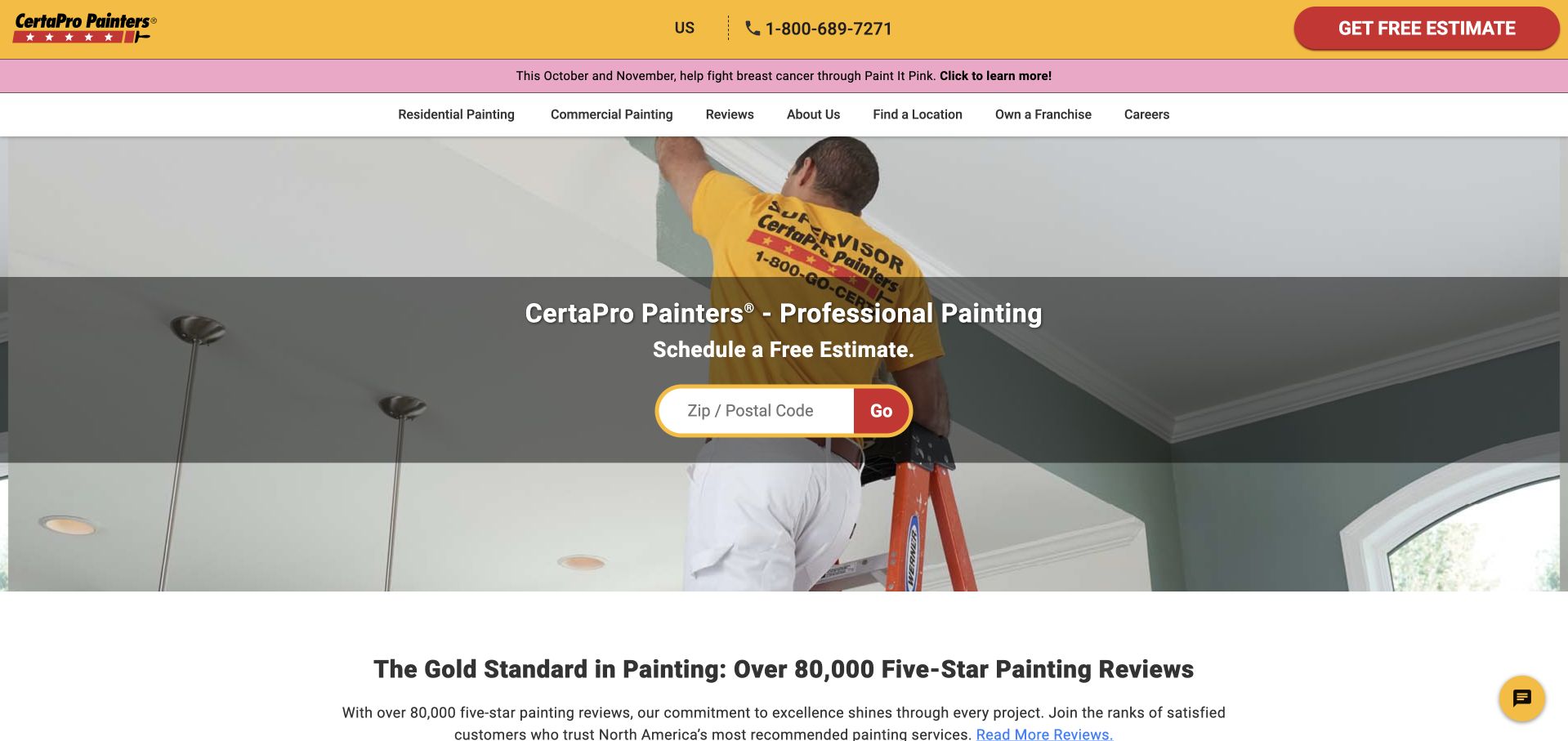
CertaPro places its yellow-and-red identity above a recognisable photograph of a painter working on an interior wall. A broad translucent band contains a short service heading and a ZIP or postal-code field, making location the obvious first input. Residential, commercial and review routes are expressed in plain language underneath the utility header. Below the hero, a review-count statement introduces social proof; it is a presentation choice rather than a result this collection independently verifies. A current campaign strip adds a second brand message without replacing the estimate route.
What you can learn
Reduce the first interaction to the information genuinely needed for routing. The postcode field works because the website has already named the service, while the photograph shows the work itself. For a smaller painter, the equivalent might simply be a visible service-area statement and one estimate link rather than a national locator.
Pros
The isolated postcode field creates an uncomplicated starting point for a nationwide network.
Residential and commercial navigation is understandable without specialist painting terminology.
Cons & considerations
The campaign banner adds another message before visitors reach the core service content.
The review headline is visually prominent but needs its linked source and context.
Platform source: WordPress.org Showcase. Linked script matches Smush. Exact public source-page reference: https://certapro.com/. This is an observed component association, not proof of private configuration, a paid plan, measured results or complete architecture. Platform evidence is separate from the direct website screenshot and is not a complete current infrastructure audit.
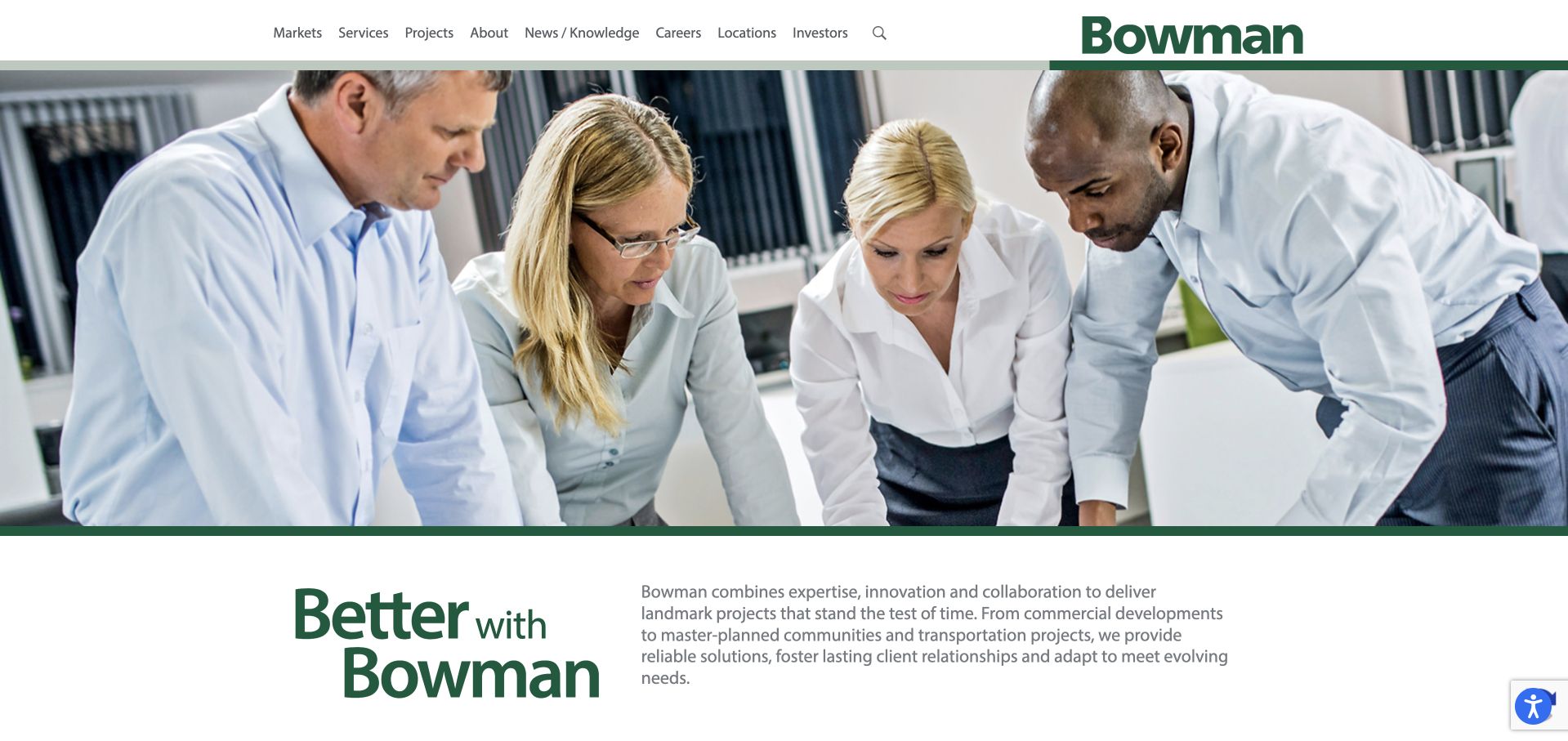
Bowman combines a broad team photograph with a green statement panel and a straightforward company description. A white header keeps the service structure familiar, while news appears separately below. The people-led image makes a larger consultancy feel less like a catalogue of infrastructure assets. Surveying is one part of the service mix, so this is useful for studying how a discipline fits into a broad brand. The opening promise is not a survey specification; clients still need to find the appropriate regional team and technical service.
What you can learn
Use people to make a large consultancy approachable, then let service pages do the technical qualification. Keep news separate from enduring capability information, and provide a direct way to identify the team responsible for a local survey enquiry.
Pros
The people-led image introduces a human dimension to a broad technical consultancy.
The split introduction gives supporting explanatory copy its own space rather than placing everything over a photograph.
Cons & considerations
The broad company message does not immediately distinguish the different types of surveying available.
A large service portfolio needs clear regional and discipline ownership so smaller enquiries do not feel lost.
Platform source: WordPress.org Showcase. Linked script matches Smush. Exact public source-page reference: https://bowman.com/. This is an observed component association, not proof of private configuration, a paid plan, measured results or complete architecture. Platform evidence is separate from the direct website screenshot and is not a complete current infrastructure audit.
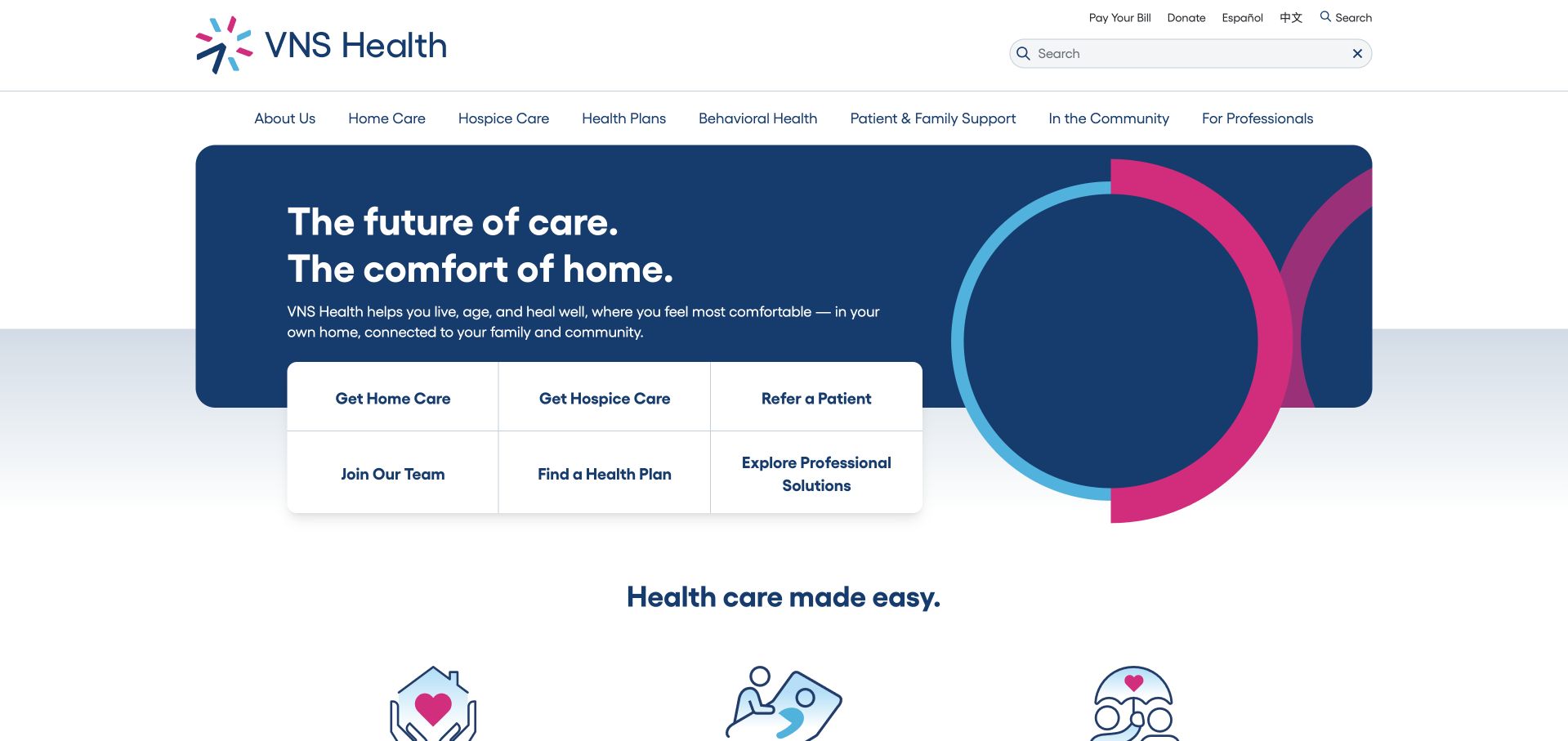
VNS Health uses a contained blue brand panel with a compact six-item task grid below the headline. Home care, hospice, referral, employment, health-plan discovery and professional solutions are distinct routes. The upper navigation also provides language choices and search, recognising that a large service organisation cannot be understood through one care button. The design is valuable for making different relationships visible before a long explanation. Its challenge is terminology: home care, health plans and professional solutions refer to materially different things. Each destination needs to explain its role and local availability instead of relying on the shared VNS identity.
What you can learn
When a brand includes care and coverage-related services, separate the tasks explicitly. Use a small grid of literal actions, with public explanations that prevent visitors from confusing a provider enquiry with a health-plan question.
Pros
Six explicit task routes acknowledge different audiences and service relationships within the same organisation.
Search and language options provide useful alternatives to navigating a large service taxonomy.
Cons & considerations
Several adjacent actions can feel dense unless their labels remain readable and clearly distinct.
Care provision and health-plan information need strong boundaries rather than an implied single process.
Platform source: WordPress.org Showcase. Linked script matches Smush. Exact public source-page reference: https://www.vnshealth.org/. This is an observed component association, not proof of private configuration, a paid plan, measured results or complete architecture. Platform evidence is separate from the direct website screenshot and is not a complete current infrastructure audit.
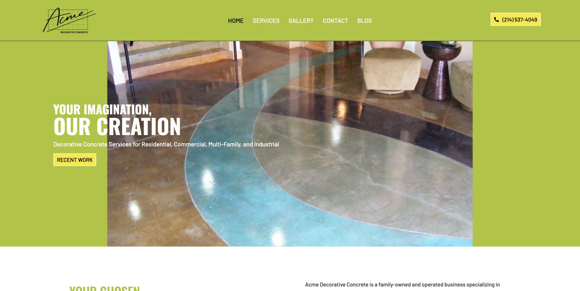
Acme uses a vivid lime surface around a large photograph of a polished interior floor. White display wording and a gold recent-work action create a strong introductory hierarchy, while the next section supplies Dallas–Fort Worth context. This is useful for studying a decorative-concrete site that chooses a distinctive color treatment rather than another dark photograph-and-form template. The floor photograph gives the palette a material reference, but detailed service information remains necessary. Neither its sheen nor the surrounding room establishes slip resistance, durability, maintenance needs, suitability, or the result another customer would receive. Promotional claims should remain attributable to the company rather than conclusions drawn from the picture.
What you can learn
Use a distinctive palette to frame the portfolio, not overpower it. Pair finish photographs with accurate service and regional text, and leave technical performance or suitability questions to responsible project assessment rather than a visual impression.
Pros
The lime background creates a recognizable identity around the project photograph.
A recent-work action makes the portfolio a clear next destination.
Cons & considerations
Bright brand colors require contrast checks for every text and action state.
An attractive finish image needs material and project context beyond its appearance.
Platform source: WordPress.org Showcase. Linked script matches Smush. Exact public source-page reference: https://acmedeco.com/. This is an observed component association, not proof of private configuration, a paid plan, measured results or complete architecture. Platform evidence is separate from the direct website screenshot and is not a complete current infrastructure audit.
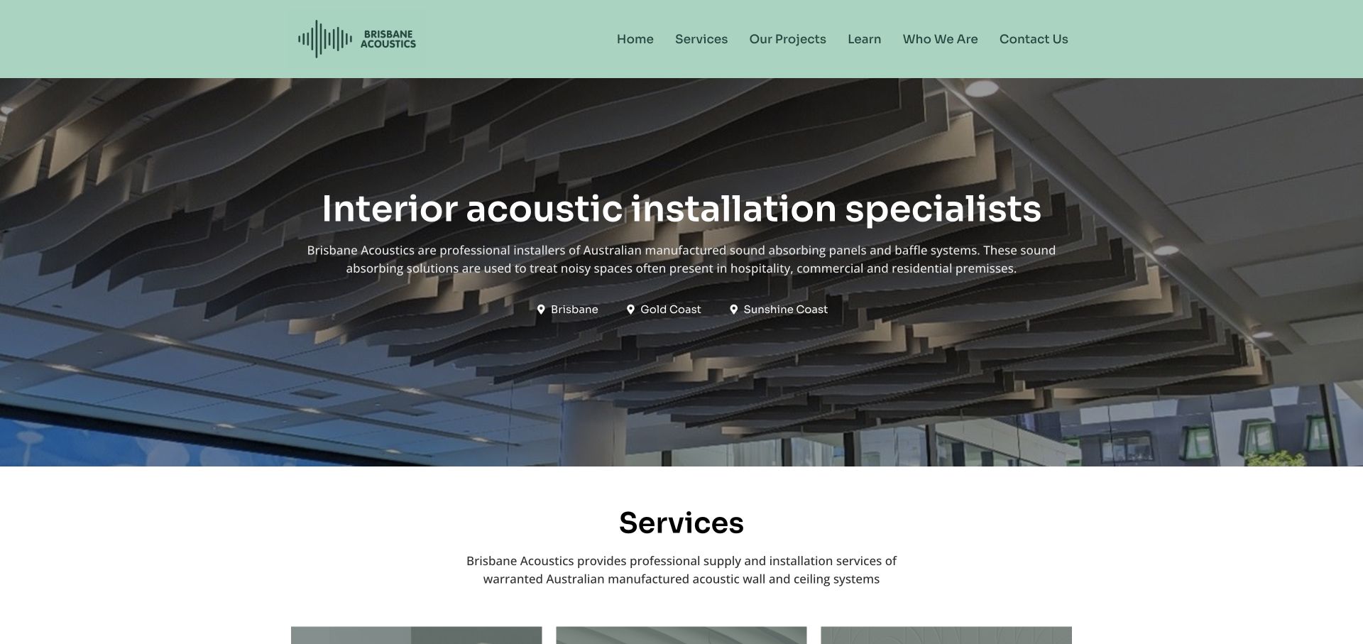
Brisbane Acoustics makes interior acoustic installation explicit over a real installed-baffle image. Brisbane, Gold Coast and Sunshine Coast coverage appears in the opening section, followed by design, ceiling and wall choices. The page links named office, hotel and dealership cases and provides a reverberation-assessment route. Its focused scope and local geography give an otherwise visual material category a practical project context.
What you can learn
State the installation region and separate material-selection support from ceiling and wall work. Named cases and an assessment route help a prospective client move beyond liking the photograph toward defining a real project. The separately observed Smush asset is a component signal, not evidence of acoustic performance or project outcomes.
Pros
The installation specialty and local coverage are visible immediately.
Named case studies connect material systems with recognizable project contexts.
Cons & considerations
A quote action sits below substantial introductory content and may deserve a clearer first-screen route.
Building-standard and product-testing statements need current system-specific documentation rather than a blanket assumption.
Platform source: WordPress.org Showcase. Linked script matches Smush. Exact public source-page reference: https://brisbaneacoustics.com.au/. This is an observed component association, not proof of private configuration, a paid plan, measured results or complete architecture. Platform evidence is separate from the direct website screenshot and is not a complete current infrastructure audit.
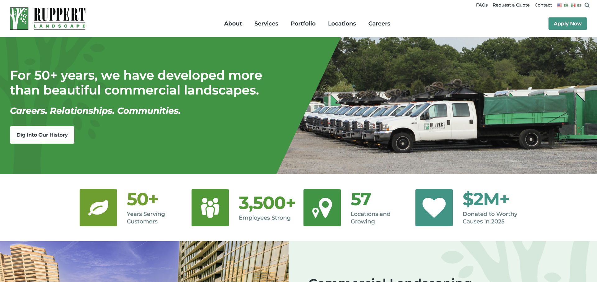
Ruppert splits its opening into a green message panel and a photograph of branded trucks. A diagonal edge joins the two halves, while a row of large icon-and-number treatments introduces company context beneath them. The header separates the main business navigation from utility links and an application button. The homepage thus presents landscaping as an organized service operation, not only as a collection of attractive spaces. The captured fleet image is a concrete counterpart to the company-focused wording.
What you can learn
Operational imagery can help explain a maintenance business, but distinguish capability evidence from sales decoration. Pair the fleet or team image with relevant service routes and portfolio examples. If recruiting is also important, make that route unmistakably different from requesting work so the two priorities can coexist.
Pros
A split hero gives the message a stable background rather than overlaying every line on photography.
The portfolio and locations routes are easy to identify in the main menu.
Cons & considerations
Company statistics occupy valuable early space and require clear context rather than decorative counting.
A prominent recruitment action can compete with the buyer’s quote or contact route.
Platform source: WordPress.org Showcase. Linked script matches Smush. Exact public source-page reference: https://www.ruppertlandscape.com/. This is an observed component association, not proof of private configuration, a paid plan, measured results or complete architecture. Platform evidence is separate from the direct website screenshot and is not a complete current infrastructure audit.
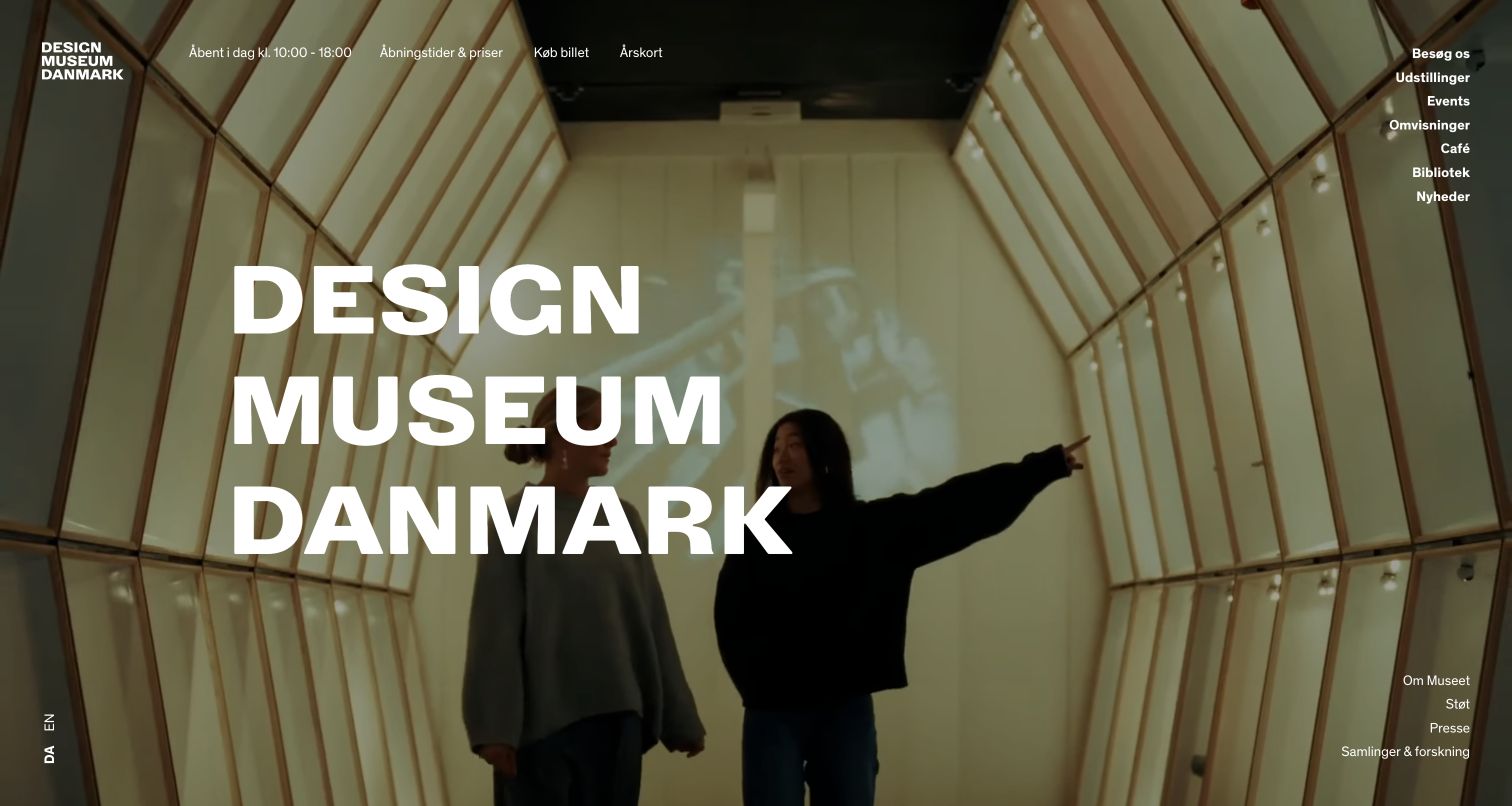
Designmuseum Danmark opens with an expansive interior photograph and large stacked typography. Practical information appears in the header, including today’s hours, prices, tickets and membership. The menu separates exhibitions, events, tours, the café, library and research resources. This is a useful example of a museum allowing a strong visual identity to lead while retaining the operational facts needed to plan a visit. The Danish page also makes an English-language route identifiable rather than assuming one audience language.
What you can learn
Let the museum’s environment establish atmosphere, then place hours, ticketing and accessibility information in stable positions. Treat translated navigation as an operational feature, and make exhibition dates and visitor details part of the content model rather than artwork embedded in an image.
Pros
Hours and ticket routes are available without requiring visitors to interpret the hero image.
The menu recognizes collection research, education and visitor services as different types of use.
Cons & considerations
Very large image-led openings need legible text treatment across changing photography and screen sizes.
A broad menu can become difficult to scan unless the main visitor tasks remain clearly prioritized.
Platform source: WordPress.org Showcase. Linked script matches Smush. Exact public source-page reference: https://designmuseum.dk/. This is an observed component association, not proof of private configuration, a paid plan, measured results or complete architecture. Platform evidence is separate from the direct website screenshot and is not a complete current infrastructure audit.
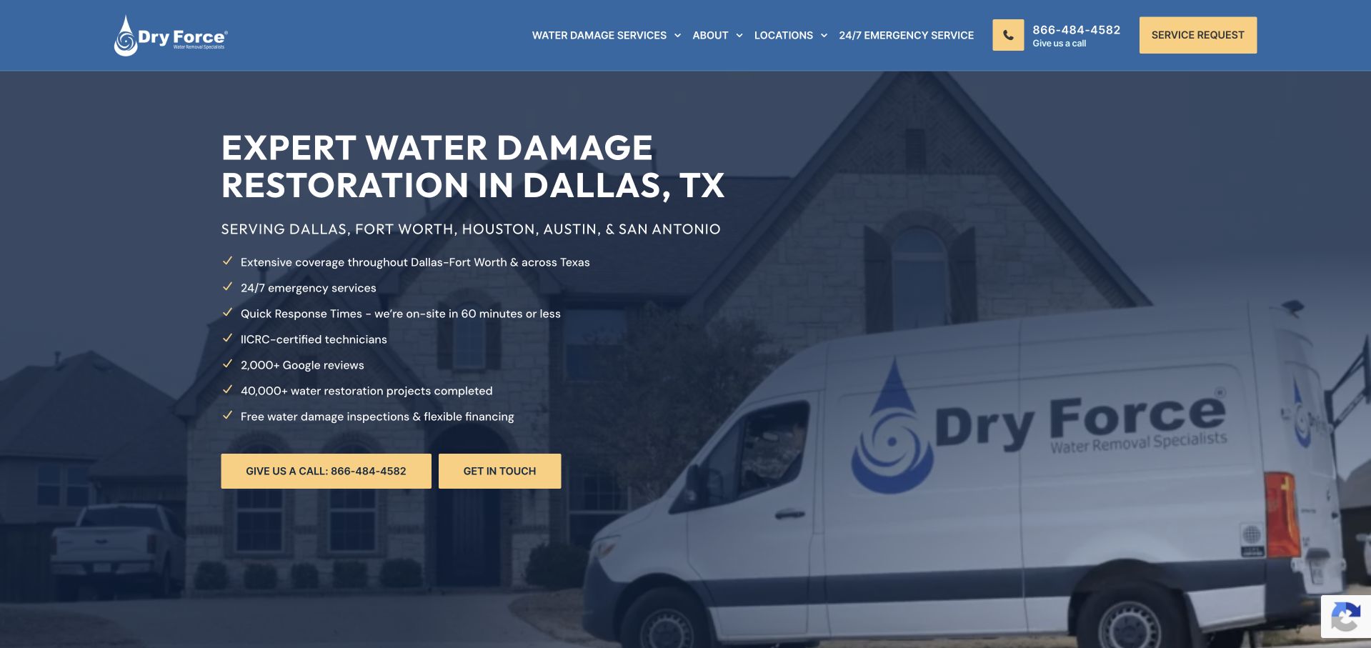
Dry Force uses a dark blue overlay on a branded service-vehicle photograph, with a large Dallas water-damage headline on the left. A short region line and a vertical checklist follow the headline, and two yellow contact actions sit below. The blue-and-yellow vocabulary repeats in the header, connecting the telephone and service-request controls to the hero. This is a useful example of using a checklist to organize supporting information without making the introduction one long paragraph. The site's claims are not independently established by this design review, so the lesson is about hierarchy and information placement rather than promised service performance.
What you can learn
Use a checklist for genuinely distinct questions and link to the underlying details. Keep the primary contact action clear, and qualify timing or monitoring statements with the relevant service and location context.
Pros
The vehicle photograph and geographic heading establish a concrete local-service context.
Yellow actions remain recognizable against the dark blue overlay.
Cons & considerations
A long checklist can dominate the first screen and reduce reading comfort.
Timing and qualification statements need more explanation than a short checkmarked line.
Platform source: WordPress.org Showcase. Linked script matches Smush. Exact public source-page reference: https://dryforcecorp.com/. This is an observed component association, not proof of private configuration, a paid plan, measured results or complete architecture. Platform evidence is separate from the direct website screenshot and is not a complete current infrastructure audit.
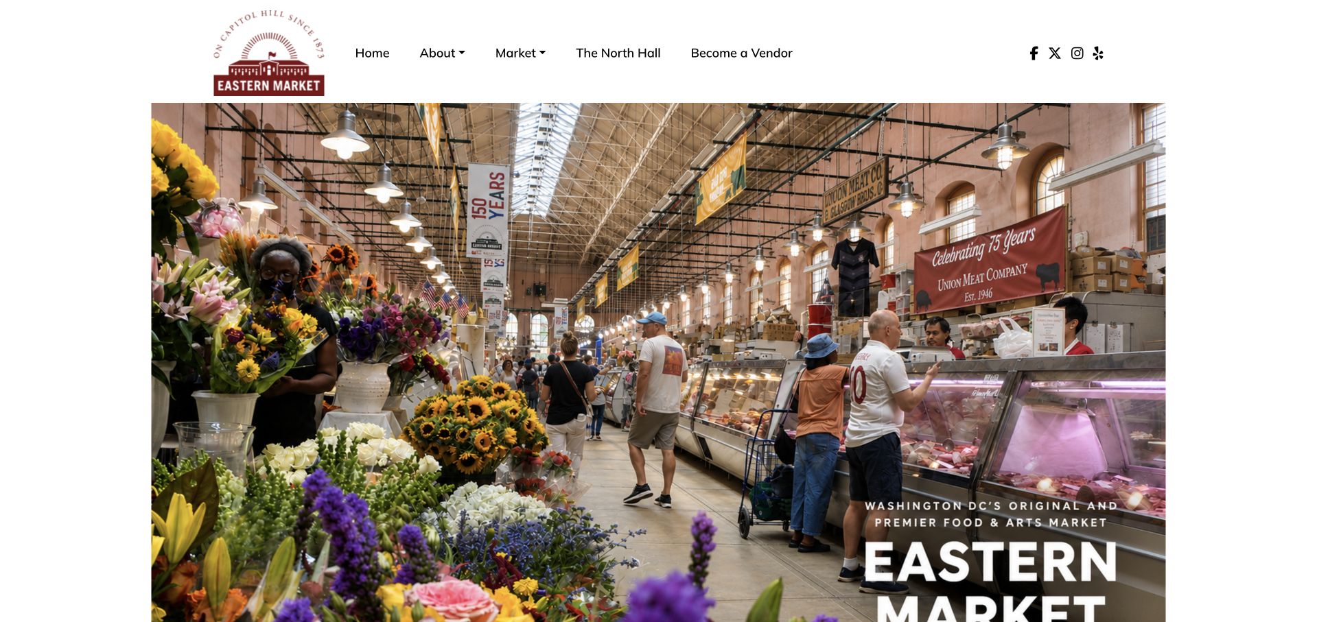
Eastern Market DC uses a large interior photograph showing stalls, flowers, shoppers and the roof structure of the hall. A compact circular identity sits above it, while the destination title is placed over a darker area at the lower right. The image makes the market feel like a real, navigable place rather than a generic festival of produce. Navigation distinguishes market information, the hall and vendor participation. This is useful for a destination with indoor and outdoor activities that may operate differently. The photograph introduces the setting, but the detail pages still need to make the relevant opening times and vendor arrangements explicit.
What you can learn
Show the shopping environment when the building is part of the visit. Keep indoor hall information distinct from outdoor stalls and events, and give users a readable route to current hours even when the main image is designed to be immersive.
Pros
The interior photograph shows a specific market environment.
Separate hall and vendor routes acknowledge different uses.
Cons & considerations
Text at the photograph’s edge needs careful cropping and contrast on narrow screens.
One interior image cannot explain different indoor, outdoor and event schedules.
Platform source: WordPress.org Showcase. Linked script matches Smush. Exact public source-page reference: https://easternmarket-dc.org/. This is an observed component association, not proof of private configuration, a paid plan, measured results or complete architecture. Platform evidence is separate from the direct website screenshot and is not a complete current infrastructure audit.
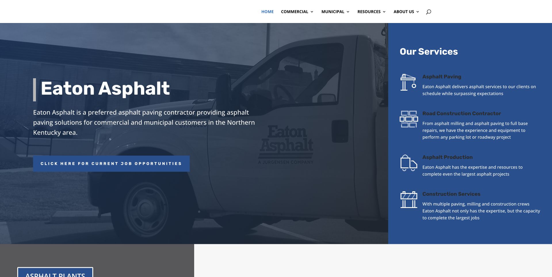
Eaton uses a blue split composition with a company-vehicle photograph on the left and a solid service panel on the right. The panel distinguishes asphalt paving, road construction, production, and construction services with short descriptions and icons. The main introduction names Northern Kentucky and the commercial and municipal audience. A job-opportunity action is prominent beneath the copy. This is useful for studying a broader contractor site that makes its operational categories visible before a long portfolio. The photograph and scope statements do not independently establish project capacity, qualifications, employment conditions, engineering requirements, or the performance of materials and construction work.
What you can learn
Translate a broad contractor organization into clear service categories, while keeping recruiting and customer tasks distinct. Explain which team and process handles a project inquiry instead of letting the scale of the equipment imply suitability for every job.
Pros
The solid blue panel gives several services their own readable descriptions.
Commercial and municipal audiences are named in the introduction.
Cons & considerations
A prominent careers action can compete with prospective-client tasks.
Small service descriptions need careful sizing and spacing on mobile.
Platform source: WordPress.org Showcase. Linked script matches Smush. Exact public source-page reference: https://eatonasphalt.com/. This is an observed component association, not proof of private configuration, a paid plan, measured results or complete architecture. Platform evidence is separate from the direct website screenshot and is not a complete current infrastructure audit.
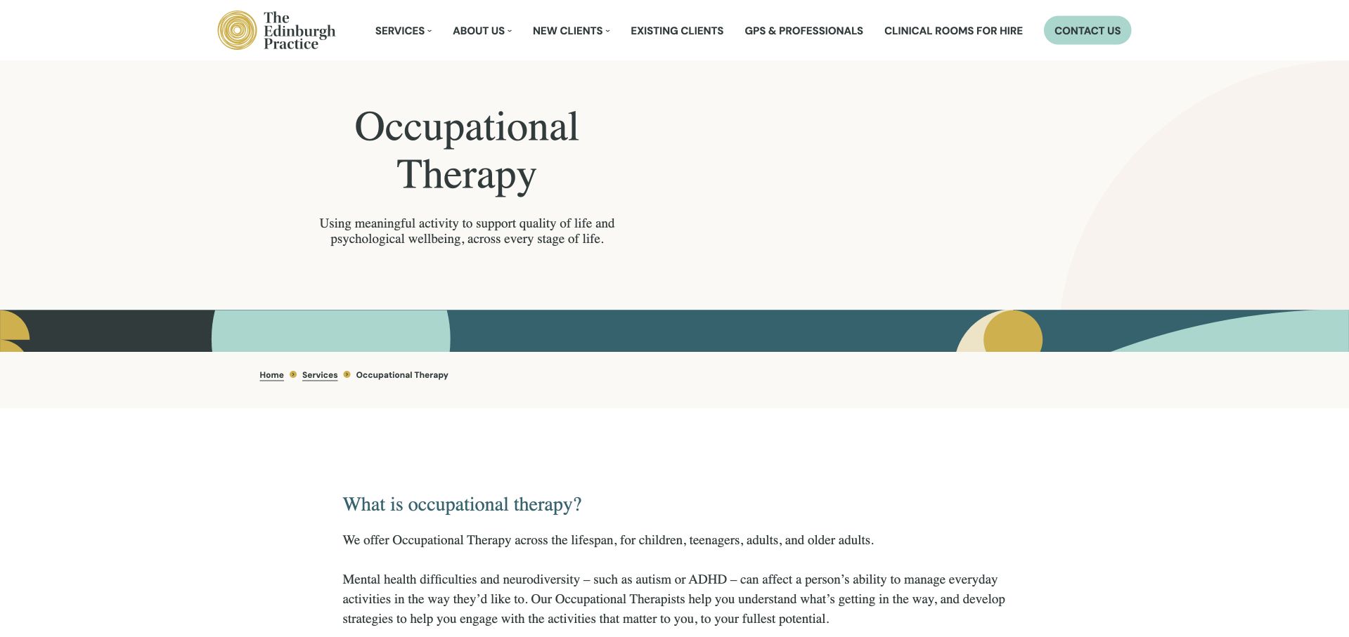
The Edinburgh Practice uses a restrained white layout with muted green accents and a clear occupational-therapy title. The service page explains support across life stages, then lists practical areas such as daily activities, routines, memory, fatigue and work. Further sections distinguish particular assessment offerings rather than leaving all services inside a general contact invitation. This gives the discipline meaningful editorial space within a wider practice website. The presentation is heavily text-led, however, so the page’s usefulness depends on clear subheadings, concise lists and prominent practical information rather than expecting every visitor to read the complete explanation in sequence.
What you can learn
A substantial service page should explain occupational therapy through practical activities and clearly separated assessment types. Keep fees, appointment format and next steps close to each offer, and avoid making one long general page carry every audience’s information without clear navigation.
Pros
The page explains functional areas rather than assuming visitors already understand the discipline.
Separate assessment sections create a clearer structure within a broad service offering.
Cons & considerations
Long text-led sections can feel demanding without a concise overview or jump navigation.
Important practical appointment information needs stronger prominence than surrounding explanatory prose.
Platform source: WordPress.org Showcase. Linked script matches Smush. Exact public source-page reference: https://edinburghpractice.com/service/occupational-therapy/. This is an observed component association, not proof of private configuration, a paid plan, measured results or complete architecture. Platform evidence is separate from the direct website screenshot and is not a complete current infrastructure audit.
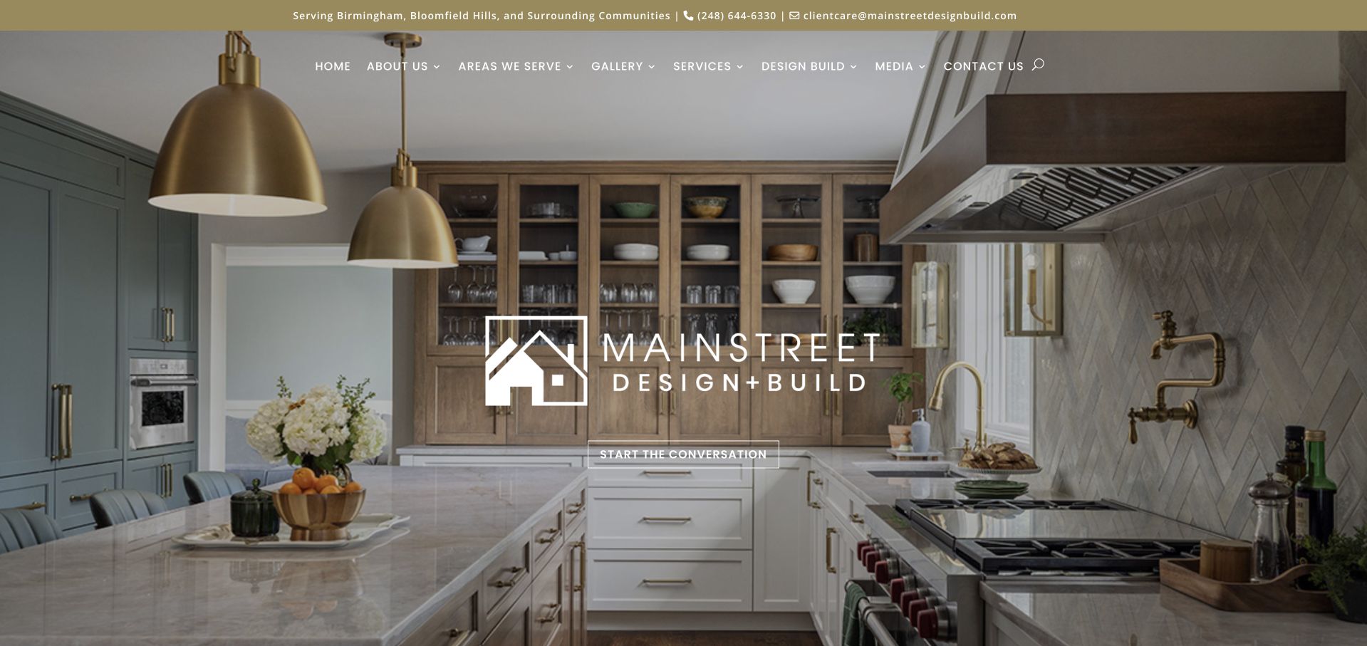
MainStreet Design Build centers its identity over a finished kitchen, using cabinetry, lighting and materials to introduce its work. A narrow utility strip names the service area and contact routes, while the navigation distinguishes galleries, services and the design-build process. The central invitation is understated. The instructive point is how an image-led hero can combine a stable logo with project photography and genuinely local information. Public website assets do not verify project ownership, construction outcomes or the business’s internal enquiry workflow.
What you can learn
Give project images useful accompanying records: the type of work, relevant constraints and an understandable route to the full case study. Keep service-area details in a shared location that editors can maintain. Avoid relying on a large identity mark to explain the practical difference between a gallery, a service and a process page.
Pros
The kitchen image shows concrete materials and spatial detail rather than an abstract mood.
Local coverage is visible before the visitor reaches the main navigation.
Cons & considerations
The restrained central action can be easy to overlook against the detailed photograph.
The opening offers little project context unless visitors continue to the gallery.
Platform source: WordPress.org Showcase. Linked script matches Smush. Exact public source-page reference: https://mainstreetdesignbuild.com/. This is an observed component association, not proof of private configuration, a paid plan, measured results or complete architecture. Platform evidence is separate from the direct website screenshot and is not a complete current infrastructure audit.
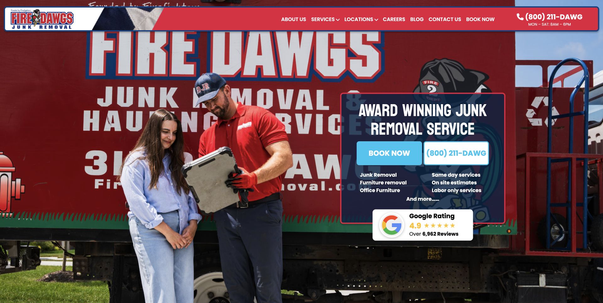
Fire Dawgs uses a photograph of a worker speaking with a customer beside a prominently branded red truck. A compact dark panel contains the service heading, blue booking and telephone controls, short category information, and a review summary. The red navigation bar stays relatively shallow above the image. This illustrates a business whose own equipment and people provide a stronger identity than a generic pile-of-junk photograph. The interaction shown gives the page a human service context, while the panel supplies a practical next step. The busy vehicle graphics also reveal a tradeoff: brand recognition and readable page copy must share the same visual space.
What you can learn
Use genuine company photography with a planned quiet area for text. Keep booking and telephone labels understandable, and explain what the first request confirms rather than allowing a branded truck image to imply a scheduled crew or promised result.
Pros
The worker-and-customer scene establishes a concrete service relationship.
Blue contact controls remain distinguishable against the red company imagery.
Cons & considerations
Large vehicle lettering competes with the overlaid service panel.
The compact category and review text needs readable sizing at narrower widths.
Platform source: WordPress.org Showcase. Linked script matches Smush. Exact public source-page reference: https://firedawgsjunkremoval.com/. This is an observed component association, not proof of private configuration, a paid plan, measured results or complete architecture. Platform evidence is separate from the direct website screenshot and is not a complete current infrastructure audit.
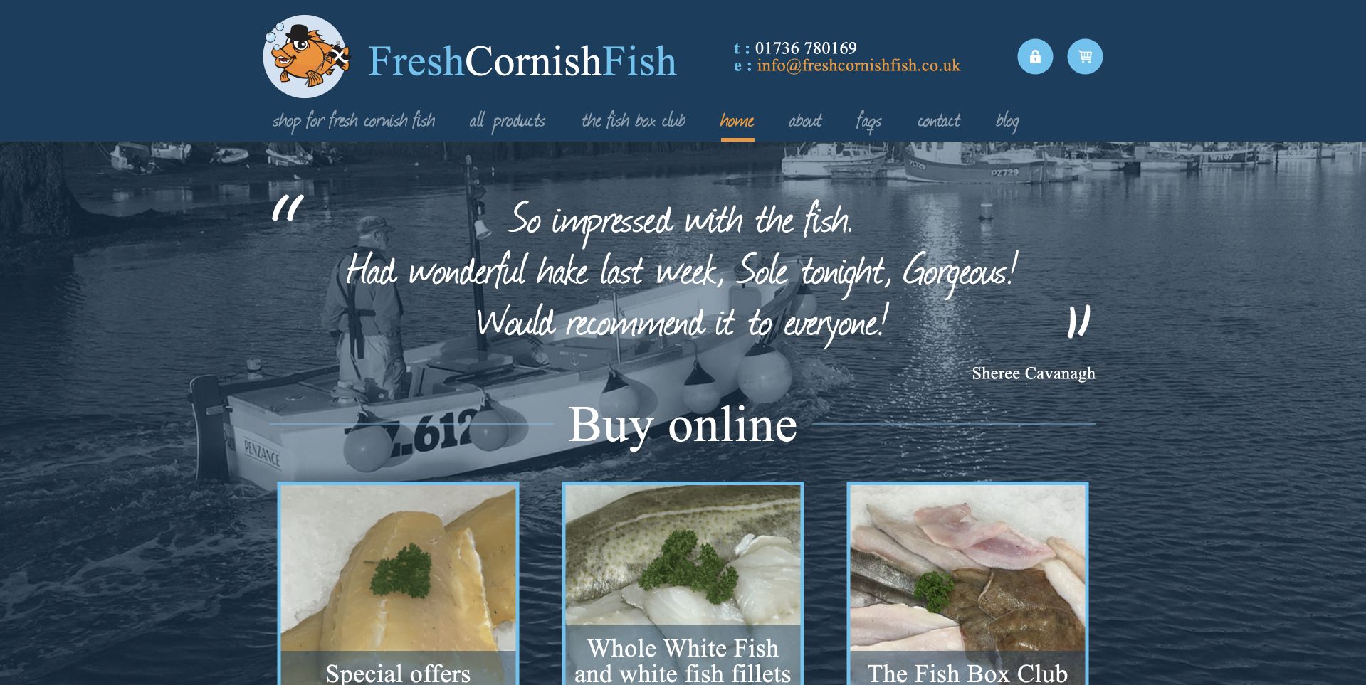
Fresh Cornish Fish uses a blue harbor photograph as the background for a short quotation and a large Buy Online heading. Beneath it, three photographic cards introduce specials, whole fish and a fish-box club. The blue header includes contact details and a compact handwritten-style navigation, reinforcing the coastal character. The useful feature is the transition from an atmospheric scene into specific buying models. A visitor does not have to interpret the harbor as a catalog: the cards name the actual next choices. The quotation is presented by the business and should not be treated as independently verified customer research in this design review.
What you can learn
Let regional imagery frame the shop, then state the buying choices literally. Distinguish a recurring box from a one-off fish purchase and make preparation, portions and delivery conditions clear before a customer commits to the selected route.
Pros
The three buying cards turn coastal atmosphere into concrete shopping choices.
Contact details remain close to the identity in the compact blue header.
Cons & considerations
Script-style navigation and quotation text need careful mobile readability checks.
A recurring club needs explicit terms rather than relying on the introductory card.
Platform source: WordPress.org Showcase. Linked script matches Smush. Exact public source-page reference: https://www.fresh-cornish-fish.co.uk/. This is an observed component association, not proof of private configuration, a paid plan, measured results or complete architecture. Platform evidence is separate from the direct website screenshot and is not a complete current infrastructure audit.
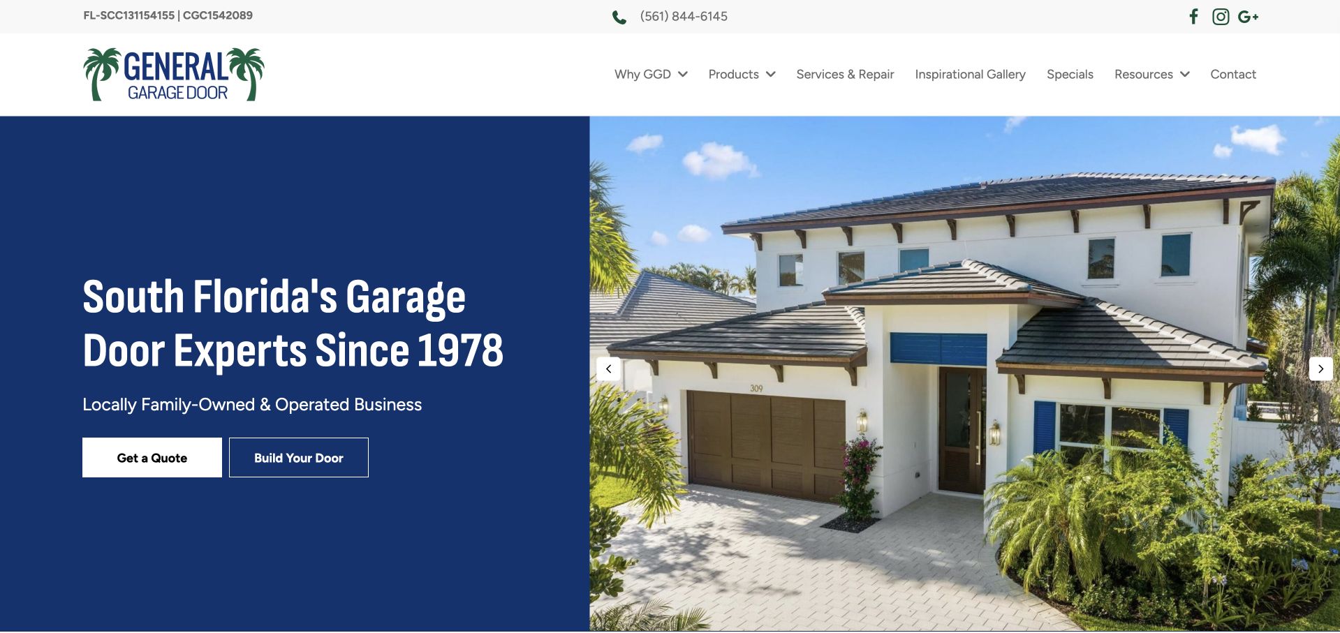
General Garage Door splits the opening into a solid blue text panel and a bright house photograph. The text names South Florida and introduces the business’s family-run identity, while two adjacent controls offer a quote or a door-building journey. An inspiration gallery, products, service and repair, resources and contact information are clearly labelled above. The composition avoids placing a long explanation over the photograph, which gives the service message stable contrast. The company-history claim remains company-provided context. The useful structure is the separation between understanding local service and imagining a different door, rather than treating both as one lead-generation step.
What you can learn
Give product imagination and service eligibility different but connected routes. A stable text panel is useful when the project photography changes, but a configurator still needs a clear route to dimensions, survey requirements and an actual quotation.
Pros
The region and service identity are immediately readable.
A quote and a door-building tool have distinct purposes.
Cons & considerations
The broad exterior image provides little detail about the featured door.
The product tool needs further explanation beyond its short button label.
Platform source: WordPress.org Showcase. Linked script matches Smush. Exact public source-page reference: https://generalgaragedoor.com/. This is an observed component association, not proof of private configuration, a paid plan, measured results or complete architecture. Platform evidence is separate from the direct website screenshot and is not a complete current infrastructure audit.
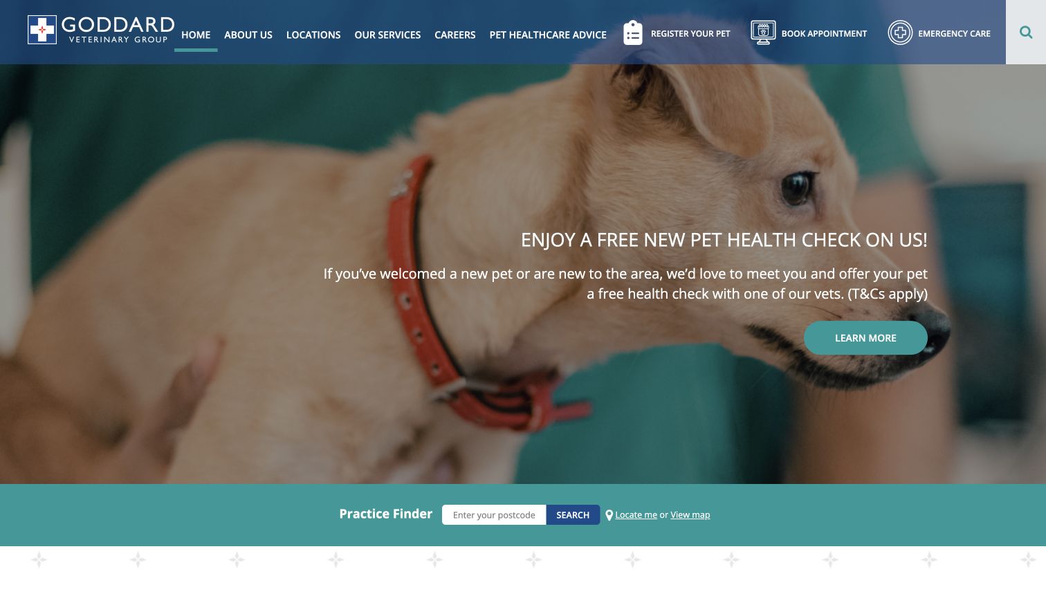
Goddard Veterinary Group combines a large pet photograph and introductory offer with a full-width practice finder. Register Your Pet, Book Appointment, and Emergency Care appear as separate header tasks with recognizable icons. The finder accepts a postcode and also offers a map route, making location selection an explicit part of the page. The design is useful for a regional practice group because it does not treat registration and appointment booking as the same task. Its dense navigation and large promotional hero make the first screen busy, and the offer needs context before it can help a visitor compare practices.
What you can learn
Separate registration, booking, and emergency help when they lead to different workflows. Give visitors a simple geographic search and an alternative way to browse. Keep introductory offers tied to clear eligibility information, and let the permanent practice finder remain useful after the promotion expires.
Pros
Three distinct client tasks are visible in the header.
Postcode and map routes support different ways to find a practice.
Cons & considerations
The header contains many competing navigation items.
The large offer area delays more detailed practice information.
Platform source: WordPress.org Showcase. Linked script matches Smush. Exact public source-page reference: https://www.goddardvetgroup.co.uk/. This is an observed component association, not proof of private configuration, a paid plan, measured results or complete architecture. Platform evidence is separate from the direct website screenshot and is not a complete current infrastructure audit.
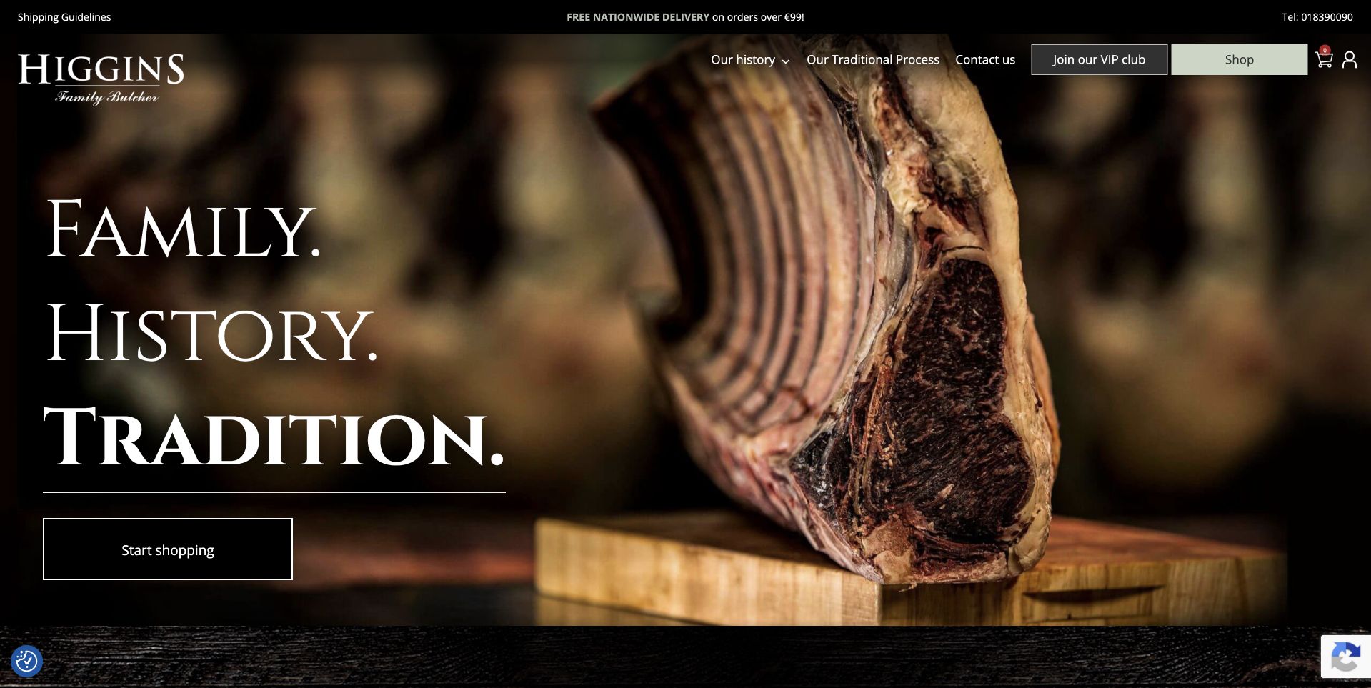
Higgins Family Butcher places a dramatic rib photograph beneath a black header, leaving a dark area at the left for three large serif words about family, history and tradition. A simple outlined Start Shopping button sits below them. The composition is tightly controlled: the cut of meat supplies texture, while the copy and action retain a quiet, readable zone. Small navigation and delivery information stay above the photograph. The page is useful for studying a heritage-led visual identity that still admits an immediate transaction. Its family positioning is communicated by typography and wording rather than a lengthy opening history lesson.
What you can learn
Reserve a predictable text area when commissioning product photography for a homepage. A strong image can carry heritage positioning, but customers still need a plain shopping action and accessible details about collection, delivery and the current range once they follow it.
Pros
The dark left side gives the large serif headline a readable setting.
An outlined shopping action remains distinct without introducing another dominant color.
Cons & considerations
Heritage words need concrete supporting company information farther into the site.
The extensive dark hero may delay useful delivery details for first-time buyers.
Platform source: WordPress.org Showcase. Linked stylesheet matches Smush. Exact public source-page reference: https://higginsbutchers.ie/. This is an observed component association, not proof of private configuration, a paid plan, measured results or complete architecture. Platform evidence is separate from the direct website screenshot and is not a complete current infrastructure audit.
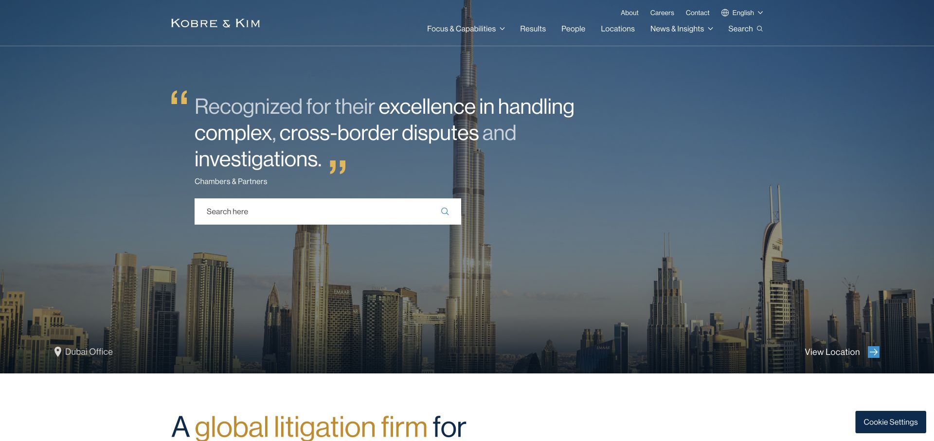
Kobre & Kim layers a large search field and an attributed quotation over a darkened city panorama. A location label and action connect the photograph to an actual office rather than anonymous decoration. Capabilities, results, people, and locations form a restrained upper navigation, with language and contact in a separate utility position. The layout recognizes several research tasks: finding a person, examining work, or searching a known term. Gold quotation marks supply an identifying accent without another illustration. The quotation is a confidence device, though anonymous client attribution is less specific than a named case study.
What you can learn
If search is a central route, make its purpose explicit and pair it with browsable capabilities. Give location photography a destination and caption so it contributes to wayfinding rather than merely filling space.
Pros
Search is treated as a useful primary task, not a tiny header icon.
The city image is linked to a visible location destination.
Cons & considerations
Visitors without legal vocabulary may still need guided practice navigation.
An anonymous quotation offers less inspectable context than a named example.
Platform source: WordPress.org Showcase. Linked script matches Smush. Exact public source-page reference: https://kobrekim.com/. This is an observed component association, not proof of private configuration, a paid plan, measured results or complete architecture. Platform evidence is separate from the direct website screenshot and is not a complete current infrastructure audit.
Kegan has 15+ years of experience working with small businesses, Fortune 500 companies, and everything in between. No development job is too big or too small: he brings the same hands-on attention to a focused improvement, a complete website, or a custom application.
For Smush projects, he can help with image-library preparation, responsive image delivery, optimization settings, visual regression checks, integration ownership and maintainable WordPress handover. He works directly with clients on scope, design, implementation, testing, and handover, with an emphasis on clear communication and a system that remains practical to maintain after launch.
Show 3 other Smush developersHide other Smush developers
Choose the image problem before enabling more features
Improve a manageable WordPress media library
For a modest editorial site, begin with the actual upload and publishing routine. Establish image dimensions, permissions, captions, and a representative visual test before deciding how optimization should be automated. The appropriate scope may be simpler than enabling every available feature.
Where a project needs a CDN or format-conversion feature, confirm its current availability, account requirements, and compatibility before including it in the brief. Identify who controls the delivery configuration and how the website behaves if that service is unavailable.
Inventory the theme, host, cache, image tools, and any existing delivery service. Assign one owner to each relevant behavior and test changes independently. A shorter, understood configuration is easier to hand over than several tools all attempting to transform the same image response.
Plan a Smush image workflow the publishing team can maintain
Inventory the pages and images that actually matter
Start with a small but representative page set: the homepage, a normal article, a long gallery, a product detail if relevant, a listing page, and an important inquiry route. Record what each image contributes to the visitor’s task. A product photograph may need detail at zoom level, while a card thumbnail mainly needs a recognizable crop. Identify where images enter the website, who supplies them, and who approves publication rights. This inventory is more useful than a blanket instruction to compress everything as aggressively as possible. It creates a testable brief rather than assuming all media has the same purpose.
List the original assets separately from the published versions. Include unusually detailed pictures, logos with fine edges, portraits, transparent graphics, and any image containing text that should ideally remain real page text. Check what the theme or page builder already creates and what editors can change without developer help. Do not treat a public competitor screenshot as a source asset or assume that a detected optimization plugin means every file passed through it. Decide which pages and images must be preserved exactly enough to compare after a configuration change, and keep those reference records private and clearly labeled.
Set a visual acceptance standard before the first bulk change
Agree what acceptable quality means for this website and who can approve it. A furniture retailer, a photographer, a document publisher, and a local service business may care about different image details. Choose a reference set with enough variety to reveal visible degradation, an unexpected background, a bad crop, or unreadable small lettering. Review the actual delivered result at relevant display sizes rather than only a full-size file on a large monitor. Keep comments tied to specific images and page contexts so another person can understand why a setting was accepted or rejected.
Document the baseline before changing a production media library. Record what was tested, the environment, the image settings involved, and what remains untested. Ask the business to identify any assets where preserving a source original is especially important. An optimizer’s storage-saving figure and a viewer’s visual acceptance are different forms of evidence; neither replaces the other. Review a limited sample first, then expand only when the result is understood. A deliberate sample avoids turning an uncertain setting into a large irreversible editorial problem simply because a bulk-processing button is convenient.
Keep authoritative source photography in a controlled location with an understandable naming and permission record. Do not rely on a single optimized web copy as the only surviving original. Define who can authorize a bulk operation, who can restore a mistaken change, and how the team knows the restore was successful. Distinguish an image-original backup from a complete website backup: the latter also involves content, configuration, and other operational concerns. A media optimization feature does not by itself establish that the site has a tested disaster-recovery plan.
Smush documents an original-image backup option and restore-related controls; verify the selected behavior for the actual installation before relying on it. Plan disk use and retention with the host and site maintainer rather than assuming backups are free of operational cost. Test a representative restoration in an appropriate non-production setting and review the resulting page as well as the file. Keep the process short enough for the responsible person to follow during an error. A rollback plan should describe what to restore, what to verify, and who can make that decision, not merely say that backups exist.
Map the actual display contexts for each important image: a wide hero, a narrow card, an article column, a gallery, and a small mobile screen can need different choices. Ask the developer to explain which image is requested in each context and what happens when the viewport changes. Optimization should not be used to disguise a layout that downloads a huge decorative photograph for a tiny card. Likewise, a smaller file is not a successful result if an important product detail becomes unreadable or an editorial crop removes the subject of the photograph.
Reserve appropriate layout space and check the page while images load, fail, and reappear from cache. Review important above-the-fold images separately from those farther down a long page. The visitor’s task should guide loading behavior rather than an assumption that every image benefits from the same setting. Confirm that captions, alternative text, and nearby controls remain understandable without the image. These are layout and content responsibilities as well as delivery decisions. A plugin can participate in the workflow, but the final acceptance must be based on the rendered page and its actual requests, not a product label.
Audit overlapping tools and change one behavior at a time
List every system involved in media handling: the theme, page builder, WordPress image sizes, host features, cache plugin, optimization plugin, and external delivery services. Record which system currently controls each relevant behavior. The purpose is not to remove tools indiscriminately, but to avoid an undocumented overlap where nobody can explain a broken image or stale response. If two systems both alter loading or delivery, define an intentional boundary and test it. Do not infer the configuration from a public asset filename alone; the actual administrator setup needs its own authorized review.
Use a staging or otherwise approved test environment for material changes. Capture a baseline, make one scoped adjustment, clear only the caches relevant to that change, and compare the selected pages under consistent conditions. Include logged-out viewing and the ordinary mobile layout. If a result is worse, preserve the evidence and return to the last understood state rather than enabling several additional features at once. Assign troubleshooting ownership before handover. The team should know whether an image problem belongs with the photographer, editor, theme developer, host, or delivery-service administrator instead of treating every failure as a mysterious plugin conflict.
Confirm product scope, accounts, and data handling
Write a feature checklist for the actual requirements and compare it with current official documentation before committing to a product edition or service dependency. Smush’s public listing distinguishes capabilities with plan conditions; a visible CDN reference on another site does not prove that your installation has those entitlements. Avoid hard-coding changing prices, limits, or promotional terms into a long-lived design brief. Record the business account owner, renewal responsibility where applicable, and the person allowed to change settings. A working demo under a developer’s account is not a complete client handover.
Review how the selected workflow processes images and whether any external services or account connections are involved. WPMU DEV documents remote optimization processing and privacy considerations; have the responsible organization review the applicable configuration and disclosures. Do not upload confidential files simply because they appear in a WordPress media library, and do not assume that image optimization makes an image safe or lawful to publish. Treat copyright permission, personal information in photographs, and service configuration as separate questions. Keep administrator access proportionate and document how the organization can recover account ownership when a contractor leaves.
Measure the actual result rather than adopting a percentage claim
Define which outcome you intend to test before changing the website. Possible measures include the delivered size of selected images, the number of requests, the appearance of important content while loading, and a repeatable page-performance test under stated conditions. Keep the page content, device assumptions, connection profile, and cache state comparable. A one-off score taken under different conditions cannot establish that a particular plugin caused an improvement. Nor does a reduced file size prove that the visitor completed a quote form, understood the content, or bought a product.
Keep the reporting language proportionate. Say what was tested, when, and what changed, including any visual tradeoff or untested pages. Separate a product vendor’s feature description from a result measured on this website. Do not promise a ranking gain, accessibility conformance, or a universal Core Web Vitals pass from installation alone. If the team has no suitable field data, state that limitation and use bounded lab checks without presenting them as real-user outcomes. The most useful handover is a small repeatable test the next maintainer can run, not a dramatic claim that nobody can reproduce.
Make the next upload a normal operational task
Write an editor-facing routine that covers asset permission, naming, an appropriate crop, meaningful captions, alternative text where relevant, and review of the published page. Decide which settings are safe for an editor to touch and which belong to the site maintainer. Demonstrate a realistic upload rather than handing over an empty media library and a list of plugin features. Include a correction task and an image replacement so the team sees how updates affect the page. A sustainable workflow should work after the original developer is no longer present to explain each click.
Schedule a periodic check of configuration, account ownership, plugin updates, failed processing, and representative pages. Keep the original visual reference set so later changes can be compared honestly, and update it when the site’s actual content changes. Document how to report a broken image and how urgent problems are triaged. Include a simple record of deliberate exclusions and the reason for each, so a later cleanup does not accidentally reintroduce a known image-quality problem. Recheck that record after a theme change or a substantial new content type. Avoid turning an initial optimization project into a permanently unattended configuration. The goal is a publishing process that keeps images understandable and reasonably delivered over time, with clear human ownership of quality, permissions, and measured outcomes.
A useful handover demonstration
Ask the actual team to carry out its routine job: publish a realistic update, correct a mistake, preview a narrow screen, and identify who owns an integration failure. For a library or frontend framework, also ask who maintains the content source and deployment. A polished screenshot does not answer those operational questions.
Beyond the screenshot
Smush planning and handover checklist
Confirm the WordPress installation, actual image workflow, and person responsible for it.
Keep visual composition separate from the plugin’s optimization role.
Create a representative image and page acceptance set before bulk changes.
Document permissions and preserve authoritative source originals.
Verify backup behavior and test an appropriate restoration process.
Map theme, host, cache, and delivery responsibilities to avoid accidental overlap.
Confirm current feature entitlements and business account ownership.
Review external processing and applicable privacy disclosures with the responsible organization.
Measure comparable pages and distinguish lab checks from real-user outcomes.
Avoid unmeasured performance, ranking, quality, or accessibility guarantees.
Demonstrate a normal upload, correction, replacement, and issue report at handover.
Test with real content, a keyboard, a small screen, slow or failed requests, and the people who will maintain the system. These are planning checks, not an accessibility, security, performance, or search-ranking certification.
Sources & editorial method
How this Smush collection was reviewed
Each example’s Smush association is scoped to its cited public signal on the named page. The collection does not identify every optimization setting, establish an active paid plan, attribute the whole design to Smush, or measure a speed improvement. Original visual commentary studies the pictured pages, while product planning references the official documentation and public plugin listing.
Every image is an unmodified capture from the actual website, with its source and capture date. Some captures are reused from our shared catalog; their dates remain the original capture dates. None comes from a vendor gallery or a generated reconstruction. Moving imagery and live content can change.
Technology attribution uses public page assets or metadata, official platform documentation, or a cited first-party project case study. Documentary and framework-relationship evidence is identified where used; it is not a complete current backend inventory. A CMS image CDN alone does not establish a full CMS deployment. A library’s presence does not prove which individual controls use it, and a platform label does not establish AI authorship.
The composition notes, lessons, pros and tradeoffs are original editorial observations. We have not measured conversion, traffic, security, performance or accessibility conformance. Website owners retain their brands and imagery; these examples are not our client portfolio. Written, Edited and Curated are independent records, not dates advanced by a build. See our editorial standards or suggest a correction.
Questions worth asking
Smush website development FAQs
Is Smush a website builder?
No. It is a WordPress image optimization tool. The theme, editor, content model, and other technologies remain separate parts of the website.
Does a Smush reference prove every image is optimized?
No. A recognized public reference supports a scoped association. It does not reveal every setting, file, account entitlement, or current processing outcome.
Will installing it guarantee a faster website?
No. Evaluate actual pages, delivered images, visual quality, and comparable measurements. Other scripts, layout decisions, hosting, and content can affect the experience.
Should all available optimization features be enabled?
Only after their purpose, current availability, and interaction with the actual site are understood. Test scoped changes and document ownership rather than enabling overlapping tools indiscriminately.
What should a client be able to do at handover?
Carry out a normal upload, review the published image, correct a mistake, identify a processing failure, and contact the right maintainer. Original assets and restoration responsibility should also be documented.
Borrow the image hierarchy and editorial restraint you find useful, then build an optimization workflow around your own assets, publishing team, and measured evidence. A tool is one part of that system, not the whole design.