Best Auto Detailing Websites of 2026 (29 Real-World Examples)
Auto detailing websites that make packages, protection and the visit easier to understand
A glossy car image does not explain whether a customer needs an interior clean, paint correction, maintenance or a protective installation. These twenty-nine examples show how independent studios, regional salons and mobile operators connect a distinctive identity with practical service choices.
Detailing is a broad label. A family car needing interior cleaning, a new vehicle being prepared for protection and a collector's car receiving corrective work are different assignments. Start the website with what the shop actually does and where it does it. Explain studio visits, mobile coverage, evaluation, time expectations and package scope before asking a driver to choose a product brand.
This collection studies website design and public content, not treatment quality, vehicle safety, insurance or the durability of products. Review totals, installer credentials, scratch-removal promises and warranty statements belong to the businesses and require separate verification. Several examples focus more on protection than routine cleaning; that distinction is stated in the reviews. No service was booked, vehicle data submitted or purchase made.
Before the examples
What makes good auto detailing website design in 2026?
Separate cleaning, correction and protection
Explain the purpose and limits of interior cleaning, exterior maintenance, machine polishing, coatings and protective film. These are not interchangeable packages. Let a customer describe a need without already understanding a manufacturer's product range.
Make packages genuinely comparable
Use consistent fields for scope, vehicle-size assumptions, condition surcharges, expected time, starting-price context and optional additions. A premium name does not tell a driver whether the cabin, wheels or paint correction are included.
Explain the logistics
State the studio location or mobile coverage, drop-off expectations and how a request becomes an appointment. Mobile services need clear site-suitability and equipment information. Pickup, loaner or storage options should carry their actual availability conditions.
Connect the reveal to aftercare
A finished photograph should be accompanied by the work performed and relevant starting condition. Explain how clients maintain a treatment and where they find care instructions. Avoid promising that any product makes a vehicle maintenance-free or immune to damage.
The collection · 29 examples
29 auto detailing websites worth studying
Compare the examples by task rather than by the price or prestige of the pictured car. Look for a clear package comparison, an evaluation process, practical mobile logistics, a useful aftercare route or a stable returning-client entrance. Similar dark imagery and supplier logos do not establish that two studios offer the same service.
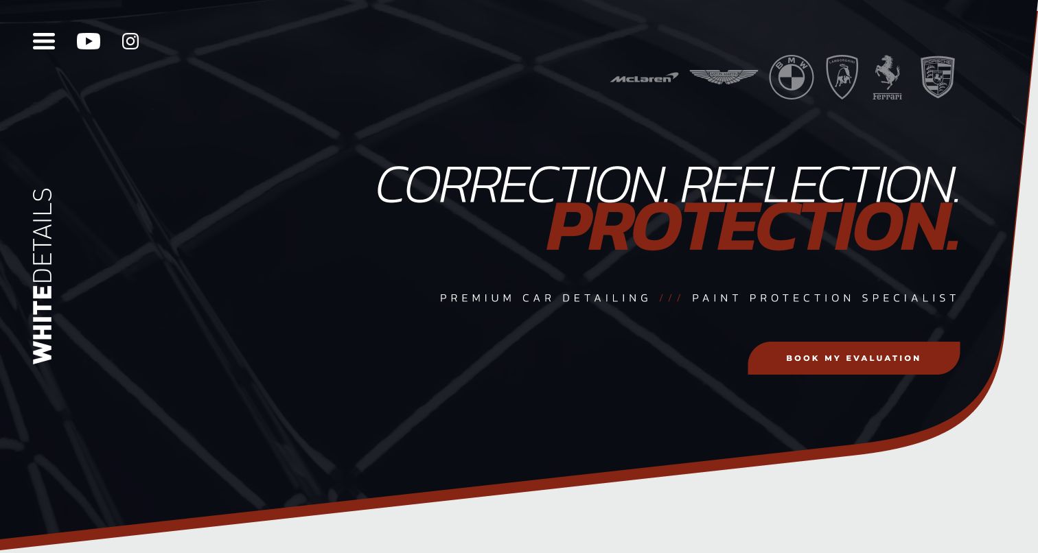
White Details builds a recognizable identity from italic typography, dark studio imagery, a red accent and a single evaluation invitation. The body shifts into a personal voice, explaining the Lincolnshire studio, client updates and the difference between a new-car detail, correction and its comprehensive named service. Detailed video case studies give the work more context than a gallery of glossy bonnets. The contact section asks for vehicle condition and desired service while acknowledging that response and lead times vary. This is a coherent specialist presentation: a visitor is encouraged to discuss the car rather than buy a supposedly universal transformation. Social follower and performance claims remain the business's own representations.
What you can learn
Make a personal studio distinctive through the way it explains judgment and communication, not just a dramatic logo. Name what an evaluation establishes and show work that illustrates different starting conditions. Keep essential service descriptions on the site even when longer case studies live on video platforms.
Pros
Distinct service descriptions explain new-car preparation versus correction
Personal communication and evaluation have a specific role in the process
Cons & considerations
If visitors do not open the compact menu, detailed service routes are initially hidden
When case studies move to external video, accessible text context still needs maintenance
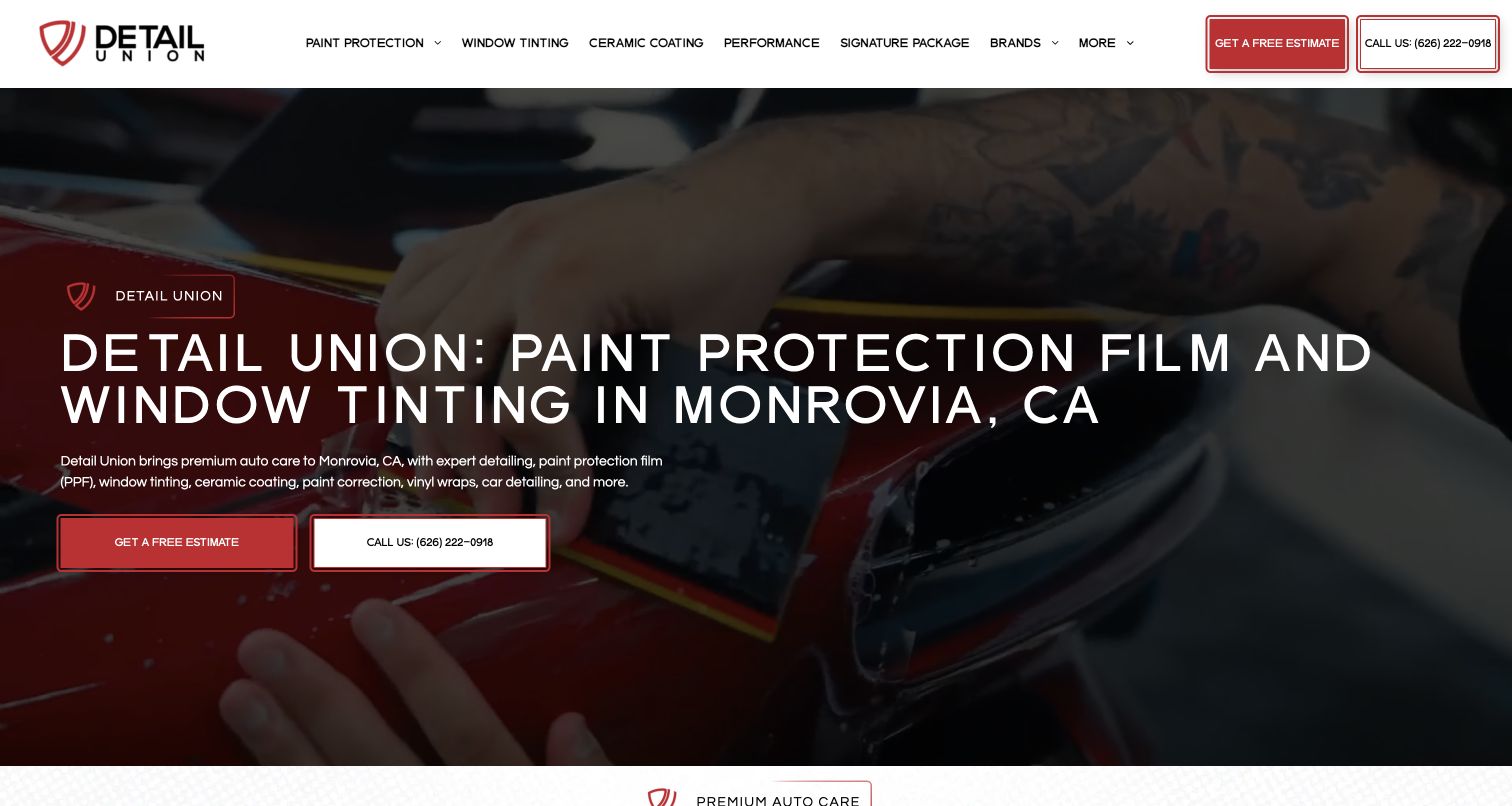
Detail Union names Monrovia in a large opening headline and pairs an estimate with a direct phone action over footage of hands-on work. Its extensive navigation separates film types, tinting, coatings, detailing and correction, then adds vehicle-specific pages. Service cards repeat the main choices with clearer visual grouping below the hero. The body explains the studio's local coverage and asks for year, make, model and the requested service before quoting. This is a useful example of making a technically broad offer discoverable, although the large headline prioritizes film and tint over ordinary detailing. Product-brand statements and installer credentials should be verified with their relevant sources rather than inferred from the menu.
What you can learn
Use service categories that reflect genuinely different work and explain unfamiliar abbreviations before asking a driver to choose. Vehicle-specific pages should add relevant detail rather than duplicate the general pitch. Preserve a straightforward interior-and-exterior option for customers who do not need a full protection package.
Pros
Location and phone contact are explicit in the opening
Separate correction and detailing destinations avoid collapsing every service into coatings
Cons & considerations
If every vehicle and film variant gets equal menu weight, navigation becomes dense
When protection leads the hero, basic detailing may be harder for newcomers to spot
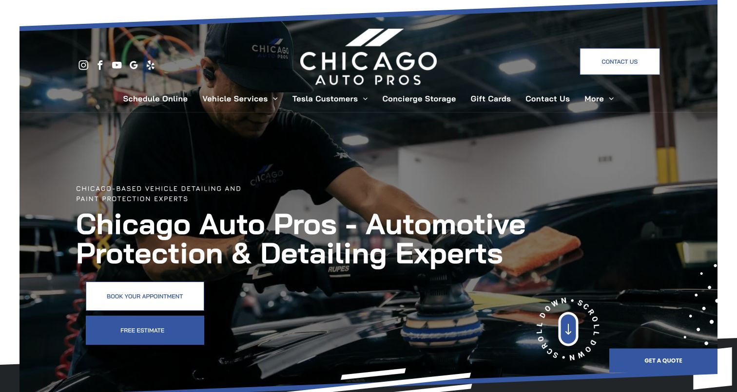
Chicago Auto Pros frames its opening with angled blue edges, workshop imagery and a substantial wordmark. Booking and a free estimate are separate actions, while the menu includes vehicle services, Tesla-specific information and concierge storage. The service structure distinguishes packages, exterior work and interior work rather than treating every visit as paint protection. Location-specific review routes and contact details support the regional operation. An opening-location promotion appeared during the first visit; the later capture shows the main introduction unobstructed. The reusable idea is the clear separation between choosing a known service and asking the shop to assess a need, not an assumption that a prominent appointment button alone makes booking easy.
What you can learn
Label appointment and quotation paths according to what they actually do. A driver who knows the package can move toward scheduling, while someone comparing correction and protection may need a conversation first. Keep location choice and service context consistent between these routes.
Pros
Estimate and appointment actions suit different readiness levels
Interior, exterior and package-detailing routes are separately named
Cons & considerations
If launch promotions cover the hero, routine service choices become a second step
When many vehicle-specific pages share navigation, location selection can lose priority
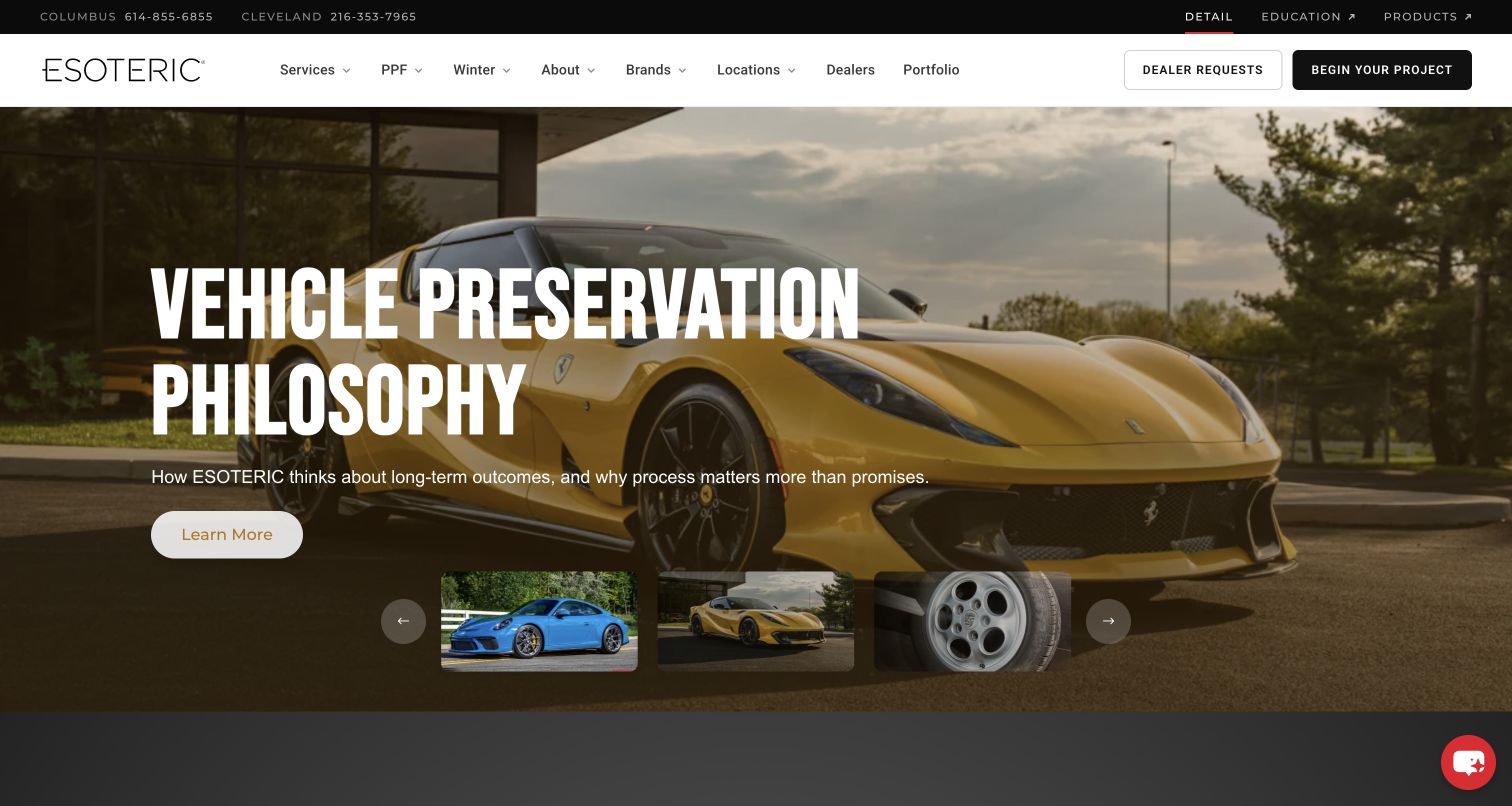
ESOTERIC separates Detail, Education and Products in a slim brand bar, preventing the service homepage from masquerading as a shop. A photographic story carousel introduces topics such as winter preparation, storage-season projects and preservation philosophy. The main navigation retains services, locations, dealer work and portfolio, with a dedicated project action. Below, film, coating and tint modules explain their roles before the broader detailing content. The presentation is particularly specific to the Ohio operation and its seasonal context. Its specialist language is compelling for enthusiasts but asks the site to keep a basic service explanation visible for less experienced owners. Business scale and product-performance statements were not independently established here.
What you can learn
When retail, training and services share a brand, label the boundaries at the top and keep enquiries on the correct side. Seasonal content should lead to a maintained service description rather than replace it. Provide a stable introduction for visitors who arrive on a different carousel slide.
Pros
Service, education and retail destinations are explicitly differentiated
Seasonal project stories give concrete reasons to explore the work
Cons & considerations
If essential meaning changes with carousel slides, visitors can receive inconsistent introductions
When enthusiast terminology dominates, ordinary owners may need plainer service labels
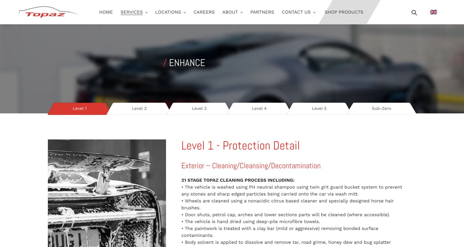
Topaz's Enhance page presents service levels as a horizontal tab strip, with Level 1 selected in the capture. The detail panel combines an illustrative wash photograph with a clearly named protection detail, timing and starting-price context, followed by separate exterior and interior scopes. Crucially, the text explains that this level does not include paint correction. The page therefore provides a concrete comparison surface beneath the broader prestige brand. FAQs and a callback or booking request follow. A support panel initially occupied the right side and was absent in the cleaner final capture. Prices, durations and treatment claims belong to the provider and should be checked against the current page, not treated as enduring quotes.
What you can learn
Make package differences operational: preparation, correction, protection, interior scope and expected time. Explicit exclusions can prevent more confusion than another luxury adjective. Ensure all levels remain accessible with a keyboard and on a narrow screen, and keep a comparison summary available outside the active tab.
Pros
The selected level states its purpose and explicitly excludes correction
Interior and exterior work are described separately
Cons & considerations
If level names are only numbers, users must inspect several panels to understand the hierarchy
When chat overlays are expanded, they can cover comparison content
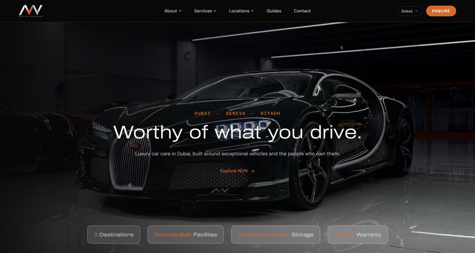
NVN's Dubai page uses a very dark vehicle photograph, a narrow orange accent and a short central statement. Dubai, Geneva and Riyadh are named in the introduction, but the page identifies its local car-care offer and provides Dubai contact information. Service modules separate film, detailing and care, tint, windscreen protection and storage. Workshop and lounge routes add context about the facility, while FAQs explain the operation in ordinary terms. The site is deliberately restrained compared with the dense package menus elsewhere in this collection. That restraint works best for a visitor already attracted to the specialist positioning; a person comparing an ordinary detail still needs to follow the service explanation.
What you can learn
Keep the city-specific offer explicit when a luxury brand spans locations. Explain storage, detailing and protective installation as separate responsibilities, and give each a clear detail destination. Aspirational copy should not be the only way to understand what the studio actually does.
Pros
The actual Dubai property and contact routes are identifiable
Care and storage are separate from protective-installation services
Cons & considerations
If contrast depends on a dark photograph, different crops need independent testing
When the opening stays minimal, scope and pricing context require additional navigation
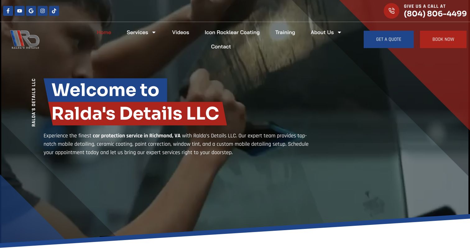
Ralda's Details uses red and blue graphic panels over footage of detailing work and names Richmond in the introductory copy. Quote and booking controls are separated, while the body explains mobile care and then walks through cleaning, preparation and protection. Service entries distinguish detailing, coatings, film, correction, tint and mobile setup work. Training and video content have their own navigation routes, making the business broader than a simple appointment page. That breadth needs careful explanation because a consumer seeking a clean car and a professional seeking a mobile setup are different audiences. The site's protective and restoration claims are marketing content, not findings about the outcome of any treatment.
What you can learn
State whether the work comes to the client or requires a studio visit before discussing products. Where training or setup services share the brand, distinguish their audience and destination. Keep quoted package scope separate from a general description of the shop's complete process.
Pros
Mobile delivery and Richmond coverage are explicit
Consumer services and training have identifiable navigation routes
Cons & considerations
If mobile setup is presented beside ordinary detailing, the intended audience can be unclear
When quote and booking differ, their follow-up expectations need precise labels
Fresh Layer opens with a restrained photograph, San Diego service statement, phone number and online-booking action. Below, it explains its mobile setup and presents a large package catalogue with starting prices and expandable price, duration, benefit and add-on information. Interior, exterior, complete and maintenance work are named separately. The self-contained-equipment explanation addresses a practical mobile-service question that a glossy photograph cannot answer. A first-time-customer promotion appeared on the initial visit; the final capture shows the simpler hero. Because the catalogue is extensive, maintaining differences between similarly named express, premium and complete packages is as important as the visual polish.
What you can learn
For mobile service, explain location suitability, equipment needs and how vehicle condition changes the quote. Package cards should use consistent fields so customers can compare like with like. Give recurring maintenance its own conditions and keep price and duration visible before the external booking step.
Pros
Practical mobile-equipment information supports the convenience promise
Package records distinguish scope, duration and optional additions
Cons & considerations
If many similarly named packages remain, comparison can require substantial expansion
When promotions appear over the hero, the simple booking route is temporarily interrupted
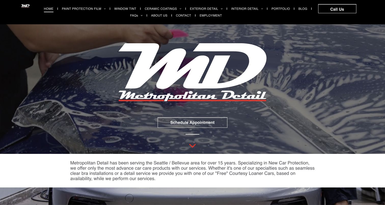
Metropolitan Detail places its large monogram over film-installation footage and offers one appointment action. The dense black navigation distinguishes exterior detailing, interior detailing, protective films, coatings and FAQs. Under the hero, the introduction identifies the Seattle and Bellevue area and qualifies courtesy-loaner availability. Separate modules explain new-car protection, restoration and cabin cleaning, while an express hand-wash destination is clearly linked as a related operation. This is an example where the underlying service structure is more informative than the brand-heavy first screen. Product-family names in the menu can assist knowledgeable clients, but beginners may need to start from the simpler service modules.
What you can learn
Let customers choose the task before the product brand: interior cleaning, exterior restoration or protection. Keep related express operations clearly identified so a client knows where the appointment will take place. State conditional conveniences such as loaner availability as conditions, not as universal inclusions.
Pros
Interior and exterior work have independent service destinations
The express wash is distinguished from the main studio experience
Cons & considerations
If the monogram dominates the first screen, local scope appears only after scrolling
When branded coating variants lead navigation, inexperienced customers may struggle to compare them
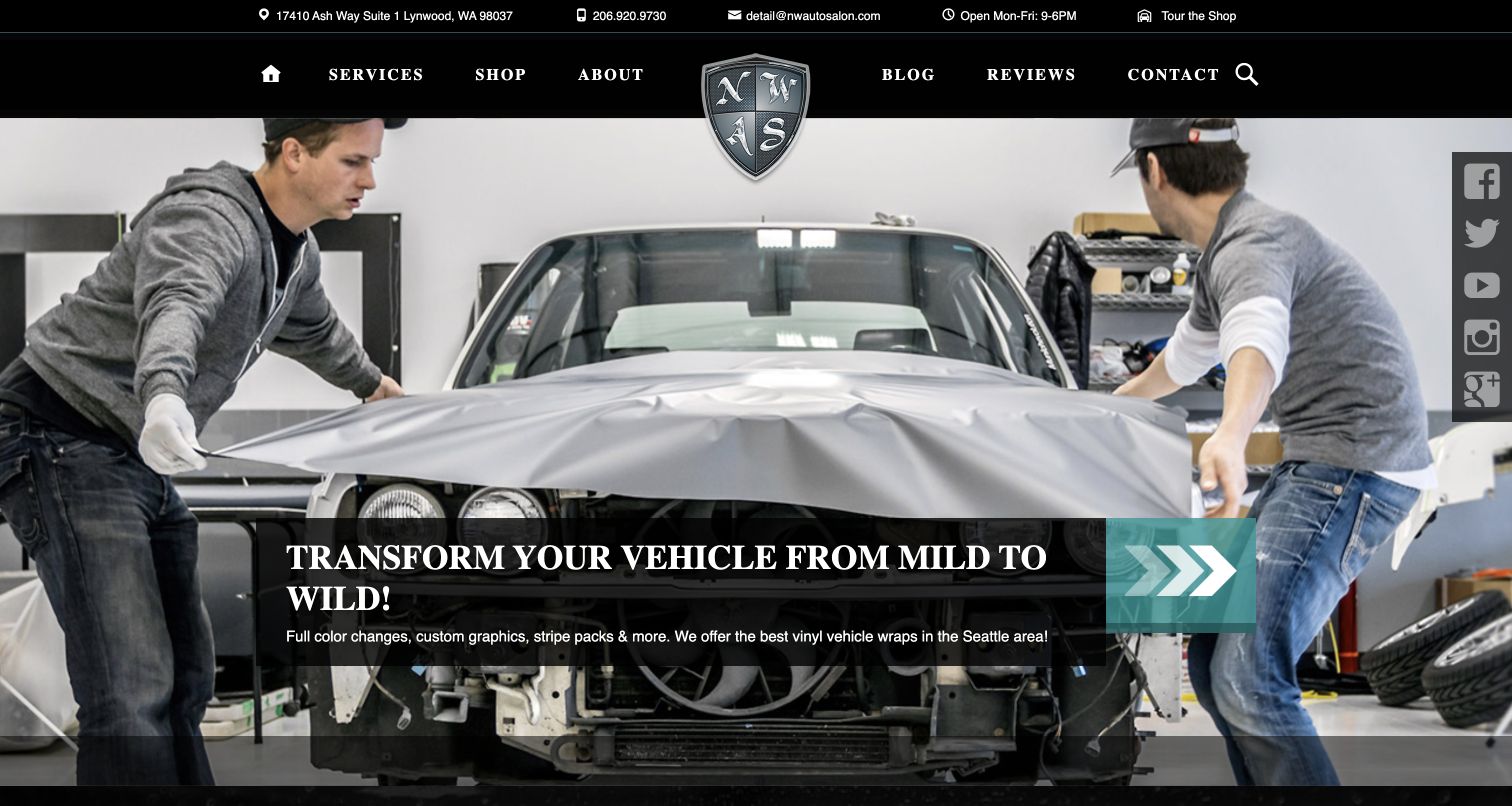
NorthWest Auto Salon opens with a photograph of technicians applying a wrap, making the work itself the focal point. Address, telephone, email, hours and a shop-tour route occupy a slim utility bar. The compact main menu separates services, shop, company information, blog, reviews and contact. Supporting sections describe detailing, wrapping and reconditioning, while feature-car links supply a longer work record. The practical utility strip is the strongest reusable choice: it answers how to reach the business without competing buttons or a form. The displayed daily-update links also show why publishing labels need review; several visible entries were historical rather than evidence of a daily current feed.
What you can learn
Use real process imagery to explain craftsmanship, and pair it with the basic visit information clients need. Date a project archive honestly instead of calling an old feed current. Separate retail from service enquiries and keep the workshop tour optional rather than a barrier to understanding scope.
Pros
Hours and contact information are visible before scrolling
Process photography shows an actual kind of work rather than only a finished car
Cons & considerations
If an archive is labeled daily updates, old entries can create a misleading freshness impression
When wrap imagery leads, detailing customers may need clearer service-specific shortcuts
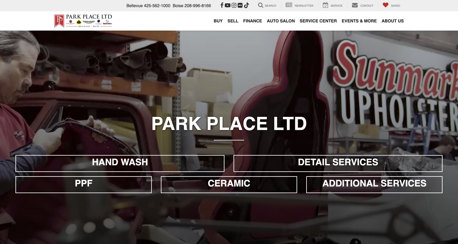
Park Place's Bellevue Auto Salon page keeps the parent dealership navigation but gives salon visitors five large service links: hand wash, detail services, film, ceramic and additional work. Workshop footage sits behind these choices. Below, the page describes the customer lounge, appointment expectation, vehicle types and Seattle-area coverage. The exact salon page is important here; the dealership's vehicle-sales homepage would not show the same task. This is a useful nested-service pattern, although the parent menu still asks a detailing client to ignore buying, selling and finance controls. The service copy supplies useful context but is lengthy, and product or restoration assertions remain the business's representations.
What you can learn
When detailing is one division of a larger business, give it a stable landing page and its own visible service navigation. Preserve clear parent-brand identity without forcing a visitor through vehicle inventory. Make appointment requirements and the actual salon location explicit before the booking destination.
Pros
Large salon-specific links distinguish wash and detailing from protective treatments
The page explains the on-site experience and appointment requirement
Cons & considerations
If dealership navigation remains dominant, a service visitor can drift into sales journeys
When lengthy coverage prose repeats place names, practical package comparison becomes harder to scan
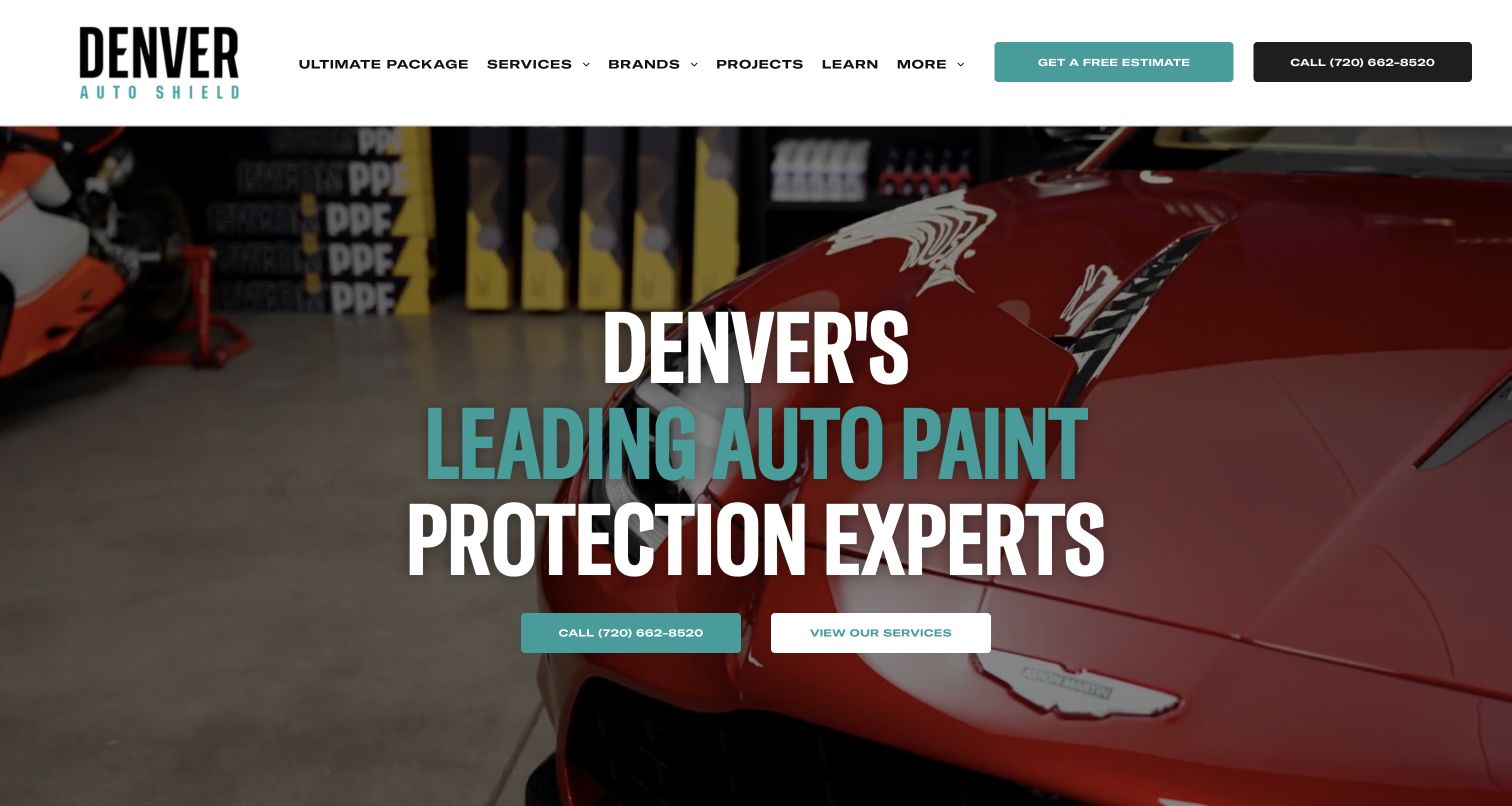
Denver Auto Shield introduces a local protection service with oversized condensed lettering, a teal accent and hands-on workshop footage. The menu separates service types, vehicle brands, projects and a learning destination. Below, a numbered service grid and a dedicated aftercare-products route connect preparation and installation with later maintenance. The body explains its chosen product system and distinguishes paint correction from film or coatings. This is useful structure for a protection-led shop, not evidence that every product claim is established. The direct phone action remains separate from the estimate route. Drivers seeking an ordinary interior clean may need a different provider, so the specific protection focus should not be obscured by a broad detailing label.
What you can learn
Explain the difference between changing paint appearance, applying a film and applying a coating. Connect each to appropriate care instructions instead of treating the sale as the end of the relationship. A learning route can support comparison without requiring a visitor to complete a quote form first.
Pros
Learning and aftercare are explicit parts of the public structure
Correction, coatings and film have separate destinations
Cons & considerations
If the page is described as general detailing, its specialist scope can be misunderstood
When brand-system claims dominate, ordinary service inclusions need equally plain explanation
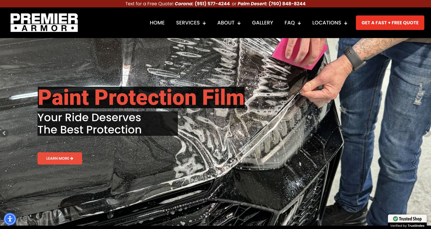
Premier Armor uses a close view of film installation behind a short service message and a red learn-more action. The top strip provides separate text-for-quote contacts for Corona and Palm Desert, while locations, services, gallery and FAQs remain in the main menu. The body distinguishes film, tint and ceramic installation with individual explanatory cards and later gives both facilities' contact details. This is a protection-installation business rather than a general wash page, and its specific scope is the relevant lesson. The opening shows work in progress, giving the visitor more process context than a static supercar portrait. Film, durability and warranty statements require their own current provider terms.
What you can learn
If a shop has multiple facilities, make the relevant contact and appointment destination unambiguous. Process photographs can show what the customer is buying, but pair them with scope and maintenance explanations. Use consistent call-versus-text labels so a phone action does not unexpectedly open a message composer.
Pros
Separate facility contacts make local routing concrete
Service cards distinguish the three main installation categories
Cons & considerations
If text and call labels are inconsistent, the contact action can surprise a visitor
When guarantees appear in service copy, current conditions must remain easy to inspect
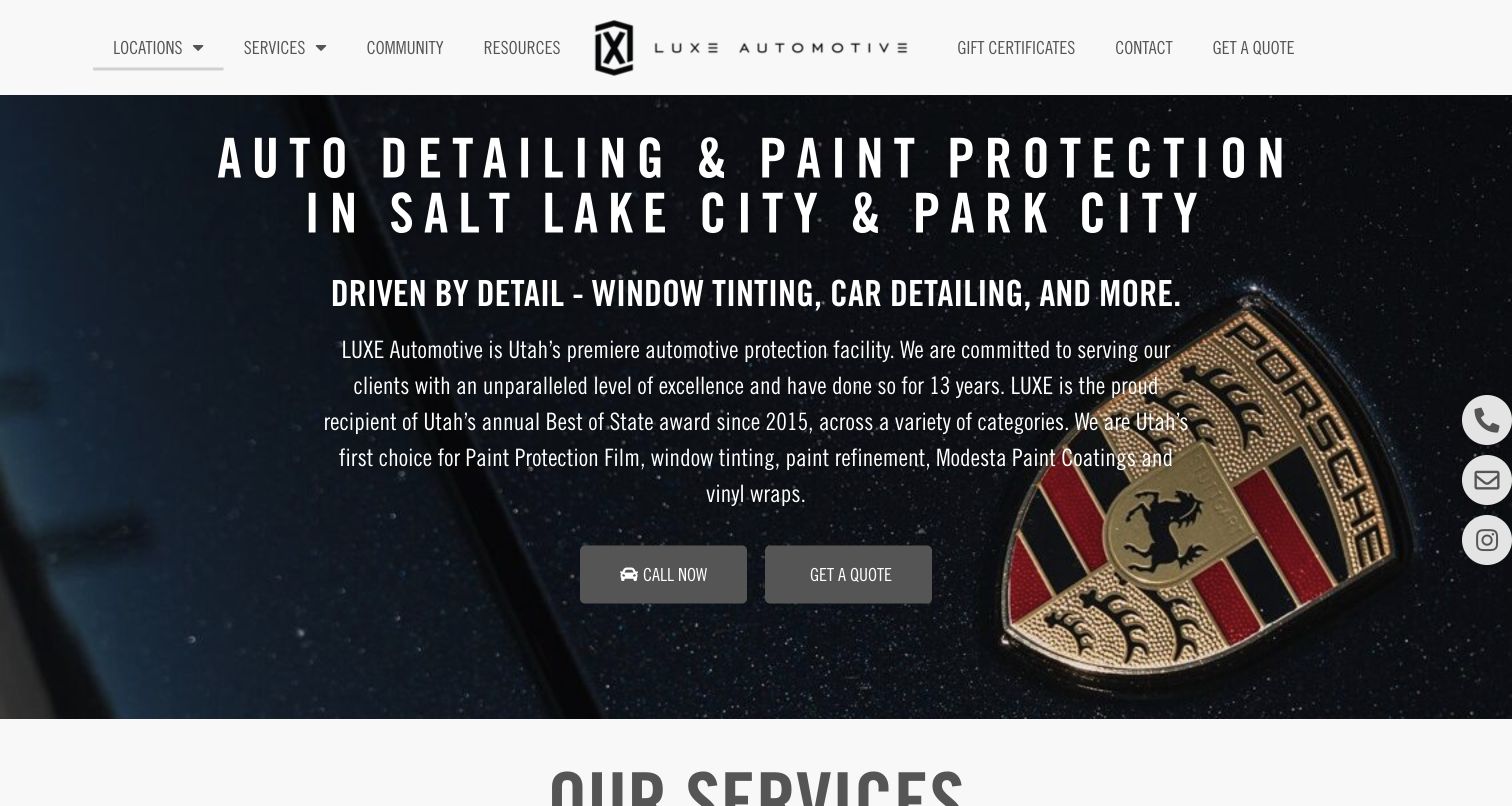
LUXE Automotive names Salt Lake City and Park City in its opening and uses narrow display type over a close vehicle-badge photograph. Call and quote controls offer two straightforward next steps. The body introduces the team and separates client resources from the service catalogue; the resources description specifically names FAQs and aftercare. The two location blocks provide their own addresses and contacts. This makes the regional operation and continuing client relationship visible without requiring an account. Award language is prominent in the introduction, so the design depends on keeping date and source context current. It is a useful brand structure, not an independent confirmation of those awards or treatment outcomes.
What you can learn
Use a shared visual identity while keeping each studio's practical details specific. Place aftercare alongside FAQs as a normal part of the service, not only in a private handover email. For a first-time visitor, make the difference between a quote request and an appointment clear.
Pros
Both operating cities and their contacts are explicitly presented
Aftercare has a public resource destination
Cons & considerations
If condensed display type is used for long paragraphs, reading becomes tiring
When award claims lead the page, service scope can receive less initial attention
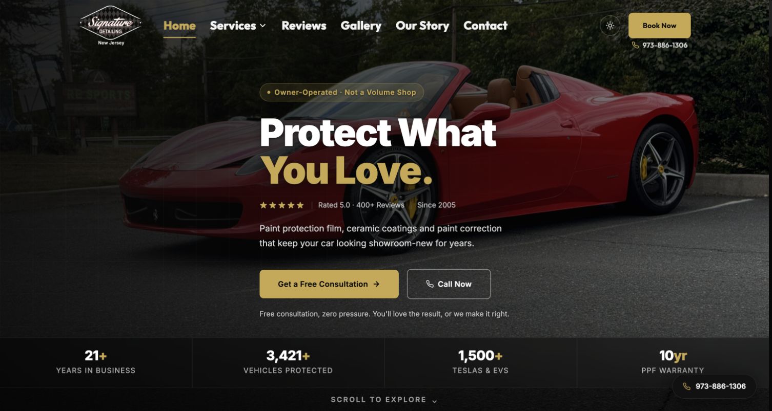
Signature Detailing NJ combines gold accents and a dark vehicle photograph with an explicit owner-operated statement. Consultation and phone actions lead into distinct film, coating, correction and EV service modules. A half-corrected-panel illustration explains a visible difference more concretely than another general gloss claim. The page then provides a seven-step process, an owner portrait and shop details. This makes the small-studio positioning tangible through the way the service is described. Statistics, certifications and guarantees are extensive and remain claims to verify separately; the design lesson is the connection between personal responsibility and a documented process rather than the numbers themselves.
What you can learn
If an owner personally oversees work, explain where that involvement occurs: consultation, assessment, installation review or handover. Show the assessment and care stages rather than presenting protection as a single product application. Keep any satisfaction promise separate from product warranty conditions.
Pros
Owner involvement is tied to specific stages of the service
A correction illustration and process outline support education
Cons & considerations
If numerous counters and certifications compete, the main service choice can become secondary
When a broad guarantee is repeated, its practical resolution process needs clear terms
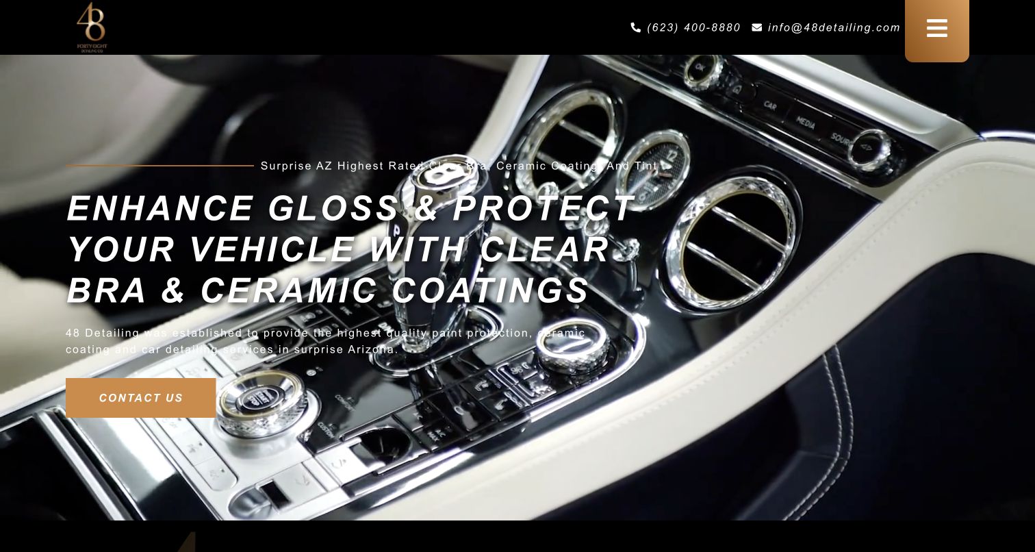
48 Detailing uses gold accents, a compact contact strip and a large protection headline over interior vehicle footage. The main navigation is collapsed behind a prominent menu icon, while one contact action leads the hero. Below, testimonials, a service area and workshop address, telephone and opening hours provide the operational information. A work carousel supplies visual examples, and the footer names ordinary car detailing separately from film, coating and tint. The page is a compact local entrance rather than an exhaustive comparison tool. Its highest-rated language and product statements are not independently verified here; the useful relationship is between a strong local identity and a plainly stated physical location.
What you can learn
A short homepage can work if the service routes and visit details remain easy to find. Do not make a visual menu icon the only route to basic package information. Give rotating work examples captions that identify the treatment, so visitors do not confuse interior footage with the scope of every appointment.
Pros
Phone, email and physical workshop details are easy to locate
The compact layout keeps one contact action visually dominant
Cons & considerations
If desktop navigation stays collapsed, service discovery requires an extra action
When the service catalogue loads lower down, the hero alone does not explain inclusions
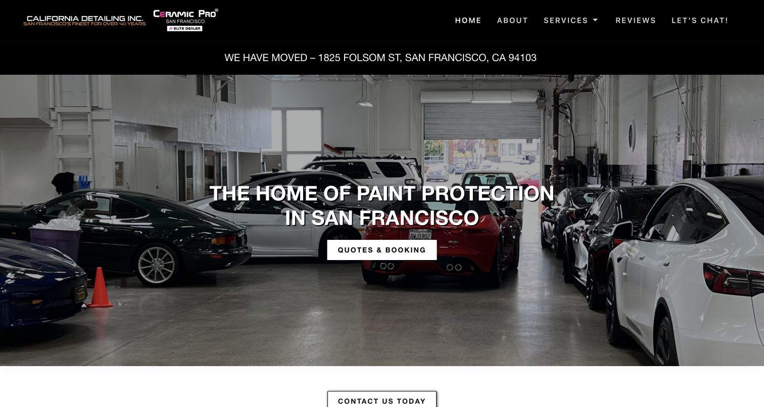
California Detailing places its moved-address notice directly beneath the navigation, a useful priority for a location-dependent service. A workshop photograph anchors the San Francisco headline and quote-or-booking action. The next grid separates Tesla services, film, coatings, tint, interior, exterior, wheels and motorcycles. Owner contact and the current address repeat in the footer. This is a restrained, direct structure in which practical information is allowed to outrank decorative storytelling. The captured shop image also shows a range of vehicles rather than suggesting the business only accepts exotics. Review excerpts support the page's own sales message, but their presence is not independent evidence of current service quality.
What you can learn
When an address changes, update the main notice, contact page, footer and booking instructions together. Keep interior and exterior service routes explicit for ordinary customers. A clear studio photograph can establish context without loading a background video or adding unnecessary animation.
Pros
The relocation notice is visible before a visitor chooses a booking route
Interior, exterior and motorcycle work have separate destinations
Cons & considerations
If a moved notice has no review date, it can remain prominent long after the transition
When quote and booking share a destination, explain whether the next step confirms anything
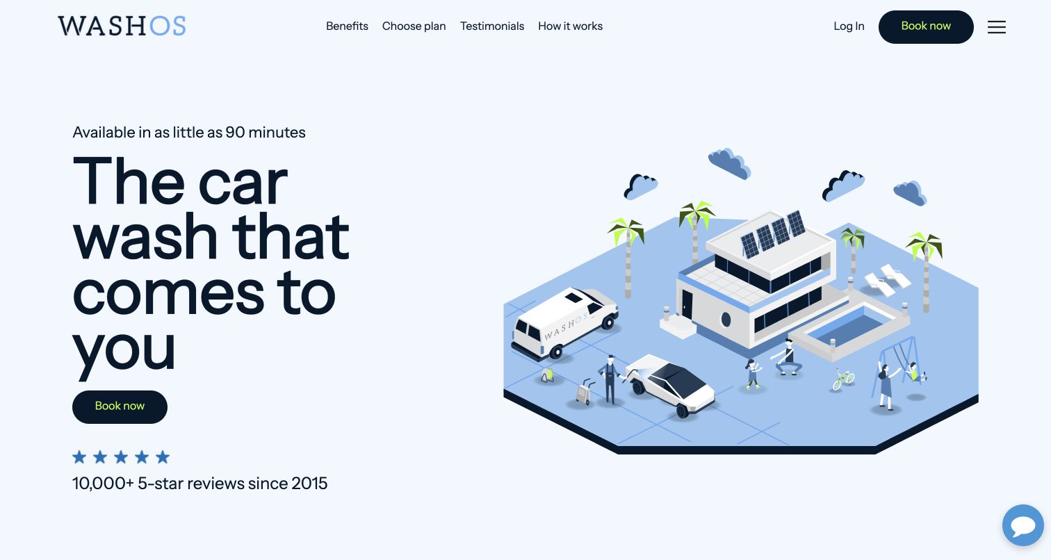
Washos uses a pale background, oversized plain-language headline and isometric neighborhood illustration instead of the dark supercar aesthetic common in this collection. A single booking action is reinforced by links to benefits, plans and how the service works. County-level availability appears on the page, alongside a postcode check and separate package descriptions. The process explanation identifies booking, the detailer's arrival and later feedback. This makes the mobile model understandable without an app download as the first action. The displayed arrival-time and review claims are the platform's own promises and should be checked for a specific market; the design review does not validate local availability or booking outcomes.
What you can learn
Explain the delivery model before asking a visitor to register. Keep area coverage and package scope available publicly, and distinguish membership pricing from one-off service. An illustration can clarify logistics, but actual service details need text equivalents and a route to support.
Pros
Illustration and headline communicate mobile delivery immediately
Locations, package plans and process have explicit public routes
Cons & considerations
If rapid-arrival claims are universalized, customers may misunderstand local availability
When member and one-off prices are displayed together, conditions need clear visual separation
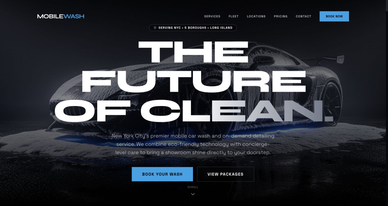
The observed MobileWash page identifies New York City, the five boroughs and Long Island, then uses very large futuristic typography over a stylized vehicle image. Booking and viewing packages are different actions. The long page separates interior work, protection, correction and other services, then adds memberships, corporate fleets and service areas. This broad scope gives several audiences a route, although it also creates a large volume of technical, environmental and operational claims to govern. The review describes the page as it actually appeared, not the company's historical positioning. Its important design contrast is the attempt to separate one-vehicle care from fleet procurement; the numbers and service-performance claims were not independently established.
What you can learn
Household and fleet clients need different information, so separate the service journey before the form. Define what a membership includes and how recurring frequency differs from an individual detail. Use real, attributable work examples where possible, and keep broad capability claims tied to current documented scope.
Pros
Packages and booking are offered as different levels of commitment
Fleet work has its own explanatory section rather than a hidden checkbox
Cons & considerations
If oversized typography dominates, practical coverage information can fall below the first view
When many technical claims span the page, editorial review becomes difficult to keep consistent
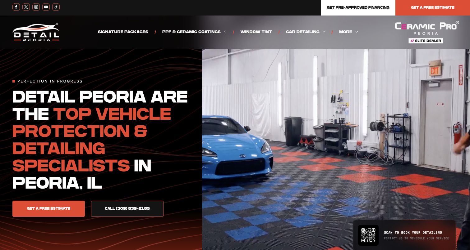
Detail Peoria uses a split hero: a text-led black panel on one side and footage of the working studio on the other. Estimate and telephone actions remain together, while a QR invitation adds another booking route. The navigation separates full, interior, exterior, maintenance and correction services beneath the broader protection offer. The body explains the Peoria operation and its enclosed pickup service, then links vehicle-specific project entries. This connects the visual service to the logistical question of how a client leaves a vehicle for longer work. The broad radius and transport claims should be confirmed with the shop rather than assumed for every booking.
What you can learn
For multi-day work, explain drop-off and transport options early, including coverage and conditions. A project gallery is more useful when each entry identifies the vehicle and treatment. Keep an ordinary clickable booking link alongside a QR code; people reading on their own phone should not need a second device.
Pros
Transport logistics receive a specific public explanation
Service navigation separates maintenance from more intensive correction
Cons & considerations
If QR codes duplicate ordinary links, they can consume scarce hero space
When a large vehicle catalogue enters the menu, the basic package choice needs strong hierarchy
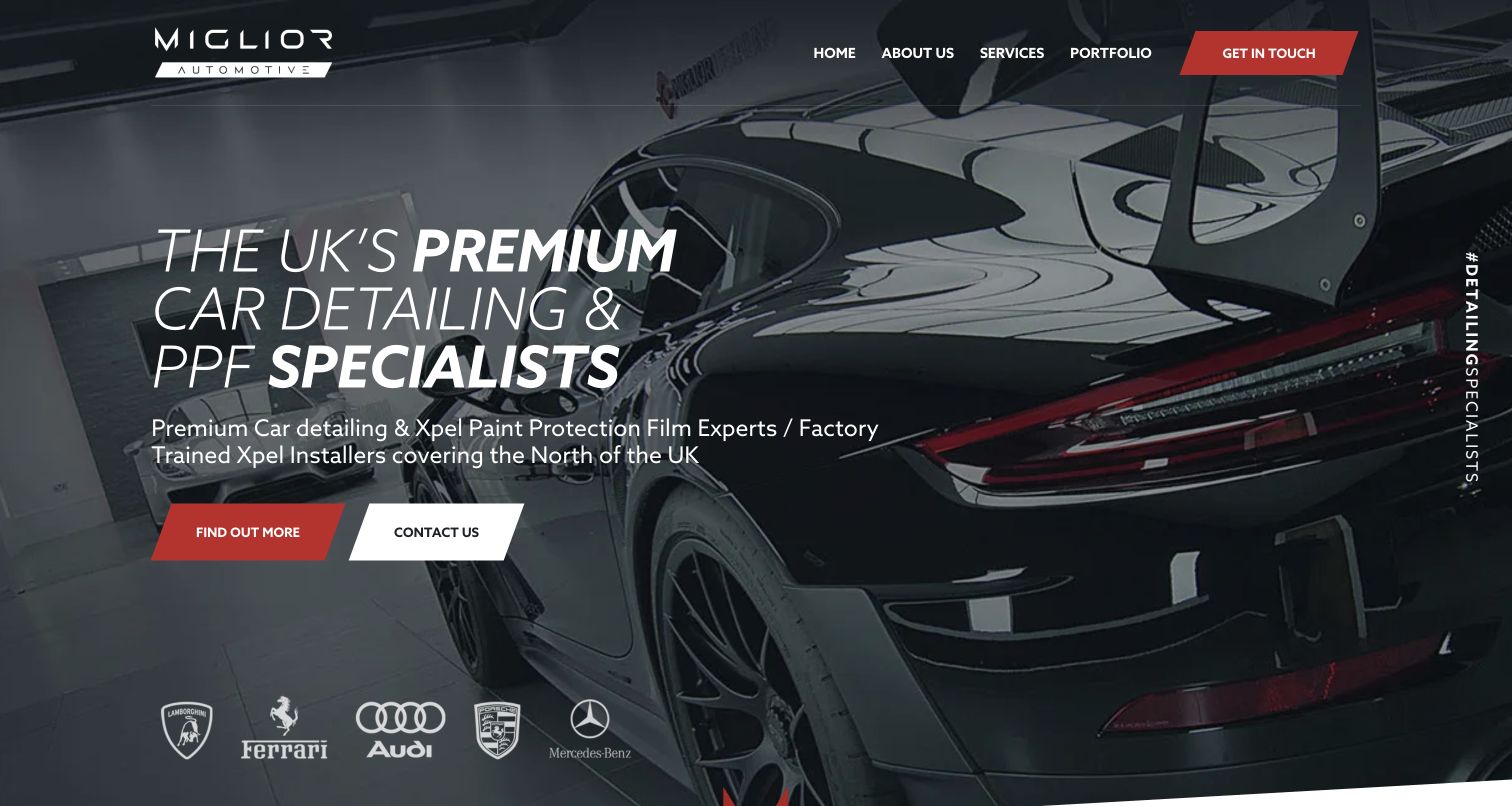
Miglior Automotive uses a simple five-item header, red-and-white actions and a close finished-car photograph to introduce its North-of-UK specialization. The single-page body groups new-car protection, film, correction, protection details and maintenance before presenting a featured Porsche project. That project description names preparation, decal removal, polishing and film application, giving the image a clearer service context. Contact remains consistent throughout rather than changing between several booking systems. The site also describes the physical studio and links more work through its social feed. Its premium positioning and product-performance statements remain business claims; the reusable pattern is focused navigation supported by a specific job story.
What you can learn
Use a featured assignment to explain the sequence of work and why those stages were chosen. A small studio does not need dozens of top-level pages if each service has enough scope information and a dependable contact path. Keep social work supplementary so the core portfolio remains useful without external feeds.
Pros
Compact navigation keeps the regional specialist offer coherent
A featured project explains work rather than showing only the final shine
Cons & considerations
If services remain headings without individual scope detail, comparison may require a conversation
When social feeds carry most recent work, external loading and content choices affect the page
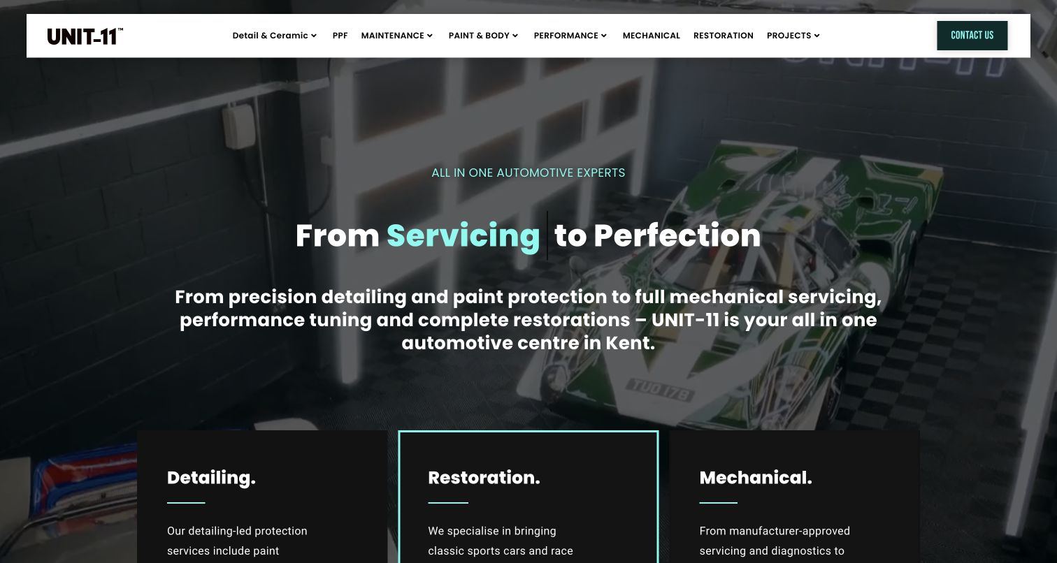
UNIT-11 introduces its Kent center with teal accents, workshop footage and an animated service word. The fixed supporting sentence explains detailing, servicing, tuning and restoration even when that word changes. Three substantial cards then divide detailing, restoration and mechanical work, while the menu provides more specific treatment routes. A short footer gives telephone, contact and workshop information. This is a useful example of keeping detailing identifiable inside a broader automotive business rather than presenting the whole operation as one cleaning package. The animated introduction is visually active, but the permanent text carries the essential meaning. Technical and manufacturer-approval claims require their own verification beyond this design inspection.
What you can learn
When several disciplines share a workshop, separate them by outcome and responsibility. A detailing customer should not have to understand tuning or mechanical servicing to ask for paint care. Keep the essential service statement static and explain which work belongs to specialist staff or external partners.
Pros
Three discipline cards clarify an otherwise broad automotive offer
Fixed supporting copy remains understandable while the animated word changes
Cons & considerations
If many disciplines share a menu, an ordinary detailing request can feel overcomplicated
When animation supplies key wording, reduced-motion and loading states need deliberate design
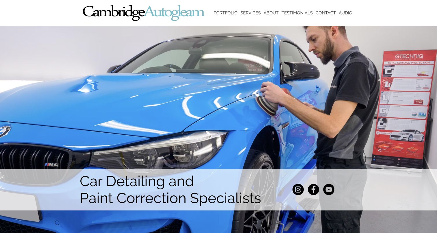
Cambridge Autogleam puts a technician polishing a vehicle at the center of the opening, with a light caption band and a restrained wordmark. The body introduces the Cambridge studio and separates video, portfolio and service sections. Service records consistently present a purpose, expected duration and starting price for new-car, protection, enhancement, correction and maintenance work. Related services identify named external providers rather than implying everything is performed by the same team. This makes it one of the more useful comparison structures in the collection. Current prices and duration still require provider confirmation, but the repeated fields show how to make package differences easier to inspect.
What you can learn
Use the same fields for every service so a customer can compare purpose, time and price context. Identify partner-delivered work clearly and explain the handoff. A process photograph can communicate expertise without relying on manufacturer badges or a montage of expensive cars.
Pros
Service entries use consistent purpose, duration and starting-price information
Partner services are named rather than silently absorbed into the studio's scope
Cons & considerations
If the long single-page structure grows, jumping between portfolio and packages can become cumbersome
When prices and durations appear in several entries, they require coordinated review
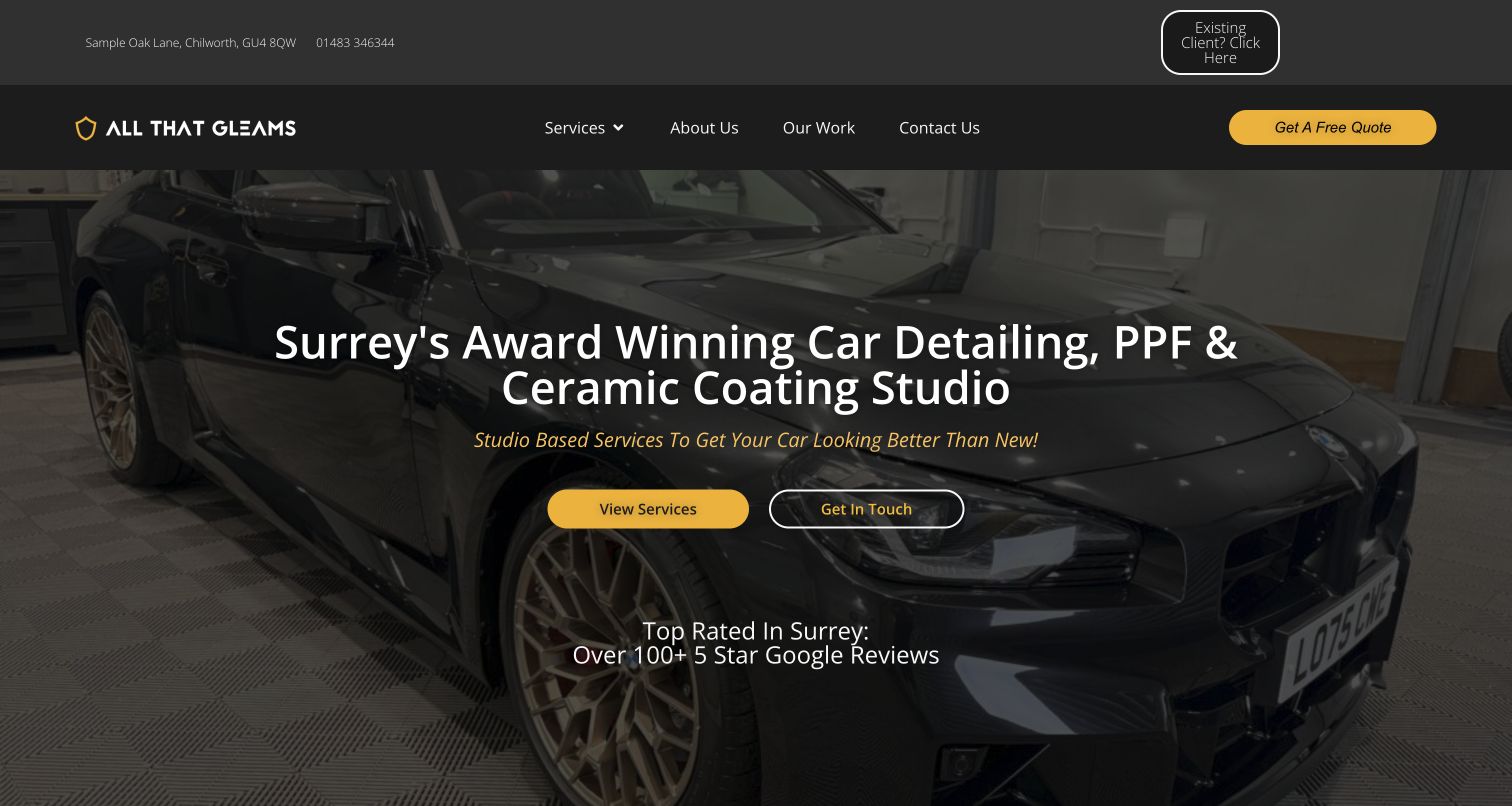
All That Gleams uses yellow actions against dark workshop imagery and identifies Surrey in the hero. A utility strip offers an existing-client portal separately from the new quote route. The service grid names detailing, film, coatings, soft-top care, engine cleaning and new-car preparation, with some starting-price context. Later content explains the workshop, project coordination and a tour, giving visitors ways to understand where the work occurs. This is a clear lifecycle distinction for a service with repeat customers. It also illustrates a maintenance burden: age-of-business statements and dated new-car references across the page need regular editorial checks so the detailed catalogue does not contain conflicting context.
What you can learn
Give repeat clients a recognizable route without asking them to start a new sales enquiry. Explain what the studio performs directly and what it coordinates with third parties. Review time-sensitive vehicle references and longevity claims together rather than updating only the hero.
Pros
Existing-client access is distinct from the new quote request
Specialist tasks such as soft-top care receive their own explanations
Cons & considerations
If dated model-year language remains, an otherwise current catalogue can appear neglected
When long trust sections repeat, practical package differences can be pushed down the page
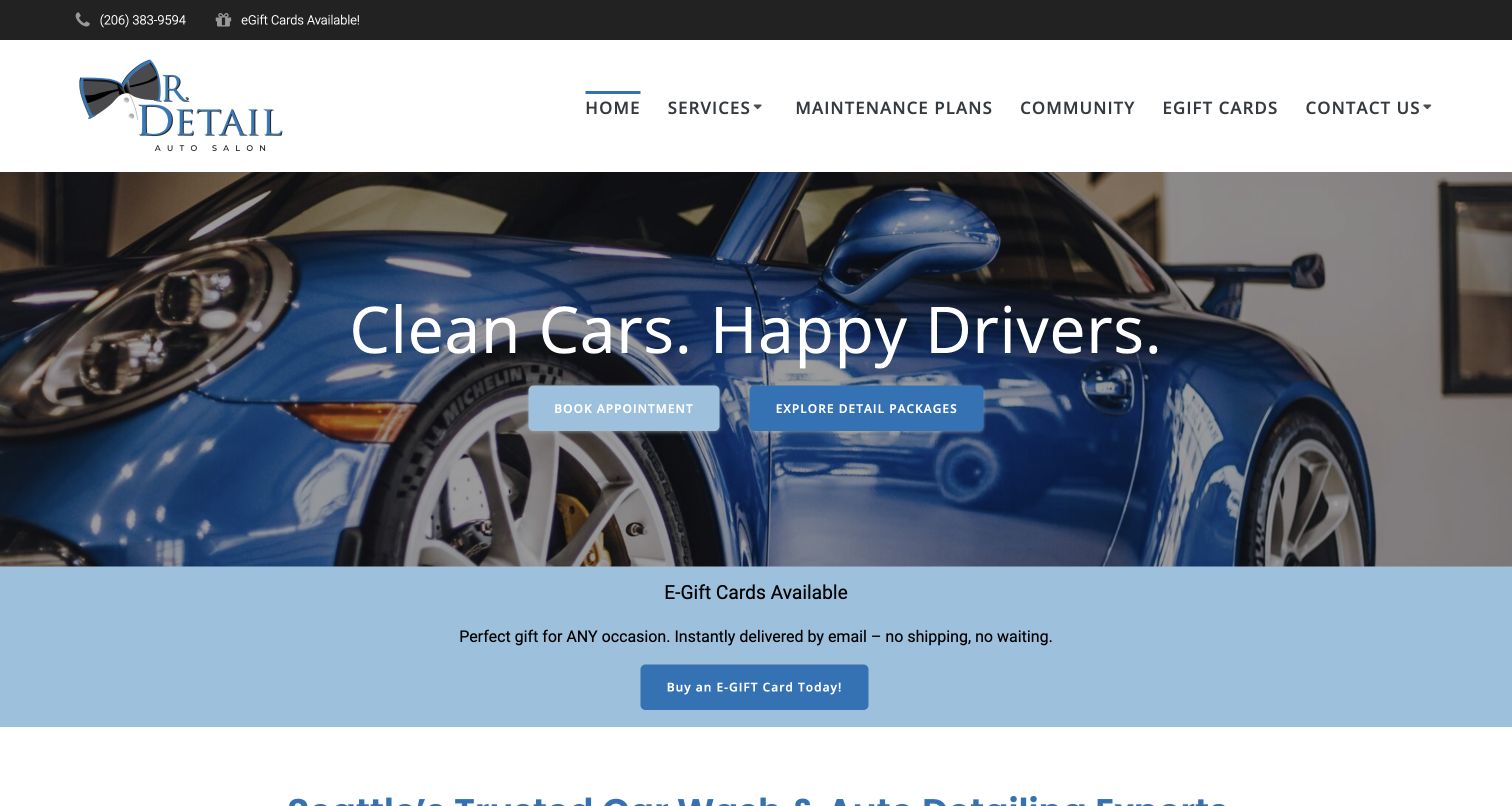
Mr. Detail Auto Salon pairs a blue vehicle photograph with a short service headline and two clear routes: book an appointment or explore packages. The main navigation distinguishes maintenance plans and the contact area, while the service menu separates interior, exterior, correction, coatings and other work. The body explicitly includes ordinary washes and daily-driver care, making the offer less exclusively exotic than many protection-led examples. Location routes identify the Seattle branches, and community content gives the owner a specific local connection. Gift cards and promotions occupy additional space but do not replace the package entrance. Service-quality and outcome statements remain the firm's own claims.
What you can learn
A local salon can be distinctive without making its service menu intimidating. Preserve a simple package-exploration path before scheduling, and distinguish routine upkeep from correction or protective installation. Keep branch choice and appointment destination aligned, especially when the scheduler is hosted by another provider.
Pros
Booking and browsing packages are visibly different actions
Ordinary wash and interior needs are not hidden behind protection terminology
Cons & considerations
If gift-card and discount modules accumulate, the basic service explanation moves down
When several branch pages share an external scheduler, location context needs testing
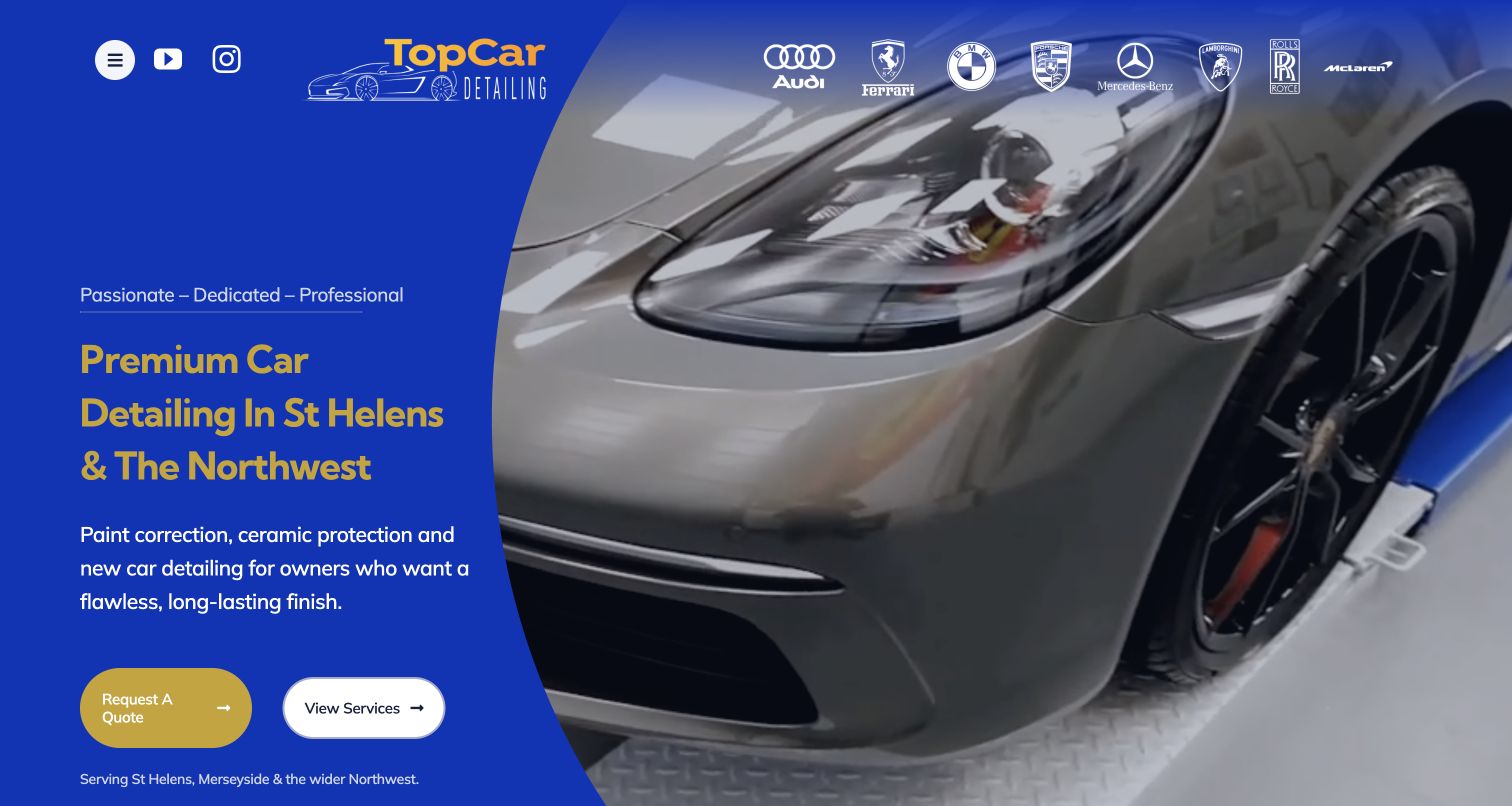
Top Car Detailing uses a bright blue-and-gold composition, a large curved image boundary and St Helens positioning to distinguish its page. Quote and service exploration remain separate in the opening. The body offers an evaluation, then explains correction, coatings, new-car work and styling through a tabbed service section. Longer video case studies are linked as evidence of the process, rather than leaving the visitor with only review excerpts. The visual style is unusually bold for a local specialist and contrasts with the dark minimalist studios elsewhere in the collection. Brand badges and service-performance language are provider claims, not an independent reason to expect the same outcome for every vehicle.
What you can learn
Explain why a vehicle needs evaluation before selecting correction work. Use case studies to show starting condition, chosen scope and limitations, not only a reveal shot. Keep tabs understandable with descriptive labels and ensure core content remains readable when videos are not played.
Pros
Local coverage and evaluation are clear parts of the offer
Descriptive service tabs support comparison before enquiry
Cons & considerations
If gold text is placed on saturated blue, contrast needs careful validation
When much evidence lives on video platforms, a concise text case-study summary remains important
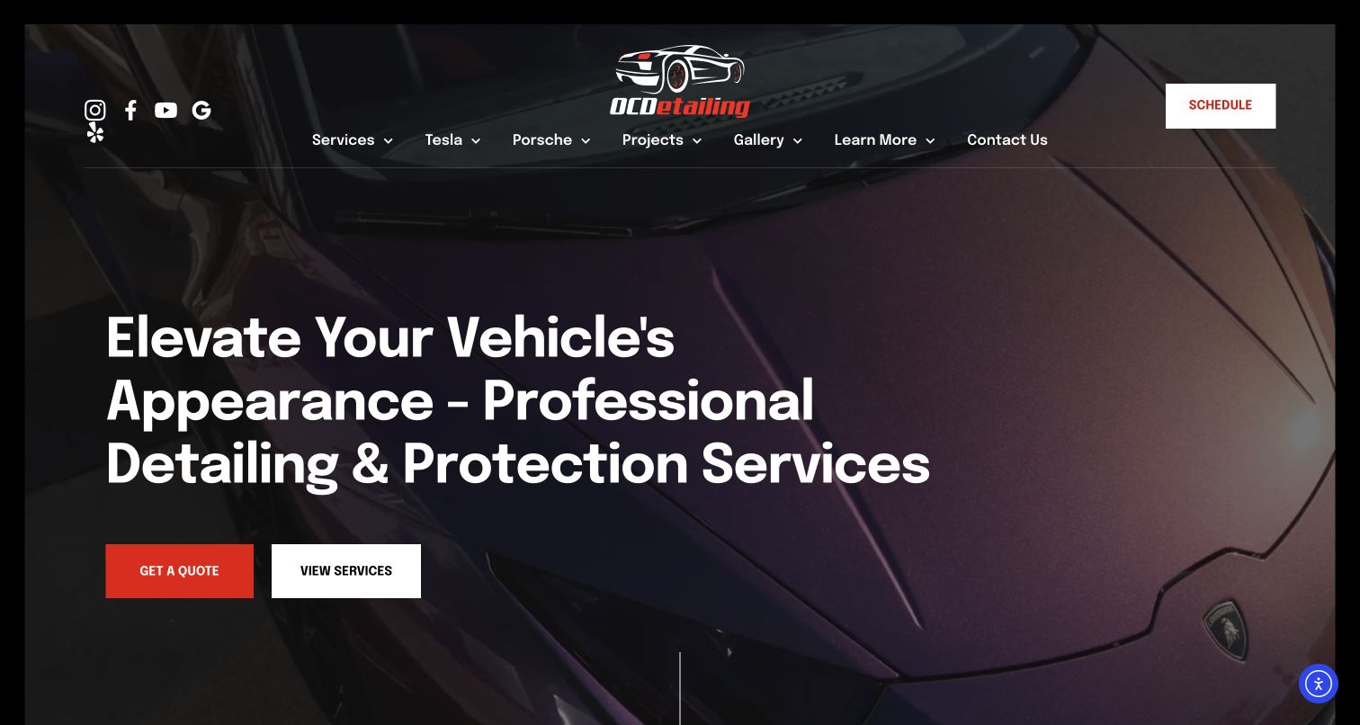
OCDetailing uses a red-and-white service action over a vehicle image, with Tesla, Porsche, projects and galleries visibly separated in the menu. The body identifies the San Francisco Bay Area and Silicon Valley, then explains film, coatings and tint through dedicated modules. The footer provides the Fremont workshop and aftercare, photo and video routes. This makes a specialist's work accessible through either treatment or vehicle interest. The actual public destination is bayareadetails.com, which is recorded here rather than assuming the older entry domain remained the displayed site. The broad list of served cities should not obscure that the work is associated with a particular studio and appointment process.
What you can learn
Vehicle-specific navigation should add relevant technical or project context, while generic service pages remain available to everyone. Keep the real studio location explicit when regional pages cover many cities. Preserve aftercare and project archives through brand or domain changes so returning customers can still find them.
Pros
Projects and service types offer two useful ways to explore the work
Aftercare and the actual Fremont studio are explicitly linked
Cons & considerations
If numerous city pages dominate, visitors may confuse service coverage with physical locations
When vehicle categories expand, the menu needs restraint to avoid duplication
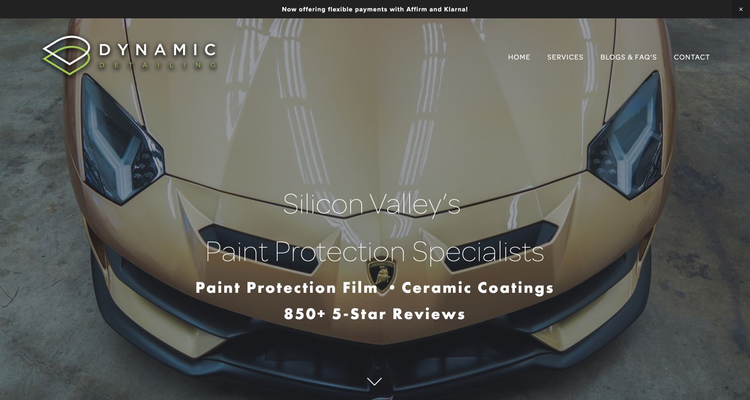
Dynamic Detailing opens with a large vehicle image and a specific Silicon Valley protection statement. The body explains the business's move from general detailing into protection services, then asks which protection service suits the visitor. Film and coatings receive parallel benefit lists and links, followed by an optional combined package. The personal origin story and practical comparison work together: one establishes the studio, the other helps a customer ask a better question. Review totals, warranty periods and turnaround statements are substantial business claims requiring current terms. The useful design is the side-by-side explanation, not an inference that a coating and a film provide interchangeable protection.
What you can learn
Explain what different treatments are intended to address and where their scopes differ. A comparison should name limitations as well as benefits, and any combined package should still list its components. Keep educational content accessible without first selecting finance or entering personal details.
Pros
The page explains its current protection specialization rather than relying on its historic name
Parallel service explanations give customers a comparison framework
Cons & considerations
If benefits are listed without limitations, users can assume the products are substitutes
When review and timing claims repeat, maintaining their current context becomes harder
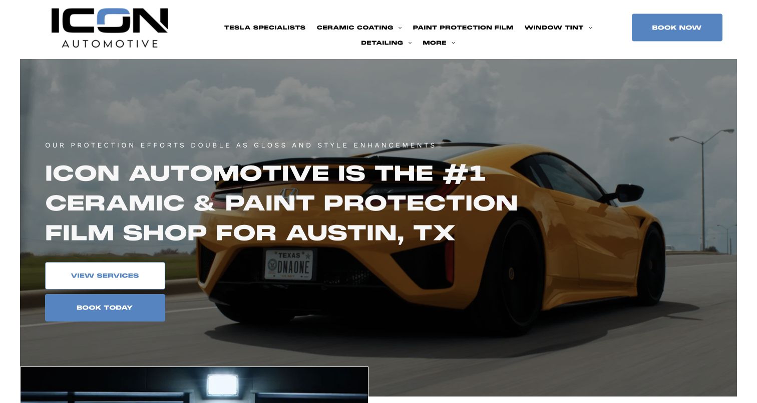
The observed authenticdetails.com page presents ICON Automotive Austin, with a large current wordmark, a protection headline and service or booking actions. Its menu still gives full detailing and maintenance detailing distinct routes alongside coatings, film and tint. The body explains nearby service areas and offers a preliminary quote path, then introduces each treatment category with a dedicated link. This is a useful example of a real brand transition: the domain and some image descriptions retain the older name while visible content uses ICON. The design review records the actual current branding rather than relabeling it from the URL. Technical and ranking assertions remain attributed business statements.
What you can learn
When changing a studio's brand, update visible labels, contact details, image text and external booking destinations consistently. Retain stable service routes and explain recurring maintenance separately from intensive detailing. A quote button should say whether the following step is a starting estimate request or a confirmed appointment.
Pros
Full-detailing and ongoing maintenance are separately navigable
Service exploration remains available before the quote form
Cons & considerations
If older brand references remain in supporting content, visitors can question whether they are in the right place
When a Book Now label opens a quote request, the expected outcome needs clarification
Kegan is a freelance web designer and developer with 15+ years of experience helping businesses turn complicated website requirements into clear, maintainable digital experiences. He works directly with clients from planning and design through development, launch, and ongoing support.
For auto detailing website design, his development approach focuses on service and package comparisons, genuine vehicle photography, studio or mobile coverage details, and clear booking or quote journeys. The scope can be a targeted improvement or a complete custom build, with responsive layouts, thoughtful content structure, and integrations chosen around the people using and maintaining the site.
Show 3 other auto detailing website designersHide other auto detailing website designers
Plan a detailing website around the car, the service and the visit
Define the actual service scope
List what the team performs directly, what it coordinates with partners and what it does not offer. Separate routine care from corrective or protective work. Have qualified staff approve product, technical and outcome explanations instead of copying supplier slogans into every package.
Create a consistent package record
For each service, record purpose, inclusions, exclusions, vehicle assumptions, likely time and how condition affects the quote. Identify whether published prices are starting points or fixed packages. Review the catalogue as a whole so similarly named options have understandable differences.
Design evaluation and booking as different actions
An assessment or quote request is not a confirmed appointment. Explain what information is needed and what the business does next. Give people a contact option if they are unsure which service fits, and keep essential scope information accessible without submitting a vehicle photograph.
Document studio and mobile logistics
Maintain the physical location, opening or appointment hours, drop-off instructions and coverage. Explain mobile setup requirements and weather or access limitations through the business's actual operating policy. Where transport or loaners are offered, state the conditions rather than implying automatic inclusion.
Build an honest project library
Record the vehicle, broad starting condition, chosen work and a concise explanation of the result. Get permission for identifiable client material, obscure personal details when needed and distinguish concepts or stock imagery from completed work. Use text summaries alongside video case studies.
Review claims and test the complete interface
Assign sources and review dates to credentials, ratings, warranties, promotions and timing statements. Check navigation, package comparison and external booking transitions on small screens and with a keyboard. Test privacy panels, chat and promotion overlays together, without submitting real bookings or payment details.
The editing job behind the design
Choose tools around package publishing, appointments and private client information
The public site should make service scope easy to maintain while the operational system handles availability, confirmations and private customer records. Choose a package content model before a visual theme. Document the handoff to any external scheduler or quotation tool, and keep its brand, location and service labels consistent with the public page.
Large video backgrounds and social feeds are optional; clear package records, contact details and aftercare should work without them. Client vehicle photographs, registration details and appointment records need appropriate privacy handling. Public technology evidence identifies only observed components, not a complete operational stack or proof that a booking system is secure.
Our WordPress website examples offer a separate look at publishing approaches. A visible platform label is evidence for that named page, not a guarantee that the same system will suit your requirements.
Before the public launch
Auto detailing website planning checklist
State the studio location or genuine mobile coverage.
Distinguish cleaning, correction and protective installation.
Use consistent fields for every package.
Name exclusions and vehicle-condition assumptions.
Explain starting prices without implying a universal quote.
Separate evaluation requests from confirmed appointments.
Describe mobile access, equipment and weather policies.
Qualify pickup, loaner and storage availability.
Give project photographs service and condition context.
Provide usable text-based aftercare instructions.
Keep ratings, warranties and credential sources current.
Test forms, keyboard use, small screens and overlapping panels without real submissions.
These checks are a project checklist, not a performance, legal, security, or accessibility certification. Test real journeys with the people responsible for the website before making claims about the result.
Sources & editorial method
How this collection was selected and reviewed
The twenty-nine examples follow the saved collection target, not a ranking of detailers or an exhaustive survey. Official public homepages and the specifically labeled Topaz and Park Place service pages were directly inspected and captured on the recorded UTC date. Actual redirects and current visible brand names are retained. Error, unrelated and coming-soon candidates were excluded. Reviews describe a visible design pattern, a practical lesson and conditional tradeoffs; they do not verify treatment performance, customer satisfaction or product durability. Editors Choice is an explicit local-specialist design selection, not a vote result or service-quality award. Technology labels remain empty unless separately supported by public evidence.
Each example links to its actual source page. Screenshots are direct browser captures with their own capture dates; moving imagery, announcements and live designs can change. The notes describe observable design choices and conditional tradeoffs, not measured traffic, conversion results, service quality, or accessibility conformance.
Technology labels use public page metadata, asset evidence, or explicitly cited platform documentation. Platform documentation is not a complete current deployment audit. A component reference may be legacy or unused; it is not a complete backend inventory. Unknown stacks are omitted. These sites are editorial examples, not our client portfolio.
Written, Edited and Curated are separate editorial records, not timestamps advanced by a rebuild. Website designs and imagery belong to their owners. See our editorial standards or suggest a correction.
Questions worth asking
Auto Detailing website design questions
What should an auto detailing homepage explain first?
Identify where the work happens and the main service types. A visitor should understand whether the business offers routine cleaning, corrective work, protection, mobile service or a studio visit. Then provide package exploration and a clearly labeled enquiry or booking route.
Should detailing prices be published?
Useful price context can help customers compare, provided it states package scope, vehicle assumptions and how condition changes the quote. Starting prices should not look like confirmed totals. Keep the service page and scheduler consistent when prices or inclusions change.
How should paint correction, coatings and film be presented?
As different services with different purposes, preparation and care requirements. Use plain descriptions before product brands and avoid suggesting one makes another unnecessary in every case. Have the shop's qualified staff approve technical claims and limitations.
What information matters on a mobile detailing website?
Coverage, appointment process, site suitability, equipment requirements and relevant access or weather policies. Explain what a customer needs to arrange before the detailer arrives. An at-home photograph is not enough to establish that every location is suitable.
How can a smaller detailing studio stand out?
Show a specific process, recognizable work and a clear communication style. White Details uses a personal evaluation approach and detailed case-study routes, while Cambridge Autogleam makes service scope, time and starting-price fields comparable. Borrow the clarity, not unsupported claims or another studio's client work.
A useful detailing website makes the service understandable before showing the shine. Explain scope, location, evaluation and care, then use real projects and a coherent identity to make those practical choices feel distinctive.