Best Car Rental Websites of 2026 (27 Real-World Examples)
Car rental websites that make the first booking decision clear
Explore 27 car rental website examples, with practical lessons for location search, date selection, return rules, fleet navigation and reservation management.
A car rental homepage has to connect a destination with a usable vehicle and a clear set of conditions. Visitors may arrive with an airport code, an unfamiliar city, a need for a replacement car or an existing reservation to change. The best starting point depends on the business: a worldwide network needs flexible location search, while an island operator may need to establish the island before showing an office. This collection brings those approaches together so the form structure can be compared alongside the visual design.
The examples include international brands, regional rental companies and services that combine cars with vans, subscriptions or longer-term hire. Each review examines the public page and its visible first booking step. Scenic photography, campaign artwork and loyalty offers are considered in relation to that task. The collection is design research, not a comparison of rental prices, insurance, vehicle quality or customer service. Those questions require the current terms for a specific location, vehicle and booking.
Before the examples
What makes good car rental website design in 2026?
Begin with the right location model
Decide whether visitors search by airport, city, address, island or branch. A broad network may need flexible suggestions, while a regional service can use a short sequence of dependent choices. Make the pickup and return relationship explicit before dates are submitted.
Keep dates, times and eligibility readable
Group pickup and return consistently, show selected values clearly and explain the date format. Age and residency can affect the available options, so their controls should be discoverable rather than hidden beneath promotional content. Test errors and corrections as carefully as the empty form.
Separate new bookings from existing reservations
Manage, change, extend, check in and obtain a receipt are different tasks. Give them stable names and routes. Returning customers should be able to recognize their next action without starting a new search or opening a generic account menu.
Connect short benefit statements to full conditions
Inclusion, cancellation, mileage and coverage summaries can help visitors understand an offer, but their scope matters. Place the relevant conditions close to the rate or package they describe. Keep discounts, memberships and optional extras distinguishable from the base rental journey.
The collection · 27 examples
27 car rental websites worth studying
Compare the booking hierarchy, location model and visual treatment across these 27 distinct public properties. The order groups useful design patterns; it is not a ranking of rental companies or an endorsement of their offers.
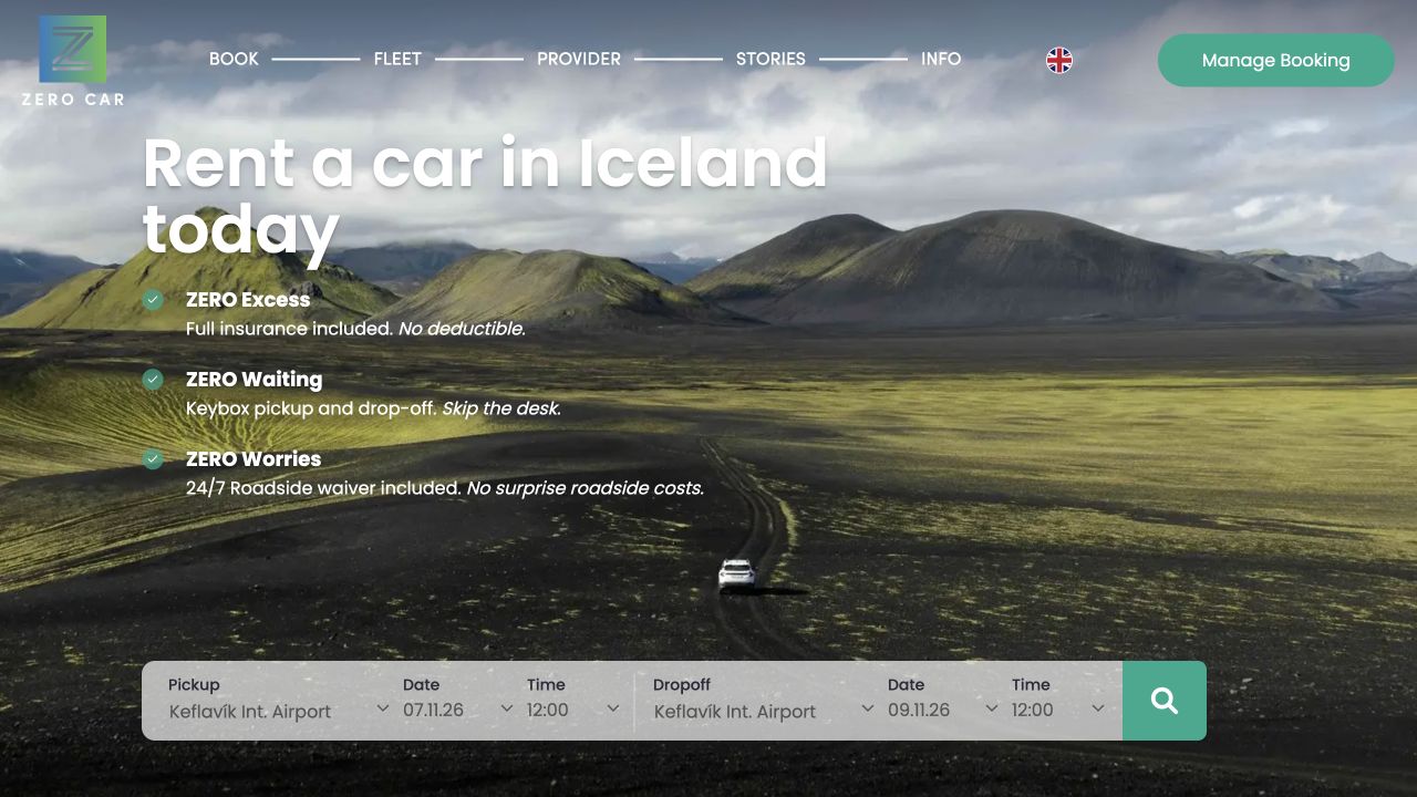
Zero Car combines a recognizable Icelandic landscape with a prominent pickup-and-return form. The page explains booking, arrival and driving as a short sequence, giving a focused regional rental service a clearer first journey than a large international location directory.
What you can learn
Explain the handoff as well as the car. A destination-led opening works best when pickup location, dates, fleet information and arrival instructions are easy to distinguish. A regional car-rental page should distinguish the reservation task from arrival instructions, making both the pickup process and the conditions of the booking easy to revisit.
Pros
The location and booking task are visible together.
A short process explanation gives the rental handoff a clear sequence.
Cons & considerations
Prominent insurance and fee claims need their full terms nearby.
Availability and booking controls need an accessible, reliable fallback when interactive services fail.
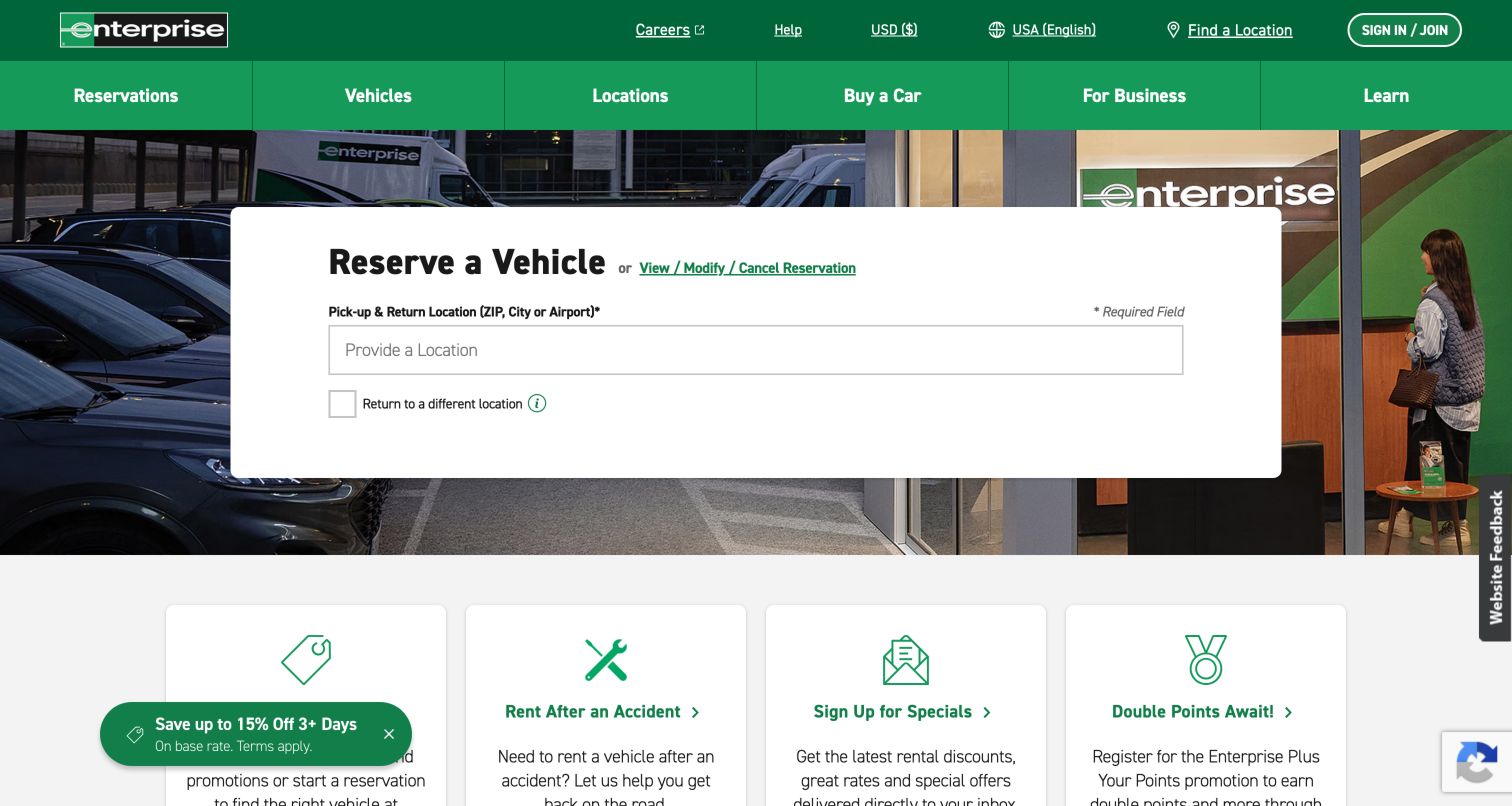
Enterprise centers a wide white reservation card over a photograph of a working rental branch. The initial card asks for a city, ZIP code or airport and includes a separate return-location option, keeping the first decision unusually focused. A nearby view, modify or cancel link serves existing reservations without sending those visitors into the new-booking form. The two green header bands divide utility links from vehicle, location and business categories. Below the photograph, service cards introduce deals, accident replacement and membership. This arrangement makes the physical branch network tangible while retaining a clear first action for visitors who already know where they need a vehicle.
What you can learn
Start with the decision that determines the rest of the booking. Give existing customers a plainly labeled management route beside the new reservation tool, and make later date and vehicle choices understandable when they appear.
Pros
The location field dominates the reservation card without competing date controls.
Branch photography and replacement-rental links connect the site to practical local needs.
Cons & considerations
The initial view does not yet explain the remaining booking steps.
Multiple green navigation bands and a floating offer add competing destinations.
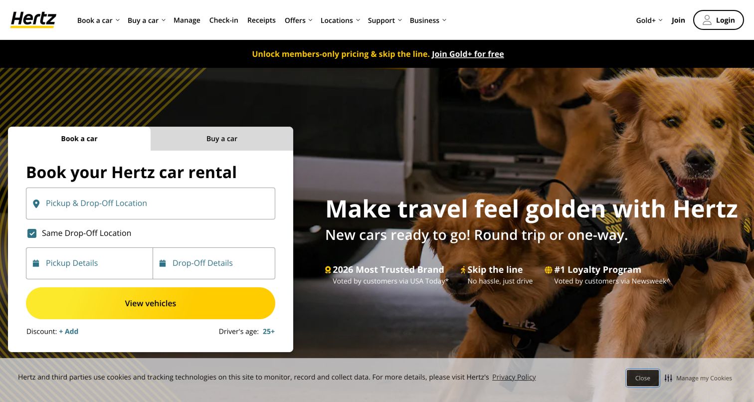
Hertz puts a compact white booking card at the left of a broad photographic hero. Book a car and buy a car appear as separate tabs, making two different commercial journeys visible before the location field. Pickup and return share one input until a different drop-off is needed, while dates sit together below it. A bright yellow vehicle button anchors the form. The adjacent dog-and-car photograph and large seasonal message provide warmth without becoming another form field. The header also separates reservation management, check-in and receipts. This is a useful model for a brand that needs an inviting campaign surface while helping returning renters reach specific service tasks.
What you can learn
Separate related journeys at the top of the tool and preserve a strong action at its end. Keep campaign copy outside the form so the booking labels remain readable even when photography or seasonal messages change.
Pros
The yellow vehicle button creates a strong endpoint for the booking card.
Receipts and check-in have direct navigation labels instead of a single vague account route.
Cons & considerations
The broad header contains many service and marketing destinations.
Collapsed date controls require clear selected-value feedback after visitors make changes.
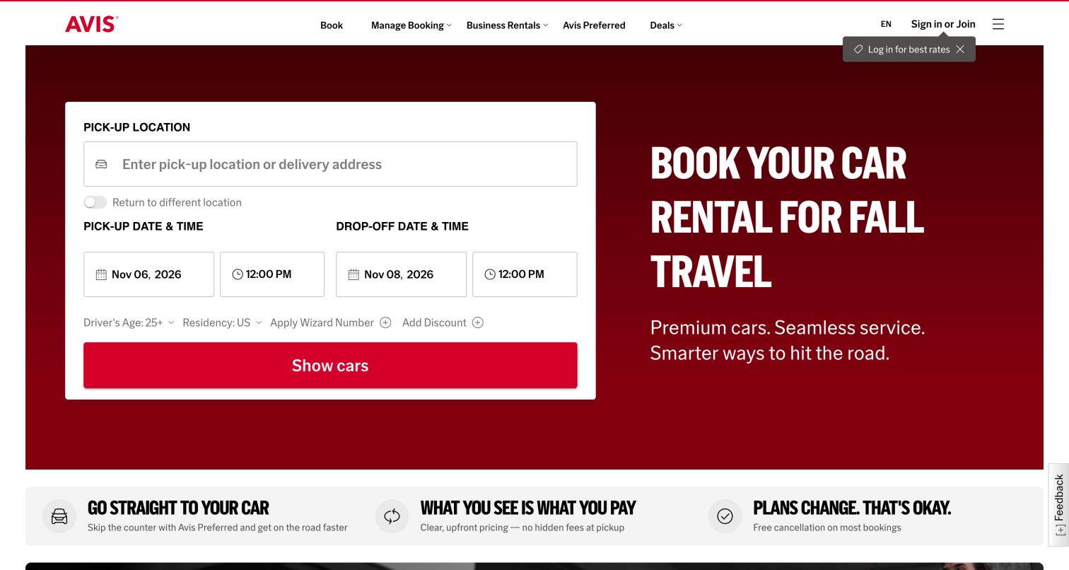
Avis uses a deep red hero split between a white booking form and a large seasonal headline. Pickup location receives a full-width field, with pickup and drop-off dates arranged beneath it in parallel. A return-location toggle remains close to the location input, while driver age, residency and discount options use a smaller supporting row. The red show-cars button spans the card, matching the brand without losing its role as the primary action. Below the hero, a benefits strip begins to explain counter access, price presentation and cancellation flexibility. Those claims function as links and reassurance cues in the design; this review does not independently verify their commercial terms.
What you can learn
Group the first booking decisions in a bounded card and let supporting benefits follow immediately below. Keep optional discounts visually subordinate, but ensure age, residency and return-location rules remain discoverable before visitors request availability.
Pros
The two date groups are easy to compare within the same white card.
The strong headline and form share a clear two-column hierarchy.
Cons & considerations
Small supporting controls can be overlooked beside the full-width action.
Membership prompts near the header add another invitation before booking is complete.
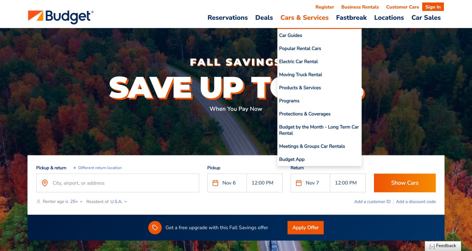
Budget places a horizontal reservation strip below a large autumn photograph and savings headline. The location field leads into pickup and return controls, followed by an orange show-cars button. Age, residency and discount routes sit in a quieter row beneath the main inputs. The captured desktop state also shows the expanded Cars and Services menu, with destinations for electric cars, protection, monthly rental and business uses. This makes the breadth of the service visible, although the dropdown competes with the campaign. A separate promotional strip below the booking tool introduces an upgrade offer. The page demonstrates how a value message can coexist with a complete initial search interface.
What you can learn
Keep the essential search controls together even when a campaign occupies much of the hero. Treat a services menu as a separate navigation layer, and test whether it obscures the main task when opened on smaller screens.
Pros
The horizontal strip exposes location and both date groups at once.
Service navigation gives specialized rental needs their own named routes.
Cons & considerations
Promotions appear in the hero, header and strip below the form.
The expanded service menu covers part of the campaign and narrows visual breathing room.
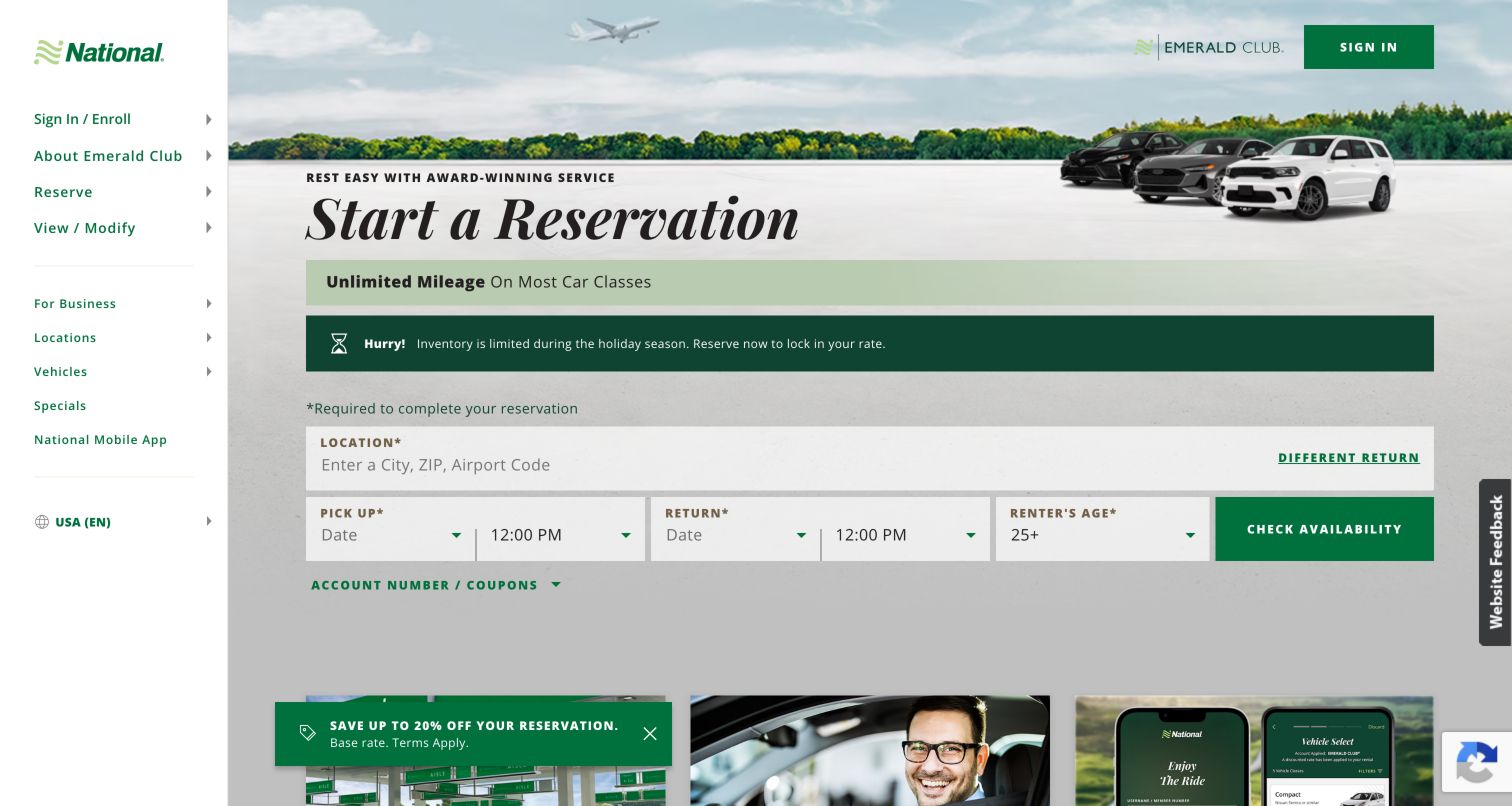
National uses a narrow left navigation rail rather than relying entirely on a horizontal header. Reserve, view or modify, locations, vehicles and business links remain grouped beside the main content. The hero pairs an understated landscape and fleet photograph with a large reservation heading. Beneath a time-sensitive inventory notice, a wide location field precedes pickup, return and renter-age controls. The green check-availability button ends that row, while account and coupon details remain a separate expandable option. This structure feels oriented toward visitors who know the brand and need a fast route to a familiar task. The stable navigation rail is the most distinctive element of the captured desktop layout.
What you can learn
Use persistent navigation when repeated service tasks matter as much as acquisition. Keep the reservation form visually separate from membership and coupon information, and ensure the side rail has a clear compact equivalent on phones.
Pros
The left rail exposes reservation management independently of account enrollment.
Date, time and age controls are grouped beside one availability action.
Cons & considerations
The fixed desktop rail reduces the width available for the central form.
An inventory alert and floating offer compete with the quieter service hierarchy.
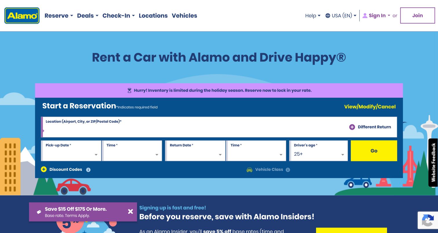
Alamo wraps its reservation module in a bright illustrated cityscape with blue, purple and yellow accents. A broad location field sits above separate pickup and return date-and-time controls, with driver age and a yellow Go button completing the row. The different-return option is placed directly alongside location entry, and a view, modify or cancel link stays in the module header. Below the form, the page introduces Alamo Insiders through a contrasting dark section. The illustration gives the site a leisure-oriented personality without changing the familiar booking sequence. The captured state also includes a seasonal inventory notice and a small promotional overlay, both secondary to the main form.
What you can learn
A playful visual identity can support a serious transaction when field groups remain conventional and clearly labeled. Reserve strong accent colors for the primary action, and prevent seasonal notices from displacing the location and date controls.
Pros
The booking module keeps existing-reservation management close to new reservations.
Illustration communicates a travel setting while leaving the form on a solid background.
Cons & considerations
Several bright colors compete across the alert, form and membership section.
The short Go label supplies less context than an explicit vehicle-search action.
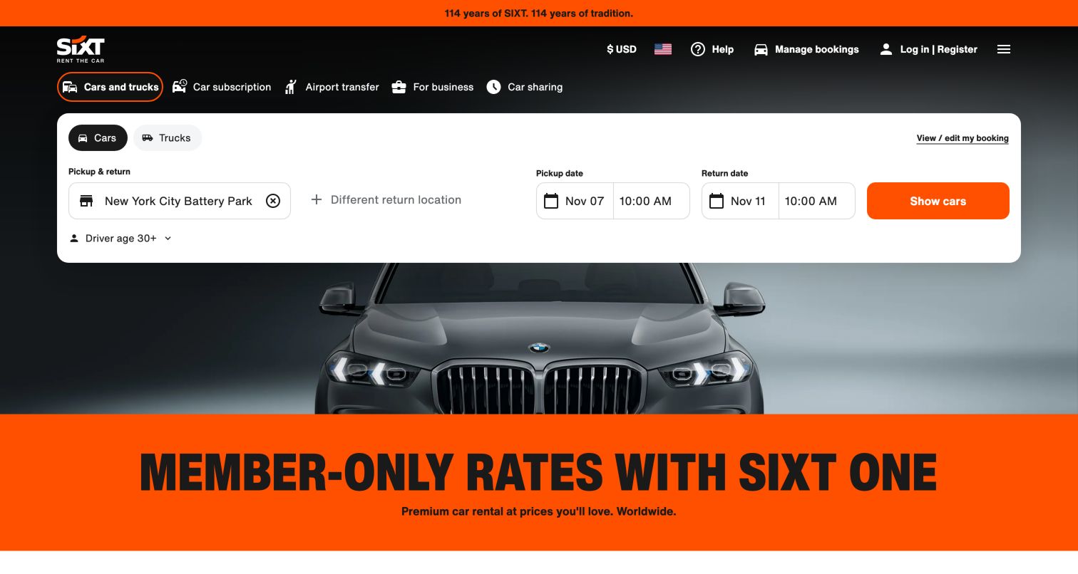
SIXT makes product choice visible before the reservation inputs. Cars and trucks, subscription, airport transfer, business and car sharing sit above a broad white booking panel. Within the panel, pickup location takes the most space, with return-location changes and dates arranged alongside the orange show-cars action. A vehicle photograph remains visible behind the card, while a vivid orange band introduces the current membership campaign below it. This is a strong example of using a common brand surface for several services while preserving a focused rental tool. The dark background and restrained form styling help the bright action stand out even alongside a large promotional message.
What you can learn
Put genuinely different products above the form rather than mixing them into field labels. Keep the selected journey unmistakable, and use one consistent action color so a large campaign does not create an ambiguous next step.
Pros
Product tabs distinguish rental from subscription and transfer services early.
The white form remains readable against the dark vehicle photograph.
Cons & considerations
The large membership band competes strongly with the booking action.
Several product labels and account utilities create a dense first screen.
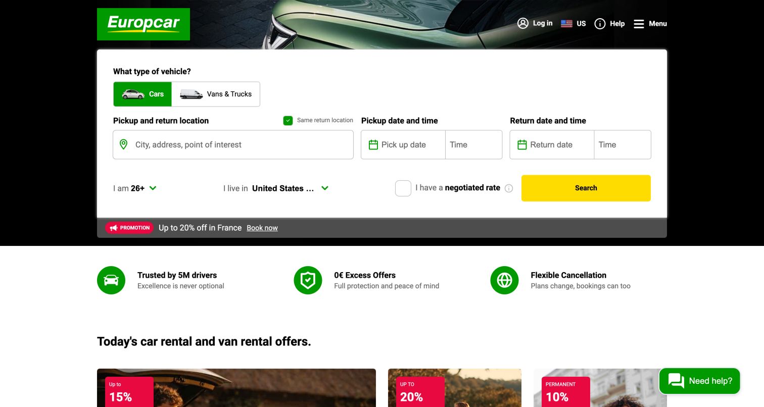
Europcar opens with a white search module over a dark vehicle image. Cars and vans or trucks are explicit choices at the start, followed by pickup and return location, dates and times. Age, country of residence and a negotiated-rate option form a secondary row. The yellow search button stays visible at the right edge. Below the hero, three small icon-and-text blocks introduce driver trust, protection offers and cancellation flexibility before destination promotions begin. This sequence separates the transaction from reassurance and then from marketing. The design is especially useful for comparing how a single homepage can serve private travelers and people seeking larger vehicles without sending either audience immediately elsewhere.
What you can learn
Resolve vehicle type before the detailed search and place policy explanations directly after the form. Describe eligibility and restrictions on the linked detail pages so compact reassurance labels do not become substitutes for clear rental terms.
Pros
Passenger and commercial vehicle categories are visible within the same tool.
Small reassurance blocks provide a clear transition into the offer section.
Cons & considerations
Age and residency controls use substantially smaller text than the location field.
Promotional percentages below the hero can draw attention before essential terms are understood.
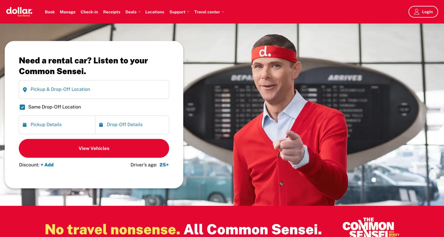
Dollar pairs a rounded white booking card with a large campaign photograph featuring its Common Sensei character. The red brand bar continues into the main vehicle button and the campaign band below the hero, giving the page a consistent visual anchor. Inside the card, a combined pickup-and-drop-off input comes first, with a same-location checkbox and two date groups beneath. Discount and driver-age controls remain available in a small final row. The campaign makes the opening distinctive, but the actual task stays conventional. Below it, the page explains direct booking and counter access through short benefit sections. The pattern is useful when a strong advertising concept must still support straightforward reservations.
What you can learn
Let the campaign carry personality while the form carries instructions. Use plain location and date labels, keep optional codes near the action, and ensure a character photograph never reduces contrast around the essential booking controls.
Pros
The large red vehicle button is easy to distinguish from secondary controls.
The campaign and form occupy separate, readable parts of the hero.
Cons & considerations
The promotional headline requires more interpretation than a direct booking title.
Small discount and age options may be missed by visitors scanning quickly.
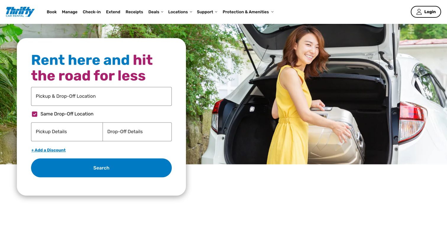
Thrifty uses a relatively restrained composition: a white card at the left and a photograph of a traveler beside an open car at the right. A two-color headline supplies the main promotional message inside the card. Location, same-drop-off choice and pickup and return details appear in a short vertical sequence, followed by a blue search button. The header exposes management, check-in, extension and receipts as separate tasks. Beneath the hero, explanatory content describes the online check-in sequence and participating-location limitations. This design is useful for studying a compact booking entry point that leaves operational support visible without filling the hero with multiple promotional cards or competing form variants.
What you can learn
Keep the first search card short, then use the next section to explain what happens after booking. Separate extension, receipts and check-in in navigation when they lead to different actions that returning customers need to recognize quickly.
Pros
The initial form has a clear vertical sequence and prominent search action.
Operational links include extending a rental as well as managing an existing booking.
Cons & considerations
The discount route is small relative to the main input fields.
The large photograph occupies space that could otherwise explain important rental conditions.
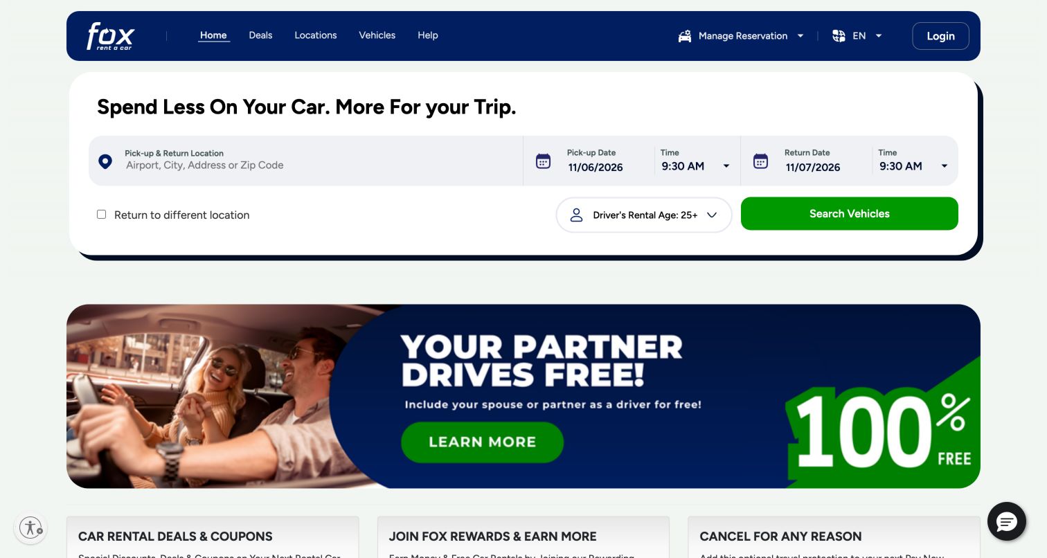
Fox keeps its booking form near the top in a broad rounded white container. Location occupies one side, with clearly separated pickup and return dates and times across the remaining width. Different-return and driver-age options sit beneath, ending with a bright green vehicle-search button. The dark blue header provides simple links for deals, locations, vehicles and help, plus a distinct reservation-management control. A large promotional banner follows the form, then smaller cards introduce deals, rewards and cancellation protection. The page offers a useful hierarchy for a price-led service: complete the initial search first, then compare the reasons to book directly. The promotion remains visibly separate from the search inputs.
What you can learn
Give the search module its own uninterrupted surface before introducing offers. Present optional protection and loyalty benefits as separate choices with clear detail routes, so visitors can distinguish the booking task from commercial extras.
Pros
The form exposes both dates and times without hiding them behind a single field.
Reservation management is named explicitly in the header.
Cons & considerations
The wide form needs careful stacking and label preservation at narrow widths.
A large offer banner can push practical policy information farther down the page.
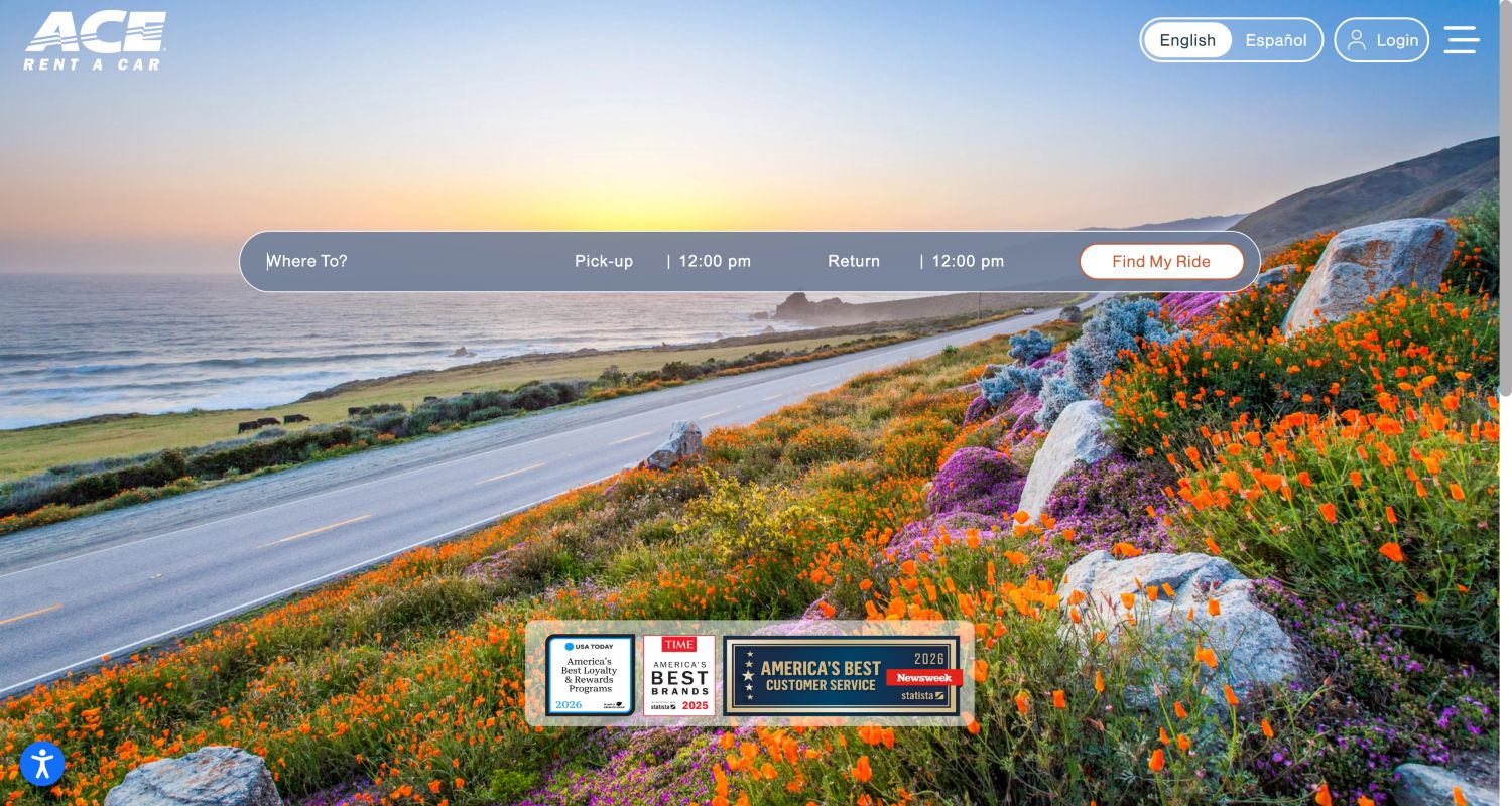
ACE places a thin translucent booking bar across a large coastal photograph. The bar contains a Where To prompt, pickup and return entries, time values and a light Find My Ride button. The logo remains small at the top left, while language, login and menu controls occupy the opposite corner. Award artwork appears near the lower edge of the hero, with membership content further down. Compared with the larger white cards elsewhere in this collection, this is an intentionally spare opening. Its strength is atmosphere and a single obvious search region; its main design question is whether the subtle labels provide enough guidance for unfamiliar renters before they interact.
What you can learn
A minimal booking bar needs especially precise labels, focus treatment and selected values. Preserve its calm visual effect while making location, date and time boundaries unmistakable, and provide an accessible route to fuller rental guidance nearby.
Pros
The scenic photograph establishes a destination mood with very little competing copy.
Language choice is visible without opening the main navigation.
Cons & considerations
Translucent fields depend on the photograph retaining enough contrast.
Where To is less explicit than a pickup-location label for a rental transaction.
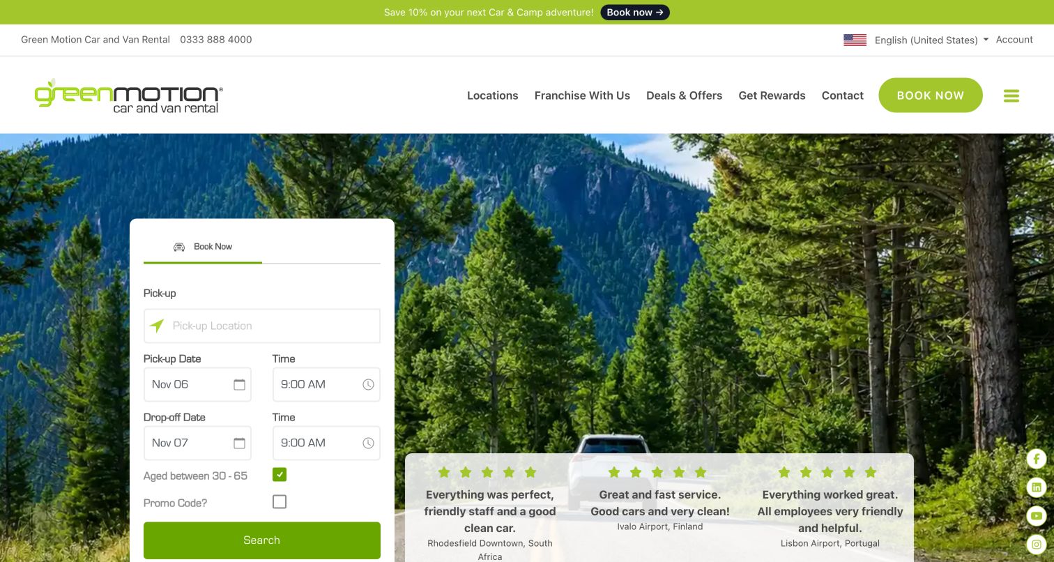
Green Motion places a narrow white reservation card over a forest-and-road photograph. Pickup location leads into paired date and time fields, followed by age-range and promotional-code options and a green search button. Beside the form, three compact customer quotations include the associated rental locations, creating context for the testimonial content. The header separates account and phone utilities from navigation for locations, offers, rewards and contact. A slim promotional strip sits above both. This is a useful example of a brand theme carried through landscape imagery and green accents while the reservation tool remains conventional. The design presents environmental associations visually; that imagery alone does not substantiate environmental performance claims.
What you can learn
Use setting and color to establish identity, then keep booking labels concrete. If testimonials accompany the form, retain their source context and avoid letting a collection of star icons replace specific explanations of the rental service.
Pros
The vertical form gives pickup, dates and the final action a clear sequence.
Location labels make the adjacent customer quotations more specific.
Cons & considerations
The narrow card leaves limited space for longer location names and errors.
Promotions, testimonials and social controls create several secondary attention points.
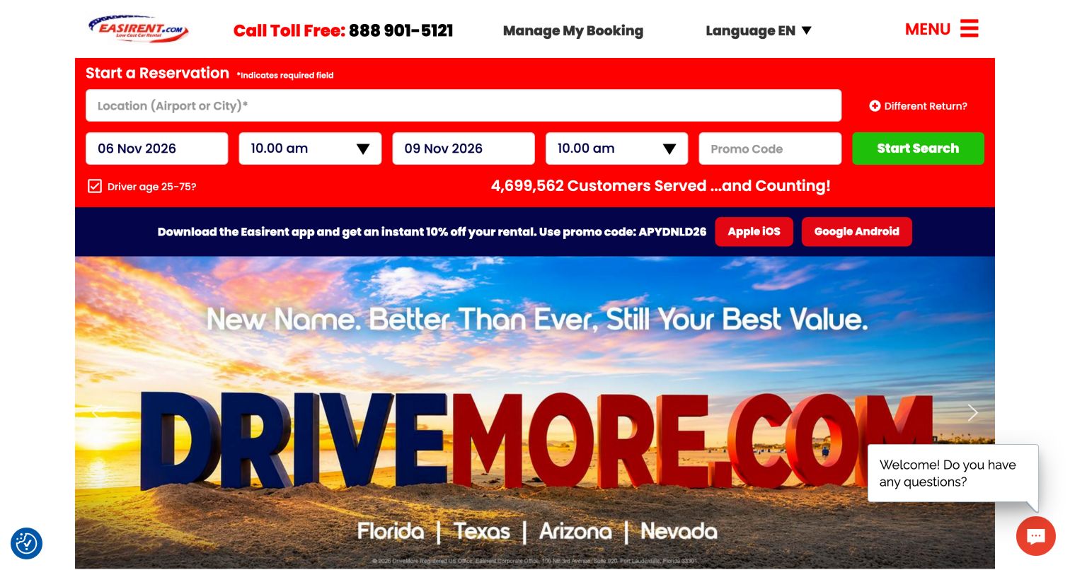
Easirent keeps a red reservation strip immediately below its utility header while a large DriveMore.com campaign announces the brand transition. Location, pickup and return dates, times and a promo-code field are all visible before the hero artwork. A green search button provides the main contrast within the red strip. An app-promotion band separates the booking tool from the rebrand message, and the top header retains a direct booking-management link and phone number. The page is a useful reference for maintaining familiar operational paths during a public identity change. The captured design makes the new name impossible to miss while still letting existing customers recognize the service they originally booked.
What you can learn
During a rebrand, retain stable reservation-management labels and explain the relationship between names close to the main task. Keep app invitations subordinate to the web booking route so visitors do not mistake a download for a required step.
Pros
The rebrand announcement is prominent without removing the reservation tool.
Phone and booking-management routes remain visible at the top.
Cons & considerations
The app banner adds another layer between the form and central explanation.
Several bright colors and a chat invitation compete within the first screen.
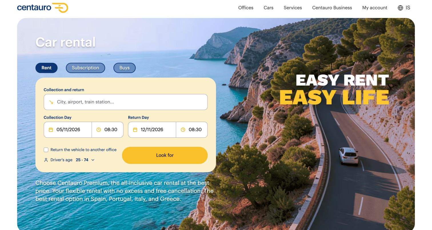
Centauro combines a coastal road photograph with a pale yellow booking card on the left. Rental, subscription and purchase appear as three small tabs above the form. A broad location field is followed by pickup and return dates and times, with a different-office choice and driver-age control below. The yellow search action fits the palette while remaining more saturated than the surrounding panel. The right side carries a short campaign line, leaving the form visually separate from the scenery. Supporting copy under the card introduces the premium rental proposition. This design is useful for studying how a light, approachable visual system can organize several mobility products without making the homepage feel like a dense directory.
What you can learn
Use product tabs to establish the journey before visitors enter dates. Let the booking card use a quieter version of the brand palette, and reserve stronger color for the search action and a small number of key messages.
Pros
Rental, subscription and purchase are distinguished before the form begins.
The pale form background creates separation from detailed scenery.
Cons & considerations
Small supporting copy beneath the card is harder to read over the photograph.
A yellow action on a yellow panel needs careful contrast and focus-state testing.
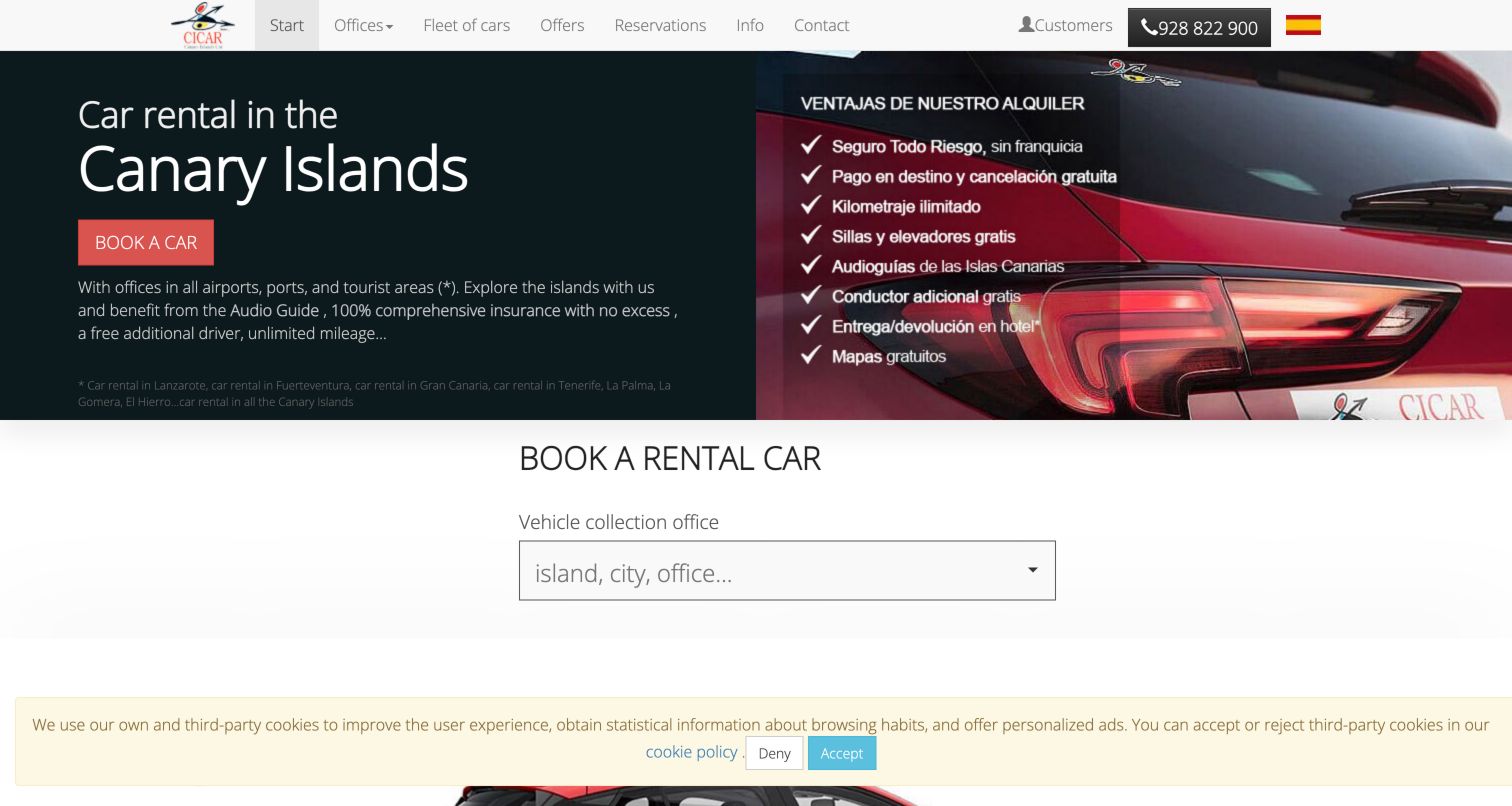
CICAR explicitly names the Canary Islands in the opening headline and pairs that message with a vehicle photograph and a short list of rental benefits. The booking tool begins underneath with a single collection-office field labeled for island, city or office. This makes geography the first useful decision, rather than presenting a long undifferentiated worldwide location list. The compact header exposes fleet, offers, reservations, information and contact routes. In the captured view, the benefit artwork retains Spanish text while much of the interface is displayed in English, highlighting a localization question for image-based copy. The page's strongest pattern is the clear connection between regional coverage and the start of a reservation.
What you can learn
For a regional service, name the operating area early and structure location entry around the terms visitors use. Keep benefits in ordinary translatable text wherever possible, especially when language choices affect the surrounding interface.
Pros
The hero states the geographic scope before visitors begin searching.
A single collection-office field reduces the first booking step to one decision.
Cons & considerations
Benefit text embedded in artwork can remain in a different language from the interface.
The initial booking view gives limited indication of the later date and vehicle steps.
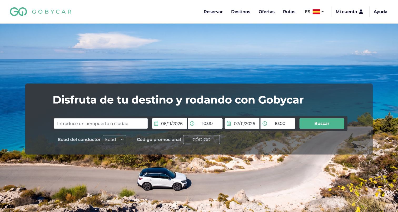
Gobycar uses a coastal photograph across the hero and places a dark translucent reservation panel in front of it. A single row groups location, pickup date and time, return date and time, and the green search button. Driver age and promotional code appear below in a quieter line. The white header is restrained, with reservation, destinations, offers, routes, account and help links. Further down, destination cards group the places where vehicles can be collected. This layout is useful for comparing how destination imagery can support the reason for travel while the interface remains centered on the rental search. The photograph supplies most of the visual personality, leaving relatively little marketing copy around the fields.
What you can learn
Use a destination image as context, then maintain strong boundaries between location, date and time controls. Follow the hero with a browsable destination list so visitors who do not know the exact branch name have another route into the service.
Pros
The main inputs and search action occupy one coherent horizontal row.
Destination browsing gives an alternative to typing an airport or city.
Cons & considerations
The transparent panel requires contrast checks across changing hero images.
Driver age and promo code are comparatively small beneath the main controls.
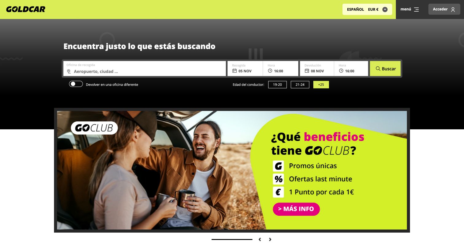
Goldcar uses a dark opening area with a bright yellow-green brand bar and matching search action. The reservation fields form one compact row, with pickup office, dates and times followed by search. A different-office toggle and three driver-age bands sit underneath, making age selection visible without a long dropdown. The large promotional panel below the form introduces GOCLUB with a photograph and a high-contrast benefits area. This is a useful reference for separating essential booking inputs from a strong loyalty campaign. The interface relies on compact typography and a relatively small header, so its efficiency comes with a need to keep control labels and selected states especially clear.
What you can learn
If age changes the available rental options, expose the relevant bands near the initial search. Keep loyalty messaging below the booking controls and ensure the distinction between membership benefits and the base rental offer is clear.
Pros
Driver-age bands are visible directly below the search row.
The dark form region and bright action establish a recognizable visual hierarchy.
Cons & considerations
Compact date and time controls may become crowded on smaller screens.
The large loyalty panel can outweigh practical service explanations in the first viewport.
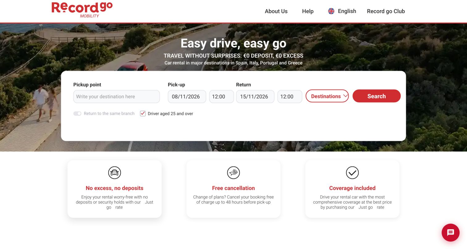
Record go places a wide white search card over a road photograph beneath a short campaign headline. Pickup point, pickup and return dates and times run across the card, followed by destination browsing and a red search button. The same-branch and driver-age options appear below. Immediately after the hero, three elevated white cards summarize deposit or excess positioning, cancellation and coverage. Each uses a simple icon and short explanation. This sequence makes the page useful for studying how rental-policy messaging can sit close to the transactional entry point. The summaries are marketing descriptions of particular offers, so the associated rate conditions still need to remain clear as visitors proceed.
What you can learn
Put the policy questions that affect booking confidence immediately after the search tool. Connect each short promise to the relevant rate and detailed conditions, and preserve a visible distinction between general service features and optional packages.
Pros
The booking card gives location and both date groups generous horizontal space.
Three consistent policy cards are easy to compare after the hero.
Cons & considerations
Short policy headings can appear broader than the rate-specific explanation beneath them.
The desktop card requires a careful field order when it stacks on a phone.
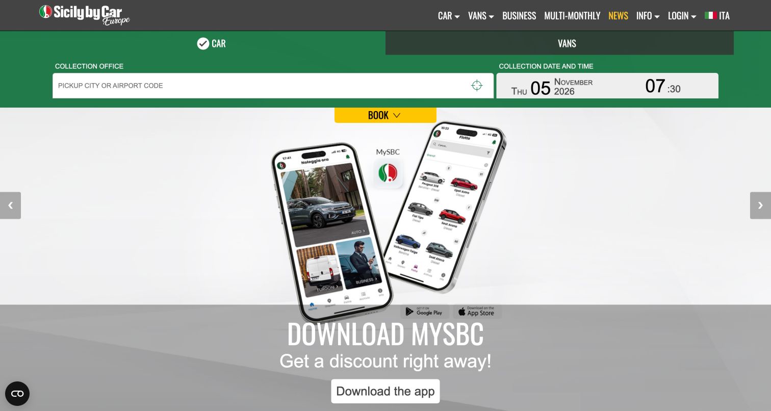
Sicily by Car places a green booking strip directly under the dark navigation bar. Car and van choices run across its top, with a pickup-office input and collection date and time beneath. A yellow booking control bridges the strip and the large campaign below. The captured campaign promotes the MySBC app using phone mockups, while the navigation retains business, longer-term rental, news and information routes. An informational fraud-awareness notice was dismissed before the final capture. The resulting page demonstrates a compact booking entry that stays visually consistent while the main campaign can change. It also shows the tradeoff of a short first step that does not expose the whole reservation sequence immediately.
What you can learn
Keep the booking entry independent of rotating promotional artwork. When the initial step asks only for collection details, make the remaining stages predictable, and ensure an app campaign reads as an optional channel rather than a prerequisite.
Pros
Car and van choices remain attached to the booking strip.
The main navigation exposes business and longer-term rental separately.
Cons & considerations
The initial strip does not display the complete pickup-and-return sequence.
Large app artwork can dominate the page below a relatively compact booking control.
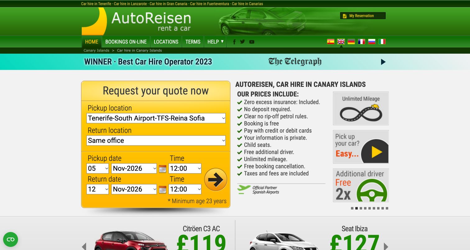
AutoReisen uses a compact, information-heavy layout rather than a large photographic hero. A yellow quote form occupies the left side, with separate pickup and return locations, date selectors and time controls. A circular arrow provides the final action. To the right, a checklist names the items the company says are included, while small illustrated panels reinforce selected benefits. Language flags and regional destination links sit in the green header, and vehicle imagery begins below. This is a useful counterpoint to minimal booking pages: it prioritizes concrete rental questions and geographic scope in the first screen. The dense presentation also shows why clear type sizing and unambiguous controls matter when many details are surfaced at once.
What you can learn
Use an inclusions list to answer practical questions beside the quote form, but keep it readable and linked to full conditions. Pair icon-only actions with a meaningful accessible name and a visible explanation of what happens next.
Pros
Pickup and return locations are both explicit in the initial quote form.
The adjacent checklist addresses common questions before a visitor requests availability.
Cons & considerations
The small type and tightly packed selectors create a dense first impression.
A circular arrow communicates the next action less clearly than a descriptive text button.
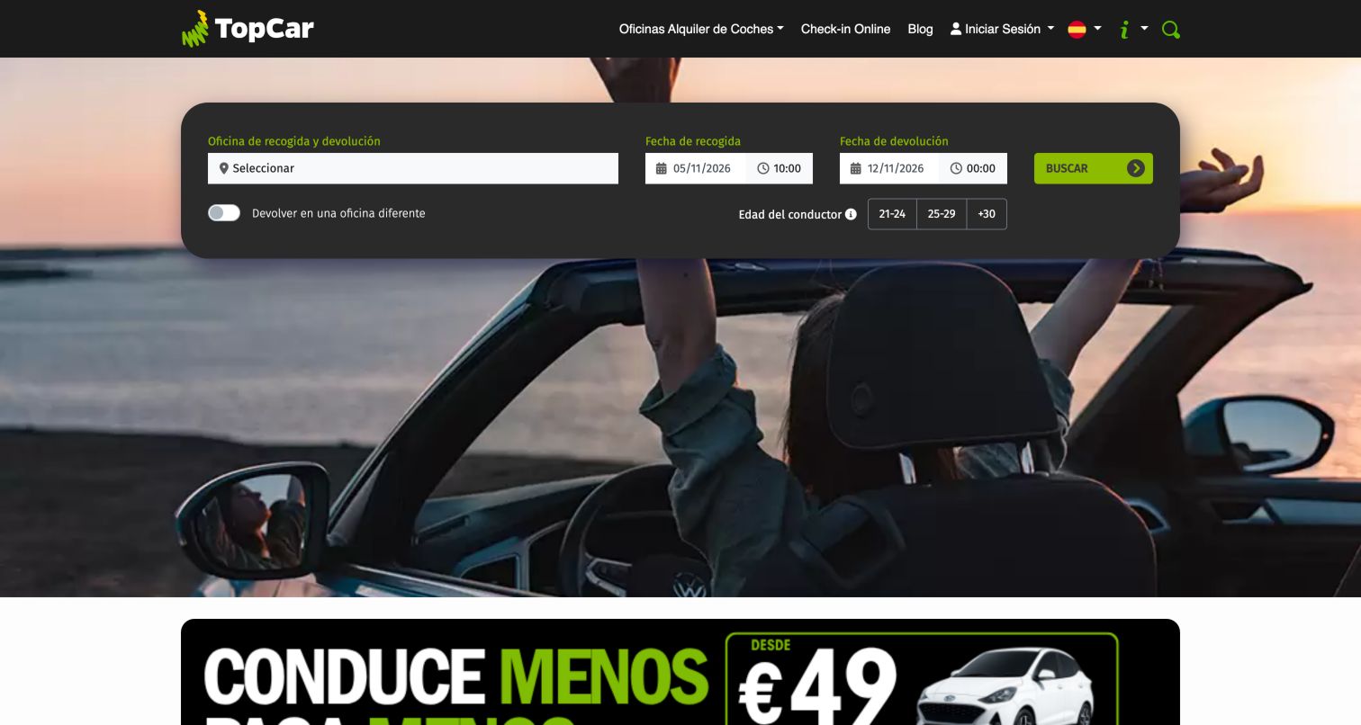
TopCar places a dark rounded search panel over a photograph of travelers in an open-top car. The office selector leads into pickup and return dates and times, while a different-office checkbox and three driver-age bands appear below. A green search button continues the brand accent used in the header and promotional content. The main navigation keeps office locations and online check-in visible without a long list of primary links. Below the hero, the page begins a series of service and inclusion explanations. This design is useful for examining how a compact horizontal form can still expose age and return-location choices, provided the darker background and smaller labels remain easy to read.
What you can learn
Show conditions that change eligibility before availability is requested, using clear groups for age and return office. Keep the scenic image outside the field surfaces and preserve a logical reading order when the wide panel becomes a vertical mobile form.
Pros
Age bands and different-office choice are visible beside the initial search.
The dark form panel separates inputs from the detailed travel photograph.
Cons & considerations
Small labels and tightly spaced controls demand careful mobile testing.
Promotional content beneath the hero introduces a second strong action area quickly.
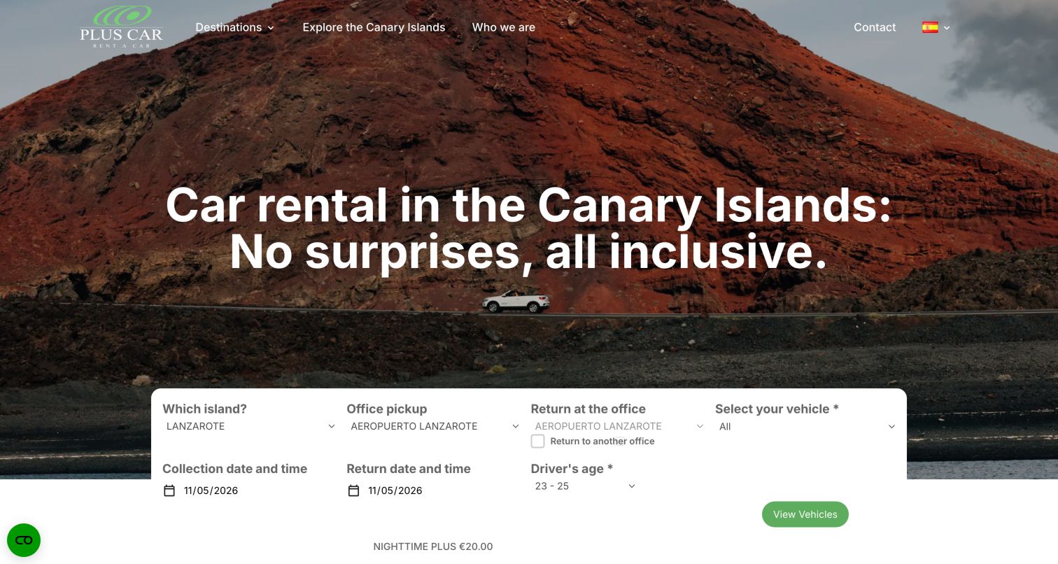
PlusCar leads with a volcanic landscape and a large headline naming the Canary Islands. Its white booking panel sits lower in the hero and begins with island, pickup office and return office before asking for vehicle choice. Date, time and driver-age controls occupy a second row. A short nighttime-surcharge note remains inside the panel near the action. This geography-first structure reflects a service where the island determines the available offices and vehicles. The surrounding navigation is minimal, with destinations, exploration, company information and contact. The design is useful for comparing how a regional inventory model can shape the order of inputs instead of copying a generic worldwide airport search.
What you can learn
Order the form according to real inventory dependencies, starting with island or region when it determines the available offices. Explain charges close to the action and make dependent disabled fields visibly understandable until their prerequisites are selected.
Pros
Island and office choices mirror the regional structure of the service.
The nighttime supplement is disclosed within the initial booking panel.
Cons & considerations
The large headline pushes the form lower in the first screen.
Several dependent selectors need clear feedback when the visitor changes the island.
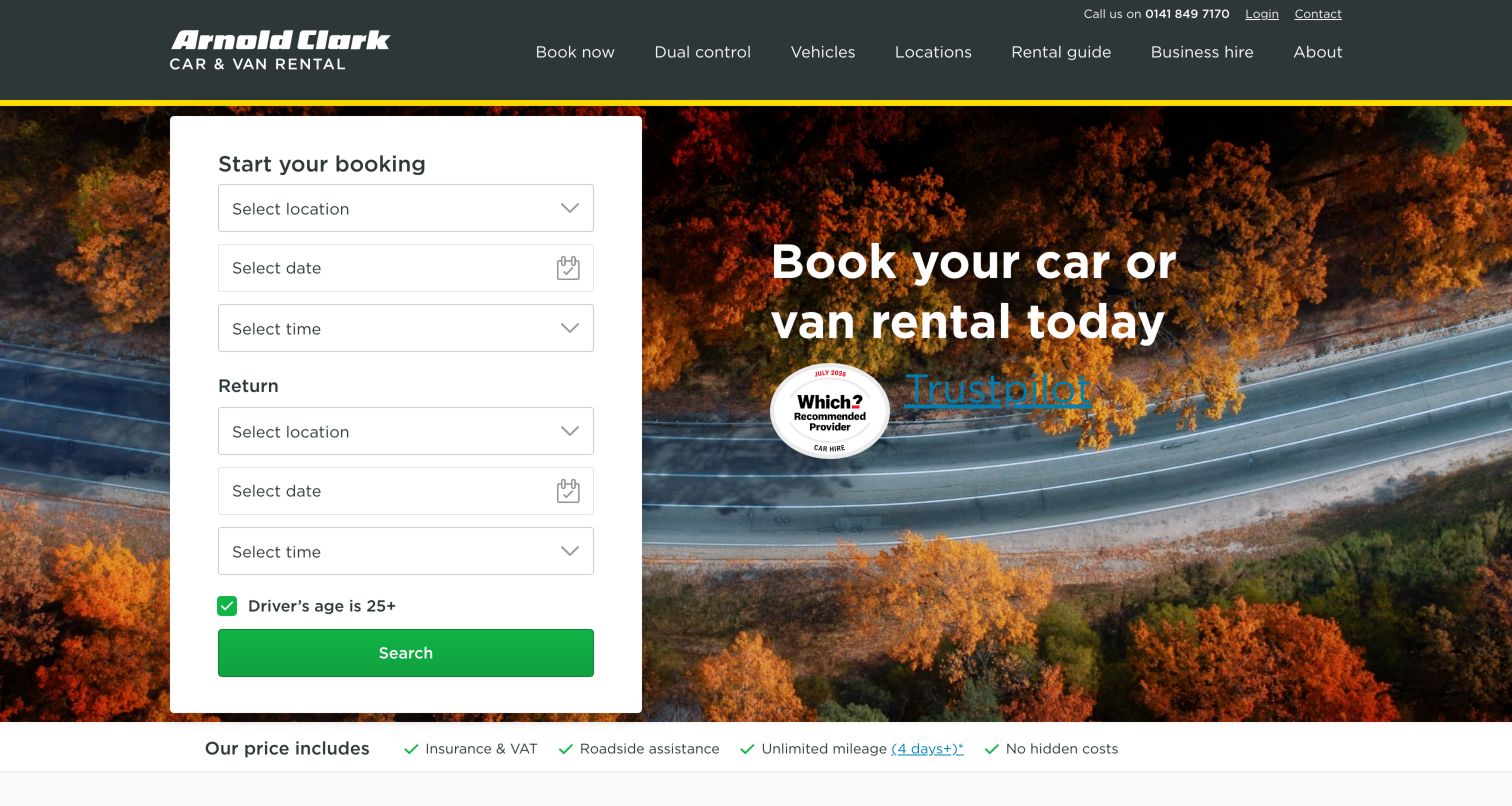
Arnold Clark Rental places a tall white booking card on the left of a winding-road photograph. Pickup and return each have a clear group of location, date and time controls, followed by a driver-age checkbox and green search button. The right side carries the main booking headline and external review or award links. A slim inclusions strip directly below the hero names insurance, roadside assistance and mileage conditions. The header also gives dual-control hire its own prominent route alongside vehicles, locations and business hire. This is a useful example of a provider serving several practical rental needs while maintaining an uncomplicated central search form and visible support contact.
What you can learn
Use explicit pickup and return groups when their locations can differ. Keep specialized rental categories in stable navigation, and place inclusion summaries close to booking while retaining links for exceptions such as mileage thresholds.
Pros
The tall card provides a clear vertical reading order for pickup and return.
Dual-control hire is identified as a distinct service rather than hidden under vehicles.
Cons & considerations
The desktop card occupies much of the hero height before supporting information begins.
Review and award graphics require enough contrast against the road photograph.
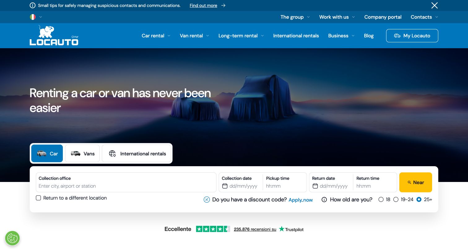
Locauto uses a blue header above a dark campaign image showing covered vehicles. Car, van and international-rental choices sit directly above a wide white booking panel that overlaps the lower edge of the hero. Pickup office receives the widest input, with collection and return dates and times continuing across the row. Different return location, discounts and age bands appear beneath. The header gives long-term rental and business services their own categories, while a narrow information strip sits above it. This layout is useful for comparing a broad service portfolio with a still-focused short-term booking tool. The hero remains atmospheric, but the white panel provides the practical structure needed to begin a reservation.
What you can learn
Attach vehicle-category choices to the tool they affect, and separate longer-term or business journeys in navigation. Use the overlapping card carefully so dates, age choices and errors remain visible without colliding with the following trust or content section.
Pros
The category choices are adjacent to the reservation form rather than buried in navigation.
A wide location field accommodates city, airport or station entry.
Cons & considerations
Two navigation layers and an information strip add substantial header density.
The compact secondary row needs clear labels when translated or enlarged.
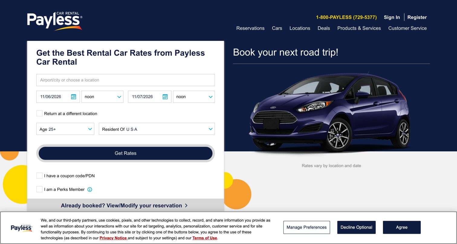
Payless uses a dark blue hero with a white reservation card on the left and a vehicle photograph on the right. The card asks for location, pickup and return dates and times, different-return choice, age and residency before the Get Rates button. Coupon and membership options remain visible below that action, followed by an existing-reservation link. A note beside the vehicle explains that rates vary with location and date. The layout is direct and functional, with limited scenic imagery or editorial storytelling. It is useful for studying a rate-oriented homepage that exposes many relevant booking controls immediately while still keeping reservation management accessible to returning visitors.
What you can learn
If the main promise is rate discovery, show the factors that affect it in a coherent form. Keep coupons and membership options clearly associated with the search, and position existing-reservation management where returning customers can bypass new-booking fields.
Pros
Age and residency are visible alongside location and dates in the initial card.
The existing-reservation route sits immediately below the booking controls.
Cons & considerations
The card is dense, particularly around the smaller date and time controls.
Placing optional coupon choices below the primary button may lead visitors to miss them.
Kegan is a freelance web designer and developer with 15+ years of experience helping businesses turn complicated website requirements into clear, maintainable digital experiences. He works directly with clients from planning and design through development, launch, and ongoing support.
For car rental website design, his development approach focuses on location discovery, vehicle information, rental guidance, and reservation-system handoffs. The scope can be a targeted improvement or a complete custom build, with responsive layouts, thoughtful content structure, and integrations chosen around the people using and maintaining the site.
Show 3 other car rental website designersHide other car rental website designers
Plan a rental website around the actual reservation sequence
Map the inventory dependencies
Document which choices determine the next set of options: country, island, branch, collection time, vehicle category or rental duration. Use that sequence to order the interface. Explain disabled controls so visitors understand why an office or vehicle choice is not available yet.
Define the pickup and return model
Decide how the site represents same-office, different-office and one-way rentals. Keep the current choice visible and preserve entered information when it changes. Confirm how opening hours, out-of-hours collection and location-specific restrictions should appear in the interface.
Design for corrections and uncertain plans
Visitors change dates, compare branches and revisit results. Plan how the search preserves valid inputs, identifies conflicts and returns focus after an error. Use clear date labels and show enough context to distinguish pickup from return without relying on position alone.
Give existing renters their own routes
List the tasks available after booking, including changes, cancellation, check-in, extensions and receipts. Make the relevant routes stable across campaigns. Explain when a task moves to another system and what information the customer will need before continuing.
Set rules for campaign and consent overlays
Define how promotional invitations, chat tools and privacy notices share the first screen. Avoid stacking several interruptions over the reservation form. Test their dismissal, keyboard focus and behavior on narrow screens, and keep essential search controls reachable.
Maintain translated content and field labels
Review text inside artwork as well as ordinary interface labels. Confirm that language changes preserve dates, times, selected locations and error meaning. Check long location names, translated controls, text enlargement and the full booking sequence with keyboard and assistive technology.
The editing job behind the design
Choose systems that keep booking information consistent
The marketing website, reservation engine, fleet inventory, pricing rules and customer-service tools may have different responsibilities. Decide which system owns location hours, available vehicle categories, rate conditions and reservation status before designing a shared experience. A visually consistent homepage is useful only if the handoff to live availability preserves the visitor’s choices and makes the next step clear.
Public stack observations can identify references to interface, content, analytics or other technologies on the reviewed page. They do not establish the complete reservation platform or the systems behind fleet and payment operations. Read each evidence group at its stated scope. For a new implementation, assess integration behavior, localization, validation, maintenance responsibilities and recovery from unavailable inventory directly.
Our WordPress website examples offer a separate look at publishing approaches. A visible platform label is evidence for that named page, not a guarantee that the same system will suit your requirements.
Before the public launch
Car rental website review checklist
Can visitors search using the location terms they actually know?
Is the pickup office clearly distinguished from the return office?
Are pickup and return dates and times labeled consistently?
Are selected values preserved when visitors correct a search?
Are age, residency and other relevant eligibility choices discoverable?
Are cars, vans and different rental products clearly separated?
Do policy summaries identify the rate or package they describe?
Can existing customers find changes, extensions, check-in and receipts?
Are optional memberships, discounts and extras distinguishable from required steps?
Do privacy, promotion and chat panels leave the booking task reachable?
Have image-based text, translations and long location names been reviewed?
Have keyboard paths, errors, text enlargement and external booking handoffs been tested?
These checks are a project checklist, not a performance, legal, security, or accessibility certification. Test real journeys with the people responsible for the website before making claims about the result.
Sources & editorial method
How this collection was selected and reviewed
Original selection: This collection retains the saved random target of 26 distinct car rental websites. Official public pages were opened on November 5, 2026, and captured directly in the browser. Source URLs, actual capture times, dimensions and attribution accompany every image. Ordinary privacy or informational panels were dismissed where needed; no availability searches, reservations, payments, account actions or contact forms were submitted. Some captured pages reflect the browser’s displayed translation, and reviews distinguish visible text from image-based copy where relevant. Promotions, defaults and notices reflect the observation date. Public stack findings are separately scoped observations and do not establish internal booking systems, service quality or accessibility conformance. On November 5, 2026, Zero Car was reviewed and added as Editors Choice in the first slot, bringing this collection to 27 examples. All earlier reviews and their original capture dates are retained. The badge is an editorial design selection, not a user-vote award or an endorsement of the organization’s services.
Each example links to its actual source page. Screenshots are direct browser captures with their own capture dates; moving imagery, announcements and live designs can change. The notes describe observable design choices and conditional tradeoffs, not measured traffic, conversion results, service quality, or accessibility conformance.
Technology labels use public page metadata, asset evidence, or explicitly cited platform documentation. Platform documentation is not a complete current deployment audit. A component reference may be legacy or unused; it is not a complete backend inventory. Unknown stacks are omitted. These sites are editorial examples, not our client portfolio.
Written, Edited and Curated are separate editorial records, not timestamps advanced by a rebuild. Website designs and imagery belong to their owners. See our editorial standards or suggest a correction.
Questions worth asking
Car Rental website design questions
Should a rental homepage show every booking field immediately?
Use the actual dependencies of the service. A location-first step can work when the branch determines later choices. A single complete form can help visitors compare pickup and return details at once. Either approach should explain the sequence and preserve information when users make corrections.
When should pickup and return use separate location fields?
Show their relationship clearly from the beginning. A same-location default can reduce visual complexity, with a visible option for a different return office. If one-way rentals are central to the service, separate fields may be more appropriate. The selected state should remain clear throughout the booking.
Where should cancellation and coverage information appear?
Provide short, understandable summaries near the relevant offer and a direct route to its full conditions. Explain which rate, vehicle or location the statement applies to. General reassurance should not obscure differences between included features and optional products.
How should a site serve customers who already booked?
Provide named routes for the actions the service supports, such as managing a reservation, checking in, extending a rental and obtaining receipts. Put those routes in stable navigation or beside the booking tool. Avoid requiring existing renters to begin a new availability search.
Do these reviews compare rental quality or prove accessibility?
No. They describe observed public-page design and questions for further testing. The collection does not test completed bookings, current rates, fleet quality or customer service. Accessibility evaluation requires direct testing across the full reservation journey, including external systems and error states.
Start with the decisions that make a reservation possible: where to collect, when to return, who is driving and which vehicle category is needed. Then use photography, campaigns and service explanations to support those decisions without making the booking path harder to understand.