These 20 public websites referenced identifiable Gravity Forms resources at the recorded time. Their screenshots show the surrounding design and service entrances. A plugin resource does not prove that a particular visible button submits a Gravity Forms form or that entries reach the intended recipient.
A useful form begins before the first field. Visitors need to understand the offer, service area, likely next step and information they should prepare. The surrounding page can reduce uncertainty or create it. This collection studies those entrances alongside exact, dated plugin-resource observations.
For your own project, define the outcome of a submission before arranging fields. A quote request, appointment inquiry and newsletter signup require different information and different follow-up. The page should explain those differences, and the implementation should preserve them through validation, confirmation and handoff.
Before the examples
What makes good Gravity Forms website development in 2026?
Explain what happens after submission
Put the purpose of the form and the expected next step close to its entrance. Identify information a visitor should have ready and whether the request commits them to anything. Use a confirmation that reflects the actual recorded state rather than an unsupported promise of completion.
Ask only for useful information
Map every field to a decision or follow-up action. Remove questions that have no responsible owner or clear use. Keep required and optional information distinguishable, and avoid using placeholder text as the only explanation of a field.
Design accessibility into the form
Gravity Forms provides an accessibility checklist covering choices made during form creation. Review labels, instructions, validation and keyboard use in the actual page theme. Product features do not remove the need to test the assembled form and its surrounding interface.
Grocery Outlet, Market Basket, Tecta America, Massey Services and SingleThread open the collection as recognizable grocery, commercial roofing, property service and hospitality brands. They are followed by other distinct public properties. Reviews discuss the photographed page; resource evidence does not identify every form or integration on the domain.
We start with five recognizable brands or organizations: Grocery Outlet, Market Basket, Tecta America, Massey Services, SingleThread. Each attribution applies to the named website property, not every product or website belonging to its organization. This is a curated reading sequence, not a measured ranking.
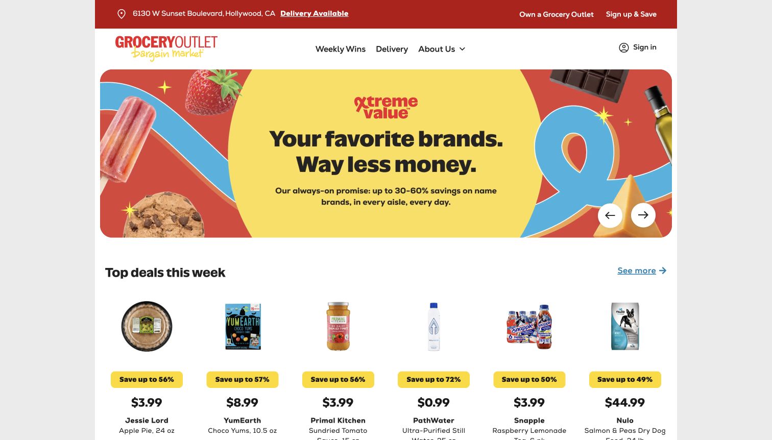
Grocery Outlet opens with a selected store address, delivery availability and a colorful value campaign, followed by a row of individual products. The practical location context sits above the promotional message, giving shoppers a reference for the offers they see. For form development, that hierarchy suggests a useful principle: requests about a store or product should carry an explicit location rather than requiring staff to infer it later.
What you can learn
Ask for the information needed to route an inquiry, then explain its purpose. Preserve the selected store when a visitor opens a contact flow and give a clear completion state.
Pros
The selected address gives the homepage a local context before the visitor studies individual products or delivery options.
Product cards beneath the campaign provide a concrete path beyond the broad savings message and its decorative graphics.
Cons & considerations
Prices and availability are dated promotional information and should not be treated as continuing promises from this screenshot.
Public plugin resources do not demonstrate message delivery, store routing or validation behavior, and no real inquiry was submitted during review.
Public source checked November 3, 2026. References may be embedded or legacy—not a complete backend inventory.
Platform source: Dated public page resource observation. The public source page referenced Gravity Forms resources on 2026-11-04. This is a scoped integration signal, not proof of configuration or successful behavior. The direct screenshot retains its separate original capture date. Platform evidence is separate from the direct website screenshot and is not a complete current infrastructure audit.
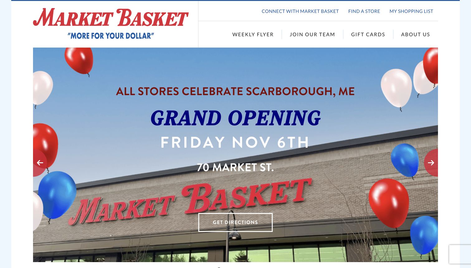
Market Basket gives a new-store announcement the main hero, with the location and opening details integrated into a storefront photograph. A directions action sits below the headline, while weekly flyers, jobs and gift cards remain in the header. The useful form-design lesson is to keep different intents distinct: a shopping-list task, job inquiry and general customer question require different information and different expectations about a response.
What you can learn
Define each form's audience and destination before selecting fields. Keep ordinary store details available without a submission, and explain whether an action opens directions, saves a list or sends a message.
Pros
The announcement pairs a recognizable store image with a specific location, making the promotional event concrete for local shoppers.
The header exposes several common tasks without requiring visitors to navigate through the new-store campaign first.
Cons & considerations
An opening date is time-sensitive and should remain a dated announcement rather than becoming evergreen service information.
The plugin reference does not identify which site forms use Gravity Forms or prove that any resulting notification reaches its intended staff recipient.
Public source checked November 3, 2026. References may be embedded or legacy—not a complete backend inventory.
Platform source: Dated public page resource observation. The public source page referenced Gravity Forms resources on 2026-11-04. This is a scoped integration signal, not proof of configuration or successful behavior. The direct screenshot retains its separate original capture date. Platform evidence is separate from the direct website screenshot and is not a complete current infrastructure audit.
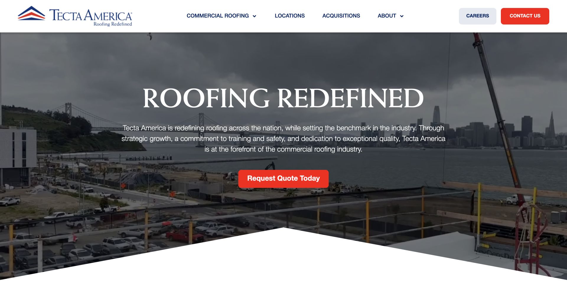
Tecta America's red quotation action is placed directly below a large roofing message and project image. The header separates customer-facing services from locations, acquisitions and careers. The design provides a visible inquiry entrance, but a useful form needs to continue that distinction. A commercial roofing request should gather enough site and service context for routing without borrowing unrelated employment or corporate-contact fields.
What you can learn
Write a short routing plan before building the quotation form. Separate service location, project type and contact preference, and explain the next step without implying that submitting creates a confirmed appointment.
Pros
The quotation button is visually distinct from the surrounding project image, giving potential customers an obvious first action.
Separate corporate and service navigation reduces the need for one overloaded form to handle every kind of visitor request.
Cons & considerations
A generic quotation label may need supporting detail about response timing and the information customers should prepare.
Observed Gravity Forms resources cannot confirm that this particular action opens that plugin or establish successful delivery of a completed quotation request.
Public source checked November 3, 2026. References may be embedded or legacy—not a complete backend inventory.
Platform source: Dated public page resource observation. The public source page referenced Gravity Forms resources on 2026-11-03. This is a scoped integration signal, not proof of configuration or successful behavior. The direct screenshot retains its separate original capture date. Platform evidence is separate from the direct website screenshot and is not a complete current infrastructure audit.
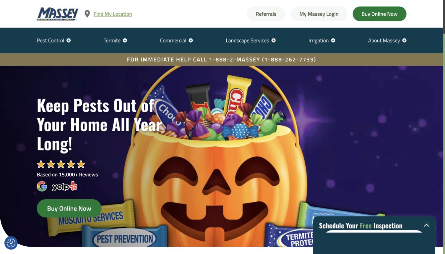
Massey Services combines a seasonal pest campaign with service categories, location access, account login and a floating inspection invitation. The page shows several stages of a customer relationship at once: exploring a service, arranging help and managing an existing account. A form implementation should preserve those distinctions. Sending a request for an inspection should not be presented as equivalent to booking a confirmed visit or purchasing an ongoing service.
What you can learn
Label the request's actual outcome and route existing customers separately. Keep the submitted address and contact details within the operational process instead of repeating them in optional diagnostic or marketing records.
Pros
The inspection invitation remains available alongside the campaign, giving visitors a service-oriented next step beyond the promotional message.
Location and customer-login routes acknowledge that new inquiries and existing-account tasks are different journeys with different information needs.
Cons & considerations
Floating inspection and chat or privacy controls can compete for the same corner, requiring coordinated keyboard and mobile testing.
The dated plugin signal does not validate service guarantees, appointment availability or the backend delivery and handling of submitted customer information.
Public source checked November 3, 2026. References may be embedded or legacy—not a complete backend inventory.
Platform source: Dated public page resource observation. The public source page referenced Gravity Forms resources on 2026-11-03. This is a scoped integration signal, not proof of configuration or successful behavior. The direct screenshot retains its separate original capture date. Platform evidence is separate from the direct website screenshot and is not a complete current infrastructure audit.
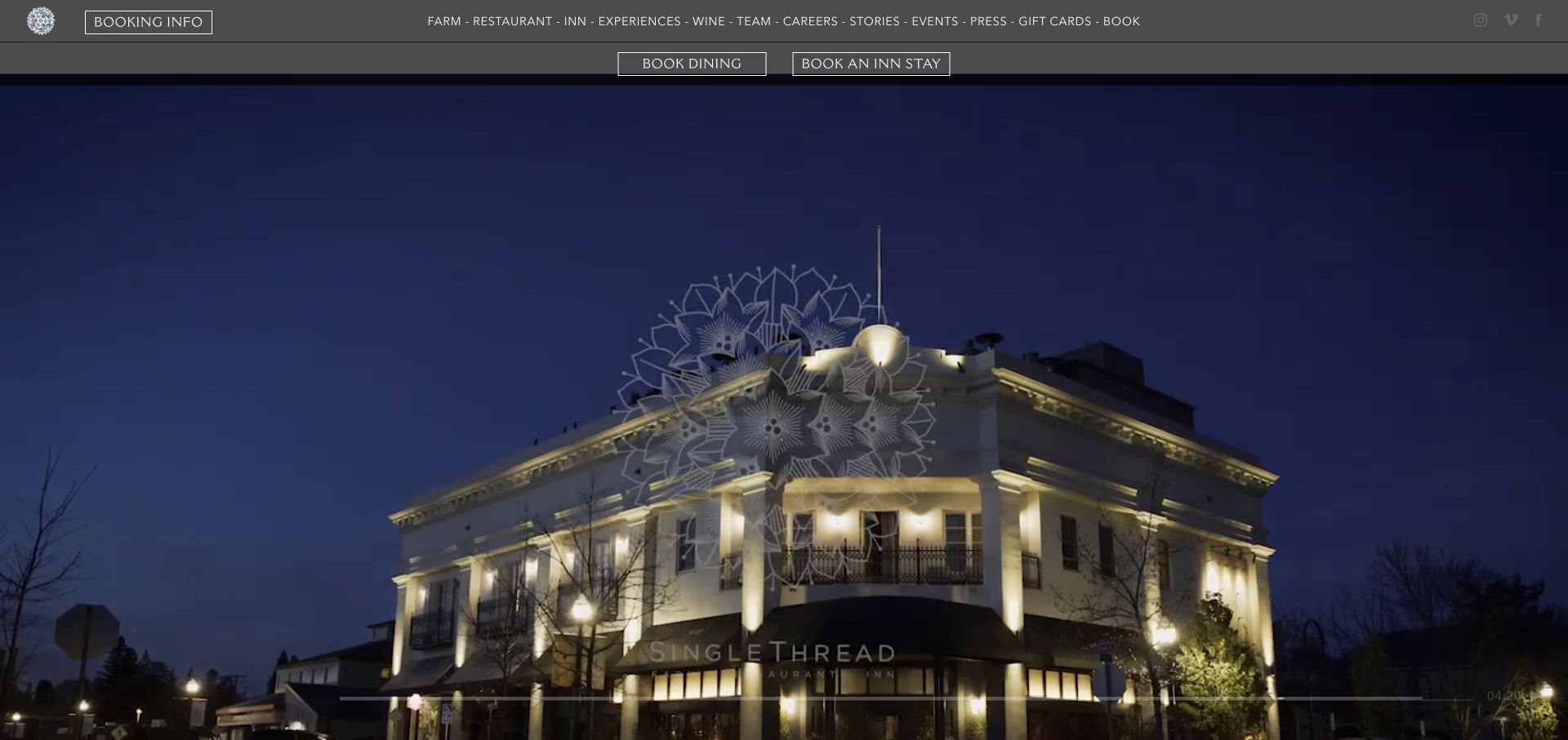
SingleThread opens with a nighttime exterior photograph and a restrained navigation system. Dining and inn-stay booking actions appear separately above the image, making two different reservation intentions visible before the visitor reads the broader story. This is a useful model for form planning: dining inquiries, accommodation questions and general messages should not be compressed into one ambiguous request that leaves staff and visitors unsure what has been arranged.
What you can learn
Separate reservation intent before asking for personal details. Explain when a visitor is making an inquiry versus confirming a booking, and keep external reservation-system status separate from a general form receipt.
Pros
Distinct dining and lodging actions help visitors choose the relevant journey without decoding the property's wider hospitality offering.
The exterior photograph establishes a sense of arrival while leaving the top of the screen available for practical booking information.
Cons & considerations
The small navigation text needs careful scaling and contrast checks, particularly when viewed against varied photography or at high zoom.
Gravity Forms asset evidence on the public page does not identify the technology or successful completion state of either external reservation system.
Public source checked November 3, 2026. References may be embedded or legacy—not a complete backend inventory.
Platform source: Dated public page resource observation. The public source page referenced Gravity Forms resources on 2026-11-03. This is a scoped integration signal, not proof of configuration or successful behavior. The direct screenshot retains its separate original capture date. Platform evidence is separate from the direct website screenshot and is not a complete current infrastructure audit.
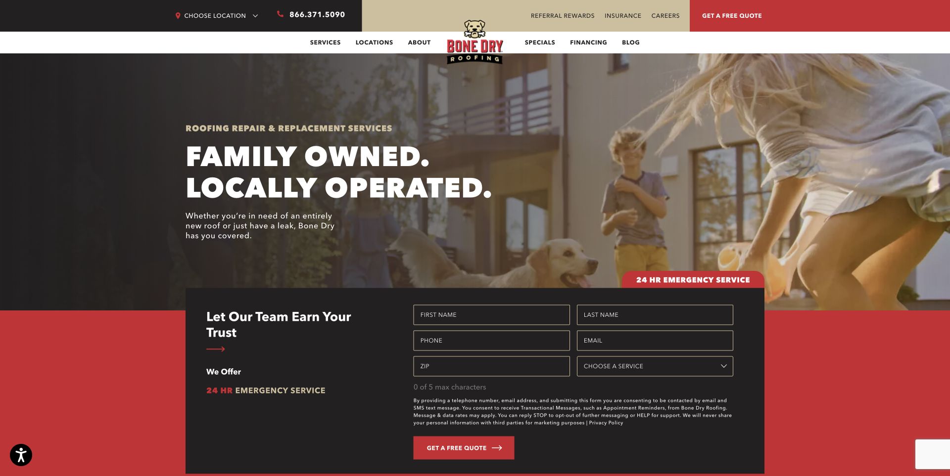
Bone Dry Roofing combines a family-oriented service message with a dark inquiry panel containing contact fields, a postal code and service selection. Emergency-service text and a quotation action appear nearby. The page demonstrates the benefit of putting the first request close to the explanation, while also showing how quickly a small form can accumulate field density and consent language that needs careful reading.
What you can learn
Keep the first inquiry limited to routing and contact information. Use persistent labels, explain required fields and distinguish a received request from a scheduled inspection or confirmed emergency response.
Pros
The service selector and postal-code field can help route an inquiry before staff need a long freeform description.
Placing the request panel near the service explanation reduces the effort required to find a practical next step.
Cons & considerations
Dense placeholder-style labels and small consent text need keyboard, zoom and screen-reader review before the form can be considered usable.
The public asset reference does not prove that the visible panel uses Gravity Forms or that submitting it produces a reliable notification and receipt.
Public source checked November 3, 2026. References may be embedded or legacy—not a complete backend inventory.
Platform source: Dated public page resource observation. The public source page referenced Gravity Forms resources on 2026-11-03. This is a scoped integration signal, not proof of configuration or successful behavior. The direct screenshot retains its separate original capture date. Platform evidence is separate from the direct website screenshot and is not a complete current infrastructure audit.
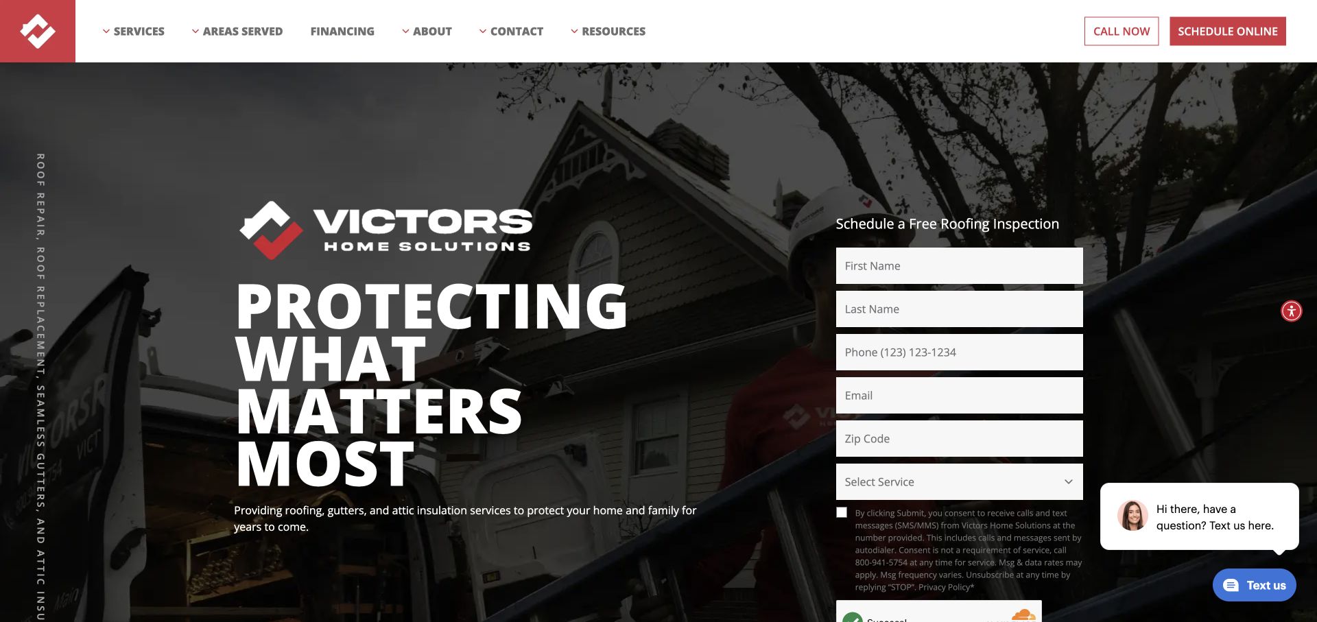
Victors Home Solutions places a vertical inspection-request panel beside a bold roof-related message, with call and online-scheduling actions in the header. A chat prompt also appears near the form. The interface provides several ways to ask for help, but their outcomes need clear language. A visitor should understand whether the form starts a conversation, reserves a slot or merely passes information to a local team.
What you can learn
Define the receipt before designing the submit button. Preserve entered information through validation errors and keep the phone route visible when a visitor cannot complete the online request.
Pros
The inspection panel is adjacent to the service introduction, making the relationship between the offer and requested information clear.
A separate phone action provides a fallback for urgent questions or visitors who prefer not to complete the form.
Cons & considerations
The chat prompt competes with the lower form area and should be tested for overlap, focus order and accidental obstruction.
Observed plugin assets do not establish that the visible scheduling panel uses Gravity Forms or that a submitted request creates a confirmed appointment.
Public source checked November 3, 2026. References may be embedded or legacy—not a complete backend inventory.
Platform source: Dated public page resource observation. The public source page referenced Gravity Forms resources on 2026-11-03. This is a scoped integration signal, not proof of configuration or successful behavior. The direct screenshot retains its separate original capture date. Platform evidence is separate from the direct website screenshot and is not a complete current infrastructure audit.
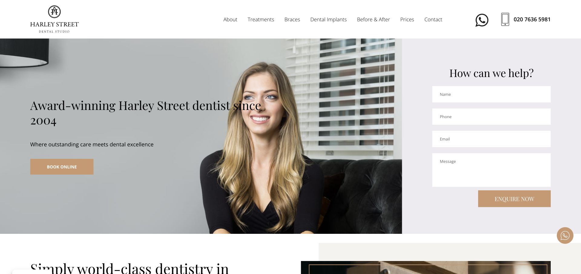
Harley Street Dental Studio combines a portrait, a short practice introduction and a booking action with a separate inquiry panel. Name, phone, email and message fields appear on a pale background at the right. The layout makes it easy to ask a question, but form planning should distinguish ordinary contact details from sensitive clinical information. The interface should explain what belongs in the message and what should use a more appropriate channel.
What you can learn
Give the inquiry form a clear scope and response expectation. Avoid inviting detailed health histories into a general message field, and distinguish an inquiry receipt from an appointment confirmation.
Pros
The booking action and question panel offer different levels of commitment for visitors who are ready to schedule or need information first.
A visually separate form panel makes the contact task easy to locate without obscuring the practice introduction and portrait.
Cons & considerations
Placeholder-only fields need persistent accessible labels so the purpose remains clear after visitors type or encounter an error.
Gravity Forms resource evidence cannot establish confidentiality, clinical suitability, appointment availability or the delivery behavior of this particular visible form.
Public source checked November 3, 2026. References may be embedded or legacy—not a complete backend inventory.
Platform source: Dated public page resource observation. The public source page referenced Gravity Forms resources on 2026-11-03. This is a scoped integration signal, not proof of configuration or successful behavior. The direct screenshot retains its separate original capture date. Platform evidence is separate from the direct website screenshot and is not a complete current infrastructure audit.
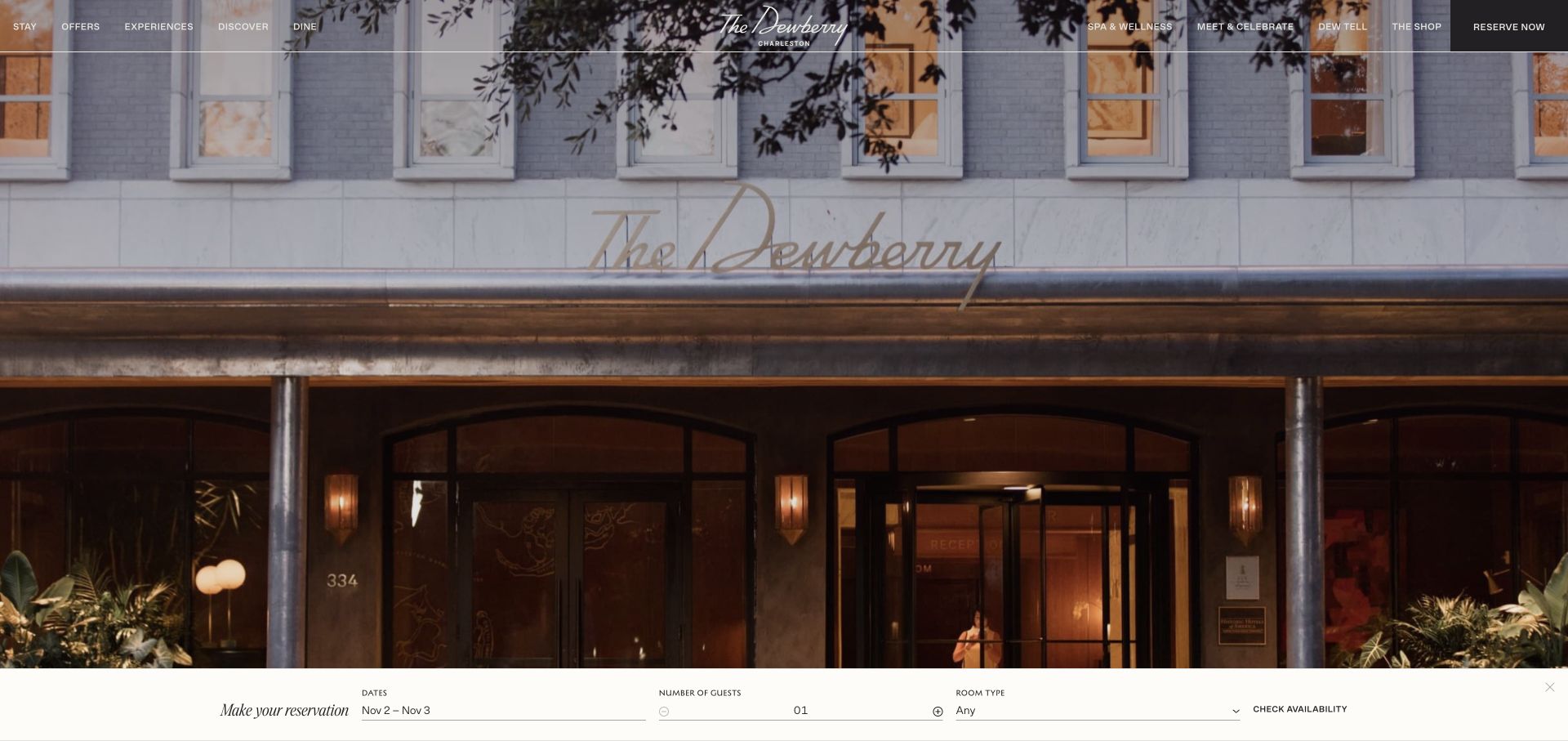
The Dewberry gives its facade most of the opening view and places a compact reservation strip along the bottom. Dates, guest count and room type form a visible sequence before the availability action. This is useful for form design because the fields correspond to a concrete next query. The interface should still explain how missing or incompatible choices are resolved, and whether the visitor is searching availability or actually making a reservation.
What you can learn
Keep search, selection and booking confirmation as distinct stages. Preserve dates and guest details after validation errors, and use a clear receipt only after the reservation system confirms the relevant action.
Pros
The reservation strip connects the atmospheric photograph with practical stay-planning fields without requiring a separate navigation search.
Grouping dates, guests and room preference reflects a familiar decision sequence that can be labeled and validated clearly.
Cons & considerations
A thin bottom strip may become cramped on phones, so field labels and date controls need enough room when stacked.
The Gravity Forms asset reference does not establish the technology, availability accuracy or transaction reliability of the visible reservation interface.
Public source checked November 3, 2026. References may be embedded or legacy—not a complete backend inventory.
Platform source: Dated public page resource observation. The public source page referenced Gravity Forms resources on 2026-11-03. This is a scoped integration signal, not proof of configuration or successful behavior. The direct screenshot retains its separate original capture date. Platform evidence is separate from the direct website screenshot and is not a complete current infrastructure audit.
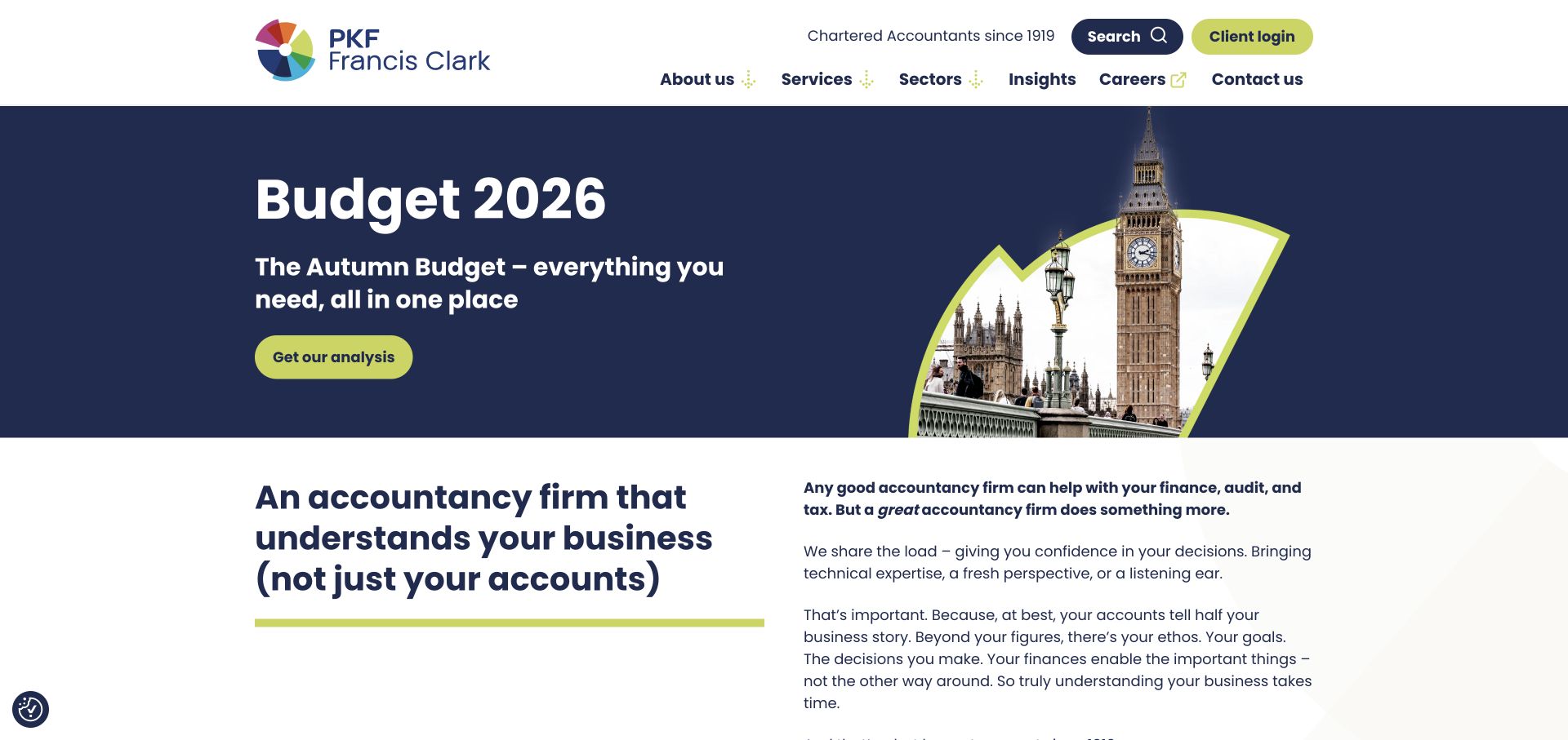
PKF Francis Clark leads with a dated budget-information campaign, followed by a concise introduction to the firm and its services. Search and client login are visually separated in the header. The layout is useful for planning forms around visitor intent: a reader seeking commentary, a prospective client and an existing client accessing records should not be sent through the same generic contact flow or asked for unnecessary information.
What you can learn
Build inquiry routes around the service question and the visitor's existing relationship. Keep public commentary readable without a form, and make secure client access distinct from general contact requests.
Pros
The dated campaign has a clear analysis action, allowing the homepage to surface timely information without replacing the service navigation.
Client login is visibly distinct from public contact and search, helping returning users choose a different path from new inquiries.
Cons & considerations
Budget and tax information requires ongoing editorial review; a captured campaign is not current professional advice for every visitor.
The plugin resource evidence does not prove which contact forms use Gravity Forms or how confidential client information is protected after submission.
Public source checked November 3, 2026. References may be embedded or legacy—not a complete backend inventory.
Platform source: Dated public page resource observation. The public source page referenced Gravity Forms resources on 2026-11-03. This is a scoped integration signal, not proof of configuration or successful behavior. The direct screenshot retains its separate original capture date. Platform evidence is separate from the direct website screenshot and is not a complete current infrastructure audit.
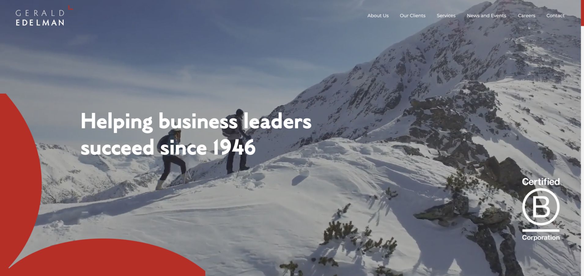
Gerald Edelman uses a mountain scene and a short business-leadership statement, with services, clients, news and contact in the header. The photograph communicates ambition and scale while the navigation carries the practical service structure. A form brief should build on that structure by identifying the purpose of the conversation. Asking for the visitor's whole business story immediately would add friction without necessarily helping route the request.
What you can learn
Begin a professional inquiry with purpose, contact preference and a concise description. Explain who will respond and keep sensitive documents outside an ordinary public contact form unless a suitable process is provided.
Pros
The restrained navigation exposes service and client context before the visitor needs to begin an inquiry or disclose information.
A short headline leaves the first screen uncluttered, giving the image and practical header room to establish the firm's presentation.
Cons & considerations
A broad success message may leave visitors unsure of the precise service they need, so the inquiry flow should offer helpful routing choices.
The observed Gravity Forms assets do not validate certifications, advisory outcomes or the secure processing and notification behavior of any particular form.
Public source checked November 3, 2026. References may be embedded or legacy—not a complete backend inventory.
Platform source: Dated public page resource observation. The public source page referenced Gravity Forms resources on 2026-11-03. This is a scoped integration signal, not proof of configuration or successful behavior. The direct screenshot retains its separate original capture date. Platform evidence is separate from the direct website screenshot and is not a complete current infrastructure audit.
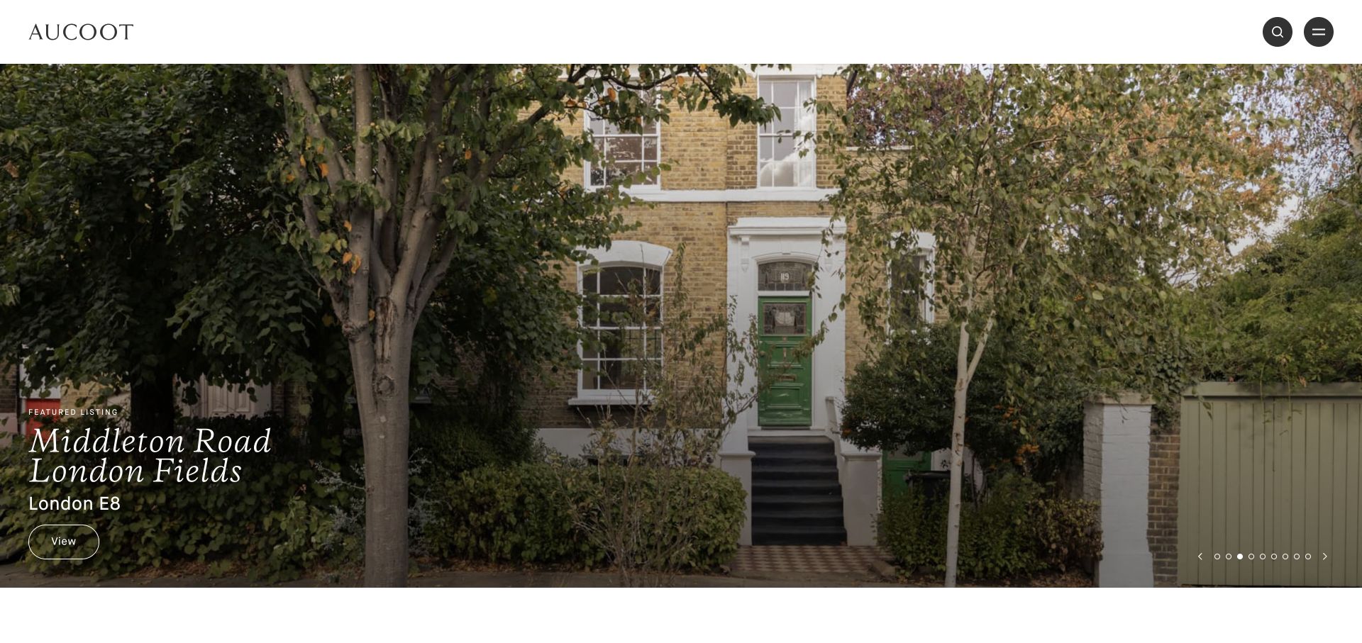
Aucoot presents a leafy residential exterior with the property's name and London location overlaid near the lower left. The header is minimal, with search and menu controls rather than a dense set of categories. The image invites a closer look, while the caption gives the interest a concrete target. An inquiry form should retain that listing context so visitors do not need to retype which property prompted their question.
What you can learn
Carry the selected property's identity into the inquiry and show it back to the visitor. Ask only for routing details at first, then explain whether the request is a question or viewing appointment.
Pros
The property name and location make the large photograph actionable instead of leaving it as an unidentified architectural image.
A restrained header gives the home room to lead while retaining search as an alternative for visitors with a specific requirement.
Cons & considerations
Small overlaid captions need reliable contrast and a clear focus treatment when linked, especially across changing listing photography.
The plugin reference does not establish listing availability or whether a submitted property request produces a confirmed viewing rather than an inquiry receipt.
Public source checked November 3, 2026. References may be embedded or legacy—not a complete backend inventory.
Platform source: Dated public page resource observation. The public source page referenced Gravity Forms resources on 2026-11-03. This is a scoped integration signal, not proof of configuration or successful behavior. The direct screenshot retains its separate original capture date. Platform evidence is separate from the direct website screenshot and is not a complete current infrastructure audit.
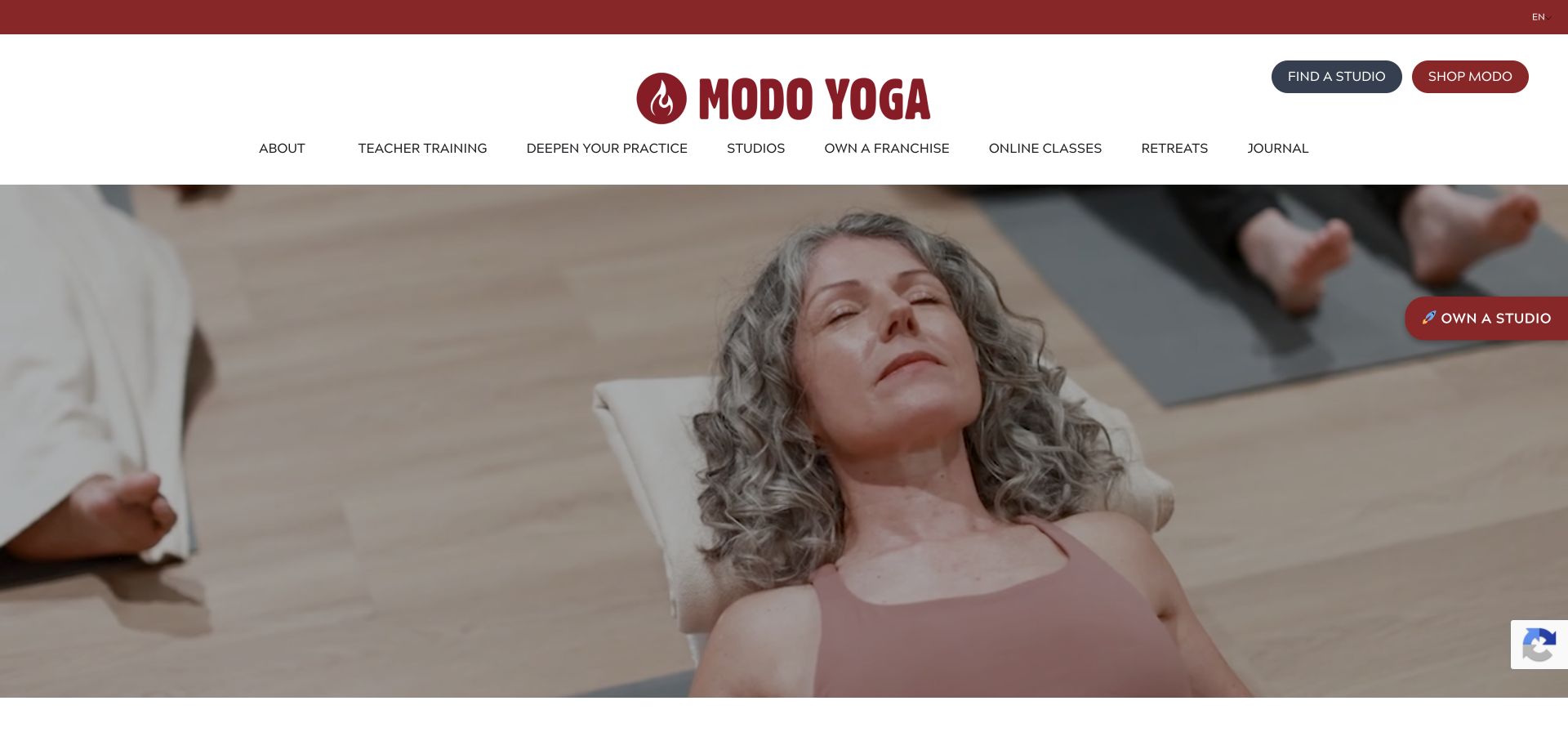
Modo Yoga pairs a quiet class photograph with navigation for studios, training, retreats, online classes and its journal. A find-a-studio action sits near the top, while a separate ownership route addresses potential operators. This is a useful example of why one form should not serve every audience. A student seeking a class, a teacher seeking training and a franchise prospect have different questions and expectations.
What you can learn
Choose the audience before choosing fields. Keep local class inquiries separate from training and ownership requests, and preserve a plain studio route for visitors who do not need to send a message.
Pros
The navigation explicitly distinguishes studios, training and other programs, providing a useful basis for separate inquiry routes.
The calm class photograph communicates the experience without pushing a large lead form over the first-screen content.
Cons & considerations
A broad program menu can become dense on mobile and should keep the local-studio route easy to locate with keyboard access.
Public Gravity Forms resources do not identify which program forms use the plugin or verify the handling of health-related details a visitor might volunteer.
Public source checked November 3, 2026. References may be embedded or legacy—not a complete backend inventory.
Platform source: Dated public page resource observation. The public source page referenced Gravity Forms resources on 2026-11-03. This is a scoped integration signal, not proof of configuration or successful behavior. The direct screenshot retains its separate original capture date. Platform evidence is separate from the direct website screenshot and is not a complete current infrastructure audit.
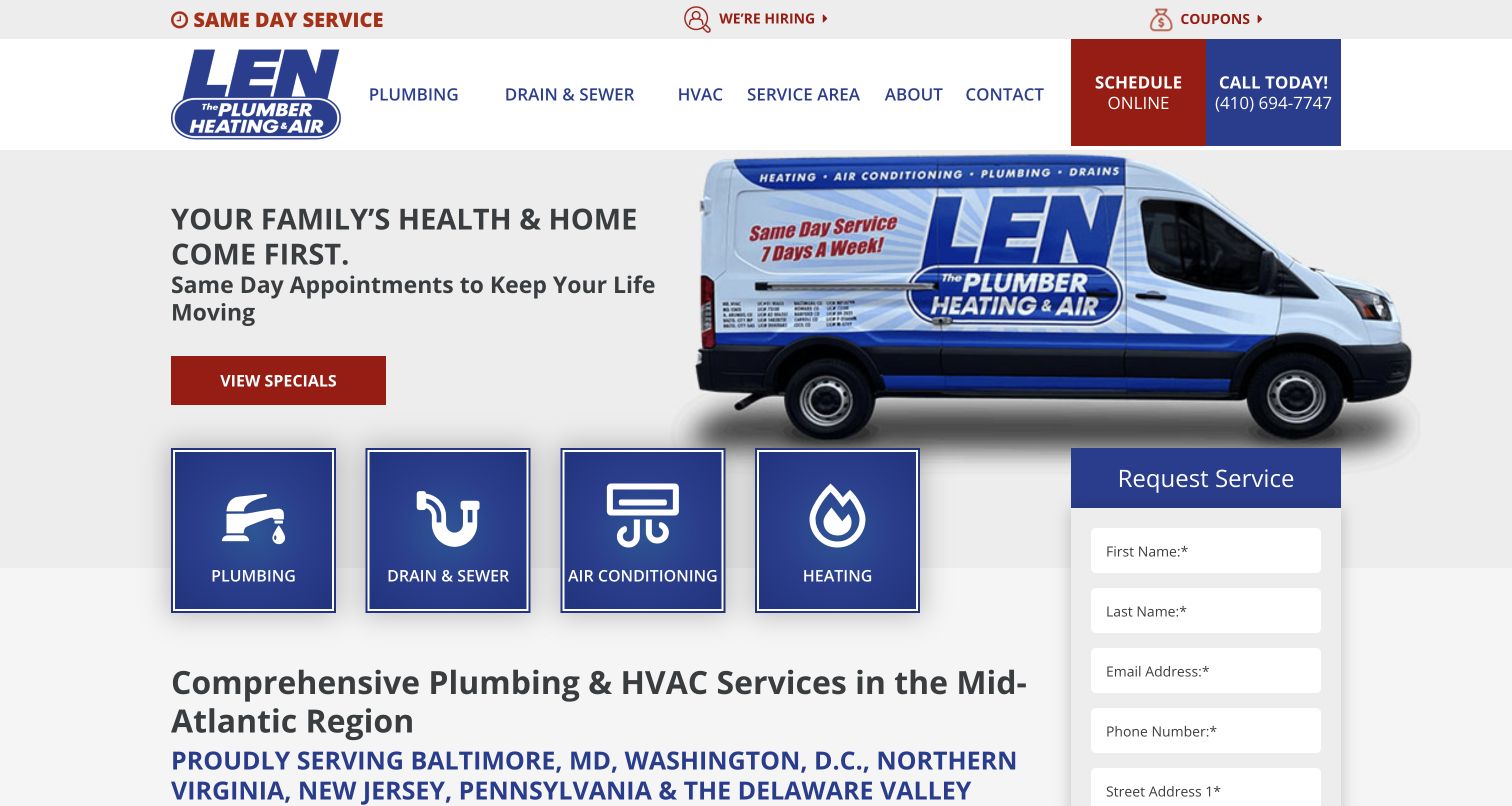
Len The Plumber places service-category tiles beneath a branded vehicle image and keeps a request panel at the right. Plumbing, drains, air conditioning and heating are presented as distinct choices, with scheduling and phone actions above. The layout demonstrates how a form can benefit from clear service classification. It also shows the need to distinguish a requested service from a guaranteed same-day appointment before visitors disclose contact and address details.
What you can learn
Carry the chosen service category into the request and explain what happens next. Preserve contact details on validation errors and offer a phone route for urgent needs without promising unconfirmed availability.
Pros
The large service tiles help visitors identify the correct category before writing a freeform account of the problem.
Scheduling and phone routes are visibly separate, supporting both online requests and conversations about more urgent or complex situations.
Cons & considerations
The form continues beyond the captured view, so the completion sequence and required disclosures need their own full-length usability review.
Gravity Forms asset presence does not prove successful request delivery or confirm that the visible panel and scheduling service use the same system.
Public source checked November 3, 2026. References may be embedded or legacy—not a complete backend inventory.
Platform source: Dated public page resource observation. The public source page referenced Gravity Forms resources on 2026-11-03. This is a scoped integration signal, not proof of configuration or successful behavior. The direct screenshot retains its separate original capture date. Platform evidence is separate from the direct website screenshot and is not a complete current infrastructure audit.
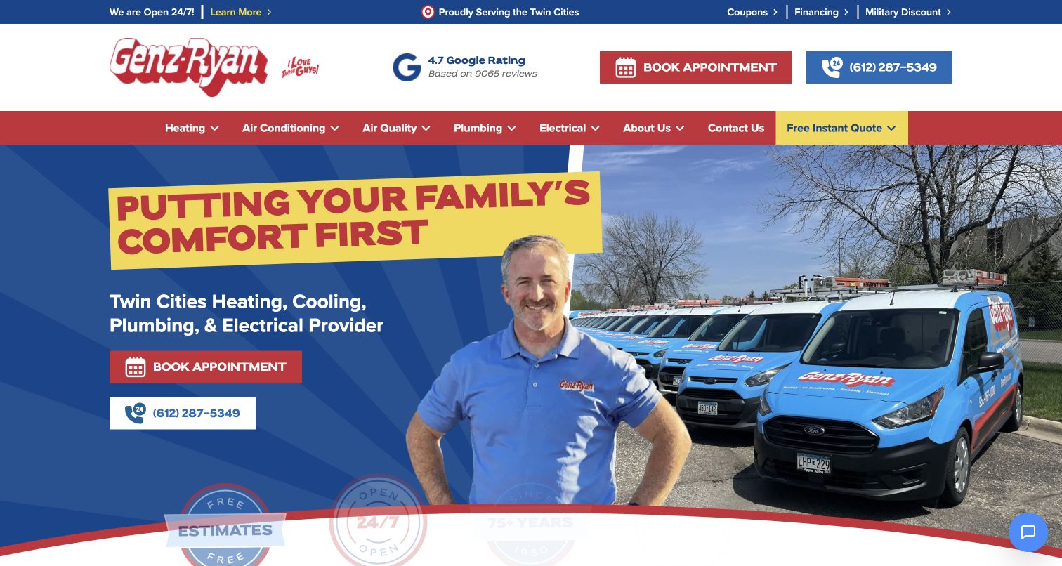
Genz-Ryan combines a staff member and vehicle photograph with a local service description, a booking action and a phone number. The header repeats contact choices and separates heating, cooling, plumbing and electrical work. The composition emphasizes availability and local identity. A useful form should preserve the chosen trade and location while avoiding a confusing mix of quotation, appointment and general-contact promises across the several visible buttons.
What you can learn
Give every contact action an explicit outcome and consistent wording. Confirm whether the visitor is requesting a call, seeking an estimate or selecting a real appointment slot before displaying success.
Pros
The local area and service categories are visible in the main message, helping visitors judge relevance before starting an inquiry.
Repeated booking and phone actions make the next step easy to find from both the header and the hero.
Cons & considerations
Several competing contact labels can create uncertainty unless the subsequent flows clearly explain how quotation and booking differ.
The dated Gravity Forms reference does not verify review ratings, response-time promises or the successful scheduling and delivery behavior behind any action.
Public source checked November 3, 2026. References may be embedded or legacy—not a complete backend inventory.
Platform source: Dated public page resource observation. The public source page referenced Gravity Forms resources on 2026-11-03. This is a scoped integration signal, not proof of configuration or successful behavior. The direct screenshot retains its separate original capture date. Platform evidence is separate from the direct website screenshot and is not a complete current infrastructure audit.
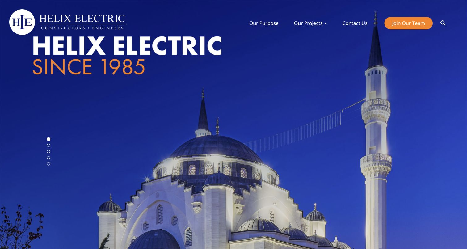
Helix Electric uses a large architectural project photograph, a short historical statement and a compact header with purpose, projects, contact and careers. The project establishes the firm's public identity without a large inquiry form in the opening. For development, the useful lesson is audience separation: a project inquiry and a job application need different fields, destinations and handling, even if both begin from the same company page.
What you can learn
Create distinct form flows for commercial inquiries and recruitment. Tell visitors which team receives the request and keep file-upload or personal-history requirements limited to the task that actually needs them.
Pros
The large project photograph gives potential clients a concrete visual reference before they decide to explore the portfolio or make contact.
The careers action is separated from ordinary contact, helping prospective employees avoid sending applications through a sales inquiry route.
Cons & considerations
Project imagery needs identifying context elsewhere so visitors can distinguish the contractor's role from the building's overall authorship.
The public plugin resources do not establish which inquiry forms use Gravity Forms or the security and retention practices of recruitment systems.
Public source checked November 3, 2026. References may be embedded or legacy—not a complete backend inventory.
Platform source: Dated public page resource observation. The public source page referenced Gravity Forms resources on 2026-11-03. This is a scoped integration signal, not proof of configuration or successful behavior. The direct screenshot retains its separate original capture date. Platform evidence is separate from the direct website screenshot and is not a complete current infrastructure audit.
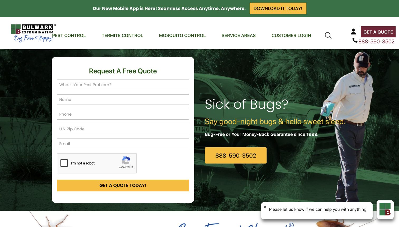
Bulwark Exterminating puts a white quotation panel directly on the hero, asking for a pest problem, name, phone, postal code and email. A verification control and quotation action follow, while a phone number remains prominent beside the panel. The design gives the visitor a compact route to help, but each required field should have a clear purpose and the form should explain what a successful submission actually means.
What you can learn
Limit the first request to the facts needed for routing and response. Preserve entered values when validation or verification fails, and offer a phone alternative without forcing repeated submissions.
Pros
The pest-problem and postal-code fields can give staff useful routing context before an extended conversation is needed.
The prominent phone route provides an alternative when the visitor cannot complete verification or needs a more immediate discussion.
Cons & considerations
Placeholders should not be the only labels because field meaning must remain clear after typing and during error correction.
The resource reference does not establish that this visible panel uses Gravity Forms or prove the accuracy of service guarantees and successful notification delivery.
Public source checked November 3, 2026. References may be embedded or legacy—not a complete backend inventory.
Platform source: Dated public page resource observation. The public source page referenced Gravity Forms resources on 2026-11-03. This is a scoped integration signal, not proof of configuration or successful behavior. The direct screenshot retains its separate original capture date. Platform evidence is separate from the direct website screenshot and is not a complete current infrastructure audit.
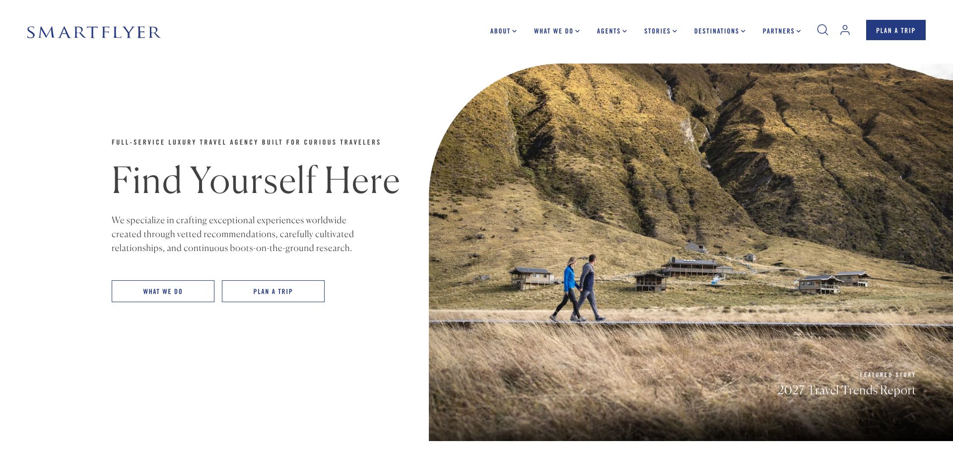
SmartFlyer pairs a restrained statement about travel planning with a large landscape photograph and two actions: learning about the service or planning a trip. The distinction supports visitors at different stages of readiness. A form brief can follow the same pattern by asking only for information relevant to an initial conversation, rather than immediately requiring a complete itinerary, identity documents or payment details from someone still exploring.
What you can learn
Start travel inquiries with goals, approximate timing and contact preferences. Explain that an inquiry is not a reservation, and collect sensitive booking information only through the appropriate later process.
Pros
The two actions distinguish service evaluation from starting a planning conversation, avoiding an all-or-nothing first-screen commitment.
The spacious photograph creates a sense of destination while leaving the service description and next steps readable beside it.
Cons & considerations
A broad inspiration image cannot explain availability, costs or suitability, so the planning flow should set clear expectations before collecting detail.
Gravity Forms assets on the public page do not identify the technology of every trip-planning flow or confirm secure handling of subsequent traveler information.
Public source checked November 3, 2026. References may be embedded or legacy—not a complete backend inventory.
Platform source: Dated public page resource observation. The public source page referenced Gravity Forms resources on 2026-11-03. This is a scoped integration signal, not proof of configuration or successful behavior. The direct screenshot retains its separate original capture date. Platform evidence is separate from the direct website screenshot and is not a complete current infrastructure audit.
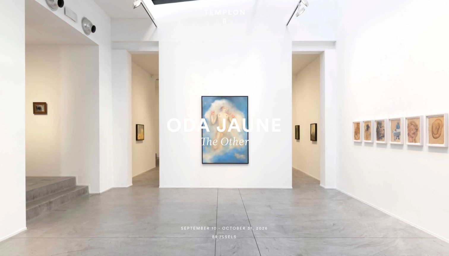
Templon uses a large gallery-installation photograph with the artist's name and exhibition information overlaid. A compact menu and small shop control sit at the right edge, while dates and location appear near the bottom. The image provides an experience of the displayed work, but inquiry forms should retain the exact artwork or exhibition context. Visitors should not have to reconstruct what they were viewing when contacting the gallery.
What you can learn
Carry exhibition or artwork context into an inquiry and show that context clearly. Keep visit information readable without submission, and distinguish a general question from a purchase or reservation commitment.
Pros
The installation photograph shows the relationship between works and space, offering more context than a single isolated artwork image.
Artist, date and location information anchor the presentation to a specific exhibition rather than an unidentified decorative gallery view.
Cons & considerations
White text over a bright interior and small date labels need contrast and responsive review before the information can be relied on.
The plugin reference does not establish artwork availability, rights, prices or the successful delivery and routing of a particular gallery inquiry form.
Public source checked November 3, 2026. References may be embedded or legacy—not a complete backend inventory.
Platform source: Dated public page resource observation. The public source page referenced Gravity Forms resources on 2026-11-04. This is a scoped integration signal, not proof of configuration or successful behavior. The direct screenshot retains its separate original capture date. Platform evidence is separate from the direct website screenshot and is not a complete current infrastructure audit.
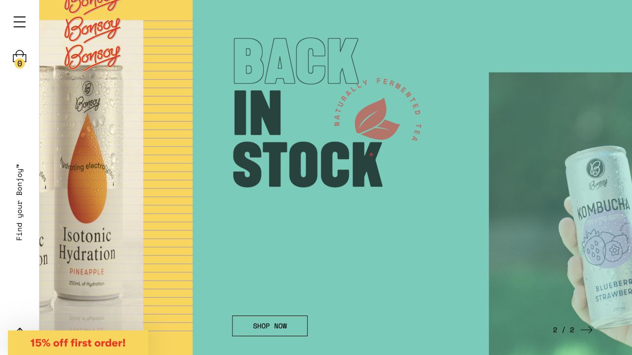
Bonsoy uses a split product campaign with bright color fields, packaging photographs and a shopping action. The retained capture also includes a first-order promotion at the lower edge. The page makes the range tangible through recognizable packaging, while form planning should distinguish customer questions, stockist requests and online orders. Those tasks may share a brand but should not receive an identical generic receipt or request the same information.
What you can learn
Route product, retailer and wholesale questions explicitly. Keep ordinary product information available without a form, and explain whether a submission requests assistance, registers interest or completes a commerce action.
Pros
Packaging photographs connect the promotional message with identifiable products, giving visitors a concrete reference for further shopping or questions.
The contrasting color fields separate the campaign elements without requiring a dense grid of product descriptions in the first screen.
Cons & considerations
A back-in-stock message and introductory discount are time-sensitive promotions, so they need current terms beyond the retained screenshot.
The dated Gravity Forms asset evidence does not prove that the shopping action uses the plugin or establish stock accuracy, order completion or message delivery.
Public source checked November 3, 2026. References may be embedded or legacy—not a complete backend inventory.
Platform source: Dated public page resource observation. The public source page referenced Gravity Forms resources on 2026-11-03. This is a scoped integration signal, not proof of configuration or successful behavior. The direct screenshot retains its separate original capture date. Platform evidence is separate from the direct website screenshot and is not a complete current infrastructure audit.
Use a short form when the next step is a conversation rather than a final transaction. Explain which team will respond and what details help route the request. Give visitors another appropriate contact route when their question does not fit the form.
Use conditional questions with a clear purpose
Gravity Forms supports conditional logic affecting form elements and actions. Use it to avoid irrelevant questions, then test every important branch. A hidden field or changed answer should not leave visitors uncertain about what will be submitted or what happens next.
A request for a visit or consultation may need staff review or another system. Say so clearly. If a journey leaves the site, name the destination and maintain enough context for the visitor to understand the handoff.
From references to requirements
Plan fields, confirmation and responsibility together
Map the complete submission journey
List the form entrance, required inputs, validation states, confirmation, notification and receiving workflow. Assign an owner to each step. Include the route for a visitor who does not receive a response or needs to correct information.
Test theme and custom code together
Custom styling and code can change the behavior of an otherwise usable form. Gravity Forms provides developer accessibility guidance; apply it to customizations and test the result with the actual theme, error messages and keyboard interactions.
Use an isolated test configuration with controlled recipients and synthetic information. Check how validation, confirmation and routing respond. Keep test messages out of real customer or staff workflows, and document any external integration separately from the plugin’s presence.
A useful handover demonstration
Ask the actual team to carry out its routine job: publish a realistic update, correct a mistake, preview a narrow screen, and identify who owns an integration failure. For a library or frontend framework, also ask who maintains the content source and deployment. A polished screenshot does not answer those operational questions.
Beyond the screenshot
Before releasing a Gravity Forms implementation
Define the purpose of the form and the actual next step.
Give every field a clear use, label and responsible owner.
Distinguish required inputs from optional information.
Test keyboard use, instructions, errors and narrow-screen layout.
Check every meaningful conditional branch with synthetic inputs.
Make confirmations match the actual submission state.
Verify routing and external handoffs in a controlled test environment.
Assign responsibility for updates, response failures and ongoing review.
Test with real content, a keyboard, a small screen, slow or failed requests, and the people who will maintain the system. These are planning checks, not an accessibility, security, performance, or search-ranking certification.
Sources & editorial method
How this Gravity Forms collection was reviewed
The reviews were authored on November 4, 2026 using genuine existing direct browser captures. Actual capture dates, source URLs and dimensions remain attached to each image. Dated Gravity Forms asset references are scoped to the exact observed public property. No real forms were submitted. The collection does not verify a specific form’s configuration, delivery, entry storage, integrations or accessibility conformance.
Every image is an unmodified capture from the actual website, with its source and capture date. Some captures are reused from our shared catalog; their dates remain the original capture dates. None comes from a vendor gallery or a generated reconstruction. Moving imagery and live content can change.
Technology attribution uses public page assets or metadata, official platform documentation, or a cited first-party project case study. Documentary and framework-relationship evidence is identified where used; it is not a complete current backend inventory. A CMS image CDN alone does not establish a full CMS deployment. A library’s presence does not prove which individual controls use it, and a platform label does not establish AI authorship.
The composition notes, lessons, pros and tradeoffs are original editorial observations. We have not measured conversion, traffic, security, performance or accessibility conformance. Website owners retain their brands and imagery; these examples are not our client portfolio. Written, Edited and Curated are independent records, not dates advanced by a build. See our editorial standards or suggest a correction.
Questions worth asking
Gravity Forms website development FAQs
Does a Gravity Forms asset prove which form a site uses?
It establishes that the page referenced an identifiable plugin resource. It does not by itself map every visible form, button or external booking route to that plugin.
Were submissions tested on these websites?
No real forms were submitted. Reviews concern the visible page design and dated public resource evidence, with testing advice intended for a controlled environment you own.
Does using the plugin make a form accessible?
No automatic conformance claim follows from the plugin name. Labels, field choices, theme customizations, validation and surrounding content all need review in the assembled page.
Should every inquiry use a long form?
No. Ask for the information needed for the next useful action. Longer applications may justify additional steps, but each question should have a purpose and a clear handoff.