Definitive guide · Apache Spark website development
Best Apache Spark Websites of 2026 (20 Real-World Examples)
Website design references with scoped Apache Spark associations, not a list of Spark-built homepages
Explore 20 public websites and publications from organizations named in Apache Spark’s community adopter directory. The screenshots show design decisions; the documentary entries describe analytical or data-processing context. Those associations are undated and may be historical, and they do not identify the complete stack serving the pictured pages.
Spark is a data-processing engine, not a visual website builder. A project might use it to prepare a large catalog, aggregate operational events or build analytical datasets while a conventional application serves the public interface. The first planning decision is therefore not what the homepage should look like. It is what data must be transformed, which downstream task depends on the result and why the workload needs distributed processing rather than a simpler database query or scheduled script.
Amazon, Autodesk, eBay, Shopify and NASA JPL’s Deep Space Network open this collection. The NASA reference is a public explainer article, not a control system. Other entries include marketing pages, a media center and corporate publications. These varied design references should not be mistaken for evidence of a shared frontend architecture. The Apache directory helps establish organizational context, but its community-maintained and undated nature limits what can be said about current deployments.
Before the examples
What makes good Apache Spark website development in 2026?
Define the dataset before the cluster
Specify the input sources, the grain of the output, its consumers and its expected refresh interval. Include late records, corrections and deletion requirements. A useful output definition explains what one row represents and how the receiving application knows which version is complete. Without that agreement, a faster processing job can simply produce a larger amount of ambiguous data.
Benchmark representative work
Use realistic data shapes, joins and file sizes when evaluating a design. Spark’s tuning guidance discusses serialization, memory and parallelism because the limiting resource varies by workload. A small demonstration that fits comfortably in memory does not predict how a skewed production join or a large recovery run will behave. Record both correctness and resource use during evaluation.
Keep analytical computation outside the visitor’s critical path
Where possible, publish a prepared result through a store or API designed for the application’s response-time requirements. Define what the interface displays while new data is being processed or a refresh fails. Avoid treating a successful background job as proof that customers can immediately retrieve the right result with suitable permissions.
The collection · 20 examples
20 Apache Spark website examples worth studying
Look at the visible information hierarchy, audience routes and explanatory patterns in these examples. A company’s adopter entry supports a narrower Spark association, not a conclusion about the public site’s hosting, CMS or current runtime. Original source qualifications and capture dates are retained.
We start with five recognizable brands or organizations: Amazon, Autodesk, eBay, Shopify, NASA JPL Deep Space Network. Each attribution applies to the named website property, not every product or website belonging to its organization. This is a curated reading sequence, not a measured ranking.
Amazon News puts a colorful lead article next to a narrower column of additional headlines. The white header distinguishes news, company information and impact, while the familiar wordmark provides continuity with the retail brand. A small announcement strip sits above the editorial grid without replacing it. The opening is therefore recognizably a publication: photographs, headline length and the relative sizes of stories establish priority. It is not the shopping homepage, and its design should be evaluated around readers finding company information rather than completing a purchase. The captured promotion is a temporary editorial subject, not an evergreen statement about the organization.
What you can learn
Give a corporate newsroom a real front-page hierarchy. Assign one lead story, make supporting articles discoverable, and maintain clear dates and permanent destinations. The archive and navigation must continue working when the promotional subject changes or the featured image is unavailable.
Pros
The lead and secondary articles have visibly different editorial weight.
Company and impact information remain accessible beside the news stream.
Cons & considerations
Promotional stories can dominate more practical corporate information.
Changing features require a useful archive rather than homepage-only discovery.
Platform source: Primary documented Apache Spark association. Apache Spark’s community adopter list includes Amazon. Platform evidence is separate from the direct website screenshot and is not a complete current infrastructure audit.
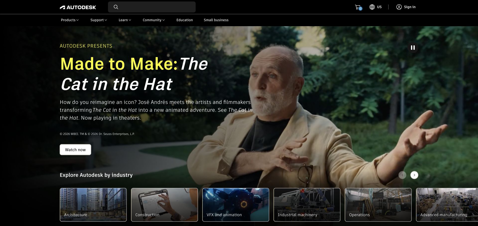
Autodesk opens with a film image and an yellow-and-white headline. A short introduction and viewing action sit over the photograph, while a row of illustrated industry cards begins near the bottom of the hero. That second layer is important: architecture, construction, visual effects and industrial work are visibly different routes rather than one vague promise about software. The black global header supplies products, support and account utilities above the story. The result is an editorial introduction with a practical audience selector attached. The film promotes a particular creative project; it does not demonstrate the capabilities of every Autodesk product or the underlying technology of this public page.
What you can learn
Use a compelling project to introduce the brand, then offer direct routes for visitors whose context is clear. Keep product information and support outside the film so they do not depend on playback, sound or recognizing the featured production.
Pros
Industry cards translate a broad brand into more specific entry points.
Strong type contrast helps the lead story remain legible over photography.
Cons & considerations
Autoplay imagery needs effective pause and reduced-motion alternatives.
The featured production may be less useful to visitors seeking a specific tool.
Platform source: Primary documented Apache Spark association. Apache Spark’s community adopter list includes Autodesk. Platform evidence is separate from the direct website screenshot and is not a complete current infrastructure audit.
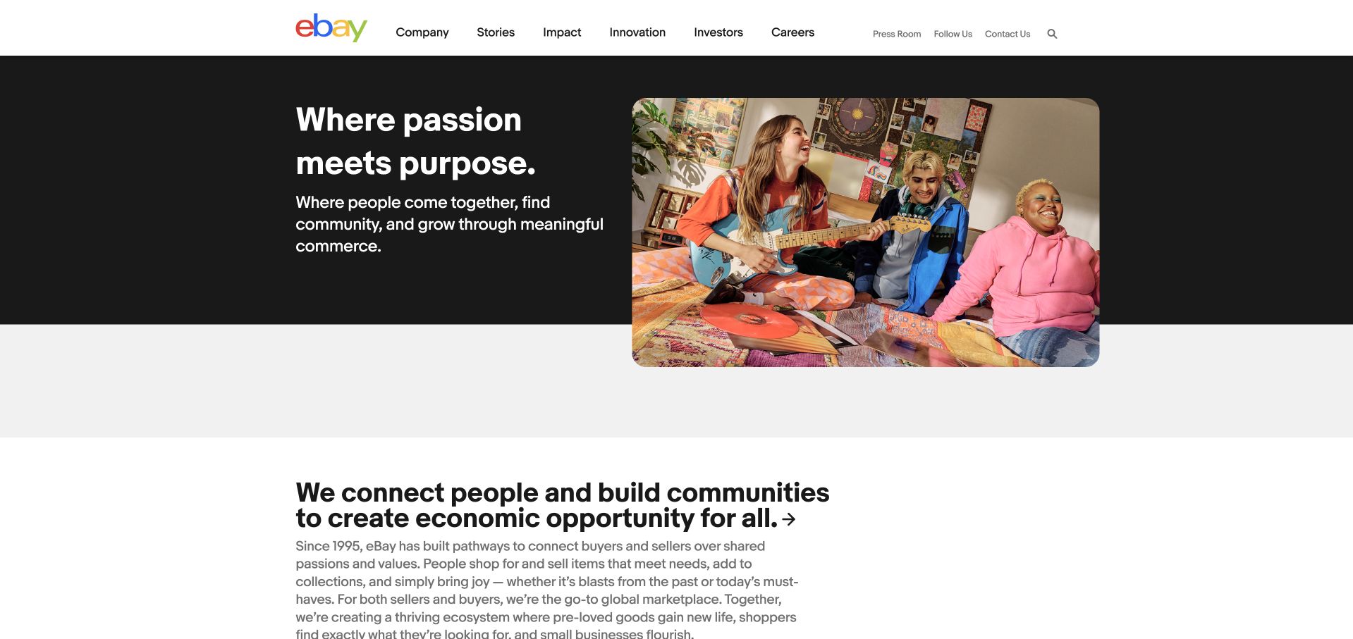
eBay’s corporate page places a short white statement on a black panel beside a rounded collage of people and objects. Its clean white header lists company information, stories, impact, innovation and careers instead of shopping categories. The next section begins with another plain-language statement and a compact explanation, making the transition from hero to supporting content easy to follow. The bright collage adds personality without forcing all text onto a busy photograph. This is a useful corporate reference because the layout explains a company’s intended role while acknowledging several audiences. It is not evidence that the same arrangement would work as the product-search interface of the marketplace itself.
What you can learn
Match navigation to the purpose of the property, even when the parent brand is very familiar. A company site can use mission and people to establish context, provided applicants, journalists and investors still receive direct paths to the information they came to find.
Pros
A solid text panel preserves readability beside expressive imagery.
Corporate audience routes are distinct from consumer buying tasks.
Cons & considerations
Broad purpose language needs concrete supporting stories and documents.
A collage requires thoughtful cropping and meaningful alternative text.
Platform source: Primary documented Apache Spark association. Apache Spark’s community list describes eBay transaction-log analytics. Platform evidence is separate from the direct website screenshot and is not a complete current infrastructure audit.
The captured Shopify page uses a large photograph of a person at work as its opening canvas. A short white headline occupies the left side, with a compact explanation and a rounded trial button beneath it. The dark navigation is deliberately restrained, keeping product, pricing and enterprise routes available without turning the first screen into a feature catalog. A secondary agent-oriented control introduces another way of exploring the service. The composition draws its energy from a specific merchant-facing campaign, not a generic collection of software diagrams. This is an older retained capture with its original date; current promotions and interface details may differ from what is pictured here.
What you can learn
Show who the product is for before presenting every technical capability. Keep the main action easy to identify and explain what happens after it. When campaigns rotate, preserve stable routes to pricing, product limitations and the practical information needed to assess the platform.
Pros
A human working scene gives the software proposition immediate context.
The primary trial action is visually distinct from ordinary navigation.
Cons & considerations
Overlay typography must remain readable across responsive image crops.
Campaign language should not replace clear product and pricing explanations.
Platform source: Primary documented Apache Spark association. Apache Spark’s community adopter list includes Shopify. Platform evidence is separate from the direct website screenshot and is not a complete current infrastructure audit.
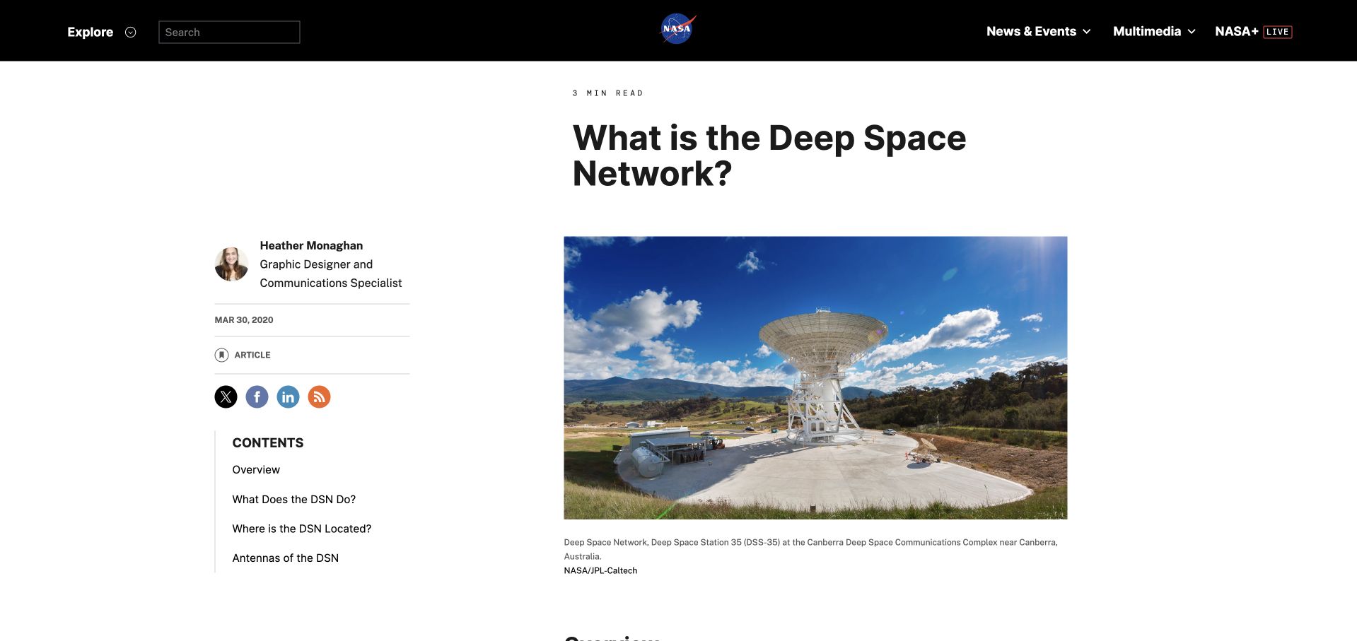
The NASA page explaining the Deep Space Network is an article, not a conventional product homepage. Its black global header leads into a large question-shaped title, a photograph of a radio antenna and a readable body column. Author information and publication date occupy a separate left rail, with article contents below. This arrangement distinguishes the source of the information from the explanation itself. The photograph helps readers connect an abstract communications system with physical equipment. The article is an editorial reference; the separate Apache Spark adopter entry concerns NASA JPL’s Deep Space Network and does not identify the publishing runtime of this NASA article.
What you can learn
Give technical explainers a clear reading order: question, orientation image, concise introduction and navigable sections. Preserve authorship and publication context without making them compete with the main explanation. A contents list should help readers return to a specific question after their first visit.
Pros
Authorship and original publication context are visible alongside the article.
A contents rail makes a specialized explanation easier to revisit.
Cons & considerations
Sidebars need a coherent mobile order and keyboard-accessible links.
A large introductory image can delay substantive information on small screens.
Visible tech stack
Earlier / documented evidence
Apache Spark
Platform source: Primary documented Apache Spark association. Apache Spark’s community list names NASA JPL’s Deep Space Network. Platform evidence is separate from the direct website screenshot and is not a complete current infrastructure audit.
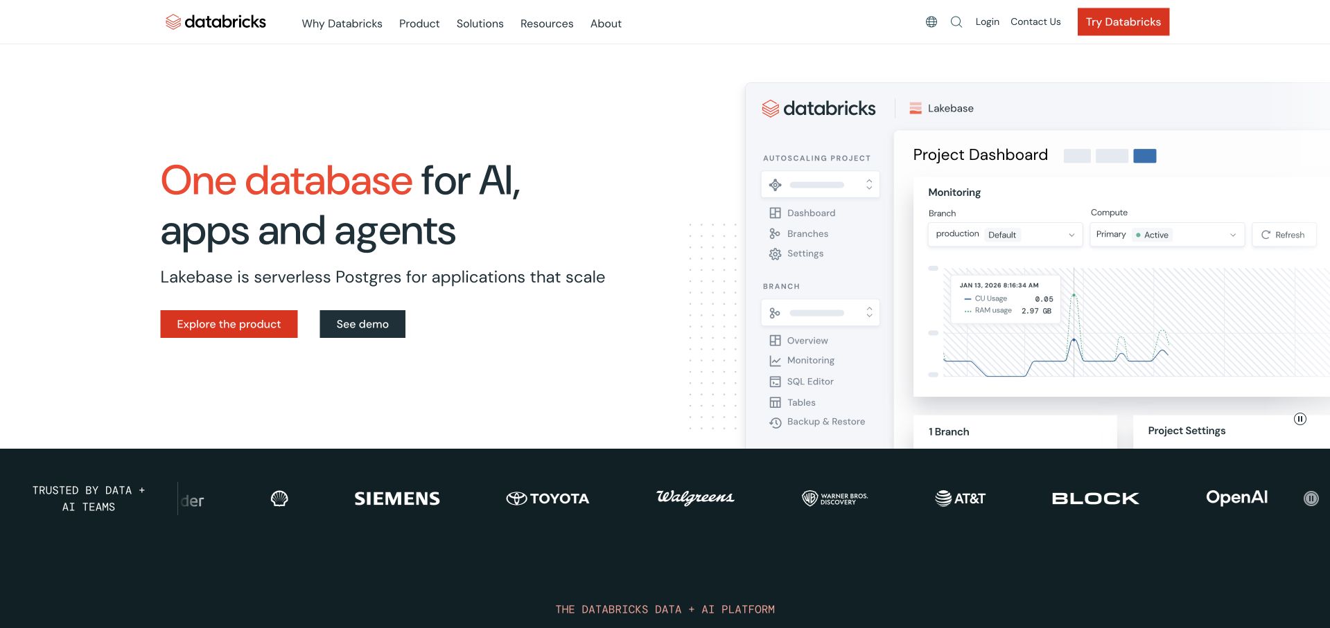
Databricks uses a white opening with a two-color headline on the left and an oversized product-interface illustration on the right. The explanation names the featured database product, while two adjacent actions distinguish exploring it from seeing a demonstration. A dark customer-logo strip creates a clear break before the next platform section. The interface image gives the headline a concrete visual object, although it is still a marketing illustration rather than a live account or an independently tested deployment. The page’s opening campaign may focus on one product within the wider company, so readers should distinguish that feature from the broader Spark association documented separately.
What you can learn
Use an interface image to explain what someone would actually work with, not merely to decorate a technical headline. Give the illustrated product a name and scope. Keep the demo and documentation routes available when animation is paused or the image cannot be seen.
Pros
The split layout connects the proposition with a tangible software interface.
Two action styles distinguish exploration from a guided demonstration.
Cons & considerations
Large interface images need readable supporting text at smaller sizes.
Customer logos require context and do not prove suitability for another project.
Platform source: Primary documented Apache Spark association. Apache Spark’s community list describes Databricks’ Spark platform. Platform evidence is separate from the direct website screenshot and is not a complete current infrastructure audit.
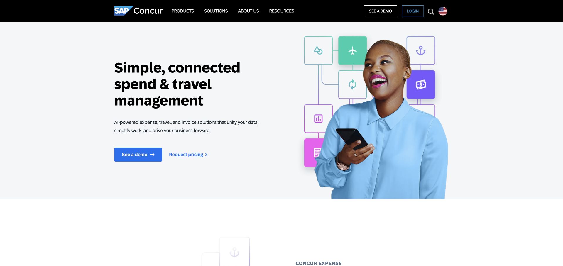
SAP Concur pairs a headline with a photograph of someone using a phone. Small colored interface symbols sit around the photograph, suggesting several parts of the expense and travel workflow without replacing the human subject. The pale background and generous spacing keep the opening calm. A blue demonstration button receives the main emphasis, with a quieter pricing route beside it. The black SAP-branded header provides a stable boundary above it. This is a marketing presentation of a business software category, not a demonstration that a visitor has completed an expense task, and the public design should not be read as evidence of processing accuracy or policy compliance.
What you can learn
Explain the business job first, then use a small number of interface cues to make it tangible. Give visitors separate routes for product exploration, pricing and existing-customer support. Important purchasing details should be available in text rather than hidden inside a polished promotional image.
Pros
A restrained headline and photograph create a clear first-screen hierarchy.
Demonstration and pricing paths have different but visible emphasis.
Cons & considerations
Decorative interface symbols cannot replace a usable product walkthrough.
Broad enterprise positioning needs more specific information for different team sizes.
Platform source: Primary documented Apache Spark association. Apache Spark’s community list describes Concur travel analytics. Platform evidence is separate from the direct website screenshot and is not a complete current infrastructure audit.
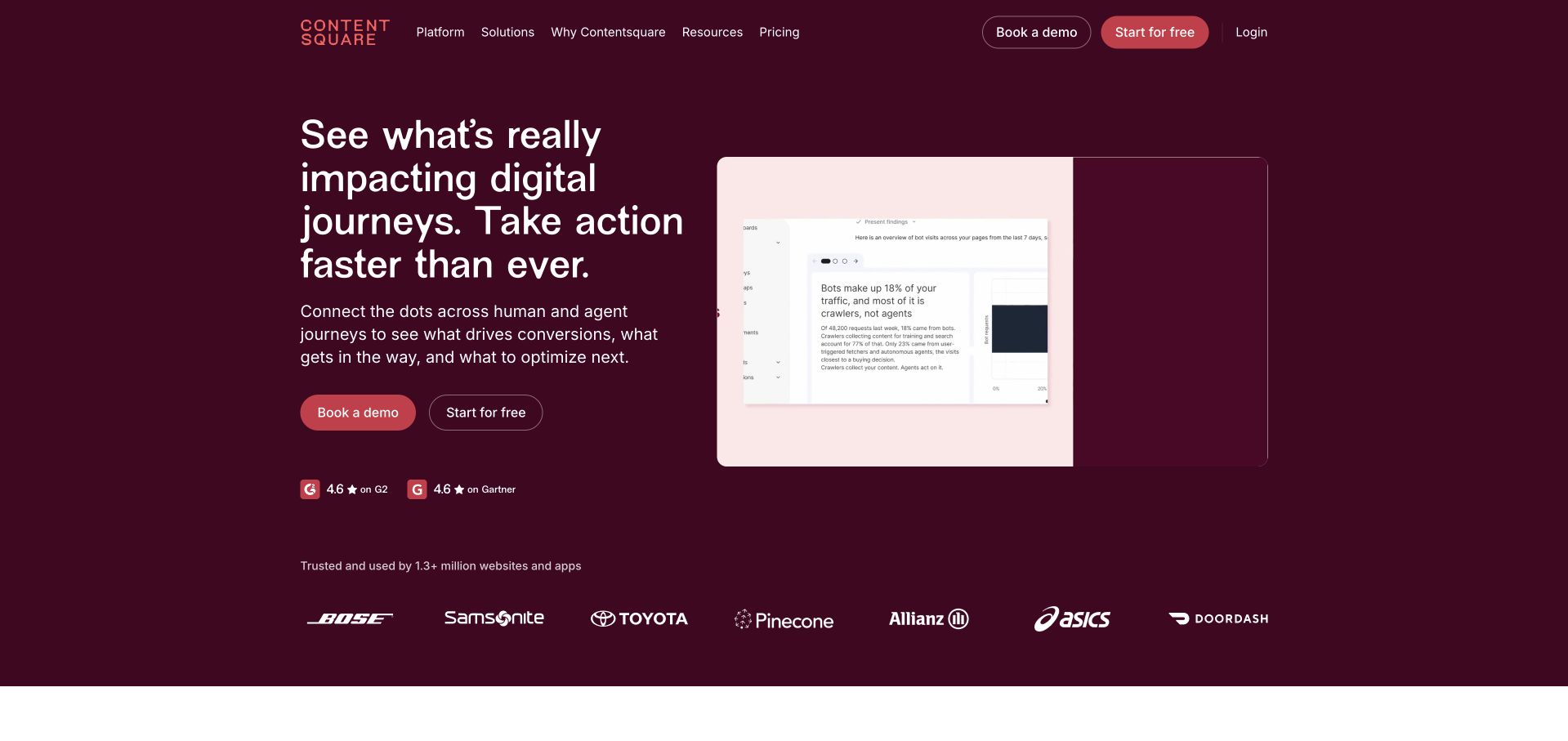
Contentsquare uses a deep burgundy background, a white multiline headline and a lighter product-demo panel. The left column contains the proposition, a short explanation and paired actions, while the demonstration sits to the right within a clearly bounded frame. A row of customer marks follows beneath the introductory content. The consistent color field makes the two halves feel like one story rather than disconnected modules. The visible product panel is useful, but the screenshot cannot establish what data was collected, whether a diagnosis is correct or how another organization should implement analytics. Those operational questions need separate documentation and an appropriate privacy review.
What you can learn
Give a complex software page one clear visual environment and one concrete demonstration. Explain what the viewer is looking at in surrounding text, and make essential information available without playing a video. Keep privacy, implementation boundaries and product limitations accessible beyond the sales headline.
Pros
The consistent background connects headline, actions and product demonstration.
The bounded demo panel gives technical positioning a concrete visual reference.
Cons & considerations
Embedded demonstrations need captions, controls and a useful static fallback.
Customer marks and short claims need supporting context rather than implied guarantees.
Platform source: Primary documented Apache Spark association. Apache Spark’s community list describes Contentsquare analytics processing. Platform evidence is separate from the direct website screenshot and is not a complete current infrastructure audit.
Credit Karma places its introductory message over a full-width photograph of two people outdoors. A white example loan card floats on the right, while bright signup and quieter login actions sit below the main statement. The Intuit strip and navigation distinguish the product from its wider corporate group. The example card gives the abstract promise a recognizable financial shape, and the page labels it as illustrative. That distinction matters: a design review cannot establish an individual’s eligibility, approval odds or borrowing terms. The useful pattern here is visual explanation with an explicit boundary between a promotional example and a real personal financial decision.
What you can learn
When an interface illustrates a consequential product, state clearly that the numbers are examples. Keep eligibility information, terms and support available before asking for personal details. Use visual hierarchy to explain the service without making a photograph or an example card look like a personalized offer.
Pros
Signup and login are easy to distinguish on the opening screen.
The illustrated card helps explain an otherwise abstract service category.
Cons & considerations
Financial examples need prominent qualifications and clear supporting terms.
Photographic text overlays require contrast checks across different screen sizes.
Platform source: Primary documented Apache Spark association. Apache Spark’s community list describes Credit Karma personalization. Platform evidence is separate from the direct website screenshot and is not a complete current infrastructure audit.
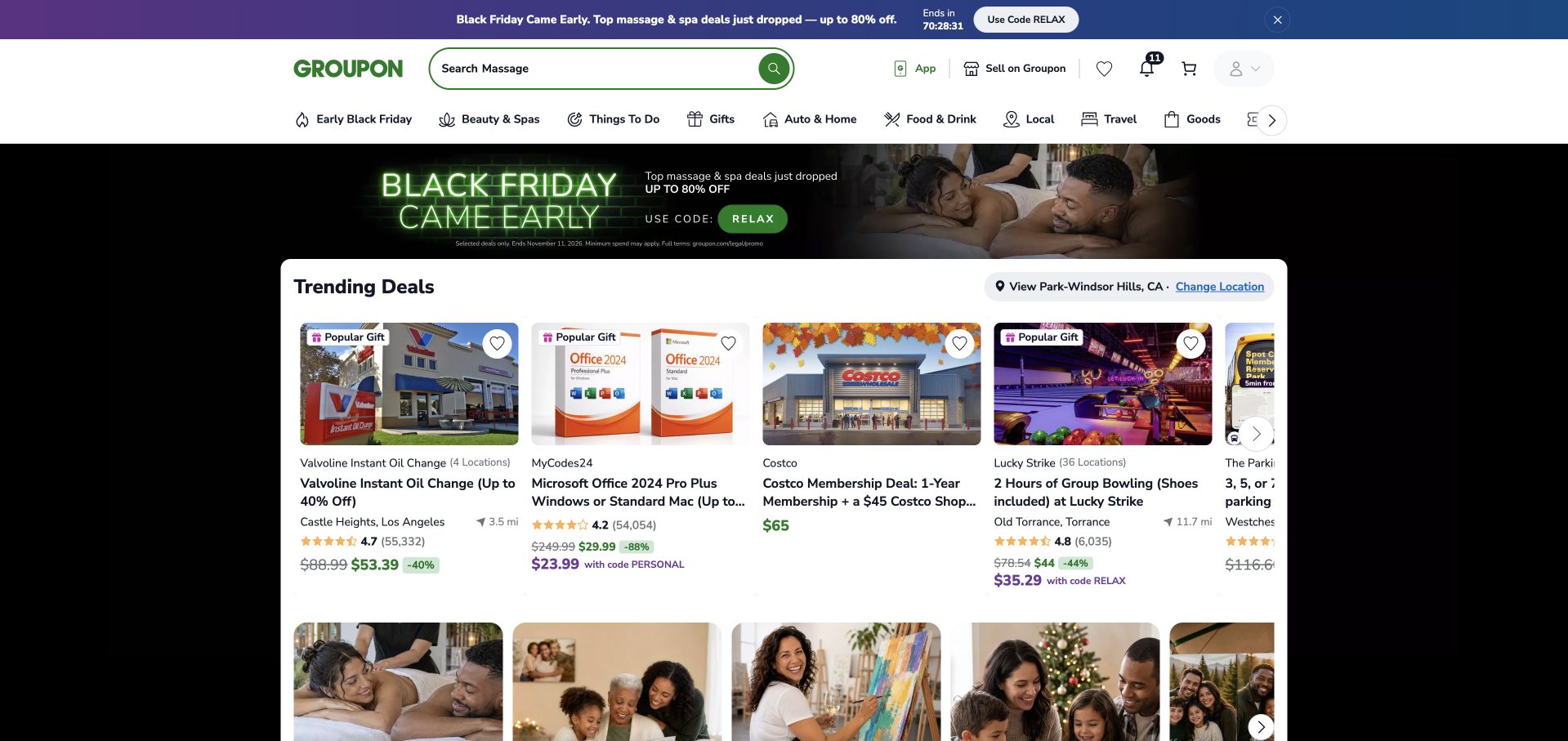
Groupon combines a prominent search field with a dense category row and a grid of deal cards. The green brand mark and controls provide continuity, while a campaign strip and promotional banner introduce the current offer theme. Product images, prices and short labels do much of the scanning work. The opening favors immediate browsing over a long explanation of the company. Location is also part of the interface, which is important for a catalog of local offers. The captured selection is a public browsing view, not proof that a particular deal is available to every visitor or that its advertised value has been independently verified.
What you can learn
Make search, location and category selection understandable before expanding the catalog. Give cards consistent information so users can compare like with like. Keep expiry, redemption limits and other important conditions close to the offer rather than relying on a visually attractive promotion alone.
Pros
Search and category routes support several ways into the same catalog.
Consistent cards make a dense first screen easier to compare.
Cons & considerations
Promotional strips can compete with the main discovery controls.
Local availability and offer conditions need clear, current explanations.
Visible tech stack
Earlier / documented evidence
Apache Spark
Platform source: Primary documented Apache Spark association. Apache Spark’s community adopter list includes Groupon. Platform evidence is separate from the direct website screenshot and is not a complete current infrastructure audit.
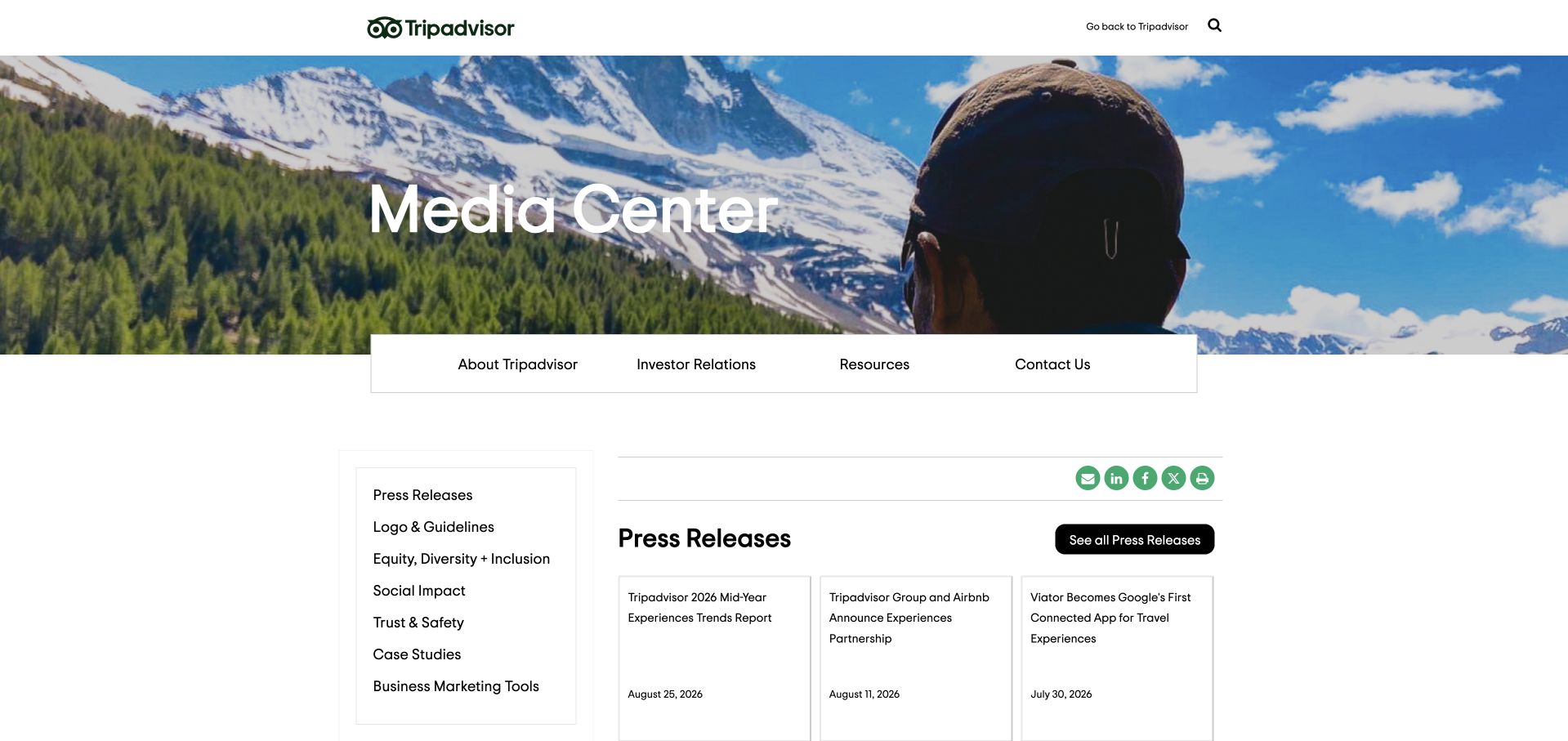
Tripadvisor’s media center opens with a wide outdoor photograph and a white title. A compact row of company and contact links overlaps the lower edge of the image, leading into a quieter white publishing area. A left-hand list groups press releases, brand guidelines, trust and other resources, while the main column presents release cards. The scenic photograph preserves the travel association, but the supporting structure is clearly designed for readers seeking company information. This is a useful example of separating press tasks from consumer booking journeys. The captured media property and engineering account have different purposes; neither alone identifies the complete current infrastructure of Tripadvisor.
What you can learn
Let a specialist corporate publication retain the parent brand’s visual character while giving its actual audience a task-focused navigation system. Keep press contacts, downloadable assets and dated releases easy to find. A beautiful banner should orient readers rather than stand in for useful media resources.
Pros
A dedicated resource rail supports practical press and research tasks.
The scenic banner connects the publication with the travel brand.
Cons & considerations
Large photography can delay the latest releases on smaller screens.
Media resources need clear ownership, dates and maintained download destinations.
Visible tech stack
Earlier / documented evidence
Apache Spark
Platform source: Primary documented Apache Spark association. Apache Spark’s community list links Tripadvisor engineering’s NLP account. Platform evidence is separate from the direct website screenshot and is not a complete current infrastructure audit.
NTT DATA’s global page uses a dark blue, cinematic feature beneath a navigation bar. A white headline and small contrasting action appear over the image, with open space around them. Industries, services, insights and corporate information remain grouped in the header rather than scattered across the picture. The result is a calm introduction to a broad services business, even though the organization has many possible audiences and regional destinations. The featured market-recognition story is a publishing choice, not an independently verified assessment of service quality. Likewise, an organization’s appearance in an Apache adopter list does not establish the technology serving this specific global marketing page.
What you can learn
Give a large service catalog a stable top-level structure and let the opening feature cover one subject at a time. Regional selection should be easy to understand without blocking all content. Keep evidence, service details and contact routes available after the temporary hero story changes.
Pros
The header groups a broad offering into understandable information categories.
Restrained text placement preserves the impact of the wide image.
Cons & considerations
General corporate headlines need more concrete supporting service information.
Regional routing can create friction if it interrupts every first visit.
Platform source: Primary documented Apache Spark association. Apache Spark’s community adopter list includes NTT DATA. Platform evidence is separate from the direct website screenshot and is not a complete current infrastructure audit.
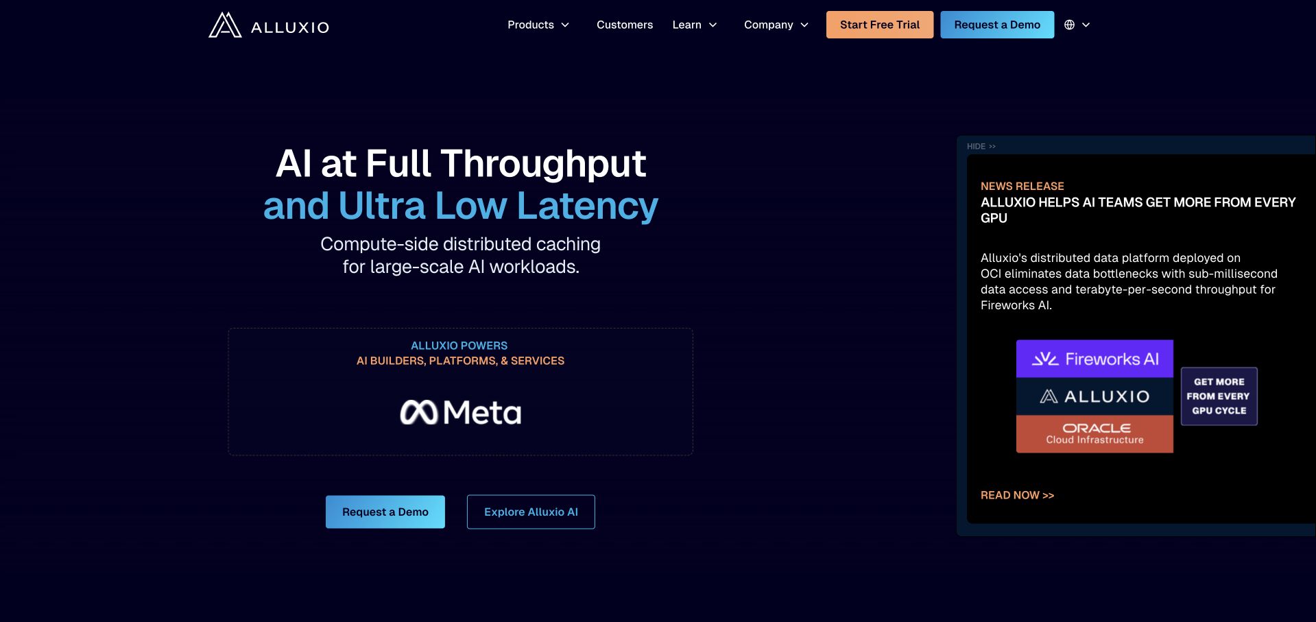
Alluxio uses a dark navy field with a large white-and-blue headline centered toward the left. A technical explanation follows, followed by paired actions. A separate announcement card on the right highlights a release, while a smaller platform callout occupies the main content area. The restrained grid and bright accents make the page feel technical without opening with a code block or a long architecture diagram. The composition is useful as a reference for presenting levels of product information. Its throughput and latency language remains a vendor claim; neither the screenshot nor the association with Spark supplies a transferable performance forecast for another deployment.
What you can learn
Separate the enduring product proposition from release-specific news. Give each a clear visual container, and explain technical terminology near the first action. Follow the introduction with concrete compatibility, operational and evaluation information so visitors can move from an attractive claim to a testable project brief.
Pros
A distinct announcement panel keeps release news separate from the main proposition.
A consistent accent palette connects text, controls and technical callouts.
Cons & considerations
Performance language needs workload-specific evidence and clear conditions.
Several competing technical messages can overload the opening without careful prioritization.
Platform source: Primary documented Apache Spark association. Apache Spark’s community list describes Alluxio’s storage relationship. Platform evidence is separate from the direct website screenshot and is not a complete current infrastructure audit.
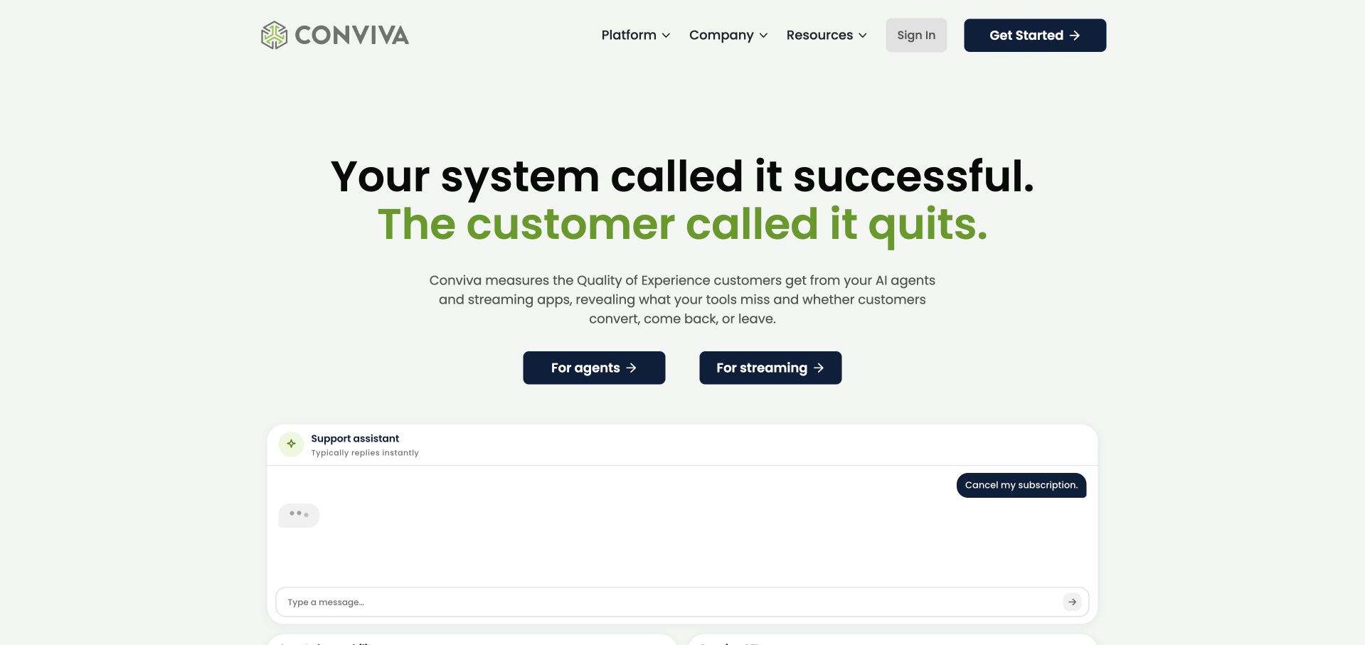
Conviva’s light opening contrasts a system-level success statement with a customer-level disappointment, using black and green typography to make the distinction visible. A short explanatory paragraph sits below, followed by two audience routes for agents and streaming. The beginning of a conversation interface appears farther down the screen. This gives the abstract topic of experience measurement a concrete situation without starting with a dashboard full of unexplained charts. The visible conversation is a product illustration, not a private customer record. The page’s rhetorical contrast is useful design thinking, but it does not establish that a particular cancellation or business outcome was caused by any one technical failure.
What you can learn
Introduce an analytics product with a specific question the intended user recognizes. Separate the audiences when their workflows differ, then explain what the illustration does and does not show. Keep causal claims and operational evidence separate from the introductory story.
Pros
The two-color headline creates a memorable contrast without a busy background.
Audience-specific actions make the next step more concrete.
Cons & considerations
An illustrative conversation needs a clear boundary from real customer data.
A strong rhetorical claim still needs precise product and measurement explanations.
Platform source: Primary documented Apache Spark association. Apache Spark’s community list cites Conviva video optimization. Platform evidence is separate from the direct website screenshot and is not a complete current infrastructure audit.
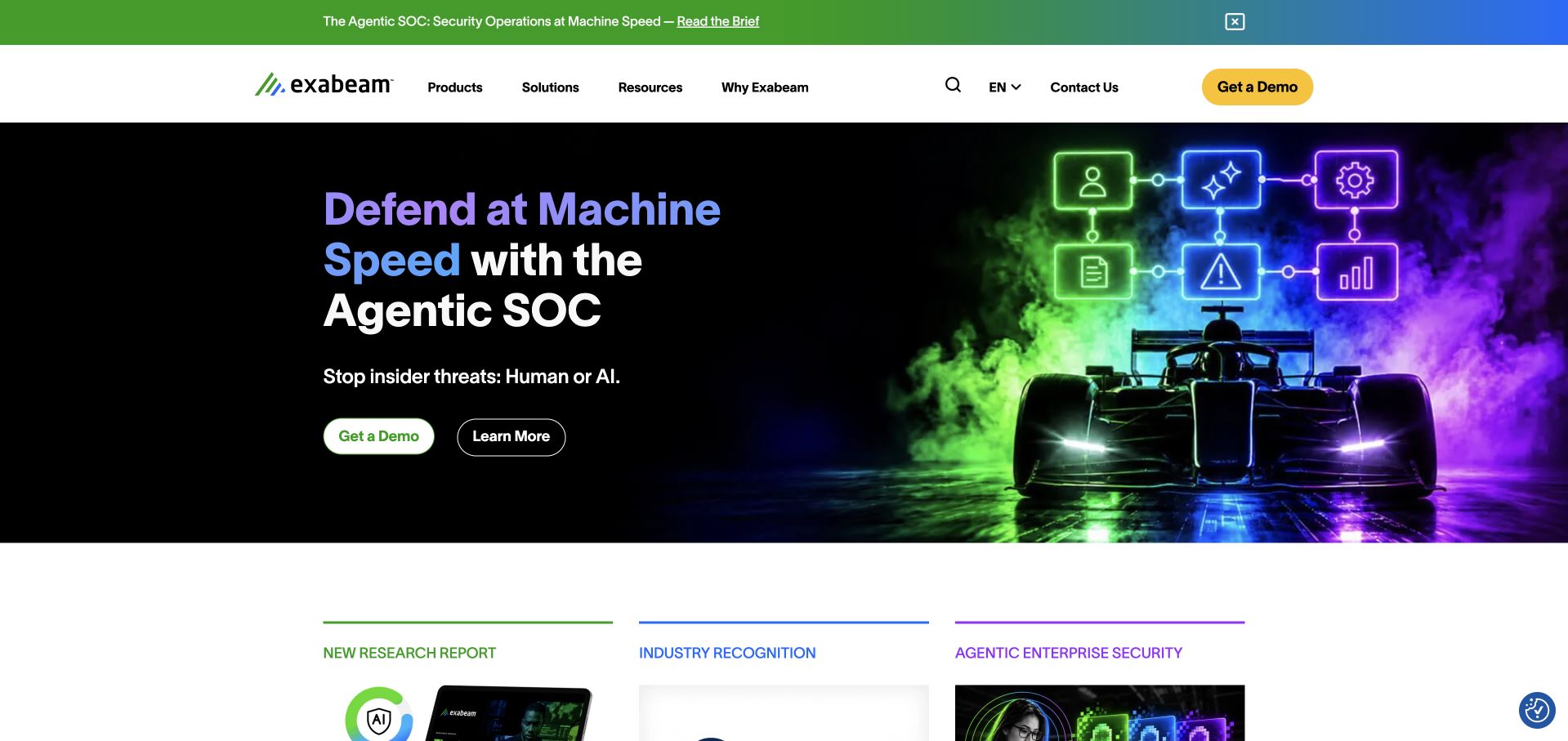
Exabeam’s opening combines a black background with green, purple and blue graphics around a racing-car illustration. The headline sits on the left, and two actions appear beneath a short explanation. A pale header and a separate announcement strip keep navigation and current research outside the dark visual field. The lower edge begins a row of resource and recognition cards, suggesting where a visitor can go beyond the headline. The metaphor makes speed tangible, but it is not evidence of detection effectiveness or response performance. A useful review of this page distinguishes its visual communication from the security claims that would require technical validation in a deployment.
What you can learn
Use a metaphor to orient attention, then provide a direct route to the actual product and its evidence. Keep research, implementation requirements and limitations readable outside the image. Security purchasing decisions need concrete scope and evaluation criteria rather than a confident visual impression alone.
Pros
The dark hero and bright illustration create a strong focal point.
Research and product routes remain distinct from the promotional metaphor.
Cons & considerations
A speed metaphor can oversimplify complex security operations.
Animated or highly saturated graphics need careful accessibility and performance testing.
Platform source: Primary documented Apache Spark association. Apache Spark’s community adopter list includes Exabeam. Platform evidence is separate from the direct website screenshot and is not a complete current infrastructure audit.
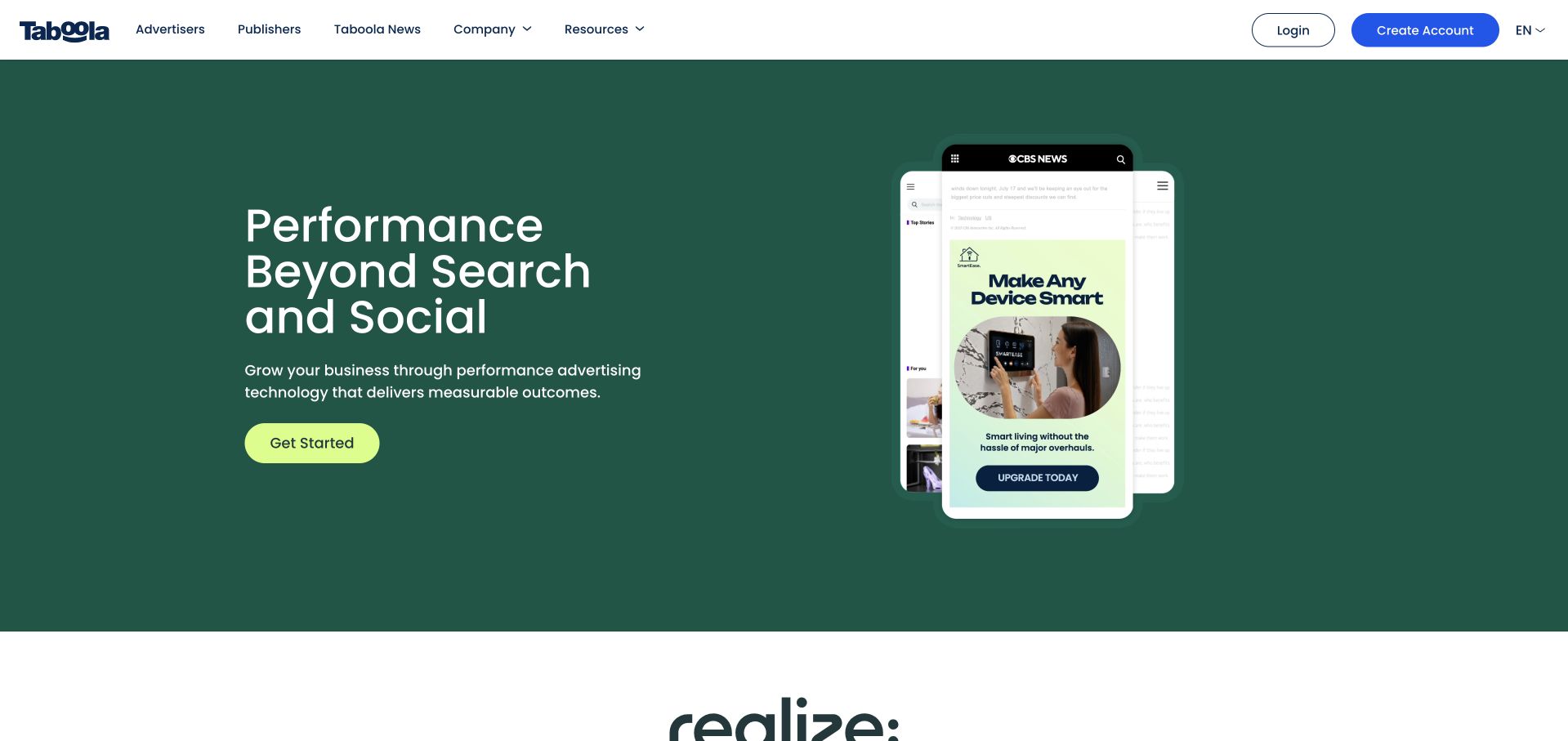
Taboola places a white proposition on green beside an illustrated phone and advertising placement. A lime primary action stands out beneath the supporting text, while the white header distinguishes advertiser, publisher and network routes. Another product identity follows, making the opening feel like the start of a broader platform explanation rather than a complete specification. The mobile example is helpful because the product’s output otherwise lives on other properties. It remains a marketing illustration: the screenshot does not establish a campaign’s conversion rate, suitability for a particular publisher or the full technical stack of any third-party page pictured inside it.
What you can learn
When a product works within someone else’s interface, show the placement in context and label the example carefully. Differentiate the audiences who buy, distribute or publish the product. Support the visual with practical information about controls, integration, measurement and the conditions behind any outcome claims.
Pros
A placement illustration makes an otherwise indirect product easier to picture.
The primary action is clearly differentiated from navigation and audience links.
Cons & considerations
Mock advertising placements should not imply verified results or partnerships.
Several platform identities need clear explanations to avoid confusing first-time visitors.
Platform source: Primary documented Apache Spark association. Apache Spark’s community adopter list includes Taboola. Platform evidence is separate from the direct website screenshot and is not a complete current infrastructure audit.
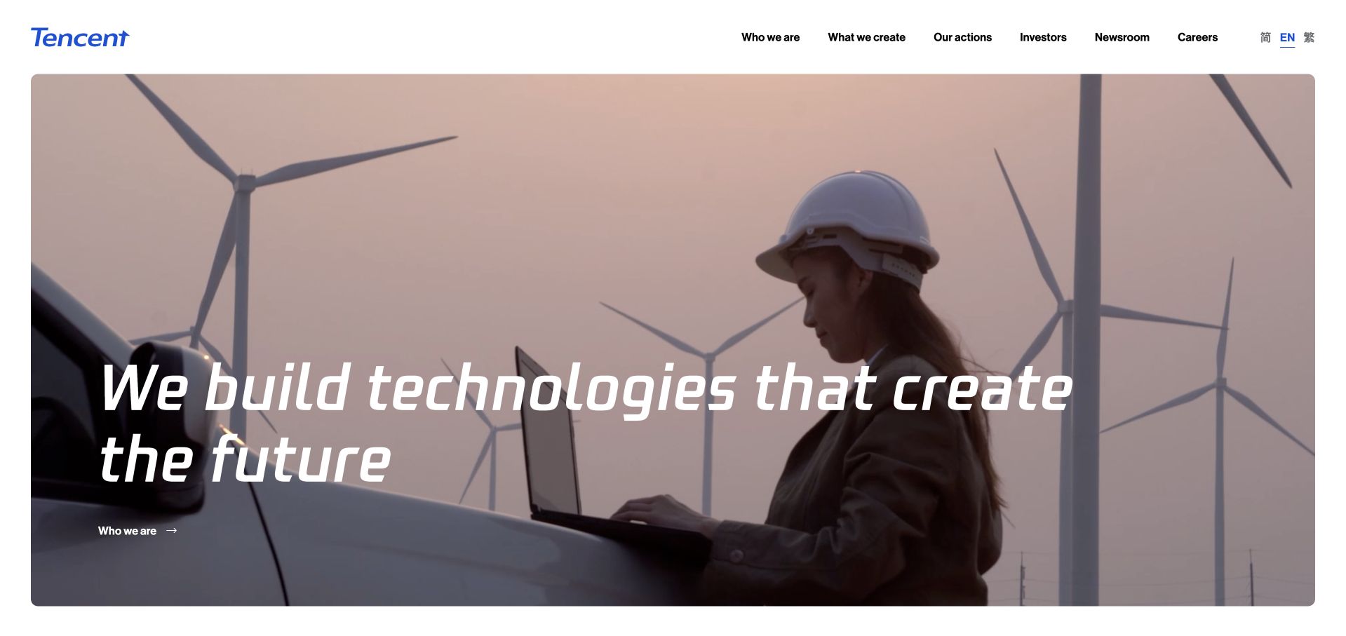
Tencent’s corporate opening uses a photograph of wind turbines and a worker, with an italic white statement laid across the image. The slim white header contains company, work, investment and newsroom routes, leaving the photograph to carry most of the first impression. The scene connects a broad technology message with a recognizable physical setting rather than an abstract stock illustration. This is a corporate storytelling property, not a catalog of every Tencent product. The photograph and statement should therefore be studied as communication choices, without treating them as proof of a specific environmental outcome, operational program or the technology delivering the pictured public page.
What you can learn
Pair a broad corporate message with a scene that gives it understandable context. Keep essential company information in stable navigation and provide supporting stories beyond the visual opening. Overlay text must remain legible when the image changes, is cropped on mobile or cannot be loaded at all.
Pros
A concise verbal layer allows the photographic setting to establish context.
Corporate utility routes remain available in a restrained header.
Cons & considerations
An expansive statement needs specific evidence and examples farther down.
Image-dependent contrast and autoplay behavior require accessible alternatives.
Platform source: Primary documented Apache Spark association. Apache Spark’s community adopter list includes Tencent. Platform evidence is separate from the direct website screenshot and is not a complete current infrastructure audit.
Trend Micro’s captured opening uses a black background, an orange geometric light shape and a white AI-security partnership headline. A small red action links to the supporting material, and circular carousel controls sit at its edges. The surrounding navigation provides product, research, resources and company routes in a separate dark header. The composition is unusually restrained for a security page: one graphic creates atmosphere without competing with a wall of product icons. The headline is a publishing subject, not a verification of a security outcome. The separate Spark association is also not proof that Spark delivers this public campaign page.
What you can learn
Give a technical announcement a concise title and a direct route to its actual scope. A simple campaign graphic can support recognition without illustrating an imaginary architecture. Keep the announcement accessible as a permanent article after the homepage rotates, and make carousel controls usable without a mouse.
Pros
A limited palette gives the announcement a strong but uncluttered focal point.
The supporting action is visible without overwhelming the short headline.
Cons & considerations
Carousel stories need stable destinations and effective motion controls.
Partnership language must be backed by precise product and availability information.
Platform source: Primary documented Apache Spark association. Apache Spark’s community adopter list includes Trend Micro. Platform evidence is separate from the direct website screenshot and is not a complete current infrastructure audit.
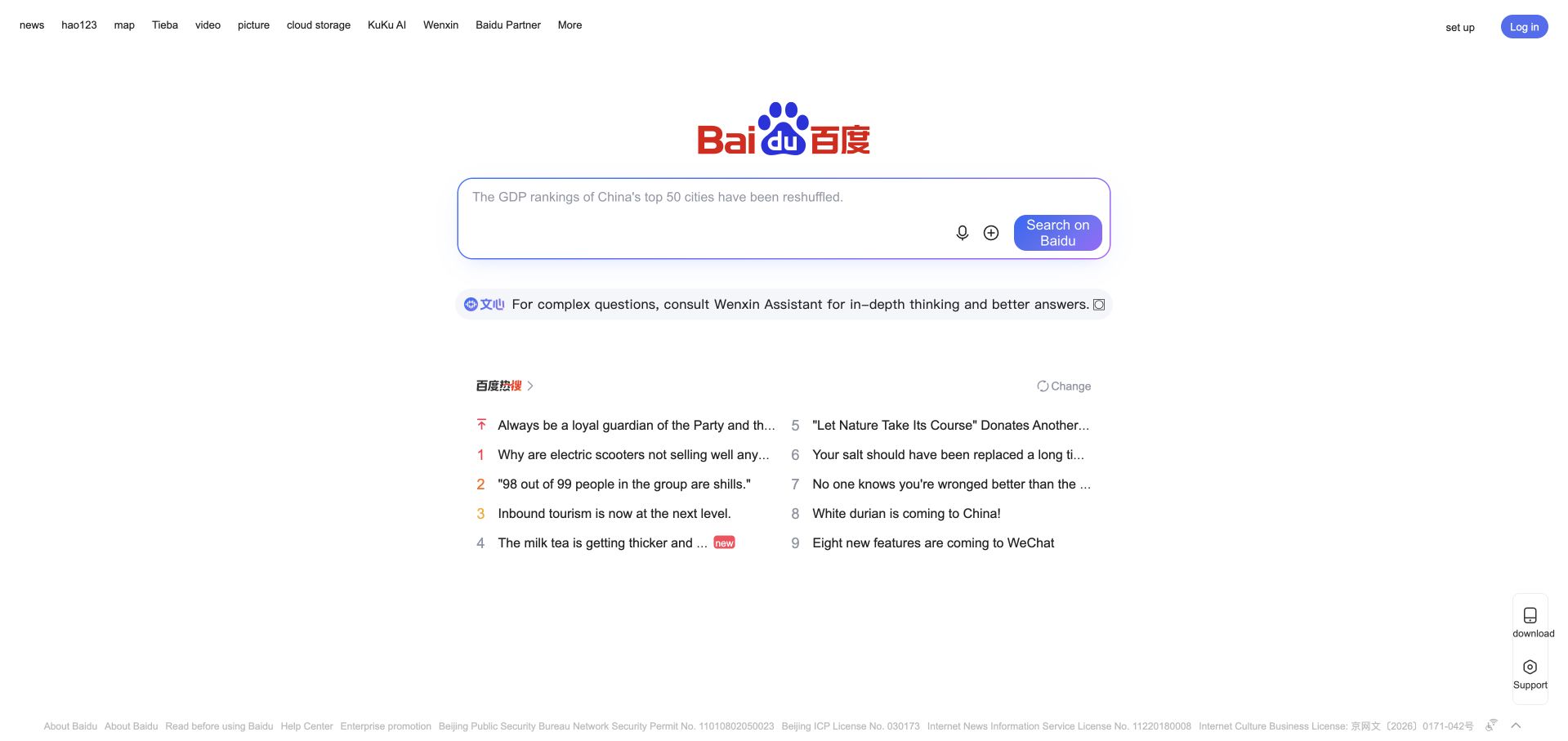
Baidu’s public opening is centered on its familiar logo and a search field on white. Small utility links run across the top, and a compact group of trending topics appears below the main control. The empty space is functional: it leaves little ambiguity about the intended first task. Secondary discovery content exists, but it receives much less visual weight than the search input. This is a useful contrast to the dense product and corporate pages elsewhere in the collection. The displayed topics are a changing editorial or algorithmic surface, not independently verified facts or a reliable description of what every visitor will see.
What you can learn
If a page has one dominant task, make that task unmistakable before adding discovery features. Keep the input’s purpose, submission behavior and error handling clear. Secondary links should remain usable without crowding the primary control, particularly when localized labels or assistive technologies change how the interface is read.
Pros
A single prominent search field gives the opening a clear purpose.
Secondary topics remain visually subordinate to the main task.
Cons & considerations
Changing topics need trustworthy destinations and appropriate context.
Minimal layouts still require clear labels, keyboard behavior and accessible feedback.
Visible tech stack
Earlier / documented evidence
Apache Spark
Platform source: Primary documented Apache Spark association. Apache Spark’s community adopter list includes Baidu. Platform evidence is separate from the direct website screenshot and is not a complete current infrastructure audit.
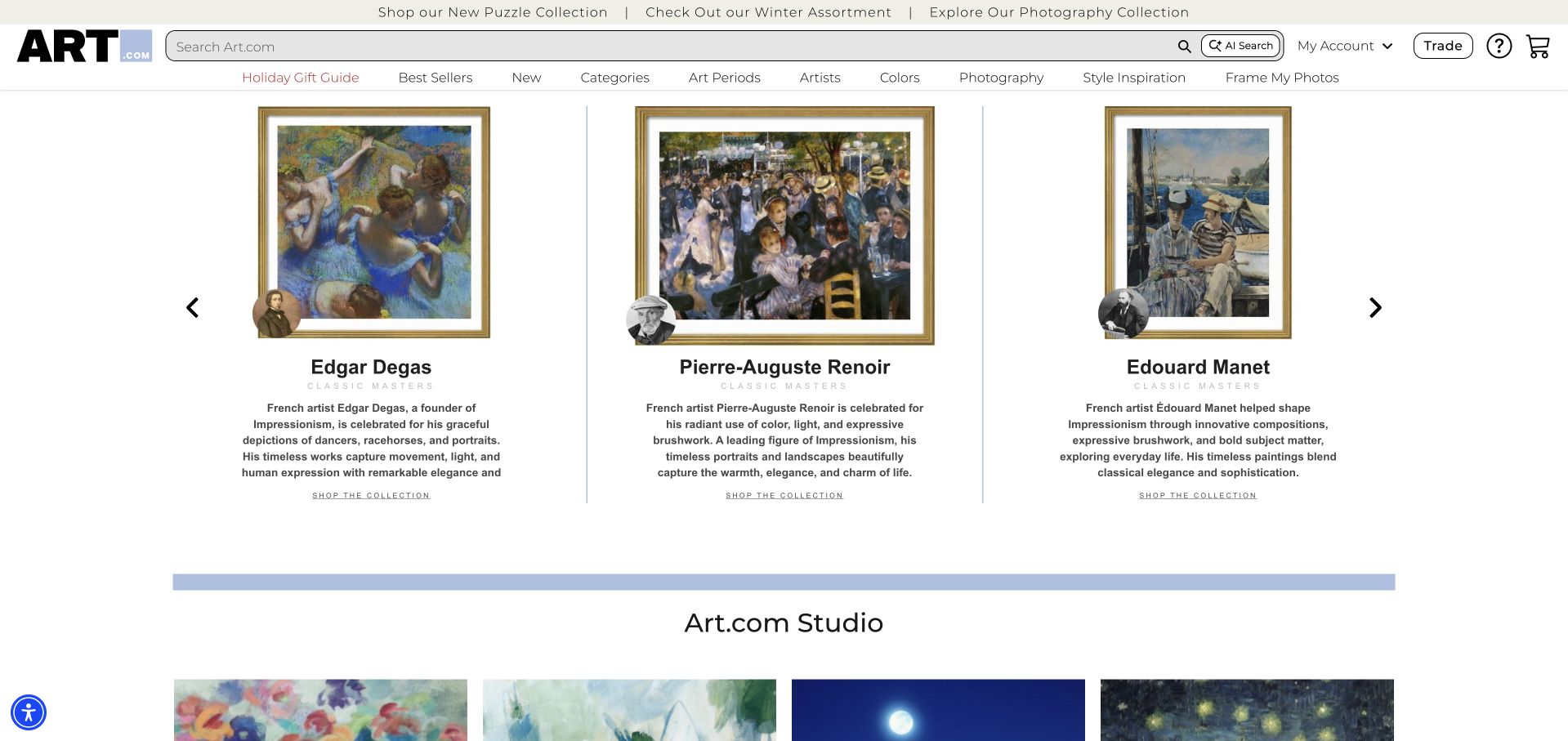
Art.com’s captured opening combines a commerce header with a sequence of framed artworks. Each artist card includes a name and a short explanation, turning the row into a small editorial gallery rather than a set of anonymous product thumbnails. Search and category links remain visible above it, while the next studio section begins below. The white background lets the framed images establish the color and rhythm of the page. The reference is useful for showing how a catalog can introduce context before asking someone to compare individual products. It does not establish artwork availability, reproduction quality or every historical statement in the retailer’s own descriptions.
What you can learn
Give visual products enough text to help visitors understand what they are comparing. Keep search and browsing categories stable while editorial selections change. Use consistent image treatment and short explanatory labels, then provide product-specific dimensions, materials and purchase conditions on the actual detail pages.
Pros
Framed imagery and short descriptions combine browsing with useful context.
Search and categories remain available above the editorial selection.
Cons & considerations
A horizontal sequence needs accessible navigation and a sensible mobile alternative.
Artist context should not replace clear reproduction and product specifications.
Visible tech stack
Earlier / documented evidence
Apache Spark
Platform source: Primary documented Apache Spark association. Apache Spark’s community list describes Art.com personalization. Platform evidence is separate from the direct website screenshot and is not a complete current infrastructure audit.
Kegan has 15+ years of experience working with small businesses, Fortune 500 companies, and everything in between. No development job is too big or too small: he brings the same hands-on attention to a focused improvement, a complete website, or a custom application.
For Apache Spark projects, he can help with data modeling, application data access, query design, search and cache integrations, migration planning, access boundaries, and maintainable handover. He works directly with clients on scope, design, implementation, testing, and handover, with an emphasis on clear communication and a system that remains practical to maintain after launch.
Show 3 other Apache Spark developersHide other Apache Spark developers
Choose the processing approach around the actual data problem
A modest report or catalog transformation
Start with the simplest maintainable process that meets the real size and refresh requirements. A warehouse query, database operation or small scheduled job may be sufficient. Document the threshold that would justify distributed processing rather than adopting it because a major reference company appears in a technology directory. Include the cost of operating and troubleshooting the result.
A substantial recurring batch workload
For large transformations, define the input snapshot, output location and completion boundary. Plan safe reruns, temporary data, failed partitions and a clear handoff to downstream consumers. Test the largest expected business period rather than only an average day. Choose storage formats and partitioning around actual access patterns, and measure before adding caching or more workers.
Describe event time, late arrivals, corrections and the state that must survive a restart. Choose checkpointing and recovery behavior around the specific processing mode and external destination. Avoid a universal promise of exactly-once business effects: the source, job, sink and any subsequent customer action all have their own failure boundaries and responsibilities.
Make correctness and operation visible in the brief
Test skew, missing records and schema changes
A realistic test set should include unusually large keys, unexpected nulls, duplicated input and a changed field. Check totals and representative records against a known baseline. Agree how a failed validation blocks publication of a new output. Technical success should not silently replace the business definition of a complete and trustworthy dataset.
Review deployment-specific security
Spark’s security guidance explicitly warns against assuming that every deployment is secure by default. Review the chosen environment’s authentication, network boundaries, service identities, storage access and administrative interfaces. Keep credentials out of public artifacts and examples. Restrict access to job definitions and logs when they can expose data or grant authority to run additional work.
Consumers should be able to distinguish an incomplete run from a complete dataset. Keep enough provenance to identify the input, transformation version and validation result associated with each publication. Rehearse interruption and recovery with safe data. Document who owns the job, its recurring cost, the output contract and the response when a refresh misses its promised window.
A useful handover demonstration
Ask the actual team to carry out its routine job: publish a realistic update, correct a mistake, preview a narrow screen, and identify who owns an integration failure. For a library or frontend framework, also ask who maintains the content source and deployment. A polished screenshot does not answer those operational questions.
Beyond the screenshot
Spark project planning checklist
Identify the input sources and permitted uses.
Define what one output record represents.
State volume, refresh and downstream response requirements.
Compare simpler processing options before adding a cluster.
Benchmark realistic joins, file sizes and uneven key distributions.
Define handling for nulls, duplicates and late corrections.
Record schema and transformation versions.
Validate outputs before making them available to consumers.
Secure job execution, storage, interfaces and credentials.
Publish complete datasets through an explicit handoff boundary.
Rehearse failed runs, reruns and restoration of a known result.
Name the operating owner and monitor business refresh deadlines.
Test with real content, a keyboard, a small screen, slow or failed requests, and the people who will maintain the system. These are planning checks, not an accessibility, security, performance, or search-ranking certification.
Sources & editorial method
How this Apache Spark collection was reviewed
These 20 examples use actual inspected public-page captures and original design reviews, paired with Apache’s community-maintained adopter directory. The first five supply recognizable organizational context. Undated and potentially historical associations remain qualified, and reused images retain their original capture dates. The guide does not certify any organization’s complete current data or public-web architecture.
Every image is an unmodified capture from the actual website, with its source and capture date. Some captures are reused from our shared catalog; their dates remain the original capture dates. None comes from a vendor gallery or a generated reconstruction. Moving imagery and live content can change.
Technology attribution uses public page assets or metadata, official platform documentation, or a cited first-party project case study. Documentary and framework-relationship evidence is identified where used; it is not a complete current backend inventory. A CMS image CDN alone does not establish a full CMS deployment. A library’s presence does not prove which individual controls use it, and a platform label does not establish AI authorship.
The composition notes, lessons, pros and tradeoffs are original editorial observations. We have not measured conversion, traffic, security, performance or accessibility conformance. Website owners retain their brands and imagery; these examples are not our client portfolio. Written, Edited and Curated are independent records, not dates advanced by a build. See our editorial standards or suggest a correction.
Questions worth asking
Apache Spark website development FAQs
Are these 20 websites built with Spark?
Not in the sense of a website builder or frontend framework. The organizations have entries in Apache’s adopter directory, sometimes for particular analytical systems. Their pictured public pages are design references, and the directory does not establish a current whole-company or homepage stack.
Do I need Spark for a small website?
Usually the decision should start with the data workload, not the size of the public site. A small site can consume a large prepared dataset, while a busy publication might need no distributed processing at all. Compare the simplest workable options using realistic requirements.
Will more workers always make the job faster?
No. Data distribution, joins, serialization, memory, storage and network behavior can all affect a workload. Measure a representative job, identify its actual constraint and test a change. Extra capacity without a diagnosis can increase cost without improving the result users need.
Can the browser query a Spark cluster directly?
A public application needs an appropriately protected interface and a response model suited to visitors. Avoid exposing administrative or unrestricted execution surfaces. Separate service identities and permissions, and consider serving prepared results through a store or API built for the application’s access pattern.
What belongs in a Spark handover?
The input and output contracts, transformation code, dependencies, environment and access model, validation checks, publication procedure, monitoring, cost expectations and recovery instructions. Another maintainer should be able to identify the current result, explain its provenance and recover from a failed run without guessing.
A strong Spark brief names the dataset, its consumers and the recovery boundary. Borrow useful website design thinking without copying infrastructure that solves a different problem.