Twenty public websites with dated plugin evidence, genuine screenshots and practical lessons for integrating social content.
An Instagram feed can add current imagery and human context to a WordPress site. It needs an editorial purpose, dependable surrounding navigation and a plan for stale or unavailable content.
Smash Balloon Instagram Feed connects Instagram content to WordPress pages. The examples here span consumer products, attractions, hospitality, local services and creative portfolios. Their visual styles differ substantially because the plugin is one component within a larger website, rather than a complete design system.
These reviews examine the public experience around that component. Exact plugin resource references support the association, while the saved screenshots show genuine page designs. A resource reference does not prove that a feed is visible in the captured viewport, that an account remains connected, or that any particular moderation or caching setting is enabled. Use the examples to plan those decisions in your own implementation.
Before the examples
What makes good Smash Balloon Instagram Feed website development in 2026?
Give social content a supporting job
Decide what the feed adds: recent studio work, community activity, destination atmosphere or a view of the team. Keep prices, hours, booking, emergency information and product specifications in maintained website content. The vendor supports several ways of placing a feed; choose the location after identifying its purpose, rather than treating the homepage as an automatic destination.
Assign someone to review which images and captions belong on the website, including permissions and expired offers. The documented moderation options distinguish an allow list from a block list. Plan which model matches the content and available staff time, and confirm that the required feature is included in the version you intend to use.
Decide how fresh each type of social content needs to be, then test both the feed cache and the site's page cache. The vendor documents background caching and several causes of delayed updates. Keep a useful fallback and an ownership process for lost account connections; a feed failure should not remove the visitor's essential next step.
The collection opens with Nalgene, Red Rocks Park & Amphitheatre, Houston Zoo, Woodland Park Zoo and Greencross Vets. Each example is a distinct public property with exact plugin-resource evidence. The screenshots and reviews describe the surrounding website design without attributing every image or interaction to the feed plugin.
We start with five recognizable brands or organizations: Nalgene, Red Rocks Park & Amphitheatre, Houston Zoo, Woodland Park Zoo, Greencross Vets. Each attribution applies to the named website property, not every product or website belonging to its organization. This is a curated reading sequence, not a measured ranking.
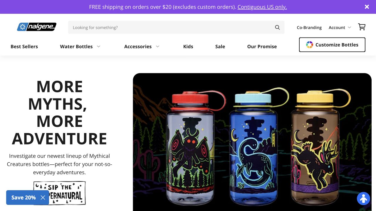
Nalgene's captured page makes a colorful bottle campaign the main attraction, but keeps water bottles, accessories, children’s products and search in a separate white header. That separation matters for an Instagram integration: the product catalog remains a dependable destination while campaign images change. The recognizable bottle shape makes the promotion understandable without a long explanation. Public resources identify Smash Balloon Instagram Feed on this property; the saved opening view does not establish its exact feed layout or moderation settings. The useful design reference is the boundary between permanent shopping tools and optional visual discovery.
What you can learn
Give community photographs a supporting role alongside a reliable product catalog. Link related posts to useful product context where appropriate, and ensure a disconnected social account cannot hide sizes, care instructions or checkout access.
Pros
Search and named categories provide direct routes beyond the featured campaign.
The repeated bottle silhouette makes decorative variations easy to recognize.
Cons & considerations
Several header bands reduce the space available for the initial product story.
Campaign artwork needs accompanying specifications so visual variety does not obscure practical differences.
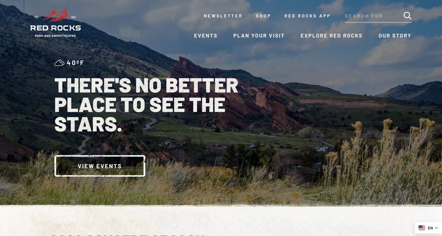
Red Rocks sets large textured lettering over a landscape that immediately identifies the amphitheatre's unusual setting. View Events is the clear hero action, while Events, Plan Your Visit and Explore remain separate header destinations. A small weather reading adds context without taking over the composition. Smash Balloon Instagram Feed resources were observed for this public site, making it a useful example of a venue that can combine its owned information architecture with a changing social channel. The screenshot demonstrates the primary landing experience; it does not reveal which Instagram posts are selected or how frequently the feed refreshes.
What you can learn
Keep event dates, ticket instructions and access notices in maintained website content. Use a social feed to extend the atmosphere or highlight recent activity, with clear links back to the relevant event or planning page.
Pros
The event action remains easy to identify within an atmospheric full-width composition.
Planning and exploration are distinct routes for visitors with different intentions.
Cons & considerations
Large display lettering and background detail need careful small-screen crop testing.
A weather snippet cannot replace complete conditions, access guidance or operational notices.
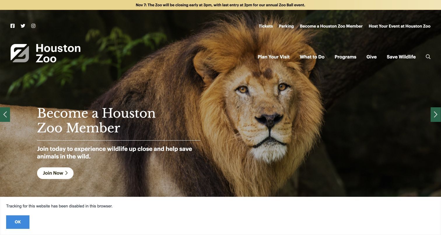
Houston Zoo's saved view pairs a close lion photograph with a membership invitation. The important structural detail sits above it: a yellow alert states an upcoming early closure and last-entry time independently of the rotating campaign. Tickets and parking have direct links, while the main menu separates visits, activities, programs and giving. Public plugin resources supply the Smash Balloon Instagram Feed association. They do not prove a particular feed's freshness or editorial policy. For an attraction with constantly changing animal and event stories, this layout illustrates why social content belongs alongside a stable layer of practical information.
What you can learn
Publish closures and entry conditions in an explicit operational component, then use moderated social posts for supplementary storytelling. A visitor should find the current arrival rules even when a feed is stale, unavailable or showing a different event.
Pros
The closure notice has its own persistent position above promotional imagery.
Parking is named directly rather than hidden within a broad visiting category.
Cons & considerations
Multiple campaign intentions can complicate the next step for first-time visitors.
White navigation over changing photographs requires consistent contrast treatments across crops.
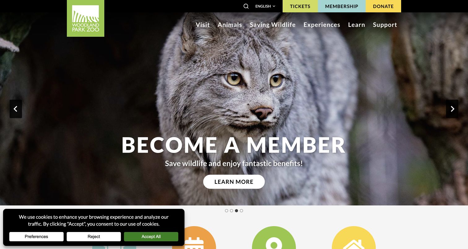
Woodland Park Zoo frames a close lynx photograph with a membership message, while three colored header blocks keep Tickets, Membership and Donate distinct. The main navigation adds animals, wildlife conservation, experiences and learning. This creates several meaningful destinations beyond the changing hero. The site's public resource evidence includes Smash Balloon Instagram Feed, but the captured first screen shows the owned campaign and navigation rather than the feed itself. That distinction is useful when evaluating integration: attractive social material should strengthen the zoo's stories without becoming the only route to a visit, donation or educational resource.
What you can learn
Map each featured social story to an appropriate maintained destination, and keep the three transaction paths available independently. Review captions for expired offers or event dates before allowing them to remain prominent in a cached feed.
Pros
Color and plain labels distinguish attendance, membership and giving in the header.
The animal image supports a clear institutional theme rather than an unrelated visual flourish.
Cons & considerations
The observed consent notice occupies part of the lower opening view.
Rotating campaigns need persistent alternatives for information a visitor may otherwise miss.
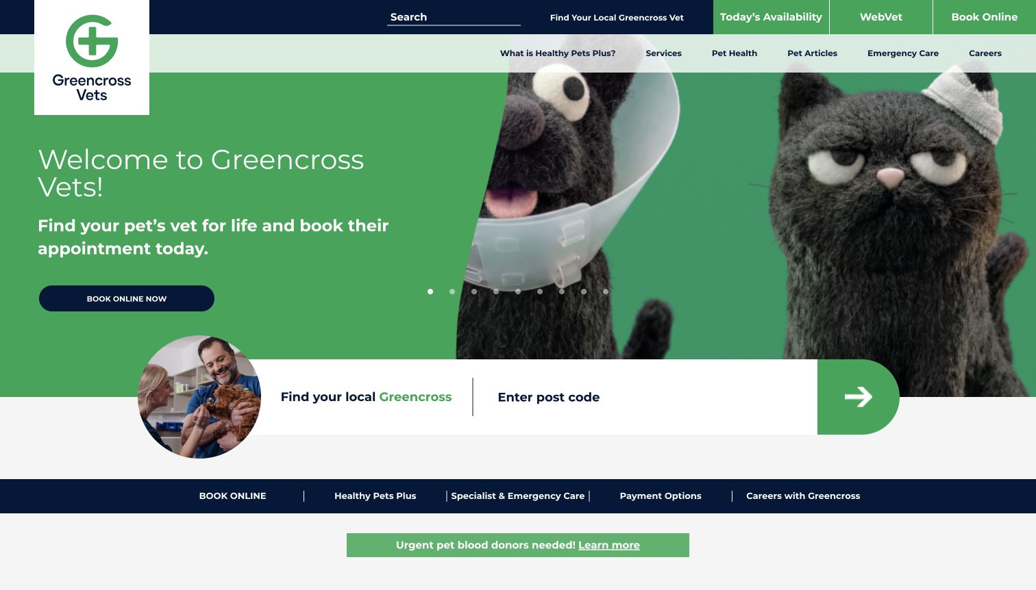
Greencross Vets combines a bright green campaign with a large postcode finder placed across the hero's lower edge. Availability, remote care and online booking occupy named utility buttons above it, and emergency information remains a separate navigation choice. The animal characters make the page approachable, but the locator performs the essential routing work. Public assets identify Smash Balloon Instagram Feed on this property. The screenshot establishes the service hierarchy rather than a visible feed configuration. For a network of clinics, the relevant lesson is how to keep changing organization-wide content from displacing the visitor's immediate need to find local information.
What you can learn
Keep clinic location, contact and urgent-care guidance outside any Instagram dependency. If social posts mention individual practices, label the location clearly and link to the appropriate local page rather than a generic booking destination.
Pros
The large postcode entry makes geographic selection easy to recognize.
Remote-care and ordinary booking choices receive different explicit labels.
Cons & considerations
Several navigation rows increase the number of competing choices on arrival.
Organization-wide campaign imagery may need additional local context for a specific clinic visit.
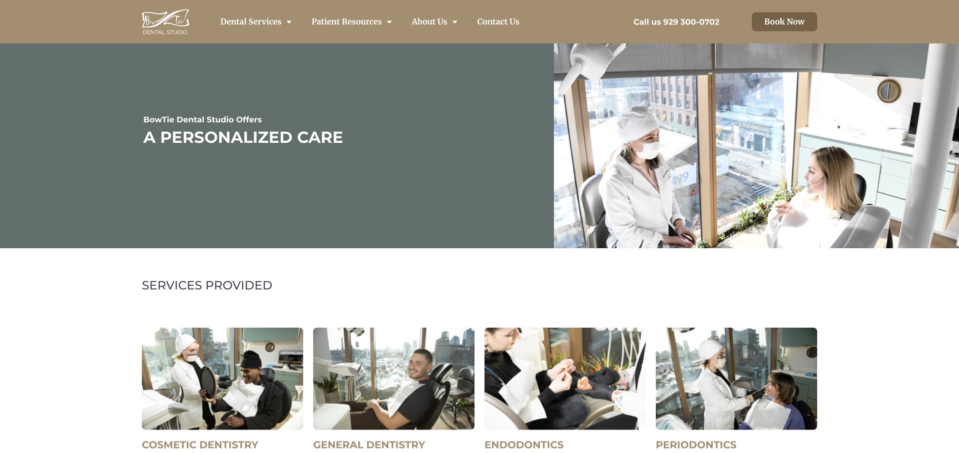
BowTie Dental Studio places a muted text panel beside a bright clinician-and-patient photograph, with treatment imagery beginning in a row below. A telephone number and booking button remain visible in the warm neutral header. The images supply concrete context for the practice without requiring visitors to begin in a social channel. The public page's linked resources identify Smash Balloon Instagram Feed; the saved hero does not establish which posts are displayed elsewhere. This makes the site a reference for the surrounding experience an Instagram component must fit: calm, recognizable and oriented toward service information rather than an endless gallery.
What you can learn
Select social imagery that adds useful context about the team or premises while preserving appropriate permissions and privacy. Keep treatment explanations and booking routes in ordinary page content so a feed connection problem does not interrupt a patient's next step.
Pros
The telephone and booking choices are available beside conventional navigation.
Different treatment photographs begin to clarify the breadth of the practice.
Cons & considerations
Muted hero text needs dependable contrast against its background.
Clinical social imagery needs editorial care and cannot substantiate promised treatment outcomes.
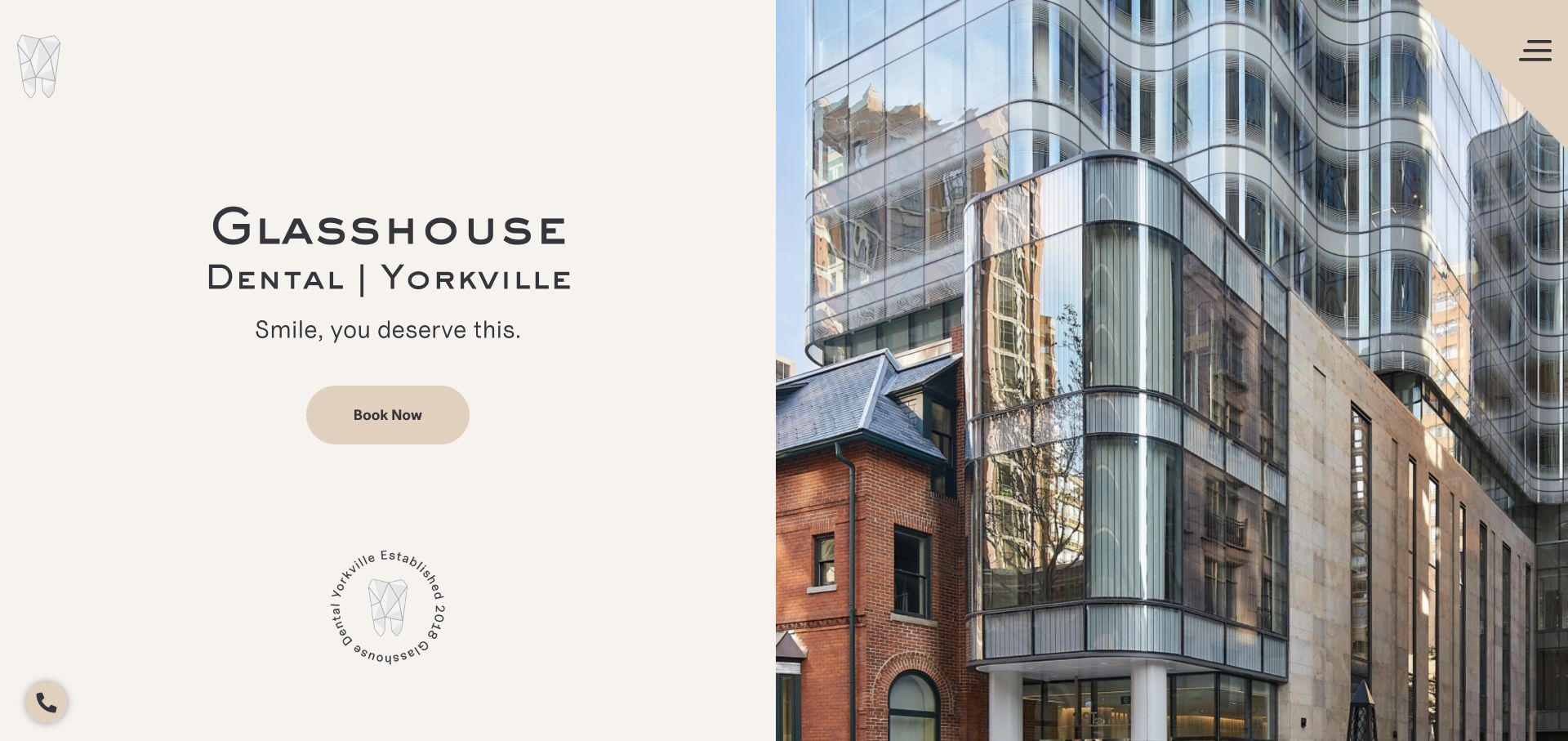
Glasshouse Dental divides the first screen between a cream text panel and a large photograph of its glass-fronted building. The Yorkville location appears beside the name, and a tan booking button provides the principal action. A geometric tooth mark and small establishment seal add identity without a crowded navigation row. Exact Smash Balloon Instagram Feed resource evidence associates the plugin with this property, although the captured view is architectural rather than a social grid. The composition suggests an integration challenge: additional photography should explain the actual practice experience without overwhelming an already distinctive sense of place.
What you can learn
Use selected social posts to add human context that a building photograph cannot provide. Keep location, arrival guidance and service details independently accessible, and give the feed a restrained layout that follows the page's existing spacing.
Pros
A dedicated text panel protects the main message from photographic detail.
The neighborhood name provides a useful geographic cue immediately.
Cons & considerations
The collapsed desktop menu adds an interaction before visitors see treatment categories.
Architecture alone supplies little information about clinicians, appointments or the treatment environment.
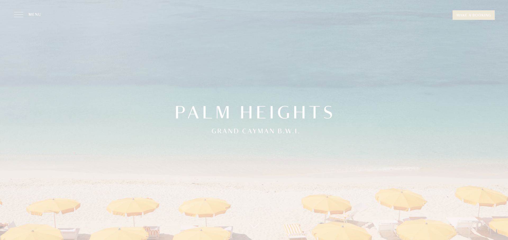
Palm Heights fills the opening with a pale coastal scene and its distinctive yellow umbrellas. The centered wordmark includes Grand Cayman, while Menu and Make a Booking occupy opposite upper corners. The photograph supplies almost all the initial explanation. Public assets identify Smash Balloon Instagram Feed on the site, but the opening capture does not show the feed's appearance or settings. For a hotel with such a restrained landing page, additional social imagery could easily repeat the atmosphere without helping a guest evaluate a stay. The useful reference is the balance between visual restraint and the practical content that must follow it.
What you can learn
Choose social stories that contribute something different, such as dining context or clearly identified spaces. Keep room descriptions, reservation terms and arrival information in dependable website sections, with a fallback when social content cannot load.
Pros
The location is part of the central identity rather than buried in a footer.
The reservation control stays separate from the collapsed menu.
Cons & considerations
White lettering over the pale beach needs a stronger contrast safeguard.
The sparse first screen leaves most practical accommodation questions for later navigation.
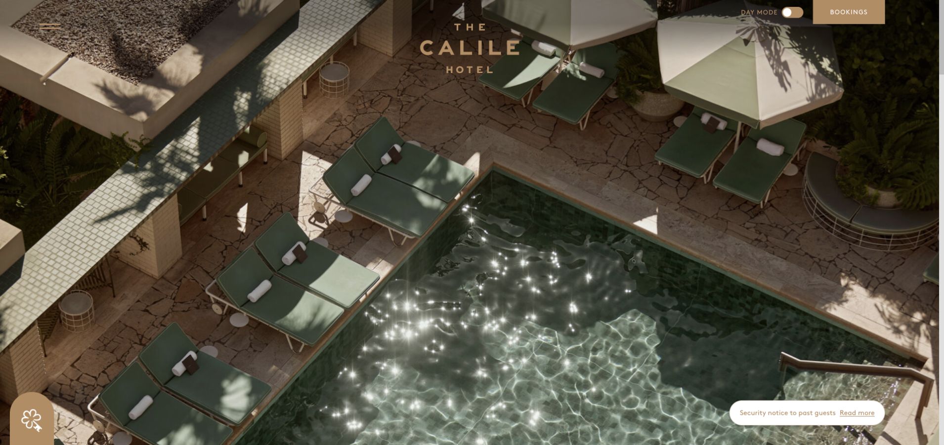
The Calile's saved view uses an overhead pool photograph as a precise arrangement of pale stone, green loungers and deep shadows. A centered wordmark, menu icon and booking rectangle leave most of that geometry unobstructed. The day-mode control is an unusual secondary detail, and an operational message occupies the lower corner. Public resource evidence identifies Smash Balloon Instagram Feed, while this capture documents the principal brand presentation. A feed added to such a composition needs a deliberate visual role; simply appending another large image grid would offer little guidance about rooms or the practical experience of staying here.
What you can learn
Treat social content as a separate, clearly titled layer of current stories. Match its spacing to the architectural presentation, preserve the reservation route, and ensure operational messages remain visible regardless of the feed's loading or connection state.
Pros
The aerial image communicates distinctive materials and spatial relationships immediately.
Booking has a separate labeled control outside the compact menu.
Cons & considerations
Small controls need reliable contrast across the light and shadow in the image.
The opening provides limited room or neighborhood information for guests comparing options.
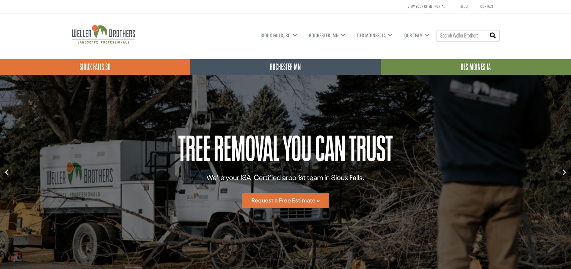
Weller Brothers places three city labels in a colored band directly above a tree-removal campaign. A working crew and branded vehicle connect the offer to a recognizable service, while an orange estimate button provides the immediate next step. The same cities also appear in the header, reinforcing geography at the cost of some space. Smash Balloon Instagram Feed resources were observed on this property. The capture does not establish the feed's location, but it makes clear why any stream of project photographs needs geographic context: work shown in one market may not describe the team or services available in another.
What you can learn
Label social project stories with the relevant city and service, then connect them to maintained local pages. Keep estimates, service coverage and seasonal notices available even if the feed is paused or a social account changes.
Pros
The colored city band makes local routing conspicuous before the campaign copy.
Real equipment and crew imagery give the service proposition a concrete setting.
Cons & considerations
Repeated city navigation consumes a substantial portion of the header.
A single seasonal slide can underrepresent the wider design and maintenance offering.
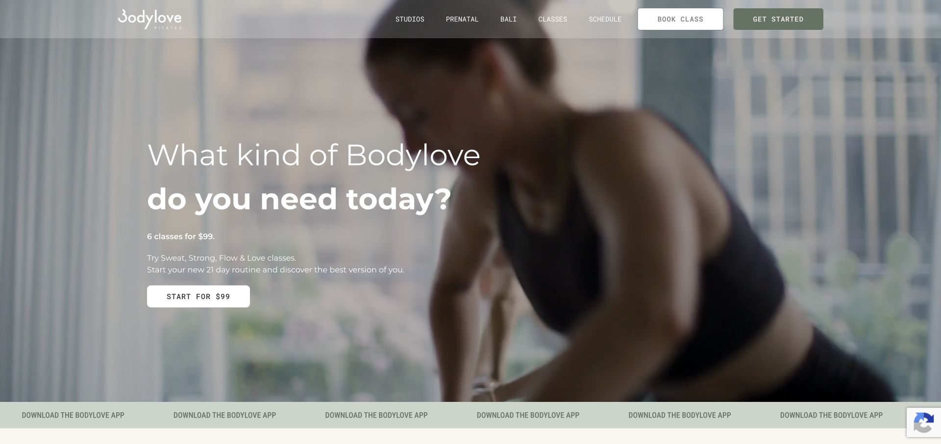
Bodylove Pilates presents a softly toned movement image behind an introductory package with its price and class quantity visible. Studios, classes and schedule remain in the translucent header, alongside Book Class and Get Started. A narrow strip then promotes the app. Public resources associate Smash Balloon Instagram Feed with this property, but the saved view shows the primary offer rather than an identifiable social component. For a studio, social photographs can communicate atmosphere and instructors, yet the practical comparison still depends on class type, timing and location. The page supplies a useful reference for preserving those decisions around an image-led brand.
What you can learn
Use a moderated feed to supplement instructor or studio context, then link back to current class information. Keep prices, introductory terms and schedules in maintained content rather than relying on captions that may remain cached after an offer changes.
Pros
The introductory package includes useful price and class context near its action.
Schedule access sits with the core navigation rather than only inside booking.
Cons & considerations
The pale translucent header requires testing against bright background frames.
App promotion and multiple starting actions compete for attention before a visitor compares classes.
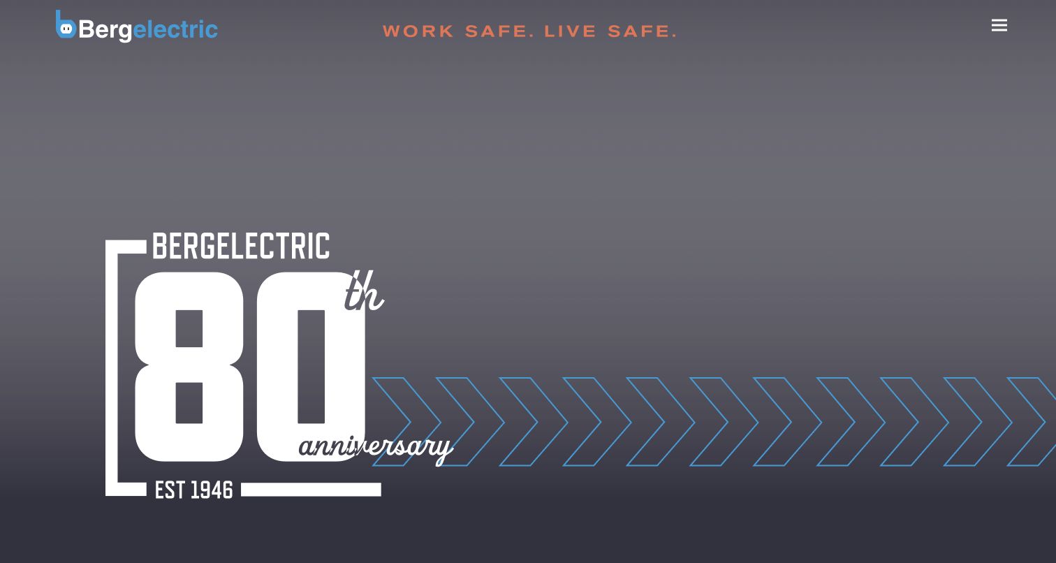
Bergelectric's captured opening is dominated by an oversized anniversary graphic on a subdued gray background. The blue brand mark and orange safety statement frame the top, while a compact menu sits at the opposite edge. This is an institutional introduction rather than a local appointment page. Public resources identify Smash Balloon Instagram Feed for the property; the screenshot does not expose a feed or establish its audience. For a contractor communicating projects, careers and regional operations, the integration question is editorial: social updates need to clarify those different purposes rather than create an undifferentiated stream beneath a large brand statement.
What you can learn
Give project and workforce posts a named context and a route to the relevant case study, career or office page. Maintain those destinations separately so social access problems do not hide capabilities or regional contact information.
Pros
The anniversary treatment creates a strong single visual hierarchy.
The restrained palette keeps the identity coherent despite the large scale of the graphic.
Cons & considerations
The compact menu hides substantive choices on the first screen.
The hero alone provides little explanation of capabilities or the kinds of projects undertaken.
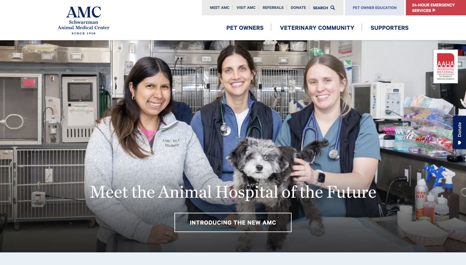
The Schwarzman Animal Medical Center uses a large team photograph to introduce its facility, while the header names Pet Owners, Veterinary Community and Supporters. A red emergency-services block is visually distinct from education, referral and donation utilities. Public assets identify Smash Balloon Instagram Feed on the site. The captured hero is not proof of a particular feed presentation; it is evidence of the information structure that an additional social layer must respect. A hospital's social stories may speak to several audiences at once, so clear context matters more than simply maximizing the number of images visible on the homepage.
What you can learn
Keep emergency, directions and referral information outside a social dependency. Label educational or institutional posts so visitors can distinguish general storytelling from current service instructions, and apply appropriate permission checks to people and animals shown.
Pros
Audience labels make the institution's different purposes explicit before deeper navigation.
The contrasting emergency block remains separate from the main promotional story.
Cons & considerations
Multiple utility rows ask visitors to scan several layers of choices.
Institutional imagery can delay a straightforward appointment or arrival task without a nearby practical route.
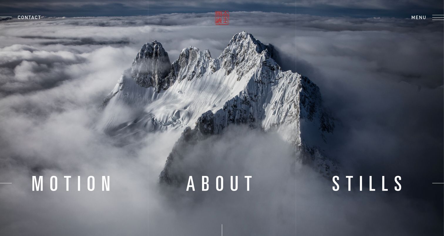
Jimmy Chin's opening places Motion, About and Stills across a snowy mountain panorama. Contact and Menu sit in the upper corners, and a small red mark adds identity without competing with the landscape. The composition gives the photograph unusual room while reducing the portfolio to three understandable directions. Smash Balloon Instagram Feed resources were observed on this public property. That association does not mean the hero is an Instagram embed; the saved view demonstrates the primary portfolio structure. A social feed here should provide a complementary layer of recent activity rather than becoming the only way to discover completed work or make contact.
What you can learn
Keep curated projects organized by their useful disciplines, with social updates in a clearly separate section. Preserve image credit and context, and ensure each feed interaction has a readable destination and an ordinary route back to the portfolio.
Pros
Three large labels make the main creative categories easy to distinguish.
Contact remains available outside the compact menu.
Cons & considerations
Text contrast depends on the chosen image and responsive crop.
Specific project details require another step beyond the cinematic opening screen.
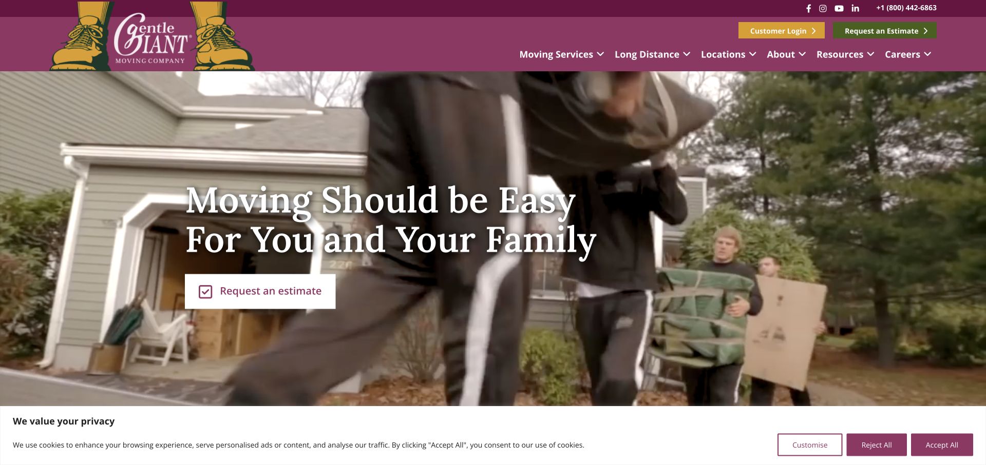
Gentle Giant combines a burgundy header and illustrated brand mark with footage of a crew moving household belongings. A large family-oriented message sits above a simple estimate action. Long Distance, Locations, Moving Services and Resources are visible in the main navigation. Public resource evidence identifies Smash Balloon Instagram Feed on the property. The saved opening shows the service story rather than the feed itself, so it supports an observation about integration priorities: additional crew or community posts should reinforce the work without forcing visitors to leave the website to establish coverage or request an estimate.
What you can learn
Use social stories to add context about the team, then connect them to clear service and location information. Obtain appropriate permission for customer settings and belongings, and keep the estimate journey usable when embedded media or social requests are unavailable.
Pros
The crew imagery demonstrates recognizable moving activity rather than an abstract promise.
Long-distance and location links support visitors with defined requirements.
Cons & considerations
Moving imagery behind large text needs a readable still fallback.
The observed consent banner reduces the available opening view and adds another interface layer.
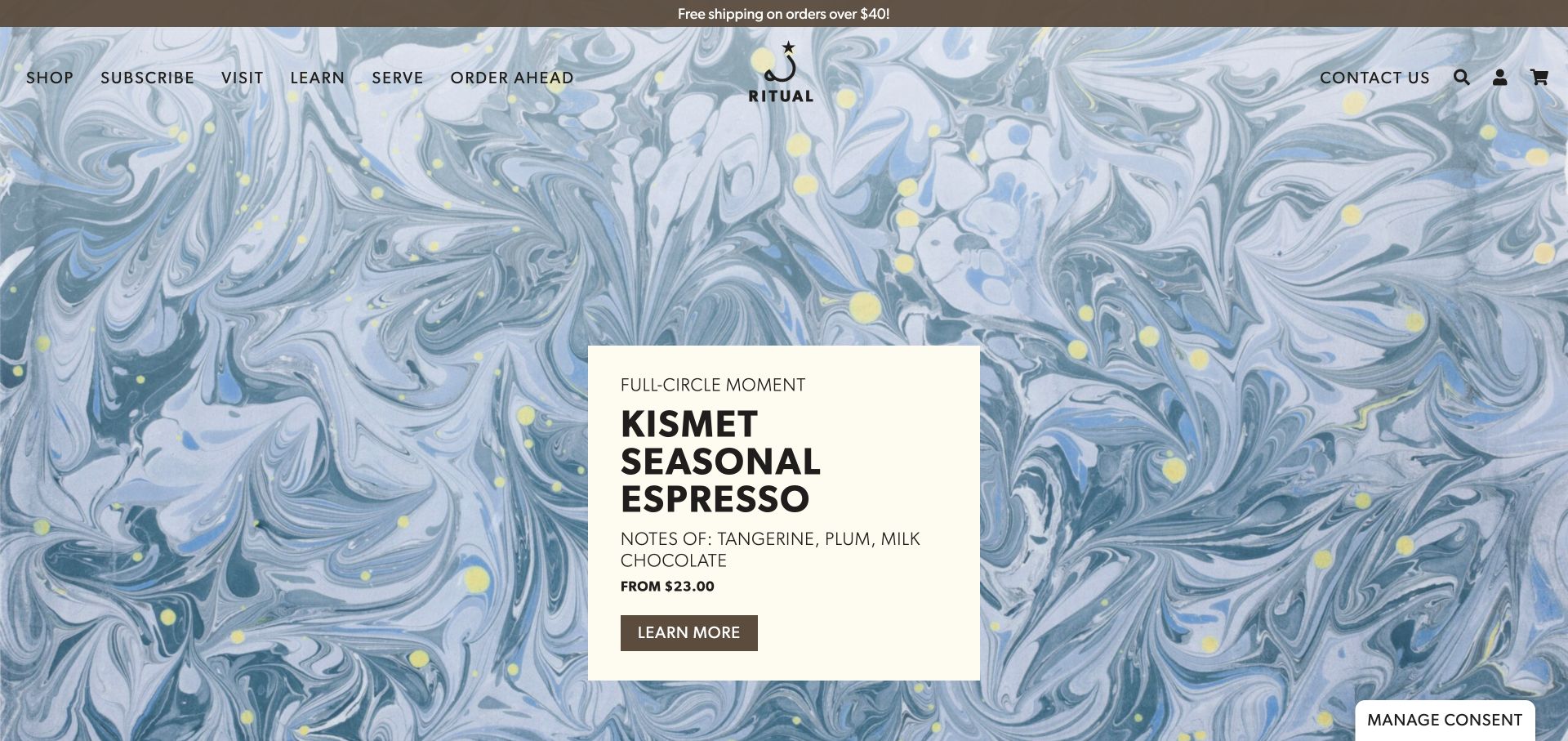
Ritual Coffee Roasters surrounds a cream product card with a detailed blue marbled campaign background. The card supplies the espresso name, tasting notes, starting price and a direct action, while the header distinguishes shopping, subscriptions, visiting and ordering ahead. Public resources identify Smash Balloon Instagram Feed on this property. The capture does not reveal the feed's arrangement, but it shows a useful discipline for integrating social imagery: expressive visuals are easier to interpret when the accompanying product information remains stable, readable and connected to a specific next step.
What you can learn
Pair selected social posts with maintained product or café context, and retire expired promotions deliberately. A beautiful drink photograph should lead to the relevant offer without making visitors infer whether it concerns shipped beans, a subscription or an in-person visit.
Pros
The solid cream card protects practical product text from the busy artwork.
Visiting and ordering ahead receive explicit routes beside online shopping.
Cons & considerations
The background could overwhelm a similarly dense social grid placed directly beside it.
Several customer intentions require precise links so a feed does not send everyone to one generic destination.
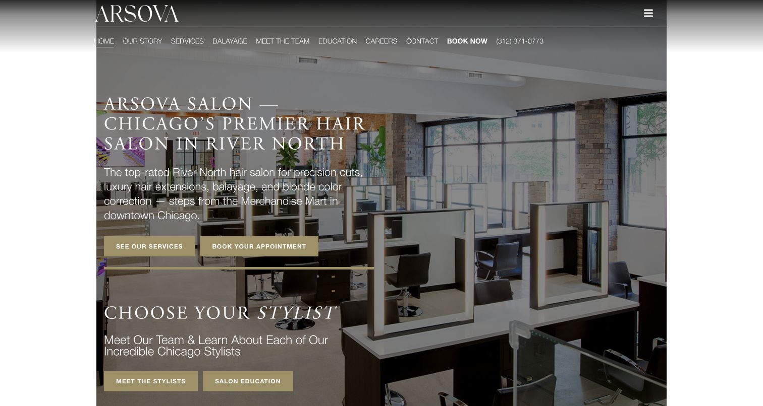
Arsova Salon places a neighborhood-specific introduction over a photograph of its interior. Two gold buttons distinguish viewing services from booking, and a stylist-selection section begins before the first desktop screen ends. The header also includes a phone number and multiple service-oriented routes. Public resources associate Smash Balloon Instagram Feed with the property, without establishing that any image in this opening comes from the feed. The relevant integration challenge is converting visual interest into a precise salon decision: a hairstyle or color photograph needs enough context to help a visitor identify the service and the person they want to consult.
What you can learn
Curate social examples with appropriate permission and meaningful service or stylist context. Link to current booking information, and avoid using isolated before-and-after images as guarantees of what an individual appointment will achieve.
Pros
The introductory text identifies a concrete neighborhood and service context.
Exploring services, booking and choosing a stylist are separate actions.
Cons & considerations
Long white text competes with the detailed room photograph.
A dense header can make an additional social browsing route harder to prioritize.
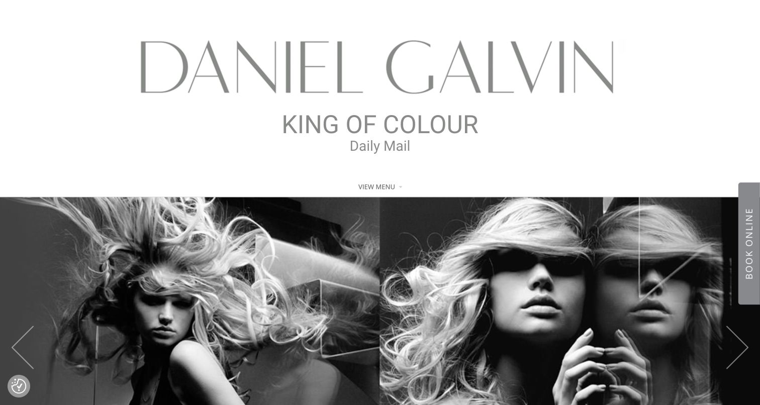
Daniel Galvin gives the name a large white identity block above a black-and-white hair montage. The main menu is small and understated, while a vertical Book Online tab occupies the right edge. This creates a strong editorial impression before explaining services or locations. Public resources identify Smash Balloon Instagram Feed for the website, although the saved first screen does not reveal its feed layout. For a brand with a substantial image archive, a current social selection needs a clear purpose: it should help visitors understand recent work or find relevant people, rather than merely add another visually dominant gallery.
What you can learn
Separate curated portfolio material from current social updates and explain the role of each. Preserve a conventional, accessible booking route alongside an edge-mounted control, and maintain service details independently of captions or social availability.
Pros
The oversized identity and monochrome imagery establish a consistent editorial tone.
The booking tab remains distinct from the central visual composition.
Cons & considerations
The large identity block postpones practical service and location information.
Vertical action text and a compact menu need careful testing for unfamiliar visitors and smaller screens.
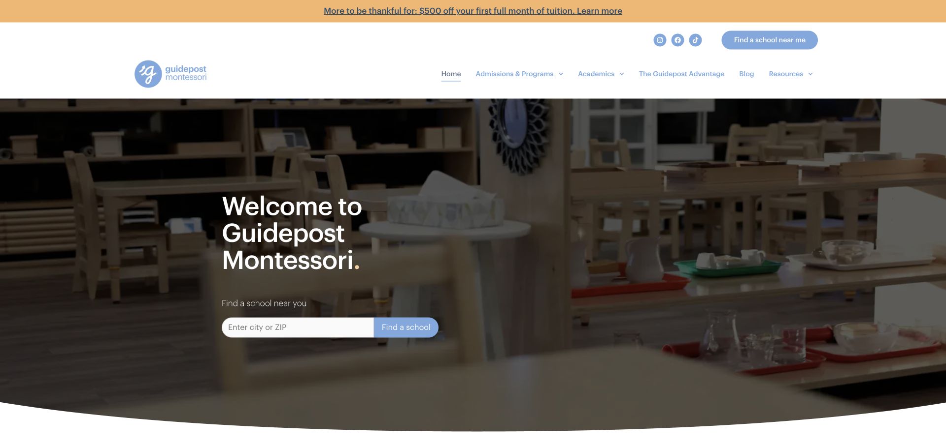
Guidepost Montessori places a short welcome message over a darkened classroom photograph, with a city-or-ZIP finder immediately below. Admissions and Programs, Academics and Resources remain named header choices, while a promotional strip sits above the navigation. Public assets identify Smash Balloon Instagram Feed on the property. The saved opening documents the location-first structure rather than a visible feed. For a school network, social content can describe community life, but the essential decision remains local: families need the appropriate campus, program and contact information without assuming that every pictured classroom represents the same offering.
What you can learn
Label school and program context when selecting social posts, and maintain careful permissions for images involving children. Keep enrollment, location and contact information available as ordinary website content even if social content is disconnected or temporarily withheld.
Pros
The city-or-ZIP field makes the intended next task concrete.
Admissions and academic information remain visible beside the school-finding route.
Cons & considerations
The simple welcome leaves ages and program formats unexplained in the first view.
A promotional strip adds another message before the main location decision.
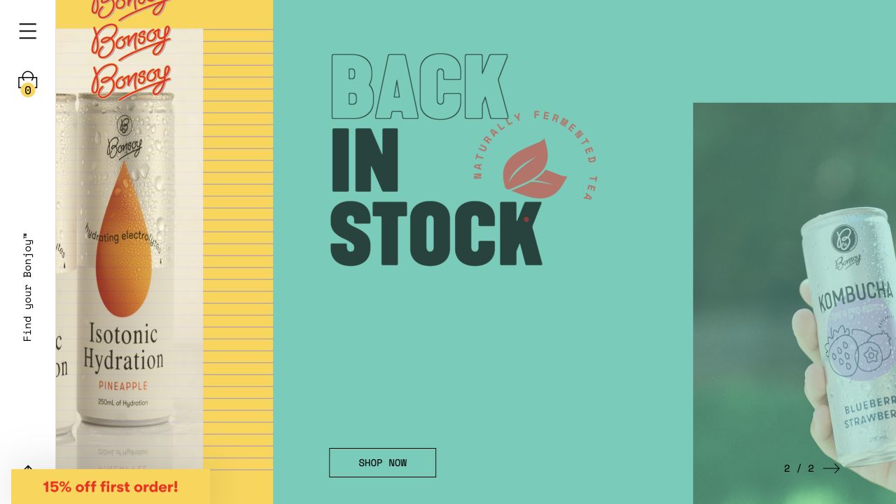
Bonsoy uses a turquoise campaign panel, oversized stacked lettering and product photographs that extend beyond the central message. A narrow utility rail holds the menu and shopping-bag icon, while Shop Now sits near the bottom of the main panel. The composition is deliberately graphic rather than a conventional product grid. Public resources identify Smash Balloon Instagram Feed on this property, but the captured campaign should not be mistaken for an observed feed layout. A social component within this visual system needs to preserve its own readable captions and controls instead of borrowing every decorative device from the surrounding campaign.
What you can learn
Define a simpler repeatable treatment for social cards, including image ratios, readable labels and an obvious destination. Keep product details and stock information on maintained pages, especially when an older social post continues circulating after a campaign ends.
Pros
Distinct colored panels make the campaign feel specific to the brand.
The shopping action offers a practical destination within the expressive composition.
Cons & considerations
A narrow utility rail can make ordinary navigation less immediately apparent.
Overlapping type and images need a simpler arrangement when the page becomes a narrow vertical layout.
Platform source: Exact public source-page audit. The public source-page audit on 2026-11-03 recorded linked stylesheet matches google fonts for this exact property. This is a public resource reference, not a test of every user journey, a complete backend inventory, or a claim that every visible element uses Google Fonts. Platform evidence is separate from the direct website screenshot and is not a complete current infrastructure audit.
Kegan has 15+ years of experience working with small businesses, Fortune 500 companies, and everything in between. No development job is too big or too small: he brings the same hands-on attention to a focused improvement, a complete website, or a custom application.
For Smash Balloon Instagram Feed projects, he can help with custom themes and templates, publishing workflows, plugin integrations, migrations, and ongoing maintenance. He works directly with clients on scope, design, implementation, testing, and handover, with an emphasis on clear communication and a system that remains practical to maintain after launch.
Show 3 other Smash Balloon Instagram Feed developersHide other Smash Balloon Instagram Feed developers
For a salon, studio or contractor, select a limited set of relevant posts and give them service, project or location context. Preserve a separate portfolio or service page with the detail required to assess fit. A changing image stream should not become the only record of completed work.
A supplementary destination story
For a hotel, venue or attraction, use social material to add current atmosphere after visitors can find booking, tickets and planning information. Keep dates and operational notices in dedicated content components that remain accurate when a feed is cached or unavailable.
A community layer around a product catalog
For a consumer brand, maintain clear product categories, specifications and stock information independently. Where a social image leads to a product, preserve the context and account for discontinued items. Choose a compact layout that supports shopping instead of turning the page into an endless feed.
From references to requirements
Prepare the integration before selecting a layout
Inventory accounts and responsibilities
Identify the account owner, website editor and technical contact. Document who reviews content, responds to a disconnected source and removes an expired promotion. Confirm permissions and the product features required without sharing account credentials in the project brief.
Specify difficult content states
Prototype long captions, unusual image crops, video thumbnails, a small number of approved posts and an empty feed. Check readable links, keyboard access and narrow screens. Ensure nearby navigation remains stable while images load and the feed changes length.
Test freshness and failure explicitly
Confirm how new posts, hidden posts and deleted posts appear after caching. Check the page when social requests are unavailable and when the account requires reconnection. Record the expected fallback, the person responsible and the ordinary process for restoring service.
A useful handover demonstration
Ask the actual team to carry out its routine job: publish a realistic update, correct a mistake, preview a narrow screen, and identify who owns an integration failure. For a library or frontend framework, also ask who maintains the content source and deployment. A polished screenshot does not answer those operational questions.
Beyond the screenshot
Smash Balloon Instagram Feed planning checklist
State the visitor need the feed supports and the page section where it belongs.
Keep essential service, product, booking and operational information outside the feed.
Confirm account ownership, content permissions and the required plugin features.
Choose an explicit moderation policy with an accountable editor.
Provide useful context for locations, services, products and dated promotions.
Test captions, image ratios, keyboard access and narrow layouts with real content.
Check the relationship between feed refresh, background tasks and page caching.
Document a useful empty state and a process for disconnected or stale sources.
Test with real content, a keyboard, a small screen, slow or failed requests, and the people who will maintain the system. These are planning checks, not an accessibility, security, performance, or search-ranking certification.
Sources & editorial method
How this Smash Balloon Instagram Feed collection was reviewed
Twenty distinct public properties were selected from stable authoring records with genuine browser captures. Their original screenshot dates, dimensions, attribution and exact technology observation dates remain attached to the source records. Each source has a documented broad public stack-audit attempt. Smash Balloon Instagram Feed is identified from product-specific public resource paths; this does not reveal private account settings, prove that a feed is visible above the fold, or establish that other Smash Balloon products are installed. The collection's visual reviews are original analysis, and integration suggestions are recommendations rather than claims about unobserved configurations.
Every image is an unmodified capture from the actual website, with its source and capture date. Some captures are reused from our shared catalog; their dates remain the original capture dates. None comes from a vendor gallery or a generated reconstruction. Moving imagery and live content can change.
Technology attribution uses public page assets or metadata, official platform documentation, or a cited first-party project case study. Documentary and framework-relationship evidence is identified where used; it is not a complete current backend inventory. A CMS image CDN alone does not establish a full CMS deployment. A library’s presence does not prove which individual controls use it, and a platform label does not establish AI authorship.
The composition notes, lessons, pros and tradeoffs are original editorial observations. We have not measured conversion, traffic, security, performance or accessibility conformance. Website owners retain their brands and imagery; these examples are not our client portfolio. Written, Edited and Curated are independent records, not dates advanced by a build. See our editorial standards or suggest a correction.
Questions worth asking
Smash Balloon Instagram Feed website development FAQs
Are the large photographs in these screenshots Instagram feeds?
Not necessarily. The screenshots show genuine public page designs, and plugin-specific resources establish a separate technical association. The review only identifies a visible feed when the evidence supports that conclusion; ordinary hero or portfolio imagery should not be attributed to Instagram merely because the plugin is present.
Does a plugin resource prove that the feed is currently updating?
No. A public reference can identify the integration without revealing account connection status, moderation choices or cache freshness. Verify those behaviors directly in your own implementation, including how new and removed posts become visible.
Should the feed contain prices, hours or event instructions?
Keep essential and time-sensitive information in maintained website content. A social caption may remain cached after an offer or schedule changes. Use social posts to supplement that information and link to its current authoritative page.
What should be checked before publishing a feed?
Review content permissions, account ownership, moderation, image presentation, readable controls, keyboard access, cache behavior and an unavailable state. Also confirm which features are included in the selected product version; the examples do not establish their licensing or settings.
Start with the content's purpose and the visitor's next step. Then build a small, well-maintained social component that supports the rest of the website.