Definitive guide · Slider Revolution website development
Best Slider Revolution Websites of 2026 (20 Real-World Examples)
Real pages with Slider Revolution references, and a practical way to plan campaign modules without making essential content depend on motion.
A moving hero should make an important message easier to understand—not become the only place where visitors can find it.
The websites below use product scenes, service photography, performance imagery and editorial layouts. A public Slider Revolution reference does not identify the author of every visible element. The reviews describe the actual captured composition, while the source notes identify the component association separately.
Before choosing a slider or animated module, decide whether visitors need a sequence at all. One well-labelled campaign can be more useful than several rotating panels with competing actions. The production brief should account for reduced motion, long copy, small screens, delayed media and the person who will edit next month’s campaign.
Before the examples
What makes good Slider Revolution website development in 2026?
Give the first view a complete message
Do not require someone to wait for a later slide to find a service, deadline or main action. Keep essential navigation outside the animated module. If several offers matter equally, compare a visible grid or ordinary content section before adopting rotation.
Design motion as an optional enhancement
Plan readable text, meaningful controls and a useful still state. Slider Revolution’s help center explains its authoring and module controls; a finished result still needs project-specific review of timing, focus, contrast and reduced-motion behavior.
Use content that can be edited and read at different sizes. Check the relationship between text, focal points and actions when a crop changes. A beautiful desktop frame is not enough if the mobile arrangement covers the product or leaves the button outside the visible message.
The five opening product, arts and trade-service brands illustrate different campaign needs. Public module references are not proof that every pictured hero, gallery or animation was made with Slider Revolution, nor evidence of its conversion performance.
We start with five recognizable brands or organizations: Bianchi, Bush Hog, Woods Equipment, Ballet Austin, Bergelectric. Each attribution applies to the named website property, not every product or website belonging to its organization. This is a curated reading sequence, not a measured ranking.
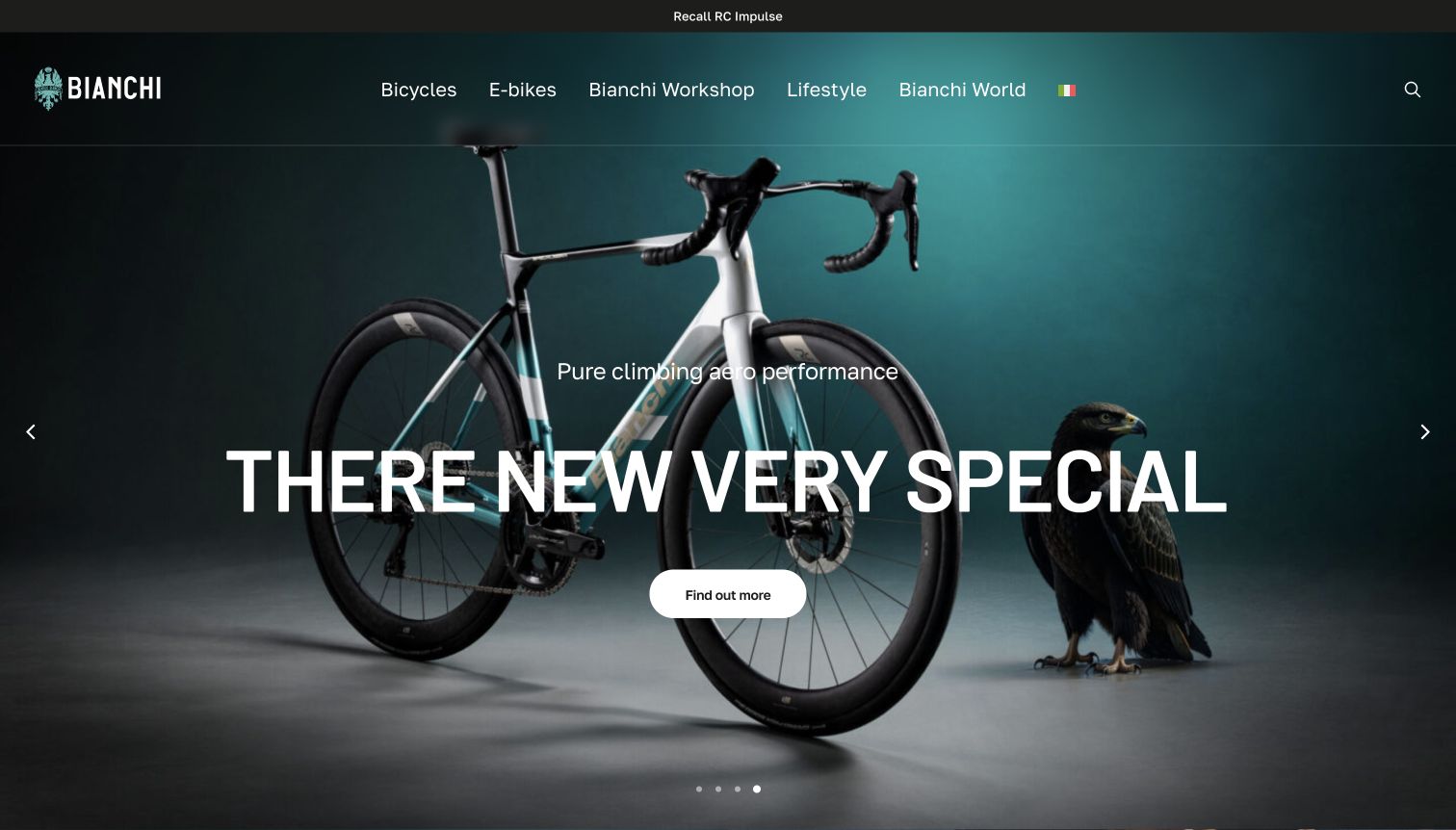
Bianchi’s captured hero places a complete road bicycle and an eagle against a dark teal studio background. The main heading, short performance-oriented line and rounded action sit over the product image, while the top navigation distinguishes bicycles, electric models, workshop, lifestyle and brand stories. A separate recall link occupies the narrow strip above the header. The source page uses Italian navigation in its DOM, while the browser visibly translated parts of the page into English, including an awkwardly rendered product heading. The capture preserves that real presentation rather than silently correcting its text.
What you can learn
Use studio imagery when the bicycle’s complete silhouette should be clear, but keep the model identity accurate across languages. Product names need protection from automatic translation. Service notices also deserve a stable, visible position so that a visually polished campaign does not conceal practical ownership information.
Pros
The studio composition shows the whole bicycle rather than only a component crop.
A recall route remains visible above the promotional content.
Cons & considerations
The observed translation distorts the main product heading.
Large overlaid text covers part of the bicycle’s frame and cockpit.
Platform source: WordPress.org Showcase. Linked stylesheet matches Slider Revolution. Exact public source-page sample: https://www.bianchi.com/. This identifies a public Slider Revolution reference or response association, not private configuration, complete architecture, measured performance or successful data collection. Platform evidence is separate from the direct website screenshot and is not a complete current infrastructure audit.
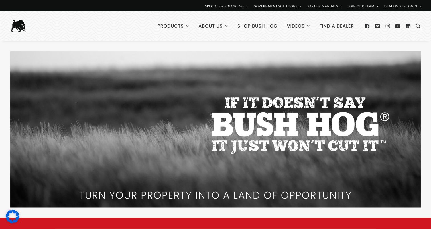
Bush Hog uses a bold, almost poster-like opening: a black-and-white field image, large slab-style lettering and a red accent strip. The small pig emblem anchors a light textured header, while a dark utility row exposes specials, government-related information, parts and dealer login. This gives the page a distinctive voice without filling the hero with several buttons. It is a useful study in brand recognition for an established equipment name, particularly when visitors may already know the product category. The same decision limits the information offered to someone arriving cold. The opening statement carries more brand attitude than machine detail, and product identification depends on the navigation and content that follow.
What you can learn
Use distinctive typography to make an established brand recognizable, but pair it with plain product categories and a clear dealer route. Ensure an unfamiliar visitor can understand what the manufacturer makes without relying on brand knowledge.
Pros
The monochrome photography and red accents create a consistent identity.
Parts and dealer utilities are visible above the main content.
Cons & considerations
The hero emphasizes the brand statement over a particular machine.
Large display lettering needs responsive checks for clipping and wrapping.
Platform source: WordPress.org Showcase. Linked stylesheet matches Slider Revolution. Exact public source-page sample: https://bushhog.com/. This identifies a public Slider Revolution reference or response association, not private configuration, complete architecture, measured performance or successful data collection. Platform evidence is separate from the direct website screenshot and is not a complete current infrastructure audit.
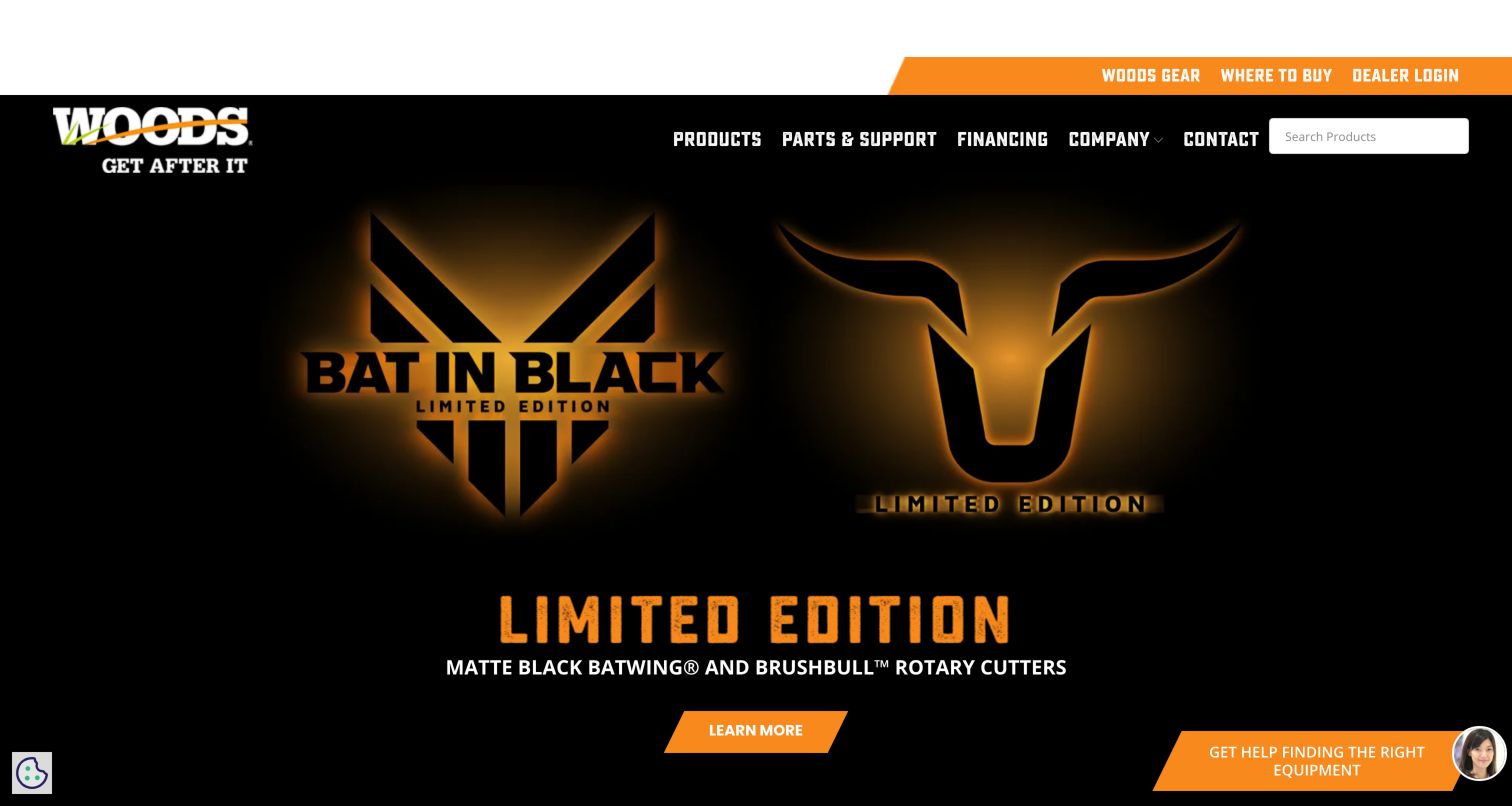
Woods Equipment uses angular black-and-orange navigation and condensed headings to create an assertive visual system. A visible product search sits alongside the menu, while Where to Buy and dealer login receive utility positions. The captured limited-edition launch uses dark imagery and glowing gold emblems, with an orange Learn More button and explanatory equipment copy below. This is a more stylized treatment than the field photographs common elsewhere in the collection. It can make a launch memorable, but the visual shorthand relies on supporting text to explain the actual rotary-cutter product. The persistent assistance control and dense header also need room around them so they do not compete with catalog or support tasks.
What you can learn
Let a special-edition campaign have its own personality while retaining the manufacturer's ordinary catalog search and buying route. Make the actual equipment category explicit near decorative launch artwork and keep service information easy to reach.
Pros
Product search is visible in the header.
Where to Buy is separated from dealer-only access.
Cons & considerations
The campaign artwork provides limited equipment detail at first glance.
Several utility and assistance elements compete at the screen edges.
Platform source: WordPress.org Showcase. Linked stylesheet matches Slider Revolution. Exact public source-page sample: https://woodsequipment.com/. This identifies a public Slider Revolution reference or response association, not private configuration, complete architecture, measured performance or successful data collection. Platform evidence is separate from the direct website screenshot and is not a complete current infrastructure audit.
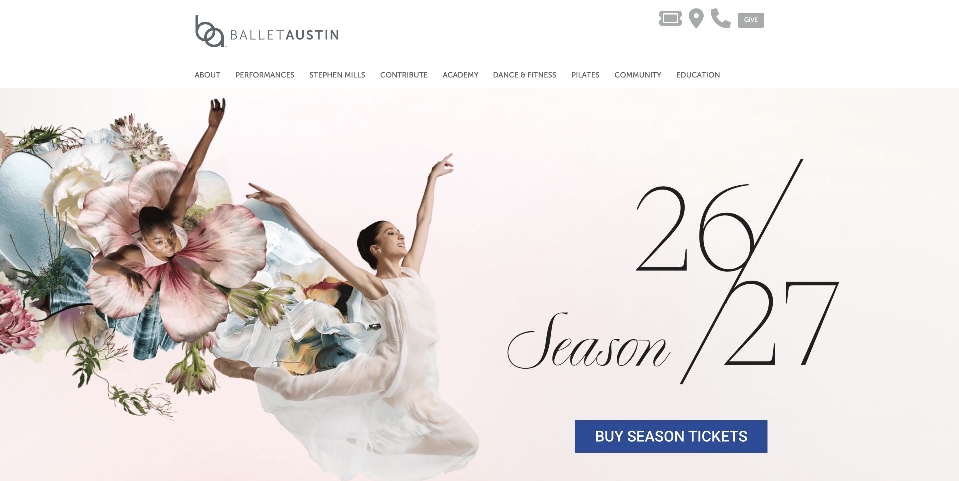
Ballet Austin combines dancers, flowers and generous pale space in its season artwork. The large season numerals establish the campaign, while a blue ticket button stands apart from the delicate image and typography. A conventional horizontal menu names performances, the academy, dance and fitness, Pilates, community and education. Below the hero, short promotional blocks distinguish enrollment, season tickets and a holiday opening weekend. This approach keeps a broad institution understandable without placing every program inside the main campaign image, though the number of top-level choices makes the header relatively dense.
What you can learn
Choose a primary action color that remains distinct from the campaign palette. Then give each secondary program a concise description and destination instead of adding more buttons over the opening photograph.
Pros
The blue season-ticket action remains easy to distinguish against the pale artwork.
Education and adult participation routes are named directly in the main navigation.
Cons & considerations
The long navigation row asks visitors to scan several related program labels.
The season-led opening does not show individual production dates immediately.
Platform source: WordPress.org Showcase. Linked stylesheet matches Slider Revolution. Exact public source-page sample: https://balletaustin.org/. This identifies a public Slider Revolution reference or response association, not private configuration, complete architecture, measured performance or successful data collection. Platform evidence is separate from the direct website screenshot and is not a complete current infrastructure audit.
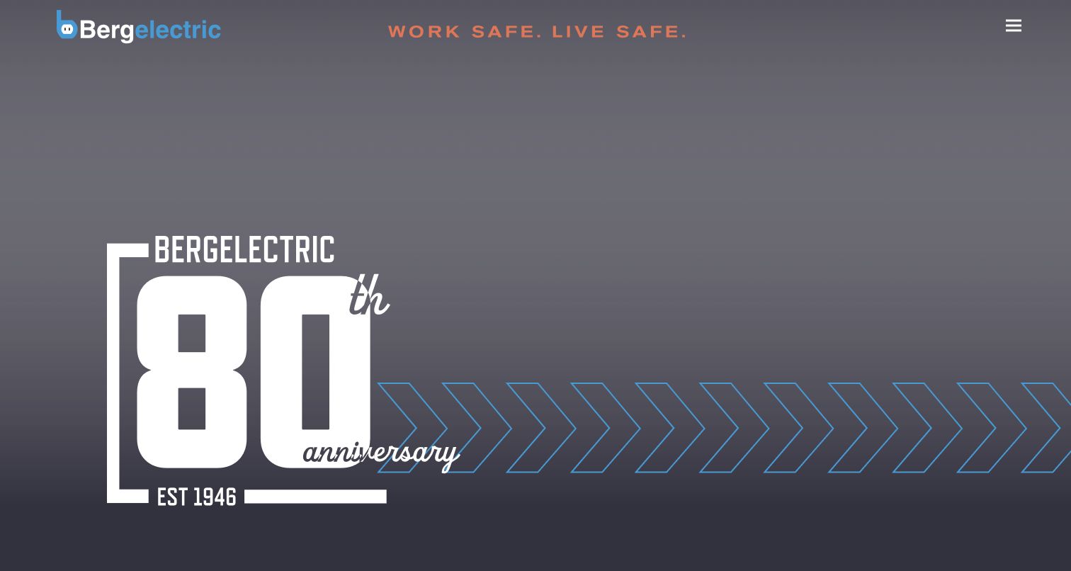
Bergelectric’s captured homepage uses a dark, restrained brand presentation with an anniversary graphic and a compact menu control. Below the hero, partner logos, recruiting content, a featured project story and regional office links provide the main information structure. The region list is particularly useful for a contractor whose local offices matter to prospective clients. This approach differs from a residential booking homepage: it emphasizes the organization and work context rather than an immediate appointment. The compact menu reduces visible navigation choices, however, so new visitors may need extra interaction to locate electrical capabilities. A client-focused project and contact route should remain easy to discover beside the workforce material.
What you can learn
Give regional electrical operations a clear place in the site structure and connect them to relevant work. Balance recruiting content with direct capability and project routes so clients can evaluate the contractor without decoding an image-led hero.
Pros
Regional offices have explicit contact-oriented destinations.
Project and workforce content provide more than a generic service list.
Cons & considerations
The compact menu hides primary choices on the first screen.
The hero offers little explanation of electrical capabilities.
Platform source: WordPress.org Showcase. Linked stylesheet matches Slider Revolution. Exact public source-page sample: https://www.bergelectric.com/. This identifies a public Slider Revolution reference or response association, not private configuration, complete architecture, measured performance or successful data collection. Platform evidence is separate from the direct website screenshot and is not a complete current infrastructure audit.
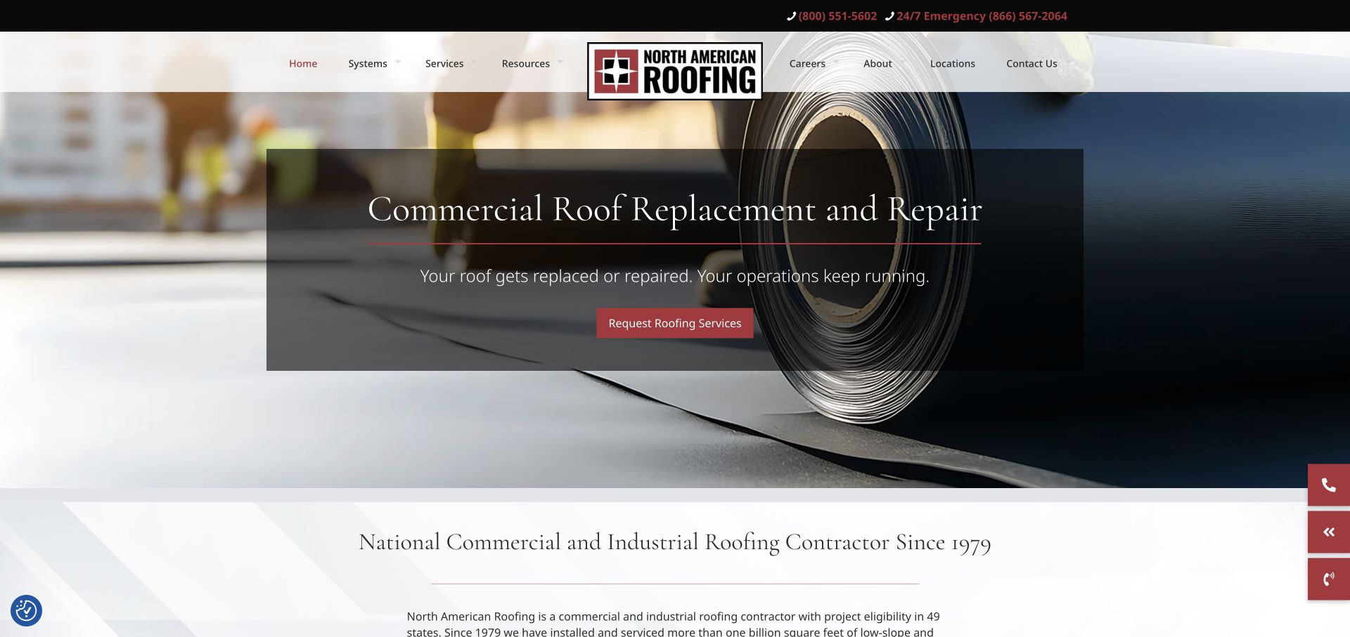
North American Roofing uses a centered logo that divides the navigation, with a separate dark phone strip above it. The captured hero promotes commercial replacement and repair over a close view of roofing material, placing the message inside a translucent dark panel. The opening transitions into a light introduction that explicitly names the commercial and industrial audience. The overall treatment is more traditional than a sparse portfolio site, but the material photograph keeps the subject matter specific.
What you can learn
A service campaign can sit inside a broader company homepage if the audience and contact routes remain clear. Give recurring programs and replacement work their own concise explanation, then provide the wider service context below. Avoid relying on a rotating slide to carry information that every buyer needs.
Pros
The material-focused image explains the work more directly than unrelated lifestyle photography.
Normal and emergency phone routes are distinct in the utility bar.
Cons & considerations
A centered logo and long navigation row demand a carefully reworked mobile header.
Translucent panels and rotating slides can weaken legibility during transitions if not tested.
Platform source: WordPress.org Showcase. Linked stylesheet matches Slider Revolution. Exact public source-page sample: https://naroofing.com/. This identifies a public Slider Revolution reference or response association, not private configuration, complete architecture, measured performance or successful data collection. Platform evidence is separate from the direct website screenshot and is not a complete current infrastructure audit.
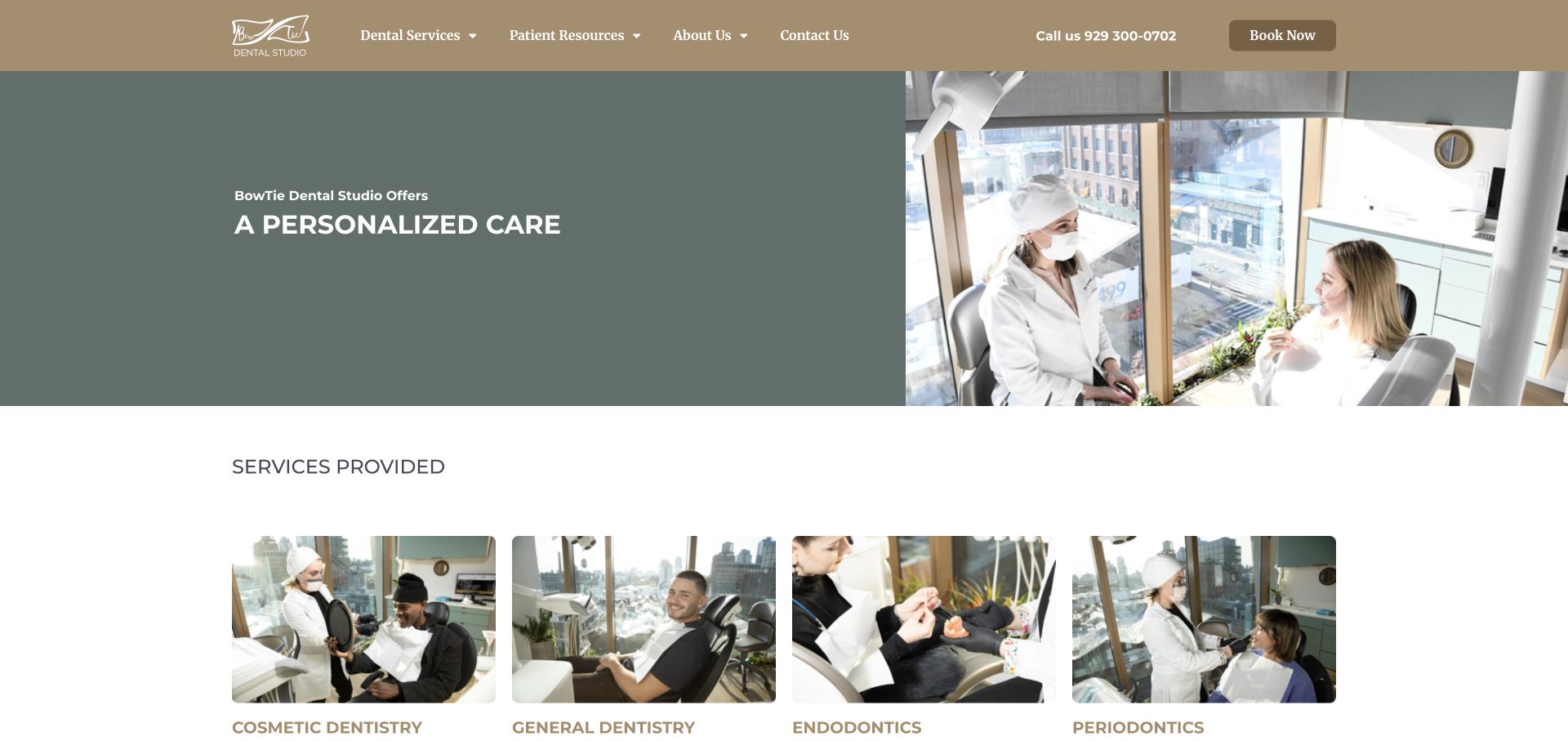
BowTie uses a warm taupe navigation bar and a subdued green-gray introduction beside a large photograph of a clinician speaking with a patient. The following services section begins within the captured view, using four actual treatment photographs rather than abstract medical illustrations. The nav keeps the telephone number and booking button on the same line as the main categories. This gives the homepage a practical rhythm: identify the practice, see the environment, then compare treatment categories.
What you can learn
For a neighborhood dental studio, recognizable people and rooms can explain more than another broad quality claim. Keep service labels plain and match each image to a useful category so that patients can move from a reassuring introduction to the care information relevant to them.
Pros
The services row shows a variety of real clinical contexts in a consistent image format.
A visible phone number supports visitors who do not want to use an online scheduler.
Cons & considerations
The pale hero type depends on its background settling into the intended darker state after entrance animation.
Several specialty labels in one row may need additional explanation for patients unfamiliar with dental terminology.
Platform source: WordPress.org Showcase. Linked stylesheet matches Slider Revolution. Exact public source-page sample: https://bowtiedentalstudio.com/. This identifies a public Slider Revolution reference or response association, not private configuration, complete architecture, measured performance or successful data collection. Platform evidence is separate from the direct website screenshot and is not a complete current infrastructure audit.
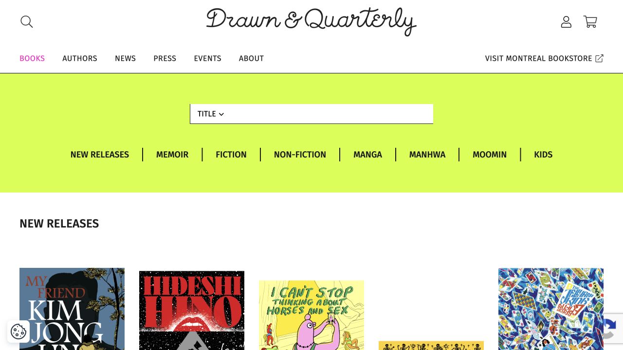
Drawn and Quarterly’s captured books page combines a handwritten-style masthead with a bright category band and an orderly cover grid. New releases sit beside memoir, fiction, nonfiction, manga, manhwa and children’s routes. Author navigation and a separately labeled Montreal bookstore destination distinguish the publishing catalog from the physical shop. This is a publisher’s catalog view rather than a replacement homepage screenshot, and its usefulness lies in how visual works remain supported by understandable textual categories.
What you can learn
For illustrated publishing, plan interior samples as well as cover images and preserve creator credits outside the artwork. Let genre and format overlap without forcing every title into one exclusive bucket. Separate publishing inquiries, online orders and physical-bookstore visits, and make the book detail record the stable source of price, edition and availability information.
Pros
The category band offers several recognizable routes into a visual catalog.
The physical bookstore is labeled separately from the publisher’s online assortment.
Cons & considerations
Cover thumbnails alone cannot communicate the style of interior pages.
Overlapping format and subject categories need consistent filtering rules.
Platform source: WordPress.org Showcase. Linked stylesheet matches Slider Revolution. Exact public source-page sample: https://drawnandquarterly.com/books/. This identifies a public Slider Revolution reference or response association, not private configuration, complete architecture, measured performance or successful data collection. Platform evidence is separate from the direct website screenshot and is not a complete current infrastructure audit.
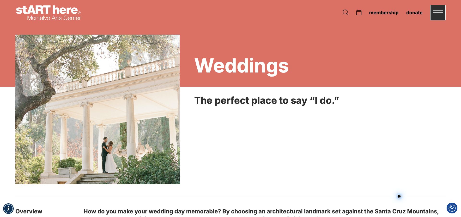
Montalvo Arts Center gives its wedding page a coral header and a large garden-ceremony photograph, maintaining the institution's identity while clearly naming the event type. The text identifies the Villa, Great Lawn, Spanish Courtyard and garden settings, then explains that fees depend on the date, guest count and spaces required. An email address accompanies the external enquiry-form link, giving visitors another way to contact the team. A separate photography-permit section distinguishes professional shoots from personal pictures. The page is concise, but it leaves capacity comparisons and weather arrangements unresolved, and the broader institutional navigation remains prominent around the venue content.
What you can learn
A cultural venue can keep its institutional identity while giving private-event visitors a focused page. Name the spaces, explain what affects a quote and provide a direct contact, then add the logistical facts that prevent an enquiry from starting entirely from scratch.
Pros
The page explains the variables behind a tailored rental quote.
Direct email and photography-permit guidance clarify separate tasks.
Cons & considerations
Capacity and weather-backup comparisons are not summarized.
Institutional navigation offers limited direct wedding-planning structure.
Platform source: WordPress.org Showcase. Linked stylesheet matches Slider Revolution. Exact public source-page sample: https://montalvoarts.org/host/weddings/. This identifies a public Slider Revolution reference or response association, not private configuration, complete architecture, measured performance or successful data collection. Platform evidence is separate from the direct website screenshot and is not a complete current infrastructure audit.
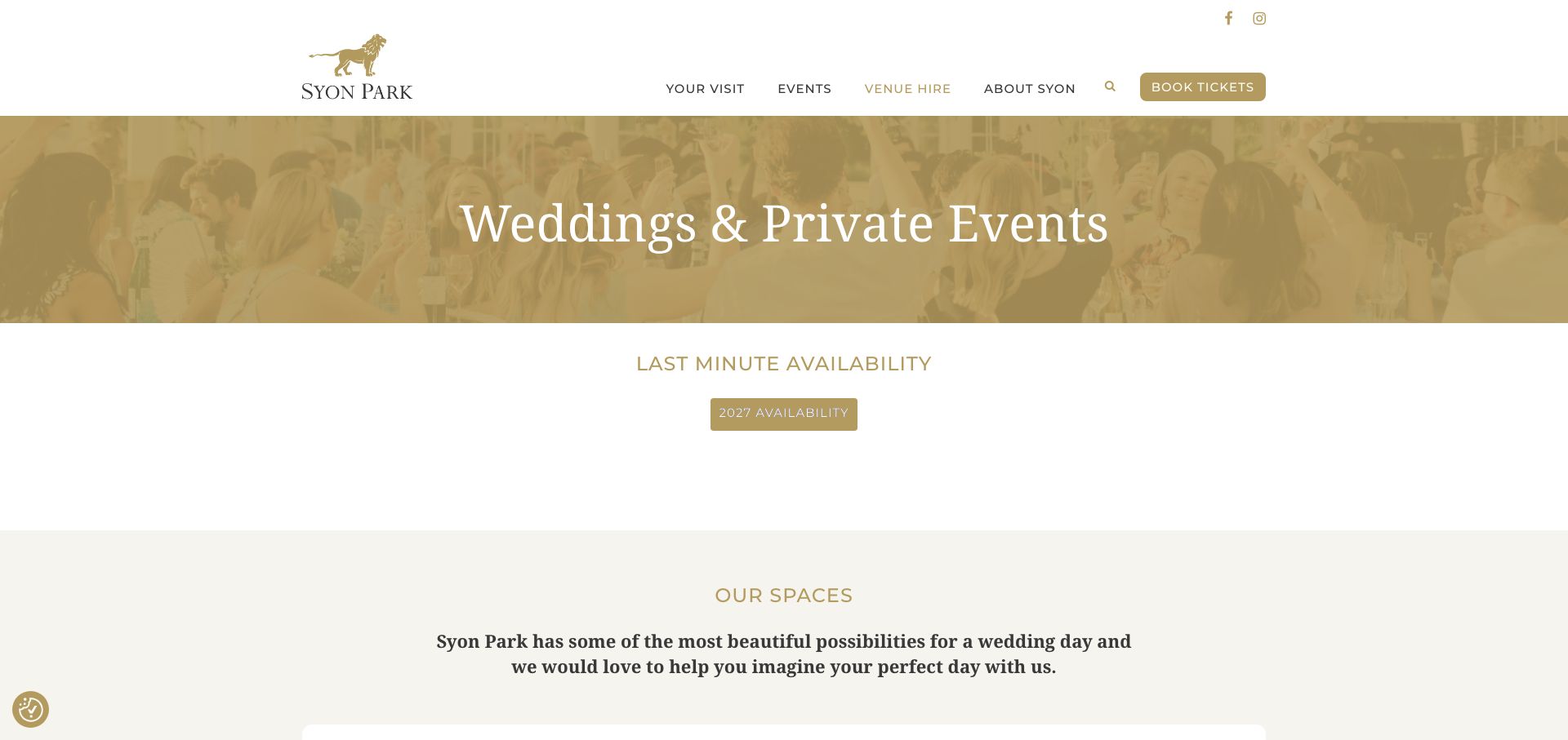
Syon Park's wedding and private-events page starts with an availability-diary link before moving into the House, Great Conservatory and Hotspur Wing. It provides hire-fee PDFs labeled by year and a separate wedding brochure, helping visitors distinguish dated commercial material from the general introduction. Suggested day formats and supplier links add further planning context, while the footer separates the postal address from the vehicle entrance. The page also covers summer, winter and Christmas parties, so wedding information shares a long page with other uses. Generic View and Book Now links reveal little about their destinations, and standing capacities vary by the event context described.
What you can learn
Give dated fee documents an explicit year and connect them to the relevant spaces. Keep arrival instructions precise, and label capacities and day formats carefully so visitors do not apply a reception maximum to a different wedding configuration.
Pros
Year-labeled hire documents and an availability diary support research.
Named spaces and a separate vehicle entrance improve planning context.
Cons & considerations
Several other party types make the wedding page lengthy.
Generic actions and context-dependent maximums require extra interpretation.
Platform source: WordPress.org Showcase. Linked stylesheet matches Slider Revolution. Exact public source-page sample: https://syonpark.co.uk/weddings-private-events/. This identifies a public Slider Revolution reference or response association, not private configuration, complete architecture, measured performance or successful data collection. Platform evidence is separate from the direct website screenshot and is not a complete current infrastructure audit.
Portland Chiropractic Clinic uses a large practitioner portrait, a beige background and a numbered text panel to introduce individual care. The header is limited to home, about, images, staff and contact. The inspected page continues into a two-column service overview, staff introduction and a conspicuous contact block containing the address and phone. Its layout is more conventional than many examples here, but it demonstrates how a small office can provide a complete public introduction without a complex selector. Several footer links appear as broad category labels rather than detailed destination descriptions.
What you can learn
A single office can use a simple structure with a named practitioner and direct contact information. Give services enough detail for useful browsing and review every category destination. Do not make a numbered promotional panel the only place visitors can find basic facts, or require waiting for a later slide.
Pros
The main menu stays compact
The page includes a clear address and phone contact block
Cons & considerations
The broad service list offers limited comparison detail
Generic and repeated footer labels warrant a destination-quality review
Platform source: WordPress.org Showcase. Linked stylesheet matches Slider Revolution. Exact public source-page sample: https://pdxchiroclinic.com/. This identifies a public Slider Revolution reference or response association, not private configuration, complete architecture, measured performance or successful data collection. Platform evidence is separate from the direct website screenshot and is not a complete current infrastructure audit.
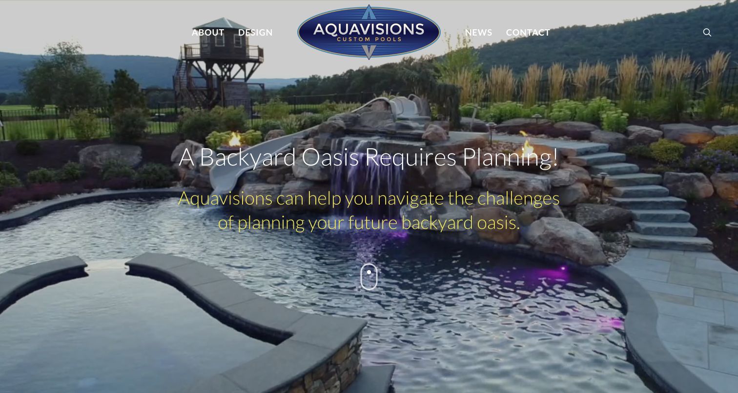
Aquavisions uses an expansive pool scene, centered wordmark and small four-item menu. A planning message appears over the water rather than a promise of an instant pool. Below, the question of when someone can swim leads into design, scope and scheduling explanations, followed by 3D design and FAQs. Central Pennsylvania positioning identifies the regional focus. The restrained navigation suits a specialist construction business, while completed-project imagery supplies visual inspiration. The practical process material is more useful for qualifying an enquiry than the opening landscape alone.
What you can learn
Use completed work to open the conversation, then explain what has to happen before construction can be scheduled. Pair design imagery with a scope and process explanation instead of implying a rendering establishes feasibility. A smaller specialist can borrow the compact navigation and planning language without imitating the scale of the photographed property or making unsupported completion promises.
Pros
Scheduling discussion acknowledges project-specific planning rather than promising one universal timeline
Compact navigation separates company, design, news and contact without a large service maze
Cons & considerations
The full-screen introduction puts the practical scheduling explanation below the fold
Light, thin text over changing imagery needs careful contrast and fallback testing
Platform source: WordPress.org Showcase. Linked stylesheet matches Slider Revolution. Exact public source-page sample: https://aquavisionspools.com/. This identifies a public Slider Revolution reference or response association, not private configuration, complete architecture, measured performance or successful data collection. Platform evidence is separate from the direct website screenshot and is not a complete current infrastructure audit.
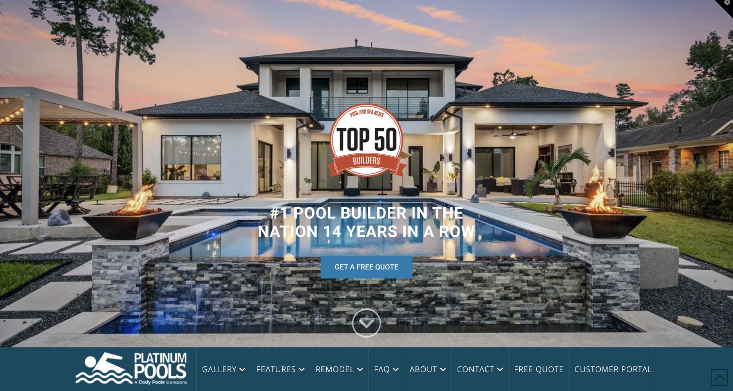
Platinum Pools places a dusk project image across almost the whole opening, with a quote action and ranking badge. Navigation follows the image’s lower edge. The body explains Houston and Beaumont coverage, ownership education and construction, then separates pricing, features and 3D videos into useful destinations. A customer portal sits alongside public routes. The wordmark identifies a Cody Pools relationship, which provides ownership context without proving the site’s effectiveness. This is a useful reference for connecting a dramatic portfolio opening to more practical information.
What you can learn
A large project photograph should lead into information that helps someone decide whether the work is relevant: region, scope, process and budget context. Keep navigation discoverable before a visitor has to scroll, and label a customer portal as separate from a new-project request. Where businesses share ownership or systems, make the relationship clear without treating the sites as identical.
Pros
Pricing, features and 3D design material have distinct explanatory routes
Regional coverage and the parent-brand relationship are visible in the site content
Cons & considerations
Bottom-positioned navigation can be missed in a cropped first view
The initial ranking badge competes with the actual project image
Platform source: WordPress.org Showcase. Linked stylesheet matches Slider Revolution. Exact public source-page sample: https://platinumpools.com/. This identifies a public Slider Revolution reference or response association, not private configuration, complete architecture, measured performance or successful data collection. Platform evidence is separate from the direct website screenshot and is not a complete current infrastructure audit.
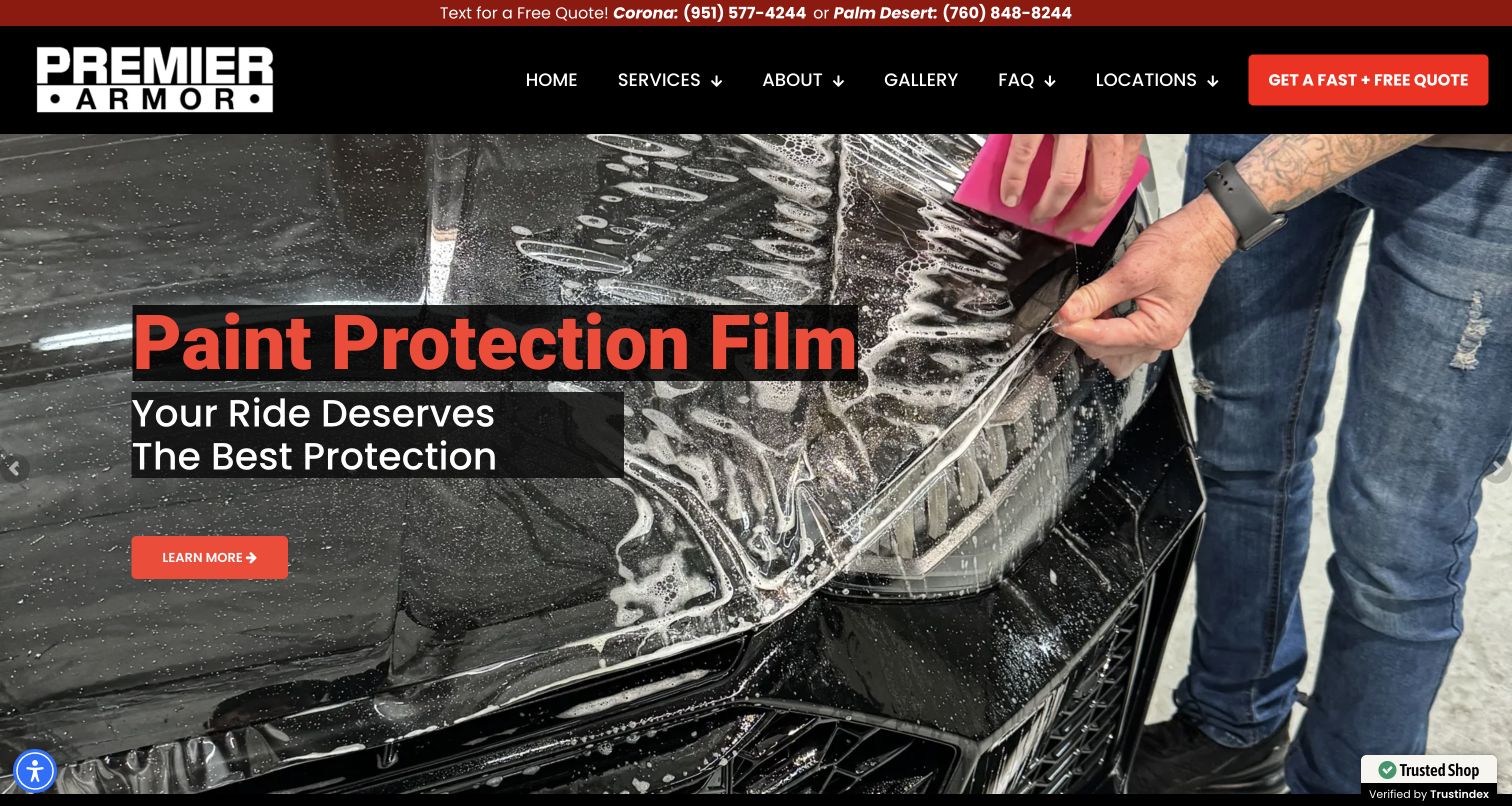
Premier Armor uses an application photograph and a prominent paint-protection message in the captured first screen. A red contact strip distinguishes Corona and Palm Desert enquiries, and the dark navigation offers services, gallery, FAQs, and locations. Window tint is part of the broader service offer, but the opening image demonstrates work on bodywork rather than glass. This distinction is important when studying the site for a tinting business: the structure is useful, while the photograph should not be relabeled as tint installation. Service modules lead to the appropriate treatment, and the gallery and FAQ navigation support customers who want more context before requesting a quote.
What you can learn
Use accurate imagery for each protective service. If the homepage leads with paint film, ensure window tint has a clearly named route and its own examples. Preserve location context in the enquiry so customers know which studio will respond.
Pros
Named location contacts make the regional operating structure visible immediately.
Gallery and FAQ links offer useful supporting information beside service discovery.
Cons & considerations
The first-screen paint-protection emphasis can delay recognition of window tinting availability.
A shared protective-services message needs precise photo captions to distinguish glass from body-film work.
Platform source: WordPress.org Showcase. Linked stylesheet matches Slider Revolution. Exact public source-page sample: https://premierarmor.com/. This identifies a public Slider Revolution reference or response association, not private configuration, complete architecture, measured performance or successful data collection. Platform evidence is separate from the direct website screenshot and is not a complete current infrastructure audit.
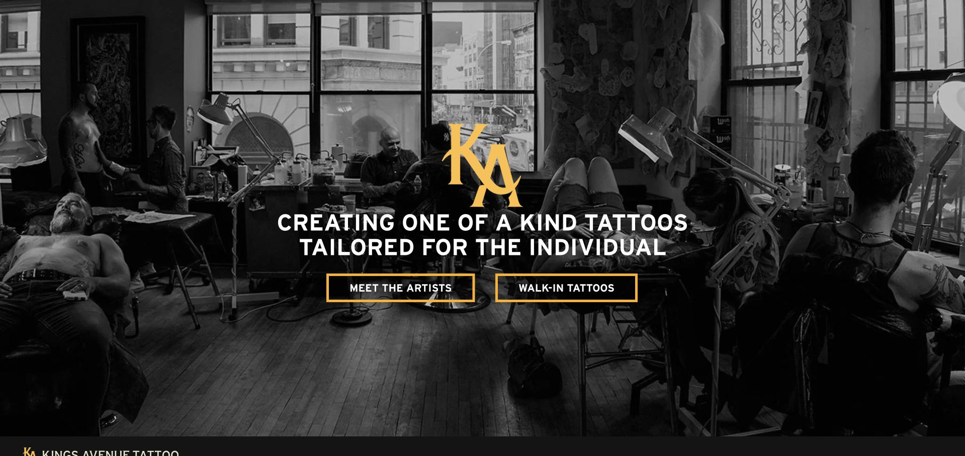
Kings Avenue uses a monochrome photograph of the studio in action, a gold monogram and two outlined actions for meeting artists and investigating walk-in tattoos. The body then introduces the approach and offers location cards for Durham, New York City and Long Island. This is a useful group-level pattern: custom artist selection and a same-day visit do not need the same explanation, and branch choice remains explicit. Editorial articles extend the site beyond booking, but they sit after the core service and place information rather than becoming the only route into the work.
What you can learn
Separate a planned custom project from a walk-in visit and attach each to an actual branch. Consistent location cards help, but artist profiles should still identify where and when the artist works instead of assuming the brand name communicates availability.
Pros
The hero presents artist discovery and walk-in information as different needs.
Location cards make the group's geographic choices explicit.
Cons & considerations
If one group roster spans several cities, keep each artist's location and guest dates maintained.
If editorial articles discuss tattoo symbolism, label interpretation carefully rather than presenting one meaning as universal or guaranteed.
Platform source: WordPress.org Showcase. Linked stylesheet matches Slider Revolution. Exact public source-page sample: https://kingsavetattoo.com/. This identifies a public Slider Revolution reference or response association, not private configuration, complete architecture, measured performance or successful data collection. Platform evidence is separate from the direct website screenshot and is not a complete current infrastructure audit.
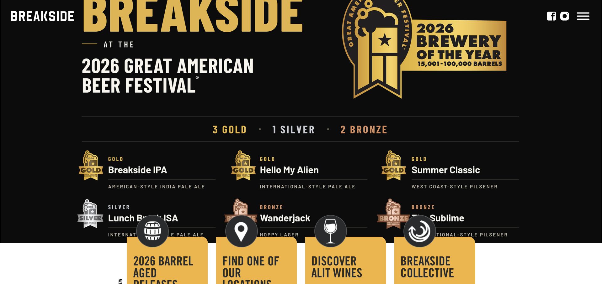
Breakside gives a current awards campaign the opening screen, using large black and gold graphics rather than a neutral welcome message. Below that promotion, beer releases carry concrete product information including strength, bitterness and packaging. A location grid extends the same site into the brewery's regional venues. The result is a useful example of a campaign-led homepage whose permanent responsibilities remain beer discovery and visiting, even when a timely achievement is receiving the most visual attention.
What you can learn
Build campaign areas as temporary modules above durable product and location records. An award can establish context, but the rest of the page must still answer which beer is available, what kind it is and where a guest can encounter the brewery.
Pros
Product facts such as ABV and packaging support comparisons beyond the appearance of the can artwork.
The location grid acknowledges that a regional brewery is also a collection of different physical destinations.
Cons & considerations
When presenting awards, retain the exact year, competition and category as readable text rather than relying only on a graphic.
If a large campaign occupies most of a phone screen, offer an immediately recognizable menu or location shortcut.
Platform source: WordPress.org Showcase. Linked script matches Slider Revolution. Exact public source-page sample: https://breakside.com/. This identifies a public Slider Revolution reference or response association, not private configuration, complete architecture, measured performance or successful data collection. Platform evidence is separate from the direct website screenshot and is not a complete current infrastructure audit.
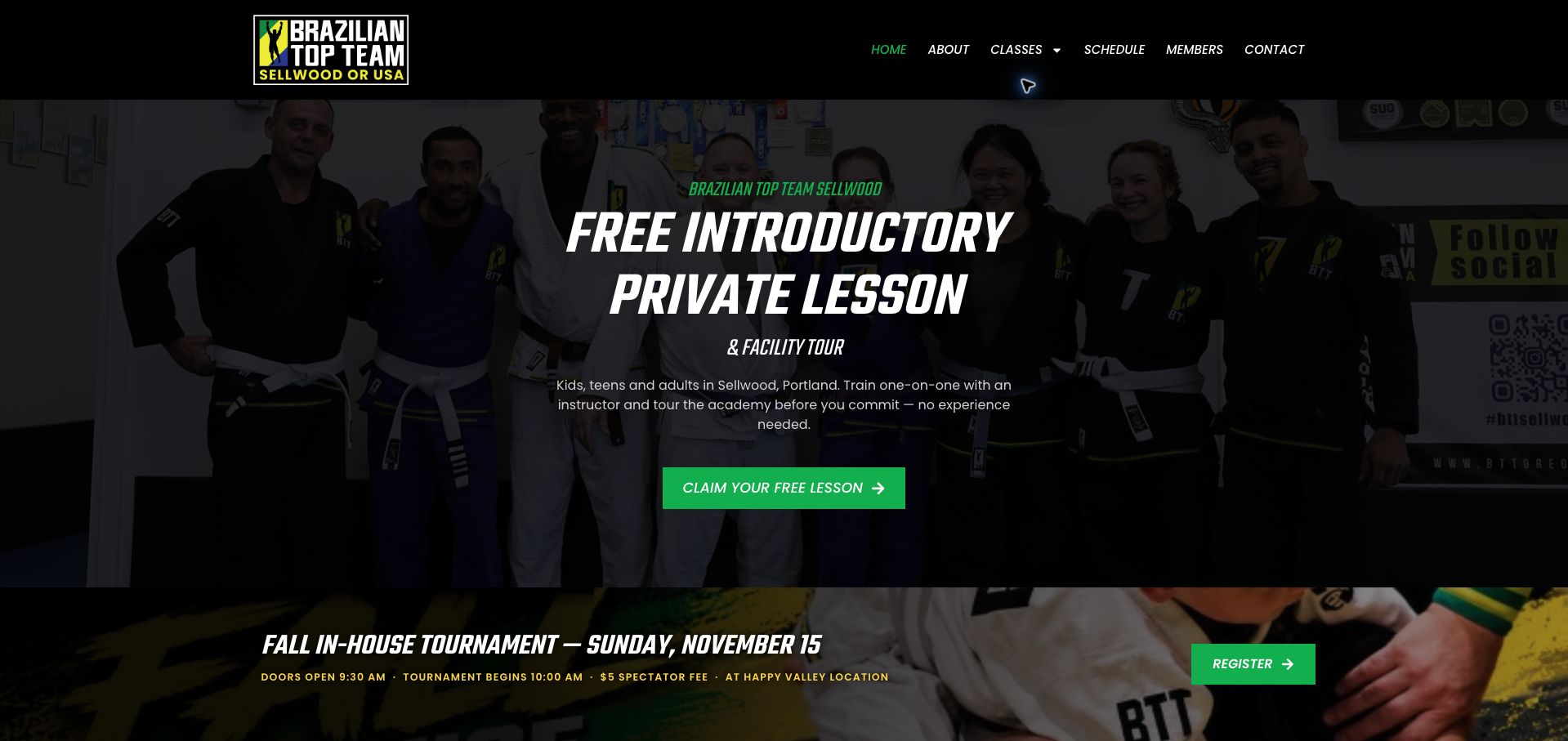
Brazilian Top Team Sellwood leads with a specific introductory experience: a private lesson and facility tour, supported by a photograph of the academy community. The copy names Sellwood and explains that no prior experience is needed, giving a nervous beginner more context than a generic free-trial button. Green actions stand out against dark photographic backgrounds. Below, tournament and camp notices identify when an event takes place at Happy Valley rather than the Sellwood location, an important distinction for families following a local page. Adult, youth and younger-child classes have separate routes, with a schedule link available in the navigation. The number of promotions creates competition for attention, however, and the paid-in-full offer appears among several trial invitations. The first-visit explanation is the most useful part of the page and deserves a clearer hierarchy over the seasonal campaigns.
What you can learn
Explain what the introductory appointment includes and repeat the actual venue whenever a shared event happens elsewhere.
Pros
Private-lesson and tour details make the first step concrete.
Event notices explicitly distinguish the Happy Valley venue.
Cons & considerations
Several promotions compete with the introductory offer.
Dark image overlays reduce the visibility of community photography.
Platform source: WordPress.org Showcase. Linked script matches Slider Revolution. Exact public source-page sample: https://bttsellwood.com/. This identifies a public Slider Revolution reference or response association, not private configuration, complete architecture, measured performance or successful data collection. Platform evidence is separate from the direct website screenshot and is not a complete current infrastructure audit.
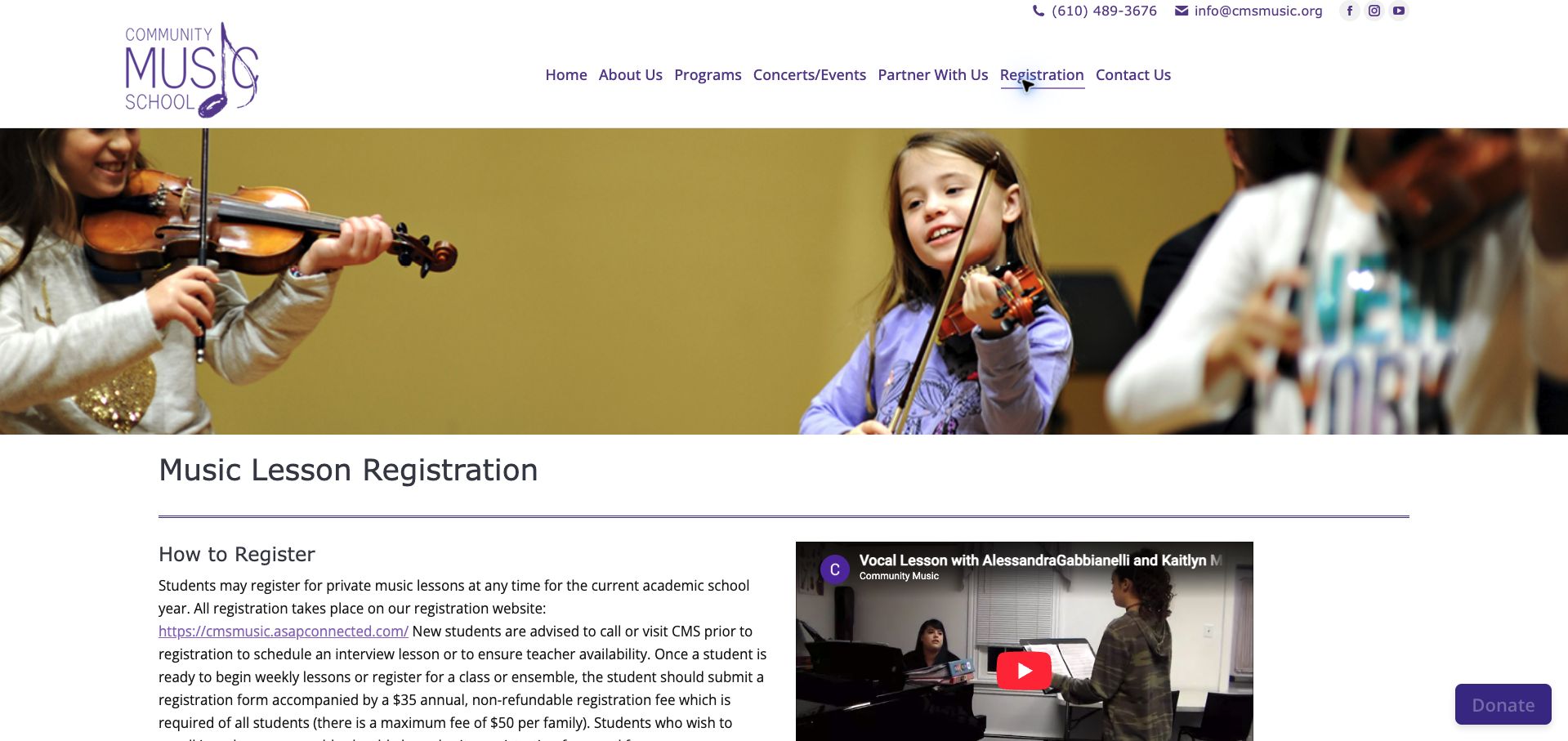
Community Music School's registration page leads with a photograph of children playing strings, followed by a direct explanation of how enrollment works. New students are advised to confirm teacher availability or arrange an interview lesson before using the separate registration website. Annual student and family registration fees are disclosed in the same introductory paragraph. The page then explains rolling enrollment, prorating and the activities included with general instruction, giving tuition more context than a bare lesson price. A performance video adds a view of teaching, but the prose is dense and combines several important conditions in long paragraphs. Prices carry an older effective date, which is useful provenance but warrants a visible confirmation of whether they still apply. The page demonstrates why portal links need preparation rather than functioning as the whole registration experience.
What you can learn
Explain teacher matching, required fees and timing before transferring a family to an external enrollment account.
Pros
Teacher availability is addressed before registration.
Included activities and registration fees are publicly described.
Cons & considerations
Long paragraphs bury several important enrollment conditions.
Older price-effective dates need an explicit currency check.
Platform source: WordPress.org Showcase. Linked stylesheet matches Slider Revolution. Exact public source-page sample: https://www.cmsmusic.org/registration/. This identifies a public Slider Revolution reference or response association, not private configuration, complete architecture, measured performance or successful data collection. Platform evidence is separate from the direct website screenshot and is not a complete current infrastructure audit.
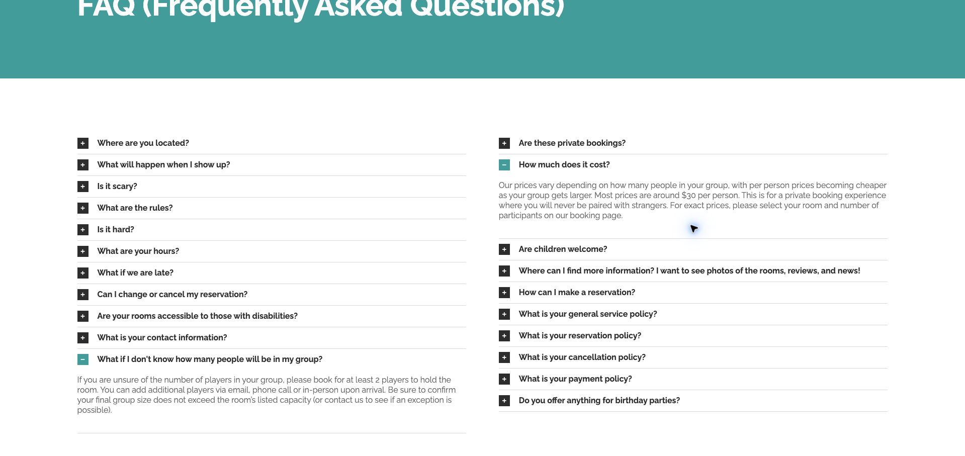
Escapism Portland's FAQ uses a restrained white-and-teal layout with two columns of expandable questions. One especially useful answer addresses an organizer who does not yet know the final headcount: it explains the minimum booking needed to hold a room, ways to add players and the need to respect its capacity. The price answer connects a larger group with a lower per-person amount and directs visitors to the room-and-participant selector for the exact total. This turns a common source of hesitation into an actionable next step. The page is long, with several overlapping policy questions and no obvious topic grouping within the two columns. Exact prices remain elsewhere. The practical value is the specificity of the answers, rather than the visual ambition of the design.
What you can learn
Write FAQs around the real uncertainty that prevents a booking, including what can be decided now and what can change later.
Pros
Unconfirmed attendance is addressed with a concrete booking procedure.
The pricing answer explains the relationship between group size and cost.
Cons & considerations
Overlapping policy questions make the long FAQ harder to navigate.
Visitors must leave the FAQ to calculate an exact group total.
Platform source: WordPress.org Showcase. Linked stylesheet matches Slider Revolution. Exact public source-page sample: https://escapismportland.com/faq/. This identifies a public Slider Revolution reference or response association, not private configuration, complete architecture, measured performance or successful data collection. Platform evidence is separate from the direct website screenshot and is not a complete current infrastructure audit.
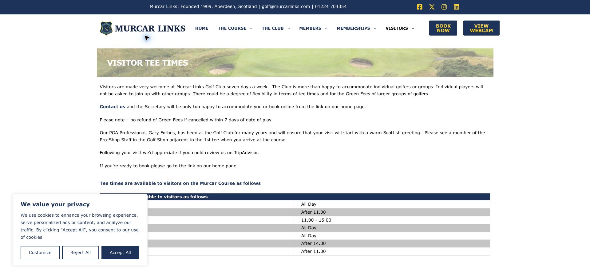
Murcar's visitor page makes availability a matter of specific days and times rather than a vague welcome. A striped timetable explains when visiting golfers may play, while separate instructions handle groups through the secretary. The page also states its pairing approach, cancellation terms and the need to report to the professional shop beside the first tee. These are practical details that prevent an attractive coastal-course photograph from becoming the whole sales argument. White space, navy text and a narrow photographic banner give the page a straightforward structure. Long paragraphs about travel and the overall visit nevertheless compete with the essential timetable, and the copy sends readers back toward the homepage to book despite a booking route in the header. The information is valuable; a tighter sequence would make the transition from eligibility to reservation easier to follow.
What you can learn
Present visitor windows, group exceptions, cancellation conditions and arrival instructions as a short sequence ending at the appropriate booking link.
Pros
A weekday timetable makes visitor restrictions concrete.
Pairing, cancellation and check-in expectations are stated.
Cons & considerations
Long travel paragraphs compete with the immediate booking task.
The written booking instruction introduces an unnecessary homepage detour.
Platform source: WordPress.org Showcase. Linked stylesheet matches Slider Revolution. Exact public source-page sample: https://murcarlinks.com/visitors/. This identifies a public Slider Revolution reference or response association, not private configuration, complete architecture, measured performance or successful data collection. Platform evidence is separate from the direct website screenshot and is not a complete current infrastructure audit.
Kegan has 15+ years of experience working with small businesses, Fortune 500 companies, and everything in between. No development job is too big or too small: he brings the same hands-on attention to a focused improvement, a complete website, or a custom application.
For Slider Revolution projects, he can help with purposeful WordPress hero and slider design, responsive layouts, accessible controls, image and motion handling, integration testing, and maintainable editing workflows. He works directly with clients on scope, design, implementation, testing, and handover, with an emphasis on clear communication and a system that remains practical to maintain after launch.
Show 3 other Slider Revolution developersHide other Slider Revolution developers
Choose the right format for the content, not the effect
A single campaign with a stable action
Use a focused composition when one launch, product or seasonal message deserves priority. Make the supporting route specific. Establish how that campaign expires and what replaces it when the promotion ends.
A controlled sequence when order has real meaning
If several frames explain a process or related set, provide usable navigation and clear position. Give people control over motion, preserve reading time and avoid changing the destination underneath a pointer or keyboard focus.
Ordinary content when comparison is the task
A product range, set of services or list of visitor choices may be easier to understand when visible together. The component should not dictate the information architecture or force every update into a moving panel.
From references to requirements
Plan a module that editors can safely update
Test realistic campaign material
Use a long headline, a short headline, an awkward portrait crop and a missing optional image. Check whether the main action and product remain visible. Define separate mobile composition only when it solves an actual reading problem.
Review states beyond the perfect first frame
Check keyboard operation, paused motion, reduced-motion settings, text enlargement and delayed media. Verify that controls have understandable labels and that content remains available without waiting for an entrance animation.
Document ownership, reuse and removal
Create a small set of approved modules and explain which layers editors may change. Keep launch and expiry dates in the publishing workflow. Removing an old module should not orphan the only link to a still-important service or product.
A useful handover demonstration
Ask the actual team to carry out its routine job: publish a realistic update, correct a mistake, preview a narrow screen, and identify who owns an integration failure. For a library or frontend framework, also ask who maintains the content source and deployment. A polished screenshot does not answer those operational questions.
Beyond the screenshot
Campaign module release checklist
State one primary message and destination.
Keep essential navigation outside the motion sequence.
Test text, focus, contrast and reduced-motion states.
Check long labels and narrow-screen crops.
Preserve useful text when media is delayed or absent.
Confirm controls do not move the active destination unexpectedly.
Assign an editor, expiry owner and reusable module boundaries.
Record image rights, actual test results and a rollback route.
Test with real content, a keyboard, a small screen, slow or failed requests, and the people who will maintain the system. These are planning checks, not an accessibility, security, performance, or search-ranking certification.
Sources & editorial method
How this Slider Revolution collection was reviewed
Every selected exact page returned a public Slider Revolution asset reference in the November 13 source checks. Screenshots are genuine and retain their actual capture dates. Reviews concern visible composition, not a verified attribution of each page element, current module configuration, performance, accessibility conformance or business outcomes.
Every image is an unmodified capture from the actual website, with its source and capture date. Some captures are reused from our shared catalog; their dates remain the original capture dates. None comes from a vendor gallery or a generated reconstruction. Moving imagery and live content can change.
Technology attribution uses public page assets or metadata, official platform documentation, or a cited first-party project case study. Documentary and framework-relationship evidence is identified where used; it is not a complete current backend inventory. A CMS image CDN alone does not establish a full CMS deployment. A library’s presence does not prove which individual controls use it, and a platform label does not establish AI authorship.
The composition notes, lessons, pros and tradeoffs are original editorial observations. We have not measured conversion, traffic, security, performance or accessibility conformance. Website owners retain their brands and imagery; these examples are not our client portfolio. Written, Edited and Curated are independent records, not dates advanced by a build. See our editorial standards or suggest a correction.
Questions worth asking
Slider Revolution website development FAQs
Does a revslider asset prove the pictured hero uses it?
Not necessarily. Assets may be loaded globally or remain after a redesign. The evidence supports the page’s reference, not attribution of every visible region.
Is a carousel better than a static hero?
It depends on the task. Compare a single useful message and a visible set of choices before requiring visitors to wait through rotation.
Can editors replace campaign content safely?
Only if the implementation gives them clear controls and boundaries. Rehearse realistic updates rather than assuming every layer remains readable after a text or image change.
Are the example sites ranked by accessibility or conversion rate?
No. We did not perform a comparable full accessibility audit or access private commercial results. The reviews identify design tradeoffs to test.