Best Swim School Websites of 2026 (30 Real-World Examples)
Swim school websites that make lesson selection understandable
These 30 swim-school examples compare age and level guidance, pool locations, lesson formats, term information, and registration handoffs.
Parents and adult learners need to know which lesson is appropriate before entering a booking system. Explain the school’s own placement process, attendance arrangements, and fee basis without implying that a short online description can assess swimming ability.
Carlile is the editorial choice. The review recognizes the website’s organization of lesson information, not a safety certification or a promise about learning speed.
Before the examples
What makes good swim school website design in 2026?
Explain level and placement
Connect level names to plain descriptions and the actual assessment process. Offer a contact route for uncertain placement rather than forcing visitors to guess a course code.
Make the pool part of the decision
Give each location an address, access and arrival information, and a clear relationship to the classes offered there. Pool photography cannot replace changing or spectator arrangements.
Show the attendance commitment
Distinguish weekly ongoing lessons, term courses, intensives, and private tuition. Explain the payment interval and important cancellation or make-up conditions before enrollment.
The collection · 30 examples
30 swim school websites worth studying
Compare the examples by the visitor decisions they support. Each review identifies a specific pattern, practical lesson, strengths, and limitations in the directly inspected page.
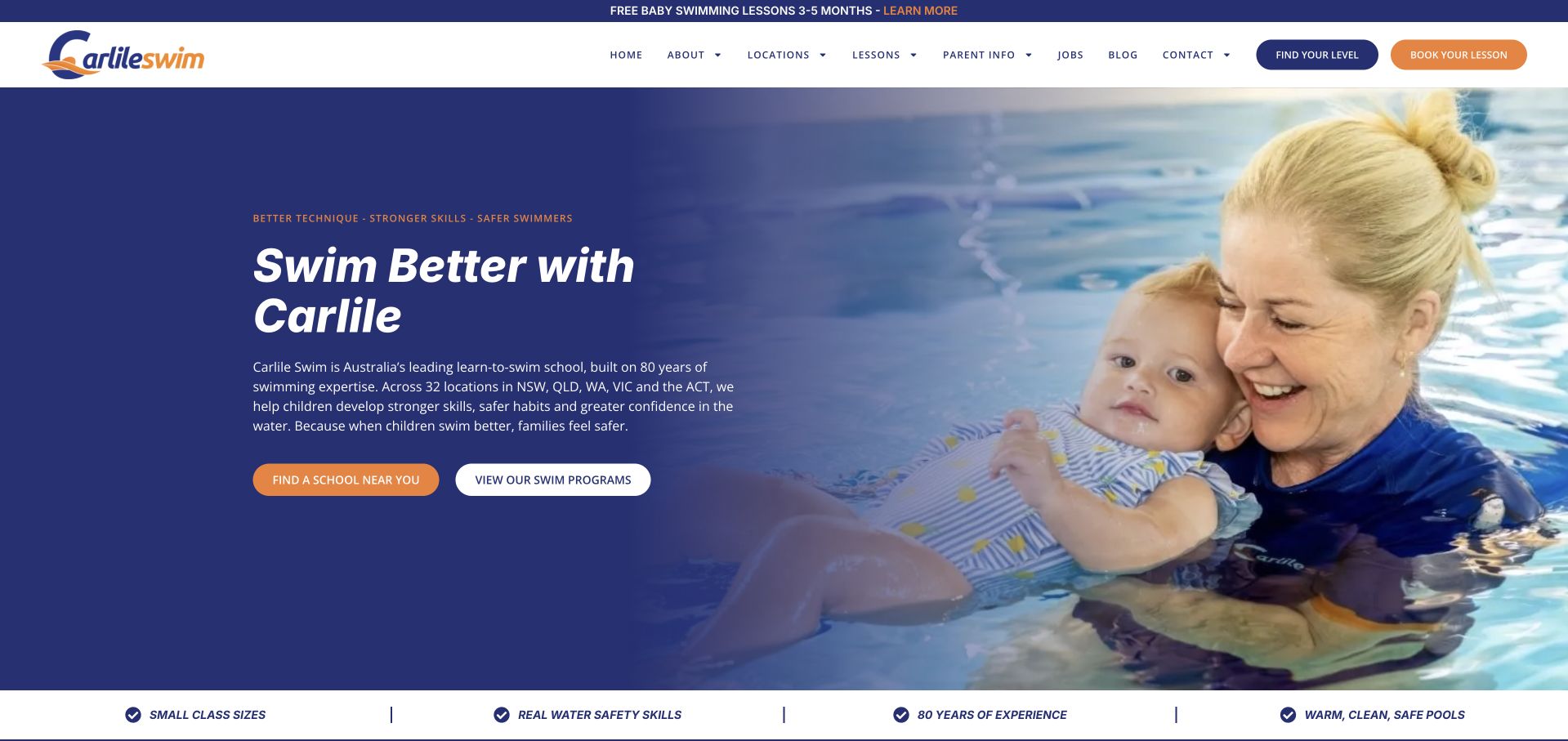
Carlile gives its homepage a clear decision structure. A dark blue text panel beside a photograph of an instructor and baby offers separate routes to nearby schools and swim programs. The header adds level selection and booking, while a narrow announcement states the age range for free baby lessons. This is our editorial choice for connecting a reassuring introduction with several specific next steps. The short benefit strip reinforces the offer without obscuring those actions. Longer sections repeat similar positioning language, however, and local schedules and prices remain another step away. The school's claims about safety and teaching quality are its own, rather than outcomes established by this review.
What you can learn
Separate three questions that families may answer in different orders: where lessons happen, which program fits, and what level is appropriate. Give each a clear route while reserving the strongest button for the most common next step.
Pros
Location and program choices appear together in the hero.
The baby promotion includes a specific age range.
Cons & considerations
Repeated positioning copy lengthens the page.
Local prices and schedules are not in the opening comparison.
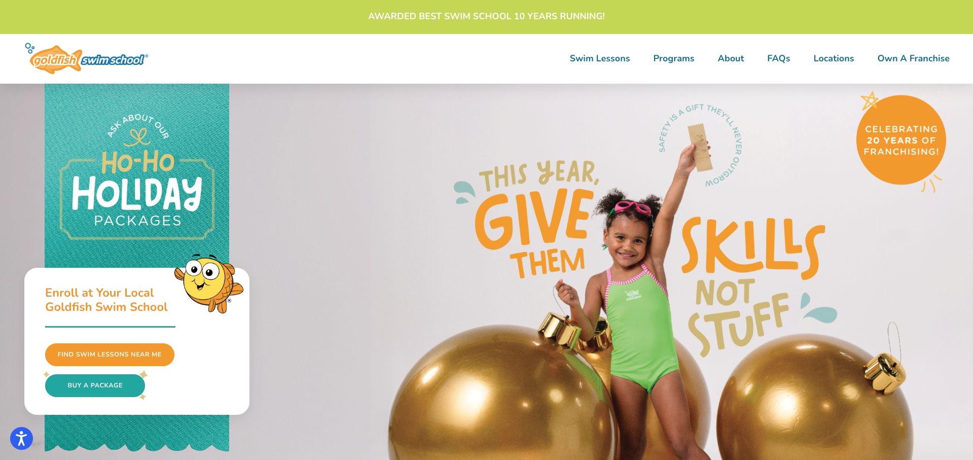
Goldfish uses an elaborate holiday scene, large gold ornaments, and a bright enrollment card to promote lesson packages. The navy, teal, and orange palette keeps the page recognizably playful. Below the campaign, the information architecture becomes especially practical: lessons, assessment, and pricing have distinct routes, followed by a choice between finding a child's level and registering through the portal. That acknowledges that first-time and returning families need different help. The seasonal creative takes up most of the opening screen, though, delaying the more useful placement decision. Package purchasing and finding nearby lessons also compete without explaining which a new visitor should do first.
What you can learn
A seasonal campaign should retain a permanent path for families who need help choosing a class. Distinguish assessment from enrollment and put the geographic requirement before asking visitors to commit to a lesson package.
Pros
Assessment and known-level registration are explicitly separated.
Pricing has a named route alongside lessons.
Cons & considerations
The campaign pushes placement guidance below the first screen.
Two prominent purchase and location actions need clearer sequencing.
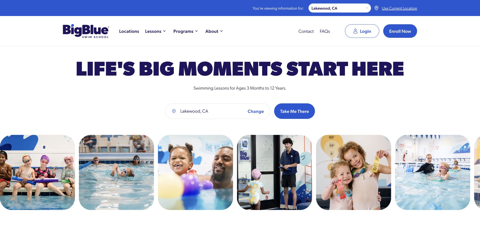
Big Blue combines a large purple headline with rounded photographs showing swimmers, instructors, and facilities. The opening states the age range and presents a selected location with a visible change control, making the branch decision part of the main introduction. Login and enrollment are also separated in the header. Further down, concise benefits introduce trials, makeups, and class size before the curriculum and facility sections. The selected branch was Lakewood during this visit; visitors still need to confirm that it is relevant to them. The large image collection creates an inviting atmosphere, but the opening does not yet explain how lesson levels or local prices compare.
What you can learn
Make the selected branch conspicuous and easy to change. Pair an inviting school introduction with the age range served, then provide direct access to that branch's timetable and fees before asking families to enroll.
Pros
The branch selector includes a clear change action.
Age suitability appears directly beneath the main headline.
Cons & considerations
An automatically displayed branch may not match a visitor’s needs.
Program and price comparison sit beyond the image-led opening.
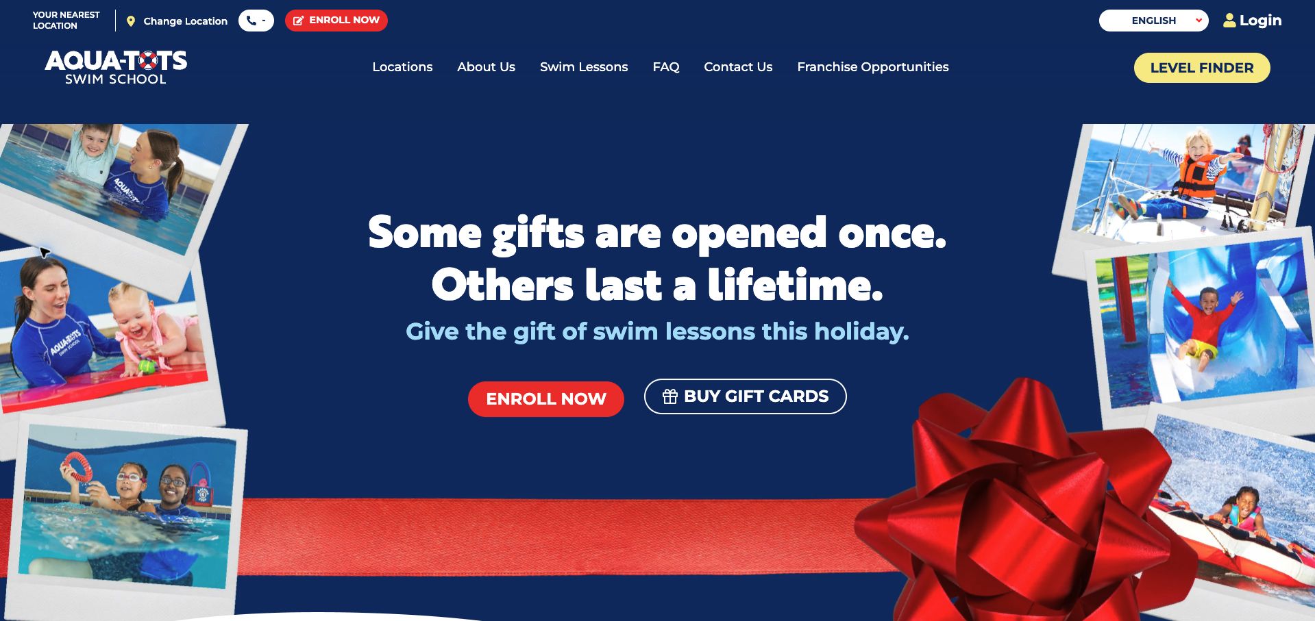
Aqua-Tots leads with a red, white, and navy holiday composition and two actions for enrollment and gift cards. A contrasting yellow level-finder button remains visible in navigation, giving uncertain parents an alternative to purchasing immediately. The body explains the age range, small-group format, scheduling flexibility, and progress tracking, with a later section linking the eight-level journey to an assessment. The opening's nearest-location area did not resolve to a named branch in the observed state, leaving a dash beside the contact context. Seasonal merchandising also outweighs the practical class choice. These are information-hierarchy observations, not a verification of the school's teaching or safety claims.
What you can learn
Keep placement help visible even when a promotion dominates the page. If a location is unknown, label that state plainly and offer a branch chooser instead of leaving an apparently unfinished contact area.
Pros
The level-finder uses a distinctive navigation treatment.
Later sections connect class progression with assessment.
Cons & considerations
The nearest-location area lacked a named branch in the capture.
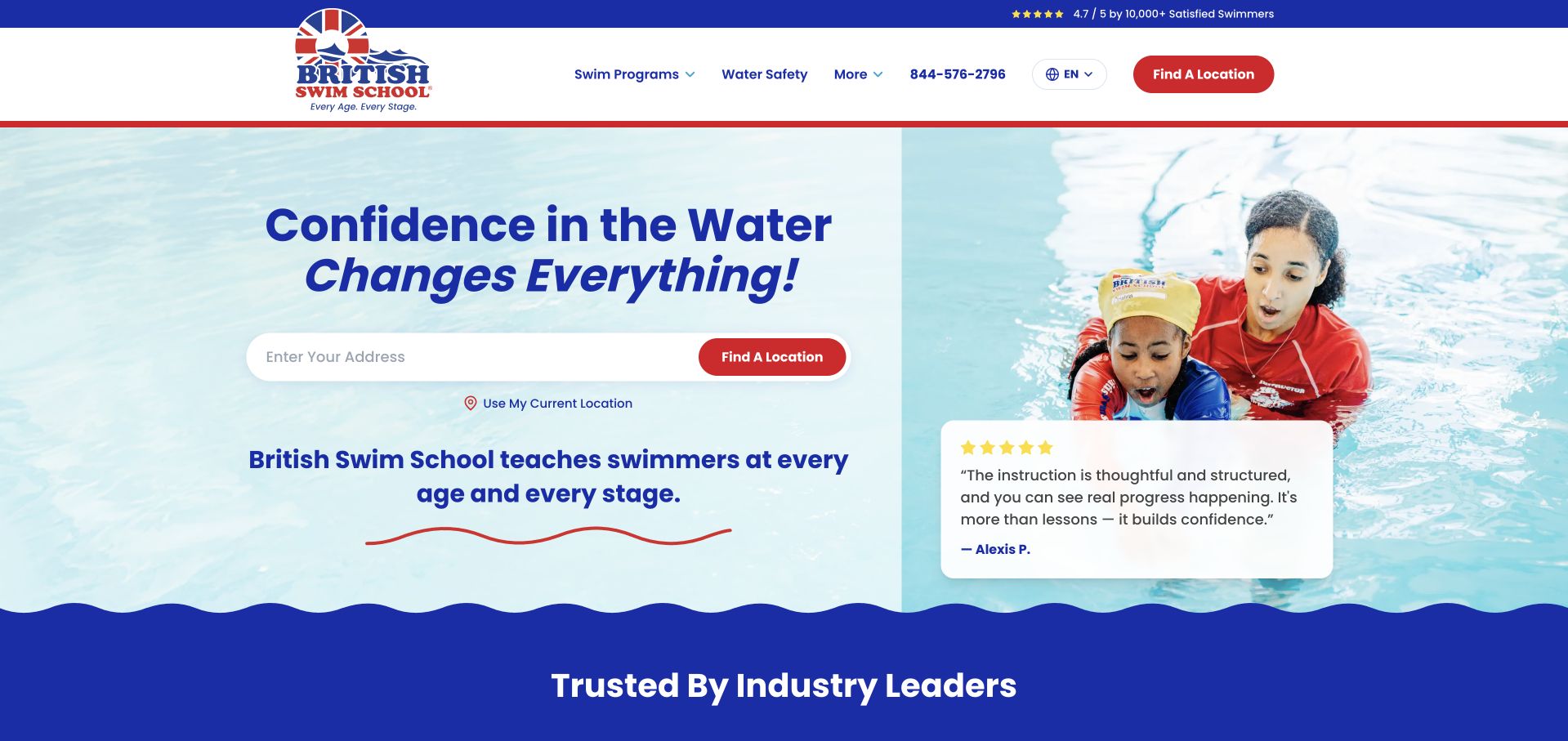
British Swim School places an address-based location finder beside instructor imagery and a parent testimonial. Red actions and navy type create a clear visual hierarchy against a pale background. The useful distinction comes below: water acclimation, survival skills, and stroke development are described before the page introduces its named classes. An assessment route then offers help choosing by age and experience, and program tabs include teens, adults, and adaptive lessons. The opening still emphasizes a broad confidence promise rather than class logistics. Prices and schedules require further exploration, while testimonials describe individual experiences rather than establishing general teaching outcomes.
What you can learn
Translate internal level names into plain-language learning goals before presenting the full curriculum. Support both geographic browsing and placement help, and keep age, parent participation, and experience requirements attached to individual classes.
Pros
Three learning stages explain the curriculum in ordinary language.
Adult and adaptive programs have visible category routes.
Cons & considerations
The opening does not show lesson price or duration.
Prominent testimonials offer less practical guidance than class requirements.
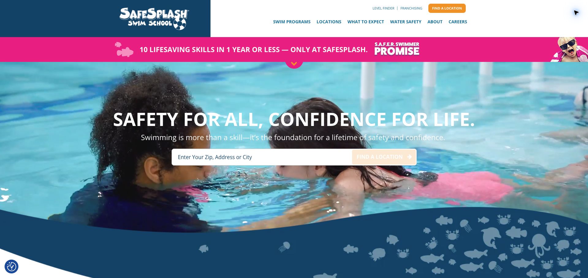
SafeSplash places a large location search over swimming video, beneath a deep blue header and a vivid pink promotional strip. The input explains that a ZIP code, address, or city can be used, and level selection remains available above it. The body introduces program types for different ages and learning needs, giving the national brand a route toward more specific choices. During the visit, a promotional lead form and privacy panel initially interrupted this path; the retained capture follows their dismissal. The strong annual-skills promise also dominates the page without presenting its qualifications in the opening. This review evaluates how that message is presented, not whether the outcome is achieved.
What you can learn
A national school can use location as its first decision, but the finder needs room to work without competing overlays. Place the conditions of prominent progress promises close to the claim and retain a separate level-selection route.
Pros
The search field clearly describes acceptable location inputs.
Level selection has a persistent header route.
Cons & considerations
Initial promotional and privacy overlays compete with the finder.
The prominent progress promise lacks immediate qualifying detail.
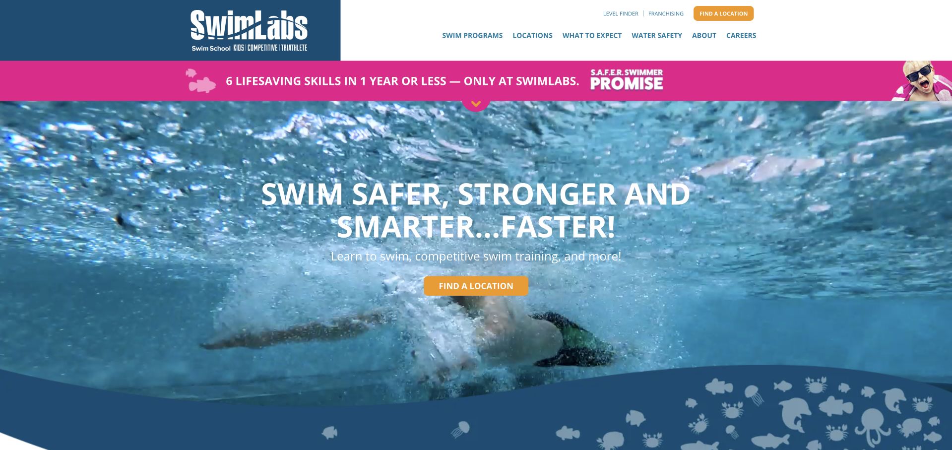
SwimLabs uses a blue-and-white header, orange location action, and a bright pink progress banner around a swimming-video hero. Its introductory line explicitly includes learning to swim and competitive training, signaling a broader audience than a children's lesson site. The page later discusses video-supported technique work and serves visitors with different experience levels. That scope is useful, but the opening sends everyone toward a location before clearly separating their objectives. A long run of testimonials also delays comparison of the distinct training formats. Claims about accelerated learning and safety remain provider statements; the visible website does not independently establish those outcomes.
What you can learn
When one school serves beginners and experienced swimmers, separate their goals early. Keep the location finder, but connect each audience to the relevant lesson format and explain specialized tools through concrete program information.
Pros
The introduction explicitly includes competitive training.
Location and level routes remain easy to locate.
Cons & considerations
Different swimmer goals share a largely undifferentiated opening path.
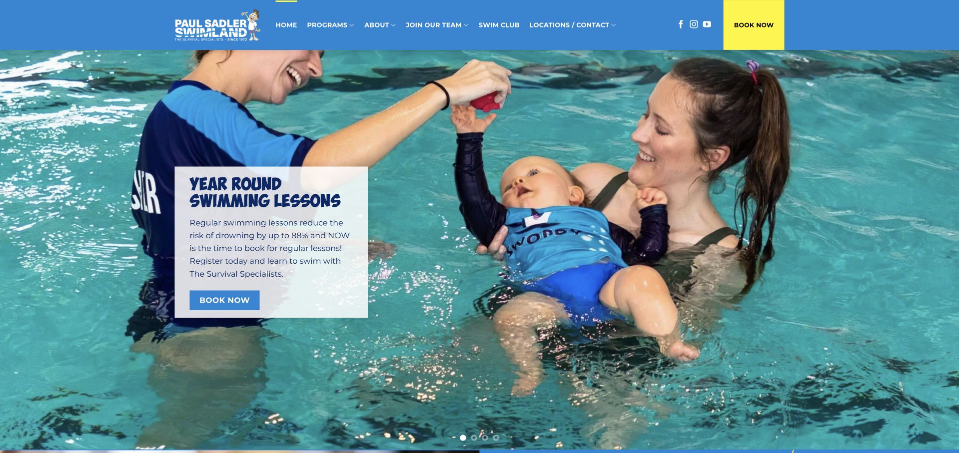
Paul Sadler Swimland pairs a large pool photograph with a compact white message card and yellow booking action. The blue-and-yellow identity is consistent across navigation and the introductory carousel. Body copy explains the school's emphasis on survival skills before presenting parent-child, children's, holiday, adult, and private lessons. Short eligibility descriptions make those program choices easier to understand. The page is less efficient when it repeats its broad saving-time and saving-lives themes across several sections. A recruitment slide also shares the introductory carousel with enrollment messages. The site's numerical safety and progression claims should be read as its own assertions, not conclusions of a design review.
What you can learn
Explain a distinctive teaching approach once, then turn it into practical program choices. Attach ages and participation format to each option, and separate staff recruitment from the primary family-enrollment sequence.
Pros
Program descriptions include useful age and format cues.
The teaching approach receives a concrete explanation.
Cons & considerations
Repeated promotional themes make the page longer than necessary.
Recruitment shares the opening carousel with lesson enrollment.
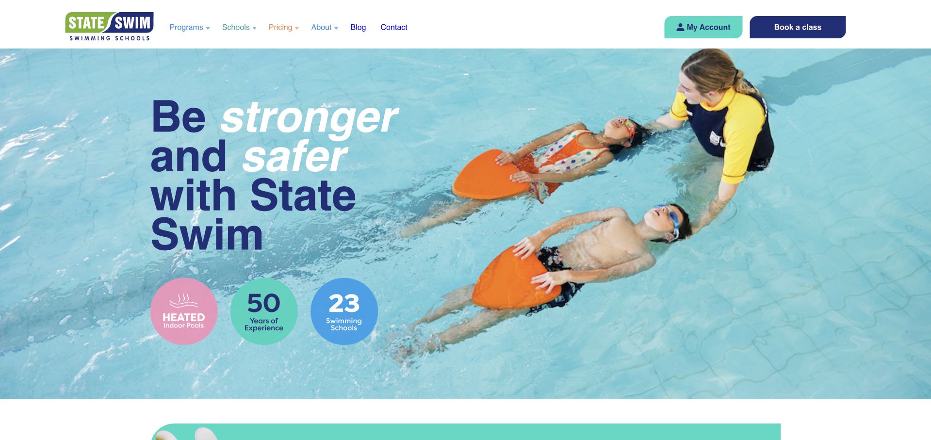
State Swim uses a wide instruction photograph, navy headline, and round benefit badges to establish its school network. The header supplies the main booking route while the page below distinguishes children's and adult lessons and presents several program stages. Practical sections address trial lessons, payment arrangements, cancellations, and makeups, helping visitors understand the recurring commitment rather than just the curriculum. The first screen is visually restrained but lacks an obvious action inside the hero itself. Its three circular badges also summarize claims more prominently than the actual program choice. Families must continue down the page or use navigation to get to the useful enrollment detail.
What you can learn
Place attendance and payment explanations near the program comparison so families can judge the whole commitment. A calm photographic hero still needs a specific next step that leads directly into those choices.
Pros
Children and adults receive distinct program routes.
The page discusses recurring attendance and payment logistics.
Cons & considerations
The hero relies on the header for its booking action.
Benefit badges receive more initial emphasis than class suitability.
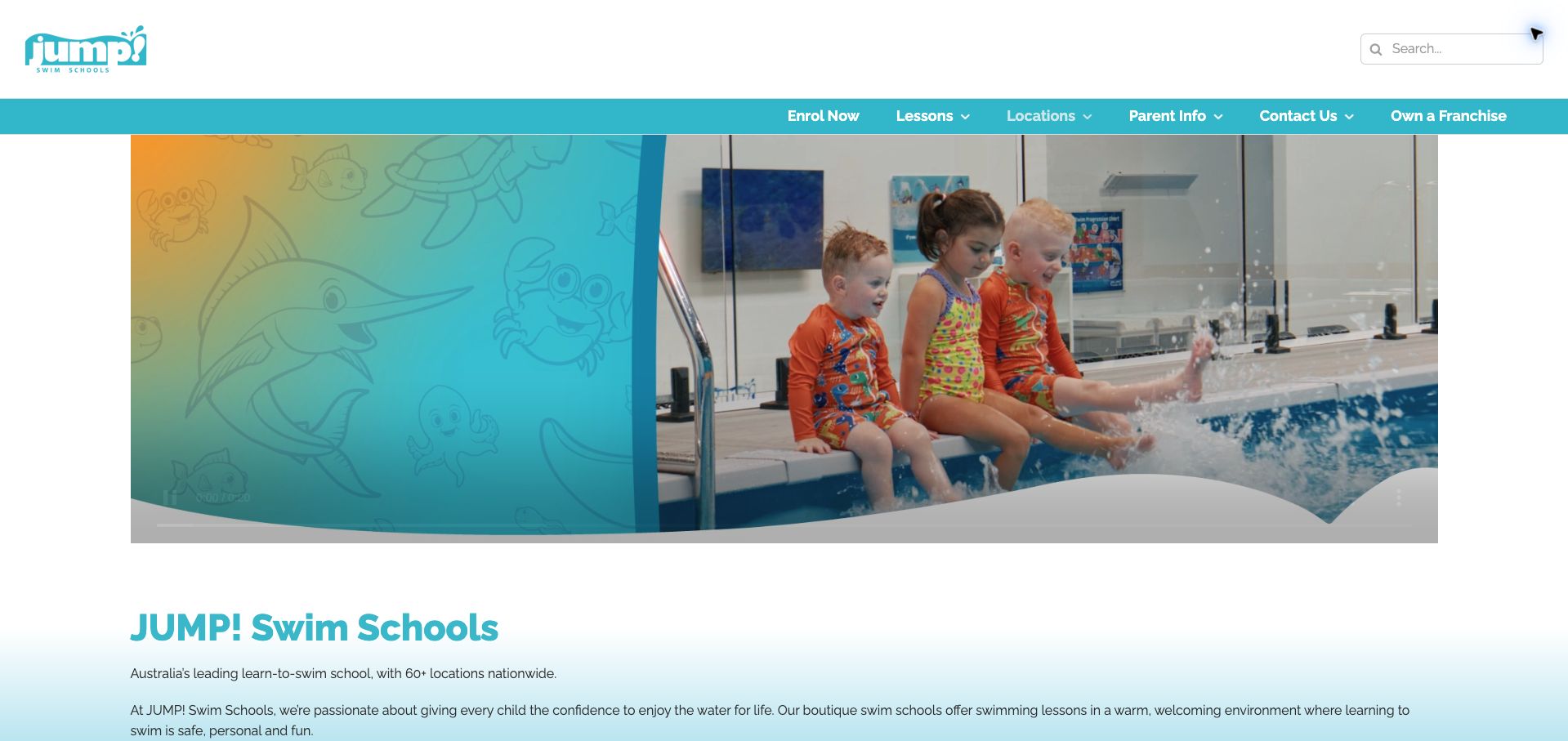
JUMP! opens with a wide pool photograph and illustrated sea-life decoration beneath a compact aqua header. The main introductory copy comes afterward, followed by three broad program groups: babies swimming with a parent, independent swimmers, and stroke development. That progression translates the curriculum into understandable changes in participation and ability. Parent information and locations are easy to find in navigation. The opening photograph itself offers little practical guidance, however, and the first program comparison sits well below it. Promotional statistics and repeated descriptions of small classes add length, while a visible broken word in the stroke-development paragraph weakens the editorial finish.
What you can learn
Explain progression through changes that matter to families, such as whether a parent joins the lesson and when independent technique begins. Keep those stages near the introduction, and give promotional metrics a secondary role.
Pros
Three program groups describe a recognizable learning progression.
Parent information has a dedicated navigation route.
Cons & considerations
The image-only opening postpones concrete program choices.
A visible copy-formatting error detracts from the curriculum section.
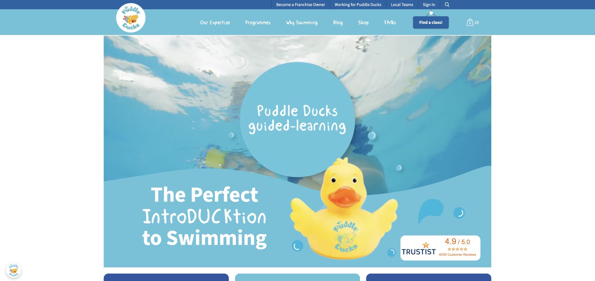
Puddle Ducks gives its homepage an unmistakable identity with a rubber-duck motif, bright cyan, and an introductory video. Beneath the playful headline, it separates baby and preschool classes from the older Swim Academy route. A useful level overview translates names such as Floaties and Kickers into age ranges and links visitors toward local teams. That makes the curriculum easier to approach without previous knowledge of the brand. The first-screen video occupies substantial space, while the more practical level information arrives later. Shopping products and a long review section also compete with the core class-finding purpose. The final capture follows dismissal of the privacy panel.
What you can learn
Keep memorable class names, but always pair them with age and progression criteria. Let families move from the level overview to the relevant local timetable without having to pass through unrelated merchandise or extended testimonials.
Pros
Branded class names have explicit age ranges.
Local teams are linked from the main enrollment content.
Cons & considerations
The large introductory video delays the level overview.
Shopping and review sections lengthen the route to practical details.
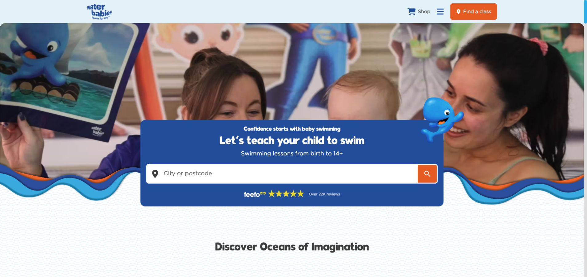
Water Babies combines lively swimming imagery, cartoon characters, wavy edges, and a compact class-finding panel. The opening states a broad age span, while the body carefully separates early-years age bands from later skill-based teams. A location qualifier accompanies the older-child offering, an important detail when availability differs across the network. The imaginative islands and characters provide a memorable curriculum story, and digital progress tracking receives an explanation. The amount of branded language can also make the practical differences harder to absorb at first. Much of the navigation is tucked into a menu, and local fees or schedules require another step beyond the introductory finder.
What you can learn
Use imaginative storytelling to support a clear curriculum map. Keep age, skill requirement, parent participation, and location availability in plain language beside each branded stage so the theme never becomes a prerequisite for choosing lessons.
Pros
Early-years programs use distinct, readable age bands.
Older-child programs carry a location-availability qualification.
Cons & considerations
Branded team language adds an extra interpretation step.
Local schedules and fees are absent from the opening overview.
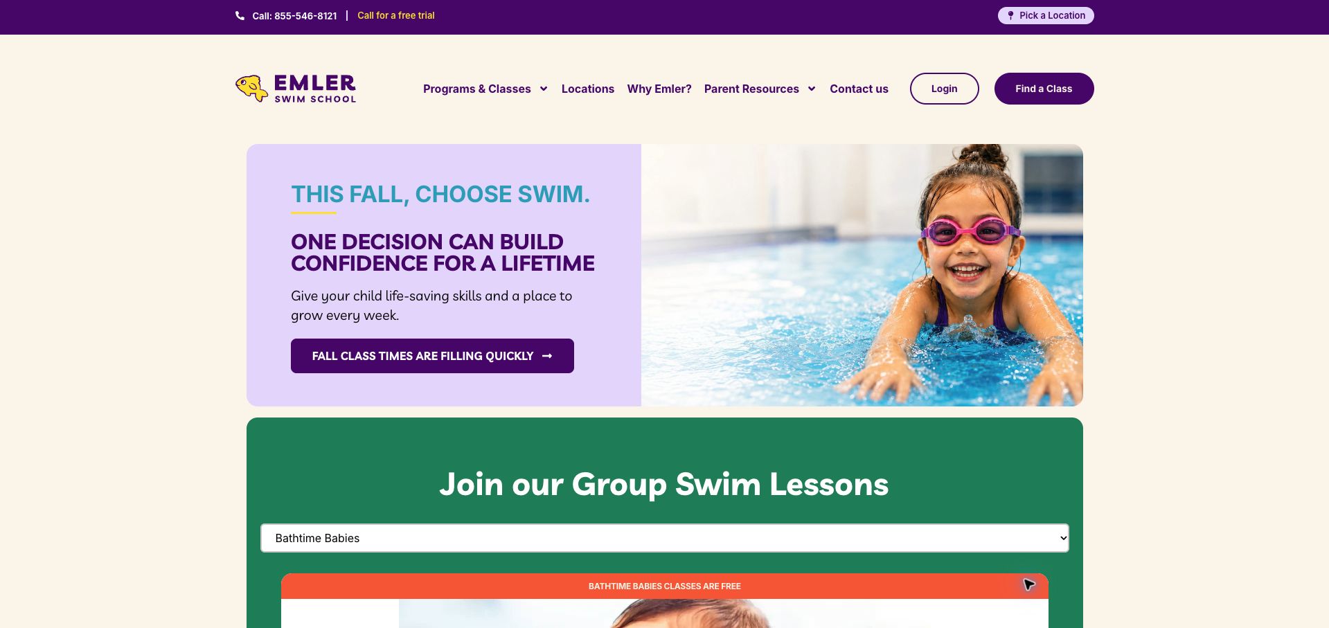
Emler pairs a cream-and-purple introduction with a child photograph, a seasonal enrollment message, and a visible class-finding route. The most useful content follows: each lesson category repeats the same fields for age, adult participation, class ratio, and duration. This is far easier to compare than a series of promotional descriptions. A later assessment link supports families who remain unsure, while makeup and discount information explains parts of the ongoing commitment. The fall urgency message takes precedence over those details in the hero. Some participation and ratio entries also use asterisks, so their qualifications need to stay especially close to the affected facts.
What you can learn
Use a consistent set of fields across every class type. Put exceptions directly beside the relevant participation or ratio value, and let families compare the basics before introducing seasonal urgency or broader brand statistics.
Pros
Class categories repeat the same practical comparison fields.
An assessment route supports undecided parents.
Cons & considerations
Seasonal urgency receives more opening emphasis than class fit.
Asterisked class details require especially clear nearby qualifications.
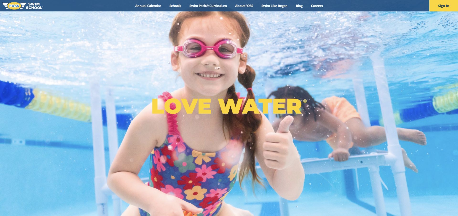
Foss makes a strong visual impression with an underwater child photograph and a short yellow brand statement. Its header includes an annual calendar alongside schools and curriculum, signaling that timing matters to the offer. The body then explains quarter-based classes, teacher continuity, and the distinction between graduating through a learning path and simply passing isolated levels. This operational explanation is useful for comparing a school term with a monthly lesson subscription. The opening image occupies almost the entire viewport, however, leaving location selection and that explanation below it. The prominent sign-in action is clearer than a first-time visitor's enrollment route in the captured header.
What you can learn
If the enrollment model follows school terms, make the calendar and commitment part of the main product explanation. Pair the emotional appeal of swimming photography with a visible route for new families as well as returning account holders.
Pros
An annual calendar has a direct header link.
Quarter-based attendance and teacher continuity are explained.
Cons & considerations
The expansive hero delays the practical school model.
The opening emphasizes sign-in more clearly than first-time enrollment.
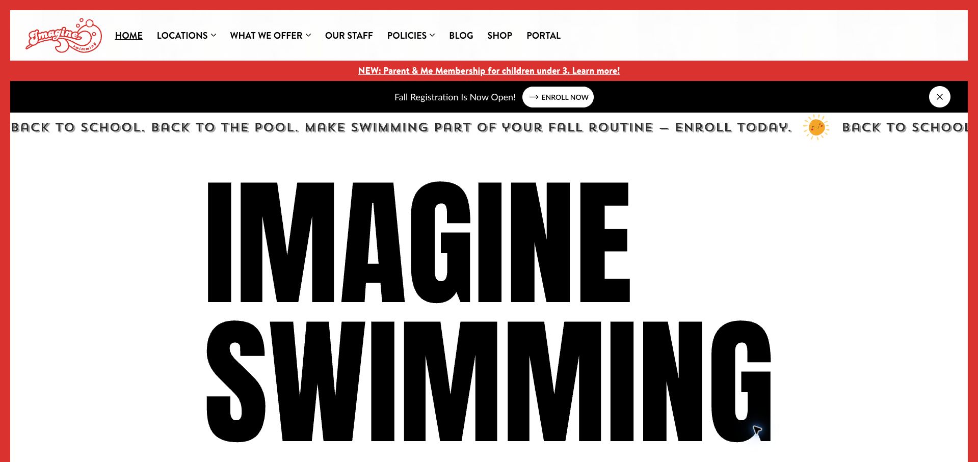
Imagine Swimming replaces the usual blue aquatic branding with an enormous black wordmark, white space, and sharp red accents. Seasonal enrollment bands sit above the main identity, while a weekly-lesson search provides a practical route onward. The body makes the New York City setting explicit, distinguishes flagship pools from satellite facilities, and gives teachers a prominent role in explaining the school. Its offering extends from infant sessions to adult classes and competitive teams. The visual personality is memorable, but the oversized branding delays this useful detail. Multiple seasonal messages and sign-up routes also make the opening busier than the otherwise disciplined typography suggests.
What you can learn
A distinctive identity can help a local school stand apart without relying on aquatic clichés. Keep a concrete lesson-search action close to the brand statement, and explain facility differences before visitors choose a location.
Pros
Flagship and satellite locations are explicitly distinguished.
Teacher information supports the school’s positioning.
Cons & considerations
The oversized wordmark delays the practical offering.
Several enrollment messages compete in the opening.
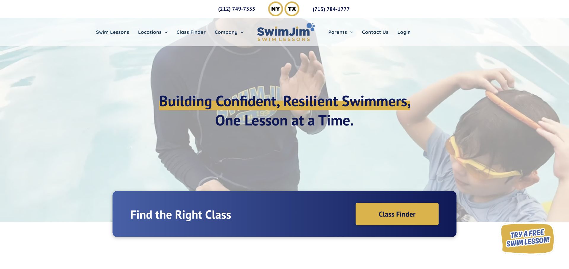
SwimJim places a wide class-finder panel at the bottom of its video introduction, giving the page a recognizable action area. Phone contacts sit above navigation, and location menus distinguish New York, Brooklyn, and Houston. The body organizes lessons by babies and toddlers, children and teens, advanced swimmers, adults, and specialty classes. That scope helps visitors see that the school serves more than early learners. The opening headline remains broad, however, and the pale moving background makes portions of the dark text less consistently clear. A floating free-trial badge adds another action beside the prominent finder. Specific fees and class eligibility are left to subsequent pages.
What you can learn
Give class discovery a stable, contrasting panel even when the hero uses video. Distinguish city selection from age or ability selection, and make a trial offer support that sequence instead of competing with it.
Pros
The class-finder occupies a clearly defined panel.
Locations and age groups have distinct navigation routes.
Cons & considerations
The video background weakens consistent headline contrast.
The floating trial offer competes with the main finder.
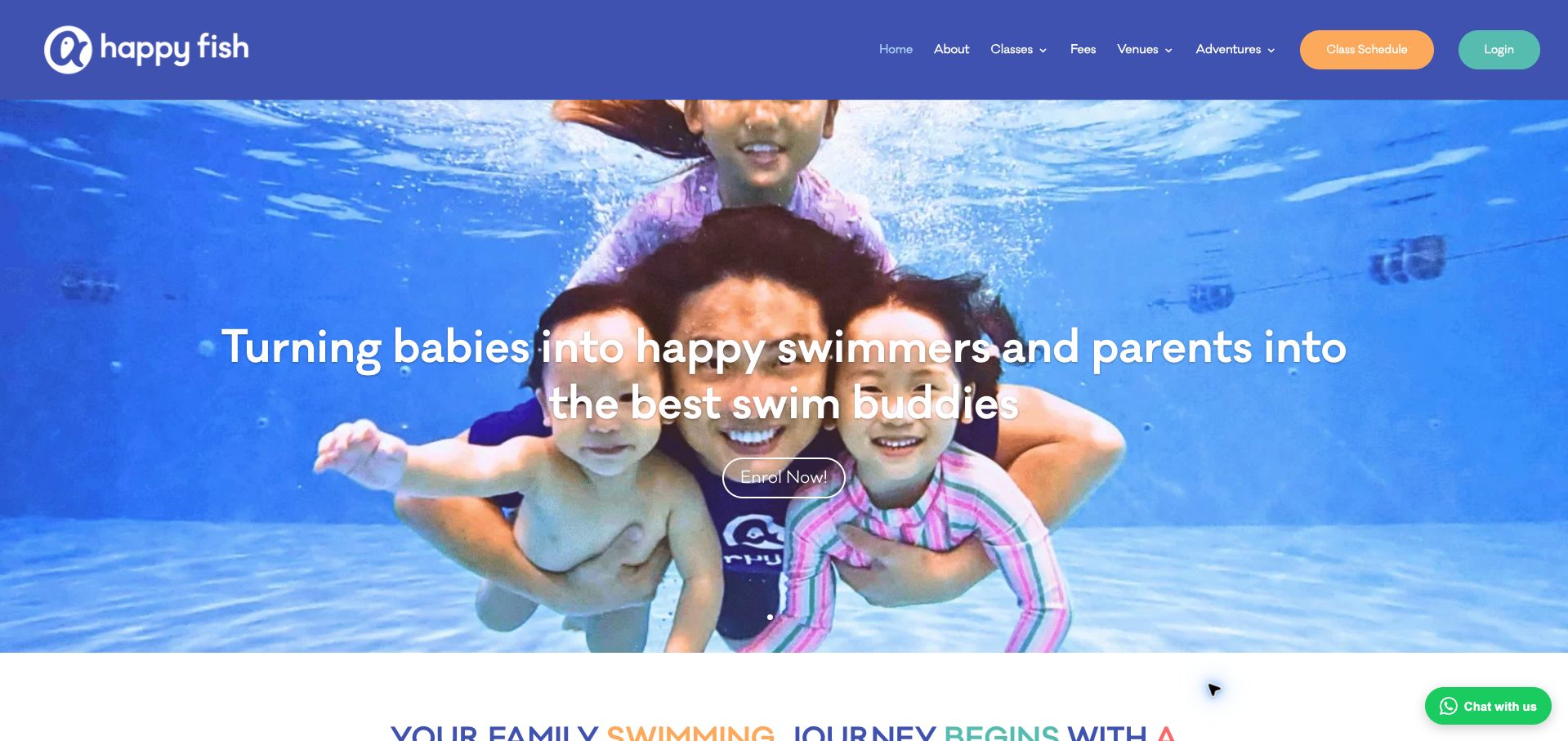
Happy Fish places an underwater family photograph beneath a royal-blue navigation bar and frames the service around parents learning alongside their children. Fees, venues, and schedules each have named header routes, which is useful for a school serving several locations. Below the hero, four class groups state ages explicitly, including an adult category rather than implying that every visitor is a parent. Facility information then explains the network's indoor-pool environment. The opening enrollment action is a modest outline against a busy image, making it less prominent than the colorful header controls. Longer mission and facility claims also appear before a compact comparison of actual lesson logistics.
What you can learn
When parent involvement is central, show it in both imagery and class descriptions. Preserve direct access to fees and schedules, and give the enrollment action enough contrast to remain clear over underwater photography.
Pros
Fees, venues, and schedules have explicit navigation labels.
Four class groups state their age ranges.
Cons & considerations
The outlined hero action is easy to overlook.
Long institutional copy delays detailed lesson comparison.
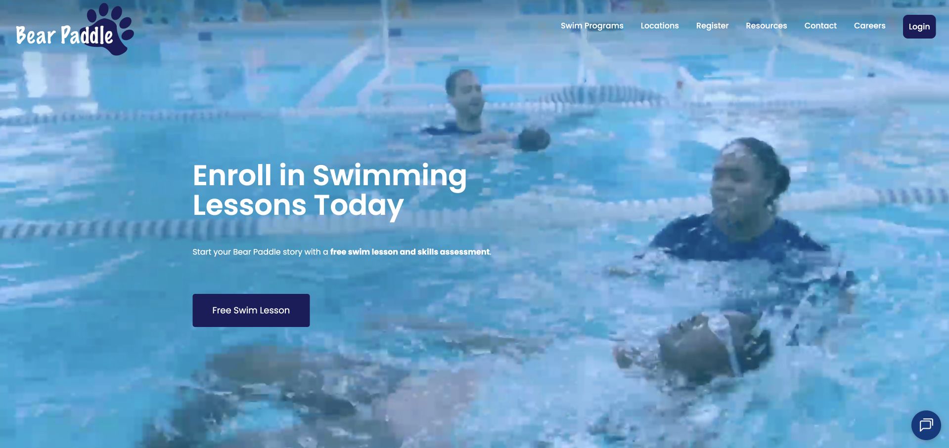
Bear Paddle makes its first action concrete: a free swim lesson and skills assessment. White text and a dark button sit over blue-toned swimming video, while the compact header keeps programs and locations nearby. The page then explains three parts of its model—story-based teaching, monthly progress reporting, and monthly scheduling—before introducing group and infant lessons. This is a useful shift from an emotional promise to the mechanics of participation. The later copy repeats several confidence and progress themes, making the page more verbose than necessary. Local fees and assessment availability are also not visible in the opening, so the offer still requires a branch-level check.
What you can learn
Combine a trial with a clearly described purpose, such as placement, so families understand what the first visit accomplishes. Follow it with concise explanations of reporting and attendance commitments, then connect directly to local availability.
Pros
The first-lesson offer explicitly includes a skills assessment.
Progress reporting and monthly scheduling are explained separately.
Cons & considerations
Repeated promotional themes lengthen the page.
Local pricing and trial availability require further exploration.
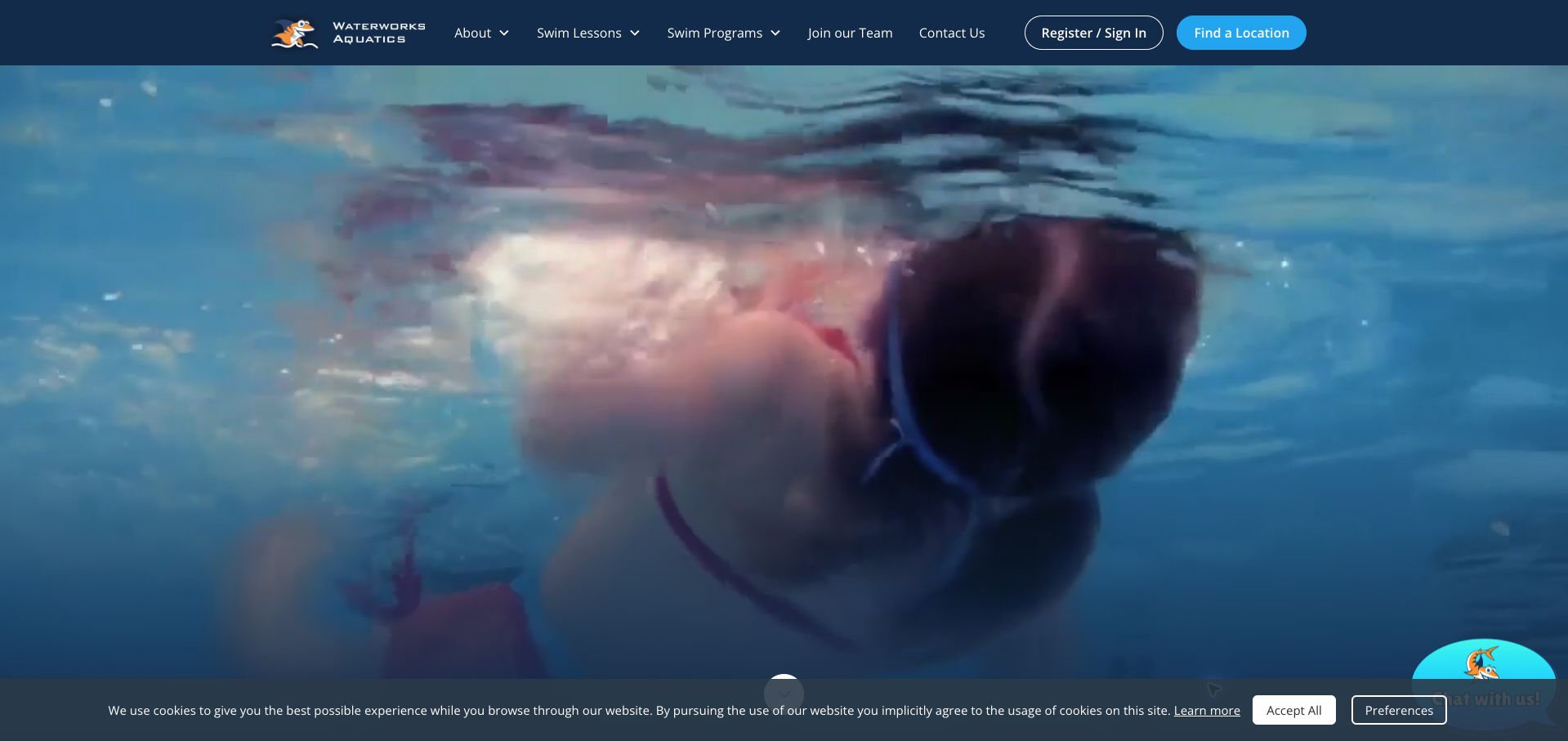
Waterworks opens with full-screen underwater video and a restrained navy header containing registration and location actions. Its most informative section comes afterward: a sequence explains creating an account, finding a program, choosing a schedule, and starting lessons. The text says an account provides access to schedules and payment information, clarifying the purpose of that step. Later copy distinguishes program availability at dedicated facilities from lessons hosted inside fitness clubs, an important operational qualification. The first viewport itself carries little explanatory text, so visitors must scroll to understand the process. A cookie strip and chat prompt also occupy the lower edge of the retained capture.
What you can learn
Explain why each enrollment step exists before asking families to create an account. Where venue types offer different programs, attach that limitation to the lesson description and surface it before location selection leads to a mismatch.
Pros
The enrollment sequence explains what happens after account creation.
Program availability is qualified by facility type.
Cons & considerations
The video-only opening delays the service explanation.
Cookie and chat elements crowd the lower screen edge.
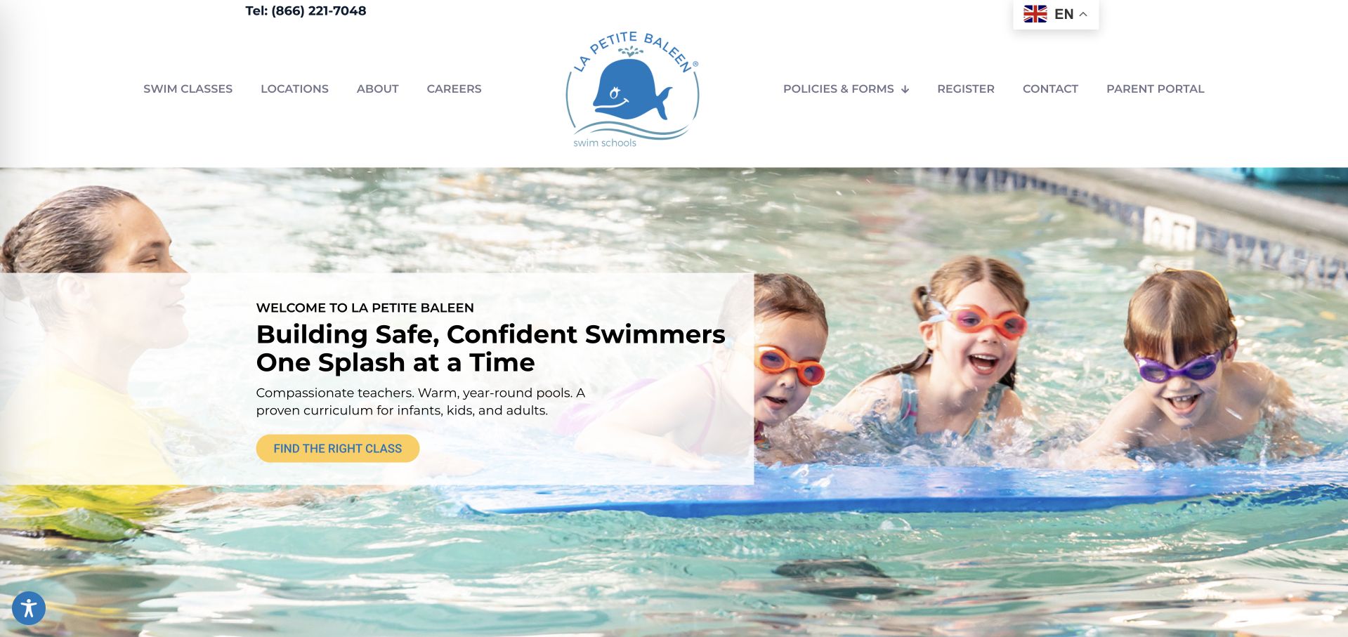
La Petite Baleen uses a large whale logo, a clean white header, and pool photography behind a translucent introductory panel. The yellow class-finding action stands out beneath a short description of year-round lessons for several ages. Below, a new-student promotion states its date window, membership-fee condition, and enrollment limitations rather than leaving the offer entirely unqualified. Age and stage categories then introduce the broader curriculum. The tall header takes a substantial share of the first screen, however, and the carousel adds movement before families reach class details. The promotion's useful conditions would be easier to assess if presented closer to the main action and price context.
What you can learn
Keep promotional eligibility and fees visible wherever a trial or discount is offered. Pair that precision with a simple class-finding action, and reduce decorative header space so new families reach the curriculum sooner.
Pros
The new-student offer includes dates and membership-fee conditions.
The main action clearly points toward class selection.
Cons & considerations
The oversized header pushes useful content downward.
Carousel movement adds complexity before the program comparison.
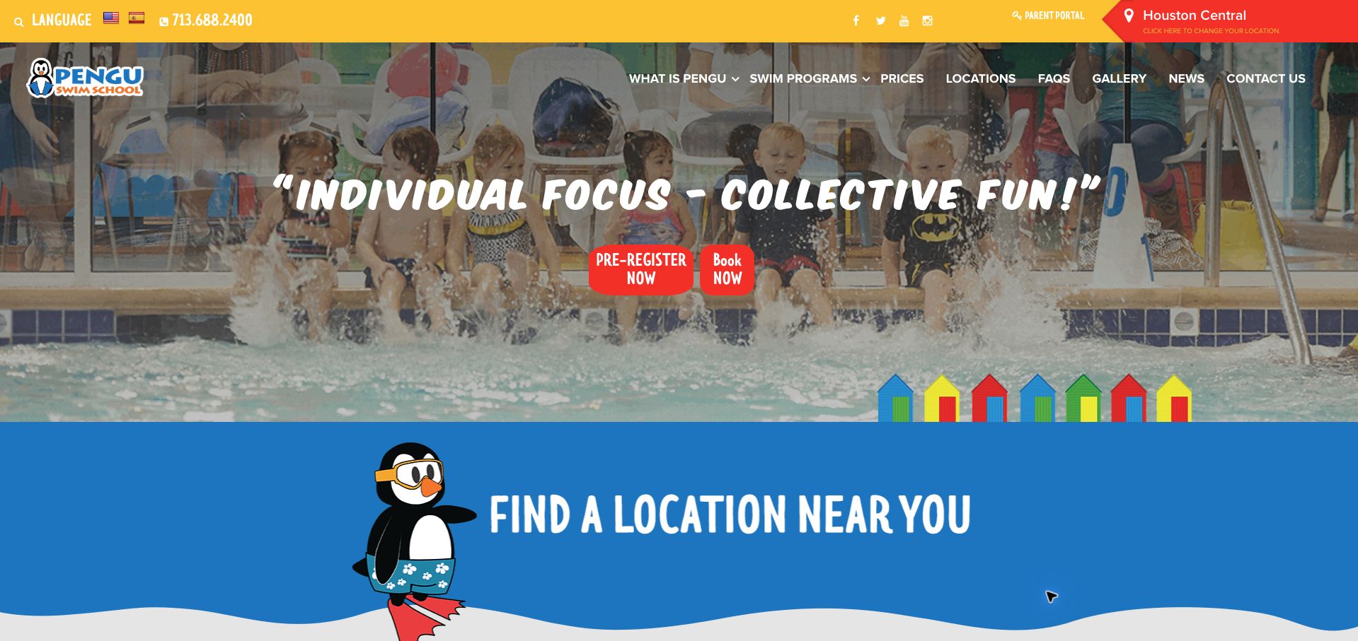
Pengu uses a yellow utility bar, red actions, blue sections, and a penguin mascot to create a lively identity. The header shows a selected Houston location and makes changing it explicit. Below the hero, individual branch blocks provide addresses, telephone numbers, and booking links, reducing uncertainty about where lessons happen. Pricing also has a direct navigation route, and a later assessment begins with the child's age. The hero's preregistration and booking actions are less clearly differentiated than the branch choices. Its playful condensed lettering and tightly packed menu add visual noise, particularly alongside the large location selector and contact information.
What you can learn
Make each branch's address and enrollment route easy to compare. If preregistration differs from booking an available class, explain that distinction in the action labels rather than asking visitors to infer it from two adjacent buttons.
Pros
Branches have individual addresses, contacts, and booking links.
The selected location can be changed from the header.
Cons & considerations
Preregistration and booking are not clearly differentiated.
Dense navigation and display lettering compete for attention.
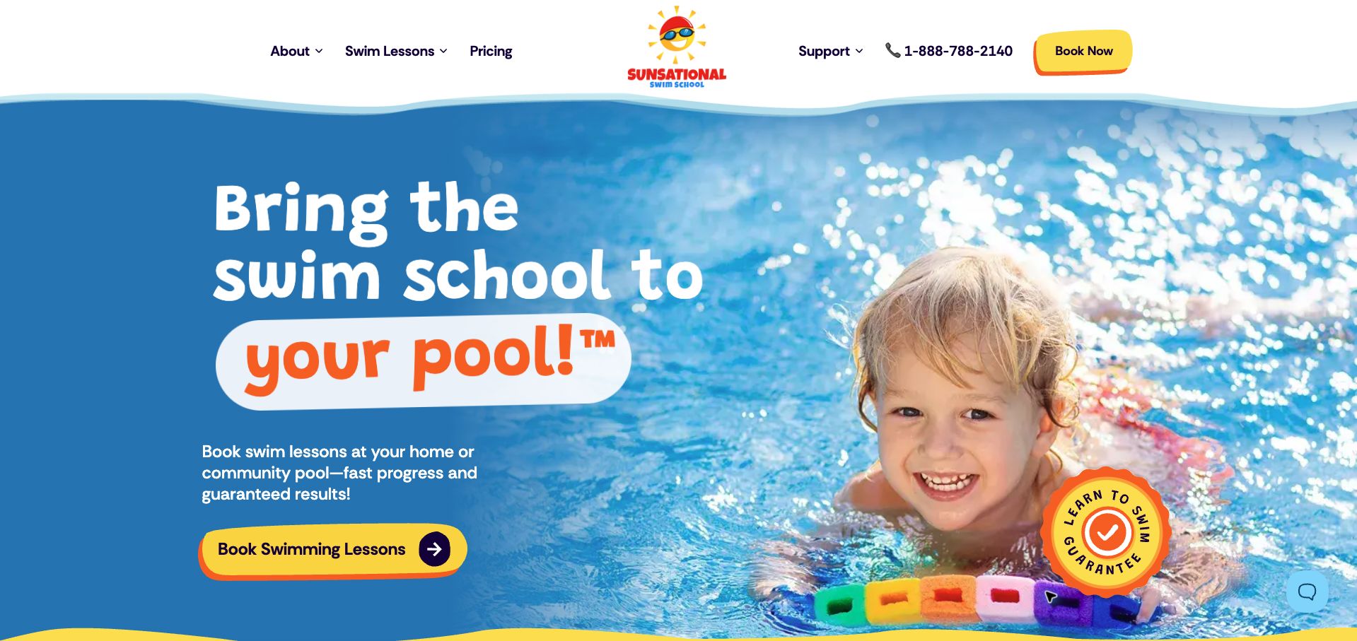
Sunsational immediately states its distinguishing service model: lessons take place at the customer's home or community pool. A bright yellow booking button, blue water background, and playful orange emphasis make the proposition easy to notice. The body explains scheduling and instructor matching, while a guarantee section supplies age, package, lesson-count, and frequency conditions for its advertised promise. Those qualifications are important because the hero presents the guarantee much more broadly. Geographic coverage and the suitability of a customer's pool are not settled by the opening. The review concerns clarity of the sales journey; it does not verify instructor screening or guaranteed learning outcomes.
What you can learn
When the service travels to the customer, state the required venue and coverage conditions before booking. Keep guarantee eligibility beside the headline promise so families can distinguish the general service from a particular qualifying package.
Pros
The at-home or community-pool model is immediately clear.
The guarantee receives specific package and age qualifications later.
Cons & considerations
The broad hero promise precedes its important conditions.
The opening does not establish local coverage or pool suitability.
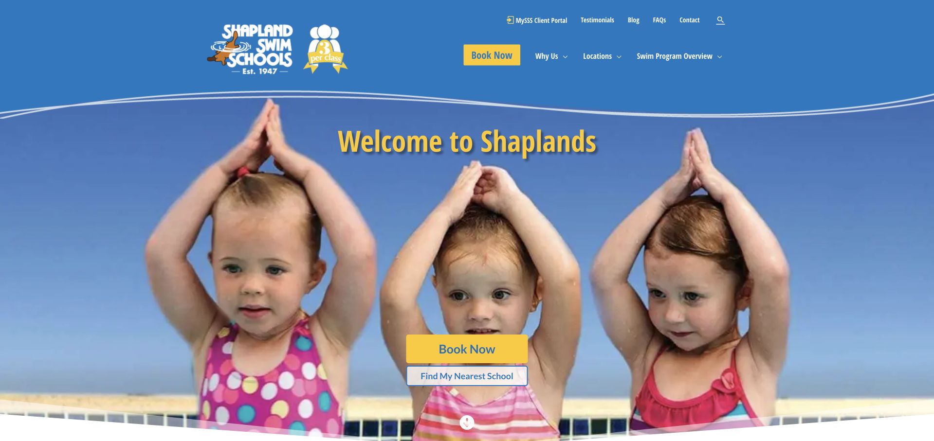
Shapland places a three-per-class emblem beside its logo, making group size part of the identity before the visitor reads the body. Blue and yellow styling surrounds a photograph of three children, reinforcing that visual message. Booking and finding a nearby school are offered together, while a later benefit list explains makeups, viewing facilities, and the pool environment. Programs progress from home preparation and babies through later learning stages. The opening headline is only a welcome, so it misses an opportunity to explain the offer more directly. Some teaching-history references also shift between generations, leaving a detail that would benefit from consistent editing.
What you can learn
A concrete service distinction, such as class size, can be more memorable than a generic slogan. Repeat it consistently across imagery and program facts, then connect the promise to a local school's actual lesson information.
Pros
The three-student format is visible beside the logo.
Booking and location discovery appear together.
Cons & considerations
The welcome headline provides little practical information.
Teaching-history references would benefit from consistent wording.
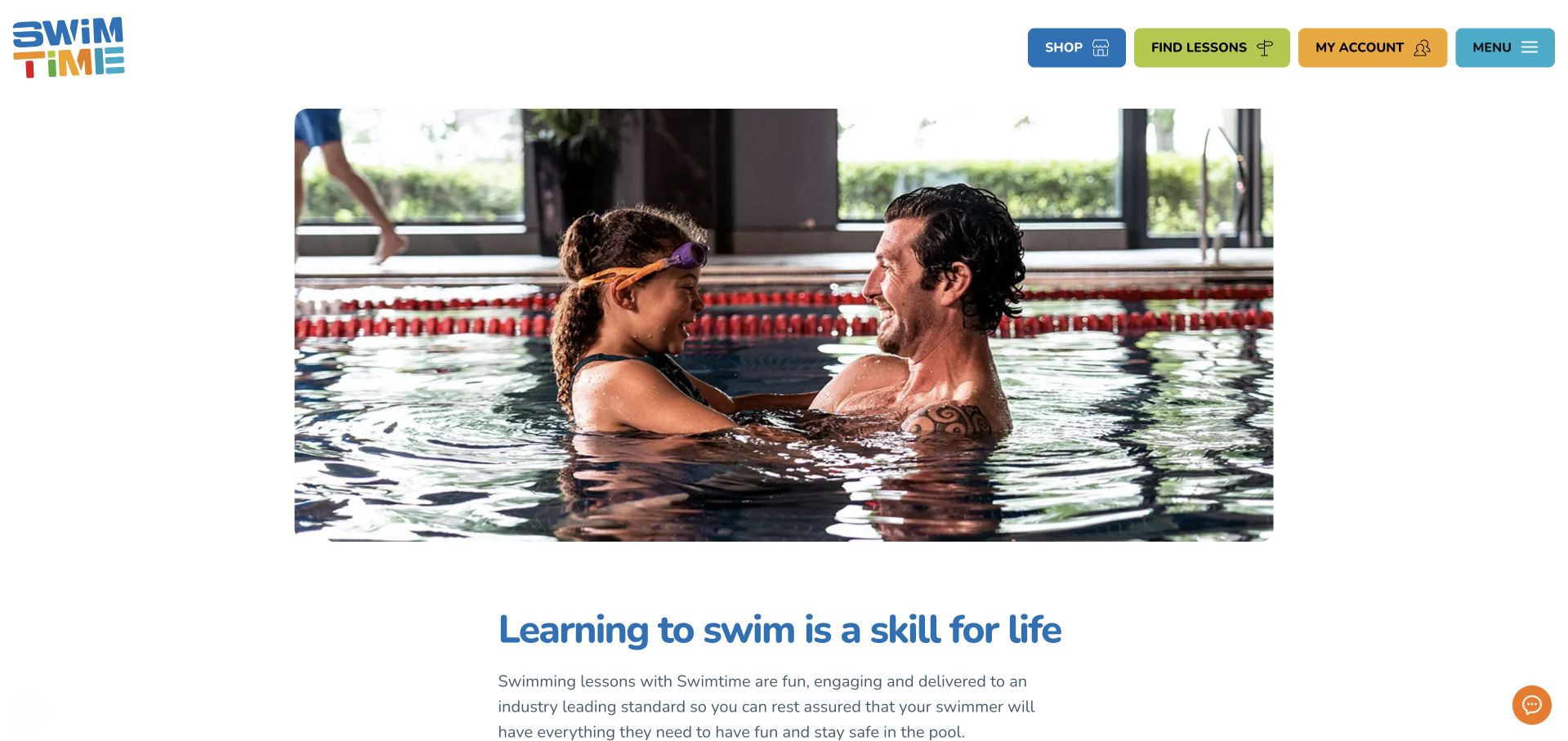
Swimtime uses a multicolored wordmark and four large header controls for shopping, finding lessons, an existing account, and the main menu. A broad instructor-and-child photograph sits above a calm introductory section. The body then separates children's lessons, baby and toddler lessons, and adult instruction, with dedicated discovery links. This straightforward structure is easy to understand without learning a set of branded level names. The large image delays the explanation and its secondary lesson button, however. Shopping receives comparable header emphasis to enrollment, and key details such as class size or price are not part of the introductory comparison. The retained screenshot follows closing the initial privacy banner.
What you can learn
Use clear audience categories and distinguish new enrollment from account management. Keep commercial extras visually secondary, and bring a concise comparison of lesson format and eligibility close to the first class-finding action.
Pros
Lesson discovery and account access are clearly separated.
Children, babies, and adults have dedicated routes.
Cons & considerations
The large photograph postpones useful explanatory content.
Shopping competes with enrollment for header emphasis.
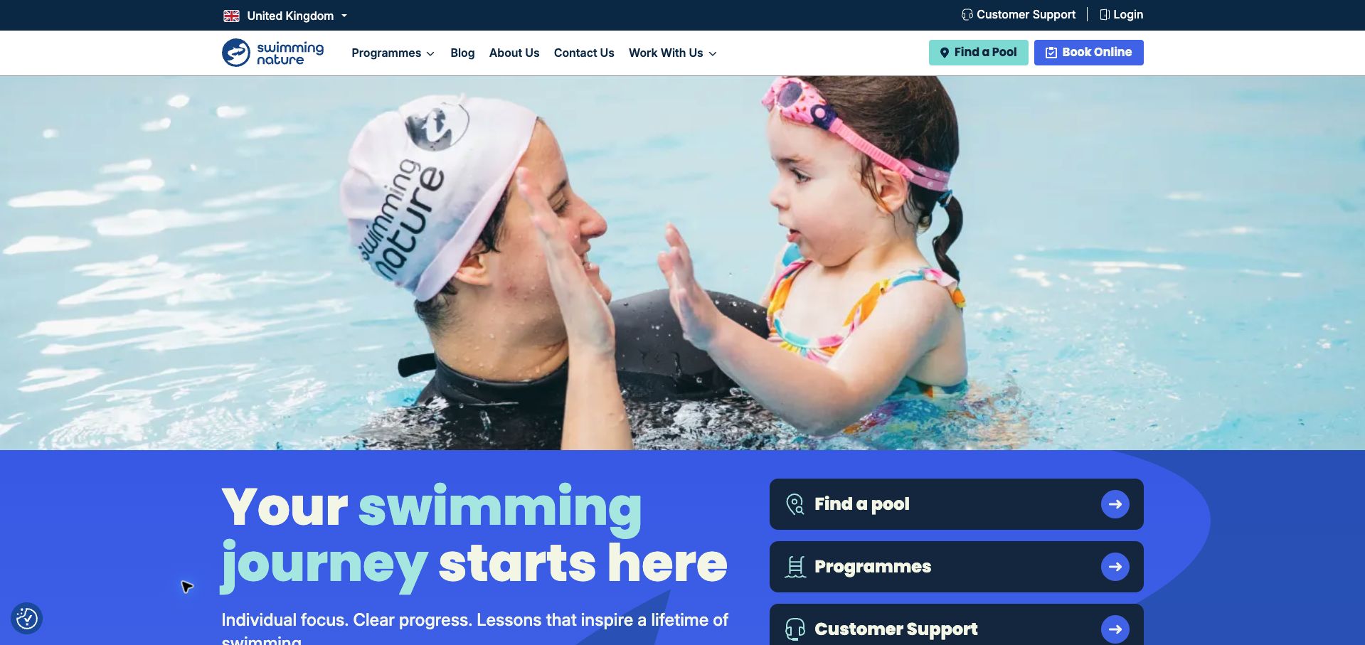
Swimming Nature combines a large instructor-and-child photograph with a vivid blue introductory panel. Three dark, clearly labeled routes lead to finding a pool, exploring programs, or customer support. The header separately provides booking and login, acknowledging different visitor intentions. Further down, the school explains one-to-one and two-to-one formats, instructor participation in the water, and progress tracking. Those details give substance to its individual-attention positioning. The photograph still consumes much of the first viewport, pushing parts of the action panel toward the fold. The broad introduction also leaves program prices and local schedule differences to later pages. The final capture follows rejection of optional cookies.
What you can learn
Separate help for prospective swimmers from support for enrolled families. Connect each route to a concrete service detail, such as lesson ratio or progress reporting, while keeping the action panel visible without an oversized introductory image.
Pros
Pool, program, and support routes are visibly distinct.
The teaching format includes explicit one-to-one and two-to-one options.
Cons & considerations
The large photo pushes the action panel toward the fold.
Local fees and schedules require additional navigation.
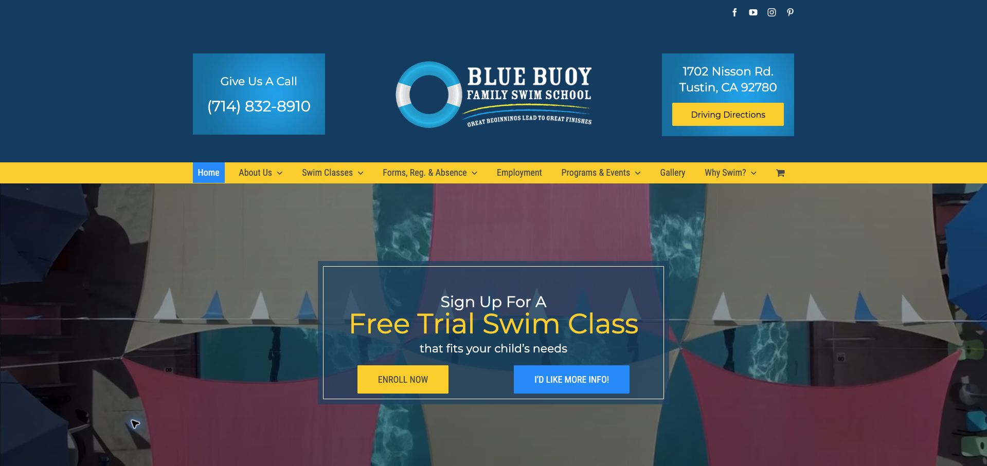
Blue Buoy frames its logo with large telephone and street-address panels, making contact and directions unusually prominent. A yellow navigation strip leads into a darkened pool image with a free-trial invitation. The hero offers both enrollment and a request for more information, recognizing that families may arrive with different readiness levels. Below, the page explains the school's family history and range of ages served. The tradeoff is scale: the tall header uses a large portion of the viewport before the actual lesson offer appears. The trial invitation also lacks immediate eligibility, scheduling, or ongoing-price information, leaving those practical questions for a later conversation.
What you can learn
For a single-site school, a visible address and direct contact can remove unnecessary searching. Keep that utility compact, and pair a trial invitation with the key conditions families need before deciding whether to enroll or ask for guidance.
Pros
Phone, address, and directions are prominent in the header.
Enrollment and further-information routes are separated.
Cons & considerations
The tall header delays the main lesson offer.
Trial conditions and subsequent pricing are not explained in the hero.
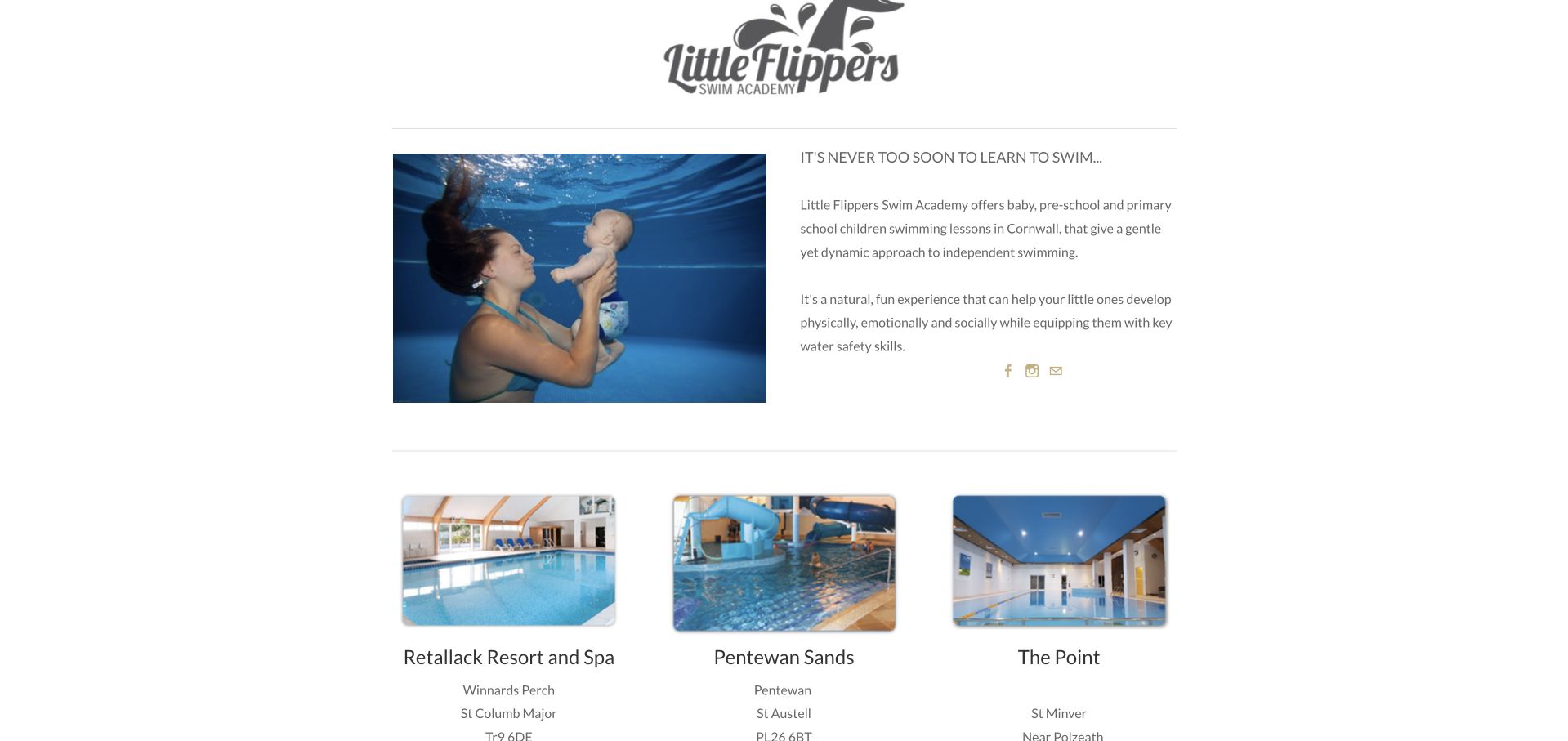
Little Flippers' Cornwall homepage combines a simple navigation row, illustrated aquatic banner, and an extensive venue directory. The retained screenshot is scrolled to its introduction and the first pool cards, where photographs and addresses give the local offering useful context. Venue descriptions also include lesson days and mark several pools as not currently running classes. This transparency is valuable, but some inactive entries retain a timetable immediately above their closure notice, making the current state harder to scan. Large blank areas and widely separated content lengthen the page considerably. The design would be more useful if active locations and their booking routes were the first things a new family encountered.
What you can learn
Treat availability as a primary field in a local venue directory. Separate active and paused locations, remove obsolete timetable cues from paused entries, and attach the relevant booking route directly to each operating pool.
Pros
Pool photographs and addresses establish useful local context.
Inactive venues are explicitly identified.
Cons & considerations
Some paused venues retain conflicting timetable information.
Large empty spaces delay the useful location directory.
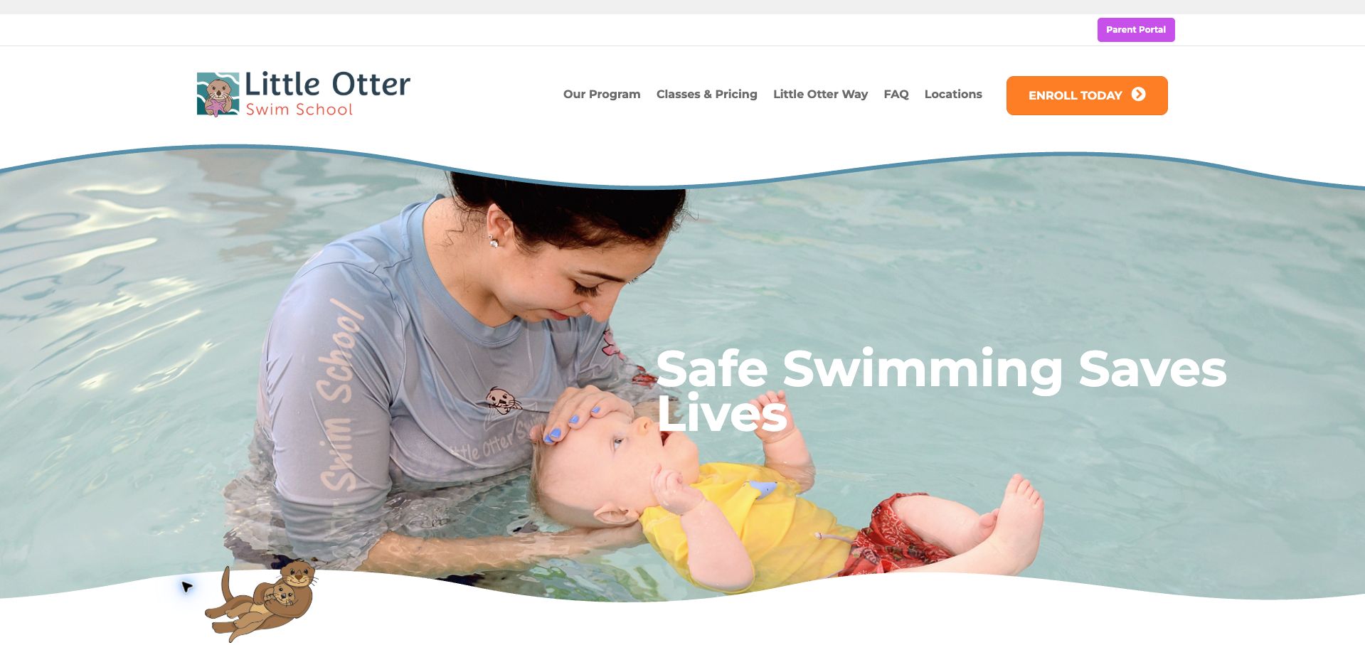
Little Otter combines a large instructor-and-baby photograph with soft wave shapes, an otter illustration, and a strong orange enrollment button. Its navigation gives classes and pricing a shared, explicit label, while parent account access is separated above the main header. The body introduces the school's teaching approach, then offers routes to programs and assistance choosing a class. Location navigation names Charlotte and Huntersville, giving the service a defined local scope. The opening slogan is less specific than the useful navigation beneath it, and pale white lettering against the pool photograph has uneven contrast. The review evaluates this presentation rather than endorsing the page's broad safety claims.
What you can learn
Pair reassurance with a direct route to class fit and cost. Preserve a help path for parents who do not know the right level, and place important headlines on a sufficiently contrasting surface instead of relying on the photograph.
Pros
Classes and pricing share a clear navigation label.
A dedicated assistance route supports uncertain class selection.
Cons & considerations
White hero lettering has inconsistent contrast over the image.
The opening slogan provides less guidance than the later program routes.
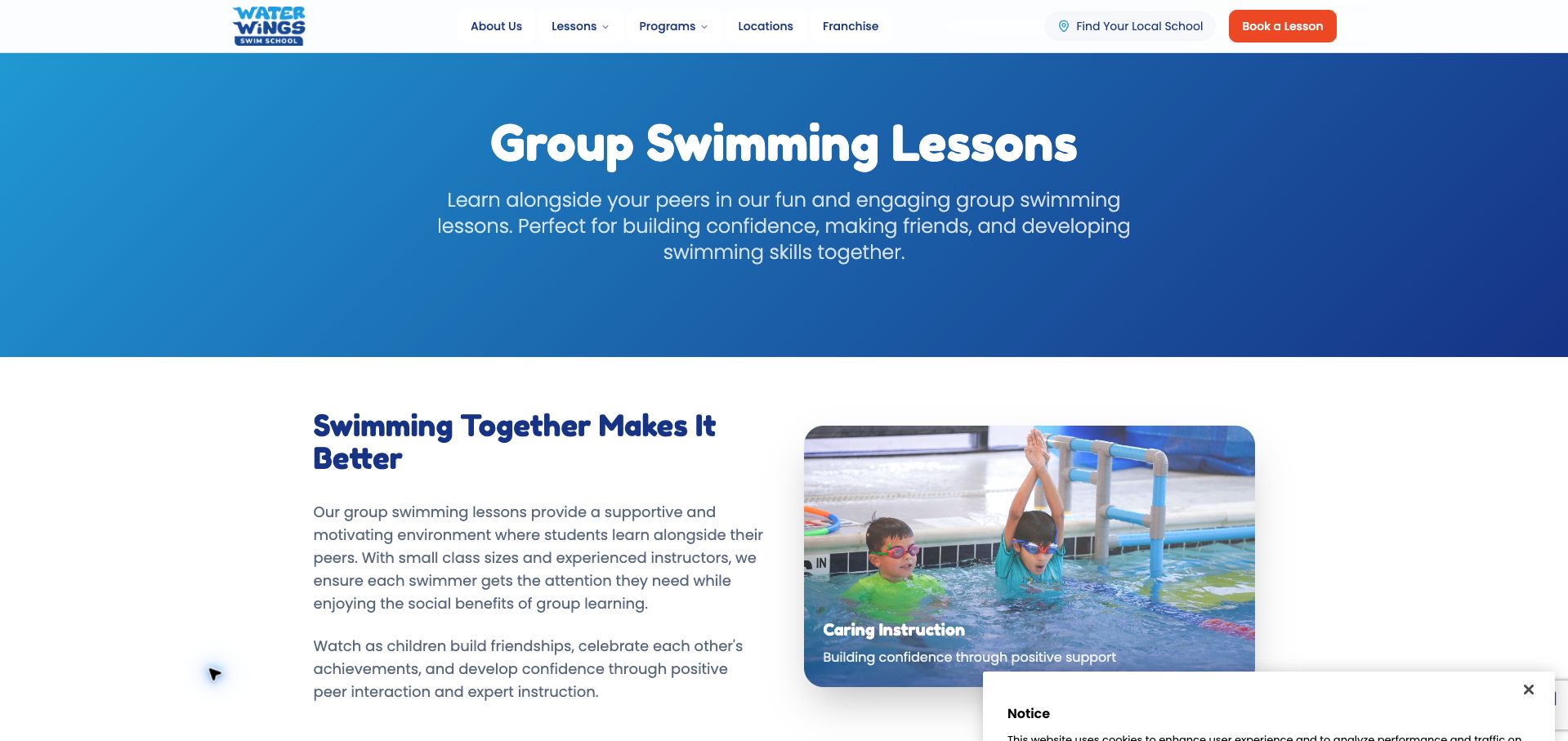
Water Wings' group-lesson page uses a simple blue gradient title panel and a side-by-side explanation with a pool photograph. Its strongest material is the progression below: each level gives an age range, duration, class maximum, and specific skills. Branded names are paired with beginner or intermediate labels, making them easier to interpret. The page then weakens that precision with a generic information section whose duration and group-size statements do not consistently match the individual cards. An evaluation is offered, but prices and local timetables remain elsewhere. This is a useful example of why a detailed curriculum and its marketing summary need to be maintained together.
What you can learn
Use repeated factual fields for every level, then generate or carefully reconcile the summary from those same facts. Clearly identify exceptions in duration and group size so parents do not receive two different descriptions of the commitment.
Pros
Level cards include ages, duration, class maximums, and skills.
Beginner and intermediate labels clarify branded level names.
Cons & considerations
Generic class summaries conflict with some level-specific details.
Local prices and timetables are not part of the program comparison.
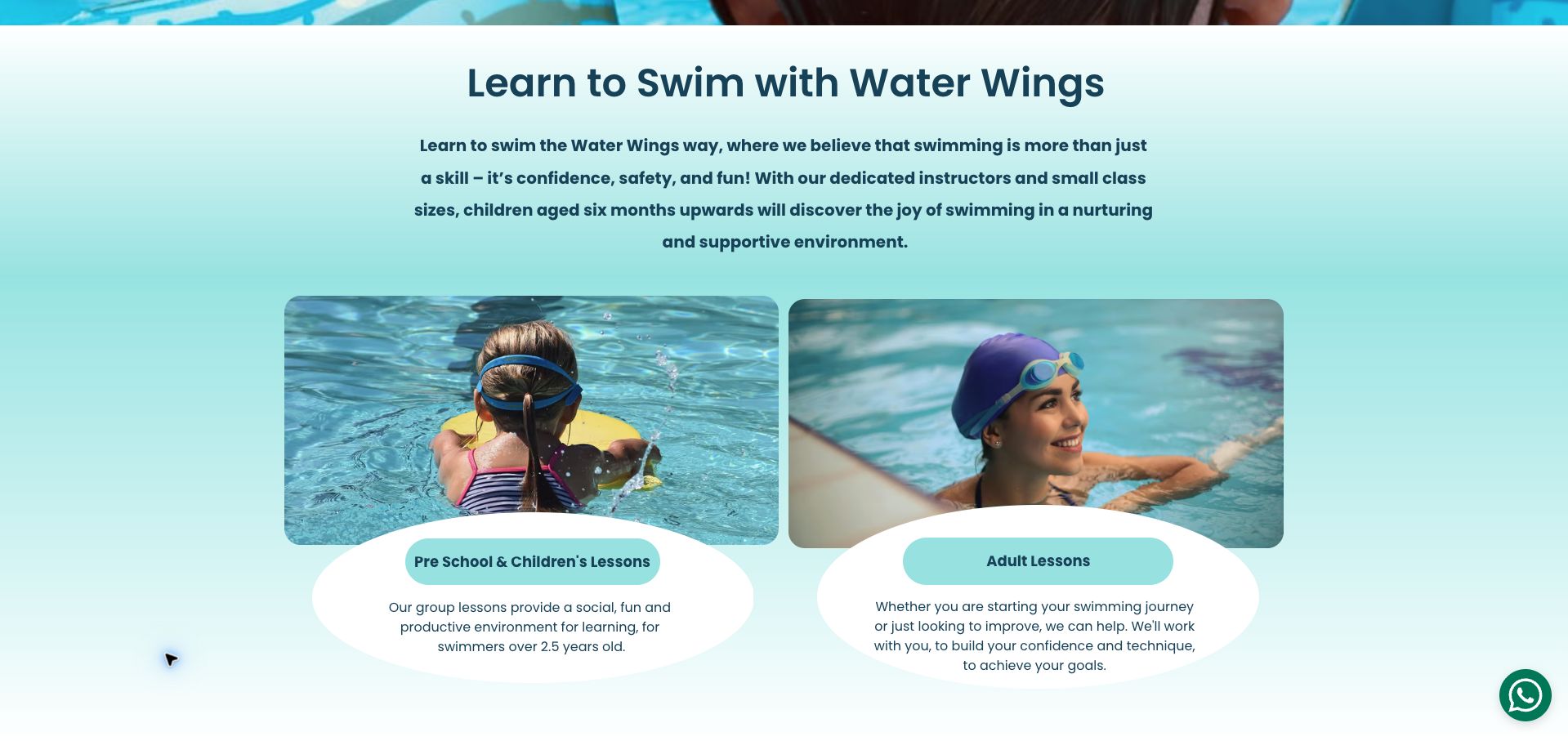
Water Wings in Surrey uses a large circular logo, a straightforward menu, and an expansive swimming photograph. Term dates, pool information, and inquiries each have an explicit navigation route. The body distinguishes preschool and children's lessons, adult tuition, individual lessons, and holiday intensives, then supplies local pool addresses and direct contact options. These are useful building blocks for a small school, but the initial image overwhelms the practical introduction. Several lesson descriptions are uneven in detail, and the opening does not immediately state the Surrey setting. The retained capture is scrolled past the oversized hero to make the actual service explanation visible after the privacy panel was dismissed.
What you can learn
A local swim school should lead with its area, lesson formats, and term dates. Keep the introductory photograph proportional to that information, and use consistent descriptions so families understand which option to inquire about.
Pros
Term dates and pool information have dedicated navigation routes.
The body distinguishes group, individual, adult, and intensive formats.
Cons & considerations
The oversized hero delays the service and location explanation.
Lesson descriptions vary in specificity and presentation.
Kegan is a freelance web designer and developer with 15+ years of experience helping businesses turn complicated website requirements into clear, maintainable digital experiences. He works directly with clients from planning and design through development, launch, and ongoing support.
For swim school website design, his development approach focuses on age and ability pathways, lesson schedules, pool access information, and enrollment-system connections. The scope can be a targeted improvement or a complete custom build, with responsive layouts, thoughtful content structure, and integrations chosen around the people using and maintaining the site.
Show 3 other swim school website designersHide other swim school website designers
Keep age guidance, level, format, venue, schedule, and price together. Clearly distinguish a published timetable from live availability in another system.
Prepare the first visit
Have the operator approve what to bring, arrival timing, changing arrangements, and accompanying-adult policies. Provide a direct channel for individual access questions.
Test booking exceptions
Check full classes, assessment requests, sibling enrollments, holiday closures, and interrupted widgets. Keep clear public contact information available when a preferred time cannot be selected.
The editing job behind the design
Choose systems the team can keep accurate
Use structured lesson and location data rather than duplicating schedules in images. Connect the public explanation to the school’s approved enrollment platform.
A reliable mobile timetable and clear placement guidance matter more than an elaborate animation. Keep student records in the appropriate operational system.
Our WordPress website examples offer a separate look at publishing approaches. A visible platform label is evidence for that named page, not a guarantee that the same system will suit your requirements.
Before the public launch
Website planning checklist
Explain levels plainly.
Describe placement steps.
Identify the correct pool.
State lesson duration.
Clarify the fee interval.
Publish term or closure dates.
Explain make-up policies.
Provide arrival guidance.
Label live availability.
Test a narrow-screen timetable.
These checks are a project checklist, not a performance, legal, security, or accessibility certification. Test real journeys with the people responsible for the website before making claims about the result.
Sources & editorial method
How this collection was selected and reviewed
These 30 examples match the collection target saved before research. Public pages were directly opened and visually inspected; the pictured source and capture date identify the reviewed state. Reused captures retain their earlier dates. Each source also has a bounded public stack-audit attempt, with inaccessible and unknown results kept explicit. Editors Choice recognizes website design and information, not service quality or promised outcomes. No purchases, bookings, applications, or private forms were submitted. Images and trademarks belong to their owners.
Each example links to its actual source page. Screenshots are direct browser captures with their own capture dates; moving imagery, announcements and live designs can change. The notes describe observable design choices and conditional tradeoffs, not measured traffic, conversion results, service quality, or accessibility conformance.
Technology labels use public page metadata, asset evidence, or explicitly cited platform documentation. Platform documentation is not a complete current deployment audit. A component reference may be legacy or unused; it is not a complete backend inventory. Unknown stacks are omitted. These sites are editorial examples, not our client portfolio.
Written, Edited and Curated are separate editorial records, not timestamps advanced by a rebuild. Website designs and imagery belong to their owners. See our editorial standards or suggest a correction.
Questions worth asking
Swim School website design questions
What should a lesson card contain?
The intended audience, level, format, venue, duration, and a clear route to schedule and price information.
Can the website assign a level?
It can explain the school’s process, but should not replace an assessment when the school requires one.
Should pool details be on each lesson page?
At least provide an obvious link to the correct location, with accurate arrival and access information.
How should ongoing payments be described?
State the billing interval, what it covers, and the current cancellation or suspension conditions before the visitor commits.