A useful dental website reduces uncertainty before an appointment. It should explain the practice and the practical details without turning every visit into a cosmetic-treatment sales pitch.
A new patient may want to know whether the practice offers general care, where it is located, what the first visit involves and how to ask about costs. Someone with urgent symptoms needs a clearly labeled contact route. Neither should have to watch a film before finding the phone number.
These examples include neighborhood practices and design-led clinics. Compare the way they introduce people, explain treatment categories and organize appointment requests. We assess the websites, not clinical quality or the accuracy of individual treatment claims.
Before the examples
What makes good dental website design in 2026?
Lead with practical patient questions
Show the location, contact options, patient types and first-visit information plainly. Make treatment labels understandable without assuming the reader knows clinical terminology. Distinguish appointment requests from confirmed bookings and routine requests from urgent contact instructions.
Use people and photography responsibly
Real practice photography can show the environment and team before a visit. Label illustrative imagery appropriately, obtain permission for patient stories, and have qualified practice staff review treatment explanations. Before-and-after images need context rather than implied guarantees.
Keep forms proportionate to the task
A first-contact form rarely needs a full medical history. Explain the next step and keep clinical intake in the practice’s approved system. Avoid encouraging patients to send sensitive details through public comments, unprotected uploads or an ordinary marketing chat.
The collection · 20 examples
20 dental websites worth studying
Study first impressions alongside access to treatment, location and new-patient information. A high-production clinic and a small family practice may need very different amounts of editorial complexity.
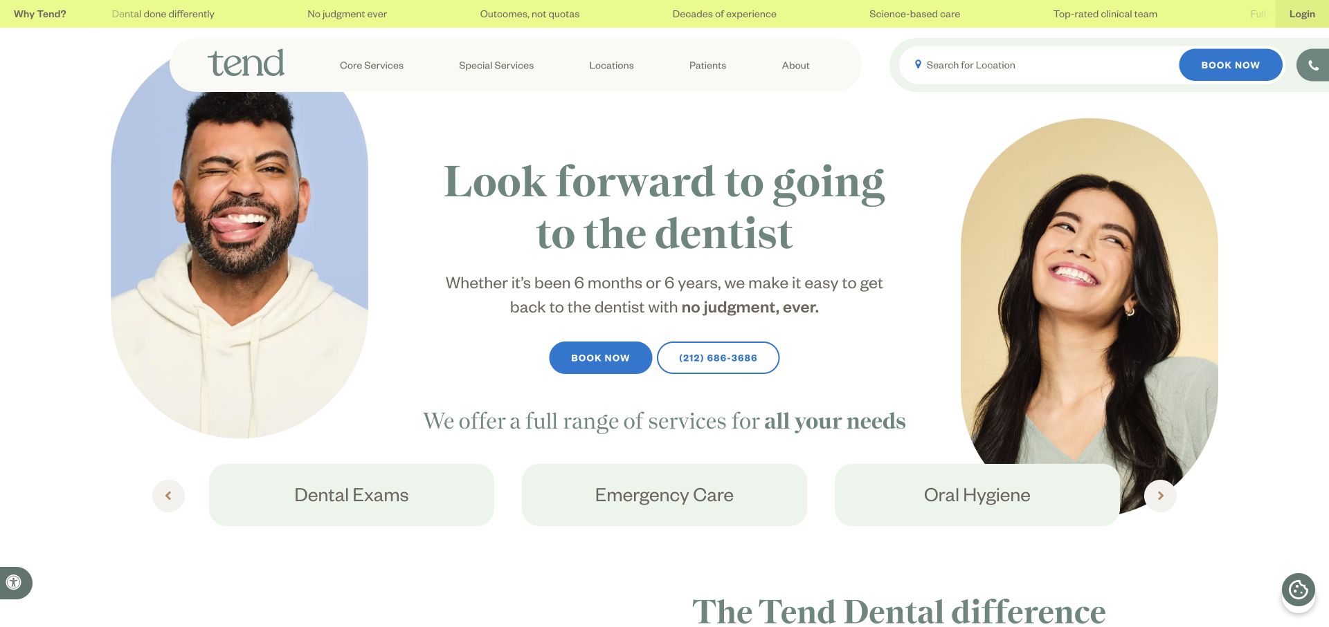
Tend combines large smiling portraits, pale rounded frames, and dark green editorial type rather than leading with dental equipment. The centered introduction is surrounded by faces without letting them conceal the booking controls. A location search sits in the main navigation beside the blue appointment button. Immediately below, large service tiles turn the broad promise into more specific routes. The yellow-green utility ribbon adds personality while separating account access from the principal patient journey.
What you can learn
For a practice network, make the first decision concrete: identify a studio or choose a service. Warm photography can soften the clinical context, but it should support those patient tasks rather than become the only explanation of what the practice offers.
Pros
The location control and booking button are visibly distinct from the editorial navigation.
Rounded portraits and service tiles create a recognizable visual system without relying on tooth icons.
Cons & considerations
The oversized portrait treatment consumes space that a smaller practice might need for insurance or hours.
Several adjacent booking and telephone controls need a clear priority as the layout compresses on smaller screens.
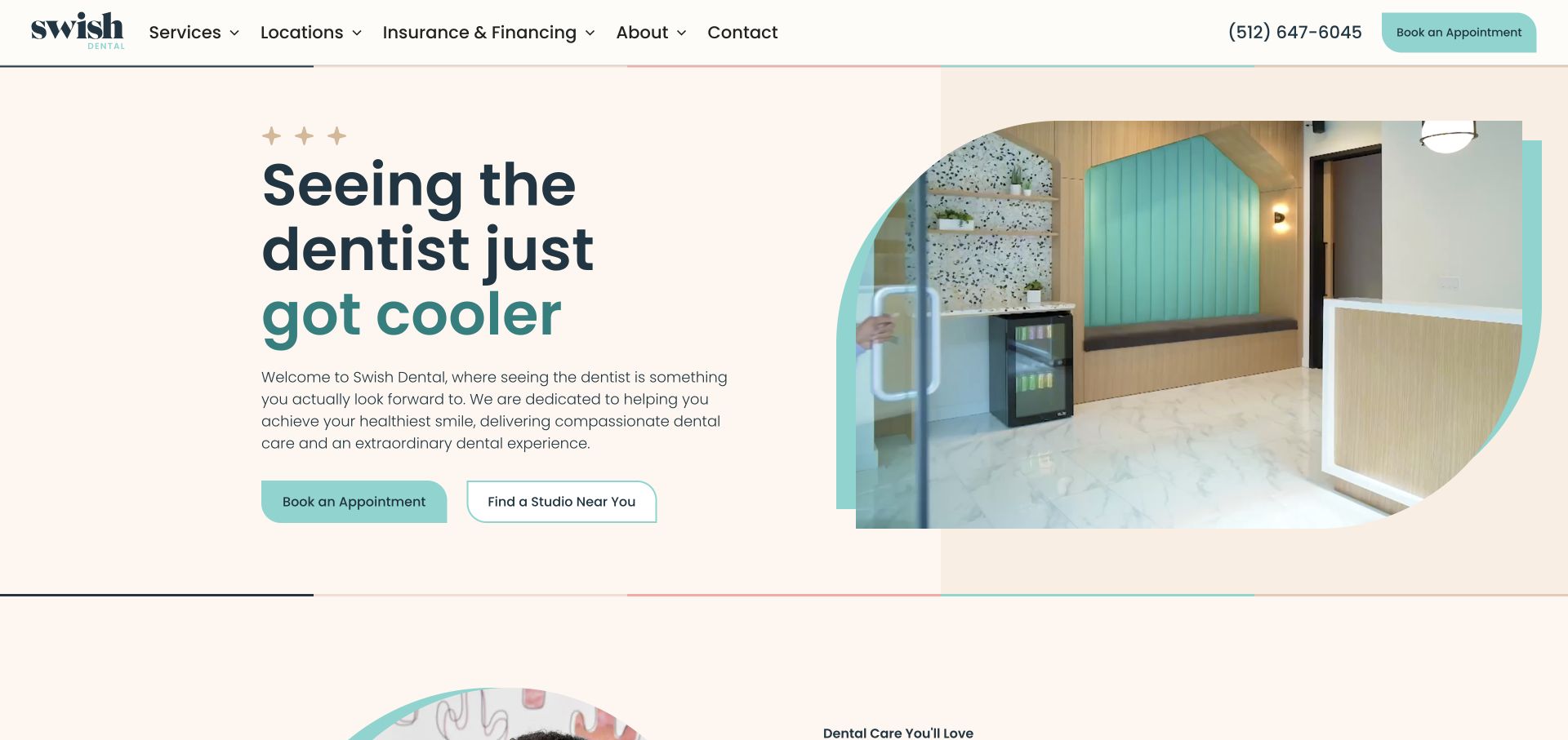
Swish uses a restrained cream canvas and a split hero: a large navy and teal headline on the left, a rounded studio image on the right. The image incorporates curved shapes that echo the brand rather than filling the whole viewport. The top navigation separates services, locations, and insurance information, while the hero offers both appointment booking and studio finding. A phone number remains visible beside the filled header button, giving people a conventional alternative to online booking.
What you can learn
A practice with several offices can treat location selection as a legitimate first step instead of sending everyone into one generic booking flow. Show the real environment, then make the two patient routes different in wording and visual weight.
Pros
The studio photograph conveys the setting without hiding the service introduction behind it.
Insurance and financing are visible navigation topics rather than buried administrative details.
Cons & considerations
The abstract shapes need enough image area to remain useful rather than becoming decoration.
Multiple appointment buttons can feel repetitive if every later section repeats the same hierarchy.
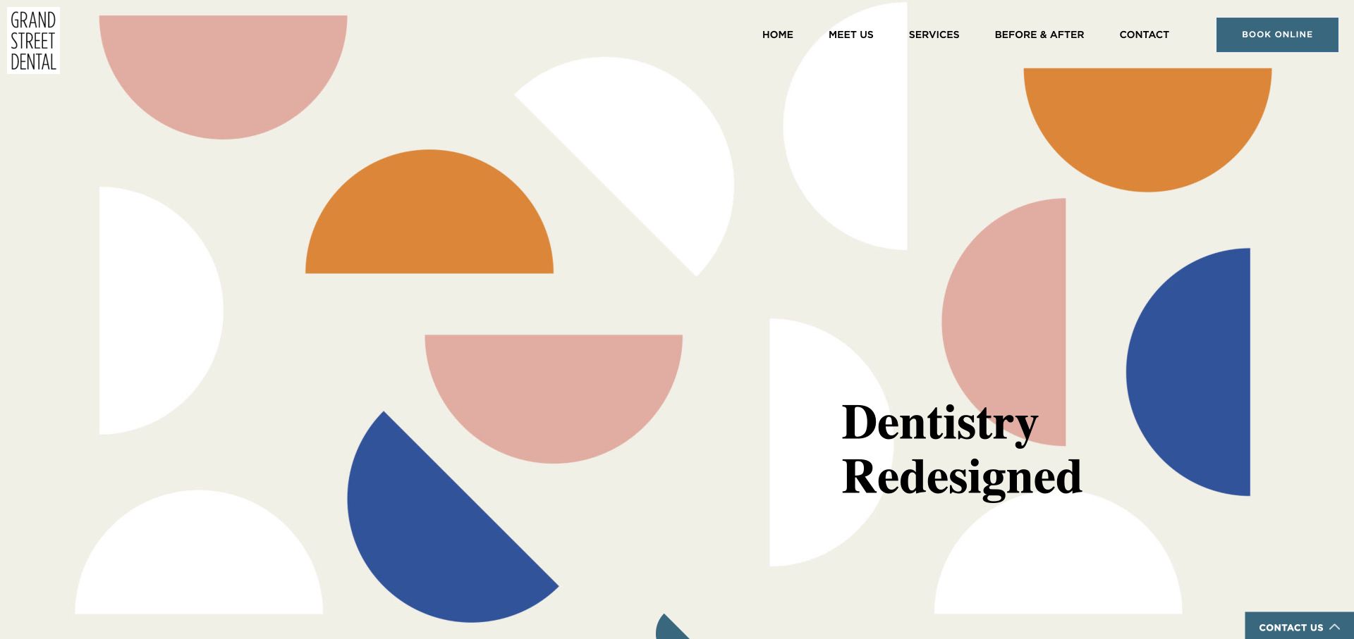
Grand Street Dental fills the opening view with oversized colored semicircles on a warm off-white background. A compact stacked wordmark anchors one corner, and the simple horizontal navigation reserves a contrasting blue rectangle for online booking. The two-line serif headline sits toward the lower right, letting the geometric composition lead. This is unusually graphic for a dental practice: there is no chair photograph or smiling stock portrait competing for attention in the captured opening view.
What you can learn
Distinctiveness can come from a consistent visual language rather than more claims. An independent dental practice can use an expressive opening, provided the next sections quickly answer patient questions about clinicians, services, payment, and where to visit.
Pros
The limited shape vocabulary gives the practice an identity recognizable without reading every word.
Booking is separated from the navigation by a strong rectangular color block.
Cons & considerations
The abstract opening does not itself explain the location or range of dental services.
A very tall graphic hero asks practical visitors to scroll before finding most supporting detail.
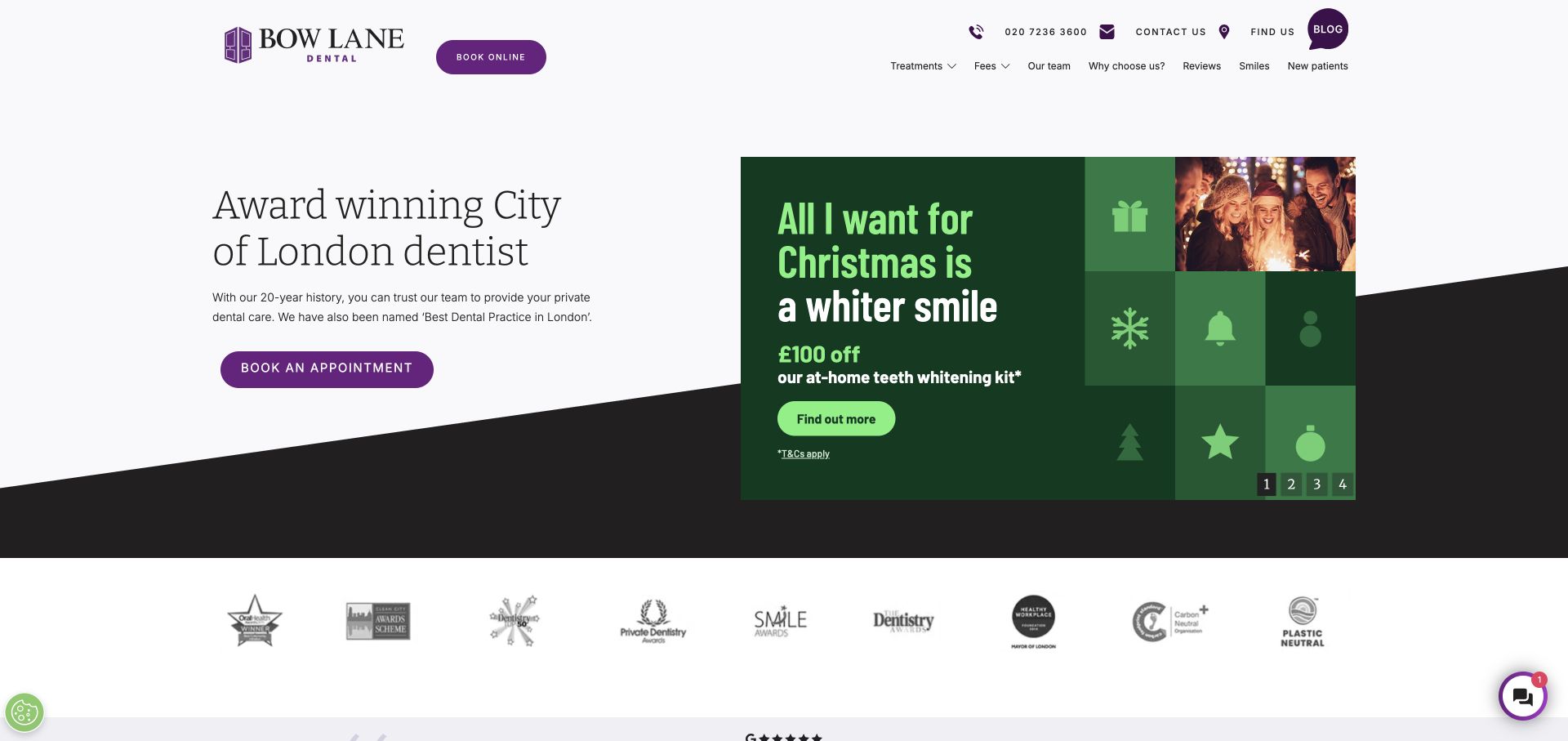
Bow Lane keeps a spacious, pale introduction on the left and a large promotional panel on the right. Purple appointment controls connect the logo, navigation, and primary action, while an angled dark band gives the otherwise conventional layout a more distinctive base. The header exposes phone, contact, location, fees, reviews, and new-patient routes. Beneath the opening, a row of third-party marks creates a separate evidence area instead of squeezing every badge into the headline.
What you can learn
Separate enduring patient information from short-lived offers. A promotion can change independently while the clinic introduction and appointment route remain stable. Keep the permanent navigation useful to both a new patient comparing fees and an existing patient trying to find the practice.
Pros
Practical links such as fees and new patients appear directly in the header.
The split composition allows an offer to change without rewriting the whole opening.
Cons & considerations
The large offer panel can visually outweigh the more important explanation of the practice.
Small promotional terms and many award marks require restraint to avoid turning trust information into clutter.
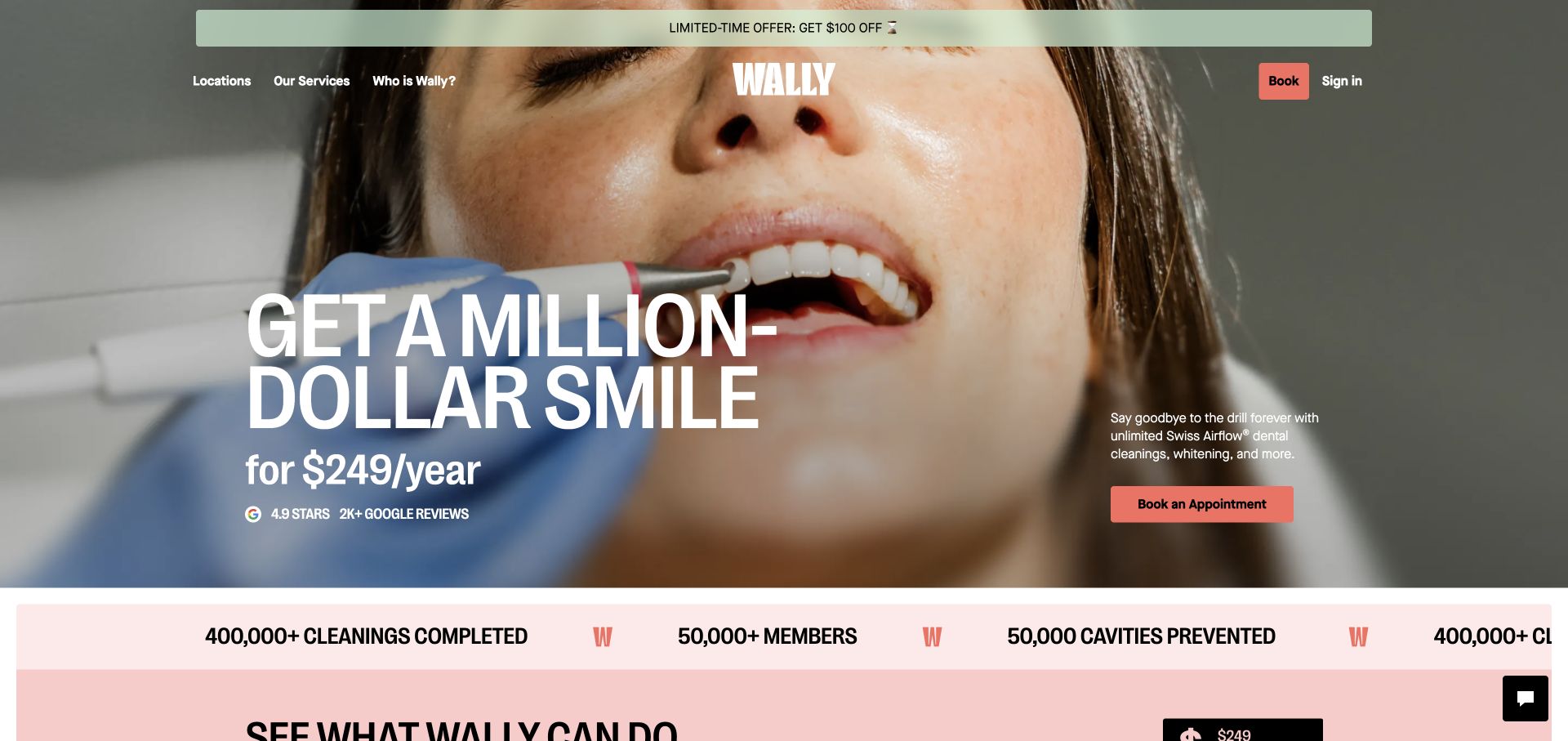
Wally places a large membership-price proposition over a full-width close-up of a cleaning appointment. White condensed type and coral buttons provide a strong contrast with the photographic background. The centered wordmark divides the navigation, with location and service links on one side and booking and sign-in on the other. A slim offer banner sits above it. The opening makes the commercial model conspicuous rather than asking visitors to infer it from generic practice language.
What you can learn
When a dental service is sold as a membership, explain that model before asking someone to book. Treat price, inclusions, exclusions, and clinical suitability as separate information needs. The useful design principle is clarity of offer, not the assumption that prominent pricing guarantees better inquiries.
Pros
The membership model is immediately apparent from the typography and pricing placement.
Account sign-in is visually separate from the main appointment action.
Cons & considerations
A clinical close-up may feel less reassuring to visitors who are already anxious about dental visits.
Offer banners and moving claim strips can compete with the terms a patient needs to evaluate carefully.
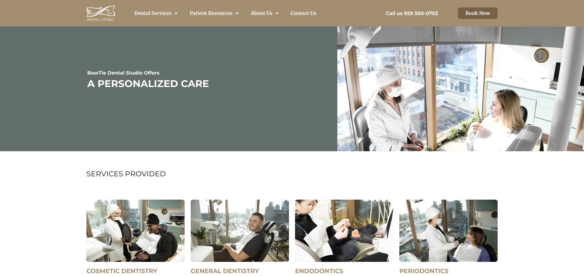
BowTie uses a warm taupe navigation bar and a subdued green-gray introduction beside a large photograph of a clinician speaking with a patient. The following services section begins within the captured view, using four actual treatment photographs rather than abstract medical illustrations. The nav keeps the telephone number and booking button on the same line as the main categories. This gives the homepage a practical rhythm: identify the practice, see the environment, then compare treatment categories.
What you can learn
For a neighborhood dental studio, recognizable people and rooms can explain more than another broad quality claim. Keep service labels plain and match each image to a useful category so that patients can move from a reassuring introduction to the care information relevant to them.
Pros
The services row shows a variety of real clinical contexts in a consistent image format.
A visible phone number supports visitors who do not want to use an online scheduler.
Cons & considerations
The pale hero type depends on its background settling into the intended darker state after entrance animation.
Several specialty labels in one row may need additional explanation for patients unfamiliar with dental terminology.
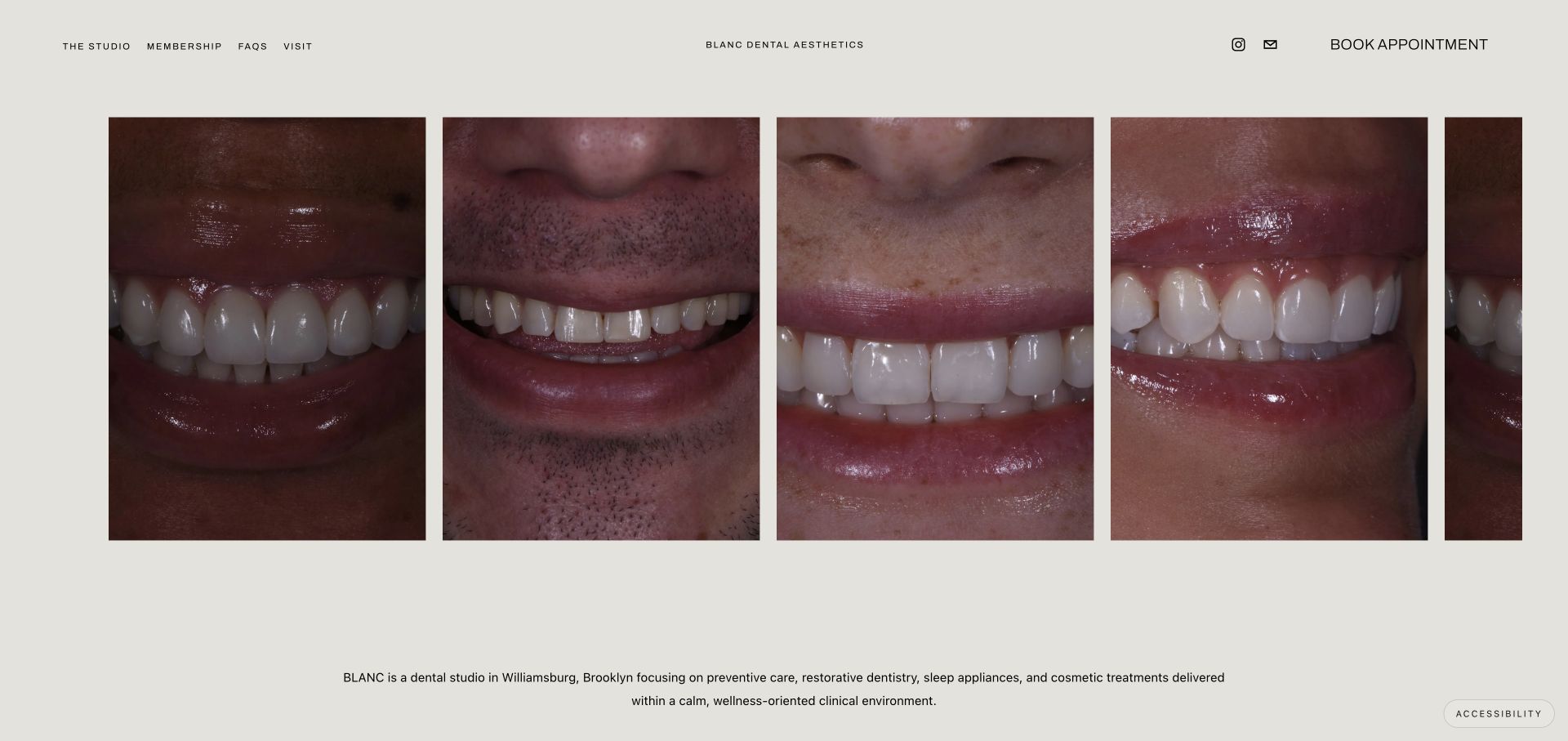
Blanc opens with a horizontal sequence of close-up smiles beneath a very sparse header. The name is centered, small navigation links sit to the left, and booking is isolated on the right. A warm gray background and generous margins make the treatment imagery feel like an editorial gallery. Below it, a short paragraph identifies the Brooklyn studio and the broad types of care available. The result is almost the opposite of a dense dental marketing homepage.
What you can learn
Minimalism works best when the remaining information is highly specific. Keep the practice location, treatment scope, and booking route easy to find, and do not expect smile imagery alone to answer questions about suitability, fees, or what happens during an appointment.
Pros
Consistent portrait crops give the opening an intentional visual rhythm with very little interface noise.
The small number of primary links makes the booking action easy to distinguish.
Cons & considerations
Close-up results imagery provides little context about the team or physical appointment experience.
The very quiet header and sparse explanation may feel under-informative to first-time patients comparing practical details.
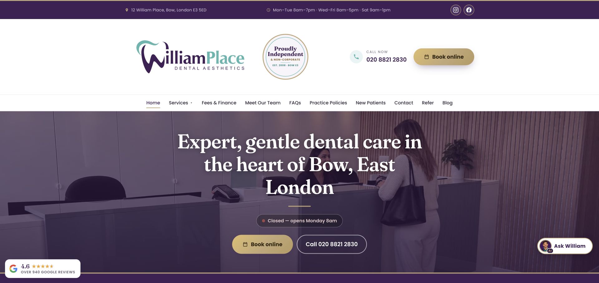
William Place devotes a substantial masthead to its logo, independent-practice badge, telephone number, and gold booking button. A purple utility bar supplies the address and opening hours before the main navigation. The hero then uses a reception photograph with a dark purple overlay, centered serif type, and two contact options. An opening-status pill adds a useful operational detail without requiring a visit to the contact page. The palette connects these otherwise numerous components.
What you can learn
A local dental homepage can make logistics part of the design rather than relegating them to the footer. Put address, hours, and the next appointment step in a stable hierarchy, while checking that the large masthead does not crowd the actual patient introduction out of the opening view.
Pros
Address, hours, phone, and booking are visible before a visitor needs to scroll.
The reception photograph provides a concrete preview of arriving at the practice.
Cons & considerations
The tall multilayer header occupies considerable space before the main care message begins.
Floating chat and review widgets can compete with the carefully grouped appointment controls.
Visible tech stack
Referenced on the public page
Google Fonts
LiteSpeedReported response header
Public source checked November 3, 2026. References may be embedded or legacy—not a complete backend inventory.
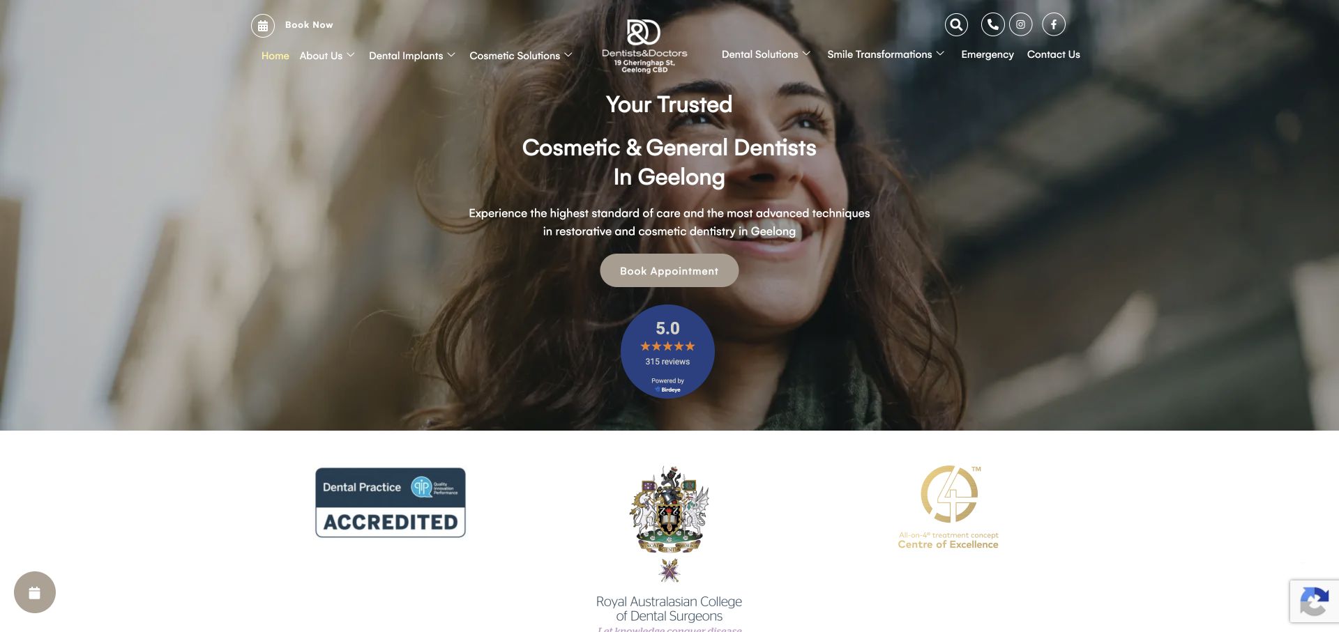
Dentists & Doctors places its location and service focus in the middle of a full-width photographic hero. The centered logo is integrated into a balanced navigation with treatment categories on either side. A beige appointment button sits directly below the short introduction, followed by a review widget. The next section places institutional marks against white, separating that supporting material from the hero. The neutral palette lets the people in the photograph provide most of the warmth.
What you can learn
A broad dental practice should state both where it operates and what kinds of appointments it handles. Use the hero to establish that context, then provide separate, inspectable details for treatment choices instead of relying on the emotional tone of the photograph or a review badge alone.
Pros
The city is explicit in the main introduction rather than hidden in the contact section.
Booking is placed directly after the explanation, keeping the first action easy to locate.
Cons & considerations
Dense navigation over a changing image can be harder to scan than a solid header.
Review widgets and institutional marks need explanatory context; their presence is not a substitute for patient information.
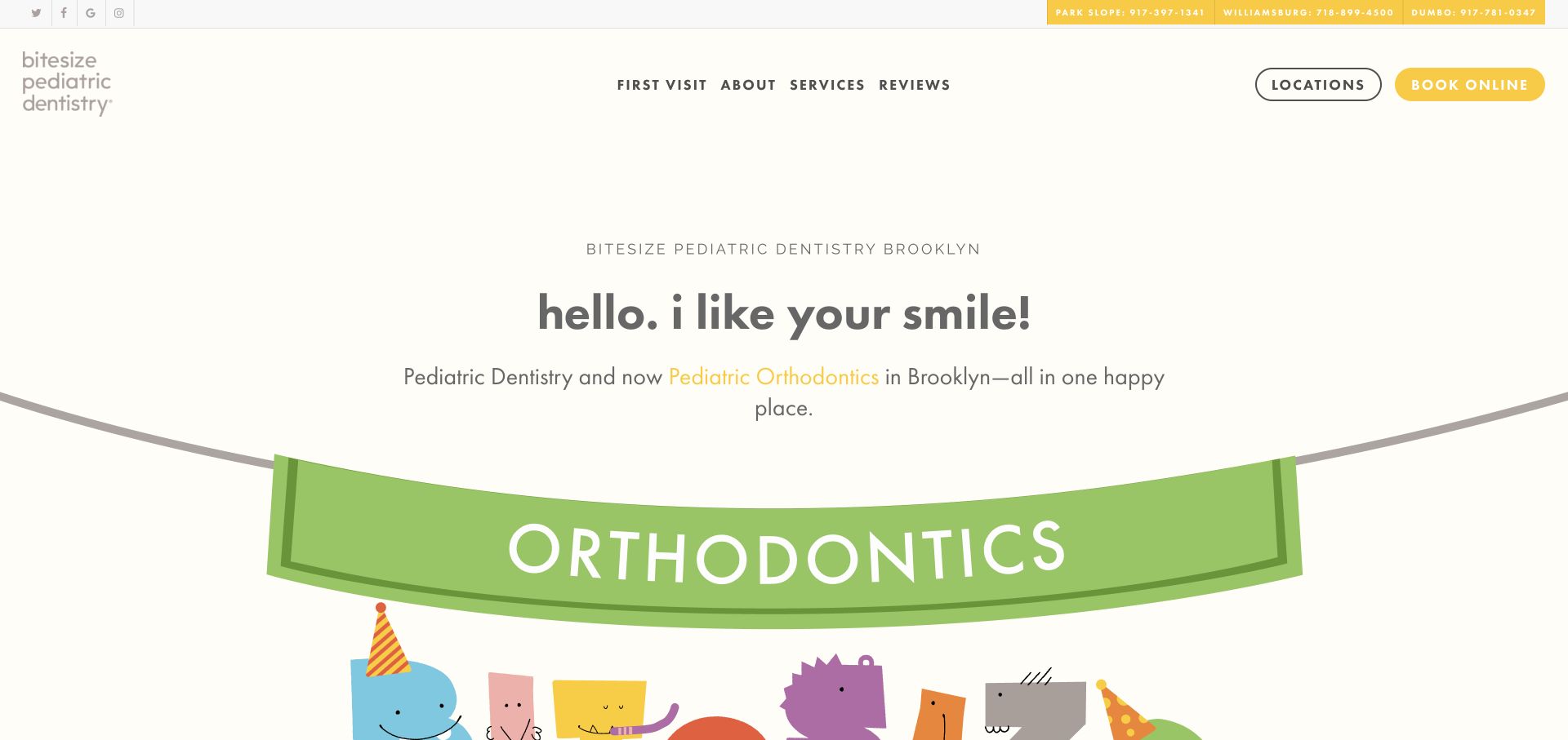
Bitesize uses a cream background, a warm yellow booking button, and playful illustrated characters instead of clinical photography in the first view. A large green orthodontics banner acts as the main visual event beneath the introductory text. The logo is deliberately small and informal, while the header still provides familiar routes for first visits, services, reviews, and locations. Telephone numbers for the Brooklyn offices sit in a slim utility strip rather than interrupting the illustration.
What you can learn
Pediatric dental design has two audiences: the child who responds to the tone and the adult arranging care. Playful illustration can establish personality, but parent-facing tasks such as a first visit, location selection, and appointment contact should remain straightforward and explicitly labeled.
Pros
The illustration system gives the practice a child-oriented identity without relying on generic tooth mascots.
First-visit information is a primary navigation item, addressing a concrete parent question.
Cons & considerations
The large illustrated opening delays more detailed information about the clinicians and appointment process.
Very light gray supporting copy needs careful contrast choices when paired with an off-white canvas.
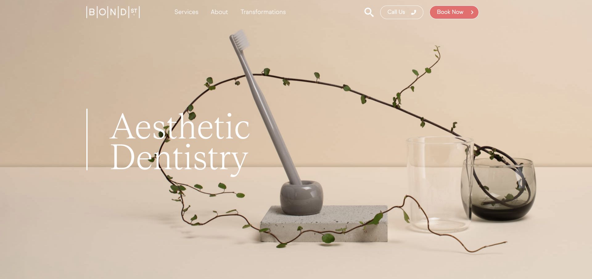
Bond Street opens with a beige still life of a toothbrush, glass vessels, and a branch rather than a conventional portrait or treatment chair. Large white serif type occupies the left side, and a very spare transparent navigation leaves the image almost uninterrupted. A coral booking button provides the one strong color accent beside a telephone control. The composition communicates a considered visual identity through objects, scale, and empty space rather than a collection of badges.
What you can learn
Aesthetic dental work can be introduced through a coherent mood, but the website still needs to explain the actual treatment pathway. Borrow the discipline of the art direction, then make sure services, risks, clinician details, and appointment options become clear immediately after the visual opening.
Pros
The single coral accent establishes a clear booking priority against the neutral imagery.
A short three-category navigation avoids turning the top of the page into a treatment directory.
Cons & considerations
The opening image says little about the actual clinic, clinicians, or geographic location.
White text on a light photographic background depends on careful positioning and may need stronger contrast in other slides.
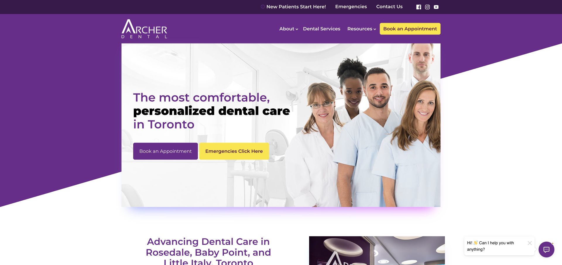
Archer Dental combines a purple diagonal background with a framed group clinical portrait. The headline sits inside the image area, and two large buttons distinguish a routine appointment from an emergency inquiry. A secondary top strip welcomes new patients and repeats the emergency and contact routes. Yellow is used consistently for high-priority actions, while the next white section begins to explain the Toronto locations. The layout is direct rather than deliberately minimal.
What you can learn
Urgent and routine dental visitors should not have to interpret the same vague contact button. Give each route an unambiguous label, and back the group portrait introduction with specific location information so that a visitor can determine whether the practice is relevant before starting an inquiry.
Pros
The emergency button is explicit and visually distinguishable from standard appointment booking.
The group portrait humanizes the practice while the purple frame maintains a strong brand identity.
Cons & considerations
Repeating the same routes in a utility strip, nav, and hero can make the opening feel busy.
Text and buttons placed over a group image need enough clear space to avoid obscuring faces or competing details.
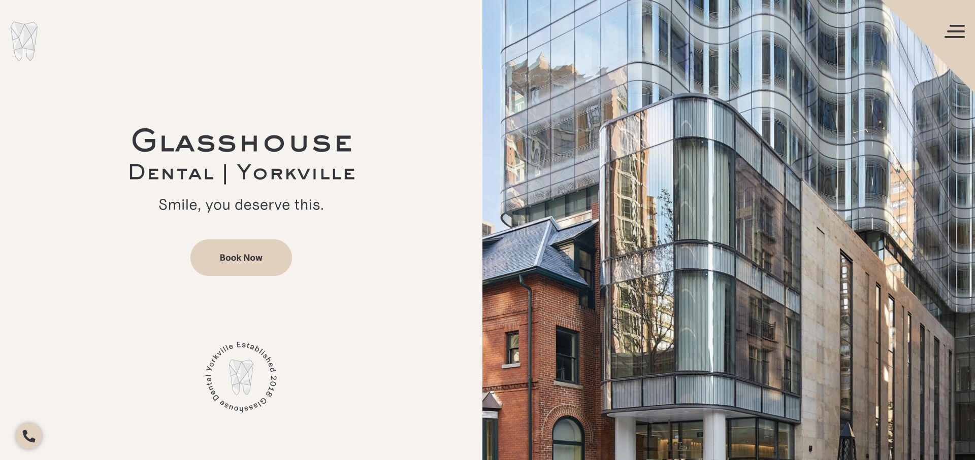
Glasshouse divides the opening into a calm cream text panel and an equally large architectural photograph. The practice name and Yorkville location are prominent on the left, followed by one short line and a rounded booking button. A small geometric tooth mark, circular establishment seal, and tucked-away menu add brand details without creating another full navigation row. The glass facade in the photograph makes the practice’s name feel connected to a real place rather than a decorative naming exercise.
What you can learn
A distinctive location can be a useful recognition cue for a dental studio. Show it clearly, but pair the visual with enough practical context to help someone identify the entrance, understand the services, and arrange a visit. Architectural identity should support wayfinding, not replace patient information.
Pros
The split layout keeps the booking text readable independently of the detailed building photograph.
The location is included directly in the main title treatment.
Cons & considerations
A collapsed menu hides service and patient-information routes even on a wide desktop screen.
The architectural image does not show the treatment environment or introduce the clinical team.
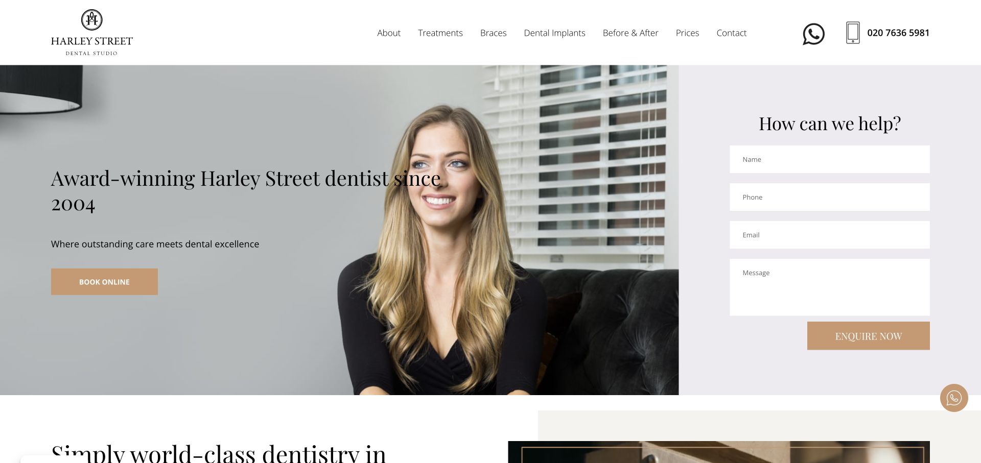
Harley Street Dental Studio places a large portrait and serif introduction beside a pale lavender inquiry panel. The form is part of the page composition rather than a separate popup, with four clearly separated fields and a gold submit control. The white header keeps treatment categories, prices, contact, a messaging icon, and the telephone number visible. Gold accents connect the hero booking button and the inquiry action, giving the otherwise familiar layout a consistent visual vocabulary.
What you can learn
Putting an inquiry form beside the introduction makes sense when visitors may have questions before booking. Keep the form concise and clarify what happens after submission. For dental practices, avoid asking for unnecessary clinical details in a broad homepage form simply because there is room for more fields.
Pros
Prices and contact are visible in the desktop navigation alongside treatment categories.
The written inquiry option is clear without forcing a visitor into an appointment scheduler first.
Cons & considerations
Two large adjacent conversion paths can compete unless their different purposes are explained.
The form occupies space that could otherwise introduce clinicians, location, or the first-visit process.
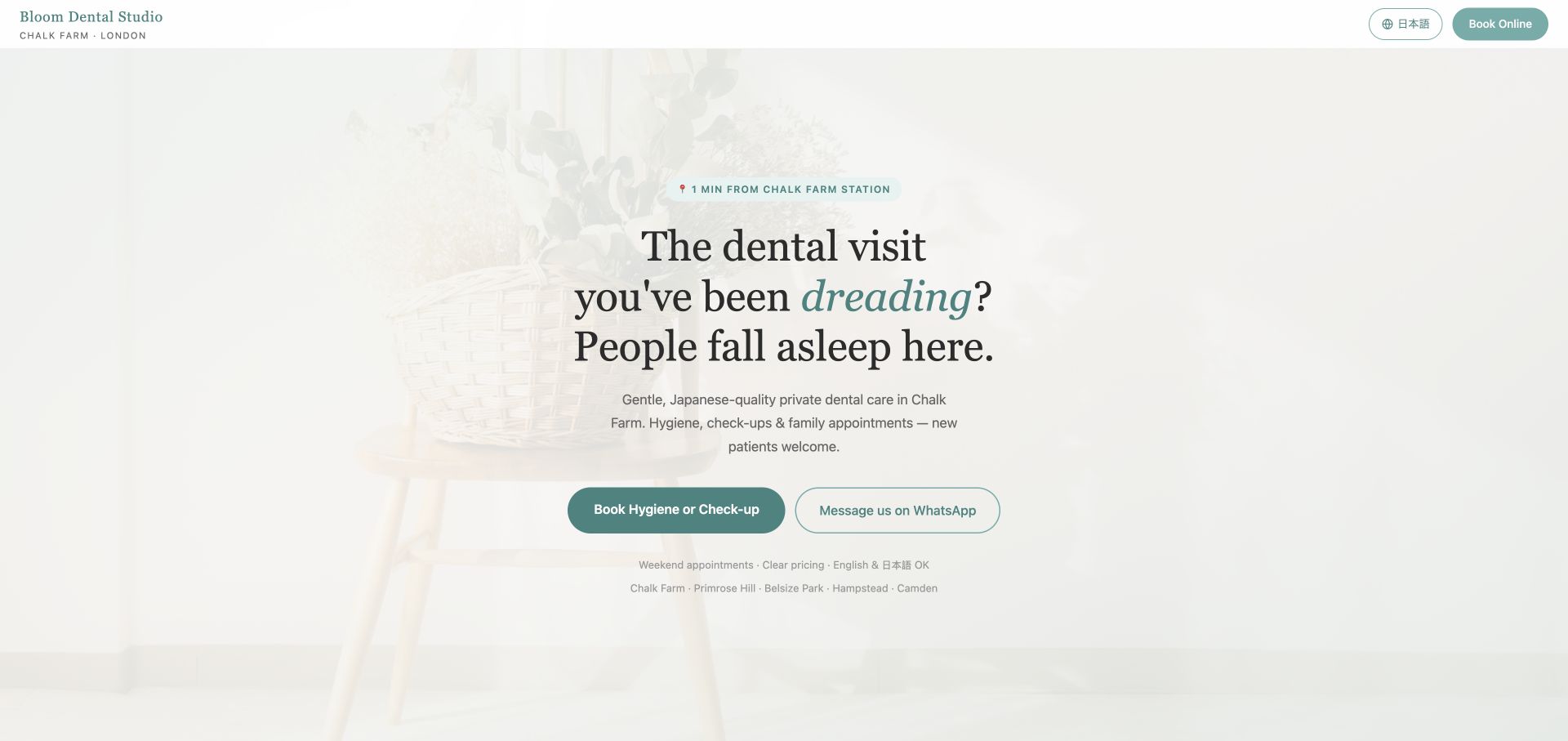
Bloom’s English-language page uses a pale, softly photographed background and a centered serif headline with an italic teal emphasis. The compact header shows the practice name, Chalk Farm location, language switch, and booking. Two large buttons offer either a hygiene or check-up appointment or a WhatsApp conversation. Small supporting lines identify nearby neighborhoods and practical appointment considerations. The presentation is closer to a calm service landing page than a large treatment catalog.
What you can learn
Specific appointment labels and visible language choices can remove uncertainty more effectively than a long generic introduction. For a bilingual dental practice, keep the language switch near the main booking route, and make sure operational details remain readable rather than disappearing into the quiet visual treatment.
Pros
The language switch is explicit and does not depend on visitors interpreting an unlabeled flag.
The primary button names the appointment types instead of using a vague next-step label.
Cons & considerations
The intentionally faint background and small supporting copy may be too subdued for practical scanning.
The minimal navigation gives little immediate access to more detailed treatment or clinician information.
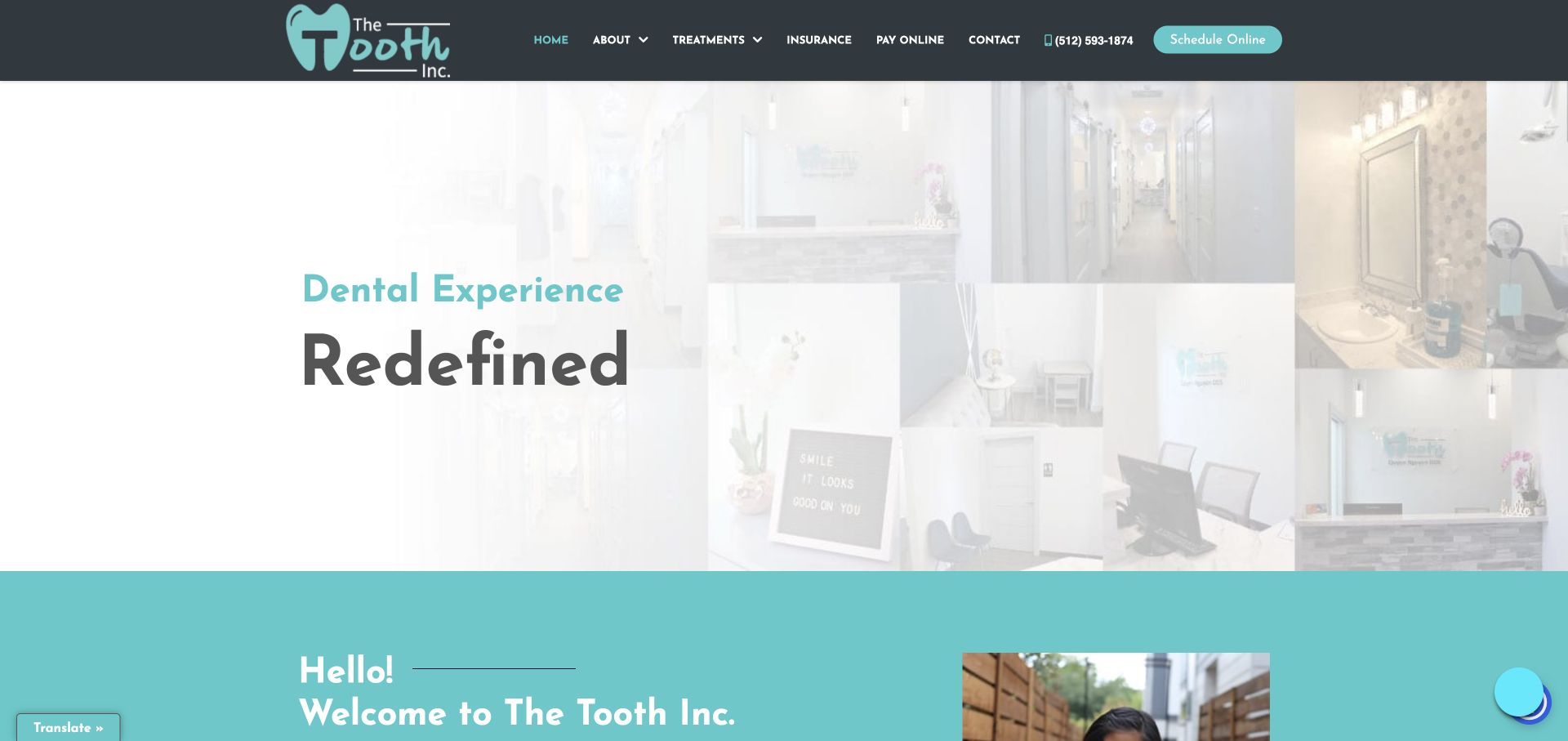
The Tooth Inc. uses a dark slate header and teal accents above a bright collage of its clinic interior. The left half of the hero is deliberately washed toward white so the large two-level headline remains readable. Beneath it, a solid teal introduction begins within the opening view. The header includes insurance and online payment alongside treatments and contact, with phone and scheduling controls grouped at the right. Those administrative routes recognize existing patients as well as new inquiries.
What you can learn
A dental homepage can use its actual environment to make an introduction tangible while still accommodating routine patient tasks. Keep insurance, payments, and contact easy to find, but give the first appointment a clear visual priority so that the header does not become an undifferentiated utility bar.
Pros
The collage shows multiple aspects of the clinic instead of relying on a single stock smile.
Insurance and payment routes are easy to locate for returning patients.
Cons & considerations
The opening headline is brand-oriented and needs the following section to explain location and services.
A deliberately pale photo collage can lose useful detail, particularly on less contrasty screens.
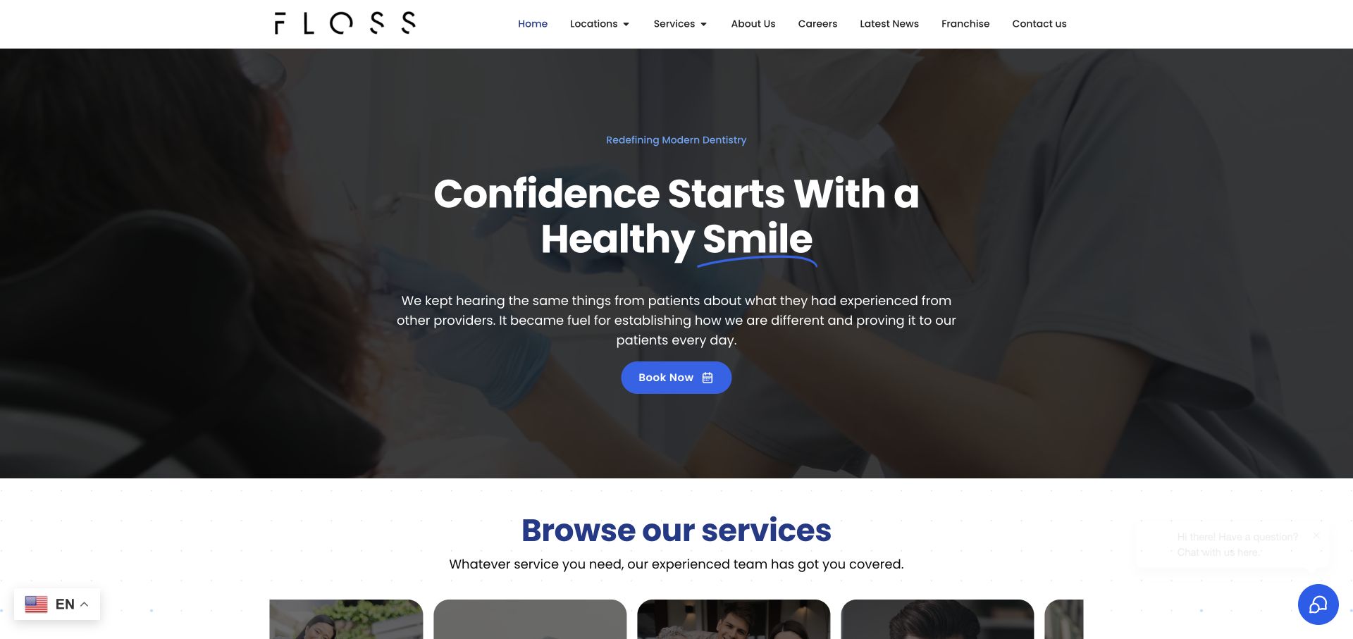
FLOSS uses a full-width treatment image under a dark overlay, large centered white type, and one blue appointment button. The compact white header carries the wordmark and an extensive navigation, including locations, services, careers, and contact. A service section begins immediately below the hero, using a white background and image cards to change the pace. The blue accent appears sparingly in the hero, so the main action has a clearer role than the smaller navigation links.
What you can learn
For a broad dental service, transition quickly from the brand introduction to concrete care categories. A familiar photographic hero is most useful when the next section helps patients identify the relevant service and location rather than repeating another general promise about the practice.
Pros
The dark overlay creates a separate readable layer for the introduction and appointment control.
The visible start of the services section gives visitors an obvious continuation after the hero.
Cons & considerations
The crowded navigation gives corporate topics similar prominence to patient-facing information.
A clinical procedure image may be less suitable than a team or reception photograph for especially apprehensive visitors.
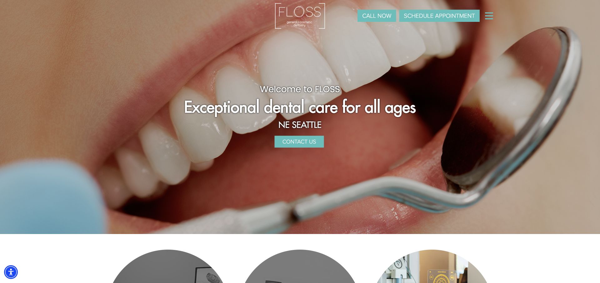
FLOSS Seattle places its compact white wordmark and teal appointment controls over a very large dental close-up. Centered white type identifies the practice’s audience and Seattle location, with another contact button beneath. A hamburger keeps the visible header spare even at desktop width. The image establishes the industry unmistakably, while teal offers the main brand distinction. The capture also demonstrates how much of the first view can be devoted to photography when the text is kept short.
What you can learn
A small local practice does not need a complicated hero to provide contact and location cues. But clinical photography is a deliberate audience choice: balance it with reassuring explanations and make essential patient information easy to reach through plainly labeled links, not just a compact menu icon.
Pros
Phone and scheduling controls remain visible without opening the hidden navigation.
The location is written directly under the headline, making local relevance easy to confirm.
Cons & considerations
The extreme treatment close-up could be uncomfortable for visitors with dental anxiety.
A hamburger on a large screen hides details that some patients may want to compare immediately.
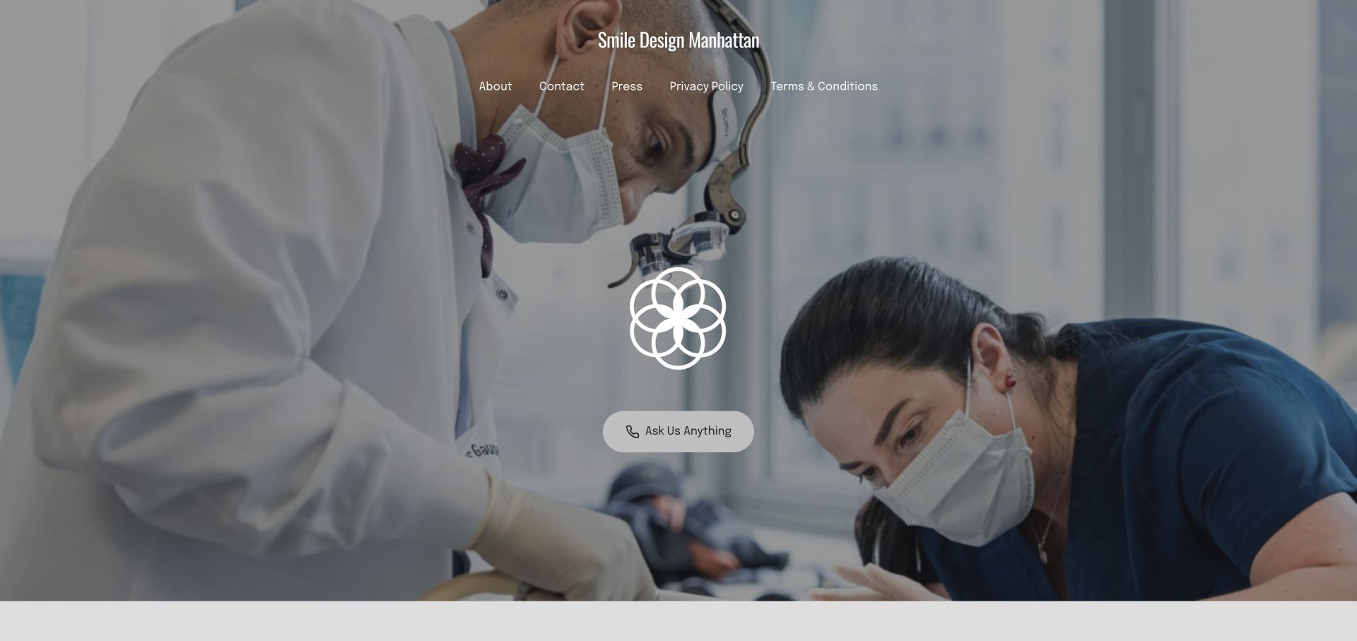
Smile Design Manhattan places a large image of clinicians at work behind a centered geometric brand mark and a single conversational contact control. The practice name and a short navigation row sit at the top over the same visual field. Unlike many dental homepages, the first captured view does not stack service cards, review widgets, and a large sales headline. It relies on the clinical scene and spare interface to create an immediate sense of the practice’s working environment.
What you can learn
Original clinical imagery can demonstrate context without a wall of promotional copy. The tradeoff is informational: a sparse opening should be followed promptly by location, care options, clinicians, and a clearly explained appointment route so that atmosphere does not become a barrier to evaluating the practice.
Pros
The visual scene has room to breathe rather than competing with several promotional panels.
A single prominent contact control provides a clear focal point in the sparse composition.
Cons & considerations
The conversational button does not explain whether it opens booking, messaging, or a general inquiry.
Policy links occupy top-level space while treatment categories are not visible in the opening navigation.
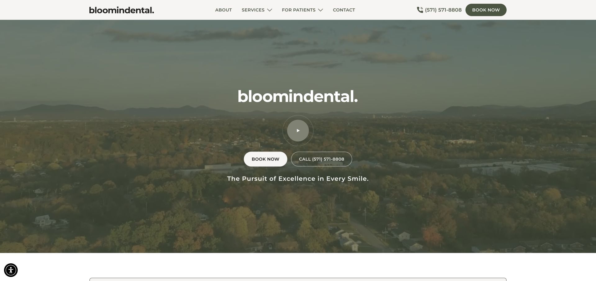
bloomindental uses a wide landscape video or image with a deep olive overlay, a centered wordmark, and a circular play control. Booking and telephone buttons sit together below the mark, while a short statement closes the composition. The solid pale header keeps about, services, patient information, contact, and phone readable independently of the moving media. The olive and off-white palette is deliberately quieter than the bright blue commonly used by dental practices.
What you can learn
A landscape can establish a sense of place without showing treatment imagery in the hero. Make sure the surrounding copy still names the dental service and locality clearly; a cinematic setting is a recognition aid, not a replacement for the practical information a new patient needs.
Pros
The solid navigation bar protects key patient links from the contrast changes of background video.
Booking and calling are presented side by side with visibly different button treatments.
Cons & considerations
The opening relies heavily on the brand name and does not immediately explain specific appointment options.
A large play control introduces another competing action before a visitor has learned much about the practice.
Plan the patient journey before the visual treatment
List what a new patient needs to decide
Ask reception which questions repeatedly delay an appointment request. Prioritize accurate hours, arrival information, new-patient steps, cost conversations and the services actually offered. Name the person responsible for keeping those answers current.
Give treatments a consistent content structure
Explain what the service is, who can discuss suitability and what a consultation involves. Let qualified clinicians approve descriptions and limitations. Do not replace an individual assessment with a generic promise or use unsupported time and result claims.
Design reception’s side of the website
Decide where requests go, how the team recognizes an urgent message and what the confirmation should say outside working hours. Test a non-sensitive sample request and an integration failure. Remove fields nobody needs before the first contact.
The editing job behind the design
Separate public content from patient systems
A marketing CMS can manage team profiles, treatment explanations, FAQs and practical location information. It should not automatically become the patient record system. Use the practice’s approved appointment and intake vendors where appropriate, with a clear handoff for the visitor.
Evaluate embeds, analytics, session recording and advertising tools before placing them on pages where patients may disclose information. Assign responsibility for content approval, backups and updates. A recognizable platform logo does not establish that a deployment is suitable for patient data.
Our WordPress website examples offer a separate look at publishing approaches. A visible platform label is evidence for that named page, not a guarantee that the same system will suit your requirements.
Before the public launch
Dental website launch checklist
Have qualified practice staff approve treatment and urgent-contact information.
Confirm team details, hours, directions and new-patient instructions.
Record permissions and context for patient imagery and testimonials.
Test request versus confirmed-booking messages without clinical data.
Review form destinations and third-party embeds with the responsible staff.
Check small-screen readability, keyboard access and a clear phone alternative.
These checks are a project checklist, not a performance, legal, security, or accessibility certification. Test real journeys with the people responsible for the website before making claims about the result.
Sources & editorial method
How this collection was selected and reviewed
We selected official practice websites with distinct patient-facing identities and content approaches. Observations concern visible design and navigation; screenshots do not verify treatment outcomes, patient experience or regulatory suitability.
Each example links to its actual source page. Screenshots are direct browser captures with their own capture dates; moving imagery, announcements and live designs can change. The notes describe observable design choices and conditional tradeoffs, not measured traffic, conversion results, service quality, or accessibility conformance.
Technology labels use public page metadata, asset evidence, or explicitly cited platform documentation. Platform documentation is not a complete current deployment audit. A component reference may be legacy or unused; it is not a complete backend inventory. Unknown stacks are omitted. These sites are editorial examples, not our client portfolio.
Written, Edited and Curated are separate editorial records, not timestamps advanced by a rebuild. Website designs and imagery belong to their owners. See our editorial standards or suggest a correction.
Questions worth asking
Dental website design questions
Should treatment prices be visible?
Explain costs and consultation steps as accurately as the practice can support. If publishing starting prices or ranges, make the assumptions and exclusions clear and have the practice approve them.
Does a dentist need online booking?
Not necessarily. A clearly explained appointment-request process can work well if reception handles it reliably. If offering live booking, test whether availability and confirmation language reflect the real appointment system.
Can we use stock photographs of patients?
Use appropriate licensing and avoid presenting models as actual patients. Real team and practice images often answer more useful questions about the experience of visiting. Patient imagery needs an approved permission process.
Should the site give treatment advice?
It can provide reviewed general explanations and clear contact routes, but should not pretend to diagnose an individual. Have qualified practice staff own clinical accuracy and the wording of urgent instructions.
Borrow approachable structure and clear practical information. Keep the practice’s own clinical review, patient permissions and appointment workflow at the center of the build.