A shipping website has to serve a first-time shipper and a customer returning with a reference number. Put those different intentions into clear paths, explain the information each tool needs, and connect route promises to maintained operational details.
Ocean shipping websites span container lines, regional carriers, vehicle and roll-on/roll-off specialists, and diversified marine groups. Their public interfaces must explain what they move and where they operate while also providing schedules, quotes, tracking, documents, local contacts, and service advisories. A useful design makes those responsibilities visible without asking visitors to understand the company's internal systems or commercial terminology first.
These twenty-three examples focus on official ocean, regional cargo, vehicle, and marine shipping properties. Some place tools directly in the opening image; others act as corporate gateways or focused service pages within larger logistics groups. The reviews examine visible design and public information architecture. They do not verify sailing performance, freight prices, environmental claims, security, private customer portals, or the successful completion of a quote or shipment transaction.
Before the examples
What makes good shipping website design in 2026?
Separate planning, quoting, booking, and tracking
A route search asks whether a movement is possible; a quote asks what a defined shipment may cost; a booking requests or confirms space; tracking concerns an existing movement. Give these actions distinct names and explain their required inputs. Do not let a generic Search button imply that all four return the same kind of result. Identify any step that continues with an agent, a regional office, or an authenticated portal.
Show cargo and geographic scope before asking for details
Describe the cargo types, service regions, and relevant handoffs in plain language. Distinguish container service from vehicle, oversized, bulk, or specialized cargo, and separate receiving locations from destination ports. If a service combines ocean and inland legs, explain the scope of the displayed schedule. Offer manual port and office choices without requiring device location. Make regional restrictions understandable before someone prepares a full enquiry.
Give operational updates a maintained structure
Separate customer advisories from company news. Each notice should identify the affected route, place, vessel, cargo process, or date range; show when it was published or updated; and link to a maintained detail page. Plan the homepage with several simultaneous updates so notices remain useful without hiding every task. Keep rate and fee references connected to their scope and effective dates rather than relying on undated promotional copy.
The collection · 23 examples
23 shipping websites worth studying
Compare how the examples divide new-business discovery from returning-customer work. Pay particular attention to identifier instructions, port choices, regional gateways, cargo categories, portal names, and the placement of advisory information. Borrow the pattern that matches the shipping service and its actual booking process rather than copying the largest hero image.
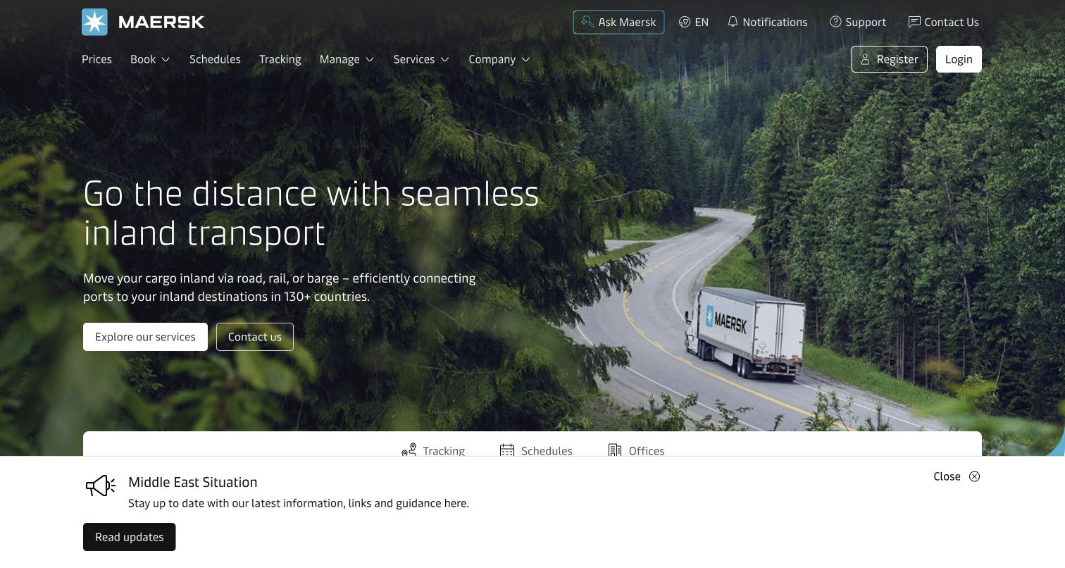
Maersk keeps Prices, Book, Schedules, Tracking, and Manage across the top while the main image promotes inland transport. The truck moving through a wooded landscape broadens the shipping story beyond the vessel without removing recognizable cargo tasks. Explore Services and Contact Us offer separate discovery and assistance routes. A tracking, schedules, and offices panel begins below the campaign, while the captured regional advisory occupies a substantial band along the bottom. The page therefore combines commercial discovery, everyday shipment work, and a current operational notice in one view.
What you can learn
Keep the task vocabulary stable when promotional imagery changes. Budget the combined height of campaign content, tools, and advisories so a disruption message stays visible without making the routine customer journey difficult to locate.
Pros
Specific verbs in the primary navigation help returning customers choose a familiar action quickly.
Inland photography makes the wider transport offering visible without requiring a long explanatory paragraph.
Cons & considerations
The large advisory band reduces the initial space available for the practical tool panel.
The inland campaign provides little immediate detail about a particular ocean route or shipment.
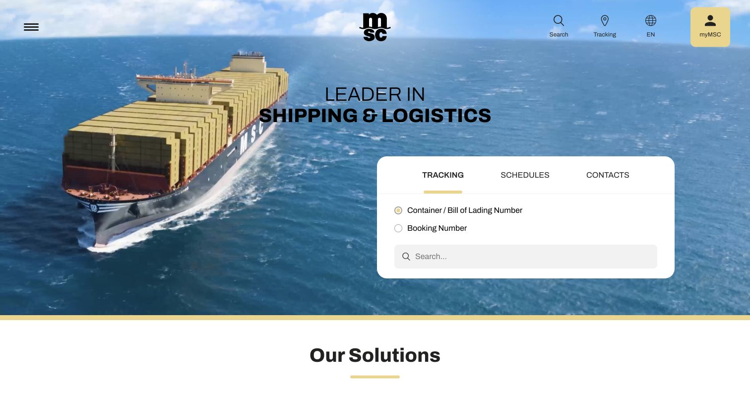
MSC gives a white tracking card a strong position on the right of a ship photograph. Tracking, Schedules, and Contacts share a compact tab row, and the tracking form distinguishes container or bill-of-lading references from booking numbers before the visitor types. This makes the tool more specific than a single unexplained search box. The rest of the first screen is restrained: the central brand, a short shipping message, a menu control, and small utility links. Lower public content separates shipping, inland, digital, and cargo-cover services, extending the practical entry point into a broader commercial catalogue.
What you can learn
Explain which shipment identifier the tool accepts at the point of entry. A small amount of field guidance can carry more operational value than adding another general shipping claim to the hero.
Pros
The solid tool panel remains visually distinct from the detailed vessel photograph behind it.
Contacts sits alongside tracking and schedules, giving an unsuccessful self-service visit an obvious alternative.
Cons & considerations
The compact menu hides much of the service structure until the visitor opens it.
Several small utility labels compete with the substantially larger tracking panel for attention.
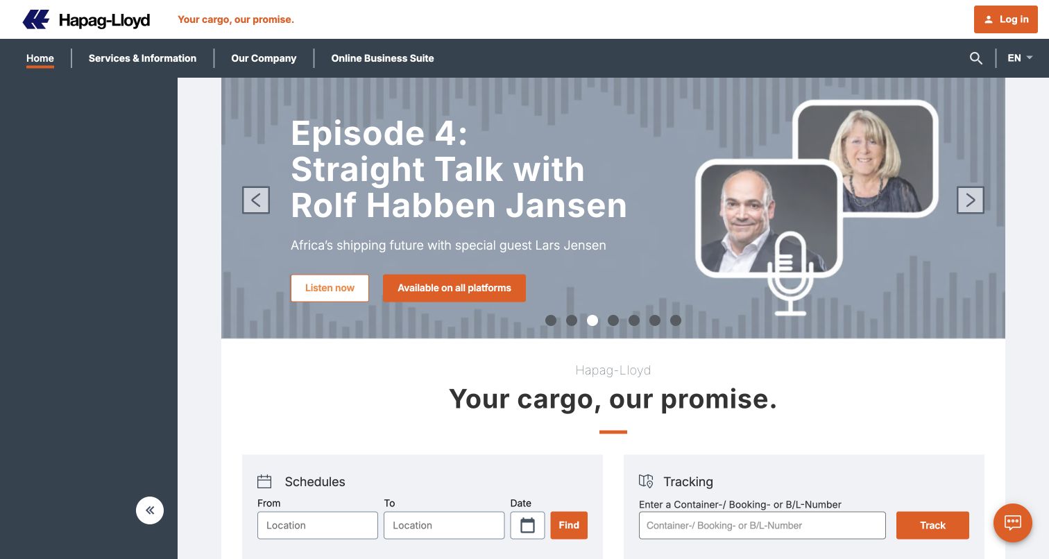
Hapag-Lloyd uses a contained central page with dark blue outer margins and orange action accents. In the captured state, a podcast conversation occupies the lead carousel, complete with speaker portraits and a listening invitation. Directly underneath, schedules and tracking receive their own adjacent panels. The schedule panel asks for origin, destination, and date; the tracking panel names container, booking, and bill-of-lading references. These separate input models keep two different shipping questions understandable even though an editorial campaign leads the page. The online business suite also has a named place in the main navigation.
What you can learn
Give each operational task the fields and explanation it needs instead of forcing everything into one generic search. If an editorial campaign leads, keep the first practical tools close enough to remain part of the same visual sequence.
Pros
The paired forms clearly distinguish planning a movement from checking an existing shipment.
Orange actions provide a consistent emphasis against the restrained blue and white structure.
Cons & considerations
The podcast campaign delays the operational forms for visitors who arrive only to work.
Multiple carousel positions create more promotional material than can be understood from a single view.
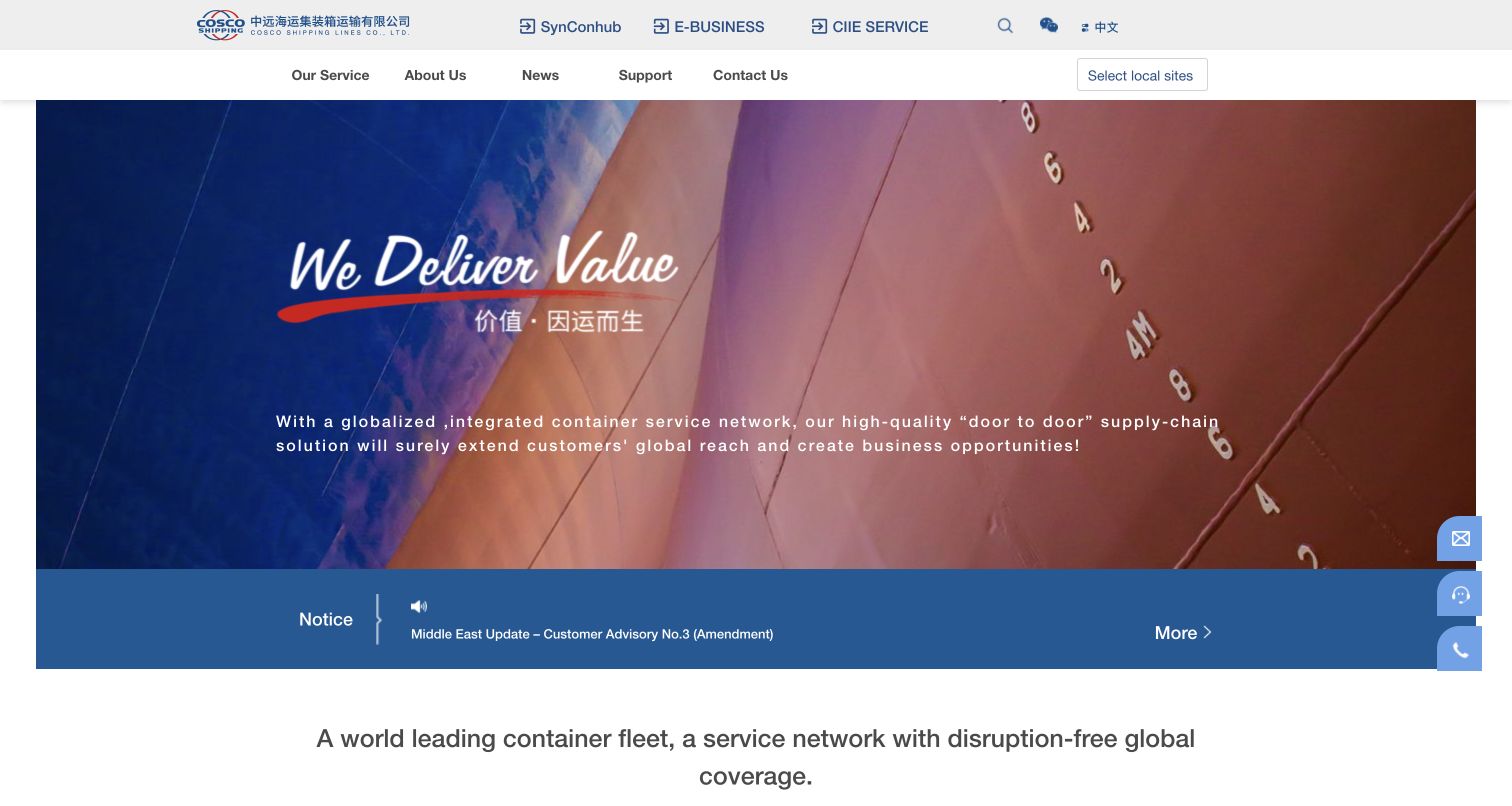
COSCO Shipping Lines presents a large vessel image beneath a two-level header. The upper row names several digital destinations, including SynConhub and E-business, while the lower row carries service, company, news, support, contact, and local-site choices. A blue notice strip immediately below the image separates a customer advisory from the broader brand statement. Fleet and network information then extends the corporate story farther down the public page. The result behaves as a gateway to several systems rather than placing a large tracking form directly over the hero.
What you can learn
When a shipping group operates several public portals, explain their purposes near their names and preserve an unmistakable support route. Give operational advisories their own recognizable band so they are not mistaken for another marketing slide.
Pros
The local-site selector acknowledges that shipping information may vary by market or office.
The dedicated notice strip gives a time-sensitive customer message a place outside the main image.
Cons & considerations
Branded portal names ask new customers to understand the system landscape before choosing a destination.
A visitor seeking a single shipment lookup must interpret more navigation than on a form-led homepage.
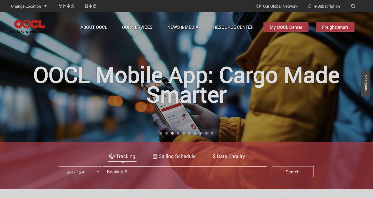
OOCL places its mobile-app campaign in a wide hero and anchors the bottom with a translucent red tool strip. Tracking, Sailing Schedule, and Rate Enquiry are presented as related but distinct tasks. In the captured tracking state, a booking-reference selector sits beside a long entry field and a clear Search action. The upper navigation separates company and resource information from the named MyOOCL Center and FreightSmart destinations. Location and language options occupy another compact utility row. The page makes a digital-product promotion the main story while preserving an immediately recognizable operational entry beneath it.
What you can learn
Treat campaign space and shipment tools as independent modules. A stable task strip can survive changes to an app or service promotion, provided its labels explain the required identifier and the destination of each action.
Pros
The red operational strip stands out clearly from the photographic application campaign.
Tracking, sailing schedules, and rate enquiries remain grouped by the customer's practical intent.
Cons & considerations
The many carousel positions distribute promotional material across states a visitor may never see.
Several separate digital brands in the header require additional explanation for first-time customers.
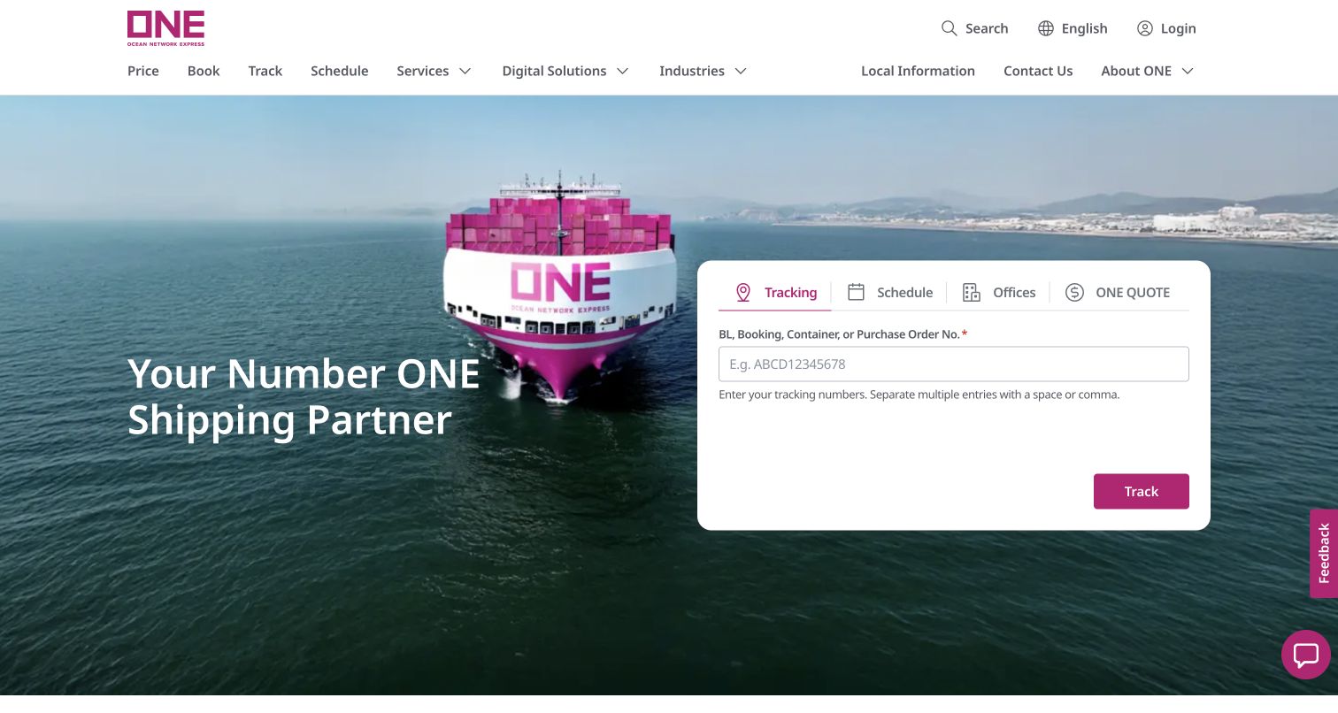
Ocean Network Express puts a substantial white task card on the right of a magenta vessel image. Tracking, Schedule, Offices, and ONE QUOTE occupy the same tab row, giving both shipment work and commercial enquiries a visible starting point. The tracking text specifies accepted references and explains that multiple entries can be separated with spaces or commas. That small instruction is especially useful for a shipping audience likely to work with several records. Across the top, Price, Book, Track, and Schedule appear before the broader services, industries, and company categories.
What you can learn
State the supported identifiers and multi-entry format before a customer submits anything. Pair that operational detail with predictable task names so a visually distinctive brand does not make the working interface harder to understand.
Pros
The tracking guidance reduces ambiguity about both reference type and how to enter several values.
Offices has equal visibility with the digital tools, supporting a local human-service route.
Cons & considerations
The large white card leaves substantial unused space relative to the compact entry control.
Abbreviations such as BL still assume some familiarity with shipping documents.
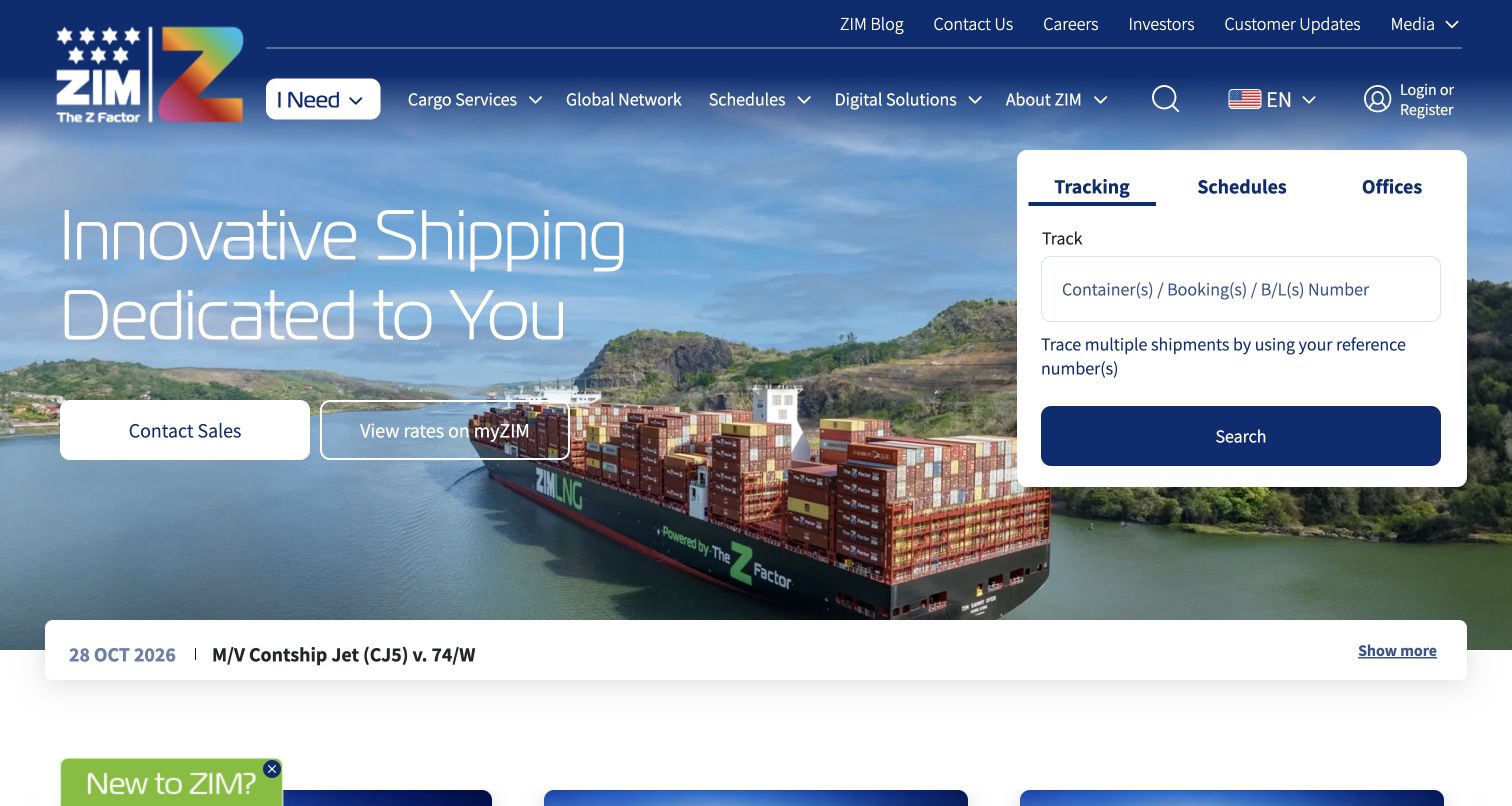
ZIM combines a container-ship photograph with two distinct commercial choices: Contact Sales and a rates route through myZIM. A separate white card offers Tracking, Schedules, and Offices, keeping existing shipment tasks visible alongside those acquisition actions. The tracking explanation names the shipment references it accepts, while a dated advisory strip sits beneath the hero. The header includes an intent-led I Need option as well as cargo, network, schedule, digital, and corporate categories. It is a busy first screen, but the page gives different customer stages recognizable starting points.
What you can learn
Distinguish a conversation with sales from a self-service rate action, and keep existing-customer tools equally prominent. Operational notices should retain their own date and scope instead of becoming indistinguishable from the main campaign.
Pros
Separate sales and rate buttons make two commercial routes visible without requiring account assumptions.
The dated notice below the hero provides a clear place for a specific customer update.
Cons & considerations
The large number of header categories makes the first navigational scan relatively demanding.
The additional welcome bubble competes with the main calls to action near the edge of the view.
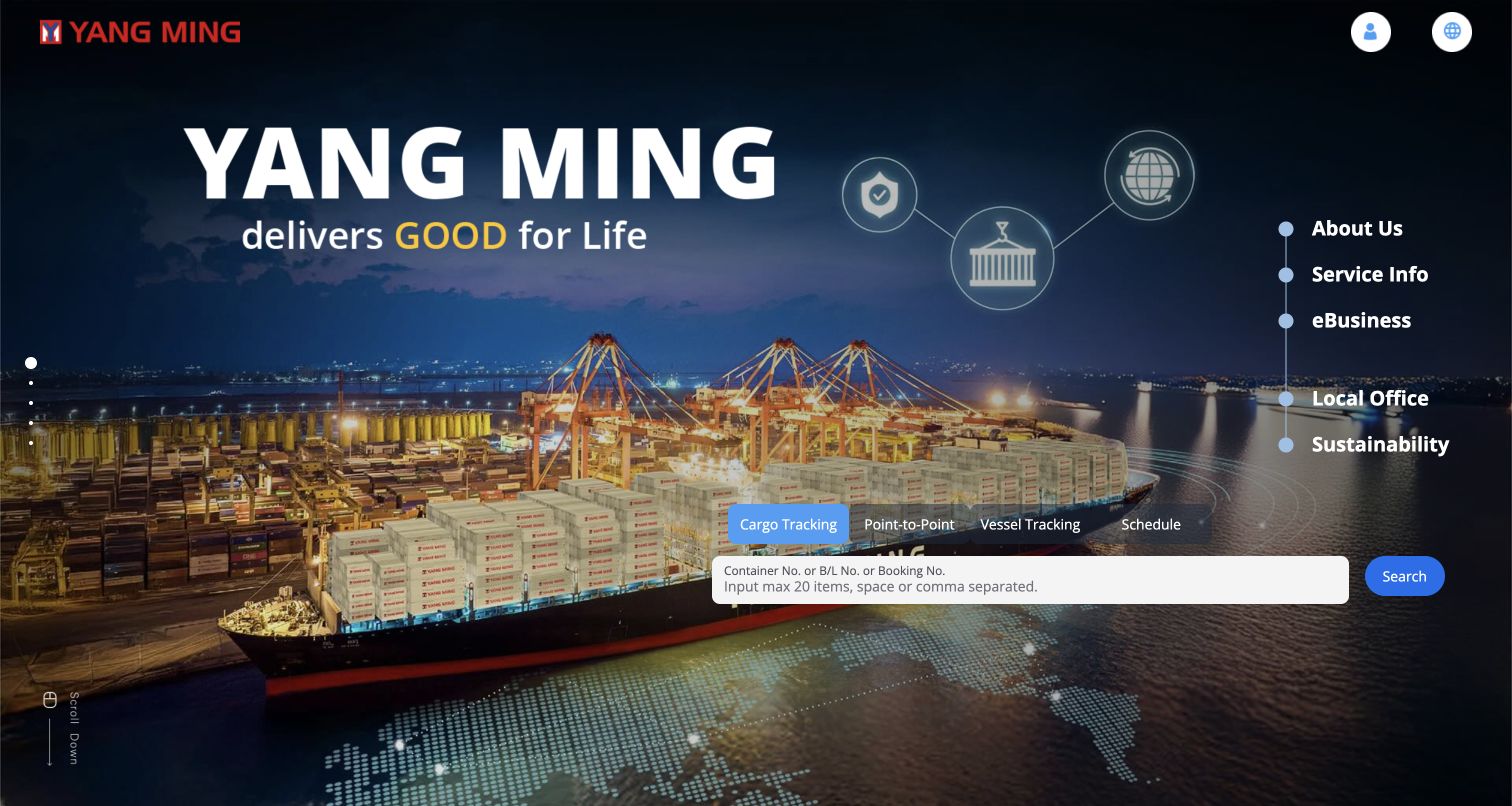
Yang Ming uses a night-port photograph and a large brand statement across the main screen. A vertical service rail on the right lists company, service, e-business, local office, and sustainability destinations. The operational panel sits lower on that same side and separates Cargo Tracking, Point-to-Point, Vessel Tracking, and Schedule. Its reference entry explains a maximum of twenty values and gives space or comma separation guidance. The combination makes the page visually different from the common horizontal-menu template while still exposing specific tools and limits rather than leaving customers to guess.
What you can learn
If the navigation layout is unusual, make its labels particularly concrete and keep important tool instructions close to the input. Explicit batch limits help users prepare a workable request before encountering a validation error.
Pros
The tracking field explains both the number of supported entries and their separator format.
Local Office remains a named navigation choice beside the digital service destinations.
Cons & considerations
The vertical arrangement asks visitors to scan in a less familiar direction than a standard header.
The detailed night photograph and large campaign text compete with smaller operational controls.
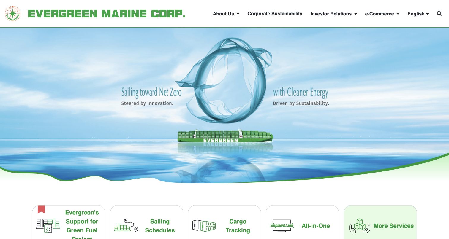
Evergreen Marine leads with a pale illustrated energy campaign, using a small container vessel inside an abstract circular composition. Five rounded cards at the bottom of that area offer Green Fuel Project, Sailing Schedules, Cargo Tracking, ShipmentLink, and More Services. The compact cards bring practical routes into a homepage otherwise oriented toward corporate, sustainability, and investor information. Public text farther down identifies the related Evergreen Line, ShipmentLink, and GreenX destinations, helping explain the group's digital landscape. The captured environmental wording is a campaign statement; the interface alone does not verify its performance claims.
What you can learn
A corporate shipping homepage can remain useful to customers through a small set of explicit service gateways. Explain external portal brands and their roles so visitors understand when a task continues on a different property.
Pros
The five gateway cards put recognizable shipping tasks close to the main corporate message.
The restrained illustration gives the page a different visual rhythm from repeated full-screen vessel photography.
Cons & considerations
The very pale campaign treatment offers less immediate visual emphasis than the stronger navigation labels.
Customers must cross into separately named destinations for several operational journeys.
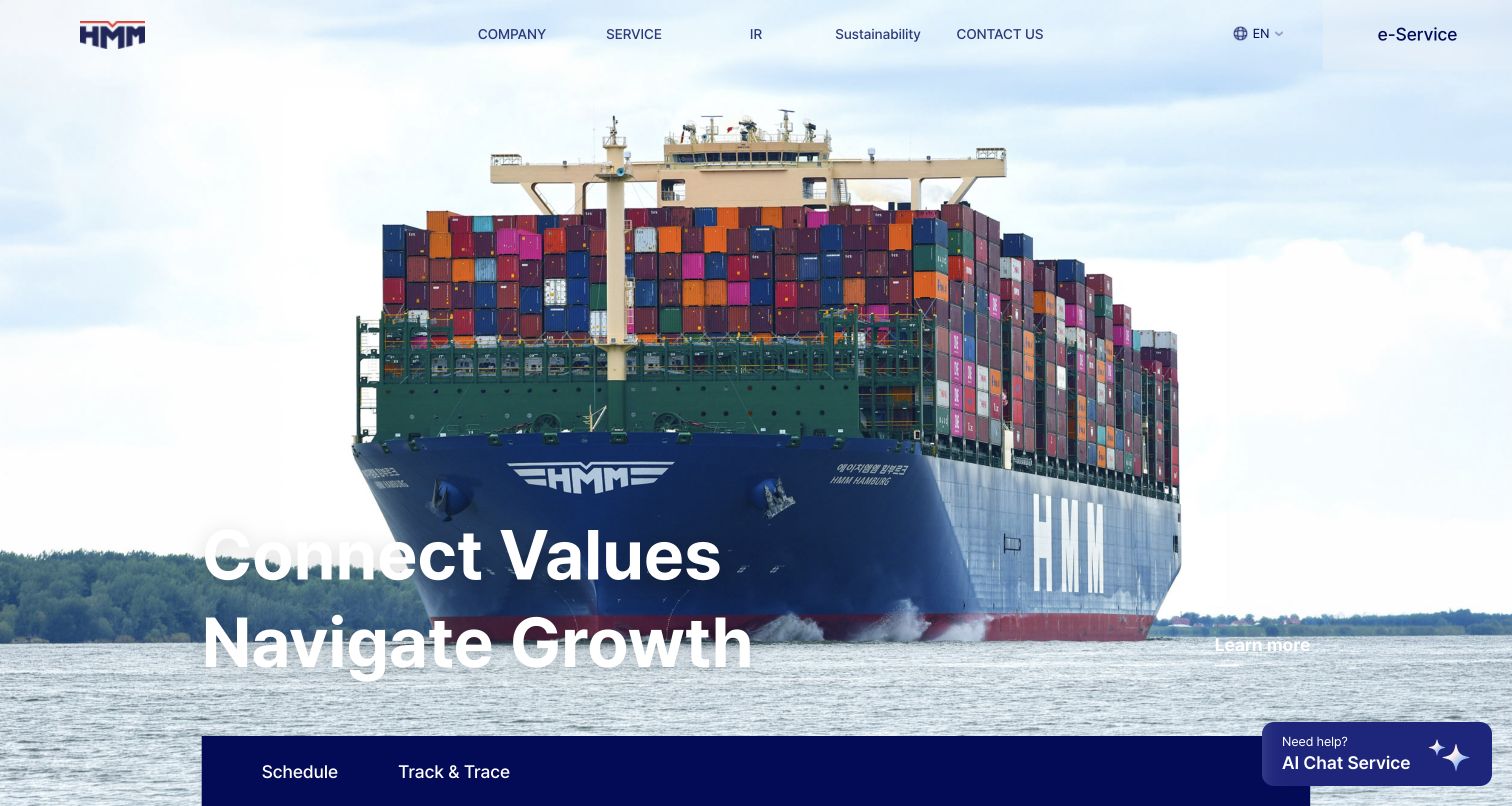
HMM uses a head-on vessel photograph and a large white statement about connection and growth. Company, Service, investor, sustainability, and contact categories form the main header, with e-Service at the far edge. The public page below the opening image exposes a much more detailed schedule model: origin and destination, service-location choices, departure date, duration, connection preferences, and results-format options. That depth is useful evidence of the information the interface expects from a route planner, even though no search was submitted during this review. The design shifts from a broad brand opening to a specialized working tool.
What you can learn
Match the schedule interface to the decisions customers actually make, but introduce abbreviations and advanced filters progressively. The detail is valuable only when someone can find the tool and understand what each option changes.
Pros
The schedule structure distinguishes dates, duration, connections, and presentation preferences rather than collapsing them together.
The e-Service destination remains identifiable in the otherwise corporate navigation.
Cons & considerations
The oversized opening image places much of the operational detail below the initial screen.
Specialist abbreviations and routing choices need explanatory help for less experienced shippers.
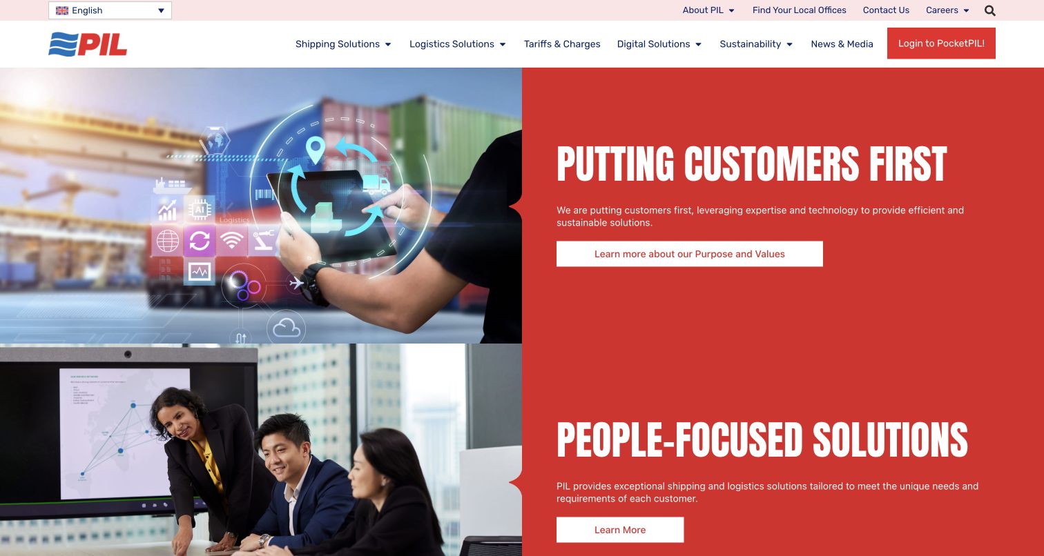
Pacific International Lines uses two substantial red-and-white feature panels to introduce its customer and people themes. Each pairs a photograph on the left with a concise heading, supporting statement, and Learn More action on the right. The navigation does more practical work than the broad campaign copy: Shipping Solutions, Logistics, Tariffs and Charges, and Digital sit together, while local offices, contact information, and the PocketPIL login remain visible above or beside them. This gives the page a relationship-oriented tone while preserving routes to commercial and operational information.
What you can learn
Use people and service stories to explain the company's approach, then counterbalance them with specific navigation for charges, contacts, and digital tasks. Repeated broad campaign buttons should not become the only route through the first screen.
Pros
Tariffs and Charges is named plainly in the main navigation rather than hidden under a general information label.
The paired image-and-copy panels make each campaign segment visually easy to distinguish.
Cons & considerations
The two large panels devote considerable space to general values before showing detailed shipping tools.
Repeated Learn More buttons communicate less destination detail than the specific service labels in the header.
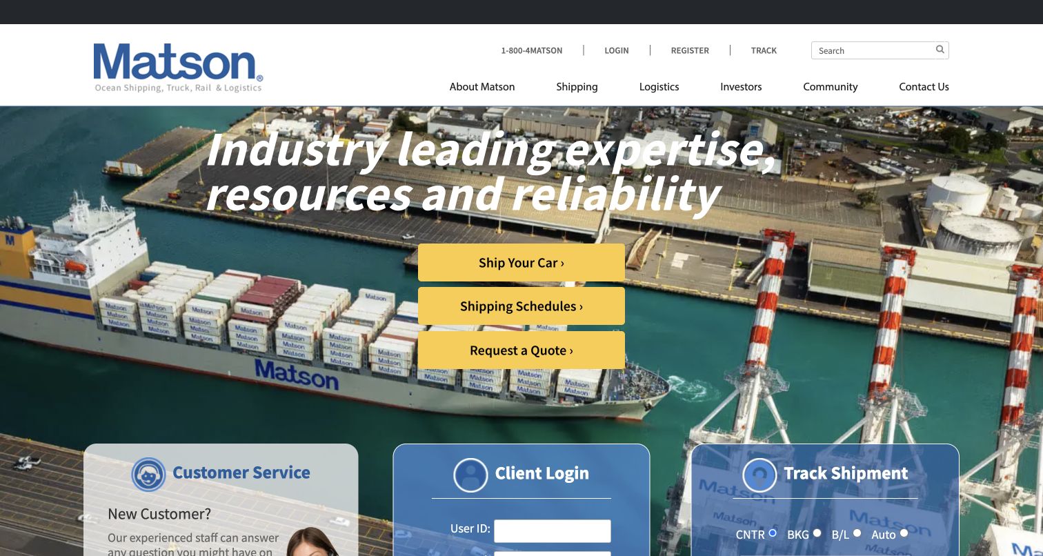
Matson places three prominent yellow actions in the middle of moving maritime imagery: Ship Your Car, Shipping Schedules, and Request a Quote. The first choice identifies a particular customer need that can otherwise get lost in a general freight website. Three translucent cards below introduce Customer Service, Client Login, and Track Shipment, keeping new customers, established accounts, and shipment checking distinct. The recorded public tracking controls distinguish container, booking, bill-of-lading, and auto references. A separate Pacific Expertise section names the carrier's regional story, giving the operational interface a clearer geographic frame.
What you can learn
Make a distinctive service audience explicit in the main calls to action. Separate assistance, authentication, and public tracking so someone moving a vehicle does not need to interpret the same starting point as an established commercial account.
Pros
The yellow action stack is easy to identify against the vessel and port imagery.
Customer service, account access, and tracking each receive a separately titled card.
Cons & considerations
The translucent lower panels share space with busy imagery and continue beyond the first viewport.
Short tracking abbreviations provide limited explanation for customers unfamiliar with freight references.
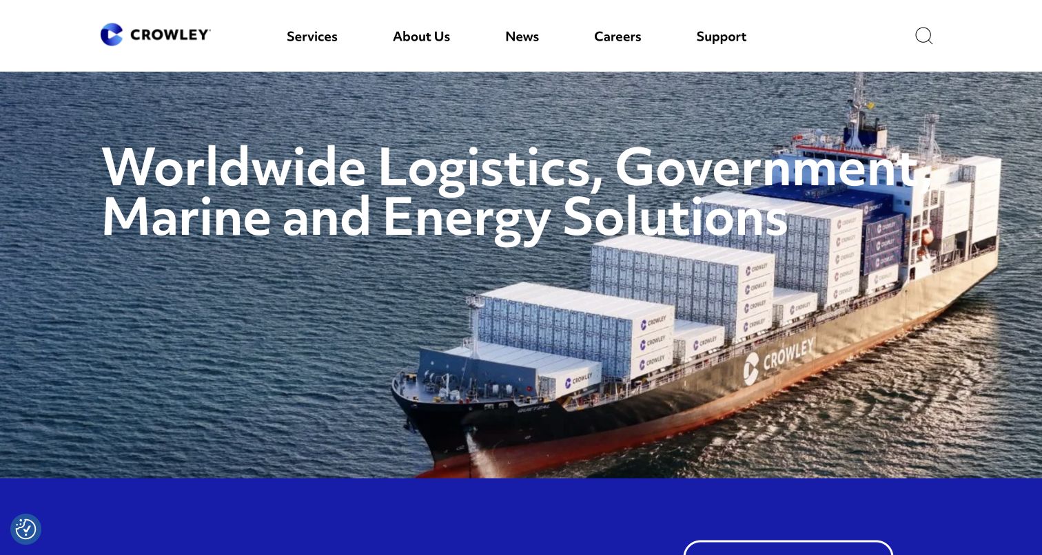
Crowley's first screen places a wide statement about logistics, government, marine, and energy solutions over a vessel at sea. The compact header limits its main choices to Services, About, News, Careers, Support, and Search. This communicates the breadth of the company before asking visitors to choose a particular cargo task. The recorded content below organizes the portfolio into shipping and logistics, energy, and government areas, along with people and community material. The homepage therefore functions primarily as a group introduction, with practical routing dependent on the service and support navigation.
What you can learn
A diversified maritime group needs an early explanation of its different audiences and services. Follow a broad portfolio statement quickly with concrete categories and preserve a clear customer-support route for people who arrive with an existing shipment problem.
Pros
The brief header avoids overwhelming visitors with a separate link for every business division.
The main statement makes the company's wider marine and government scope visible immediately.
Cons & considerations
The opening screen offers less direct shipment action than the form-led carrier examples.
A broad portfolio headline does not tell a new shipper which division handles a particular movement.
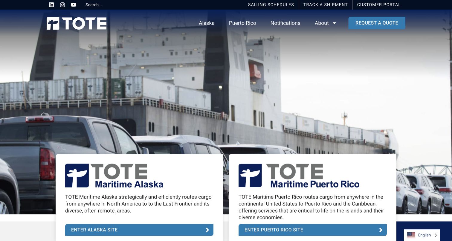
TOTE Maritime makes Alaska and Puerto Rico the two major choices beneath its moving vessel imagery. Each white gateway card includes the regional name, a short description, and a matching entry link. The header reinforces this geographic structure while keeping Schedules, Track Shipment, and Customer Portal in a separate utility row. Public content also names cargo categories such as dry, refrigerated, oversized, and personal vehicles. This establishes the difference between choosing the correct operating region and choosing what will be shipped, a useful distinction for a business that serves two clearly separated markets.
What you can learn
When regions have different operating sites, make the geography explicit before sending visitors onward. Keep common task links available as well, and explain whether a customer is entering a regional information site or an authenticated service.
Pros
The Alaska and Puerto Rico cards make the regional decision visible without relying on a map.
Schedules and tracking remain named utilities above the broader corporate and service navigation.
Cons & considerations
The regional gateway adds another decision before visitors reach some detailed service information.
The large moving image uses substantial space before the regional descriptions are fully visible.
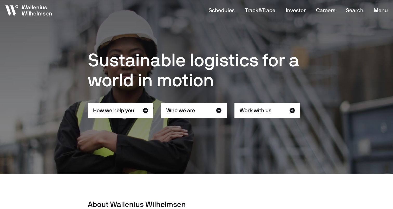
Wallenius Wilhelmsen opens with a worker in protective equipment rather than a distant vessel. Three white actions ask how the company can help, who it is, and whether the visitor wants to work there. Schedules and Track and Trace remain separate links in the upper navigation alongside investor and career information. This arrangement acknowledges that a corporate shipping homepage serves several audiences, while keeping two frequent cargo tasks outside the main menu. Public content below describes vehicle logistics and roll-on/roll-off services and provides additional schedule, tracking, rate-request, and contact routes.
What you can learn
Use an audience-level opening when the corporate site genuinely serves different groups, but exempt high-frequency cargo tasks from that extra choice. Human photography can support a service story without replacing the need for clear operating categories.
Pros
The three main actions distinguish assistance, company discovery, and recruitment in plain language.
Schedule and tracking links remain visible without opening the fuller service menu.
Cons & considerations
The broad help action still requires another step before a shipper reaches a specific service.
The detailed offering is less apparent in the first screen than the company and employment routes.
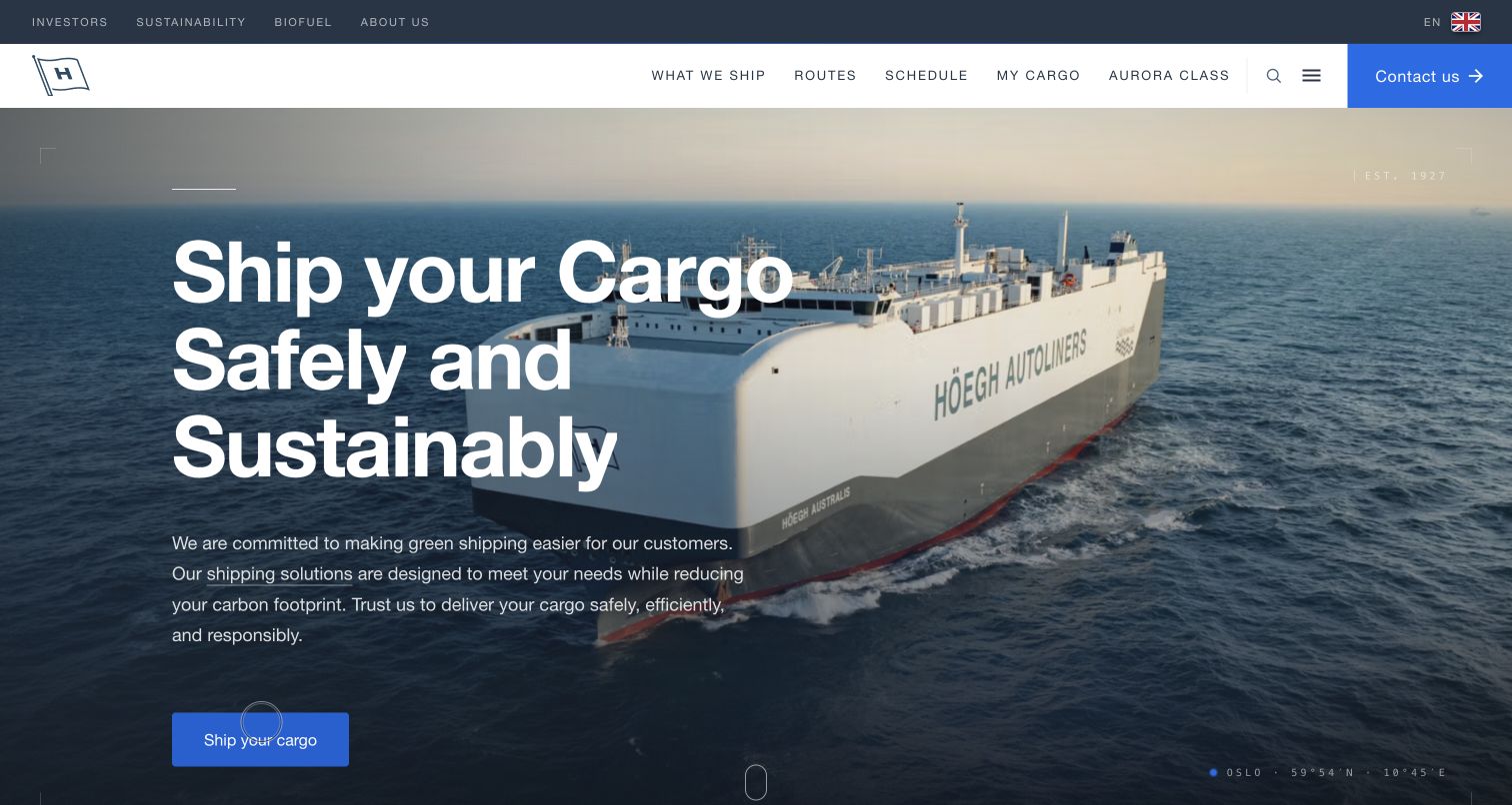
Höegh Autoliners pairs a ship-at-sea image with direct navigation for What We Ship, Routes, Schedule, and My Cargo. A prominent shipping action and a separate contact button make enquiry routes easy to identify. Farther down, the page explains a four-stage journey: check the schedule, send a freight enquiry, receive booking confirmation from the customer-service team, and track the cargo. That sequence is more informative than implying that every shipping request becomes an instant online booking. The recorded tracking description also distinguishes booking, bill-of-lading, and vehicle identification references.
What you can learn
Explain the real operating process, including human confirmation, before asking for an enquiry. Customers need to know whether a button starts a quote, requests space, confirms a booking, or merely opens shipment information.
Pros
Cargo types and routes are visible primary choices rather than buried inside company information.
The four-stage explanation sets expectations for the role of the customer-service team.
Cons & considerations
The large hero makes the more instructive process explanation a later-page discovery.
The broad safety and sustainability wording needs supporting evidence beyond the promotional first screen.
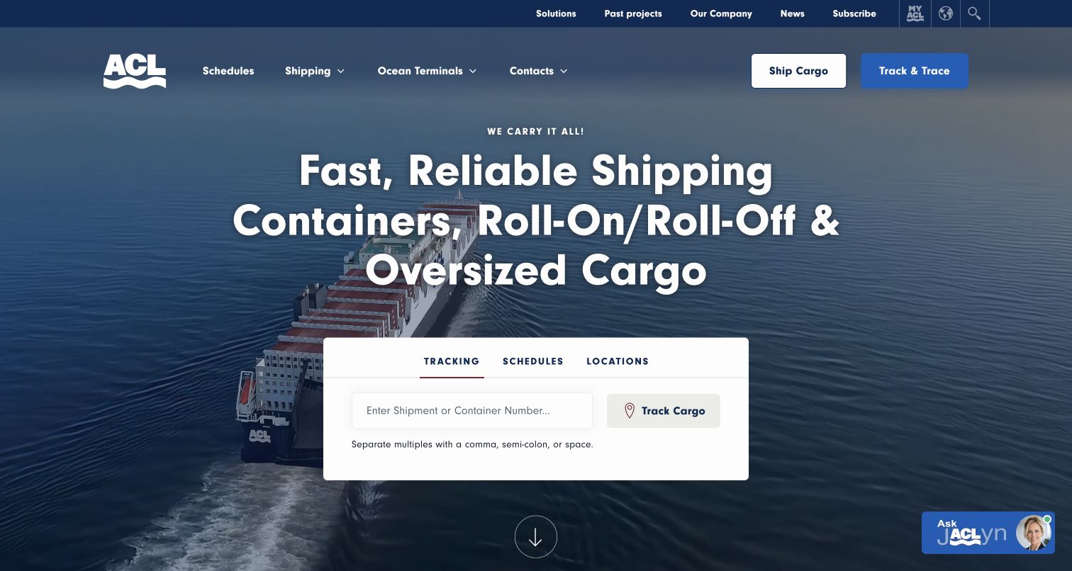
Atlantic Container Line names containers, roll-on/roll-off, and oversized cargo in a large central headline. A compact white panel beneath it provides Tracking, Schedules, and Locations against the vessel photograph. The tracking entry explains how several shipment or container references can be separated, helping the user prepare the input before searching. Two header rows distinguish company and account information from schedules, shipping, terminals, contacts, and cargo actions. The page gives a useful answer to both a new visitor asking what the company moves and an existing customer looking for an operational tool.
What you can learn
State the cargo specialisms plainly and put a working task entry nearby. For a carrier with varied cargo types, broad maritime photography becomes more useful when supported by exact categories and clear reference-entry guidance.
Pros
The main heading identifies three concrete cargo categories instead of relying on a general logistics promise.
The tracking panel explains multiple-reference separators directly beside the input.
Cons & considerations
The two navigation rows create a fairly dense set of choices above the hero.
Tracking and shipping actions appear in several places, requiring consistent wording to avoid ambiguity.
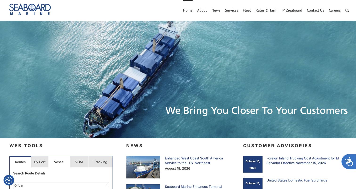
Seaboard Marine leads with an aerial vessel image and a short customer-oriented statement, then divides the next band into Web Tools, News, and Customer Advisories. That distinction gives operational information a separate identity from general company reporting. The tool area exposes several views, including route, port, vessel, verified-gross-mass, and tracking choices. Main navigation also names rates and tariffs directly, alongside the fleet and customer portal. The first screen remains image-heavy, but the content immediately below it has a strong operational structure for a regional shipping audience.
What you can learn
Keep customer advisories separate from ordinary news, and give them clear dates and affected-service context. Group practical tools by the question being answered so a schedule search does not compete with unrelated company content.
Pros
The three-column arrangement distinguishes tools, news, and advisories without requiring separate landing pages first.
Rates and Tariff are explicit navigation choices for customers researching shipping costs and conditions.
Cons & considerations
The substantial vessel image pushes much of the useful three-column section below the initial view.
Technical labels such as VGM need expansion or help for less experienced shipping customers.
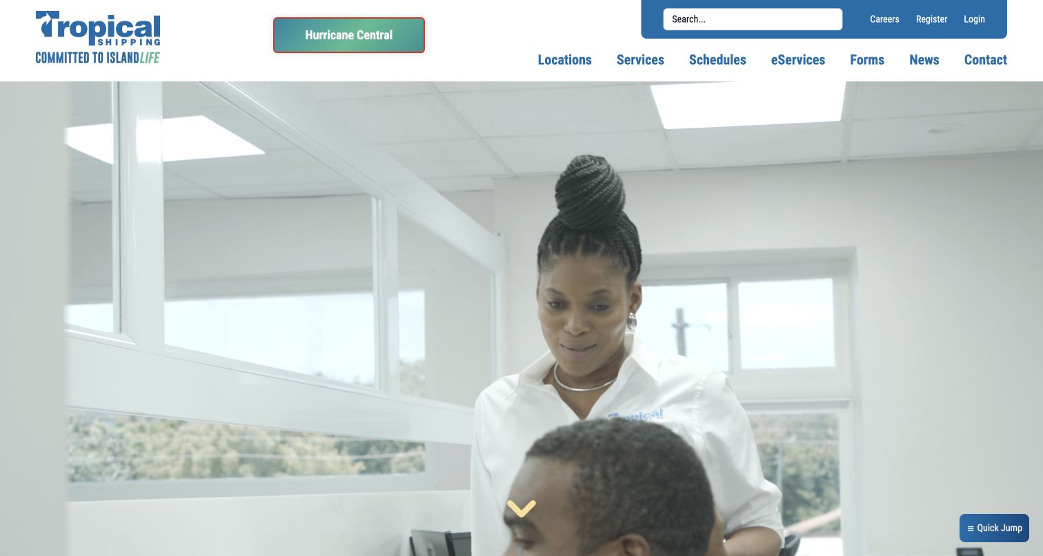
Tropical Shipping places Hurricane Central prominently beside its logo and island-service identity. The main navigation names Locations, Services, Schedules, eServices, Forms, News, and Contact, while registration and login sit in a smaller upper band. The captured hero frame shows staff in an office and includes a downward cue, giving the site a people-focused introduction. The recorded page below promotes small-package and less-than-container-load shipping, a booking and payment portal, and receiving and destination locations. These distinctions are useful for customers whose shipping journey may begin at a collection point rather than at a major container terminal.
What you can learn
Make region-specific disruption information a stable destination, then distinguish receiving locations from shipping destinations. An island-service website should help visitors identify the correct handoff and cargo service before presenting a broad portal invitation.
Pros
Hurricane Central is visually prominent and separated from the general news category.
Forms and locations are named directly in the primary navigation alongside schedules and services.
Cons & considerations
The tall introductory media uses nearly the full first screen without showing an operational form.
The eServices label is less descriptive than naming the individual booking, payment, or tracking task.
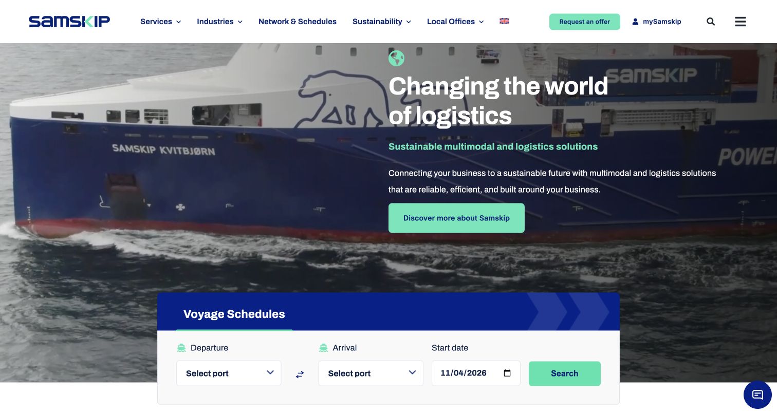
Samskip combines moving vessel imagery with a short explanation of its multimodal offering. A blue-and-white Voyage Schedules panel overlaps the lower edge of the hero and presents departure port, arrival port, and start date in one row. The header separately highlights Request an Offer and mySamskip, distinguishing a commercial enquiry from an existing customer portal. Services, Industries, Network and Schedules, and Local Offices provide another layer of route and audience information. The specific port choices in the recorded form make the network tangible without relying on the general sustainability message above it.
What you can learn
Pair a broad multimodal proposition with a small, concrete planning tool. Keep an offer request distinct from portal access, and explain whether the visible schedule represents only the sea leg or a wider door-to-door service.
Pros
Departure, arrival, and date are grouped in a straightforward schedule form below the introductory copy.
The local-office route and offer button provide alternatives to signing into the customer portal.
Cons & considerations
The large moving background competes visually with the relatively compact schedule entry.
A voyage search alone does not explain which inland connections are included in the wider service proposition.
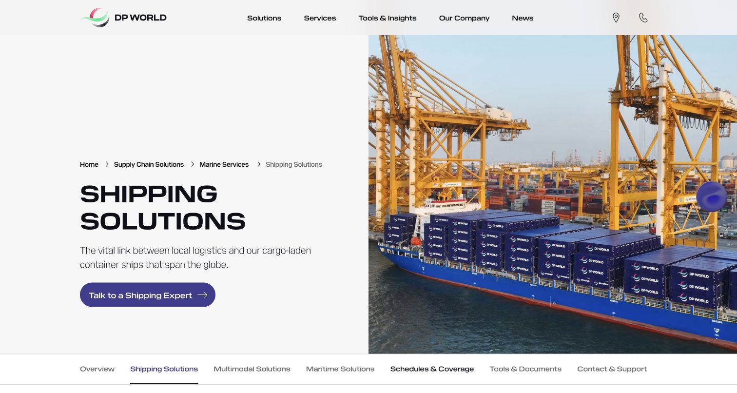
DP World's Shipping Solutions page uses a clear split layout: the service name, a short explanation, and an expert-contact action on the left, with container-terminal photography on the right. Breadcrumbs locate shipping inside the broader supply-chain and marine-services structure. A horizontal section menu then offers schedules and coverage, tools and documents, and contact and support alongside related marine services. This is a service-detail page rather than a corporate homepage; the former Unifeeder address redirected here during research. The layout therefore provides a useful example of keeping shipping context visible inside a much wider logistics brand.
What you can learn
Give an acquired or integrated shipping service a precise destination, not just the parent company's homepage. Preserve recognizable routes to schedules, documents, and support, and make the relationship to the wider service catalogue understandable.
Pros
The split hero makes the service description readable without placing it over the detailed port photograph.
The section navigation exposes practical shipping resources immediately beneath the introduction.
Cons & considerations
The leading action emphasizes contacting an expert rather than a direct public shipment lookup.
Visitors following an older brand address must reorient themselves within the parent company's navigation.
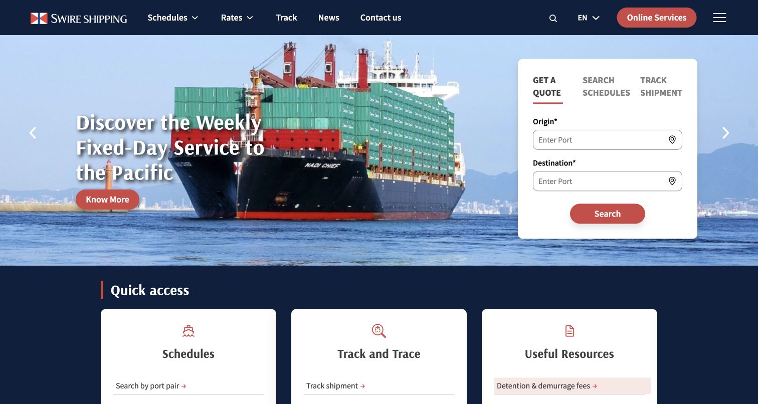
Swire Shipping promotes a weekly Pacific service beside a white operational card. Get a Quote, Search Schedules, and Track Shipment are the three task tabs; the captured quote state begins with origin and destination ports. The hero is followed by a Quick Access section with schedules, tracking, and useful resources, including container specifications and detention and demurrage information. This makes the page more than a single search interface: it acknowledges the reference material customers need before or after a shipping enquiry. The upper navigation also keeps rates, news, and contact information visible.
What you can learn
Support the core quote, schedule, and tracking tasks with the documents and fee information people need to interpret them. A route campaign works best when the nearby tool allows customers to investigate their own journey without losing context.
Pros
The white card clearly separates three different operational intentions from the promotional image.
Useful Resources exposes practical supporting information instead of leaving it only in the footer.
Cons & considerations
The generic Search action in the quote panel provides limited detail about what the next step will return.
Several repeated schedule and tracking routes need careful consistency across the header, card, and quick-access area.
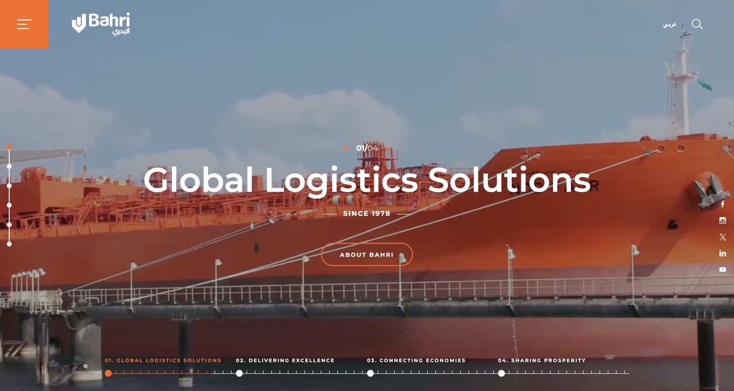
Bahri uses full-screen maritime imagery with a large central statement and a restrained About Bahri action. A four-part campaign indicator stretches along the bottom, while a vertical set of section markers and a compact orange menu control shape the navigation. The recorded content below divides the business into oil, integrated logistics, chemicals, dry bulk, ship management, and marine units. Investor information, reports, and careers follow as separate sections. This is a corporate storytelling approach suited to a varied marine group, with the detailed operating distinctions becoming clearer after the opening campaign.
What you can learn
A diversified shipping group should identify its business units in language that reflects cargo and service differences. If an immersive opening is used, provide clear navigation to those units and do not expect a general brand statement to answer a shipment-specific question.
Pros
The business-unit names distinguish several substantially different maritime services in the public content.
The restrained orange accents give the menu and campaign controls a consistent visual identity.
Cons & considerations
The full-screen opening supplies little immediate route, quote, or shipment information.
Section markers and a collapsed menu provide less descriptive guidance than visible text navigation.
Plan the shipping website around a complete cargo journey
Define the customer situations and expected outcomes
Map a new commercial shipper, a customer moving a vehicle, an existing account checking several containers, and someone responding to a disruption notice. Record what each person knows on arrival and what information they need next. Distinguish a useful route result from a binding booking or confirmed rate. Give each journey an owner and identify the point where the public website hands responsibility to a portal or service team.
Model ports, routes, cargo types, and references consistently
Establish clear names for origin and destination locations, service regions, cargo categories, and supported shipment identifiers. Explain abbreviations where they first appear, including the distinction between booking, bill-of-lading, container, and vehicle references. Specify whether a tool accepts one or several values and how they should be separated. Plan empty results, ambiguous port names, unsupported cargo, and invalid-reference messages before designing only the successful search state.
Design portal transitions and enquiry expectations
Inventory every public tool, customer portal, regional site, and document library. Describe the purpose of each branded destination and keep support links available around the handoff. Explain whether an enquiry receives an automated estimate, a staff response, or an actual booking confirmation. Use approved nonproduction services and test accounts for transactional QA; do not submit real cargo enquiries, bookings, or customer references while checking the design.
Assign owners to changing service information
Give schedules, advisories, local contacts, fees, cargo specifications, and downloadable documents named content owners and review dates. Define how corrections propagate to related pages and regional destinations. Test the first screen with several advisories and a visible consent interface. Keep a useful static explanation when a live schedule or tracking integration is unavailable, and provide a contact route that identifies the correct service area.
The editing job behind the design
Choose tools that support dependable shipping information
Start with structured content for cargo services, regions, ports, advisories, documents, and contacts. A content system should support dated revisions, responsible owners, translations, and reusable service links. Treat public content publishing as a separate responsibility from customer-account and shipment-data access. Keep route and advisory information understandable when maps, video, or interactive search components do not load, and provide an accessible text alternative to visual network diagrams.
Integrations should have a clear purpose and an honest unavailable state. Document the systems that own schedules, rates, booking status, and tracking events rather than duplicating uncertain data in the marketing site. Avoid collecting shipment references or account details in general analytics. Public source observations may identify some scripts, fonts, delivery services, or content tooling, but they do not prove a complete logistics architecture. Preserve evidence dates and distinguish a public website component from a private operating system.
Our WordPress website examples offer a separate look at publishing approaches. A visible platform label is evidence for that named page, not a guarantee that the same system will suit your requirements.
Before the public launch
Shipping website launch checklist
State the cargo types, service regions, and ocean or inland scope in public service descriptions.
Give schedule search, quote request, booking, and tracking distinct labels and expected outcomes.
Explain accepted shipment identifiers, reference limits, and separators beside each entry field.
Distinguish origin, receiving point, destination, and local-office choices where they differ.
Make customer advisories separate from news and include affected-service and date context.
Explain named portals and regional handoffs before customers leave the public site.
Keep fees, specifications, forms, and documents discoverable with responsible owners and review dates.
Test keyboard access, focus order, input labels, contrast, motion preferences, and clear validation messages.
Check mobile layouts with long port names, multiple notices, consent controls, and unavailable integrations.
Verify enquiry and booking journeys only with approved test data and nonproduction transaction systems.
These checks are a project checklist, not a performance, legal, security, or accessibility certification. Test real journeys with the people responsible for the website before making claims about the result.
Sources & editorial method
How this collection was selected and reviewed
The collection contains twenty-three distinct official shipping website properties captured directly during the November 4, 2026 evening research session in America/Los_Angeles, which fell on November 5 UTC. Every record retains the actual UTC capture timestamp, source URL, dimensions, and attribution. The DP World example is its shipping service page, reached through the former Unifeeder address; the remaining examples are public home or landing pages. Reviews use the visible desktop presentation and recorded public page text. No real quotes, bookings, tracking references, logins, or enquiry forms were submitted. Security-blocked pages and a persistently unloaded page were excluded. Public technology evidence is handled separately through documented audit attempts.
Each example links to its actual source page. Screenshots are direct browser captures with their own capture dates; moving imagery, announcements and live designs can change. The notes describe observable design choices and conditional tradeoffs, not measured traffic, conversion results, service quality, or accessibility conformance.
Technology labels use public page metadata, asset evidence, or explicitly cited platform documentation. Platform documentation is not a complete current deployment audit. A component reference may be legacy or unused; it is not a complete backend inventory. Unknown stacks are omitted. These sites are editorial examples, not our client portfolio.
Written, Edited and Curated are separate editorial records, not timestamps advanced by a rebuild. Website designs and imagery belong to their owners. See our editorial standards or suggest a correction.
Questions worth asking
Shipping website design questions
What should a shipping website put on its first screen?
Show enough service and geographic context for a new visitor to recognize the offering, then expose the tasks existing customers use most. Those often include schedules, tracking, quotes, and local contacts. A diversified marine group may need an early business-unit choice, while a regional carrier may need a clear geographic gateway. Keep current operational notices readable without allowing campaign content to conceal practical routes.
Should tracking require a customer login?
The appropriate access model depends on the information shown and the operator's requirements. The public interface should clearly explain which references it accepts, what the lookup provides, and when authenticated access is necessary. Keep sensitive account or shipment details within the proper service. A public tracking entry should not promise information that only a separate account portal can return.
How should a quote request differ from booking?
Name the action according to its actual result. An enquiry may start a conversation, a quote may provide a conditional price, and booking may require a separate confirmation of space and terms. Explain what happens next and whether a service team will respond. Do not describe a request as confirmed merely because a form has been submitted.
How can schedules remain understandable across different regions?
Use consistent location names and explain the service leg covered by each result. Keep dates, timezones, connections, and any published limitations close to the schedule information. Provide help for port abbreviations and a useful no-results state. Link to relevant local contacts and advisories so a customer can resolve uncertainty without starting over at the corporate homepage.
What can these website examples establish about a carrier?
They show public interface choices and recorded content at the time of research. They can support observations about navigation, task wording, visual hierarchy, and some publicly evidenced web technologies. They do not establish service reliability, current sailing availability, rate accuracy, environmental performance, private-system security, or the success of a shipment transaction. Evaluate those questions through the appropriate authoritative operational sources.
Build the interface around the shipment decisions customers actually need to make, then support each action with clear scope, maintained information, and a reliable route to the responsible service team.