The best restaurant websites make you curious about dinner without making you work to arrange it.
A first-time visitor may be deciding whether a restaurant suits the occasion. A returning guest may only need opening hours or the booking link. Atmosphere matters, but the core task remains surprisingly practical: understand the food, find the right location and work out how to visit.
This collection compares neighborhood restaurants, destination dining and multi-location brands. Study their photography and typography alongside the less glamorous details: location choice, menu format, reservation handoffs and the way announcements compete with guest tasks.
Before the examples
What makes good restaurant website design in 2026?
Keep the menu and visit information easy to reach
Put menus, hours, the address and booking or walk-in guidance somewhere guests can predict. Use readable menu text where practical, with a downloadable version as an option rather than the only route. Distinguish lunch, dinner and location-specific menus when the differences matter.
Show the kind of experience you offer
A dining-room photograph can communicate an occasion; food details can explain the cooking; team and supplier stories can give the restaurant a point of view. Choose imagery with a job to do. A large film should not be the sole source of essential information or make navigation difficult to read.
Treat booking as a complete journey
Explain whether guests are requesting a reservation, joining a queue or opening a separate booking provider. Make the correct venue explicit for restaurant groups. Test the handoff on mobile and provide an appropriate contact alternative when the booking system cannot answer a question.
The collection · 20 examples
20 restaurant websites worth studying
Compare atmosphere-led introductions with task-first layouts. These are design references, not restaurant rankings, dining reviews or measured assessments of booking performance.
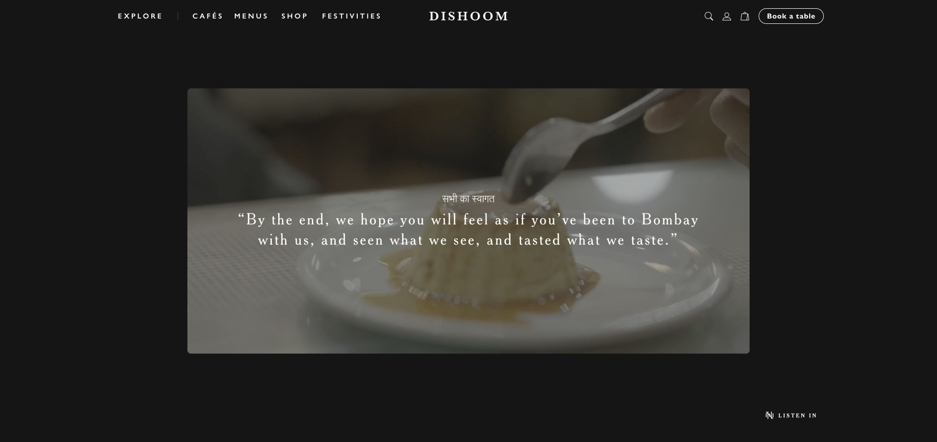
Dishoom frames a wide cooking film inside a dark page rather than making every element float over a full-screen image. The small, widely spaced navigation sits above the film, with the wordmark centered and a separate outlined table-booking control on the right. The opening favors atmosphere and narrative, while cafés and menus remain recognizable destinations in the header. The dark treatment makes the moving food imagery the focal point without requiring a long introductory paragraph.
What you can learn
Give the brand story and repeat-visitor tasks different jobs. A film can make a first visit feel distinctive, but a guest returning for a menu or the right café should not have to watch it. Keep the practical routes stable when a campaign or seasonal story changes.
Pros
The booking control has its own visual boundary beside the quieter editorial navigation.
The framed film creates a deliberate composition rather than an undifferentiated image background.
Cons & considerations
The story-led opening leaves practical location details further down the journey.
Moving footage and overlaid copy require careful loading, readability and reduced-motion consideration.
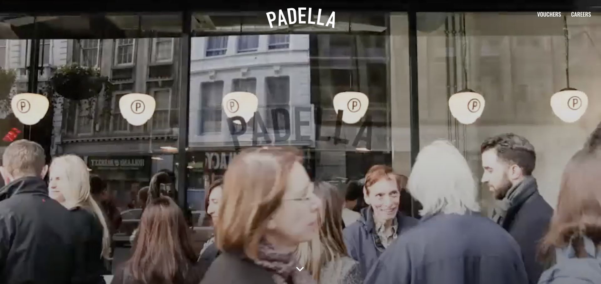
Padella opens with a restaurant-window film and a centered white wordmark. The footage shows the space in use instead of isolating a dish on a studio background. Small voucher and career links sit at the top edge, while the rest of the opening remains almost entirely photographic. Location choices and menu content follow below. A group-booking announcement appeared during the visit and was dismissed before the capture, illustrating another layer competing for a guest’s attention.
What you can learn
Use atmosphere to introduce the restaurant, then offer a decisive location step. For a small group, a visitor should know which venue’s menu and booking rules they are viewing. Do not let secondary recruitment or gifting links become easier to discover than ordinary guest information.
Pros
The footage makes the physical restaurant, rather than generic food styling, the subject.
The restrained wordmark leaves room for a consistent visual identity across locations.
Cons & considerations
Menus and venue choice require moving beyond the captured opening view.
White branding over changing footage needs testing across different frames and smaller screens.
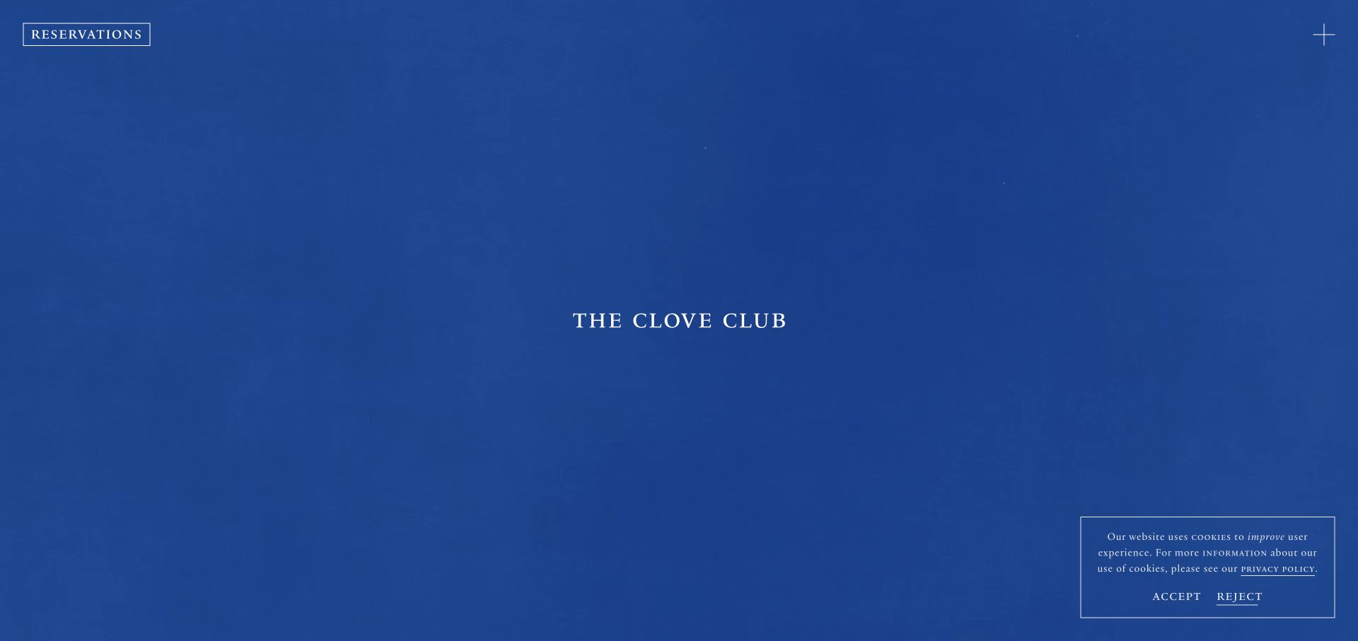
The Clove Club places a small centered wordmark over blue-toned moving imagery, with reservations isolated in the upper-left corner and a minimal menu control opposite. The page offers very little introductory text in the captured view. That restraint creates a calm, almost exhibition-like first impression, but it also assumes that a visitor is willing to explore before learning about the food or location. A cookie panel remained visible during this capture despite an ordinary reject action.
What you can learn
Minimalism works best when the few visible controls have clear purposes. A small restaurant can borrow the separation of booking from exploration without copying the near-total absence of explanatory information. Give an unfamiliar guest enough context to understand what they are about to reserve.
Pros
The reservations action remains outside the central imagery.
A consistent blue field and small wordmark create a coherent, restrained introduction.
Cons & considerations
The opening alone does not explain the restaurant or practical visit details.
The visible cookie panel competes with an already sparse interface and should be tested carefully.
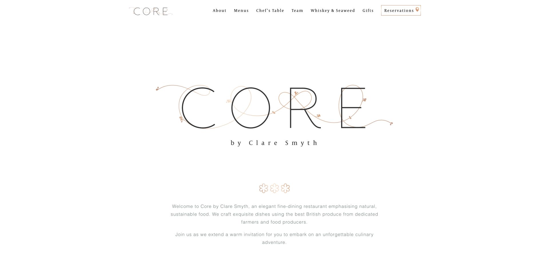
Core uses an unusually light opening: a large fine-line wordmark, generous white space and a short centered introduction. A compact header names menus, the chef’s table, team and other restaurant experiences, with reservations receiving an outlined treatment. The captured view communicates restraint through typography and spacing rather than a collage of dishes. Below the introduction, separate routes to reserve and inspect menus translate the brand presentation into practical guest choices.
What you can learn
A restaurant does not need a full-bleed photograph to feel distinctive. Establish a visual hierarchy with type, spacing and a concise explanation, then give the menu and reservation different routes. The copy should add information about the experience instead of merely repeating the logo’s premium tone.
Pros
Menus and reservations are named directly in the header.
The limited palette and centered composition make the identity easy to recognize.
Cons & considerations
The pale, delicate typography needs attention to readability at small sizes.
Large empty areas defer the first food or room photograph and practical detail.
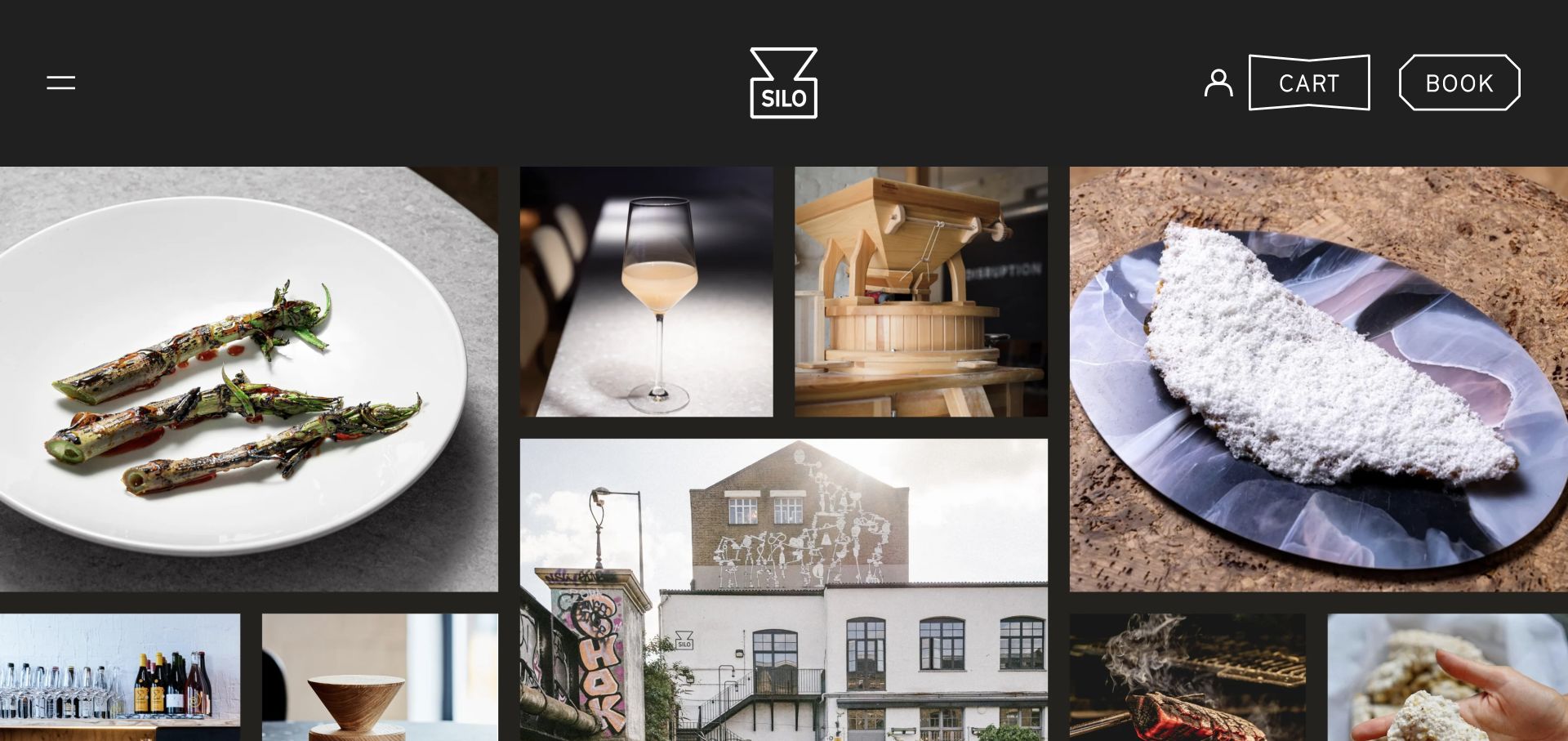
Silo combines photographs of dishes, materials, equipment and the exterior in a tightly spaced collage below a charcoal header. The imagery has different proportions, making the page feel more like an editorial contact sheet than a single hero campaign. A simple line-drawn logo sits in the middle of the header, with account, cart and booking controls toward the right. The storefront elements make it clear that the site has more than a reservation function.
What you can learn
Give multiple images complementary roles: food, process and place can explain different parts of a restaurant’s identity. Keep the practical booking route separate from that visual browsing. If the site also sells products, label shopping and restaurant tasks so guests do not confuse the cart with a table request.
Pros
The collage communicates a wider range of material and process detail than a single dish shot.
The booking control is visibly separated from the account and cart controls.
Cons & considerations
A picture-led opening gives little immediate textual explanation of the restaurant.
Numerous large images need a loading strategy and meaningful alternatives where they carry information.
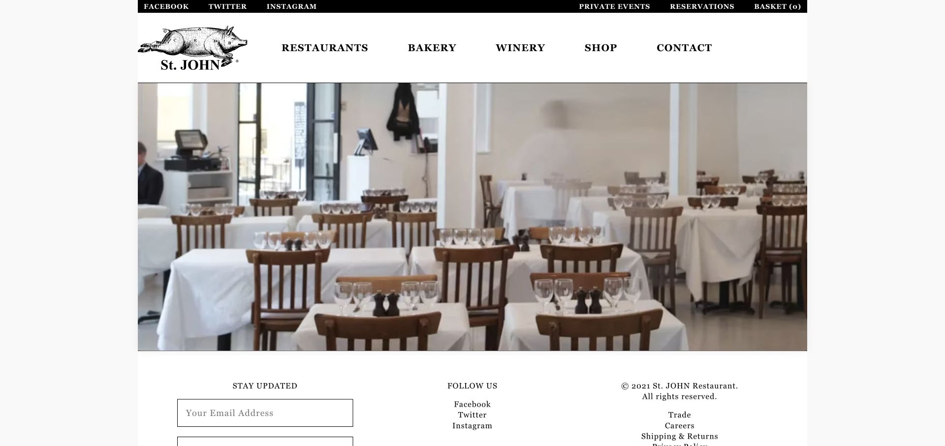
St. JOHN uses its illustrated pig mark, heavy serif capitals and a simple white page to frame a large dining-room photograph. The black utility strip separates reservations, private events and the basket from the main restaurant, bakery and winery navigation. The captured homepage is short enough that newsletter and contact-oriented footer material follows immediately after the main image. It is a useful counterpoint to restaurant sites that add many promotional sections before providing an address.
What you can learn
Keep a recognizable identity consistent across the practical interface. A restaurant with bakery, wine and shop operations can use plain labels to distinguish them instead of inventing a different visual experience for each. A short homepage can work when the primary navigation does the organizational work.
Pros
The illustrated mark and typography give a simple layout a very specific identity.
Restaurant and retail categories are distinct from utility actions such as reservations and the basket.
Cons & considerations
The dense uppercase header needs careful adaptation as available width decreases.
The main photograph provides atmosphere but little immediate menu or location explanation.
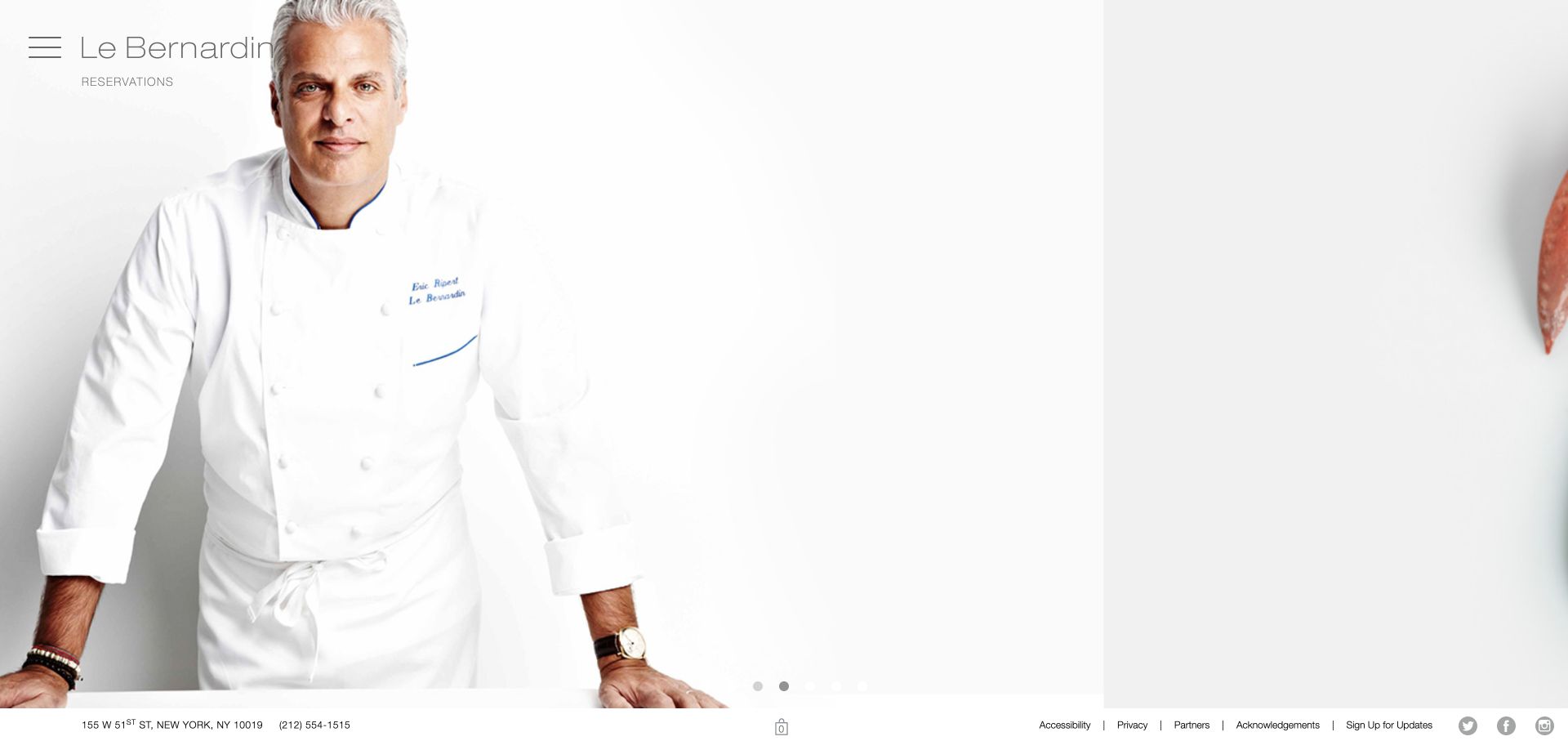
Le Bernardin devotes most of the viewport to a sequence of food and portrait photographs. Its thin wordmark, menu icon and reservations link occupy the upper-left corner, while an address and phone number stay in a narrow lower strip. Small slide dots make the changing image set visible as a sequence. The captured page is deliberately sparse: the photographs carry the impression, and most explanatory content sits behind navigation rather than beside the opening image.
What you can learn
If imagery dominates the homepage, preserve a stable practical layer. Address, phone and booking should not move around with each slide. A smaller venue can borrow that separation without reproducing a large carousel; one strong image may make the same hierarchy easier to maintain.
Pros
Address and telephone details remain available outside the image composition.
The photography gets space without a large marketing paragraph covering the food.
Cons & considerations
Thin controls over light imagery can be difficult to distinguish and need frame-by-frame checks.
The image sequence adds loading and interaction work before a visitor reaches detailed information.
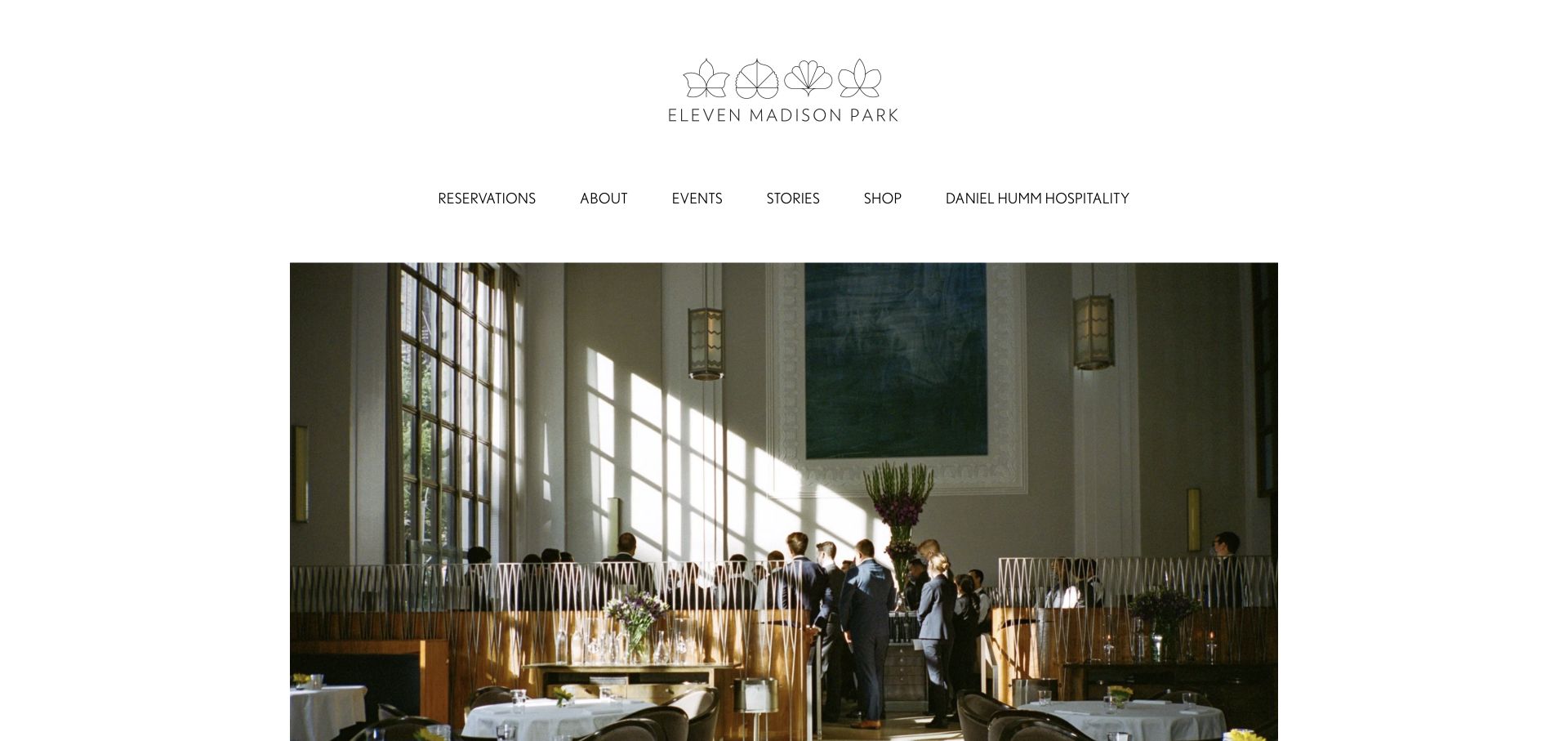
Eleven Madison Park centers a delicate illustrated wordmark above a horizontal navigation row, then introduces large editorial photography inside generous white margins. Reservations is the first named destination rather than a hidden submenu item. Events, stories and the shop sit alongside it, communicating the broader hospitality activity. The image area changes between kitchen, ingredients and people. A promotional overlay appeared on the initial visit; the reference capture was refreshed without that obstruction.
What you can learn
Use a recognizable editorial frame to accommodate changing stories without moving the guest tasks. A restaurant with events and retail can give them explicit destinations while keeping reservations predictable. Promotional announcements should remain easy to dismiss and should not become the only route to ordinary booking.
Pros
Reservations is plainly named within a compact set of destinations.
White margins give changing photographs a consistent frame.
Cons & considerations
The tall brand and navigation area postpones practical detail below the first photograph.
Stories, retail and promotional overlays can compete with a visitor who only wants to arrange dinner.
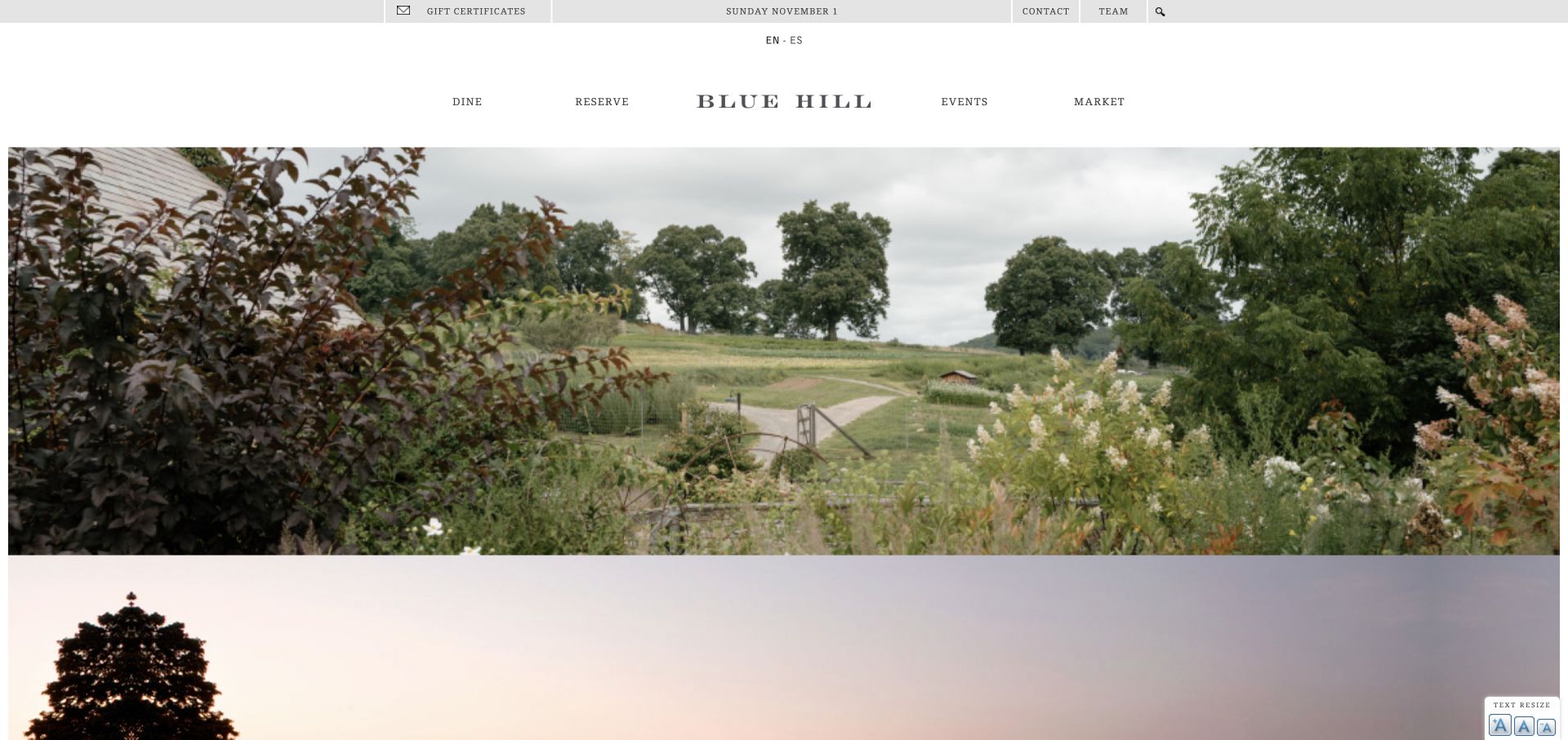
Blue Hill leads with landscape and farm imagery rather than a plated dish. A small utility bar handles gifts, contact, team, language and search above the main dining, reservation, events and market navigation. The wordmark sits centrally within that practical framework. The composition makes the setting part of the restaurant’s identity while keeping the primary categories visible. A time-sensitive event announcement appeared during the visit and was dismissed for the reference view.
What you can learn
Show the setting when it explains why someone would visit, but keep the operational choices legible above it. A restaurant with multiple dining experiences should clarify those choices before a visitor enters a booking provider. Seasonal events also need an owner so a prominent announcement does not outlive its usefulness.
Pros
Dining and reservations are visible categories rather than inferred from the photography.
The landscape image communicates place at a scale a dish close-up could not.
Cons & considerations
Several utility and commercial links share the upper area and can dilute priority.
Large rotating imagery and event overlays require maintenance and testing beyond the initial capture.
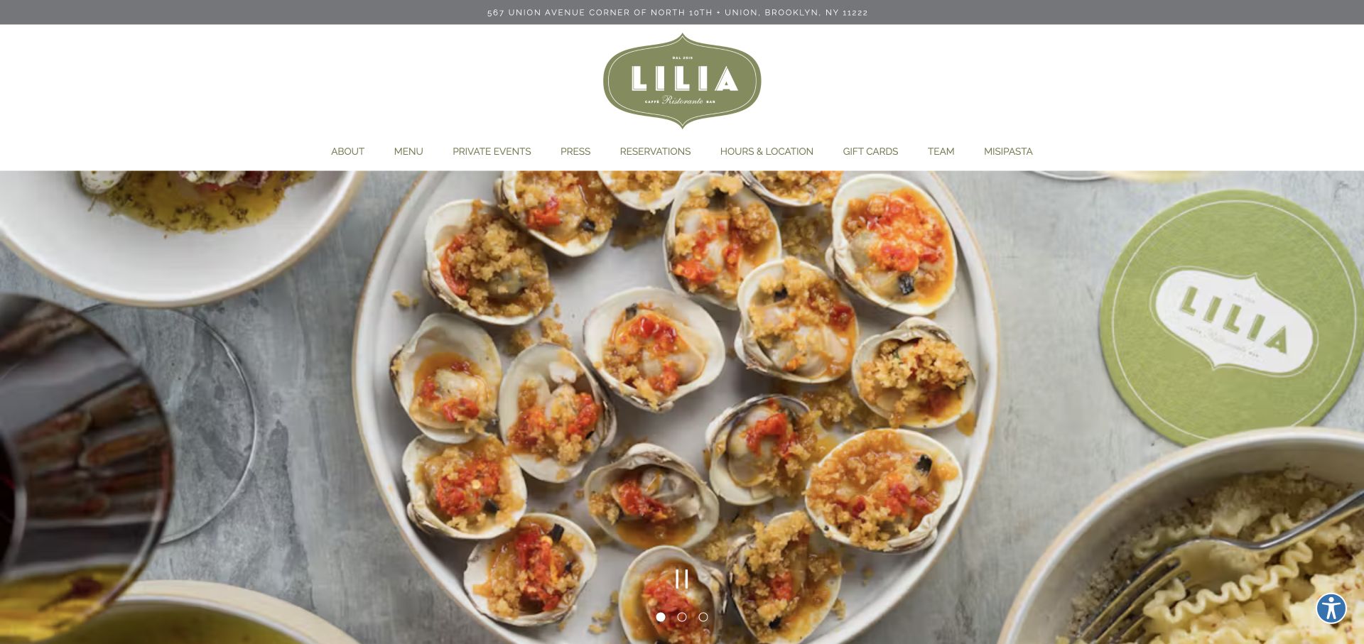
Lilia places its olive-green badge below a narrow address strip and above a clearly labeled row of guest destinations. Menu, reservations and hours-and-location are visible alongside private events, team and other restaurant activity. A large food photograph then fills the lower part of the viewport, with slide controls at the bottom. The overall identity relies on the badge, restrained green palette and direct food photography rather than an elaborate animation or a long slogan.
What you can learn
Put frequently requested information where guests can recognize it immediately. An address strip and a plain hours-and-location label can be more useful than another decorative hero sentence. If a carousel is used, preserve clear controls and do not hide essential visit information inside changing slides.
Pros
The address appears before the main image, with hours and location explicitly named in navigation.
The badge and limited palette provide identity without covering the food photograph.
Cons & considerations
Nine adjacent destinations create a crowded header as the screen narrows.
The large image sequence occupies most of the opening and needs a good small-screen treatment.
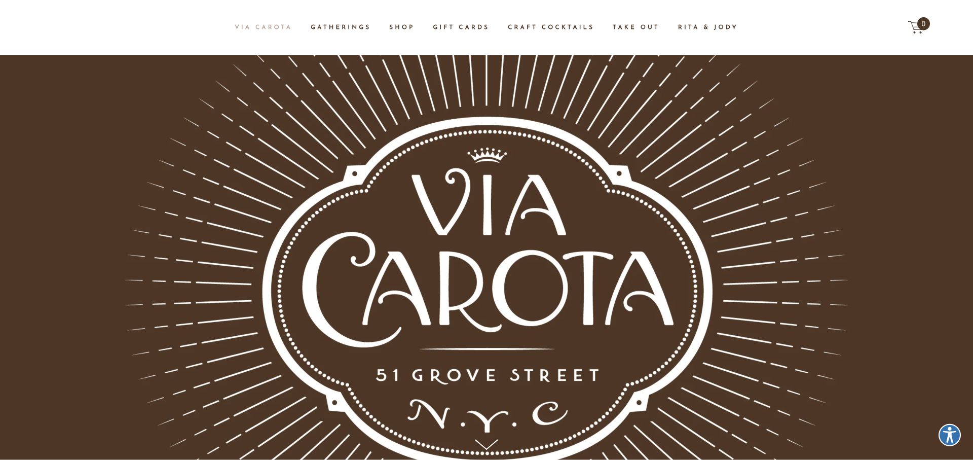
Via Carota opens with a large brown-and-cream restaurant emblem rather than a conventional photograph. Its address forms part of the graphic, while the upper navigation names gatherings, shop, gift cards, cocktails and takeout. The page continues into a broad food-image collection and a statement about the neighborhood experience. The captured opening demonstrates how a printed visual language can become the website’s main composition instead of merely appearing as a small corner logo.
What you can learn
A distinctive identity can be an effective opening asset, but guest tasks still need their own readable interface. Do not rely on an address drawn into a graphic as the only location information. Keep restaurant planning separate from gift, retail and takeout routes so the brand’s extensions do not obscure the visit.
Pros
The large emblem creates a memorable introduction without relying on autoplay film.
Takeout and gatherings have explicit destinations in the header.
Cons & considerations
The opening prioritizes commercial extensions over a plainly visible menu or reservation action.
Graphic text should be supported by readable practical information elsewhere on the page.
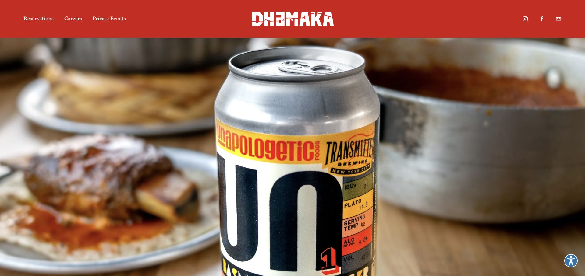
Dhamaka uses a saturated red header, a bold white wordmark and a full-width food photograph. Reservations, careers and private events sit on one side, while social and email icons occupy the other. The photo’s packaging and dishes reinforce the restaurant’s visual world. Further page content explains the cooking and provides PDF menu links. Compared with highly layered restaurant homepages, the introduction has few interface elements and relies on color and image selection for character.
What you can learn
A strong palette and one specific image can establish identity without an elaborate component system. Reserve the visible navigation for real tasks, and make sure menus are as usable as the reservation link. If PDF menus are necessary, check them on a phone instead of assuming a desktop export will work everywhere.
Pros
Reservations is a directly named action in the opening header.
The red-and-white identity remains distinct from the full-bleed food image.
Cons & considerations
The page’s menu route relies on downloads rather than visible opening-page menu text.
Small icon-only contact and social controls need accessible labels and usable touch targets.
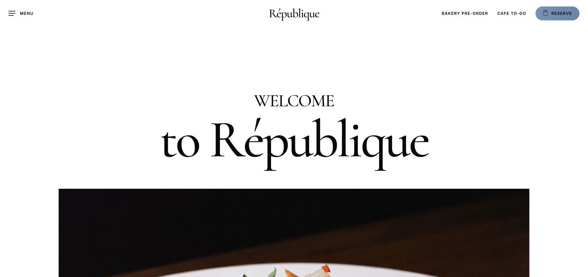
République gives a large serif welcome statement a white canvas before introducing the food imagery. A centered wordmark anchors the header, with a general menu control at the left and bakery pre-order, café takeaway and reservations grouped at the right. The reservation action gets a blue pill-shaped treatment, making it distinct from the text links. This organization acknowledges that visitors can arrive with different intentions even when all three experiences share the same restaurant identity.
What you can learn
Name the different service journeys before choosing how to decorate them. Bakery ordering, café takeaway and dinner reservations are not interchangeable calls to action. A restaurant with several modes of service can keep a unified identity while giving each task a clear label and appropriate operational destination.
Pros
Ordering and reserving are distinct actions with specific labels.
The typographic introduction creates hierarchy without placing all text over a photograph.
Cons & considerations
The large welcome uses substantial screen space without explaining the service differences in detail.
The general menu control needs to remain discoverable beside the more prominent transaction links.
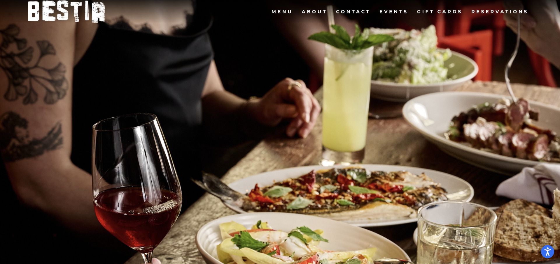
Bestia places a distressed white wordmark and widely spaced navigation over a large warm-toned food-and-table image. Menu, about, contact, events, gift cards and reservations are all named directly. The opening is almost entirely image-led, while address and hours are provided in the page’s subsequent content. Its useful quality is the small number of recognizable destinations: the visitor does not have to learn unusual section names to find the menu or get in touch.
What you can learn
An expressive wordmark does not require an expressive navigation vocabulary. Use plain task labels and let the photography carry the character. When controls sit over a changing or detailed image, check every crop and responsive state so visual atmosphere does not reduce practical legibility.
Pros
Menu, contact and reservations are plainly named in one coherent row.
Warm imagery and the textured mark establish identity with little extra decoration.
Cons & considerations
White letter-spaced navigation can become difficult to read over lighter image areas.
Hours and address require moving beyond the first-screen composition.
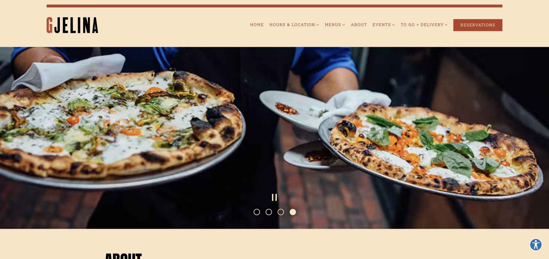
Gjelina uses a cream header, a condensed wordmark and rust-colored links above a wide photographic carousel. Hours-and-location and menus are separate dropdown categories, alongside events and takeaway or delivery. Reservations receives a filled treatment at the right. The image sequence alternates food and restaurant scenes within a consistent frame. The palette creates a softer introduction than a dark full-screen hero, while the navigation acknowledges the operational complexity of more than one venue.
What you can learn
For a restaurant group, organize menus and hours around the location decision. A consistent photographic frame can let venues share an identity without pretending their practical details are identical. Keep takeaway and events visible but distinct from the route to an ordinary table booking.
Pros
A filled reservation action has clear priority within the warm header.
Menus and location information are explicit navigation categories.
Cons & considerations
Multiple dropdowns introduce an extra decision before guests reach specific venue information.
The large carousel needs careful loading and readable controls across all image frames.
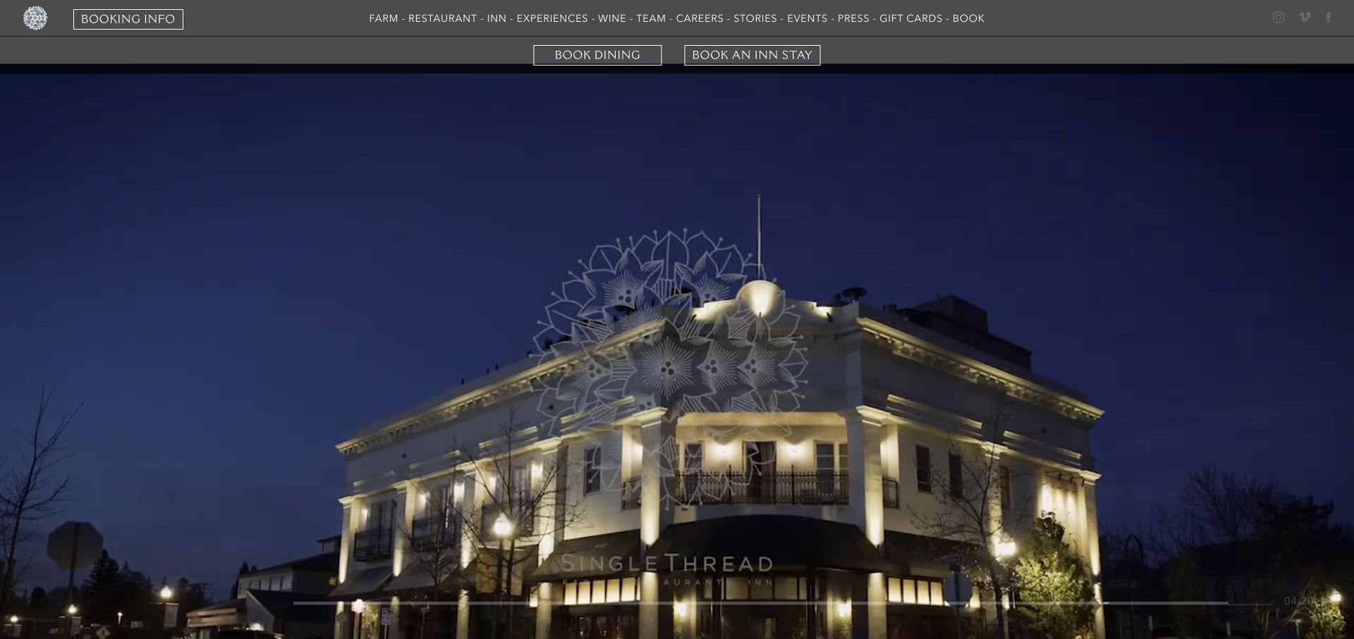
SingleThread uses a dark header above a film of dishes and service. The main navigation spans farm, restaurant, inn, experiences and supporting editorial destinations. Immediately beneath it, separate buttons distinguish dining from an inn stay. That distinction is important: the homepage is representing more than a restaurant. A substantial notification panel also appeared during the visit, promoting several time-sensitive offerings; it was dismissed before the final reference capture.
What you can learn
Make the booking object explicit when a hospitality brand offers more than one experience. A guest should not enter a room-booking flow while trying to reserve dinner. Keep broad ecosystem navigation available, but review promotional panels so that urgent announcements do not crowd out the two main tasks.
Pros
Dining and inn bookings are separated by clear labels.
The main categories explain the wider farm-and-hospitality context.
Cons & considerations
The long navigation row creates substantial density above the moving image.
Promotional notices and dated messages need ongoing review to avoid competing with current visit information.
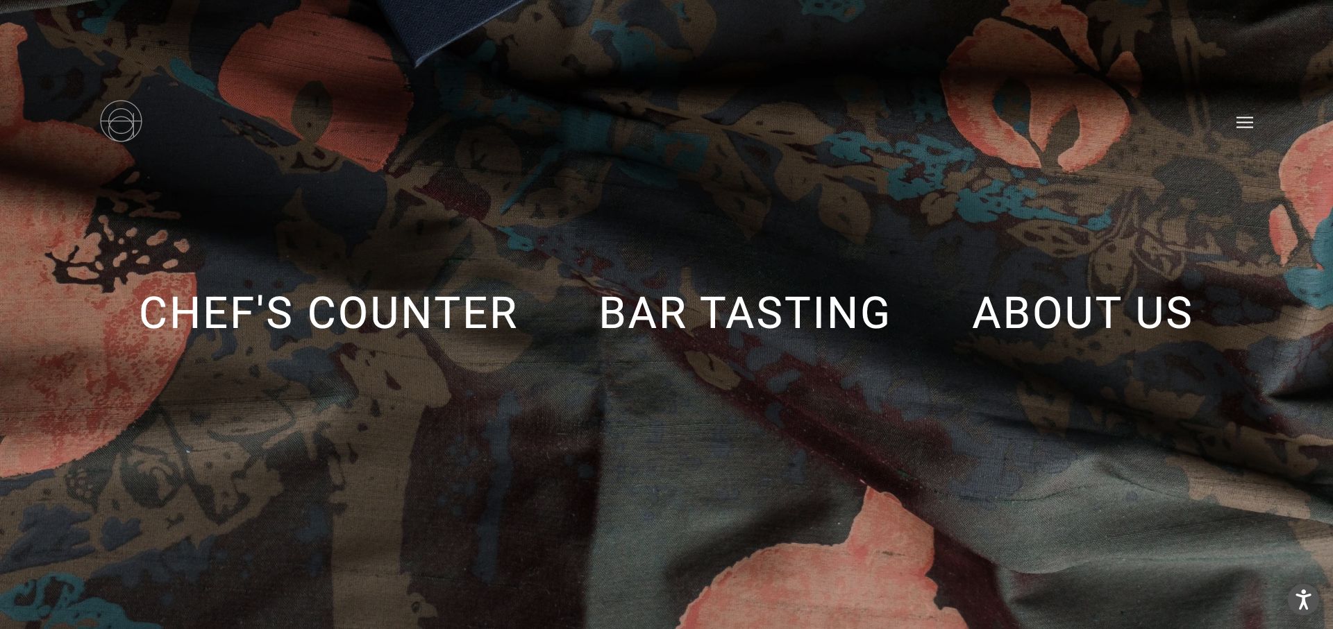
Atomix uses a full-screen patterned photographic background with three oversized destinations across the middle: the chef’s counter, bar tasting and information about the restaurant. A small symbol and a compact menu control occupy opposite upper corners. The interface is unusually spare, with the experience names acting as both navigation and headline. It communicates that choosing the type of visit matters before exploring the rest of the site.
What you can learn
When two experiences have different booking rules or expectations, make the choice visible early. Large labels can simplify the decision, but they need short explanatory support for an unfamiliar guest. Do not assume every visitor understands a restaurant’s format simply because the labels look striking.
Pros
The two dining formats receive equal visibility rather than being hidden in a generic booking menu.
A limited set of controls lets the patterned background establish a coherent identity.
Cons & considerations
The opening offers little explanation of what distinguishes the two formats.
Oversized horizontal labels need careful stacking and focus treatment on smaller screens.
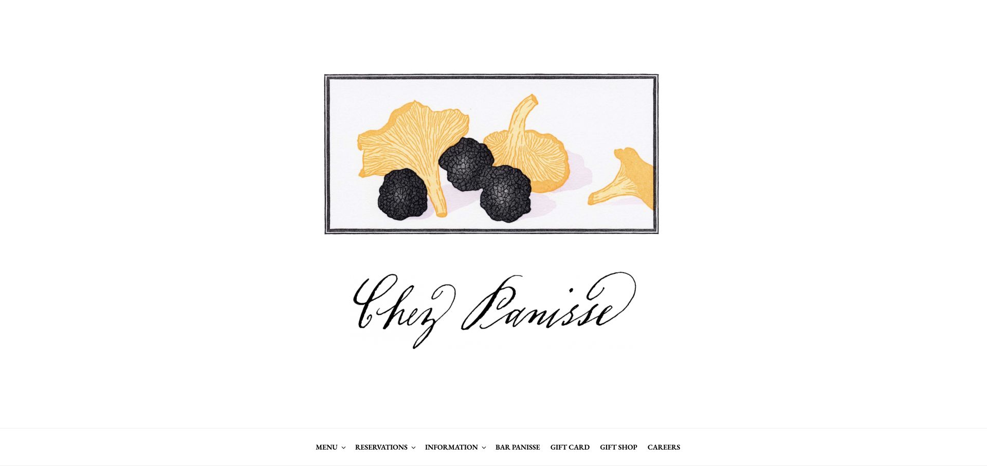
Chez Panisse centers an illustrated ingredient composition and a large script signature on a white background. The practical navigation sits near the bottom of the opening, naming menus, reservations, information and gift options. Its menu and reservation structures distinguish café from restaurant, which is more useful than assuming every visitor wants the same experience. The illustration has the character of printed restaurant artwork, making the homepage feel like a considered poster rather than a generic booking template.
What you can learn
A restaurant’s existing illustration or printed identity can be a strong digital asset. Support it with plain navigation that reflects the actual service model. If café and restaurant experiences differ, make those distinctions consistent across menus, reservations and practical information rather than explaining them only after booking starts.
Pros
The ingredient illustration provides character without a large autoplay video.
Café and restaurant distinctions are represented in the navigation structure.
Cons & considerations
The first practical controls sit low in the captured opening view.
A large illustrated identity should not replace readable hours, address and visit details.
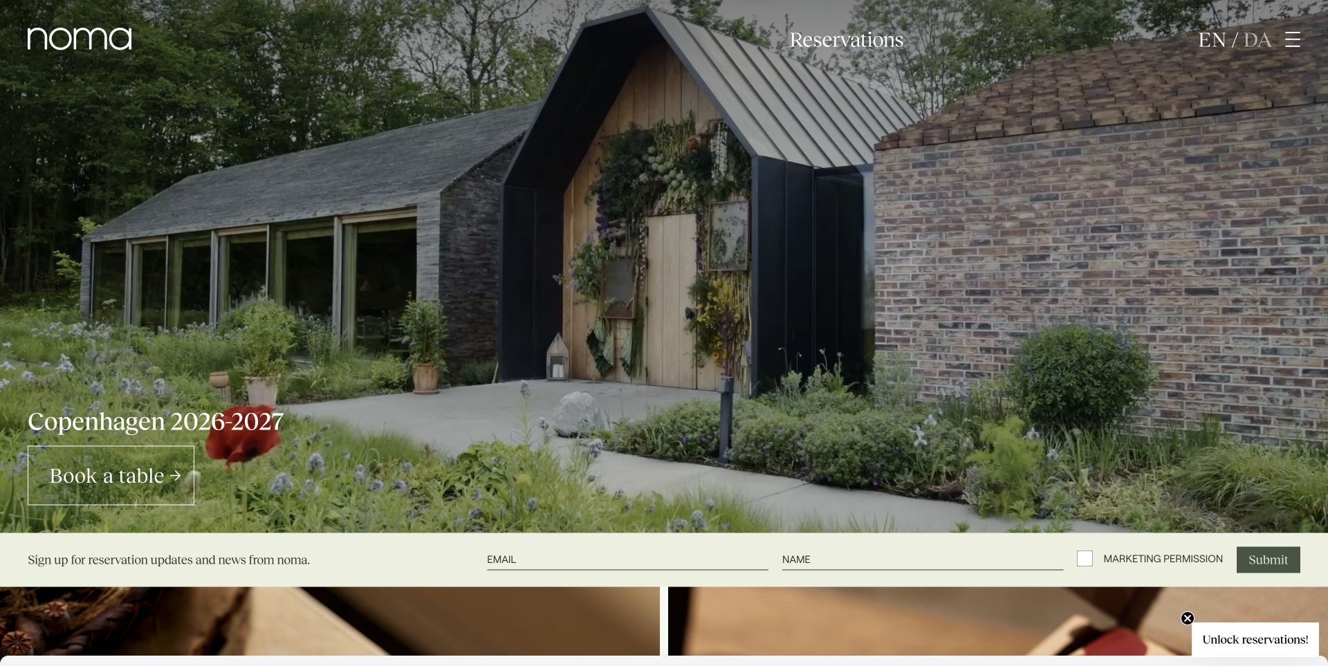
Noma’s captured homepage uses a broad photograph of its entrance and planted surroundings, with the wordmark, reservations and language choice positioned above it. A seasonal Copenhagen message and an outlined table-booking button sit toward the lower left. A pale newsletter strip follows the image, separating ongoing updates from the immediate reservation action. The photograph explains the setting before a visitor sees individual dishes, giving the restaurant a sense of place rather than treating the opening as a product grid.
What you can learn
Use a seasonal message as an explicit content unit with its own owner and expiry review. Preserve booking and language controls when the image or campaign changes. A setting-led image is useful when it tells guests something meaningful about the visit, but it still needs practical information in readable text.
Pros
Reservations and language choice remain visible outside the seasonal headline.
The entrance photograph communicates the physical setting and arrival character.
Cons & considerations
White interface elements over a detailed photograph need crop-specific contrast checks.
Seasonal booking copy and reservation-update prompts can age quickly without editorial ownership.
PHPCMS dependency association; runtime not independently observed
Public source checked November 3, 2026. References may be embedded or legacy—not a complete backend inventory.
Platform source: WordPress.org Showcase. Platform evidence is separate from the direct website screenshot and is not a complete current infrastructure audit.
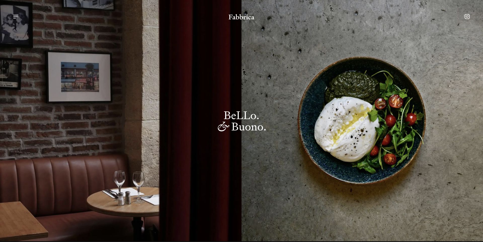
Fabbrica divides the opening between a warm restaurant interior on the left and a close-up dish on the right. A centered wordmark, a short expressive line and small corner controls sit above that two-image composition. The photographs have different subjects but compatible tones, so the split explains both setting and food instead of repeating the same image twice. Practical information is not the main subject of this captured opening; the interface asks the visitor to explore beyond the first impression.
What you can learn
Give each image a defined role before building a split layout. One can explain the room while the other shows the cooking. Provide editing guidance for brightness, crop and subject so replacement images preserve that relationship, then offer clear menu and visit routes beyond the atmospheric introduction.
Pros
The paired images communicate two different aspects of the restaurant experience.
A small amount of typography creates identity without hiding the subjects.
Cons & considerations
Menus, locations and booking require exploration beyond the opening composition.
The balance is sensitive to replacement images with very different brightness or visual detail.
Earlier cited evidence retained; no current scan result. References may be embedded or legacy—not a complete backend inventory.
Platform source: WordPress.org Showcase. Platform evidence is separate from the direct website screenshot and is not a complete current infrastructure audit.
Plan around the guest’s occasion and the team’s updates
Write the visit information before choosing the hero
Collect approved hours, menu links, location details, booking policies, accessibility information and the best contact route. Ask the front-of-house team what people repeatedly call to ask. A beautiful page that omits the answer still creates work for staff.
Make routine menu changes straightforward
Decide who changes dishes and prices and how quickly those edits need to go live. Treat location menus, special events and holiday hours as structured information. Avoid a design that requires exporting an entire image every time one item changes.
Give secondary revenue its own place
Gift cards, private dining, takeaway and merchandise may be important, but they should not overwhelm the primary visit. Prioritize by the actual business model. Test a guest’s first booking and a returning guest’s quick hours check before adding more promotional panels.
The editing job behind the design
Connect publishing, reservations and ordering deliberately
A restaurant CMS should make menus, hours and venue details easy for the people who maintain them. A small restaurant may need only a few well-structured pages; a group needs a reliable location model. Choose the editor around that recurring work, not a technology badge seen on a famous restaurant’s site.
Reservation, ordering and gift-card providers can remain external services. Explain the transition, keep venue identity consistent and test failure or sold-out states. Do not collect payment or dietary details in an improvised marketing form when an approved operational system already handles the task.
Our WordPress website examples offer a separate look at publishing approaches. A visible platform label is evidence for that named page, not a guarantee that the same system will suit your requirements.
Before the public launch
Restaurant website launch checklist
Check menus, prices, hours and location-specific differences with the team.
Test each booking link and venue selection on a phone.
Make walk-in, waiting-list and reservation language unambiguous.
Confirm image rights and make essential information readable without video.
Check keyboard access, text zoom and the readability of downloadable menus.
Assign an owner for holiday hours, announcements and menu changes.
These checks are a project checklist, not a performance, legal, security, or accessibility certification. Test real journeys with the people responsible for the website before making claims about the result.
Sources & editorial method
How this collection was selected and reviewed
We visited official restaurant sites and captured the pages directly. The selection intentionally contrasts story-led, commerce-enabled, minimal and multi-location approaches. Noma and Fabbrica reuse existing direct captures from our shared website catalog, with restaurant-specific commentary.
Each example links to its actual source page. Screenshots are direct browser captures with their own capture dates; moving imagery, announcements and live designs can change. The notes describe observable design choices and conditional tradeoffs, not measured traffic, conversion results, service quality, or accessibility conformance.
Technology labels use public page metadata, asset evidence, or explicitly cited platform documentation. Platform documentation is not a complete current deployment audit. A component reference may be legacy or unused; it is not a complete backend inventory. Unknown stacks are omitted. These sites are editorial examples, not our client portfolio.
Written, Edited and Curated are separate editorial records, not timestamps advanced by a rebuild. Website designs and imagery belong to their owners. See our editorial standards or suggest a correction.
Questions worth asking
Restaurant website design questions
Is a one-page restaurant website enough?
It can be, when menus, hours, location, booking and practical questions remain easy to find and update. Separate pages become useful for multiple venues, private events or a substantial editorial program.
Should menus be PDFs?
A PDF can be useful for printing, but readable page text is usually easier to scan and resize on a phone. If using a PDF, check its legibility, file size and accessibility, and make the date or menu context clear.
Does a restaurant need custom development?
Only when the requirements justify it. An appropriate template and good photography may serve a small venue better than a bespoke system that staff cannot update. Evaluate editing and reservation integrations before visual novelty.
Should reservation availability be embedded?
Use the approach supported by the reservation provider and the restaurant’s workflow. An embed may reduce context switching, while a clear external link can be simpler. Test both loading and unavailable states rather than assuming either is automatically better.