Best Day Spa Websites of 2026 (17 Real-World Examples)
Day spa websites that turn atmosphere into a clearly described visit
These 17 day spa website examples examine treatment menus, package inclusions, property information and the distinction between buying a gift and reserving a spa day.
A day spa can sell several different things under one relaxing headline: an individual treatment, access to shared amenities, a combined package, a gift voucher or a group event. The website needs to explain which of those a visitor is choosing. Attractive interiors establish a setting, but duration, inclusions, pricing units and arrival information give the setting practical meaning.
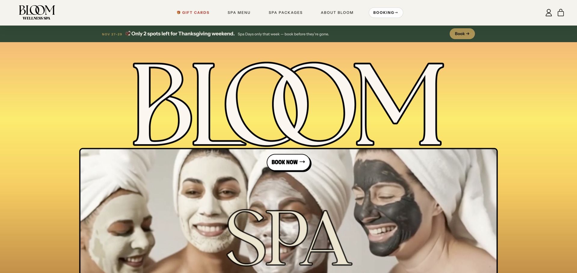
Bloom Wellness Spa is our Editors Choice for a distinctive Ann Arbor identity and a clear separation of booking, the spa menu, gifts and parties. Its inspected package cards provide prices and short inclusion summaries, while group offers identify per-person pricing and capacity context. This is a selection for the website’s product structure and visual character, not an endorsement of treatment effects or promotional availability.
Before the examples
What makes good day spa website design in 2026?
Explain what the visit includes
Separate treatment time, total visit expectations and amenity access. Identify inclusions and optional additions without relying on a package name such as “complete” or “ultimate.” Explain whether the price refers to one person, a couple or a group.
Keep purchase and reservation distinct
A gift card, prepaid package and confirmed appointment are different outcomes. Label Buy, Gift and Book actions accordingly, and explain the next step after each. Do not let a product checkout imply that a date or treatment room has been reserved.
Attach practical details to the actual property
Publish the address, arrival guidance, opening hours and relevant visit policies. A spa inside a hotel or a multi-property brand needs more precise orientation than a city name alone. Keep temporary restrictions and dated promotions near the affected offer.
The collection · 17 examples
17 day spa websites worth studying
Compare these sites by the visit they explain, not by the intensity of their wellness language. The collection includes compact local spas, mixed salon-and-spa businesses and destination properties with different appointment and access models.
Bloom Wellness Spa in Ann Arbor uses oversized outlined lettering, a warm yellow background and playful treatment imagery rather than a conventional muted-spa template. The visual energy is supported by four practical choices: booking, the spa menu, gifts and parties. Package cards combine a named experience with a price and short description, while group options state per-person pricing and capacity context. The inspected page also labels its seasonal offer with specific dates. The page is promotion-heavy, but the design remains distinctive because it gives those offers concrete destinations rather than relying on atmosphere alone.
What you can learn
A bold spa identity still needs a clear product structure. Pair each package with its inclusions and pricing unit, and separate individual appointments from group bookings before visitors enter different reservation processes.
Pros
Booking, menu, gift and party interests have distinct destinations.
Packages and group options include useful price and capacity context.
Cons & considerations
Several seasonal promotions compete for first-screen attention.
Repeating brand text and multiple purchase actions increase visual activity.
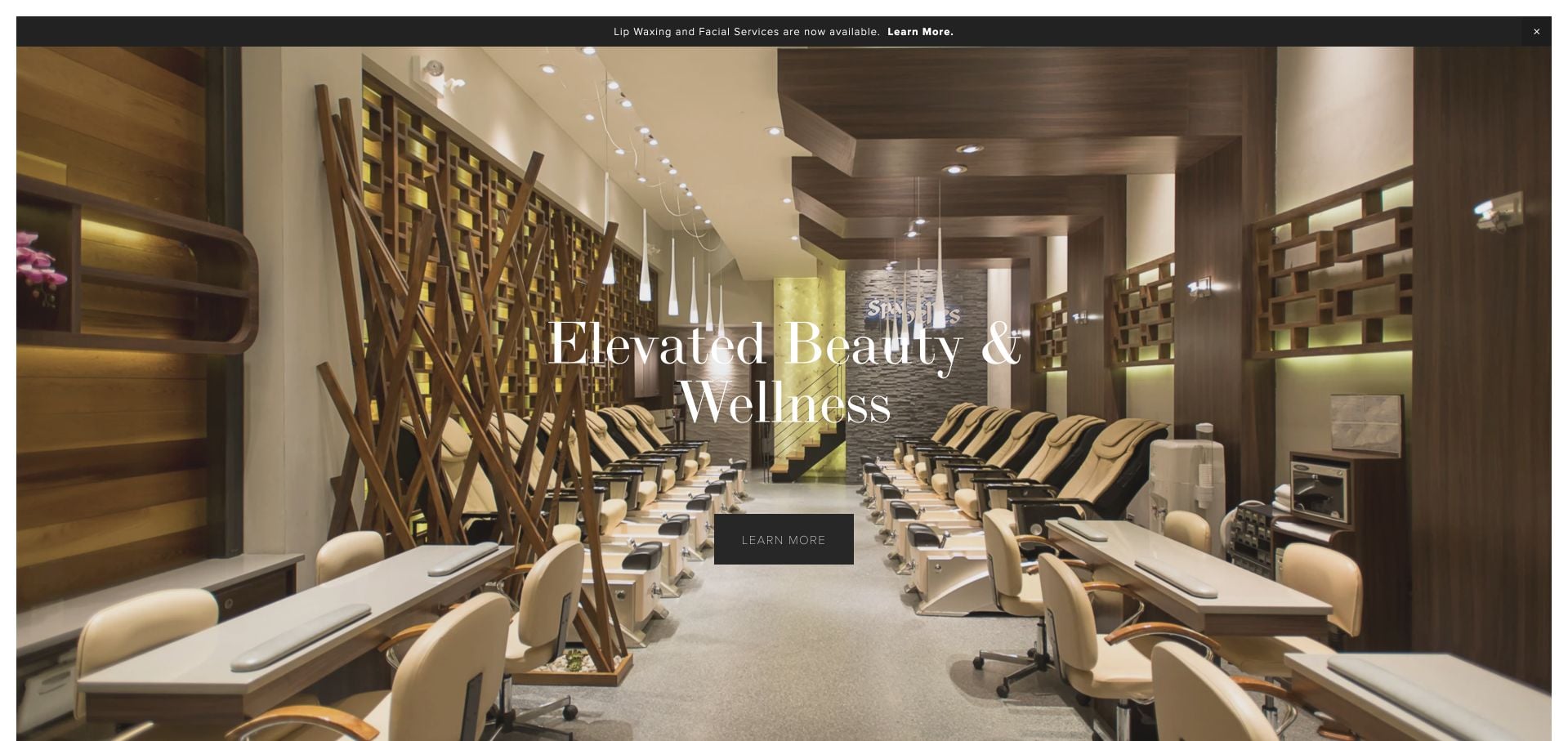
Spa Belles leads with a full interior photograph and a concise beauty-and-wellness heading. The page then gives nail art, gifts, events, services, locations and contact their own visual destinations. That structure is practical for a multi-location spa whose visitors have different reasons to arrive. The inspected header exposes detailed service types, but it is crowded and retains older operational labels. The broad introduction communicates the atmosphere more quickly than it helps compare the price or duration of a specific treatment.
What you can learn
Use the room photograph to introduce the experience, then let a small set of task cards organize a broad menu. Review old operational notices and avoid turning the header into an equally weighted list of every treatment.
Pros
The actual interior supplies a specific visual introduction.
Service, location, event and gift interests are separated.
Cons & considerations
The dense header makes the initial navigation harder to scan.
Detailed price and appointment-length comparison requires another step.
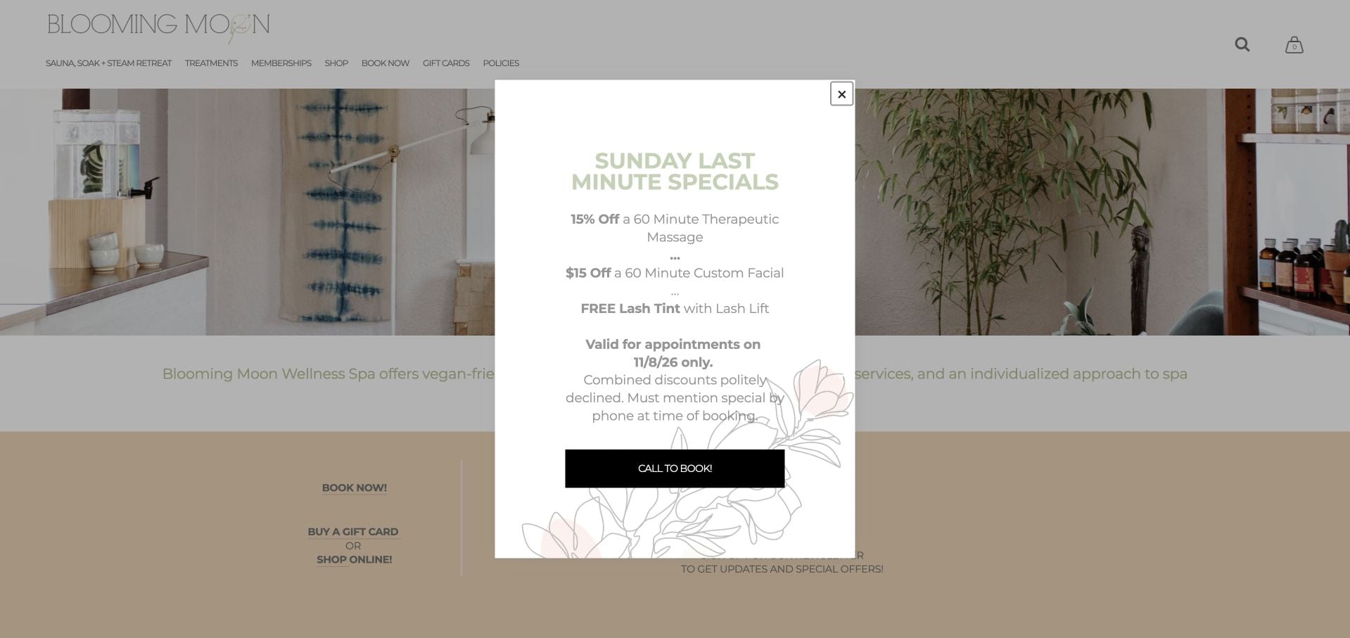
Blooming Moon uses soft neutral surfaces and real studio imagery to introduce its Portland practice. Its menu separates treatments from a private sauna, soak and steam retreat, while booking and gift cards remain prominent routes. The inspected page supplies the Overlook neighborhood address and day-by-day hours, making the physical visit concrete. Retail, memberships, seasonal offers and a newsletter extend the business, but the resulting volume of choices is substantial. A promotional overlay appeared during review, demonstrating how an offer can obscure an otherwise calm introduction.
What you can learn
Distinguish a private-facility reservation from an ordinary treatment appointment. Keep address, hours and the principal booking route clear before introducing memberships, retail and time-sensitive promotional layers.
Pros
Treatment and private-retreat interests have distinct routes.
The page provides a specific neighborhood address and opening hours.
Cons & considerations
A promotional overlay interrupts the initial view.
The broad mix of retail, membership and service options can feel crowded.
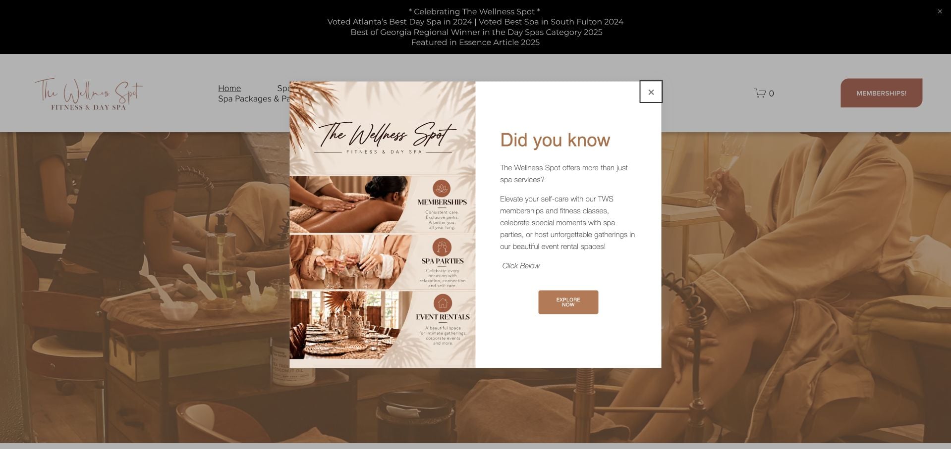
The Wellness Spot introduces a College Park location and identifies its mix of day-spa, fitness and private-event interests. A warm interior image and a short booking invitation establish the atmosphere, while later service blocks divide the offer into spa, classes and events. The inspected site also provides appointment-preparation guidance and a virtual tour. The breadth is useful to study, but awards, membership messaging and an opening promotional overlay compete with the practical choice. The design should be evaluated as a mixed-use venue, not a spa-only appointment site.
What you can learn
Name the different facility uses early and give each its own process. A virtual tour can explain a multi-purpose space, but it should supplement rather than obscure service details and the correct inquiry or booking route.
Pros
The introduction explains the spa, fitness and event scope.
A virtual tour and preparation guidance support the visit decision.
Cons & considerations
The opening promotional overlay interrupts the introduction.
Awards and membership messages add competition between the main task choices.
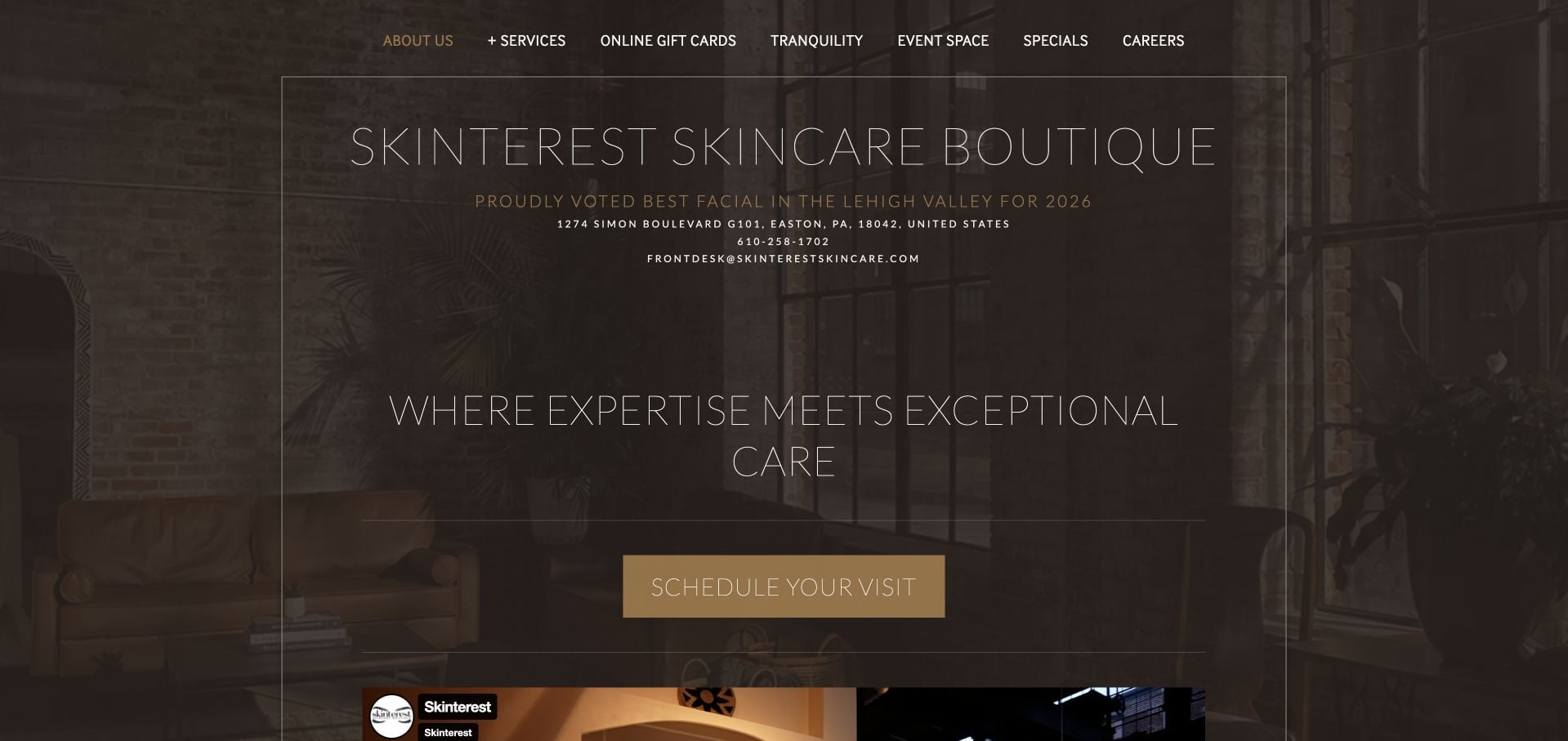
Skinterest Skincare Boutique puts its Easton address and phone near a large introductory panel, with a specific scheduling action beneath it. The inspected page introduces owners, management, estheticians and massage therapists in separate groups. That makes the people behind a broad treatment offer visible rather than leaving the business as an anonymous room. The long mission and philosophy sections require substantial reading, and the darkened photograph reduces the visual detail of the space. This is a review of presentation and team information, not the evidence behind skincare or treatment assertions.
What you can learn
Organize a team directory by the roles that matter to appointment selection. Keep local contact facts near the first action and shorten repeated philosophy material when it postpones the service menu.
Pros
Address and phone accompany the opening appointment invitation.
The team is organized into identifiable professional roles.
Cons & considerations
Long mission and philosophy passages slow scanning.
The dark image treatment makes the physical space less visible.
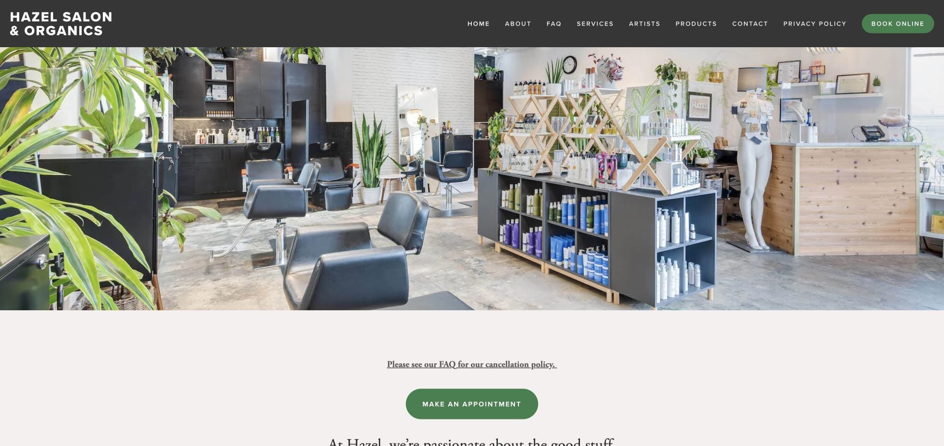
Hazel Salon & Organics uses a bright photograph of its real Seattle room, dark green navigation and restrained appointment buttons. The inspected service structure distinguishes hair, skin and additional beauty appointments, with artists and FAQs as separate destinations. A cancellation-policy pointer appears close to the appointment route, and the footer supplies a specific Greenwood address and phone. This is a salon-and-skincare hybrid rather than a massage-led day spa. Its main limitation is that the opening image and general brand statement supply little immediate comparison between the different appointments.
What you can learn
Keep distinct treatment disciplines understandable when they share one room and brand. A cancellation-policy link is most useful near booking, with ordinary contact and location facts still easy to find.
Pros
Hair and skin services have distinct navigation routes.
The appointment area points visitors toward the cancellation policy.
Cons & considerations
The shared brand introduction provides limited treatment-level comparison.
A visitor interested only in spa services must navigate a broader salon offer.
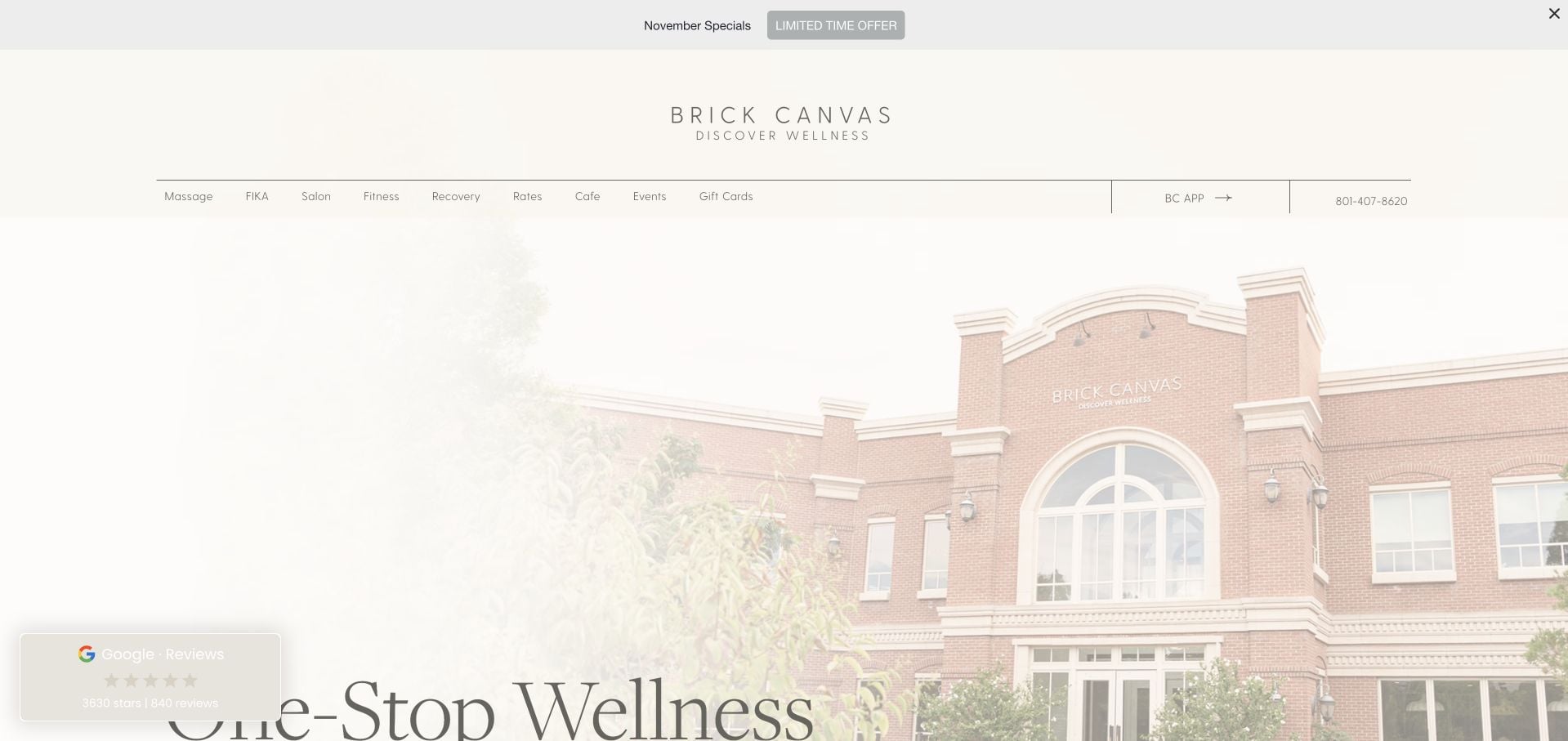
Brick Canvas uses a pale building photograph and fine serif typography to introduce a broader wellness venue. The inspected page separates spa, salon, recovery, fitness, cafe and events into individual discovery routes, while Rates remains a literal navigation option. This structure acknowledges that the visitor may need a class, a treatment or simply venue information. A first-visit promotion and current specials add timely content, but their scope needs to be interpreted rather than assumed to cover every service. The many facility names also increase the number of decisions on the homepage.
What you can learn
Treat a mixed venue as a small directory rather than pretending every visit is the same appointment. Label introductory offers with the exact service and eligibility context so a broad venue headline does not create an overly broad promise.
Pros
The site separates materially different facilities and visit types.
Rates is an explicit navigation destination.
Cons & considerations
The number of facility choices can overwhelm a first-time visitor.
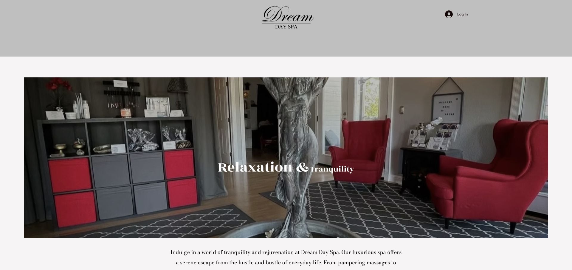
Dream Day Spa uses a real room photograph, a short relaxation-led introduction and very little navigation. The inspected homepage supplies its Folsom street address and clearly distinguishes open days from closed days. That practical information gives a minimal page more value than an atmospheric image alone. The tradeoff is the lack of a detailed service comparison in the same view: a visitor can understand where the spa is and when it operates, but still needs further contact to establish the right treatment, price and appointment process.
What you can learn
A minimal site should at least answer where, when and how to inquire. Keep those basics concise, then provide an accessible service menu before adding decorative sections or an unmaintained blog.
Pros
The address and open-versus-closed days are explicit.
The real interior keeps the small page connected to the physical business.
Cons & considerations
The homepage supplies little detailed treatment comparison.
The next step for establishing price and availability could be clearer.
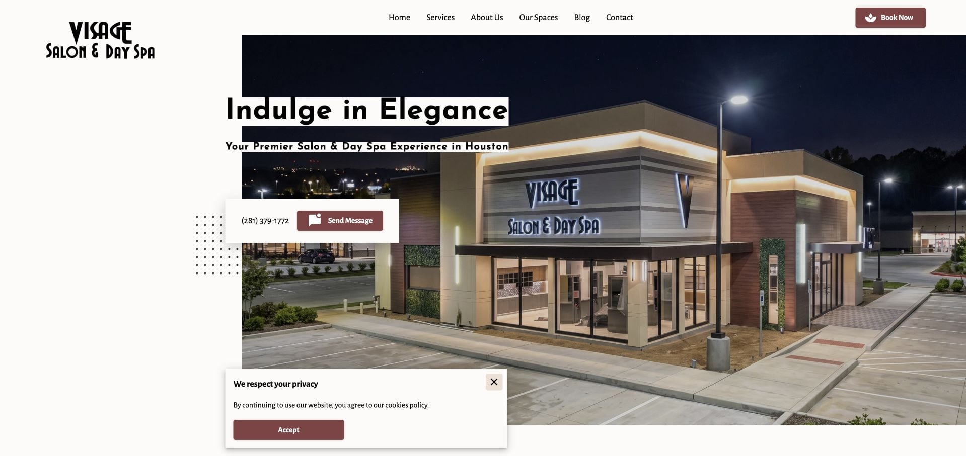
Visage Salon & Day Spa uses an exterior photograph of its Houston premises alongside a concise introduction, phone number and message action. The inspected body separates hair, facials, massage, nails and other beauty interests, with packages as a different route. Our Spaces and About give visitors additional context about the people and place. This is useful for making a broad offer navigable, although the headline is more general than the practical service list below it. Promotional pricing and a privacy notice also add layers around the primary booking task.
What you can learn
Use exterior photography when recognizing the premises is part of a successful visit. Then group a broad treatment menu by ordinary service categories, keeping packages and promotions distinguishable from individual appointments.
Pros
The actual exterior helps visitors recognize the location.
The body divides the broad offer into recognizable service categories.
Cons & considerations
The general hero headline explains less than the service list below it.
Promotional and privacy layers compete with the appointment journey.
Shevet Hammam & Spa builds an atmospheric introduction around a warm cinematic scene and a numbered ritual sequence. The inspected ritual descriptions specify what the visit includes, with durations and separate individual or couple prices. Language choice and booking routes are available, so the story does eventually lead to a concrete decision. The immersive opening and numbered navigation require more interpretation than a conventional menu, however. This is inspiration for explaining a multi-stage experience, not an endorsement of the health or cultural claims in the ritual copy.
What you can learn
Translate an elaborate experience into a readable sequence, duration and pricing unit. Offer a way past the cinematic introduction so visitors who already know what they want can reach the actual package comparison.
Pros
Ritual descriptions combine inclusions, duration and pricing context.
Language and booking options support the broader storytelling.
Cons & considerations
The immersive introduction delays straightforward service comparison.
Numbered ritual navigation is less self-explanatory than named categories.
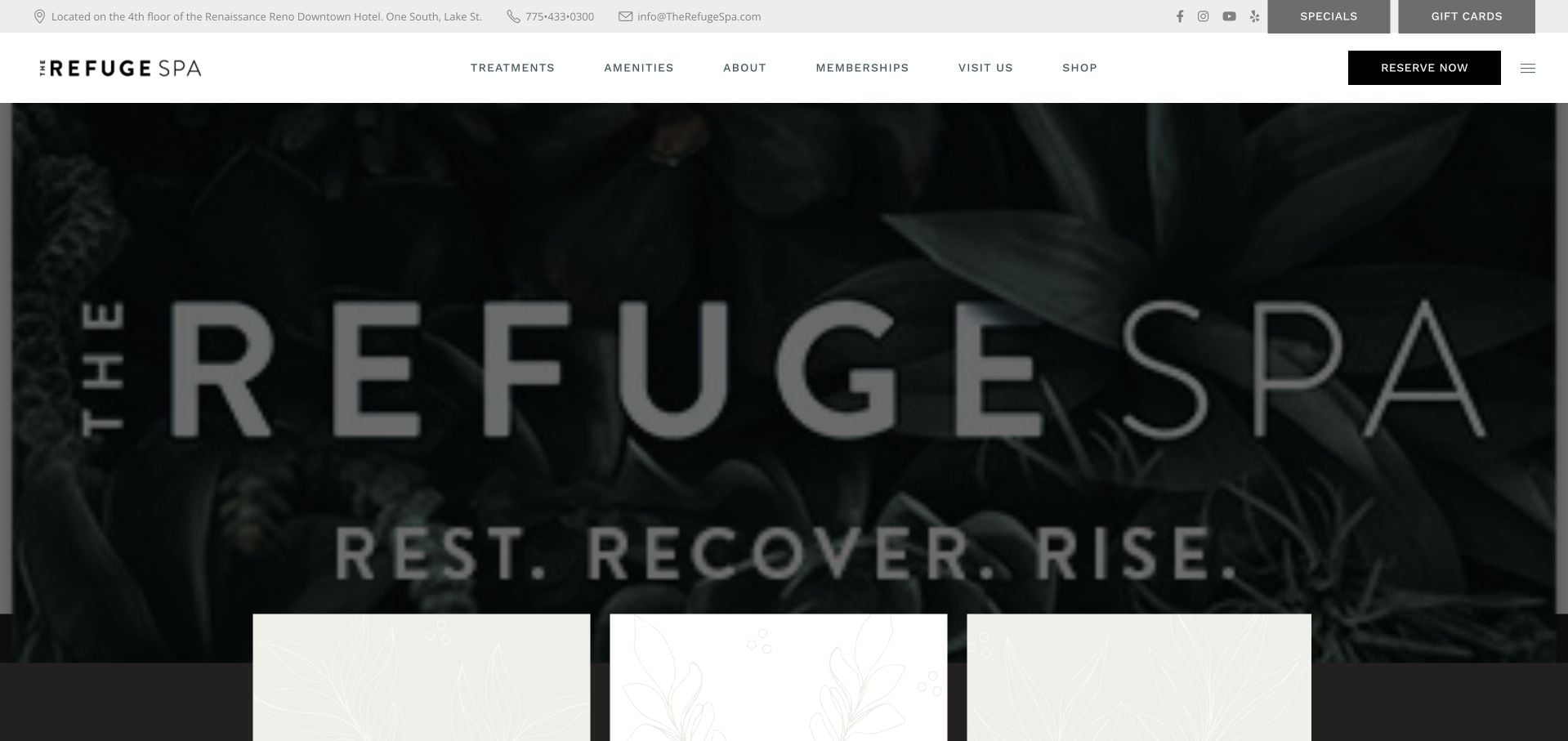
The Refuge Spa names its floor within the Renaissance Reno Downtown Hotel in the top utility area. That is practical orientation before a visitor reaches its dramatic dark opening and treatment routes. The inspected page distinguishes massages, facials, express services, amenities and parties, while preparation and pricing information have their own destinations. The breadth is valuable, but the layered menus are extensive and the brand-led hero supplies less operational detail than the utility strip. The main design lesson is to keep the spa’s own visit process clear inside a larger host property.
What you can learn
If the business sits within a hotel or shared building, explain the exact arrival context early. Keep treatment appointments, amenity access and private events separate when their reservation or eligibility rules differ.
Pros
The top bar identifies the host property and floor.
Pricing and what-to-expect information have dedicated routes.
Cons & considerations
The extensive layered navigation requires careful scanning.
The dramatic hero gives little immediate appointment comparison.
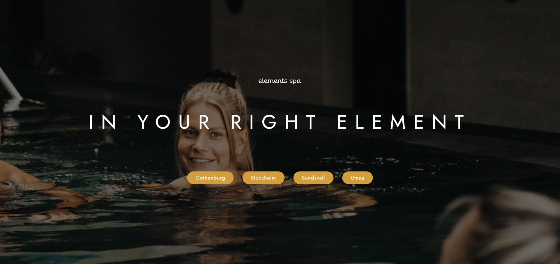
Elements Spa’s reviewed entry page uses a dark pool photograph, a short centered headline and four city buttons. It is a location gateway rather than a complete treatment homepage. The sparse composition makes the required next step clear without asking visitors to interpret a large shared service catalog. Its limitation is equally clear: the page itself provides little written explanation of treatment availability, prices or visit rules. Those details must be supplied reliably by the chosen destination rather than assumed to be identical across the group.
What you can learn
A city gateway can be deliberately short when geography is the first necessary decision. Preserve the selected city through the next page and booking route, and do not imply that every location has the same offer.
Pros
Four city choices make the geographic decision explicit.
The minimal layout avoids an undifferentiated group-wide treatment menu.
Cons & considerations
The gateway provides little direct service or price information.
Visitors must continue to establish each property’s appointment and access rules.
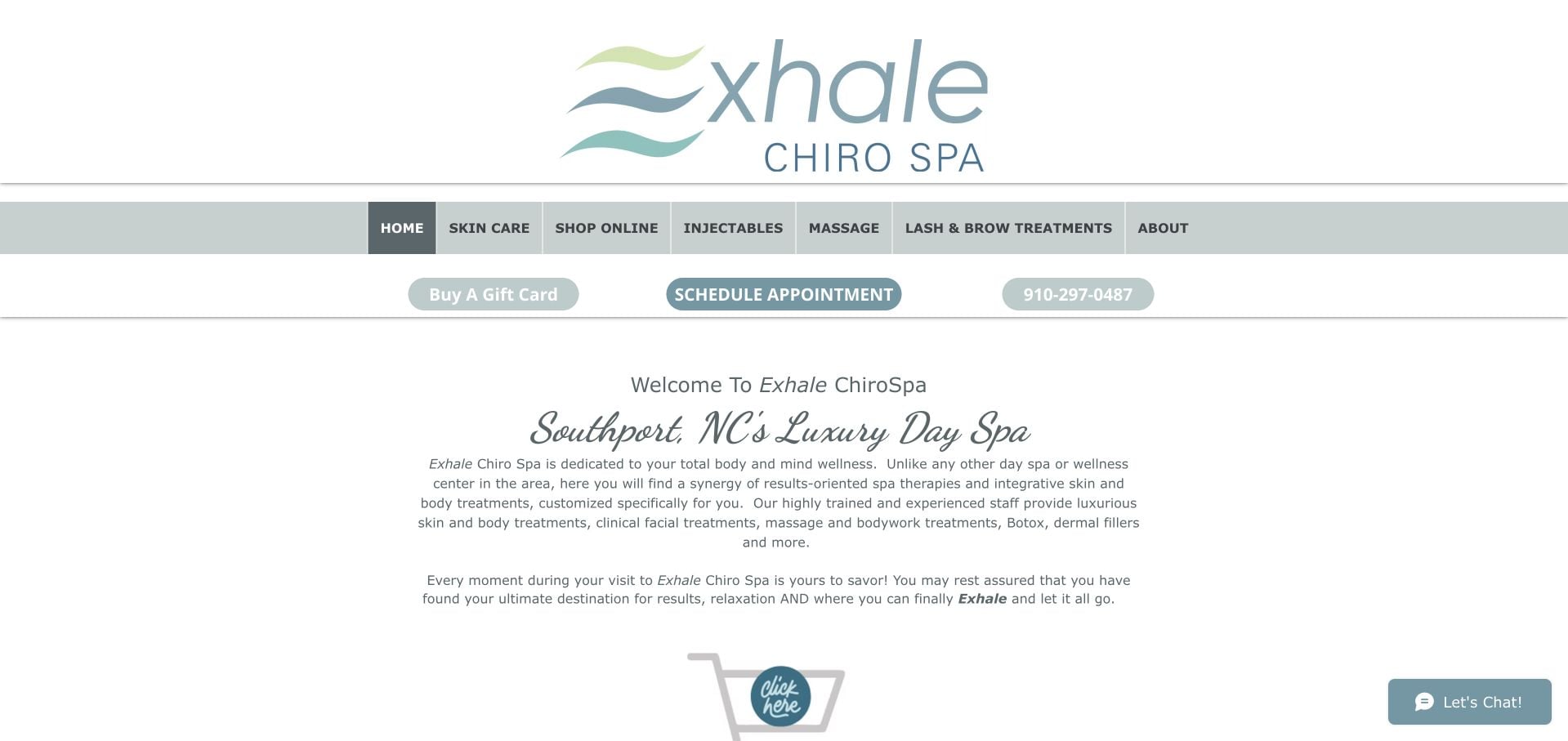
Exhale ChiroSpa uses a restrained pale-blue identity and a centered introduction that explicitly names Southport. The inspected navigation distinguishes skincare, massage, lashes and other offerings, while a scheduling action and phone number remain available. The page provides its suite address and clarifies that the number accepts calls or texts. Its limited visual treatment places much of the explanatory burden on a long introductory paragraph, and the mixed service scope needs careful qualification. The review concerns navigation and visit information, not the suitability or effectiveness of any clinical service.
What you can learn
State the location and actual contact channel clearly, particularly when phone and text are both supported. Separate materially different appointment types rather than relying on a broad total-wellness paragraph to explain them.
Pros
The page names the city and supplies a suite-level address.
Call-or-text wording makes the contact process explicit.
Cons & considerations
The long introduction is less scannable than distinct service summaries.
The mixed service scope requires more explanation than a single general appointment label.
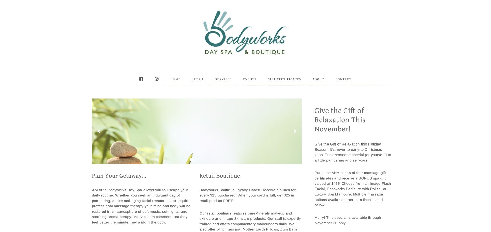
Bodyworks Day Spa uses a spacious white header and a conventional menu that separates Services, Retail, Events and Gift Certificates. The inspected content explains the practice, provides a specific military-discount condition and presents a current November gift promotion. What to Expect and Professionals are useful routes for new visitors who need more than a purchase button. The page is long and text-heavy, with several commercial interests sharing the same visual weight. Its useful lesson is the presence of practical conditions and preparation information, not the need to preserve every section.
What you can learn
Put the exact conditions of a local offer beside the promotion, and retain preparation information for first-time visitors. Simplify the main sequence when retail, gifts and appointments all compete for the same attention.
Pros
What to Expect and Professionals support first-time appointment research.
Offer descriptions include concrete conditions rather than a discount alone.
Cons & considerations
Long paragraphs make the homepage harder to scan.
Retail, event and gift interests compete with ordinary appointments.
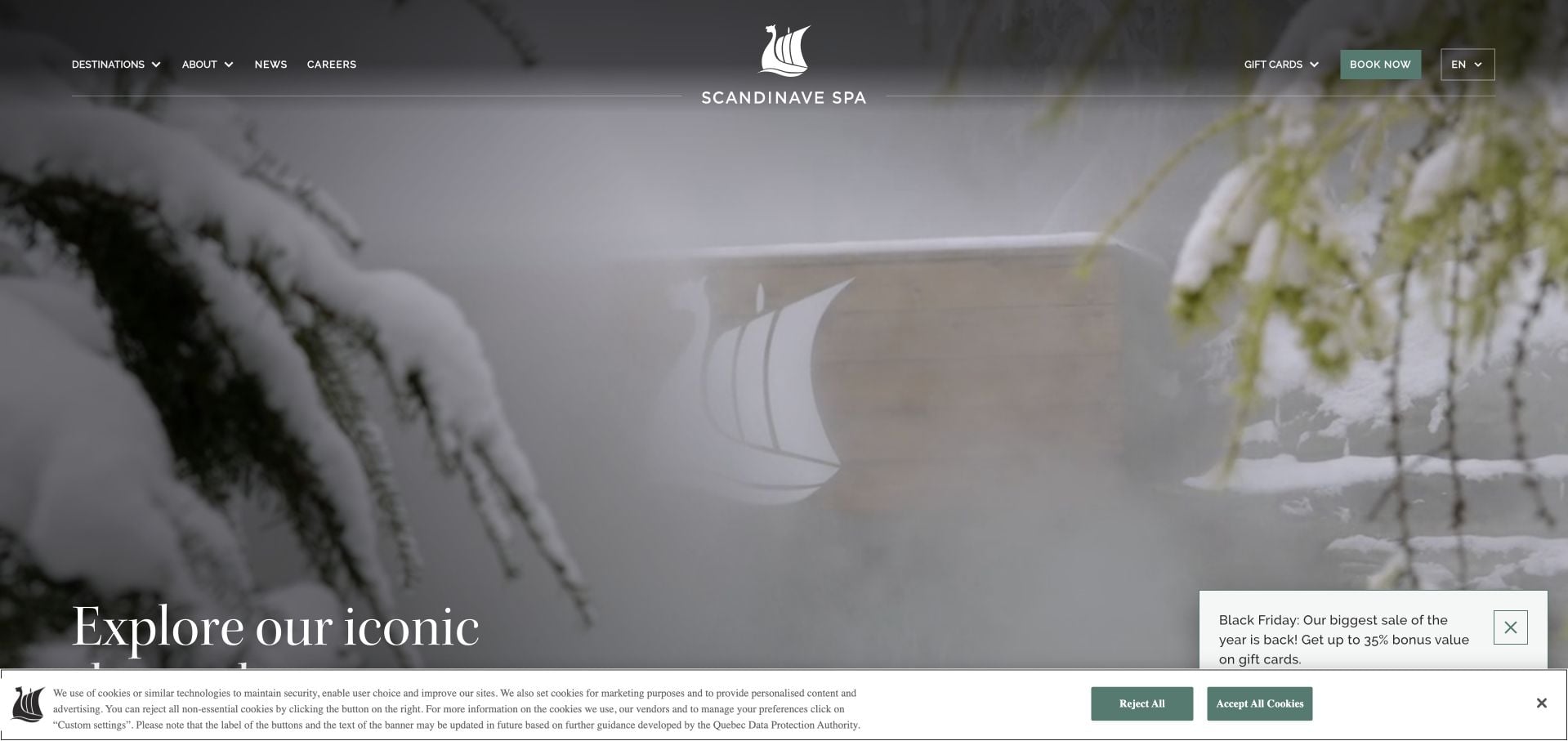
Scandinave Spa uses a large outdoor thermal-pool image and a short invitation to explore destinations. The inspected page separates its properties into individual routes and explains the nature-focused positioning of the group. Booking and gift cards remain visible, while dated news supplies context for changes to the portfolio. This is a larger destination-spa comparison rather than a small treatment-room template. The broad opening communicates place well, but the visitor still needs property-level information about admission, appointments and practical visit rules. A seasonal gift promotion adds another layer to that first decision.
What you can learn
Use setting photography when the physical destination is a central part of the product. Keep property-specific admission and appointment information distinct from the shared brand story, particularly when locations change.
Pros
The page organizes the experience by destination.
Dated news provides context for changes to the property portfolio.
Cons & considerations
Practical admission and appointment details require a property-level visit.
Seasonal gift promotion competes with destination discovery.
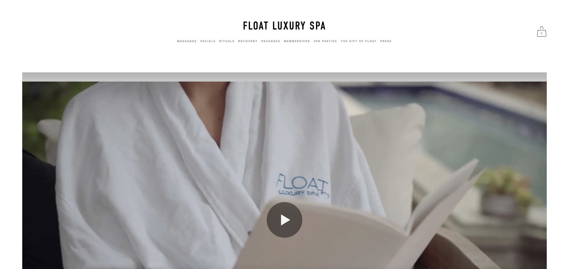
Float Luxury Spa’s downtown page follows an initial location-selection screen. Its navigation separates massage, facials, rituals, recovery and packages, while the main body uses room photography and a mission-led narrative. The inspected page also promotes another beachfront property and lists the downtown street address and reservation route. That makes it useful for studying the boundary between a shared brand and a specific place. The risk is losing geographic clarity as visitors move between treatments, sister properties and retail content.
What you can learn
After location selection, keep the current property’s name, address and reservation route consistent. Cross-promote another site only where the link makes that change of location clear before the visitor leaves the local appointment journey.
Pros
The shared entry explicitly asks visitors to choose a location.
The downtown page offers distinct treatment and package categories.
Cons & considerations
Sister-property promotion can blur which spa the visitor is viewing.
The atmospheric narrative delays a concise treatment comparison.
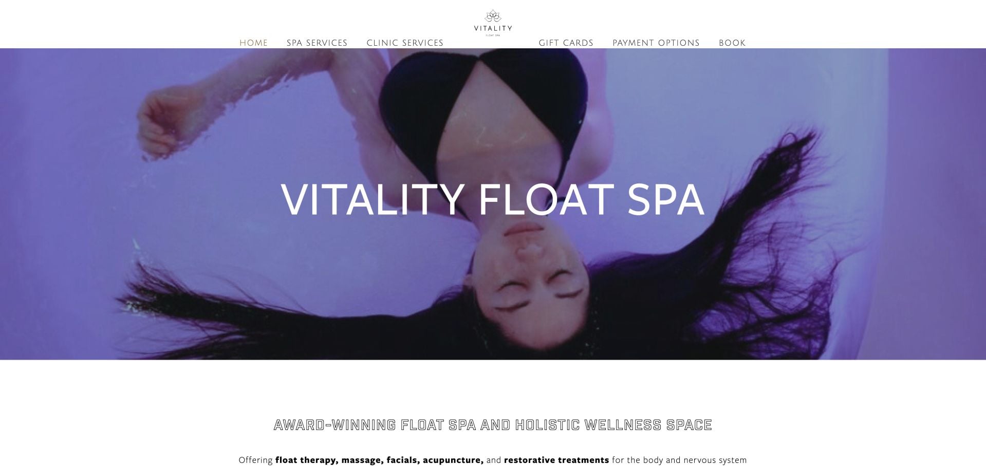
Vitality Float Spa combines a distinctive purple treatment image with a Richmond introduction and a prominent appointment route. The inspected navigation separates spa and clinic services, while a shorter Popular Services section offers another way into the larger menu. Team, pricing, payment options and contact are all available. The structure is useful because it acknowledges different kinds of visits, but the very large menu demands careful reading. A new customer should not have to infer the appropriate facility or professional from broad wellness language alone.
What you can learn
Use separate navigation groups when appointments differ in provider, setting or preparation. A popular-service shortcut is helpful only when it still leads to clear prices, location context and the correct appointment process.
Pros
Spa and clinic categories make different visit interests explicit.
Popular Services provides a shorter route through the broad offer.
Cons & considerations
The large navigation has many competing categories.
General wellness language needs concrete facility and appointment context.
Kegan is a freelance web designer and developer with 15+ years of experience helping businesses turn complicated website requirements into clear, maintainable digital experiences. He works directly with clients from planning and design through development, launch, and ongoing support.
For day spa website design, his development approach focuses on treatment and package comparisons, facility and arrival details, separate group inquiries, and dependable reservation handoffs. The scope can be a targeted improvement or a complete custom build, with responsive layouts, thoughtful content structure, and integrations chosen around the people using and maintaining the site.
Show 3 other day spa website designersHide other day spa website designers
Document appointments, shared facilities, packages and retail before choosing navigation labels. Establish which access is included in each option and which requires a separate reservation. Use a comparison format when visitors must distinguish several similar packages.
Create a first-visit information page
Explain how to arrive, when to arrive, what is supplied and how to ask practical questions. Keep accessibility information and contact options easy to find. Describe the business’s published policies without turning general guidance into advice about personal medical suitability.
Give groups a different planning route
Couples, parties and larger groups may require coordination that a single appointment form cannot capture. Explain the pricing unit, group-size context and inquiry process. Give seasonal promotions dates and a responsible editor rather than leaving urgency messages indefinitely visible.
The editing job behind the design
Match the tools to appointments, access and gifts
Use structured service and package records that can show inclusions, duration and price basis consistently. Keep a readable web menu even if a designed PDF is also offered. Real room photographs are helpful, but practical information should remain understandable when video or a gallery does not load.
Connect separate reservation and commerce tools only where their roles are clear. A gift purchase should explain redemption, while an appointment handoff should preserve the selected property and service where possible. Keep relevant terms available before the transaction and avoid duplicating live availability in static promotional cards.
Our WordPress website examples offer a separate look at publishing approaches. A visible platform label is evidence for that named page, not a guarantee that the same system will suit your requirements.
Before the public launch
Day spa website planning checklist
Separate treatments from amenity access.
List package inclusions plainly.
Show the correct pricing unit.
Distinguish session time from total visit time.
Label gift purchase and booking differently.
Identify the exact property and arrival route.
Provide first-visit practical guidance.
Give groups a suitable inquiry route.
Date promotions and temporary restrictions.
Keep appointment and redemption conditions findable.
These checks are a project checklist, not a performance, legal, security, or accessibility certification. Test real journeys with the people responsible for the website before making claims about the result.
Sources & editorial method
How this collection was selected and reviewed
These 17 examples match the collection count saved before research. The editorial team directly inspected the public company pages and recorded source URLs, visible text and screenshot provenance in the supporting capture manifest. Direct browser captures are individually dated; the collection may also reuse an existing direct capture of the same primary property without changing its original capture date. The guide-level narrative was prepared from that inspected evidence. Reviews describe website design, service information and navigation, not professional competence, safety, treatment effectiveness, availability or promised outcomes. Business claims, testimonials and badges are not independent verification. Public technology labels require source evidence; unknown stacks remain unlisted. No appointments, purchases, inquiries or private intake forms were completed for this review. Parked, blocked, empty and unrelated pages were excluded. Website imagery and trademarks belong to their respective owners.
Each example links to its actual source page. Screenshots are direct browser captures with their own capture dates; moving imagery, announcements and live designs can change. The notes describe observable design choices and conditional tradeoffs, not measured traffic, conversion results, service quality, or accessibility conformance.
Technology labels use public page metadata, asset evidence, or explicitly cited platform documentation. Platform documentation is not a complete current deployment audit. A component reference may be legacy or unused; it is not a complete backend inventory. Unknown stacks are omitted. These sites are editorial examples, not our client portfolio.
Written, Edited and Curated are separate editorial records, not timestamps advanced by a rebuild. Website designs and imagery belong to their owners. See our editorial standards or suggest a correction.
Questions worth asking
Day Spa website design questions
What belongs in a spa package description?
The included services or access, relevant duration, pricing unit and any important exclusions or required next step. A poetic package name can provide character, but it should not be the visitor’s only basis for comparison.
Does buying a spa gift card reserve a visit?
Not unless the business explicitly says it does. The website should distinguish the purchase from the appointment process and explain how the recipient uses the gift. Avoid a shared button label that makes those outcomes look identical.
Should a day spa publish group prices?
Publish accurate per-person, per-couple or starting-price context when possible, with the relevant group-size conditions. If a proposal is required, explain the variables and what information the inquiry should include.
How should a hotel spa explain access?
Identify the spa’s exact location within the property and distinguish treatment appointments from amenity admission or other hotel facilities. State the business’s published access process rather than assuming every guest or treatment receives the same inclusions.
The strongest day spa site pairs a recognizable atmosphere with a literal explanation of the visit: what is included, what is purchased and what still needs to be reserved.