A useful widget makes a task easier to understand. These references show the labels, content hierarchy, and surrounding navigation that still matter when a website adds suggestions, calendars, tabs, dialogs, or other enhanced controls.
jQuery UI is a collection of interactions, widgets, effects, and themes built on jQuery. A resource reference can establish that the library is associated with a public page, but it cannot identify a specific widget without additional evidence. The reviews therefore separate visible layout from recommendations for an implementation.
The collection covers banking, commerce, location finding, creative portfolios, events, and hospitality. Each has a different state problem: a chosen store, a selected date, an active category, or the context to restore after an overlay closes. The strongest lesson is to define those states and their labels before choosing an enhancement.
Before the examples
What makes good jQuery UI website development in 2026?
Distinguish entered text from a selected result
Autocomplete can suggest matching values as someone types. Your application still needs to define what counts as a valid choice and what happens when a previously selected value is edited. Show the final selected location, product, or person in readable language near the next action.
A datepicker supplies a calendar interface; it does not establish availability or explain a booking rule. Specify the accepted format, applicable service, and invalid range behavior. Keep a usable text value and test dates that cannot complete the intended task.
A dialog needs a useful title, clear controls, and a deliberate focus sequence. Test the trigger, keyboard use inside the overlay, dismissal, and the return to the underlying page. Decorative placement at the screen edge does not remove the need for an understandable label.
PNC, Drunk Elephant, North American Van Lines, Busy Bees, and Dominique Ansel Bakery open the collection. The underlying evidence identifies jQuery UI resources on the exact reviewed properties. The original reviews do not claim that visible finders, booking panels, or navigation controls use the library without direct evidence.
We start with five recognizable brands or organizations: PNC, Drunk Elephant, North American Van Lines, Busy Bees, Dominique Ansel Bakery. Each attribution applies to the named website property, not every product or website belonging to its organization. This is a curated reading sequence, not a measured ranking.
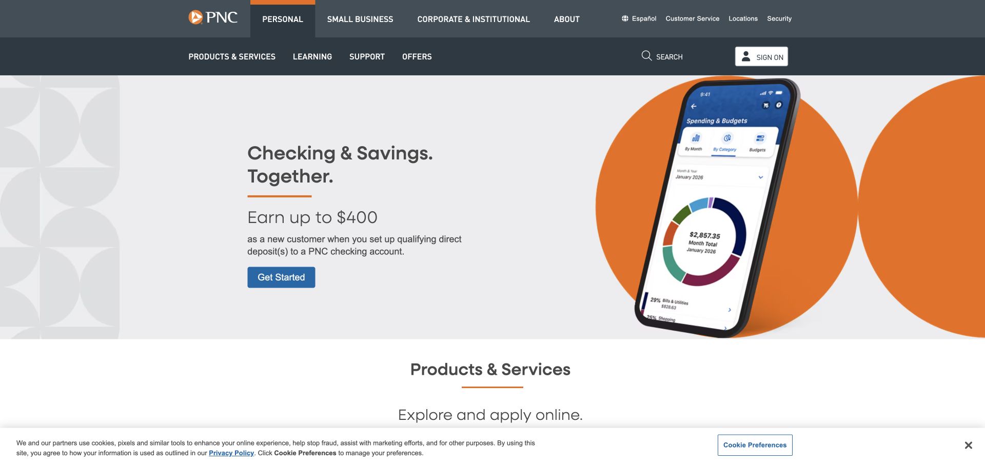
PNC pairs neutral page surfaces and orange accents with a large phone illustration beside account copy. Audience choices occupy a separate header level, while product content begins below the campaign. For jQuery UI planning, this is useful as an information hierarchy rather than proof of a particular widget. The dated source includes a jQuery UI resource, but the screenshot does not identify an autocomplete, tab set, dialog, or other initialized component. It also does not reveal the software behind private account services.
What you can learn
If interactive product comparison is added to a similar page, preserve plain labels and stable links outside the widget. A phone illustration should explain a task without becoming the only source of information. Test keyboard operation, selected-state cues, and the reading order of any tabs against the full audience navigation, so the interface does not require visitors to understand two unlabeled levels of selection.
Pros
Orange actions stand out within the restrained neutral composition.
The phone and explanatory copy have distinct visual areas.
Cons & considerations
A large device image postpones more detailed account comparison.
Two header levels require clear distinction between audience and product choices.
Platform source: Dated exact public source-page audit. Linked script matches jQuery UI. Dated public resource or code association on this exact source page; not proof that any particular visible component initializes or behaves as assumed. Platform evidence is separate from the direct website screenshot and is not a complete current infrastructure audit.
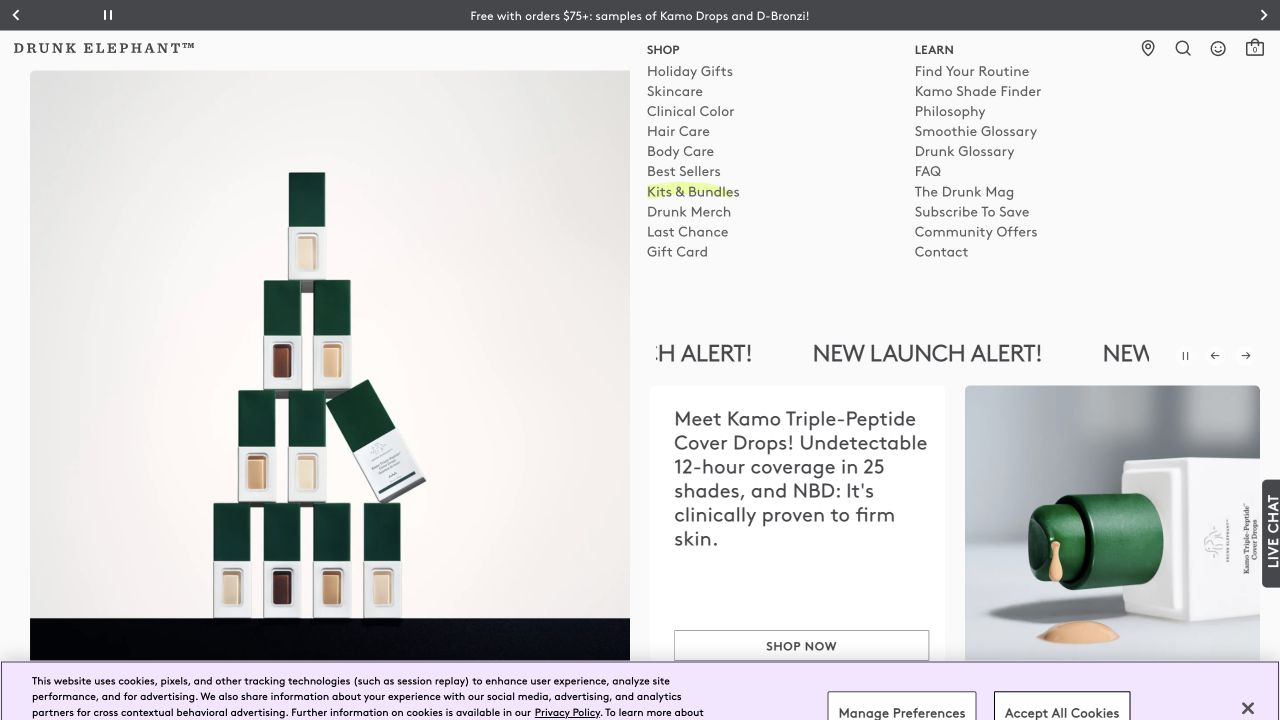
Drunk Elephant separates shopping from learning, placing routine guidance and explanatory terminology alongside a brightly colored product world. The opening introduces a product with a model and concise action. For jQuery UI planning, the useful question is how an interactive explanation preserves plain meaning. Public resource evidence does not prove the presence of a jQuery UI accordion, autocomplete, or dialog on the visible screen, nor does it verify the logic of a routine recommendation or any claim about suitability.
What you can learn
If a glossary or routine guide uses expandable sections, give every control a descriptive label and preserve a clear reading order. Keep product identity visible when a panel opens and provide an ordinary destination for the complete explanation. Test unfamiliar terms with a new visitor, including keyboard navigation and a narrow screen, so playful naming does not turn a simple question into a hidden interaction puzzle.
Pros
Shop and Learn give different intentions recognizable homes.
Product colors create continuity across a broad assortment.
Cons & considerations
Playful terminology can obscure the distinction between items.
Launch imagery may dominate quieter usage and service information.
Platform source: Dated exact public source-page audit. Linked stylesheet matches jQuery UI. Dated public resource or code association on this exact source page; not proof that any particular visible component initializes or behaves as assumed. Platform evidence is separate from the direct website screenshot and is not a complete current infrastructure audit.
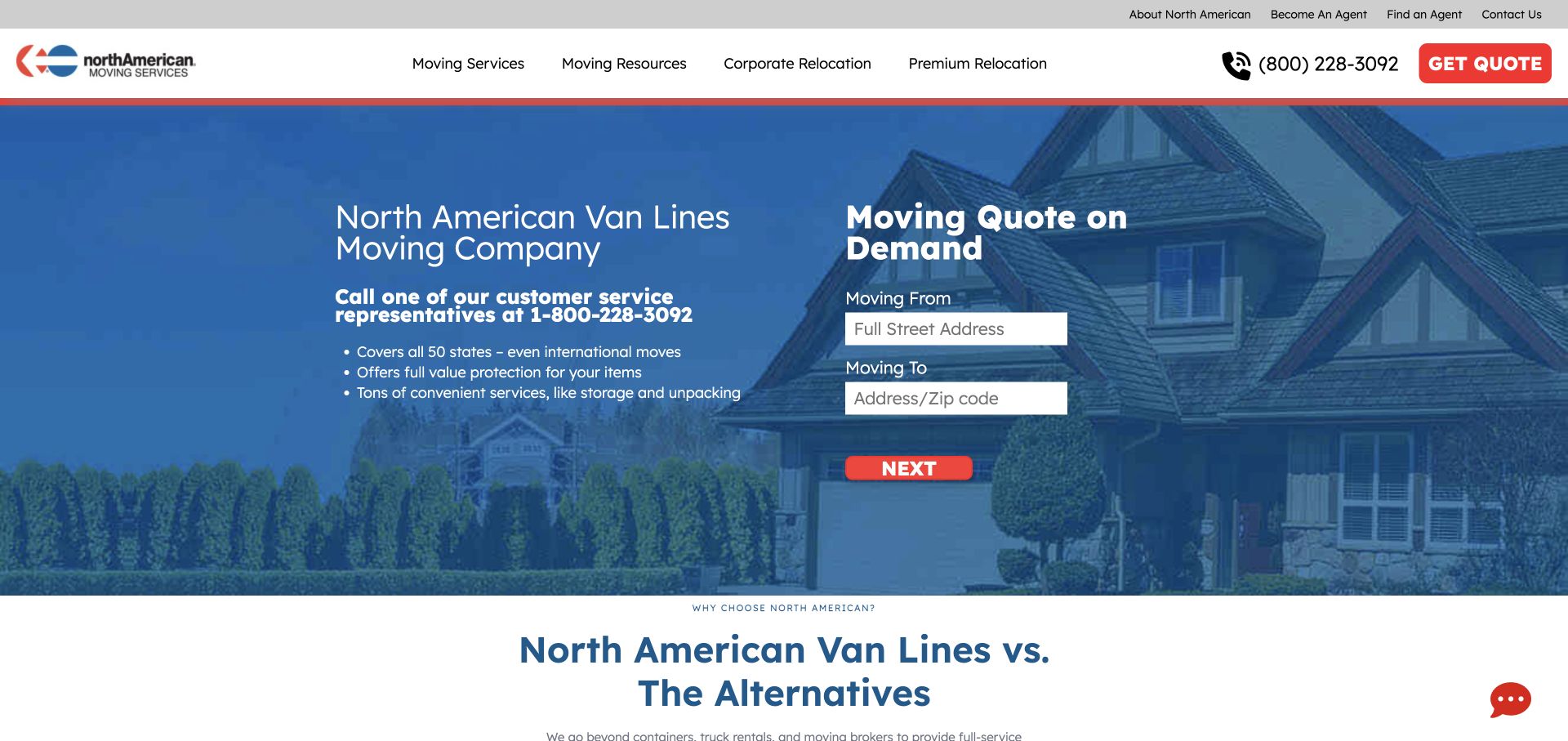
North American Van Lines places a white quote card and red action against a blue area and residential photograph, with service points immediately beside the form. The composition lets someone consider the offer while deciding whether to enter move details. For jQuery UI planning, this is a useful form-context reference. The public library resource does not establish that a datepicker or autocomplete powers any field, reveal the estimate logic, or verify what happens after the visitor chooses the next step.
What you can learn
For a comparable quote flow, explain accepted location and date formats before adding enhanced controls. Let a keyboard user enter values directly and understand errors without interacting with a calendar grid. Make the next-step label distinguish an estimate from a contact request. Test incomplete locations, unavailable dates, and changing an earlier choice, while keeping the nearby service explanation visible when a suggestion menu or date panel opens.
Pros
The white card and red action make the sequence visually recognizable.
Adjacent service points answer questions without a separate navigation step.
Cons & considerations
The next-step wording must explain the actual outcome.
Comparative claims require maintained evidence beyond the form's visual credibility.
Platform source: Dated exact public source-page audit. Linked script matches jQuery UI. Dated public resource or code association on this exact source page; not proof that any particular visible component initializes or behaves as assumed. Platform evidence is separate from the direct website screenshot and is not a complete current infrastructure audit.
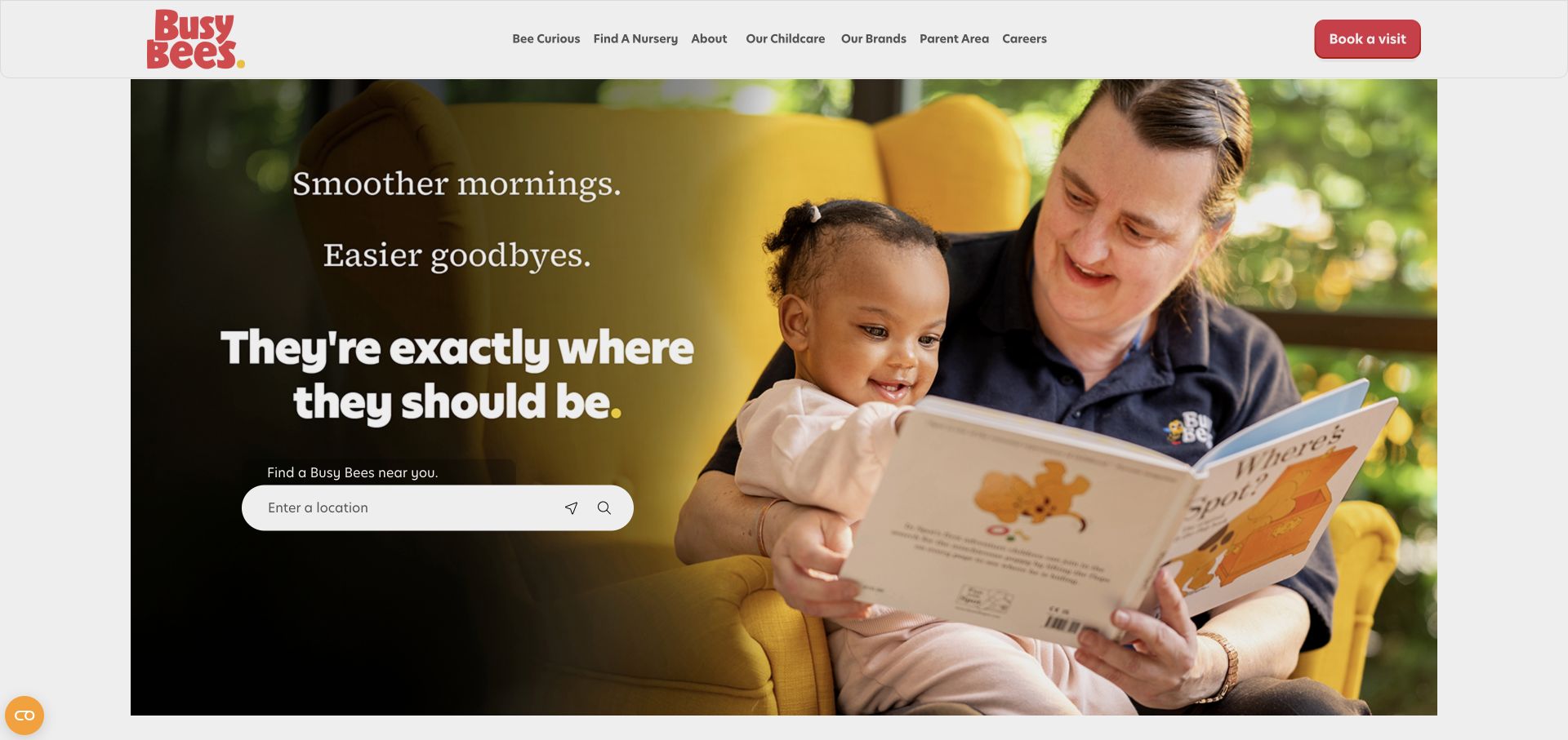
Busy Bees places its nursery finder over a darkened section of a large photograph, with a compact header and a red visit action. Nursery, childcare, parent, and careers routes remain explicit. The arrangement is useful jQuery UI inspiration because a location input needs more than a recognizable search icon. The detected library association does not identify the finder as an autocomplete or prove how suggestions, geolocation, keyboard focus, or an empty result behave in the actual implementation.
What you can learn
If implementing an enhanced finder, state whether the field accepts town, postcode, or another input. Distinguish manually entering a location from requesting current location, and keep suggestions readable over the image. Test a misspelling, no results, a long place name, and keyboard selection. After a result is chosen, make the nursery destination and next task clear rather than silently assuming the user has booked a visit.
Pros
The darkened image creates a usable zone for the location task.
A compact header leaves more room for the primary finder.
Cons & considerations
Icon controls require descriptive names and visible focus treatment.
The large image postpones detailed program and fee information.
Platform source: Dated exact public source-page audit. Linked script matches jQuery UI. Dated public resource or code association on this exact source page; not proof that any particular visible component initializes or behaves as assumed. Platform evidence is separate from the direct website screenshot and is not a complete current infrastructure audit.
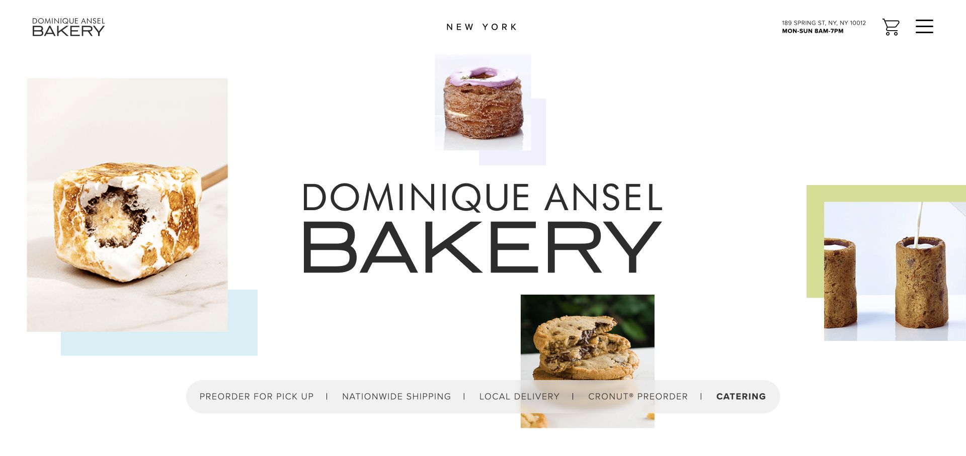
Dominique Ansel's New York website places address and hours close to an expressive pastry collage, then separates pickup, shipping, local delivery, Cronut preorders, and catering. The practical strip makes several different operational journeys visible. For jQuery UI planning, it suggests why a calendar or select menu must be introduced after the appropriate fulfillment mode is clear. Public jQuery UI resources do not show that any date field uses the library or establish availability in the linked ordering systems.
What you can learn
For a similar ordering interface, choose the service first and explain which dates and locations apply. A datepicker should not imply that every visible day is actually available for every pastry or delivery method. Preserve an understandable text value, label disabled dates, and test a visitor switching modes after making a selection. Keep street address and hours available when the enhanced control is closed or cannot initialize.
Pros
Header address and hours support visitors already planning a trip.
Explicit fulfillment labels separate distinct order expectations.
Cons & considerations
The collage delays detailed product information beneath its visual identity.
Parallel ordering routes need consistent explanations of availability and timing.
Platform source: Dated exact public source-page audit. Linked stylesheet matches jQuery UI. Dated public resource or code association on this exact source page; not proof that any particular visible component initializes or behaves as assumed. Platform evidence is separate from the direct website screenshot and is not a complete current infrastructure audit.
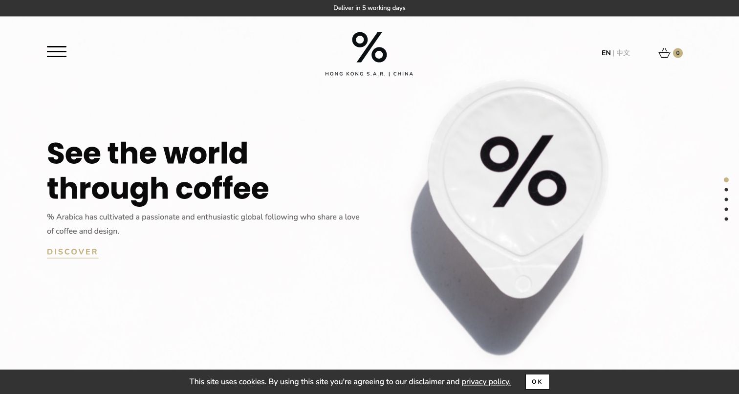
The Hong Kong % Arabica property combines a large coffee cup and central percent identity with a quiet Discover action on white. Region, language, cart, and delivery information establish scope without a conventional dense header. For jQuery UI planning, this is a useful test of whether a minimal visual system can still explain an interactive choice. The library resource association does not identify a particular menu or widget, and it does not establish the implementation of every global Arabica website.
What you can learn
If region or product choices use enhanced menus, make the current selection visible as readable text and support keyboard operation. Do not rely only on a small icon or color to distinguish a selected option. Test longer translated labels, a missing result, and a change of market after a product has been viewed, ensuring the surrounding delivery statement remains consistent with the visitor's final selection.
Pros
Regional and language controls make the property's scope visible.
One product photograph gives the restrained identity a clear focal point.
Cons & considerations
Icon-led navigation is less immediately descriptive than written categories.
Quiet actions need sufficient contrast and clear interactive states.
Platform source: Dated exact public source-page audit. Linked stylesheet matches jQuery UI. Dated public resource or code association on this exact source page; not proof that any particular visible component initializes or behaves as assumed. Platform evidence is separate from the direct website screenshot and is not a complete current infrastructure audit.
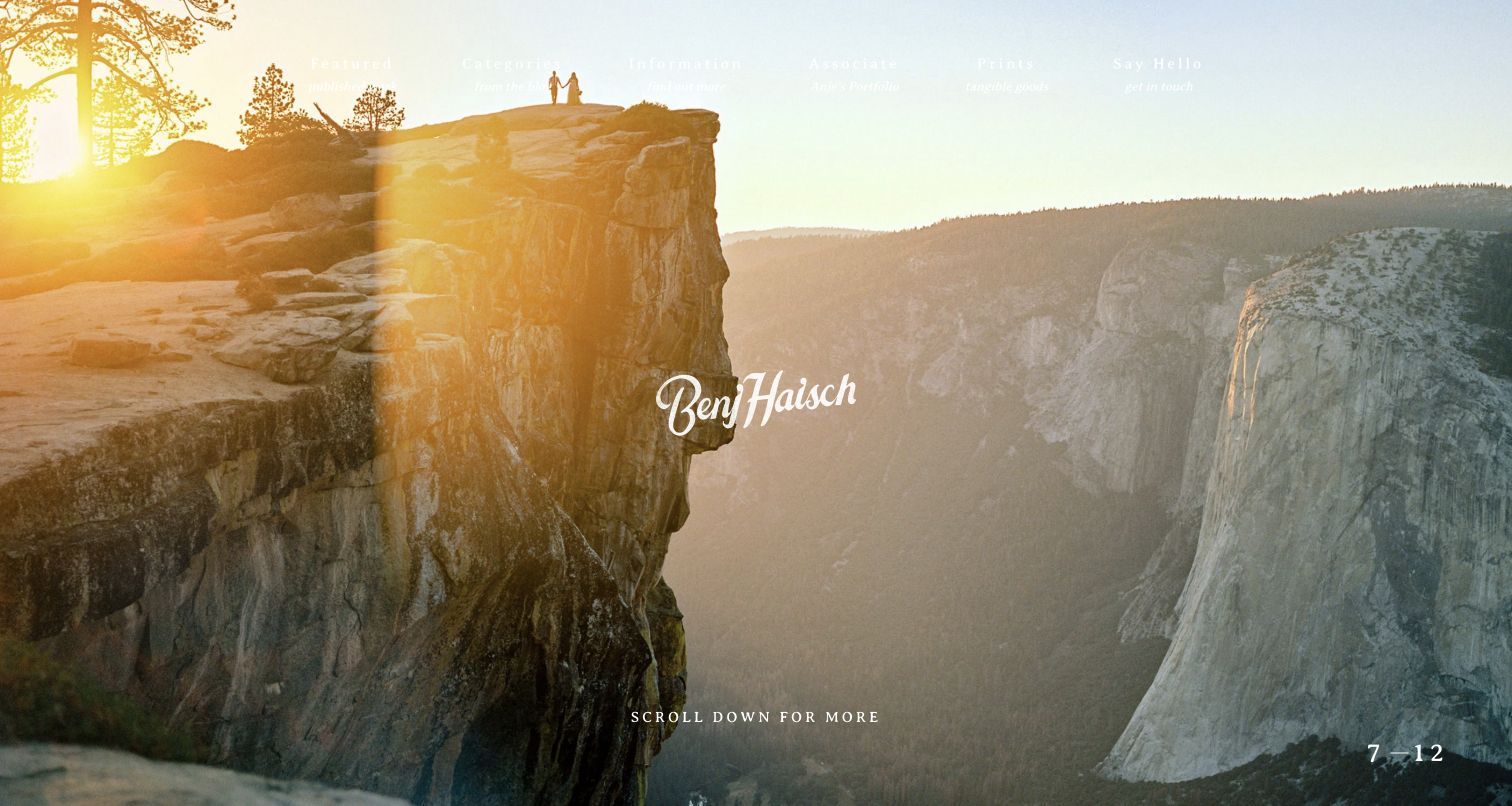
Benj Haisch's landscape wedding opening uses a centered signature, a slide counter, and a scroll cue. Broad navigation labels have small descriptive subtitles, adding context to routes such as Featured and Say Hello. For jQuery UI planning, the useful issue is clarity around an expressive portfolio. The source's library association does not identify the slide mechanism or demonstrate a dialog, tab, or other widget. The capture shows a visual reference, not a test of the site's interaction behavior.
What you can learn
If portfolio categories use tabs or an inquiry opens in a dialog, retain the descriptive wording and a useful focus sequence. A visitor should understand where the control leads before opening it. Test the same navigation against bright and dark photographs, then check that closing an overlay returns to the initiating control. Keep practical service and location information available without requiring the entire image sequence to be explored first.
Pros
The landscape photograph establishes the relationship between people and setting.
Subtitles help explain otherwise broad creative navigation labels.
Cons & considerations
Light text loses contrast over the captured bright sky.
Practical service detail is deferred beyond the atmospheric first view.
Platform source: Dated exact public source-page audit. Linked stylesheet matches jQuery UI. Dated public resource or code association on this exact source page; not proof that any particular visible component initializes or behaves as assumed. Platform evidence is separate from the direct website screenshot and is not a complete current infrastructure audit.
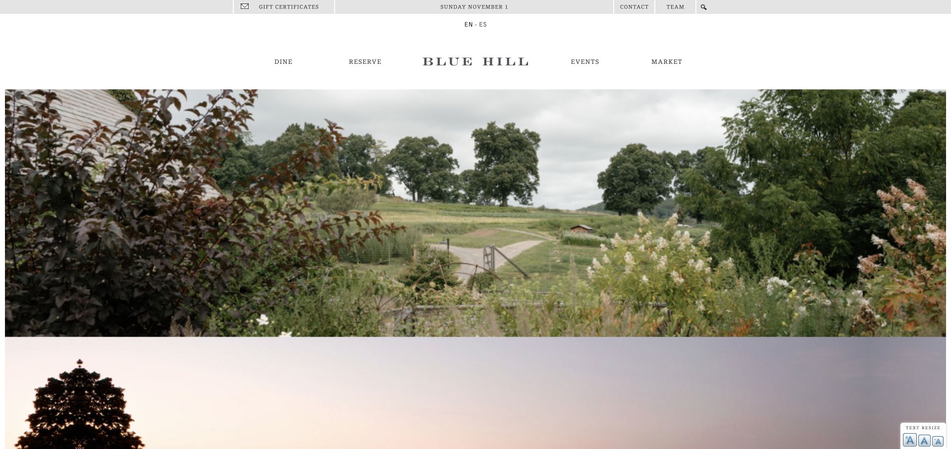
Blue Hill uses landscape and farm imagery around visible dining, reservations, events, and market categories. Gifts, contact, language, and search occupy a smaller utility layer. A temporary event announcement was dismissed for the genuine reference view. For jQuery UI planning, the important distinction is between choosing an experience and choosing a date. The library's public resource association does not identify the booking provider, verify a datepicker, or establish focus and dismissal behavior for the temporary announcement.
What you can learn
If a similar site uses a dialog or calendar, first explain the dining experience and its destination. Test keyboard entry and dismissal, return focus to the correct trigger, and keep important event information available outside an overlay. A seasonal announcement should have an owner and expiry rule. Verify that opening it does not conceal the visitor's existing reservation context or reset a choice made elsewhere on the page.
Pros
Dining and reservation categories remain explicit above the landscape.
The setting communicates a distinctive reason to visit.
Cons & considerations
Several utility and commercial links compete in the upper area.
Seasonal overlays require interaction testing and timely editorial retirement.
Platform source: Dated exact public source-page audit. Linked stylesheet matches jQuery UI. Dated public resource or code association on this exact source page; not proof that any particular visible component initializes or behaves as assumed. Platform evidence is separate from the direct website screenshot and is not a complete current infrastructure audit.
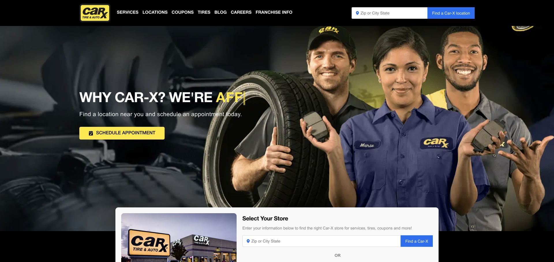
Car-X puts a ZIP-or-city entry in the header and a larger store panel below a crew photograph and yellow appointment action. Services, tires, coupons, and locations have ordinary navigation labels. For jQuery UI development, this is a useful state-consistency problem: two controls can appear clear independently yet disagree about the selected shop. Public library evidence does not prove these controls use autocomplete or establish that their values synchronize, persist, or route an appointment to the same location.
What you can learn
If enhanced suggestions are used, keep one explicit store choice and display it in both relevant locations. Distinguish typed text from a confirmed selection, and explain what selecting a shop changes. Test choosing a result with the keyboard, editing the query afterward, and moving from a coupon back to the homepage. A stale store identifier must not remain hidden behind newly typed text that suggests a different place.
Pros
Location and appointment routes are available early in the visit.
The consistent dark-and-yellow treatment connects people and service actions.
Cons & considerations
Multiple selectors can feel redundant when their relationship is unclear.
Animated headline fragments need a complete static reading state.
Platform source: Dated exact public source-page audit. Linked stylesheet matches jQuery UI. Dated public resource or code association on this exact source page; not proof that any particular visible component initializes or behaves as assumed. Platform evidence is separate from the direct website screenshot and is not a complete current infrastructure audit.
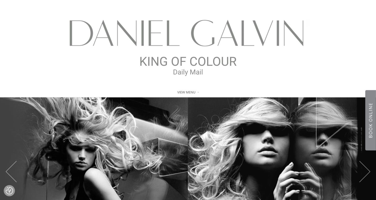
Daniel Galvin gives its name substantial space above a monochrome hair montage, using a compact menu and a vertical booking tab at the screen edge. The composition keeps several large buttons away from the photography. For jQuery UI planning, it highlights the need to make an unconventional trigger understandable before any enhanced interface opens. A library resource does not prove the booking tab launches a jQuery UI dialog or reveal the appointment system behind its destination.
What you can learn
For a similar edge-triggered interface, provide a readable label, visible focus, and a predictable position at narrow widths. If it opens a dialog, give that dialog a title and a clear close control, then restore focus to the trigger. Test the keyboard route from navigation through the booking action and verify that service and location information remain available without requiring someone to start an appointment flow merely to learn the basics.
Pros
The wordmark and montage create a coherent editorial identity.
Booking has a distinct position outside the central visual composition.
Cons & considerations
The oversized opening postpones ordinary service and location details.
Vertical labels and compact menus can be less immediately familiar.
Platform source: Dated exact public source-page audit. Linked script matches jQuery UI. Dated public resource or code association on this exact source page; not proof that any particular visible component initializes or behaves as assumed. Platform evidence is separate from the direct website screenshot and is not a complete current infrastructure audit.
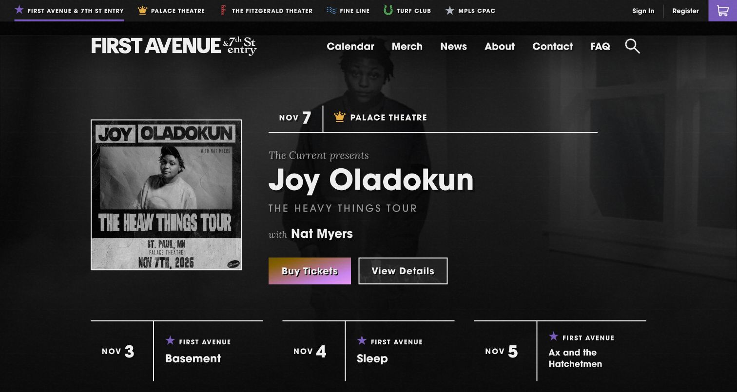
First Avenue's monochrome feature identifies an artist, a November date, and Palace Theatre, with separate ticket and detail actions. A venue selector and calendar support a network of rooms. This is useful jQuery UI planning material because a filter or tab can change the practical meaning of an event list. The source's library association does not identify the selector or calendar as jQuery UI components, verify ticket availability, or establish interaction behavior across the linked ticketing service.
What you can learn
If venue and date filters are enhanced, show the active choices beside the results and preserve them on browser back. A result should repeat its venue even when the list is filtered, because visitors may share or open it independently. Test empty dates, switching venues, and keyboard focus after an update. Keep details available before a purchase handoff so age restrictions and arrival information are not hidden inside ticket checkout.
Pros
The actual venue appears beside the artist and date.
Separate detail and ticket routes serve different levels of readiness.
Cons & considerations
A crowded venue selector may need geographic context.
Strong display styling must remain readable around dense event metadata.
Platform source: Dated exact public source-page audit. Linked stylesheet matches jQuery UI. Dated public resource or code association on this exact source page; not proof that any particular visible component initializes or behaves as assumed. Platform evidence is separate from the direct website screenshot and is not a complete current infrastructure audit.
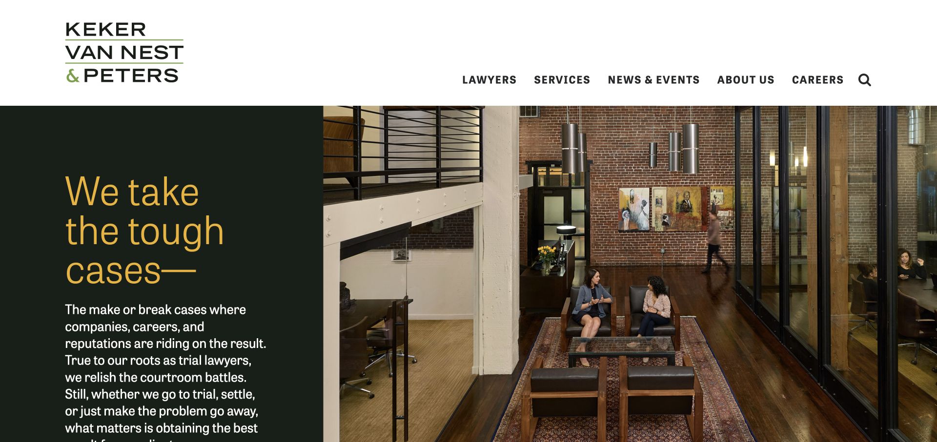
Keker, Van Nest & Peters divides its opening between deep green text and a red-brick building, using gold lettering and a white navigation bar. The supporting explanation is substantial rather than hidden in an overlay. For jQuery UI planning, this is a useful reference for respecting reading space around interaction. Public library resources do not establish a particular widget, inquiry form, or private legal system, and the building photograph does not substitute for details about services and responsibilities.
What you can learn
If long practice descriptions use tabs or accordions, make the section labels concrete and preserve a direct route to the full content. A visitor should not need to guess which panel contains the relevant expertise. Test long headings and keyboard navigation with the actual dense copy, then verify that the main inquiry route remains visible. Avoid using an overlay to compress information that readers need to compare calmly across several sections.
Pros
The building photograph gives the firm a particular sense of place.
Text and imagery have clearly separated visual areas.
Cons & considerations
Dense support copy can fall low in a tall split-screen opening.
The brand statement is more prominent than an immediate inquiry route.
Platform source: Dated exact public source-page audit. Linked script matches jQuery UI. Dated public resource or code association on this exact source page; not proof that any particular visible component initializes or behaves as assumed. Platform evidence is separate from the direct website screenshot and is not a complete current infrastructure audit.
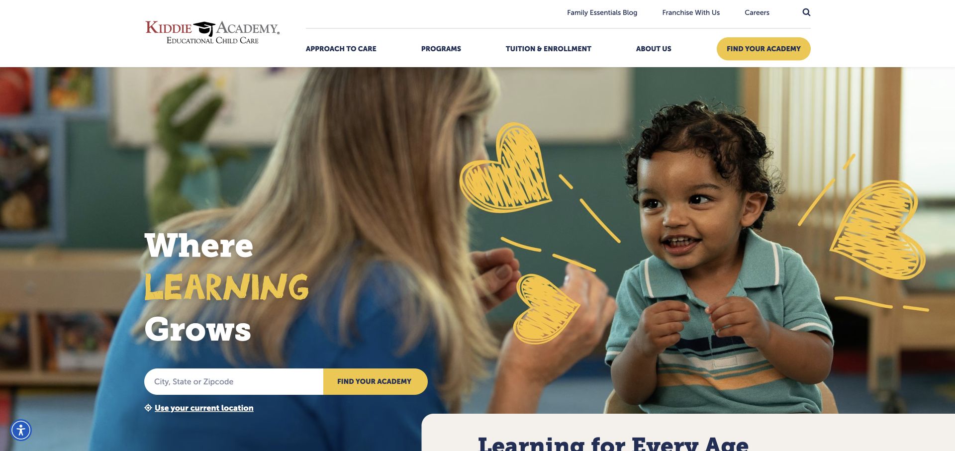
Kiddie Academy surrounds a city, state, or ZIP locator with burgundy, yellow, navy, a teacher-and-child photograph, and hand-drawn accents. Tuition and enrollment appear as explicit navigation terms. For jQuery UI planning, the useful pattern is a practical field with clear input expectations inside a warm visual campaign. The observed library association does not prove that the locator uses autocomplete, validate its suggestions, or establish whether selecting a result preserves context through enrollment and tour destinations.
What you can learn
If the locator is enhanced, keep the geographic label visible when text is entered and identify suggestions as locations rather than generic links. Test keyboard selection, an ambiguous city name, and a query with no nearby result. Show the chosen academy before offering a next step, and preserve ordinary browsing for families who prefer to inspect locations without entering precise geographic information immediately.
Pros
The locator specifies a concrete kind of geographic input.
Tuition and enrollment use words that match common family questions.
Cons & considerations
Mixed lettering and decorative accents compete near the practical control.
The hero supplies little immediate information about an individual academy.
Platform source: Dated exact public source-page audit. Linked stylesheet matches jQuery UI. Dated public resource or code association on this exact source page; not proof that any particular visible component initializes or behaves as assumed. Platform evidence is separate from the direct website screenshot and is not a complete current infrastructure audit.
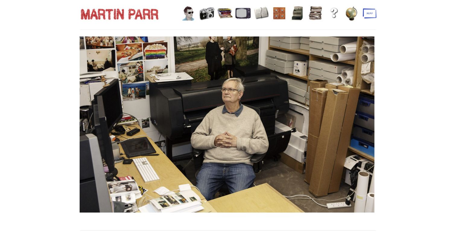
Martin Parr's red nameplate and illustrated-object navigation sit above a studio photograph, creating an informal, personal opening. Recent work, books, archive, biography, and contact remain the underlying destinations. For jQuery UI planning, the useful issue is whether an expressive control communicates its purpose. Public library evidence does not identify the object menu as a particular widget or verify its keyboard behavior. The screenshot also does not show how the archive is searched or how later content is organized.
What you can learn
Pair each illustrated destination with a readable label and keep the same meaning when focus, hover, or touch changes its appearance. If a menu, tooltip, or tab enhances the objects, make the essential destination understandable without that enhancement. Test a first-time visitor trying to find the archive and contact information, then check the entire route using only a keyboard rather than assuming the visual joke will explain every control.
Pros
The studio photograph makes the property feel specific and personal.
Illustrated objects reinforce an identifiable informal tone.
Cons & considerations
Objects can require interpretation before their destination becomes clear.
The first view shows the workspace rather than representative projects.
Platform source: Dated exact public source-page audit. Linked stylesheet matches jQuery UI. Dated public resource or code association on this exact source page; not proof that any particular visible component initializes or behaves as assumed. Platform evidence is separate from the direct website screenshot and is not a complete current infrastructure audit.
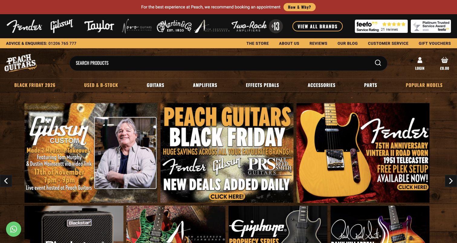
Peach Guitars layers a showroom appointment notice, manufacturer logos, search, navigation, and compact promotions over a woodgrain identity with yellow accents. The page immediately feels specialist, but several kinds of information compete before merchandise detail. For jQuery UI planning, this is useful context for designing filters and selection controls. The dated library association does not identify a price slider, autocomplete, or other product widget, verify inventory, or establish the behavior of any showroom appointment system.
What you can learn
Keep essential showroom conditions permanent and give product filters a separate, readable region. If a range slider is used, supply labeled values and an alternative input method; if suggestions appear in search, distinguish brands from individual instruments. Test long manufacturer names, no matching stock, and clearing all filters. A visually dense specialist identity should not obscure which constraints produced the current result list or how to start again.
Pros
The appointment notice addresses a practical condition for visiting.
Manufacturer imagery establishes the store's instrument specialty quickly.
Cons & considerations
Several stacked header layers postpone merchandise exploration.
Woodgrain and bright accents need careful small-text contrast checks.
Platform source: Dated exact public source-page audit. Linked stylesheet matches jQuery UI. Dated public resource or code association on this exact source page; not proof that any particular visible component initializes or behaves as assumed. Platform evidence is separate from the direct website screenshot and is not a complete current infrastructure audit.
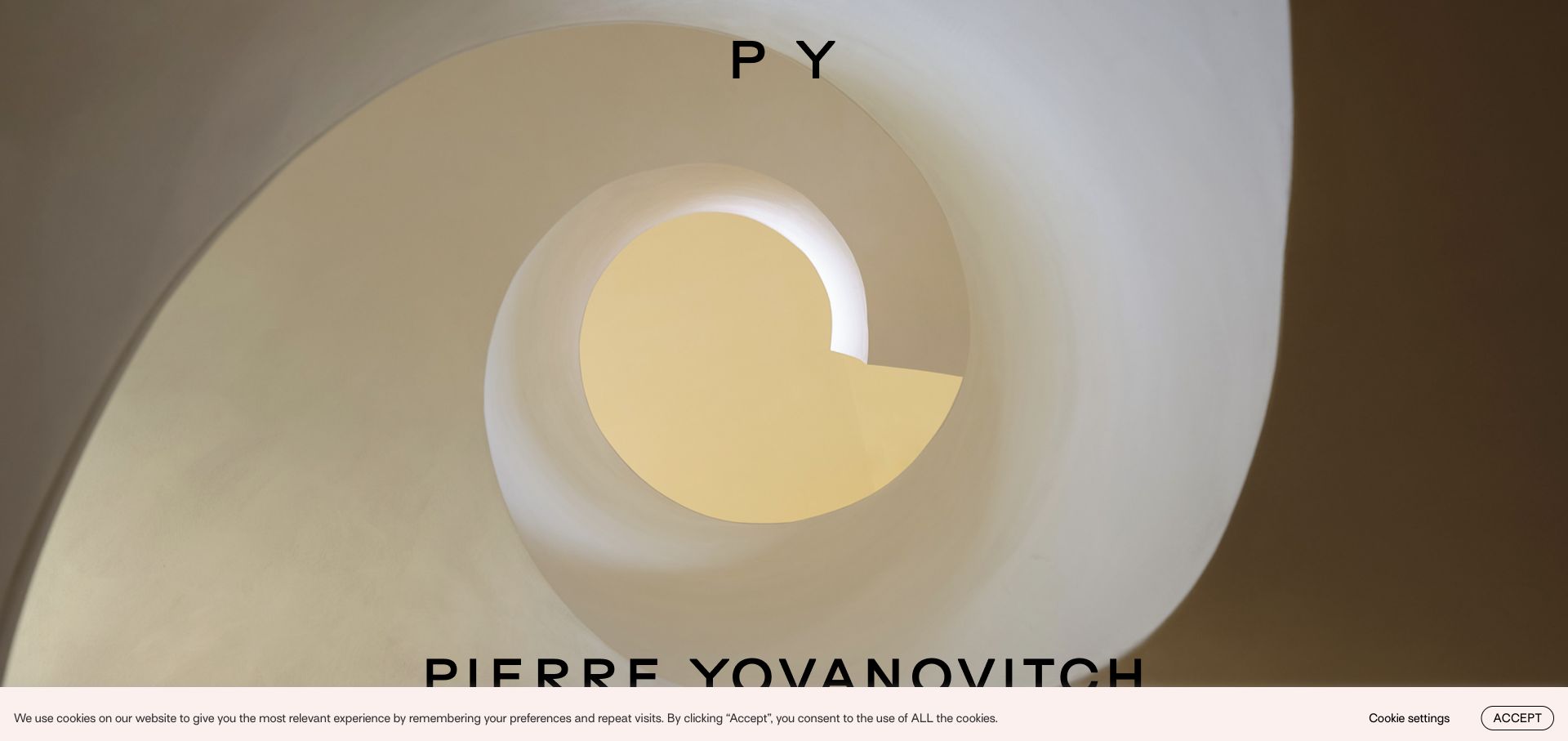
Pierre Yovanovitch uses a curved stair photograph, compact monogram, and a large lower-edge name to introduce a sculptural design sensibility. The broader interface holds project and furniture navigation. For jQuery UI planning, this is useful as a transition from atmosphere to structured discovery. Public resource evidence does not identify a tabbed portfolio, dialog, or filtering widget, and it cannot establish the animation implementation or how a visitor would inquire about a specific interior or furniture piece.
What you can learn
If projects and furniture use enhanced categories, explain the distinction before asking people to manipulate filters. Keep a selected work's title and category visible when opening detail content, and provide a permanent link outside any overlay. Test long project names and browser back behavior from a detail view. The interface should let someone move from an appealing stair image to relevant commission information without requiring an unfamiliar gesture or hidden control.
Pros
The stair image communicates form and light with little supporting copy.
The compact monogram leaves much of the work unobstructed.
Cons & considerations
The first view does not explain the interiors and furniture relationship.
Large lower-edge text can collide with browser or consent controls.
Platform source: Dated exact public source-page audit. Linked script matches jQuery UI. Dated public resource or code association on this exact source page; not proof that any particular visible component initializes or behaves as assumed. Platform evidence is separate from the direct website screenshot and is not a complete current infrastructure audit.
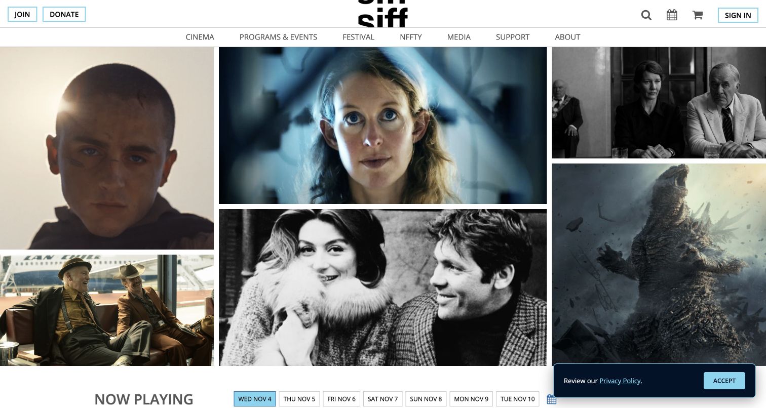
SIFF places a film-still mosaic beneath a restrained header, then introduces Now Playing and a row of dates. Cinema, programs, festival, and support remain distinct routes. For jQuery UI planning, this is a useful example of turning broad discovery into a day-specific choice. The public library association does not identify those dates as tabs or a datepicker, verify updated listings, or demonstrate focus behavior when a different day's films appear. The annual festival also remains a separate visitor intention.
What you can learn
If date controls update a listing, expose the selected day in text and announce the meaningful result change without moving focus unexpectedly. Keep film titles and venue details readable outside the images. Test a date with no screenings, moving between months, and returning from a film detail page. Preserve the annual festival route so a daily-cinema filter does not silently become the only way to browse the organization's program.
Pros
Varied stills communicate the breadth of the film selection.
Date choices align the list with a concrete attendance decision.
Cons & considerations
Images need identifying text or nearby listings to support discovery.
Festival visitors must distinguish the annual event from ordinary screenings.
Platform source: Dated exact public source-page audit. Linked script matches jQuery UI. Dated public resource or code association on this exact source page; not proof that any particular visible component initializes or behaves as assumed. Platform evidence is separate from the direct website screenshot and is not a complete current infrastructure audit.
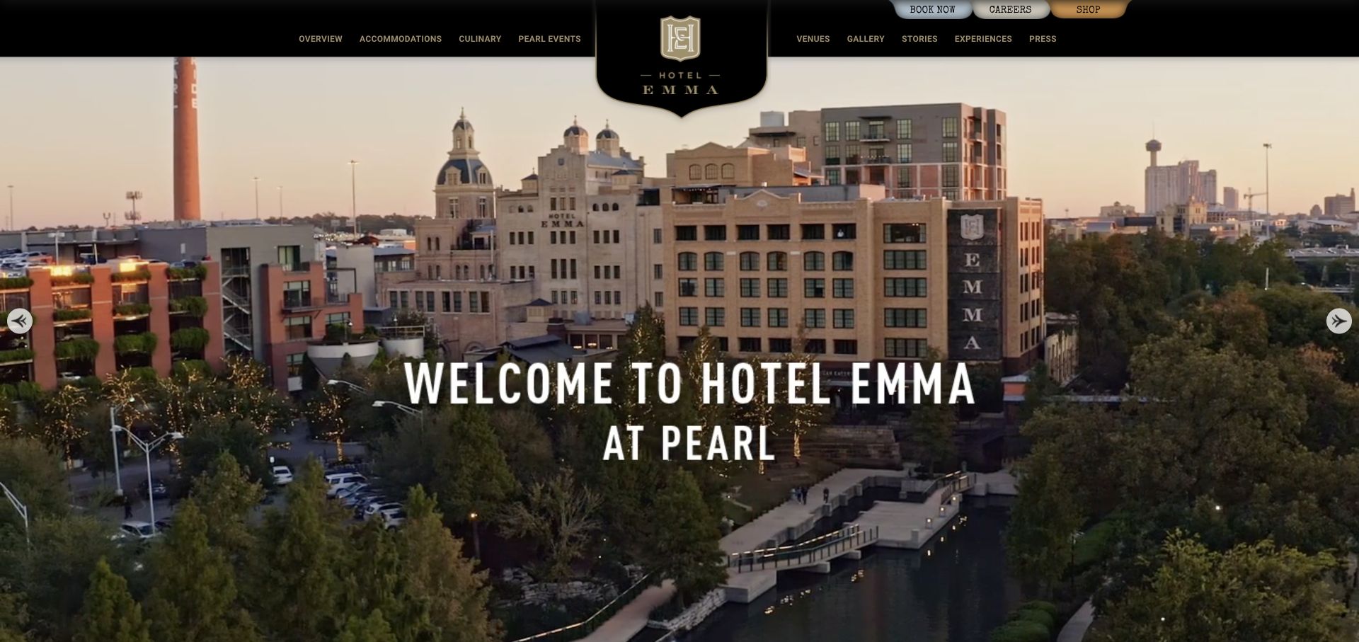
Hotel Emma uses a black-and-gold masthead and a large crest over a panoramic view of the property and Pearl district. Accommodations, dining, venues, and stories have familiar categories, while small tabs offer booking, careers, and shopping. For jQuery UI planning, it is a useful case for keeping task controls legible within decorative identity. The source's library association does not establish a booking datepicker or dialog, identify the reservation engine, or verify availability and rates beyond the public presentation.
What you can learn
If a booking panel is enhanced, give dates, occupancy, and the action clear labels that remain legible beside the crest and navigation. Test keyboard entry and invalid date ranges without relying on a calendar alone. Keep dining and event inquiries separate from a room search. A visitor should be able to compare accommodation information before entering a booking flow, and return to the same context when closing any optional panel.
Pros
The panorama explains the property's relationship to its district.
Dining and event categories sit alongside accommodation as concrete choices.
Cons & considerations
The elaborate crest and small navigation demand substantial attention.
Booking competes with less urgent corporate and shopping tabs.
Platform source: Dated exact public source-page audit. Linked script matches jQuery UI. Dated public resource or code association on this exact source page; not proof that any particular visible component initializes or behaves as assumed. Platform evidence is separate from the direct website screenshot and is not a complete current infrastructure audit.
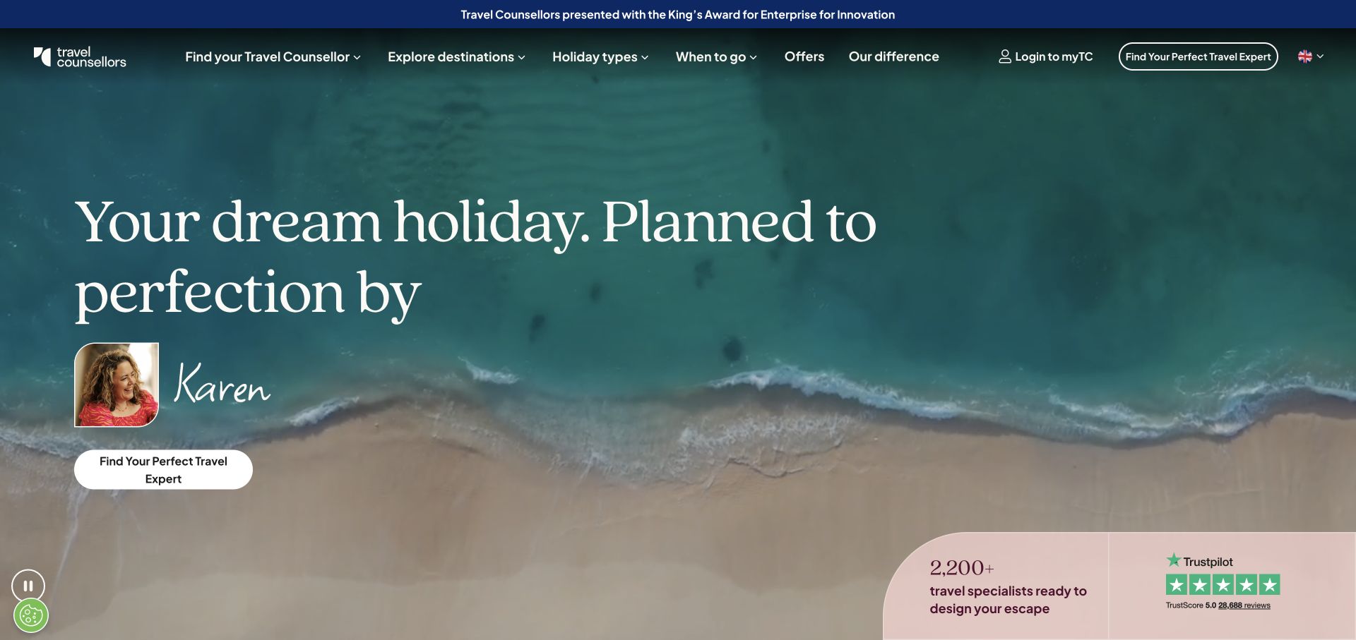
Travel Counsellors puts a named adviser and portrait within an ocean-led opening, with an expert-finding action and navigation for destinations, timing, trip types, and offers. This is useful jQuery UI planning material because a matching interface should help visitors express a travel need. A public library reference does not prove an autocomplete or select widget powers that process, verify adviser availability, or reveal the logic connecting a visitor's preferences to a particular person.
What you can learn
If expert discovery uses enhanced filters, label each choice by the visitor's need and show how to remove it. Distinguish a typed destination from a confirmed selection, and explain empty results with a useful broader route. Test someone who knows a specific adviser and someone who only knows approximate timing. Keep the human contact context visible rather than reducing the service promise to an unexplained list of filter values.
Pros
A named adviser makes the promised service relationship tangible.
Timing complements destination and trip-type discovery.
Cons & considerations
The broad hero postpones detailed itinerary examples.
Review and scale signals do not explain matching criteria by themselves.
Platform source: Dated exact public source-page audit. Linked script matches jQuery UI. Dated public resource or code association on this exact source page; not proof that any particular visible component initializes or behaves as assumed. Platform evidence is separate from the direct website screenshot and is not a complete current infrastructure audit.
Montane pairs a cold-weather photograph and insulation message with navigation distinguishing waterproof, insulated, windproof, and softshell clothing. The vocabulary is useful to experienced customers but asks more of a newcomer. For jQuery UI planning, this is a useful case for readable product filtering. The public resource association does not identify a particular widget, establish a range slider's behavior, or verify the selection logic of the commerce system. A campaign photograph also cannot explain every layer's function.
What you can learn
If filters or comparison tabs use enhanced controls, support both activity-led and product-type entry points. Explain unfamiliar categories near the choice and keep selected filters visible as removable text. Test a newcomer seeking clothing for a trip and an expert seeking a known construction type. Include empty results and keyboard operation, making sure a slider or dropdown does not become the only way to express a necessary constraint.
Pros
The outfit photograph presents clothing as a layered system.
Catalog labels distinguish meaningful construction categories.
Cons & considerations
A long specialist menu can be demanding on a phone.
The campaign image cannot explain insulation and shell differences alone.
Platform source: Dated exact public source-page audit. Linked script matches jQuery UI. Dated public resource or code association on this exact source page; not proof that any particular visible component initializes or behaves as assumed. Platform evidence is separate from the direct website screenshot and is not a complete current infrastructure audit.
Label accepted input, distinguish suggestions from a confirmed choice, and provide an empty-result path. If the same selection appears in several places, make its relationship explicit and verify consistency after edits.
Categories and result lists
Show active filters, retain ordinary item links, and provide a clear way to reset. Test browser back and direct entry to a detail page. A specialized catalog should support visitors who know their goal but not the exact technical term.
Optional overlays
Keep essential information available through a normal destination. Use an overlay when it preserves useful context, and verify that closing it returns people to the appropriate control and reading position.
From references to requirements
Plan compatibility and awkward states together
Inventory the actual implementation
Record the installed jQuery and jQuery UI versions, loaded components, custom styles, and extensions. Consult the corresponding upgrade guidance before changing dependencies; the versions observed on unrelated public sites are not a recommendation for your application.
List initial, focused, selected, changed, empty, invalid, loading, and failed states for the specific task. Explain what the visitor sees and what remains selected in each. Use that description to review the widget and the surrounding content together.
Test real content within the whole page
Use long names, translations, narrow screens, fixed headers, consent panels, and actual dense copy. Verify keyboard operation and visible focus. A component demo can pass while the same control becomes obscured or confusing within the finished layout.
A useful handover demonstration
Ask the actual team to carry out its routine job: publish a realistic update, correct a mistake, preview a narrow screen, and identify who owns an integration failure. For a library or frontend framework, also ask who maintains the content source and deployment. A polished screenshot does not answer those operational questions.
Beyond the screenshot
jQuery UI development checklist
Identify the actual installed library versions and used components.
Define the visitor task before selecting a widget.
Label entered text, selected results, dates, and active filters clearly.
Provide empty, invalid, unavailable, and failed states.
Test keyboard entry, visible focus, dismissal, and focus restoration.
Verify long content and translations within the real page layout.
Check upgrade guidance and repeat the affected interaction tests after dependency changes.
Test with real content, a keyboard, a small screen, slow or failed requests, and the people who will maintain the system. These are planning checks, not an accessibility, security, performance, or search-ranking certification.
Sources & editorial method
How this jQuery UI collection was reviewed
Twenty distinct public properties were matched to genuine captures and dated exact-page jQuery UI resource or code evidence. Every source page has a documented broad public stack-audit attempt. Original capture dates, image dimensions, attribution, and observation dates are retained. A loaded library is not proof of a specific initialized widget or its behavior. The reviews describe observed composition and propose implementation tests; no real applications, purchases, bookings, or forms were submitted.
Every image is an unmodified capture from the actual website, with its source and capture date. Some captures are reused from our shared catalog; their dates remain the original capture dates. None comes from a vendor gallery or a generated reconstruction. Moving imagery and live content can change.
Technology attribution uses public page assets or metadata, official platform documentation, or a cited first-party project case study. Documentary and framework-relationship evidence is identified where used; it is not a complete current backend inventory. A CMS image CDN alone does not establish a full CMS deployment. A library’s presence does not prove which individual controls use it, and a platform label does not establish AI authorship.
The composition notes, lessons, pros and tradeoffs are original editorial observations. We have not measured conversion, traffic, security, performance or accessibility conformance. Website owners retain their brands and imagery; these examples are not our client portfolio. Written, Edited and Curated are independent records, not dates advanced by a build. See our editorial standards or suggest a correction.
Questions worth asking
jQuery UI website development FAQs
Does a jQuery UI resource prove a visible finder uses Autocomplete?
No. A library may be included globally or used by another part of the page. Identifying a widget requires additional evidence. The collection records the association without assigning untested visible controls to it.
Can a datepicker determine booking availability?
The interface can present date choices, but availability and business rules come from the application. Verify allowed dates, time context, invalid ranges, and the actual next step independently of the calendar's appearance.
Should an ordinary link become a dialog?
Only when preserving the current context helps the task. Keep clear titles, close controls, keyboard behavior, and focus restoration. A permanent page may be more useful for content people need to compare, bookmark, or share.
Do these reviews prove accessibility or compatibility?
No. Genuine screenshots and public-source observations support editorial comparison. Accessibility, supported browsers, dependency compatibility, and actual component behavior need testing in the specific implementation.
Use the references to define better labels and state transitions. Choose a widget only after the task and its failure cases are understandable without it.