A consent interface must fit around the actual work visitors are doing. These examples pair genuine screenshots with exact-property OneTrust resource evidence and original reviews of navigation, overlays, forms, and regional handoffs. A public reference establishes an integration association; it does not establish legal compliance or prove how every script behaves.
The visible notice is only one part of a preference system. A project also needs an inventory of services, a clear configuration owner, understandable choices, and tests of what changes after a decision. Those responsibilities should be planned with the website rather than added after the main interface is finished.
This collection includes corporate gateways, entertainment, retail, service discovery, financial information, software marketing, and documentation. Some saved captures show notices; others do not. That difference is a recorded visual state, not evidence that one site has more or fewer privacy obligations or a better implementation.
Before the examples
What makes good OneTrust website development in 2026?
Inventory services before styling the notice
List the services and embedded features on each page type, their purpose, and the person responsible for their configuration. Separate core navigation from optional marketing or assistance features. Use that inventory to plan controls and testing, then have the responsible team decide the applicable policy and regional requirements.
Treat publication and blocking as separate work
OneTrust’s implementation documentation distinguishes testing and production scripts and explains that adding the consent script alone does not automatically block cookies unless the relevant automatic blocking is configured. Confirm the intended integration method and test its behavior against the actual services on the site.
A visitor may want to change a choice later. Put a clear, persistent route in the interface and test it from important page types. OneTrust documents a method to display the Preference Center; the surrounding link label, focus behavior, and responsive placement still need deliberate implementation.
Disney Experiences, Pixar, Nintendo UK, IKEA Global, and Vodafone UK open the collection. Each is followed by other distinct properties with OneTrust public resource observations. Reviews assess the saved public interface; they do not infer a configuration from a screenshot, attribute every visible notice to OneTrust, or certify compliance.
We start with five recognizable brands or organizations: Disney Experiences, Pixar Animation Studios, Nintendo UK, IKEA Global, Vodafone UK. Each attribution applies to the named website property, not every product or website belonging to its organization. This is a curated reading sequence, not a measured ranking.
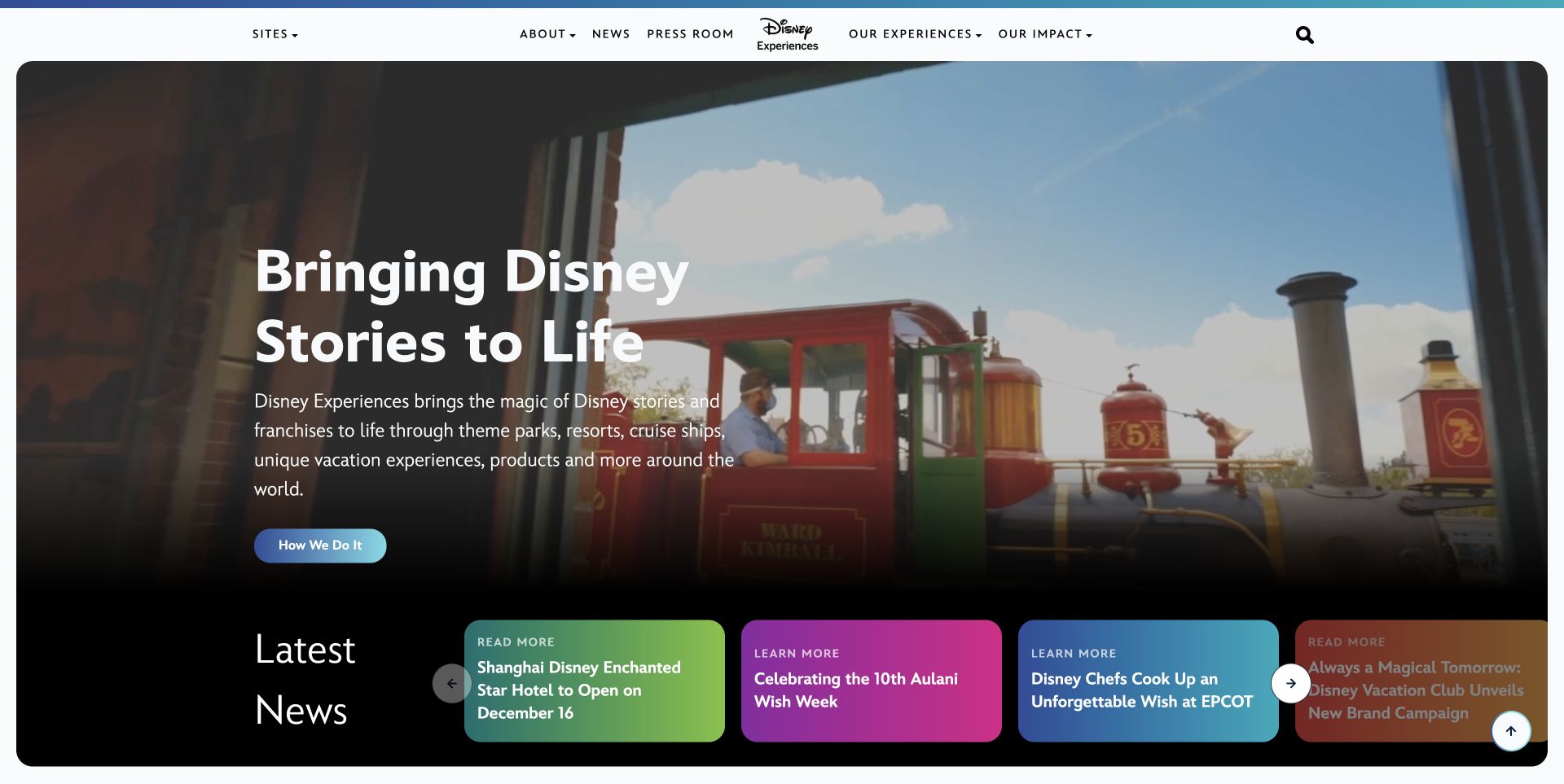
Disney Experiences places a large mission headline over a cinematic scene, followed by brightly colored news cards. The centered identity and compact navigation keep the corporate context visible while the photograph carries the emotional introduction. The cards introduce separate developments without turning the hero into a list of competing links. OneTrust is supported by a public resource reference on this property; the capture does not show a preference panel or establish how scripts respond to a visitor's choice.
What you can learn
Plan consent components alongside the hero and news rail. Keep their text readable, preserve a clear route to change preferences, and test whether a reopened panel obscures carousel controls or traps focus away from the corporate navigation.
Pros
The strong headline backing separates the main message from the changing brightness and detail of the background scene.
Distinct news cards give recent updates their own destinations without diluting the broader introduction above them.
Cons & considerations
A large cinematic opening can leave little room for an additional consent panel on short laptop screens.
The horizontal news rail needs its own keyboard and mobile treatment when combined with persistent utility controls.
Public source checked November 3, 2026. References may be embedded or legacy—not a complete backend inventory.
Platform source: Exact public source-page audit. The public source-page audit on 2026-11-03 recorded linked script matches onetrust for this exact property. This is a public resource reference, not a test of every user journey, a complete backend inventory, or a claim that every visible element uses OneTrust. Platform evidence is separate from the direct website screenshot and is not a complete current infrastructure audit.
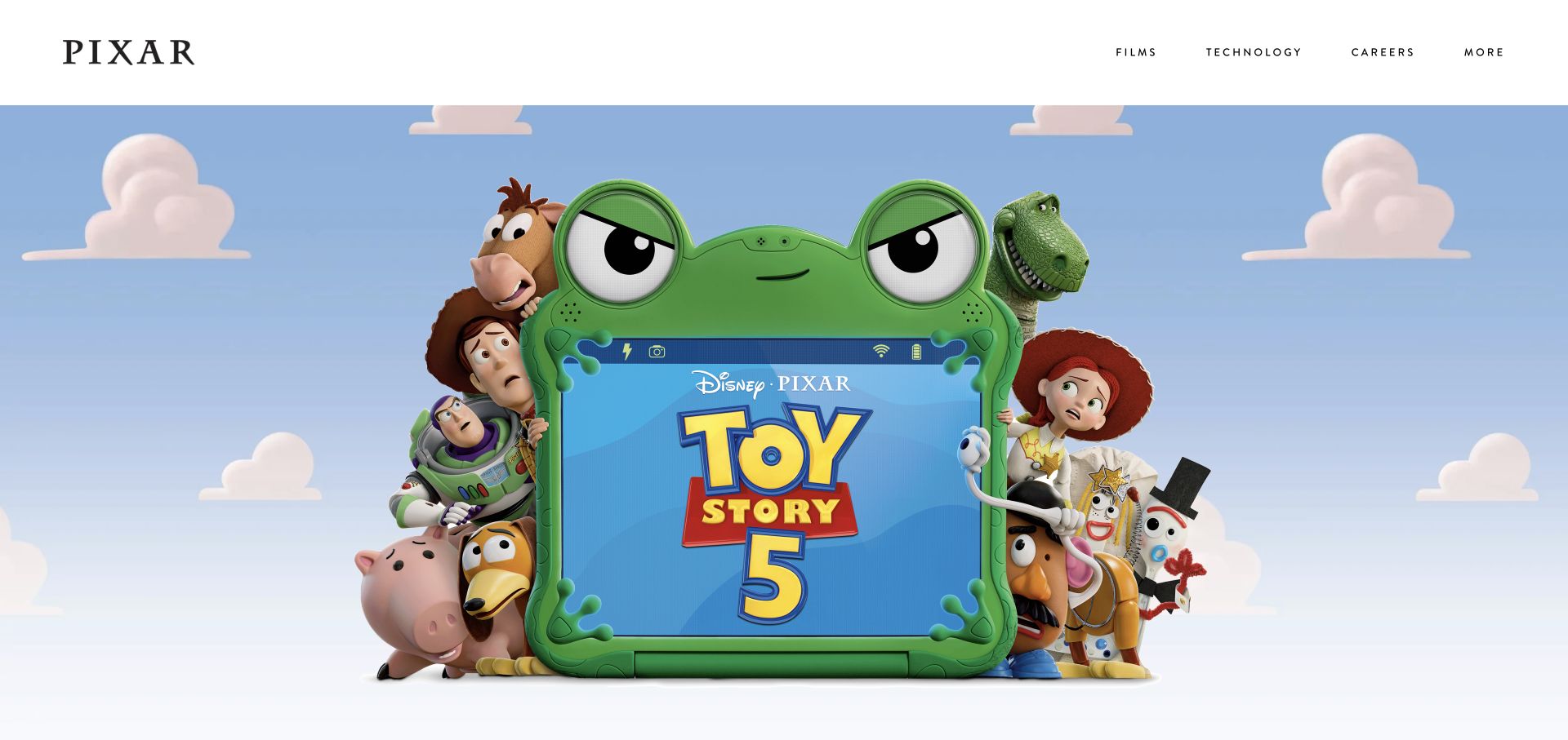
Pixar's saved homepage is almost entirely a film campaign image beneath a restrained white navigation band. The black studio identity occupies one corner, while four small section links sit opposite. The composition gives the artwork room to establish the immediate story without a competing paragraph or form. The OneTrust evidence belongs to this public website, not to the production process behind the film, and no preference interaction is implied by the uncluttered captured state.
What you can learn
Treat the empty margins around major artwork as intentional interface space. Design any consent notice so it can be read and dismissed or configured without obscuring the only route to films, careers, and technology information on narrow screens.
Pros
The small number of principal navigation labels makes the corporate routes easy to distinguish from the campaign artwork.
A clean white header provides a stable surface for essential links despite the colorful and detailed scene below.
Cons & considerations
Artwork that fills most of the viewport can make an overlaid notice disproportionately dominant on phones.
If a campaign title is embedded in the image, meaningful text alternatives and a clear destination still need separate attention.
Public source checked November 3, 2026. References may be embedded or legacy—not a complete backend inventory.
Platform source: Exact public source-page audit. The public source-page audit on 2026-11-03 recorded linked script matches onetrust for this exact property. This is a public resource reference, not a test of every user journey, a complete backend inventory, or a claim that every visible element uses OneTrust. Platform evidence is separate from the direct website screenshot and is not a complete current infrastructure audit.
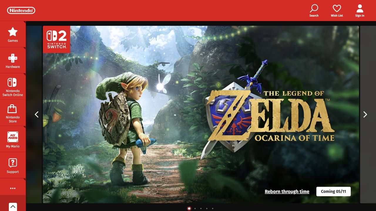
Nintendo UK uses a vivid red top bar and a vertical category rail to frame a large game campaign. Search, wish list, and account utilities remain above, while games, hardware, online services, and support form a separate left-hand sequence. The screen is already rich with controls before any consent component appears. Its public OneTrust reference supports a scoped technology association; it does not reveal the choices offered in different regions or the behavior of every embedded game promotion.
What you can learn
Map persistent controls before placing a preference launcher or banner. Reserve usable space around the side rail and carousel actions, then test the interface with enlarged text and keyboard focus rather than reviewing the notice in isolation.
Pros
The category rail distinguishes product families with both labels and icons, providing a stable browsing frame around changing campaigns.
Account and search utilities have their own top-row positions instead of competing directly with the featured game's action.
Cons & considerations
Several fixed navigation regions can crowd the remaining content when a consent panel opens on a smaller screen.
A campaign carousel needs clear control labels and a deliberate reading order when its artwork and text are rearranged.
Public source checked November 3, 2026. References may be embedded or legacy—not a complete backend inventory.
Platform source: Exact public source-page audit. The public source-page audit on 2026-11-03 recorded linked script matches onetrust for this exact property. This is a public resource reference, not a test of every user journey, a complete backend inventory, or a claim that every visible element uses OneTrust. Platform evidence is separate from the direct website screenshot and is not a complete current infrastructure audit.
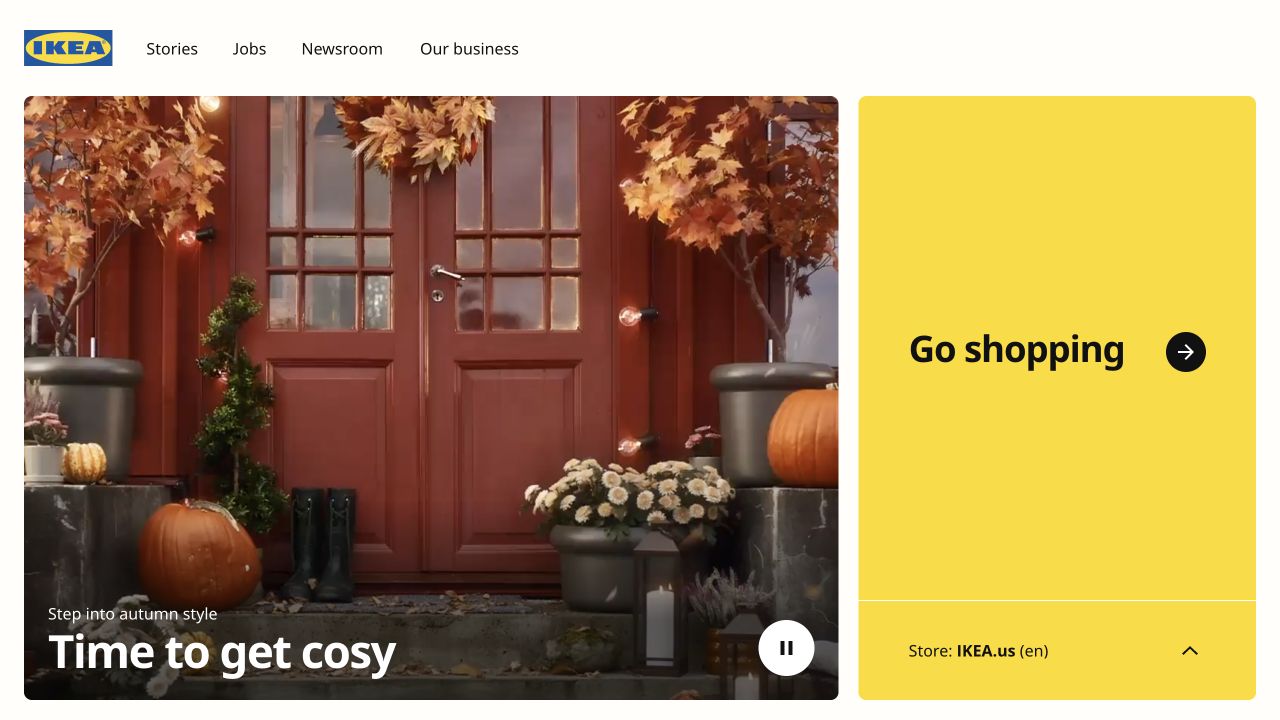
IKEA Global divides its opening between seasonal imagery and a large yellow shopping panel. The corporate header stays brief, with stories, jobs, newsroom, and business routes. A store selector at the base of the shopping panel makes the regional destination visible before the visitor continues. This is a useful consent-planning example because the global gateway and local store are separate surfaces; the OneTrust reference on this page does not establish that preferences transfer between them.
What you can learn
Document which domain owns each preference decision before connecting a global gateway to country stores. Keep the selected destination clear and test the handoff using a fresh browser state, changed preferences, and a return visit without assuming continuity.
Pros
The large shopping panel makes the principal consumer destination obvious while keeping corporate content available in the header.
The visible store label gives visitors useful regional context before they follow the main shopping action.
Cons & considerations
Regional routing and consent notices can compete for attention if both appear as large first-visit overlays.
A video or rotating visual beside the gateway needs accessible controls that remain reachable when preference interfaces are open.
Public source checked November 3, 2026. References may be embedded or legacy—not a complete backend inventory.
Platform source: Exact public source-page audit. The public source-page audit on 2026-11-03 recorded linked script matches onetrust for this exact property. This is a public resource reference, not a test of every user journey, a complete backend inventory, or a claim that every visible element uses OneTrust. Platform evidence is separate from the direct website screenshot and is not a complete current infrastructure audit.
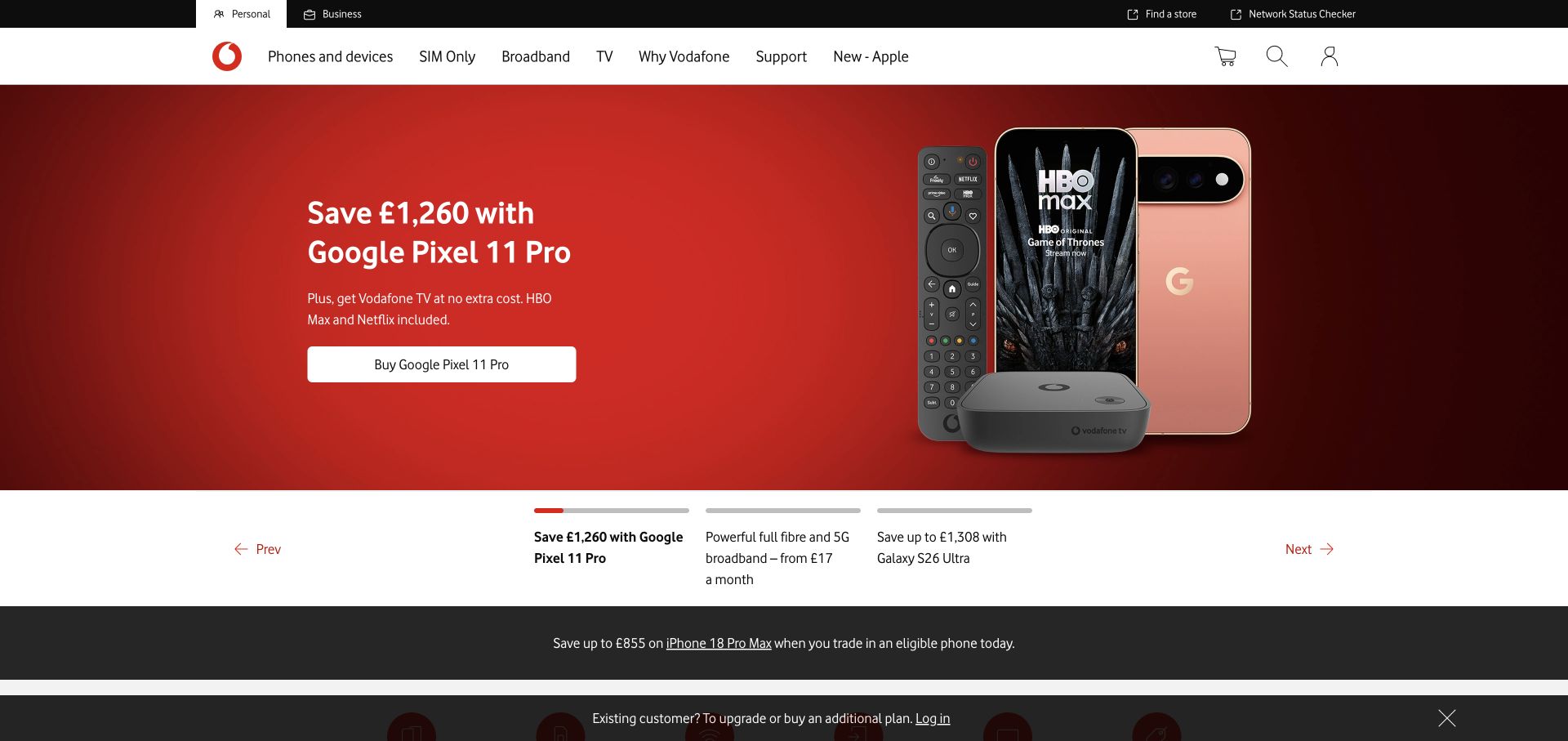
Vodafone UK's opening separates personal and business audiences, then places product categories above a large red promotional panel. The offer combines a headline, supporting terms, a white action, and a device illustration. Below, a sequence of alternative offers and an existing-customer strip add further routes. A OneTrust public reference is present for this property, but this review does not test account access, purchase flows, or whether any individual marketing component waits for consent.
What you can learn
List promotional modules, account utilities, and preference controls as separate interface responsibilities. Test the homepage with optional content unavailable and make sure essential support and account routes remain understandable when a notice occupies the lower edge of the screen.
Pros
The personal and business split gives visitors an early indication of which service context they are browsing.
The main offer uses a clear text-and-device arrangement, leaving the shopping action easy to locate within the red panel.
Cons & considerations
Multiple promotional strips can reduce the space available for a consent notice without covering useful content.
Fine offer terms and preference explanations both need readable sizing; neither should be compressed merely to preserve the hero's height.
Public source checked November 3, 2026. References may be embedded or legacy—not a complete backend inventory.
Platform source: Exact public source-page audit. The public source-page audit on 2026-11-03 recorded linked script matches onetrust for this exact property. This is a public resource reference, not a test of every user journey, a complete backend inventory, or a claim that every visible element uses OneTrust. Platform evidence is separate from the direct website screenshot and is not a complete current infrastructure audit.
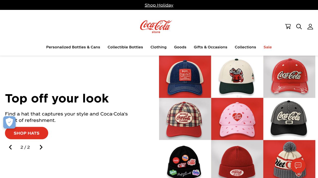
Coca-Cola Store pairs a short promotional heading and red shopping action with a grid of branded hats. A centered wordmark, shopping categories, and compact account tools define the storefront above. Floating controls also occupy the lower corners of the captured page. For a OneTrust implementation, this composition is useful because preference controls would share scarce edge space with other utilities. The public resource evidence does not identify which visible corner element, if any, belongs to the consent product.
What you can learn
Create a single placement plan for chat, accessibility, cart, and privacy utilities. Test overlap at phone widths and with text enlarged, then make each control's name explicit so visitors can distinguish support from changing their privacy preferences.
Pros
The product grid makes the promoted category tangible while the short text explains where the main action leads.
The category row remains visible above the campaign, supporting shoppers who already know the type of merchandise they want.
Cons & considerations
Independent floating widgets can collide with each other or with a reopened preference panel near the viewport edges.
A rotating campaign requires careful focus and reading-order checks when another overlay is introduced over the storefront.
Public source checked November 3, 2026. References may be embedded or legacy—not a complete backend inventory.
Platform source: Exact public source-page audit. The public source-page audit on 2026-11-03 recorded linked script matches onetrust for this exact property. This is a public resource reference, not a test of every user journey, a complete backend inventory, or a claim that every visible element uses OneTrust. Platform evidence is separate from the direct website screenshot and is not a complete current infrastructure audit.
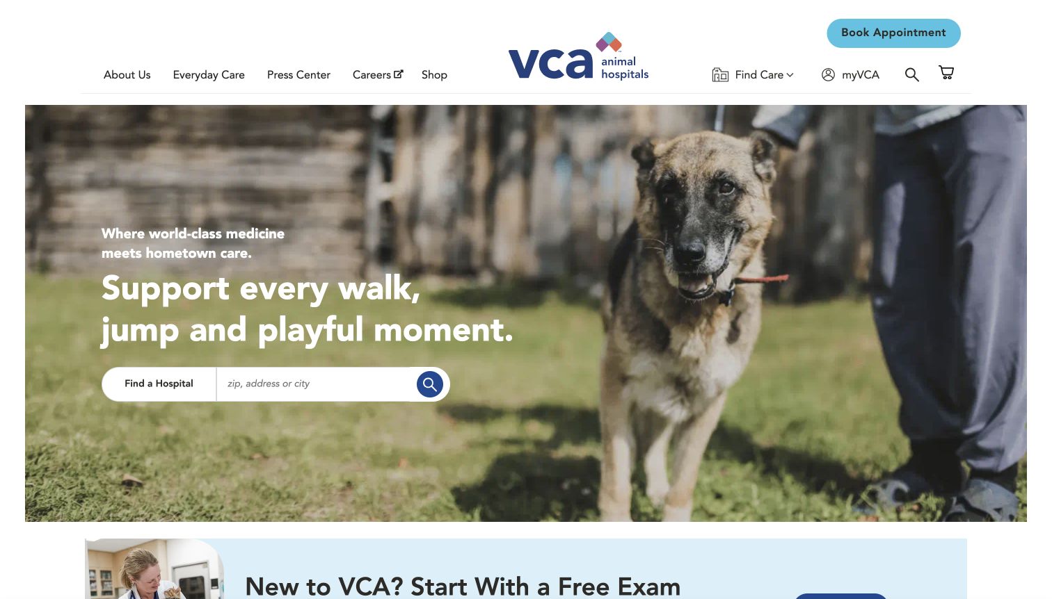
VCA Animal Hospitals uses a dog photograph and a short care message to lead into a hospital finder. A large appointment button remains in the header, alongside care, account, search, and shopping utilities. The location field has a clear role within the hero, while an introductory offer begins below. Its OneTrust source reference is evidence of a public integration resource, not proof that the hospital search or appointment journey shares any specific consent configuration.
What you can learn
Keep location discovery and appointment routes usable when optional tracking is unavailable. Test preference panels against the finder, including keyboard focus returning to the original control, and provide a clear alternative route when visitors cannot use the interactive search.
Pros
The location field turns the broad care message into a concrete next step within the same visual area.
The header appointment button remains separate from promotional material, helping repeat visitors identify a practical route quickly.
Cons & considerations
A notice covering the lower hero could obscure the location field or its search action on a short screen.
The location and account functions need their own privacy explanations; a general cookie notice cannot substitute for clear form context.
Public source checked November 3, 2026. References may be embedded or legacy—not a complete backend inventory.
Platform source: Exact public source-page audit. The public source-page audit on 2026-11-03 recorded linked script matches onetrust for this exact property. This is a public resource reference, not a test of every user journey, a complete backend inventory, or a claim that every visible element uses OneTrust. Platform evidence is separate from the direct website screenshot and is not a complete current infrastructure audit.
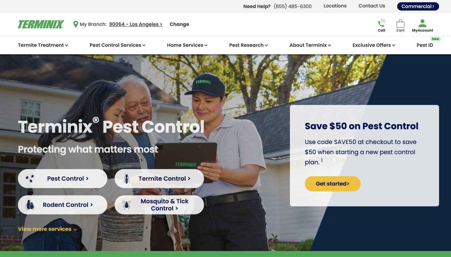
Terminix shows a selected branch near its logo, gives telephone help a prominent utility position, and groups service categories above a photographic hero. Four rounded service actions sit beside a discount card with its own call to action. The page therefore combines location context, problem selection, and promotion before a visitor reaches deeper content. The audited OneTrust reference supports this exact property, without establishing the behavior of location detection or the later quote process.
What you can learn
Test consent changes alongside branch selection and service navigation. Essential location context should remain clear even when optional personalization is unavailable, and a preference panel should not hide the phone route for visitors who prefer direct assistance.
Pros
The selected branch is visible near the top, helping visitors assess whether the displayed service context applies to them.
Specific service buttons let visitors identify their problem without reading every navigation category or entering a sales flow immediately.
Cons & considerations
The combination of offer card, service buttons, and location controls leaves limited room for another prominent overlay.
Automatic regional assumptions need an obvious correction route, especially when privacy choices or browser settings limit location information.
Public source checked November 3, 2026. References may be embedded or legacy—not a complete backend inventory.
Platform source: Exact public source-page audit. The public source-page audit on 2026-11-03 recorded linked script matches onetrust for this exact property. This is a public resource reference, not a test of every user journey, a complete backend inventory, or a claim that every visible element uses OneTrust. Platform evidence is separate from the direct website screenshot and is not a complete current infrastructure audit.
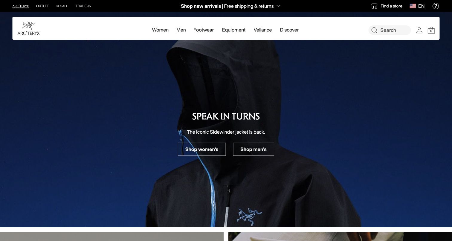
Arc’teryx presents a dark product photograph beneath a white navigation panel. The campaign uses a compact title, one explanatory line, and two outlined shopping actions. A slim upper strip adds resale, trade-in, store, region, and language utilities. The contrast makes the campaign visually calm despite the number of functions surrounding it. OneTrust is detected through a public source reference; the photograph and interface do not establish any particular tracking or preference behavior.
What you can learn
Place consent controls within the same responsive plan as regional selection and shopping utilities. Check whether a notice covers the two campaign actions and whether text remains readable against the dark image when the panel changes size or language.
Pros
The white navigation panel keeps shopping categories distinct from the low-light campaign image beneath it.
Two explicitly labeled shopping actions give the restrained campaign practical destinations without requiring a separate category decision first.
Cons & considerations
Fine outlined buttons over dark photography need contrast and focus checks beyond their appearance in one screenshot.
Regional and privacy controls can be mistaken for one another if both are reduced to ambiguous icons on smaller screens.
Public source checked November 3, 2026. References may be embedded or legacy—not a complete backend inventory.
Platform source: Exact public source-page audit. The public source-page audit on 2026-11-03 recorded linked script matches onetrust for this exact property. This is a public resource reference, not a test of every user journey, a complete backend inventory, or a claim that every visible element uses OneTrust. Platform evidence is separate from the direct website screenshot and is not a complete current infrastructure audit.
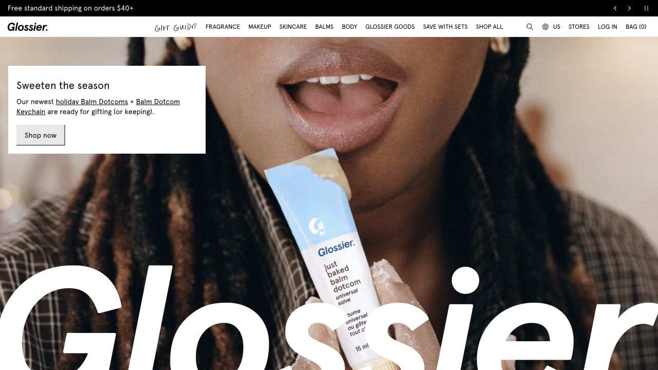
Glossier's saved opening uses a close product-use photograph, a small white campaign card, and an oversized brand wordmark near the bottom. The top navigation contains product categories, region, stores, account, and bag utilities in a single compact row. The campaign card supplies the product context that the photograph alone cannot. The OneTrust reference supports a public integration on this storefront; it does not prove whether particular analytics or marketing services are enabled after a choice.
What you can learn
Protect the campaign's short explanation and shopping action when introducing a consent notice. Test the complete opening at narrow widths, with long preference labels, and with optional scripts unavailable so the basic product story remains understandable.
Pros
The white campaign card provides a predictable reading surface separate from the detailed product-use photograph.
A direct shopping action sits beside the introductory copy, connecting the new product message with a practical next step.
Cons & considerations
The large decorative wordmark consumes lower-screen space that an additional notice may also need on mobile.
A dense top navigation can become difficult to operate if region, account, search, and preference controls are all compressed into tiny targets.
Public source checked November 3, 2026. References may be embedded or legacy—not a complete backend inventory.
Platform source: Exact public source-page audit. The public source-page audit on 2026-11-03 recorded linked script matches onetrust for this exact property. This is a public resource reference, not a test of every user journey, a complete backend inventory, or a claim that every visible element uses OneTrust. Platform evidence is separate from the direct website screenshot and is not a complete current infrastructure audit.
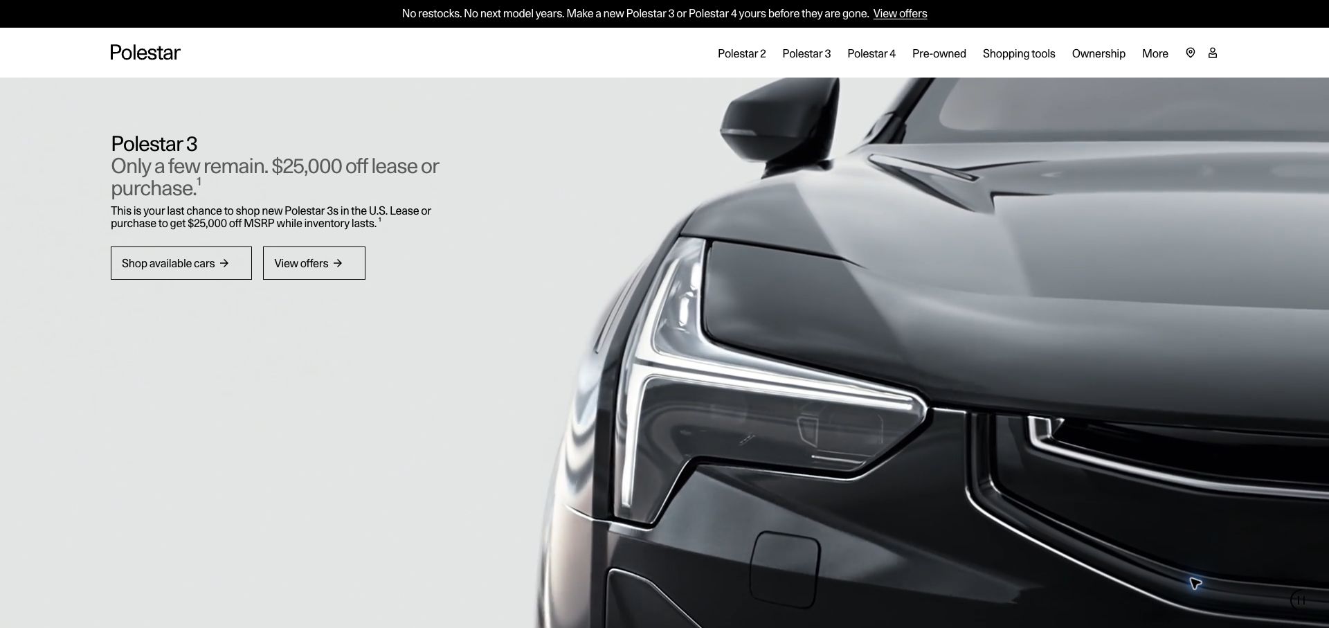
Polestar places a close vehicle photograph on the right and a restrained offer block on the left. The copy names the model, explains the captured promotion, and separates available cars from offer details with two outlined actions. A short strip above the main navigation adds another campaign message. The dated screenshot is useful as interface evidence, not as current purchasing advice. OneTrust's public reference does not establish the configuration of vehicle forms, finance tools, or regional consent choices.
What you can learn
Keep offer details and inventory routes available when optional services are disabled. Test consent panels beside long qualifying copy, and preserve the distinction between browsing cars and entering a later form that asks for personal information.
Pros
The two actions distinguish browsing available vehicles from investigating the promotion, reducing ambiguity about the next destination.
A quiet neutral background gives the offer text its own reading area instead of laying it across the vehicle's details.
Cons & considerations
Temporary promotional terms need active editorial maintenance and should not be treated as permanent product information.
A second announcement strip plus a consent notice can consume substantial vertical space on a small screen before useful content appears.
Public source checked November 3, 2026. References may be embedded or legacy—not a complete backend inventory.
Platform source: Exact public source-page audit. The public source-page audit on 2026-11-03 recorded linked script matches onetrust for this exact property. This is a public resource reference, not a test of every user journey, a complete backend inventory, or a claim that every visible element uses OneTrust. Platform evidence is separate from the direct website screenshot and is not a complete current infrastructure audit.
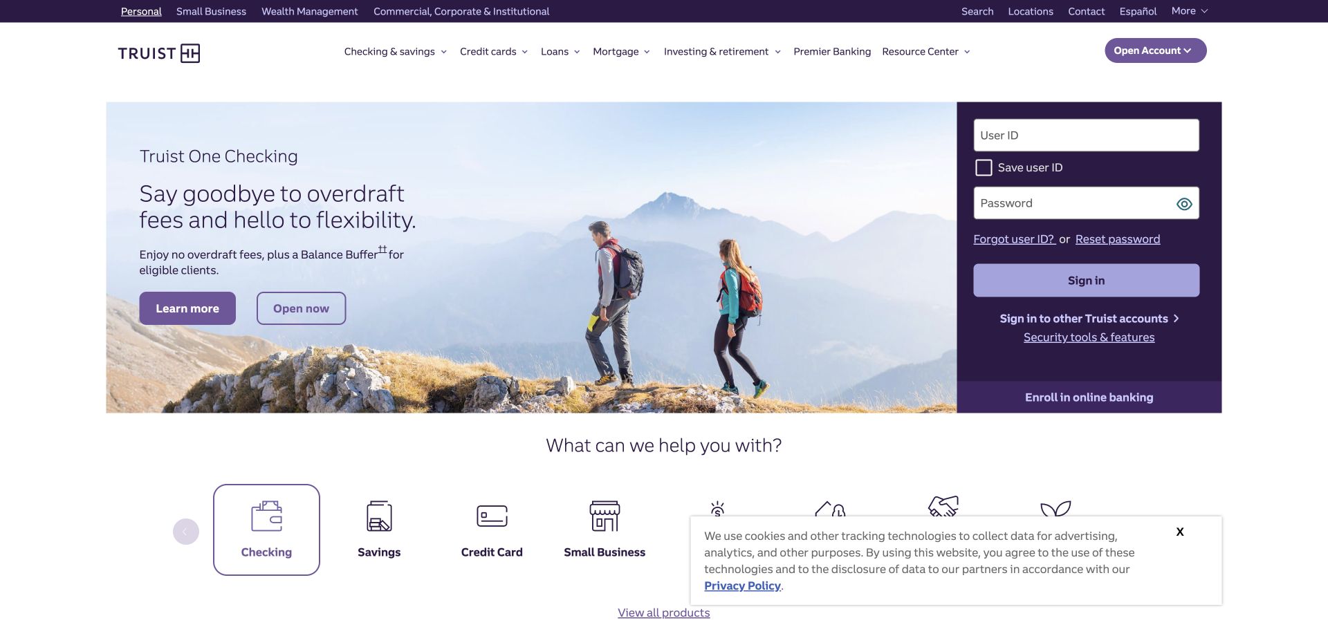
Truist combines a broad product campaign with a substantial sign-in panel on the right. Product categories sit above, while large service icons appear below. The saved capture also contains a lower-right notice describing cookies and tracking, with a privacy-policy link and close control. That visible state is useful for layout review, but it does not establish what happens after interaction. The separately recorded OneTrust reference should not be read as proof of account security or legal compliance.
What you can learn
Review consent and privacy surfaces alongside account entry without submitting real credentials. Check that notices do not obscure recovery links, that keyboard focus remains predictable, and that visitors can locate preference information without mistaking it for a login requirement.
Pros
The sign-in panel is visually separate from the acquisition campaign, giving returning customers a recognizable dedicated area.
Large service icons below the hero provide additional task routes without requiring visitors to interpret every promotional message.
Cons & considerations
The captured notice covers part of the lower service area, showing why overlay placement must be tested against real content.
Dense account and privacy text requires careful mobile reflow so recovery links and explanatory labels remain readable and reachable.
Public source checked November 3, 2026. References may be embedded or legacy—not a complete backend inventory.
Platform source: Exact public source-page audit. The public source-page audit on 2026-11-03 recorded linked script matches onetrust for this exact property. This is a public resource reference, not a test of every user journey, a complete backend inventory, or a claim that every visible element uses OneTrust. Platform evidence is separate from the direct website screenshot and is not a complete current infrastructure audit.
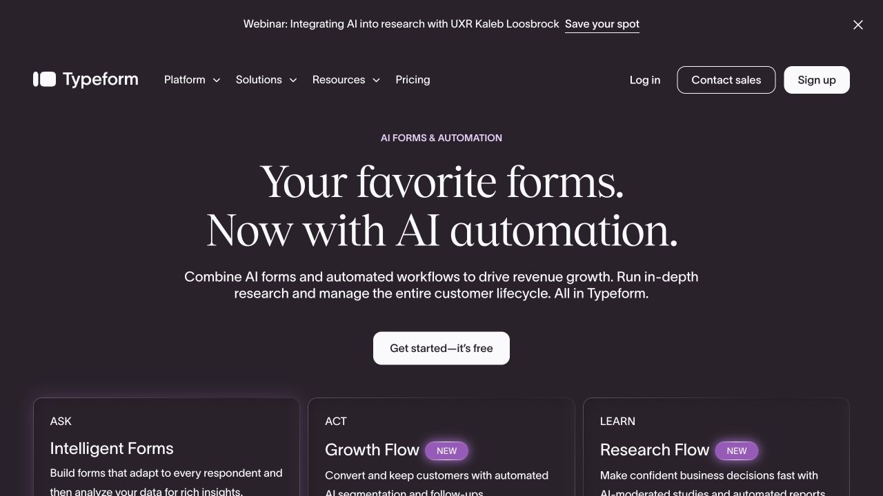
Typeform uses a dark opening, a large serif headline, and a brief explanation above a single bright starting action. Three lower cards divide the product story into asking, acting, and learning. The header separately offers login, sales contact, and signup, while a webinar announcement adds a further layer. The OneTrust source evidence applies to this marketing property; it does not describe consent settings in forms created by customers or in the authenticated product.
What you can learn
Define the boundary between marketing-site preferences and product-level data collection. Keep that distinction in plain language, and test the marketing page with a reopened preference panel so signup, sales, and educational routes remain easy to distinguish.
Pros
The central starting action has a clear visual priority even though additional conversion routes remain available in the header.
The three lower cards organize a broad product promise into separate jobs that visitors can compare before exploring further.
Cons & considerations
A webinar strip and a consent panel can crowd the opening if both remain prominent on narrow screens.
Marketing copy about automated workflows needs concrete explanation deeper in the site so visitors understand what information later forms request.
Public source checked November 3, 2026. References may be embedded or legacy—not a complete backend inventory.
Platform source: Exact public source-page audit. The public source-page audit on 2026-11-03 recorded linked script matches onetrust for this exact property. This is a public resource reference, not a test of every user journey, a complete backend inventory, or a claim that every visible element uses OneTrust. Platform evidence is separate from the direct website screenshot and is not a complete current infrastructure audit.
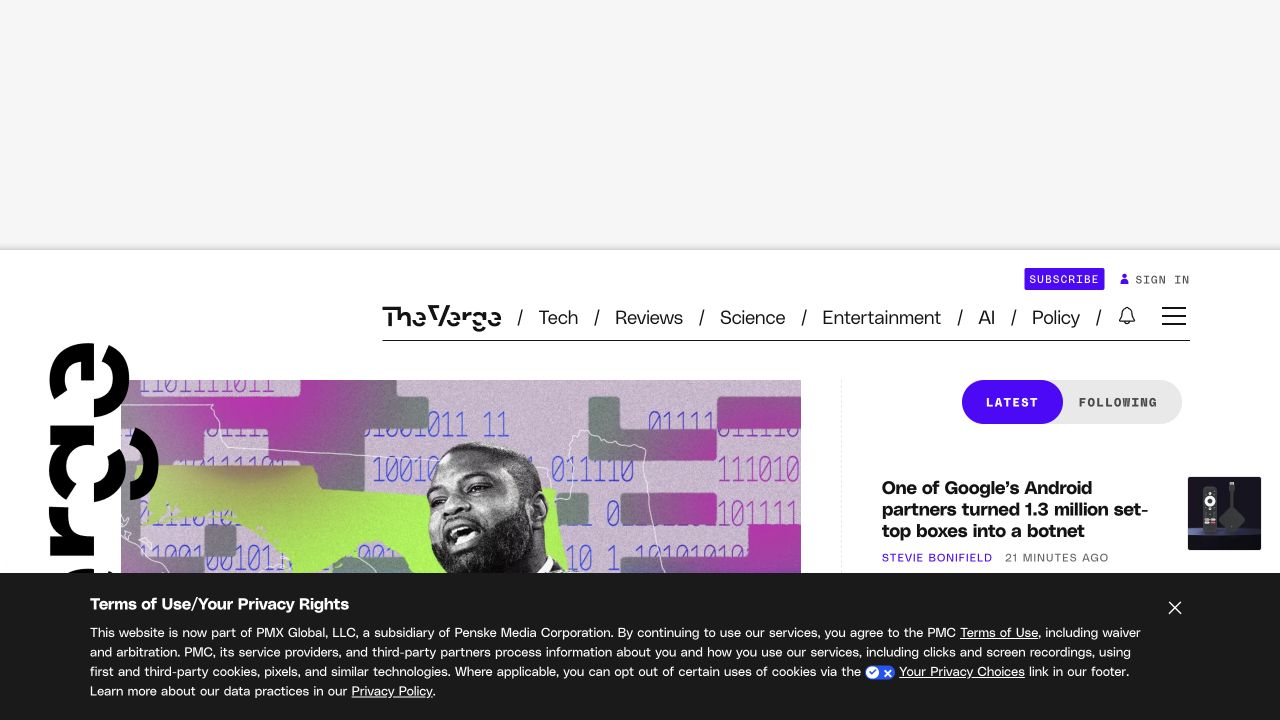
The Verge's capture shows a large empty upper area, a compact editorial navigation row, and the beginning of a story grid. A dark privacy notice occupies a substantial strip at the bottom, with explanatory text, links, and a close control. Its height materially changes how much editorial content is visible. The public OneTrust reference is independently recorded; the screenshot alone cannot establish whether this particular notice is generated by OneTrust or how advertising responds to visitor choices.
What you can learn
Evaluate privacy messaging using article and homepage layouts. Measure how much reading space remains, keep the preference route understandable, and test returning focus after closing a notice without assuming that hiding the message changes the underlying choices.
Pros
The notice uses a solid dark surface that separates its explanatory text from the changing editorial images behind it.
Editorial categories and subscription utilities remain visibly grouped, providing a stable frame for the publication's main tasks.
Cons & considerations
A tall notice combined with reserved upper space can leave little journalism visible on a short display.
Long explanatory text requires careful mobile sizing and link treatment so visitors can understand choices without excessive scrolling or accidental dismissal.
Public source checked November 3, 2026. References may be embedded or legacy—not a complete backend inventory.
Platform source: Exact public source-page audit. The public source-page audit on 2026-11-03 recorded linked script matches onetrust for this exact property. This is a public resource reference, not a test of every user journey, a complete backend inventory, or a claim that every visible element uses OneTrust. Platform evidence is separate from the direct website screenshot and is not a complete current infrastructure audit.
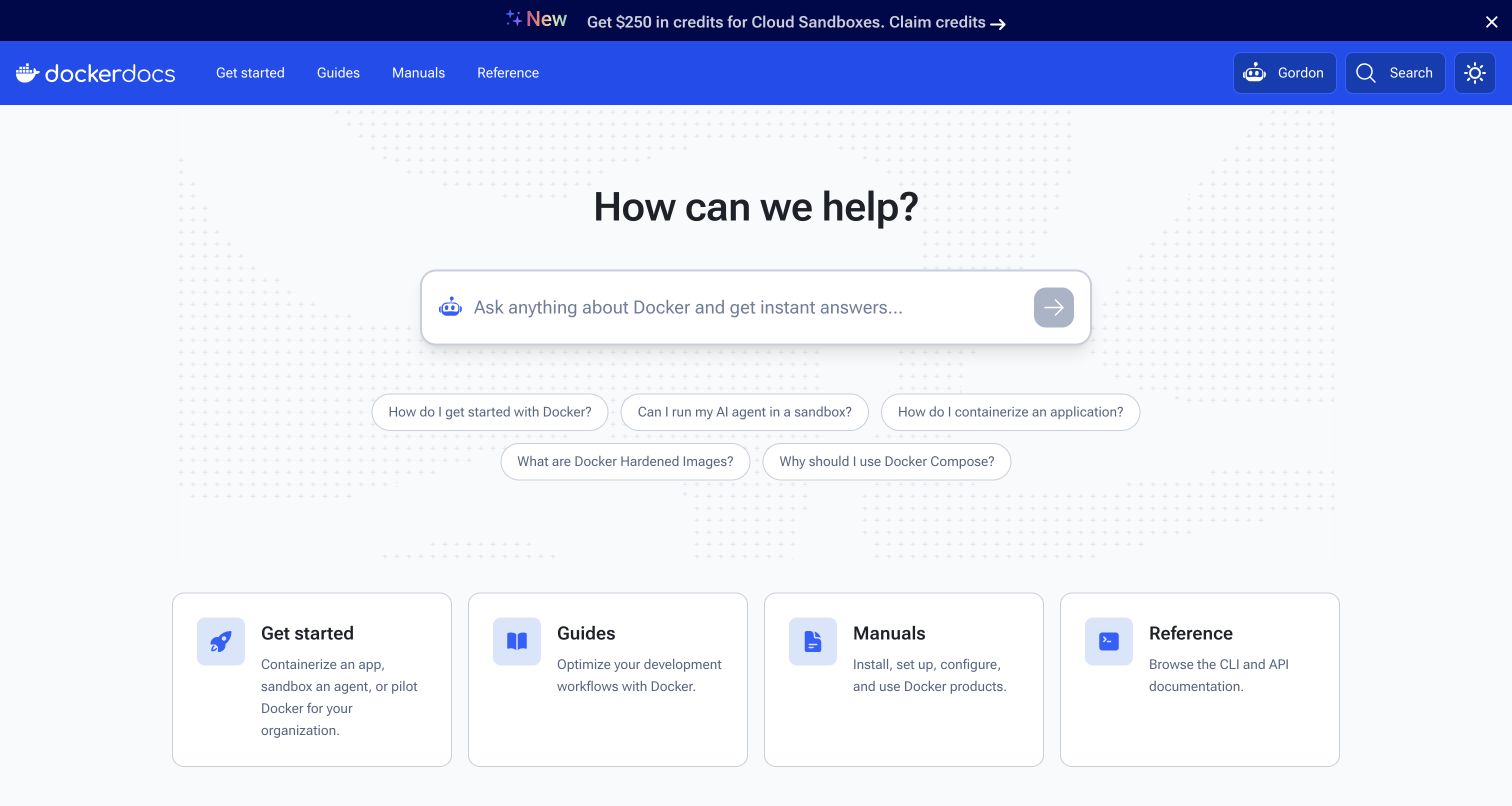
Docker documentation leads with a large question field and suggested prompts, followed by four conventional documentation entry cards. A blue navigation band and a smaller promotional strip sit above. The composition balances an assistant-style discovery route with direct links to guides, manuals, and reference material. OneTrust's public resource reference is scoped to this documentation property; it does not establish what the assistant collects, how questions are retained, or which consent choices affect it.
What you can learn
Keep ordinary documentation navigation available independently of optional assistant features. Explain data handling at the point where a question is entered, and test consent changes without submitting confidential content or assuming a cookie preference also governs conversational data.
Pros
The four entry cards preserve familiar documentation routes for readers who prefer structured browsing to a question-based interface.
Suggested prompts demonstrate the intended scope of the central field without requiring a visitor to invent an initial query.
Cons & considerations
A promotional strip and an assistant field already compete for space that a consent panel may also occupy on mobile.
The assistant's data handling needs its own clear explanation rather than relying on a general notice elsewhere in the documentation shell.
Public source checked November 3, 2026. References may be embedded or legacy—not a complete backend inventory.
Platform source: Exact public source-page audit. The public source-page audit on 2026-11-03 recorded linked script matches onetrust for this exact property. This is a public resource reference, not a test of every user journey, a complete backend inventory, or a claim that every visible element uses OneTrust. Platform evidence is separate from the direct website screenshot and is not a complete current infrastructure audit.
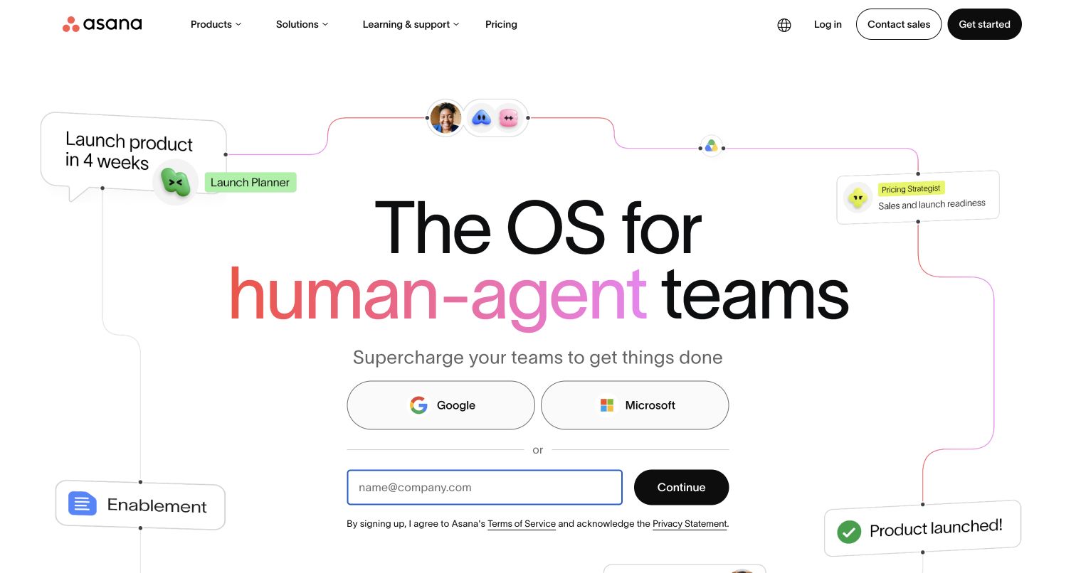
Asana's saved marketing opening places a large product promise above account-provider choices and an email field. The header separates product exploration from pricing, sales, login, and signup routes. The page has to serve both a new evaluator and someone returning to an existing workspace. Its OneTrust reference belongs to the public marketing page; this collection does not infer consent behavior inside customer workspaces or connect the detected resource to any particular AI capability.
What you can learn
Keep public-site preferences separate from explanations about workspace data. Test the marketing page after rejecting optional services, then verify that login and product documentation remain discoverable without forcing visitors through a sales or signup decision first.
Pros
The email field and provider choices make the starting options concrete beneath the product promise and surrounding workflow illustration.
A persistent header keeps returning-user access available even while the main page concentrates on new-customer messaging and product positioning.
Cons & considerations
A dense collection of product and conversion links needs an intentional mobile hierarchy when a consent panel is also visible.
Broad product promises require specific supporting detail below the fold, particularly when visitors need to understand data use before evaluating AI features.
Public source checked November 3, 2026. References may be embedded or legacy—not a complete backend inventory.
Platform source: Exact public source-page audit. The public source-page audit on 2026-11-04 recorded linked script matches onetrust for this exact property. This is a public resource reference, not a test of every user journey, a complete backend inventory, or a claim that every visible element uses OneTrust. Platform evidence is separate from the direct website screenshot and is not a complete current infrastructure audit.
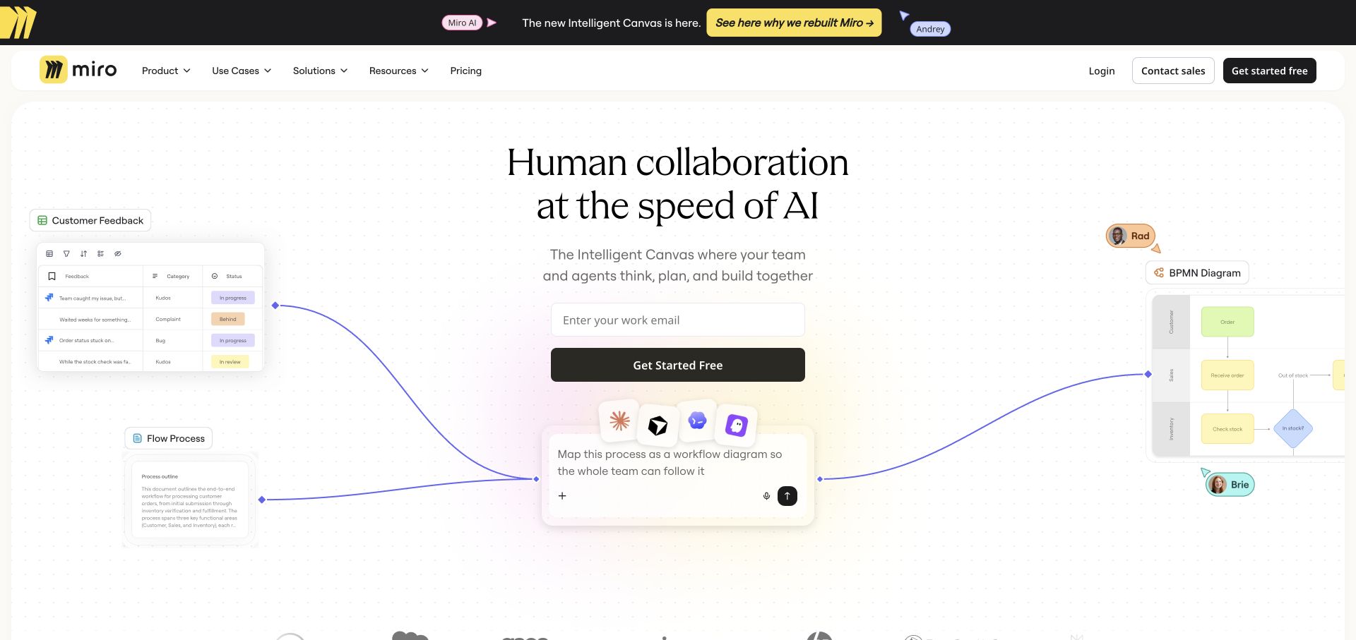
Miro's marketing capture combines a prominent central headline with a pale background and colorful visual elements that suggest collaborative work. The header provides product, solution, resource, and pricing routes alongside account and signup actions. The composition makes a visual case before asking visitors to explore details. A OneTrust source reference supports the marketing property's inclusion, but it does not establish how preferences behave inside boards, embedded content, or authenticated collaboration spaces.
What you can learn
Document the boundary between the public marketing site and the collaboration product. Test the public page with optional integrations unavailable, and make preference controls easy to revisit without covering the main invitation or being confused with product collaboration tools.
Pros
The central heading creates a clear reading anchor amid the more playful surrounding visual elements and product imagery.
Navigation provides practical evaluation routes for visitors who need pricing or product information beyond the initial visual introduction.
Cons & considerations
Decorative canvas elements can complicate notice placement if they occupy the same lower corners or overlap interactive controls.
A visual collaboration metaphor needs concise explanatory copy for visitors who cannot infer the product's purpose from imagery alone.
Public source checked November 3, 2026. References may be embedded or legacy—not a complete backend inventory.
Platform source: Exact public source-page audit. The public source-page audit on 2026-11-03 recorded linked script matches onetrust for this exact property. This is a public resource reference, not a test of every user journey, a complete backend inventory, or a claim that every visible element uses OneTrust. Platform evidence is separate from the direct website screenshot and is not a complete current infrastructure audit.
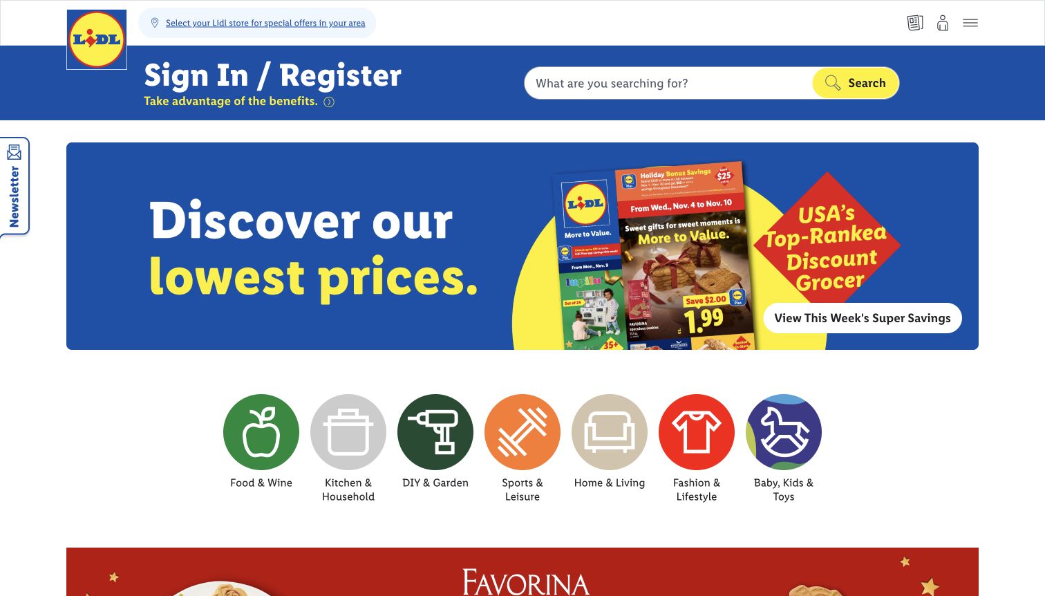
Lidl US puts a store-selection prompt near the logo, then uses a blue band for account access and a large product search. The main campaign promotes weekly savings, with colorful category icons below. The design makes local context, search, and offers visible together. The dated capture records an interface state rather than current prices. OneTrust's public source reference does not establish how store preferences, account information, or individual promotional trackers are configured.
What you can learn
Treat store selection, account access, and consent as separate decisions with distinct labels. Test the weekly-offer page when optional personalization is unavailable, and keep the route to choose a store visible without suggesting that privacy choices determine advertised availability.
Pros
The store-selection prompt appears before promotional browsing, giving visitors a way to establish relevant local context early.
Large search and category controls support direct product discovery alongside the more seasonal savings message in the hero.
Cons & considerations
A newsletter tab, account band, and consent panel can compete for attention before visitors reach the actual offer content.
Promotional dates and prices need clear editorial ownership; reused interface patterns should not preserve expired offers as if they were current.
Visible tech stack
Referenced on the public page
OneTrust
Public source checked November 3, 2026. References may be embedded or legacy—not a complete backend inventory.
Platform source: Exact public source-page audit. The public source-page audit on 2026-11-04 recorded linked script matches onetrust for this exact property. This is a public resource reference, not a test of every user journey, a complete backend inventory, or a claim that every visible element uses OneTrust. Platform evidence is separate from the direct website screenshot and is not a complete current infrastructure audit.
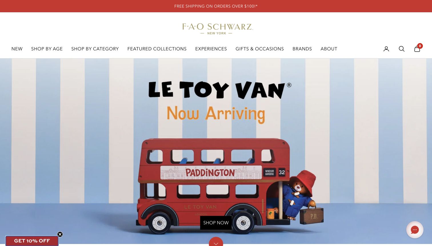
FAO Schwarz uses a spacious identity area and a detailed shopping navigation above a toy campaign. Age, category, collections, experiences, and occasions are distinct browsing routes. A discount prompt sits near one lower corner and chat near the other, while the campaign's shopping action sits low in the image. The OneTrust public reference supports this property, without establishing whether any visible widget is controlled by the consent configuration or what happens after a choice.
What you can learn
Plan privacy controls alongside promotional prompts and chat before adding them to the storefront. Test overlap around the low campaign action, and make age-based shopping labels clearly about product discovery rather than implying that they identify the visitor's age.
Pros
Multiple shopping routes reflect different gift-buying intentions, allowing visitors to browse by recipient stage, occasion, or product category.
The large product scene provides a concrete focus while the short shopping action avoids adding another block of campaign copy.
Cons & considerations
Discount and chat widgets already occupy both lower corners, leaving limited unobstructed space for a persistent preference control.
A tall header and low-positioned campaign action can push the first useful shopping destination below a small phone's opening viewport.
Public source checked November 3, 2026. References may be embedded or legacy—not a complete backend inventory.
Platform source: Exact public source-page audit. The public source-page audit on 2026-11-04 recorded linked script matches onetrust for this exact property. This is a public resource reference, not a test of every user journey, a complete backend inventory, or a claim that every visible element uses OneTrust. Platform evidence is separate from the direct website screenshot and is not a complete current infrastructure audit.
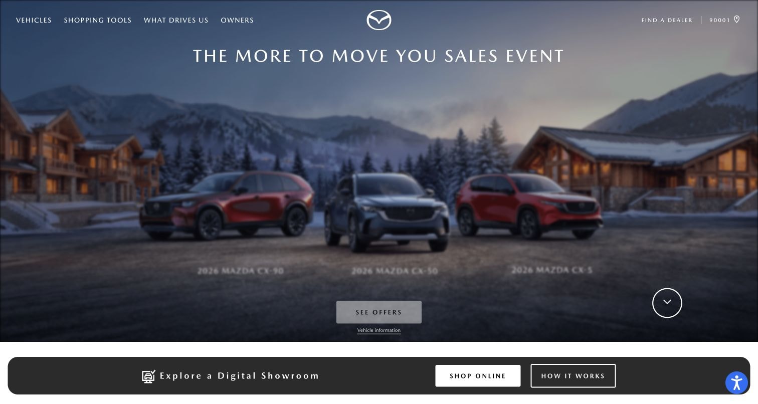
Mazda USA's saved opening uses a large vehicle-led campaign beneath compact navigation. Model exploration, shopping tools, and owner resources occupy distinct routes, while the main image and restrained text provide the immediate brand impression. The arrangement is useful for studying how a consent layer fits around a visual retail journey. The public OneTrust reference establishes a resource association on this property, not the behavior of dealer forms, financing services, or every regional shopping tool.
What you can learn
Map boundaries between manufacturer, dealer, and embedded retail tools. Test preference changes at those boundaries, keep ownership support reachable, and explain new data requests where they occur instead of assuming one homepage notice covers every later interaction.
Pros
The navigation separates prospective shopping from owner needs, helping returning visitors avoid the campaign path when they need practical support.
The three-vehicle scene gives the opening a subject, while a showroom strip introduces online shopping below the campaign.
Cons & considerations
A large hero can leave limited room for a consent notice while keeping campaign actions visible on shorter screens.
Links into dealer or finance systems need destination context because their data handling and interface behavior may differ from the manufacturer homepage.
Public source checked November 3, 2026. References may be embedded or legacy—not a complete backend inventory.
Platform source: Exact public source-page audit. The public source-page audit on 2026-11-03 recorded linked script matches onetrust for this exact property. This is a public resource reference, not a test of every user journey, a complete backend inventory, or a claim that every visible element uses OneTrust. Platform evidence is separate from the direct website screenshot and is not a complete current infrastructure audit.
Choose an integration plan around the site’s structure
Begin with a defined public property
For a small marketing site, identify the exact domain, page templates, embedded services, and preference entry points. Keep test and production configuration distinct. Verify a fresh visit, a saved choice, and a changed choice across the real templates before expanding the implementation to additional properties.
Plan regional and domain handoffs
A global gateway, country storefront, documentation subdomain, and authenticated application may have different configurations. Record those boundaries explicitly. Test what happens when a visitor crosses them and returns. Do not assume that a regional selector or common visual identity means preference state is shared.
Connect changes to actual application behavior
OneTrust’s Web CMP API exposes a consent-change callback and methods for consent-aware insertion of scripts or HTML. Use the supported integration appropriate to the application, then verify the resulting requests and interface states. A callback firing or a banner disappearing is only part of the evidence.
Plan the notice, the underlying services, and ongoing ownership
Review the whole screen with overlays present
Test a notice and reopened preference panel alongside chat, promotions, search, account entry, and mobile navigation. Check overlapping controls, readable text, scrolling, keyboard focus, and the route back to the original task. Use real page content and long translated labels rather than an empty demonstration shell.
Create a behavior matrix
Record the expected behavior for fresh, accepted, rejected, customized, changed, and expired states where applicable to the chosen configuration. Cover direct page loads and client-side navigation. Compare expected requests and embedded content with actual behavior in an authorized test environment, and record discrepancies for the configuration owner.
Maintain the service inventory after launch
Give new tags, embeds, and page templates a review path before release. Keep configuration and deployment records so an unexpected request can be traced to a change. Recheck the interface when branding, localization, regional routing, or a vendor integration changes; those updates can affect both readability and behavior.
A useful handover demonstration
Ask the actual team to carry out its routine job: publish a realistic update, correct a mistake, preview a narrow screen, and identify who owns an integration failure. For a library or frontend framework, also ask who maintains the content source and deployment. A polished screenshot does not answer those operational questions.
Beyond the screenshot
Before releasing a OneTrust website integration
List exact domains, page types, services, purposes, and responsible owners.
Confirm the intended testing and production configuration.
Implement and verify the chosen blocking or consent-aware integration method.
Provide a clear persistent route to reopen preference controls.
Test fresh, saved, changed, and applicable expired preference states.
Review mobile layout, long labels, keyboard focus, scrolling, and overlay collisions.
Check regional, subdomain, application, and external-service handoffs.
Record test evidence, unresolved differences, and the owner of future tag changes.
Test with real content, a keyboard, a small screen, slow or failed requests, and the people who will maintain the system. These are planning checks, not an accessibility, security, performance, or search-ranking certification.
Sources & editorial method
How this OneTrust collection was reviewed
Authored November 4, 2026 using genuine saved public-page captures with original dates, dimensions, and attribution preserved. Every image was inspected for this collection. OneTrust associations come from exact-property public resource observations with original timestamps and scanner provenance. No preference choices, real forms, accounts, or transactions were exercised on the example sites for this review. Presence of a resource does not establish consent behavior, legal compliance, or control over every service.
Every image is an unmodified capture from the actual website, with its source and capture date. Some captures are reused from our shared catalog; their dates remain the original capture dates. None comes from a vendor gallery or a generated reconstruction. Moving imagery and live content can change.
Technology attribution uses public page assets or metadata, official platform documentation, or a cited first-party project case study. Documentary and framework-relationship evidence is identified where used; it is not a complete current backend inventory. A CMS image CDN alone does not establish a full CMS deployment. A library’s presence does not prove which individual controls use it, and a platform label does not establish AI authorship.
The composition notes, lessons, pros and tradeoffs are original editorial observations. We have not measured conversion, traffic, security, performance or accessibility conformance. Website owners retain their brands and imagery; these examples are not our client portfolio. Written, Edited and Curated are independent records, not dates advanced by a build. See our editorial standards or suggest a correction.
Questions worth asking
OneTrust website development FAQs
Does OneTrust presence mean a website is compliant?
No. A public resource reference is evidence of a technical association. Applicable requirements, configuration, service behavior, organizational processes, and ongoing maintenance are separate questions. This collection reviews design and documented technical scope rather than providing a compliance determination.
Does adding the script automatically block every cookie?
OneTrust’s implementation documentation says the consent script alone does not automatically block cookies unless automatic blocking is configured. The chosen method still needs to be verified against the site’s real services and behavior, including features added after launch.
Why do some screenshots show no notice?
A screenshot records one state at one time. Region, stored choices, configuration, timing, and other factors may affect what is visible. The collection does not infer the cause from the image. Separate public resource evidence supports each technology association.
What should be tested after a visitor changes preferences?
Check the actual service behavior and interface, including page reloads, navigation, embedded features, and the ability to revisit settings. Confirm that the visitor can continue essential tasks and that the observed result matches the intended configuration recorded by the responsible team.