Video can introduce a place, explain a product, or document a project. This collection examines the public pages around that media and records the narrower Vimeo relationship separately. A player SDK, an embedded video, and a Vimeo-delivered media file are different evidence types; none establishes the rest of a website's architecture.
Begin by deciding what a film contributes to the visitor's task. An optional introduction, a product demonstration, and a decorative background should not receive the same controls or loading treatment. Keep the page useful before playback, and preserve the main message and next step when media is unavailable.
These examples reuse genuine public-page screenshots with their original capture dates. The design observations describe the visible page. Dated public-source records identify an embed, player script, or media URL on that property. The collection does not claim to have tested every film, authenticated account, player setting, or commercial plan.
Before the examples
What makes good Vimeo website development in 2026?
Separate the page's job from the player's job
The page should explain the subject and the next useful action. The player handles viewing. A visitor should understand what a film covers before selecting it and know where to continue afterward, especially when the film opens in an overlay.
Use player integration only where it adds useful behavior
Vimeo's official player library exposes an interface for embedded players, including methods and events. Plan the interaction you need before adding custom controls. A simple video does not automatically need a complex surrounding application.
Choose a useful poster frame, descriptive title, and stable layout dimensions. Treat the first view as part of the design rather than a blank interval before media arrives. Keep important text outside the moving image.
The collection · 20 examples
20 Vimeo website examples worth studying
Look at how navigation, explanation, and action remain available around media. The source notes distinguish Vimeo player scripts, actual embed URLs, and delivered video files; the review never assigns a visible scene to a provider merely because it resembles a film.
We start with five recognizable brands or organizations: Visa Product Design System, Mazda USA, Yamaha Boats, The Goddard School, Budget Blinds. Each attribution applies to the named website property, not every product or website belonging to its organization. This is a curated reading sequence, not a measured ranking.
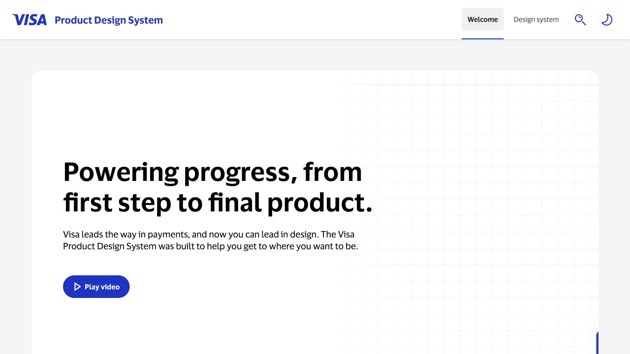
Visa's Product Design System uses a quiet white panel, a bold statement, and a small Play video button. The surrounding navigation offers the design system directly, so the introduction does not become an obstacle to documentation. The restrained presentation suggests a useful role for optional video: orientation for newcomers while experienced visitors continue straight to the material they need. The dated evidence identifies a Vimeo player script, without assigning every visible scene to that player.
What you can learn
Use introductory video to explain purpose, while keeping the documentation route complete on its own. Give the player a meaningful label and preserve the visitor's place when it closes.
Pros
The video action is explicit and visually separate from the main documentation navigation.
A stable text introduction communicates the purpose before any media has loaded or begun playing.
Cons & considerations
A short Play video label would be more informative with a title or expected duration nearby.
If the player opens over the page, its focus and return behavior need testing beyond this static view.
Public source checked November 3, 2026. References may be embedded or legacy—not a complete backend inventory.
Platform source: Exact public source page with a dated Vimeo resource observation. Linked script matches Vimeo. The dated evidence identifies a Vimeo player script, without assigning every visible scene to that player. Platform evidence is separate from the direct website screenshot and is not a complete current infrastructure audit.
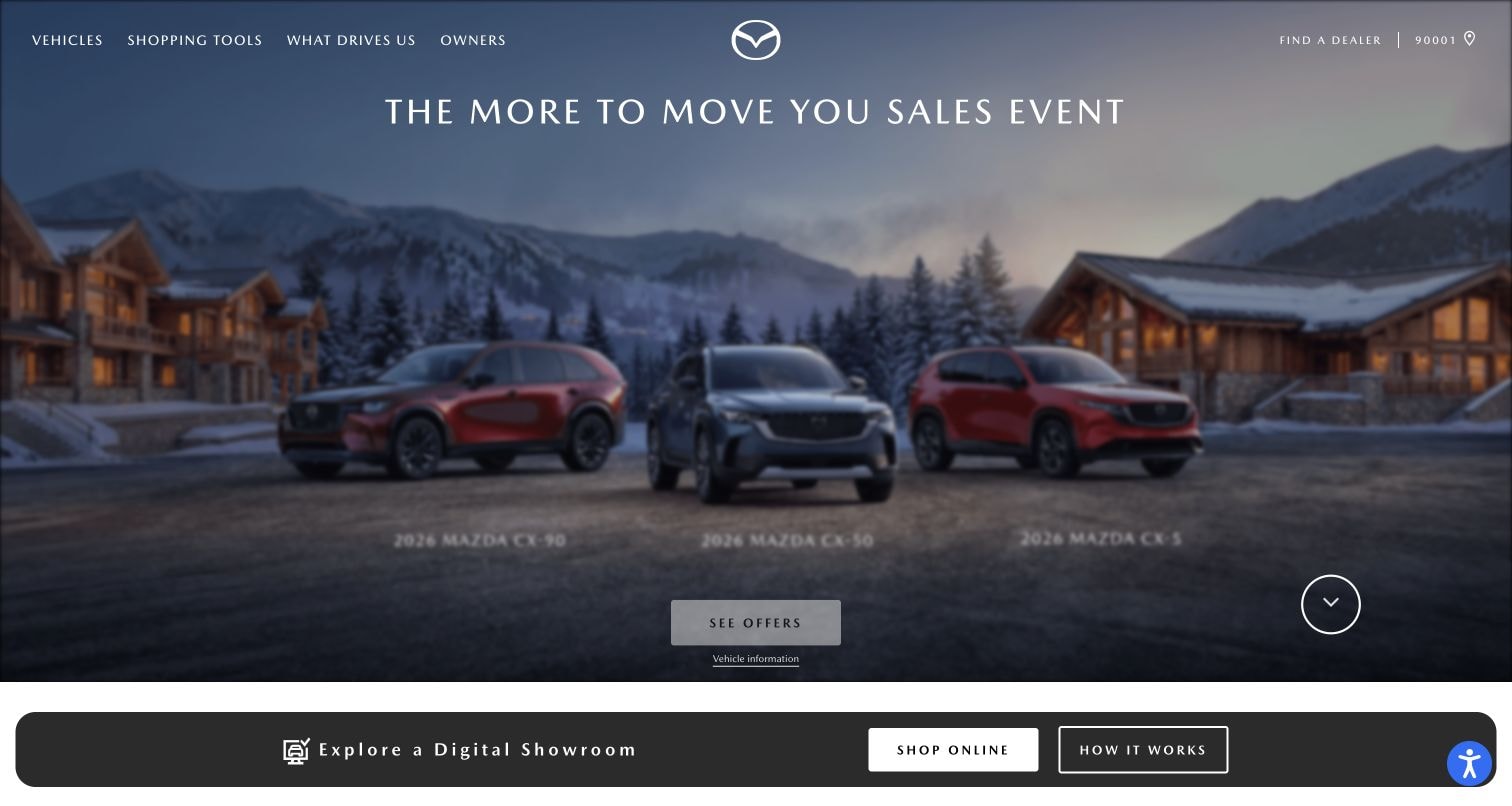
Mazda USA presents several vehicles against a winter resort setting beneath a sales-event headline. A See Offers button sits within the scene, while a lower strip introduces the digital showroom. The composition keeps a clear commercial path beside the visual campaign. It is a useful reminder that video-related resources can support a page whose practical decisions still depend on ordinary text and buttons. The dated evidence identifies a Vimeo player script, without assigning every visible scene to that player.
What you can learn
Keep the offer and showroom route stable as campaign imagery changes. Visitors comparing vehicles should not need to wait for a film sequence to reveal the relevant model or action.
Pros
The model lineup creates an immediate visual comparison within a single coordinated campaign scene.
The separate showroom strip gives interested visitors a practical continuation below the emotional introduction.
Cons & considerations
Small model labels and offer qualifications may become difficult to read in reduced-width layouts.
Campaign motion should not interfere with visitors trying to compare controls or understand the current offer.
Public source checked November 3, 2026. References may be embedded or legacy—not a complete backend inventory.
Platform source: Exact public source page with a dated Vimeo resource observation. Linked script matches Vimeo. The dated evidence identifies a Vimeo player script, without assigning every visible scene to that player. Platform evidence is separate from the direct website screenshot and is not a complete current infrastructure audit.
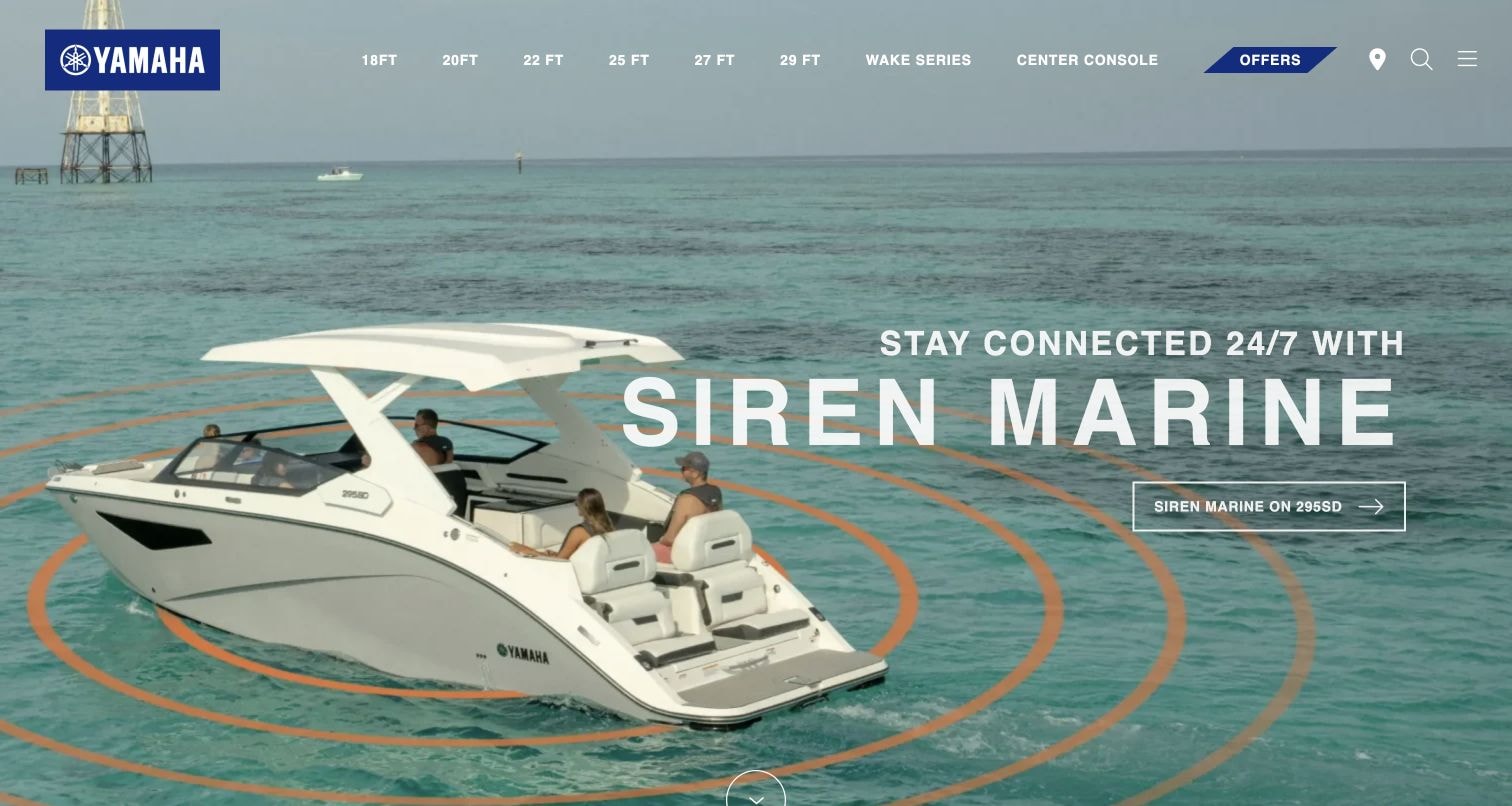
Yamaha Boats opens with a boat on open water and a prominent Siren Marine message. Product-year and model-category navigation runs across the top, keeping the broader catalog accessible. The captured frame uses space and product context to communicate a feature story. Its evidence concerns a Vimeo-delivered media file, so it should not be mistaken for a demonstration of Vimeo player controls. The dated evidence identifies Vimeo media delivery, without establishing use of Vimeo embedded-player controls.
What you can learn
Describe the feature in text even when a film supplies the atmosphere. Keep model-specific facts and the next product route available independently of a moving background or remote media request.
Pros
The boat remains clearly visible while the feature message occupies a separate area of the scene.
Model navigation provides a route into the catalog without requiring the visitor to interpret the campaign.
Cons & considerations
White text over water and imagery needs contrast checks across the complete sequence, not one frame.
A media-delivery relationship does not establish that any particular player controls or analytics are implemented.
Public source checked November 3, 2026. References may be embedded or legacy—not a complete backend inventory.
Platform source: Exact public source page with a dated Vimeo resource observation. Linked media matches Vimeo. The dated evidence identifies Vimeo media delivery, without establishing use of Vimeo embedded-player controls. Platform evidence is separate from the direct website screenshot and is not a complete current infrastructure audit.
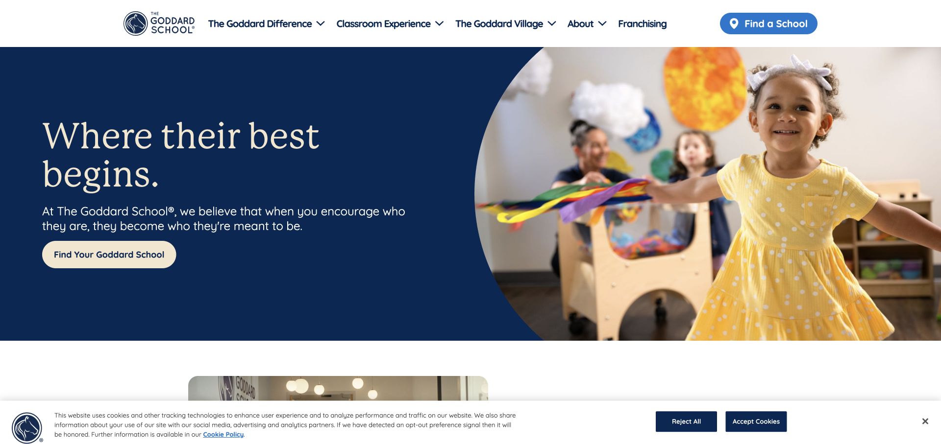
The Goddard School pairs a dark blue statement panel with a child in a classroom activity. Find Your Goddard School appears within the hero, and Find a School remains in the header. The composition uses a human scene to set expectations while keeping location discovery explicit. Video can deepen that introduction, but the captured opening already explains the immediate task without requiring playback. The dated evidence identifies a Vimeo embed on this page; playback behavior was not independently tested.
What you can learn
Make the school-selection path understandable before offering a film. Keep practical location details and the next enquiry step alongside the story so families can proceed at their own pace.
Pros
The solid blue panel gives the headline and primary action a consistent, readable surface.
The repeated school-finding route links the brand introduction to a concrete local next step.
Cons & considerations
The privacy banner occupies the lower edge and needs consideration alongside any video controls.
A classroom film should not replace factual information about the specific school a family is considering.
Public source checked November 3, 2026. References may be embedded or legacy—not a complete backend inventory.
Platform source: Exact public source page with a dated Vimeo resource observation. Linked embed matches Vimeo. The dated evidence identifies a Vimeo embed on this page; playback behavior was not independently tested. Platform evidence is separate from the direct website screenshot and is not a complete current infrastructure audit.
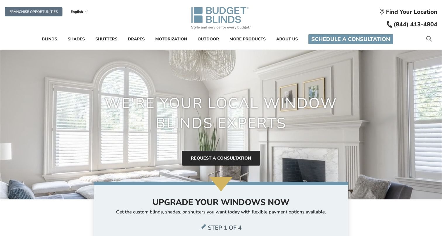
Budget Blinds opens with a bright interior photograph and a local-expertise statement. A consultation button sits over the room, while product categories and location information remain in the header. A second panel begins a staged upgrade journey below. The page connects inspiration to a service process; supporting video should explain that process without obscuring the practical handoff. The dated evidence identifies a Vimeo embed on this page; playback behavior was not independently tested.
What you can learn
Pair room imagery with an explicit explanation of the consultation. Keep product choices and location information usable before a visitor is asked to watch or submit anything.
Pros
The room scene shows the product in context rather than presenting isolated material samples alone.
The consultation action and location utility make the service relationship visible from the opening screen.
Cons & considerations
Text placed over a bright interior needs sufficient contrast for every photograph and responsive crop.
Several consultation entrances should converge on a consistent process rather than competing or duplicating intake.
Public source checked November 3, 2026. References may be embedded or legacy—not a complete backend inventory.
Platform source: Exact public source page with a dated Vimeo resource observation. Linked embed matches Vimeo. The dated evidence identifies a Vimeo embed on this page; playback behavior was not independently tested. Platform evidence is separate from the direct website screenshot and is not a complete current infrastructure audit.
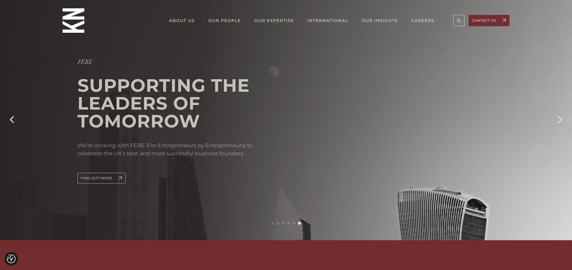
Kingsley Napley opens with a monochrome city scene and a large statement about supporting future leaders. A short explanation names the featured initiative, while Find Out More leads into the story. People, expertise, insights, and contact routes remain in the header. A Vimeo film can supplement this editorial structure, but the written campaign should explain its subject before visitors choose to watch. The dated evidence identifies a Vimeo embed on this page; playback behavior was not independently tested.
What you can learn
Connect a professional-service film to a named initiative and a written explanation. Keep the firm's expertise and contact routes available so the campaign does not become the only entrance.
Pros
The campaign includes a subject label and explanatory paragraph rather than relying only on a large slogan.
The main navigation preserves direct routes to people and expertise beyond the featured story.
Cons & considerations
Text over an atmospheric image needs contrast checks across the complete campaign and responsive crops.
Carousel controls and any video controls should remain distinct so visitors understand which content will change.
Public source checked November 3, 2026. References may be embedded or legacy—not a complete backend inventory.
Platform source: Exact public source page with a dated Vimeo resource observation. Linked embed matches Vimeo. The dated evidence identifies a Vimeo embed on this page; playback behavior was not independently tested. Platform evidence is separate from the direct website screenshot and is not a complete current infrastructure audit.
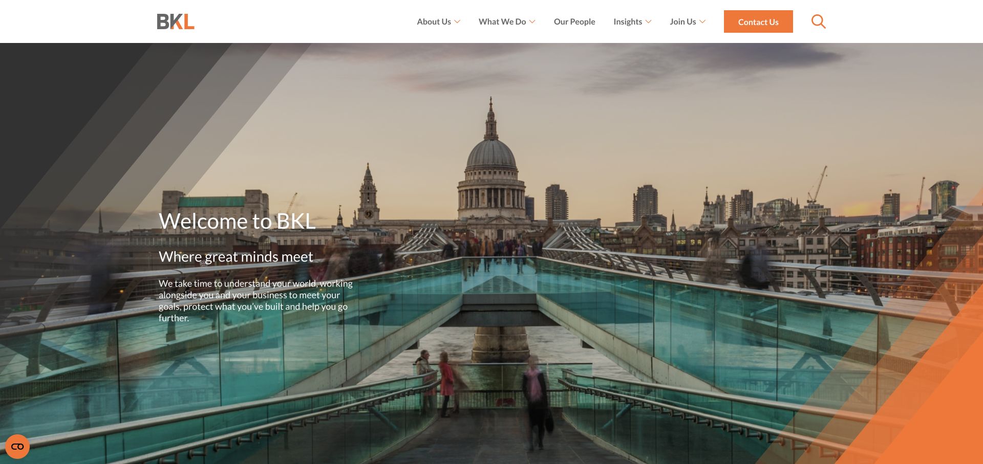
BKL pairs a London cityscape with a concise welcome message and a description of its working approach. Orange brand details frame the image, while What We Do, Our People, and Contact Us remain clear in the header. The view introduces the practice before a visitor enters more specific service material. A supporting Vimeo embed should add context without becoming necessary to understand the basic proposition. The dated evidence identifies a Vimeo embed on this page; playback behavior was not independently tested.
What you can learn
Keep the practice introduction readable and connect films to specific services or people. Geographic imagery can establish context, while written content should explain the work and the next useful step.
Pros
The solid header gives service and contact navigation a dependable reading surface above the image.
The brief introduction adds meaning to the city scene without requiring a long opening statement.
Cons & considerations
A cityscape can establish a tone while still leaving specialist services unclear to new visitors.
Text over moving or detailed imagery requires testing beyond a single still frame and desktop width.
Public source checked November 3, 2026. References may be embedded or legacy—not a complete backend inventory.
Platform source: Exact public source page with a dated Vimeo resource observation. Linked embed matches Vimeo. The dated evidence identifies a Vimeo embed on this page; playback behavior was not independently tested. Platform evidence is separate from the direct website screenshot and is not a complete current infrastructure audit.
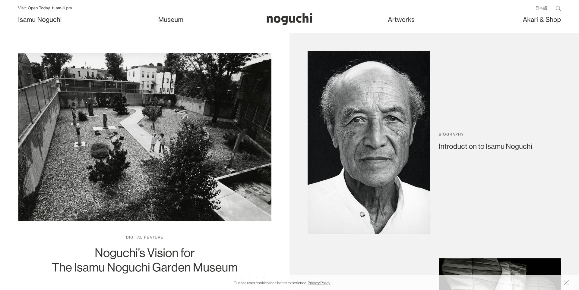
The Noguchi Museum presents a garden photograph beside a portrait and biography entry. A compact header separates museum information, artworks, and shopping. The editorial grid gives each story its own visual identity without requiring a cinematic opening. Video can contribute interpretation here, but it needs the same care in naming, context, and relationship to the collection as the surrounding still images. The dated evidence identifies a Vimeo player script, without assigning every visible scene to that player.
What you can learn
Treat a museum film as an editorial object with a title and context. Keep the associated artist, artwork, or visit information available in text rather than only within narration.
Pros
The grid distinguishes institutional and biographical material through clear image and text relationships.
The restrained navigation leaves attention on the collection while retaining practical museum routes.
Cons & considerations
Mixed image and video cards need consistent cues so visitors can predict what selecting them will do.
Archival films may require captions or transcripts that should be planned alongside the surrounding editorial copy.
Public source checked November 3, 2026. References may be embedded or legacy—not a complete backend inventory.
Platform source: Exact public source page with a dated Vimeo resource observation. Linked script matches Vimeo. The dated evidence identifies a Vimeo player script, without assigning every visible scene to that player. Platform evidence is separate from the direct website screenshot and is not a complete current infrastructure audit.
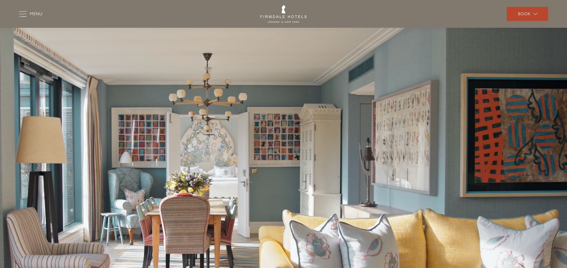
Firmdale Hotels fills the opening with a detailed interior scene, retaining a narrow header with Menu and Book controls. Color, furniture, and artwork carry most of the first impression. The composition works as a visual invitation, while the visible booking route prevents the image from becoming a dead end. Supporting video needs to preserve that same balance between atmosphere and action. The dated evidence identifies a Vimeo embed on this page; playback behavior was not independently tested.
What you can learn
Keep booking and property selection available throughout an atmospheric introduction. Provide a useful still frame and literal room or property context so the page remains meaningful without motion.
Pros
The large interior image communicates a specific decorative character rather than a generic hospitality promise.
A contrasting booking control remains visible without occupying a large part of the photograph.
Cons & considerations
An image-dominated opening can make it harder to distinguish which hotel or room is being shown.
Motion and high-resolution media need performance testing so practical booking controls remain responsive on mobile.
Public source checked November 3, 2026. References may be embedded or legacy—not a complete backend inventory.
Platform source: Exact public source page with a dated Vimeo resource observation. Linked embed matches Vimeo. The dated evidence identifies a Vimeo embed on this page; playback behavior was not independently tested. Platform evidence is separate from the direct website screenshot and is not a complete current infrastructure audit.
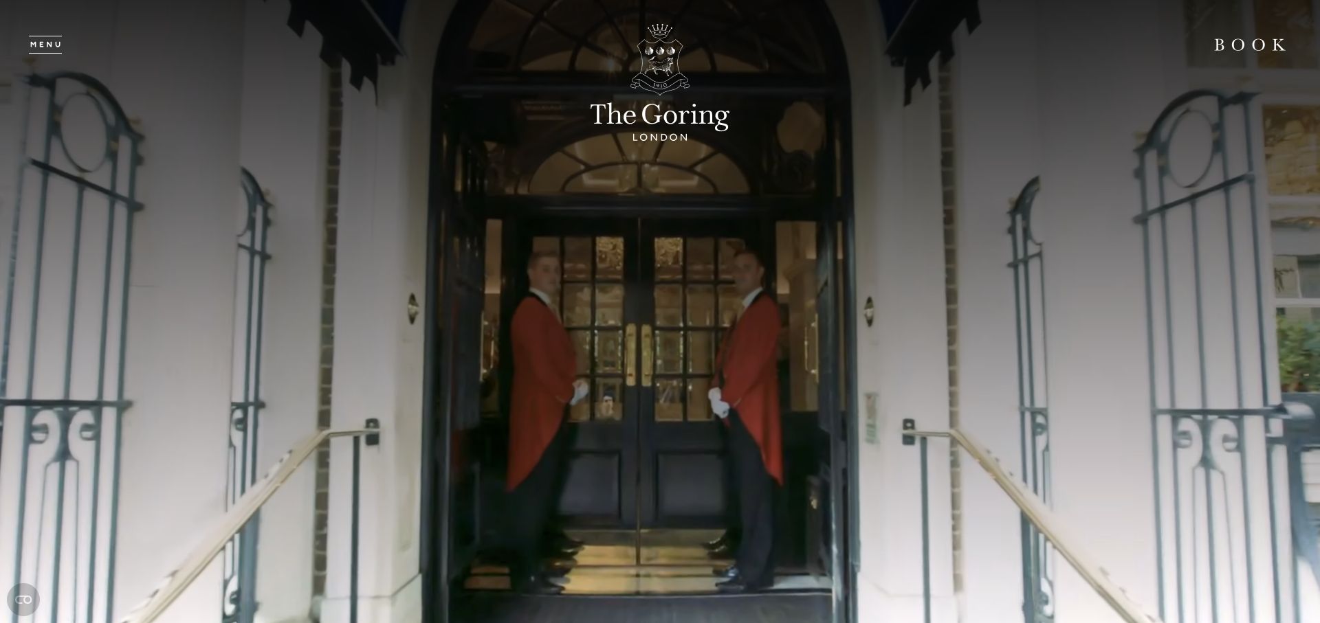
The Goring's captured opening frames the hotel entrance and staff beneath a centered crest. Menu and Book sit at opposite edges, leaving the arrival scene largely uninterrupted. The view introduces a sense of place before room details. A Vimeo embed reference establishes a separate media relationship; the still capture alone does not establish playback, sound, or interaction behavior. The dated evidence identifies a Vimeo embed on this page; playback behavior was not independently tested.
What you can learn
An arrival film should support a clear hotel identity and a stable booking route. Keep the location, room information, and accessible alternatives available without requiring the visitor to play it.
Pros
The centered identity and symmetrical entrance create a coherent, recognizable first impression.
Booking remains a direct header action rather than being hidden within the visual presentation.
Cons & considerations
Dark overlays can reduce photographic detail while still leaving small navigation text difficult to read.
A cinematic introduction should offer an appropriate pause or static alternative when motion is unnecessary.
Public source checked November 3, 2026. References may be embedded or legacy—not a complete backend inventory.
Platform source: Exact public source page with a dated Vimeo resource observation. Linked embed matches Vimeo. The dated evidence identifies a Vimeo embed on this page; playback behavior was not independently tested. Platform evidence is separate from the direct website screenshot and is not a complete current infrastructure audit.
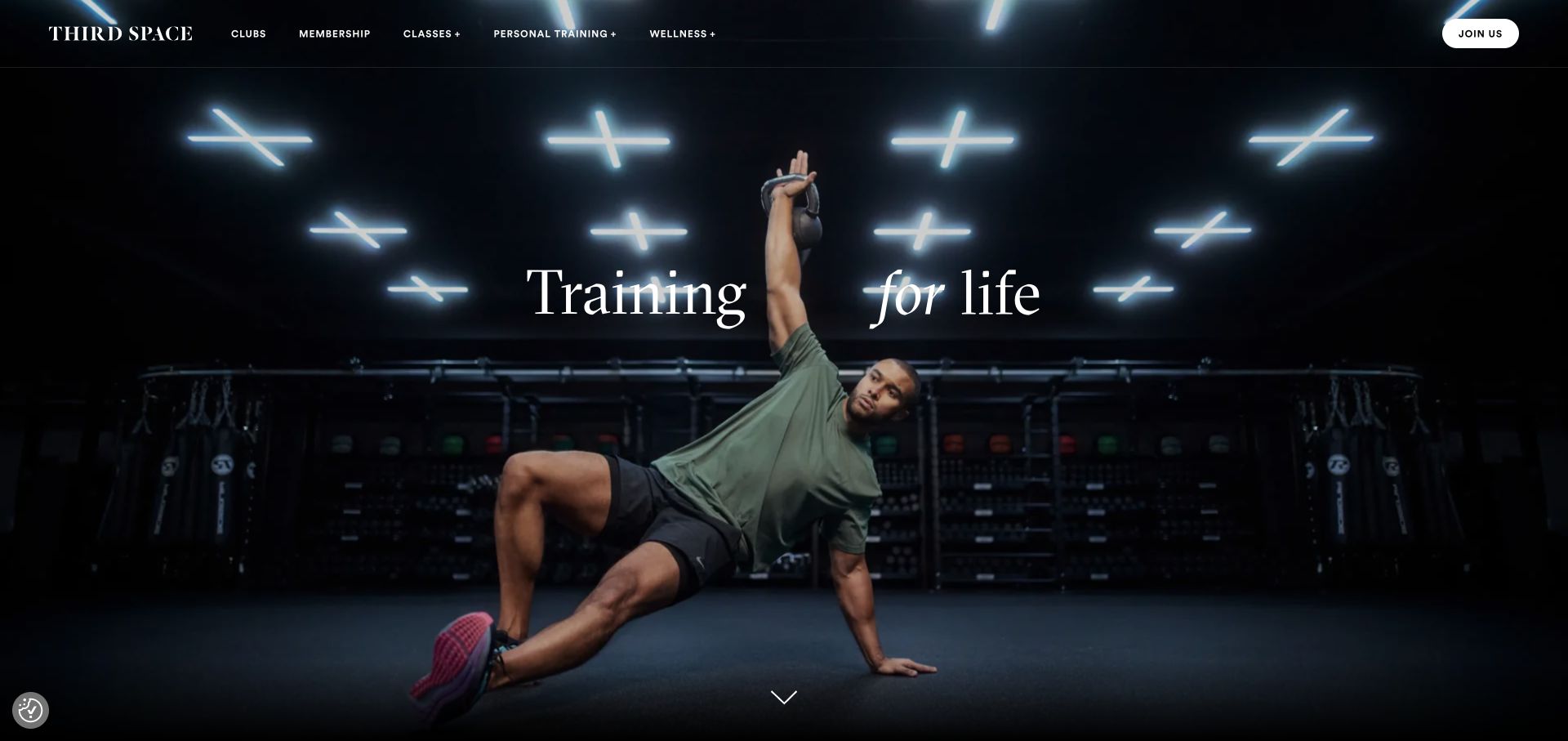
Third Space pairs a training scene with a brief statement and a compact set of club, class, and membership links. The dark background and widely spaced composition give the action room to stand out. For a video-supported fitness site, the useful lesson is the stable layer around the media: visitors can still locate a club or understand the service categories. The dated evidence identifies a Vimeo player script, without assigning every visible scene to that player.
What you can learn
Keep the navigation and membership decision separate from the energy of the film. Plan a strong poster frame and readable text so the opening works before playback and when motion is reduced.
Pros
The short message avoids covering the training subject with a large block of promotional copy.
The navigation exposes practical service categories while the imagery communicates the atmosphere of the brand.
Cons & considerations
A changing sequence needs contrast checks for every moment behind the headline and navigation.
Motion should remain optional for visitors who want facility information or membership details immediately.
Public source checked November 3, 2026. References may be embedded or legacy—not a complete backend inventory.
Platform source: Exact public source page with a dated Vimeo resource observation. Linked script matches Vimeo. The dated evidence identifies a Vimeo player script, without assigning every visible scene to that player. Platform evidence is separate from the direct website screenshot and is not a complete current infrastructure audit.
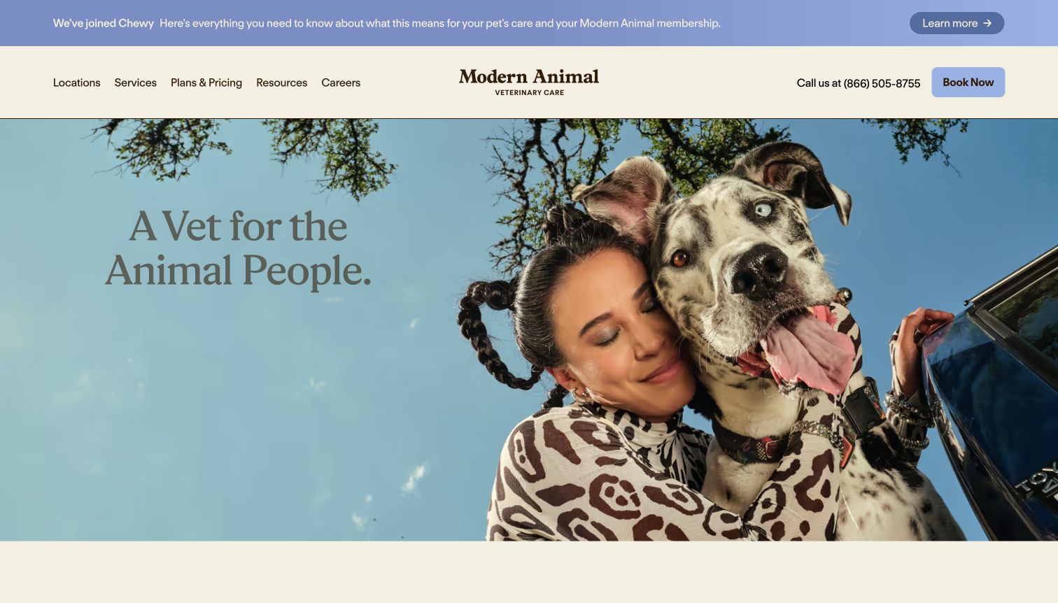
Modern Animal places a large owner-and-dog portrait beneath a compact service header. Locations, services, plans, and booking are all visible, while a narrow announcement strip sits above. The opening communicates personality without asking the image to explain the whole service. Any supporting film should add useful detail rather than carrying information that visitors need before selecting a care route. The dated evidence identifies a Vimeo player script, without assigning every visible scene to that player.
What you can learn
Keep service categories and booking choices explicit around emotional imagery. Use video for additional explanation, with equivalent practical information available to visitors who prefer to read or proceed directly.
Pros
The main navigation identifies practical service questions before the visitor scrolls into the brand story.
The photograph gives the page a human tone while leaving a separate, readable headline area.
Cons & considerations
Announcement strips and media controls can compete for vertical space on small screens.
A warm film or portrait should not be treated as evidence of clinical quality or service availability.
Public source checked November 3, 2026. References may be embedded or legacy—not a complete backend inventory.
Platform source: Exact public source page with a dated Vimeo resource observation. Linked script matches Vimeo. The dated evidence identifies a Vimeo player script, without assigning every visible scene to that player. Platform evidence is separate from the direct website screenshot and is not a complete current infrastructure audit.
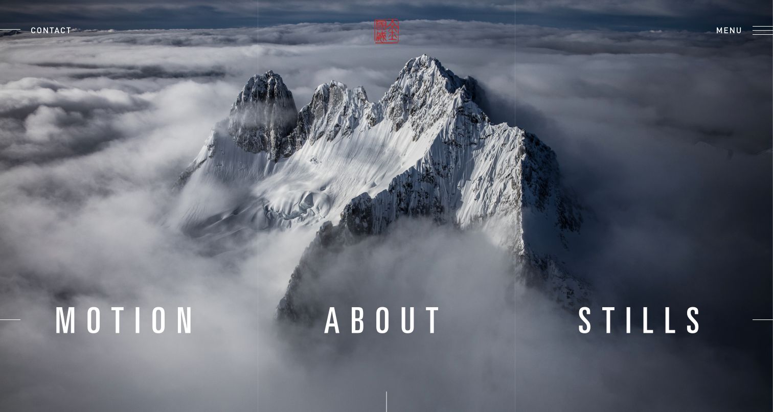
Jimmy Chin's opening uses a mountain landscape as the background for three large choices: Motion, About, and Stills. The categories make the media distinction explicit at the point of entry. A visitor can choose film work without assuming every portfolio item is a video. The sparse composition places considerable responsibility on the legibility and interaction behavior of those few controls. The dated evidence identifies a Vimeo player script, without assigning every visible scene to that player.
What you can learn
Distinguish film and still-image collections before visitors open an item. Keep project titles and return navigation consistent so a powerful full-screen treatment does not make the portfolio difficult to browse.
Pros
The Motion and Stills labels communicate two different bodies of work without requiring explanation.
The landscape provides a strong visual signature while the limited choices keep the opening focused.
Cons & considerations
Large text over photography still needs contrast checks across crops, images, and display sizes.
A full-screen portfolio should avoid trapping visitors in media without an obvious close or back route.
Public source checked November 3, 2026. References may be embedded or legacy—not a complete backend inventory.
Platform source: Exact public source page with a dated Vimeo resource observation. Linked script matches Vimeo. The dated evidence identifies a Vimeo player script, without assigning every visible scene to that player. Platform evidence is separate from the direct website screenshot and is not a complete current infrastructure audit.
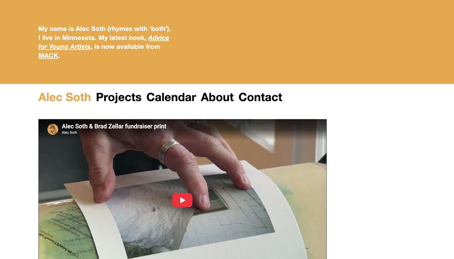
Alec Soth's page begins with a short personal introduction in an ochre band, followed by direct project and contact navigation. The visible player below is a YouTube embed showing a book, while a separate audited Vimeo embed exists on the same property. That distinction matters: the screenshot illustrates the page's editorial arrangement, not the identity of every video provider it uses. The dated evidence identifies a Vimeo embed on this page; playback behavior was not independently tested.
What you can learn
Label media entries individually when a page uses more than one provider. Keep the publication or project context close to each film so visitors understand what they are choosing to watch.
Pros
The first-person introduction provides authorship and context before the visitor encounters the media collection.
Direct project and contact links remain available above the player rather than disappearing into it.
Cons & considerations
A mixed-provider page needs consistent controls and descriptions despite differences between embedded players.
One visible provider mark should not be used to infer the technology of every other media item.
Public source checked November 3, 2026. References may be embedded or legacy—not a complete backend inventory.
Platform source: Exact public source page with a dated Vimeo resource observation. Linked embed matches Vimeo. The dated evidence identifies a Vimeo embed on this page; playback behavior was not independently tested. Platform evidence is separate from the direct website screenshot and is not a complete current infrastructure audit.
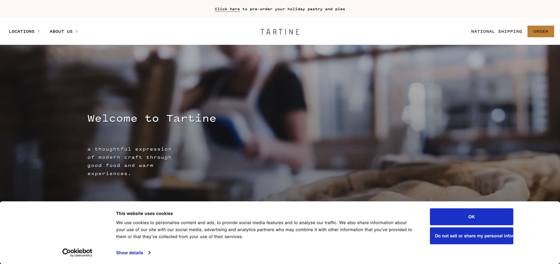
Tartine's opening combines a softly focused bakery scene with a restrained welcome message. Locations and About sit on the left, while shipping and ordering occupy the right. The visual mood introduces the brand's craft, but the navigation separates visiting a bakery from purchasing remotely. A video sequence can enrich that atmosphere without becoming the only explanation of what customers can do. The dated evidence identifies a Vimeo embed on this page; playback behavior was not independently tested.
What you can learn
Separate local visits from shipped orders around the media. Keep hours, pickup, shipping, and product information available as ordinary content so a film remains an optional introduction.
Pros
The navigation distinguishes physical locations from national shipping before visitors enter the product journey.
The minimal headline leaves the bakery scene readable without a dense overlay of campaign text.
Cons & considerations
The captured consent panel covers much of the lower opening and needs coordination with player controls.
A soft-focus scene can communicate atmosphere while leaving the actual products and ordering conditions unclear.
Public source checked November 3, 2026. References may be embedded or legacy—not a complete backend inventory.
Platform source: Exact public source page with a dated Vimeo resource observation. Linked embed matches Vimeo. The dated evidence identifies a Vimeo embed on this page; playback behavior was not independently tested. Platform evidence is separate from the direct website screenshot and is not a complete current infrastructure audit.
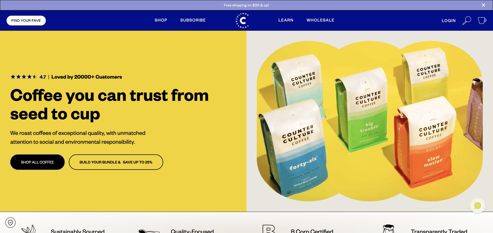
Counter Culture Coffee uses a yellow field, illustrated product packaging, and two clear shopping actions. Shop All Coffee and Build Your Bundle offer different levels of commitment, while subscription, learning, and wholesale remain in the header. The page works as a product entrance before any film is played. Vimeo evidence should therefore be understood as a supporting resource, not the explanation for the visible commerce design. The dated evidence identifies a Vimeo player script, without assigning every visible scene to that player.
What you can learn
Make the product and purchase choices understandable before introducing film. Let video explain process or sourcing, while preserving the practical selection and subscription information in accessible text.
Pros
The packaging illustration makes the product category immediately recognizable within the bright campaign palette.
Distinct shopping and bundle actions support both browsing and a more directed purchase task.
Cons & considerations
Prominent review and quality claims need their own evidence beyond the visual presence of a badge.
Additional video should not delay access to product choices or obscure recurring-order terms.
Public source checked November 3, 2026. References may be embedded or legacy—not a complete backend inventory.
Platform source: Exact public source page with a dated Vimeo resource observation. Linked script matches Vimeo. The dated evidence identifies a Vimeo player script, without assigning every visible scene to that player. Platform evidence is separate from the direct website screenshot and is not a complete current infrastructure audit.
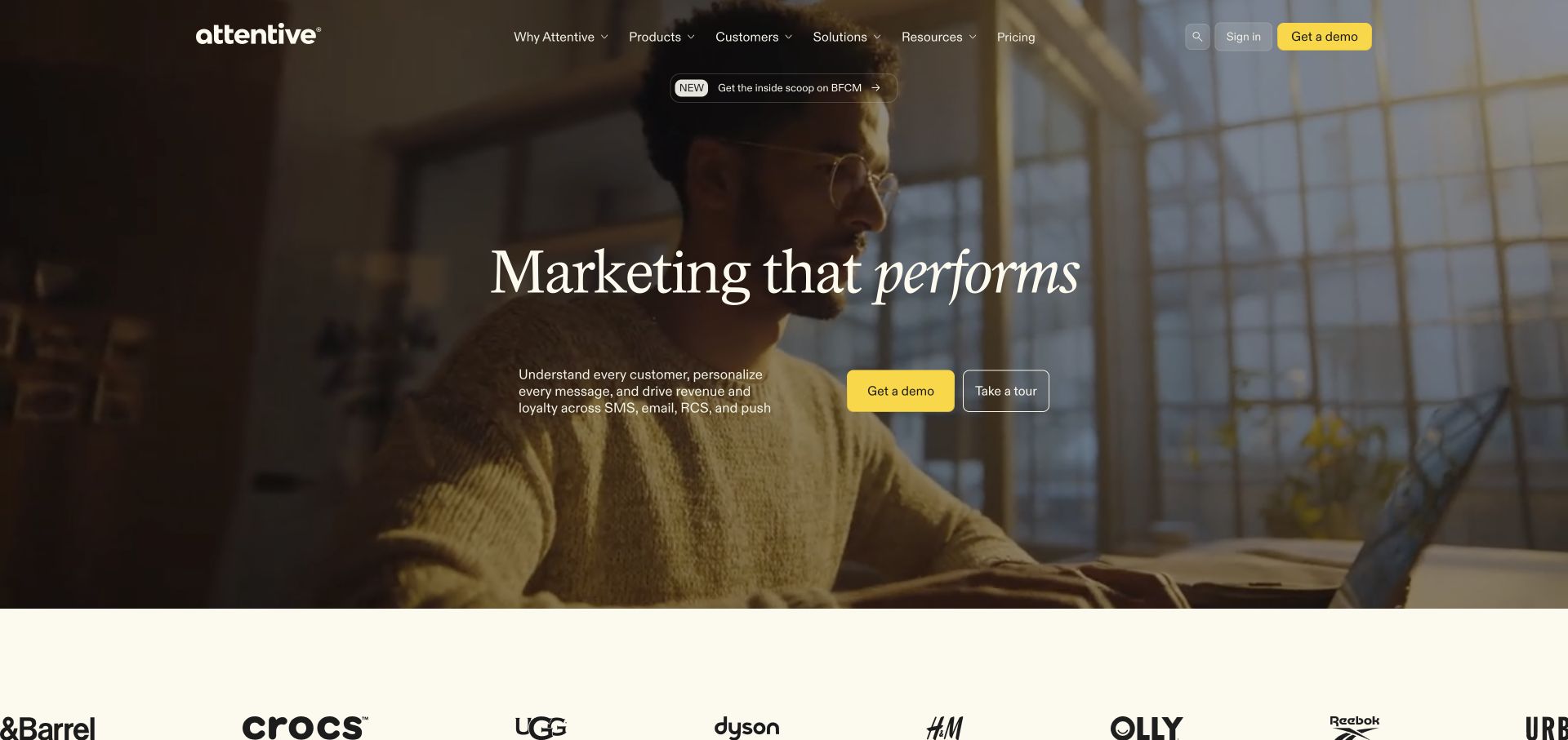
Attentive places a broad marketing statement over a human workplace scene, with Get a Demo and Take a Tour offered together. Customer logos begin beneath the hero. The two actions distinguish a sales conversation from independent exploration. Video can help the latter route, but the captured page already provides enough text to explain the product's general purpose and the available next steps. The dated evidence identifies a Vimeo embed on this page; playback behavior was not independently tested.
What you can learn
Separate a self-guided product explanation from a sales enquiry. Give any film a specific role in that choice, and keep the visitor in control of when media and forms begin.
Pros
The demo and tour choices acknowledge different levels of readiness without forcing a single conversion path.
The main message and supporting description occupy a stable central area within the larger visual scene.
Cons & considerations
Customer logos alone do not explain which products or workflows those organizations use.
A tour should disclose whether it is a video, interactive demonstration, or gated process before selection.
Public source checked November 3, 2026. References may be embedded or legacy—not a complete backend inventory.
Platform source: Exact public source page with a dated Vimeo resource observation. Linked embed matches Vimeo. The dated evidence identifies a Vimeo embed on this page; playback behavior was not independently tested. Platform evidence is separate from the direct website screenshot and is not a complete current infrastructure audit.
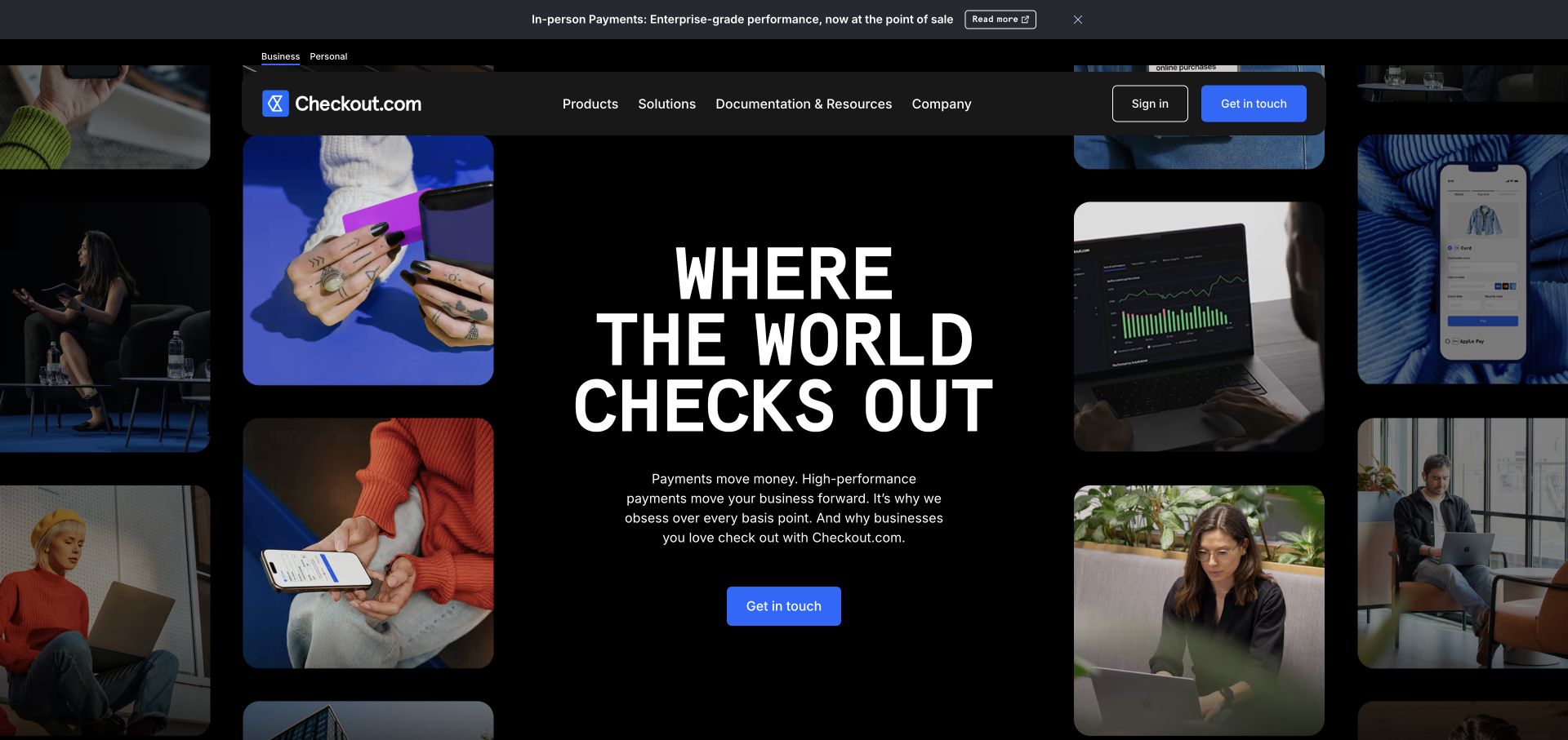
Checkout.com surrounds its central payment-platform message with a collage of product, people, and interface imagery. A Get in Touch button sits beneath the explanation, while product and documentation routes remain in the header. The composition creates breadth without abandoning a central reading path. Its Vimeo evidence concerns a delivered media file rather than proof of an embedded player interface. The dated evidence identifies Vimeo media delivery, without establishing use of Vimeo embedded-player controls.
What you can learn
Give a moving collage a stable text center and a clear action. Preserve a useful still state and avoid making the service explanation depend on several simultaneous clips being understood.
Pros
The central text block remains visually distinct from the varied surrounding imagery and interface fragments.
Documentation and product navigation offer practical routes beyond the high-level sales introduction.
Cons & considerations
Multiple moving tiles can compete for attention and should be evaluated with reduced-motion preferences.
A media host reference does not establish the page's payment infrastructure or the behavior of its video controls.
Public source checked November 3, 2026. References may be embedded or legacy—not a complete backend inventory.
Platform source: Exact public source page with a dated Vimeo resource observation. Linked media matches Vimeo. The dated evidence identifies Vimeo media delivery, without establishing use of Vimeo embedded-player controls. Platform evidence is separate from the direct website screenshot and is not a complete current infrastructure audit.
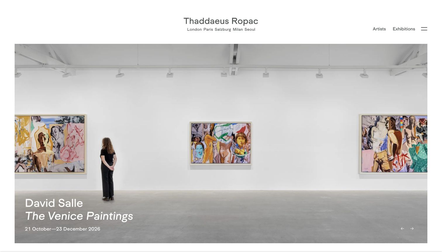
Thaddaeus Ropac presents a spacious gallery scene with the artist, exhibition title, and dates placed at the lower edge. The restrained header leaves attention on the work while retaining artist and exhibition navigation. This establishes a useful editorial contract for supporting films: each media item should belong to a clearly named show rather than functioning as anonymous atmosphere. The dated evidence identifies a Vimeo embed on this page; playback behavior was not independently tested.
What you can learn
Carry the exhibition title, artist, and relevant dates into every film entry. A visitor should be able to understand the subject and find associated work without relying only on narration.
Pros
The wide installation view supplies spatial context that an isolated artwork image would not provide.
Visible title and date information connects the visual presentation to a specific editorial record.
Cons & considerations
Small white labels over artwork need contrast checks when images or exhibition campaigns change.
A film archive should remain navigable after an exhibition closes, with dates preserved rather than silently replaced.
Public source checked November 3, 2026. References may be embedded or legacy—not a complete backend inventory.
Platform source: Exact public source page with a dated Vimeo resource observation. Linked embed matches Vimeo. The dated evidence identifies a Vimeo embed on this page; playback behavior was not independently tested. Platform evidence is separate from the direct website screenshot and is not a complete current infrastructure audit.
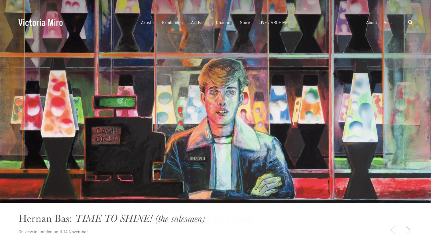
Victoria Miro fills the opening with a colorful artwork and places exhibition information in a white caption area below. Artist, exhibition, film, and channel navigation sit over the image. The page gives moving-image material an explicit place within the wider program. The practical opportunity is to connect those films to the same artist and exhibition records that organize the still-image content. The dated evidence identifies a Vimeo embed on this page; playback behavior was not independently tested.
What you can learn
Use the caption area to anchor a visual campaign in clear exhibition information. Keep films discoverable through named subjects and dates instead of relying on a general video channel alone.
Pros
The white caption band provides a more dependable reading surface than text over the artwork itself.
A visible film route recognizes moving-image material as part of the gallery's editorial program.
Cons & considerations
Header links over a colorful image may require stronger contrast than the artwork naturally provides.
Films should retain related artist and exhibition links so playback does not become a disconnected browsing endpoint.
Public source checked November 3, 2026. References may be embedded or legacy—not a complete backend inventory.
Platform source: Exact public source page with a dated Vimeo resource observation. Linked embed matches Vimeo. The dated evidence identifies a Vimeo embed on this page; playback behavior was not independently tested. Platform evidence is separate from the direct website screenshot and is not a complete current infrastructure audit.
Provide a short explanation of the subject and an explicit play action. Keep the ordinary navigation complete. A first-time visitor may appreciate orientation while a returning visitor needs a direct route to the work.
A project or product explanation
Connect the film to named project facts, product details, or documentation. Include equivalent practical information in text. Give a series a clear order and distinguish a short overview from a detailed demonstration.
Atmospheric media
Keep a strong still frame and stable reading surface. Avoid placing essential information only inside the sequence. Check motion preferences, loading cost, and the ability to continue without the film.
From references to requirements
Plan the editorial and interaction details
Create a media record
Store the title, subject, date, owner, poster, caption or transcript status, and related page with each film. That record should survive a redesign and make it clear which version of a project or product the recording describes.
Define how a viewer enters and leaves
Test play, pause, focus, close, and return behavior in the actual layout. Preserve the visitor's position and any form progress. Do not make an overlay the only route to information that is needed for the main task.
Handle unavailable media honestly
Plan what appears when a film is removed, restricted, or temporarily unavailable. Keep the title and supporting information useful, and give the visitor another route. A failed remote request should not leave a large unexplained blank space.
A useful handover demonstration
Ask the actual team to carry out its routine job: publish a realistic update, correct a mistake, preview a narrow screen, and identify who owns an integration failure. For a library or frontend framework, also ask who maintains the content source and deployment. A polished screenshot does not answer those operational questions.
Beyond the screenshot
Before releasing a video-supported page
Describe the film's subject before the visitor presses play.
Keep the main message and next action available without playback.
Use a meaningful poster frame and stable media dimensions.
Provide captions, transcripts, or other appropriate alternatives for the content.
Test keyboard controls and focus return in the actual page layout.
Preserve form progress and reading position when media opens or closes.
Test unavailable, slow, and restricted media states.
Record the film's owner, date, related content, and review schedule.
Test with real content, a keyboard, a small screen, slow or failed requests, and the people who will maintain the system. These are planning checks, not an accessibility, security, performance, or search-ranking certification.
Sources & editorial method
How this Vimeo collection was reviewed
Curated November 4, 2026 using existing direct browser screenshots and exact-page public evidence. Original capture and audit dates remain attached to each source. Evidence types are preserved: Vimeo player scripts, video embeds, and Vimeo-delivered media files. The photographed view may not show the relevant film, and a static frame does not establish motion or sound. Alec Soth's visible screenshot shows a YouTube player while the distinct Vimeo evidence applies elsewhere on the same page. No complete backend, exclusive provider relationship, plan entitlement, or successful playback is inferred.
Every image is an unmodified capture from the actual website, with its source and capture date. Some captures are reused from our shared catalog; their dates remain the original capture dates. None comes from a vendor gallery or a generated reconstruction. Moving imagery and live content can change.
Technology attribution uses public page assets or metadata, official platform documentation, or a cited first-party project case study. Documentary and framework-relationship evidence is identified where used; it is not a complete current backend inventory. A CMS image CDN alone does not establish a full CMS deployment. A library’s presence does not prove which individual controls use it, and a platform label does not establish AI authorship.
The composition notes, lessons, pros and tradeoffs are original editorial observations. We have not measured conversion, traffic, security, performance or accessibility conformance. Website owners retain their brands and imagery; these examples are not our client portfolio. Written, Edited and Curated are independent records, not dates advanced by a build. See our editorial standards or suggest a correction.
Questions worth asking
Vimeo website development FAQs
Does a Vimeo script mean the page's hero uses Vimeo?
No. It shows a player-library reference on the recorded public page. The particular hero or control needs separate evidence. The resource may support media elsewhere on the page.
Is a Vimeo media file the same as a Vimeo embed?
No. A delivered file establishes a media-delivery relationship. An embed identifies a player endpoint, and the SDK is another distinct integration surface. The collection preserves these scopes.
Should a brand film autoplay?
Decide from the content and user task, then test the actual behavior across devices and preferences. Essential explanations should remain available without motion, sound, or successful playback.
Can one page use more than one video provider?
Yes. Evidence is attached to each resource and property. A provider mark visible in one screenshot does not identify every other media item on that page.