These public websites have dated references to Cookiebot resources. Their screenshots show the surrounding design and, when visible, the consent interface. The evidence establishes a scoped integration signal; it does not establish consent enforcement, legal compliance or the configuration behind the page.
Consent is part of the first visit. It can appear before a visitor has learned what a business sells, where a museum is located or which service covers their address. A useful design preserves that context while making choices understandable and easy to revisit.
This collection places Cookiebot alongside the real pages it accompanies. Compare the relationship between the opening message, primary navigation, practical information and the available space for a dialog. Use those observations to plan your own implementation, then separately test the actual consent behavior with your approved configuration.
Before the examples
What makes good Cookiebot website development in 2026?
Keep the first task understandable
A visitor may need opening hours, a product price or a route to an existing account immediately. Identify the information that should remain readable while consent controls are present. Avoid placing the only useful action beneath a persistent panel, especially on a narrow screen.
Give choices clear names
Write short labels that describe a real decision. Use clear heading levels, readable text and a consistent route back to preferences. Review translated labels in their actual layouts; a button that fits in one language may wrap badly in another.
Treat the integration as a maintained component
Cookiebot documents JavaScript consent state, callbacks and methods for showing or renewing choices. Decide how your application responds when those choices change, including content loaded after the first page render. Keep the implementation and ownership recorded beside other shared components.
Lazard, Barry’s, Milk Bar, Pinarello and Designmuseum Danmark open the collection as recognizable financial, fitness, food, cycling and cultural brands. The remaining examples widen the design contexts. Each review refers to a genuine dated screenshot, with a separate dated Cookiebot resource observation.
We start with five recognizable brands or organizations: Lazard, Barry’s, Milk Bar, Pinarello, Designmuseum Danmark. Each attribution applies to the named website property, not every product or website belonging to its organization. This is a curated reading sequence, not a measured ranking.
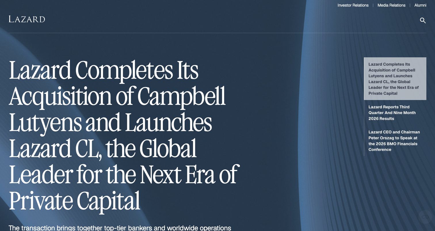
Lazard uses a large serif announcement over a blue architectural background, with a narrow column of other news on the right. The composition gives one corporate development clear priority, while investor and media routes remain above. For a consent implementation, the practical challenge is to preserve access to this public information when optional resources are withheld, rather than allowing a banner or script dependency to block the entire entrance. The dated Cookiebot reference establishes script presence, not consent enforcement or a legal compliance finding.
What you can learn
Keep public announcements and investor navigation available independently of optional measurement. A consent choice should leave the visitor with the same clear route into the underlying corporate information.
Pros
The large headline establishes a clear editorial lead instead of asking visitors to choose among many equally weighted announcements.
The neighboring news list exposes alternative updates without adding a second large promotional panel to the first screen.
Cons & considerations
A long headline fills much of the view and needs careful reflow when a consent panel reduces available phone space.
A Cookiebot resource reference does not demonstrate correct consent categories, regional rules or the timing of other third-party requests.
Public source checked November 3, 2026. References may be embedded or legacy—not a complete backend inventory.
Platform source: Dated public page resource observation. The public source page referenced Cookiebot resources on 2026-11-03. This is a scoped integration signal, not proof of configuration or successful behavior. The direct screenshot retains its separate original capture date. Platform evidence is separate from the direct website screenshot and is not a complete current infrastructure audit.
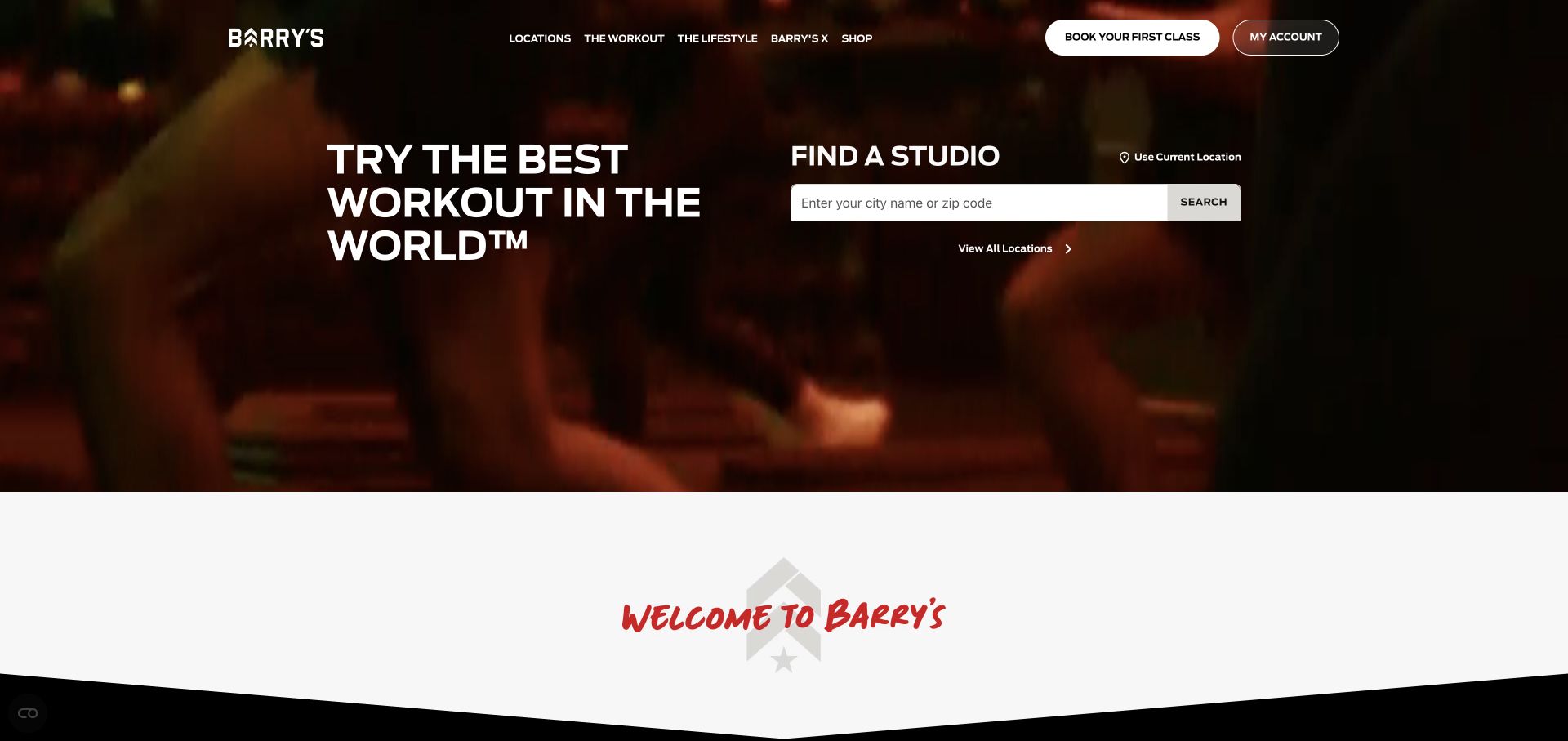
Barry's gives its first screen two practical roles: a bold workout statement on the left and a studio search on the right. The darker activity backdrop communicates atmosphere while the white search box stays distinct. A consent layer should preserve that location task without assuming permission to use precise device location; typing a city or postal code provides an ordinary alternative visible in the interface. The dated Cookiebot reference establishes script presence, not consent enforcement or a legal compliance finding.
What you can learn
Separate optional location assistance from the core studio search. Let visitors enter a place manually and keep the result route usable when consent-dependent services are not available.
Pros
The studio finder turns a general fitness brand introduction into an actionable local decision in the first view.
The contrasting search box remains identifiable against the dark background, keeping the practical task separate from the campaign message.
Cons & considerations
Background motion and white text need a stable readable fallback when media is paused, delayed or disabled.
Consent software presence does not establish that location requests, analytics or embedded booking services follow the intended visitor choices.
Public source checked November 3, 2026. References may be embedded or legacy—not a complete backend inventory.
Platform source: Dated public page resource observation. The public source page referenced Cookiebot resources on 2026-11-03. This is a scoped integration signal, not proof of configuration or successful behavior. The direct screenshot retains its separate original capture date. Platform evidence is separate from the direct website screenshot and is not a complete current infrastructure audit.
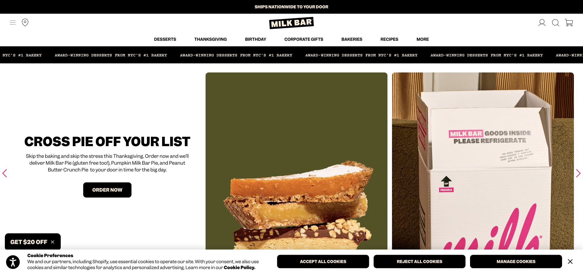
Milk Bar arranges its pie campaign across copy, product detail and branded shipping packaging. The retained screenshot also shows a compact cookie strip with accept, reject and manage choices. This makes it possible to study the coexistence of merchandising and preference controls without claiming that the visible buttons prove correct behavior. The order action remains separate from the consent decision, which is a useful distinction for a transactional homepage. The dated Cookiebot reference establishes script presence, not consent enforcement or a legal compliance finding.
What you can learn
Design promotional and privacy decisions as separate tasks. Keep preference buttons legible at narrow widths and verify the resulting resource behavior rather than judging success from the banner's appearance.
Pros
Product and packaging photographs explain both the item and its delivery context, giving the seasonal message concrete support.
Accept, reject and management actions are presented as distinct controls in the captured bar instead of one vague dismissal.
Cons & considerations
A bottom consent strip can collide with promotions or accessibility widgets, so stacking and keyboard order need deliberate testing.
The screenshot does not verify shipping availability or consent enforcement; both depend on systems beyond the visible campaign and controls.
Public source checked November 3, 2026. References may be embedded or legacy—not a complete backend inventory.
Platform source: Dated public page resource observation. The public source page referenced Cookiebot resources on 2026-11-03. This is a scoped integration signal, not proof of configuration or successful behavior. The direct screenshot retains its separate original capture date. Platform evidence is separate from the direct website screenshot and is not a complete current infrastructure audit.
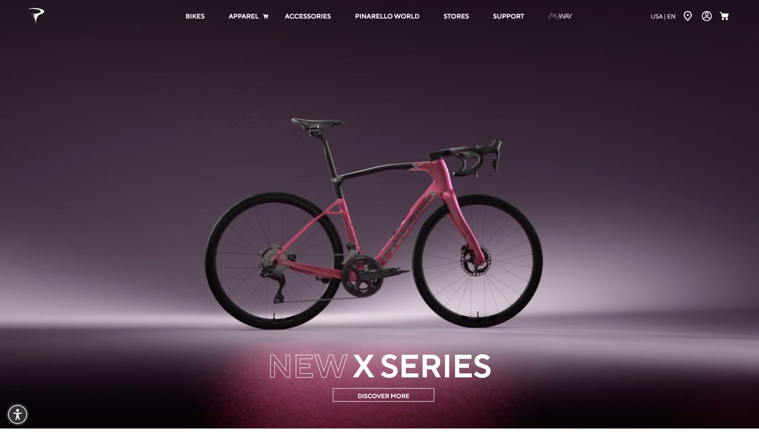
Pinarello places a bicycle against a studio background, with a short product-family title and discovery action near the lower edge. Navigation for bikes, apparel, accessories, stores and support stays across the top. The focused product view is easy to understand visually, but a consent design must account for the low action position: a bottom panel should not cover the only visible route into the promoted range. The dated Cookiebot reference establishes script presence, not consent enforcement or a legal compliance finding.
What you can learn
Test consent placement against the actual hero action, not an empty wireframe. Preserve ordinary category and dealer links so visitors can explore the product when optional campaign resources are withheld.
Pros
Showing the whole bicycle gives the launch a clear silhouette and avoids making visitors infer the product from an abstract close-up.
The restrained navigation keeps product, dealer and support routes available without competing heavily with the central photograph.
Cons & considerations
The discovery action is positioned close to the bottom of the hero and could be obscured by a large preference panel.
Cookiebot evidence identifies a public integration only; it does not establish purchase availability, dealer stock or correct consent handling.
Public source checked November 3, 2026. References may be embedded or legacy—not a complete backend inventory.
Platform source: Dated public page resource observation. The public source page referenced Cookiebot resources on 2026-11-04. This is a scoped integration signal, not proof of configuration or successful behavior. The direct screenshot retains its separate original capture date. Platform evidence is separate from the direct website screenshot and is not a complete current infrastructure audit.
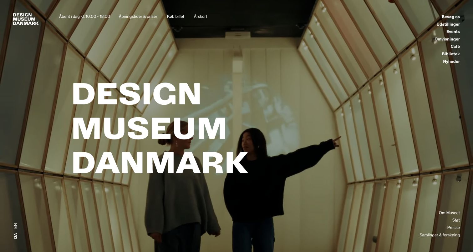
Designmuseum Danmark overlays its name on a photograph of visitors inside a distinctive timber structure. Opening information and ticket access sit along the top, while exhibitions, events and other destinations form a vertical group on the right. The image communicates a real visit, and the surrounding information supports planning. Consent controls should respect both roles by keeping ticket and access information available without optional tracking. The dated Cookiebot reference establishes script presence, not consent enforcement or a legal compliance finding.
What you can learn
Plan a museum consent experience around the visitor's immediate questions. Keep hours, ticket routes and access information readable even if photography, video or analytics integrations are withheld.
Pros
The photographed visitors provide human scale and communicate an experience beyond a static collection of design objects.
Practical visit links sit within the opening composition, reducing the distance between inspiration and planning a trip.
Cons & considerations
Navigation placed over a photograph needs contrast testing across every image and crop used by the museum.
A script reference cannot prove whether an external ticketing service shares the same consent state or correctly handles a changed preference.
Public source checked November 3, 2026. References may be embedded or legacy—not a complete backend inventory.
Platform source: Dated public page resource observation. The public source page referenced Cookiebot resources on 2026-11-03. This is a scoped integration signal, not proof of configuration or successful behavior. The direct screenshot retains its separate original capture date. Platform evidence is separate from the direct website screenshot and is not a complete current infrastructure audit.
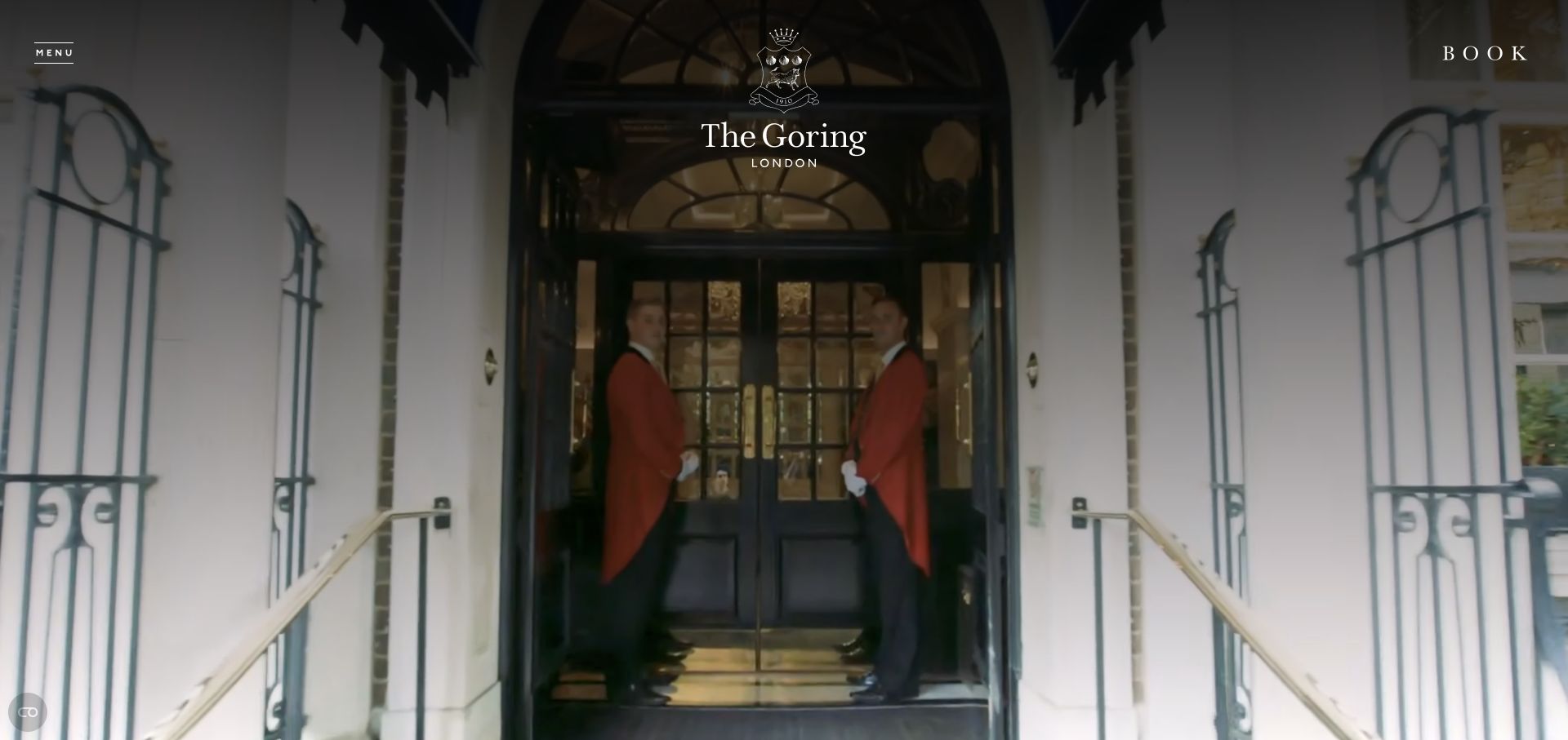
The Goring opens with its entrance, a centered crest and a small booking link in the upper corner. The photograph conveys arrival and service through the doorway and staff rather than a collage of amenities. A consent panel added to this composition should preserve the booking route and a way to find practical details. Its presence should not force visitors to accept optional resources merely to learn about accommodation. The dated Cookiebot reference establishes script presence, not consent enforcement or a legal compliance finding.
What you can learn
Treat booking access as essential navigation, then test the separate reservation system in its own scope. Keep a simple contact route available if an optional embedded experience cannot load.
Pros
The entrance photograph offers a concrete sense of arrival and establishes the hotel's identity without a long opening description.
A persistent booking link provides a next step while the main image remains visually quiet and uncluttered.
Cons & considerations
The sparse opening leaves room and accessibility details to later navigation, which must remain easy to discover with keyboard access.
The Cookiebot observation concerns the public hotel page and does not establish the configuration of a separate booking engine.
Public source checked November 3, 2026. References may be embedded or legacy—not a complete backend inventory.
Platform source: Dated public page resource observation. The public source page referenced Cookiebot resources on 2026-11-03. This is a scoped integration signal, not proof of configuration or successful behavior. The direct screenshot retains its separate original capture date. Platform evidence is separate from the direct website screenshot and is not a complete current infrastructure audit.
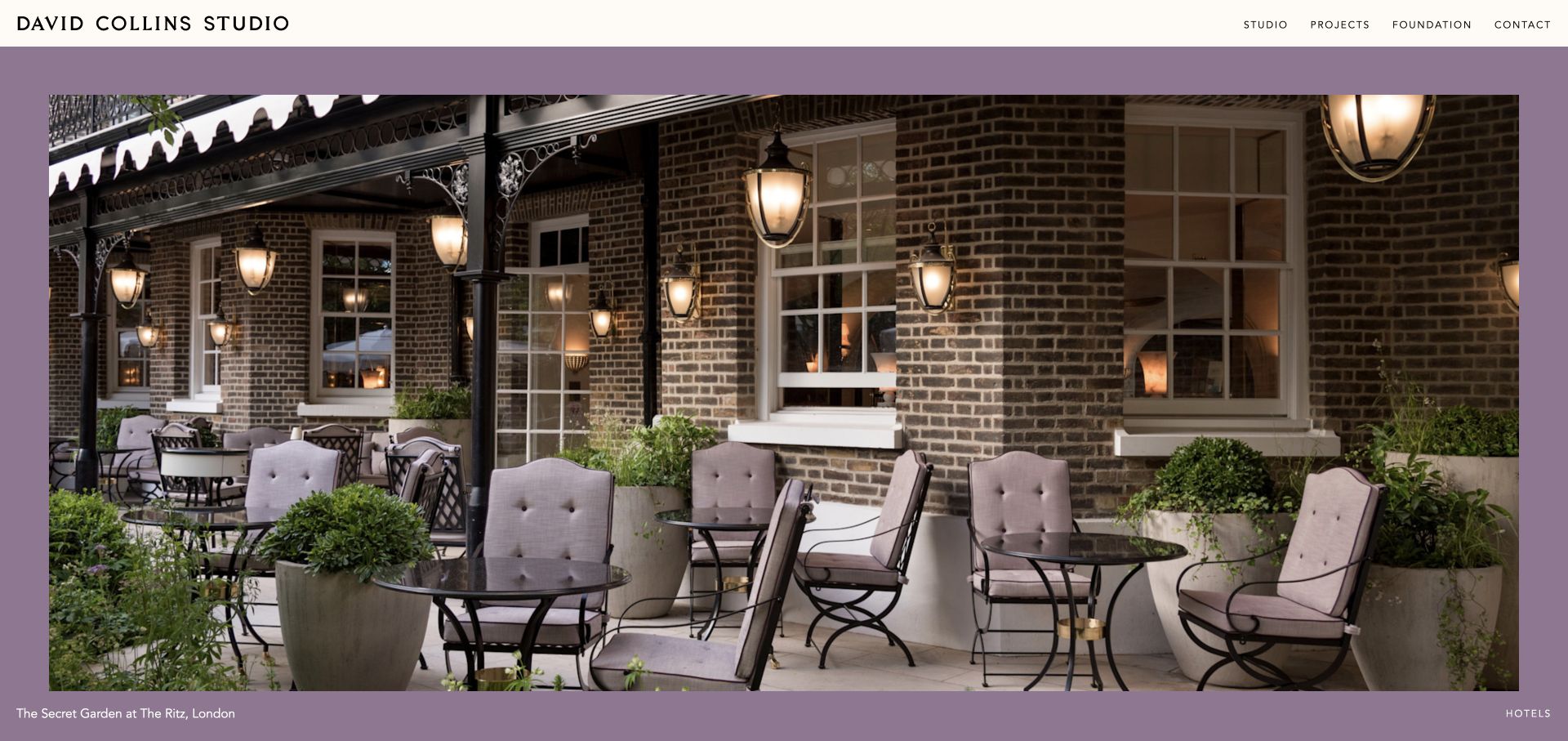
David Collins Studio frames a hospitality photograph with a muted purple field and a small project caption. A thin white header contains studio, project, foundation and contact routes. The picture carries the initial impression, but the caption anchors it to a specific place. Consent design here should protect that context: a banner should neither conceal the credit nor prevent the visitor from reaching a plain project index. The dated Cookiebot reference establishes script presence, not consent enforcement or a legal compliance finding.
What you can learn
Keep project identification and navigation independent of optional imagery enhancements. Place consent controls where they do not cover captions or make the photographed work appear uncredited.
Pros
The restrained header leaves the project photograph dominant while maintaining clear routes into the studio's work and contact information.
The caption gives the image a specific project identity, adding useful context to a visually atmospheric opening.
Cons & considerations
Small captions at the edge of an image can become difficult to read when viewport height is reduced by notices.
A Cookiebot script observation does not establish whether third-party video, project media or analytics remain blocked before the appropriate choice.
Public source checked November 3, 2026. References may be embedded or legacy—not a complete backend inventory.
Platform source: Dated public page resource observation. The public source page referenced Cookiebot resources on 2026-11-03. This is a scoped integration signal, not proof of configuration or successful behavior. The direct screenshot retains its separate original capture date. Platform evidence is separate from the direct website screenshot and is not a complete current infrastructure audit.
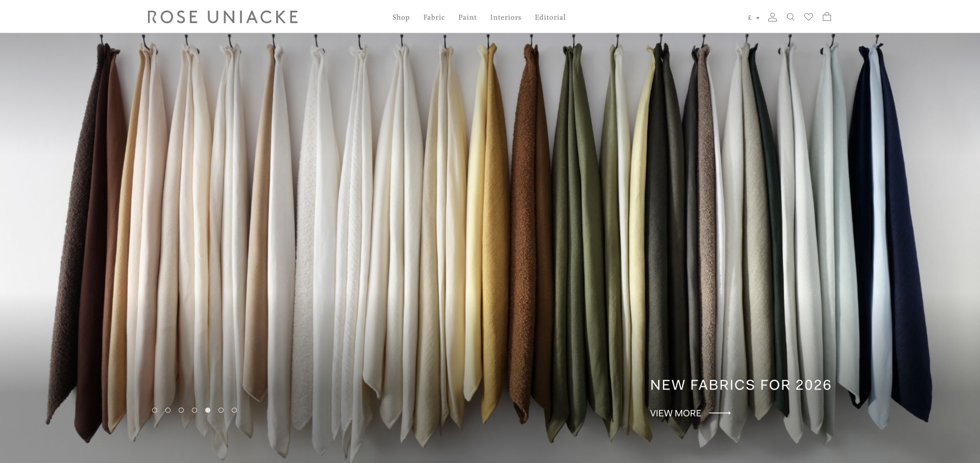
Rose Uniacke presents hanging fabric lengths across the full hero, using subtle tonal changes and texture as the main content. A small collection label and view-more link sit in the lower right, while shop and material categories remain above. The composition is useful for a range whose distinctions are tactile and visual. Consent implementation should preserve the catalog route even when a media-heavy presentation needs to fall back. The dated Cookiebot reference establishes script presence, not consent enforcement or a legal compliance finding.
What you can learn
Keep material names, product categories and ordinary links available alongside rich collection imagery. Test notice placement against quiet corner actions that can disappear behind a larger consent panel.
Pros
The repeated fabric lengths communicate the breadth of the palette without turning the opening into a dense product grid.
The header exposes specific shopping categories, giving goal-directed visitors a practical alternative to the visual collection introduction.
Cons & considerations
Small white action text over changing fabric tones needs a dependable contrast treatment and clear keyboard focus.
The observed integration does not show whether embedded media, personalization or shopping analytics respond correctly when a visitor changes consent.
Public source checked November 3, 2026. References may be embedded or legacy—not a complete backend inventory.
Platform source: Dated public page resource observation. The public source page referenced Cookiebot resources on 2026-11-03. This is a scoped integration signal, not proof of configuration or successful behavior. The direct screenshot retains its separate original capture date. Platform evidence is separate from the direct website screenshot and is not a complete current infrastructure audit.
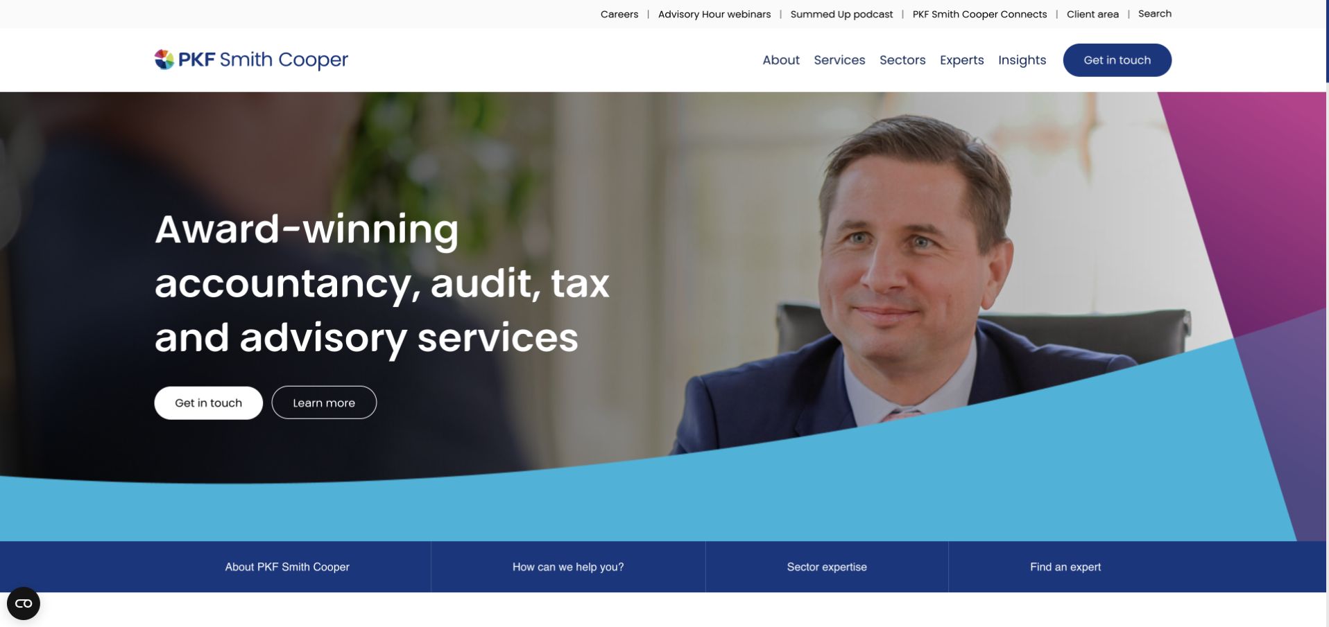
PKF Smith Cooper pairs a staff photograph with a concise list of advisory disciplines, then adds a horizontal row of service-oriented shortcuts below. Contact and learn-more actions appear in the hero, while a second header row separates services, sectors, experts and insights. The useful consent lesson is to preserve these task distinctions: opting out of measurement should not remove access to a person, service or relevant article. The dated Cookiebot reference establishes script presence, not consent enforcement or a legal compliance finding.
What you can learn
Test consent states using actual service-finding tasks. A visitor should still reach an expert profile and contact route when optional marketing scripts have not been allowed.
Pros
The explicit list of disciplines explains what the firm offers before visitors encounter more general brand or awards language.
The lower shortcut row gives several task-based entrances, supporting visitors who think in sectors, questions or people.
Cons & considerations
Two navigation levels and a hero action group can become crowded when a consent panel reduces the first-screen area.
A small preference icon is useful only if its label, focus behavior and reopening action are accessible in the finished implementation.
Public source checked November 3, 2026. References may be embedded or legacy—not a complete backend inventory.
Platform source: Dated public page resource observation. The public source page referenced Cookiebot resources on 2026-11-03. This is a scoped integration signal, not proof of configuration or successful behavior. The direct screenshot retains its separate original capture date. Platform evidence is separate from the direct website screenshot and is not a complete current infrastructure audit.
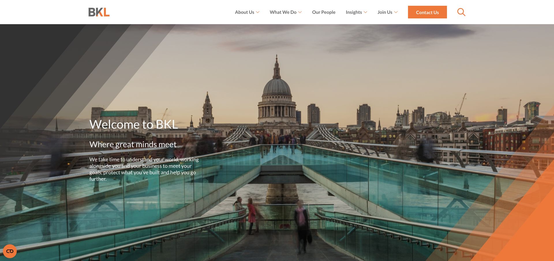
BKL uses a London cityscape with a small welcome statement and restrained navigation. Dark angled overlays and an orange corner connect the photograph to the brand without replacing it. The opening is concise, leaving service discovery to the header. A consent experience should fit this restrained structure while remaining explicit; visual subtlety should not turn important preference controls into an unexplained icon that visitors cannot locate again. The dated Cookiebot reference establishes script presence, not consent enforcement or a legal compliance finding.
What you can learn
Make the preference-reopening route clear even on visually minimal sites. Keep service and contact links functional when optional resources are absent, and test the page with enlarged text.
Pros
The city photograph gives a clear sense of place, helping the small introductory statement feel grounded rather than abstract.
The orange contact action is visually distinct from the surrounding navigation, providing a practical next step for interested visitors.
Cons & considerations
Light introductory text over a detailed city image requires contrast checks for every crop and responsive breakpoint.
Cookiebot's presence does not demonstrate how contact forms, embedded maps or marketing integrations honor a visitor's chosen categories.
Public source checked November 3, 2026. References may be embedded or legacy—not a complete backend inventory.
Platform source: Dated public page resource observation. The public source page referenced Cookiebot resources on 2026-11-03. This is a scoped integration signal, not proof of configuration or successful behavior. The direct screenshot retains its separate original capture date. Platform evidence is separate from the direct website screenshot and is not a complete current infrastructure audit.
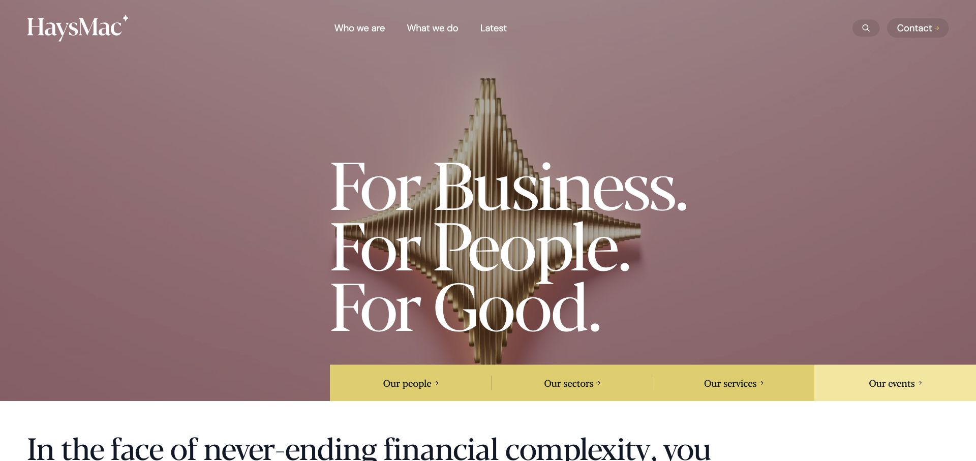
HaysMac uses a muted background, a large serif statement and a yellow strip of links to people, sectors, services and events. The opening makes the firm's positioning memorable while offering concrete paths immediately below. For a consent integration, those paths provide useful test cases: the visitor should be able to find a person or relevant service without first engaging optional analytics or a marketing widget. The dated Cookiebot reference establishes script presence, not consent enforcement or a legal compliance finding.
What you can learn
Preserve audience and service routes as ordinary navigation before enhancing them. Test preference controls at the point where the hero meets the yellow link strip, including keyboard focus and text zoom.
Pros
The yellow route strip translates a broad brand statement into four specific exploration choices within the opening composition.
Restrained color and large type create a clear hierarchy without relying on a complex arrangement of promotional panels.
Cons & considerations
A short positioning statement can leave first-time visitors unsure of the service category unless nearby context remains visible.
The public resource observation does not establish correct regional banner behavior or whether preferences remain consistent on linked service pages.
Public source checked November 3, 2026. References may be embedded or legacy—not a complete backend inventory.
Platform source: Dated public page resource observation. The public source page referenced Cookiebot resources on 2026-11-03. This is a scoped integration signal, not proof of configuration or successful behavior. The direct screenshot retains its separate original capture date. Platform evidence is separate from the direct website screenshot and is not a complete current infrastructure audit.
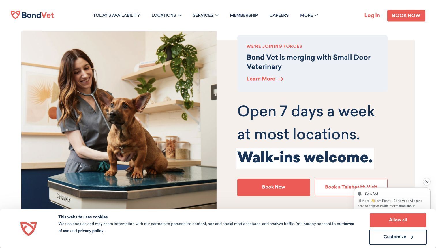
Bond Vet places a photograph of a clinician and dog beside opening-hours messaging and booking actions. A merger notice, chat panel and cookie strip are also visible in the retained capture. The page is useful for examining cumulative interface weight: each individual addition may seem small, yet together they compete with the appointment task and reduce the available space for service information. The dated Cookiebot reference establishes script presence, not consent enforcement or a legal compliance finding.
What you can learn
Review consent, chat and promotional notices as one composition. Preserve a clear booking route and avoid letting multiple floating layers cover the same controls on a short mobile screen.
Pros
The clinician-and-animal photograph gives the service a concrete human setting, rather than relying solely on abstract reassurance.
The main booking action is paired with service availability language, helping visitors connect the promise with a next step.
Cons & considerations
The visible chat and consent layers crowd the lower action area and need coordinated stacking, dismissal and keyboard behavior.
The screenshot does not verify appointment availability or privacy behavior within booking and telehealth systems linked from the page.
Public source checked November 3, 2026. References may be embedded or legacy—not a complete backend inventory.
Platform source: Dated public page resource observation. The public source page referenced Cookiebot resources on 2026-11-03. This is a scoped integration signal, not proof of configuration or successful behavior. The direct screenshot retains its separate original capture date. Platform evidence is separate from the direct website screenshot and is not a complete current infrastructure audit.
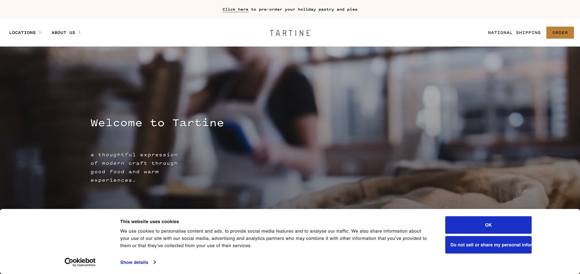
Tartine's opening uses a bakery-work photograph, a compact welcome statement and a quiet header with locations and ordering. A large Cookiebot-branded panel occupies the lower portion of the retained capture, making the consent interface a substantial part of the initial experience. This is useful evidence of layout coexistence, but the visible text and buttons do not establish which resources were actually allowed or blocked. The dated Cookiebot reference establishes script presence, not consent enforcement or a legal compliance finding.
What you can learn
Test the first visit with the complete consent panel open, not only after dismissal. Keep location and ordering routes visible and provide a clear way to revisit preferences later.
Pros
The bakery-work scene communicates the craft behind the product without requiring a lengthy story in the first screen.
Local locations and national ordering appear as separate navigation choices, acknowledging different customer intentions and fulfillment paths.
Cons & considerations
The tall consent panel removes a significant portion of the hero at the captured height and may dominate smaller screens.
Consent wording, category mapping and downstream resource behavior require separate review; a branded panel alone cannot establish correct implementation.
Public source checked November 3, 2026. References may be embedded or legacy—not a complete backend inventory.
Platform source: Dated public page resource observation. The public source page referenced Cookiebot resources on 2026-11-03. This is a scoped integration signal, not proof of configuration or successful behavior. The direct screenshot retains its separate original capture date. Platform evidence is separate from the direct website screenshot and is not a complete current infrastructure audit.
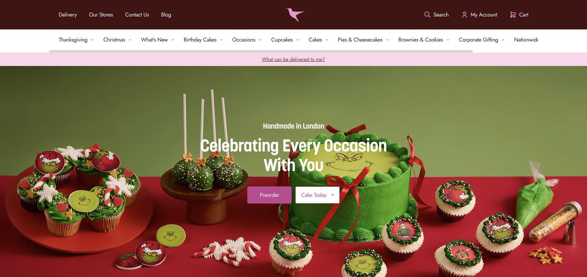
The Hummingbird Bakery uses a vivid red-and-green cake campaign, with two actions distinguishing advance orders from cakes available today. Category navigation sits above, alongside delivery and store information. The page demonstrates why consent controls must accommodate commerce context: a visitor still needs to understand timing and delivery options when optional tracking, personalization or promotional features are unavailable. The dated Cookiebot reference establishes script presence, not consent enforcement or a legal compliance finding.
What you can learn
Keep timing choices explicit and preserve them through any consent interaction. Test ordinary ordering links and delivery information independently of seasonal media and optional marketing features.
Pros
The separate preorder and same-day actions make a practical timing distinction that matters more than the seasonal campaign alone.
Product categories and store information remain visible above the photograph, supporting visitors who already know the cake type they need.
Cons & considerations
The rich seasonal scene needs a mobile crop that preserves the product and actions rather than only decorative details.
Cookiebot evidence does not establish current delivery eligibility, inventory or the behavior of consent within any connected ordering service.
Public source checked November 3, 2026. References may be embedded or legacy—not a complete backend inventory.
Platform source: Dated public page resource observation. The public source page referenced Cookiebot resources on 2026-11-03. This is a scoped integration signal, not proof of configuration or successful behavior. The direct screenshot retains its separate original capture date. Platform evidence is separate from the direct website screenshot and is not a complete current infrastructure audit.
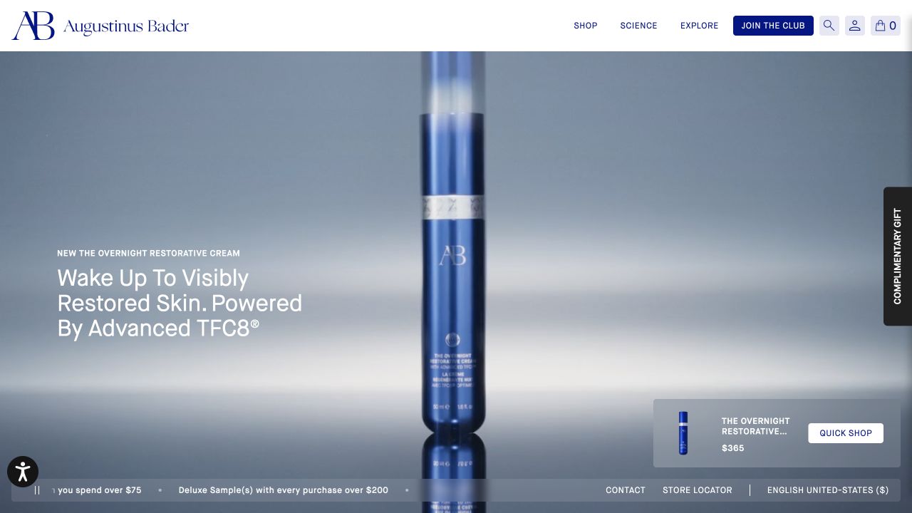
Augustinus Bader gives a single blue bottle most of the hero, with a short benefit statement and a compact quick-shop card. The header keeps shopping, science and exploration as distinct routes, while a vertical gift tab and lower utility strip add secondary choices. Consent placement should account for these existing edges so a new panel does not cover price, product selection or the practical path into the catalog. The dated Cookiebot reference establishes script presence, not consent enforcement or a legal compliance finding.
What you can learn
Audit the full stack of edge controls before adding a consent interface. Keep product facts and ordinary shopping navigation available even when optional personalization or campaign features are withheld.
Pros
The large bottle image and smaller purchase card connect the campaign's visual focus with a specific product choice.
Science and shopping are separated in the header, allowing visitors to investigate information before entering the purchase flow.
Cons & considerations
Benefit claims and product pricing require their own current evidence; the design review does not validate treatment outcomes or offers.
Several peripheral controls may collide on narrow screens, so consent placement needs testing alongside gift tabs, accessibility tools and utilities.
Public source checked November 3, 2026. References may be embedded or legacy—not a complete backend inventory.
Platform source: Dated public page resource observation. The public source page referenced Cookiebot resources on 2026-11-03. This is a scoped integration signal, not proof of configuration or successful behavior. The direct screenshot retains its separate original capture date. Platform evidence is separate from the direct website screenshot and is not a complete current infrastructure audit.
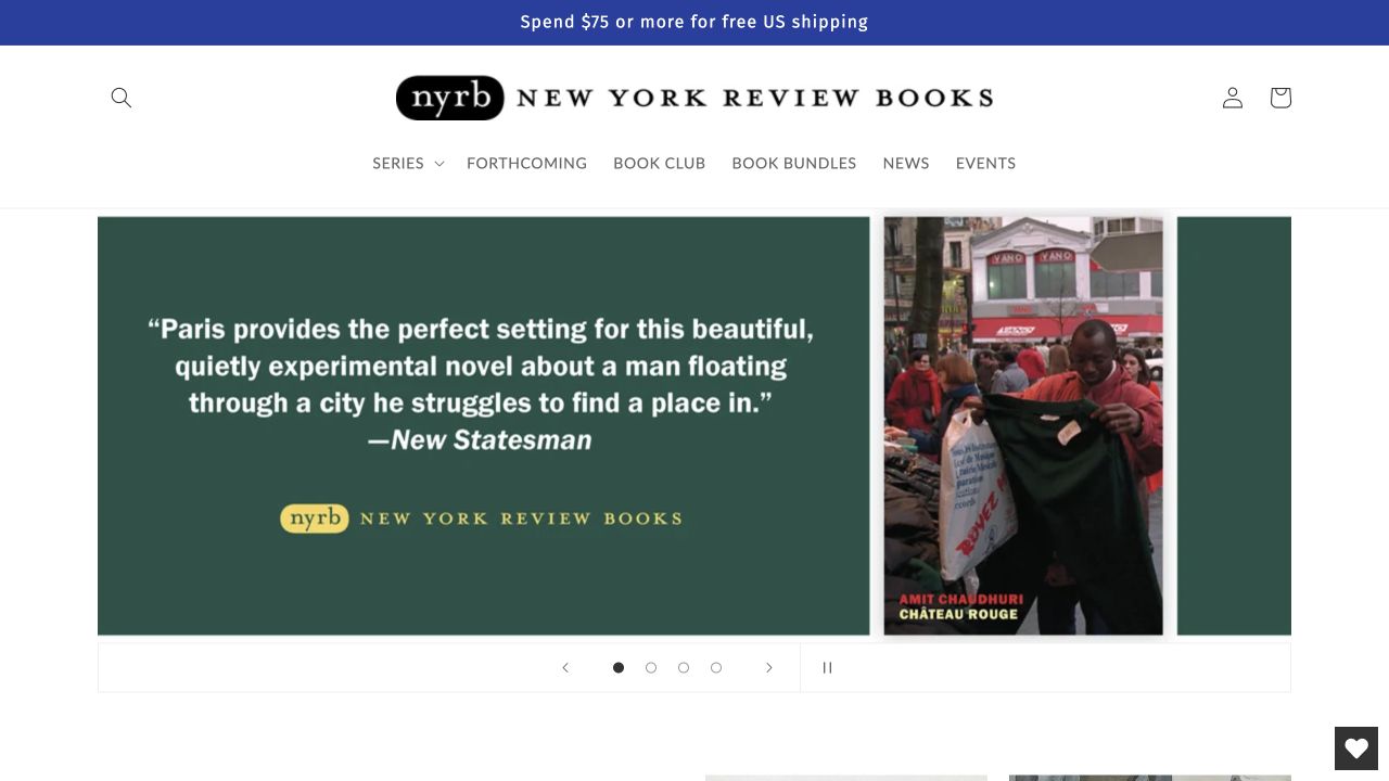
NYRB Books combines a review excerpt on a colored panel with the corresponding book cover. The restrained header exposes series, forthcoming titles, bundles, news and events, while a shipping notice remains separate above. This layout gives reading context before a product grid. A consent implementation should preserve the bibliographic route and readable recommendation even when optional carousel behavior or external measurement does not load. The dated Cookiebot reference establishes script presence, not consent enforcement or a legal compliance finding.
What you can learn
Build a plain title-and-link fallback for editorial promotions. Keep the route to book details usable under every consent state, rather than making the carousel the only entrance.
Pros
The paired recommendation and cover connect editorial judgment with a specific title, making the promotion more concrete than a generic slogan.
Navigation by series and forthcoming titles supports readers exploring the publisher's range beyond the featured book.
Cons & considerations
Long quotation panels need careful mobile typesetting and attribution, particularly when another notice reduces the available height.
The script evidence does not verify the rights, accuracy or currency of quoted reviews, shipping terms or connected commerce behavior.
Public source checked November 3, 2026. References may be embedded or legacy—not a complete backend inventory.
Platform source: Dated public page resource observation. The public source page referenced Cookiebot resources on 2026-11-03. This is a scoped integration signal, not proof of configuration or successful behavior. The direct screenshot retains its separate original capture date. Platform evidence is separate from the direct website screenshot and is not a complete current infrastructure audit.
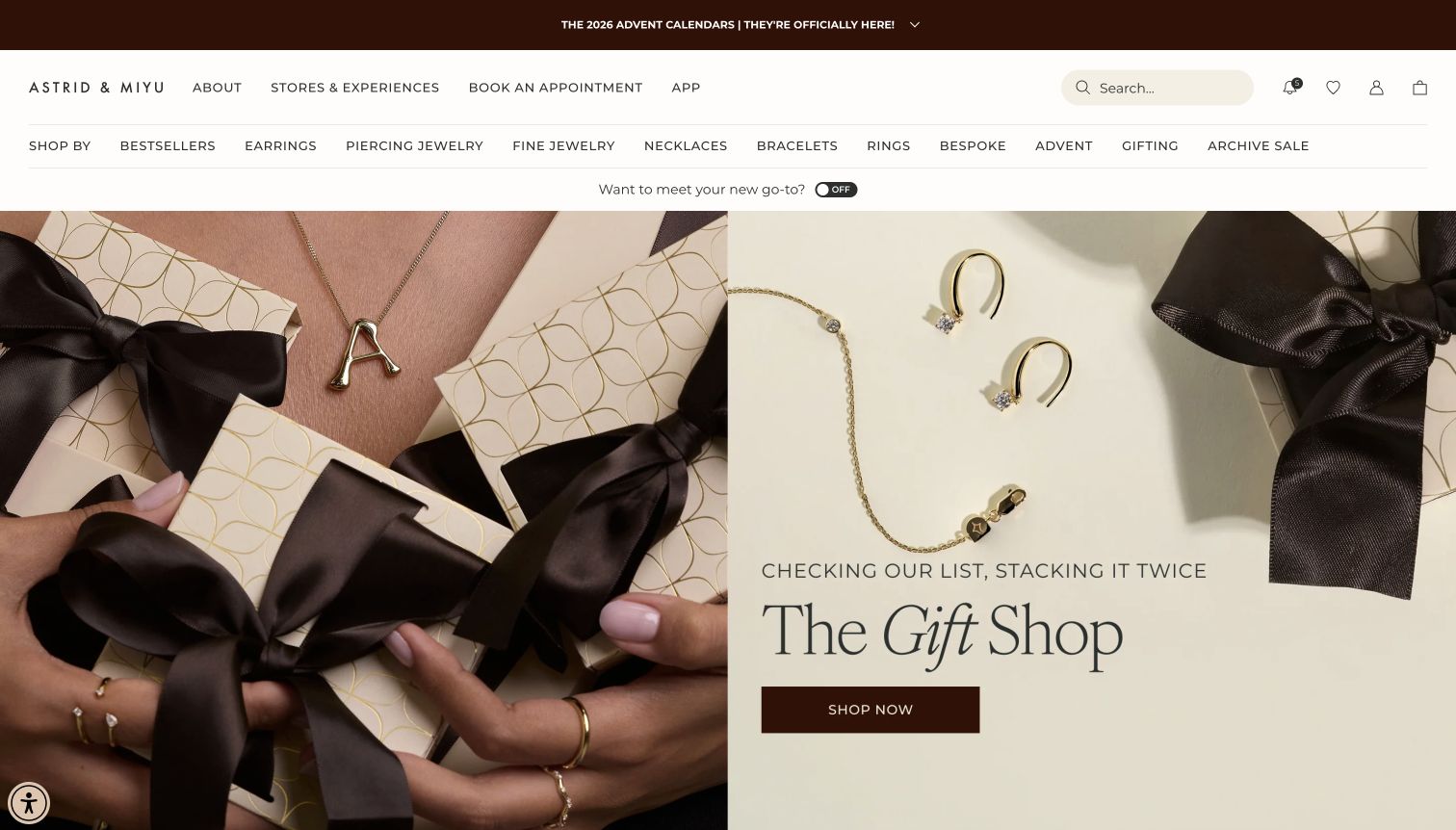
Astrid & Miyu combines wrapped gifts, jewelry detail and a central gift-shop invitation. The header also exposes store experiences, appointments and numerous product categories, giving the campaign a broader service context. The composition illustrates how consent placement should consider the whole navigation system. A visitor choosing an appointment should not lose that route beneath promotional bars and a second large preference layer. The dated Cookiebot reference establishes script presence, not consent enforcement or a legal compliance finding.
What you can learn
Test gift shopping and appointment discovery as separate tasks across consent states. Keep core links and entered choices intact while optional marketing or personalization resources change availability.
Pros
The combination of packaging and jewelry detail gives the gifting theme a tangible context beyond a seasonal headline.
Appointments and store experiences are exposed alongside product categories, supporting customers who need assistance before choosing an item.
Cons & considerations
Several header rows consume substantial vertical space and may become cumbersome when an additional consent panel is visible.
Cookiebot's resource reference does not demonstrate correct tracking control in external appointment tools, store integrations or the checkout journey.
Public source checked November 3, 2026. References may be embedded or legacy—not a complete backend inventory.
Platform source: Dated public page resource observation. The public source page referenced Cookiebot resources on 2026-11-04. This is a scoped integration signal, not proof of configuration or successful behavior. The direct screenshot retains its separate original capture date. Platform evidence is separate from the direct website screenshot and is not a complete current infrastructure audit.
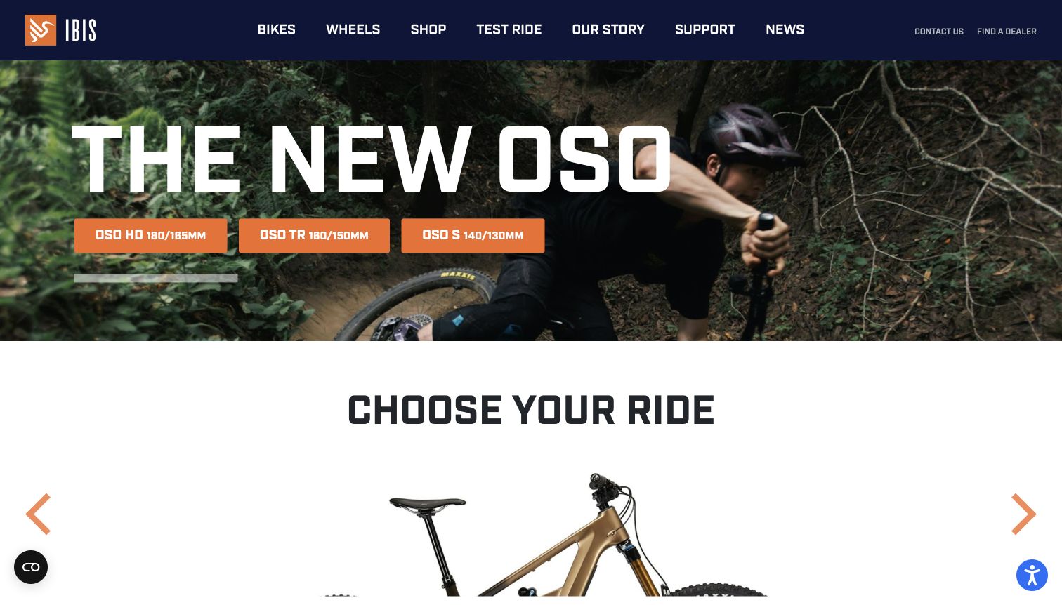
Ibis Cycles introduces the OSO range with an action photograph, three model buttons and a chooser immediately below. The dark header separates bikes, wheels, testing, support and news. This creates several meaningful routes out of the launch message, which is helpful when optional media is unavailable. Consent testing should include those model and dealer paths instead of stopping once the initial banner can be dismissed. The dated Cookiebot reference establishes script presence, not consent enforcement or a legal compliance finding.
What you can learn
Use real model-selection journeys to test preference changes. Keep product navigation and dealer information available independently of promotional media, and explain any embedded feature that remains unavailable.
Pros
Three model buttons make the promoted range more navigable than a single generic discover-more action would be.
The following chooser and visible support links accommodate both exploratory visitors and riders with a specific practical question.
Cons & considerations
Abbreviated model and travel labels can confuse newcomers unless the next view explains the distinctions in ordinary language.
The public integration signal does not verify consent handling inside dealer searches, embedded media or separate purchasing systems.
Public source checked November 3, 2026. References may be embedded or legacy—not a complete backend inventory.
Platform source: Dated public page resource observation. The public source page referenced Cookiebot resources on 2026-11-04. This is a scoped integration signal, not proof of configuration or successful behavior. The direct screenshot retains its separate original capture date. Platform evidence is separate from the direct website screenshot and is not a complete current infrastructure audit.
Ace & Tate shows two portraits wearing glasses, with a small collection action at the lower left. Navigation for glasses, sunglasses, accessories, services and eye care runs across the top of the images. The portraits communicate styling and fit at a glance, but the quieter controls need protection from added notices. A consent panel should remain clear without making the collection action or care routes difficult to find. The dated Cookiebot reference establishes script presence, not consent enforcement or a legal compliance finding.
What you can learn
Test the storefront with every first-visit notice visible at once. Preserve product and eye-care navigation independently of optional campaign resources, and retain a straightforward route to preference settings.
Pros
The portraits show the frames on people, providing a useful wearing context that isolated product photographs cannot supply alone.
Shopping and care-service categories appear together, acknowledging that visitors may need an appointment or information rather than a product.
Cons & considerations
Small white navigation over photography needs robust contrast and focus styling across every campaign image and viewport crop.
The Cookiebot observation does not establish the consent configuration of regional eye-care bookings, personalization or separate commerce services.
Public source checked November 3, 2026. References may be embedded or legacy—not a complete backend inventory.
Platform source: Dated public page resource observation. The public source page referenced Cookiebot resources on 2026-11-03. This is a scoped integration signal, not proof of configuration or successful behavior. The direct screenshot retains its separate original capture date. Platform evidence is separate from the direct website screenshot and is not a complete current infrastructure audit.
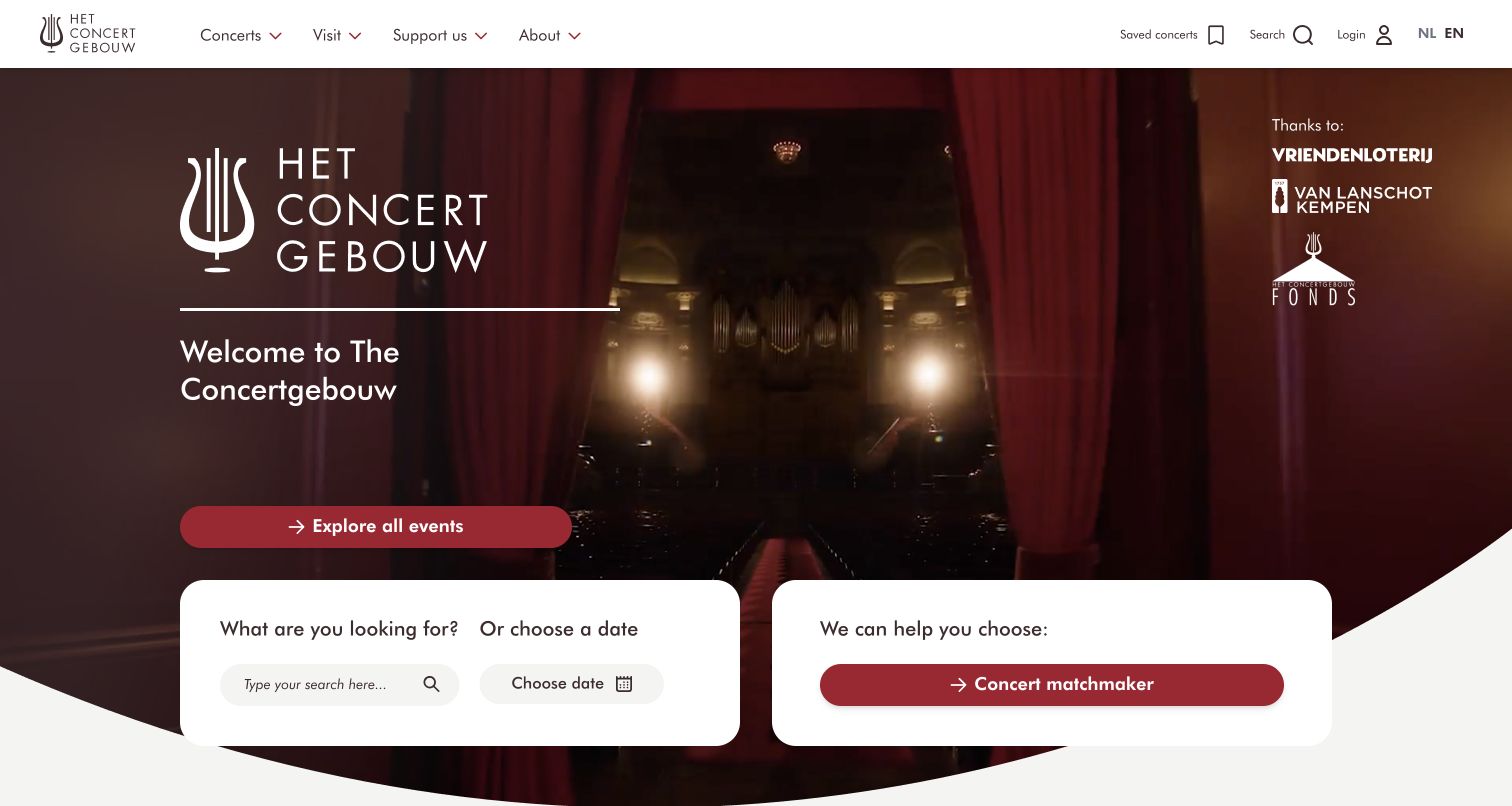
Concertgebouw combines a dark auditorium image, a welcome statement and a prominent events action. Two white panels below offer search or date selection and a concert-matching route. The contrast gives practical planning tools a clear place beneath the atmospheric introduction. Consent design should preserve these alternative ways of finding an event, especially when a matching feature depends on optional resources or a separate service. The dated Cookiebot reference establishes script presence, not consent enforcement or a legal compliance finding.
What you can learn
Keep date search and ordinary event listings available beside guided recommendations. If a consent-dependent feature cannot run, explain the limitation while preserving a useful route to the program.
Pros
The auditorium image establishes the venue experience while the contrasting panels make event discovery visibly actionable.
Search, date choice and guided matching acknowledge different levels of familiarity with the program and concert repertoire.
Cons & considerations
A matching tool can become a dead end unless its limitations and an ordinary list-based alternative are clearly presented.
The public Cookiebot reference does not show whether ticketing, recommendation and marketing services share or correctly apply the same preference state.
Public source checked November 3, 2026. References may be embedded or legacy—not a complete backend inventory.
Platform source: Dated public page resource observation. The public source page referenced Cookiebot resources on 2026-11-03. This is a scoped integration signal, not proof of configuration or successful behavior. The direct screenshot retains its separate original capture date. Platform evidence is separate from the direct website screenshot and is not a complete current infrastructure audit.
For an appointment, ticket or location-led site, keep the visitor oriented toward the immediate task. Reserve sufficient space for the consent panel without obscuring service availability, address information or contact routes. Test the actual stacked layout when navigation and accessibility controls are also open.
Protect product understanding
On a store, evaluate whether the first product image, category label and price remain understandable together. Coordinate competing panels such as delivery selectors and newsletter invitations. A consent decision should not leave visitors unsure whether a shopping action also occurred.
Plan delayed third-party content
Document which embeds or scripts depend on a choice. Provide a meaningful explanation if a map, video or other optional component is unavailable. Cookiebot’s developer reference includes mechanisms for responding to consent and running marked scripts; adapt those mechanisms to the actual page lifecycle.
List scripts, embeds, tag-manager entries and third-party destinations with their owners. Include campaign pages and localized versions. Determine the intended behavior of each component with the responsible team, rather than inferring it from a scanner label or a vendor category.
Choose an implementation route deliberately
Cookiebot documents manual implementation and automatic blocking placement. Follow the instructions for the chosen setup and current version. Check how it interacts with your existing tag management, navigation and loading sequence; the fact that a script appears in public HTML is only the beginning of that review.
Use an isolated test environment to inspect an initial visit, a saved choice, an updated choice and a fresh session. Cover keyboard interaction, long translations and mobile layouts. Record what was observed and who owns corrections before introducing new vendors or changing the shared page template.
A useful handover demonstration
Ask the actual team to carry out its routine job: publish a realistic update, correct a mistake, preview a narrow screen, and identify who owns an integration failure. For a library or frontend framework, also ask who maintains the content source and deployment. A polished screenshot does not answer those operational questions.
Beyond the screenshot
Before releasing a Cookiebot integration
Document the public pages, localized variants and components in scope.
Assign an owner to the consent configuration and the third-party inventory.
Use the current installation guidance for the chosen integration route.
Review labels, focus order, keyboard controls and readable text.
Check the page with consent, navigation and other fixed panels visible.
Explain unavailable optional embeds without hiding the main task.
Test initial, saved and changed choices in an isolated environment.
Retain dated observations and recheck after scripts or templates change.
Test with real content, a keyboard, a small screen, slow or failed requests, and the people who will maintain the system. These are planning checks, not an accessibility, security, performance, or search-ranking certification.
Sources & editorial method
How this Cookiebot collection was reviewed
Original visual reviews were written on November 4, 2026 from genuine existing direct browser captures. Each image retains its actual capture date, source URL and dimensions. The resource evidence retains its original observation timestamp. A resource reference does not verify settings, effective blocking, consent records, regional behavior or legal compliance. The reviews assess the visible page composition; they do not claim that any named site passed a consent audit.
Every image is an unmodified capture from the actual website, with its source and capture date. Some captures are reused from our shared catalog; their dates remain the original capture dates. None comes from a vendor gallery or a generated reconstruction. Moving imagery and live content can change.
Technology attribution uses public page assets or metadata, official platform documentation, or a cited first-party project case study. Documentary and framework-relationship evidence is identified where used; it is not a complete current backend inventory. A CMS image CDN alone does not establish a full CMS deployment. A library’s presence does not prove which individual controls use it, and a platform label does not establish AI authorship.
The composition notes, lessons, pros and tradeoffs are original editorial observations. We have not measured conversion, traffic, security, performance or accessibility conformance. Website owners retain their brands and imagery; these examples are not our client portfolio. Written, Edited and Curated are independent records, not dates advanced by a build. See our editorial standards or suggest a correction.
Questions worth asking
Cookiebot website development FAQs
Does a Cookiebot script prove that the consent setup works?
No. It establishes that the observed page referenced a Cookiebot resource at the recorded time. Configuration and behavior require separate testing across relevant states and pages.
Must every example show a cookie dialog in its screenshot?
No. The screenshot records one public page state. A panel may depend on saved choices, location or timing. Integration evidence is recorded separately from the visible design.
Can I copy another site’s banner layout?
Use its spacing or hierarchy as a design reference, then write labels and configure behavior for your own site. The example cannot supply your inventory, language requirements or release criteria.
Is this a compliance ranking?
No. These are design reviews with scoped public technology evidence. They do not certify any website or compare the legal adequacy of its consent implementation.