Definitive guide · Advanced Custom Fields website development
Best Advanced Custom Fields Websites of 2026 (20 Real-World Examples)
Twenty public websites with documented Advanced Custom Fields associations, actual screenshots and original design reviews.
Advanced Custom Fields helps WordPress teams organize content beyond a single text editor. These examples show what that work can support in public: research libraries, service directories, fundraising campaigns, museum collections and distinctive institutional websites.
Advanced Custom Fields, usually called ACF, is a WordPress plugin for defining additional content fields and working with their values. A field model can describe a research project, an exhibition, a service or a campaign without determining how the finished website must look. Developers still need to build the presentation, interactions and publishing workflow around that information.
This collection begins with specific public properties from UNHCR Italy, Harvard Brain Science Initiative, Somerset NHS Foundation Trust, MIT SCRAM and the National Museum of Women in the Arts. Their ACF associations come from named developer or vendor project documentation. The scope is the reviewed property, not every website belonging to the institution. Historical implementation accounts remain historical evidence; a new screenshot does not prove that a private backend is unchanged.
Before the examples
What makes good Advanced Custom Fields website development in 2026?
Start with the content, then choose fields
List the information that repeats and the relationships that matter. A research entry may need an author, date and document; an exhibition needs a title, artwork and visiting context. Keep those concepts separate from decorative layout choices. The public examples make these distinctions visible through navigation and recurring content patterns. ACF supports additional fields in WordPress, but useful modeling begins with understanding the organization’s actual material.
A flexible content model should make ordinary changes easy while keeping the overall design coherent. ACF’s Flexible Content field defines layouts and their subfields, with optional limits on their use. That can support reusable sections without making every page an unrestricted design exercise. Decide which changes editors need to make frequently, which variations are useful, and which decisions should remain shared across the site.
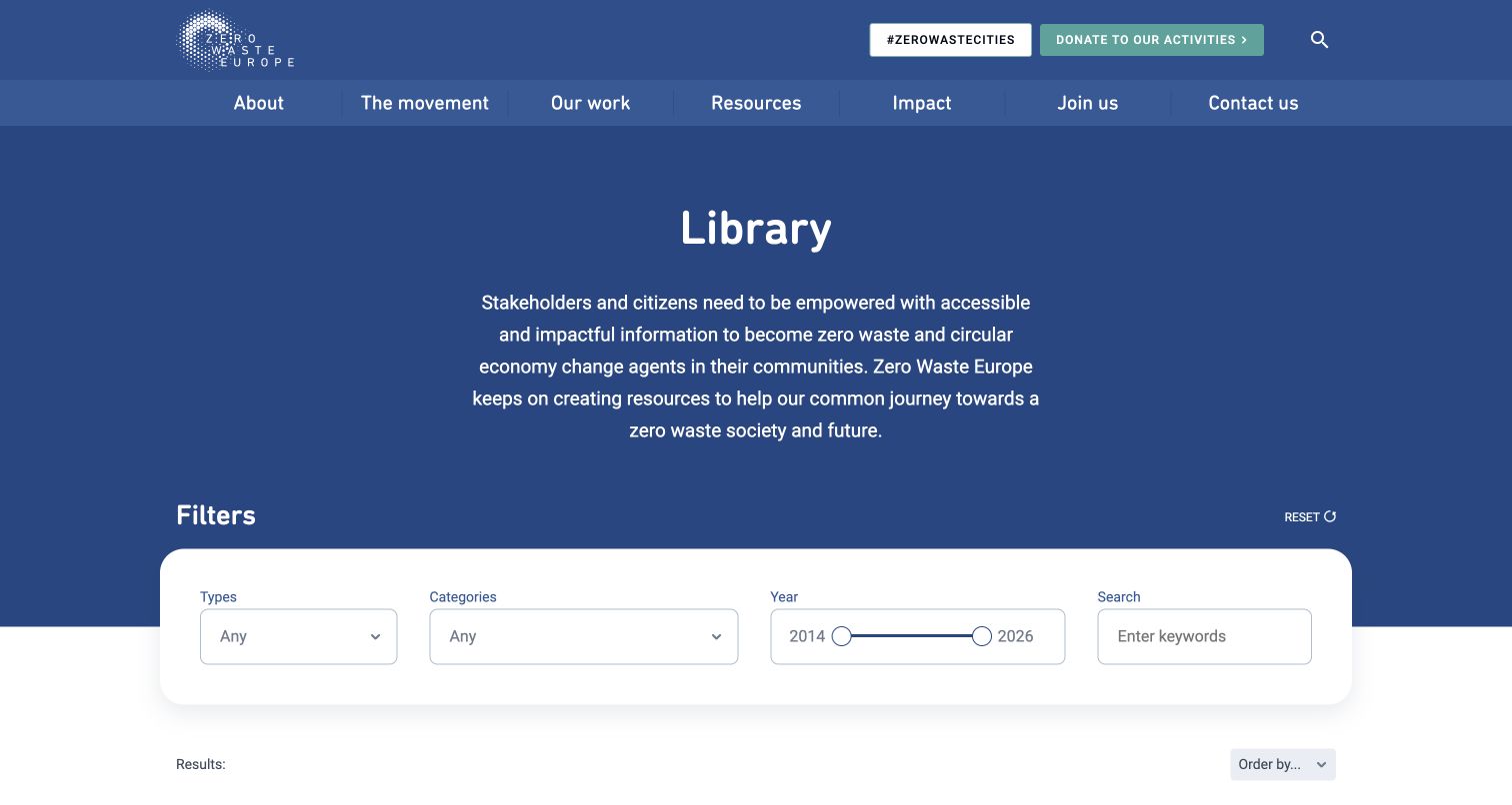
A directory, research library or museum collection gains value when related information can be found naturally. Zero Waste Europe exposes publication attributes as filters; the museum separates exhibitions, artists and visiting information. Plan those reader-facing relationships before deciding how to store them. A technically tidy field group is only useful if its output helps people understand, compare or discover the content.
Keep evidence as specific as the website
A developer’s case study can establish an ACF association for a named public project. It does not establish the technology of a linked payment service, application, account area or parent institution. Keep the exact property and original document context attached to the claim. Public WordPress signals can corroborate part of the stack, but WordPress by itself is not proof of ACF.
These reviews compare visible information design across twenty distinct public properties. Each has its own primary project evidence, direct browser capture and broad public-stack audit attempt. The examples illustrate different content needs rather than a ranking of organizations or their services.
We start with five recognizable brands or organizations: UNHCR Italy donations, Harvard Brain Science Initiative, Somerset NHS Foundation Trust, MIT SCRAM, National Museum of Women in the Arts. Each attribution applies to the named website property, not every product or website belonging to its organization. This is a curated reading sequence, not a measured ranking.
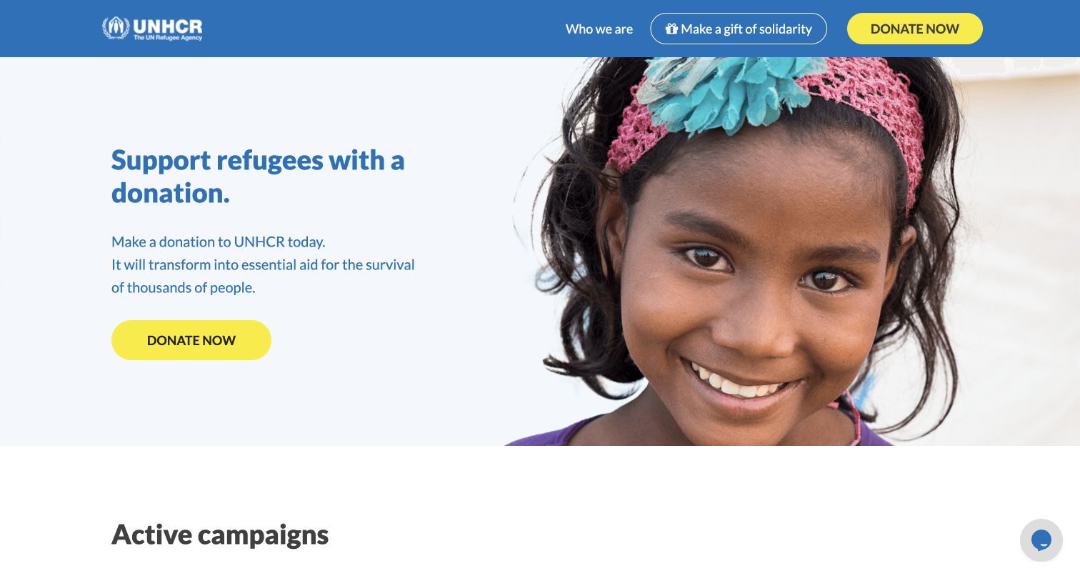
UNHCR Italy’s donation property makes its purpose clear before introducing individual campaigns. A blue header, familiar agency mark and bright yellow donation buttons establish a consistent route through the page. The opening combines a short appeal with a large portrait, keeping the person pictured visually central while leaving enough quiet space for readable text. Below it, campaign cards give visitors more specific reasons to explore. This is a useful example of a focused fundraising entrance: the broader organization remains recognizable, but the navigation stays close to donation and solidarity activities. The review concerns this public Italian portal; the payment journey was not tested.
What you can learn
Build a campaign system around a clear shared action, then give each appeal its own image, explanation and destination. Keep the organization’s identity visible without importing every part of its corporate navigation.
Pros
Yellow calls to action remain distinct against the restrained blue and white palette.
The short opening explains the donation purpose before presenting individual campaign choices.
Cons & considerations
The large portrait pushes most campaign detail below the initial viewport.
Repeated donation prompts leave limited space for deeper evidence in the opening.
Platform source: WordPress.org Showcase. ACF vendor interviews Noiza about the UNHCR Italy donation portal. Noiza independently identifies dona.unhcr.it as the 2019 donation portal in https://noiza.com/unhcr-buon-compleanno-donatore/. Scope is the Italian donation property, not unhcr.org. Documented exact public-property association; not a current private backend inspection. Original project/document date: 2022-09-23. Evidence reviewed November 12, 2026; this review date does not establish a new backend implementation. Platform evidence is separate from the direct website screenshot and is not a complete current infrastructure audit.
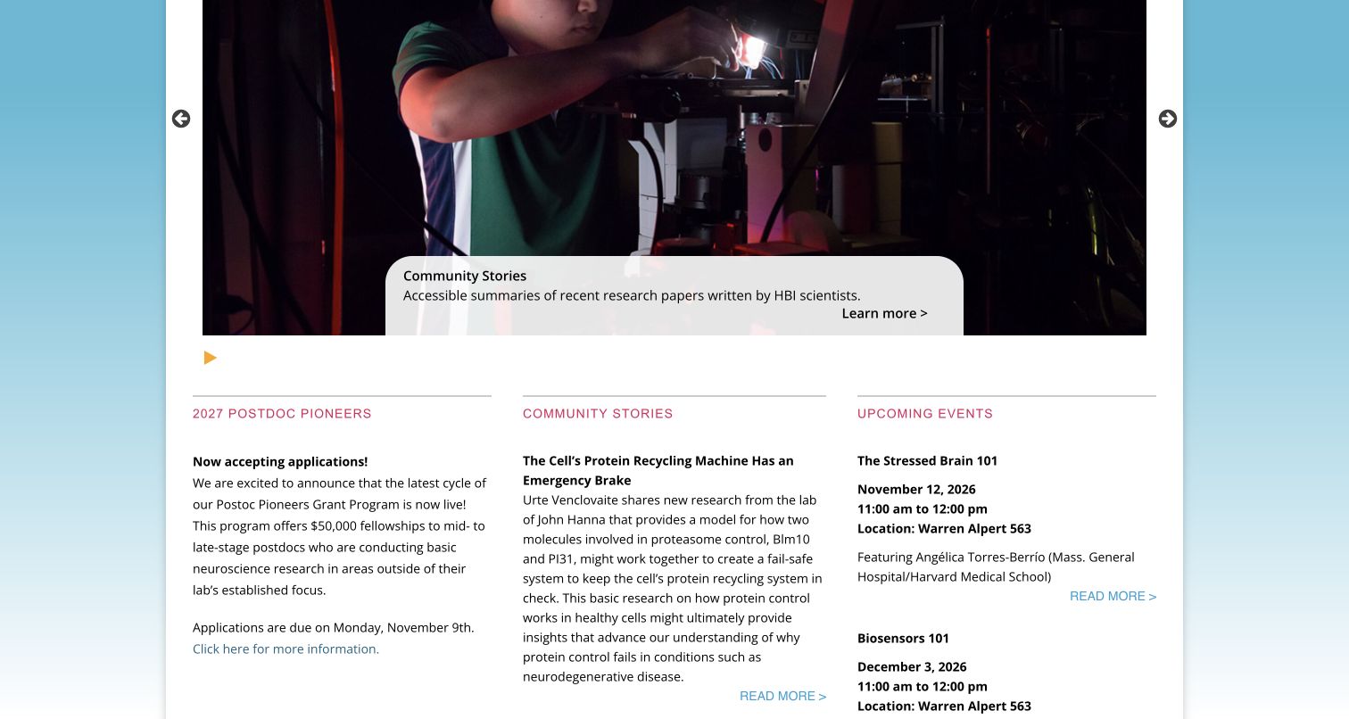
Harvard Brain Science Initiative presents research as a community of people, stories and events. The reviewed homepage combines a photographic carousel with three editorial columns for fellowship information, accessible research summaries and upcoming sessions. Those columns make different content types recognizable through repeated headings and restrained rules, while event dates and locations provide practical detail. The captured view shows the carousel paused on a scientist working at a microscope, followed by the information columns. It is a useful reference for a specialist institutional property that needs frequent updates without reducing everything to an undifferentiated news feed. Its scope is the initiative website, not Harvard’s other public sites.
What you can learn
Separate recurring content by the decision a visitor needs to make. A funding notice, research explanation and calendar entry can share a visual system while keeping their own useful metadata and reading rhythm.
Pros
Parallel columns distinguish opportunities, research stories and events in one compact overview.
Event entries include dates, times and locations beside their descriptive titles.
Cons & considerations
Long research excerpts create a dense reading area beneath the large carousel.
The rotating opening requires deliberate controls to keep a chosen story in view.
Platform source: WordPress.org Showcase. Developer explicitly says ACF structured this public initiative website and links the live exact hostname. Nov12 primary HTML also links acf-google-maps.js in the Divi-Child theme. No inference to harvard.edu or other Harvard sites. Documented exact public-property association; not a current private backend inspection. Original publication date not established. Evidence reviewed November 12, 2026; this review date does not establish a new backend implementation. Platform evidence is separate from the direct website screenshot and is not a complete current infrastructure audit.
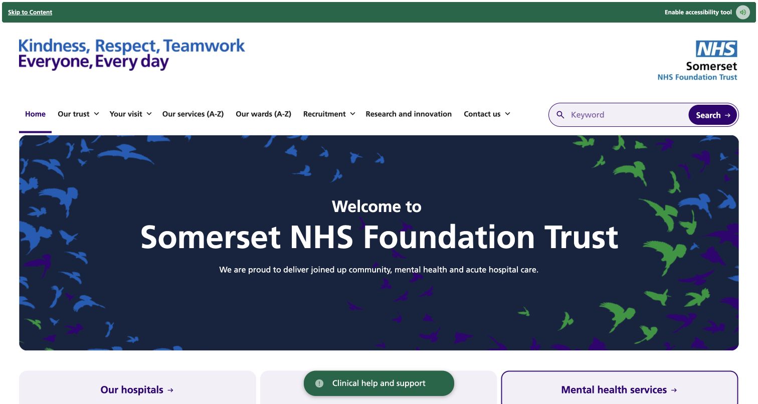
Somerset NHS Foundation Trust organizes a broad public service website around practical routes. Its header places services, wards, visits and contact information beside a prominent keyword search, with the NHS identity clearly visible. A dark welcome panel gives the organization room to explain its combined care remit, followed by large destinations for hospitals, community care, mental health and urgent treatment. The page also contains dated news and feedback information. The strongest pattern is the separation between navigation for a known task and introductory context for unfamiliar visitors. The large opening is visually calm, although someone seeking a specific service must move past substantial branding before reaching the service tiles.
What you can learn
Use explicit service labels and a visible search option when an organization serves many needs. Keep institutional explanation short enough that people arriving with a practical task can reach their destination quickly.
Pros
Services and wards have clearly named alphabetical routes in the primary navigation.
Large service categories create a second way to find information below the welcome.
Cons & considerations
The tall branding and welcome area delay the more actionable service categories.
Several navigation rows and controls compete for attention near the page entrance.
Platform source: WordPress.org Showcase. Builder case describes the Trust master website and multisite CMS structured with ACF and custom post types, with a named Trust communications officer testimonial. Exact public homepage identifies same Trust. No inference to all NHS sites. Documented exact public-property association; not a current private backend inspection. Original publication date not established. Evidence reviewed November 12, 2026; this review date does not establish a new backend implementation. Platform evidence is separate from the direct website screenshot and is not a complete current infrastructure audit.
MIT SCRAM gives a specialist research project a public identity. The header separates projects, research, events, participation and people, while a distinct login link leads toward a separate service. The opening names secure cyber risk measurement and modeling over a dark photographic background, then introduces the mission in a contrasting burgundy section. Further down, a chronological list connects research activity to papers, conference material and summaries. This makes the page useful as a public explanation and record of work, even for visitors who do not need the associated application. The ACF association is documented for this research property and does not establish the technology of the linked secure computing system.
What you can learn
Give a technical project both a mission and a publication trail. Separate the public explanation from application access, and make research outputs understandable through dates, types and descriptive link labels.
Pros
The main heading states the research subject without requiring visitors to decode the acronym.
Chronological entries connect project activity to concrete papers and supporting documents.
Cons & considerations
The timeline mixes several document types within relatively dense blocks of text.
The broad technology photograph provides atmosphere but little explanation of the research method.
Platform source: WordPress.org Showcase. Implementer explicitly names SCRAM among four MIT public research website projects and lists ACF in their project technology stack. Exact SCRAM public homepage verified. Association is project-documented; no public current ACF plugin marker found in bounded scan. Documented exact public-property association; not a current private backend inspection. Original project/document date: 2026-11-12. Evidence reviewed November 12, 2026; this review date does not establish a new backend implementation. Platform evidence is separate from the direct website screenshot and is not a complete current infrastructure audit.
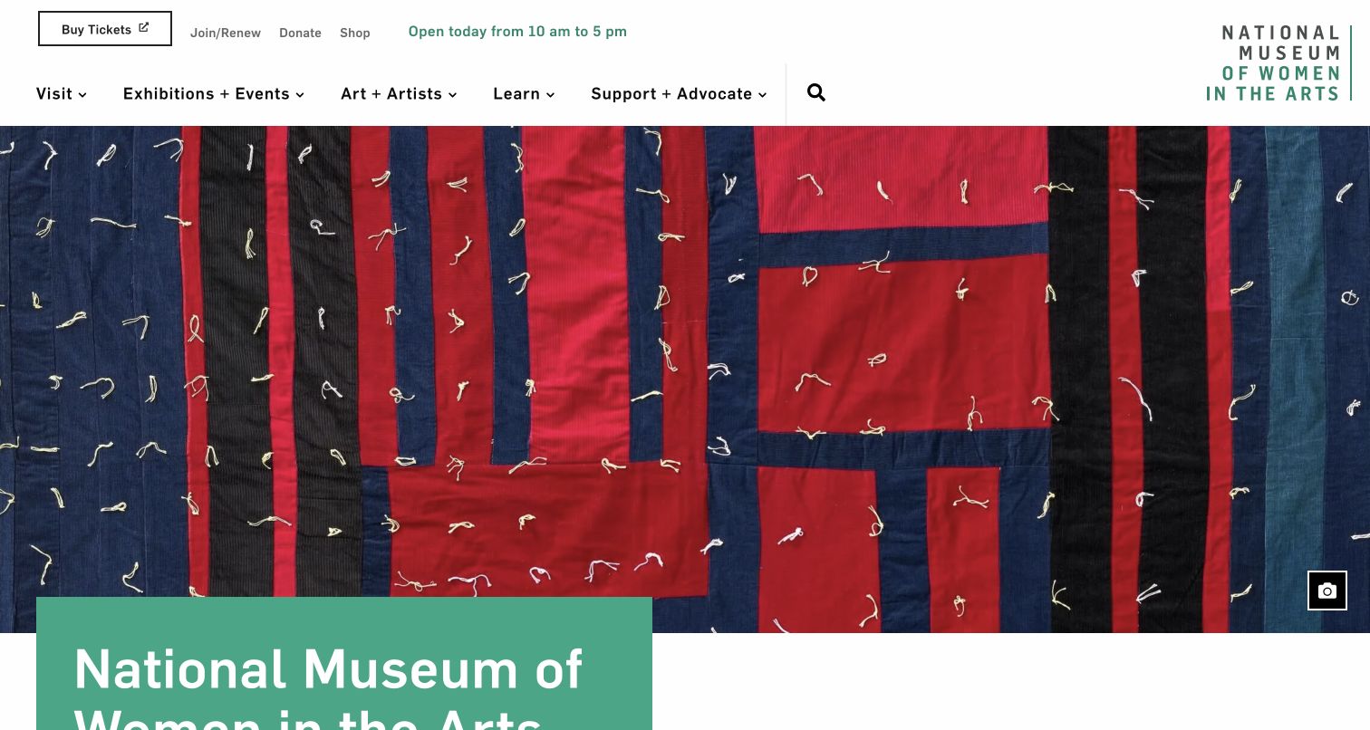
The National Museum of Women in the Arts puts the artwork ahead of promotional decoration. A large quilt detail dominates the captured opening, while a restrained header separates visit planning, exhibitions, artists, learning and support. Practical ticket and membership links sit in their own upper row, alongside an opening-hours message. The page continues with current exhibitions, visiting information, events and editorial material, giving the museum several ways to connect a collection with an in-person visit. An image-information control provides the artwork’s attribution and context. This balance between expressive imagery and useful institutional navigation is more instructive than the size of the hero alone.
What you can learn
Treat collection imagery as content with context, not as an interchangeable background. Pair an expressive visual introduction with clear routes to exhibitions, artists and practical visiting information so interest can lead to a useful next step.
Pros
Ticket and visiting information remain visible while the artwork receives generous space.
Exhibitions, events and editorial stories have distinct roles within the same homepage.
Cons & considerations
The tall hero leaves the main museum heading partly below the captured viewport.
Two navigation rows introduce many destinations before visitors reach the exhibition explanation.
Platform source: WordPress.org Showcase. Builder describes the museum public website launched June2020 and explicitly credits ACF Pro for relationships between content types, with ongoing support stated. Current exact public museum domain verified. Documented exact public-property association; not a current private backend inspection. Original project/document date: 2020-06. Evidence reviewed November 12, 2026; this review date does not establish a new backend implementation. Platform evidence is separate from the direct website screenshot and is not a complete current infrastructure audit.
Zero Waste Europe’s library turns an extensive publication archive into a recognizable research interface. A blue introduction explains the purpose of the collection, followed by a white filter panel that separates type, category, year and keyword. The panel’s rounded shape and spacing give each control a clear place without making the archive feel like a spreadsheet. Results have dates and descriptive titles, and an ordering control offers another way to approach the material. The important design decision is to expose the archive’s organizing dimensions together. Visitors can understand the available ways to narrow the collection before committing to a particular document or topic.
What you can learn
Model a library around the attributes readers actually use to find material. Keep the filters grouped, provide a visible reset, and make dates and descriptive titles available in the results rather than relying on cover images alone.
Pros
Type, category, date range and keyword are presented as complementary discovery tools.
A clear reset and sort control make the archive’s navigation structure understandable.
Cons & considerations
The generous introduction means publication results begin below the initial screen.
Specialist report titles can become long, increasing the effort needed to compare entries.
Platform source: WordPress.org Showcase. ACF vendor quotes builder explicitly describing the Zero Waste Europe interactive library using ACF types/categories and FacetWP. Exact current public library matches the documented interface. Experts not duplicated as a second organization. Documented exact public-property association; not a current private backend inspection. Original project/document date: 2022-09-23. Evidence reviewed November 12, 2026; this review date does not establish a new backend implementation. Platform evidence is separate from the direct website screenshot and is not a complete current infrastructure audit.
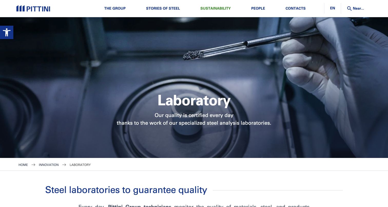
Pittini’s laboratory page uses a specific industrial image to make a technical subject tangible. A gloved hand and sample apparatus fill the opening, while a short title and supporting statement explain the page’s subject. The navigation preserves the broader company structure, but a breadcrumb places the visitor within innovation and laboratories. Below the image, a descriptive section heading begins the explanation of testing and quality work. The combination is useful for industrial organizations whose capabilities can otherwise become abstract lists of claims. It provides an identifiable setting for the content without requiring a process demonstration or an elaborate interaction.
What you can learn
Introduce a technical capability with a relevant process image and a clear position in the information structure. Let the body explain the work in detail, and preserve a breadcrumb for visitors who arrive directly on the interior page.
Pros
The laboratory photograph gives a concrete visual setting to an otherwise technical topic.
Breadcrumbs connect the interior page to its parent section without repeating the whole menu.
Cons & considerations
The large image postpones most of the detailed laboratory explanation until below the fold.
The extensive company navigation can distract from the page’s narrower technical subject.
Platform source: WordPress.org Showcase. ACF vendor case explicitly describes Pittini modular page templates and directly links this laboratories page as its frontend example. Documented exact public-property association; not a current private backend inspection. Original project/document date: 2022-09-23. Evidence reviewed November 12, 2026; this review date does not establish a new backend implementation. Platform evidence is separate from the direct website screenshot and is not a complete current infrastructure audit.
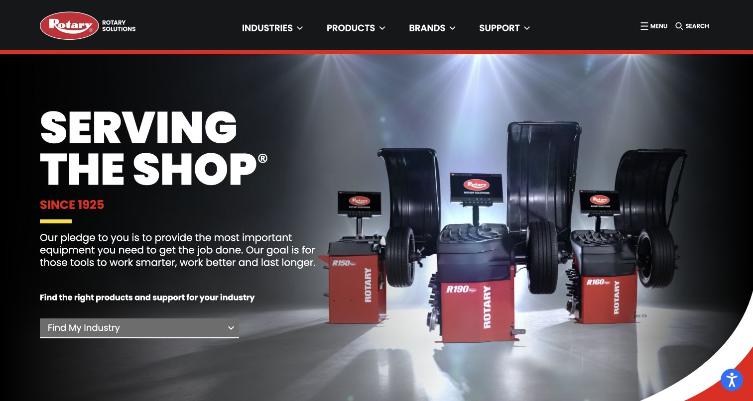
Rotary Solutions treats its homepage as an entrance to a substantial equipment catalog. The dark background, red accents and large product photography establish a coherent industrial identity. Its opening puts a short brand statement beside recognizable shop equipment, then offers an industry selector to help visitors find a relevant starting point. The main menu separates industries, products, brands and support, acknowledging that buyers may approach the same catalog in different ways. Further sections introduce individual equipment and training topics. The page is worth studying for that information structure: the visual presentation is forceful, but the more transferable idea is to organize discovery around several legitimate customer perspectives.
What you can learn
A catalog does not need a single browsing path. Define the meaningful relationships among industries, product types, brands and support content, then make those routes easy to distinguish before presenting detailed specifications.
Pros
Industry-based discovery gives visitors an alternative to knowing the correct product terminology.
Product photography and restrained red accents keep the equipment visually prominent.
Cons & considerations
The oversized brand statement occupies space that could introduce more specific product choices.
Multiple catalog routes need careful labels to avoid overlapping or confusing destinations.
Platform source: WordPress.org Showcase. Vendor case directly links Rotary Solutions and documents its ACF-backed product catalog migration and content models. Documented exact public-property association; not a current private backend inspection. Original publication date not established. Evidence reviewed November 12, 2026; this review date does not establish a new backend implementation. Platform evidence is separate from the direct website screenshot and is not a complete current infrastructure audit.
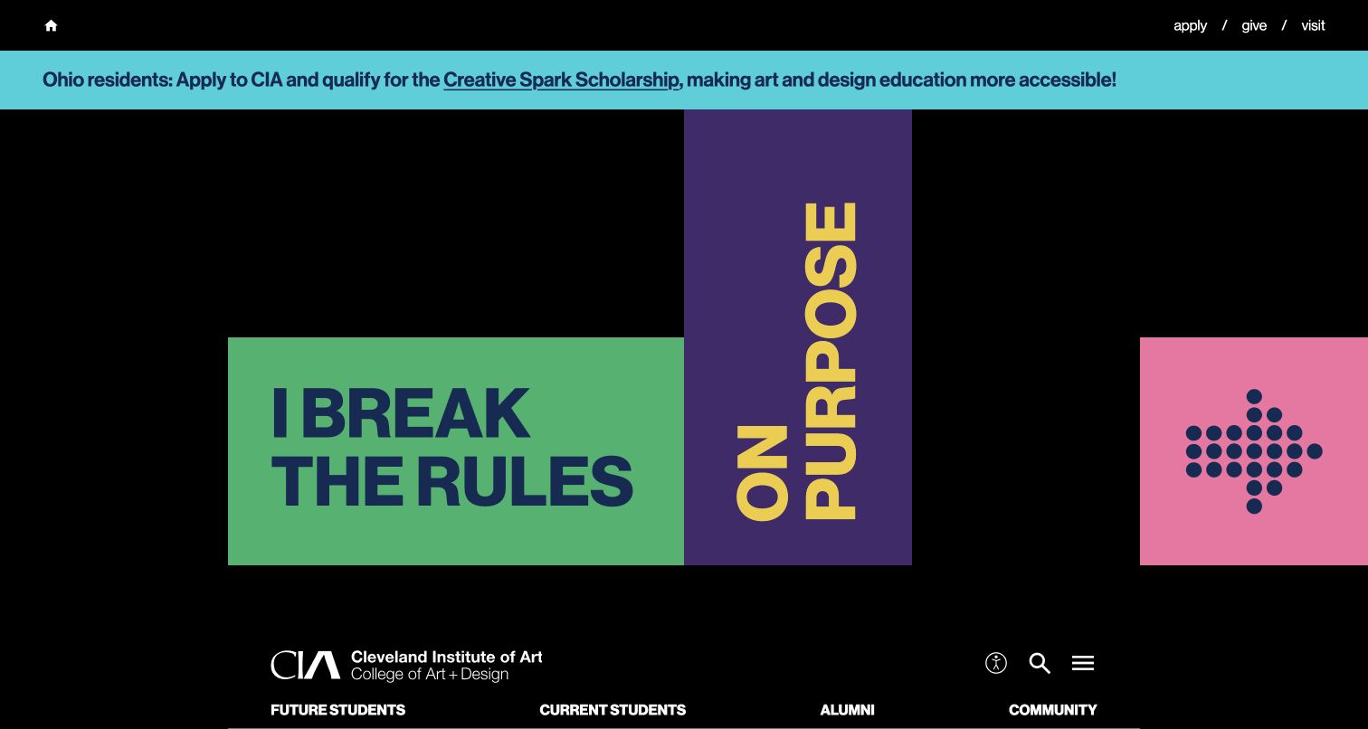
Cleveland Institute of Art gives its recruitment homepage an expressive typographic opening. Bright blocks of green, purple and pink sit against black, with large lettering that feels closer to a studio composition than a conventional university banner. A scholarship announcement appears near the top, while application, giving and visiting links remain available in a compact utility row. The broader page separates audience routes for future students, current students, alumni and the community, then introduces campus visits, financial aid, facilities and student work. The result shows how an institution can express a creative identity while still preserving practical routes for people making an education decision.
What you can learn
Let the visual language demonstrate the institution’s character, but retain obvious routes for its main audiences. Distinctive art direction works best when application, visiting and program information remain easy to locate around it.
Pros
Bold typography and color blocks give the art school a recognizable visual character.
Audience categories distinguish student recruitment from community, alumni and current-student needs.
Cons & considerations
The expressive hero delays a straightforward explanation of programs and study options.
Some controls rely on icons or minimal labels, requiring more interpretation from newcomers.
Visible tech stack
Earlier / documented evidence
Advanced Custom Fields
Platform source: WordPress.org Showcase. Same vendor case separately identifies and directly links CIA, explicitly attributing its dynamic image management to ACF. Documented exact public-property association; not a current private backend inspection. Original publication date not established. Evidence reviewed November 12, 2026; this review date does not establish a new backend implementation. Platform evidence is separate from the direct website screenshot and is not a complete current infrastructure audit.
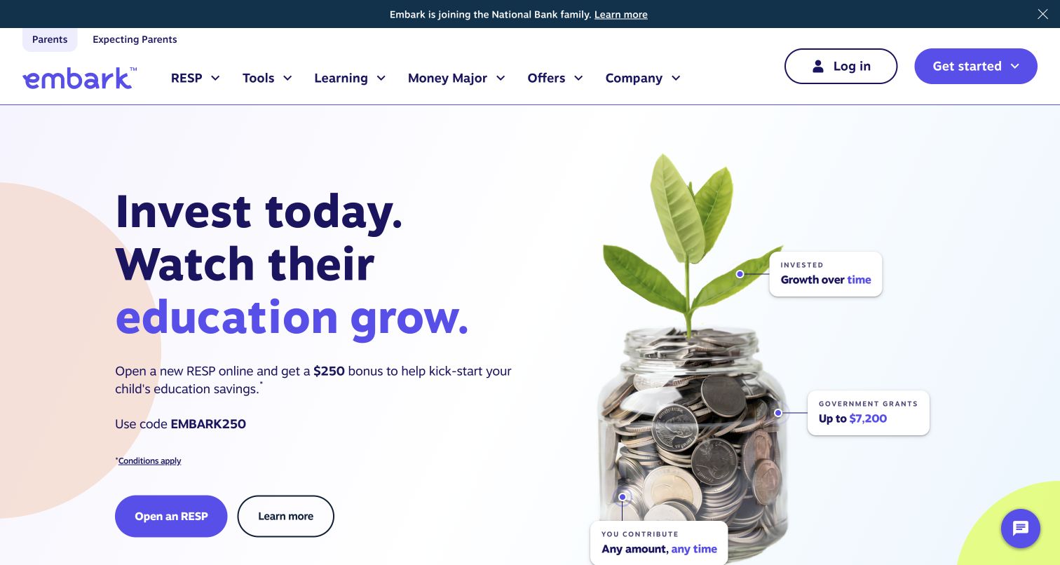
Embark’s public education-savings website uses a growth metaphor without allowing it to replace the explanation. A plant emerging from a jar of coins sits beside the main heading, with small annotations connecting the image to contributions, grants and growth. The primary action and a quieter learn-more link offer different levels of commitment. The header separates parent audiences, product information, tools and learning, and the page continues with explanatory questions and a calculator section. Its promotional wording includes visible conditions links. This review considers the public marketing interface and how it introduces a complex subject; account opening, financial projections and private account functionality were not tested.
What you can learn
Use a visual metaphor to introduce an unfamiliar product, then connect it to clearly labeled explanations. Give visitors a learning route alongside the primary action, and place qualifications near the promotional claims they limit.
Pros
Image annotations connect the visual metaphor to the page’s main explanatory categories.
A secondary learning action gives cautious visitors a clear alternative to immediate signup.
Cons & considerations
The opening promotion competes with the broader explanation of the education savings product.
Several menu categories and two audience tabs make the header relatively information heavy.
Platform source: WordPress.org Showcase. Vendor case directly links embark.ca and attributes its public headless WordPress build to Art & Science using ACF alongside Faust.js and WPGraphQL. This is the education savings company, not pet DNA. Documented exact public-property association; not a current private backend inspection. Original publication date not established. Evidence reviewed November 12, 2026; this review date does not establish a new backend implementation. Platform evidence is separate from the direct website screenshot and is not a complete current infrastructure audit.
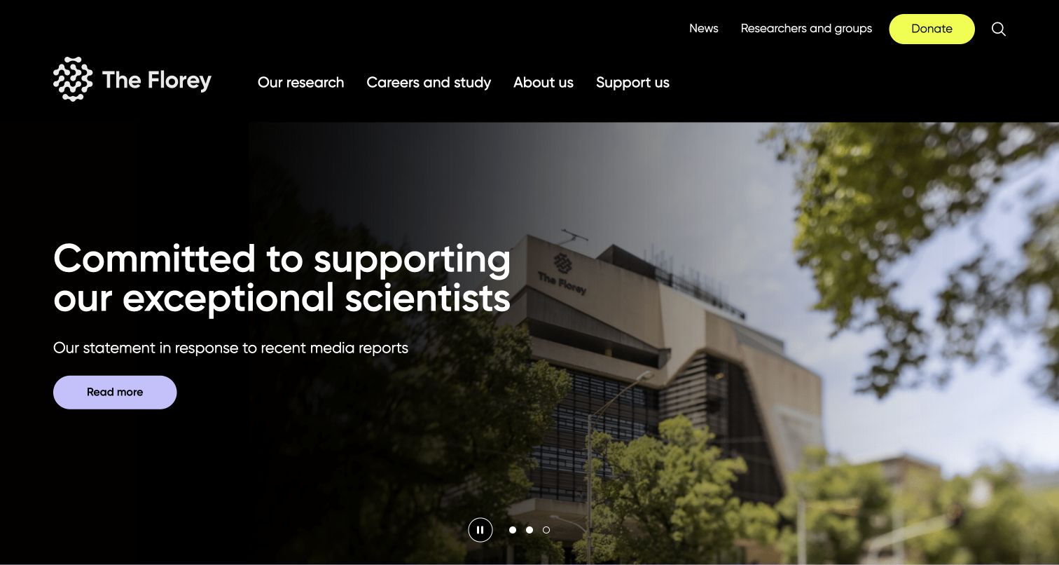
The Florey’s homepage balances a strong research identity with several institutional audiences. Its black header and bright yellow donation button create a clear hierarchy around research, careers, organizational information and support. The captured carousel panel pairs a large statement with a building photograph and a modest read-more action. Other homepage sections explain research priorities, teams, projects, study opportunities and current news. This is a useful example of a content system that must support both enduring scientific context and timely institutional announcements. The visual consistency keeps those different purposes connected, although the visitor’s first impression depends considerably on which carousel panel is currently visible.
What you can learn
Design research institutions around durable content categories, then give timely announcements a defined place within them. A consistent visual system should make changing messages recognizable without allowing the homepage’s central purpose to become unclear.
Pros
Research, careers and support have distinct destinations in a compact primary navigation.
The restrained palette gives the donation action emphasis without overwhelming the research content.
Cons & considerations
A rotating statement can temporarily displace the broader explanation of the institute’s work.
Large carousel imagery pushes detailed research priorities and project information farther down the page.
Platform source: WordPress.org Showcase. Vendor case body identifies and links The Florey, describing migration of content with ACF. Page browser title incorrectly says LUMA; body, logo, client link and quote consistently identify Florey. Documented exact public-property association; not a current private backend inspection. Original publication date not established. Evidence reviewed November 12, 2026; this review date does not establish a new backend implementation. Platform evidence is separate from the direct website screenshot and is not a complete current infrastructure audit.
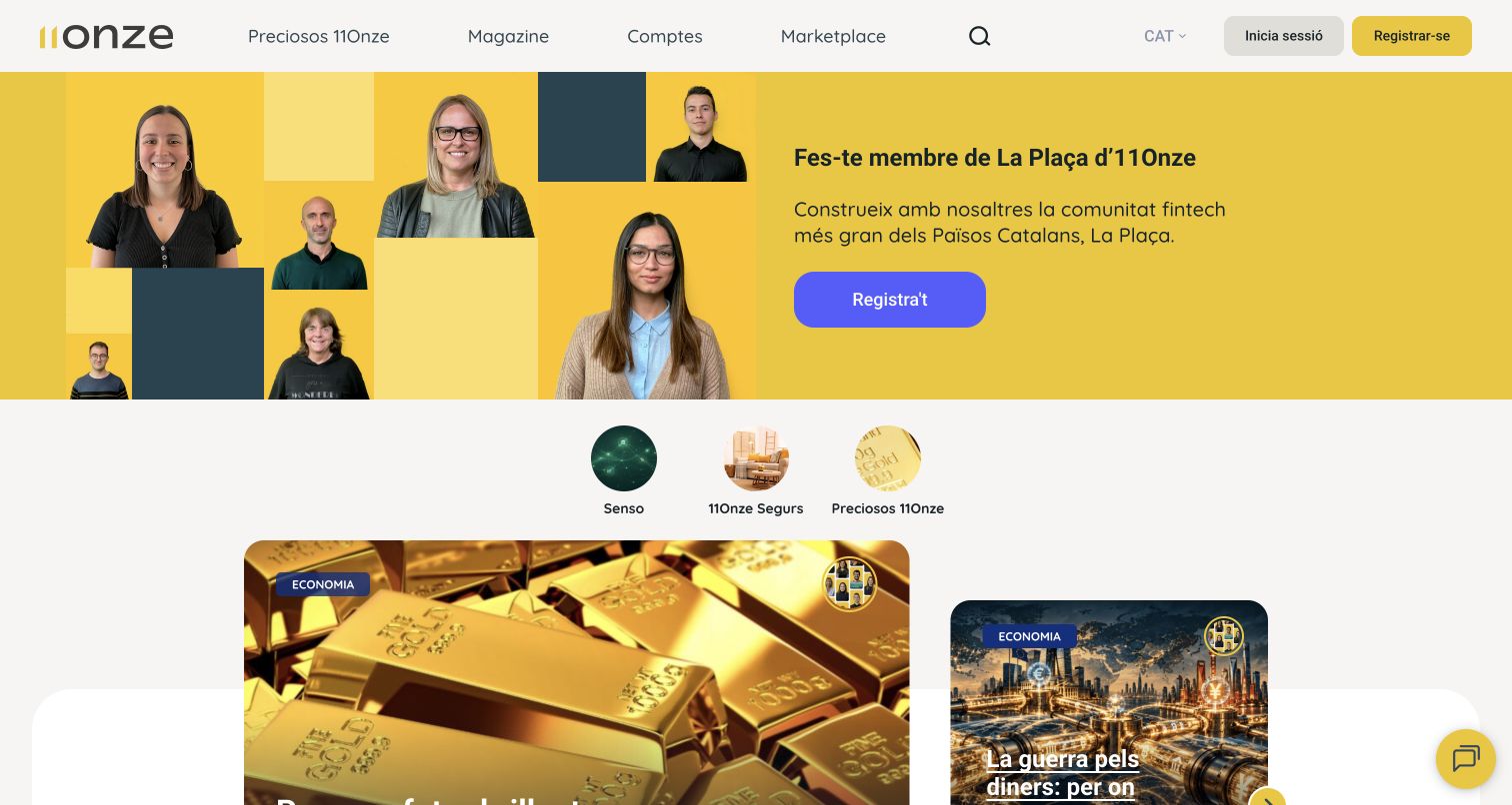
11Onze’s public La Plaça entrance combines community invitation with an editorial feed. A yellow opening uses a collage of people beside the registration message, followed by topic-oriented articles and links to video content. The header separates the magazine from accounts and marketplace sections, while article cards provide categories and reading-time cues. These patterns help the site feel like an ongoing publication rather than a single product landing page. They also reveal a design tension: community, education and commercial services share the same entrance. The example is included for the documented public publishing property, with no inference about the technology or operation of private financial accounts.
What you can learn
For a community publication, make recurring editorial structure visible through categories, authors and reading cues. Distinguish content discovery from membership and product actions so visitors understand which kind of journey they are beginning.
Pros
The people collage makes the community invitation concrete and visually recognizable.
Article categories and reading-time labels help readers assess content before opening it.
Cons & considerations
Membership, publication and marketplace destinations compete within a single compact header.
Large promotional areas can delay the editorial material that encourages repeat visits.
Platform source: WordPress.org Showcase. Vendor case directly links La Plaça and identifies ACF in the public social learning platform. Scope excludes banking app/private account infrastructure. Documented exact public-property association; not a current private backend inspection. Original publication date not established. Evidence reviewed November 12, 2026; this review date does not establish a new backend implementation. Platform evidence is separate from the direct website screenshot and is not a complete current infrastructure audit.
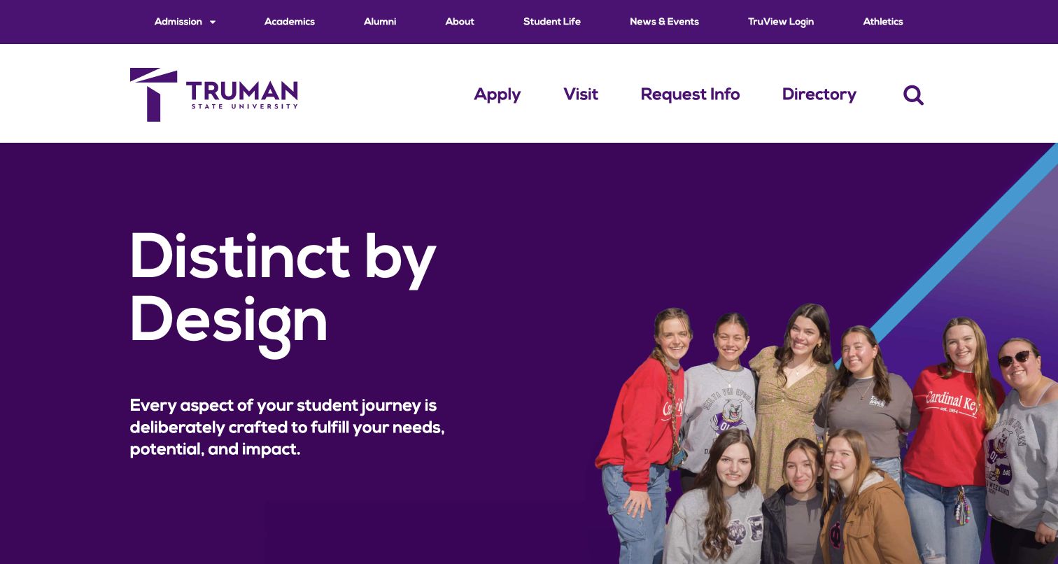
Truman State University uses a bold purple identity to connect aspiration with practical admissions routes. A large student photograph anchors the opening, while application, visiting, information-request and directory links receive their own prominent row. The main navigation covers academic and institutional areas without forcing those links into the same hierarchy as recruitment actions. Below the hero, the page introduces academic programs, student life and funding, followed by community news. The arrangement is worth studying because it recognizes that prospective students need several kinds of evidence, from what they can study to how they might fit into campus life. The screenshot documents the public homepage, not application systems.
What you can learn
Separate high-intent admissions actions from broader institutional navigation. Then organize the body around the questions a prospective student needs answered, using specific program, campus and funding destinations to support the introductory message.
Pros
Application and visit links are easy to identify in a dedicated action row.
Student imagery and consistent purple branding give the opening a coherent campus identity.
Cons & considerations
The large promotional headline offers less immediate detail than the navigation beneath it.
Multiple header rows consume substantial vertical space before the main content begins.
Platform source: WordPress.org Showcase. Implementer case directly links truman.edu and describes delivered ACF plugin configurations, reusable public pages and content controls. Documented exact public-property association; not a current private backend inspection. Original publication date not established. Evidence reviewed November 12, 2026; this review date does not establish a new backend implementation. Platform evidence is separate from the direct website screenshot and is not a complete current infrastructure audit.
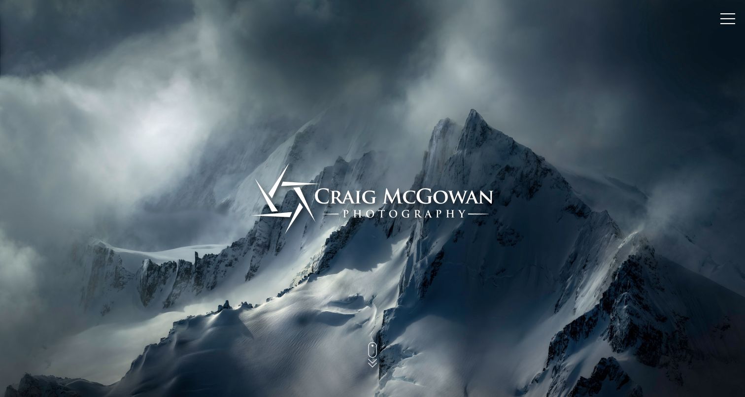
Craig McGowan’s photography homepage lets a single mountain image establish the tone. The opening places a white wordmark over a broad landscape and leaves most of the frame unobstructed, with a small menu control and a downward cue. The page’s supporting content introduces the photographer and separates the portfolio into land, wildlife, water, frozen landscapes, natural abstracts, urban work, fine art and favorites. That structure gives a large visual collection understandable routes without crowding the opening image with thumbnails. The design shows how a photographic portfolio can move from an immersive first impression to a practical category system while emphasizing the work itself.
What you can learn
Let the strongest image establish a portfolio’s character, then provide a small, meaningful set of collection categories. Keep the route into those collections visible enough that the immersive opening does not become a navigation obstacle.
Pros
The uncluttered opening gives the photograph and photographer’s identity clear visual priority.
Specific collection categories offer a more useful browsing structure than a single endless gallery.
Cons & considerations
The small menu icon does not explain the available destinations until opened.
The full-screen image delays the biography and collection links for visitors seeking immediate context.
Platform source: WordPress.org Showcase. Builder explicitly identifies recent gallery overhaul using ACF and links the exact photography website. Documented exact public-property association; not a current private backend inspection. Original publication date not established. Evidence reviewed November 12, 2026; this review date does not establish a new backend implementation. Platform evidence is separate from the direct website screenshot and is not a complete current infrastructure audit.
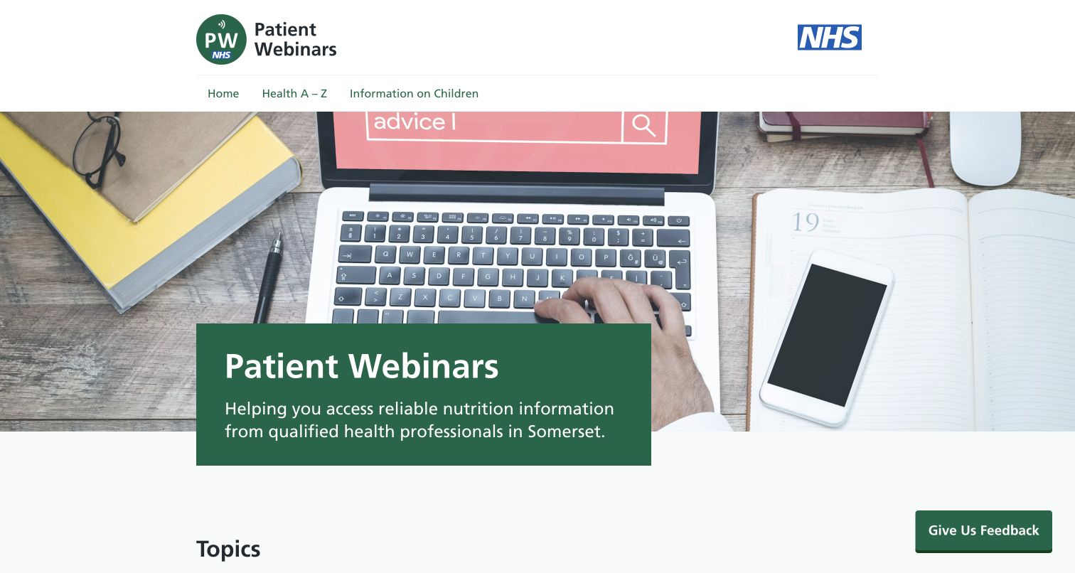
Patient Webinars presents a specialist health-information collection with restrained navigation. The header offers the homepage, a health alphabet and information about children, while the opening explains the site’s nutrition-information purpose. Below it, a topic grid names conditions directly and uses small updated or new labels where relevant. The page also explains that NHS dietitians in Somerset developed the project and provides an area for healthcare professionals. The design provides straightforward access to a library: visitors do not need to understand the organization’s internal structure before finding a subject. This is a review of information presentation, without assessing the medical advice or any clinical outcome.
What you can learn
For a focused information library, use the reader’s topic vocabulary as the main navigation. Keep audience-specific material identifiable and make update cues visible, while preserving context about who produced the content and who it is intended to serve.
Pros
The three-item navigation keeps the public learning task easy to understand.
Direct topic labels and update badges help visitors locate relevant information quickly.
Cons & considerations
The large generic desktop photograph takes space from the more useful topic grid.
Some long condition names make individual cards much denser than neighboring entries.
Platform source: WordPress.org Showcase. Implementer identifies the Patient Webinars replacement website and explicitly says it used ACF5.8 custom blocks and LocalJSON. Exact public property confirmed by https://studiobr.io/work/nhs-patient-webinars and its own NHS-dietitian description. Documented exact public-property association; not a current private backend inspection. Original publication date not established. Evidence reviewed November 12, 2026; this review date does not establish a new backend implementation. Platform evidence is separate from the direct website screenshot and is not a complete current infrastructure audit.
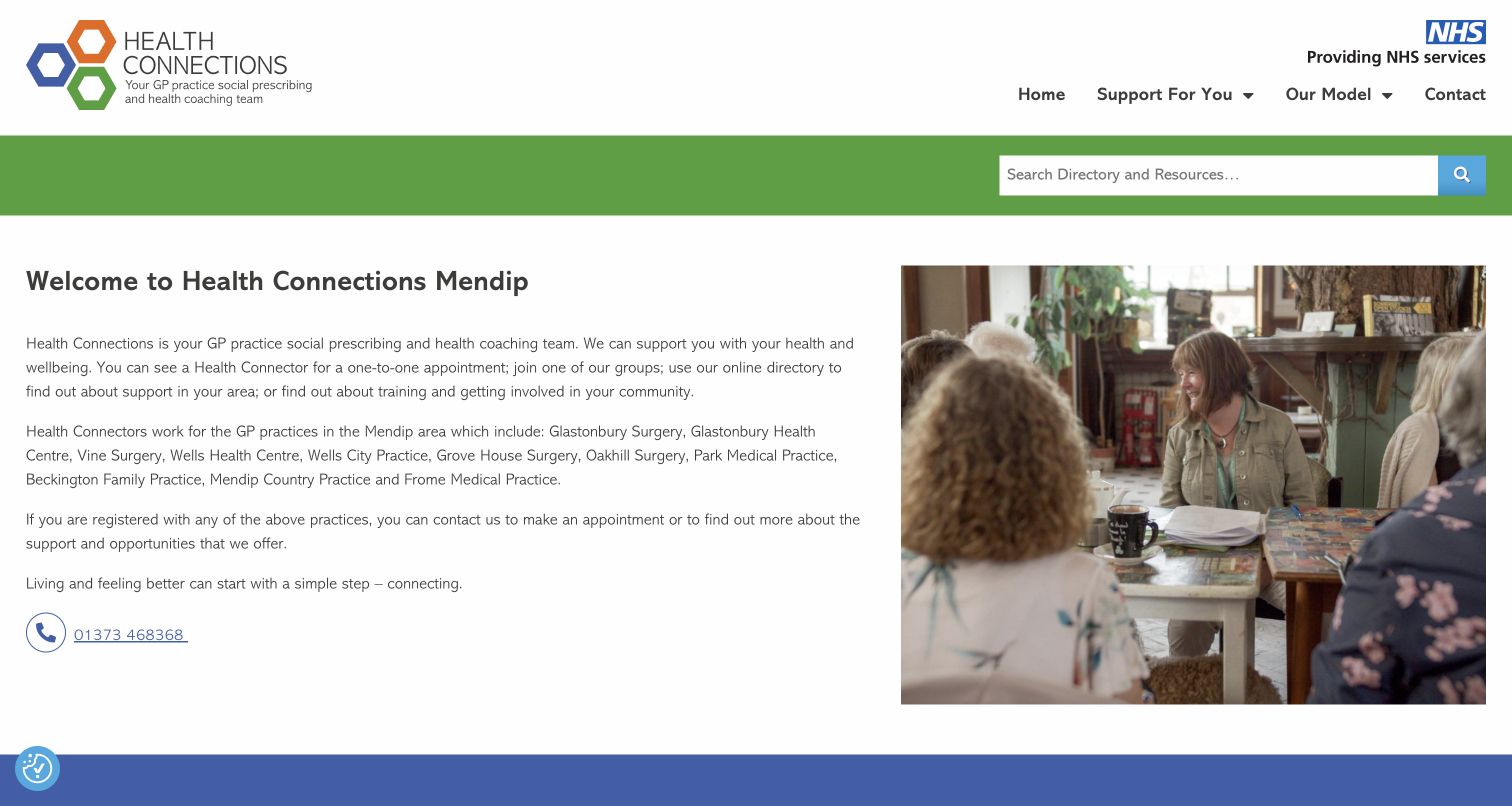
Health Connections Mendip introduces its support service through plain explanation and a photograph of people in conversation. A green search strip sits below the header, making directory discovery a visible task. The opening explains the relationship with local GP practices, names the communities served and provides a phone route before presenting resource categories. Those categories distinguish practical help, health conditions, community connection and life events. This is a useful example of a service website that needs both human reassurance and structured information. Its content gives visitors several possible starting points, though the long introductory paragraphs demand more reading than a concise task-based entrance would.
What you can learn
Combine a human introduction with clear discovery routes when a service covers many kinds of support. Explain eligibility and contact options plainly, then organize resources around everyday needs rather than internal team terminology.
Pros
A prominent directory search supports visitors who already know what they need.
The introduction explains the service’s local scope and includes a visible phone contact.
Cons & considerations
The opening contains several long paragraphs before visitors reach the resource categories.
The thin search strip gives less emphasis to browsing than to keyword entry.
Platform source: WordPress.org Showcase. Builder provides a separate project section with ACF technology logo, describes rebuilding this WordPress directory, and directly links the exact property. Documentary project evidence, not generic agency tool use. Documented exact public-property association; not a current private backend inspection. Original publication date not established. Evidence reviewed November 12, 2026; this review date does not establish a new backend implementation. Platform evidence is separate from the direct website screenshot and is not a complete current infrastructure audit.
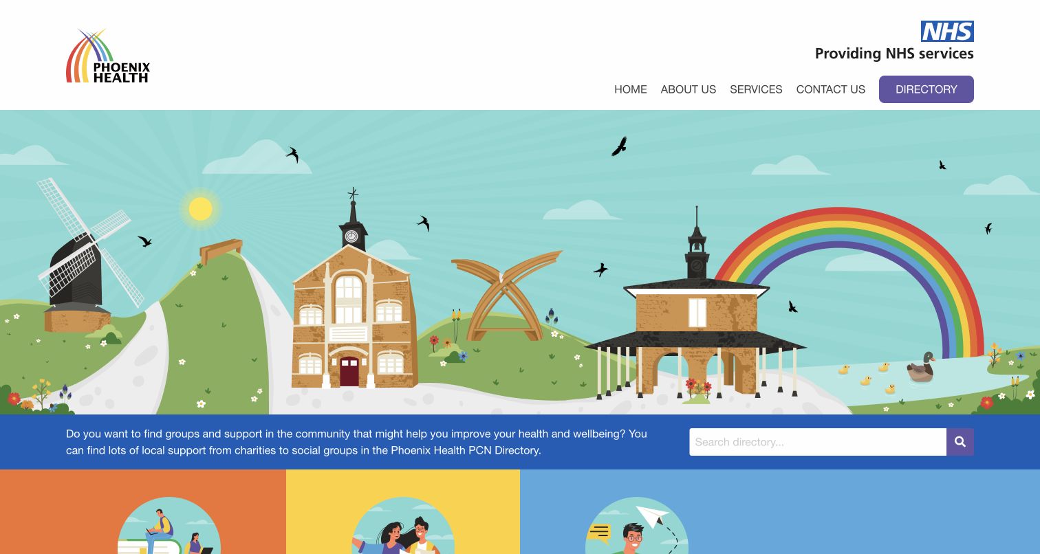
Phoenix Health PCN uses a distinctive local illustration as the entrance to its community support directory. The colorful scene gives the page a welcoming identity, while a short explanation and search box sit together in a blue strip immediately below it. The header keeps the available routes compact: organizational information, services, contact and a highlighted directory link. Lower cards explain the network, its services and how registered patients can access support through their practice. This makes a practical directory feel approachable without becoming a generic corporate homepage. The illustration is memorable, but it occupies much more space than the initial explanation of what users can find.
What you can learn
Give a community directory a recognizable local identity, then place its explanation and discovery controls together. The visual welcome should help people feel oriented while the search and category routes carry the practical work.
Pros
The directory has a distinct header action and an immediate search entry point.
Local illustration creates a consistent, approachable visual identity across the opening.
Cons & considerations
The large illustrated area pushes most service explanations below the first viewport.
The search box offers little visible guidance about useful keywords or available categories.
Platform source: WordPress.org Showcase. Builder provides a separate Phoenix project section with ACF technology logo and direct exact-site link, describing implementation of its directory framework for three practices. Documented exact public-property association; not a current private backend inspection. Original publication date not established. Evidence reviewed November 12, 2026; this review date does not establish a new backend implementation. Platform evidence is separate from the direct website screenshot and is not a complete current infrastructure audit.
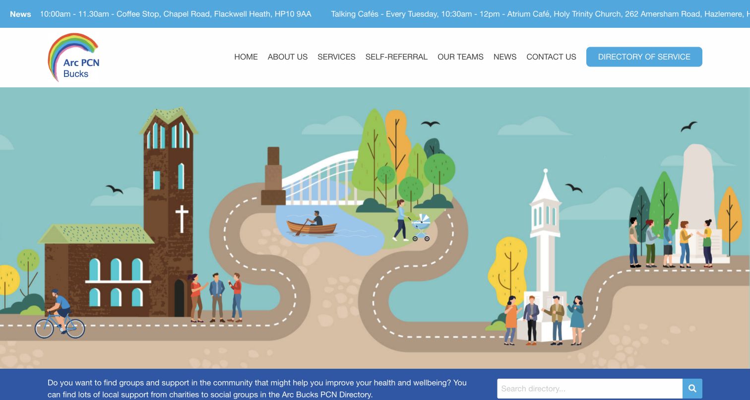
Arc Bucks PCN places community discovery at the center of a colorful public website. Its opening illustration depicts local landmarks and everyday activity, with a directory search strip beneath it. A news ticker adds timely announcements above the header, and the navigation separates services, teams, self-referral, news and contact from a highlighted directory destination. Supporting cards explain the directory, social prescribing and health coaching, then introduce the people who provide support. The design demonstrates how a shared directory approach can receive a specific local identity. It also shows the pressure created when many routes and announcements appear before visitors reach search and browsing.
What you can learn
Localize a reusable directory through relevant imagery and accurate service information, while keeping the primary discovery task easy to find. Give time-sensitive announcements a controlled space so they do not compete with permanent navigation.
Pros
The directory action remains visually distinct within the main navigation.
Supporting cards explain several routes into local help rather than relying on search alone.
Cons & considerations
The moving news strip adds another competing element above an already broad menu.
The tall illustration leaves the directory search close to the bottom of the viewport.
Platform source: WordPress.org Showcase. Primary developer portfolio contains an individual project section naming this site, linking its exact live domain, and labeling its project stack with the Advanced Custom Fields logo. This is project-level evidence, not an agency-wide technology inference. Documented exact public-property association; not a current private backend inspection. Original publication date not established. Evidence reviewed November 12, 2026; this review date does not establish a new backend implementation. Platform evidence is separate from the direct website screenshot and is not a complete current infrastructure audit.
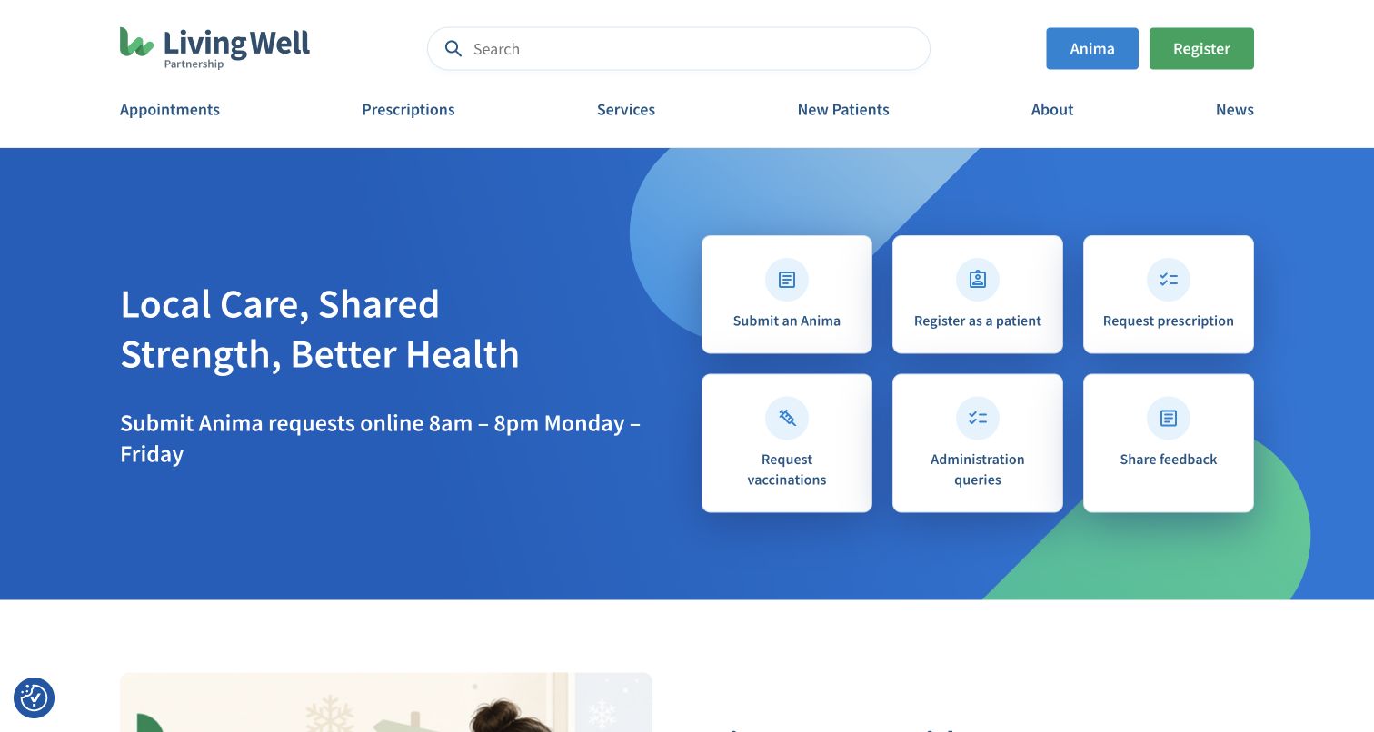
Living Well Partnership puts common patient tasks directly into the opening of its public website. Six white cards sit beside a short statement, separating requests, registration, prescriptions, vaccinations, administrative questions and feedback. A wide search box and a navigation row offer additional routes without obscuring those actions. Further down, the page introduces a seasonal guide, surgery locations, news and practice information. Its strongest pattern organizes the homepage around what visitors came to do. Actions lead to other pages or systems, so the public interface should be understood as a guide to the next step rather than proof that an entire request can be completed within the homepage.
What you can learn
Use frequent visitor tasks to define the opening hierarchy. Make the label describe the next step accurately, and keep location information and background content available after those immediate routes have been established.
Pros
Six clearly separated task cards give the opening a practical, understandable structure.
The broad search field and named navigation provide alternatives to the featured actions.
Cons & considerations
Several similarly weighted task cards require visitors to compare options before proceeding.
The Anima product name may need explanation for people unfamiliar with the request system.
Platform source: WordPress.org Showcase. ACF vendor case names Living Well Partnership as a delivered example of Rareloop ACF component builder, links https://www.rareloop.com/project/living-well-partnership-nhs-gp-surgery-website/ which directly identifies livingwellpartnership.nhs.uk and its public WordPress page builder. Documented exact public-property association; not current backend inspection. Original project/document date: 2022-11-15. Evidence reviewed November 12, 2026; this review date does not establish a new backend implementation. Platform evidence is separate from the direct website screenshot and is not a complete current infrastructure audit.
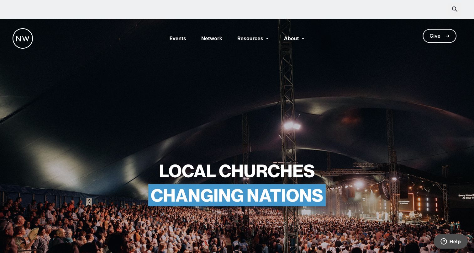
New Wine opens with a large gathering photograph and a short statement about local churches. A restrained navigation row places events, the network, resources and organizational information beside a separate giving action. Below the opening, dated event links and explanatory sections connect the broad message to specific ways to participate. The page also introduces a church finder, resources and promotional material for its festival. The useful pattern connects a collective identity and a practical calendar: the photograph establishes the community, while the later content makes its activities concrete. The review covers the public website and does not evaluate registration, donations or the separate online resource service.
What you can learn
Pair an organization’s broad purpose with concrete participation routes. Let events carry dates and descriptive names, keep ongoing resources separate from announcements, and make giving one identifiable action within the wider information structure.
Pros
The simple primary navigation distinguishes events, community information and resources.
Dated event entries translate the broad opening message into specific opportunities to explore.
Cons & considerations
The tall crowd photograph delays the event details that many returning visitors may need.
Several broad organizational sections make the homepage long before reaching all participation options.
Platform source: WordPress.org Showcase. ACF vendor case explicitly describes the New Wine ACF-powered donation workflow and links the primary Rareloop project case https://www.rareloop.com/project/new-wine-website-case-study/ which names new-wine.org as its public digital home. Separate festival subdomain is not counted. Documented exact public-property association; not current backend inspection. Original project/document date: 2022-11-15. Evidence reviewed November 12, 2026; this review date does not establish a new backend implementation. Platform evidence is separate from the direct website screenshot and is not a complete current infrastructure audit.
Kegan has 15+ years of experience working with small businesses, Fortune 500 companies, and everything in between. No development job is too big or too small: he brings the same hands-on attention to a focused improvement, a complete website, or a custom application.
For Advanced Custom Fields projects, he can help with responsive interfaces, reusable components, custom functionality, API connections, and performance-minded implementation. He works directly with clients on scope, design, implementation, testing, and handover, with an emphasis on clear communication and a system that remains practical to maintain after launch.
Show 3 other Advanced Custom Fields developersHide other Advanced Custom Fields developers
Harvard Brain Science Initiative, MIT SCRAM and Zero Waste Europe organize different kinds of knowledge. Identify which entries need dates, contributors, categories, documents and related material. Make the distinctions visible in the interface, and consider how readers arrive from search. A useful archive should still make sense when its oldest and newest entries appear together.
Service and community directories
Somerset NHS, Health Connections Mendip, Phoenix Health and Arc Bucks demonstrate several ways to introduce public services. Start with the vocabulary visitors use, then define location, eligibility, contact and category information consistently. Search is one route; clear browsing and explanations are equally valuable when visitors do not know the right term. Keep operational systems and public guidance clearly separated.
Campaign and community publishing
UNHCR Italy and New Wine connect an organizational purpose with more specific appeals or activities. Structure each campaign or event around information that can change independently: its title, dates, image, explanation and destination. The public page should accurately describe the next step. A donation link, event listing or account entrance does not by itself demonstrate the behavior of the connected transaction.
Visual portfolios and collections
Craig McGowan Photography, Cleveland Institute of Art and the museum use imagery in markedly different ways. Model the context that makes each image useful, including its collection, caption, credit and related destination. Plan how the design handles varied aspect ratios and longer titles. A strong visual opening still needs a comprehensible route into the work.
From references to requirements
Plan an ACF website around maintainable content
Inventory real content and exceptions
Collect representative examples before defining the model. Include short and long titles, missing images, multiple authors and old entries that must remain available. Decide which fields are required and what an empty optional field means. Avoid designing only for the most attractive sample; the ordinary and awkward records reveal whether the proposed structure will last.
Write field labels for the editor
Use language that describes the content and its purpose. Explain expected image proportions, link destinations and where a value will appear. Group related choices and avoid exposing controls that the team does not need. A consistent interface reduces the need to remember hidden conventions and makes it easier to hand routine publishing to the people responsible for the material.
Choose sections and relationships deliberately
Use flexible sections where page composition legitimately varies. Use stable fields where information must be compared, filtered or reused. Define limits that keep sections understandable, and design empty states rather than publishing empty headings. Treat the public navigation and the editing interface as two views of the same information model, each written for its own audience.
ACF Local JSON can save field definitions and related configuration as files, providing a way to version and synchronize that configuration. Decide who can change the model, how changes reach each environment and what happens to existing content. A field rename or removal can affect public templates and stored material, so plan migrations and review the resulting pages.
A good editing model does not guarantee a good public website. Check navigation, keyboard use, image alternatives, contrast, content length and screen changes in the actual implementation. Test filters and forms through their empty, error and unavailable states. Keep performance and accessibility claims separate from visual impressions, and assign ongoing responsibility for dated content and external destinations.
A useful handover demonstration
Ask the actual team to carry out its routine job: publish a realistic update, correct a mistake, preview a narrow screen, and identify who owns an integration failure. For a library or frontend framework, also ask who maintains the content source and deployment. A polished screenshot does not answer those operational questions.
Beyond the screenshot
A practical Advanced Custom Fields website checklist
Identify the actual public properties and audiences in scope.
Inventory representative content, including incomplete and unusual records.
Name repeatable content types before designing individual pages.
Define useful relationships and categories for discovery.
Write clear field labels, instructions and required-value rules.
Separate structured facts from optional presentation choices.
Set sensible limits on flexible sections and repeated rows.
Plan captions, credits and alternative text for collection imagery.
Design readable empty states for optional information.
Keep field configuration and template changes coordinated.
Test filters, keyboard navigation and connected-service handoffs.
Assign ownership for dates, locations, eligibility and external links.
Preserve the distinction between documented association and current observation.
Test with real content, a keyboard, a small screen, slow or failed requests, and the people who will maintain the system. These are planning checks, not an accessibility, security, performance, or search-ranking certification.
Sources & editorial method
How this Advanced Custom Fields collection was reviewed
Twenty distinct public properties were reviewed and captured on November 12, 2026. Each ACF association is supported by a primary developer or vendor account of the specific project, with the original document date retained where available. These accounts may describe an earlier implementation and are not presented as a current inspection of private administration systems. Every selected page received a bounded broad public-stack audit attempt. Nineteen returned usable public observations; Cleveland Institute of Art returned an incomplete redirect response to the automated scanner while its public page loaded normally in the browser. That failed audit remains recorded without inferred additions. The screenshots are genuine browser captures; ordinary site controls dismissed obstructing consent notices, and no page content was altered for presentation. Some Italian pages were displayed in English by the browser’s existing translation behavior. Harvard’s capture shows the paused carousel and editorial columns below the header. No forms, medical requests, account registrations, donations, purchases or messages were submitted. Reviews discuss public information and visual design, not organizational quality, clinical advice, investment performance, measured conversion or accessibility certification.
Every image is an unmodified capture from the actual website, with its source and capture date. Some captures are reused from our shared catalog; their dates remain the original capture dates. None comes from a vendor gallery or a generated reconstruction. Moving imagery and live content can change.
Technology attribution uses public page assets or metadata, official platform documentation, or a cited first-party project case study. Documentary and framework-relationship evidence is identified where used; it is not a complete current backend inventory. A CMS image CDN alone does not establish a full CMS deployment. A library’s presence does not prove which individual controls use it, and a platform label does not establish AI authorship.
The composition notes, lessons, pros and tradeoffs are original editorial observations. We have not measured conversion, traffic, security, performance or accessibility conformance. Website owners retain their brands and imagery; these examples are not our client portfolio. Written, Edited and Curated are independent records, not dates advanced by a build. See our editorial standards or suggest a correction.
Questions worth asking
Advanced Custom Fields website development FAQs
What is Advanced Custom Fields?
Advanced Custom Fields is a WordPress plugin for adding structured content fields and working with their values. It helps developers define editing interfaces and content models; the theme or application still determines how that information is presented to visitors.
How were these ACF websites identified?
Each reviewed public property has a primary developer or vendor project account explicitly connecting it with ACF. Broad public-stack audits were also attempted. Documentary associations retain their original context and do not become current backend observations merely because a new screenshot was taken.
Does WordPress prove that a website uses ACF?
No. WordPress can be implemented in many ways. A WordPress resource path or theme signal is not enough to identify ACF. This collection relies on separate project-specific evidence for that association.
Do these examples cover the institutions’ entire technology stacks?
No. The evidence is limited to the named public properties. Linked accounts, donation processors, medical request systems, private applications, sibling websites and the wider institutions are not automatically included.
Can websites using ACF look very different?
Yes. A content model does not prescribe one visual style. These examples range from a restrained research timeline to an immersive portfolio and illustrated service directory. Their presentation depends on the design and implementation built around the content.
What should I learn from these examples?
Study how the information is organized and how that structure supports the visitor’s task. Reuse useful ideas such as clear categories, distinct audience routes and consistent metadata, while developing your own content, imagery and visual identity.
Begin with the information your team needs to maintain and the questions your visitors need answered. An effective ACF website makes that relationship clear in both its editing model and its public pages.