Best Conference Center Websites of 2026 (25 Real-World Examples)
Conference center websites that help people choose, plan and attend an event
A conference venue website serves several different audiences before, during and after an event. These examples show how room information, destination context and operational details can work together without making every visitor start with an enquiry form.
A planner comparing venues needs capacities by layout, floor plans, technical requirements and a realistic next step. An exhibitor needs delivery instructions and service ordering. An attendee needs the right entrance, transport, accessibility information and the event date. Treating those people as one audience produces a beautiful brochure that answers too few questions.
This collection studies public conference and convention venue websites, from focused regional meeting centers to large urban campuses. The reviews examine visible design and information structure, not service quality, contractual suitability or event outcomes. A venue's promotional claim is not an independent assessment of its facilities.
Before the examples
What makes good conference center website design in 2026?
Separate the three main audiences
Give planners, exhibitors and attendees recognizable starting points. Shared information such as directions can remain global, while freight, catering and proposal requirements belong in the relevant journey.
Make room comparison concrete
Show capacity by seating layout, dimensions, access, equipment and useful photographs. Label combined rooms clearly. A total building capacity does not answer whether a particular event format fits.
Explain the next step honestly
Distinguish an enquiry, a proposal request, a provisional hold and a confirmed booking. Tell visitors what information is needed and what happens next without implying availability that has not been checked.
Support the day of the event
Keep dates, building names, entrances, parking, public transport and accessibility easy to find. These details remain important after the sales decision and often matter most on a phone.
The collection · 25 examples
25 conference center websites worth studying
Compare the examples by the question each answers well: choosing a space, understanding a destination, preparing a proposal request or arriving at the correct building. The collection includes both residential conference campuses and standalone city venues.
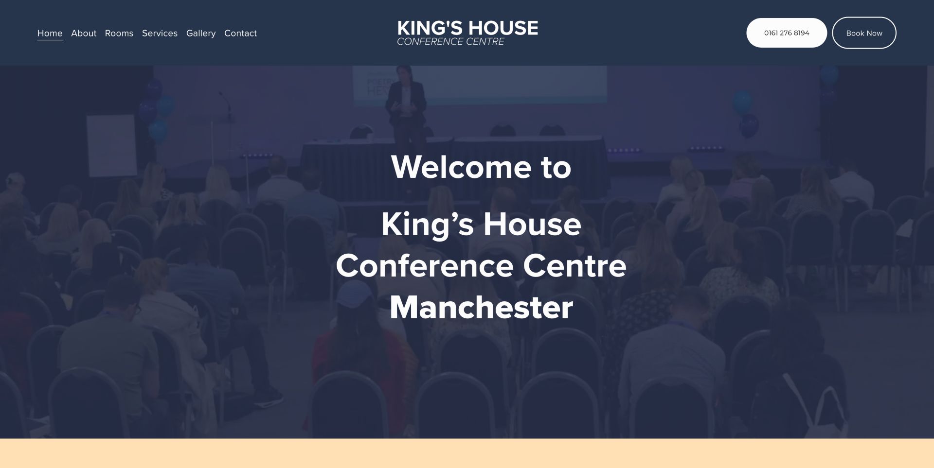
King's House places its Manchester identity, telephone number and enquiry route around an actual auditorium photograph. The site's most useful detail is its separation of rooms, technology and catering, supported by direct links to room rates, equipment rates, delegate rates and capacities. That is a strong model for a focused regional venue because it helps a planner prepare a meaningful enquiry. The Book Now wording could be clearer when the next step is an enquiry rather than confirmed availability.
What you can learn
Publish the practical documents that help a buyer scope an event before contacting sales. Label an enquiry as an enquiry so that a prominent button does not imply an instant reservation.
Pros
Room, equipment and delegate-rate resources are distinct
Technical, catering and location information support planning
Cons & considerations
Book Now wording can overstate the immediacy of the next step
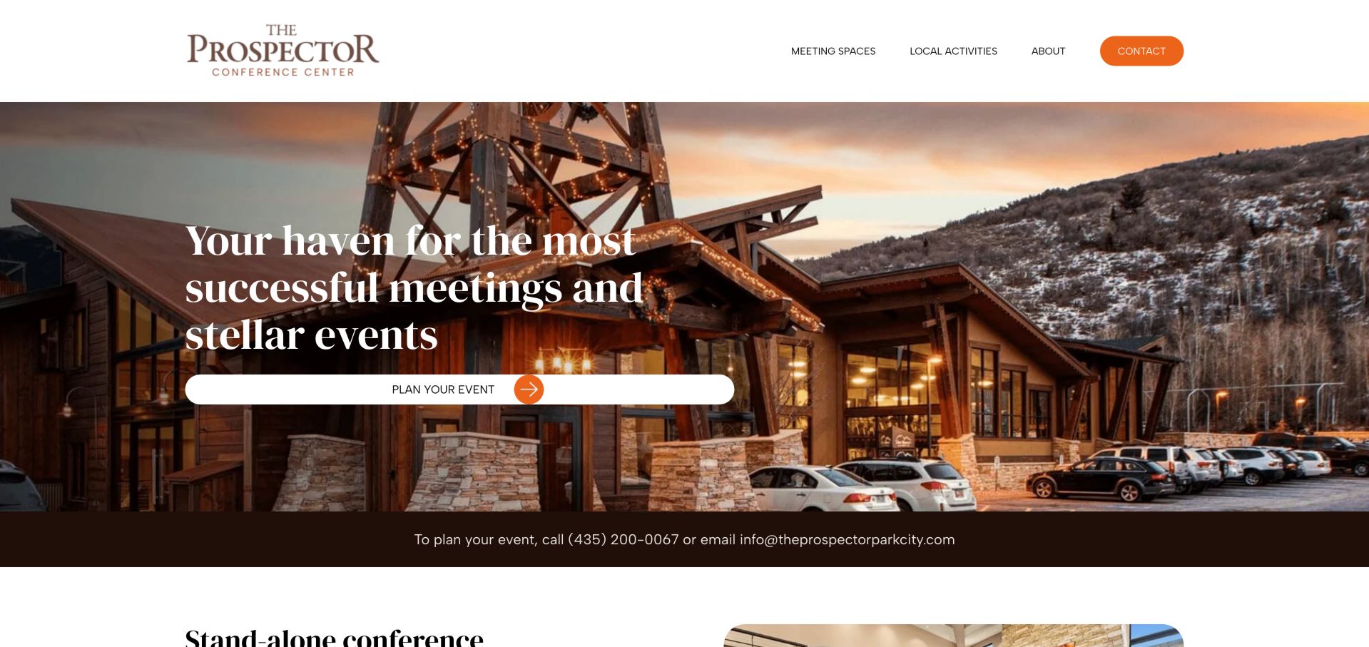
Prospector pairs a dusk photograph of its timber building with a restrained white header and an unmistakable contact button. The page moves from atmosphere into meeting spaces, the theater and outdoor options rather than treating the venue as one undifferentiated room. Local activities give a planner useful destination context. The structure is easy to borrow, although placeholder footer destinations and a malformed telephone link undermine the otherwise direct contact experience. The orange contact control remains distinct from the quieter meeting-space and local-activity links, giving the atmospheric opening a practical next step.
What you can learn
Give each genuinely different space its own route and keep destination context nearby. Test every permanent footer and phone link before adding more promotional content.
Pros
Distinct indoor, outdoor and theater routes
Location atmosphere and contact details work together
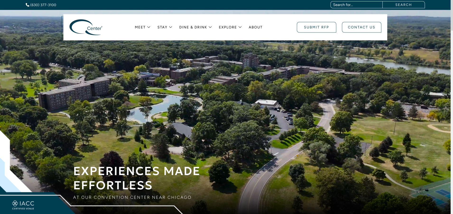
Q Center organizes the whole residential event around Meet, Stay, Dine & Drink and Explore. Its aerial campus imagery explains the setting while the floating white navigation keeps proposal and contact routes separate from discovery. Packages, lodging information and a virtual tour support a longer planning cycle. The video initially appeared black during inspection before loading, illustrating why this kind of presentation needs a useful static fallback.
What you can learn
Model the stay as a sequence of linked decisions rather than a single sales page. Keep navigation and a representative image usable while rich media loads.
Pros
Meeting, lodging and dining have distinct routes
Proposal and contact links remain easy to identify
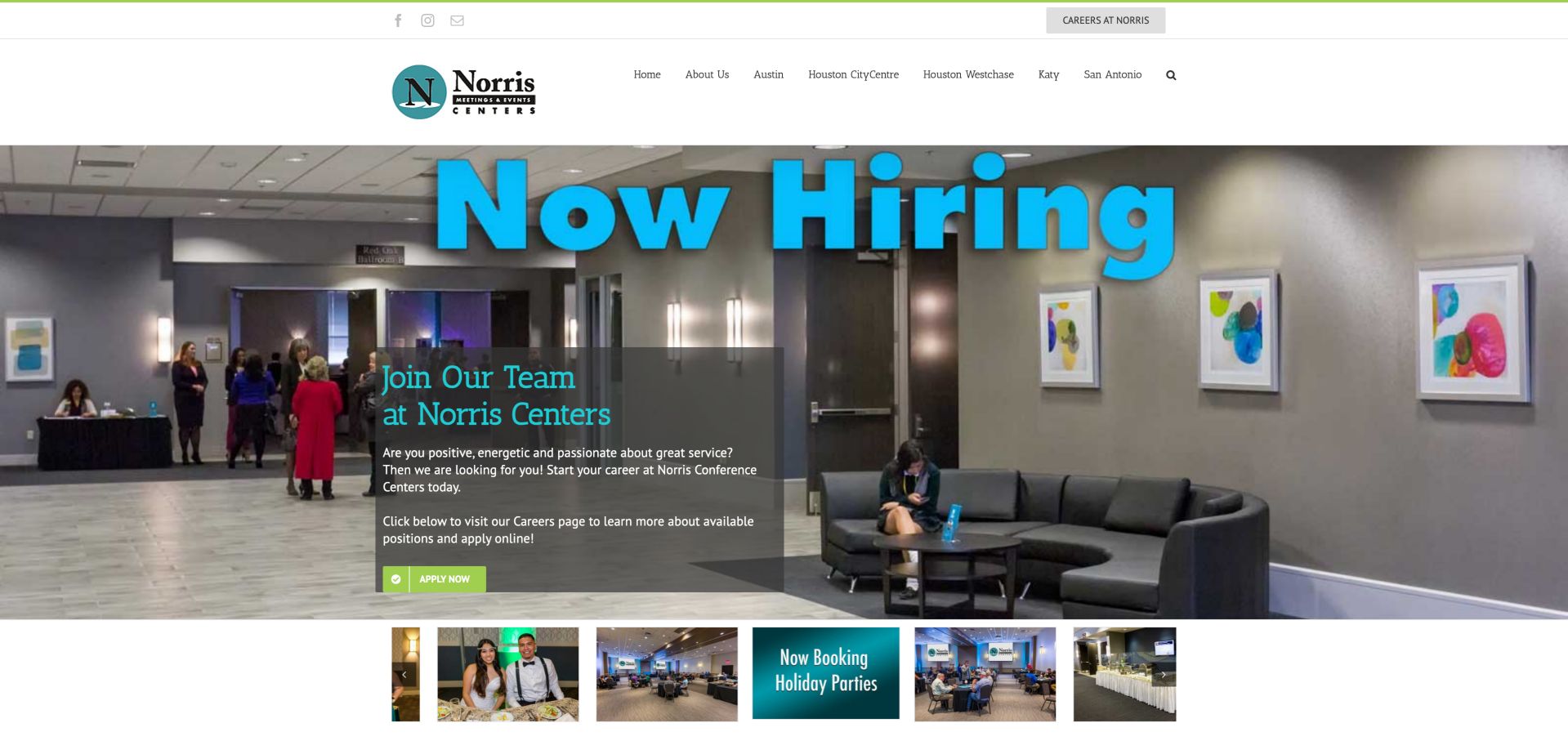
Norris puts its Texas locations directly into the primary navigation, which helps a planner choose the correct facility before comparing rooms. Availability, directions and telephone options sit alongside a substantial gallery and service information. The availability copy usefully distinguishes a request from a confirmed reservation. A hiring campaign occupied the large carousel during inspection, competing with the core meeting task, and older news remained visible farther down.
What you can learn
For a multi-location venue business, identify the city before collecting event details. Keep recruitment and expired campaigns from displacing the information planners need first.
Pros
Locations are explicit in the main navigation
Availability request is not presented as a booking
Cons & considerations
Hiring slide competes with the event-planning message
Older news and seasonal promotions require maintenance
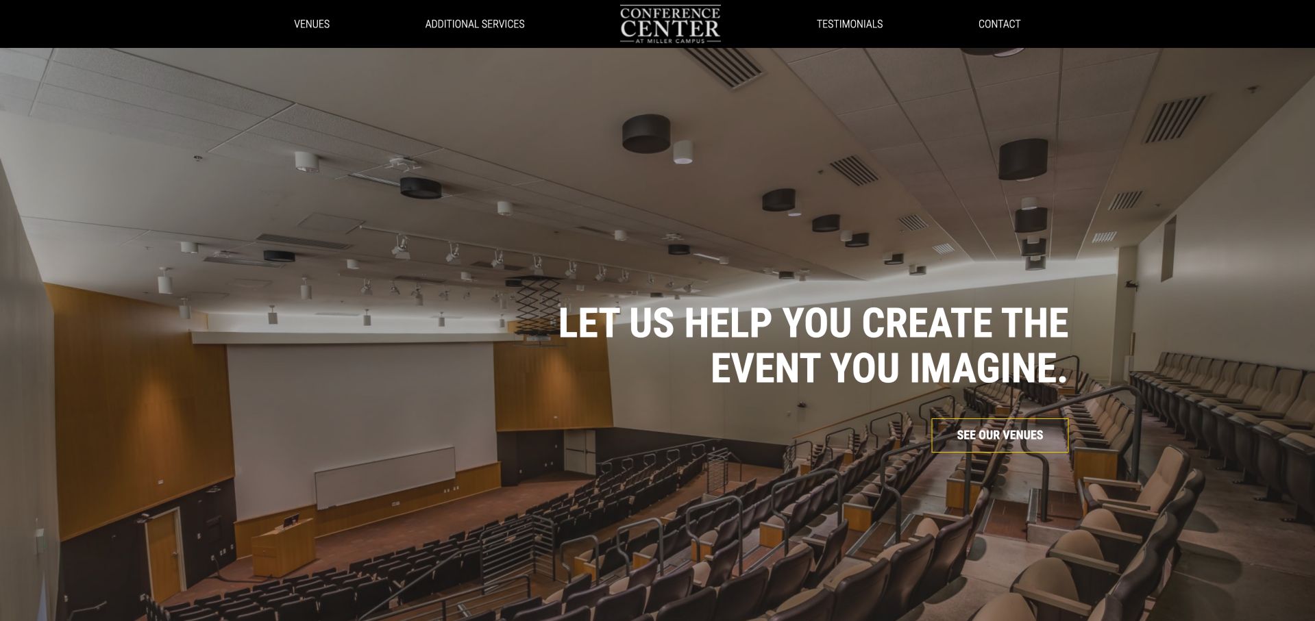
Miller uses a full-width auditorium photograph, a dark navigation bar and a direct route into its venues. The content distinguishes the campus buildings and their classroom, conference and auditorium uses, then connects them with catering, equipment and event-support information. This is a practical alternative to a video-heavy convention homepage. More descriptive image labels and a closer connection between room photos and layout capacities would make comparison easier.
What you can learn
A simple venue index can outperform a cinematic homepage when buyers need to distinguish buildings and room types. Attach configuration information to the images that introduce each space.
Pros
Different campus venue types are explained
Services support the space-selection journey
Cons & considerations
Some images and links have limited descriptive labeling
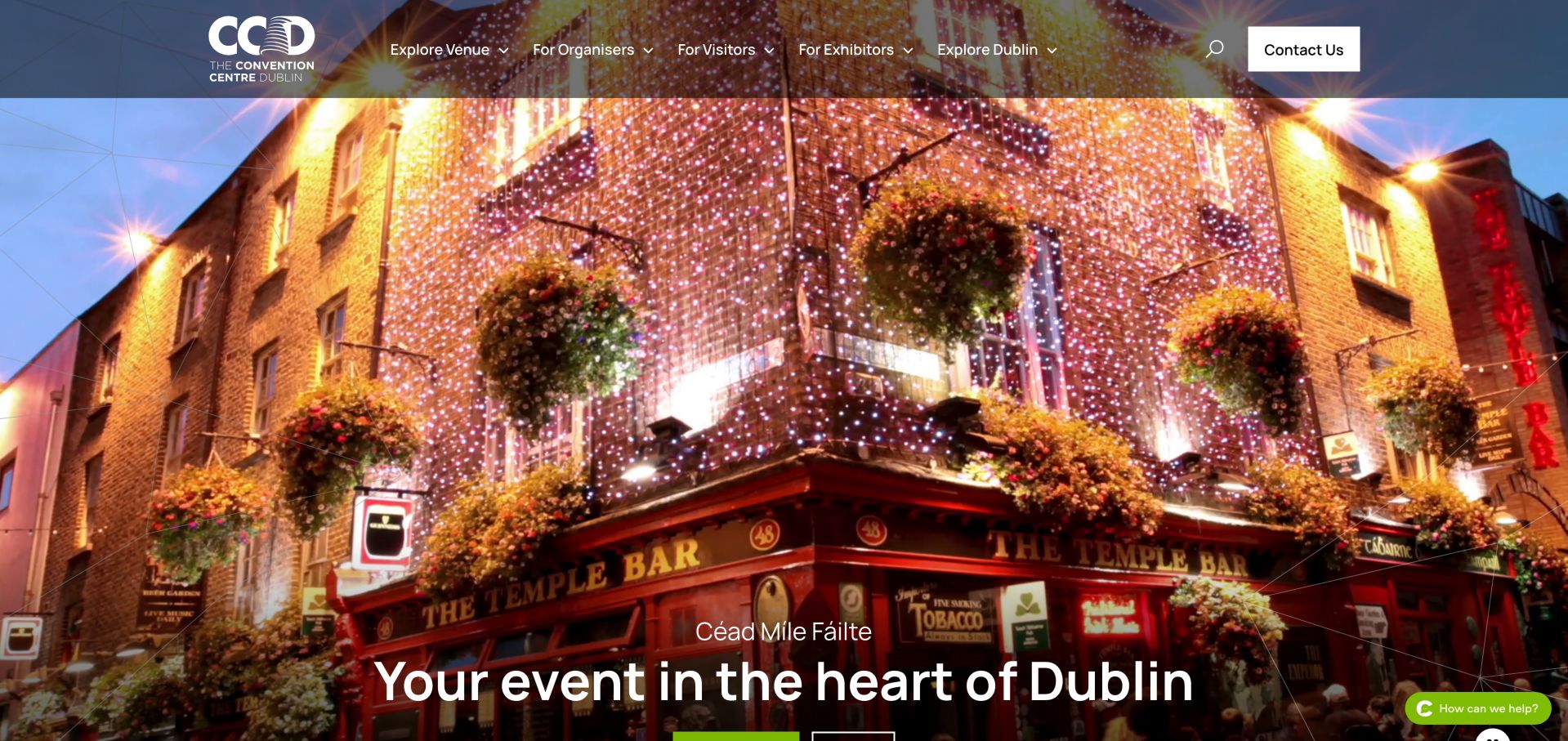
The CCD combines Dublin destination imagery with separate routes for organisers, visitors and exhibitors. A room finder, capacity chart and floor plans turn the visual introduction into practical planning material, while travel, hotels and local dining support attendance. The broad opening image makes the city memorable, but the actionable details sit farther down. Animated statistics initially read as zero in the inspected page, so essential facts should not depend on a counter animation.
What you can learn
Separate people choosing a venue from people arriving for an event. Make capacities and plans available as ordinary readable content even when animated presentation is enabled.
Pros
Distinct organiser, visitor and exhibitor journeys
Room finder and planning documents support comparison
Cons & considerations
Large visual opening delays detailed planning content
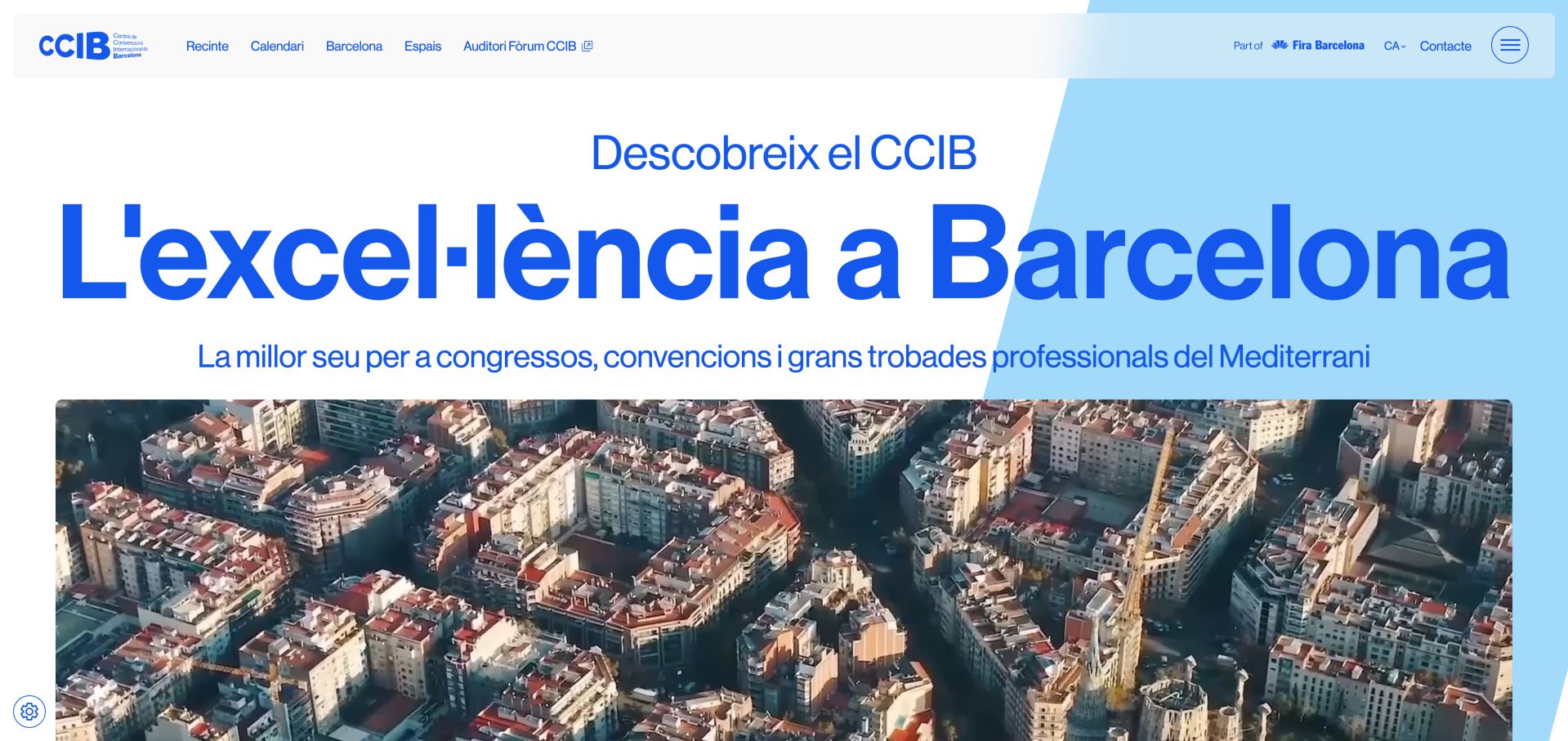
CCIB uses oversized blue typography and Barcelona imagery to connect the building with its setting. The navigation leads into spaces, the calendar and city information, while production, audiovisual, IT, furniture and signage services receive their own treatment. That breadth helps a planner understand what must be coordinated beyond the room. The inspected English entry redirected to Catalan, so international language routing deserves as much care as the visual identity.
What you can learn
Show production responsibilities as clearly as room options. For an international venue, test language destinations directly instead of assuming that a language label guarantees translated content.
Pros
Production and supporting services are clearly differentiated
Venue, events and destination information share a coherent structure
Cons & considerations
Requested English route redirected to Catalan during inspection
Large imagery and typography postpone detailed specifications
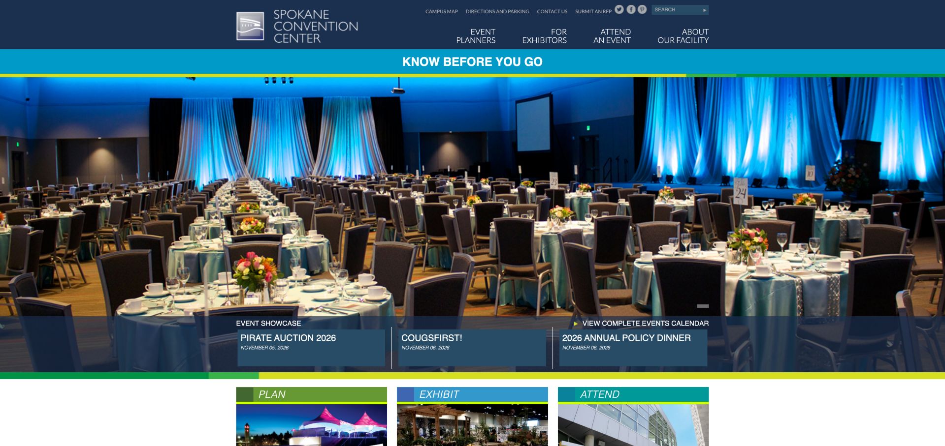
Spokane separates planning, exhibiting and attending, then supports those paths with a campus map, directions and planning resources. A fully set banquet image demonstrates a real configuration rather than relying only on an empty building. Event dates and visitor information keep the site useful after the venue has been selected. The amount of small navigation text and some generic icon links make the information architecture stronger than parts of its accessible labeling.
What you can learn
Keep the website useful throughout an event lifecycle. Give each role the maps, dates and operational information it needs, and make icon links understandable without their visual symbols.
Pros
Role-specific navigation serves different stages of an event
Campus maps and dated events support practical use
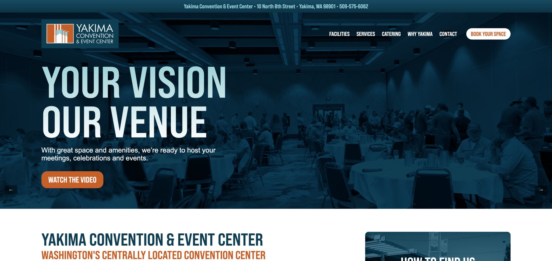
Yakima overlays a real banquet-room photograph with a strong teal identity and contrasting video and booking actions. Facilities, services and catering are easy to distinguish, and the regional map and virtual walkthrough help an out-of-town planner understand the venue. Address and telephone details are available early. The tour is useful supporting material, but it should not become the only way to learn a room's dimensions, access or suitability.
What you can learn
Use a virtual tour to complement a written venue specification, not replace it. Pair destination context with clear contact details and explain what a booking action actually initiates.
Pros
Early contact details reduce location uncertainty
Map and virtual walkthrough support remote evaluation
Cons & considerations
Some carousel controls lack descriptive names
Room specifications require more exploration than the hero actions
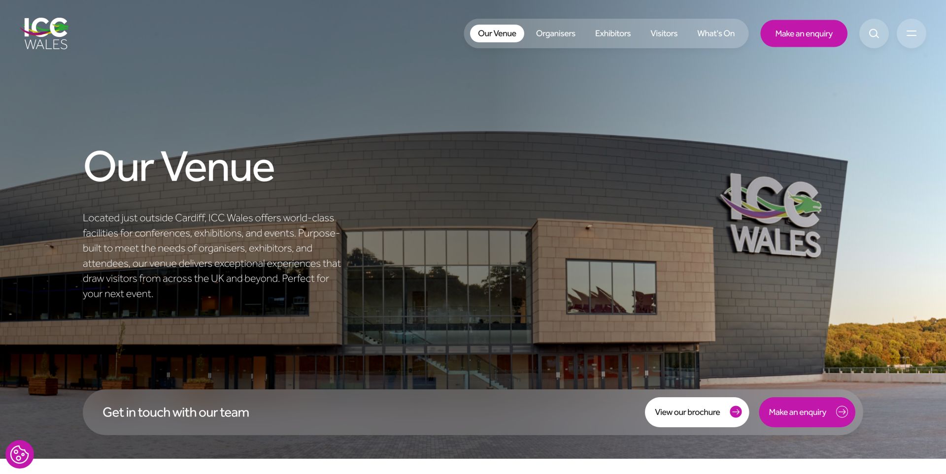
ICC Wales makes Organise your event and Plan your visit visually distinct with magenta and yellow buttons on its homepage. Its separate venue overview, shown here, follows a clear exterior photograph with space tabs, room descriptions and production details. The main-hall information distinguishes floor area, divisibility and vehicle access, while the auditorium description explains fixed seating and stage-level loading. These are useful planning distinctions rather than interchangeable headline capacities. The audience navigation remains available across both views. Seasonal entertainment adds substantial homepage length, and the soft opening media observed there makes the sharper venue overview more useful for understanding the building.
What you can learn
Use contrasting calls to action when two audiences have genuinely different jobs. Protect the permanent space and travel routes when a seasonal event campaign expands.
Pros
Organiser and visitor actions are immediately distinct
Space and travel information support both audiences
Cons & considerations
Seasonal entertainment adds considerable homepage length
The homepage background remained soft during review; the selected capture shows the separate venue overview
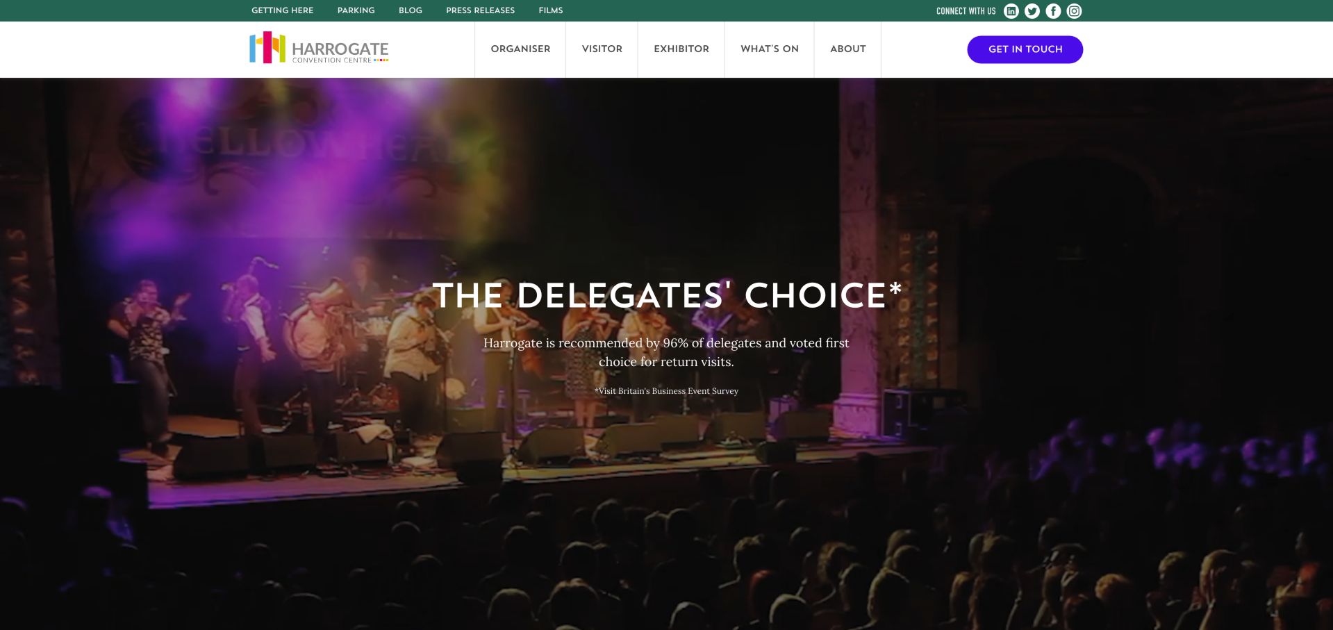
Harrogate places getting-here and parking information in a utility strip above its organiser, visitor and exhibitor navigation. Deeper routes distinguish capacities, event services, deliveries and accessibility rather than giving every audience the same generic brochure. Upcoming listings identify dates and event context. The opening survey-led message includes a source attribution, but the large image and extensive menus still leave practical comparison several steps into the site. A separate utility strip keeps immediate travel questions outside the deeper audience menus, which helps repeat visitors bypass the promotional story.
What you can learn
Put operational questions into the correct audience pathway and retain travel links globally. When using a research-led headline, show its source and keep room facts close at hand.
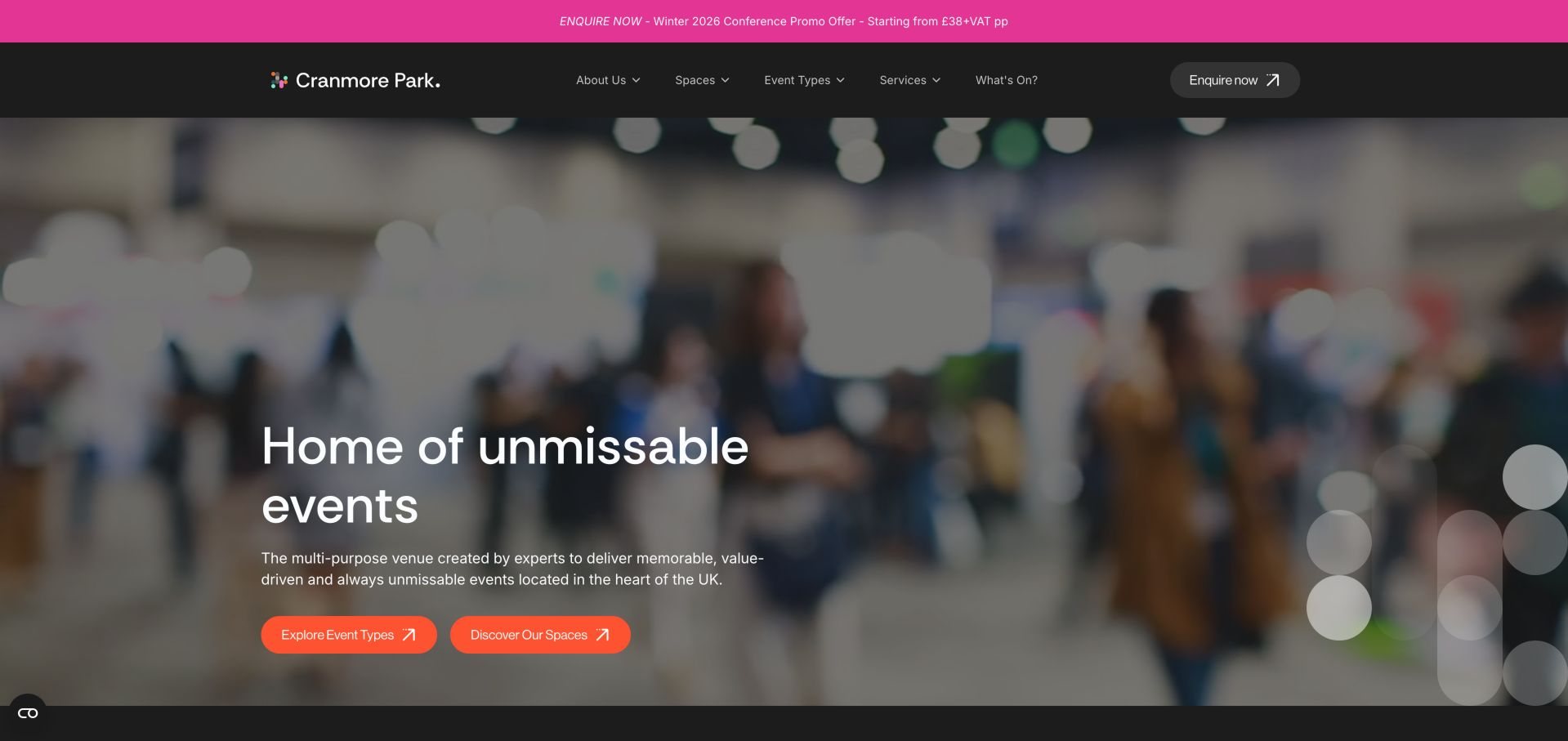
Cranmore Park provides two useful ways into the venue: the event being planned and the space that might accommodate it. Room tabs combine photographs with area and suitability information, while catering, parking and local context support the decision. Orange accents and a persistent enquiry route give the site a recognizable character. Promotional package pricing needs regular review, and the blurred opening treatment communicates less about a room than the later photographs.
What you can learn
Offer both event-type and room-based navigation when customers think in different ways. Keep package terms maintained and let actual space photography do the explanatory work.
Pros
Event types and spaces offer complementary routes
Room information combines photos and practical suitability
Cons & considerations
Blurred opening treatment reveals little about rooms
Promotional package details need date-sensitive maintenance
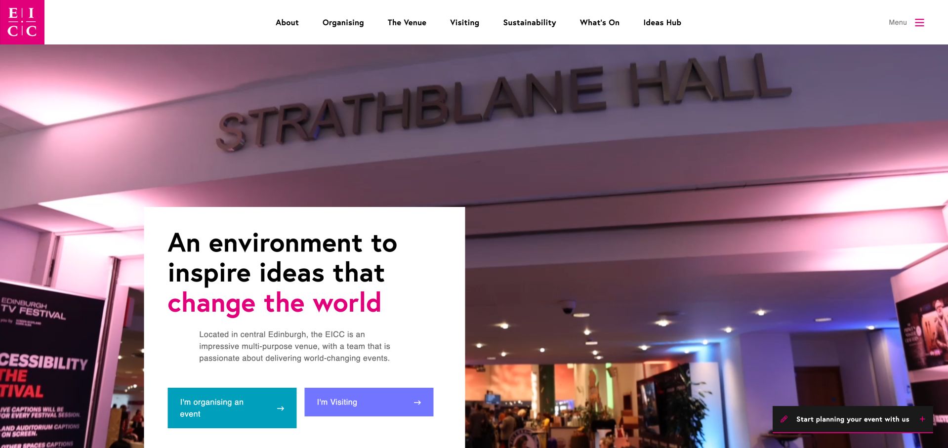
EICC contrasts organiser and visitor actions over venue photography and keeps a planning invitation nearby. The homepage connects venue information with travel guidance and an editorial layer covering inclusion, impact and sustainability topics. That structure gives a planner more to discuss than room size alone without treating those themes as independently verified outcomes. Dense navigation and some filename-like image labels make the polished visual system less consistent for nonvisual use.
What you can learn
Use editorial material to explain the venue's approach, while linking it to concrete planning resources. Do not let broad impact language substitute for documented facilities or accessible navigation.
Pros
Organiser and visitor routes are visually distinct
Travel and editorial resources add planning context
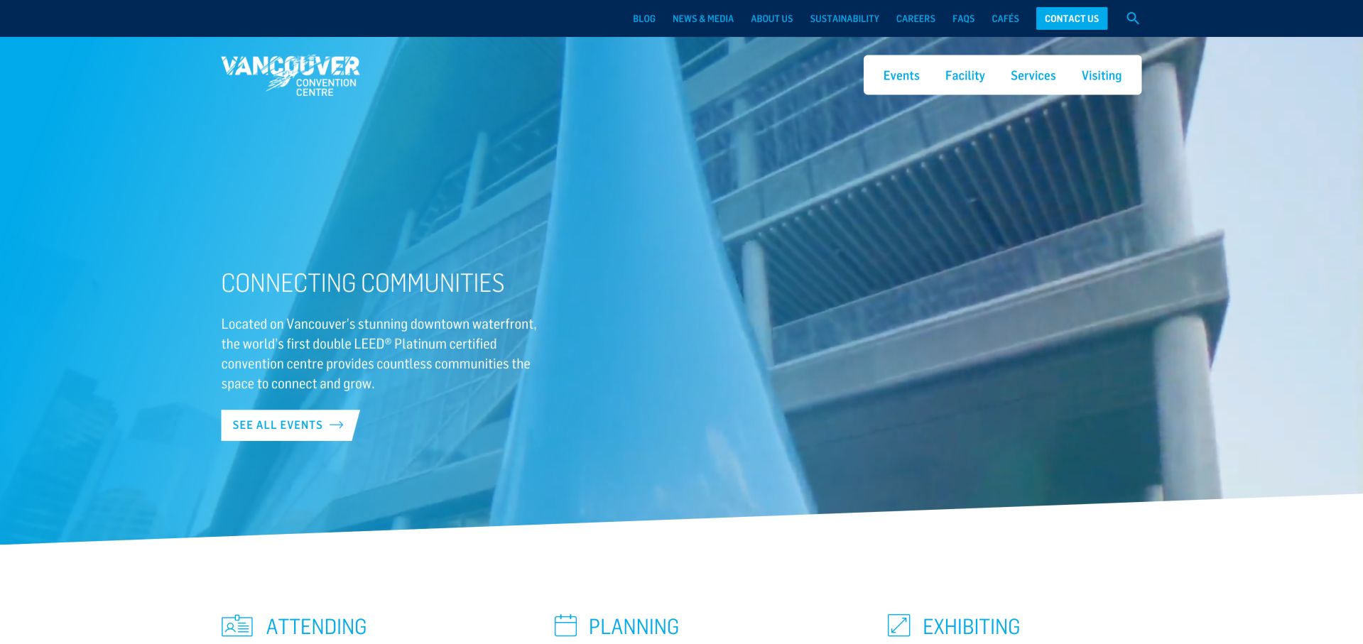
Vancouver introduces its waterfront setting with cyan accents and large Attend, Plan and Exhibit pathways. The event cards add a particularly useful operational detail: they identify the relevant building or plaza as well as the date. That helps bridge the gap between inspiration and arrival. The site also provides facility and service information, although the long news section mixes content from different years and demands ongoing editorial care.
What you can learn
For a venue with several buildings, carry the building name into every event card and arrival route. Treat a news archive differently from current planning instructions.
Pros
Event cards identify building locations
Attend, Plan and Exhibit provide clear audience routes
Cons & considerations
Long news section mixes older and newer content
Text over photographic areas needs careful contrast checks
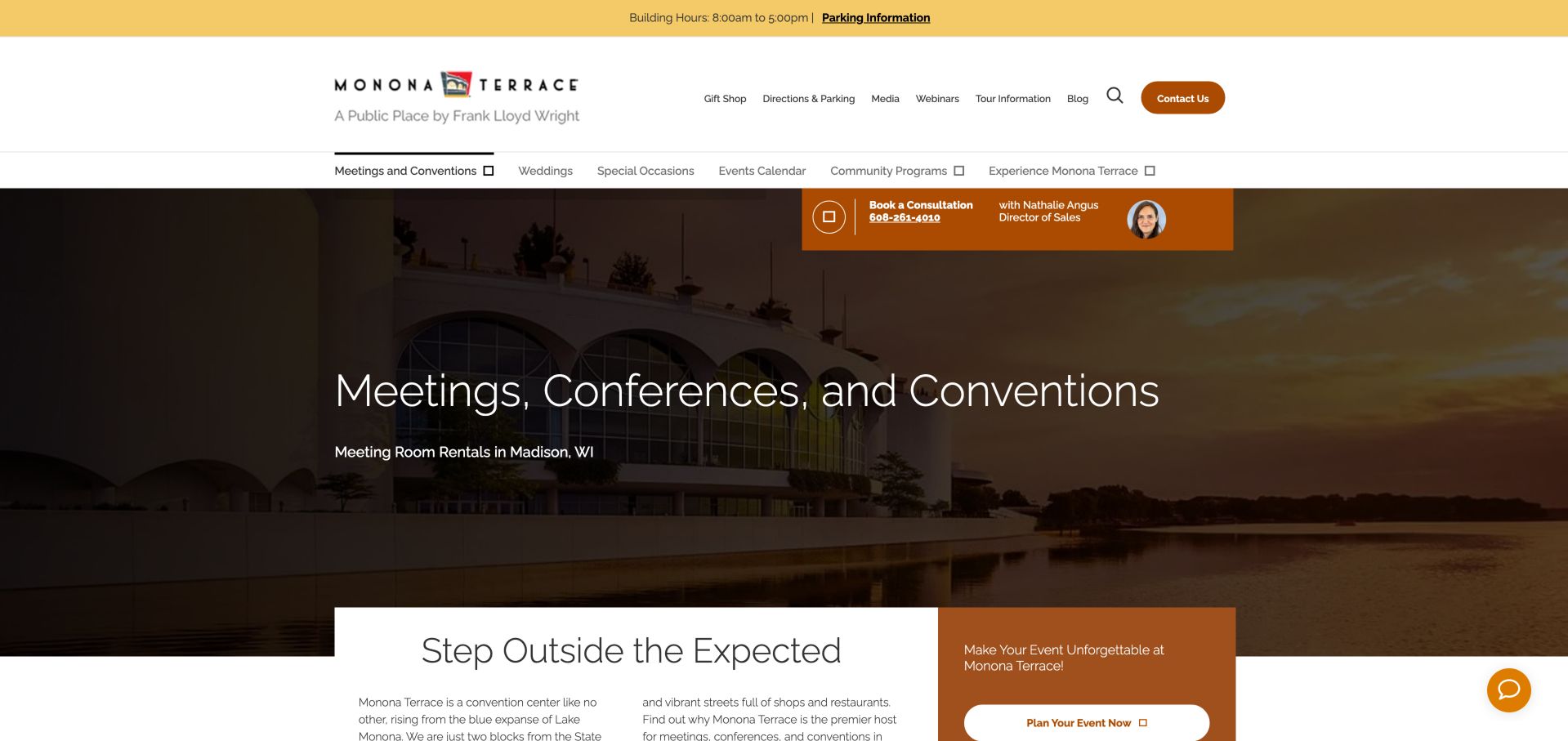
Monona Terrace's meetings page pairs warm architectural photography with a named sales contact and direct planning actions. The RFP route, brochure, spaces and audiovisual or catering information let a visitor move between self-service research and human help. The approach feels more concrete than an anonymous enquiry form. Some wedding-oriented copy appears within the meeting-space content, and several visible icon glyphs did not render cleanly during inspection.
What you can learn
A named planning contact can sit beside useful self-service resources rather than replace them. Audit shared room copy for event-type mismatches and verify that icon fonts have a readable fallback.
Pros
Named contact makes the next conversation concrete
Brochure, spaces and service resources support self-service
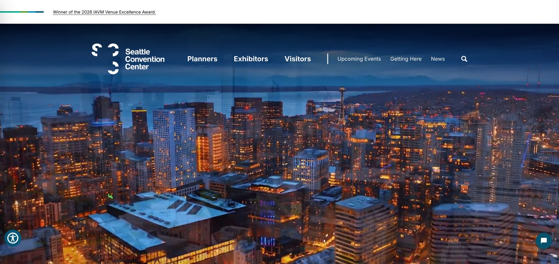
Seattle uses a city-and-building video as its opening statement, with planners, exhibitors and visitors clearly separated in the navigation. Getting-here and upcoming-event routes stay beside those roles, while the linked about content explains the Arch and Summit campus context. The opening is visually memorable but supplies little descriptive body copy in the initial page structure. It depends heavily on visitors choosing the correct navigation route.
What you can learn
A cinematic entry can establish place, but it still needs an accessible textual explanation of the venue. Preserve direct arrival and event links for people who already know why they are visiting.
Pros
Clear planner, exhibitor and visitor navigation
Travel and event routes remain prominent
Cons & considerations
Initial page structure provides little descriptive body text
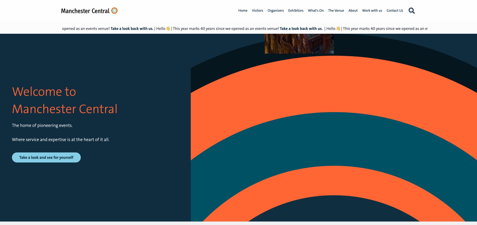
Manchester Central uses a bold coral-and-navy graphic language instead of a conventional full-room photograph in its opening. Visitor, organiser and exhibitor hubs then connect the identity to operational content, including directions, spaces and exhibitor resources. The event list keeps dates visible. A repeated anniversary ticker and several generic link labels add noise, showing why expressive design needs a careful accessibility pass. The restrained white header gives those audience links a stable setting, even while the much larger graphic panel establishes the venue identity.
What you can learn
A venue can be recognizable without making every screen a photograph. Keep the graphic identity subordinate to clear audience hubs, readable event dates and meaningful link names.
Pros
Audience hubs remain clear beneath a distinctive identity
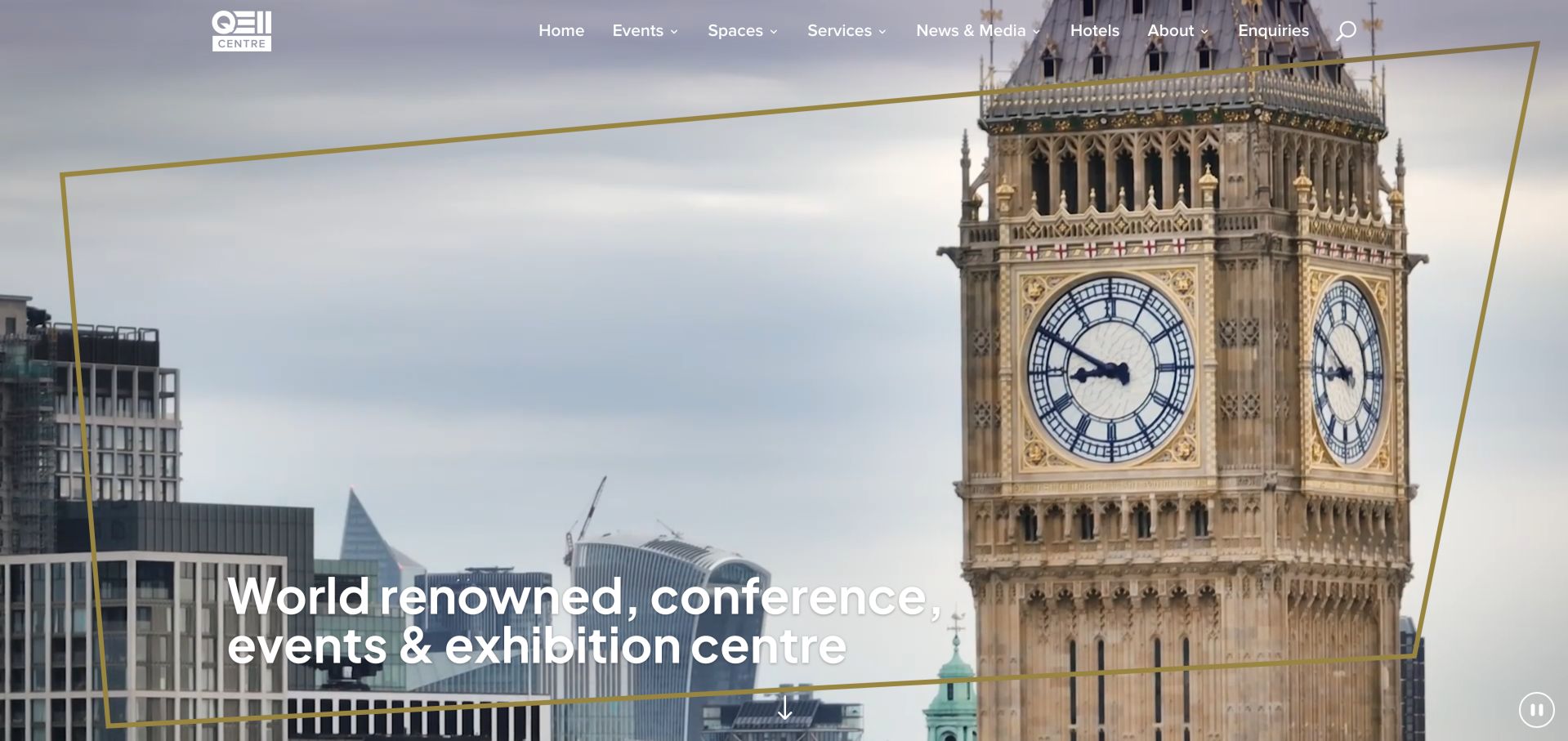
QEII combines landmark and building imagery with a gold-framed identity, then organizes spaces into broad size categories. Interactive floor plans and a virtual tour support those categories, while audiovisual, catering and IT services are treated separately. Nearby hotels and transport context help an organiser think beyond the room. The opening prestige statement is less useful for comparison than the concrete room-selection tools farther down.
What you can learn
Let location establish context, then move quickly into room-scale and service decisions. Virtual tours and floor plans work best when they reinforce a clearly named set of space categories.
Pros
Room-scale categories simplify the first comparison
Floor plans, tour and service routes support deeper planning
Cons & considerations
Broad prestige copy precedes practical room information
Some icon-like text is unclear outside its visual styling
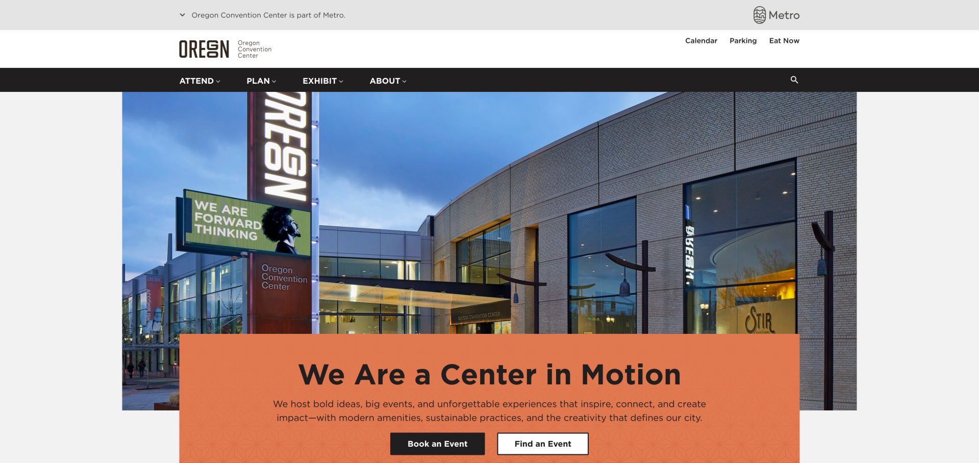
Oregon combines a building photograph with an orange headline card and distinct booking and event-finding actions. The public ownership strip and role-based navigation make the institution recognizable, while parking, food, accessibility, wayfinding and cashless information address real arrival questions. This is especially useful after an event is sold. The long homepage asks for careful prioritization, but its strongest pattern is keeping operational information in plain sight.
What you can learn
Treat event-day questions as first-class website tasks. Pair the sales route with current parking, accessibility, payment and wayfinding information instead of burying them in a general FAQ.
Pros
Booking and event discovery are separate actions
Practical arrival information is easy to identify
Cons & considerations
Homepage contains a large amount of competing material
Detailed policies still require navigation beyond the opening
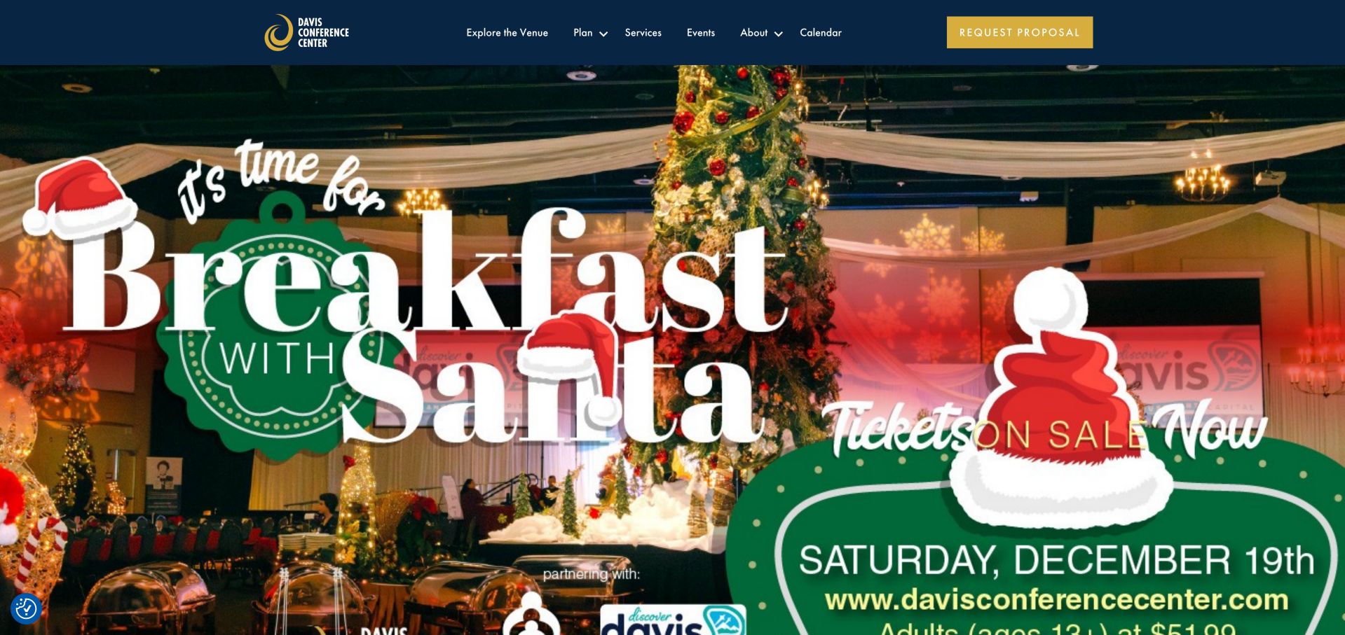
Davis provides venue, planning and attendance routes with a prominent proposal action, then supports them with a planning kit and virtual tour. The site explains its regional setting and nearby lodging context. During inspection, however, a large seasonal Santa promotion occupied the first screen, so the permanent conference proposition arrived later. Room totals also differed between homepage and FAQ copy, a reminder to centralize operational facts.
What you can learn
Keep a stable conference introduction above seasonal promotions. Maintain room counts and facility facts in one source so the homepage, FAQ and downloadable materials do not contradict one another.
Pros
Proposal action and planning kit give buyers next steps
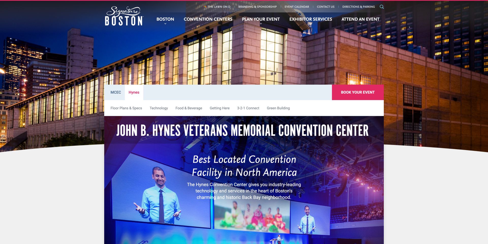
The Hynes page sits within Signature Boston but gives the venue its own planning navigation. Floor plans, specifications, technology, food and travel information are distinct, and a space finder lets planners think by capacity and seating style. Connected hotel and shopping context supports the destination decision. The many navigation layers are a tradeoff, and generic photograph labels make some of the detailed presentation less useful to assistive technology.
What you can learn
A shared destination brand should not hide each venue's specifications. Give the individual venue a compact planning index and make capacity tools use the same configuration terms as its documents.
Pros
Venue-specific plans and service information remain distinct
Space finder supports capacity and seating-style comparison
Cons & considerations
Several layers of navigation increase scanning effort
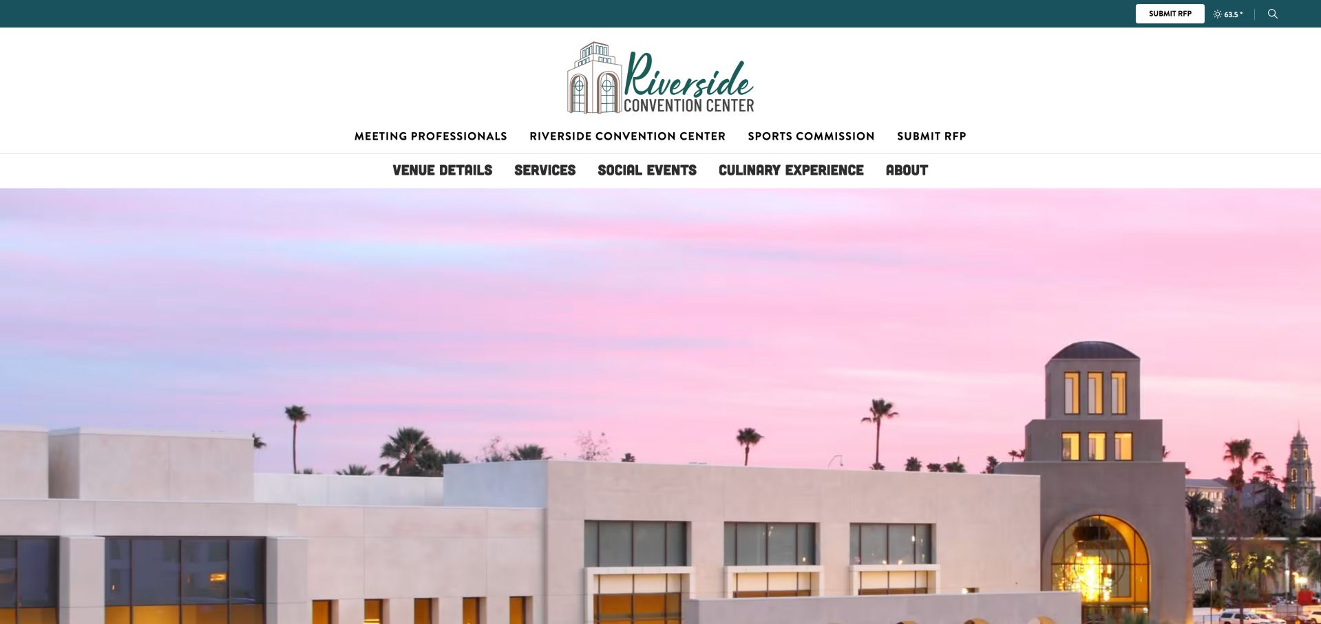
Riverside's venue-details page gives floor plans, safety and parking, a virtual tour and facility guidelines separate cards. The shared destination navigation and venue subnavigation make its relationship to the wider visitor bureau clear. Real building photographs provide a useful visual introduction, unlike the black video area initially encountered on the venue landing page. The repeated generic image labels and deep header leave room to simplify the experience.
What you can learn
Make specifications and guidelines reachable without playing a promotional video. When a venue lives inside a destination site, keep its local navigation clear and avoid repeating ambiguous image links.
Pros
Plans, guidelines and virtual tour have separate routes
Venue and destination context are both visible
Cons & considerations
Main venue landing video was black during inspection
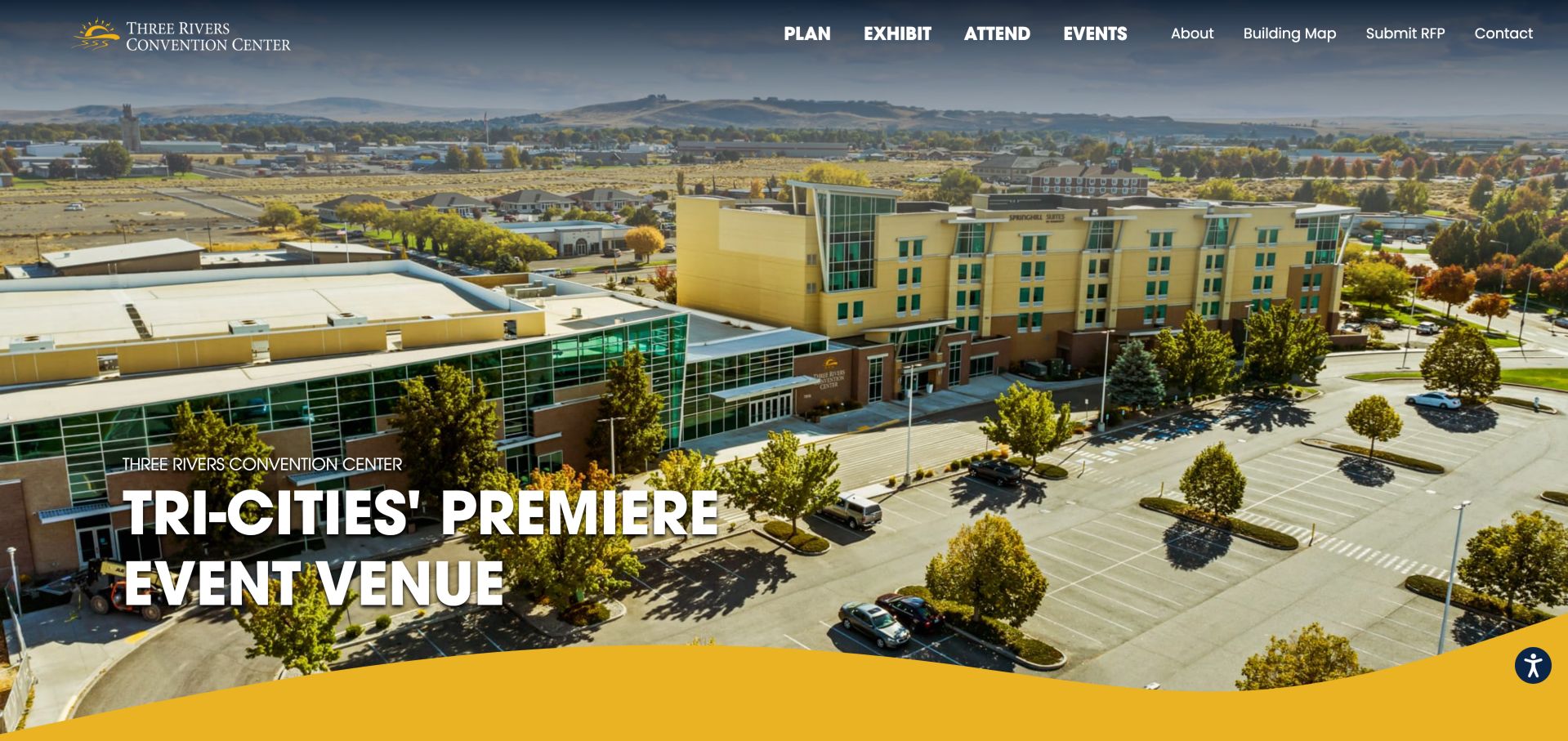
Three Rivers uses real event-space and exterior photography with a yellow wave motif that gives the site a recognizable regional identity. Plan, Exhibit and Attend routes are reinforced by event-type links, while building maps, nearby lodging and travel details support practical preparation. Dated upcoming events make the venue feel active. Some builder-generated link names remain generic, and animated counters initially exposed zero values. The building-map link sits directly in the main navigation, allowing returning attendees to find spatial information without revisiting the venue sales material.
What you can learn
Reinforce audience navigation with the event categories people actually recognize. Keep building maps and lodging near the planning journey, while ensuring animations and page-builder components preserve useful text labels.
Pros
Audience and event-type navigation complement each other
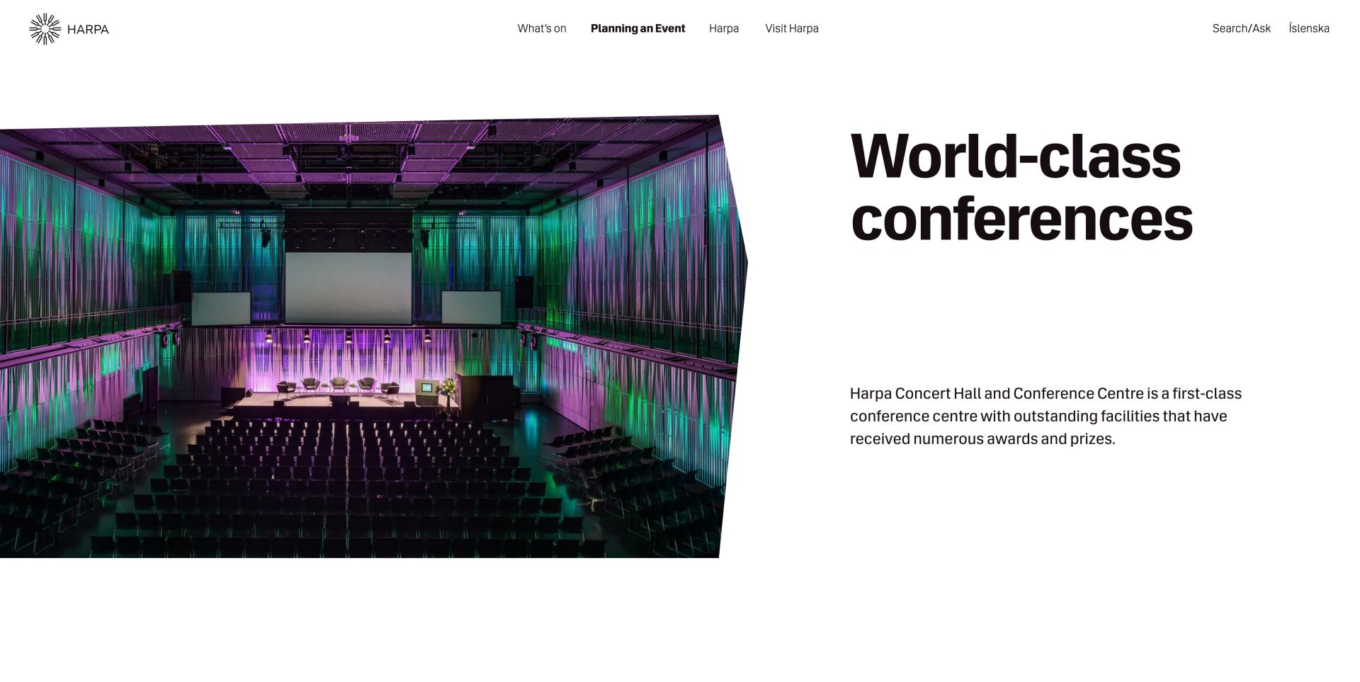
Harpa's conference page places a large hall photograph beside bold, uncluttered typography, then introduces named rooms with individual images and uses. Floor plans, terms, sustainability resources and named conference contacts provide useful supporting routes. It successfully distinguishes conference use within a cultural venue. Repeated animated link text and an Icelandic button on the English page weaken the otherwise clear international presentation.
What you can learn
A cultural venue can explain conference suitability without losing its character. Name the rooms, show their different configurations and audit translated controls as carefully as the main prose.
Pros
Named rooms pair images with distinct uses
Plans, terms and named contacts support further evaluation
Cons & considerations
Repeated link text creates noise in the page structure
Some controls remain Icelandic on the English page
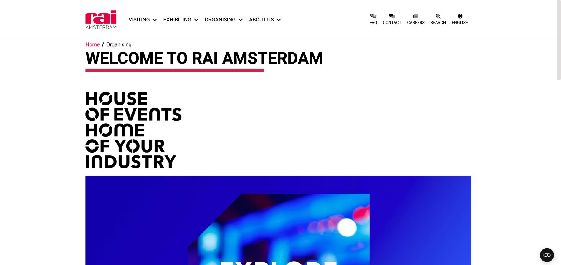
RAI's organiser page uses strong red branding, a breadcrumb and a generous typographic introduction rather than squeezing every audience into one screen. Visiting, Exhibiting and Organising remain distinct in the global navigation, while the body explains Amsterdam's destination context and the venue's event role. Practical contact and directions links remain available. The page is more persuasive introduction than room-comparison tool, and several image descriptions resemble internal filenames.
What you can learn
Give organisers an introduction written for their decision, but connect it promptly to specifications and contact options. Descriptive image text should explain what a planner can learn, not expose an asset filename.
Kegan is a freelance web designer and developer with 15+ years of experience helping businesses turn complicated website requirements into clear, maintainable digital experiences. He works directly with clients from planning and design through development, launch, and ongoing support.
For conference center website design, his development approach focuses on room and capacity comparisons, accessible venue information, event-planning resources, and clear availability or booking inquiries. The scope can be a targeted improvement or a complete custom build, with responsive layouts, thoughtful content structure, and integrations chosen around the people using and maintaining the site.
Show 3 other conference center website designersHide other conference center website designers
Plan a conference center website around the event lifecycle
Inventory audiences and responsibilities
List the decisions made by organisers, exhibitors, delegates and suppliers. Identify which team owns each answer. Keep public guidance separate from event-specific instructions that require an organiser's approval.
Create one room-information source
Maintain dimensions, layout capacities, access restrictions, equipment and current plans as structured information. Use that source across room pages, comparison tools and documents so a changed configuration does not leave contradictory numbers online.
Connect photographs to configurations
Label whether an image shows a banquet, classroom, exhibition or theater setup. Include useful views of sightlines, entrances and circulation rather than only decorative details. Explain when furniture or production equipment is optional.
Design a proportionate enquiry
Ask initially for event type, date range, expected attendance and essential space needs. Explain the response process and provide a human contact. Do not require a complete production specification simply to ask whether the venue might fit.
Publish arrival and exhibitor guidance
Separate public entrances from loading access and identify the relevant building on event listings. Provide transport, parking and accessibility information in ordinary web content, with downloadable documents as a supplement rather than the only route.
Assign update and expiry owners
Give each room specification, price sheet, campaign and event listing an owner. Review seasonal promotions, outdated news and downloaded plans regularly. Test the same tasks on mobile and keyboard without submitting a real enquiry or booking.
The editing job behind the design
Choose systems around reliable venue information
The central requirement is dependable structured content, not a particular visual framework. A venue with several buildings benefits from shared room, event and location records. Booking or sales systems should only expose availability when the operational process supports that promise. Otherwise, a well-explained proposal request is more honest and useful.
Virtual tours, video and interactive floor plans can help remote evaluation, but they need readable fallbacks and clear loading behavior. Keep the room facts, contact route and arrival instructions available without rich media. Public technology observations describe visible evidence, not the venue's complete internal booking or event-management systems.
Our WordPress website examples offer a separate look at publishing approaches. A visible platform label is evidence for that named page, not a guarantee that the same system will suit your requirements.
Before the public launch
Conference center website planning checklist
Give planners, exhibitors and attendees distinct routes.
Identify the city, venue and relevant building clearly.
Publish capacity by configuration rather than only a headline total.
Keep room dimensions, photographs and plans consistent.
Explain included and optional equipment or services.
Label enquiries and proposal requests accurately.
Provide a named team or clear contact route.
Show event dates and building or entrance information together.
Separate attendee arrival from loading and supplier access.
Publish practical accessibility information without unsupported guarantees.
Give video and interactive tools useful static alternatives.
Review seasonal campaigns, rate sheets and downloadable plans for expiry.
These checks are a project checklist, not a performance, legal, security, or accessibility certification. Test real journeys with the people responsible for the website before making claims about the result.
Sources & editorial method
How this collection was selected and reviewed
The examples were inspected directly on their public websites and captured for editorial review on November 6, 2026 UTC. Reviews focus on observable navigation, room discovery, planning resources and arrival information. We did not submit enquiries, place bookings or verify venue service outcomes. Capacities, pricing, policies and event dates can change. Editors Choice is a researched editorial design selection, not a venue-service endorsement or a vote-derived award.
Each example links to its actual source page. Screenshots are direct browser captures with their own capture dates; moving imagery, announcements and live designs can change. The notes describe observable design choices and conditional tradeoffs, not measured traffic, conversion results, service quality, or accessibility conformance.
Technology labels use public page metadata, asset evidence, or explicitly cited platform documentation. Platform documentation is not a complete current deployment audit. A component reference may be legacy or unused; it is not a complete backend inventory. Unknown stacks are omitted. These sites are editorial examples, not our client portfolio.
Written, Edited and Curated are separate editorial records, not timestamps advanced by a rebuild. Website designs and imagery belong to their owners. See our editorial standards or suggest a correction.
Questions worth asking
Conference Center website design questions
What should a conference venue homepage prioritize?
Identify the venue and location, then help people choose the right audience route. Planners need spaces and proposal information, exhibitors need operational resources, and attendees need events and travel. A strong photograph can establish character, but it should not be the only explanation.
Should visitors be able to book a conference room instantly?
Only when the system and operating process can reliably confirm the requested room, date, configuration and services. Many events require coordination. In that case, an enquiry or proposal request with a clear response process is more appropriate than a button that implies an immediate reservation.
Are downloadable floor plans enough?
They are useful supporting material, but key information should also be readable on the website. Provide room names, dimensions, configurations, capacities and access notes in a format that works on mobile and with assistive technology. Keep downloads synchronized with the same source.
How should a multi-building venue present events?
Include the building or campus area beside the event date and title, then connect it to the correct entrance and travel information. Do not make an attendee interpret an entire campus map just to learn which building hosts their event.
How much destination content belongs on a venue site?
Enough to support the decision and the visit. Nearby lodging, transport and relevant local context help, especially for multi-day events. Keep that content connected to practical planning rather than letting a travel magazine displace room specifications or contact information.
A good conference center website reduces uncertainty at every stage. Make the spaces comparable, the next step honest and the arrival details dependable, then use photography and destination storytelling to show what makes the venue distinctive.