A useful contact form begins before the first field. People need to know which team, location, product, or service they are contacting and what the submission will actually accomplish.
Contact Form 7 is a WordPress form plugin with editable form templates, mail configuration, messages, and integrations. Its official documentation explains that JavaScript and styles can load across pages by default. A detected plugin resource therefore supports a public-page association, not proof that a particular visible booking, checkout, newsletter, or contact control uses the plugin.
The examples below examine that surrounding experience: a newsroom versus product support, a local service inquiry versus a confirmed appointment, and a general hotel question versus a reservation. The recommendations describe what to implement and test in your own form. No live forms were submitted to evaluate these references.
Before the examples
What makes good Contact Form 7 website development in 2026?
Clarify the destination before requesting information
Name the request type, responsible team, and relevant location or product. Provide a useful alternative for visitors who chose the wrong route. A short, well-routed inquiry is more useful than a universal form that asks everyone for every possible detail.
Contact Form 7 separates the form from its mail template. Verify recipient, sender, subject, reply handling, and message content in an authorized test environment. The official setup guidance calls for a sender address on the website's domain. A browser confirmation alone does not demonstrate inbox delivery.
Audit resource loading without overstating evidence
A globally loaded plugin file can appear on a page without a form. For your own site, review where the resources are required and test any loading optimization against every actual form location. Keep resource presence, initialized form behavior, mail delivery, and downstream integration as separate verification steps.
Spotify's For the Record, UC Berkeley, Sprouts Farmers Market, Bianchi, and Noma open the collection. The association is specific to each reviewed public property. It does not extend to the organization's apps, private systems, booking providers, or every related website.
We start with five recognizable brands or organizations: Spotify — For the Record, University of California, Berkeley, Sprouts Farmers Market, Bianchi, Noma. Each attribution applies to the named website property, not every product or website belonging to its organization. This is a curated reading sequence, not a measured ranking.
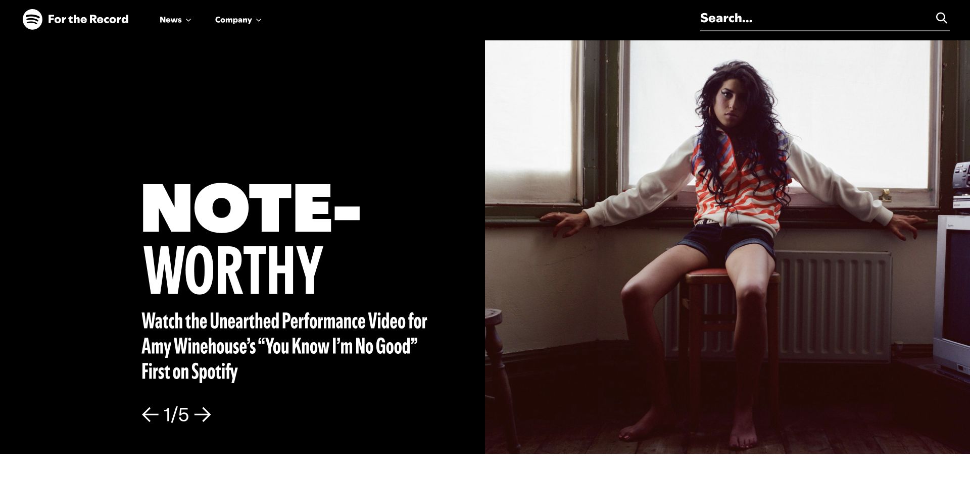
Spotify's For the Record uses a bold story headline, artist photography, and a small News/Company navigation, with search retained above the feature. The page is useful Contact Form 7 inspiration because a newsroom receives different inquiries from a consumer listening service. Contact Form 7 resources were observed on this exact public property; that does not prove a visible form uses the plugin, establish delivery to a particular team, or identify the technology behind Spotify accounts and the listening application.
What you can learn
For a comparable newsroom, distinguish media questions, company information, and consumer support before presenting fields. Explain where an inquiry goes and what kind of response is reasonable. Keep article search available so a reader can resolve a factual question without sending a message, and test delivery and failure states in an authorized staging environment rather than treating a loaded plugin file as proof that mail works.
Pros
Archive search remains available around the prominent lead story.
News and company information have recognizable separate entry points.
Cons & considerations
A rotating cover can delay someone seeking a specific announcement.
Generic contact wording could confuse press inquiries with product support.
Platform source: Dated exact public source-page audit. Linked stylesheet matches Contact Form 7. Dated public resource or code association on this exact source page; not proof that any particular visible component initializes or behaves as assumed. Platform evidence is separate from the direct website screenshot and is not a complete current infrastructure audit.
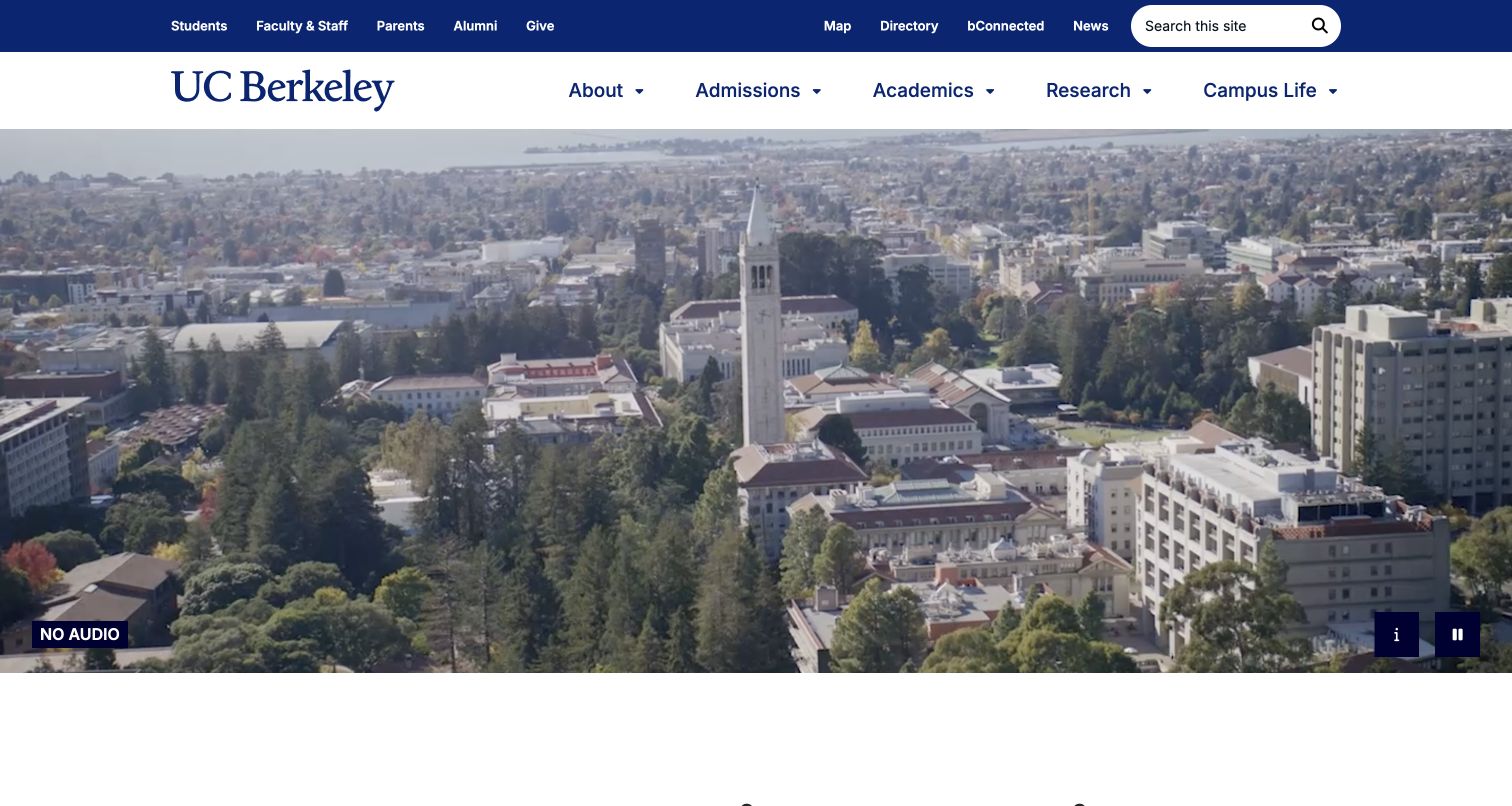
Berkeley places campus video beneath blue-and-gold navigation and separates student, staff, parent, and alumni utilities from academic sections. Pause and description controls make the media behavior more explicit, while research material follows below. For Contact Form 7 planning, the useful distinction is among audiences and responsibilities. The plugin resources on this central public property do not identify admissions software, departmental forms, student accounts, or the recipient of any inquiry. A university brand alone cannot determine which office should receive a message.
What you can learn
Offer an audience and topic directory before a general form. Explain when admissions, accessibility support, media relations, or a department is the appropriate destination, and ask only for information needed to route the request. Preserve an alternative contact route when a form cannot load. Test each configured recipient and response message separately, using approved test data and avoiding live student or applicant information.
Pros
Audience utilities reduce reliance on a single undifferentiated entrance.
Visible video controls support different ways of using the opening media.
Cons & considerations
Broad research storytelling postpones some immediate practical tasks.
An institution-wide inquiry route can obscure responsibility without explicit topics.
Platform source: Dated exact public source-page audit. Linked stylesheet matches Contact Form 7. Dated public resource or code association on this exact source page; not proof that any particular visible component initializes or behaves as assumed. Platform evidence is separate from the direct website screenshot and is not a complete current infrastructure audit.
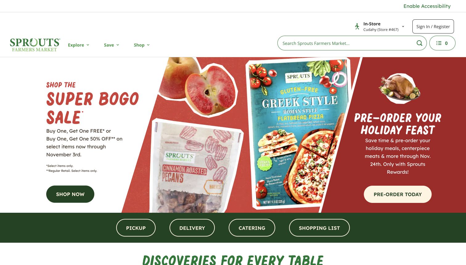
Sprouts separates pickup, delivery, catering, and shopping-list actions below a dense sale and holiday-preorder opening. Dates and membership conditions appear within the promotions, while search and store context remain in the header. This is useful Contact Form 7 planning material because an inquiry about an order depends on how and where it was placed. The observed plugin resources do not identify checkout, order management, delivery partners, or the form implementation behind any particular shopping mode on the public website.
What you can learn
For a similar contact system, establish store and request type before requesting an explanation. Distinguish a catering question from an existing delivery issue and explain whether another provider handles the latter. Keep offer conditions readable near the original promotion so visitors need not ask basic eligibility questions. Test topic changes to ensure obsolete fields and recipient rules do not survive from a different inquiry type.
Pros
Four named shopping modes communicate distinct operational journeys.
Campaign dates provide some context before a visitor opens an offer.
Cons & considerations
Several promotions compete for attention within the same opening.
Small qualifications may be missed and create avoidable support questions.
Platform source: Dated exact public source-page audit. Linked stylesheet matches Contact Form 7. Dated public resource or code association on this exact source page; not proof that any particular visible component initializes or behaves as assumed. Platform evidence is separate from the direct website screenshot and is not a complete current infrastructure audit.
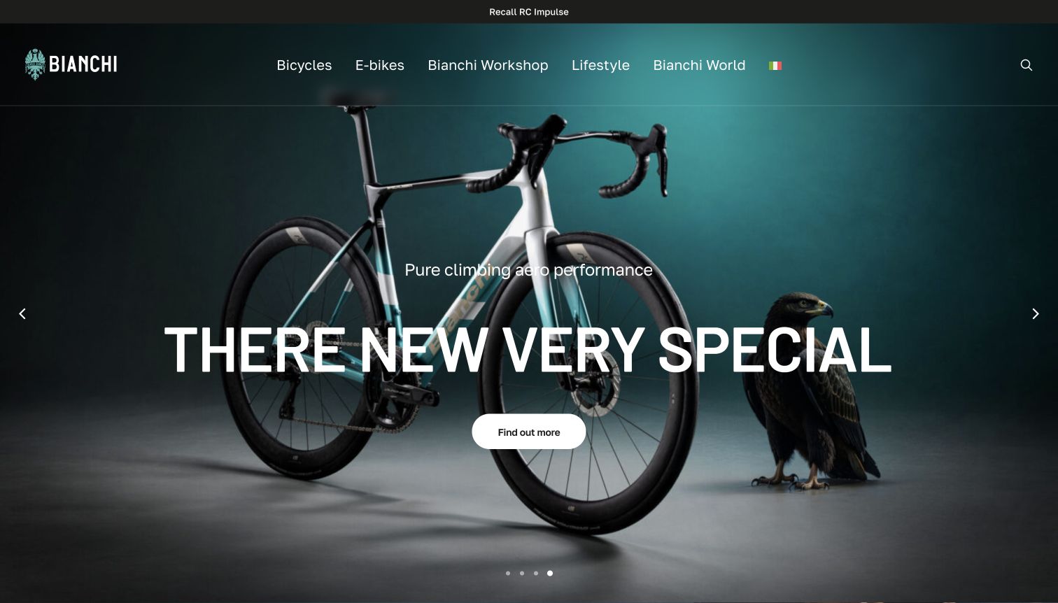
Bianchi's opening shows a complete road bicycle on dark teal, with navigation for bicycles, electric models, workshop, lifestyle, and brand stories. A recall route sits above the campaign. The genuine capture also preserves an awkward browser-translated product heading. For Contact Form 7 planning, the useful issue is accurate product context across language and service routes. The plugin association does not establish warranty processing, recall handling, dealer systems, or which actual forms are connected to this public page.
What you can learn
Separate product questions, dealer inquiries, and ownership notices before composing a general form. Preserve the exact model identifier rather than relying on automatically translated text, and make language choice explicit. If an inquiry requires a dealer, explain that destination before submission. Review a translated confirmation and an invalid model entry in staging, while retaining the recall route as a permanent task outside ordinary marketing contact.
Pros
Whole-bicycle imagery helps visitors recognize the product being discussed.
The recall link remains visible above promotional content.
Cons & considerations
Automatic translation can distort the product name used in an inquiry.
Overlaid text obscures parts of the frame and cockpit photograph.
Platform source: Dated exact public source-page audit. Linked stylesheet matches Contact Form 7. Dated public resource or code association on this exact source page; not proof that any particular visible component initializes or behaves as assumed. Platform evidence is separate from the direct website screenshot and is not a complete current infrastructure audit.
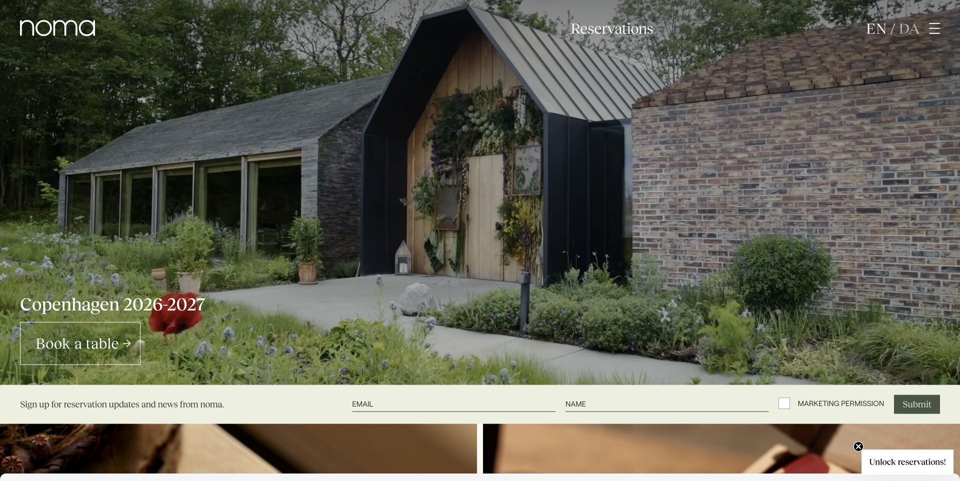
Noma's entrance photograph establishes a sense of arrival, with reservations and language choice above it and a seasonal booking message lower down. A pale newsletter strip follows the image. The separation offers useful Contact Form 7 planning lessons: a reservation request and a request for future updates require different expectations. The plugin resources observed on the public page do not identify the reservation system, show mailing-list consent behavior, or prove that the newsletter strip itself uses Contact Form 7.
What you can learn
Keep booking availability, general inquiries, and optional updates clearly distinguished. Describe what each action does before asking for an email address, and make seasonal messages reviewable content with an owner. For a comparable form, test confirmation language that accurately describes receipt rather than implying a table is reserved. Check the mailing-list integration independently; successful form submission does not by itself establish subscription or reservation success.
Pros
Reservation and language controls remain outside the changing seasonal message.
The entrance image communicates the setting of a future visit.
Cons & considerations
White controls need contrast checks against each photographic crop.
Seasonal booking and update language can become inaccurate without maintenance.
Platform source: Dated exact public source-page audit. Linked stylesheet matches Contact Form 7. Dated public resource or code association on this exact source page; not proof that any particular visible component initializes or behaves as assumed. Platform evidence is separate from the direct website screenshot and is not a complete current infrastructure audit.
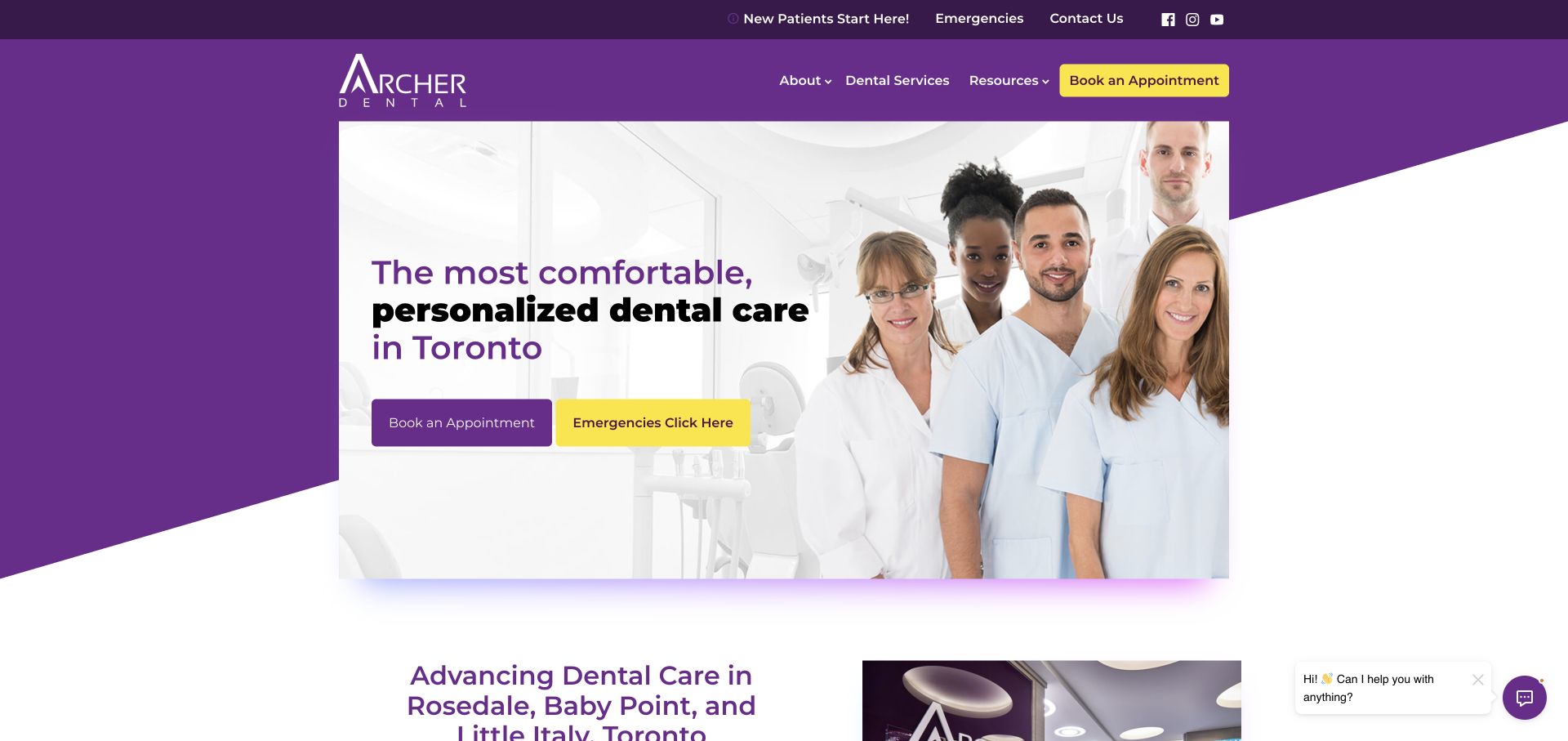
Archer Dental uses a purple diagonal frame, a clinical team portrait, and prominent yellow actions that distinguish an appointment from an emergency inquiry. A utility strip repeats contact information, with Toronto locations introduced below. For Contact Form 7 planning, the valuable pattern is the explicit difference between urgent and routine intent. Public plugin resources do not establish that either action uses the plugin, confirm appointment availability, or verify clinical triage and message handling after a visitor submits information.
What you can learn
Explain the appropriate route and response expectation before showing a form. A routine inquiry should not imply immediate clinical attention, and an emergency destination needs clear operational information outside a general inbox. For a similar implementation, request only the initial details needed for contact and location routing. Test failure messaging and the alternative telephone route without asking visitors to send unnecessary medical details through an ordinary website form.
Pros
Emergency wording is distinct from the standard appointment action.
The group portrait gives the practice a recognizable human introduction.
Cons & considerations
Repeated actions make the initial hierarchy visually busy.
Text and buttons over the portrait compete with faces and image detail.
Platform source: Dated exact public source-page audit. Linked stylesheet matches Contact Form 7. Dated public resource or code association on this exact source page; not proof that any particular visible component initializes or behaves as assumed. Platform evidence is separate from the direct website screenshot and is not a complete current infrastructure audit.
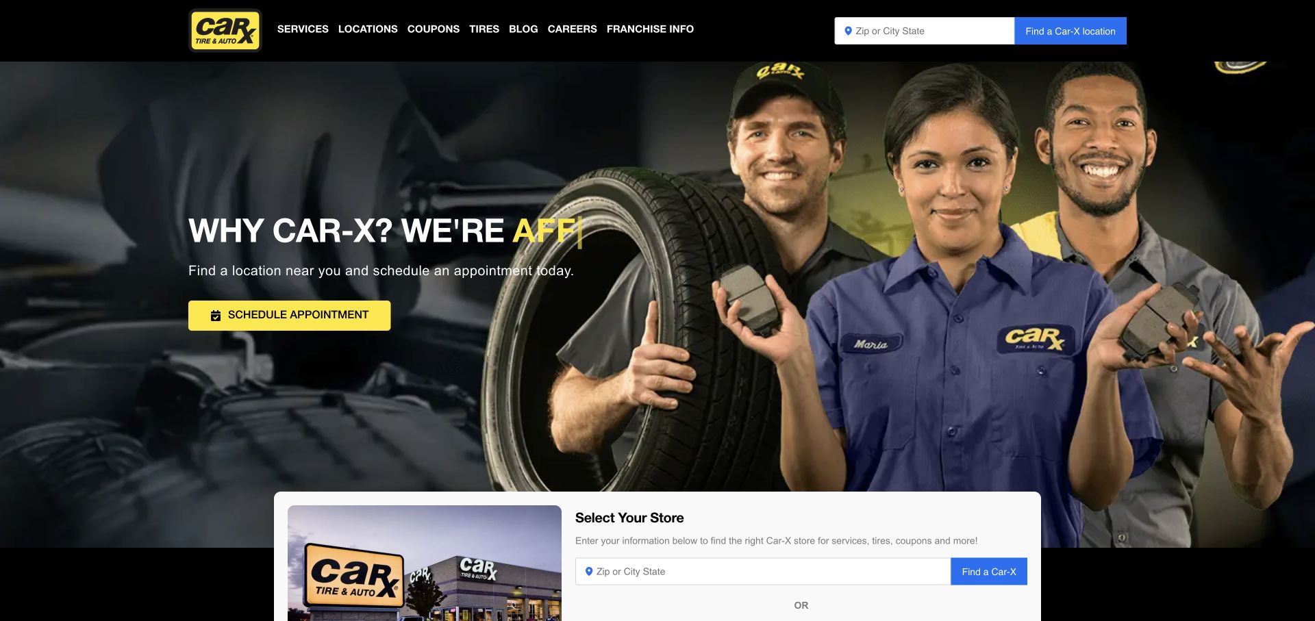
Car-X gives appointment access a yellow action over a crew photograph, with a ZIP-or-city field in the header and another store-selection panel below. Services, coupons, tires, and locations are named directly. This is useful Contact Form 7 inspiration because the selected shop determines who can answer many questions. The plugin's public resource association does not identify the appointment platform, prove that selectors synchronize, or establish which store receives a submitted message. Those are implementation details that need explicit verification.
What you can learn
Preserve the chosen store and show it again beside the inquiry action. If someone changes location, clear assumptions about services and offers that no longer apply. For a similar form, keep appointment requests distinct from confirmed bookings and explain how the shop will respond. Test recipient routing for two locations and a missing location in staging, including a failed delivery and a visitor returning from a coupon page.
Pros
Location and appointment routes appear early in the public experience.
The crew photograph makes the service brand feel concrete and human.
Cons & considerations
Repeated selectors need consistent selected-state behavior.
Changing headline fragments require a complete and readable fallback message.
Platform source: Dated exact public source-page audit. Linked stylesheet matches Contact Form 7. Dated public resource or code association on this exact source page; not proof that any particular visible component initializes or behaves as assumed. Platform evidence is separate from the direct website screenshot and is not a complete current infrastructure audit.
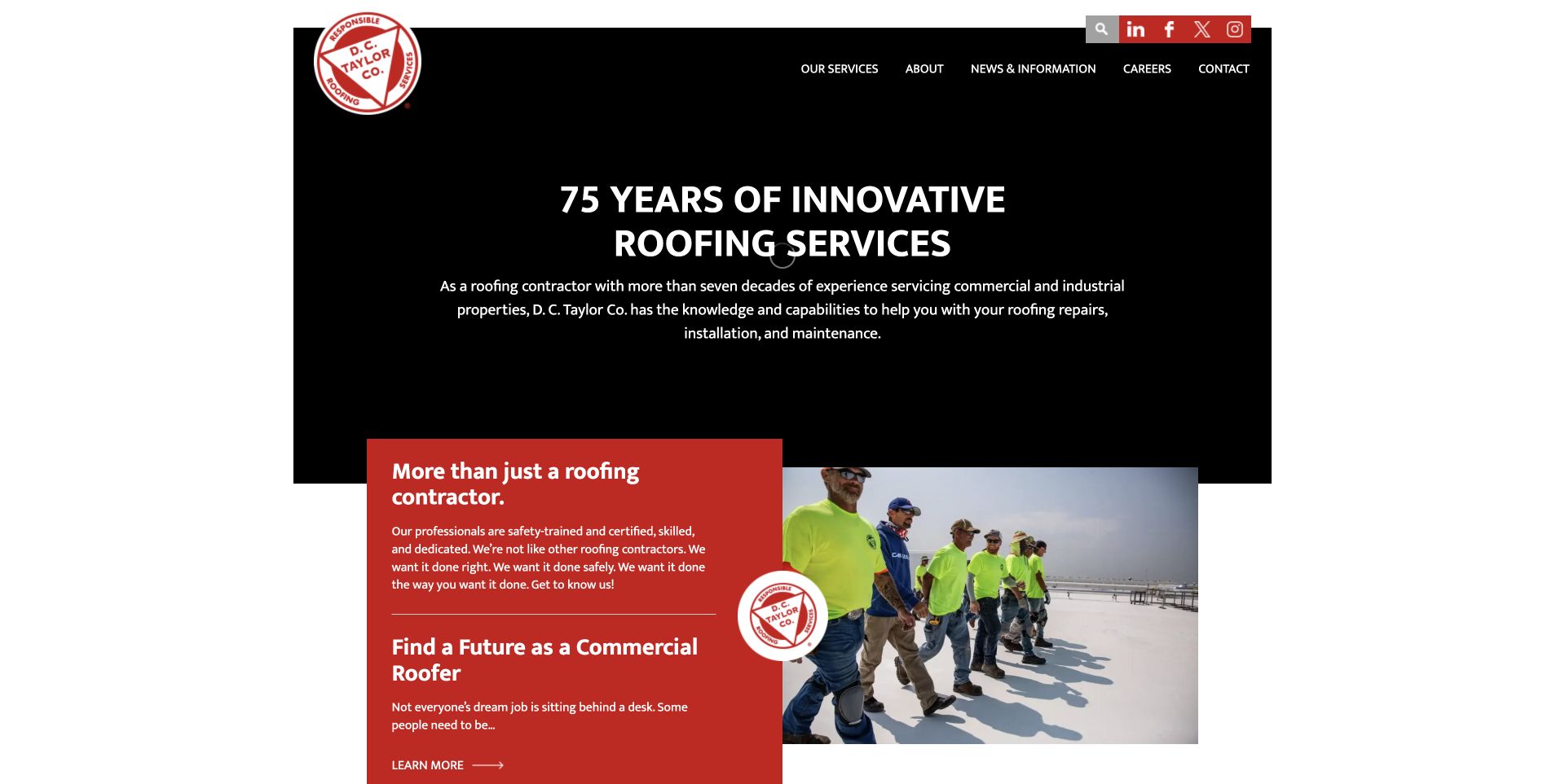
D. C. Taylor pairs a largely black headline area with red accents and an overlapping introduction card above roof-crew photography. The page explains the team before revealing more detailed service material. For Contact Form 7 development, this is a useful reference for a company serving both prospective buyers and job seekers. A plugin resource on the public page does not show how project inquiries are routed, whether recruitment uses a separate application, or whether either destination successfully delivers messages.
What you can learn
Give project requests and employment questions separate starting points with appropriate explanations. A commercial buyer may need to identify a building location and project stage, while a candidate should reach the maintained recruitment process. Avoid collecting detailed documents before the visitor understands the destination. Test the ordinary contact path with a short message and a failed submission, and preserve a useful telephone alternative beside the form.
Pros
The limited palette creates a coherent transition into supporting information.
Crew photography makes the company's work more specific than a slogan.
Cons & considerations
The centered introduction offers little immediate project-request direction.
Buyer and recruitment content can blur without clear destination labels.
Platform source: Dated exact public source-page audit. Linked stylesheet matches Contact Form 7. Dated public resource or code association on this exact source page; not proof that any particular visible component initializes or behaves as assumed. Platform evidence is separate from the direct website screenshot and is not a complete current infrastructure audit.
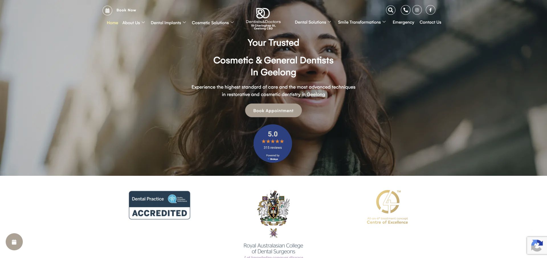
Dentists & Doctors names its location and service focus over a broad photograph, with treatment navigation around a centered identity. An appointment action follows the introduction, and reviews and institutional marks occupy later layers. The page is useful Contact Form 7 planning material because an initial inquiry should begin with clear practical context. The detected plugin resources do not verify treatment booking, patient records, review authenticity, or the destination of any particular form. The image is a public presentation reference only.
What you can learn
State the practice location, relevant appointment types, and what happens after a request. Give treatment information its own readable pages so visitors do not need to send sensitive details merely to understand the offer. On a comparable form, distinguish required contact fields from optional context, and test that errors are understandable without relying solely on color. Keep urgent contact guidance separate from a routine appointment-request inbox.
Pros
The city appears in the introduction rather than only in the footer.
The appointment action follows the explanation in a clear sequence.
Cons & considerations
Dense navigation over photography can be difficult to scan.
Reviews and institutional marks need context beyond their visual presence.
Platform source: Dated exact public source-page audit. Linked stylesheet matches Contact Form 7. Dated public resource or code association on this exact source page; not proof that any particular visible component initializes or behaves as assumed. Platform evidence is separate from the direct website screenshot and is not a complete current infrastructure audit.
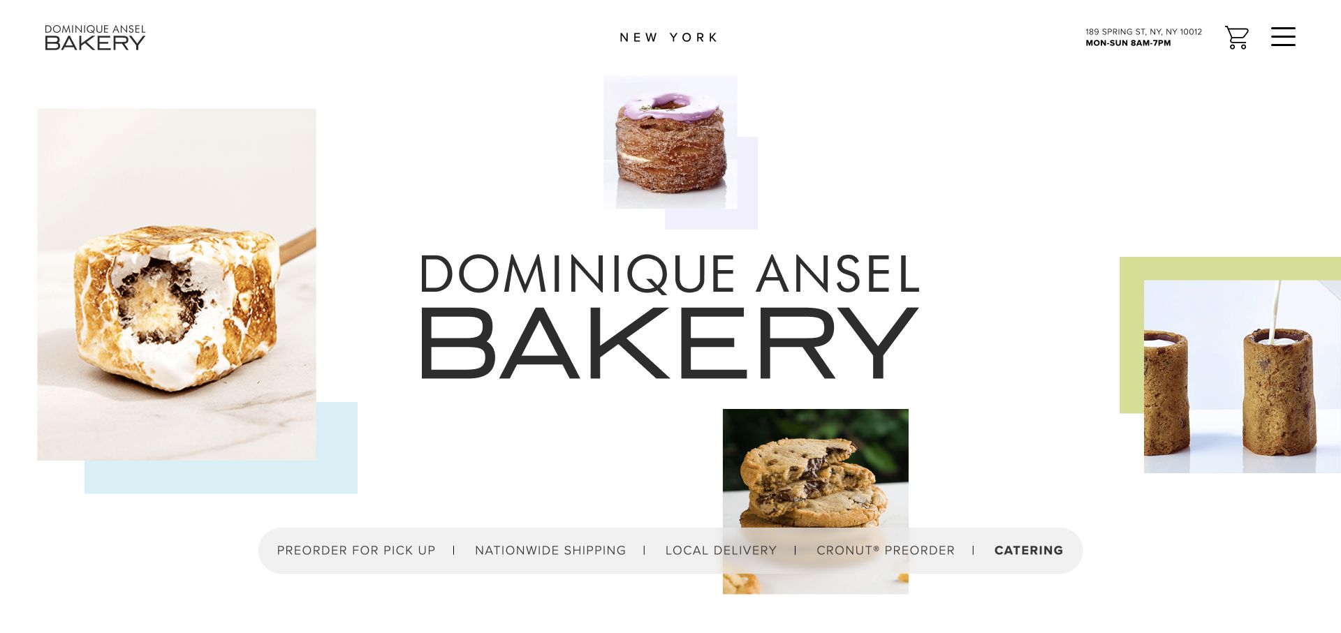
Dominique Ansel's New York property combines pastry cutouts, a large wordmark, and pastel blocks with unusually accessible address and opening hours. A strip separates pickup, shipping, local delivery, Cronut preorders, and catering. For Contact Form 7 planning, this is a useful example of several request types sharing one brand. Public plugin assets do not establish which ordering routes use the plugin, verify inventory, or prove that a message can reserve a signature pastry or schedule a catered event.
What you can learn
Explain the difference between an inquiry and an order before presenting fields. A catering form may need date, approximate party size, and service location, while a pickup question may belong with an existing order reference. Keep current hours and fulfillment rules available without submission. Test that switching request types preserves relevant information and removes irrelevant fields, then make confirmation wording specific to the requested next step.
Pros
Address and hours are accessible before visitors enter an inquiry flow.
Fulfillment labels distinguish several materially different ordering processes.
Cons & considerations
The large collage delays detailed product information.
Parallel order routes need consistent explanations to prevent misdirected requests.
Platform source: Dated exact public source-page audit. Linked stylesheet matches Contact Form 7. Dated public resource or code association on this exact source page; not proof that any particular visible component initializes or behaves as assumed. Platform evidence is separate from the direct website screenshot and is not a complete current infrastructure audit.
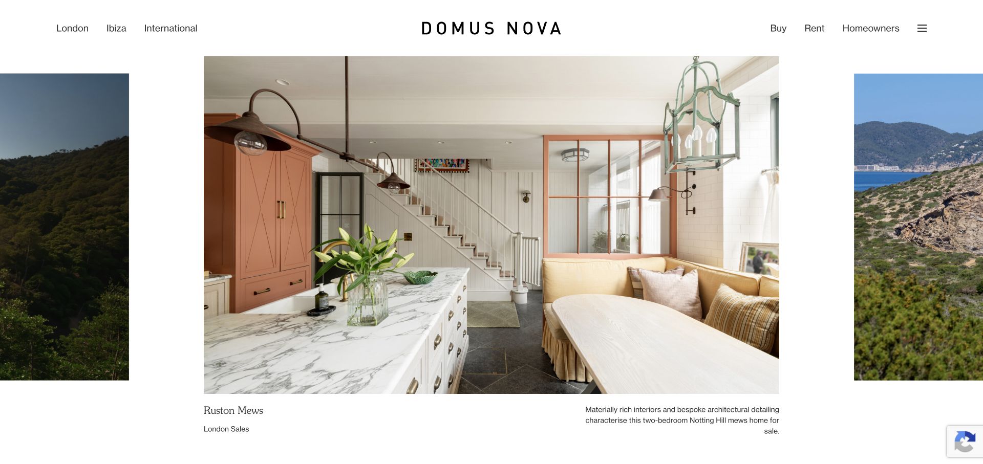
Domus Nova places geography before transaction type, distinguishing London, Ibiza, and international destinations around a gallery-like property feature. A listing name and market label sit below the image, while buy, rent, and homeowner paths remain available. For Contact Form 7 planning, the valuable pattern is preserving the property and market context when a visitor asks a question. The public plugin association does not establish listing availability, CRM integration, recipient routing, or the behavior of an actual inquiry form.
What you can learn
Carry a stable property identifier and market into the inquiry, then display the selected property in plain language before submission. Let visitors correct an accidental selection and distinguish buyer, renter, and owner requests. Avoid requiring financial or identity documents for an initial question. Test an expired listing and a visitor moving between markets so a polished gallery does not produce a message attached to the wrong property.
Pros
Geographic routes clarify the agency's separate markets immediately.
Captions remain separate from the architectural photography.
Cons & considerations
The initial feature postpones price and comparison details.
Gallery exploration can lose context without explicit inquiry identifiers.
Platform source: Dated exact public source-page audit. Linked script matches Contact Form 7. Dated public resource or code association on this exact source page; not proof that any particular visible component initializes or behaves as assumed. Platform evidence is separate from the direct website screenshot and is not a complete current infrastructure audit.
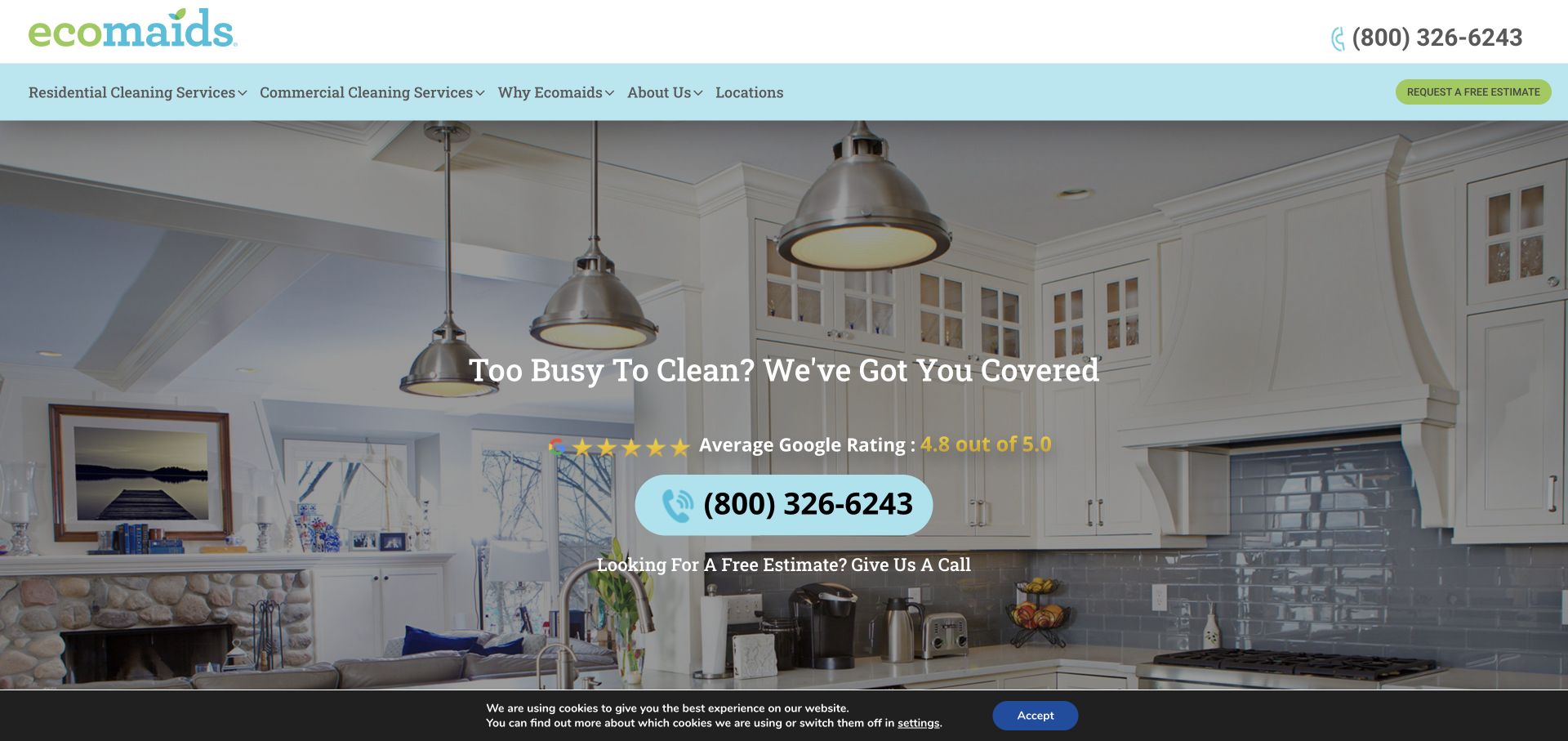
ecomaids centers a message over a kitchen-and-living-room photograph, giving phone and estimate actions greater prominence than a long form. Residential and commercial cleaning have separate navigation routes. For Contact Form 7 planning, this is a useful example of offering an inquiry channel without assuming every visitor prefers typing. The observed plugin resources do not identify the estimate tool, prove local service availability, or verify delivery to an individual franchise or cleaning team. Environmental branding also needs its own factual support.
What you can learn
Start with service type and location, then ask only for the information needed to discuss an estimate. Explain what affects the eventual quote and avoid making the submit action sound like a confirmed price or appointment. Keep the phone route visible when validation fails. In a similar implementation, test residential and commercial routing separately and ensure optional details cannot accidentally become required through layout or unclear labels.
Pros
A large phone action provides an immediate alternative to a form.
Residential and commercial labels establish useful service boundaries.
Platform source: Dated exact public source-page audit. Linked stylesheet matches Contact Form 7. Dated public resource or code association on this exact source page; not proof that any particular visible component initializes or behaves as assumed. Platform evidence is separate from the direct website screenshot and is not a complete current infrastructure audit.
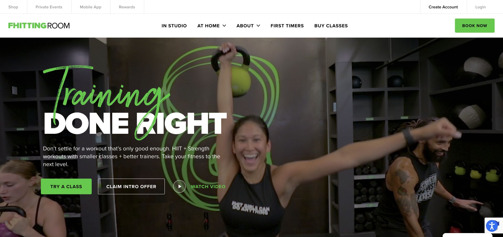
Fhitting Room uses class footage, a green handwritten accent, and a large white headline, while navigation distinguishes in-studio and at-home attendance. First-timer information, class purchase, account access, and app links have separate places. For Contact Form 7 planning, this is useful because a newcomer asking about format is not yet making the same decision as a returning customer buying classes. Public plugin resources do not identify booking software, confirm purchase behavior, or show which inquiry destination uses Contact Form 7.
What you can learn
Let visitors choose studio, attendance model, and question type without entering a purchase flow. Keep practical information about equipment and class format available before asking for contact details. If a form handles introductory questions, make the response expectation clear and avoid treating it as a class reservation. Test a visitor who changes from an at-home question to a local studio inquiry, including the destination and confirmation text.
Pros
Attendance models have clear positions in the primary navigation.
Real class footage explains the environment and equipment visually.
Cons & considerations
Several neighboring hero actions weaken one obvious next step.
Expressive lettering can compete with the main message at narrow widths.
Platform source: Dated exact public source-page audit. Linked script matches Contact Form 7. Dated public resource or code association on this exact source page; not proof that any particular visible component initializes or behaves as assumed. Platform evidence is separate from the direct website screenshot and is not a complete current infrastructure audit.
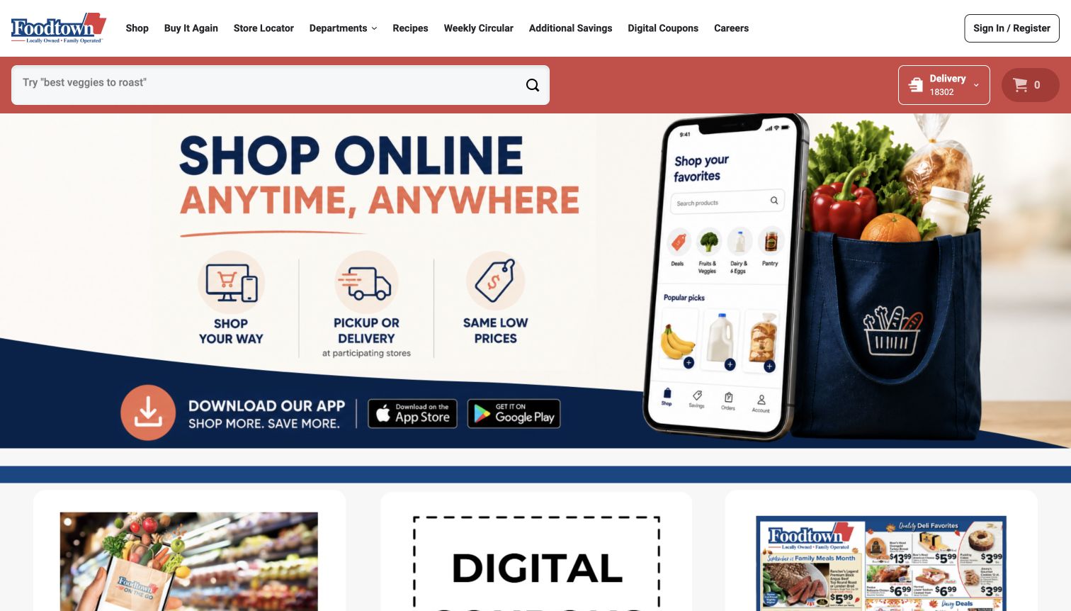
Foodtown's public site combines a phone illustration and grocery artwork with separate search, delivery context, and cart access. Departments, circulars, coupons, and recipes provide familiar routes beyond the digital-shopping campaign. This is the New Jersey, New York, and Pennsylvania Foodtown property. For Contact Form 7 planning, regional identity and store context are essential. The plugin resources do not establish checkout behavior, delivery-provider systems, or the implementation of a particular support form, and should not be extended to a different similarly named retailer.
What you can learn
Ask visitors to identify the relevant store and shopping channel before describing a problem. Explain whether a coupon question, delivery issue, or general company message reaches a different team. Keep circulars and fulfillment information easy to find so routine questions do not require submission. Test the contact route with no selected store and with an unsupported delivery area, using clear alternatives rather than a generic success message.
Pros
Search and delivery context remain outside dense promotional artwork.
Circular and coupon routes match common grocery tasks.
Cons & considerations
Several messages compete inside one large graphic.
Pickup and delivery availability require local confirmation beyond the campaign.
Platform source: Dated exact public source-page audit. Linked stylesheet matches Contact Form 7. Dated public resource or code association on this exact source page; not proof that any particular visible component initializes or behaves as assumed. Platform evidence is separate from the direct website screenshot and is not a complete current infrastructure audit.
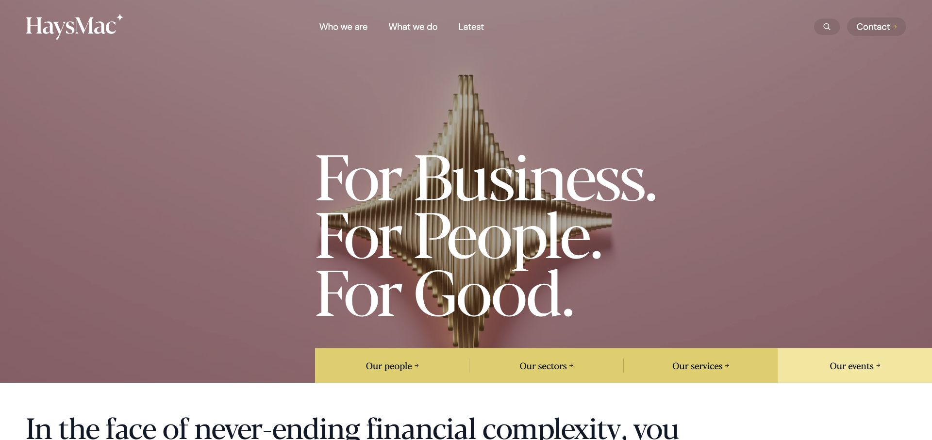
HaysMac uses pale sculpture, fine serif lettering, and pink tones to distinguish its accounting identity, then anchors the experience with a yellow strip for people, sectors, services, and events. For Contact Form 7 planning, that practical strip matters: an inquiry should reach relevant expertise without asking visitors to decode the artwork. The public plugin association does not establish a CRM connection, identify the responsible professional, or verify any handling of private client information. It supports only the scoped resource observation.
What you can learn
Let an initial inquiry name the service or sector and preferred contact method without requesting detailed financial records. Offer a people directory for visitors seeking a known professional, and explain when confidential documents belong in a separate approved channel. Test the form's required fields and error messages against long organization names, then verify that a generic inquiry and a named-person request reach their intended destinations.
Pros
The yellow navigation strip translates visual expression into practical choices.
Platform source: Dated exact public source-page audit. Linked stylesheet matches Contact Form 7. Dated public resource or code association on this exact source page; not proof that any particular visible component initializes or behaves as assumed. Platform evidence is separate from the direct website screenshot and is not a complete current infrastructure audit.
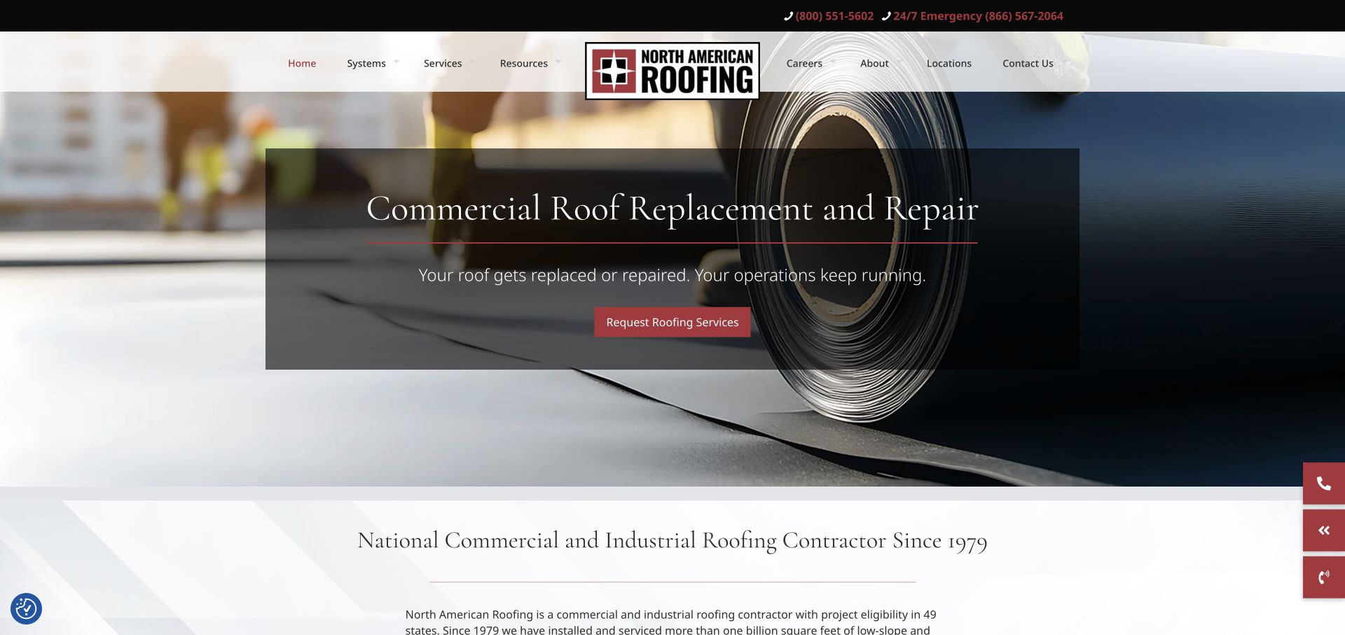
North American Roofing uses material photography beneath a dark translucent message, with a centered logo and a separate phone strip. Commercial and industrial scope becomes explicit in the introduction, while normal and emergency telephone routes are distinguished above. For Contact Form 7 planning, the key issue is matching a buyer's urgency and location to a useful destination. The public plugin evidence does not prove a form's implementation, establish dispatch behavior, or confirm that an online inquiry receives immediate attention.
What you can learn
Give replacement planning, routine repair, and urgent contact different explanations before collecting details. A first project inquiry can identify location and general work type without implying a scheduled inspection. Keep the emergency telephone route independent of form availability. In staging, test delivery failures, an unsupported location, and a request sent outside ordinary response hours, making sure the confirmation accurately describes what the company has received.
Pros
Material imagery makes the commercial work recognizable immediately.
Normal and emergency phone routes have distinct utility positions.
Cons & considerations
A long centered navigation requires deliberate mobile restructuring.
Translucent campaign panels can lose legibility over changing photography.
Platform source: Dated exact public source-page audit. Linked stylesheet matches Contact Form 7. Dated public resource or code association on this exact source page; not proof that any particular visible component initializes or behaves as assumed. Platform evidence is separate from the direct website screenshot and is not a complete current infrastructure audit.
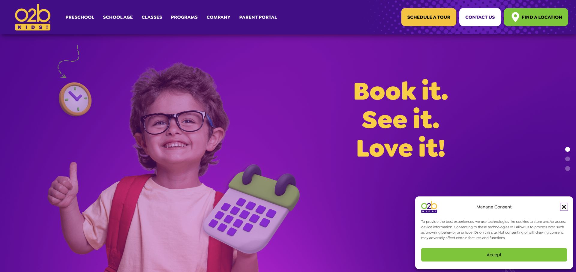
O2B Kids uses saturated colors and playful type around a child photograph, with separate preschool, school-age, classes, and program categories. Tour, contact, and location actions are explicitly named, and age ranges appear in subsequent program content. For Contact Form 7 planning, this is useful because a family may be asking about very different services. The observed plugin resources do not identify enrollment software, confirm available places, or establish how a tour request is processed at a particular location.
What you can learn
Begin with location, service type, and broad age stage, then explain the next step without asking for unnecessary details about a child. A tour request should remain distinct from enrollment or a confirmed appointment. Keep program descriptions available before submission, and test a family switching between preschool and afterschool inquiries so the visible fields, destination, and confirmation remain consistent with the final choice.
Pros
Separate program categories recognize different family needs at entry.
Location, tour, and contact actions use explicit labels.
Cons & considerations
Several saturated buttons compete with the vivid hero.
A short campaign slogan supplies little immediate operational detail.
Platform source: Dated exact public source-page audit. Linked stylesheet matches Contact Form 7. Dated public resource or code association on this exact source page; not proof that any particular visible component initializes or behaves as assumed. Platform evidence is separate from the direct website screenshot and is not a complete current infrastructure audit.
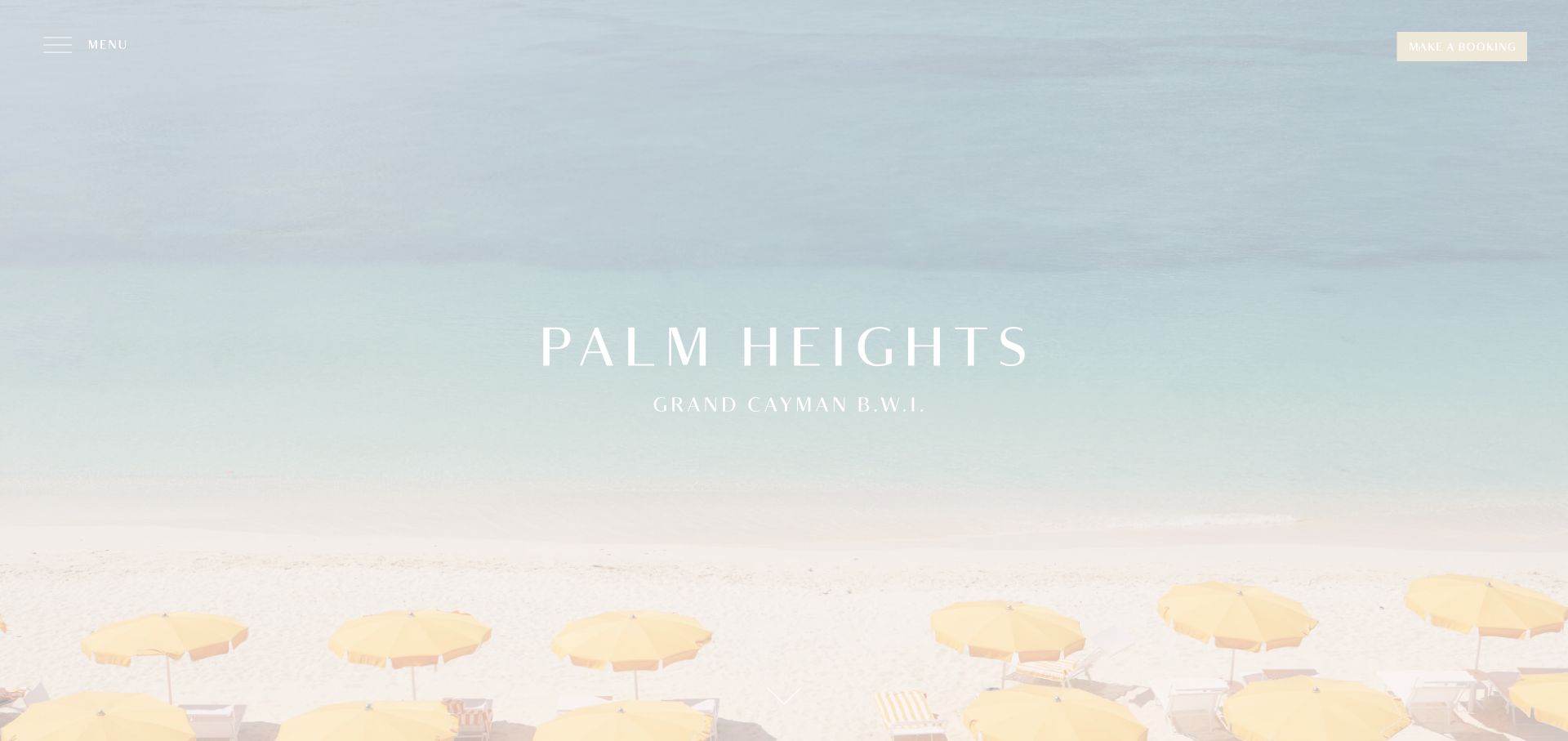
Palm Heights lets pale water, sand, and yellow umbrellas establish its setting, with Grand Cayman in the centered identity and booking separate from the menu. Very little supporting copy occupies the first view. For Contact Form 7 planning, this is a useful case for distinguishing atmospheric introduction from a practical stay inquiry. The plugin resources on the public page do not identify the booking engine, verify room inventory, or show whether a guest message is stored or delivered to the hotel.
What you can learn
Provide clear routes for accommodation questions, dining, events, and an existing reservation. Ask only for the dates and context needed for an initial response, and avoid implying that a submitted inquiry holds a room. Keep arrival and suite information readable without a form. Test a message about an existing booking separately from a new stay request, including what happens when the normal submission cannot be completed.
Pros
The geographic location is part of the main identity.
A distinct booking control remains available within the spare composition.
Cons & considerations
White interface text can disappear against very pale scenery.
Minimal navigation hides practical categories until the menu is opened.
Platform source: Dated exact public source-page audit. Linked stylesheet matches Contact Form 7. Dated public resource or code association on this exact source page; not proof that any particular visible component initializes or behaves as assumed. Platform evidence is separate from the direct website screenshot and is not a complete current infrastructure audit.
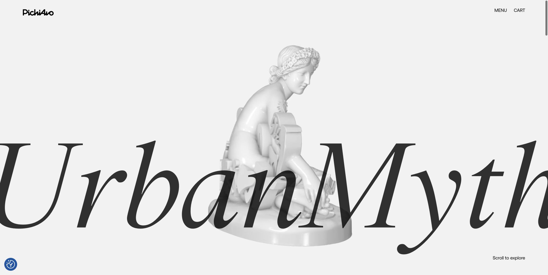
PichiAvo's UrbanMyth opening combines monumental lettering with a pale sculptural figure, leaving only a small logo, menu, and cart around the work. The public presentation is expressive, but an inquiry still needs a conventional destination. Contact Form 7 resources were observed on this property; that does not identify the animation system, prove a visible form uses the plugin, or establish how artwork sales, commissions, and shop support are managed after a visitor makes contact.
What you can learn
Separate exhibition, commission, press, and existing-order questions before showing fields. Keep the selected work or order context visible, and explain the appropriate channel for larger supporting material instead of encouraging unnecessary uploads. A comparable form should work within a quiet static layout as well as the expressive presentation. Test keyboard focus, errors, and confirmation without requiring the visitor to complete a decorative interaction first.
Pros
The site's visual language clearly relates to the artists' work.
Minimal utility controls leave the artwork as the principal focus.
Cons & considerations
Large overlapping type may become demanding on a small screen.
Creative interaction needs separate keyboard, touch, and motion review.
Platform source: Dated exact public source-page audit. Linked stylesheet matches Contact Form 7. Dated public resource or code association on this exact source page; not proof that any particular visible component initializes or behaves as assumed. Platform evidence is separate from the direct website screenshot and is not a complete current infrastructure audit.
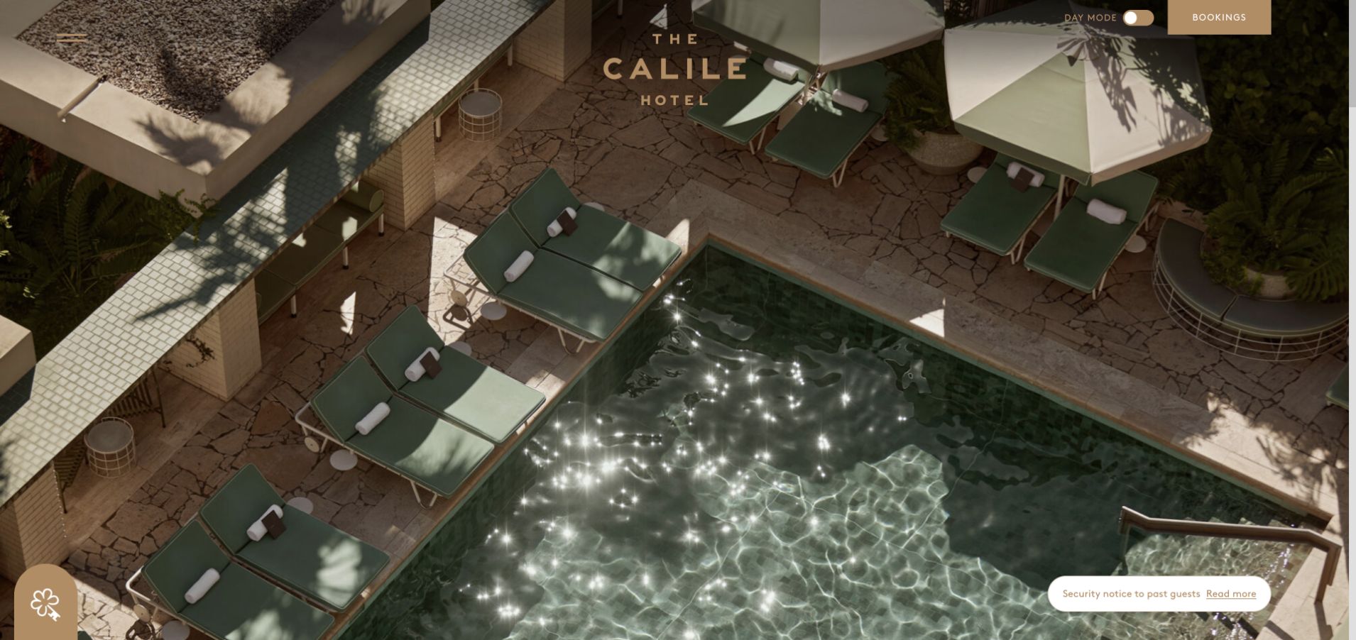
The Calile opens with an overhead pool photograph, geometric lines, sage loungers, and deep shadows, placing a small identity between menu and booking controls. A day-mode control adds a distinctive interface detail. For Contact Form 7 planning, the useful question is how a visually led entrance hands visitors to practical guest information. The plugin resources do not identify room booking, establish availability, or show whether an inquiry and a reservation are processed by the same system or staff.
What you can learn
Give room, dining, event, and existing-reservation inquiries explicit destinations with clear response expectations. Keep room and neighborhood information available before the form so a visitor can ask a focused question. Test form labels and error states in every supported visual mode, including contrast and focus. A receipt message should confirm the inquiry accurately without implying a room, table, or event date has been reserved.
Pros
Architectural photography communicates distinctive materials and spatial relationships.
Booking remains a separate rectangular control outside the menu.
Cons & considerations
The first view gives little detail about room choices or location.
Small controls require dependable contrast over both bright and dark areas.
Platform source: Dated exact public source-page audit. Linked stylesheet matches Contact Form 7. Dated public resource or code association on this exact source page; not proof that any particular visible component initializes or behaves as assumed. Platform evidence is separate from the direct website screenshot and is not a complete current infrastructure audit.
Use clear topic choices, a concise explanation, and an appropriate reply route. Keep archive search, support information, and staff directories available when those paths can answer the question without a submission.
Location-based service requests
Preserve the selected location and show it near the action. Explain whether the message requests contact, an estimate, or an appointment. A receipt should not imply a booking or immediate response unless the underlying process actually guarantees it.
Contextual product and property questions
Carry an accurate item identifier and readable name into the inquiry. Let visitors correct the context before sending. Handle withdrawn products, expired listings, and regional differences deliberately rather than forwarding ambiguous messages.
From references to requirements
Prepare the form and its response workflow
Define necessary information
Write down why each field is needed for the initial response. Separate required contact details from optional context, and avoid requesting detailed medical, financial, or identity documents through an ordinary first-contact form.
Write every message
Prepare validation, sending, success, and failure text in the same plain language as the form. Explain an alternative contact route when delivery cannot complete. Test long names, missing values, translated text, and changed topic selections.
Verify each boundary
Test form validation, configured mail delivery, any stored record, and each downstream integration separately with approved test data. Assign an owner for recipient changes and response expectations. Review performance and spam handling without creating obstacles to legitimate inquiries.
A useful handover demonstration
Ask the actual team to carry out its routine job: publish a realistic update, correct a mistake, preview a narrow screen, and identify who owns an integration failure. For a library or frontend framework, also ask who maintains the content source and deployment. A polished screenshot does not answer those operational questions.
Beyond the screenshot
Contact Form 7 planning checklist
Name the request's purpose and responsible destination before the fields.
Collect only the initial information required to respond.
Preserve and display relevant location, product, or property context.
Use persistent labels and understandable required-field and error text.
Verify mail configuration and actual receipt with authorized test messages.
Distinguish inquiry receipt from a booking, quote, subscription, or purchase.
Provide an alternative route when the form cannot complete.
Test resource loading, keyboard operation, narrow screens, and integrations independently.
Test with real content, a keyboard, a small screen, slow or failed requests, and the people who will maintain the system. These are planning checks, not an accessibility, security, performance, or search-ranking certification.
Sources & editorial method
How this Contact Form 7 collection was reviewed
Twenty distinct public properties have genuine captured references and dated Contact Form 7 resource evidence. Every source page has a documented broad public stack-audit attempt; partial audit status and original observation dates remain in the underlying records. Screenshots retain their authentic capture dates and dimensions. Plugin files may load without an active form, so reviews do not assign a visible control or backend workflow to Contact Form 7 without evidence. No real inquiries, reservations, subscriptions, purchases, or applications were submitted.
Every image is an unmodified capture from the actual website, with its source and capture date. Some captures are reused from our shared catalog; their dates remain the original capture dates. None comes from a vendor gallery or a generated reconstruction. Moving imagery and live content can change.
Technology attribution uses public page assets or metadata, official platform documentation, or a cited first-party project case study. Documentary and framework-relationship evidence is identified where used; it is not a complete current backend inventory. A CMS image CDN alone does not establish a full CMS deployment. A library’s presence does not prove which individual controls use it, and a platform label does not establish AI authorship.
The composition notes, lessons, pros and tradeoffs are original editorial observations. We have not measured conversion, traffic, security, performance or accessibility conformance. Website owners retain their brands and imagery; these examples are not our client portfolio. Written, Edited and Curated are independent records, not dates advanced by a build. See our editorial standards or suggest a correction.
Questions worth asking
Contact Form 7 website development FAQs
Does finding Contact Form 7 assets prove a visible form uses it?
No. Official documentation explains that the plugin can load resources on every page. The association is evidence of those resources, while a particular form's implementation and behavior require separate inspection.
Does a successful on-screen message prove email delivery?
It is one signal, not a complete delivery test. Verify the configured recipient and actual inbox receipt in an authorized environment. Check any autoresponse or external integration independently rather than treating them as one outcome.
Can the same form handle several locations or request types?
It can be designed to do so, but the visible choice and routing must agree. Test every destination, preserve relevant context, and remove fields that no longer apply when a visitor changes topic or location.
Do the examples certify privacy or accessibility compliance?
No. They support editorial design analysis and carefully scoped technology associations. Data handling, consent, retention, keyboard behavior, and assistive-technology support need review within the actual implementation and organizational process.
Use the references to make the inquiry's purpose, destination, and next step clear. Then test the complete response path with the people responsible for answering it.