Apache HTTP Server does not dictate a website’s visual style. It provides a serving layer whose behavior must fit the content, URL history, and application boundaries of the site being built.
A public Apache response reference identifies a limited serving association. It does not reveal every server, module, proxy, CMS, or deployment arrangement behind a brand. These examples compare visible interfaces on named properties while keeping that attribution separate from the editorial design observations.
For a rebuild, the important questions often begin with existing URLs and operating practices. Which pages have been bookmarked? Who maintains redirects? What happens when a file is moved? A new layout can look complete while those everyday responsibilities remain unresolved.
Before the examples
What makes good Apache HTTP Server website development in 2026?
Treat a URL as a public commitment
Inventory important page paths, downloads, aliases, language variants, and historical campaign links before designing their replacements. Give each a deliberate retained location, redirect, or missing-page outcome. A migration should not silently replace useful destinations with a generic landing page.
Know which layer maps the request
Apache’s URL-mapping documentation describes relationships among request paths, document roots, aliases, redirects, and proxies. Your implementation may use only some of those mechanisms. Record the actual owner of a route instead of assuming the CMS or filesystem is always responsible.
Keep publishing changes separate from operational changes
Routine content editing should not require an editor to alter server configuration. Define the boundary between the CMS, generated content, application routes, and hosting settings. Give each kind of change an appropriate review and recovery process rather than putting every responsibility into one administrator account.
The collection · 20 examples
20 Apache HTTP Server website examples worth studying
Study the way large archives, institutional services, and specialist organizations make content discoverable. Their reported Apache association is not evidence that the interface needs a particular module or that a similar build should copy their infrastructure.
We start with five recognizable brands or organizations: Disney Experiences, Massachusetts Institute of Technology, United Nations, U.S. Bank, Nationwide. Each attribution applies to the named website property, not every product or website belonging to its organization. This is a curated reading sequence, not a measured ranking.
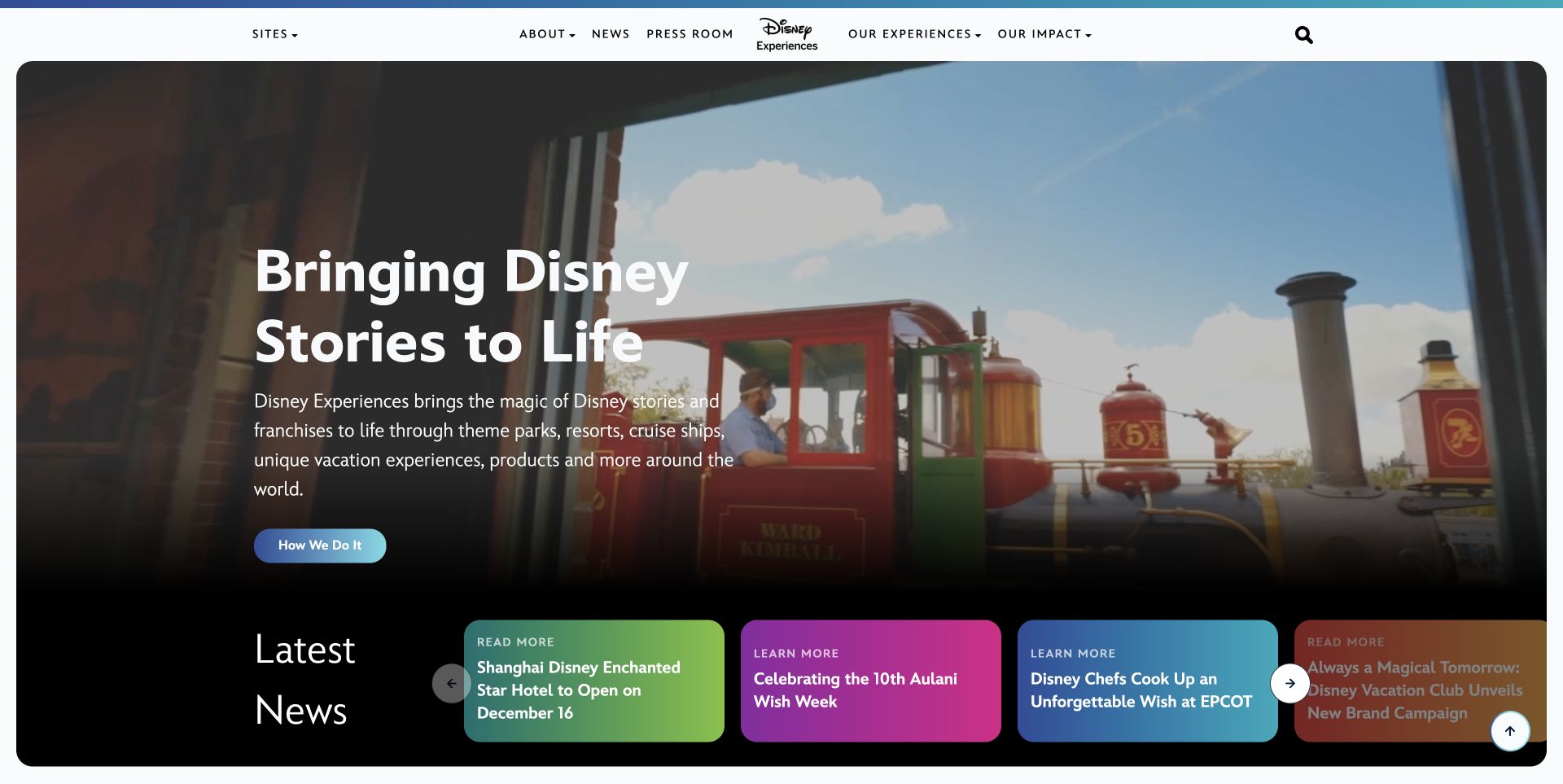
Disney Experiences combines a large thematic photograph with a short portfolio introduction and a contrasting band of current news. The page is the destination of the former Disney Connect address, so the old name and the present public property need to be distinguished. The sampled response reported Apache HTTP Server. This is not an attribution of Disney's streaming, booking, or other application infrastructure.
What you can learn
When replacing a longstanding corporate site, make the redirect inventory part of the design work. Map useful legacy destinations to their real equivalents, preserve campaign and article context, and test both old and current hostnames. Keep the new page's identity explicit so a returning reader understands the change. A recognizable corporate brand is not a reason to route every historic URL to the same broad introduction.
Pros
The portfolio statement is supported by concrete current stories beneath it.
The news band gives the image-led opening another useful entry point.
Cons & considerations
Legacy names can remain confusing without a deliberate migration explanation.
The current news band needs an archive route that remains useful after its featured stories change.
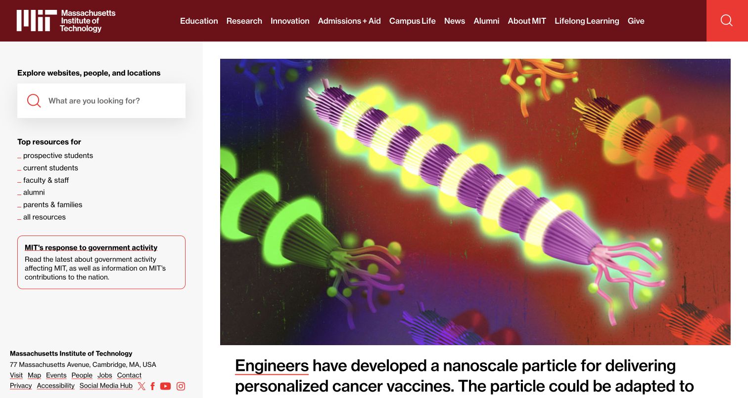
MIT places a large illustrated research feature beside a narrow column of search, resources, and audience destinations. A plain-language caption connects the dramatic scientific image to an actual story. The institutional header spans education, research, innovation, and campus subjects. Apache was reported in the public response, but the observation does not describe laboratory systems, departmental applications, or the university's authenticated services.
What you can learn
Separate the changing research feature from durable destinations when defining the delivery plan. Story pages, illustrations, downloadable publications, and search results need intentional URL and freshness rules. Test whether old research links still provide context after a headline changes. Use a meaningful not-found page rather than serving the homepage with a successful status for every invalid path, especially in a large institution with many externally cited resources.
Pros
The research caption explains the image rather than assuming specialist knowledge.
Search and practical resources have a permanent place beside the feature.
Cons & considerations
The narrow utility column needs careful ordering when the layout collapses.
Small audience utilities need careful reading order beside the much larger research illustration.
Visible tech stack
Referenced on the public page
Apache HTTP Server
Public source checked November 3, 2026. References may be embedded or legacy—not a complete backend inventory.
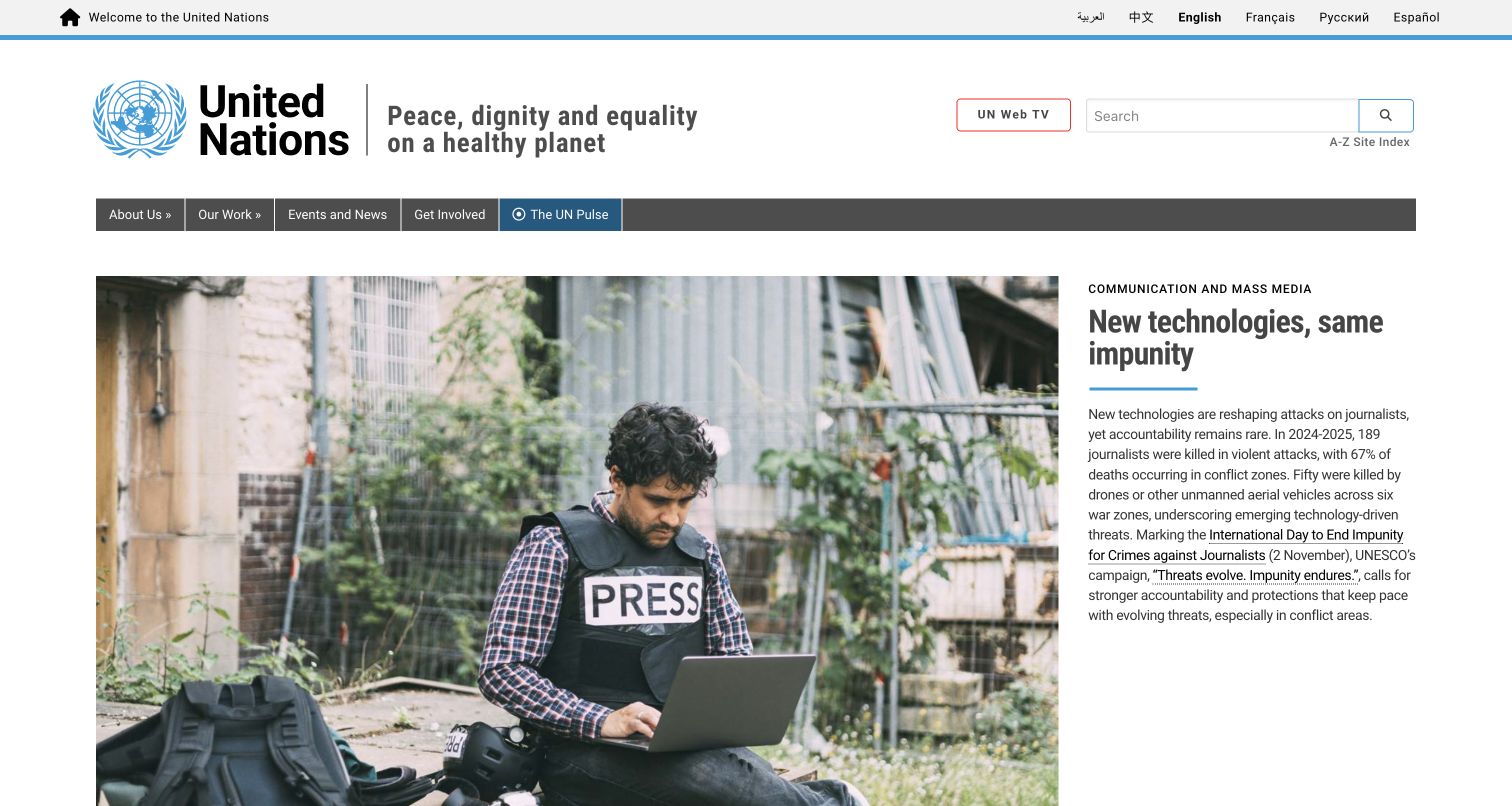
The United Nations homepage pairs a generous identity band with a broad photograph and a narrower explanatory story column. Language choices sit above the main navigation, and search is separate from the feature. The composition balances institutional recognition with actual reading material. The response reported Apache for this public surface; other UN organizations, language properties, and transaction systems may be delivered differently.
What you can learn
Model language and publication relationships before writing rewrite rules. A translated article should resolve to the correct edition rather than whichever page happens to share part of its slug. Define canonical host and path behavior, test trailing slashes and retired translations, and keep fallback language choices understandable. Server configuration can implement those decisions, but it cannot supply editorial equivalence where no suitable translation or replacement exists.
Pros
The story has enough explanatory text to provide context beyond its photograph.
Language selection is recognizable without dominating the main editorial panel.
Cons & considerations
A broad multilingual estate needs precise ownership of equivalent destinations.
A translated campaign title needs enough space beside the image without collapsing the explanatory story column.
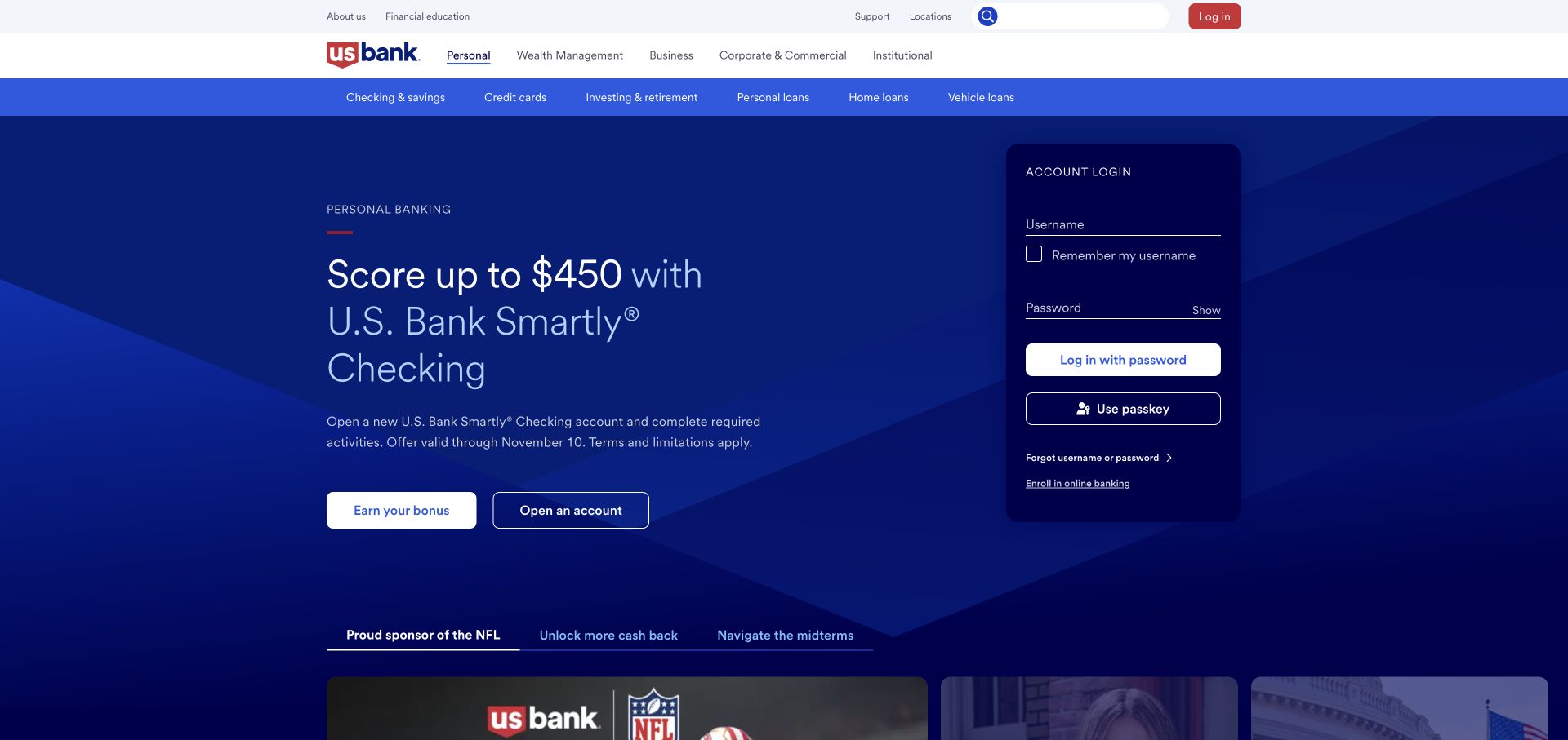
U.S. Bank places a campaign on a deep blue field beside a distinct account-access panel. Visitors can either explore the promoted product or move toward an existing relationship, while product and audience navigation remain above. The Apache observation is limited to the sampled public response. No login, account opening, customer information, or financial transaction was attempted during this review.
What you can learn
For a similarly divided homepage, document the boundary between public promotion and authenticated service before choosing caching or proxy rules. Keep the correct account destination explicit, and test an unavailable authentication provider without collecting real customer credentials. A campaign migration must not alter an established sign-in route accidentally. Treat personalized responses and public marketing assets as different security and delivery responsibilities even when they share a visual identity.
Pros
The account panel is visually distinct from the acquisition campaign.
Learning and opening actions offer different levels of commitment.
Cons & considerations
Product promotions and daily access can compete on short screens.
Account access and product-opening actions need clear expectations rather than similar-looking routes with different consequences.
Visible tech stack
Referenced on the public page
Apache HTTP Server
Public source checked November 3, 2026. References may be embedded or legacy—not a complete backend inventory.
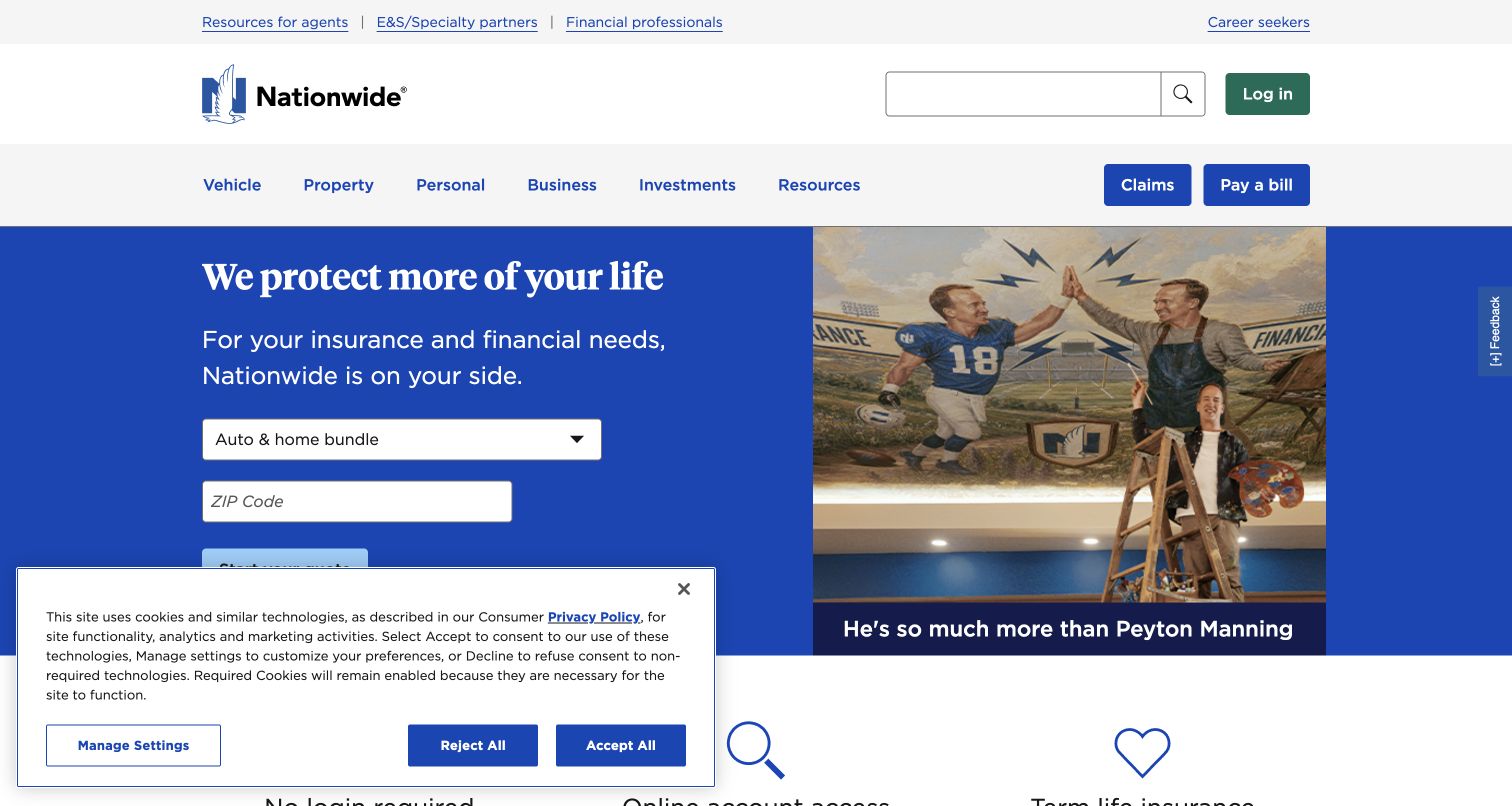
Nationwide gives its brand message a blue field, then introduces a product selector and quote entry. Separate utilities point toward bill payment, documents, claims, and other existing-customer tasks. The layout makes acquisition and service visible at the same time. The sampled response reported Apache, not the architecture of the quotation, claims, investment, or account systems reached from these controls.
What you can learn
Write route and handoff requirements around the actual visitor task. A public product explanation, an anonymous quote entrance, and a protected claims response should not inherit one undifferentiated cache policy. Preserve durable service URLs when campaigns change, and provide clear alternatives if a separate provider fails. Test redirects with the product and region context that a visitor needs, without using real policy details in development.
Pros
Existing-customer utilities do not have to masquerade as product promotions.
The quote entrance follows an explicit product choice.
Cons & considerations
A large set of financial and insurance destinations needs disciplined navigation hierarchy.
Product quotes and existing-policy tasks require distinct labels even when both begin in the same branded opening.
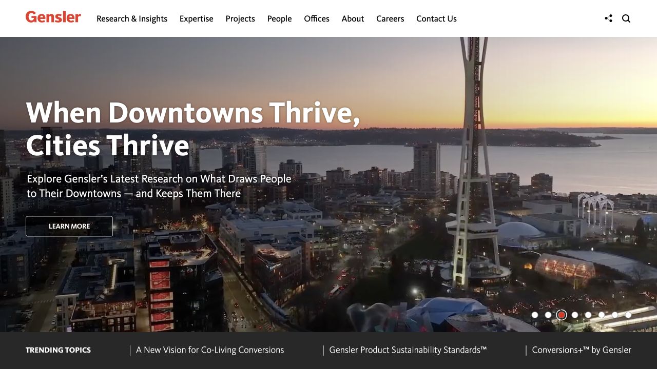
Gensler uses a large city photograph and editorial headline beneath a fully labeled navigation bar. Research and insights appear beside projects, people, offices, and expertise, making published thinking a first-class destination. The sampled Apache header concerns this public page. It does not establish how the firm's project database, internal collaboration, or other office systems operate behind the presentation.
What you can learn
Identify the relationships between projects, expertise, people, and research before implementing redirects or aliases. A moved article should retain relevant subject context rather than simply entering the project index. Keep image and document assets versioned where appropriate while allowing genuine editorial corrections to reach public pages. Test deep links that clients may have saved from old proposals, not only the current homepage navigation.
Pros
Research has a clear identity alongside the visual project archive.
Conventional destination names support visitors with specific professional questions.
Cons & considerations
A wide navigation structure requires comparable depth and ongoing editorial ownership.
Project, expertise, office, and people routes need connected content so visitors do not encounter disconnected corporate sections.
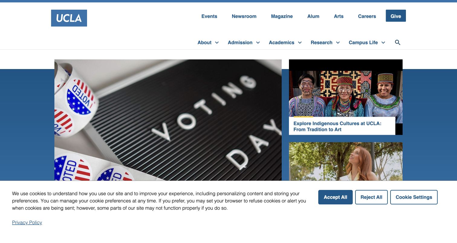
UCLA presents a group of stories beneath its blue wordmark and compact institutional navigation. Civic information, culture, and a student profile coexist in the opening rather than competing through separate full-screen campaigns. Dates and source context continue in the news material below. Apache was reported on this public response, but the observation does not identify every campus application or publishing property.
What you can learn
Treat editorial slots as references to durable articles, not as separate copies of the same content. A release should update the selection without invalidating long-lived story URLs or asset references. Test the complete document when an image is missing, and preserve practical admissions and academic routes when the news mix changes. Keep any campus authentication handoff separate from the public editorial cache and deployment responsibilities.
Pros
Several story types communicate a broad campus community.
The persistent institutional routes remain recognizable above the news selection.
Cons & considerations
A multi-story opening needs clear priority rather than equal emphasis on everything.
The story selection needs dates and source labels so a visitor can distinguish enduring guidance from current campus news.
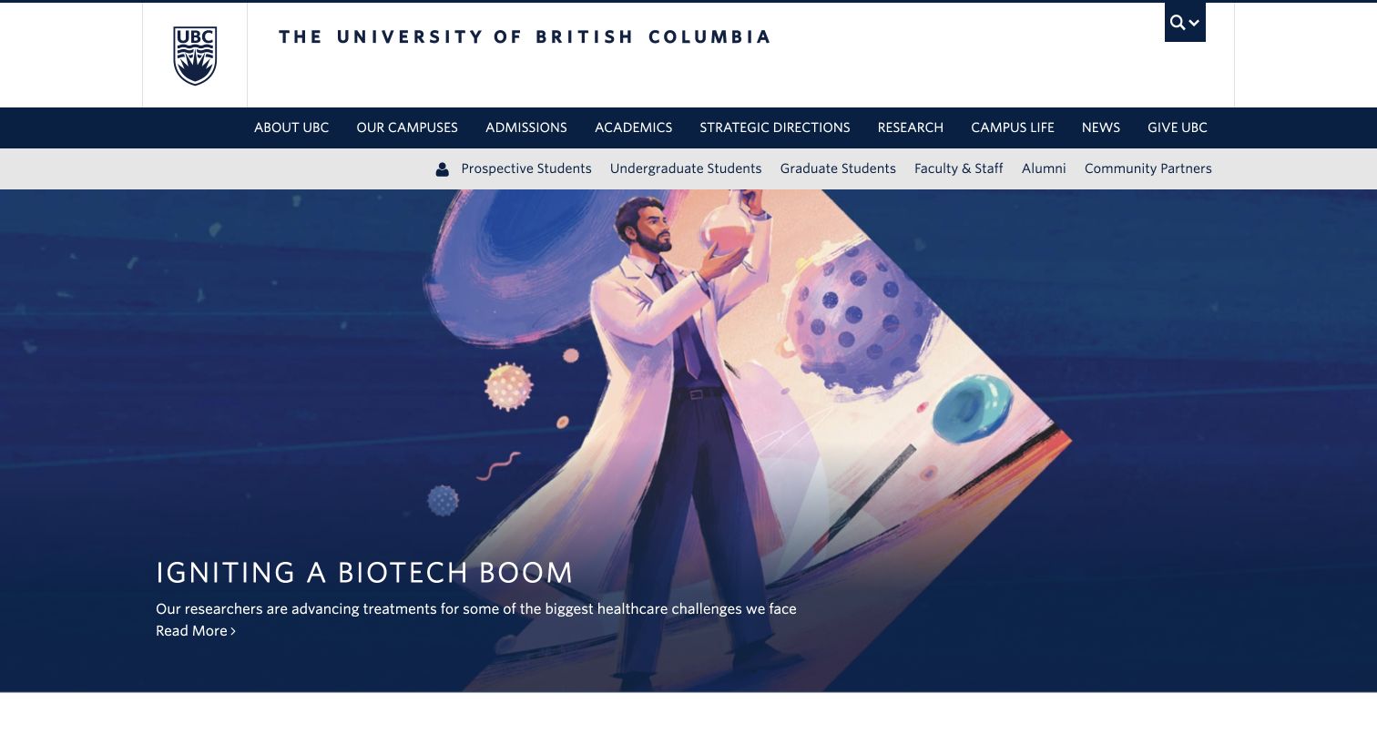
UBC introduces a research story through a bold illustrated feature under a navy institutional header. A separate audience row distinguishes prospective and current students, faculty, alumni, and community partners. The main navigation follows subjects such as campuses, admissions, and research. This public response reported Apache; it does not prove that every audience route leads to the same platform or access environment.
What you can learn
Document audience redirects and subject routes separately. An alumni destination and a research category may both be valid entrances without being substitutes for each other. Test host transitions, canonical paths, and unavailable partner services in the migration plan. Keep important audience guidance in readable public content rather than relying on a chain of opaque server redirects to explain where someone should go next.
Pros
The audience layer recognizes needs not captured by the main subject navigation.
The research illustration gives the opening a distinctive editorial purpose.
Cons & considerations
Two navigation systems require a clear hierarchy on mobile.
Audience and campus destinations need clear context instead of sending every visitor through the same broad introduction.
Sydney places its study invitation over student photography and follows it with a course finder and subject areas. Application guidance, fees, scholarships, and international-student information provide practical routes beyond the opening aspiration. Research and institutional destinations remain available in the header. The sampled Apache response is evidence about this public surface, not admissions processing or every university application.
What you can learn
A recruitment launch should include tests for course URLs, search parameters, removed programs, and regional information. Preserve the relationship between a campaign and the course it introduces when implementing redirects. Define freshness for deadlines and fees independently of long-lived brand assets. A visitor arriving directly at a course should receive the same essential context as someone who followed the homepage's intended sequence.
Pros
The broad study promise connects to concrete course and practical-information routes.
Institutional navigation remains available outside the recruitment emphasis.
Cons & considerations
Deadline and fee material needs explicit review and update ownership.
Course search needs useful alternatives and honest removed-program states for visitors arriving outside the main recruitment campaign.
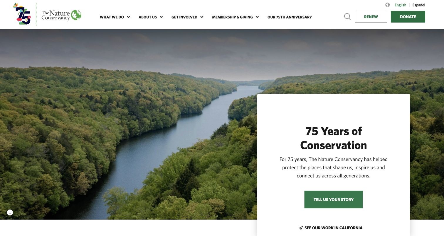
The Nature Conservancy places an anniversary card over landscape photography, then continues with recognizable questions about the organization, its work, and how to help. Membership, giving, and renewal remain in the header. The composition leaves room for a major milestone without removing ordinary explanations. Apache was reported in the public response, not demonstrated as the platform behind donor records or membership transactions.
What you can learn
Make a milestone a dated campaign record rather than a permanent replacement for institutional information. Define where the story should live after the anniversary ends, and keep support and renewal URLs stable. Distinguish cacheable public narratives from personalized donor responses. Test a campaign rollback with existing asset references intact so the removal of a temporary card does not leave the continuing homepage visually or functionally incomplete.
Pros
The anniversary has a clear visual frame within a recognizable public mission.
New and existing supporters have distinct useful routes.
Cons & considerations
Milestone content becomes stale without an intentional post-campaign destination.
Membership renewal and first-time giving need clear differences beside an otherwise broad support invitation.
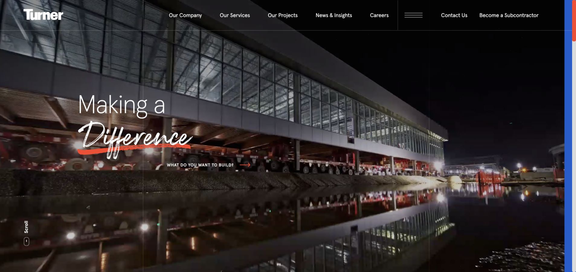
Turner opens with a broad building photograph and a restrained statement, while the surrounding structure connects projects, careers, and broader company themes. Contact and subcontractor access have their own routes. The page recognizes audiences beyond a prospective client admiring the image. Its sampled response reported Apache, but that does not describe the implementation or authorization boundaries of the linked subcontractor and employment systems.
What you can learn
Create a destination inventory for client information, recruitment, partner access, and project content before a migration. The public site can explain a handoff without pretending to be the protected destination itself. Test old project links, renamed offices, and unavailable partner portals. Keep descriptive error pages useful, and avoid rewriting every request into the same public shell where a missing resource should instead be reported honestly.
Pros
The opening image is connected to several explicit professional paths.
Partner access is not hidden inside a generic contact destination.
Cons & considerations
Distinct professional audiences need more than one broad promotional message.
Clients, prospective employees, and subcontractors need distinct next steps rather than one general company-story sequence.
Visible tech stack
Referenced on the public page
reCAPTCHA
Apache HTTP Server
Public source checked November 3, 2026. References may be embedded or legacy—not a complete backend inventory.
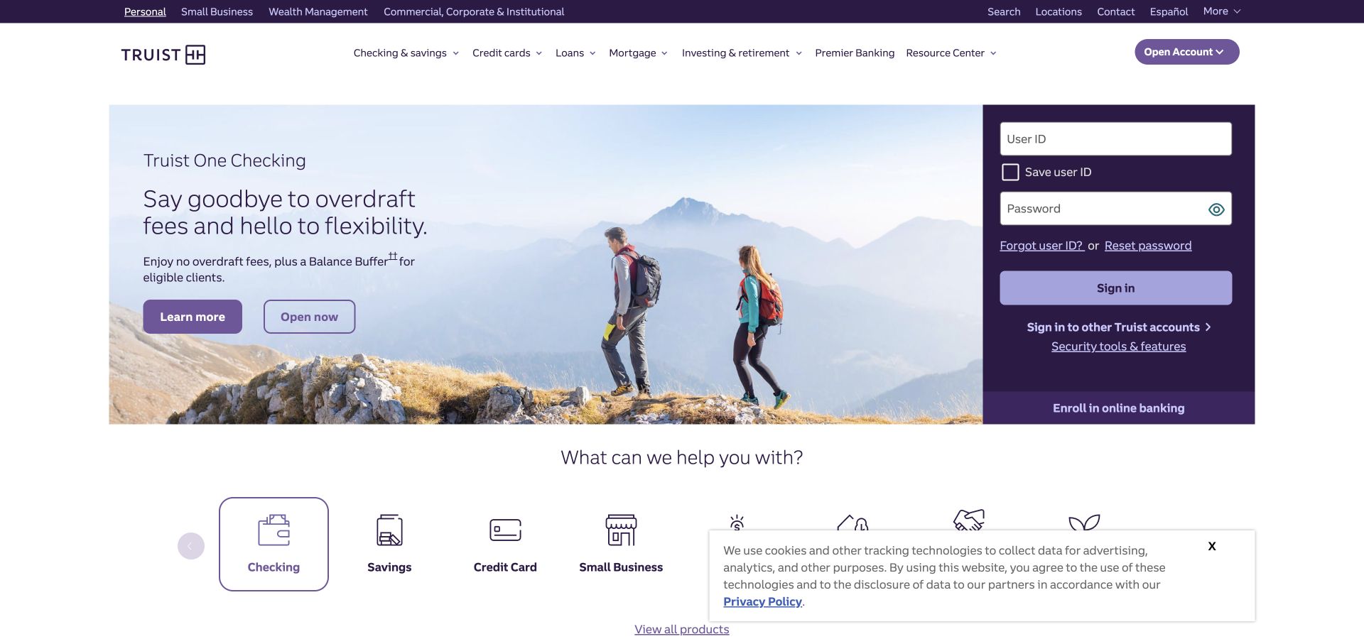
Truist uses purple to define the account panel beside an outdoor campaign photograph. A learning route and a product-opening route appear in the promotional area, followed by product icons below. The account entrance remains visibly separate for returning customers. Apache was reported on the sampled public response; no authenticated banking, application, or transaction workflow was exercised.
What you can learn
Keep established account paths stable when replacing public campaign components. Define a different delivery and logging boundary for personalized activity rather than treating all branded pages as one static site. Test redirection between canonical marketing hosts and the real service destination with fictional development data only. Ensure an expired promotion can be removed without altering sign-in information that returning customers may depend on every day.
Pros
Color establishes a strong boundary between campaign and account access.
The paired promotional actions distinguish exploration from a stronger commitment.
Cons & considerations
A prominent login surface demands accurate destination and outage information.
Returning customers need a stable account route that is not visually subordinate to the changing acquisition campaign.
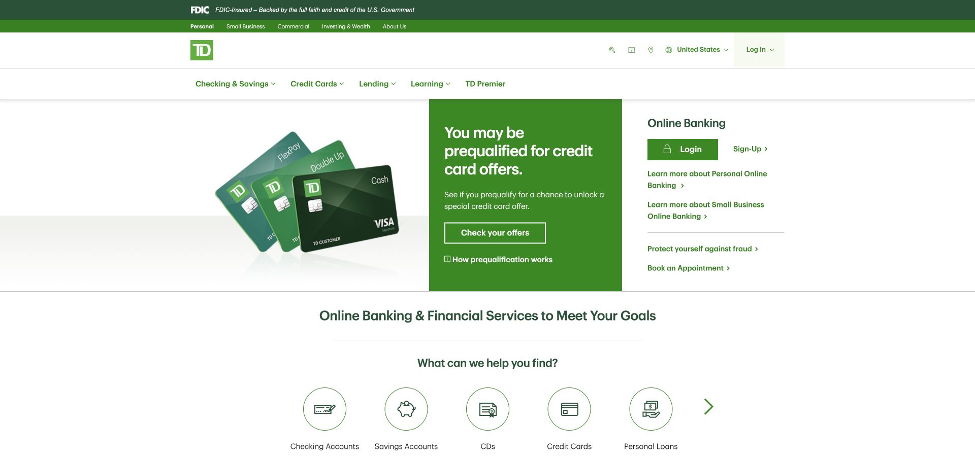
TD Bank divides its opening into a product image, a solid green offer panel, and an online-banking area. The lower product icons introduce another way to explore. White, green, and gray keep the parts recognizably related without merging their purposes. The observed Apache header applies to this public page, not necessarily to the protected account or product-application destinations reached from it.
What you can learn
Assign ownership to the offer copy, public product pages, and account handoff separately. When a campaign changes, test whether old links retain their context and whether time-sensitive terms have genuinely expired. A cache configuration that suits an illustration should not be copied indiscriminately to account-related responses. Preserve clear behavior when a service destination is unavailable rather than allowing a marketing page to imply a successful login or application.
Pros
Visual boundaries make three different tasks understandable within one desktop composition.
The product row supports visitors who are not interested in the current offer.
Cons & considerations
The desktop arrangement needs deliberate priority when its columns stack.
Offer descriptions and existing-account utilities need enough room when the three-part desktop composition stacks.
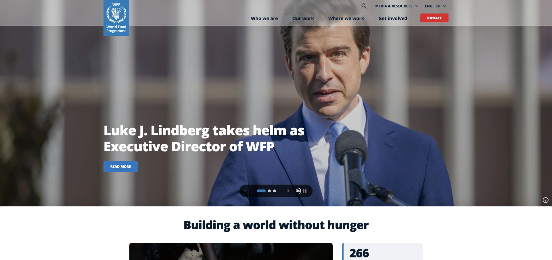
The World Food Programme places a photographic announcement below its blue institutional identity. Donation is a contrasting action, and visible slide controls sit near the feature. An explanation of the organization begins beneath it. Apache was reported for the sampled response; this does not identify the architecture of fundraising providers, operational food systems, or every WFP web property.
What you can learn
Separate current announcements, stable mission material, and transactions in the delivery brief. Give a report an enduring URL and retain its date when moving it out of the lead position. Define cache refresh and correction responsibilities, including a case where an old image remains in an intermediary cache. Keep a readable public explanation and an explicit donation handoff if optional media or a separate provider cannot load.
Pros
The contrasting support action is distinct from informational navigation.
The organizational introduction continues after the temporary lead item.
Cons & considerations
A rotating announcement requires motion, focus, and editorial-expiry decisions.
A dated announcement should remain distinguishable from the enduring mission explanation after the lead feature changes.
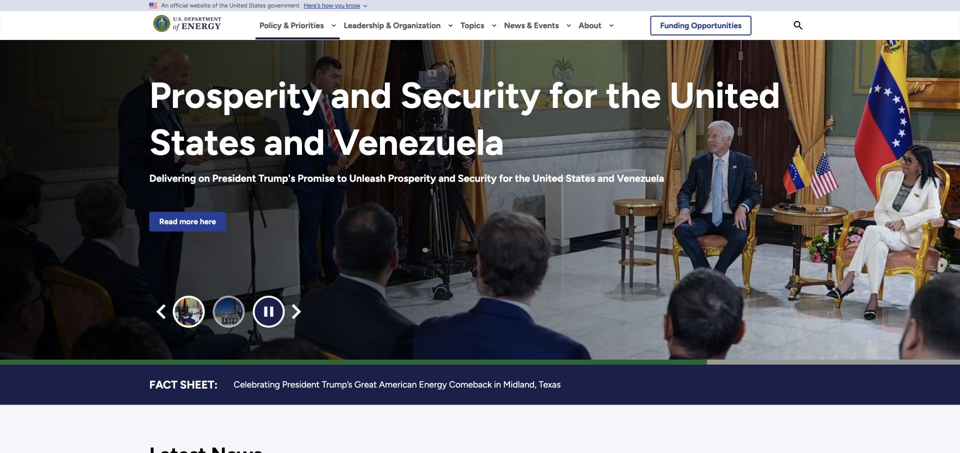
The Department of Energy surrounds a large photographic announcement with a compact institutional header and a separate funding-opportunities route. The lead feature exposes position and pause controls, and supporting material begins below it. The sampled response reported Apache. Neither the public header nor the visible announcement establishes how grant applications, research databases, or other linked agency systems operate.
What you can learn
Treat funding and application destinations as durable public tasks even when the featured administration or policy message changes. Specify redirect ownership, dated announcement archives, and an expiry process for temporary banners. Check that documents and public pages return appropriate types and statuses after deployment. Keep an unavailable transaction system from being obscured by a successful marketing-shell response that leaves the visitor uncertain about what actually happened.
Pros
Funding information has an explicit route outside the current campaign.
Visible media controls acknowledge that the lead presentation changes over time.
Cons & considerations
Time-sensitive policy features need clear editorial dates and ownership.
Funding opportunities need a clear continuing route even when a prominent policy feature changes subject.
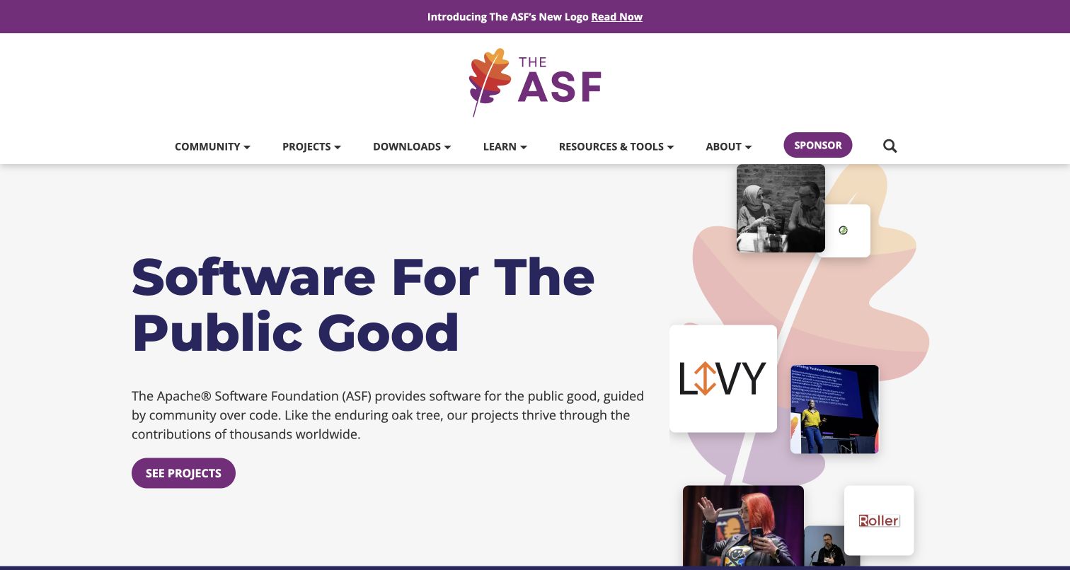
The Apache Software Foundation introduces its public mission with a large typographic statement and a prominent project entrance. Community and project navigation sit around a collage of software identities, with an announcement strip above. The page itself reported Apache HTTP Server, but the shared organization name is not evidence that every hosted project or public project website uses the same stack.
What you can learn
Keep the foundation's directory and each project's own publishing responsibility distinct. A retired project link needs an honest archive or status destination, not a silent substitution by another project. Test hostnames, download references, and MIME types when changing public delivery rules. An organization supporting many independent communities should explain ownership and continuity rather than expecting a familiar server brand to communicate those policies automatically.
Pros
The main project entrance connects the mission statement to a practical next step.
Community and project material have recognizable places in the navigation.
Cons & considerations
A collage of project identities can become difficult to scan without readable labels.
Project discovery requires readable labels alongside the collage, especially when project identities are unfamiliar.
The Hong Kong % Arabica property uses a large coffee-cup image, a percent-symbol identity, and a short statement on a white field. Region, language, cart, and delivery cues establish a commercial context without a crowded header. Apache was reported on this regional public response. The observation should not be extended to every Arabica website, physical store, or checkout implementation worldwide.
What you can learn
Define region and language routing deliberately rather than relying on a broad global redirect. A returning visitor should retain useful catalog and delivery context when switching properties. Keep cache keys and canonical URLs consistent with genuine regional differences, and test an unavailable item or shipping destination. Separate the shared brand assets from content that a regional operator must be able to update independently.
Pros
The recognizable identity and product image create a focused introduction.
Regional commerce information remains visible despite the sparse header.
Cons & considerations
A minimal layout still needs enough context for unfamiliar shoppers.
Region and delivery context should remain understandable when a shopper follows a link directly into the catalog.
FIS places a broad brand statement over an aerial urban photograph, with bright green actions and distinct product, insight, developer, and client-portal routes. The following content groups a large portfolio through recognizable financial themes. The sampled response reported Apache; this concerns the public corporate site, not the transaction engines or protected financial products represented by its marketing material.
What you can learn
Keep the route map aligned with actual product and audience ownership. A public product explanation may lead to documentation or a client portal, but those destinations need separate acceptance and security responsibilities. Preserve old portfolio URLs with meaningful equivalents after a reorganization. Test canonical hosts and error behavior without assuming that a successful public page proves the availability of an entirely different financial service.
Pros
Developer and client entrances are distinct from broad portfolio exploration.
The content following the hero offers a framework for a complex product range.
Cons & considerations
A broad brand promise needs concrete product explanations nearby.
The money-lifecycle themes need concrete product differences rather than another layer of broad enterprise terminology.
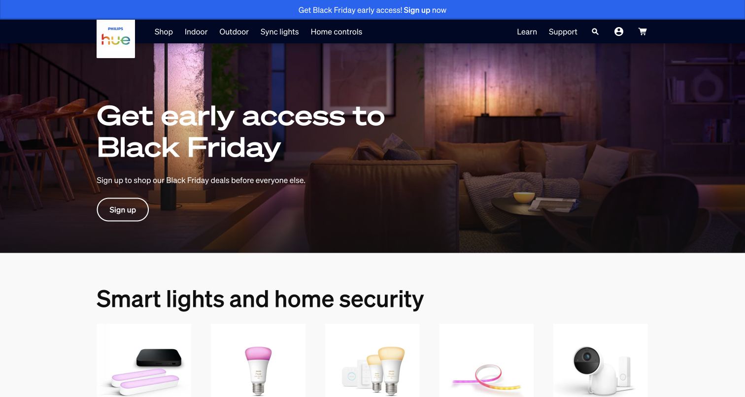
Philips Hue shows a furnished, atmospherically lit room rather than beginning with isolated product thumbnails. A concise seasonal offer overlays the scene, while shopping, lighting categories, synchronization, and support remain in the dark navigation. Product categories continue beneath the image. Apache was reported in the public response, not established as the implementation of connected devices, mobile applications, or all regional shops.
What you can learn
Document the relationship between a campaign, its product categories, and the ongoing support material. A promotion should be replaceable without breaking setup instructions that may be linked from packaging or saved by an owner. Test regional routes, image versions, and retired product destinations in the server migration plan. Keep commerce and device-support responsibilities explicit even when a common brand header makes the experience feel continuous.
Pros
The room photograph explains the intended lighting experience before product details.
Support retains a distinct route alongside the shopping taxonomy.
Cons & considerations
Seasonal offers need an explicit expiry and replacement process.
Connected-lighting categories need clear distinctions between shopping, compatibility, setup, and ongoing support.
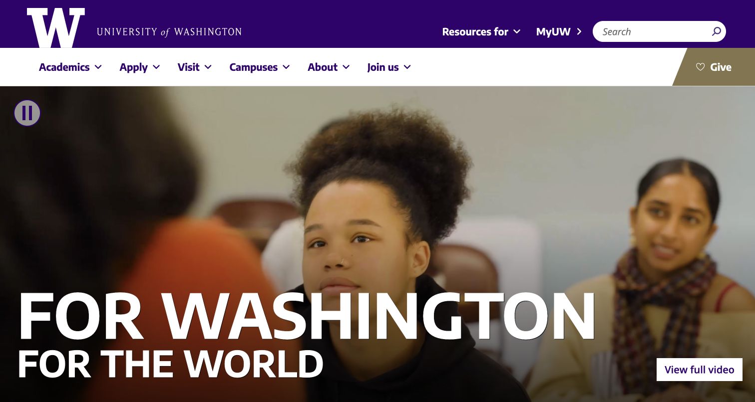
The University of Washington combines a purple identity bar, a white institutional navigation row, and a large media-backed statement. A pause control and a separate full-video destination recognize different viewing intentions. Giving occupies a distinct gold area. The public response reported Apache; the observation is not a description of student records, course applications, or the university's wider authenticated estate.
What you can learn
Keep a usable still and text alternative inside the public page when planning a similarly media-led introduction. Version the large assets so a rollback does not leave HTML pointing at missing files, and maintain stable admissions and research routes outside the campaign. Include reduced-motion and unavailable-media scenarios in acceptance tests. The presence of controls is useful visual evidence, but their existence alone does not verify that every interaction is implemented appropriately.
Pros
The campaign identity is anchored by familiar institutional navigation.
Pause and full-video routes express different possible media intentions.
Cons & considerations
A large media field can compete with practical university tasks.
A full-video action and pause control need clear purposes for visitors who only want the essential institutional information.
Use the provider’s maintained environment deliberately
Understand the provider’s responsibilities for runtime support, configuration changes, backups, and incident handling. Ask how you can test a redirect or recover a release. A managed environment is useful only when its boundaries and the business’s remaining duties are clear.
Plan a CMS rebuild around durable content types
Model articles, profiles, products, offices, and resources separately from their presentation. Map the old URL inventory to the new model before moving content. Server-level redirects and CMS routes should agree, particularly when a path resembles a file or has several historical versions.
Give a custom deployment an explicit operating contract
For a custom application or static build, document artifact layout, application handoffs, configuration ownership, and failure behavior. Test a release on the intended hosting setup rather than assuming that a local development router represents production accurately.
From references to requirements
Plan the migration, access boundaries, and everyday upkeep
Reconcile the content and URL inventories
Have editorial and technical owners review the same list of important destinations. Identify duplicate content, obsolete downloads, and addresses that must remain reachable. Keep the migration decision and test result together so the team can investigate a later report without reconstructing the project from memory.
Make file publication intentional
Decide which files belong in the public release and which belong in protected operational storage. Keep backups, environment files, customer exports, and development artifacts out of the public document tree. Review the generated or uploaded artifact itself, not only the list of pages visible in a browser.
Make changes reviewable and reversible
Record configuration and deployment changes through the team’s normal review process. Include old and new paths, application failures, and a rollback in the acceptance session. A content correction and an infrastructure change can have different owners without requiring two contradictory operating manuals.
A useful handover demonstration
Ask the actual team to carry out its routine job: publish a realistic update, correct a mistake, preview a narrow screen, and identify who owns an integration failure. For a library or frontend framework, also ask who maintains the content source and deployment. A polished screenshot does not answer those operational questions.
Beyond the screenshot
Apache HTTP Server website launch checklist
Agree which component owns each public route, file, redirect, and application endpoint.
Map important historical URLs to deliberate new destinations or correct missing-page responses.
Test direct deep links, canonical-host handling, and redirect chains.
Review the exact public artifact for backup files and private operational data.
Separate content editing permissions from infrastructure administration.
Check missing files and application failures without exposing internal details.
Rehearse a release and recovery on the intended hosting environment.
Assign owners for redirects, content corrections, updates, and incident follow-up.
Test with real content, a keyboard, a small screen, slow or failed requests, and the people who will maintain the system. These are planning checks, not an accessibility, security, performance, or search-ranking certification.
Sources & editorial method
How this Apache HTTP Server collection was reviewed
Each named property returned a reported Apache HTTP Server reference during the public evidence review. We did not inspect private configuration, module inventories, underlying operating systems, or corporate infrastructure. The screenshots are actual dated captures used for original content and navigation observations, not proof of configuration quality or business performance.
Every image is an unmodified capture from the actual website, with its source and capture date. Some captures are reused from our shared catalog; their dates remain the original capture dates. None comes from a vendor gallery or a generated reconstruction. Moving imagery and live content can change.
Technology attribution uses public page assets or metadata, official platform documentation, or a cited first-party project case study. Documentary and framework-relationship evidence is identified where used; it is not a complete current backend inventory. A CMS image CDN alone does not establish a full CMS deployment. A library’s presence does not prove which individual controls use it, and a platform label does not establish AI authorship.
The composition notes, lessons, pros and tradeoffs are original editorial observations. We have not measured conversion, traffic, security, performance or accessibility conformance. Website owners retain their brands and imagery; these examples are not our client portfolio. Written, Edited and Curated are independent records, not dates advanced by a build. See our editorial standards or suggest a correction.
Questions worth asking
Apache HTTP Server website development FAQs
Does Apache mean the website uses WordPress or PHP?
No. A reported server component does not identify the CMS or application language. The stack lists require separate evidence for those technologies and retain the distinction between observations and dependencies.
Can a screenshot reveal Apache settings?
No. A screenshot can show a visible page or navigation pattern. Configuration, application boundaries, and access rules need direct operational evidence and testing.
Should redirects live in the server or CMS?
Choose an authoritative location that fits the deployment and team, and document it. The important requirement is consistent, tested behavior rather than duplicating conflicting rules in several places.
Can we reuse a famous site’s server setup?
The guide does not disclose that setup. Work from your own route inventory, application requirements, provider responsibilities, and recovery plan instead of attributing a reference site’s appearance to its reported server.