A roofing website has to help someone make a consequential decision about a building—not simply admire a photograph of a roof.
Some visitors have an active leak; others are researching replacement materials or assembling bids for a commercial property. Those are different journeys. A useful site distinguishes urgent assistance from planned work and makes the service area explicit before asking for personal details.
This collection includes residential contractors, specialist roofers and commercial firms. Study the relationship between their project imagery, service navigation and contact routes. The examples are design references, not endorsements of workmanship or independent verification of advertised credentials.
Before the examples
What makes good roofing website design in 2026?
Explain what you do and where you do it
Put the roofing services and actual coverage area close to the introduction. Separate repair, replacement and commercial maintenance if the business genuinely offers them. A city list is not a substitute for explaining the work, and dozens of interchangeable location pages give readers little reason to trust the site.
Turn finished roofs into useful project evidence
Pair a completed project with the roof type, relevant constraints and a short explanation of the work. Before-and-after images need consistent angles and honest labels. Use customer names, reviews, manufacturer relationships and credentials only with permission and current supporting evidence.
Offer a realistic next step
Label an estimate request differently from an emergency call. Explain what information the team needs, who responds and what happens next without promising an unstaffed response time. Keep the phone number usable on mobile and avoid burying it under financing or promotional overlays.
The collection · 20 examples
20 roofing websites worth studying
Compare local service clarity, specialist positioning, project presentation and estimate journeys. Bigger firms are useful references for information architecture; their marketing volume is not a requirement for a smaller contractor.
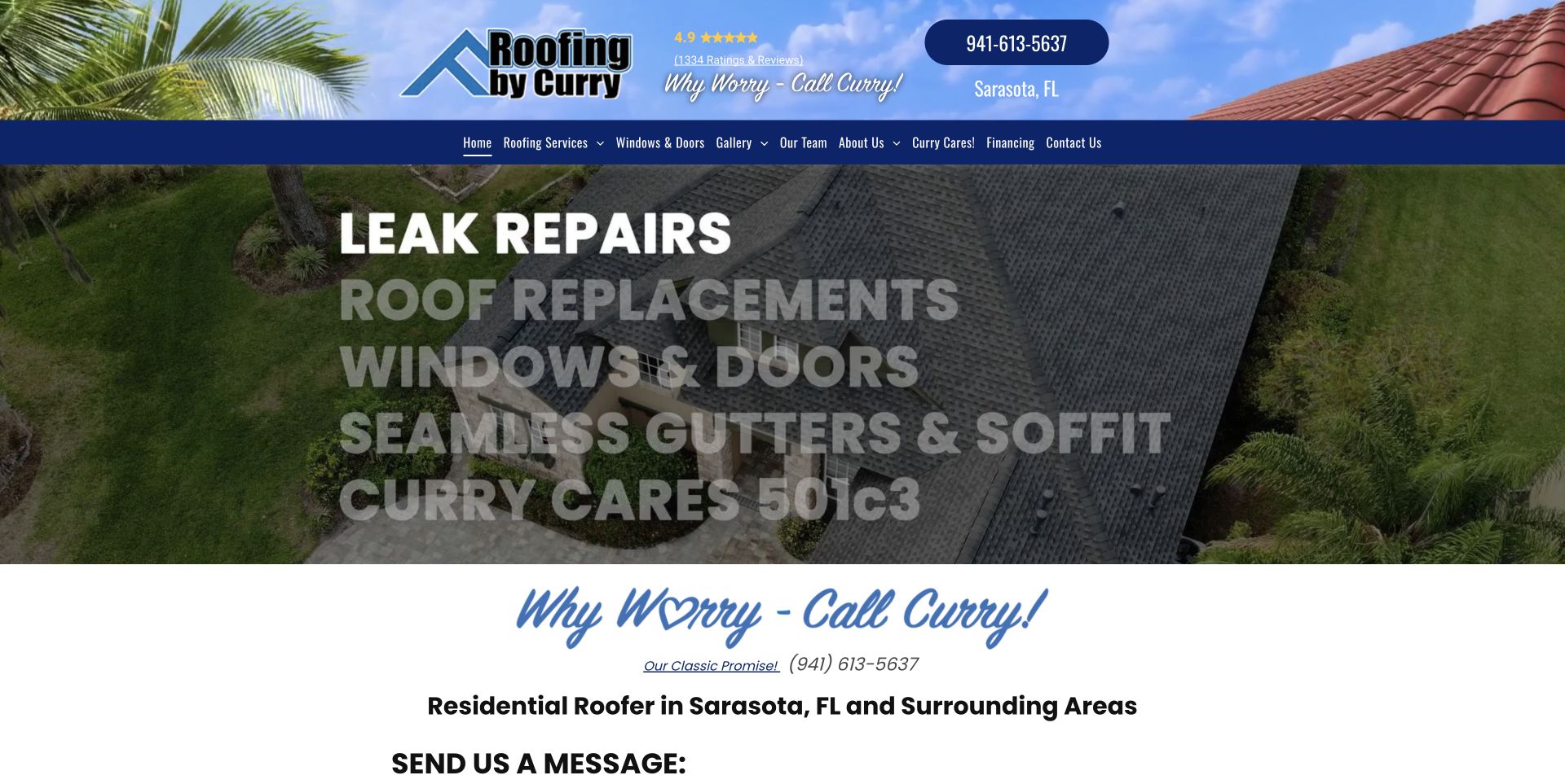
The masthead combines a roofscape, palm trees, a substantial logo, a local address, and a conspicuous phone control. A navy navigation band then separates that identity from the service-led hero beneath it. The opening image shows roofing rather than an unrelated lifestyle scene, while the service labels provide a quick sense of the available work. The result is deliberately busier than a minimal contractor page, but the busyness has a local, familiar character rather than looking like an anonymous national template.
What you can learn
Borrow the sequence: establish who and where you are, provide a direct contact route, then explain the service. A smaller contractor could keep the regional photography and phone emphasis while reducing the number of competing utility elements.
Pros
The regional roof-and-palm imagery makes the brand visually specific to its market.
A distinct navigation band keeps service discovery separate from the decorative masthead.
Cons & considerations
Several masthead elements compete for attention before the visitor reaches the main message.
De-emphasized service labels over imagery need strong contrast and a considered mobile alternative.
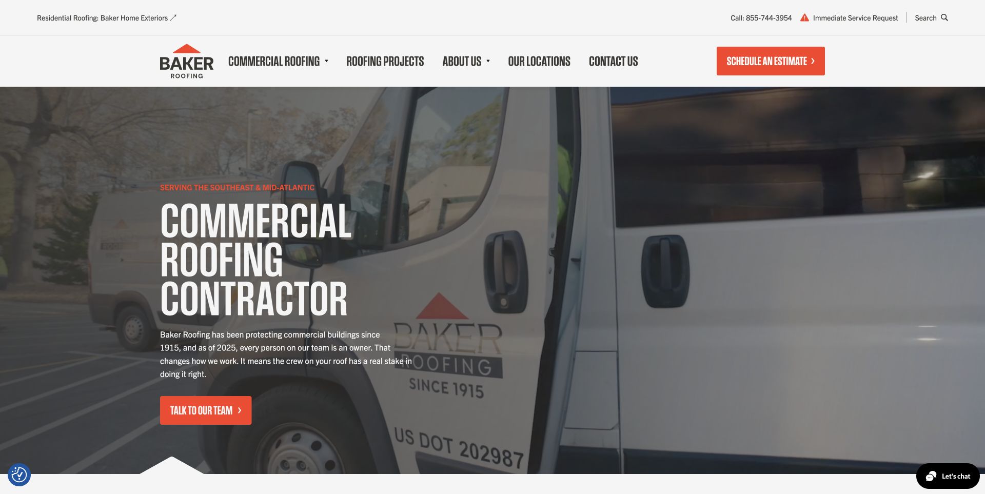
Baker puts the commercial identity in the main navigation while giving residential visitors a separate utility route. The captured hero uses branded vehicles and a dark overlay, with a large condensed headline, a short supporting paragraph, and an orange contact action. Phone and urgent-service options remain visible above the main menu. This is useful operational storytelling: the opening image presents the people and equipment behind the service rather than only showing an attractive finished building.
What you can learn
When two audiences need different services, split their routes before asking them to interpret one generic page. Keep the primary audience dominant, and use real fleet, crew, or project imagery to make the company tangible without turning the hero into a credentials wall.
Pros
The residential route is discoverable without diluting the commercial main menu.
Orange actions stand apart from the white header and dark footage.
Cons & considerations
The utility bar, navigation, urgent options, and chat can become crowded on smaller screens.
Background motion needs a legible still-image fallback rather than carrying essential information.
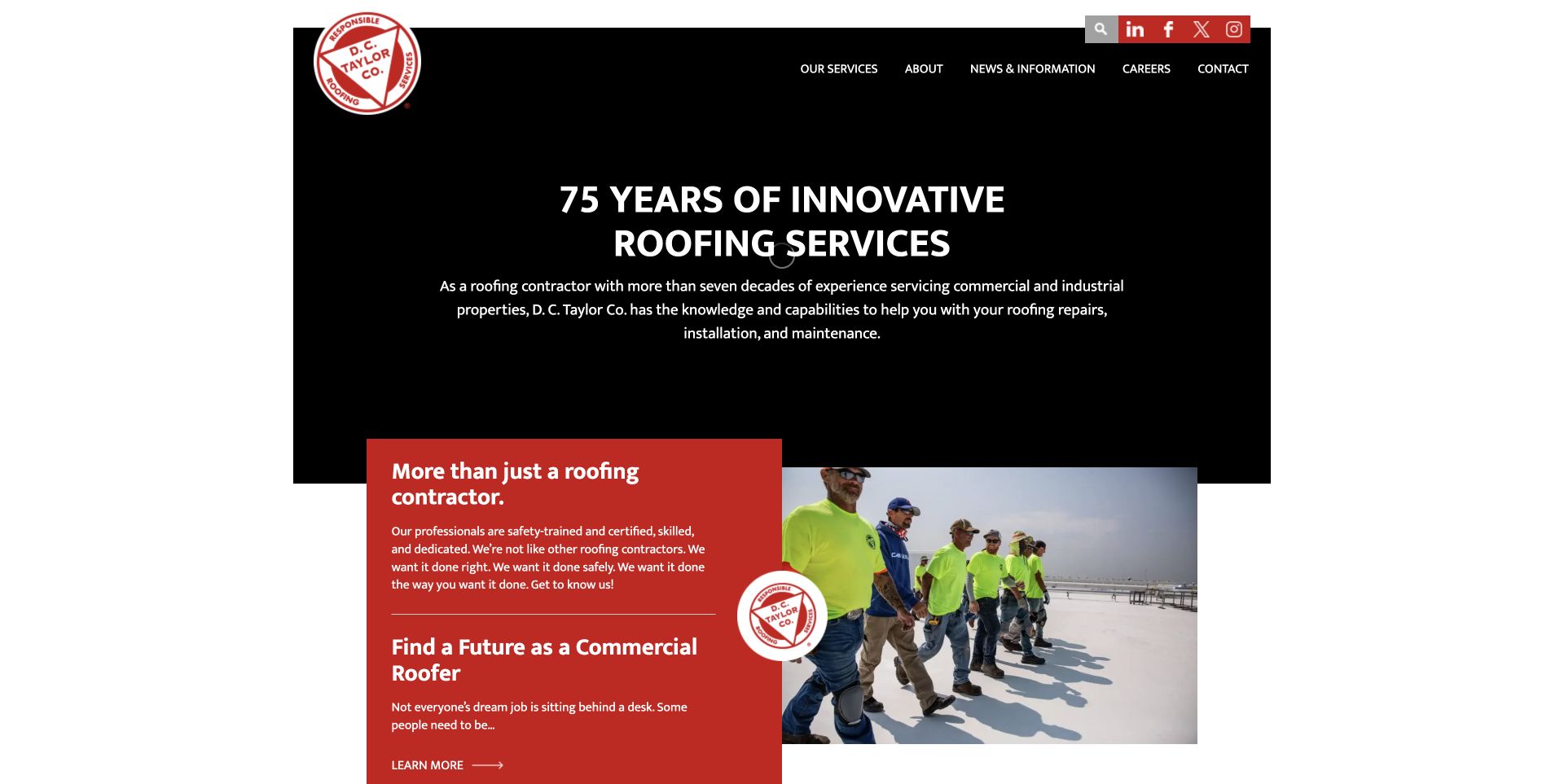
D. C. Taylor uses a largely black opening panel with a centered white headline and restrained navigation above. A red circular logo interrupts the edge of the composition, and a red introduction card overlaps the transition into a roof-crew photograph below. The limited palette gives these layers a clear relationship. Rather than placing every service in the opening view, the page emphasizes experience and how the team works, then moves toward more detailed information in subsequent sections.
What you can learn
An overlapping card can connect a broad promise to a concrete explanation without adding another full-width banner. Use the card for a buyer-relevant message and let a crew photograph establish context. The shape and color should clarify reading order, not merely decorate it.
Pros
Black, white, and red create a small, coherent visual vocabulary.
The overlapping card makes the transition from headline to supporting content easy to notice.
Cons & considerations
A centered brand-led opening offers less immediate direction than a visible project-request action.
Recruitment and buyer content should remain clearly separated when they share the same page.
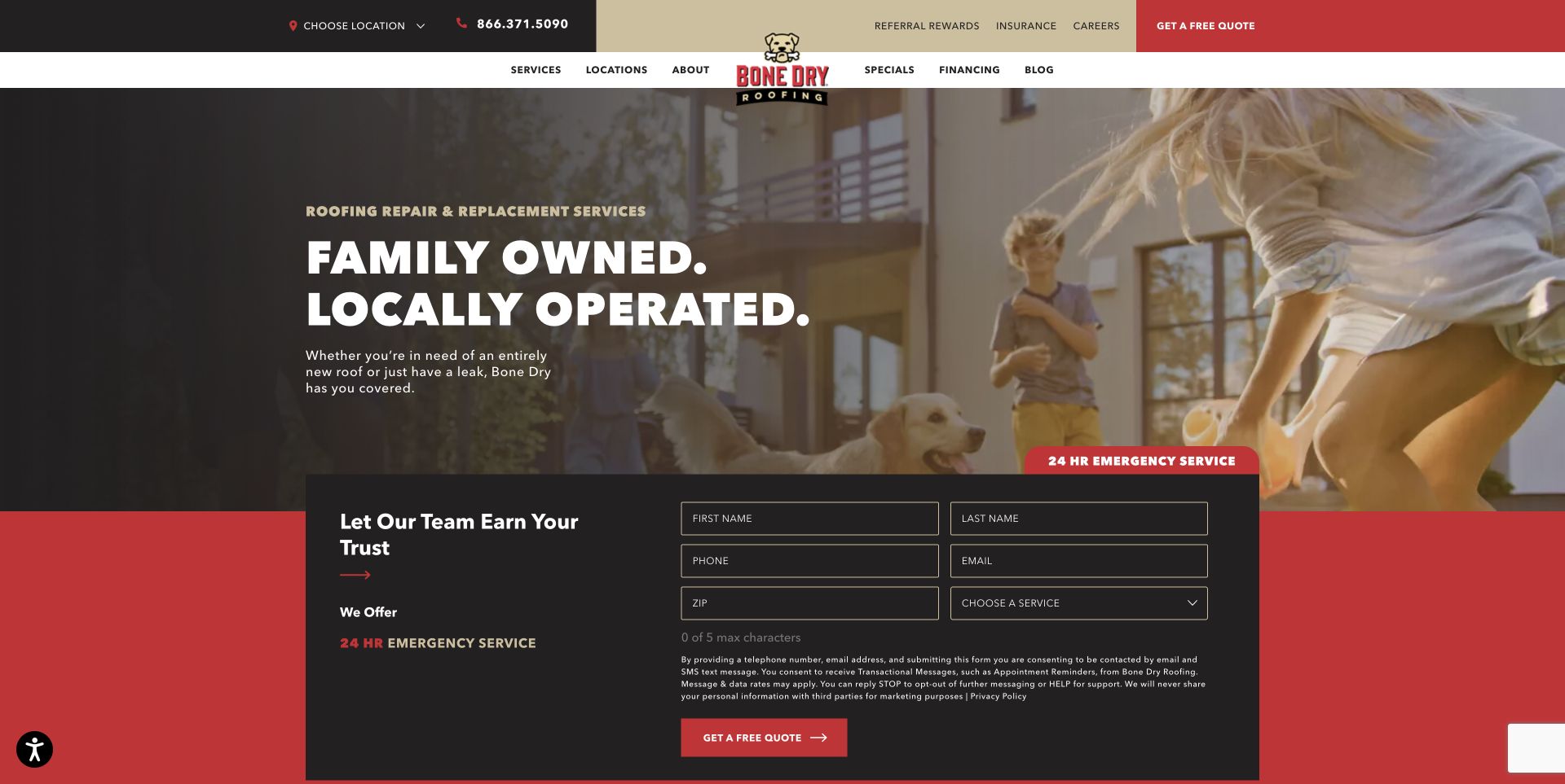
The Bone Dry opening uses a warm backyard scene with a family and dog, then overlays a dark headline area and a broad contact form. The header has multiple functional layers: local contact information, secondary links, navigation, and a red quote control. An emergency label introduces the form, which asks for contact details, location, and service choice. This makes the first screen both emotional and practical: the image describes the home context while the form begins qualifying the actual request.
What you can learn
Pair the homeowner outcome with a specific next step, but decide how much information you truly need immediately. A short first stage can keep the same service-and-location routing while reserving detailed questions for the next screen or conversation.
Pros
The form is visibly connected to the service proposition rather than hidden on another page.
Emergency help and routine quote requests have distinguishable visual cues.
Cons & considerations
A wide multi-field form creates substantial first-screen effort, particularly on phones.
Several header layers compete with the image and may need consolidation at narrow widths.
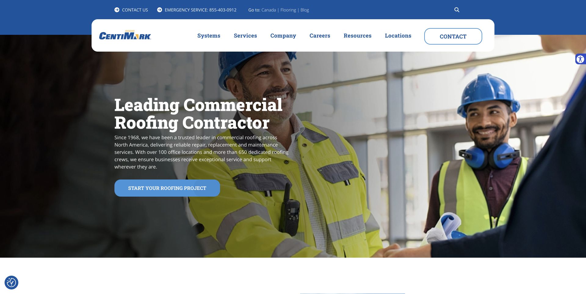
CentiMark places a rounded white navigation container over a large image of people discussing work on a roof. The utility strip handles phone, emergency, and secondary destinations, while the main menu distinguishes systems, services, company information, resources, and locations. A large white service heading and blue project action occupy the darker part of the image. Showing a conversation rather than just a roof surface makes the commercial service feel like an ongoing working relationship.
What you can learn
Use navigation categories that match how buyers investigate the work: the roof system they have, the task they need, and the location that can help. Give each category a distinct purpose instead of filling several menus with near-duplicate service labels.
Pros
The systems-versus-services distinction accommodates technically different buying questions.
The white navigation panel stays visually separate from the changing background image.
Cons & considerations
A national-scale menu would be unnecessarily complex for a small single-market roofer.
Moving hero imagery and animated controls require steady text and sensible reduced-motion behavior.
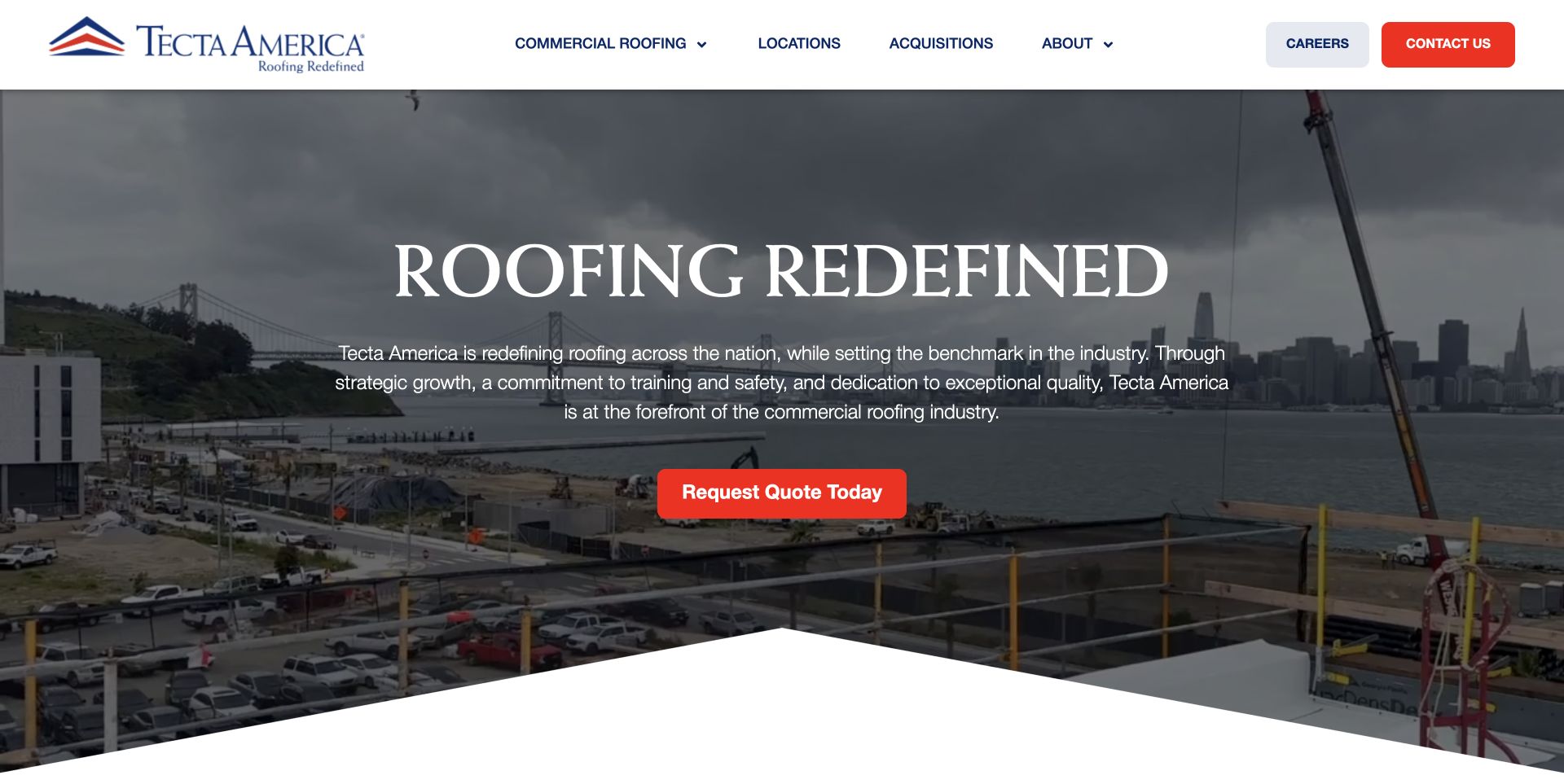
Tecta America uses a white navigation row, blue-and-red identity, a large centered serif headline, and a single red quote action. The reviewed hero shows a substantial waterfront construction setting behind a dark overlay. A sloped lower edge adds shape without introducing another content block. The page feels corporate and expansive, yet the opening keeps the action count low: the visitor can investigate the service and locations from the menu or request a quote from the hero.
What you can learn
A broad organization does not need a crowded opening. Keep the first screen to a recognizable identity, a short positioning statement, and one buyer action; let geography and corporate detail live in clearly labeled routes. Project-scale photography should support, rather than replace, the explanation.
Pros
A single red hero action is easy to distinguish from the quieter navigation.
The restrained palette connects the logo, header, and action without competing accent colors.
Cons & considerations
The broad positioning paragraph gives fewer immediate clues about a particular roof problem.
Centered text over construction footage needs careful cropping and contrast across screen sizes.
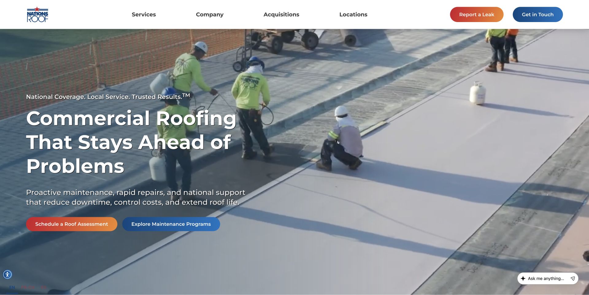
Nations Roof places two differently colored actions in the header: one for reporting a leak and one for general contact. The hero then presents a crew working on a flat roof, a large left-aligned problem-prevention message, and separate assessment and maintenance-program buttons. The content is grounded in a commercial buyer’s situation rather than a generic construction slogan. Plenty of open image space remains on the right, keeping the headline from having to cover every worker in the scene.
What you can learn
Distinguish a building manager with an active leak from someone evaluating future maintenance. The same company can serve both, but their next steps should not have identical labels or lead to an undifferentiated inquiry form. Let the visitor self-select the urgency.
Pros
Leak reporting is visible before visitors read the entire hero.
Assessment and maintenance are offered as different next steps, not buried in prose.
Cons & considerations
Multiple contact actions need consistent destination behavior to avoid creating redundant paths.
The large moving background should not be required to understand the service or its scope.
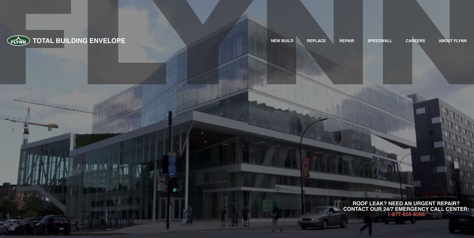
Flynn replaces conventional service names with task-oriented navigation for new work, replacement, and repair. The opening fills the screen with footage of large buildings, while oversized translucent brand lettering becomes part of the composition. A dark emergency-contact block sits at the lower right, separate from the main navigation. The opening therefore sells the scale and breadth of the practice visually, with the menu doing most of the work of directing a visitor to an actionable service route.
What you can learn
Use buyer verbs when the visitor already knows the task they need completed. New construction, replacement, and repair can be more useful first-level distinctions than a long list of materials. Keep an urgent route independent from an atmospheric brand presentation.
Pros
Short task labels are easy to compare while scanning the main navigation.
Emergency contact information has its own strong, stable container over the image.
Cons & considerations
The immersive reel offers little explanatory copy for visitors unfamiliar with building-envelope terminology.
Large background branding and motion can dominate the practical content without a strong still fallback.
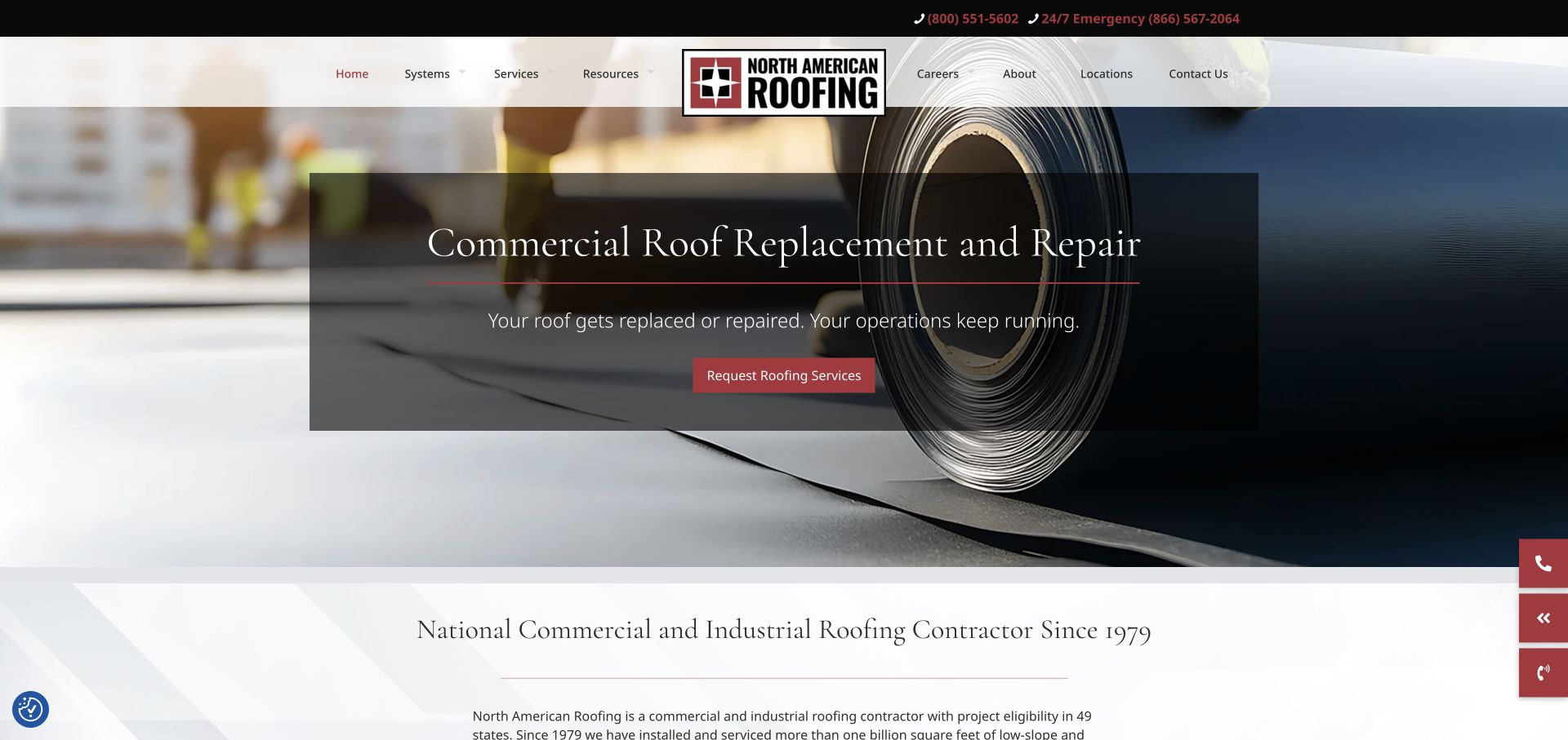
North American Roofing uses a centered logo that divides the navigation, with a separate dark phone strip above it. The captured hero promotes commercial replacement and repair over a close view of roofing material, placing the message inside a translucent dark panel. The opening transitions into a light introduction that explicitly names the commercial and industrial audience. The overall treatment is more traditional than a sparse portfolio site, but the material photograph keeps the subject matter specific.
What you can learn
A service campaign can sit inside a broader company homepage if the audience and contact routes remain clear. Give recurring programs and replacement work their own concise explanation, then provide the wider service context below. Avoid relying on a rotating slide to carry information that every buyer needs.
Pros
The material-focused image explains the work more directly than unrelated lifestyle photography.
Normal and emergency phone routes are distinct in the utility bar.
Cons & considerations
A centered logo and long navigation row demand a carefully reworked mobile header.
Translucent panels and rotating slides can weaken legibility during transitions if not tested.
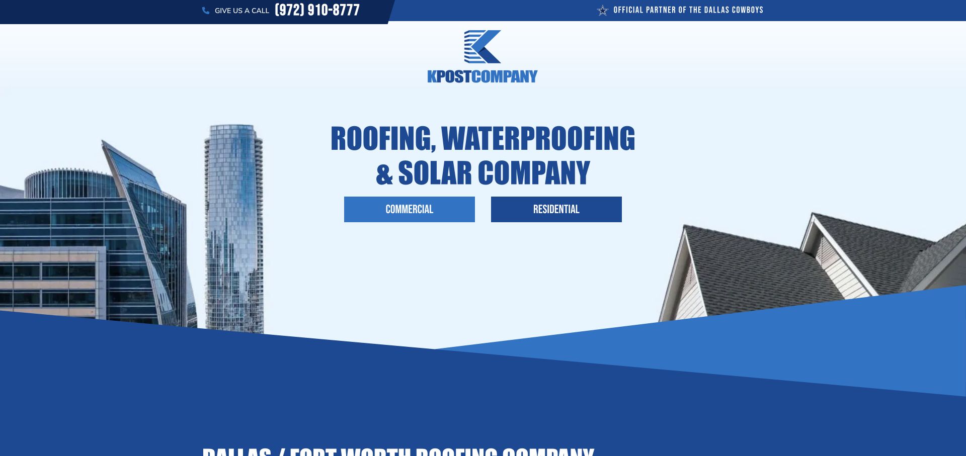
KPost treats its homepage as a gateway rather than a conventional long sales pitch. A central logo sits above a bold condensed category heading, followed by two large buttons for commercial and residential visitors. Building silhouettes flank the composition: commercial towers on one side and a pitched residential roof on the other. Blue angular bands join these visual halves. A phone strip remains available above, so visitors do not have to choose a division simply to find a contact number.
What you can learn
If two divisions have different proof, processes, and buyer questions, a simple gateway can be clearer than squeezing both sales narratives into one hero. Make the choices explicit and visually balanced, while keeping a universal contact route available for people who are unsure.
Pros
The audience decision is the dominant action rather than a hidden menu option.
Commercial and residential imagery reinforces the meaning of the two buttons.
Cons & considerations
The gateway delays service details for visitors who want to compare capabilities immediately.
The large logo and generous sky area use space that a smaller business may need for context.
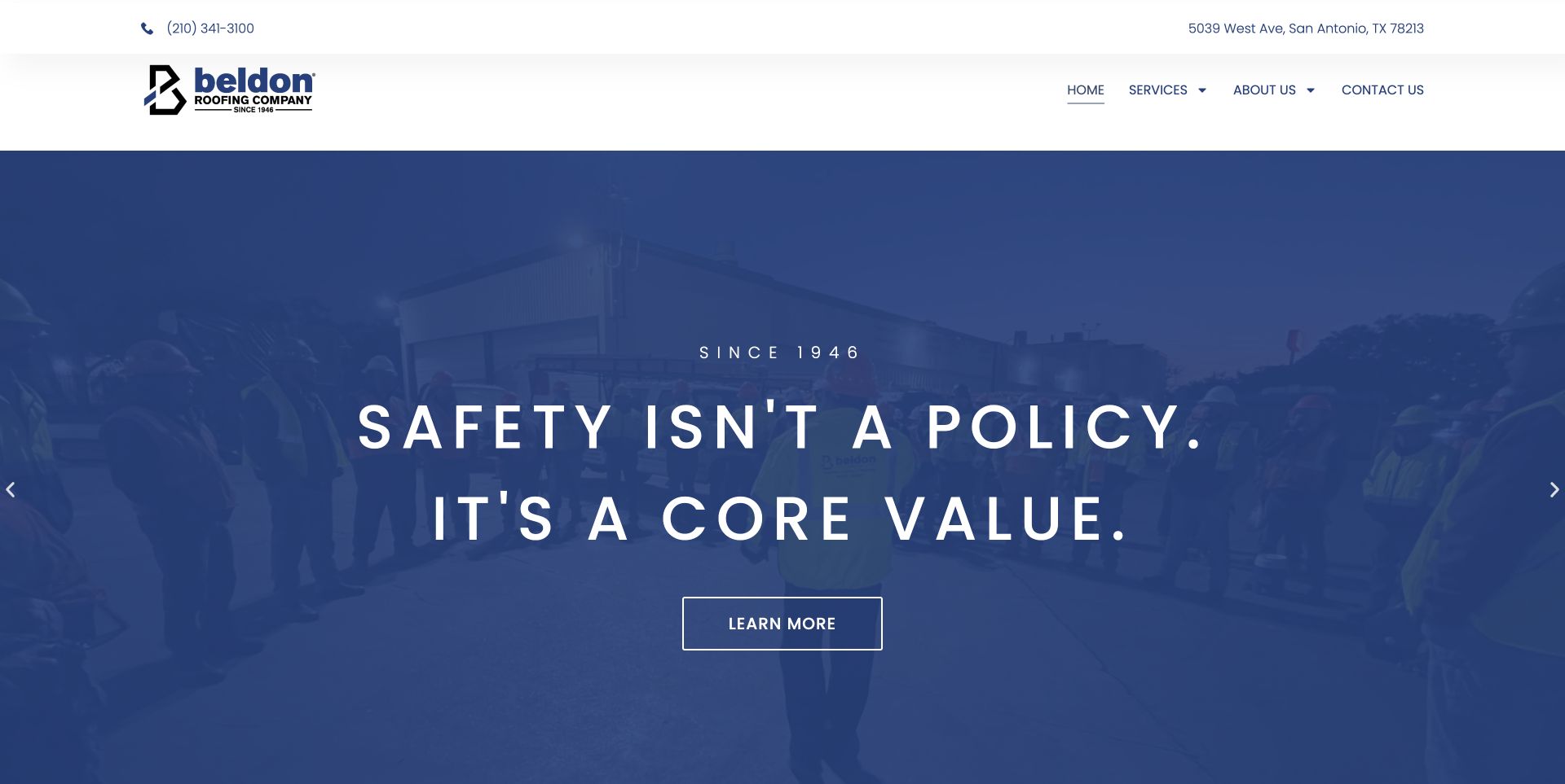
Beldon uses a calm white header with phone and address information above a compact navigation row. Its full-width carousel combines a strong blue overlay, team imagery, generous letter spacing, and a centered message about working values. A simple outlined button provides the next step. The composition is much more restrained than many contractor homepages: instead of several lead forms and promotional ribbons, the opening asks visitors to absorb one company story at a time.
What you can learn
Values become more meaningful when the supporting image shows the people who are expected to deliver them. Keep the palette narrow and link the story to a concrete destination. For a less familiar firm, place the service type and service area alongside the brand message rather than making visitors infer them.
Pros
Phone and physical location remain easy to find outside the rotating campaign.
The blue overlay gives the typography a consistent background despite changing photography.
Cons & considerations
A values-led slide says less about the immediate roofing task a new visitor may have.
A generic learn-more label provides less destination clarity than a specific service or process action.
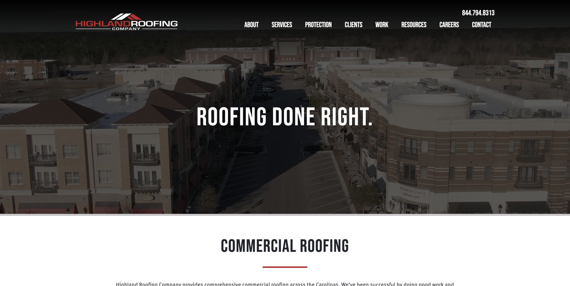
Highland’s opening is built around an aerial commercial-building image with a dark overlay and a short, condensed white statement at its center. The black header merges with the image, while the red-and-white logo and narrow uppercase navigation maintain the same visual language. Immediately below, a white section introduces commercial roofing with another condensed heading and a short red rule. This keeps the visual transition simple and lets the project setting carry a substantial part of the context.
What you can learn
An aerial can communicate the scale and type of buildings a contractor serves, but pair it with explicit service wording near the image. Repeat a small number of typographic and color choices between the hero and introduction so the page feels continuous rather than assembled from unrelated sections.
Pros
The image and the following commercial-service heading reinforce the same audience.
A limited black, white, and red palette keeps the opening visually consistent.
Cons & considerations
The short central slogan gives limited help choosing the next step.
Condensed uppercase navigation can become hard to scan when many items share one row.
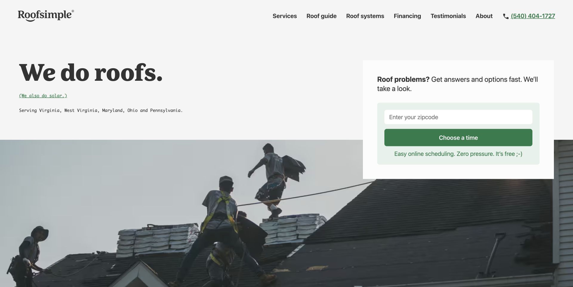
Roofsimple takes a noticeably quieter approach: a pale background, a large serif service statement, small monospaced location copy, and a green scheduling panel. Rather than asking for a full project description at once, the visible starting field asks for a ZIP code. A worksite photograph begins below the text, connecting the friendly tone to the physical roofing service. The header still offers guides, roof systems, financing, and testimonials for visitors who are not ready to schedule.
What you can learn
A simple first step works best when it has an obvious purpose. Here, location comes before appointment choice, so the visitor can understand why the field exists. Preserve educational routes for research-stage buyers instead of assuming everyone arriving on the homepage wants to fill out a long quote form.
Pros
The ZIP-first panel asks for a clear, limited piece of information.
Distinct serif, monospaced, and sans-serif roles give the layout personality without extra graphics.
Cons & considerations
The brief service statement needs supporting detail for buyers comparing specialized capabilities.
The scheduling promise should match the actual next screen and local availability.
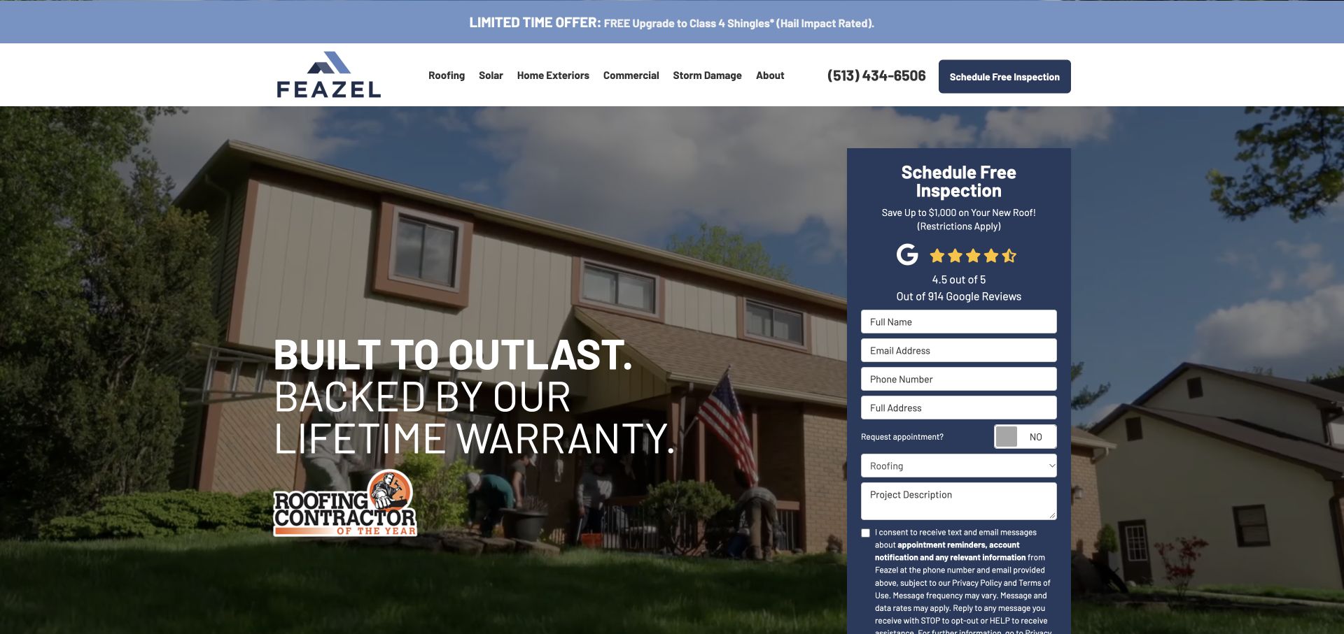
Feazel pairs a house photograph and large warranty-focused statement with a tall navy inspection form on the right. The form includes a review treatment, labeled contact fields, a service selector, project notes, and consent information. A promotional strip sits above the white navigation, while the header repeats the inspection action. The opening is clearly designed around requesting help rather than browsing a portfolio, with the home image providing the setting instead of competing for a separate visual story.
What you can learn
If inspection is the central next step, give the form a clear heading and explain the type of request it starts. Keep the surrounding message short enough to support the form. Review and consent treatments should remain readable without pushing essential controls beyond reach on smaller devices.
Pros
The form’s dark panel gives the request flow a distinct visual boundary.
The header and form use the same inspection language, reducing uncertainty about the action.
Cons & considerations
A long form and extensive consent copy can dominate the initial experience.
Promotions, reviews, warranty language, and a form create several competing reasons to pay attention.
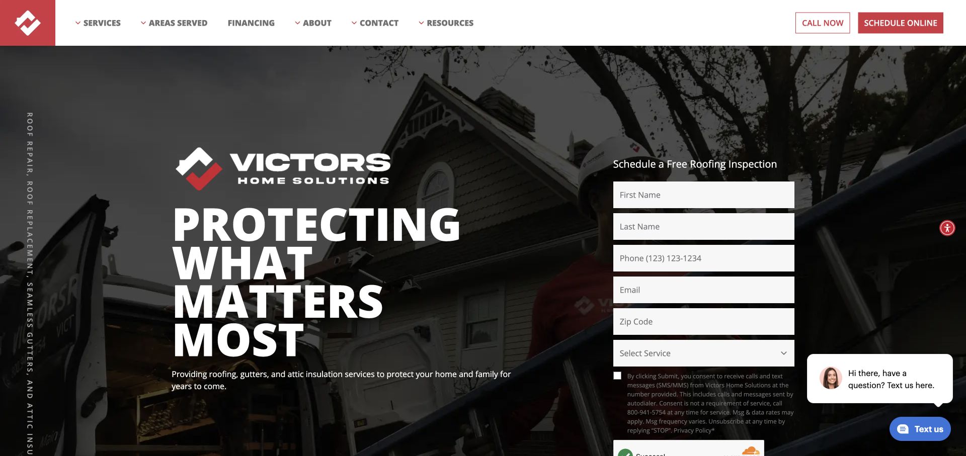
Victors uses a white header with red contact controls, a darkened worksite background, and an oversized stacked white headline on the left. The brand mark is repeated in the hero before the message, while the inspection form occupies a separate right column. Vertical service wording adds another layer at the far edge. The treatment is assertive and highly branded, but the visible form fields keep the main request practical rather than leaving visitors with only a slogan.
What you can learn
A powerful brand treatment still needs a straightforward task beside it. Separate the expressive headline from the form column, then use consistent action language in the header. The brand should make the page recognizable without making the service, location, or consent requirements harder to find.
Pros
High-contrast white type and red actions make the main hierarchy immediately apparent.
The form sits next to the service message instead of interrupting it in a modal.
Cons & considerations
Oversized line breaks use substantial vertical space and need careful mobile adaptation.
Chat prompts and edge text can compete with the form rather than helping visitors complete it.
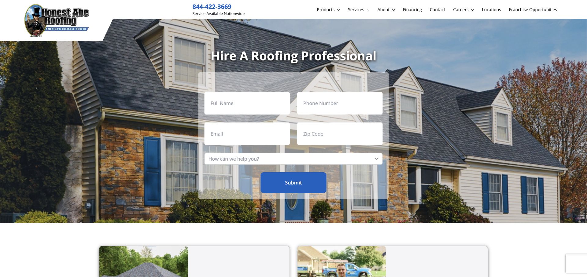
Honest Abe places its illustrated identity in a shaped white header, followed by a service phone treatment and navigation. A centered heading and translucent form panel occupy the middle of a residential roof image. The form groups name, phone, email, ZIP, and service selection into an uncomplicated grid. Compared with editorial contractor sites, this page puts the request flow first; visitors see immediately that the homepage is a place to ask for roofing help.
What you can learn
A centered form can work when its field count is modest and the background remains secondary. Use a service selector to clarify the inquiry, but make sure the company’s actual coverage is explained before the visitor spends time entering personal details. A clear next-step label is more useful than a generic submission command.
Pros
The form groups related contact details into a compact, understandable layout.
The roof photograph makes the service category obvious even before reading the navigation.
Cons & considerations
A translucent panel over a detailed house image needs consistent contrast across crops.
A generic submit button does not explain what response or next step the visitor should expect.
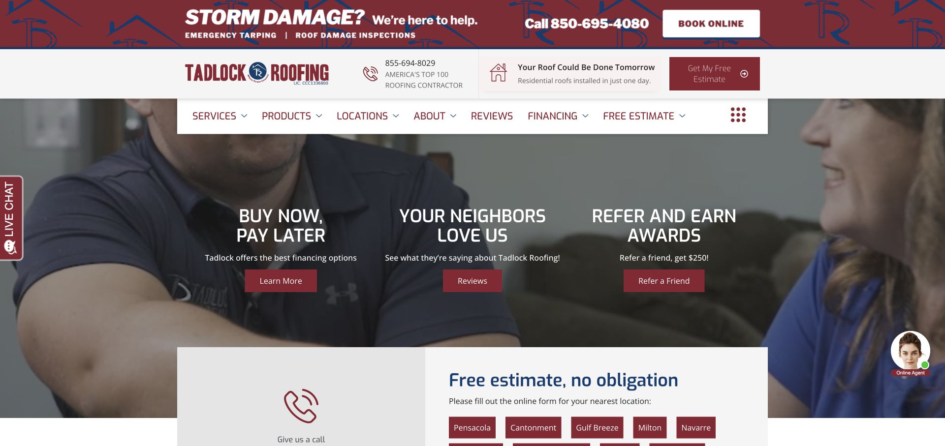
Tadlock’s homepage combines a storm-help banner, a branded contact header, a floating white menu, and three promotional columns over a residential scene. Financing, reviews, and referrals receive equal visual weight, with a light estimate section beginning underneath. The visible estimate area routes visitors toward local locations rather than presenting an undifferentiated national form. The burgundy palette ties these pieces together, although the page offers substantially more simultaneous choices than a single-action contractor homepage.
What you can learn
Identify the concerns that genuinely change a homeowner’s decision, then label those routes plainly. Financing and evidence can sit beside the quote path, but referral marketing should not obscure help for a new prospect. Local-office routing is useful when it meaningfully changes the contact experience.
Pros
The storm banner separates urgent help from routine research routes.
Financing and customer evidence have visible destinations rather than being buried in long copy.
Cons & considerations
Several stacked header layers reduce the available room for the main service message.
Three equal promotional columns can dilute the priority of requesting an estimate.
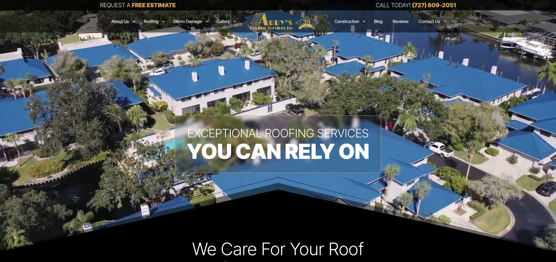
Arry’s opens with an aerial view of blue-roofed buildings beside water, using the project itself as a substantial visual statement. A black utility strip emphasizes the estimate and phone routes, while the centered logo divides a translucent navigation row. The headline sits inside a soft dark panel outlined in a restrained gold accent. At the bottom, layered roof-like angles lead into a black introduction section. This creates a distinctive transition without inserting another promotional banner.
What you can learn
Choose a project image that remains recognizable as roofing at a glance, and keep practical contact routes outside the moving visual. A geometric transition can echo the trade, but it should also help the reader understand where the next content section begins. Use it sparingly rather than repeating the motif everywhere.
Pros
The aerial gives an immediate sense of the type and scale of roofs being shown.
A separate utility strip makes contact options independent of the hero’s text.
Cons & considerations
Translucent navigation may become hard to read over brighter frames or alternate crops.
An image-led opening needs supporting service and coverage detail for first-time visitors.
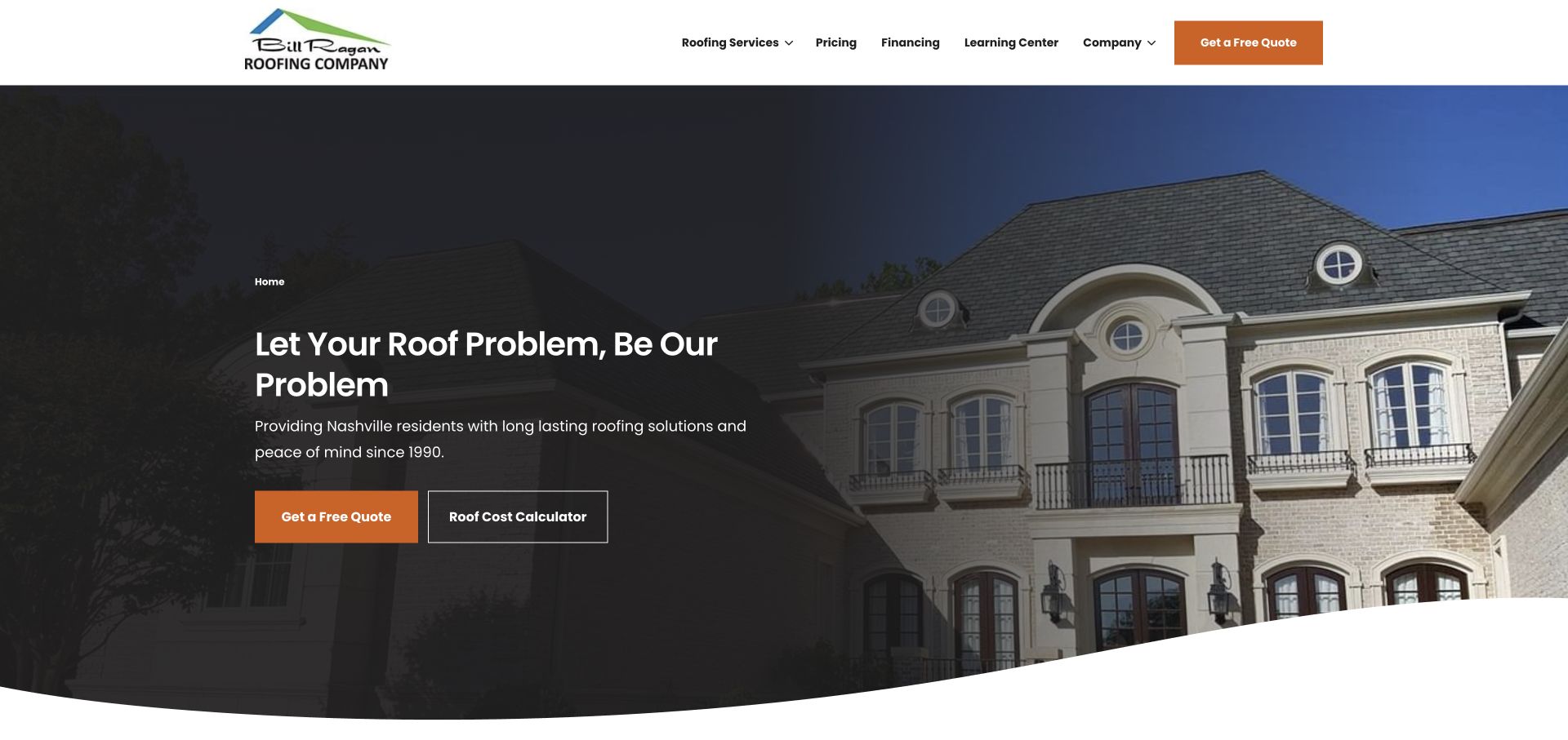
Bill Ragan’s opening uses an orange quote button beside an outlined roof-cost calculator action. The header makes pricing, financing, and a learning center visible alongside roofing services, rather than relegating all research material to a blog footer. The dark gradient keeps the left-aligned message readable over a large house photograph, and a curved white lower edge separates the hero from the next section. The practical distinction is the two-level intent: visitors can ask for a quote or first investigate cost.
What you can learn
Not every roofing visitor is ready for an appointment. Pair the primary inquiry with one genuinely useful self-service resource that answers a common buying question. The resource should disclose its limits and lead naturally to project-specific advice, rather than pretending an estimate is a binding price.
Pros
The cost-calculator route acknowledges a common early-stage buyer question.
Pricing and learning content are visible in the primary navigation.
Cons & considerations
Two actions require a clear visual priority so they do not appear interchangeable.
A large residential image alone cannot explain which roof materials or projects the firm handles.
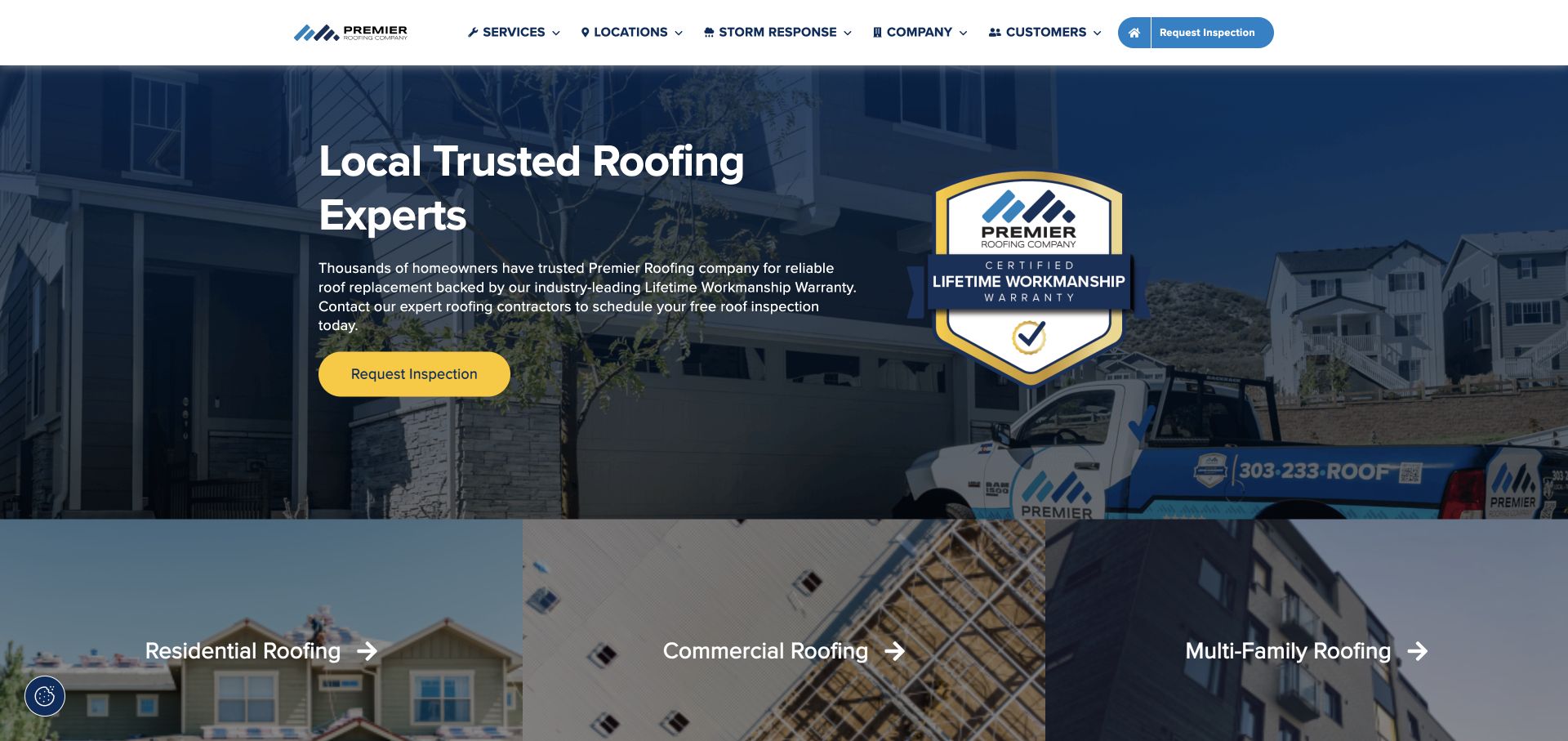
Premier uses a compact white navigation row with small category icons, a dark blue hero, and a yellow inspection button. A large warranty-shaped badge balances the headline and introductory copy on the opposite side. The next visible row breaks the offering into residential, commercial, and multifamily roofing with three photographic panels. This is a useful information sequence: make the main service request recognizable, then help visitors choose the property category that fits their situation.
What you can learn
Let the first action stay simple, then separate audience-specific detail in the following section. A badge should represent a real, explained promise and link to its terms or supporting information. Use the category images to distinguish buyer contexts rather than repeating three visually identical roof close-ups.
Pros
The yellow action is distinct from the blue background and quieter navigation.
Property-type panels provide a clear next step after the broad introduction.
Cons & considerations
The badge occupies substantial hero space that could otherwise show the work.
Small navigation icons need text labels and should not become a substitute for clear category wording.
Write down recurring questions about leaks, roof age, materials, inspections, service boundaries and scheduling. Map each question to an honest answer or a person who can answer it. Do not promise a diagnosis from a photograph or present an estimate form as a binding quote.
Create a repeatable project record
Collect approved photographs, work categories, approximate locality and a factual description while the crew still remembers the job. Record who can publish it. A manageable project library is more useful than a gallery that requires a developer for every new image.
Define the handoff after the form
Choose the person or team responsible for requests, a backup route if notifications fail, and a clear confirmation message. Test spam handling without discarding real leads silently. Keep requests and tracking data out of publicly accessible pages and repositories.
The editing job behind the design
Choose a system the roofing team can maintain
A conventional CMS can support service pages, project records and a small set of genuine location pages. Model those as repeatable content rather than copying one long page for every town. Decide who can edit credentials and seasonal offers, since outdated claims can undermine otherwise good design.
Use the existing office workflow or CRM as the destination for inquiries when practical. A booking widget, finance application or measurement service introduces another vendor and another failure point; give visitors a plain contact alternative and test the transition on a phone.
Our WordPress website examples offer a separate look at publishing approaches. A visible platform label is evidence for that named page, not a guarantee that the same system will suit your requirements.
Before the public launch
Roofing website launch checklist
Verify every service, coverage area, phone number and emergency statement with the office.
Check that project and review permissions are recorded and credentials are current.
Test an estimate request, confirmation and staff notification without sending real customer data.
Try tap-to-call, navigation, keyboard focus and zoom on a small screen.
Compress project images and make essential service text available without video.
Assign an owner for offers, warranties, broken forms and ongoing content reviews.
These checks are a project checklist, not a performance, legal, security, or accessibility certification. Test real journeys with the people responsible for the website before making claims about the result.
Sources & editorial method
How this collection was selected and reviewed
We selected distinct official roofing-company websites to compare service-led, project-led and specialist approaches. We avoided using the curator’s roofing demo sites or client portfolio as supposedly independent inspiration.
Each example links to its actual source page. Screenshots are direct browser captures with their own capture dates; moving imagery, announcements and live designs can change. The notes describe observable design choices and conditional tradeoffs, not measured traffic, conversion results, service quality, or accessibility conformance.
Technology labels use public page metadata, asset evidence, or explicitly cited platform documentation. Platform documentation is not a complete current deployment audit. A component reference may be legacy or unused; it is not a complete backend inventory. Unknown stacks are omitted. These sites are editorial examples, not our client portfolio.
Written, Edited and Curated are separate editorial records, not timestamps advanced by a rebuild. Website designs and imagery belong to their owners. See our editorial standards or suggest a correction.
Questions worth asking
Roofing website design questions
Does a roofer need a separate page for every town?
Only when there is useful, accurate local information to publish. Explain actual coverage, relevant projects and practical service differences. Do not generate near-identical pages solely to repeat place names.
Should pricing be on the homepage?
Explain how pricing is established and what affects an estimate. Publish ranges only when the company can support the scope and assumptions. A precise-looking price without context can create misleading expectations.
What should an estimate form ask for?
Start with contact information, project location, the type of help needed and an optional description. Request photos only through an appropriately protected workflow. Ask the team which fields are genuinely needed before the first conversation.
Is a dramatic roofing video necessary?
No. A strong still image, clear services and credible projects can do more for a visitor than a large video. If using motion, preserve readable text, a useful still fallback and access to the primary contact action.
Borrow the hierarchy and proof patterns that fit your roofing business. Use your own projects, real service boundaries and a contact process your team can deliver.