Best Adaptive Equipment Supplier Websites of 2026 (23 Real-World Examples)
Understandable product information, respectful representation, procurement clarity, and accessible ways to ask a real person for help.
An adaptive equipment supplier’s website should help people understand a product range and find appropriate support without asking them to diagnose a need or treating every visitor as the same kind of buyer.
An individual exploring equipment, a family member assisting with a purchase, and a professional preparing an organizational order may need different information. A useful website acknowledges those roles without assuming who can make a decision for someone else or prescribing a device from a few form answers.
This collection studies website design and product communication. It is not clinical advice, a recommendation for an individual, a service-quality ranking, or an independent assessment of equipment safety. Borrow useful navigation, specification, and support patterns while keeping suitability decisions with the appropriate people and evidence.
Before the examples
What makes good adaptive equipment supplier website design in 2026?
Let people understand the range without a diagnosis gate
Offer clear product categories, ordinary descriptions, and routes for different browsing tasks. Do not require a medical label before someone can read product information or assume that a diagnosis alone establishes the right equipment.
Make product information specific and maintainable
Use current approved descriptions, specifications, compatible accessories, support documents, and the actual ordering arrangement. Distinguish an item shown for reference from one available for direct purchase, consultation, quotation, or a local dealer.
Treat accessible interaction as a real project requirement
Test navigation, search, filters, documents, forms, and assistance routes with appropriate methods and users. An accessibility symbol, a toolbar, or the subject of the business does not establish that the website itself is accessible.
Study how each supplier explains its range, provides product context, separates purchasing routes, and makes help available. The collection concerns public communication rather than individual equipment suitability or tested clinical outcomes.
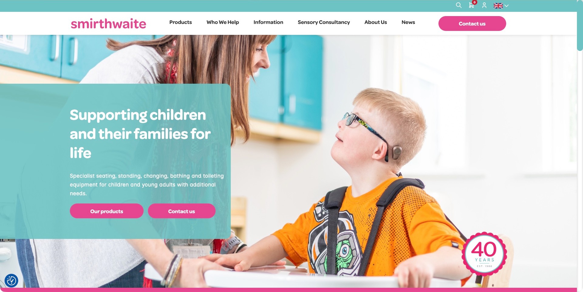
Smirthwaite uses a bright turquoise-and-pink identity, a short white header, and a large photograph of a child with an adult nearby. A translucent turquoise panel gives the introduction a defined reading area and explicitly names seating, standing, changing, bathing, and toileting equipment. Products and Contact Us are separate actions, while Who We Help and Information provide additional research routes. The photo gives the equipment a human setting without showing every product at once. The useful reference is the balance of purpose, scope, and contact; the image cannot establish a child’s needs or the suitability of equipment for someone else.
What you can learn
Name the actual equipment families while keeping the first message centered on people and their context. Give product research and professional conversation separate routes, and never treat a photographed use case as a prescription or a universal outcome.
Pros
The supporting text makes the equipment scope more concrete than the broad headline alone.
A plain navigation and distinct contact action separate research from an inquiry.
Cons & considerations
White text on a translucent colored panel needs measured contrast across responsive image crops.
The anniversary badge needs maintained context and should not substitute for product documentation.
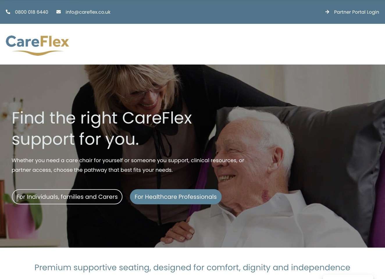
CareFlex’s homepage introduces supportive seating through a large human-context photograph and two explicit audience choices. Individuals, families, and carers have a separate route from healthcare professionals, while a partner-portal link stays in the contact strip above the logo. The supporting introduction identifies care chairs, resources, and partner access rather than presenting every visitor with the same product grid. Current first-party content confirms physical specialist seating products and distinguishes guidance, professional resources, and trade support. The photograph and comfort language do not establish clinical suitability or an outcome for another person.
What you can learn
Ask visitors which information task fits them before introducing a specialist catalog. Clear audience routes can reduce confusion while keeping product facts, professional assessment, and partner administration separate; they should not force people to disclose health information merely to browse.
Pros
The first actions identify their audiences instead of using two indistinguishable Learn More buttons.
Partner administration is separated from the ordinary individual and professional research routes.
Cons & considerations
The large logo area uses substantial space before the audience choices appear.
Support and comfort claims need qualified product detail rather than an assumption of universal suitability.
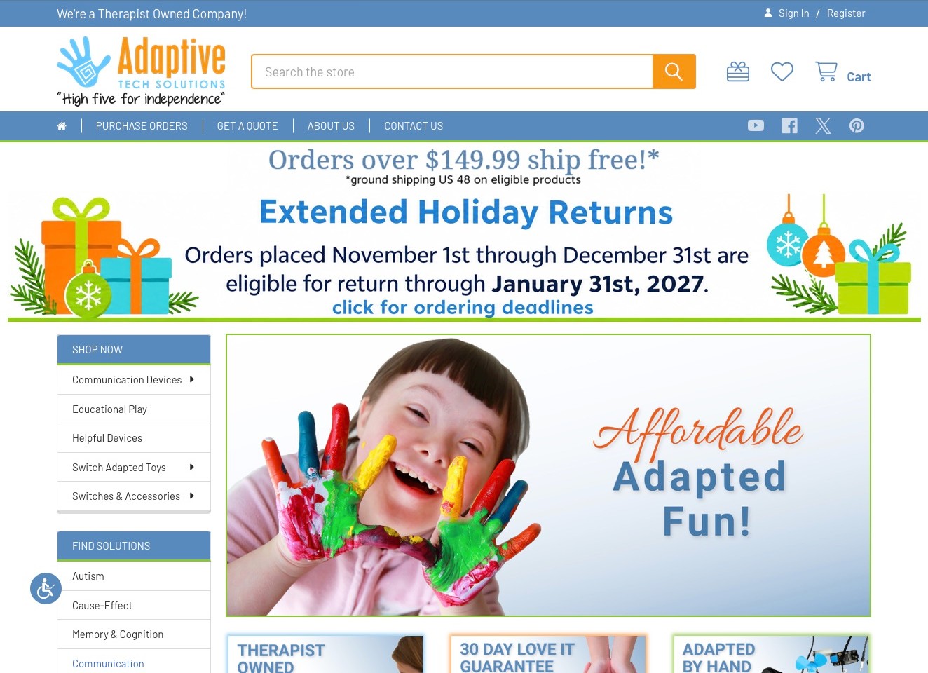
Adaptive Tech Solutions uses a prominent store search, blue-and-orange identity, and a short utility navigation that separates purchase orders, quotations, company information, and contact. The left-side category menu names communication devices, educational play, helpful devices, switch-adapted toys, and switches. A large seasonal returns panel occupies the opening content, with its date boundaries stated explicitly. The company’s therapist-owned positioning is a business statement, not our clinical endorsement. The reference is the way this specialist catalog exposes buying workflows and product families rather than assuming everyone arrives ready for a standard card checkout.
What you can learn
Give organizational purchasing and an ordinary customer inquiry distinct routes in an equipment shop. Keep dated offers from overwhelming stable product categories, and make product specifications and professional advice separate from the emotional appeal of campaign imagery.
Pros
Purchase-order and quote destinations acknowledge procurement tasks beyond a retail checkout.
A persistent category menu makes the specialized physical-product range visible.
Cons & considerations
The large seasonal returns panel delays substantive product and support information in the first view.
Condition-based browsing needs careful framing and should not imply a product prescription.
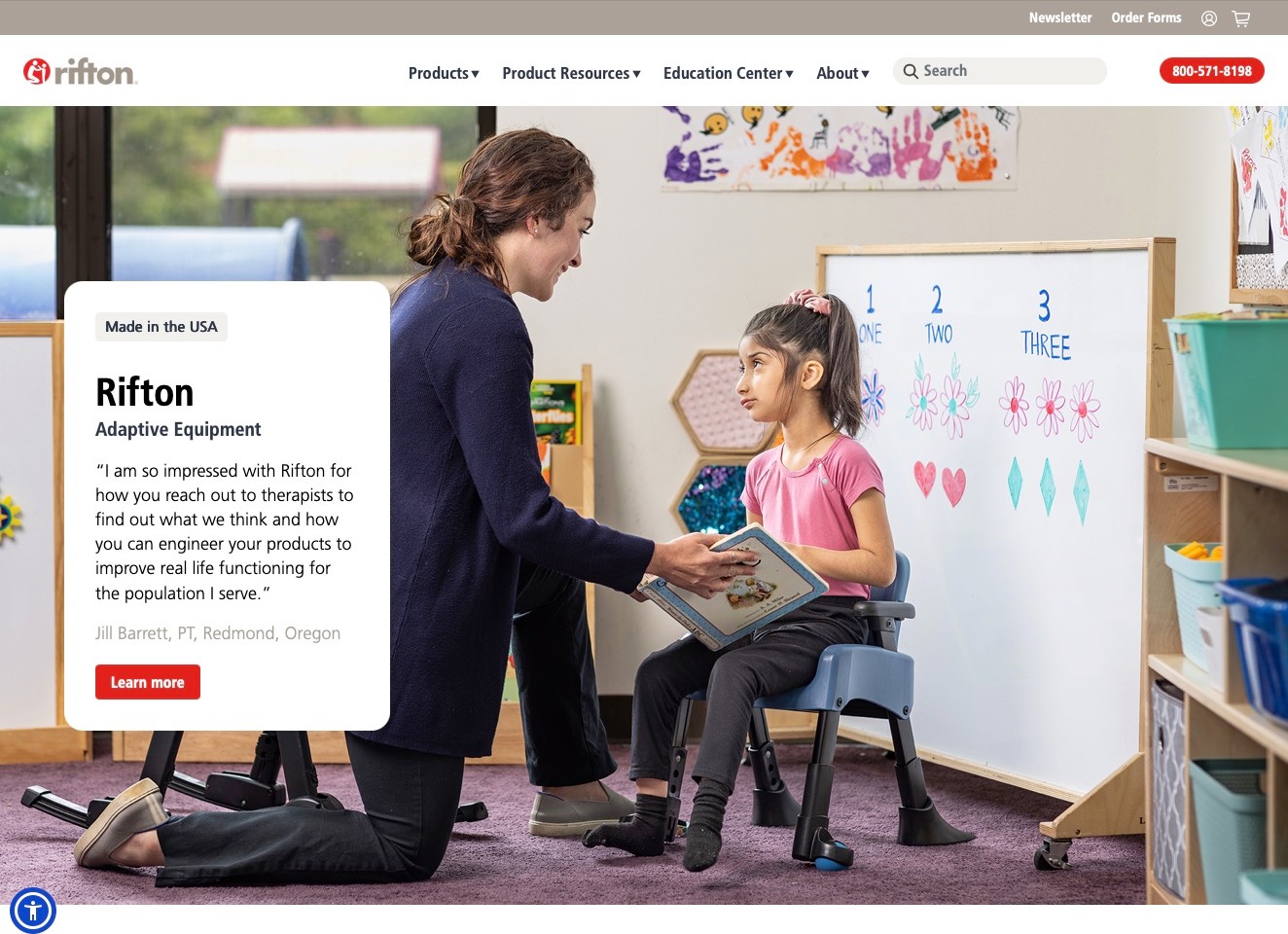
Rifton uses a restrained white navigation above a large classroom-context photograph. A compact white introduction card identifies adaptive equipment and presents an attributed professional quotation, while the header distinguishes Products, Product Resources, and Education Center. Search, order forms, and a telephone route are also visible. These are meaningful information tasks for a catalog with supporting documentation, not merely alternative labels for the same sales page. The quotation is a company-published testimonial, not independent evidence that a particular product will meet another person’s needs. The design reference is the clear separation between browsing, documentation, and broader educational material.
What you can learn
Give product facts, supporting resources, and education their own coherent destinations. A human use setting can make a catalog approachable, but the visitor still needs current documentation and appropriate professional discussion rather than inferring individual suitability from a testimonial.
Pros
Resource and education labels communicate purposes beyond an immediate purchase.
Text in a white panel remains more readable than a long paragraph directly over the photograph.
Cons & considerations
The general Learn More action could identify which information destination it opens.
Testimonials and manufacturing-origin labels need attribution and must not be treated as clinical evidence.
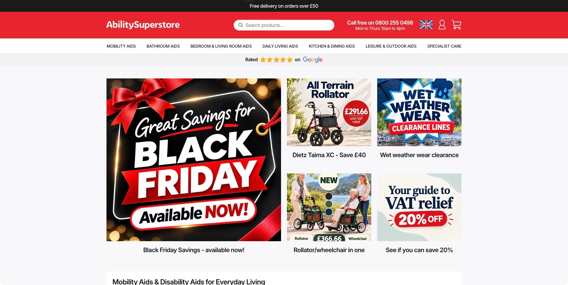
Ability Superstore gives search a central position in its red header, with a telephone route and opening hours alongside it. A white category strip divides mobility, bathroom, bedroom, daily living, kitchen, leisure, and specialist-care aids. The opening content is promotion-led, combining a large seasonal offer with smaller product and information tiles. This makes the breadth of the store visible while the category navigation provides a more stable route than the changing promotions. Displayed prices, review graphics, and tax-relief messaging are retailer-provided information, not our verification of eligibility, savings, product suitability, or independent service quality.
What you can learn
Keep a broad equipment catalog navigable by ordinary activities and spaces, even when the homepage promotes a seasonal campaign. Search and stable categories should help visitors investigate product facts without relying on a discounted item as an individual recommendation.
Pros
A large search field is available before visitors need to understand the entire catalog structure.
Everyday category labels provide useful alternatives to diagnosis-led browsing.
Cons & considerations
Large promotional artwork can delay the explanation of how to investigate equipment and obtain help.
Price and relief messages need current terms and context rather than an assumption that every visitor qualifies.
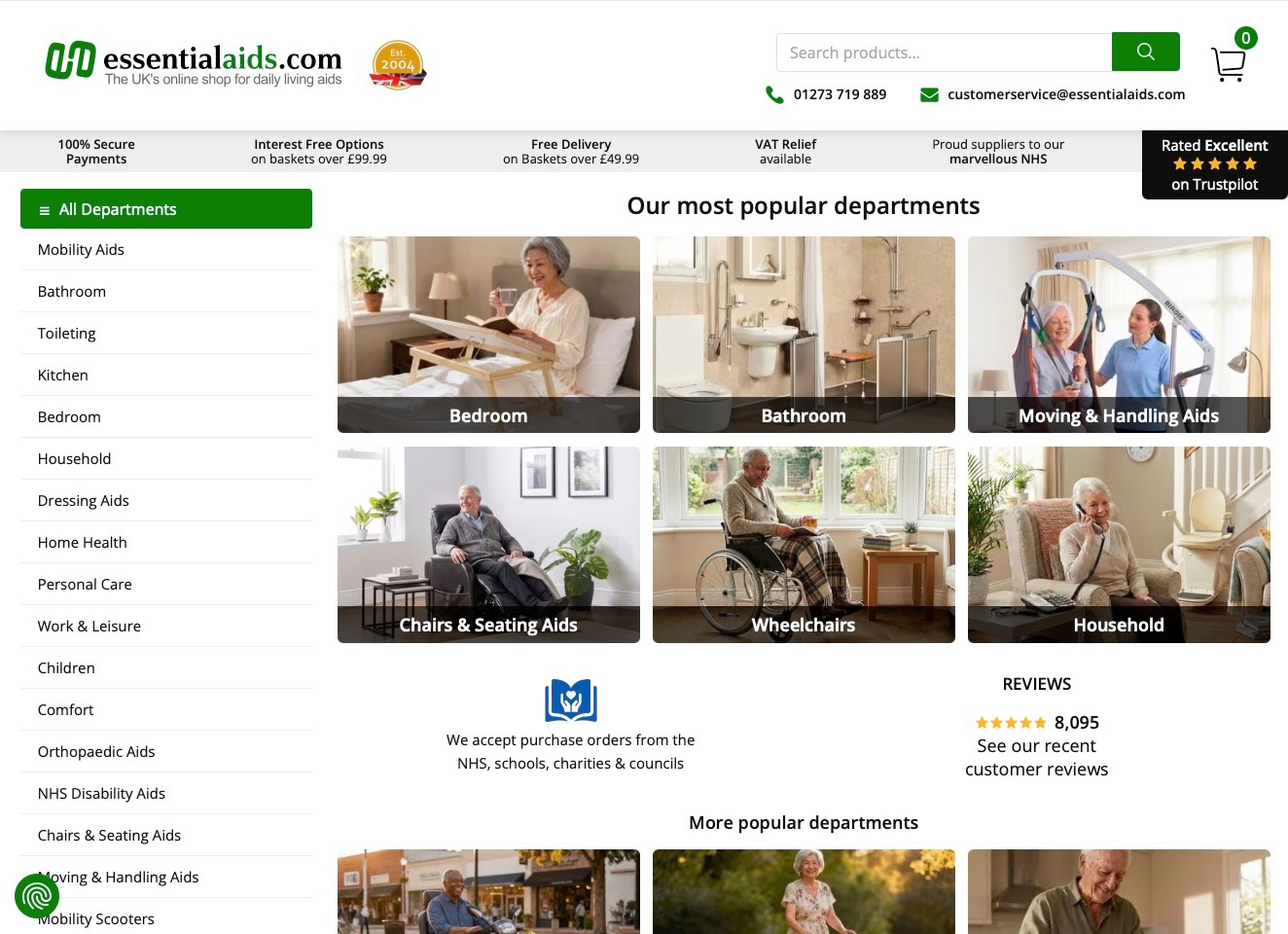
Essential Aids gives its broad store two complementary navigation methods: a left-hand department list and large photographic cards for familiar contexts such as bedroom, bathroom, seating, and wheelchairs. Search and telephone details remain visible in the white header. A purchase-order statement acknowledges schools, charities, councils, and health-service organizations, while the ordinary department grid remains available to individual buyers. The useful pattern is task discovery rather than a single promotional hero. Review graphics, financial messages, and supplier claims remain the retailer’s own presentation, not our independent endorsement of a product or an organization’s purchasing eligibility.
What you can learn
Offer ordinary category labels in more than one readable format so visitors can investigate equipment without knowing a brand or a diagnosis. Keep institutional purchasing information separate from product suitability and provide substantive details after the category selection.
Pros
A text department list works alongside the image-based grid rather than depending on photographs alone.
Purchase-order information acknowledges a distinct organizational procurement route.
Cons & considerations
A long department list needs good keyboard navigation and sensible grouping on phones.
Several promotional and assurance strips can postpone the actual product-selection information.
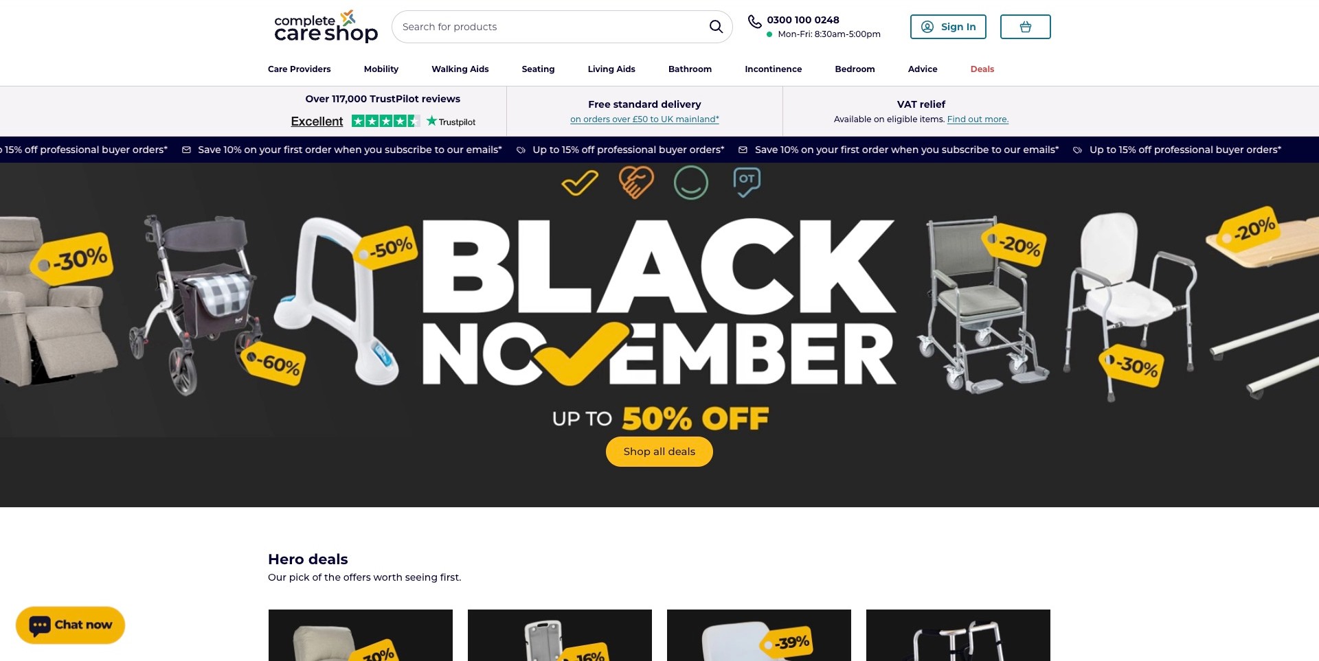
Complete Care Shop places a wide search, telephone number, office hours, and account controls above a compact equipment navigation. Care Providers, mobility, walking aids, seating, living aids, bathroom, bedroom, and advice have identifiable destinations. The main view is dominated by a seasonal campaign showing several physical products around a large sale headline. That contrast is useful: promotions change, while categories provide structure for visitors who are not looking for a deal. Displayed review totals, discounts, delivery terms, and tax-relief language are retailer statements, not independently verified outcomes or universal entitlements.
What you can learn
Preserve a clear, ordinary product-and-advice structure when the homepage is occupied by a time-sensitive campaign. Someone investigating equipment should still be able to find current facts, assistance, and professional purchasing information without treating the most discounted item as the right choice.
Pros
An explicit Advice destination sits with product categories rather than being hidden in a footer.
Telephone hours make the human contact route more informative than an unexplained phone icon.
Cons & considerations
A large campaign can crowd out introductory guidance for visitors unfamiliar with the equipment range.
Scrolling promotional text needs motion controls and should not carry essential terms alone.
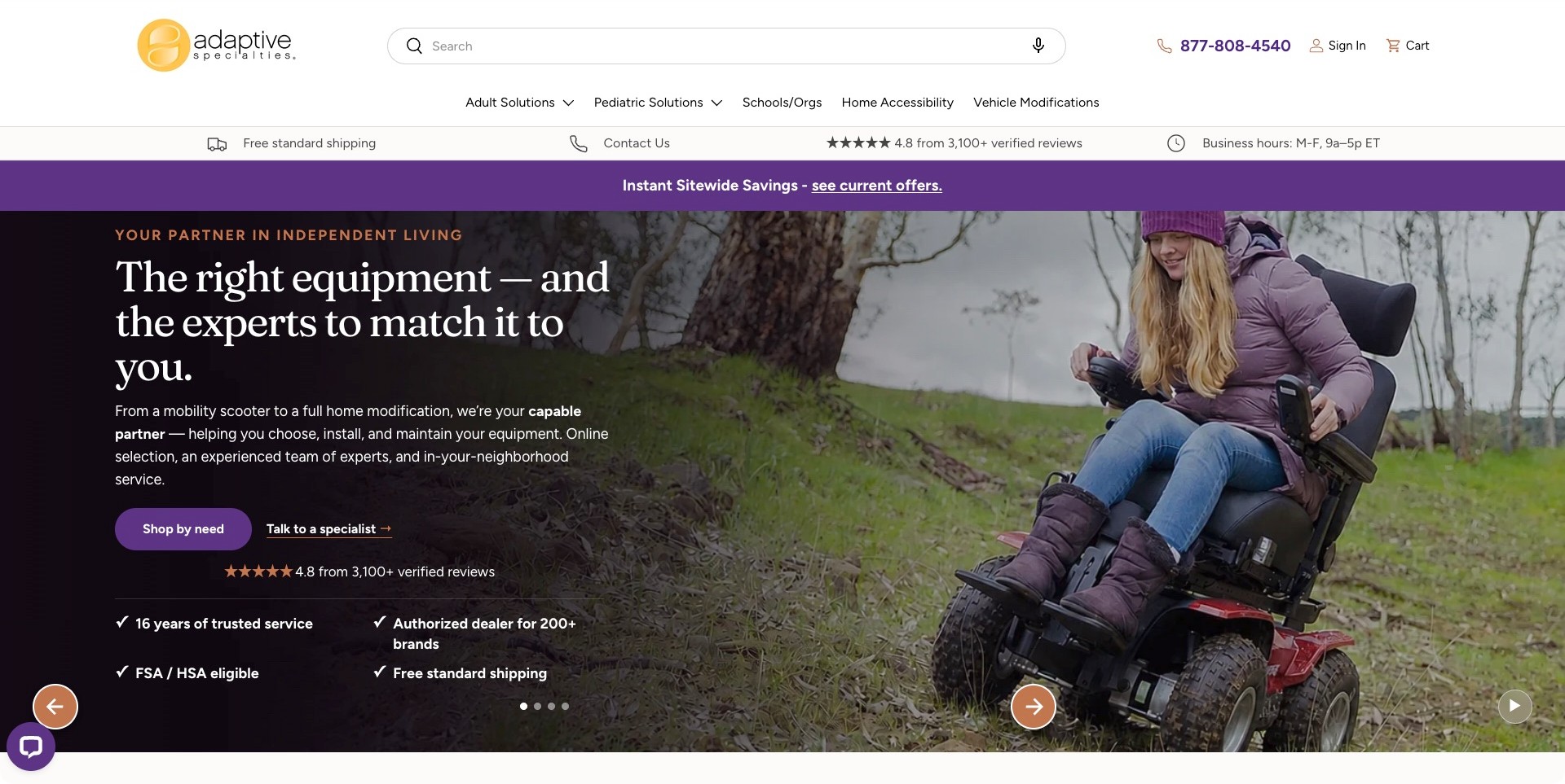
Adaptive Specialties places a wide search and a telephone number above navigation that distinguishes adult, pediatric, school, home-accessibility, and vehicle-modification contexts. The visible introductory layout pairs text and a product-use photograph, with different actions for browsing by need and talking to a specialist. Current first-party content separately describes equipment, modifications, delivery, and service. This is useful for studying a company whose offering extends beyond a shopping cart. Its professional, installation, eligibility, and review claims remain the business’s statements; the breadth of the menu does not establish service coverage or the suitability of a product for an individual visitor.
What you can learn
Distinguish equipment shopping from consultation and modification work when a business offers several kinds of support. Clear audience routes should help start the right conversation, not suggest that a general website search can make an individual clinical or installation decision.
Pros
Adult, pediatric, and organizational paths recognize different research contexts.
A specialist-contact action offers an alternative to selecting a product immediately.
Cons & considerations
A wide range of product and service contexts needs clear scope and geographic availability information.
Assurance and eligibility claims require current terms rather than a universal interpretation.
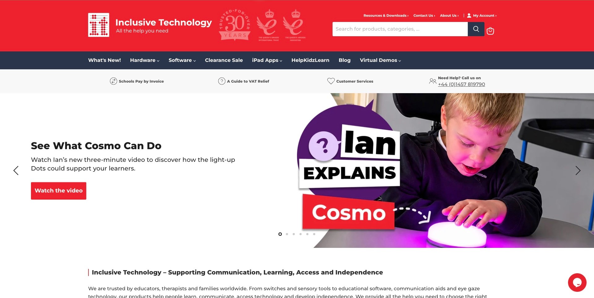
Inclusive Technology uses a conspicuous red header with a broad product search and a dark navigation band separating Hardware, Software, iPad Apps, learning resources, and virtual demonstrations. The captured hero introduces a light-up physical learning product through a short video invitation beside a use-context photograph. A practical strip names school invoicing, customer service, and a telephone route. The design is useful for this collection because physical switches and access equipment have a deliberate place alongside software, rather than being implied by an ambiguous technology label. The pictured activity is illustrative and does not establish educational or individual clinical outcomes.
What you can learn
Keep hardware, software, and supporting resources distinguishable when a specialist store offers all three. A demonstration can explain what an interface does, but current product documentation and appropriate professional discussion remain separate from the campaign image.
Pros
Hardware and software are explicit different destinations in the main navigation.
School invoicing and virtual demonstrations recognize buying and research tasks beyond a standard checkout.
Cons & considerations
Large anniversary and award artwork can compete with product discovery in the header.
A moving promotion needs accessible controls and a stable route to the featured product’s facts.
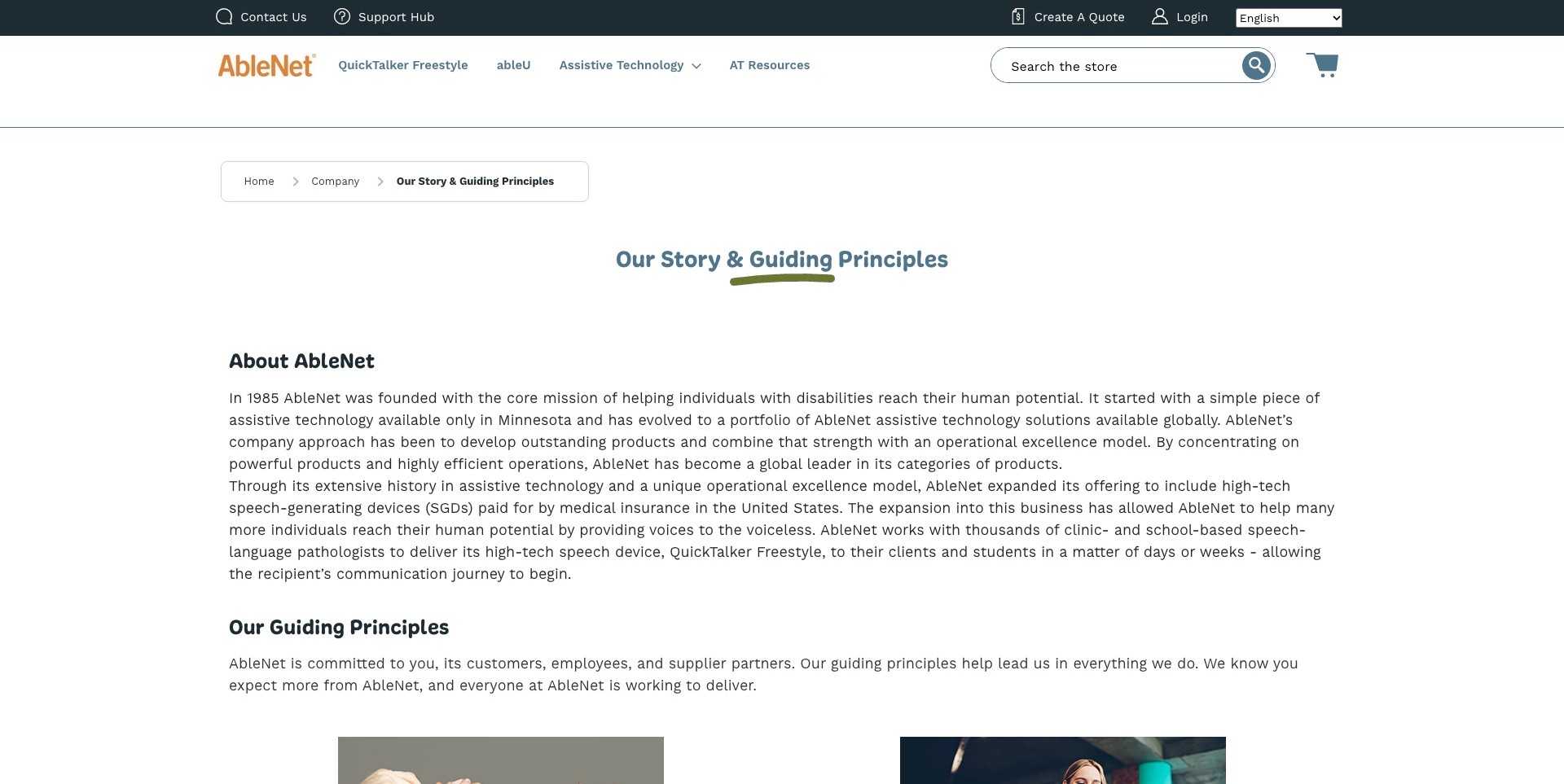
AbleNet’s Our Story and Guiding Principles page introduces the company’s history before separating its principles into named sections. The introduction links assistive technology to speech-generating devices; catalog navigation names physical switches, mounting, computer access, and activity supports. Support Hub and Create a Quote remain distinct tasks in the shared header. This makes the company background useful to a visitor who may also need documentation or a purchasing conversation. The reference concerns the organization of information, not independent verification of product effectiveness, regulatory claims, funding eligibility, or the outcomes described by the supplier.
What you can learn
A company story can provide context without replacing practical product and support information. Keep the organization’s principles attributable, give each a clear explanation, and preserve ordinary routes to documentation and human assistance rather than turning the About page into an unsupported assurance.
Pros
Support and quotation have identifiable destinations rather than being merged into one generic contact action.
Named principles divide the company narrative into more understandable information topics.
Cons & considerations
Broad principles need specific maintained explanations instead of functioning as unqualified trust badges.
Company history alone cannot explain current regional availability or the purchasing process for a particular product.
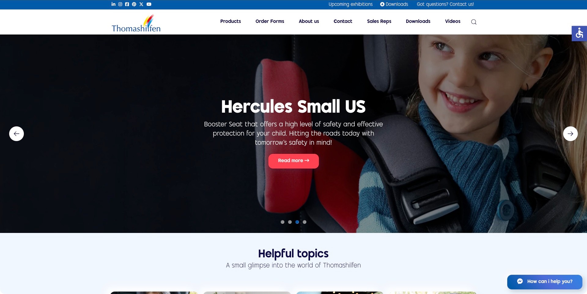
Thomashilfen’s US site uses a blue utility strip and white navigation above an adaptive car-seat campaign. The observed introduction names Hercules Small US beside a human-context photograph and a Read More action. Order Forms, Sales Reps, Downloads, and Videos have distinct positions beside Products and Contact, making several practical research tasks visible. Current first-party catalog information identifies pediatric wheelchairs and adaptive car seats, including region-specific product variants. The design reference is this connection between a named item and supporting information, not verification of the pictured product’s safety, individual suitability, or a published dimensional limit for another person.
What you can learn
Give a specialist product campaign a recognizable name and clear routes to its current documentation and the appropriate human contact. Keep regional product versions explicit, and never use a photograph or simplified size statement as a substitute for a qualified individual assessment.
Pros
Downloads, order forms, and sales representatives acknowledge research and purchasing tasks beyond ordinary checkout.
A named product family gives the introduction a concrete subject.
Cons & considerations
A changing campaign needs readable controls and a stable path to the featured documentation.
Prominent suitability or capacity language needs current model-specific context and professional limits.
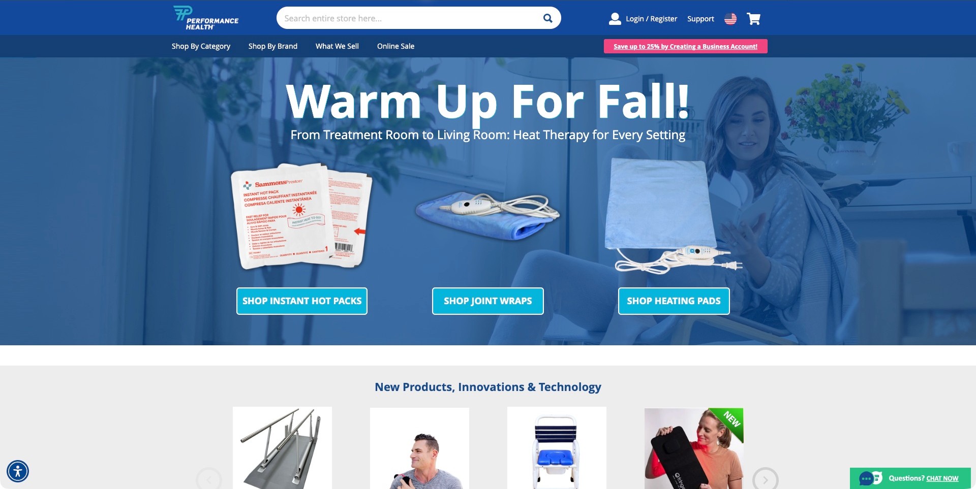
Performance Health uses a blue header with a large store search and separate category, brand, and overview destinations. The captured campaign promotes a seasonal treatment category, while the next row begins a broader product selection that includes a ramp and other physical equipment. Current first-party catalog information explicitly includes aids for daily living, establishing this collection’s fit without pretending the supplier sells only adaptive equipment. The reference separates changing campaigns from the stable catalog structure. Product imagery and therapeutic marketing remain supplier statements, not recommendations for an individual visitor or proof of a health outcome.
What you can learn
A broad supplier needs a stable route into the relevant equipment family even when a different category occupies the homepage campaign. Make product facts and buyer support findable independently of promotional imagery and avoid implying that every catalog item serves the same need.
Pros
Search and separate category or brand routes offer different ways to locate a known product.
The next product row begins to expose the catalog’s breadth below the campaign.
Cons & considerations
A seasonal therapy promotion does not itself explain the daily-living equipment range.
Business-account offers need clear eligibility and should not obscure ordinary product research.
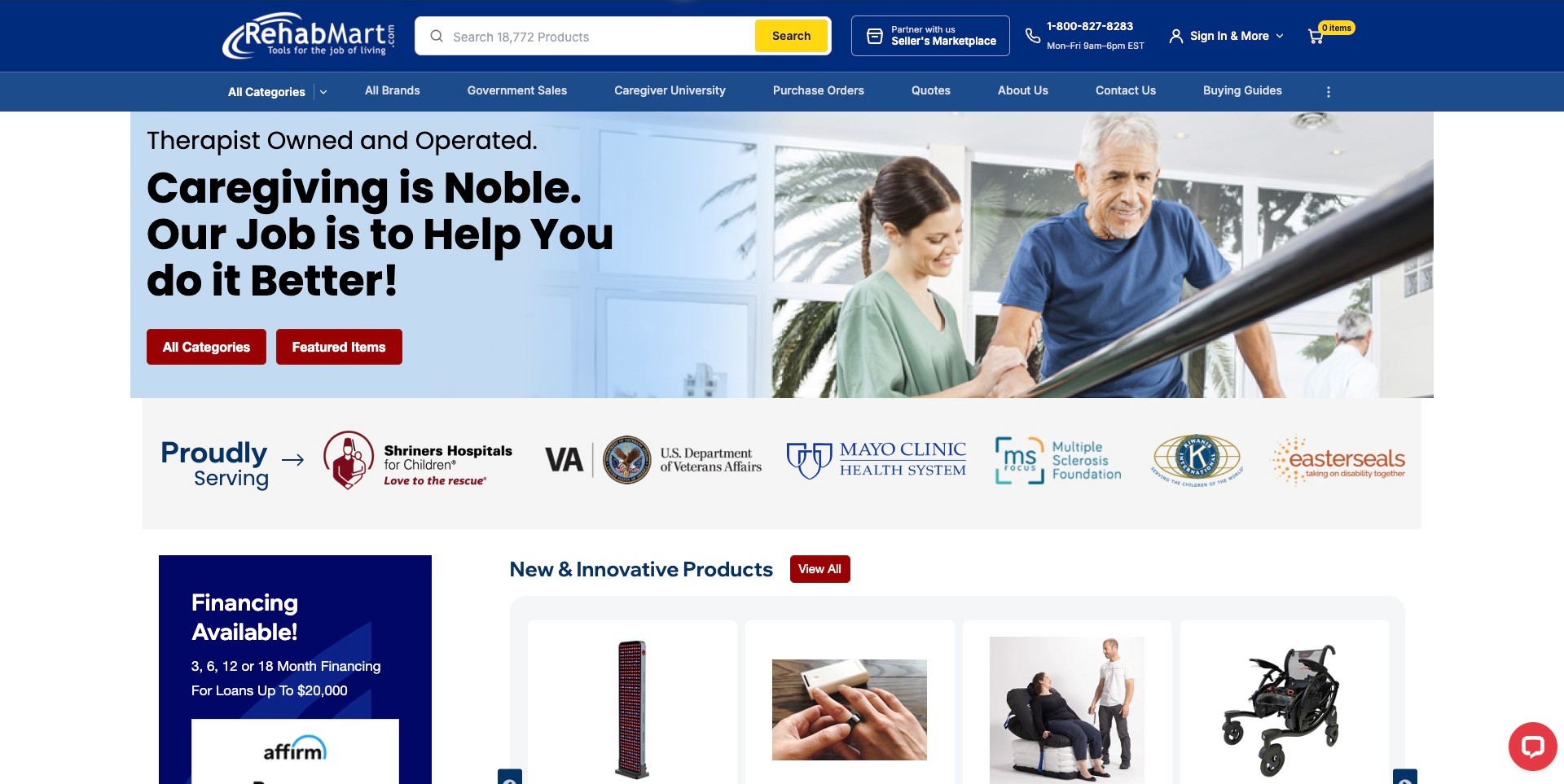
Rehabmart pairs a caregiver-and-equipment scene with a plain statement about helping people who provide support. The blue header prioritizes search and telephone hours, while the secondary navigation separates categories, brands, government sales, purchase orders, quotations, and buying guides. A product row begins below the hero, making the store more concrete than the broad caregiving message alone. Its therapist-owned positioning and client-logo strip are company-presented information, not our clinical endorsement or independent verification of purchasing relationships. The useful pattern is the way this broad supplier acknowledges several real procurement tasks without forcing every visitor directly into checkout.
What you can learn
Separate product discovery from purchasing administration and advice. An equipment store can be welcoming while still making quotations, institutional orders, and supporting guides explicit; neither a professional ownership claim nor a client logo establishes individual product suitability.
Pros
Quote and purchase-order links recognize buying processes that differ from card checkout.
Buying guides and caregiver resources provide research routes beside the commercial catalog.
Cons & considerations
Many secondary navigation items need careful grouping and keyboard support on smaller screens.
Financing and assurance graphics can crowd out the practical explanation a new visitor needs.
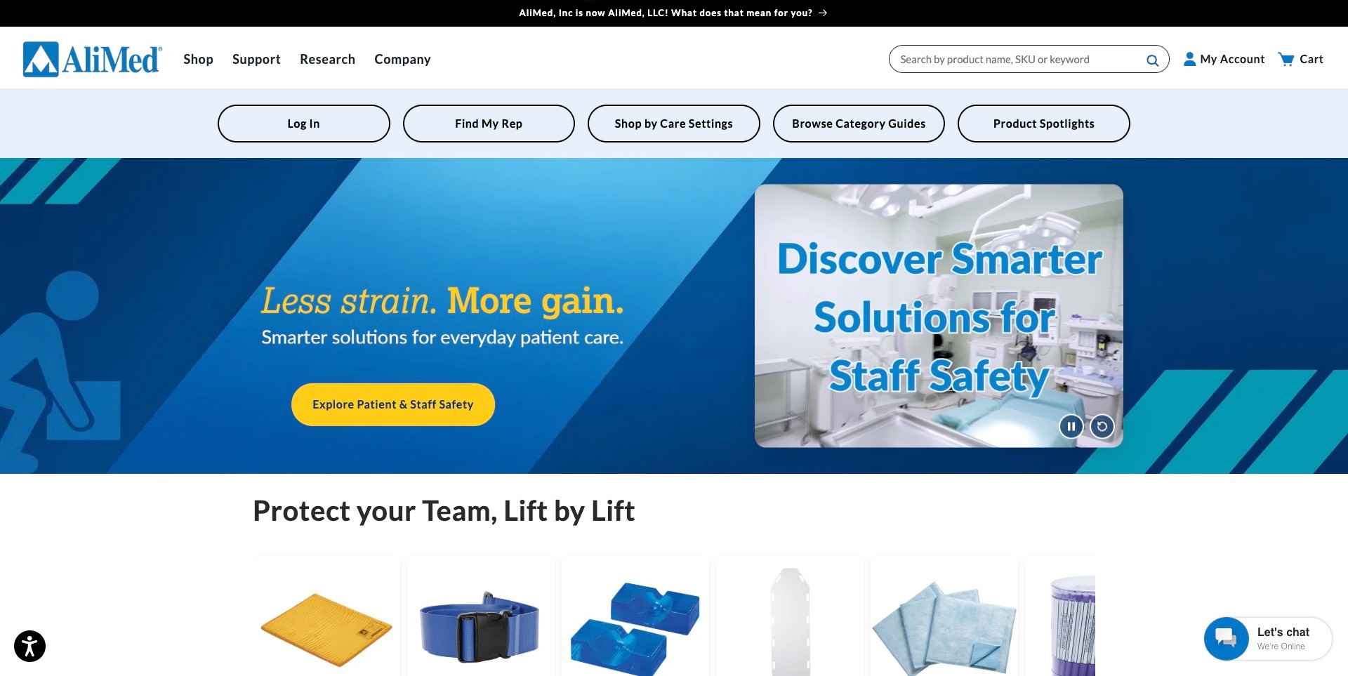
AliMed uses a short primary navigation for Shop, Support, Research, and Company, followed by a pale blue row of task controls. Find My Rep, Shop by Care Settings, category guides, and product spotlights offer different approaches to the catalog. The captured campaign addresses patient-and-staff equipment, with a separate product-video panel and a visible pause control. First-party product information includes daily-living and adaptive aids within the wider medical range. The useful industry reference is the variety of discovery routes, not a claim that the current homepage campaign explains every adaptive product or that a safety headline proves a particular outcome.
What you can learn
A large equipment catalog benefits from routes based on setting, documentation, and a human representative rather than product names alone. Keep campaign claims distinct from product specifications and make support discoverable without requiring an account login.
Pros
Support and research are first-class destinations rather than small footer afterthoughts.
A representative route accommodates buyers who need a conversation before choosing catalog items.
Cons & considerations
Several large task controls can be harder to prioritize without short explanations of their purposes.
Animated product messages need accessible controls and equivalent information in ordinary text.
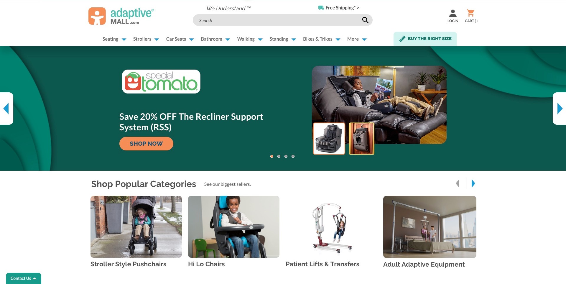
Adaptivemall places seating, strollers, car seats, bathroom, walking, standing, and bikes in a readable category navigation. A Buy the Right Size destination stands apart from the main range, acknowledging that equipment research needs more than an attractive photograph. The captured hero promotes a Special Tomato support system, with a use-context image beside isolated product views; larger category cards begin below it. This is a retail-catalog reference, distinct from the brand’s own explanatory website elsewhere in the collection. Discounts and the pictured seating arrangement do not establish suitability, fit, or a clinical outcome for another person.
What you can learn
Put substantive sizing and product-information routes near category discovery while retaining appropriate professional boundaries. A featured brand campaign can illustrate the range, but a buyer still needs current documentation and an appropriate conversation rather than assuming a photographed setup will transfer.
Pros
Clearly named physical-equipment categories make the catalog’s scope understandable.
The sizing-information route is visible before visitors enter a product detail page.
Cons & considerations
A promotional carousel should not be the only route to essential equipment information.
Sizing content must explain its limits and not encourage unsupported self-prescription or unsafe measurements.
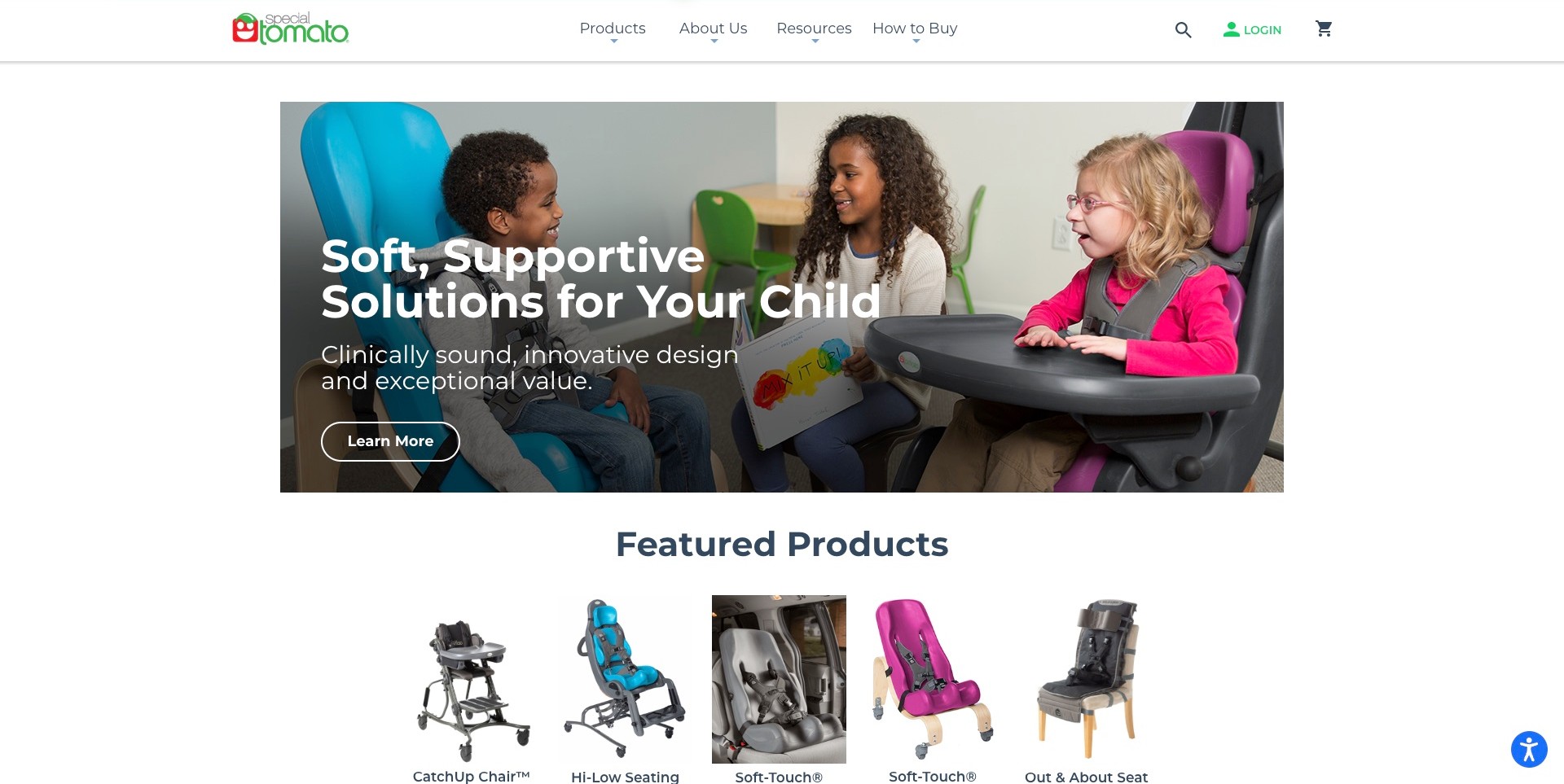
Special Tomato’s contained homepage pairs a child-centered product-use scene with a short introduction, leaving white space around the main image. Products, Resources, and How to Buy are distinct navigation routes, and a row of named equipment begins directly below the hero. This provides a useful comparison with a broader retailer featuring the same brand: the manufacturer-style page foregrounds its own range and supporting information rather than a large catalog of unrelated suppliers. Clinical and value language is the company’s claim, not our independent judgment, and the photograph does not establish that a particular configuration suits another child.
What you can learn
Give a focused equipment brand clear routes into documentation and purchasing context as well as the products themselves. Human imagery can explain the setting, but specifications and individual professional decisions must remain separate from the emotional introduction.
Pros
Resources and How to Buy distinguish information research from choosing a product.
Named equipment previews make the range concrete immediately below the introduction.
Cons & considerations
A generic Learn More control could describe its destination more specifically.
Clinical-sounding marketing language requires appropriate evidence and must not be treated as a universal outcome.
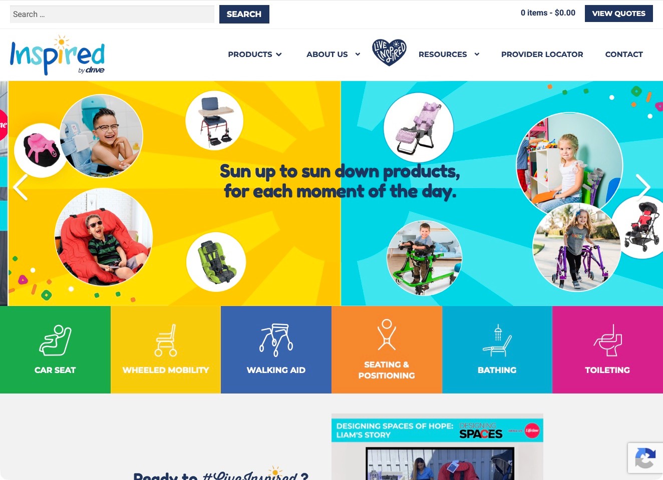
Inspired by Drive uses a playful blue-and-yellow introduction with circular product and child-context photographs. A row of colored category tiles names car seats, wheeled mobility, walking aids, seating and positioning, bathing, and toileting. The white header distinguishes Products, Resources, Provider Locator, and Contact, while a quotation control sits above. This shows how a pediatric range combines an approachable identity with concrete equipment categories. Its images illustrate contexts rather than establish individual suitability, and the category labels do not replace current documentation or professional assessment for a particular child or setting.
What you can learn
Make the physical equipment families explicit and give visitors a recognizable route to local provider information. A playful visual identity can make a catalog approachable, but it should not blur the boundary between exploring a range and deciding on an individual product.
Pros
Color-coded labels expose the main equipment families without requiring specialist product names.
Resources and a provider locator acknowledge research and local-contact tasks beyond a quote.
Cons & considerations
Many bright panels and circular images can compete with the hierarchy on small screens.
A quotation destination needs to explain whether it creates a request, a saved list, or a confirmed commercial offer.
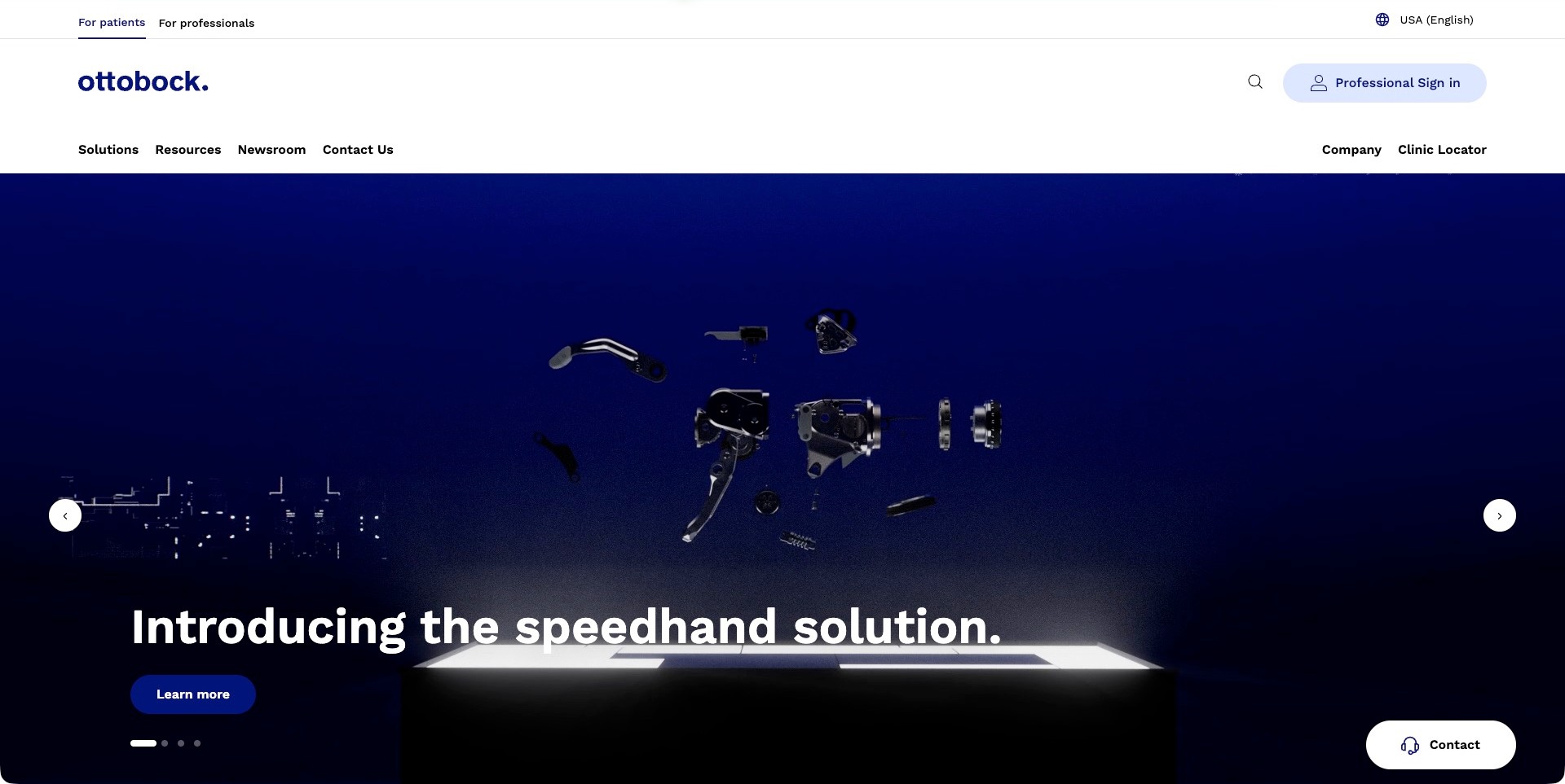
Ottobock’s US homepage separates For Patients and For Professionals in its upper navigation, with an explicit country-and-language context at the other side. The white header distinguishes solutions, resources, contact, and a clinic locator before a large dark product campaign. The captured frame presents an exploded hand-device illustration with a short introduction and a focused information action. The visual treatment makes the product tangible without filling the opening with specifications. The useful reference is the audience separation and local context, not a claim that the rendering demonstrates function, that the device is appropriate for any particular person, or establishes a purchase route.
What you can learn
Separate audiences before asking them to navigate a complex device catalog. A patient, clinician, and procurement professional may need different resources and contact destinations, while product imagery should remain an introduction rather than a substitute for individual professional assessment.
Pros
Patient and professional routes are visible before the main product navigation.
Country and clinic-location controls give the global brand a more concrete local context.
Cons & considerations
The tall header and product campaign use substantial space before the broader range appears.
A dramatic product animation needs accessible controls and clear supporting product documentation.
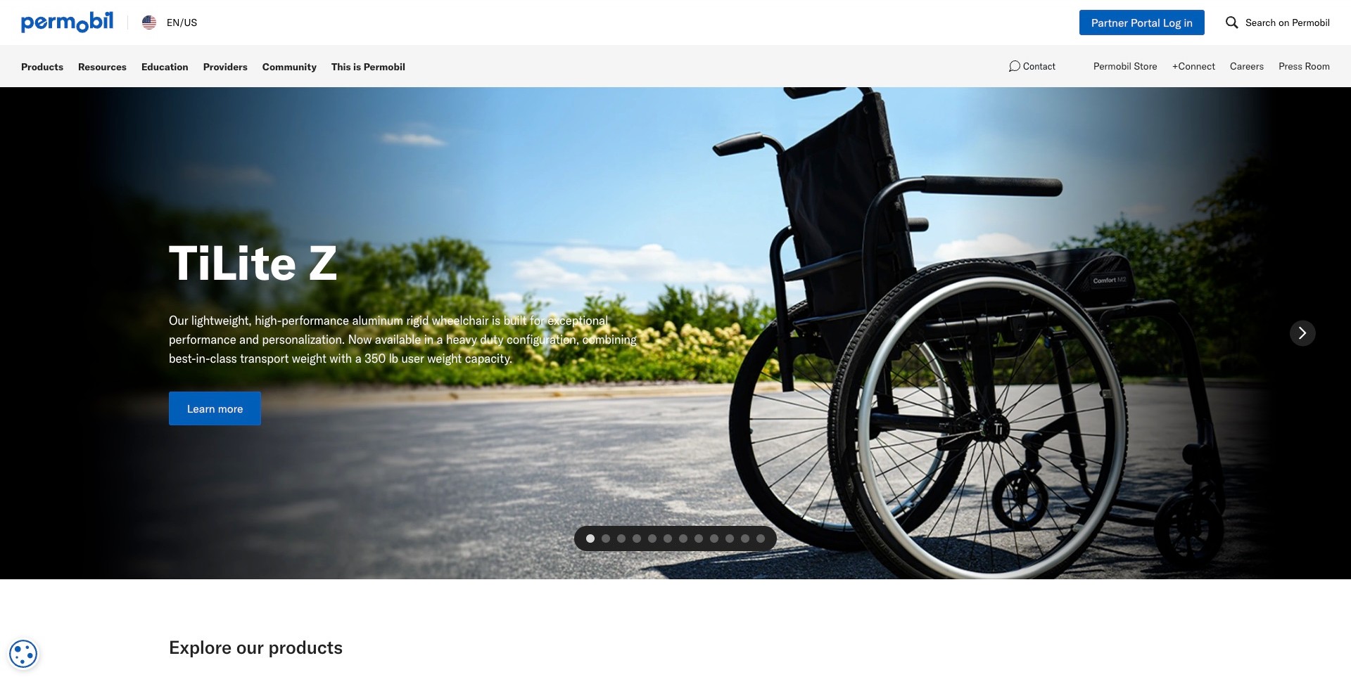
Permobil’s US homepage combines a white, blue-accented header with a TiLite Z wheelchair campaign. Region and language are explicit, while Products, Resources, Education, Providers, and Community have distinct navigation roles. Partner Portal Log In is separated from the ordinary browsing routes, and contact and store destinations are also available. Current first-party content names power and manual wheelchairs, seating and positioning, and power-assist products. The useful reference is the way a broad catalog acknowledges several audiences and ongoing information tasks. Product imagery and performance language remain company-presented material, not an individual equipment recommendation or our independent verification of outcomes.
What you can learn
Keep product discovery, documentation, professional education, community information, and account administration distinguishable. A visitor should be able to find appropriate research or human assistance without treating the most prominent campaign as the right solution for their circumstances.
Pros
An explicit regional context reduces ambiguity about which market’s information is being presented.
Education and provider resources have named positions beside the commercial product route.
Cons & considerations
A wide multirow navigation needs a clear, tested equivalent on smaller screens.
Numerous changing campaigns can postpone stable product-family information and documentation.
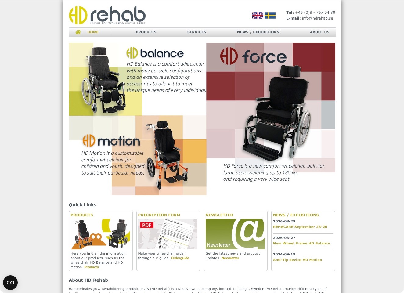
HD Rehab uses a contained white page on a gray background, with three named wheelchair products arranged in a large introductory graphic. The contrasting product panels make the range concrete before the company description begins. Below, Quick Links separate products, a prescription-form guide, newsletter updates, and news or exhibitions. Language and telephone information remain in the header. Current first-party company information explicitly describes a third-generation family manufacturer developing and producing wheelchairs in Lidingö, Sweden. The reference is the connection between named physical products and practical supporting tasks, not verification of the graphic’s capacity statements or individual equipment suitability.
What you can learn
A focused product range can benefit from a straightforward introduction and a few meaningful document shortcuts. Make the difference between researching a model, preparing an order, and obtaining appropriate individual advice explicit rather than turning a product graphic into an assessment tool.
Pros
Named product panels give the manufacturer’s range an immediate tangible subject.
Document and product-information shortcuts support tasks beyond reading company history.
Cons & considerations
Graphic-based descriptions need readable text alternatives and careful mobile adaptation.
A prescription-form destination must explain its professional context rather than encouraging unsupported self-selection.
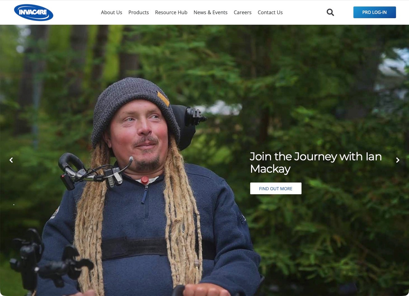
Invacare America pairs a simple white header with a large outdoor portrait and a personal-story introduction. Products, Resource Hub, company information, and contact have clear main-menu destinations, while a professional login is visually separate. Current first-party US content identifies mobility, seating, and daily-living equipment, establishing the catalog fit without treating a global brand name as proof of local availability. The reference is the distinction between a human story and the stable information routes around it. A featured individual’s experience is not evidence that another person will obtain the same result or should choose the pictured equipment.
What you can learn
Use a personal story as one way into the website, not as a substitute for product facts. Keep resource and regional contact routes visible so visitors can move from the introduction to documentation and an appropriate professional conversation.
Pros
The professional login is distinct from ordinary public product and resource navigation.
A dedicated Resource Hub provides a research route beyond the featured story.
Cons & considerations
A broad story-led hero may delay equipment discovery for a visitor with a specific product question.
Regional product availability needs explicit supporting information rather than assumptions from the brand identity.
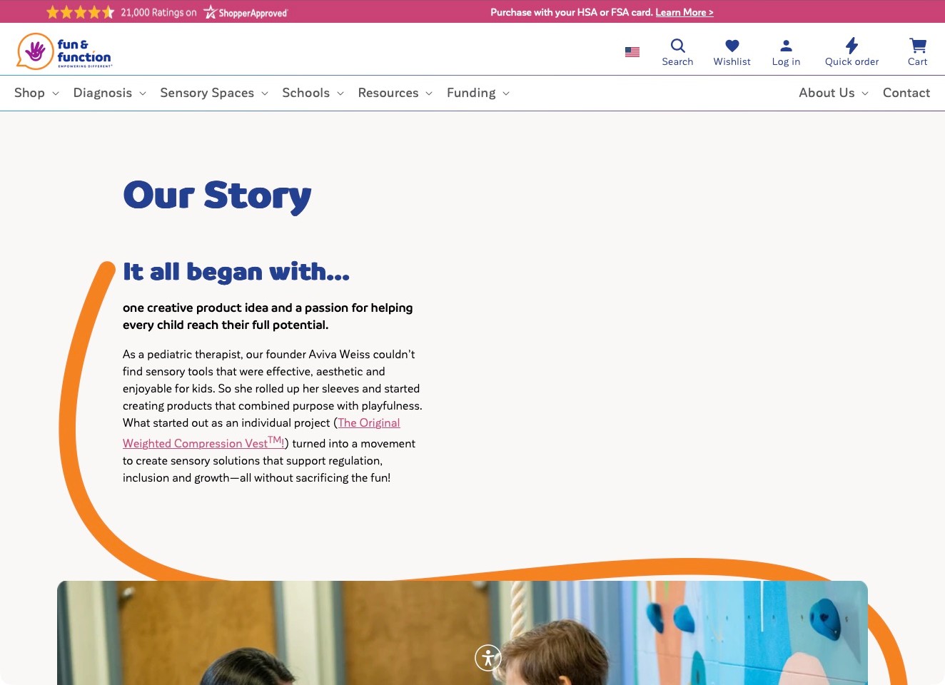
Fun & Function’s Our Story page uses a navy heading, narrow reading column, and orange line leading toward photography below. The introduction names founder Aviva Weiss and connects the business’s beginnings to a linked physical product rather than presenting an anonymous mission statement. The wider store header remains available, separating shopping, sensory spaces, schools, resources, and funding information. Current first-party catalog navigation explicitly includes physical sensory seating and room equipment. The reference is how the page connects a person, an origin, and a tangible product, not verification of professional credentials, treatment effectiveness, or educational outcomes.
What you can learn
Make a company story concrete with attributable people and a specific product or problem, while keeping appropriate evidence and product documentation separate. A calm reading layout can complement a broad catalog instead of repeating every homepage promotion and category card.
Pros
A contextual product link gives the origin story a concrete reference point.
The narrow text column and generous spacing make the introduction easier to scan.
Cons & considerations
The expansive opening needs careful adaptation so the actual story is not delayed on phones.
Founder and product-benefit claims need supporting context rather than being treated as independent clinical evidence.
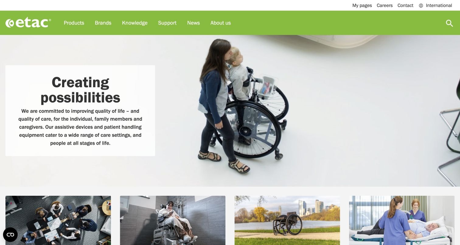
Etac’s retained homepage places a short introduction in a white panel beside a photograph of a child using a wheelchair with an adult nearby. A green navigation bar distinguishes Products, Brands, Knowledge, and Support, while photographic cards begin below the hero. An International control makes regional context visible without putting every market in the main menu. Its current first-party site explicitly presents assistive devices and patient-handling equipment. The reference is the relationship between a human introduction and structured product information, not proof that the pictured equipment suits another person or that every product is available in every region.
What you can learn
Use human imagery to introduce the company’s purpose, then provide distinct routes for product facts and ongoing support. Keep regional availability, individual suitability, and professional assessment separate from the broad emotional message of the homepage.
Pros
A plain text panel keeps the introduction readable independently of the photograph.
Knowledge and support destinations remain visible beside the commercial product navigation.
Cons & considerations
The broad opening promise does not explain how a visitor should investigate a particular equipment category.
A global introduction needs clear local product and contact handoffs before purchase or professional inquiries.
Platform source: Optimizely CMS customer implementation story. Optimizely's case explicitly names Etac.com as the consolidated global product website using its CMS alongside a separate InRiver product information system. Documentary CMS implementation evidence for this named public property or regional estate. It is not a complete current backend inventory, a claim about private accounts, or proof that every linked service uses Optimizely. Platform evidence is separate from the direct website screenshot and is not a complete current infrastructure audit.
Kegan is a freelance web designer and developer with 15+ years of experience helping businesses turn complicated website requirements into clear, maintainable digital experiences. He works directly with clients from planning and design through development, launch, and ongoing support.
For adaptive equipment supplier website design, his development approach focuses on understandable product categories, maintained specifications and documents, respectful representation, distinct procurement and support routes, and accessible enquiries without individual equipment recommendations. The scope can be a targeted improvement or a complete custom build, with responsive layouts, thoughtful content structure, and integrations chosen around the people using and maintaining the site.
Show 3 other adaptive equipment supplier website designersHide other adaptive equipment supplier website designers
Plan an adaptive equipment website around clear choices and accountable support
Understand the people and decisions without making assumptions for them
Begin by mapping the actual audiences and tasks with people who use the service. A person researching equipment for their own use may want clear specifications and an ordinary way to ask a question. A family member may be helping compare options, while a professional or organizational buyer may need documentation and a quote route. These roles can overlap. Avoid writing every page as though the user is necessarily a caregiver, a clinician, or someone unable to make their own decisions. Use respectful language and give the person a way to choose the route that fits their task.
Separate browsing from recommendations. A visitor should be able to explore a product category without disclosing a diagnosis or completing an assessment questionnaire. Explain where the supplier provides information, where a qualified professional may be involved, and what the actual purchasing process requires. Do not imply that a website category or an automated selector determines individual suitability. Interview customer-support staff about frequent points of confusion, then validate the proposed routes with representative users where appropriate. The goal is a clearer interface for a real decision, not a marketing funnel that assumes more authority than the supplier actually has.
Create a reliable product information model
Define the fields each product record needs before designing cards and detail pages. Useful information may include the official product name, a plain-language purpose, current manufacturer-approved specifications, available variants, compatible accessories, relevant documents, and an accurate route to purchase or inquire. Decide which information is owned by the manufacturer, which is added by the supplier, and who reviews each change. Do not copy a competitor’s specification or infer a capability from a photograph. Product information needs an accountable source and update process, particularly when an accessory, model, or ordering arrangement changes.
Keep important details as structured readable content rather than hiding everything in an image or downloadable brochure. A document may provide valuable supporting information, but the visitor should still understand the basic item and next step from the page itself. Identify the actual model associated with a document and the relevant language or edition where appropriate. Avoid placing an old manual beside a newer product without explanation. If a piece of information is uncertain, provide a route to confirm it rather than a guessed value. A consistent product model helps search and comparison only when its fields are genuinely accurate.
Design categories and filters around the available evidence
Build a taxonomy from the actual range and the language users recognize. Balance broad entry categories with more specific product labels, and test whether people can find an item without knowing its formal model name. A filter is useful when the underlying information is consistent and meaningful; it becomes misleading when missing data silently excludes a relevant product. Make clear which filters are browsing aids rather than a prescription for suitability. Do not infer a person’s needs or eligibility from disability-related information, and avoid designing a public selector that presents a clinical conclusion from an oversimplified answer.
Keep applied filters visible and easy to remove. Provide clear empty states and a route to assistance when a search produces no match. Ensure the search and filter controls can be operated using the keyboard and relevant assistive technology, with testing appropriate to the project. Retain product names and context when visitors move between a listing and a detail page. Consider the person who returns to a comparison after a phone conversation, not just someone completing a single uninterrupted session. A restrained catalog can be more useful than an ambitious filter panel that only works for a small subset of products.
Explain the actual purchasing and support relationship
State how each product is obtained. Direct checkout, a quotation, a professional consultation, an authorized dealer, and an organizational procurement process are different routes. A visitor should not reach a large purchase button only to discover that the item is not sold through that website. Explain regional availability, delivery arrangements, assembly or setup support where genuinely provided, and how to discuss returns or warranty terms through the organization’s approved wording. Avoid inventing a universal funding or insurance pathway. Any eligibility, coverage, or financial statement needs its own qualified review and appropriate source.
Give ongoing support a visible route separate from the new-sales path. A current user looking for a replacement part, a document, or help contacting the right team may not need a fresh consultation form. Show the correct manufacturer or supplier responsibility without suggesting a relationship that does not exist. Keep contact details and working hours current, and offer an ordinary written or telephone alternative when the main interface is not suitable. A site should not force someone to disclose a detailed personal history simply to ask about an accessory or obtain the correct support contact.
Use imagery that explains a product respectfully
Choose approved photographs and illustrations that clarify the product and its context. A neutral product view can explain form and components, while a contextual image can show scale or an intended setting. Obtain permission and ensure representation is respectful rather than reducing a person to an inspirational marketing device. Captions should distinguish what is shown from a claim about an individual’s outcome. Do not infer medical effectiveness, safety for a particular user, or compatibility from an attractive image. Keep the responsible supplier or manufacturer reviewer involved in approving explanatory material.
Provide useful alternative text for informative images and avoid embedding essential instructions, specifications, or product names only inside graphics. Where videos are offered, plan appropriate captions, transcripts, controls, and a readable alternative for important information. Do not assume a demonstration video can replace qualified instruction or assessment where those are needed. Optimize media for ordinary connections while preserving the details users must inspect. A product gallery should help understanding without making the page impossible to navigate by keyboard or relying on precise pointer movements to reveal essential information.
Make assistance forms proportionate and privacy-aware
Define the purpose of each form before deciding its fields. A product availability question may need only contact details, a product reference, a location at an appropriate level, and a short message. More sensitive information should use an appropriately reviewed process rather than an unrestricted general inquiry form. Do not require health information when it is unnecessary for the task, and do not use a public form to determine eligibility for a high-impact service. Explain who receives the information, what happens next, and which contact alternatives are available.
Keep labels clear, errors specific, and progress understandable. Avoid time pressure or a short session that causes people to lose a carefully written message. Validate the server response and show success only when the request has actually been accepted. Document server-verified anti-spam protection, access, retention, and internal responsibility. Test with fictional or clearly marked authorized records rather than real customer information. Where a form involves an assessment or a professional workflow, define who is authorized to review it and keep automated interface convenience separate from a decision about the person.
Treat accessibility as implementation and verification work
Write accessibility requirements into the brief for navigation, headings, search, filters, product tables, documents, media, forms, and any checkout or quotation flow. Include appropriate keyboard and assistive-technology testing and involve users with relevant access needs where possible. A product category devoted to disability does not automatically make the website accessible, and an icon or overlay is not evidence of conformance. Keep claims tied to actual review scope and findings, including limits. Provide a clear way to report an access problem and a useful alternative route for important tasks.
Review the complete journey rather than only the homepage. Check whether a product can be found, understood, compared, and discussed without relying solely on color, hovering, an image, or a difficult document. Make focus states, error announcements, and changing filter results understandable. Test narrow screens, zoom, and slower connections with real content. Do not turn a passing automated scan into a blanket accessibility guarantee. Record issues and assign responsibility for fixing them. The strongest handover is a repeatable process for maintaining access as the catalog changes, not a badge added once at launch.
Maintain the catalog, ownership, and correction process
Assign owners for specifications, product availability, documents, images, regional ordering details, and support contacts. Define how a supplier update reaches the website and how superseded material is corrected or removed. Keep a record of approval and publication rights for each important asset. Document administrator access, backups, updates, and the handover process so the organization can maintain the catalog without relying on a departed contractor’s personal account. Review changes to forms or connected services through the same privacy and accessibility standards as the initial build.
Use actual support questions and appropriate site evidence to improve missing explanations over time. Do not infer product effectiveness or customer satisfaction from page visits, and avoid representing a redesign as a guaranteed increase in sales or independence. Keep editorial observations about reference websites distinct from claims about equipment. A maintained adaptive equipment site should make accurate information and accountable assistance easier to access, while leaving individual suitability and professional judgments with the appropriate people rather than a marketing interface.
The editing job behind the design
Choose a catalog and support system with clear information ownership
A product information model and reliable approval workflow matter more than adopting a competitor’s platform. Choose tools around who maintains specifications, availability, documents, and ordering relationships.
Keep sensitive assessment or customer information separate from public product content and ordinary analytics. Define the appropriate secure process, access, retention, and qualified review before enabling detailed forms or integrations.
Test search, filters, tables, documents, support forms, and purchasing routes as a complete accessible journey. A CMS, ecommerce platform, or accessibility toolbar is not proof that the result meets every requirement.
Our WordPress website examples offer a separate look at publishing approaches. A visible platform label is evidence for that named page, not a guarantee that the same system will suit your requirements.
Use respectful language that does not assume who makes a person’s decisions.
Let visitors browse without an unnecessary diagnosis or health-information gate.
Approve product descriptions and specifications through accountable sources.
Identify the correct model, documents, variants, and compatible accessories.
Distinguish browsing filters from professional suitability assessment.
State the actual checkout, quotation, dealer, or procurement route.
Check regional availability and approved delivery, returns, and support wording.
Provide a clear support path for existing users and replacement-part inquiries.
Verify permissions, informative alternative text, and appropriate video alternatives.
Minimize inquiry data and route sensitive information through an approved process.
Test forms, server-side anti-spam controls, delivery, and truthful confirmations.
Verify keyboard, assistive-technology, zoom, mobile, filter, and document journeys.
Avoid unverified medical, safety, funding, accessibility, and effectiveness claims.
Assign catalog, accessibility, privacy, account, backup, and correction owners.
These checks are a project checklist, not a performance, legal, security, or accessibility certification. Test real journeys with the people responsible for the website before making claims about the result.
Sources & editorial method
How this collection was selected and reviewed
This editorial collection concerns website presentation and information architecture for adaptive equipment suppliers. Observations about product organization, specifications, representation, purchasing routes, and assistance do not establish medical suitability, clinical effectiveness, product safety, funding eligibility, service quality, or website accessibility conformance.
Each example links to its actual source page. Screenshots are direct browser captures with their own capture dates; moving imagery, announcements and live designs can change. The notes describe observable design choices and conditional tradeoffs, not measured traffic, conversion results, service quality, or accessibility conformance.
Technology labels use public page metadata, asset evidence, or explicitly cited platform documentation. Platform documentation is not a complete current deployment audit. A component reference may be legacy or unused; it is not a complete backend inventory. Unknown stacks are omitted. These sites are editorial examples, not our client portfolio.
Written, Edited and Curated are separate editorial records, not timestamps advanced by a rebuild. Website designs and imagery belong to their owners. See our editorial standards or suggest a correction.
Do not require medical information merely to browse. Define the legitimate task and keep individual suitability assessment and sensitive information within an appropriate professionally reviewed process.
Should every product have a checkout button?
No. Clearly show the actual route: direct purchase, quotation, consultation, dealer, or organizational procurement. The interface should not imply availability or a sales relationship that does not exist.
Can a brochure replace the product description?
A brochure can support the page, but the visitor should still find an understandable product introduction and next step in readable web content. Check the document’s correct model, edition, language, and accessibility.
Does an accessibility symbol prove the site is accessible?
No. Use appropriate testing across the complete catalog and inquiry journey, record the scope and limits, and provide a way to report access problems.
What should the support route cover?
The supplier’s actual responsibilities, with clear paths for existing-user questions, documents, parts, and the appropriate professional or manufacturer contact. Keep that separate from an unnecessarily detailed new-sales form.
Borrow the clearer product organization, more respectful language, or more accessible route to help. Build around accurate information and accountable human support, without asking a marketing interface to make individual suitability decisions.