Best Adaptive Clothing Brand Websites of 2026 (29 Real-World Examples)
Explore 29 adaptive clothing brand and specialist retail websites, with real screenshots, original design reviews and practical lessons for clearer product, fit and dressing information.
Show the personal style, explain the actual adaptation, and make fit and dressing information easy to find before purchase.
An adaptive clothing website has to communicate two things at once: the clothes should feel like something a person wants to wear, and the practical differences must be understandable before purchase. A model photograph cannot explain a back opening, seated fit or port-access panel by itself. A technical diagram cannot carry the whole brand either. The strongest sites connect those jobs without making one audience read an entire medical-style catalogue.
This collection includes specialist brands and clearly identified multi-brand retailers. Their ranges cover easier fastenings, assisted dressing, seated-use garments, sensory features, tactile braille design and treatment-access clothing. Those are not interchangeable adaptations. The reviews examine public website presentation and information structure, not clinical outcomes, garment quality, independent accessibility conformance or whether a product suits a particular wearer.
Use the examples to build a better brief around real shopping questions: where does it open, how is it put on, who assists, what does the fabric feel like, how is the fit measured, and what happens if it is unsuitable? Keep the answers in readable product content, with photographs and demonstrations that support rather than replace the explanation.
Before the examples
What makes good adaptive clothing brand website design in 2026?
Explain the actual adaptation
Name openings, closures, seams, access panels and seated-fit differences in plain language. Connect each detail to the garment shown. Do not treat adaptive, sensory-friendly and medical-access as synonyms or imply that every item in a mixed catalogue has the same features.
Support fit and dressing decisions
Provide relevant measurements, wearing-position photographs, fabric and care information, and clear instructions for independent or assisted dressing. Make sizing and human support discoverable before checkout. Any product-specific precautions belong near the product, not behind a broad reassurance.
Preserve ordinary personal style
Use real garment photography and a recognisable fashion identity without hiding functional detail. Let the wearer’s preferences remain visible. Avoid reducing every visitor to a diagnosis, age group or presumed need for assistance.
Compare fashion-led introductions, need-based shopping, garment demonstrations and practical sizing support. The examples include distinct makers and explicitly described mixed retailers, with stock and website limitations noted rather than concealed.
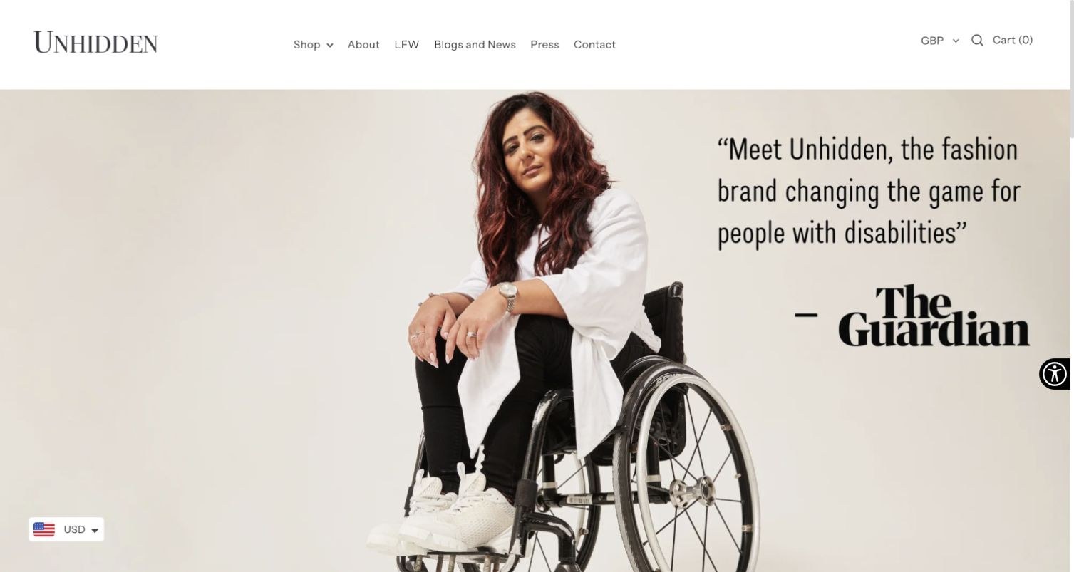
Unhidden uses a spacious monochrome header above a changing fashion photograph. The reviewed slides include wheelchair users without turning the whole composition into a medical catalogue. Shop, About, London Fashion Week, news and press have distinct routes. Lower on the page, a fabric-reuse collaboration and named customer quotations explain more about the business. The footer provides returns, support and policy destinations. The strongest aspect is the ordinary fashion presentation: the garments and people remain the subject, rather than a stock photograph of an abstract accessibility symbol.
What you can learn
Give adaptive products the same considered photography and brand presence as any fashion collection. Add a short, permanent explanation of the relevant adaptations so that a changing image never carries the whole introduction.
Pros
Real fashion photography gives the clothing a confident identity.
Shopping, brand background and practical support remain separate.
Cons & considerations
Some hero slides provide little immediate functional explanation.
Large images and rotating messages need useful text alternatives and controls.
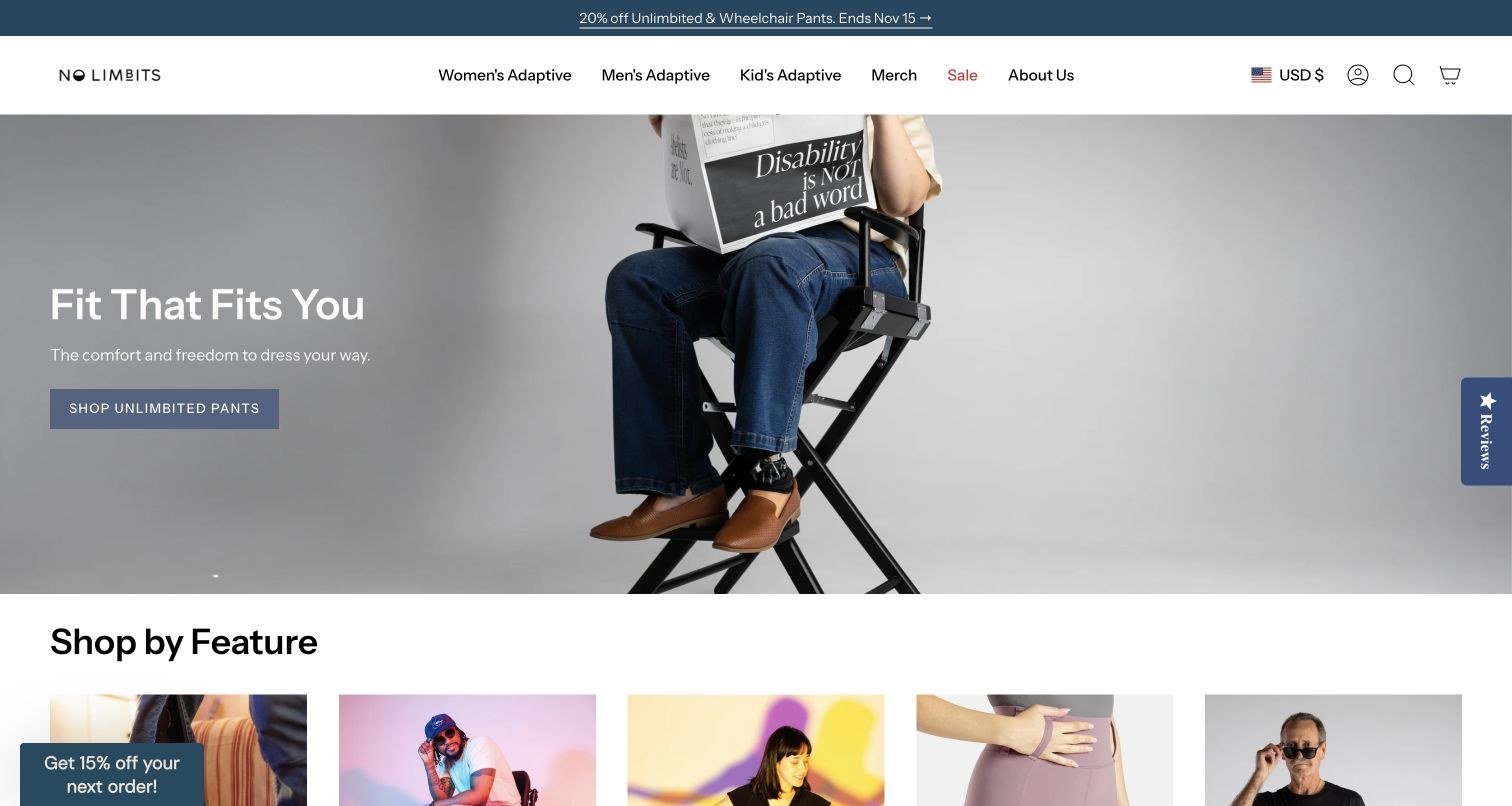
No Limbits combines restrained store navigation with a large lifestyle photograph and a direct route into its pants collection. Its more distinctive information architecture appears in Shop by Feature: wheelchair, prosthetic-access, sensory-friendly and easier-dressing needs are not collapsed into one label. Product cards show colours, prices and meaningful garment names. A separate sensory explanation adds context beyond a generic comfort claim. The opening sale and rotating headline are more temporary than that underlying structure, so the enduring feature routes deserve equal visual priority.
What you can learn
Keep a need-based path alongside conventional product categories. Someone who knows the required opening or fit should not have to identify an internal collection name before reaching suitable garments.
Pros
Feature labels distinguish genuinely different adaptations.
Product cards expose prices and colour choices before a product visit.
Cons & considerations
Promotions compete with the lasting explanation of the range.
A rotating introduction can delay the most relevant feature for a new visitor.
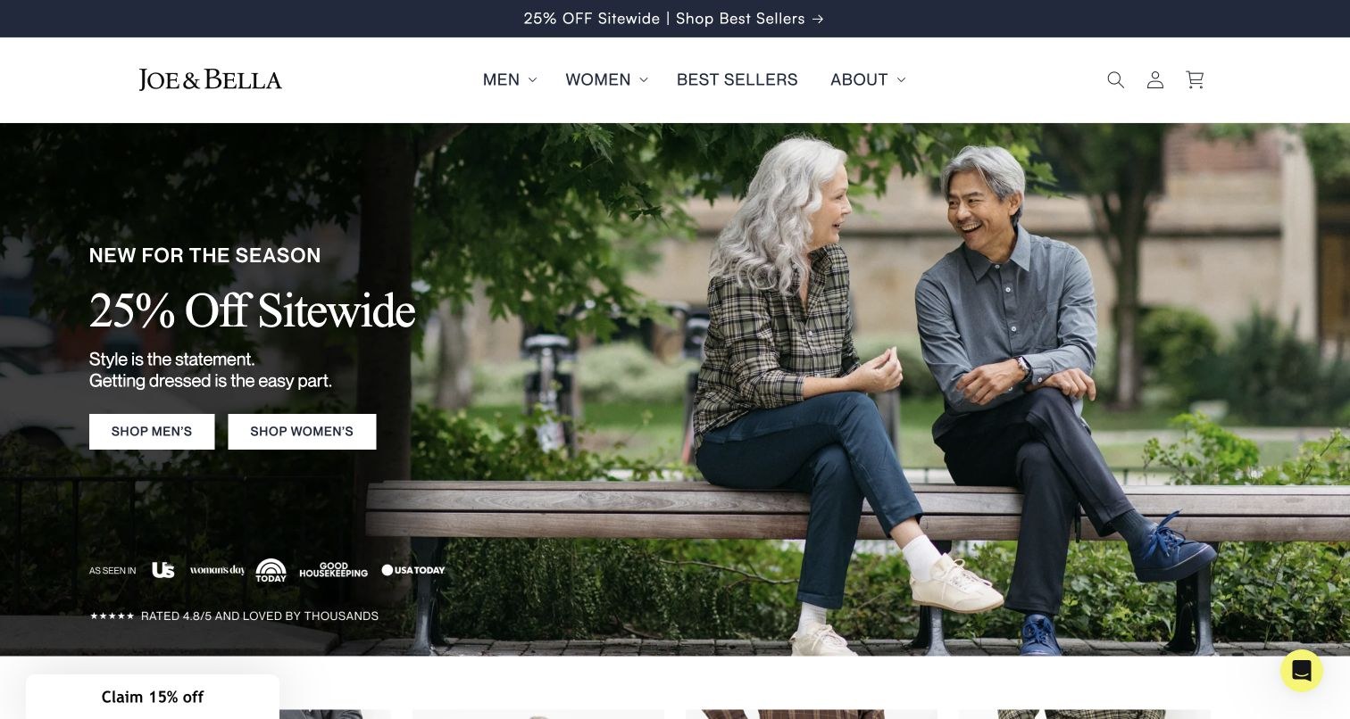
Joe & Bella presents older models in a relaxed outdoor setting rather than opening with a clinical diagram. A restrained header gives men, women and bestsellers clear shopping routes. Further down, names such as magnetic flannel, side-zip pants and access pants communicate how products differ. The page also makes room for fit guidance and detailed questions about independent and assisted dressing. Its current sale takes much of the hero emphasis; the more durable benefit is the connection between familiar clothing and a clearly described fastening or access feature.
What you can learn
Use lifestyle photography to communicate personal style, then use precise product language to explain function. Fit and dressing instructions should be easy to reach without relying on a promotional campaign.
Pros
Product names identify practical closure and access differences.
Fit guides and substantial questions support a more considered purchase.
Cons & considerations
The hero is dominated by a temporary percentage-off message.
Repeated carousel cards require a reliable non-carousel browsing route.
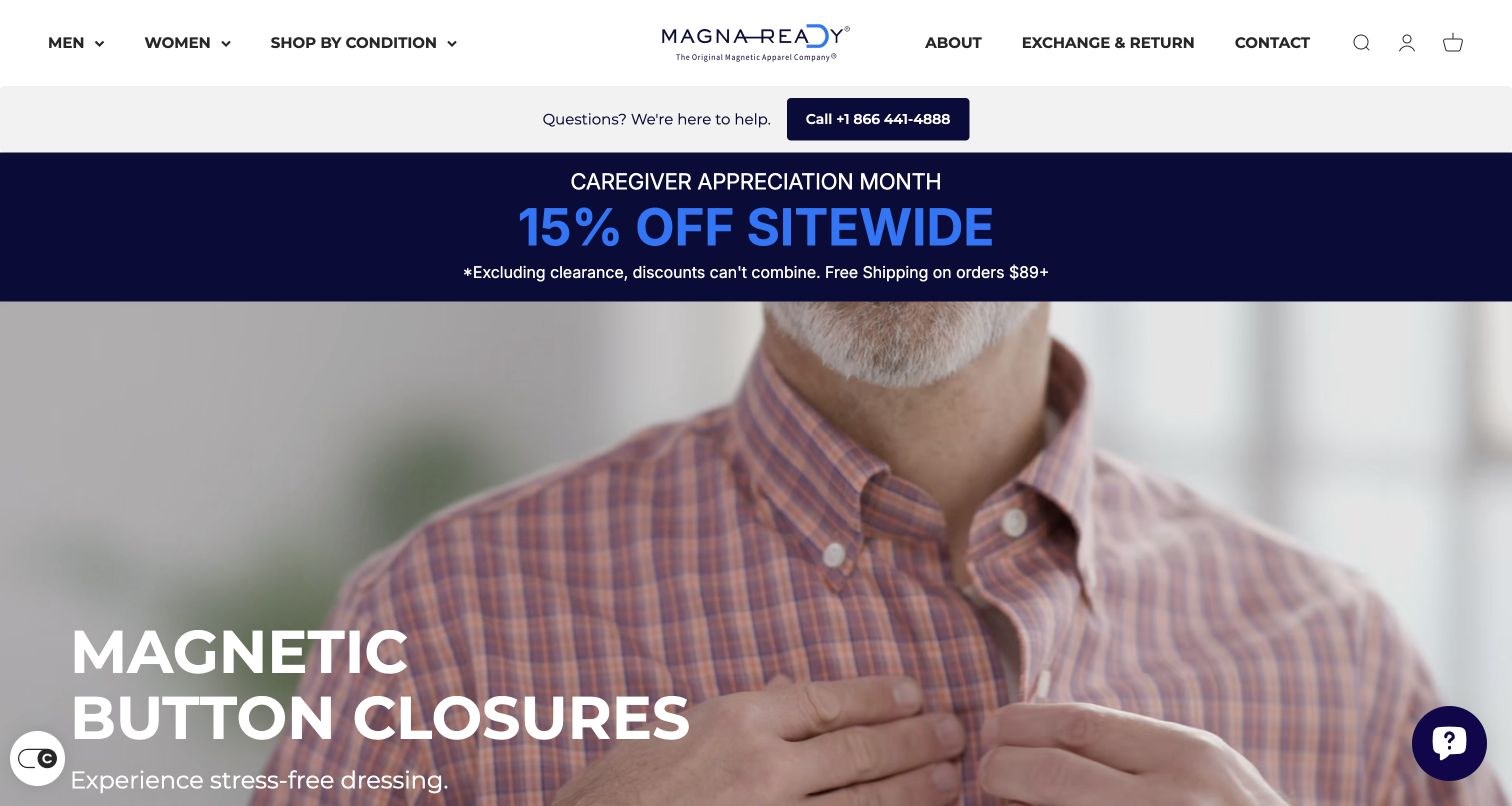
MagnaReady places the magnetic fastening itself in the opening photography. That is more informative than showing a conventional shirt with no explanation of what makes it different. Men, women and shopping by condition are grouped together, while background information, exchanges and contact have their own routes. A telephone help link is unusually easy to find. New-arrival cards continue the specificity through garment, fabric and closure names. Seasonal discount messaging occupies another large band, which adds visual competition to an otherwise direct product proposition.
What you can learn
Demonstrate the actual mechanism in context, with close-up imagery and plain labels. Keep suitability, care and any product-specific precautions available alongside the purchase decision rather than treating the image as sufficient instruction.
Pros
The fastening photograph explains a difference that a standard fashion shot cannot.
Telephone help and returns are prominent.
Cons & considerations
Stacked promotional areas consume much of the first screen.
Condition-led shopping still needs individual suitability information.
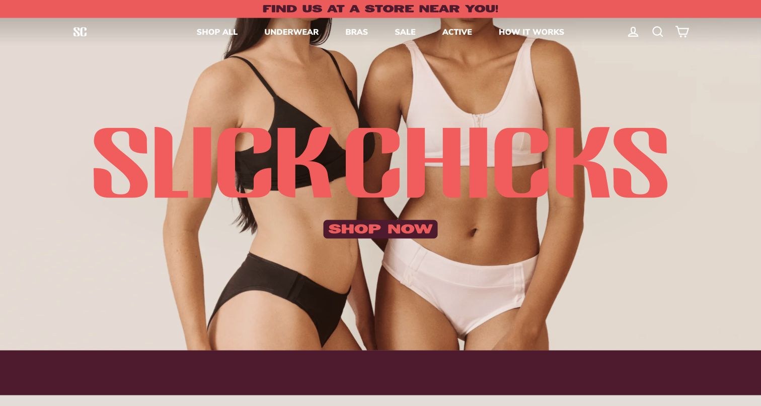
Slick Chicks uses an oversized coral wordmark over fashion photography, with clear underwear, bra and activewear destinations. The opening treatment is intentionally closer to an apparel campaign than a care-supply catalogue. A How it Works route gives the adaptation a separate explanation, and bestseller cards make actual product names and prices available. Below the campaign imagery, the site describes fastening and fabric features and shows customer quotations. Some slideshow labels and controls are less polished than the visual identity, a useful reminder that editorial styling does not establish accessibility.
What you can learn
Pair a memorable brand treatment with a readily discoverable explanation of how a garment is put on and removed. Test carousel controls and labels as carefully as the large typography.
Pros
Strong colour and type create a coherent fashion identity.
How it Works is available directly in the main navigation.
Cons & considerations
The hero can communicate brand more clearly than product function.
A translation placeholder was visible in the slideshow control text.
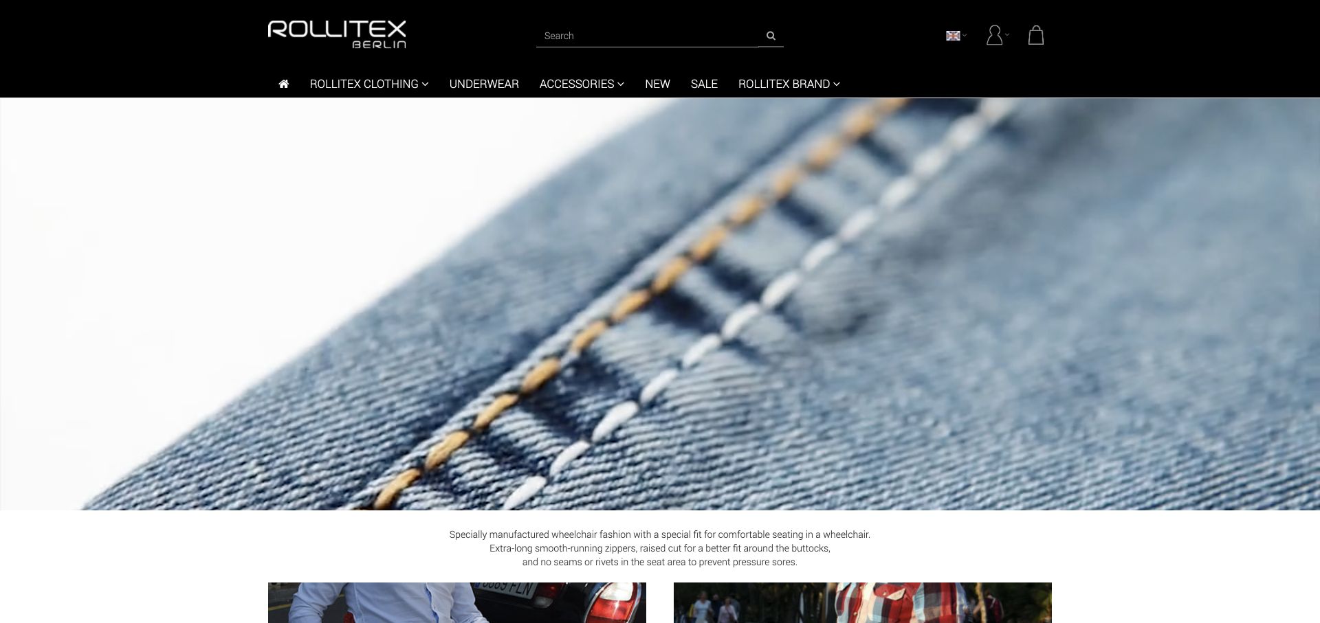
ROLLITEX opens with a large close view of denim stitching beneath a black two-tier store header. Clothing, underwear and accessories have separate shopping routes, while the introduction explains seated fit and garment construction. A fitting-guide route and telephone consultation offer practical support beyond the image. This is useful material-led brand presentation, but the macro photograph does not itself explain the fit or show the full garment. The reviewed page also contains differing consultation-hours statements, a small but important maintenance issue when personal advice is part of the service.
What you can learn
Use material photography to establish character, then provide complete garment views and fit information. Keep consultation hours in one maintained record so that the homepage and footer do not give conflicting advice.
Pros
The material close-up gives the specialist store a recognisable introduction.
Fit guidance and personal support have explicit routes.
Cons & considerations
Macro imagery delays the first complete garment comparison.
Consultation hours need a consistency review across the page.
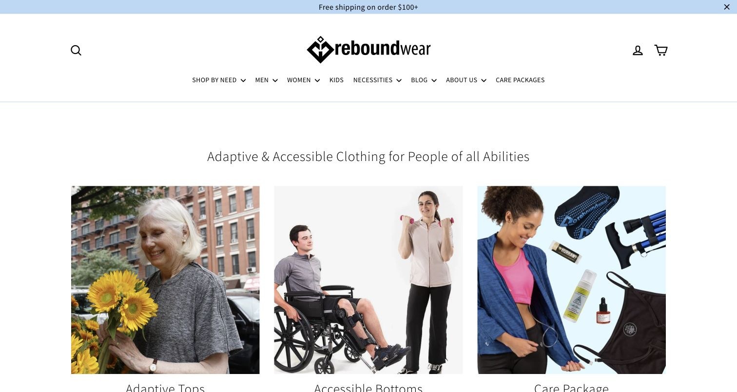
Reboundwear starts with a plain adaptive-clothing statement and three large photographic routes for tops, bottoms and care packages. The header also provides a Shop by Need path alongside men, women and kids. Price-led product cards follow, while customer accounts and longer recovery-related explanations provide context lower down. The composition is straightforward and largely familiar, which helps the specialised products feel approachable. A long navigation row and multiple merchandising sections still create work for somebody who arrives knowing a particular access requirement rather than a garment name.
What you can learn
Use a small number of clear shopping groups at the start, but preserve a direct path for specific needs. Explain what a package contains and how its garments differ from the individual products.
Pros
Three photographic categories make the range easy to enter.
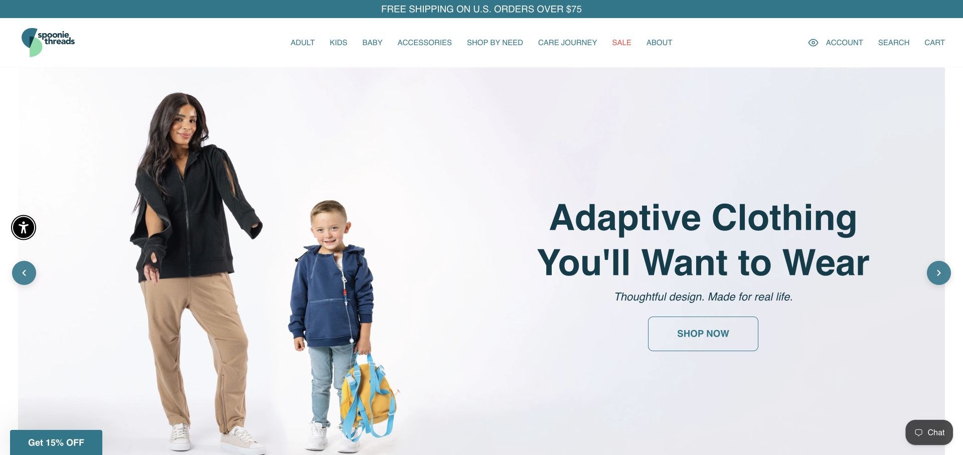
Spoonie Threads pairs adult and child garment photographs with a clear adaptive-apparel introduction. Age groups are not the only entry points: Shop by Need and Care Journey are both prominent in the header. The collection structure distinguishes areas such as tube and port care, ostomy support and other treatment-related needs. Product-linked customer reviews provide more context than a detached star total. The rotating hero contains several different messages, so the strongest enduring idea is the navigation that lets visitors describe the access they need in practical terms.
What you can learn
Organise specialist clothing around concrete access points and daily situations, not only diagnoses or internal product ranges. Let age, garment type and access requirements work together without forcing a single route.
Pros
Age and need-based shopping paths are both visible.
Reviews link back to the garments being discussed.
Cons & considerations
Several hero messages compete for the first impression.
Clinical-sounding categories still require careful product-level explanations.
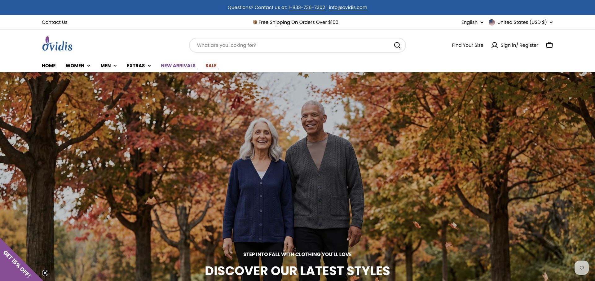
Ovidis gives search, sizing and telephone support substantial space in its header. An autumn lifestyle photograph leads into distinct women’s and men’s category grids, with labels for tops, dresses, trousers and sleepwear. Short feature explanations discuss assisted dressing, care and fabric practicality. This is a catalogue-oriented design rather than an abstract brand showcase. The seasonal hero is attractive but does not immediately explain the back-opening construction that makes many items relevant, so the size and dressing information must carry that more specific job.
What you can learn
Put sizing and human help where a shopper can find them before committing. Combine familiar clothing categories with clear descriptions of the opening, wearing position and assistance each garment requires.
Pros
Sizing help and telephone support are prominent.
Category grids make a substantial range easier to browse.
Cons & considerations
The introductory campaign says little about the actual adaptations.
Several header rows reduce the space available for useful product context.
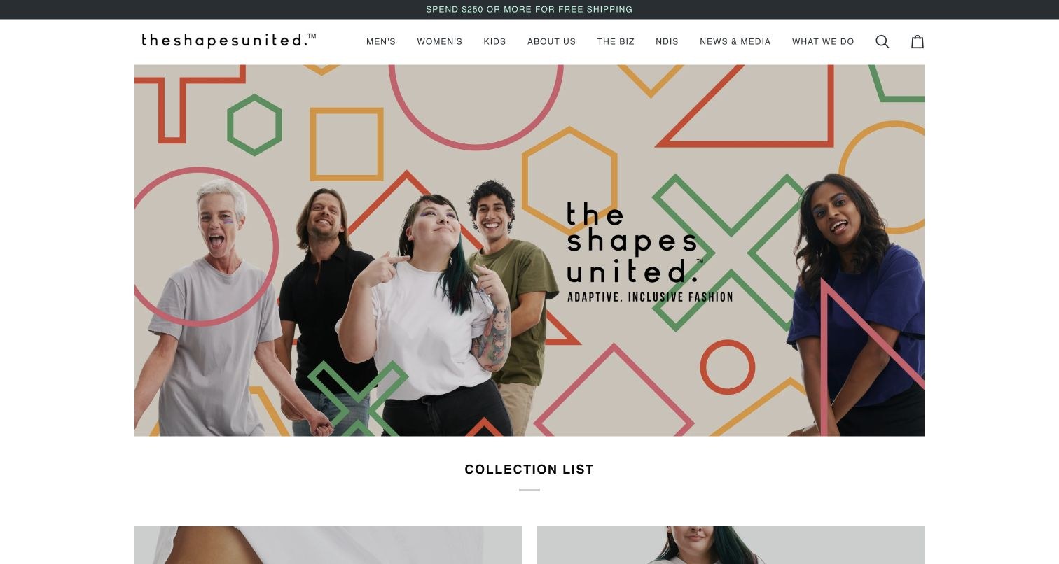
The Shapes United combines a geometric, multicolour identity with a photograph of different wearers. Below that introduction, separate Adaptive and Sensory collections establish an important distinction instead of making every garment serve the same claim. The page adds a plain-language brand explanation, product-specific customer comments and a practical demonstration video. Main navigation retains men, women and kids, plus background and NDIS information. The large opening image carries much of the visual introduction, while some of the most useful functional detail sits further down.
What you can learn
Make the distinction between garment access and sensory features explicit. Use brand imagery for identity, then provide text and demonstrations that help visitors compare actual design choices.
Pros
Adaptive and sensory collections are clearly separated.
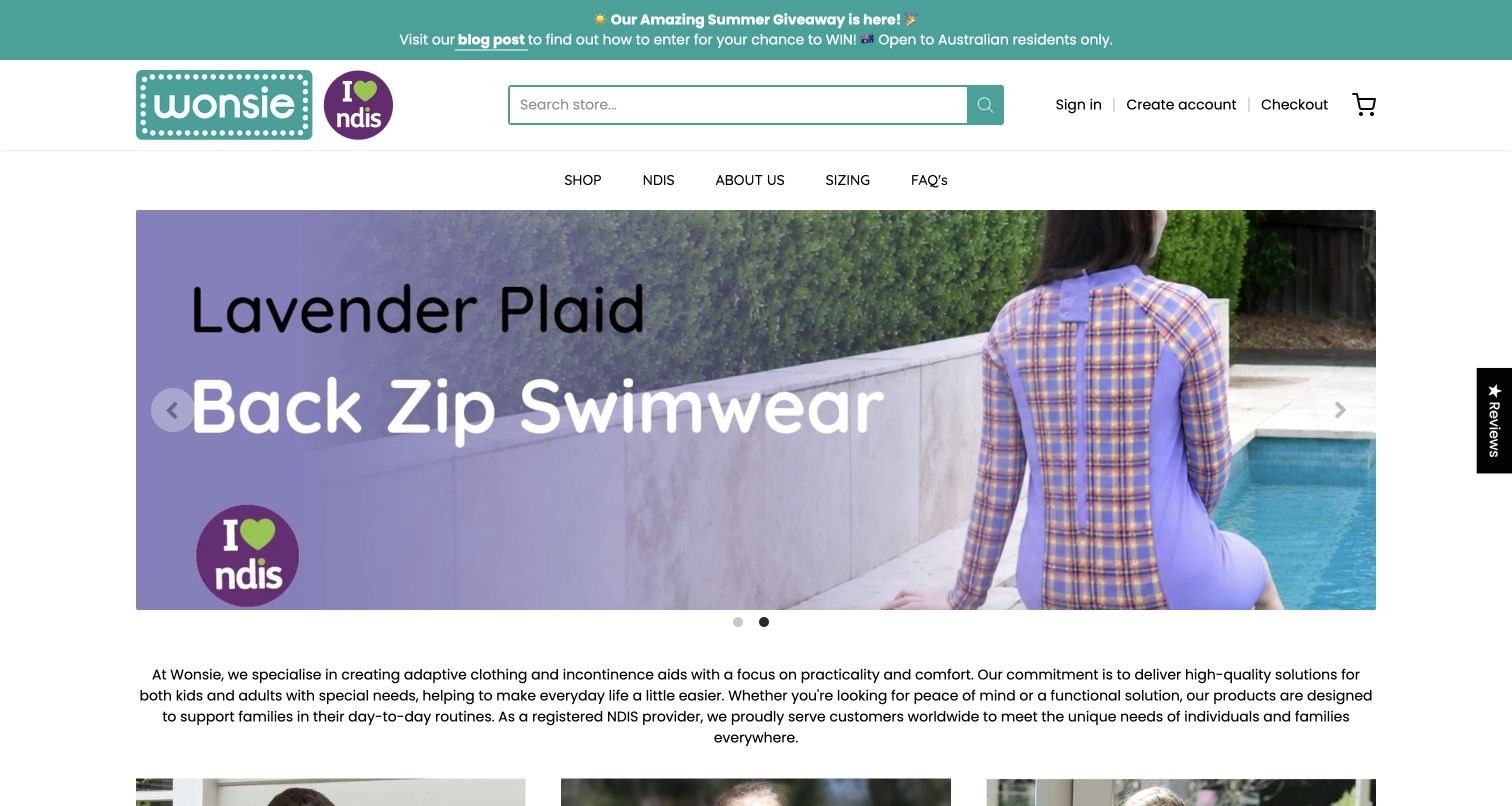
Wonsie uses a teal identity and a compact navigation row for shopping, sizing, questions and company background. Its reviewed campaign shows a specific back-zip swimsuit rather than a generic beach image. The introduction explains the purpose of the range, followed by separate basic, back-zip and tummy-access routes. Dated news and product-linked customer reviews keep the catalogue connected to actual use. Promotional copy and text within images take substantial space, so important fitting and access details should remain available as normal page text.
What you can learn
Name the construction in both the product photograph and accessible text. Keep size guidance close to the buying journey, and separate promotional campaigns from the stable explanation of the range.
Pros
Specific access types form useful product routes.
Sizing and questions are accessible from the main header.
Cons & considerations
Promotional imagery carries text that should not exist only in pixels.
Multiple news and review sections make the homepage lengthy.
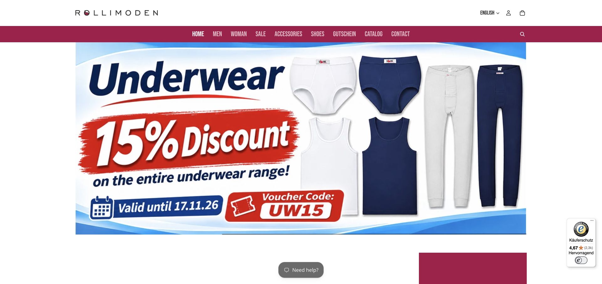
Rollimoden combines a white utility header with burgundy category navigation and a large dated clothing promotion. Product cards beneath it show photographs, names, euro prices and separate detail actions. A fitting guide, consultation information and ordering policies support the purchase journey. The directly reviewed company page explains that its garment cuts are designed around seated posture, giving the catalogue an actual specialist context. The English storefront retains some German labels, and its image-based promotion needs a maintained expiry state rather than remaining an apparently current offer indefinitely.
What you can learn
Connect the catalogue to a plain explanation of the specialist fit. Treat translations and promotions as maintained content, with readable equivalents and clear expiry handling rather than text embedded only in an image.
Pros
Fit guidance and practical ordering support are available.
Product cards provide photographs, names and prices.
Cons & considerations
Mixed-language labels make the selected English edition less consistent.
A large image-based promotion needs readable text and an expired state.
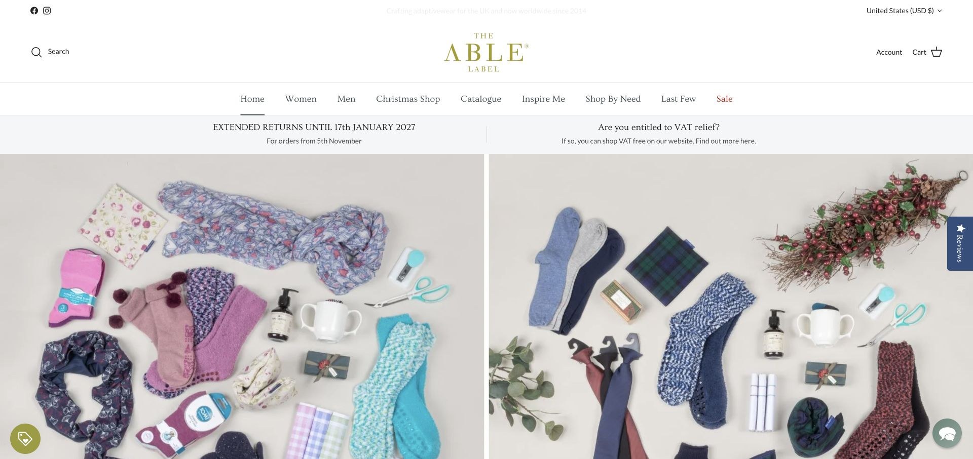
The Able Label uses a restrained white header, serif navigation and a large seasonal gift composition. Women, men, a catalogue, inspiration and shopping by need have separate destinations. Returns and VAT information sit above the main merchandising, while product names identify particular fastening types. This creates a useful bridge between familiar catalogue shopping and functional garment detail. The multiple navigation and policy rows are substantial, though, and seasonal gifts can occupy the first screen before an unfamiliar visitor learns what the adaptations involve.
What you can learn
Keep the familiar shopping structure, but ensure the lasting product proposition survives seasonal merchandising. Make fit, fastening and support information easier to find than a temporary campaign.
Pros
Need-based shopping is retained alongside normal apparel categories.
Product labels identify the type of fastening.
Cons & considerations
Several stacked header rows push products down the page.
Seasonal gift imagery delays an explanation of easier dressing.
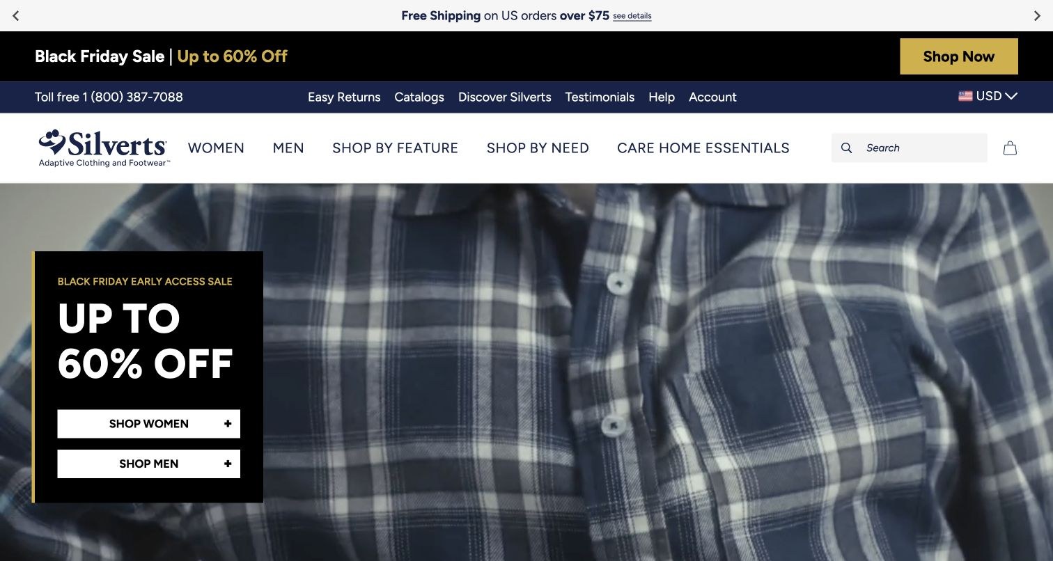
Silverts uses a substantial retail header with search, a telephone number, returns and catalogue information. The main navigation separates shopping by feature, shopping by need and care-home essentials. Product cards identify actual openings and garment types, while lower sections demonstrate specific fastening mechanisms. That information architecture is more useful than treating adaptive clothing as a single category. The reviewed first view is heavily promotional, with multiple announcement rows and a sale message layered over product photography.
What you can learn
Give a large catalogue several coherent entry points, especially where wearers and care settings have different requirements. Preserve an understandable route to the garment mechanism even during a major sale.
Pros
Feature and need navigation serve different shopping questions.
Closure demonstration imagery supports the more detailed product explanations.
Cons & considerations
Promotional and navigation rows occupy much of the first screen.
A large catalogue needs consistent distinctions between self and assisted dressing.
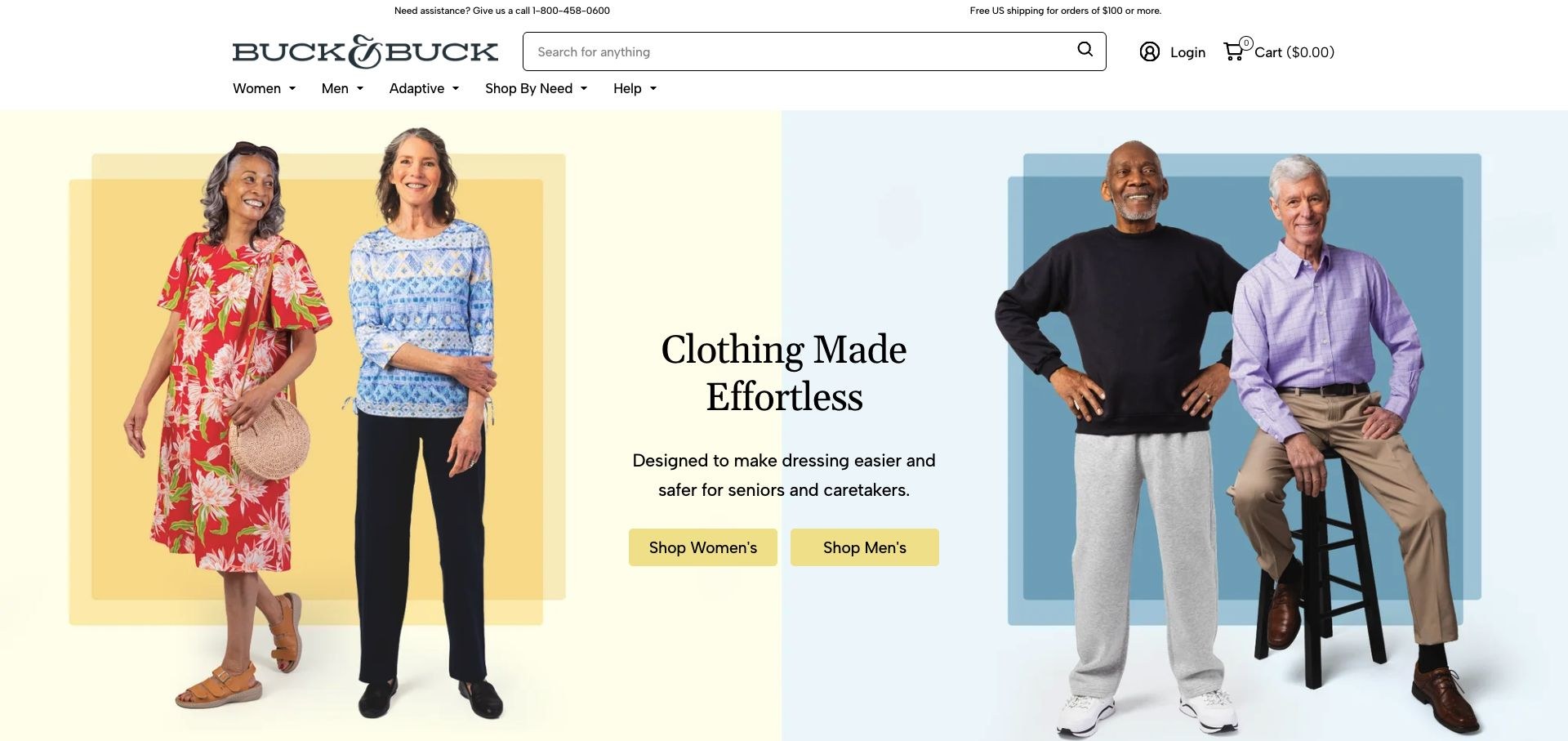
Buck & Buck opens with everyday clothing photographs on soft yellow and blue backgrounds. Its introduction speaks directly about easier dressing, with women’s and men’s routes visible immediately. The next feature cards explain hook-and-loop closures, wrap-back shirts, side-zip trousers and other constructions in ordinary language. Search and telephone help are prominent rather than buried in the footer. Customer quotations and longer product sequences follow. The clarity of the feature explanations is the useful design lesson, without treating the site’s own scale or outcome claims as independently established.
What you can learn
Describe the dressing action a construction supports, not just the name of the fastening. Keep wearer and care-partner perspectives available without assuming that every customer needs the same level of assistance.
Pros
Feature cards explain concrete differences in plain language.
Search and telephone help are easy to locate.
Cons & considerations
Long testimonial and trust sections precede more detailed inventory.
Broad benefit claims need product-specific qualifications.
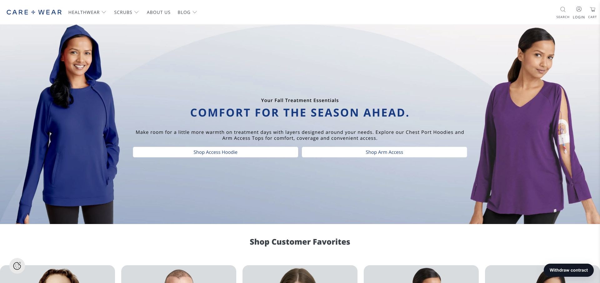
Care+Wear’s opening composition pairs two actual garment photographs with separate chest-port hoodie and arm-access shopping actions. That specificity is useful: the visitor does not need to infer the access location from a broad comfort statement. The header separates healthwear from scrubs, while customer-favourite links identify additional product categories. Community stories provide context outside the catalogue. Because the business addresses both garment wearers and professionals, preserving the distinction between those audiences is more important than making the homepage a single undifferentiated clothing feed.
What you can learn
Make the relevant access point explicit in both the imagery and link label. When a brand serves professionals as well as consumers, keep those shopping and information routes recognisably separate.
Pros
Two specific hero actions make the access options understandable.
Healthwear and scrubs have different navigation destinations.
Cons & considerations
Some introductory text is small over a large photograph.
Audience-specific information must remain clear across the broader catalogue.
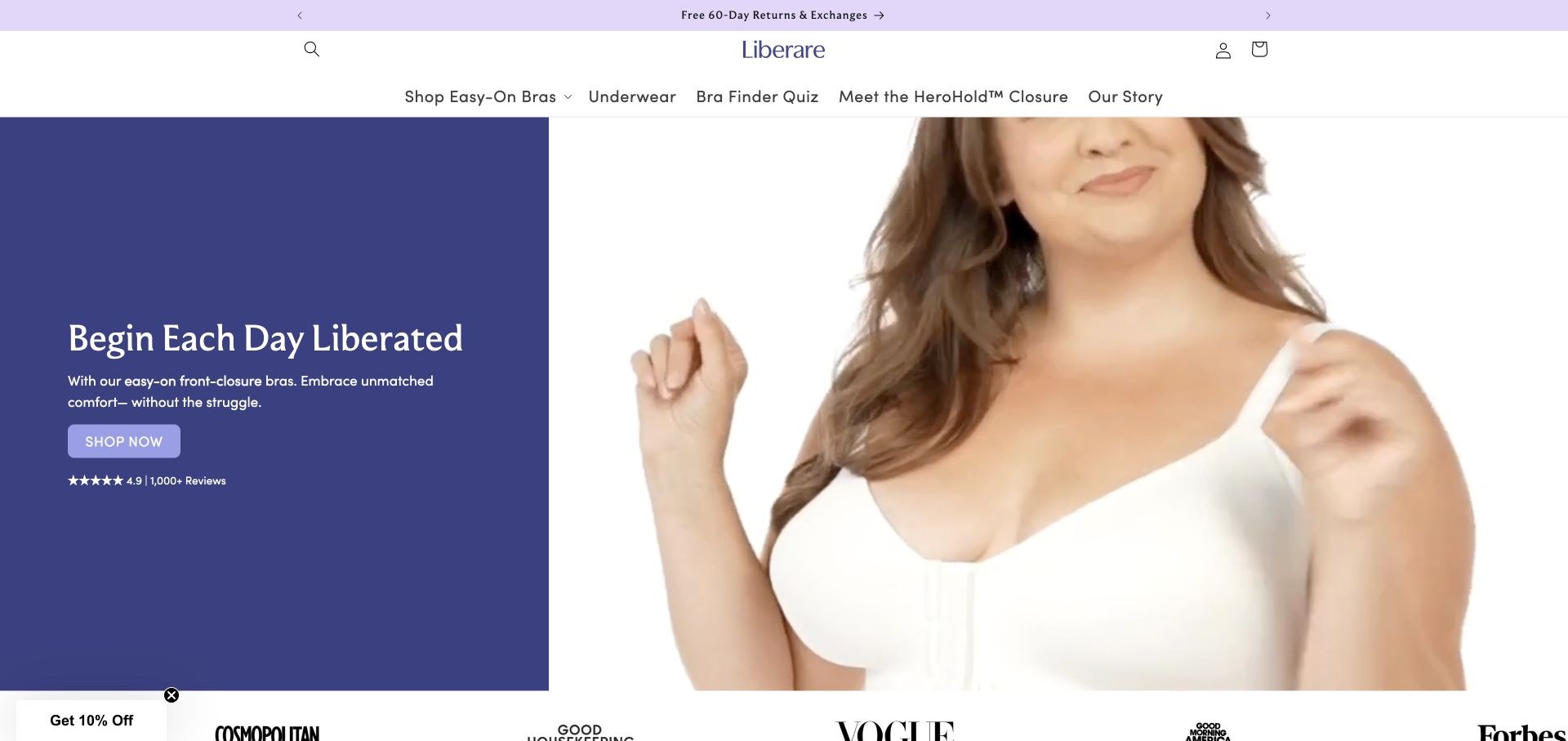
Liberare uses a soft purple palette and a split composition that connects its easy-on message with a close view of a front-closure bra. The header includes a bra-finder quiz and a named closure explainer alongside shopping and company background. Product cards give prices and describe the relevant construction. A demonstration and founder story add detail beyond the headline. Several repeated Shop Now labels are less informative than the explicit navigation, and absolute ease-of-use language needs qualification around the individual garment and wearer.
What you can learn
Show the closure, explain its operation and provide fit guidance within the same shopping journey. Use specific action labels so a demonstration, product range and individual item do not all appear to be the same destination.
Pros
The mechanism has its own prominent explanatory route.
Fit discovery and product information are linked to the shopping experience.
Cons & considerations
Repeated generic action labels conceal differences between destinations.
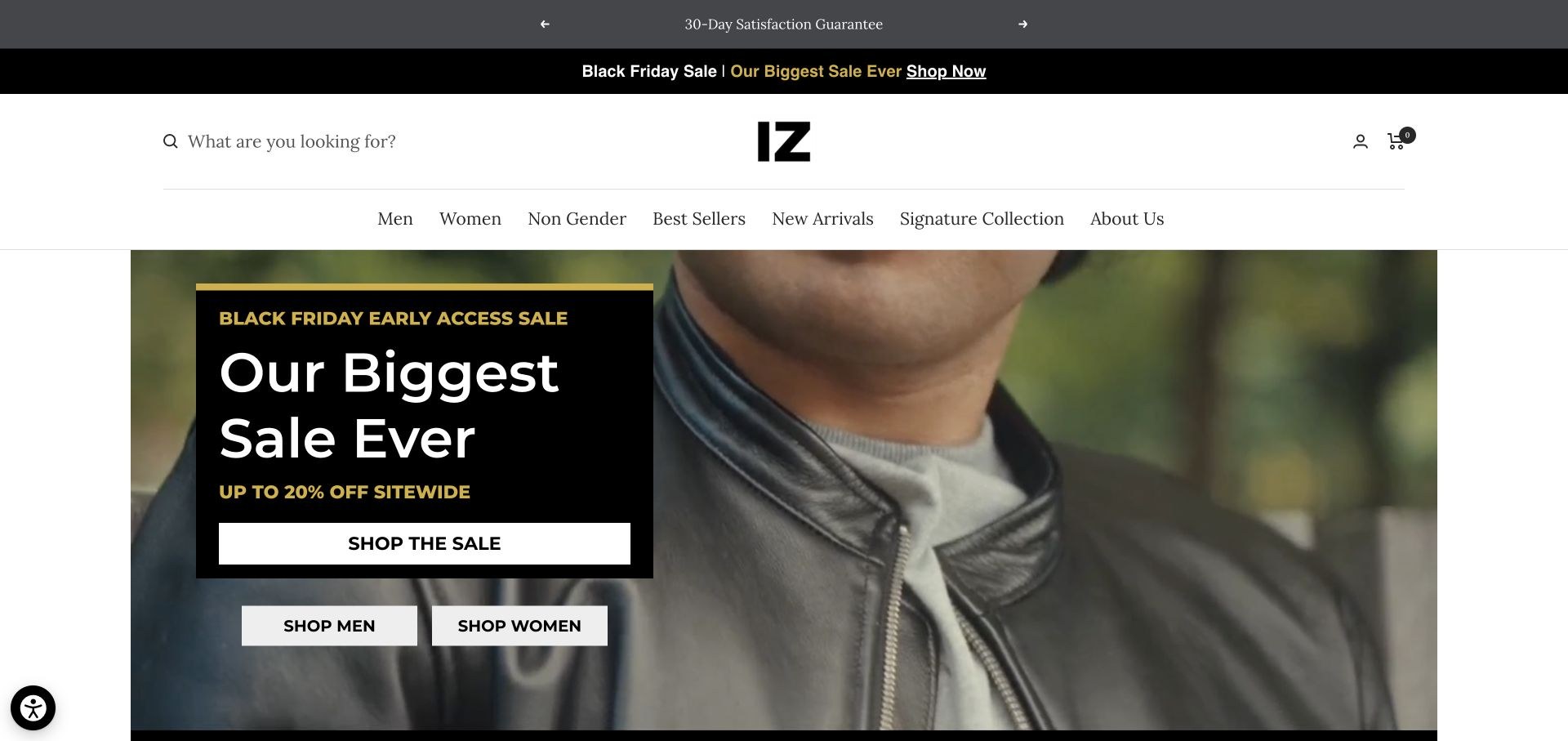
IZ Adaptive uses a restrained black identity, large fashion photography and conventional category navigation. Men, women and a non-gender collection sit alongside signature products and company background. More specific routes identify open-back tees, jackets and its named pants collection, with product cards exposing colour choices and prices. The reviewed sale campaign dominates the hero, so the special construction of a named collection is not immediately apparent. The useful pattern is familiar fashion browsing supported by more precise product explanations, rather than assuming that a collection name explains itself.
What you can learn
Keep fashion categories familiar while giving special construction its own explanation. A product family name should be supported by diagrams, wearing-position photos and concrete fit information.
Pros
Conventional categories make the store approachable.
Product cards show colour choices and actual garment descriptions.
Cons & considerations
Temporary sale messaging dominates the opening view.
A named specialist pants collection needs more explanation than its name alone.
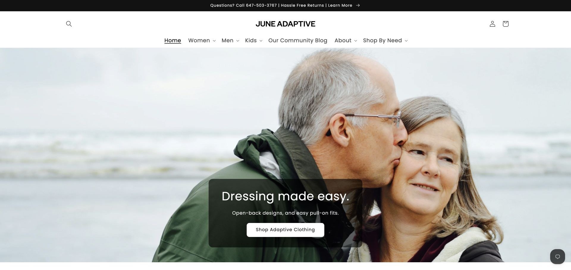
June Adaptive presents a straightforward easier-dressing introduction with open-back and pull-on language. The header combines women, men and kids with shopping by need and a community blog. Telephone help and return information are visible before the product grid. The catalogue includes products from other makers, including Ovidis, so this example should be understood as a retail presentation rather than an entirely separate garment-manufacturing model. The product names contain substantial functional detail, but their length makes individual cards harder to scan.
What you can learn
Keep the useful garment details, but divide them into a concise title and structured attributes. In a multi-brand shop, make the maker and fit information clear without forcing the visitor to decode a long repeated title.
Pros
Telephone help and practical returns information appear early.
Need-based navigation helps people enter a mixed catalogue.
Cons & considerations
Very long product titles make the grid harder to compare.
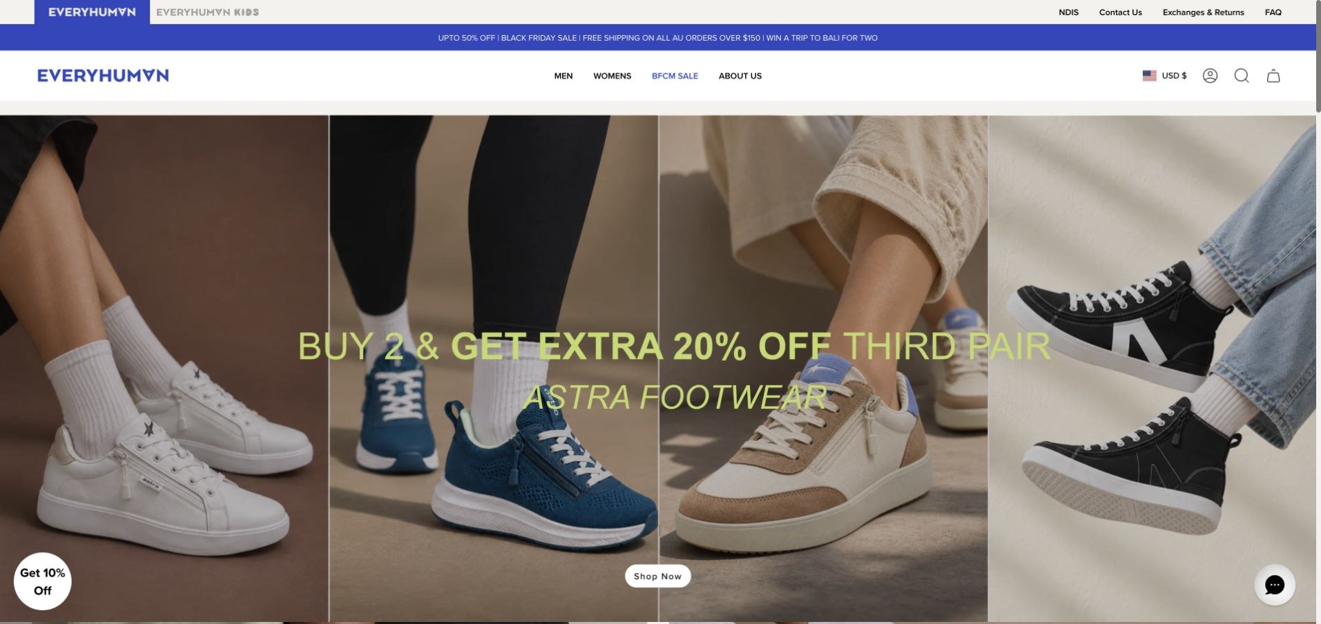
EveryHuman uses a blue identity, adult and kids branches and visible NDIS, return and help destinations. The reviewed hero promotes footwear, while the page also presents its own comfort apparel and collections such as seated jeans, socks and advocacy clothing. Product cards show colour choices and current prices. That range makes careful labelling important: a broad inclusive shop can include conventional items as well as garments with a particular adaptation. The homepage is useful for studying catalogue organisation, not as evidence that every product has the same accessibility features.
What you can learn
State the actual adaptation at item and collection level. Separate comfort, fit, garment access and footwear mechanisms so that an inclusive brand identity does not become a blanket functional claim.
Pros
Adult and kids shopping routes remain distinct.
Practical help and return information is visible in the header.
Cons & considerations
The footwear campaign delays the clothing proposition.
A mixed catalogue needs precise item-level adaptation labels.
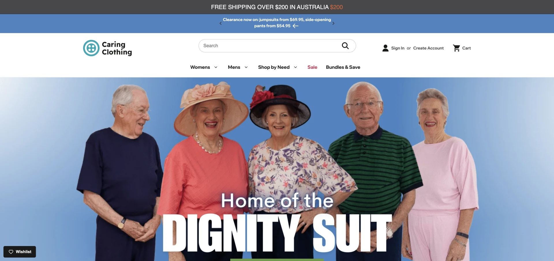
Caring Clothing opens with a large photograph of older wearers and a direct dignity-focused clothing message. Women, men and shopping by need remain the main navigation routes, with bundles and sale information separated. Its product cards identify vendor names, garment types, options and prices rather than presenting every item as an unnamed house product. A visible new-ownership announcement is a useful example of communicating a material business change. Promotional and funding-related statements still need current supporting details rather than relying on icons alone.
What you can learn
Connect a humane brand message to structured product records. Explain important changes and retain maker, fastening, sizing and care information so the practical shopping decision is not lost in the emotional introduction.
Pros
Vendor names and garment details are available in product cards.
The change-of-ownership notice is explicit.
Cons & considerations
Stacked promotions compete with the main clothing explanation.
Funding and delivery claims require their current terms and conditions.
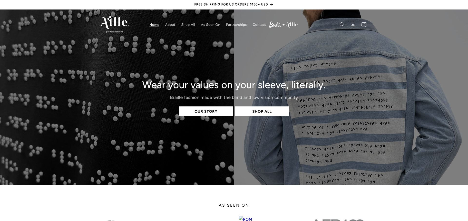
Aille Design places a close view of braille beadwork next to a denim garment in its opening composition. The explanation explicitly connects the fashion to blind and low-vision co-design, with separate story and shopping routes. Product photography and descriptive alternative text continue that focus in the catalogue. This is a different adaptation from a larger opening or easier fastening, which is precisely why the specific explanation matters. Many products were marked sold out during review, so the page is a design reference rather than a promise of current purchase availability.
What you can learn
Show how an adaptation works in the material itself, then explain its purpose in normal text. Preserve accurate stock states and distinguish tactile design from other kinds of garment accessibility.
Pros
Close-up photography makes the braille treatment tangible.
The co-design purpose is explained clearly.
Cons & considerations
Many displayed items were sold out at the time of review.
Large photographic sections delay the more detailed product comparison.
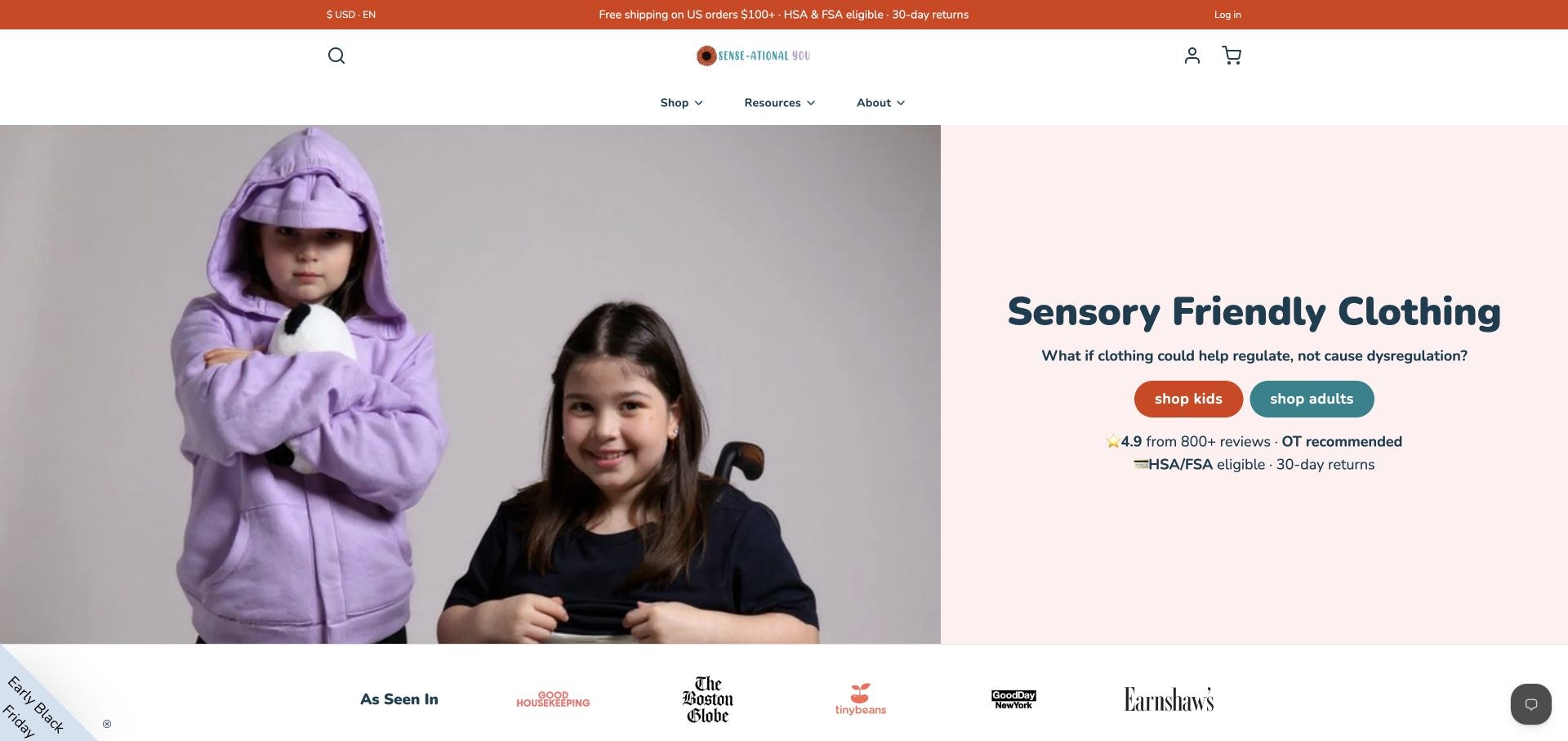
Sense-ational You’s split introduction shows children demonstrating a hood and a garment lining rather than only posing in an outfit. Separate kids and adults actions are supported by resources covering clothing features, questions, a quiz and dressing preparation. Further sections name tagless construction, flat seams and built-in tools. The site makes the specialist proposition unusually explicit, although benefit statements should not be read as clinical guarantees. The useful reference is the connection between a visible garment feature and a practical explanation of why someone might look for it.
What you can learn
Demonstrate the relevant detail and provide a plain-language explanation, with fit and material guidance nearby. Keep shopping recommendations distinct from medical advice or promises about an individual’s sensory response.
Pros
The introductory photograph demonstrates specific garment features.
Educational and shopping resources are both easy to locate.
Cons & considerations
Broad regulation and outcome language needs careful qualification.
A long feature-and-resource page benefits from concise local navigation.
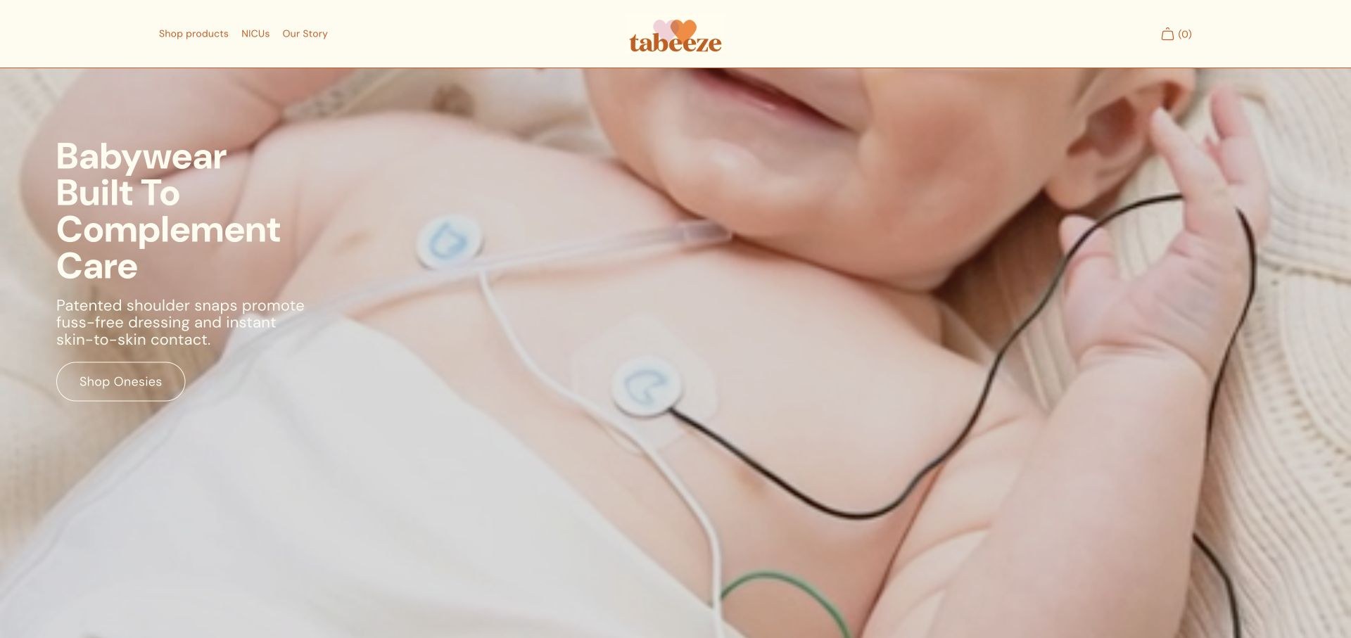
Tabeeze uses a warm cream-and-orange identity and close babywear photography. The introduction identifies shoulder snaps, while product navigation provides age ranges and concise descriptions rather than only product names. A three-step explanation shows the dressing sequence, and medical-access patches receive a separate route. NICU information and consumer shopping coexist on the same site. The number of clinical, certification and sustainability statements makes supporting detail important; the design itself should not be treated as independent verification of those claims.
What you can learn
Explain an unfamiliar construction as a sequence of observable actions. Keep family shopping, hospital evaluation and supporting evidence in distinct destinations, especially where the audiences need different levels of detail.
Pros
The dressing sequence makes the product mechanism understandable.
Age ranges and medical-access products are identified clearly.
Cons & considerations
Consumer and professional information create a long shared page.
Clinical and certification claims need accessible supporting evidence.
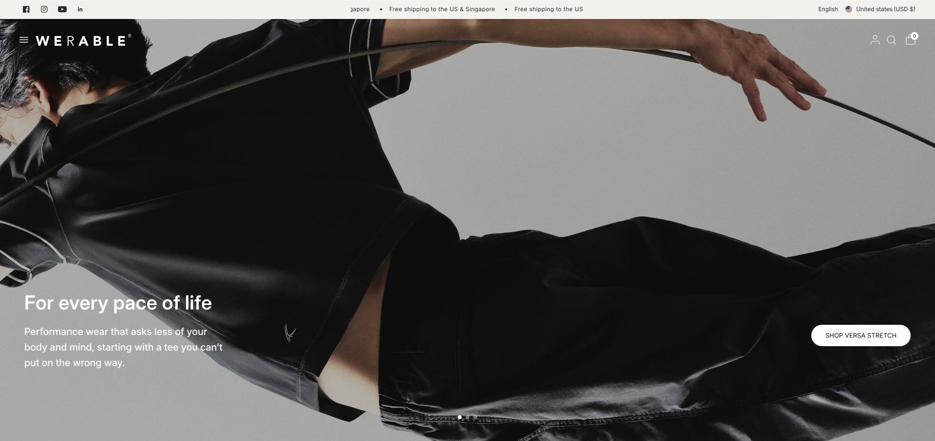
Werable’s opening photograph and restrained typography feel closer to a fashion editorial than a medical catalogue. The reviewed apparel message describes a reversible tee in practical terms, with a named collection action. Product cards distinguish fits, colours, prices and pre-order status. Other hero slides and shop tabs introduce one-handed bags, making the separation between apparel and accessories important. Stories and store-location information add context. A changing homepage can bring those different categories into focus at different moments, so a permanent product index remains valuable.
What you can learn
Translate a technical garment idea into a concrete daily benefit, then show the construction and fit. If accessories share the brand, let visitors choose that branch instead of making the carousel decide for them.
Pros
The reversible-garment benefit is stated in ordinary language.
Product cards identify fit, colours and pre-order status.
Cons & considerations
Rotating bag campaigns can temporarily obscure the apparel focus.
Image-led styling needs reliable readable product detail beneath it.
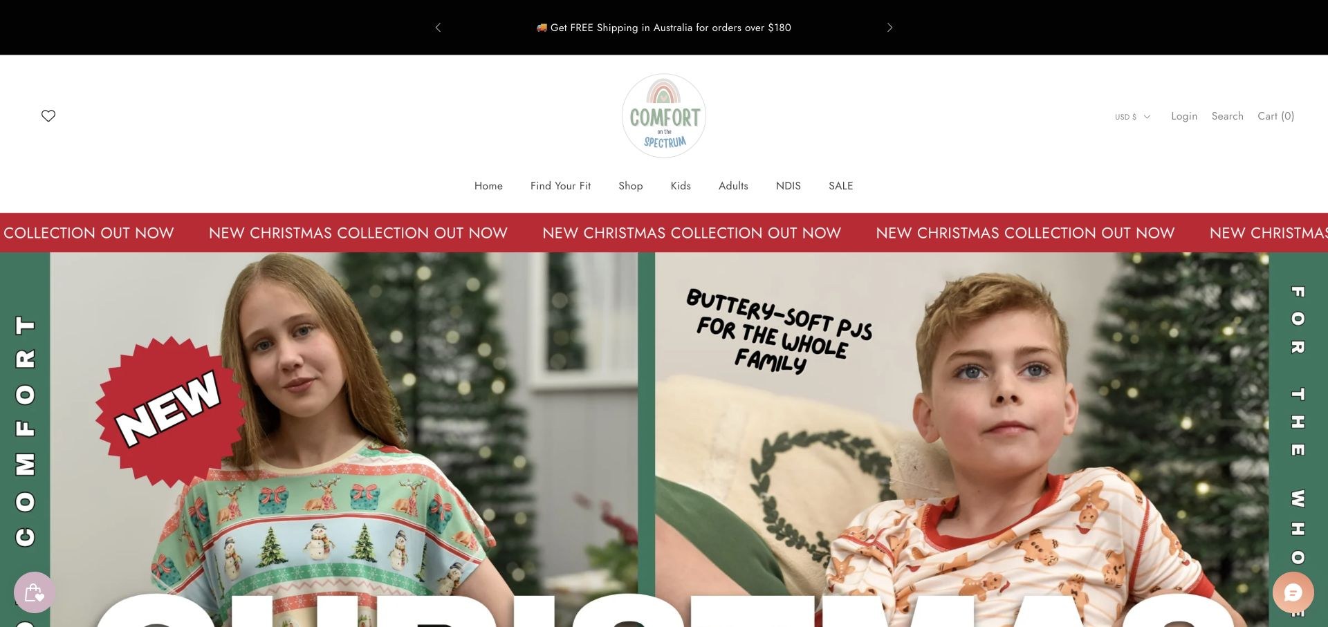
Comfort on the Spectrum combines a spacious header with a prominent Find Your Fit route and separate kids and adults shopping branches. Its page explains tag-free and flat-seam construction, adds a founder-family story and displays product options with prices. The reviewed hero is a large seasonal campaign, while other slides use everyday clothing photographs. A quiz can help organise a range, but it should not imply certainty about a particular person’s sensory response. The most transferable design idea is the pairing of concrete material information with practical product discovery.
What you can learn
Let shoppers compare seams, labels, fabrics and sizing before asking for preferences. Use a quiz as an optional aid, with ordinary category browsing and full product information still available.
Pros
Fit discovery sits in the main navigation.
Concrete fabric and seam information supports the brand proposition.
Cons & considerations
A large seasonal campaign pushes practical guidance below the first view.
Personalised recommendations need clear limits rather than universal comfort promises.
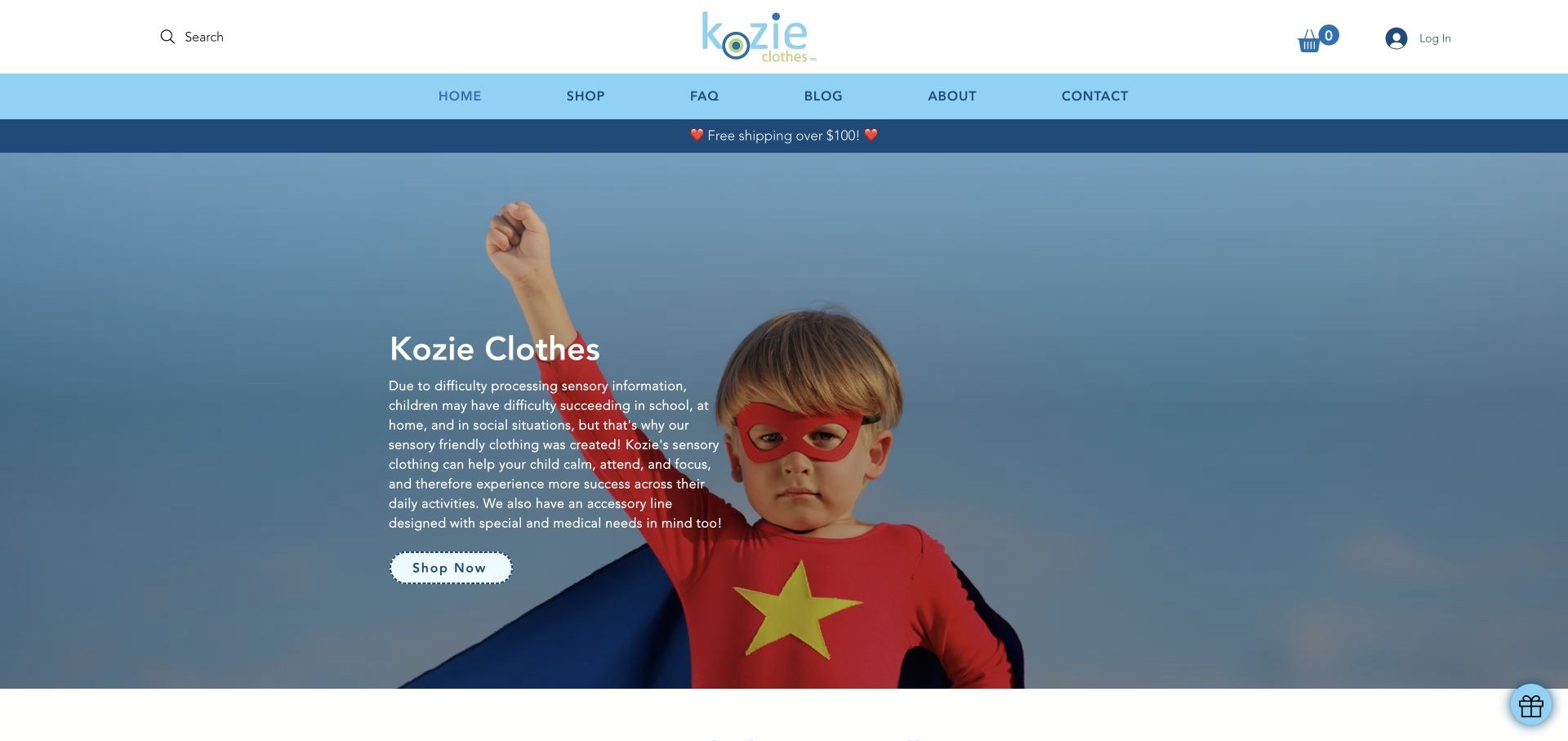
Kozie Clothes uses a bright blue identity and a superhero-child photograph to introduce its range. Below the opening statement, named bestsellers lead into separate explanations of sensory-friendly clothing and medical-access clothing. Questions, company background and contact remain available in the main navigation. The page also offers a practical dressing guide, though the related marketing checkbox starts selected. Its therapeutic-sounding benefit language needs supporting evidence; the useful information-design distinction is between sensory characteristics and a garment modified for treatment access.
What you can learn
Separate the reasons a garment differs instead of placing every adaptation in one category. Present educational material with clear evidence boundaries and let visitors make an active, informed choice about marketing email.
Pros
Sensory and medical-access clothing receive different explanations.
Named products connect the educational material to the actual range.
Cons & considerations
Therapeutic benefit statements need careful substantiation.
The guide form’s marketing checkbox was preselected.
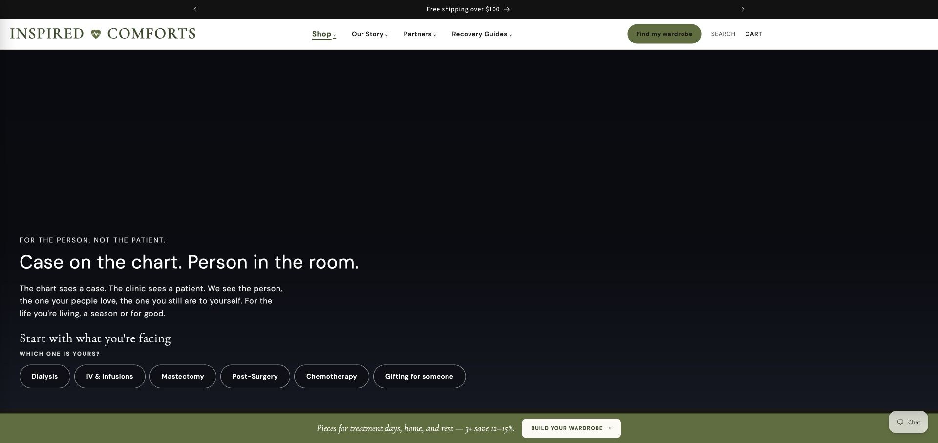
Inspired Comforts uses a dark, typographic introduction and an olive action treatment rather than opening with a conventional product grid. The first shopping choices identify dialysis, infusions, surgery, chemotherapy and gifting, while a wardrobe finder offers another route. Further sections explain garment access, coverage and dressing mechanisms, with photographs of products in everyday use. The narrative establishes a humane tone, but its length and broad benefit statements should not substitute for precise item-level details about openings, materials and fit.
What you can learn
Start with the situation a visitor recognises, then move quickly to the garment facts needed to compare options. Keep personal storytelling useful without making it the only route to a product or care instruction.
Pros
Situation-specific actions appear early in the page.
Access and coverage receive explicit explanations.
Cons & considerations
The long editorial introduction can delay product-level comparison.
Broad comfort and recovery claims need appropriate qualification.
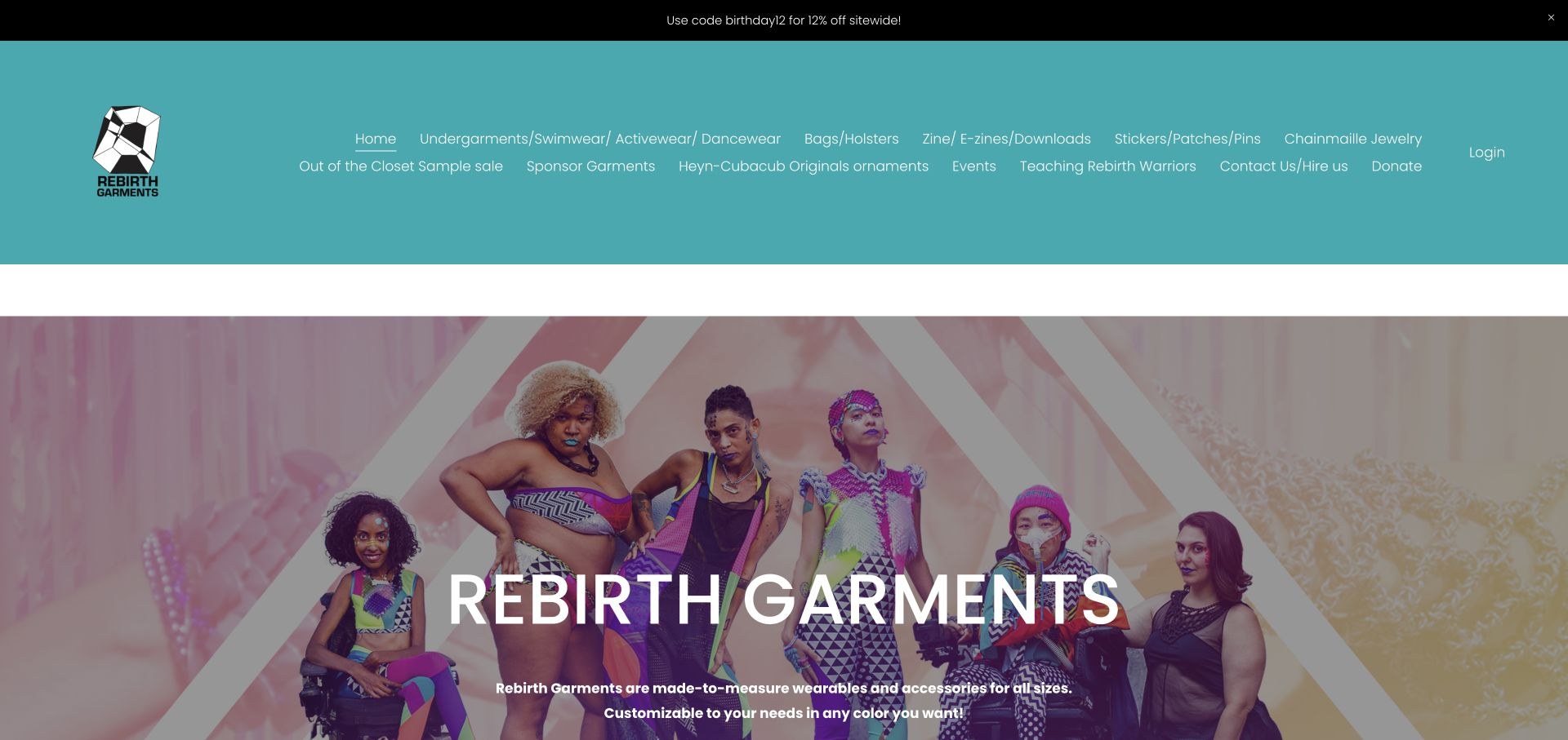
Rebirth Garments uses vivid inclusive fashion photography beneath an unusually extensive navigation menu. Its public homepage makes the made-to-measure approach explicit, with a direct custom-clothing route and a clear statement that garments are not medical devices. Workshops, community publications, accessories and sponsored garments form separate activities. The page also honestly records an ongoing template change, damaged alternative text and password-protected portions of the site. Those are material limitations, not details to overlook while admiring the distinctive photographic identity.
What you can learn
Explain the ordering model before presenting a custom range, and be transparent about current website limitations. Keep public product and access information usable even when some community material is intentionally restricted.
Pros
The made-to-measure model is stated explicitly.
The site communicates current limitations and non-medical scope openly.
Cons & considerations
A very long header creates a demanding first navigation choice.
The owner reports ongoing alternative-text and template repairs.
Kegan is a freelance web designer and developer with 15+ years of experience helping businesses turn complicated website requirements into clear, maintainable digital experiences. He works directly with clients from planning and design through development, launch, and ongoing support.
For adaptive clothing brand website design, his development approach focuses on garment adaptations, fit and fastening information, descriptive product media, useful sizing guidance, and dependable accessible shopping journeys. The scope can be a targeted improvement or a complete custom build, with responsive layouts, thoughtful content structure, and integrations chosen around the people using and maintaining the site.
Show 3 other adaptive clothing brand website designersHide other adaptive clothing brand website designers
Define maker, garment type, sizes, measurement method, materials, openings, fastenings, access points, wearing position, dressing assistance, care instructions and relevant precautions. Keep those fields separate from marketing copy so filters and product comparisons use consistent information.
Use more than one useful shopping route
Support normal garment categories alongside features or practical needs where the range warrants it. Keep multi-brand maker information explicit. A quiz can help, but should not be required before reading product facts or browsing the complete catalogue.
Commission a purposeful image set
Show the garment on actual wearers, the relevant seated or standing position, and close views of the opening or fastening. Provide readable text instructions and meaningful alternative text. If a demonstration uses motion, offer controls and an equivalent explanation.
Make practical terms part of the decision
Keep returns, exchanges, delivery limits and sizing support easy to locate. Explain any VAT, reimbursement or funding statement with current conditions rather than suggesting universal eligibility. Show stock and pre-order status honestly, including unavailable products.
Test with the people using the site
Test keyboard operation, zoom, contrast, product options, filters and forms, as well as screen-reader labels and errors. Include disabled shoppers and care partners in research. A widget, badge, familiar platform or attractive screenshot does not establish conformance.
The editing job behind the design
Choose a catalogue the team can keep accurate
Model garment features, makers, sizes, materials and stock states as structured fields rather than repeated marketing paragraphs. A maintained CMS and ecommerce platform can then support consistent product pages and useful filters. Keep real availability and order information in the authoritative commerce system, particularly for custom measurements and pre-orders.
List payments, review widgets, quizzes, email, funding applications and other integrations separately. Decide what each one may collect and who maintains it. Public script references can support qualified technology notes, but they cannot establish the private backend, medical suitability, security or accessibility of the complete shopping journey.
Our WordPress website examples offer a separate look at publishing approaches. A visible platform label is evidence for that named page, not a guarantee that the same system will suit your requirements.
Before the public launch
Adaptive clothing website planning checklist
Identify whether the site is a maker, retailer or both.
Describe the actual adaptation on every relevant garment.
Separate sensory features, easier dressing and treatment access.
Provide relevant measurements and a clear sizing method.
Show the garment’s openings and intended wearing position.
Explain independent and assisted dressing where relevant.
Publish materials, care and product-specific precautions.
Offer readable alternatives to image-only or video-only instructions.
Keep garment, feature and maker filters consistent.
Make quizzes optional, with their recommendation limits clear.
Show stock, pre-order and custom-order states honestly.
Keep delivery, return and funding conditions easy to find.
Test product options, checkout, forms and keyboard navigation.
Assign responsibility for reviewing prices, campaigns and garment details.
These checks are a project checklist, not a performance, legal, security, or accessibility certification. Test real journeys with the people responsible for the website before making claims about the result.
Sources & editorial method
How this collection was selected and reviewed
The original random draw was 29, saved before research. These 29 distinct public source pages were directly reviewed and captured in the normal browser on November 13, 2026 UTC. Captures retain their actual dimensions and timestamps; rejected popup and transition images remain private. Notices were dismissed through normal offered controls, without editing page content or bypassing access controls. Christina Stephens was excluded after a TLS failure; Mighty Well’s reviewed current homepage was not used because its emphasis was line-care accessories rather than the clothing scope chosen here. Unhidden is an explicitly researched Editors Choice for website presentation, not a claim about product effectiveness. June Adaptive, EveryHuman and other mixed ranges are described as retailers where appropriate, and overlapping catalogue layouts are noted. Rebirth Garments is represented only by its public homepage, with its current repair and restricted-content notices acknowledged. Public technology audits are bounded evidence checks, not complete private-system inventories.
Each example links to its actual source page. Screenshots are direct browser captures with their own capture dates; moving imagery, announcements and live designs can change. The notes describe observable design choices and conditional tradeoffs, not measured traffic, conversion results, service quality, or accessibility conformance.
Technology labels use public page metadata, asset evidence, or explicitly cited platform documentation. Platform documentation is not a complete current deployment audit. A component reference may be legacy or unused; it is not a complete backend inventory. Unknown stacks are omitted. These sites are editorial examples, not our client portfolio.
Written, Edited and Curated are separate editorial records, not timestamps advanced by a rebuild. Website designs and imagery belong to their owners. See our editorial standards or suggest a correction.
Questions worth asking
Adaptive Clothing Brand website design questions
What should an adaptive clothing product page explain?
Describe the garment’s openings, closures, fit, materials, access points, care instructions and relevant precautions. Show how it is put on or removed, who may assist and the measurements needed to compare sizes. Use actual product detail rather than an unsupported universal comfort promise.
Should shopping be organised by diagnosis?
Diagnosis can be a useful optional route for some ranges, but it does not describe every person’s requirements. Keep garment type and concrete features available too, such as side openings, seated fit, flat seams or a particular access panel.
Does a sensory-friendly garment serve the same purpose as medical-access clothing?
Not necessarily. Sensory features can concern seams, labels, texture or other design details, while medical-access garments can have specific openings for care. Explain the actual construction and its limits rather than treating those labels as interchangeable.
How should a store describe funding or tax relief?
Link a specific current explanation of eligibility, exclusions and the process involved. Do not imply that every garment, customer or purchase qualifies. Financial and medical suitability depend on the applicable scheme and circumstances.
Why is Unhidden the Editors Choice?
The reviewed website combines distinctive fashion presentation, inclusive garment photography and separate shopping, background and support routes. This is an editorial website-design selection, not a measured ranking or endorsement of garment quality or suitability.
Start with accurate garment records, real wearing-context images and practical fit guidance. Then build the brand and campaigns around that foundation. The best-looking homepage still needs to help someone understand what the clothing actually does before they place an order.