Good web typography connects identity to reading. Adobe Fonts can be one delivery component, but the design still needs clear hierarchy, appropriate text roles, and a useful fallback when the preferred face is unavailable.
These twenty properties referenced Adobe Fonts resources in the public source audit. The captures show the surrounding typographic composition. They do not independently identify every displayed family: a wordmark may be artwork, a campaign image may contain lettering, and ordinary text may use several other sources.
Study the relationship between display headlines, navigation, body copy, product facts, and practical actions. The important choice is not merely whether a brand looks distinctive. A real system should still work with an unfamiliar name, a long sentence, a different writing system where supported, and the reader’s own text-size preferences.
Before the examples
What makes good Adobe Fonts website development in 2026?
Assign roles before choosing families
List the jobs the typography must do: identity, display, navigation, reading, captions, prices, measurements, and form feedback. Decide which roles genuinely benefit from a separate family or weight. A small deliberate set is easier to reason about than a font collection assembled because every reference looks interesting. Test the system on real content before approving its visual character.
Treat web delivery as an implementation decision
Adobe documents web projects and embed code as the mechanism for supplying selected fonts to a website. Keep the responsible business account and project ownership clear, and follow the current vendor guidance for the chosen implementation. A resource request is not a guarantee that every intended family, weight, or character is actually being rendered.
Test the page with its preferred font unavailable and during delayed loading. Compare line breaks, button widths, content height, and navigation collisions. Keep important words as semantic text rather than an image solely to preserve one ideal rendering. Review contrast, size, line length, and spacing in the actual layout instead of treating a typeface’s reputation as a readability certification.
The collection · 20 examples
20 Adobe Fonts website examples worth studying
Compare restrained studio headers, serious research publishing, condensed hospitality identities, product specifications, and expressive retail campaigns. The examples demonstrate roles and relationships, not a forensic identification of each visible font.
We start with five recognizable brands or organizations: Pixar Animation Studios, Bechtel, Human Rights Watch, International Rescue Committee, Arc’teryx. Each attribution applies to the named website property, not every product or website belonging to its organization. This is a curated reading sequence, not a measured ranking.
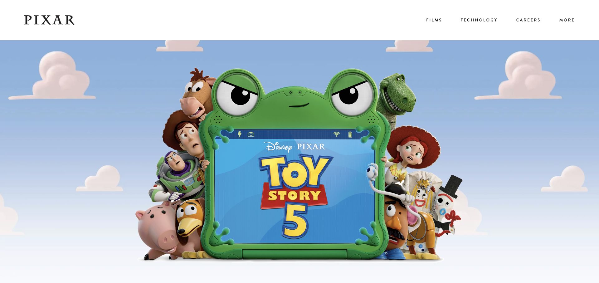
Pixar places a quiet white navigation bar above an almost uninterrupted film image. The studio name and plain text routes for films, technology, and careers do not compete with the characters and campaign artwork. This restraint is the typographic idea worth studying. An Adobe Fonts resource was referenced on the public page, but the observation does not identify every visible face, the studio's internal type system, or the artwork's embedded lettering.
What you can learn
Define typography by role before choosing how many font families to request. A studio wordmark, utility navigation, film title inside artwork, and ordinary article heading may have different technical sources and responsibilities. Test the live text with fallback fonts, longer labels, and a narrow viewport while leaving campaign art untouched. The navigation should remain useful when the film feature changes to a different visual style.
Pros
The restrained header leaves the campaign artwork a clear primary role.
Plain destination labels keep the studio's broader work and careers discoverable.
Cons & considerations
A nearly all-image opening supplies little explanation if the campaign artwork is unfamiliar.
Fine header lettering still needs readable size, spacing, and focus treatment on small screens.
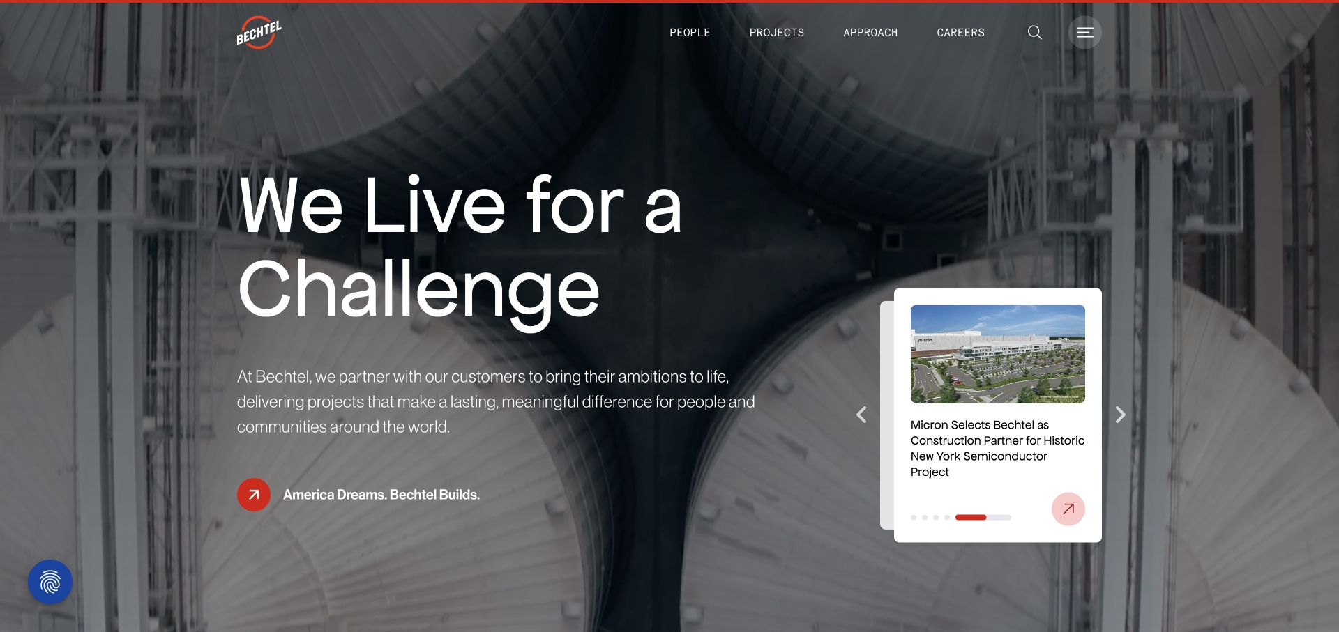
Bechtel places a large challenge-focused headline over an industrial photograph, with a shorter explanatory paragraph and a smaller editorial card nearby. Navigation remains compact above the feature. The contrast between scales helps separate brand introduction from a specific story. Adobe Fonts delivery was observed on the public page; the image does not establish which individual font produces each visible element or how the corporate font account is administered.
What you can learn
Create explicit heading, body, navigation, and card styles rather than letting every campaign set a new scale. Test fallback metrics and longer project titles against the same photograph and narrow layouts. Keep the headline as readable text, with enough contrast independent of a particular crop. A smaller editorial card should retain its own useful hierarchy instead of inheriting the largest display style simply because it shares the opening section.
Pros
Different type scales establish a clear relationship between introduction and supporting story.
The project scene gives the broad headline a concrete industrial context.
Cons & considerations
Large overlay text needs reliable contrast across changing images.
Supporting copy can become too subordinate if the display headline consumes the mobile opening.
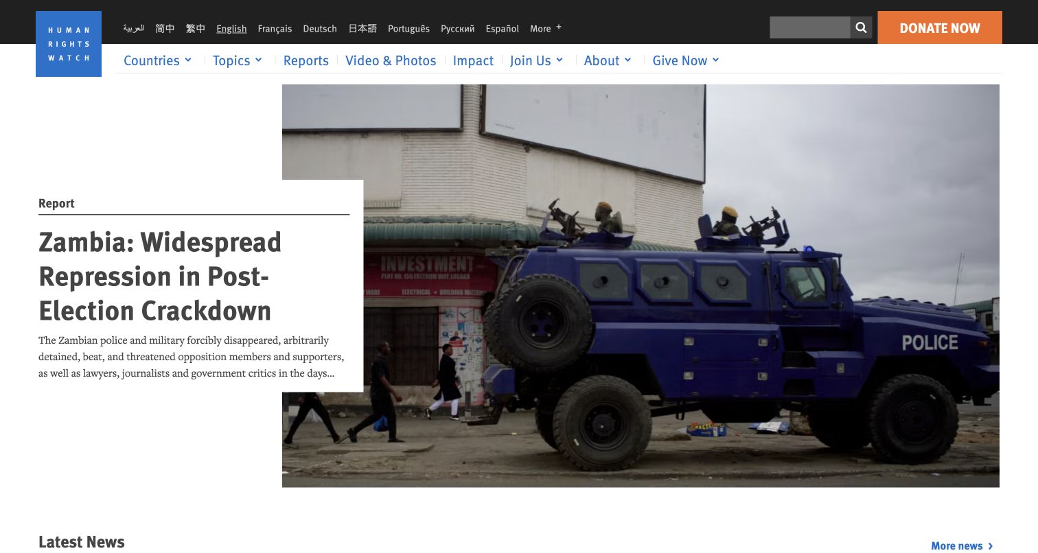
Human Rights Watch gives the lead report a substantial headline, summary, and photographic context. Countries, topics, reports, video, and impact remain visible in the navigation, while language selection has a utility role. The page behaves as a research publication as well as an institutional introduction. Adobe Fonts resources were referenced publicly, not audited as a complete inventory of typefaces across translations, reports, or downloadable documents.
What you can learn
Build a typographic system around actual research material: long titles, named locations, quotations, tables, and several writing systems where supported. Keep report hierarchy distinct from short fundraising actions. Test a fallback stack and increased text size before declaring the visual system finished. The strongest idea to borrow is the relationship between headline, explanatory summary, and research taxonomy, not an assumption that one font service automatically solves multilingual publication needs.
Pros
The lead summary adds context rather than relying on an image and title alone.
Research categories and geographic routes remain visible around the featured report.
Cons & considerations
Long investigative titles need more flexible wrapping than a short campaign slogan.
A multilingual reading interface requires attention to language-specific text and navigation lengths.
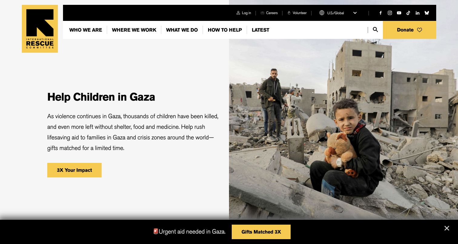
The International Rescue Committee pairs a specific crisis appeal with documentary photography and a clear yellow action. Black and white provide the surrounding text frame, while navigation distinguishes who, where, what, and how to help. A further explanation of programs follows the immediate request. Adobe Fonts delivery was observed on the public website; the presence of a resource does not verify font use in every campaign or document.
What you can learn
Define a readable type hierarchy for urgent notices, explanatory summaries, and enduring program information. An appeal should tolerate a longer location name or translated sentence without becoming an oversized block that hides its context. Check fallback rendering and the contrast of smaller text beside documentary images. Keep a genuine date and responsible owner attached to an urgent message so typographic emphasis does not make an old appeal appear newly issued.
Pros
The action and explanatory copy have clearly different visual roles.
Simple organizational categories connect the immediate appeal to a broader account of the work.
Cons & considerations
Urgency should not remove the context a reader needs to understand the request.
A campaign's headline length and image crop must be checked together across breakpoints.
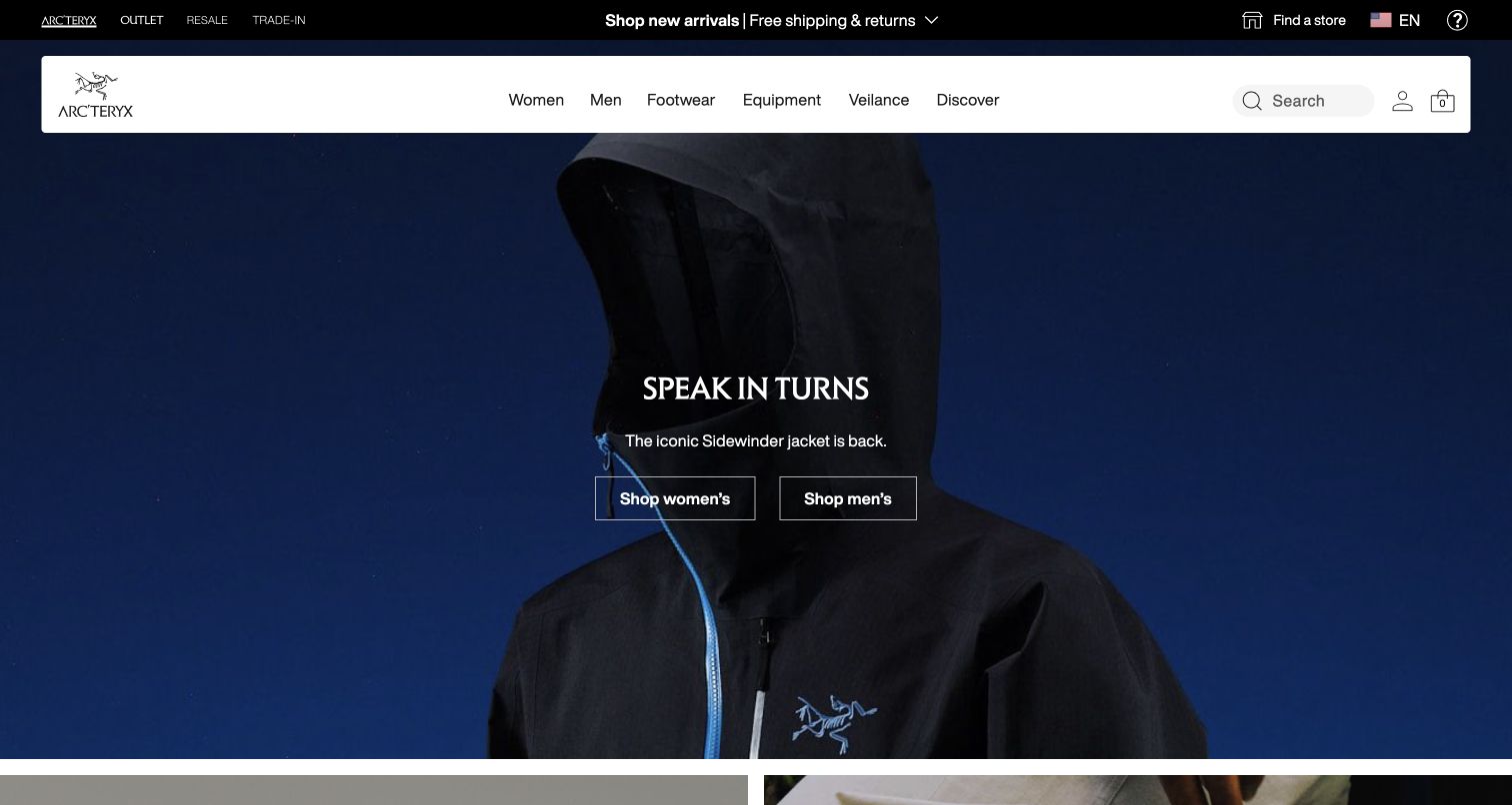
Arc'teryx places a dark close-up jacket photograph under a floating white commerce bar. Search, account, bag, and practical product categories form a compact typographic system, while a centered campaign line and audience actions occupy the image. Adobe Fonts resources were referenced publicly. The observation is about font delivery, not a finding that every label or product graphic uses the same supplied family.
What you can learn
Keep campaign type and retail utility text as separate roles with shared constraints. A longer garment name, another language, or a fallback font should not make search and category controls collide. Test the small header as carefully as the large photograph, especially when account and bag states change. Technical product details need a more durable reading hierarchy below the scene so a short editorial slogan does not become the only explanation of the equipment.
Pros
The white commerce surface remains distinct from the dark product photograph.
Compact practical labels give the wider catalog a stable entrance.
Cons & considerations
Small utility text and controls need adequate space when the layout narrows.
The campaign slogan should not postpone material, fit, and intended-use information indefinitely.
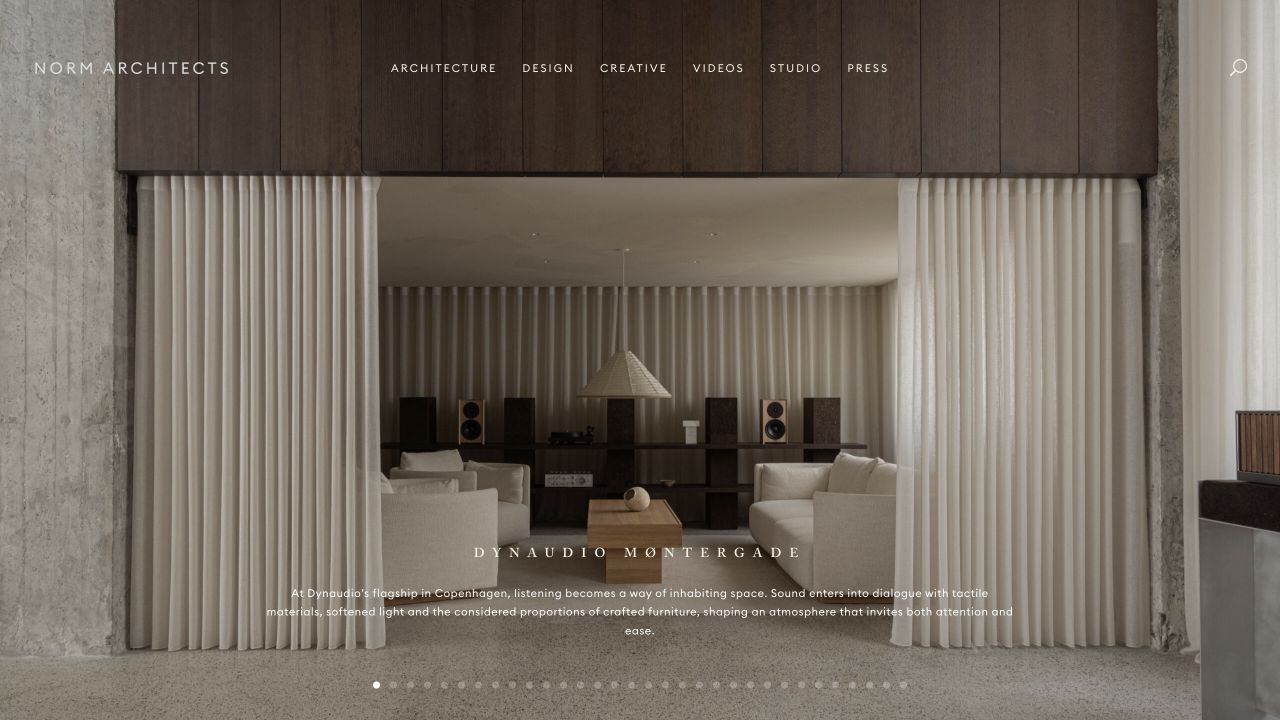
Norm Architects uses an atmospheric interior photograph, a small identity, and restrained navigation. The quiet type gives light, texture, and proportion the opening's dominant role rather than covering the scene with a manifesto. Adobe Fonts resources were observed in public delivery alongside other components. That does not identify the source of every wordmark or the complete editorial typography used elsewhere on the practice's website.
What you can learn
A restrained system still needs defined minimum sizes, line lengths, and fallback behavior. Test a project with a long location and an unfamiliar title instead of only a short featured name. Keep text as real content rather than baking labels into photographs, and verify readable contrast for replacement crops. The useful lesson is deliberate hierarchy: reduce competing messages without reducing essential wayfinding to text that only works in a controlled desktop composition.
Pros
The quiet framing gives the project photograph a clear expressive purpose.
A limited navigation avoids competing with the image's material detail.
Cons & considerations
Very small labels can make practical project and contact routes harder to find.
Restrained overlay type depends on consistent contrast as the featured photograph changes.
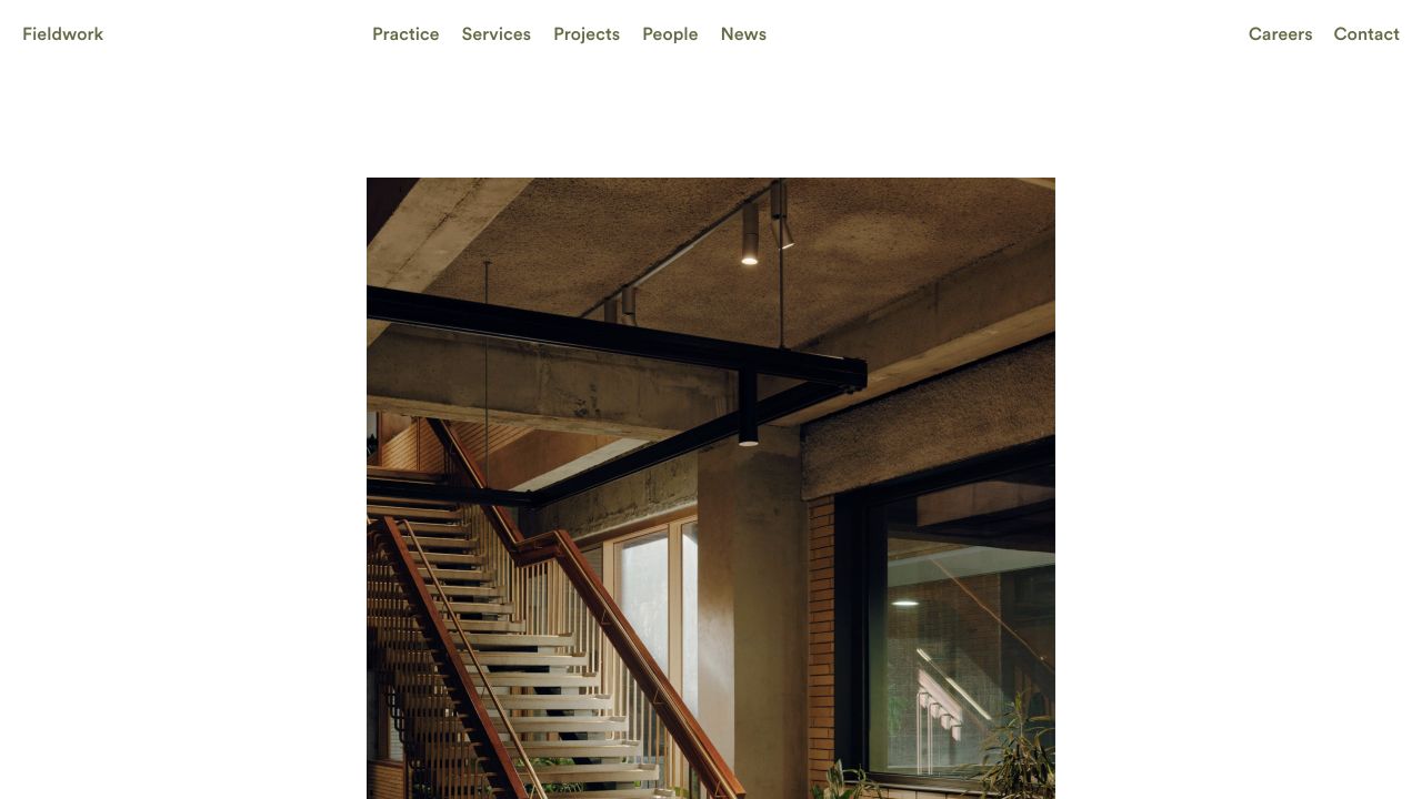
Fieldwork uses a light canvas, explicit top navigation, and a large project photograph with generous space around it. Practice, services, projects, people, and news are named rather than implied through imagery. The typography is quiet without making every destination a hidden control. An Adobe Fonts reference was observed publicly, not as proof that all text, logos, or downloaded material use one supplied typeface.
What you can learn
Define a compact hierarchy for page introductions, project facts, and ordinary navigation before adding display effects. Test the same system on a service description and a long project record, including a fallback font and larger user text. Keep enough distinction between a heading and a link that a new visitor can explore without guessing. White space should support reading and orientation, not require editors to maintain artificially short sample copy forever.
Pros
Service and project routes make the practice's offering understandable without interpretation.
Generous space gives the image and the navigation different roles.
Cons & considerations
Large white margins need adjustment on short or narrow displays.
Quiet typography still needs enough hierarchy when project descriptions become much longer.
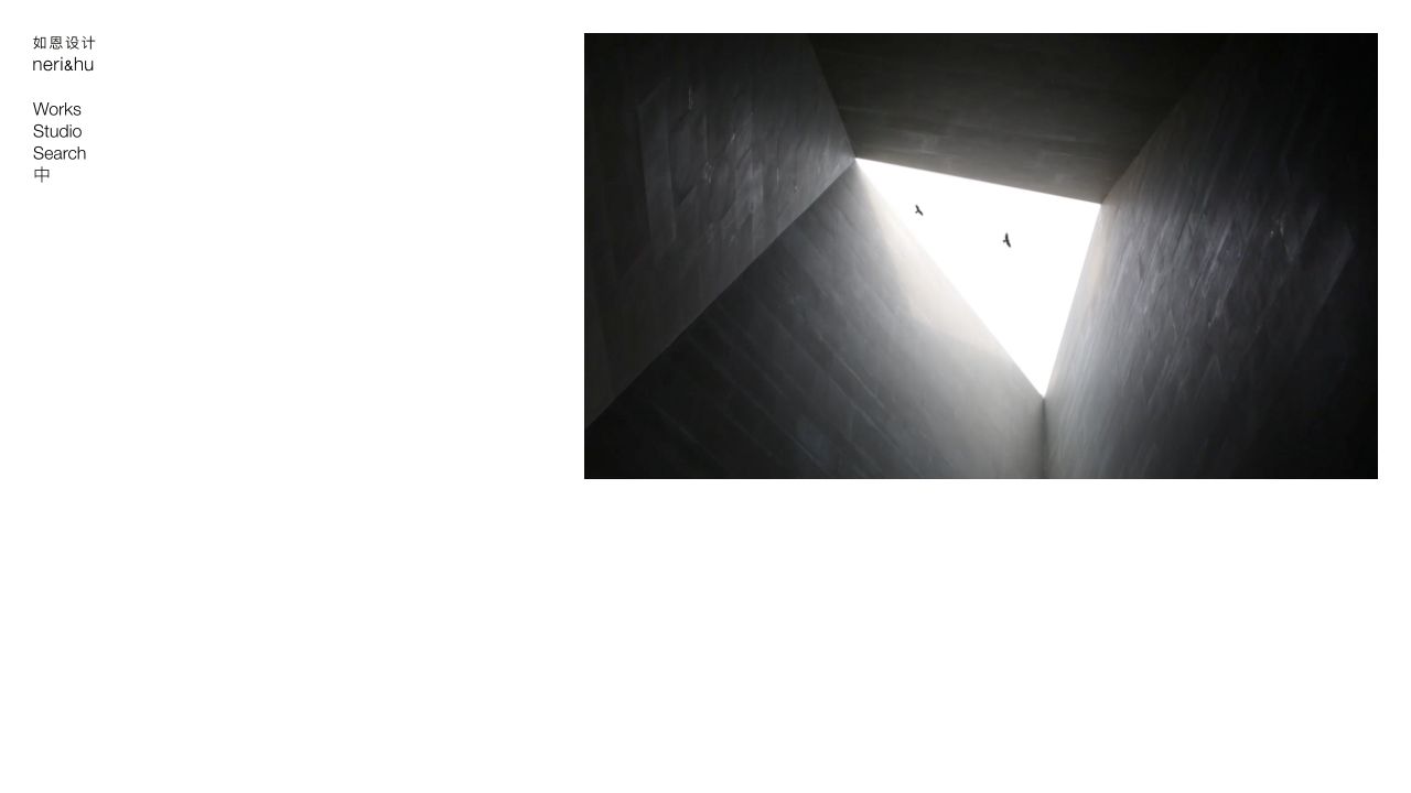
Neri&Hu places its bilingual identity and a short navigation column at the left, leaving the main field to a single image or media panel. The calm opening leads into a deeper body of architecture, interiors, and design. Public Adobe Fonts references establish a delivery association, not an identification of every script, logo character, or font used throughout the multilingual archive.
What you can learn
Treat each supported script and language as a first-class design case. Check line height, label length, fallback selection, and the relationship between bilingual identity and ordinary navigation. Test a long project title in the narrow column and a missing media item in the main field. Preserve category labels and project facts as readable text so the quiet opening can expand into a useful archive without forcing visitors to decode imagery alone.
Pros
The navigation and media have clearly separate spatial responsibilities.
The bilingual identity communicates a specific practice rather than a generic portfolio template.
Cons & considerations
A narrow navigation column has little room for long translated labels.
A single large media field needs a useful next step when its content is unfamiliar or unavailable.
MVRDV overlays a bold condensed statement on a full-screen project scene. The visible type is emphatic, while thematic routes connect the broad position to housing, transformation, research, and other interests beyond the initial image. Adobe Fonts delivery was observed on the public page, but the reference does not independently identify the display family, every theme label, or the composition of project graphics.
What you can learn
A condensed display style needs explicit boundaries around length and context. Test a longer statement, a translated label, and a quieter project photograph before establishing it as the default for every page. Use a separate reading style for project facts and research material. The opening's confidence can be preserved without asking a dense paragraph or a complex technical caption to behave like a short poster headline.
Pros
The display treatment gives the project scene an unmistakable editorial attitude.
Thematic routes provide a bridge from the slogan into a substantial body of work.
Cons & considerations
Tall condensed lettering can become difficult to read when it wraps across a small image.
An emphatic opening still needs conventional project facts and practical contact destinations.
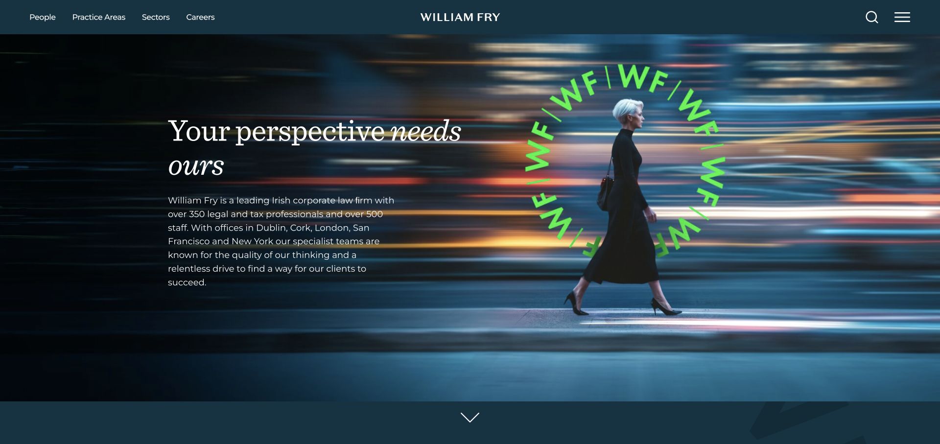
William Fry combines fine white serif lettering, a dark teal field, and a vivid green circular mark. A moving city figure provides contemporary business context, with people, practices, and sectors as distinct destinations. Supporting text gives the headline substance. Adobe Fonts resources were observed, not audited as the source of every brand mark, document style, or page in the firm's public estate.
What you can learn
Test the fine reading style under realistic conditions: a long practice name, increased text size, a smaller screen, and a fallback font. Give lawyer names, contact details, and lengthy expertise descriptions their own dependable hierarchy rather than inheriting every hero treatment. Keep the animated or graphic identity separate from semantic headings so the professional story remains understandable when motion or custom fonts are unavailable.
Pros
The bright monogram and restrained palette establish a distinctive signature.
Separate people and sector routes support several ways a visitor may evaluate the firm.
Cons & considerations
Fine white text on a dark moving field needs careful contrast and size decisions.
A long introduction can demand more reading before a visitor reaches specific relevant expertise.
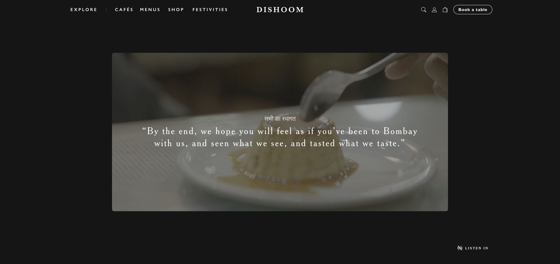
Dishoom frames a wide cooking scene within a dark page rather than extending every element over a full-screen background. The small, widely spaced navigation and centered identity sit above it, with a separate outlined table action. Adobe Fonts delivery was observed publicly. The reference does not demonstrate the precise source of the wordmark or establish that every menu and campaign asset uses the same font service.
What you can learn
Separate atmospheric display treatment from the practical typography required for menus, addresses, and booking explanations. Test the widely spaced labels at narrow widths and with longer location names. Keep the table action readable independently of the film and define a useful fallback when custom fonts load late. The dark framing can remain distinctive without turning ordinary service information into text that only works over one carefully chosen scene.
Pros
The framed media and separate navigation give the introduction a clear hierarchy.
The table action is identifiable without becoming another large promotional headline.
Cons & considerations
Small spaced navigation can be difficult for a reader seeking quick practical information.
A cinematic opening needs an explicit path to the relevant café, menu, or visit details.
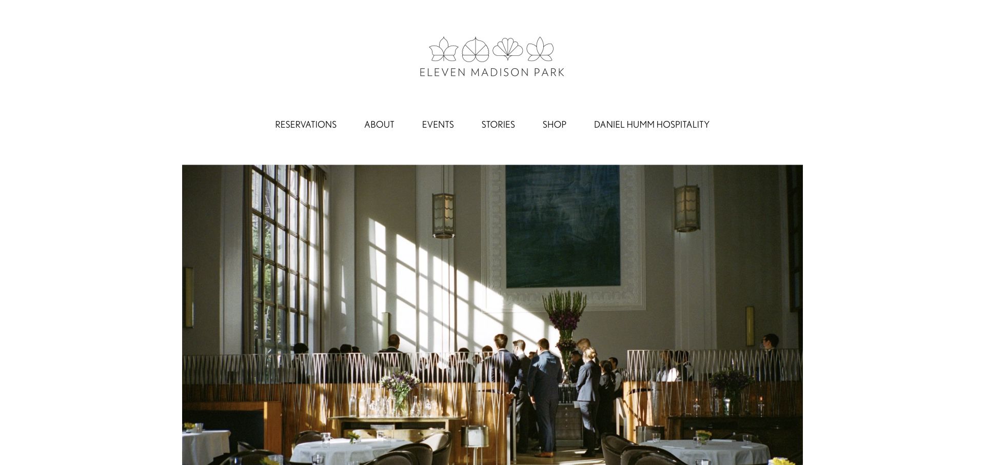
Eleven Madison Park centers a delicate illustrated identity above a horizontal navigation and large photography within white margins. Reservations appears as an ordinary named destination beside events, stories, and shopping. The restrained presentation lets people, ingredients, and kitchen scenes carry the opening. Adobe Fonts resources were referenced publicly, not identified as the source of every illustrated letter or document associated with the restaurant.
What you can learn
Define practical navigation and long-form reading styles separately from delicate brand artwork. Test a long event name, a changed reservation explanation, and a fallback font without disturbing the page's quiet proportions. Maintain sufficient contrast and size instead of reducing utility text simply to preserve the visual mood. The same system should make a detailed menu or first-visit explanation approachable, not only frame a beautiful opening photograph.
Pros
White margins and restrained labels give the photography a coherent editorial frame.
Reservations remains a recognizable destination rather than a hidden symbol.
Cons & considerations
Delicate identity details should not become the size model for ordinary readable text.
Very quiet navigation may postpone essential expectations for an unfamiliar guest.
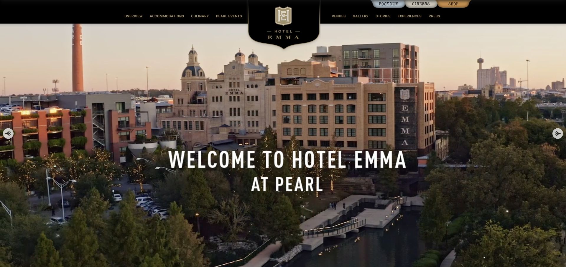
Hotel Emma places a central crest across a black-and-gold masthead and panoramic district photograph. Condensed white lettering names the property and its setting, while accommodation, dining, venue, and story routes use familiar categories. Small utility controls remain above. Adobe Fonts delivery was observed on the public page, without independently identifying the source of every crest detail, sign-like wordmark, or booking interface label.
What you can learn
Use the signage-inspired display style for a defined role, then give room descriptions, directions, policies, and booking information a comfortable reading style. Test a long venue name and a larger text setting against the same layout. Keep ornamental identity artwork distinct from semantic headings and address information. A guest should be able to understand the property and its next practical step even when custom fonts or the panoramic image do not load.
Pros
The typographic and graphic frame connects the hotel to a specific historic setting.
Conventional hospitality categories remain recognizable within the expressive identity.
Cons & considerations
Condensed display text can become crowded when translated or paired with long place names.
Small upper utility controls need adequate readable spacing rather than purely decorative proportions.
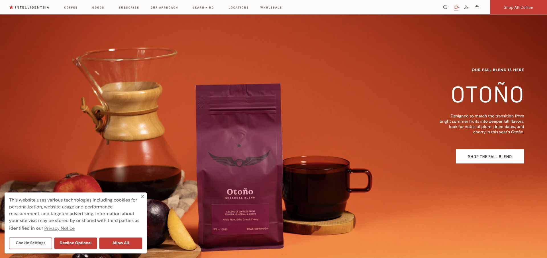
Intelligentsia places its seasonal blend in a vivid orange scene containing brewing equipment, fruit, and a contrasting bag. A thin white header holds coffee, goods, subscriptions, locations, and learning in a calmer typographic register. Adobe Fonts was referenced in public delivery. The font-service association does not identify the printed packaging face or establish that each retail and editorial label uses one common family.
What you can learn
Define a stable hierarchy for product names, prices, tasting information, and subscription explanations before styling seasonal campaigns. Check diacritics in origin and product names, fallback metrics, and narrow category labels. Give the package image room without making important commerce text artificially small. A shopper comparing bag size or a recurring order should not have to extract that information from lettering embedded in the campaign photograph.
Pros
The restrained header lets the product arrangement carry the seasonal character.
The named subscription and learning routes have clear identities outside the campaign.
Cons & considerations
Small retail navigation needs enough space when categories or language labels expand.
The strong image should not replace readable product and recurring-order information.
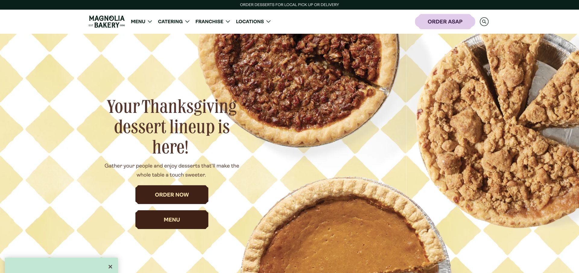
Magnolia uses pie photography, a checked tablecloth, and a large seasonal message, framed by cream and green. Prominent menu and ordering controls give the celebration practical continuations, while location and catering information support other visits. Adobe Fonts resources were observed on the public page. The observation does not independently identify lettering on packaging, every illustration, or the type used by separate ordering providers.
What you can learn
Create type roles for the occasion headline, product details, location information, and time-sensitive ordering conditions. Test longer holiday names and cutoff explanations rather than designing only for one short phrase. Keep the campaign's charm while making ordinary service text comfortable at larger user settings and with fallback fonts. Immediate ordering and a planned catered purchase should remain distinguishable through clear language, not just differently colored decorative buttons.
Pros
The palette carries the bakery identity through both campaign and navigation.
Menu and ordering actions connect the celebration image to recognizable tasks.
Cons & considerations
Large seasonal copy can crowd practical dates and fulfillment conditions.
Several ordering occasions need distinct labels rather than one generic purchase prompt.
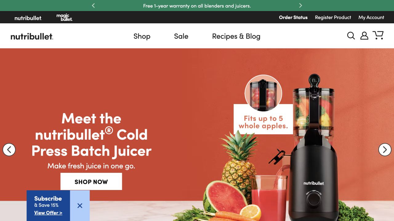
Nutribullet pairs a clearly named juicer with oversized product imagery, fruit, and a small capacity illustration on an orange field. Shop, sale, and recipes remain in a short navigation, while order status and registration occupy another utility layer. Adobe Fonts delivery was observed publicly, not verified as the source of every capacity graphic, product mark, or support-document typeface.
What you can learn
Keep product names, measurements, units, and supporting captions as explicit reading cases in the typography brief. Test long model variants, a fallback font, and increased text size against the campaign layout. Critical capacity or compatibility information should also appear as readable text, not only inside a small image annotation. Maintain a separate hierarchy for support and registration so the visual excitement of a product launch does not make after-purchase tasks unnecessarily hard to find.
Pros
The product image and clear model description explain the category quickly.
A capacity cue introduces a concrete evaluation question beyond lifestyle imagery.
Cons & considerations
Small diagram text can become unreadable when the campaign image scales down.
Sale messaging should not obscure support, registration, or accurate specification information.
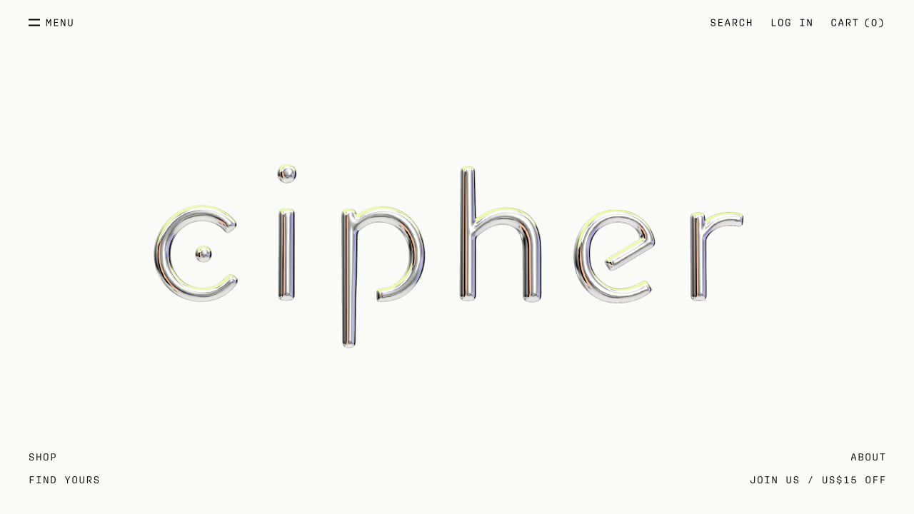
Cipher Skincare surrounds a large reflective wordmark with an almost empty off-white canvas. Menu and commerce utilities occupy the upper edges, while shop, product-finding, company, and signup routes sit lower in the frame. There is little conventional product introduction in the captured opening. Adobe Fonts delivery was observed, but the metallic wordmark should not automatically be treated as live text supplied by that service.
What you can learn
Distinguish artwork from the site's actual reading system. A visually elaborate wordmark can remain an image or graphic while product names, ingredients, instructions, and navigation use dependable semantic text. Test the page without the central artwork and with a fallback font to see whether the purpose remains understandable. Give editors constraints for long skincare descriptions so the sparse visual identity does not become an excuse to omit useful product-selection information.
Pros
The restrained canvas gives the brand identity a singular visual role.
Commerce utilities retain recognizable text positions around the expressive artwork.
Cons & considerations
An identity-only opening provides little immediate explanation for an unfamiliar shopper.
Widely separated corner routes can become hard to discover on a small display.
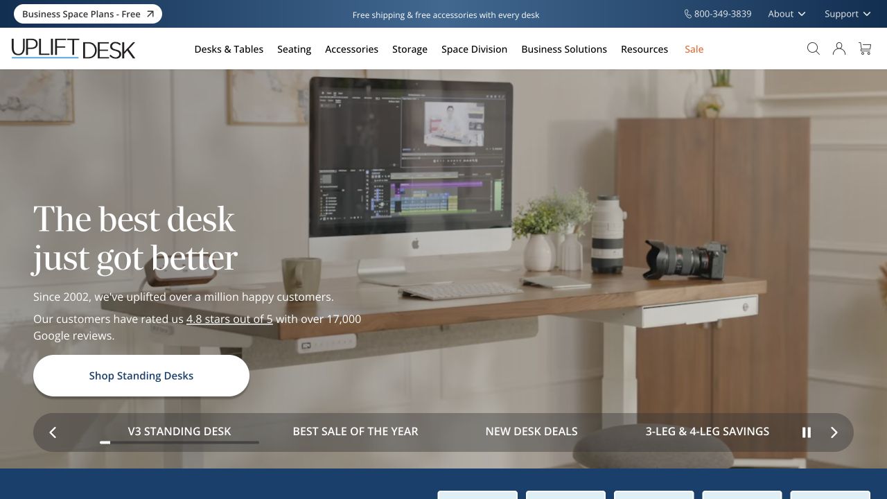
UPLIFT Desk shows a standing desk in a working room beneath a large serif headline, supporting copy, and a shopping action. Product families, business solutions, and support occupy a wider navigation, while named campaign choices follow the hero. Adobe Fonts resources were referenced publicly. That does not identify every visible font or prove that specification and configuration interfaces share the same typographic implementation.
What you can learn
Define separate roles for inspirational headlines and the dense information needed to compare dimensions, options, and accessories. Test tabular numbers, long product combinations, and a fallback stack before selecting a final family set. Keep named campaign controls readable when more words are needed. A room photograph can explain use, but technical furniture evaluation requires a stable text hierarchy that remains comfortable beyond the curated introductory scene.
Pros
The room setting shows the product in an understandable working context.
Named campaign choices offer more orientation than anonymous carousel dots.
Cons & considerations
A wide product navigation needs deliberate grouping when it becomes a mobile menu.
The aspirational headline must lead into precise dimensions and configuration explanations.
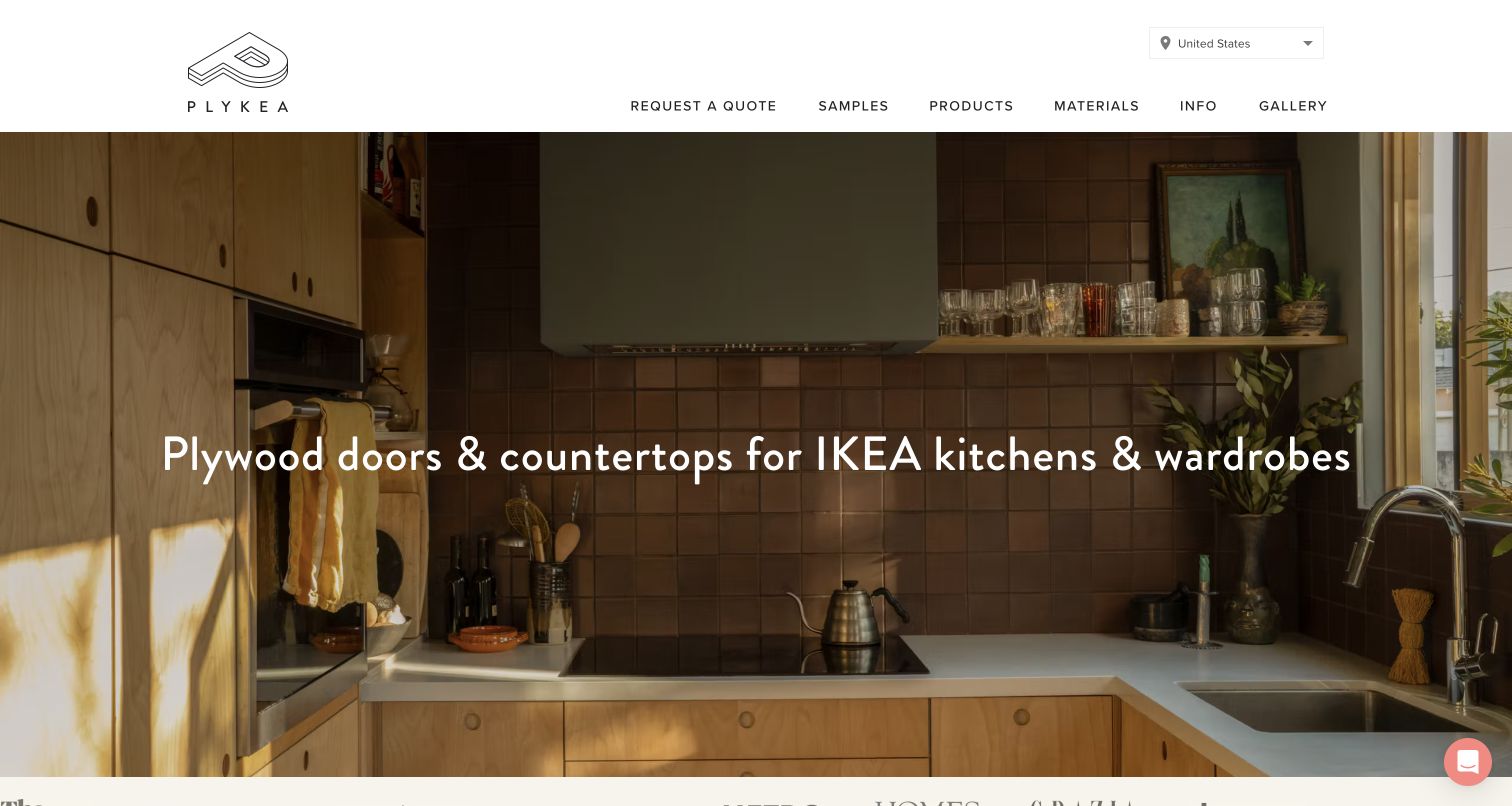
Plykea places a simple explanation of plywood doors and countertops over a warm kitchen photograph. A spacious header names samples, products, materials, information, gallery, and quotation. The captured route is the US version of the property. Adobe Fonts delivery was observed, not independently identified for every wordmark or technical document; the separate furniture brand mentioned in compatibility copy is not attributed to the same website stack.
What you can learn
Give compatibility statements and material names an explicit typographic role, with enough space for long dimensions and regional terminology. Test fallback rendering and a more detailed product explanation rather than assuming a short headline covers every specification. Keep sample and quotation actions distinct so the next commitment is understandable. The warm room scene can remain inviting while the live text supplies the exact relationship between the offered parts and the systems they are intended to fit.
Pros
The headline states the actual product relationship rather than relying on a vague interior slogan.
Samples, materials, and quotations have understandable separate destinations.
Cons & considerations
Overlay copy needs sufficient contrast over different kitchen photographs.
Compatibility and regional product terminology require more precision than the main campaign headline alone.
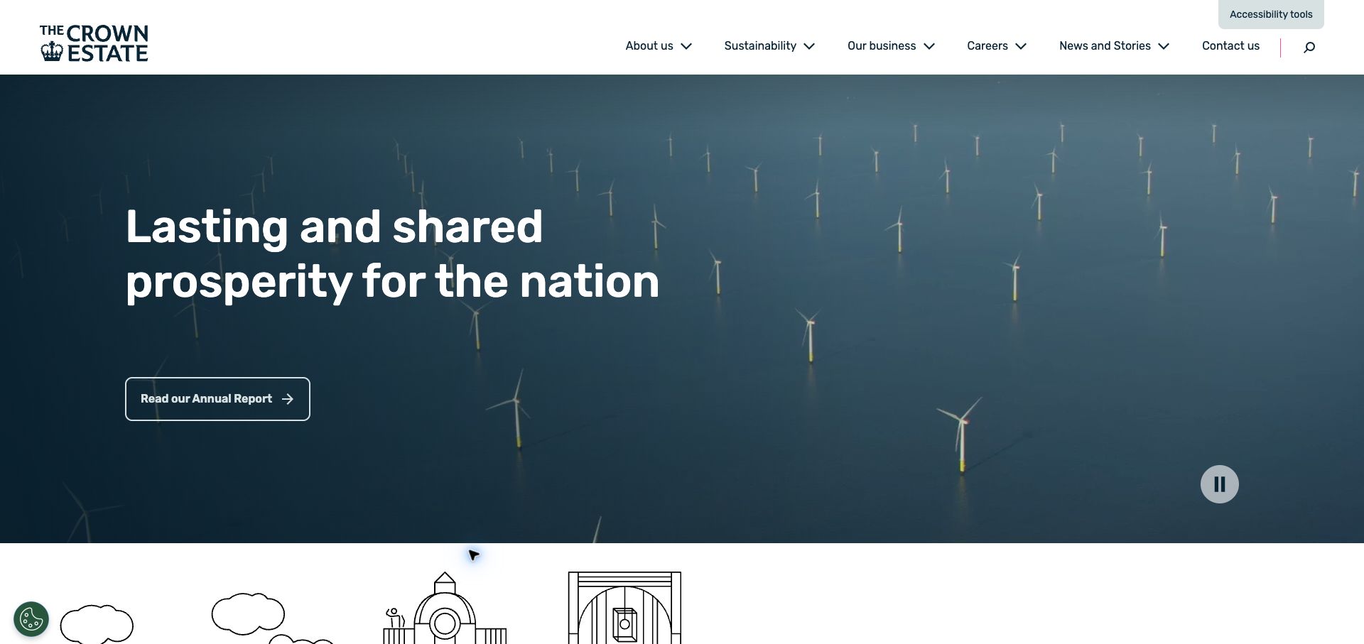
The Crown Estate presents a large white purpose statement over a dark offshore-wind scene. A separate annual-report link provides a concrete continuation. Sustainability, business, careers, news, and contact remain in the white masthead, with an accessibility-tools control separately visible. Adobe Fonts resources were referenced in public delivery, not audited as the source of every report typeface or a guarantee of readable behavior throughout the website.
What you can learn
Define a consistent hierarchy for public statements, evidence, report titles, dates, and ordinary navigation. Test long formal names, fallback metrics, and increased text size while preserving a useful still alternative to the moving image. Keep the annual-report destination explicit and dated, and ensure downloadable material receives its own readability review. A font service and an accessibility control are components of an implementation, not substitutes for checking the actual text and interaction states.
Pros
The annual-report link connects the broad purpose statement to a specific evidence destination.
A strong dark tonal field supports the large introductory text.
Cons & considerations
Moving backgrounds require contrast and motion decisions beyond the chosen font family.
Formal claims and report references need genuine dates and sufficiently readable supporting detail.
Choose a typographic system before adding another font request
Use a small shared system when the content is conventional
A focused service or editorial site may need only a clear reading family and a restrained display treatment. Define sizes and spacing that handle long content before adding decorative exceptions. Keep labels and form feedback comfortable even if the main headline uses a more distinctive style.
Add a display role for a genuine identity need
An expressive face can give campaigns, cultural projects, or product stories character. Keep its intended use explicit and test it on the longest realistic title. Do not automatically apply condensed, delicate, or highly stylized display proportions to body paragraphs, technical captions, or essential navigation simply to make every element look more branded.
Plan language and technical content explicitly
List supported scripts, diacritics, numerals, units, and specialist symbols before choosing the final families. Test actual translated content and representative specifications. A web-font project and a fallback stack must support the real publication, not only the English sample headline. Have the appropriate owner review account and usage arrangements rather than inferring them from another website’s resource URLs.
From references to requirements
Turn typography references into a maintainable implementation brief
Build a realistic specimen page
Include a long heading, several paragraph lengths, lists, quotations, cards, buttons, tables if needed, and form errors. Add a genuine awkward name and a missing-image state. Review the specimen on a phone and with increased text size before building an entire page library around the easiest sample.
Check loading and layout behavior
Compare the first useful content before and after the preferred fonts become available. Review shifts, clipped controls, and navigation wrapping using the actual chosen delivery method. Adobe’s font-display guidance explains implementation options; the right choice still needs testing against the site’s content and requirements.
Give editors a short vocabulary of text roles rather than an invitation to select arbitrary families and sizes for every paragraph. Record the responsible account, project reference, fallback stack, supported character needs, and update process. Keep artwork and live text clearly distinguished so a future maintainer can correct actual content without having to recreate a decorative logo.
A useful handover demonstration
Ask the actual team to carry out its routine job: publish a realistic update, correct a mistake, preview a narrow screen, and identify who owns an integration failure. For a library or frontend framework, also ask who maintains the content source and deployment. A polished screenshot does not answer those operational questions.
Beyond the screenshot
Typography and font-delivery acceptance checklist
Define semantic text roles before selecting families and weights.
Test real long titles, names, prices, units, and supported language content.
Keep navigation, labels, errors, and practical facts as readable live text.
Review fallback rendering and delayed or failed font requests.
Check text size, contrast, line length, spacing, and wrapping on small screens.
Verify that the intended families and weights are actually rendered.
Record web-project, account, usage-review, and ongoing ownership responsibilities.
Give editors clear style boundaries and a representative specimen for future changes.
Test with real content, a keyboard, a small screen, slow or failed requests, and the people who will maintain the system. These are planning checks, not an accessibility, security, performance, or search-ranking certification.
Sources & editorial method
How this Adobe Fonts collection was reviewed
The collection uses twenty actual source properties with observed Adobe Fonts resource references. We inspected the captured composition and preserved original screenshot dates. A font-delivery reference does not identify all visible typefaces, embedded artwork lettering, language coverage, licensing arrangements, or accessibility conformance. The reviews describe hierarchy and practical tradeoffs rather than verified font-family matches.
Every image is an unmodified capture from the actual website, with its source and capture date. Some captures are reused from our shared catalog; their dates remain the original capture dates. None comes from a vendor gallery or a generated reconstruction. Moving imagery and live content can change.
Technology attribution uses public page assets or metadata, official platform documentation, or a cited first-party project case study. Documentary and framework-relationship evidence is identified where used; it is not a complete current backend inventory. A CMS image CDN alone does not establish a full CMS deployment. A library’s presence does not prove which individual controls use it, and a platform label does not establish AI authorship.
The composition notes, lessons, pros and tradeoffs are original editorial observations. We have not measured conversion, traffic, security, performance or accessibility conformance. Website owners retain their brands and imagery; these examples are not our client portfolio. Written, Edited and Curated are independent records, not dates advanced by a build. See our editorial standards or suggest a correction.
Questions worth asking
Adobe Fonts website development FAQs
Can the screenshot identify the exact font?
Not reliably by itself. Several faces can look similar, the displayed text may be artwork, and a page may load a family without using it in the element being studied. Treat the service association separately from any exact family identification.
Should every element use the display font?
No. Define its role and test real reading tasks. A distinctive campaign heading can coexist with more ordinary navigation, captions, tables, and body copy. Visual consistency comes from a coherent system, not from applying one unusual proportion to every kind of text.
Why does the fallback matter if the font service usually works?
A reader can experience delayed or failed requests, different device settings, or a character the selected family does not cover. A useful fallback keeps content and controls understandable. Test those states rather than assuming the ideal desktop screenshot is the only experience.
What information belongs in the handover?
Record text roles, families and weights, fallback choices, supported characters, project and account ownership, and the process for updating the system. Include a realistic specimen page and editing rules. Review current vendor usage guidance with the responsible business owner.
Borrow the hierarchy and the clarity, not a guessed font name. Build a text system that remains useful when the content, device, preferred face, or next editor changes.